
Шаблоны готовых решений для аналитических расчетов таблиц со статистическими показателями деятельности и функционирования предприятия за определенный промежуток времени.
Ссылки на страницы для скачивания примеров
 Как сделать круговую диаграмму более чем 100%-200% в Excel.
Интересная идея как создавать диаграммы для показателей более чем 100% или 200% и выше. Пошаговая инструкция с файлом примером готового результата – скачать.
 Как создать тепловую карту США или ЕС в Excel: скачать.
Разработка интерактивной тепловой карты США и Евросоюза для визуализации данных в Excel. Скачать готовый шаблон дашборда с фигурами штатов US и стран EU.
 Как сделать красивую диаграмму для дашборда Excel скачать.
Пошаговая инструкция сборки комбинированной диаграммы с оформлением цветовой схемы. Скачать готовый пример с шаблоном дашборда для презентации кол-центра.
 Скачать шаблон календаря Excel для визуализации данных.
Урок по созданию шаблона календаря для дашбордов с пошаговым описанием. К уроку прилагается файл с примером и готовым решением для интерактивного календаря.
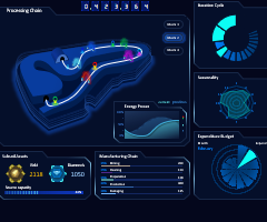 Скачать визуализацию данных Excel с элементом геймификации.
Шаблон с примером универсального дашборда для презентации визуализации данных о бизнес-процессах производственной цепочки с элементами игрофикации.
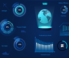 Дашборд с планетой Excel скачать для презентации логистики.
Скачать пример дашборда для эффектно презентации логистических показателей. Применяются элементы анимации инфографики. Сборка красивых диаграмм.
 Как сделать простую презентацию World Map Chart в Excel.
Пошаговая инструкция для создания инфографики с эффектом анимации. Урок с примерами как делать интересную визуализацию данных в Excel. Скачать шаблон примера.
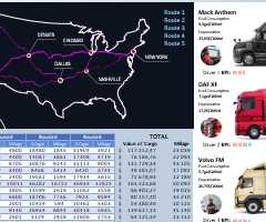 Как сделать Map Chart для управления логистикой в Excel.
Скачать презентацию отчета эффективности управления логистикой. Как создать свой интерактивный Map Chart с построением маршрутов логистической цепочки поставок.
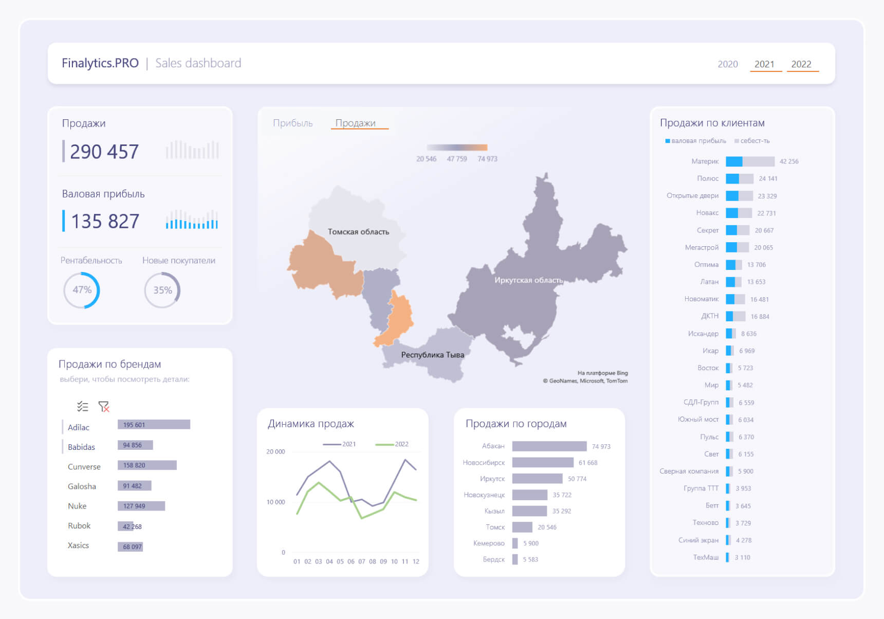
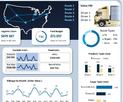 Анализ логистики и управления цепочками поставок в Excel.
Скачать шаблон презентации отчета для оценки эффективности управления логистикой с визуализацией данных. Как составить ТЗ для разработки дашборда под бизнес?
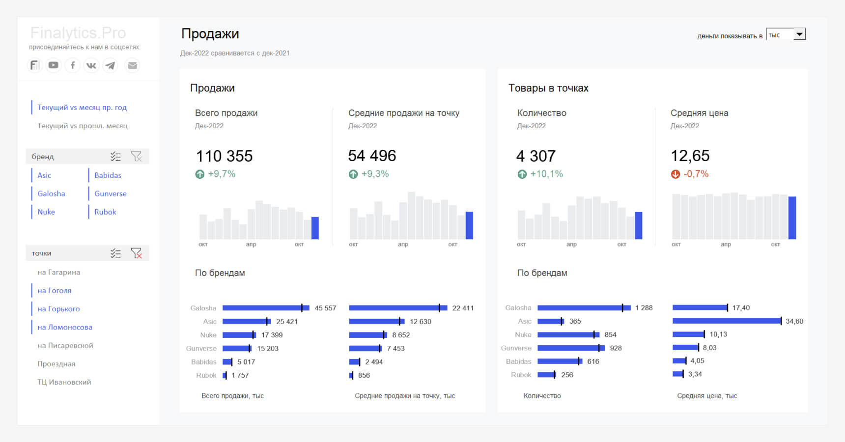
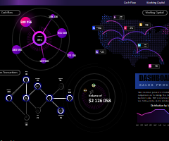 Красивый дашборд для анализа процессов продаж в Excel.
Бесплатно скачать шаблон дашборда со стильным дизайном для презентации отчета о продажах. Пример возможностей Excel в области разработки визуализации данных.
1
2
3
4
5
6
7
8
9
10
11
12
13
14
15
Подготовили подборку разработанных нами интерактивных управленческих отчетов в Excel для экономистов и финансистов. Эти отчеты или дашборды можно скачать, заполнить данные и вносить изменения, а еще разобраться с тем, как они построены и «прокачать» свои навыки в Excel. Но не обещаем, что это будет легко )
Скачивайте файлы — это бесплатно. А если вы хотите научиться строить такие отчеты самостоятельно, приходите к нам на курсы.
Если вы хотите научиться консолидировать бюджеты с использованием Power Query и выполнять расчеты ключевых показателей с помощью DAX-формул, приходите к нам на курс «Бюджетирование с Business Intelligence».
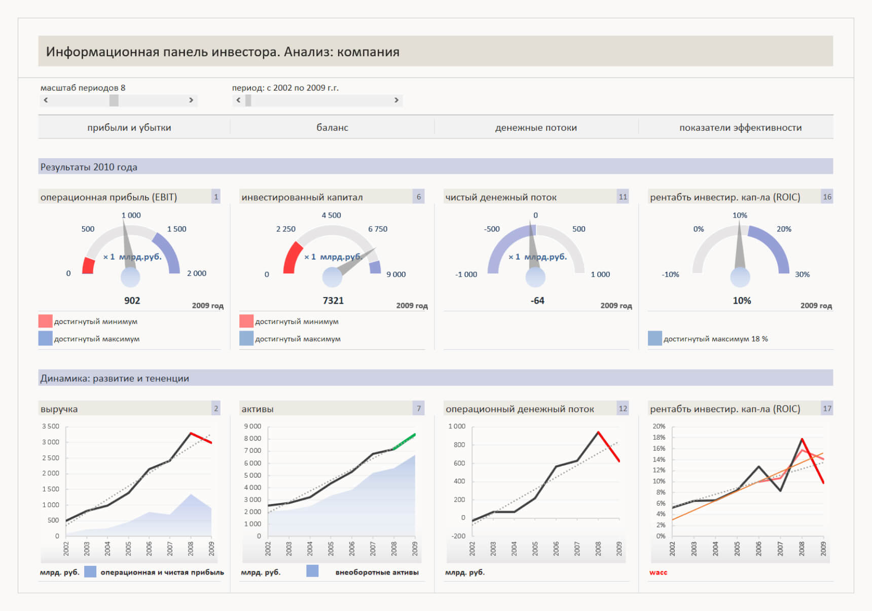
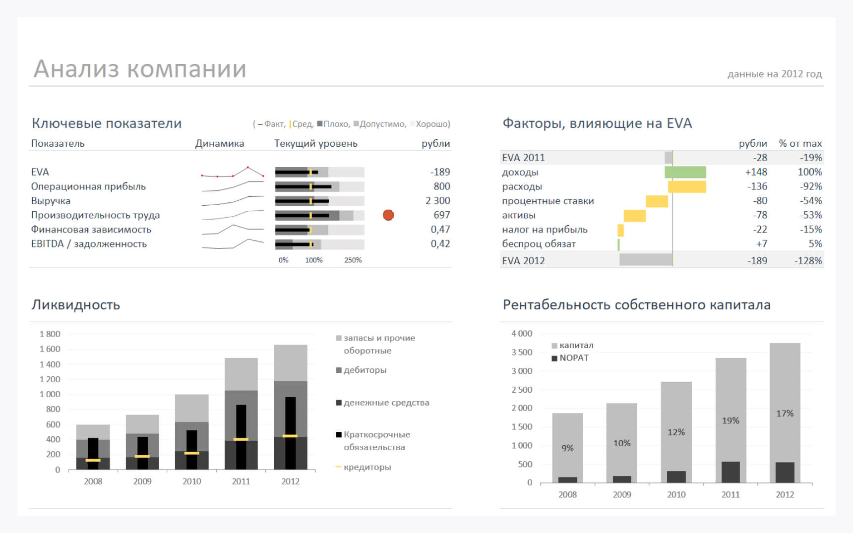
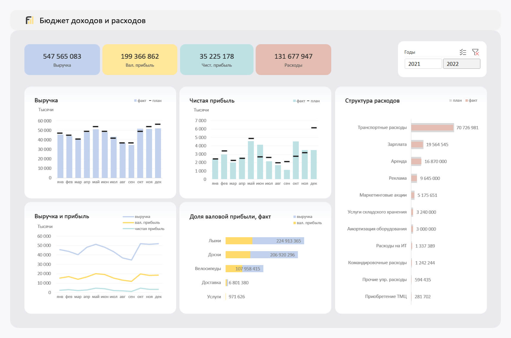
Анализ ключевых показателей и EVA
В отчете проиллюстрированы изменение ключевых показателей, ликвидности, рентабельности собственного капитала и факторы, влияющие на изменение EVA.
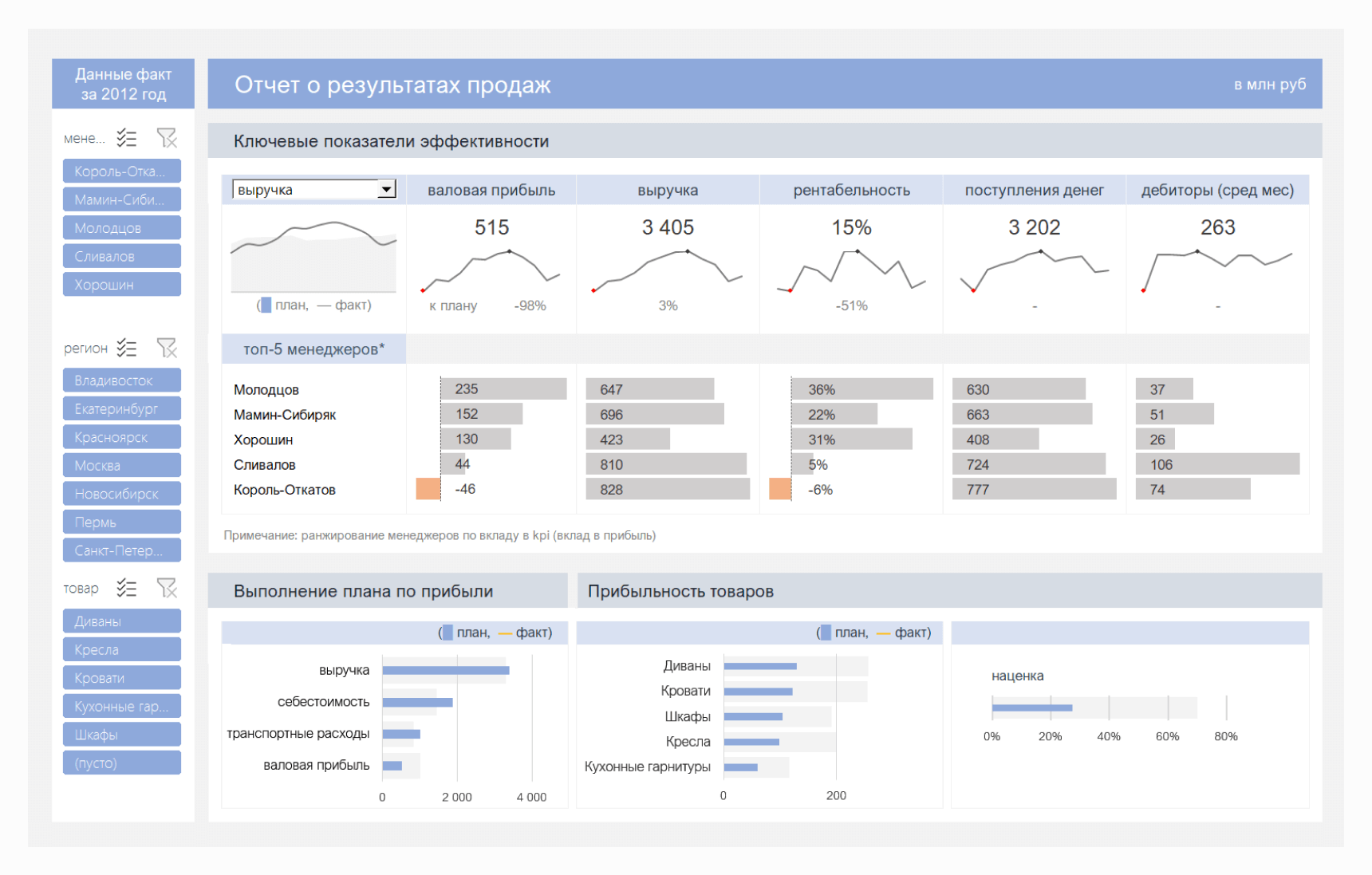
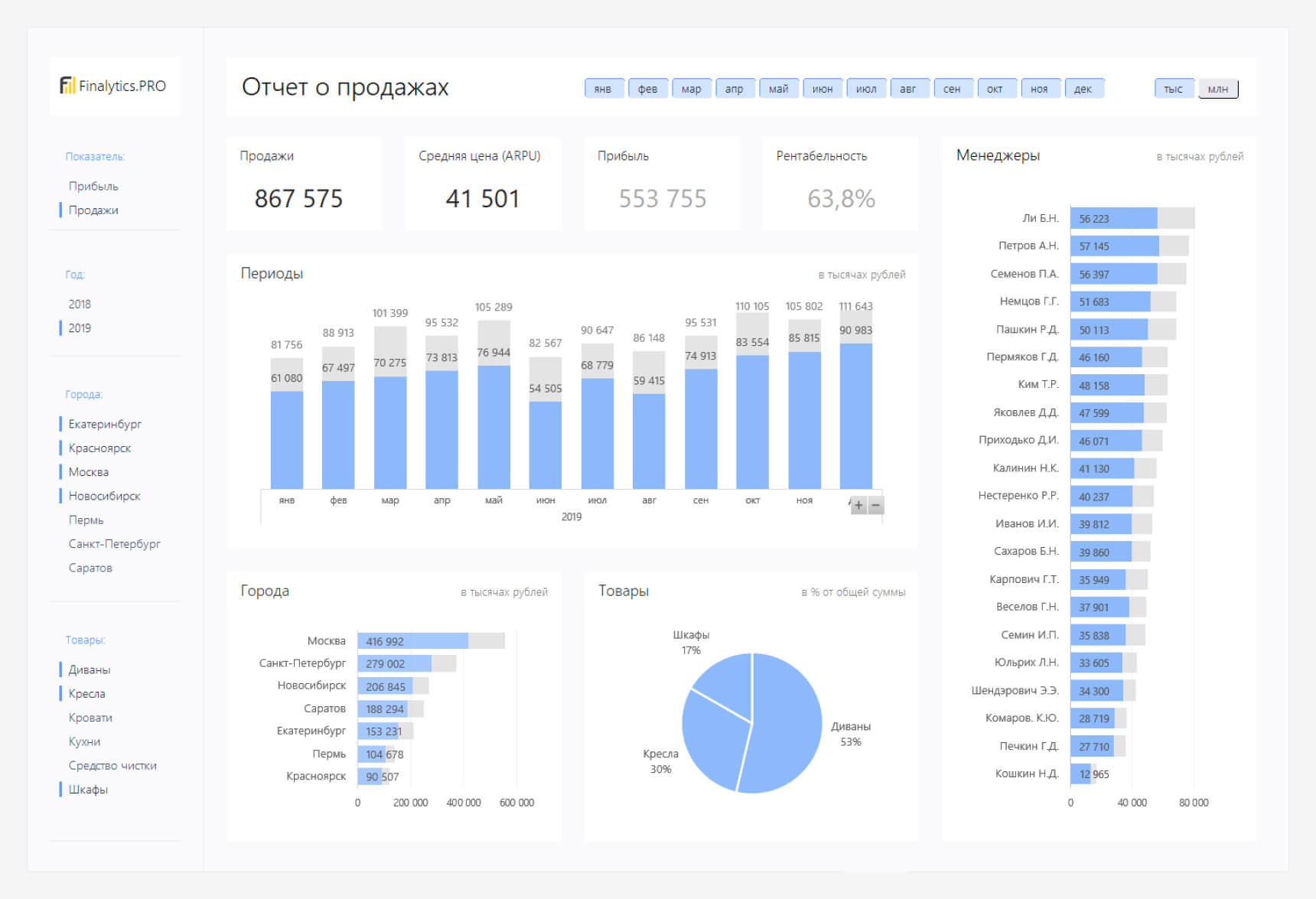
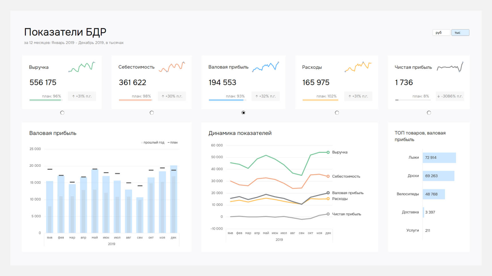
Отчет о результатах продаж
Файл показывает выполнение плана и ключевые показатели эффективности: прибыль, выручку, рентабельность и поступление денег. А также вклад менеджеров в формирование показателей.

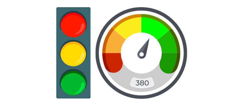
We have good news for the Excel funs! No more traffic jams if you use our traffic light dashboard! Just work or learn using our fully editable and free stoplight template. Before creating a dashboards or templates, set up your goals. It is important to decide what metric is most suitable for you.
In the example, you will learn how to track a project using a smart way. Use key performance indicators, and you can measure all activities easily.
One of the most liked tools is conditional formatting in Microsoft Excel. A traffic light report is an all-round tool, and it is not a difficult task to build it.
As usual, the light has three statuses. Use three different colors (red, yellow, and green) to track the project status!
Before we take a deep dive: just a few words about the solution. We apply a new method besides the VLOOKUP and SUMIF formulas. Learn how to build dashboards from the ground up using a blank Excel workbook.
Today’s guide will be about how to create a Human Resources Dashboard Template using typical hr metrics. HR is responsible for recruitment, handling employee records, administer payroll and follow-up work performance. As part of the building of the dashboard, we are focusing on the most frequently used HR KPI measures.
For convenience, we’ve just grouped them under the following four categories: Employee Turnover, Recruiting, Retention, and Training. Using this dashboard, you can easily track your employee human resource data using a single Worksheet. The template is portable and can be deployed in seconds.
We’ll use qualitative and quantitative metrics to provide better dashboards. The published template is an intermediate level spreadsheet. Which is the best way to create a useful and user-friendly dashboard? We will share with you some great data visualization technics like shape-based people graphs and speedometers.
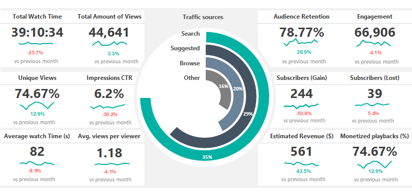
Social Media Dashboard Template is fully optimized for Youtube channel tracking using Microsoft Excel. The free excel dashboard gives you a quick overview and helps you to track views and engagement on your videos. Are people engaging with your video tutorials? Use this spreadsheet to analyze and measure social engagement, and discover trends and know your audience.
Many users need more details to analyze data using an easier way. In the example, you only need to replace your initial data on the ‘data’ sheet. You will able to create various reports for Twitter, Pinterest, or Facebook analytics. It’s important to understand how all of these metrics work. Look at all your data in a single location in Excel. The report enables you to stay on top of social media analytics from all of your favorite social media channels.
The Template uses our latest dashboard framework. You can track the most important metrics like Total watch time, Audience Retention, Engagement, Impressions CTR. Furthermore, you will get information about the revenue if you check the ratio of Estimated revenue and Monetized Playbacks.
Finally, follow the Subscriber’s trend in real-time. Last but not least, analyze the traffic sources on a stunning radial bar chart. Follow our step by step tutorial! Learn more and discover how to build stunning dashboards in a few clicks.
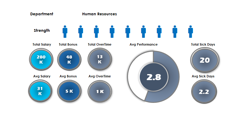
Keep an eye on the HR resources of the company! In today’s excel dashboard guide, you will find two ready to use workbooks. As usual, we will build the dashboards from the ground up.
The first template uses a people graph. You can track the following key metrics: Salary, Bonus, Sick days by branch.
How to show the performance using a new way? The first thing that you should learn an old Excel function. The fact: sparklines will not appear in earlier versions. Making a good dashboard in Excel is a space-saving job. If you are using the REPT function and a little trick, you can fully replace sparklines. Because it is a text function, you can repeat custom fonts in a single cell. Read more, and you will see how it works!
Are you ready to use the linked picture method in Excel? The drop-down list and pivot tables are core functions in Excel. The next dashboard has an easy learning curve. As first, place your data set in the data Worksheet. Insert simple vector graphs into the ‘Data’ Worksheet. Create unique ranges for graphs using the name manager. After that, link the pictures to the ‘Dashboard’ sheet from the ‘Data’ sheet. Finally, use line charts to display the plan and actual values. It is easy!
Check our financial dashboard template! One of our favorite spreadsheets will produce a dynamic dashboard! You can track the main financial metrics month by month. Show comparisons and trends using modern chart types, grid layouts, and smart navigation structure.
The included metrics and groups are efficiency, liquidity, and profitability. Our template combines traditional reports of financial information with charts of financial measures. The excel dashboard provides a logical and easily editable structure. You can put your raw data into the ‘Data’ sheet. Apply some calculation on the ‘Calc’ sheet. Finally, show the result on the main dashboard sheet.
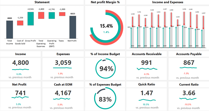
If you are looking for a clean dashboard to take a quick overview, you are in the right place at the right time. Using this template, you can easily communicate the result with your staff. You can measure Incomes, Expenses, Net profit, etc. The dynamic waterfall chart helps you to track the yearly performance from the Total income to the Net Profit. We apply infographics-style double doughnut charts to visualize the net profit margin.

Dashboards in Excel – The all-time classic! We have a goal, which is the exact value that it should reach and ranges for tracing purposes. The business world for some time now is heading in the direction that we weigh every possible thing. To quote a phrase: we weight it, it gets better. So we got the idea for the key performance indicator from here. And how right is the before quoted sentence!
Do we know the sources of the information? Where is the dashboard “feed” from? Automated updates are necessary, or is it enough to send daily or weekly reports? If we know the answer to all these questions, then it will be easy for us. If we do not, then we have to find out every little detail by a preliminary survey.
How do I choose the appropriate chart? This always depends on the given project. Think about what you want to visualize. In the newer versions of Excel, you can use the Recommended charts function.
Which is the best solution for creating a dashboard? If you only have a few key performance indicators, then a gauge chart is the best. If there are more of them, we recommend the bullet chart.
Is it rewarding to use a business intelligence or kpi dashboard? If the usual excel dashboard is not enough, then yes. The Excel Power BI was built for cases like this!

Today you will learn how to create a dashboard using key metrics. If you are an Excel newbie, this tutorial is yours! This Excel dashboard will show you how to enhance your story using key performance indicators. Good to know that you can edit the template freely. A great KPI template is simple: create a proper layout and build a wireframe. Pick your key metrics carefully!
Let us see the main steps! As first, you need to clean, group, and sort the data. When it is done, use the name manager. It can help you to define a range. Are you want to highlight the top 5 and bottom 5 performance? No problem, use simple Excel functions to reach your goal.
Dynamic dashboards in Excel are great! If you are using option buttons, form controls, and small macros, you show a large data set in a small place.
You will learn how the OFFSET function work. It is a volatile function, but this is one of the best ways to create a dynamic list in Microsoft Excel. Read more about this KPI Dashboard Template!
In this tutorial, you will learn how to create an Excel Dashboard using form controls. Are you looking for a space-saving solution? We will use a radio button, slider, and some smart technics to build a dynamic dashboard. Furthermore, you will learn how to save time without using pivot tables. If you have a large amount of raw data, the best choice is using built-in Excel tools.
Use these controls on worksheets to help select data. For example, boxes, spinners, and scroll bars are useful for choosing items from a large list. If you want to add a form control, go the ribbon. Now chose the Form Control Menu. Select the right control, which is fit your project. Select the cell or range you want your form control and insert it. You can resize the forms anytime. Easy!
Download the Excel file, which contains the dashboard template. Follow the step by step instructions! We will help you to make the right business decisions.
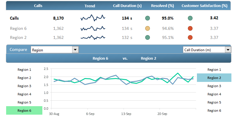
Download our customer service dashboard template and make quick decisions! Use dashboards in Excel to analyze trends and track the performance. We love drill-down methods! With its help, you can transform your data into a custom view. It’s important to display the data in an easily understandable format.
How to create it? The answer is simple. Show the most important metrics! Agents, team leaders, managers depend on a well-organized dashboard to track performance over time.
Our goal is to improve customer service’s performance. Furthermore, we’ll take a snapshot of the plan vs. actual ratio for improvements. In the example, we’ll track and measure the following metrics: Calls, Resolved Calls, Customer Satisfaction.
This excel dashboard allows you to transform data into an advanced template! Get information about various levels, from overall contact center performance to departments and sales representations.
We already know that processing a huge data set is not an easy task. Discover how to convert the results of outgoing calls into an advanced dashboard template!

The Dashboard UX template will show you how to create better Excel dashboards using smart screen tips. You will learn how to make a clickable question mark icon. After that, it’s easy to show or hide the context help.
Would you like to improve the UX? This feature is yours! The ideal case is if you have easy to read dashboards. In some cases, you have to add some comments because a few metrics requires further explanation.
How to build comments to avoid poor report design? For example, provide information to describe a particular data visualization, or to explain data values shown.
There are methods in Excel to avoid help text cluttering up your dashboard template. The best way if you show pop-up windows (text boxes) upon clicking or hovering over a help (question mark) icon.
It is not rocket science, learn how to add any description for your template without any troubles! Download our free template and check how to provide better support for users using a single page dashboard.

SEO Analytics Dashboard Template provides an overview of the performance of your site. With its help, you can track 11 SEO metrics, for example, page views, bounce rate, traffic sources. We have sad quite a number of times that raw data without a visual context is useless. In a nutshell, charts that make life easier.
If you are building a dashboard in Excel, we recommend using sparklines. This mini chart is a smart choice to show trends in a cell or a small space. For the greatest impact, place your chart near the data. Use sparklines if you want to highlight the peaks and show trends.
Use a simple setup, the Excel dashboard template shows the trend over 45 days by default. If you need more options, use the built-in drop-down list and select the period what you want to show. Look at the peaks and lows over days or months; you will see the characteristic of your site. In the example, most of this data comes from Excel. If you need more, you can get real-time data from Google Analytics using Power BI.

Learn how to create a one-page dashboard template for tracking the actual status of key metrics. Use our call center dashboard to track the weekly activity of a call center. In some cases, less is more. Insert a simple line chart and column chart (combo chart) to display the variance for each week.
You will get answers about how to reduce the time to answer and abandon rate and increase the first call resolution (FCR). Before we start, we will explain to you the most used metrics with the help of a few examples. Using these KPIs, you can track and trace the overall service level easily.
Today’s guide about to create and configure a spin button in Excel and create a dynamic report. This free spreadsheet displays information for the relevant audience. Last but not least: Improve decision making and simplify your data set! Our main goal is to track the ‘Time to Answer’ and ‘Abandon Rate’ and show them on a clean dashboard.

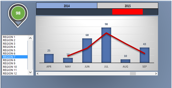
Today we will show you how to build customer analytics in a short time. This Excel dashboard contains many useful ideas, we will explain all of them. Follow our tutorial and learn how to build a dynamic dashboard in Excel.
Let us see the main steps! As usual, you will use the ‘data’ sheet to create an Excel table. If your data is in raw format, you should have to convert the range into a table. For the sake of simplicity, we will use five products and five customers to build a dashboard. Use a line chart to highlight the min and max sales value. Apply the red color for the lowest, and green fill for the highest value.
Select cell I7 and go to the Data tab on the ribbon. Insert a drop-down list. Make sure you checked the list option. Now link the data range – which contains months – to the given cell. From now, you can select the month, and your chart will reflect in real-time. Take a closer look at the ‘calc’ sheet! We will explain how to create a dynamic list using formulas. Read more about this free excel dashboard template!

If you want to create an Excel dashboard using infographics, take a deep into our template! Today’s lesson will be about a custom business spreadsheet. You will see how to build a stunning report using a male and female infographic. The good news: we know how to build a heat map style dashboard in Excel. No more boring pie charts! If you like custom dashboard design, follow our detailed guide, and download the free template.
You need only a few steps to track the main metrics on your dashboard template. As first, go to the ‘Calc’ sheet and plan your structure. Divide your intervals into 16 equal parts. With the help of the PERCENTILE function, you can split the data range. For example, if you want to can decide to examine peoples who score above the 10th percentile. After that, create a gradient color scale. The template contains built-in color schemes. You only have to pick your preferred colors.
Finally, create 16 shapes and assign the colors to them. We are ready! Stay tuned. We’ll improve your dashboard frequently and provide the latest tips and tricks.
In this free example we will use sales data to create a scrolling chart using a simple macro.
We’ll build an interactive report applying Excel’a VBA with exercise file which you can download. We will see the essential things that we need to understand to develop dynamic charts.
Learn advanced tricks to create awesome visualization! We’ll use a small animation because the task is so unique that we don’t get along with the known methods.
What is a widget? We hear and talk a lot about it in our everyday work. Maybe many don’t know what this phrase exactly means.
Widgets are supplements, mini applications that Excel does not include as a default. Do you need new ideas? From gauge chart it is never enough! The quarter style widget is not too frequent but can be excellently use.
Just imagine that you have a template and you notice at the end that you run out of place on the worksheet. We will help you to fix it!

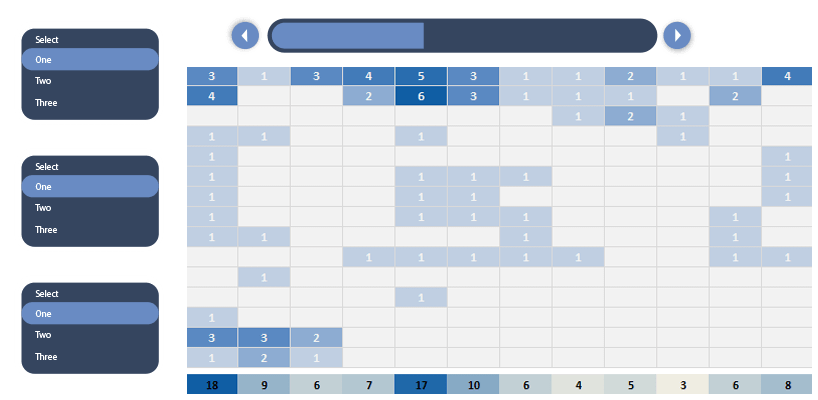
If you are working with an Excel Dashboard and you are in sales, you have to monitor often the sales of your team. It is time to talk about today’s topic. The scrolling list using the OFFSET formula is a handy tool to create dynamic lists. Dashboards in Excel are very popular, and we have made many blog posts about them.
Let us see our data set! The main list contains all states of the US. We only want to show five states in a small window. With the help of a slider (we’ll talk about it later in detail), we’ll create a scrolling-list. Why is this good? Viewers can switch between countries using menus. We can use it in such situations where we only want to show parts of a large data table. Learn more about it. So many reasons why we love Excel dashboard templates!

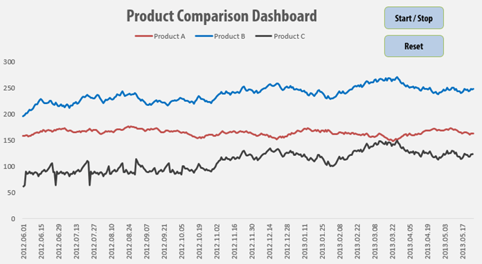
How to create a dynamic product metrics template? It’s a crucial criteria in designing a report that is should support valuable business decisions.
The interactive window on the right hand site is the most valuable part of the product metrics dashboard. For the chosen product we display the most important indicators on an interactive chart. We visualize the results for the marketing related to 15 different products.
Furthermore, we display trends and graphical elements so the report will be smarter. Sparklines is one of the most popular mini charts. It is great for displaying trends!
We use the gauge chart here for the first time. We’ll learn a lot about that later!
Dynamic charts are core elements of dashboards. In this tutorial, you will get great tips to build a timeline based data visualization. We have said many times that the best dashboards in Excel based on form controls. We love this topic because, in most cases, we have to transform large data sets into a small dashboard screen. At first glance, it is not an easy task.
Today’s goal is to create an interactive dashboard to track the key metrics. As first, place the initial data set. Above all, go to the Developer tab. Insert a blank list box. Fill the list box: right click on the control! Add the input range and the cell link. In the example, the input is the range that contains names.
Insert a column chart! Column charts are used to compare values across categories. Add a line chart. Under the trend options, choose the moving average. Finally, use two periods moving average.
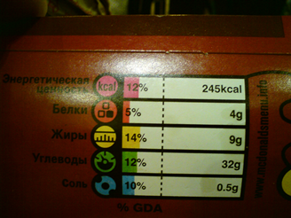
На волне всеобщего помешательства о здоровой пище, решил тоже обратить свое внимание на то, какое количество белков, жиров и углеводов попадает в мой организм. Засим, был создан Excel дашборд, куда я вводил все, что я съел за день. После месячного трекинга потребляемой пищи, нарисовалась, не внушающая оптимизма, картинка, которая заставила задуматься об отношении к тому, что я запихиваю в свой организм. Оказывается, количество белка, даже вполовину не соответствует рекомендуемой дневной норме потребления. Были сделаны соответствующие выводы и внесены корректировки и ежедневный рацион.
Скачать дашборд и прочитать о нюансах его работы можете под катом.
Как работать с дашбордом
Файл с дашбордом состоит из пяти листов, два из которых видимы для пользователя, остальные – скрытые.
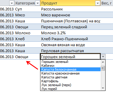
Data (видимый) – сюда вноситься информация о приемах пищи. Пользователь вводит в новую строку таблицы (при этом таблица данных DataTable расширяется) дату, категорию, продукт и вес. При этом потреблённая энергетическая ценность рассчитывается от веса продукта.
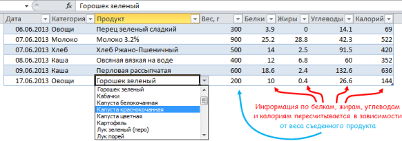
Value (скрытый) – лист с информацией о пищевой ценности продуктов. Сюда вы заносите данные о продуктах, которые составляют ваш ежедневный рацион. Благо интернет изобилует такого рода информацией. Продукты, занесенные в эту таблицу, формируют списки на листе Data. Две таблицы на листах Data и Value связаны между собой формулой подстановки ВПР.
Обратите внимание, добавил для каждого продукта идентификационный номер (на будущее), вдруг, кто-нибудь захочет расширить функционал дашборда. На данный момент номер ID ни в одном из расчетов не используется.
Oper (скрытый) — один из двух операционных листов. Отвечает за формирование списка категорий и списка продуктов на листе Value.
Calculation (скрытый) – здесь производятся расчеты, которые в конечном итоге будут отображены в дашборде.
Dashboard (видимый) – самый красивый и основной лист, ради чего все это задумывалось. Лист с дашбордом.

В дашборде задается два параметра: период, за который вы хотите отобразить данные, и компонент, по которому строятся два верхних графика.
Как читать дашборд
На дашборде отображены четыре графика, визуализирующие информацию в определенном ключе:
Потребление компонента – график Парето, который показывает, какая категория продукта была основным вкладчиком в потребление того или иного компонента.
Тренд потребления компонента – отображает недельный тренд потребления в сравнении с рекомендуемой суточной нормой (тренд строиться за последнюю неделю от Даты ПО, указанной в периоде).
Потребление за период – здесь все понятно. Информация обо всех потребленных компонентах за период.
Факт vs Целевое значение – сравнивает все потребленные компоненты в процентном соотношении с рекомендуемой нормой. Идею взял у МакДональдса, уж больно она мне понравилась.
Excel интересности в дашборде
В дашборде используется принцип динамических диаграмм, которые меняют свое отображение в зависимости от заданных параметров. Как мы уже упоминали, в нашем случае присутствует два параметра.
В зависимости от указанного периода – первый параметр – меняются данные в таблицах листа Calculation, которые основаны на формулах СУММЕСЛИМН (диапазон C10:F15). Далее происходит сортировка выбранных данных (L10:L15) с помощью функции НАИБОЛЬШИЙ. Этот подход был описан статье Добавление сортировки в дашборд.
За формирование списков категорий и списков продуктов отвечает небольшой макрос, который запускается каждый раз, когда вы покидаете лист Value. Макрос помещает категории продуктов в столбец A листа Oper. Напротив каждой категории в строку помещается список всех продуктов, которые присутствуют в этой категории.
В зависимости от выбранной категории в таблице DataTable меняется список продуктов, который появляется при выборе продукта. За формирование списка отвечает именованная формула операц, которая использует в качестве параметра значение категории, находящееся в ячейке слева.
=СМЕЩ(Oper!$A$1;ПОИСКПОЗ(Data!$C51;спкатегорий;0)- 1;1;;СЧЁТЗ(СМЕЩ(ДВССЫЛ(АДРЕС(ПОИСКПОЗ(Data!$C51;спкатегорий;0);2;;;»Oper»));0;0;;2000)))
В итоге
Дашборд я строил исключительно под свои нужды, поэтому, вероятно, каждый из вас, скачав шаблон дашборда, сделает свой, более функциональный и красочный.
Скачать дашборд Excel бесплатно
Information is power, but gathering the data to produce the right information can be a challenge. If you use Excel, your spreadsheets might be packed with valuable data, but few people have time to dissect it and make sense of the numbers. This is why Excel Dashboards can be so valuable.
An Excel dashboard is a single page that consolidates valuable information into a summary, often using charts and other visuals to help users digest key data and make important business decisions.
A free Excel dashboard template can help you make sense of results and improve strategic planning.
Creating an Excel dashboard can be a complex process. This single page summary often pulls data from many different sources and must do so in a way that makes sense. Since there isn’t much logic in reinventing the wheel, you’ll probably want to start with an Excel dashboard template, provided there is one that closely meets your requirements.
The good news is that there are a ton of free Excel dashboard templates available for download — if you know where to look. Today, we’re going to give you a list of 22 free templates for Excel dashboards that you can download to get started.
You can use these as-is or make changes to them so that they fit your exact requirements. As always, if you need help customizing one of these tools or find that you need to troubleshoot an issue in Excel, our live chat service is always standing by to help.
Free Excel Executive Dashboards. When you own or manage a business, it often becomes useful and necessary to have access to high-level data on results. This helps gauge progress towards achieving goals and provides a starting point to make key business decisions. An executive dashboard is the answer.
1. You can get a free Corporate Summary Excel Dashboard template from Eloquens. This is a feature-rich dashboard that delivers a wide range of metrics on a single page. These include such things as revenue, expenses, and customer satisfaction.
2. Smartsheet also has a free Executive Dashboard template that is a bit more simplified. It gives monthly data in a table for revenue, revenue growth, number of customers, customer growth, average order value (AOV), and progress in AOV. There are also bar and line graphs and totals for the current period.
Excel KPI dashboards allow you to track your performance metrics in one convenient template.
Free Excel KPI Dashboards. You can use an Excel dashboard to track your company’s key performance metrics. In many cases, this will show the data in both table and graph formats.
3. The first free KPI Dashboard template is from Smartsheet. This template allows you to view multiple KPIs, view targets and averages for selected KPIs, and see these in different formats.
4. Trump Excel also offers a KPI Dashboard template at no cost. You can track KPIs for various companies or departments, select one for drilling down to further data, and see the information on scatter and bar charts for further visuals.
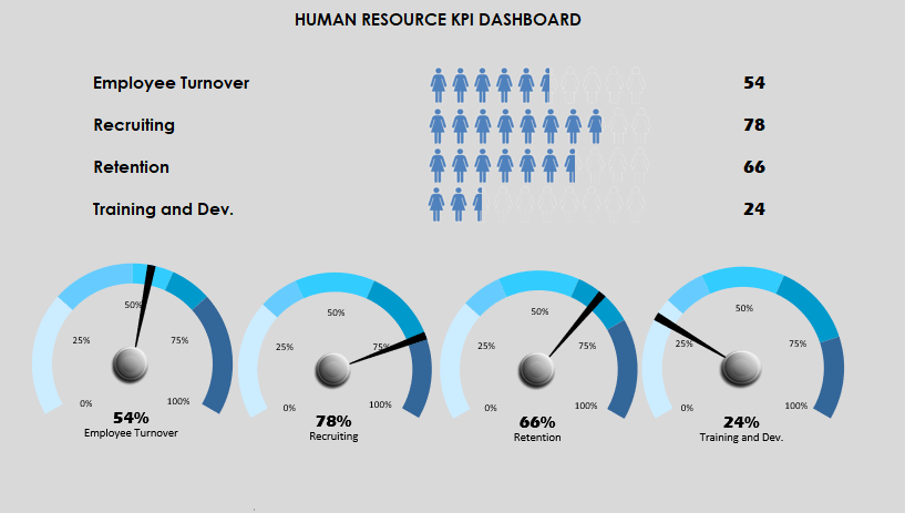
5. Excel Dashboard School provides a variety of free Excel templates. One is a Human Resources KPI Scorecard template. This template provides an HR department with an attractive way to gauge essential performance indicators such as employee turnover, recruiting, retention, and training & development.
6. Excel Dashboard School also offers a free Healthcare KPI Dashboard. This is an infographic-style dashboard that depicts healthcare quality information separated by male and female as well as a list of body parts.
Free Excel Financial Dashboard Templates. Many executive and KPI templates report financial figures, but other reports are more targeted to financial analysis. These financial dashboard templates should help you get on the right track if this is your goal.
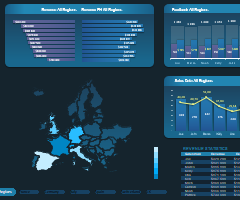
7. Smartsheet has a free Financial Dashboard template that includes many of the key financial metrics related to a business. These include revenue by product (estimated vs. actual) and revenue broken down by region. These figures are also depicted in graphs and pie charts.
8. Eloquens also has a Revenue and Expenses Excel Dashboard that you can download at no cost. It is a one-page summary that includes a variety of operational metrics like revenue and expenses. The data can be split by operational department, period vs. full year, and region.

Excel Chat can help if you need to troubleshoot issues or customize an Excel dashboard template.
Free Excel Sales and Marketing Dashboard Templates. Most businesses sell something, whether it is a product or service. Keeping track of what is selling best, who is selling the most, and what methods work can be a challenge. These free sales and marketing dashboard templates can put useful data on a single page.
9. Microsoft Office has a free Online Sales Tracker that is a dashboard template. On one page, you’ll get information such as the cost per item, percent markup, total revenue, and profit. There are also different graphs that depict the profit per item or product.
10. Smartsheet has a free Sales Management dashboard template that has a ton of features. You’ll be able to see sales results over time broken down by salesperson, region, outlet, and product mix.
11. If you’re interested in seeing how lead generation is working, there is also a free Lead Generation Dashboard template from Smartsheet. This gives you details on leads generated, leads per source, percentage of goal reached, response time, and untargeted leads.
12. Another way to track leads is with the Marketing Dashboard template from Smartsheet. This is a similar template to the one above, but with a greater emphasis on traffic. It tracks leads per day/month as well as leads per source. It also tracks and displays traffic per source/month and annual traffic/source.
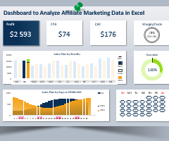
13. You can track and measure the effectiveness of your various social media marketing efforts with this free Social Media Metrics Excel dashboard template from Eloquens. There is a data input tab that allows you to enter data relevant to the activity on your different social platforms. The metrics reported on the dashboard (“heartbeat”) page include Activity, Interaction, Reach, and Subscribers.

Excel dashboard templates can provide helpful visibility into your business data.
14. Smartsheet also has a free Social Media Dashboard template. This allows you to monitor performance across multiple channels (Facebook, Twitter, Pinterest, LinkedIn, YouTube, and Google Plus) so that you can track engagement and make targeting decisions. Some of the areas that the report shows include total visits per period, visits vs. goals, followers, post reach, clicks, favorites, “likes,” and subscribers.
15. Not all online marketing is done via social media. Smartsheet also has a Digital Marketing Dashboard template that allows you to track the effectiveness of your online marketing campaigns across various channels. These include social media, paid ads, email marketing, and organic vs. paid reach.
16. If your company is using email marketing to keep in touch with customers and drive sales, this Email Marketing Dashboard template can help you track these efforts. The report gives you a quick look at new subscribers, unsubscribers, growth, bounce rates, and data for various campaigns.
Free Excel Project Management Dashboard Templates. Whether you are attempting to get one project in on time and under budget or are juggling several at once, it helps to have data at your fingertips. These project management dashboard templates that are free to download can help you stay on track.
17. Smartsheet has a free Project Management Dashboard template that delivers and tracks various KPIs for managing a project. These include deadlines, financial status, and risk mitigation.
18. If your project is more technical, this free Development Operations (DevOps) Dashboard template might be a better choice. It includes areas for reporting and tracking feature vs. bug investment, resolved and unresolved issues, work in progress limits, and a release tracker.

Specialty templates can help you organize information quickly and easily.
Other Free Specialty Excel Dashboard Templates. There are several situations in which you might want to locate and use an Excel dashboard template. Here are a few more.
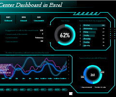
19. Trump Excel has a free Call Center Performance Dashboard template. This system allows you to view and track such things as total calls, average answer speed, call abandon rate, and average calls per minute.
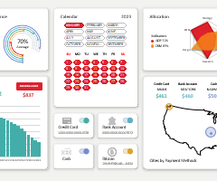
20. If your company provides support services to clients, you can track this activity with this free Support Dashboard template. This dashboard will display ticket volume and response times, report performance for a period, and compare that to past results.
21. This free HR Dashboard template gives a broad overview of a company’s staff and salaries. It graphically displays the number of employees per department as well as a breakdown of the average salary and salary range per department.
22. You can download a free SEO Dashboard template from Smartsheet that will give you some insight into your Search Engine Optimization efforts. The dashboard will show such things as traffic sources, top ranking keywords, visits/month, backlinks, and conversions.
Some of your projects and ongoing business operations need a dashboard. These visual representations of large amounts of data can streamline your processes and make it easier to communicate results. This list of free Excel dashboard templates should be enough to get you started.
You may find that one of these templates is close to suiting your needs, but not quite perfect. Or maybe there is an issue with a formula or function that pulls data from the corresponding sheets. If you need help customizing or troubleshooting an issue with an Excel dashboard template, Excel Chat is standing by.
Your first live chat session is always free.