
37
37 people found this article helpful
How to Create a Report in Excel
Using charts, graphs, and pivot tables makes it easy
Updated on September 25, 2022
What to Know
- Create a report using charts: Select Insert > Recommended Charts, then choose the one you want to add to the report sheet.
- Create a report with pivot tables: Select Insert > PivotTable. Select the data range you want to analyze in the Table/Range field.
- Print: Go to File > Print, change the orientation to Landscape, scaling to Fit All Columns on One Page, and select Print Entire Workbook.
This article explains how to create a report in Microsoft Excel using key skills like creating basic charts and tables, creating pivot tables, and printing the report. The information in this article applies to Excel 2019, Excel 2016, Excel 2013, Excel 2010, and Excel for Mac.
Creating Basic Charts and Tables for an Excel Report
Creating reports usually means collecting information and presenting it all in a single sheet that serves as the report sheet for all of the information. These report sheets should be formatted in a way that’s easy to print as well.
One of the most common tools people use in Excel to create reports is the chart and table tools. To create a chart in an Excel report sheet:
-
Select Insert from the menu, and in the charts group, select the type of chart you want to add to the report sheet.
-
In the Chart Design menu, in the Data group, select Select Data.
-
Select the sheet with the data and select all cells containing the data you want to chart (include headers).
-
The chart will update in your report sheet with the data. The headers will be used to populate the labels in the two axis.
-
Repeat the above steps to create new charts and graphs that appropriately represent the data you want to show in your report. When you need to create a new report, you can just paste the new data into the data sheets, and the charts and graphs update automatically.
There are different ways to lay out a report using Excel. You can include graphs and charts on the same page as tabular (numeric) data, or you can create multiple sheets so visual reporting is on one sheet, tabular data is on another sheet, and so on.
Using PivotTables to Generate a Report From an Excel Spreadsheet
Pivot tables are another powerful tool for creating reports in Excel. Pivot tables help with digging more deeply into data.
-
Select the sheet with the data you want to analyze. Select Insert > PivotTable.
-
In the Create PivotTable dialogue, in the Table/Range field, select the range of data you want to analyze. In the Location field, select the first cell of the worksheet where you want the analysis to go. Select OK to finish.
-
This will launch the pivot table creation process in the new sheet. In the PivotTable Fields area, the first field you select will be the reference field.
In this example, this pivot table will show website traffic information by month. So, first, you’d select Month.
-
Next, drag the data fields you want to show data for into the values area of the PivotTable fields pane. You’ll see the data imported from the source sheet into your pivot table.
-
The pivot table collates all of the data for multiple items by adding them (by default). In this example, you can see which months had the most page views. If you want a different analysis, just select the drop-down arrow next to the item in the Values pane, then select Value Field Settings.
-
In the Value Field Settings dialog box, change the calculation type to whichever you prefer.
-
This will update the data in the pivot table accordingly. Using this approach, you can perform any analysis you like on source data, and create pivot charts that display the information in your report in the way you need.
How to Print Your Excel Report
You can generate a printed report from all the sheets you created, but first you need to add page headers.
-
Select Insert > Text > Header & Footer.
-
Type the title for the report page, then format it to use larger than normal text. Repeat this process for each report sheet you plan to print.
-
Next, hide the sheets you don’t want included in the report. To do this, right-click the sheet tab and select Hide.
-
To print your report, select File > Print. Change orientation to Landscape, and scaling to Fit All Columns on One Page.
-
Select Print Entire Workbook. Now when you print your report, only the report sheets you created will print as individual pages.
You can either print your report out on paper, or print it as a PDF and send it out as an email attachment.
FAQ
-
How do I create an expense report in Excel?
Open an Excel spreadsheet, turn off gridlines, and enter your basic expense report information, such as a title, time period, and employee name. Add data columns for Date and Description, and then add columns for expense specifics, such as Hotel, Meals, and Phone. Enter your information and create an Excel table.
-
How do I create a scenario summary report in Excel?
To use Excel’s scenario manager function, select the cells with the information you’re exploring, and then go to the ribbon and select Data. Select What-If Analysis > Scenario Manager. In the Scenario Manager dialog box, select Add. Name the scenario and change your data to see various outcomes.
-
How do I export a Salesforce report to Excel?
In Salesforce, go to Reports and find the report you want to export. Select Export and choose an export view (Formatted Report or Details Only). Formatted Report will export in .xlsx format, while Details Only gives you other choices. Select Export when ready.
Thanks for letting us know!
Get the Latest Tech News Delivered Every Day
Subscribe
Analyzing data and converting values into tabular form is not the only thing Excel can do. In fact, Excel can perform advanced functions as well. These functions include creating a report and making them outstanding by using multiple features.
The Pivot Table feature in Excel is a great option to avail when it comes to making a report. It lets you organize, group, and summarize data by dragging and dropping fields.
What are Excel Reports?
Do you have any idea what Excel reports are?
In Excel, making a report is not something you can use for one function, instead this term is used on the whole to present all the linked data on a sheet precisely. Most often, Excel reports let you display a part of the sheet in a way that makes it super easy to understand the whole dataset.
Not only this, but it also includes a little part of data manipulation that answers a particular question. For instance, your report includes sales per day data will show data as the average daily sales per month or net monthly sales. When you manipulate data by adding the entire month or average them over monthly time, it gives you a clearer report view.
Steps to Follow:
Here’s how to create a report in Excel:
- Open Microsoft Excel and choose the Controller option.
- Now, click on the Reports button and choose Open Report.
- Click on the Controller button and choose the Reports option and then the Run Report button.
- You will see a Run Reports window.
- Now, add the actuality, period, and forecast actuality that needs to make a report.
- Add the company that needs to generate the report.
- Enter the currency type in which you need to make a report. You may add a local currency or even the converted currency can be added.
- Now, add the currency code you need to use, such as ER. You will add this field only when you need to process a report by using more than one currency code as currency type.
- Add the extended dimension that needs to be in the report. When there is no dimension, the total will be used.
- Now, add the closing version in which you need to make a report. By default, you will see REP is used.
- Add the contribution version in which you need to make a report.
- Now, you need to add the account, the movement extension, the form, and the counter company that is supposed to make a report.
- Press the OK button and you will notice the Excel sheet is expanded into rows and columns filled with values. You are now able to make changes to the report format in Excel according to your needs.
- In Microsoft Excel, choose the Controller button and then click on Save Report option from the Reports menu.
Tips for Making Excel Reports
You must follow the tips given below while creating an Excel report:
Make a Group of Reports on a Dashboard
You should make a dashboard that lets you display the key points of the reports. This dashboard is useful when you need to track more than one report.
Use Timelines or Interactive Factors
By using timelines or layered charts, you can have more approaches that contain relevant topics of interest in a dashboard report.
Make Backups of Data Reports
Once your documents are updated, you must have a backup of your important files so that you can save data.
Formatting Tools Help in Arranging Data
With the help of formatting tools, you can clean and wrap factors when you need to add data in Excel within the cells of the sheet.
Summary
In this post, you have learned how to create a report in Excel. As an analyzing tool, you can purely utilize Excel features in multiple projects. Keep exploring Excel and you will become an expert in the field.
Go to the “View” tab of the ribbon and click the tiny arrow below the “Macros” button. 2. Then click “Record Macro” 3. Type in the name of your macro and click “OK” to start the recording.
Contents
- 1 How do I create an automatic report from a Macro?
- 2 How do I create a Macro report?
- 3 How do I create a report in VBA?
- 4 How do I create a daily report in Excel?
- 5 How do I automate Excel macros?
- 6 Can Excel generate reports?
- 7 How do you automate a report?
- 8 What is a macro report?
- 9 What is the use of macros in Excel with examples?
- 10 What is a VBA routine?
- 11 How do I create a weekly report in Excel?
- 12 How do I create a daily report?
- 13 Can macros run automatically?
- 14 How do you automate data analysis in Excel?
- 15 Can you automate reports?
- 16 What is report automation?
- 17 What is the best reporting tool?
- 18 What is a report database?
- 19 What are macro commands?
- 20 How do macros work in access?
How do I create an automatic report from a Macro?
Report Automation Template Using Excel Macro
- Create Shapes in the spreadsheet. Start the Excel application.
- Insert an embedded object in the spreadsheet. On the insert tab click object to create a Word document embedded object.
- Assign a macro for objects.
How do I create a Macro report?
Go to Developer Tab à Macros to use the Macros Menu. Enter a Macro Name for the report and click Create Button. After all these steps are done now you are all set to run the report. Enter the necessary details to generate the report.
How do I create a report in VBA?
Using Excel and VBA to generate your VISUAL reports
- Under the Developer tab, click on Visual Basicto launch the VBA interface.
- Select UserForm from the INSERT menu.
- Select the Label icon from the TOOLBOX and place it on the form (as shown).
- Right click on the label and select Propertiesfrom the popup menu.
How do I create a daily report in Excel?
Select any cell in the data set, click the Insert tab, and then click PivotTable in the Tables group. If you’re still using Excel 2003, choose PivotTable and PivotChart Report from the Data menu to launch a wizard that will walk you through the process.
How do I automate Excel macros?
Follow these steps to record a macro.
- On the Developer tab, in the Code group, click Record Macro.
- In the Macro name box, enter a name for the macro.
- To assign a keyboard shortcut to run the macro, in the Shortcut key box, type any letter (both uppercase or lowercase will work) that you want to use.
Excel is a powerful reporting tool, providing options for both basic and advanced users. One of the easiest ways to create a report in Excel is by using the PivotTable feature, which allows you to sort, group, and summarize your data simply by dragging and dropping fields.
How do you automate a report?
Step-by-Step: How to Automate Your Reporting Process
- Step 1: Preparation.
- Step 2: Creating a Campaign.
- Step 3: Connecting Your Data Sources.
- Step 4: Choose Between Sending Reports or Creating a Dashboard.
- Step 5: Customize Your Reports or Dashboards.
- Step 6: White Label Your Reporting with Your Agency’s Branding.
What is a macro report?
A macro in Access is a tool that allows you to automate tasks and add functionality to your forms, reports, and controls.For example, suppose that you want to start a report directly from one of your data entry forms. You can add a button to your form and then create a macro that opens the report.
What is the use of macros in Excel with examples?
If you have tasks in Microsoft Excel that you do repeatedly, you can record a macro to automate those tasks. A macro is an action or a set of actions that you can run as many times as you want. When you create a macro, you are recording your mouse clicks and keystrokes.
What is a VBA routine?
The VBA routine uses an application object to create a new PowerPoint presentation in the PowerPoint application. A new slide is created used the “Add” method, and then each chart is added to its own slide using the CopyPaste methods.
How do I create a weekly report in Excel?
Click a cell in the date column of the pivot table that Excel created in the spreadsheet. Right-click and select “Group,” then “Days.” Enter “7” in the “Number of days” box to group by week. Click “OK” and verify that you have correctly converted daily data to weekly data.
How do I create a daily report?
How to write a daily report to the boss
- Make sure to add a header.
- Start with a brief outline of the accomplishments made during the day.
- The next section must be about planned tasks.
- The final section should contain issues and comments about these issues.
- Spellcheck and proof your report.
Can macros run automatically?
You might want a macro you recorded to run automatically when you open a specific workbook. The following procedure uses an example to show you how that works. You may also want to run macros automatically when Excel starts. Before you get started, make sure the Developer tab is shown on the ribbon.
How do you automate data analysis in Excel?
Four steps to automating data analysis in Excel
- 1 Using Formulas. We can create the above table by using excel sumifs and countifs formula.
- 2 Using named ranges. If we have only one or two tables.
- 3 Automating changing named ranges using VBA.
- 4 Automatically reading Excel files.
Can you automate reports?
Report automation is the process through which digital marketing reports are created and automatically updated using a software. The gathered data can then be delivered to specific email addresses on a regular basis with automatic email dispatches.
What is report automation?
Report automation is the process of scheduling an existing report (that somebody currently produces at some level of frequency) to automatically refresh and be delivered to specific places at a specific regular interval.
What is the best reporting tool?
The Best Reporting Tools List
- Wrike. Best for collaboration on project reporting.
- ProWorkflow. Best reporting software for graphical data reports.
- Hive. Best reporting tool with interactive dashboards.
- Google Data Studio. Best free reporting tools.
- Power BI for Office 365.
- Tableau.
- Thoughtspot.
- Octoboard.
What is a report database?
A database report is the formatted result of database queries and contains useful data for decision-making and analysis. Most good business applications contain a built-in reporting tool; this is simply a front-end interface that calls or runs back-end database queries that are formatted for easy application usage.
What are macro commands?
A macro is a series of commands and instructions that you group together as a single command to accomplish a task automatically.Then you can run the macro by clicking a button on the Quick Access Toolbar or pressing a combination of keys.
How do macros work in access?
Access Macros are built from a set of predefined actions, allowing you to automate common tasks, and add functionality to controls or objects. Macros can be standalone objects viewable from the Navigation pane, or embedded directly into a Form or Report.
Содержание
- Create status and trend reports from a work item query
- Prerequisites
- Create an Excel report from a flat-list query
- Create a query-based report by using Excel
- Q: Can I export a query to Excel?
- Q: Which fields can’t I use to generate a report?
- Q: Can I create reports if I’m working in Azure DevOps?
- Q: How do I refresh the report to show the most recent data?
- How to Create a Report in Excel
- In This Article
- What to Know
- Creating Basic Charts and Tables for an Excel Report
- Using PivotTables to Generate a Report From an Excel Spreadsheet
- How to Print Your Excel Report
Create status and trend reports from a work item query
TFS 2017 | TFS 2015 | TFS 2013
One of the quickest ways to generate a custom work tracking report is to use Excel and start with a flat list query. You can generate both status and trend charts. Also, once you’ve built a report, you can manipulate the data further by adding or filtering fields using the PivotTable.
This feature is supported for the following versions and configurations:
- Azure DevOps Server 2020 and earlier versions configured with SQL Server Analysis Services.
- For Azure DevOps Server 2019 and Azure DevOps Server 2020, supports projects that are defined on project collections configured with the On-premises XML process model. If your collection is configured to support the Inheritance process model, you can use Analytics views to filter work items and generate Power BI reports. To learn more, see What are Analytics views? To learn more about process models, see Customize your work tracking experience.
If you want to export work items to Excel, see Bulk add or modify work items with Excel. To get the latest version of the Azure DevOps add-in for Office, install Azure DevOps Office® Integration 2019.
Here’s an example of a status report generated from a flat-list query.

Prerequisites
You can generate these reports only when you work with an on-premises Azure DevOps Server that has been configured with reporting services.
Your deployment needs to be integrated with reporting services. If your on-premises application-tier server hasn’t been configured to support reporting services, you can add that functionality by following the steps provided here: Add reports to a team project.
You must be a member of the TfsWarehouseDataReader security roles. To get added, see Grant permissions to view or create reports in Azure DevOps Server.
A version of Excel that is compatible with your version of Azure DevOps, such as Office 2010 or later version. For a complete list of supported versions, see Azure DevOps client compatibility, Microsoft Office integration. If you don’t have Excel, install it now.
A version of Visual Studio that supports the Team Explorer plugin, such as Visual Studio or Visual Studio Community. You can install Visual Studio from this download site. Team Explorer is free and requires a Windows OS.
To work from Microsoft Excel and use the Team menu, you’ll need to install Azure DevOps Office® Integration 2019.
Create an Excel report from a flat-list query
Use this procedure when you work from the Team Explorer plug-in for Visual Studio.
Create or open a flat-list query that contains the work items that you want to include in the report.
To view queries in Visual Studio 2019 and later versions, you must choose the Tools option Legacy experience (compatibility mode) as described in Set the Work Items experience in Visual Studio 2019.
Choose the fields you want to base reports on and include them in the filter criteria or as a column option. For non-reportable fields, see Q: Which fields are non-reportable?
Create a report in Excel From the query results view. The option to Create Report in Microsoft Excel only appears if all prerequisites are met.

Select the check boxes of the reports that you want to generate.

Wait until Excel finishes generating the reports. This step might take several minutes, depending on the number of reports and quantity of data.
Each worksheet displays a report. The first worksheet provides hyperlinks to each report. Pie charts display status reports and area graphs display trend charts.
To view a report, choose a tab, for example, choose the State tab to view the distribution of work items by State.
You can change the chart type and filters. For more information, see Use PivotTables and other business intelligence tools to analyze your data.
Create a query-based report by using Excel
Use this procedure when you work from the web portal or the Team Explorer plug-in for Visual Studio.
Open an Office Excel workbook and choose New Report.
The option New Report appears even if all prerequisites aren’t met. Choosing it may cause Excel to stop responding or display the following error message:

If you don’t see the Team menu, you’ll need to install you’ll need to install the Azure DevOps Office® Integration 2019. See Requirements listed earlier in this article.
Connect to the project and choose the query.
If the server you need isn’t listed, add it now.
Choose the reports to generate (steps 3 and 4 from the previous procedure).
Q: Can I export a query to Excel?
A: If you want to export a query to Excel, you can do that from Excel or Visual Studio/Team Explorer. Or, to export a query directly from the web portal Queries page, install the Azure DevOps Open in Excel Marketplace extension. This extension adds an Open in Excel link to the toolbar of the query results page.
Q: Which fields can’t I use to generate a report?
A: Even though you can include non-reportable fields in your query field criteria or as a column option, they won’t be used to generate a report.
Description, History, and other HTML data-type fields. These fields won’t be added to the PivotTable or used to generate a report. Excel does not support generating reports on these fields.
Fields with filter criteria that specify the Contains, Contains Words, Does Not Contain, or Does Not Contain Words operators will not be added to the PivotTable. Excel does not support these operators. To learn more about these operators, see Query fields, operators, and macros.
Q: Can I create reports if I’m working in Azure DevOps?
A: You can’t create Excel reports; however, you can create query-based charts, generate Power BI reports using an Analytics views, or use the Analytics Service.
Q: How do I refresh the report to show the most recent data?
A: At any time, you can choose Refresh on the Data tab within Excel to update the data for the PivotTables in your workbook. To learn more, see Refresh PivotTable data.
Источник
How to Create a Report in Excel
Using charts, graphs, and pivot tables makes it easy
:max_bytes(150000):strip_icc()/RyanDube-214359-8f50cb3133cd47c7ae1f3d4f09349f4e.JPG)
In This Article
Jump to a Section
What to Know
- Create a report using charts: Select Insert >Recommended Charts, then choose the one you want to add to the report sheet.
- Create a report with pivot tables: Select Insert >PivotTable. Select the data range you want to analyze in the Table/Range field.
- Print: Go to File >Print, change the orientation to Landscape, scaling to Fit All Columns on One Page, and select Print Entire Workbook.
This article explains how to create a report in Microsoft Excel using key skills like creating basic charts and tables, creating pivot tables, and printing the report. The information in this article applies to Excel 2019, Excel 2016, Excel 2013, Excel 2010, and Excel for Mac.
Creating Basic Charts and Tables for an Excel Report
Creating reports usually means collecting information and presenting it all in a single sheet that serves as the report sheet for all of the information. These report sheets should be formatted in a way that’s easy to print as well.
One of the most common tools people use in Excel to create reports is the chart and table tools. To create a chart in an Excel report sheet:
Select Insert from the menu, and in the charts group, select the type of chart you want to add to the report sheet.
:max_bytes(150000):strip_icc()/001-how-to-create-a-report-in-excel-3384b6a8655f46d194f9a6c4e66f8267.jpg)
In the Chart Design menu, in the Data group, select Select Data.
:max_bytes(150000):strip_icc()/002-how-to-create-a-report-in-excel-ae2e9c1538e84d9e979d564addf9ef8b.jpg)
Select the sheet with the data and select all cells containing the data you want to chart (include headers).
:max_bytes(150000):strip_icc()/003-how-to-create-a-report-in-excel-fb008687c1694cca980abec23c313112.jpg)
The chart will update in your report sheet with the data. The headers will be used to populate the labels in the two axis.
:max_bytes(150000):strip_icc()/how-to-create-a-report-in-excel-4691111-4-23f0e5d9ab484e1caa2bd8f05c1e85e6.png)
Repeat the above steps to create new charts and graphs that appropriately represent the data you want to show in your report. When you need to create a new report, you can just paste the new data into the data sheets, and the charts and graphs update automatically.
:max_bytes(150000):strip_icc()/how-to-create-a-report-in-excel-4691111-5-db599f2149f54e4c87a2d2a0509c6b71.png)
There are different ways to lay out a report using Excel. You can include graphs and charts on the same page as tabular (numeric) data, or you can create multiple sheets so visual reporting is on one sheet, tabular data is on another sheet, and so on.
Using PivotTables to Generate a Report From an Excel Spreadsheet
Pivot tables are another powerful tool for creating reports in Excel. Pivot tables help with digging more deeply into data.
Select the sheet with the data you want to analyze. Select Insert > PivotTable.
:max_bytes(150000):strip_icc()/006-how-to-create-a-report-in-excel-e603cd4511e54819bf066fc05ab5301e.jpg)
In the Create PivotTable dialogue, in the Table/Range field, select the range of data you want to analyze. In the Location field, select the first cell of the worksheet where you want the analysis to go. Select OK to finish.
:max_bytes(150000):strip_icc()/007-how-to-create-a-report-in-excel-50510dcd3ef44eef804b57df0404a1de.jpg)
This will launch the pivot table creation process in the new sheet. In the PivotTable Fields area, the first field you select will be the reference field.
:max_bytes(150000):strip_icc()/008-how-to-create-a-report-in-excel-193e2114b8944b0fb2f2a307f747dc70.jpg)
In this example, this pivot table will show website traffic information by month. So, first, you’d select Month.
Next, drag the data fields you want to show data for into the values area of the PivotTable fields pane. You’ll see the data imported from the source sheet into your pivot table.
:max_bytes(150000):strip_icc()/how-to-create-a-report-in-excel-4691111-9-8f7a7e77198d4a14a5594546c0cafdcf.png)
The pivot table collates all of the data for multiple items by adding them (by default). In this example, you can see which months had the most page views. If you want a different analysis, just select the drop-down arrow next to the item in the Values pane, then select Value Field Settings.
:max_bytes(150000):strip_icc()/010-how-to-create-a-report-in-excel-9274c07370fd4061974b59fd7a5c9b19.jpg)
In the Value Field Settings dialog box, change the calculation type to whichever you prefer.
:max_bytes(150000):strip_icc()/011-how-to-create-a-report-in-excel-5c74ef47bcee4ed0bc3884e5064c430f.jpg)
This will update the data in the pivot table accordingly. Using this approach, you can perform any analysis you like on source data, and create pivot charts that display the information in your report in the way you need.
How to Print Your Excel Report
You can generate a printed report from all the sheets you created, but first you need to add page headers.
Select Insert > Text > Header & Footer.
:max_bytes(150000):strip_icc()/012-how-to-create-a-report-in-excel-889c9bba712140278816b0ec1668efdd.jpg)
Type the title for the report page, then format it to use larger than normal text. Repeat this process for each report sheet you plan to print.
:max_bytes(150000):strip_icc()/013-how-to-create-a-report-in-excel-011fb58b22d348dd83c9cbeaf5302440.jpg)
Next, hide the sheets you don’t want included in the report. To do this, right-click the sheet tab and select Hide.
:max_bytes(150000):strip_icc()/014-how-to-create-a-report-in-excel-7cb2d864bfc44964ae580859bc0c2b76.jpg)
To print your report, select File > Print. Change orientation to Landscape, and scaling to Fit All Columns on One Page.
:max_bytes(150000):strip_icc()/015-how-to-create-a-report-in-excel-0fdfa4a1748a48f1a261ac07e9b9eb81.jpg)
Select Print Entire Workbook. Now when you print your report, only the report sheets you created will print as individual pages.
You can either print your report out on paper, or print it as a PDF and send it out as an email attachment.
Open an Excel spreadsheet, turn off gridlines, and enter your basic expense report information, such as a title, time period, and employee name. Add data columns for Date and Description, and then add columns for expense specifics, such as Hotel, Meals, and Phone. Enter your information and create an Excel table.
To use Excel’s scenario manager function, select the cells with the information you’re exploring, and then go to the ribbon and select Data. Select What-If Analysis > Scenario Manager. In the Scenario Manager dialog box, select Add. Name the scenario and change your data to see various outcomes.
In Salesforce, go to Reports and find the report you want to export. Select Export and choose an export view (Formatted Report or Details Only). Formatted Report will export in .xlsx format, while Details Only gives you other choices. Select Export when ready.
Источник
Maintenance Alert: Saturday, April 15th, 7:00pm-9:00pm CT. During this time, the shopping cart and information requests will be unavailable.
Categories: Basic Excel
Excel is a powerful reporting tool, providing options for both basic and advanced users. One of the easiest ways to create a report in Excel is by using the PivotTable feature, which allows you to sort, group, and summarize your data simply by dragging and dropping fields.
First, Organize Your Data
Record your data in rows and columns. For example, data for a report on sales by territory and product might look like this:
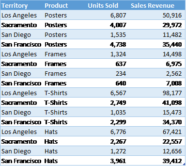
A PivotTable report works best when the source data have:
1. One record in each row;
2. One column for each category for sorting and grouping (such as “Territory” and “Product” in the example above; and
3. One column for each metric (such as “Units Sold” and “Sales Revenue” above). Recording some sales revenue in a different column complicates the task of adding up all of the sales revenue.
Create the PivotTable
Next, create the PivotTable report:
1. Highlight your data table.
2. From the Insert ribbon, click the PivotTable button.
3. On the far right, select fields that you would like on the left-hand side of the report and drag them to the Rows box.
4. Also on the far right, select fields that you would like to appear across the top of the report and drag them to the Columns box.
5. Select the data that you would like to summarize and drag it to the Values box.
6. For each item under Values, specify how to aggregate the data—with a sum, average, or some other function. This is a great time-saving step!
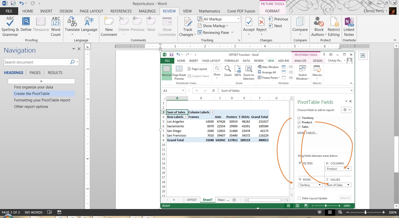
With each change, you’ll see your PivotTable report take shape. If you decide you don’t like the layout, just drag the fields to other positions.
Formatting Your PivotTable Report
From the PivotTable Design ribbon, choose a style for your report based on your theme’s color schemes with options for header rows, header columns, totals, and subtotals. From the Home ribbon, set the number format for your data, or right-click your data, choose Value Field Settings, and click Number Format.
Other Report Options
Do you want even more flexibility in your reports? Do you ever need to, say, connect to data in an external database or create charts based on your reports? All of these options are available with PivotTables!
Or, if you need more flexibility than PivotTables provide, you can:
1. Create a freeform report by adding totals and subtotals directly to your source data,
2. Use the Group and Subtotal options on the new Outline section of the Data ribbon, or
3. If you’re using Excel 2013, use the new Quick Analysis button.
No matter which option you choose, Excel is one of the most flexible reporting tools available today!
PRYOR+ 7-DAYS OF FREE TRAINING
Courses in Customer Service, Excel, HR, Leadership,
OSHA and more. No credit card. No commitment. Individuals and teams.