
Present your data in a Gantt chart in Excel
Excel for Microsoft 365 Excel for Microsoft 365 for Mac Excel 2021 Excel 2021 for Mac Excel 2019 Excel 2019 for Mac Excel 2016 Excel 2016 for Mac Excel 2013 Excel 2010 Excel 2007 More…Less
A Gantt chart helps you schedule your project tasks and then helps you track your progress.
Need to show status for a simple project schedule with a Gantt chart? Though Excel doesn’t have a predefined Gantt chart type, you can create one using this free template: Gantt project planner template for Excel
Need to show status for a simple project schedule with a Gantt chart? Though Excel doesn’t have a predefined Gantt chart type, you can simulate one by customizing a stacked bar chart to show the start and finish dates of tasks, like this:

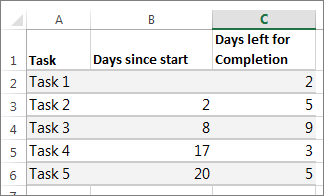
To create a Gantt chart like the one in our example that shows task progress in days:
-
Select the data you want to chart. In our example, that’s A1:C6

If your data’s in a continuous range of cells, select any cell in that range to include all the data in that range.
If your data isn’t in a continuous range, select the cells while holding down the COMMAND key.
Tip: If you don’t want to include specific rows or columns of data you can hide them on the worksheet. Find out more about selecting data for your chart.
-
Click Insert > Insert Bar Chart > Stacked Bar chart.
-
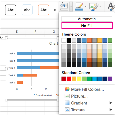
Next, we’ll format the stacked bar chart to appear like a Gantt chart. In the chart, click the first data series (the Start part of the bar in blue) and then on the Format tab, select Shape Fill > No Fill.
-
If you don’t need the legend or chart title, click it and press DELETE.
-
Let’s also reverse the task order so that it starts with Task1. Hold the CONTROL key, and select the vertical axis (Tasks). Select Format Axis, and under Axis Position, choose Categories in reverse order.

Customize your chart
You can customize the Gantt type chart we created by adding gridlines, labels, changing the bar color, and more.
-
To add elements to the chart, click the chart area, and on the Chart Design tab, select Add Chart Element.
-
To select a layout, click Quick Layout.
-
To fine-tune the design, tab through the design options and select one.
-
To change the colors for the chart, click Change Colors.
-
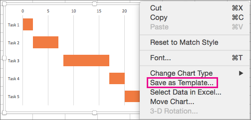
To reuse your customized Gantt chart, save it as a template. Hold CONTROL and click in the chart, and then select Save as Template.


Did you know?
Microsoft 365 subscription offers premium Gantt chart templates designed to help you track project tasks with visual reminders and color-coded categories. If you don’t have a Microsoft 365 subscription or the latest Office version, you can try it now:

See Also
Create a chart from start to finish
Save a chart as a template
Need more help?
Want more options?
Explore subscription benefits, browse training courses, learn how to secure your device, and more.
Communities help you ask and answer questions, give feedback, and hear from experts with rich knowledge.
Все мы хоть раз в жизни сталкивались с Excel — одним из самых распространенных инструментов для работы с электронными таблицами. С 1985 года множество специалистов из самых разных профессиональных сфер используют Эксель в повседневной работе.
Программа помогает работать с большими объемами данных, вести экономико-статистические расчеты, использовать графические инструменты для визуализации данных.
Кроме привычных возможностей, Excel позволяет решать и не самые тривиальные рабочие задачи. Например, с помощью этого инструмента начинающие проектные менеджеры могут построить диаграмму Ганта для визуализации рабочего процесса. Кстати, такую возможность предлагают и некоторые другие аналоги Excel.
В этот статье мы напомним вам, что такое диаграмма Ганта, а также пошагово продемонстрируем, как построить диаграмму Ганта в Excel.
Содержание:
- Что такое диаграмма Ганта
- Как построить диаграмму Ганта в Excel
- Шаблоны диаграммы Ганта в Excel
- Как построить диаграмму Ганта онлайн
Что такое диаграмма Ганта
Диаграмма Ганта — это инструмент для визуализации рабочего процесса. Он помогает планировать проекты, управлять ими, а также структурирует рабочие процессы.
График назван в честь Генри Ганта — американского инженера, благодаря которому этот метод планирования стал известен на весь мир.
Перед вами классический пример диаграммы Ганта, которая представлена в виде столбчатого графика и выглядит так:
По вертикали вы можете увидеть задачи в хронологической последовательности. Все они должны быть выполнены для успешного завершения проекта.
По горизонтали расположена временная шкала или таймлайн. Он помогает понять, сколько времени запланировано на каждую из задач, а также на весь проект в целом.
Между осями диаграммы находятся горизонтальные полосы, которые изображают задачи. Длина полос зависит от времени, необходимого на выполнение каждой из задач.
Как построить диаграмму Ганта в Excel
Как мы уже рассказывали выше, диаграмму Ганта можно создать с помощью Excel. Инструмент предлагает широкий выбор графиков всевозможных разновидностей: от классических до лепестковых гистограмм.
Однако, шаблона диаграммы Ганта в Экселе никогда не существовало. Поэтому построение графика в программе возможно только собственноручно.
В этой статье мы пошагово продемонстрируем, как построить диаграмму Ганта в Excel 2016. Однако точно таким же образом вы можете создать график в Excel 2007, 2010 и 2013 годов.
Итак, начнем.
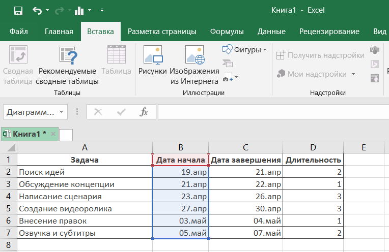
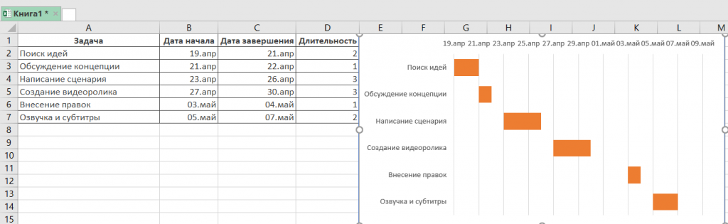
1. Внесите информацию о проекте в таблицу
Добавьте в таблицу данные о проекте: его задачах, дате начала и дате завершения, а также о длительности каждой задачи. Последний параметр можно определить по формуле: дата окончания задачи-дата ее начала.
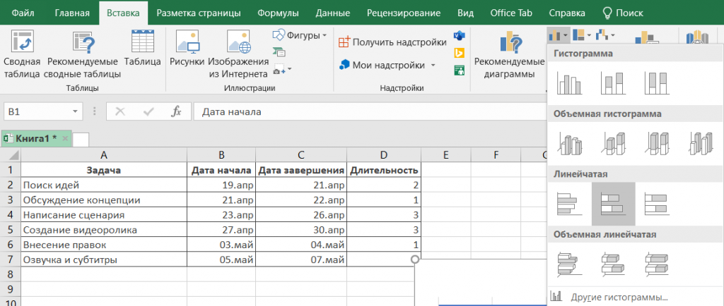
2. Создайте линейчатую диаграмму в Excel
Перейдем к созданию графика в Экселе. Для этого:
- Выделите первый столбец таблицы, начиная от его названия и заканчивая последней задачей.
- Во вкладке «Вставка» выберите линейчатую диаграмму с накоплением.
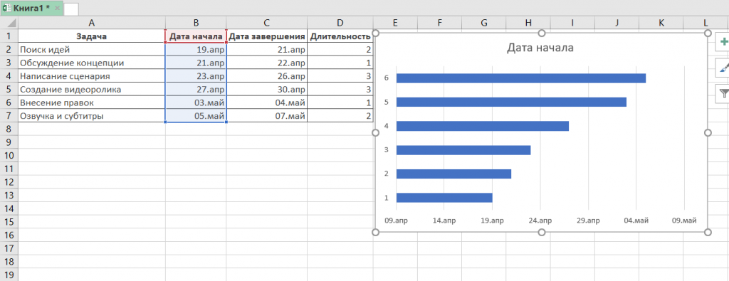
В результате на листе появится такая диаграмма:
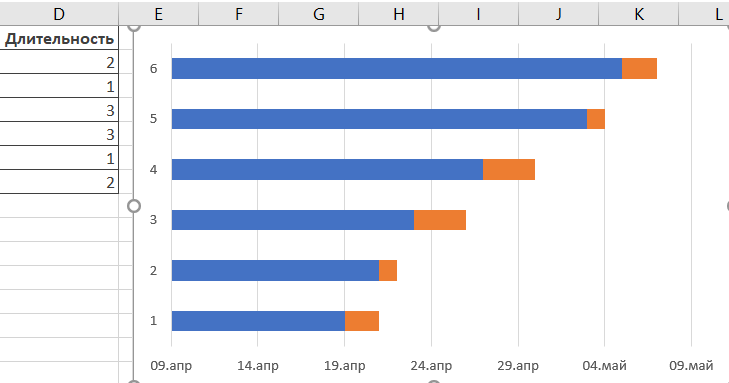
3. Добавьте в график данные о длительности задач
Чтобы внести в график информацию о длительности задач, нужно:
- Нажать правой кнопкой мыши по диаграмме и кликнуть в меню на «Выбрать данные».
- В новом окне «Выбор источника данных» кликнуть на кнопку «Добавить».
- Далее в окне «Изменение ряда» в поле «Имя ряда» ввести слово «Длительность».
- А в поле «Значения» добавить длительности задач, выделив область от первой ячейки (в нашем случае это D2) до последней (D7). Дважды нажать «ОК».
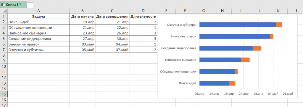
Теперь, кроме дат начала, в вашей диаграмме будут отображаться и длительности задач. Итог должен выглядеть таким образом:
4. Добавьте в график описания задач
Чтобы в левой части диаграммы вместо цифр появились названия задач, вам следует:
- Кликнуть правой кнопкой мыши на графике, нажать на «Выбрать данные».
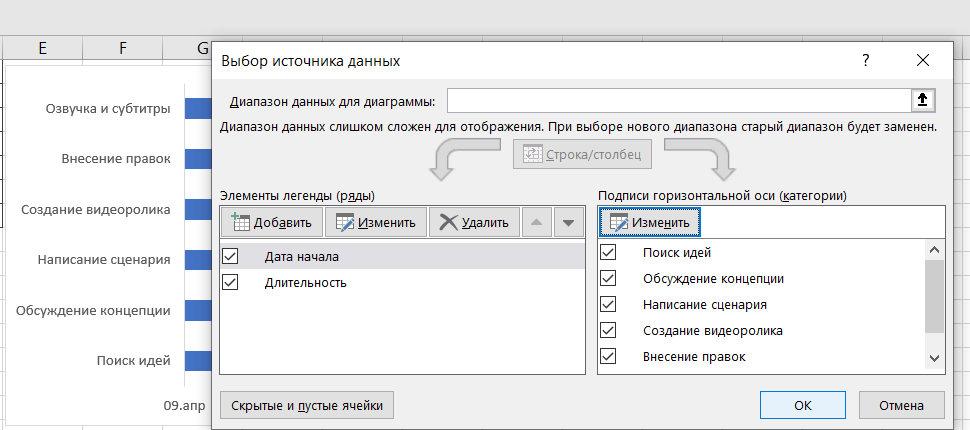
- Во вновь открывшемся окне «Выбор источника данных» выделить слева строку «Дата начала», а на панели справа нажать на кнопку «Изменить».
- В появившемся окне «Подписи оси» выделить названия задач таким же образом, как в предыдущем пункте выделялись ячейки с длительностью. Далее нажать «OK». Окно теперь будет выглядеть вот так:
После повторного нажатия на «OK» перед вами появится диаграмма с названиям задач слева:
5. Преобразуйте линейчатую диаграмму в диаграмму Ганта
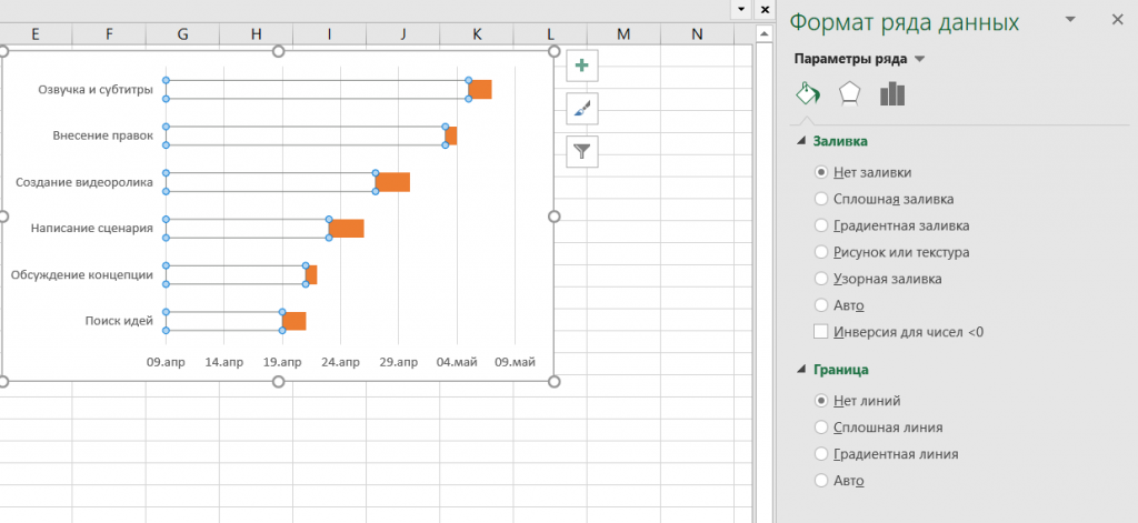
Для того, чтобы гистограмма стала более похожа на диаграмму Ганта, сделаем синие полосы на ней невидимыми. Для этого:
- Нажмите на любую синюю полосу на графике для того, чтобы выделить их все. После кликните по ним правой кнопкой мыши и в контекстном меню выберите «Формат ряда данных».
- В одноименном появившемся окне в разделе «Заливка и границы» выберите «Нет заливки» и «Нет линий».
Далее расположим задачи на нашей диаграмме в хронологическом порядке. Для этого:
- На графике слева выделите задачи, кликнув на них правой кнопкой мыши, и выберите «Формат оси».
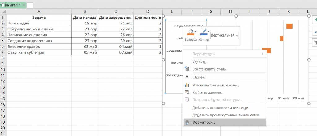
- В одноименном появившемся окне отметьте галочкой пункт «Обратный порядок категорий» во вкладке «Параметры оси».
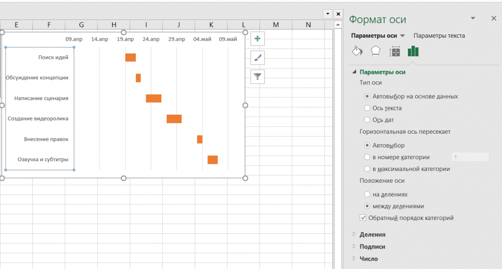
Вот и все, задачи вашего проекта теперь расположены в хронологическом порядке, так же, как и в классической диаграмме Ганта.
5. Улучшите дизайн построенной в Excel диаграммы Ганта
Напоследок внесем еще несколько изменений, которые улучшат внешний вид диаграммы Ганта. Начнем с пустого места слева от задач в области графика. Чтобы убрать его, нужно:
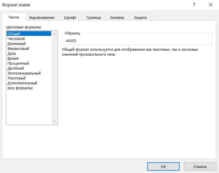
- Правой кнопкой мыши кликнуть на дату начала первой задачи в таблице. Выбрать «Формат ячеек» — > «Общий». Перед вами появится пятизначное число (в нашем случае 44305), запишите его. Далее важно не вносить никаких изменений и нажать в этом окне на кнопку «Отмена».
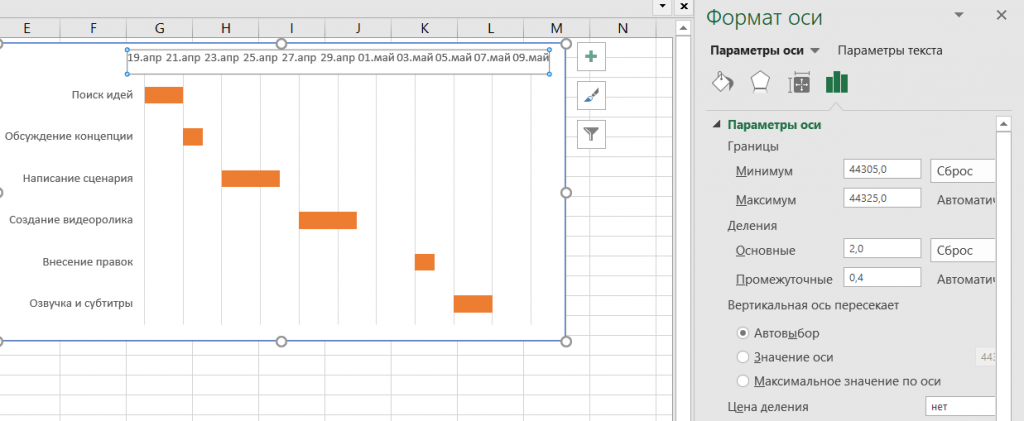
- Правой кнопкой мыши нажать на область с датами над панелью задач диаграммы. Затем открыть через меню пункт «Формат оси».
- Во вкладке «Параметры оси» в область «Минимум» вписать число, сохраненное на предыдущем этапе.
- Кроме того, во вкладке «Параметры оси» есть возможность изменить основные и промежуточные деления для интервалов дат. Чем меньше длительность проекта, тем меньшее число следует задавать в этих полях.
Ниже вы можете увидеть, какие значения мы внесли для нашего графика.
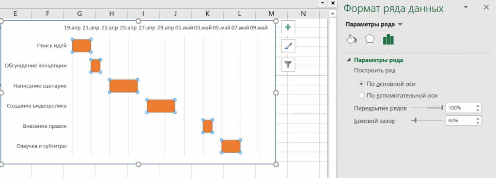
Напоследок удалим пространство между полосами на диаграмме. Для этого:
- Нажмите на любую полоску на графике, чтобы выделить все задачи, а затем кликните по ним правой кнопкой мыши и выберите «Формат ряда данных».
- Во всплывшем окне задайте «Перекрытие рядов» на 100%, а значение «Бокового зазора» отрегулируйте на свое усмотрение. Однако важно, чтобы этот показатель был значительно ниже (иногда он может быть равен и нулю).
И вот, наконец, наша диаграмма Ганта в Excel готова.
Создание диаграммы Ганта в Excel — дело довольно времязатратное. Процесс сложно назвать интуитивным, а командное взаимодействие с диаграммой Ганта в Экселе значительно усложняется из-за отсутствия возможности совместной работы над ней.
Поэтому, создание и работа с графиком Ганта в Excel больше подойдет небольшим командам, ведущим простые проекты.
Шаблоны диаграммы Ганта в Excel
Для упрощения работы с графиками Ганта в Excel существует множество готовых шаблонов, подходящих для различных профессиональных сфер:
- IT.
- Маркетинг.
- Веб-дизайн.
- Розничная торговля.
- Учебный план.
- Запуск продукта.
- Консалтинг.
- Организация мероприятий,
- и другие.
Вы можете найти, выбрать и скачать бесплатно диаграмму Ганта в Excel в интернете, а также настроить шаблон под себя и сохранить для использования в будущем.
Как построить диаграмму Ганта онлайн
Как мы уже говорили, работать с диаграммой Ганта в Экселе проще, если вы ведете проект самостоятельно либо в небольшой команде. А как быть тем, кто планирует многоуровневый проект в крупной компании?
Решит эту проблему специальный инструмент для построения диаграммы Ганта. С его помощью вы можете быстро и легко создать график, управлять им, а также централизованно хранить всю информацию о плане в одном месте.
Далее мы расскажем вам, как построить диаграмму Ганта в инструменте управления проектами онлайн GanttPRO.
1. Зарегистрируйтесь в приложении, используя электронную почту либо аккаунты Microsoft, LinkedIn или Facebook.
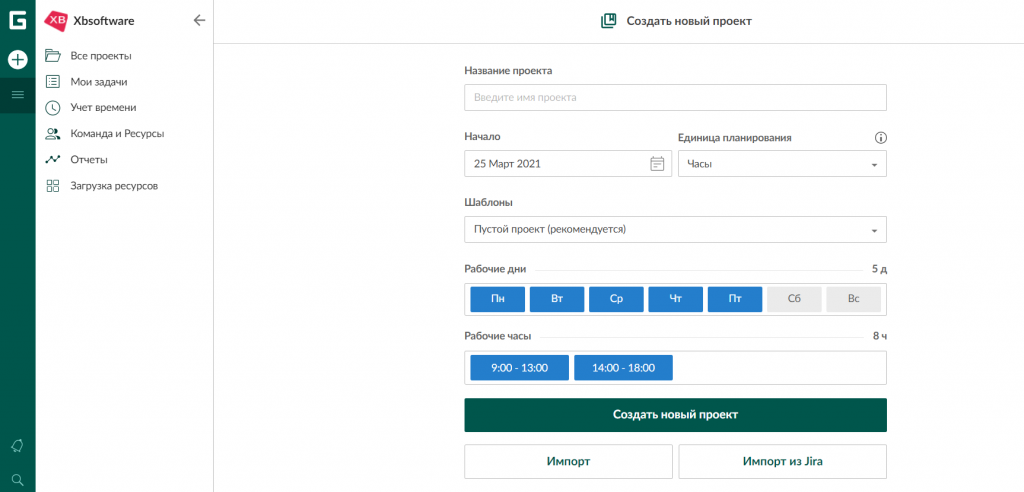
2. Затем перейдите к добавлению нового проекта. В окне, появившемся после регистрации, нажмите «Создать новый проект». Настройте рабочий календарь, выберите дни для работы и отдыха, задайте единицу планирования проектов (от часов до месяцев).
Если вы начали работу с проектом в одном из классических приложений, а затем решили перейти в GanttPRO, мы можем предложить вам возможность импорта. В GanttPRO легко импортировать файлы форматов:
- XLSX.
- MPP (ранее мы рассказывали о том, как построить диаграмму Ганта в MS Project).
- CSV,
- и проекты из JIRA Cloud.
Таким образом, вся ранее созданная информация сохранится, и вам не придется тратить время на ее восстановление.
3. Итак, когда основные параметры будущего проекта заданы, нажмите на «Создать новый проект».
Перед вами откроется рабочее поле, где буквально за несколько секунд вы сможете начать создавать задачи. Для этого кликните на «Добавить задачу» слева от временной шкалы.
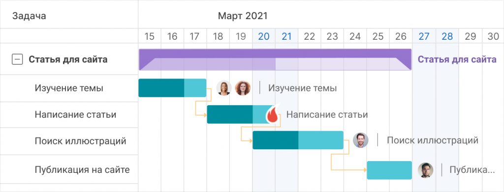
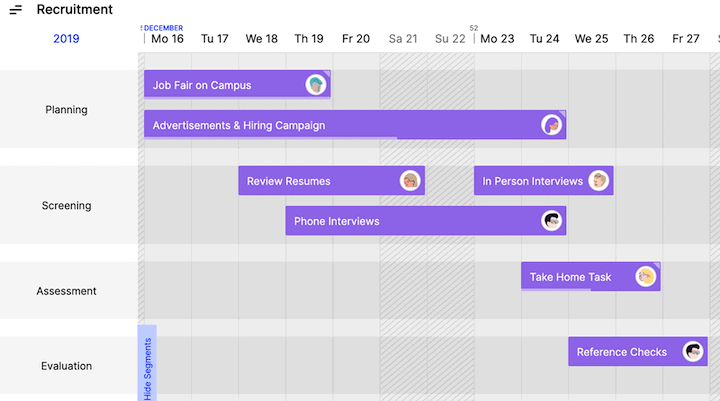
Ниже вы можете посмотреть, как выглядит уже готовый проект, созданный с помощью нашего планировщика задач онлайн.
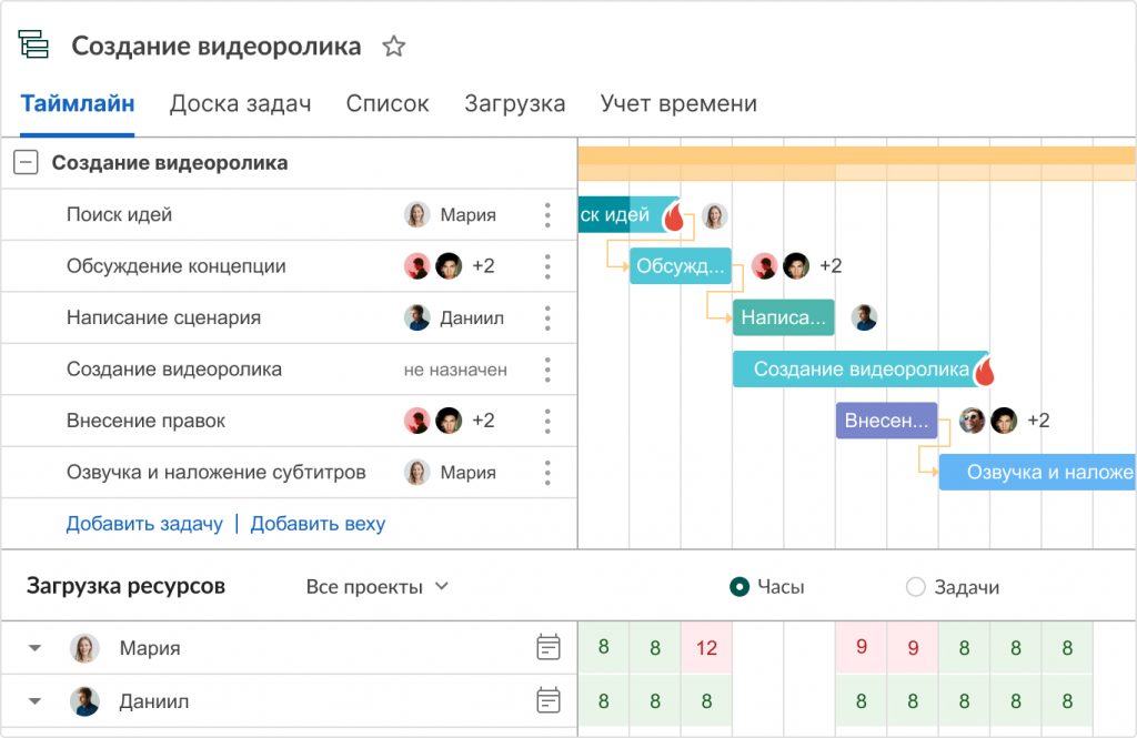
Вся информация о проекте всегда находится в одном месте и доступна каждому участнику команды 24/7.
Преимущества работы с диаграммой Ганта в GanttPRO:
- Простой и интуитивный интерфейс, который позволяет построить график в считанные минуты.
- Возможность автоматического планирования.
- Создание подзадач, групп задач, вех и зависимостей.
- Оповещения в режиме реального времени.
- Контроль дедлайнов.
- Управление рабочей загрузкой.
- Возможность оставлять комментарии, упоминать коллег, прикреплять файлы.
- Настраиваемые колонки.
- Интеграция с JIRA Cloud, Google Drive, Slack.
- Возможность поделиться диаграммой с кем угодно с помощью ссылки.
- Управление портфелем проектов.
- Готовые шаблоны диаграммы Ганта для различных профессиональных областей.
- Создание собственного шаблона для использования в будущем.
- Возможность назначать несколько ресурсов на задачу,
- и многое другое.
С GanttPRO все эти действия не займут много времени и значительно облегчат работу над проектом.
Онлайн диаграмма Ганта GanttPRO
Создавайте и управляйте задачами и проектами любой сложности.
Попробуйте бесплатно
Какой инструмент выбрать для создания диаграммы Ганта
График Ганта — универсальный инструмент для управления проектами. С его помощью можно просто и быстро визуализировать рабочие процессы и контролировать их реализацию.
Диаграмму Ганта можно создать с помощью множества классических инструментов:
- Word.
- PowerPoint.
- MS Project.
- Excel,
- и других.
Выбор инструмента зависит от того, насколько широкий функционал требуется для комфортной работы над проектом вам и вашей команде. Стандартные приложения, перечисленные выше, подойдут для работы с графиком начинающим менеджерам либо тем, кто работает в одиночку.
В Экселе полноценно работать с диаграммой Ганта довольно проблематично: внесение правок и корректировок будет отнимать много времени, которое можно было бы потратить на работу над проектом.
Если же вы планируете не только создание, но и работу с графиком Ганта и его данными, удобнее будет воспользоваться специальными инструментами для управления проектами.
А какими инструментами для создания диаграммы Ганта предпочитаете пользоваться вы? Делитесь в комментариях.
4.6
15
голоса
Рейтинг статьи
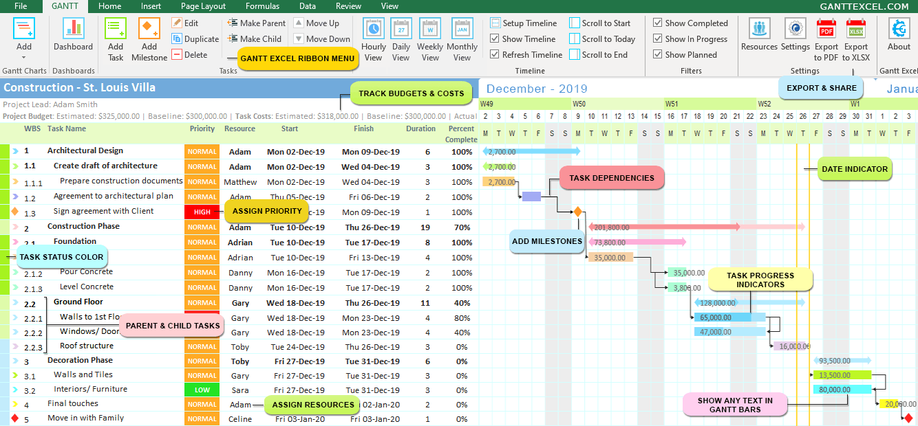
Step-by-Step Gantt Chart Tutorial for Making a Gantt Chart in Excel
Gantt Chart Excel is everyone’s new favorite project management software with the ability to create Gantt Charts in minutes.
We all love Microsoft Excel and we use it almost every day for everything – from a simple calculator to tracking massive projects.
There’s just one thing that Excel is not good at and that is creating Gantt charts. In fact a lot of users on the internet search for “How to Create a Gantt Chart in Excel?”.
For this reason, we created Gantt Excel, an automated excel template that allows you to create professional-looking Gantt Charts all within Microsoft Excel.
Create Gantt Charts in Excel 2007, 2010, 2013, 2016 & 2019
Also works on all excel versions supported by Office 365/ Microsoft 365
How to Create a Gantt Chart in Excel?
- Download the Gantt Chart Excel Template
- Click on Add Gantt Chart button
- Click Add Tasks button to add tasks
- Set Parent & Child Tasks
- Add Task Dependencies
- Setup Gantt Timeline
Detailed steps are listed below. We also have a detailed YouTube instructional video.
How to Make a Gantt Chart in Excel
-
Open the Gantt Chart Template
Download the Gantt Chart Excel template if you haven’t done so already. Open the template.
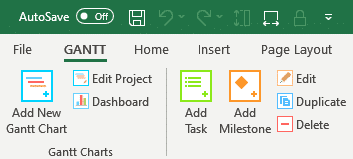
The Gantt Menu tab in the excel ribbon will instantly load (see image below).

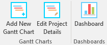
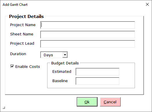
- Create a New Gantt ChartClick on the Add New Gantt Chart button to bring up the Project Details window.

Enter the Project Name, Worksheet Name, Project Lead and the Estimated/ Baseline Budget for the Project.
You can also use Gantt Excel to track project budget and task costs.
Click the Ok button when done.
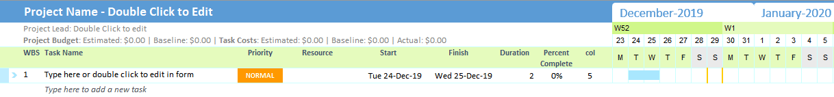
A brand new gantt chart with the gantt timeline is created for you. By default, a task is added with the start date set to today.

- Add Tasks
Gantt charts don’t give useful information unless they include all of the tasks/ milestones needed for a project to be completed.
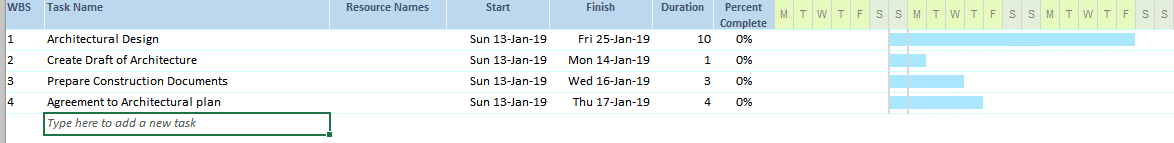
So, to start, list all of the activities as tasks. There are three ways to add tasks in Gantt Chart ExcelMethod 1: Type directly in the excel grid. If you type a task where it says “Type here to add a new task“, it will automatically create a new task with default start and end dates and the timeline will instantly update.
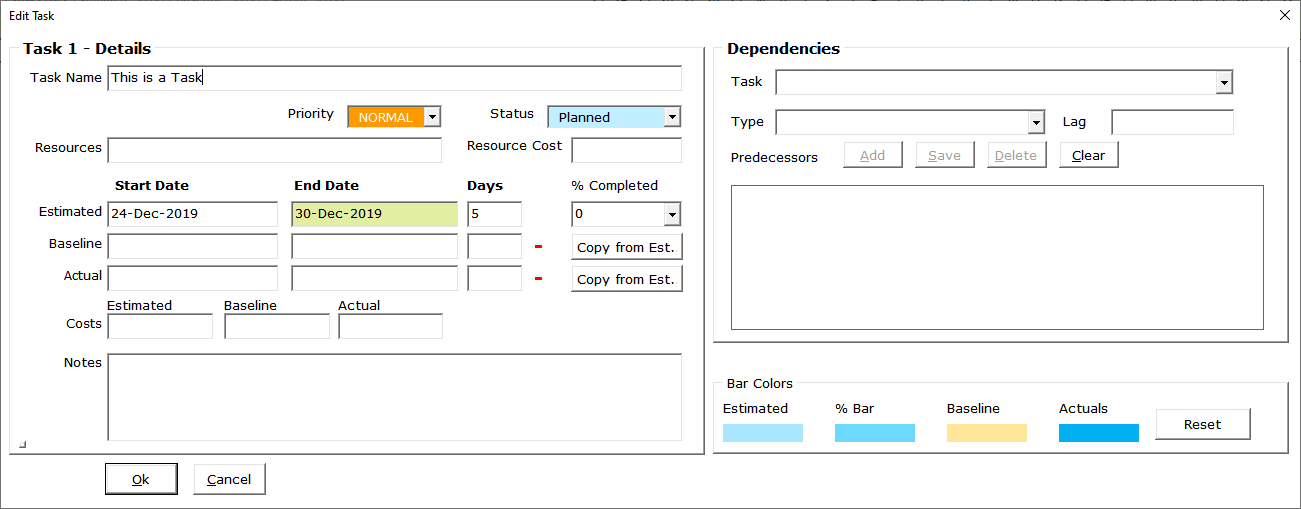
Method 2: Click the Add Task button on the Gantt tab

The task details form will open up where you can enter all the task details including task resource, estimated, baseline, actual – start and end dates. You can also keep track of costs including estimated, baseline and actual costs, therefore making it an excellent budget and costs planner.
Task notes can also be captured to include a short description of the task to clarify its purpose or scope and to provide additional info to everyone involved.
Click the Ok button when done. The newly added task will show up in the excel grid with all the details.
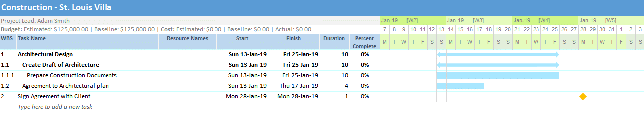
Go ahead and add a few tasks as in the example below and set the start and finish dates.

Importantly, note that the Work Break Structure (WBS) is automatically calculated and set for you.
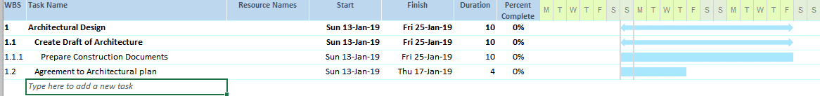
- Set Parent and Child TasksIf a task is relatively large and requires several users with different skills to manage, break the task into subtasks and create parent-child relationships.
To set parent-child relationships, select a task that you want to convert to a child task and click on the Make Child button.

Shortcut – Alt + Right arrow key
To create a parent task from a child task click on the Make Parent button.

Shortcut – Alt + Left arrow key
As a result, when you group child tasks together under a parent, values such as dates, costs etc. aggregate and roll up to the parent task.
This is how the tasks look when I set a few tasks as child tasks.
- Add MilestonesMilestones help your team stay on track and to more accurately determine whether or not your project is on schedule.
To add a milestone click on the Add Milestone button on the Gantt Menu.

This will bring up the Add Milestone details window. Enter the milestone details and click the Ok button when done.
To illustrate, see the example below. The milestone and a diamond-shaped symbol show up in the timeline.
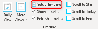
- Setup TimelineClick on the Setup Timeline button in the Gantt Menu.

Set the Start and End Date of the timeline and click the Update Timeline button.

Gantt Excel will instantly recreate the calendar timeline with the selected dates.
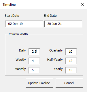
- Setup Gantt Chart ResourcesClick on the Resources button in the Gantt Menu.
You can create as many resources and assign them to the tasks. You can also add Holidays and Non-working days in the Resource window. The Holidays and Non-working days will be considered while calculating end dates.

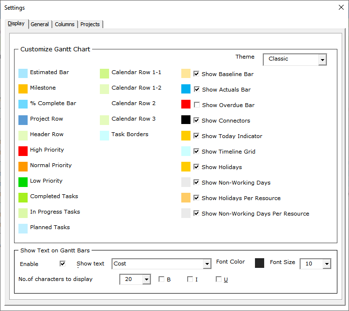
- Gantt Chart Excel SettingsEqually important, is to set up the Gantt chart correctly. Let’s look at all the settings screens and go through them one by one.
Click on the Settings icon in the Gantt Menu.
Display Settings
By default, the Display tab opens up first. Here you can set the general theme colors including the different timeline bar and milestone colors.
You can also choose to show additional timeline bars for baseline, actual dates and the overdue bar for all overdue tasks.
Lastly, one of the most sought out features is to show text within the Gantt Bars. You can check the Enable Text Display option and select any text from any column to show within the Gantt bars.

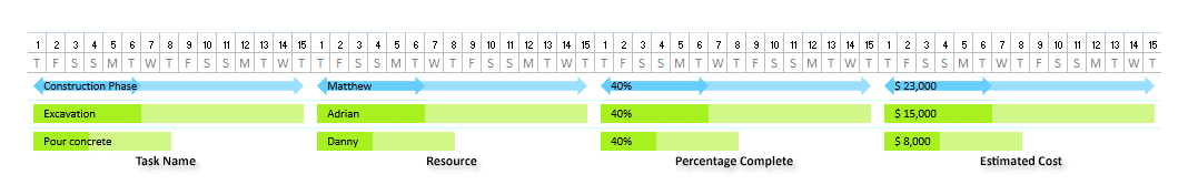
This is how it looks when the Show Text in Gantt Bars is enabled. We think it is one of the finest features of Gantt Chart Excel.
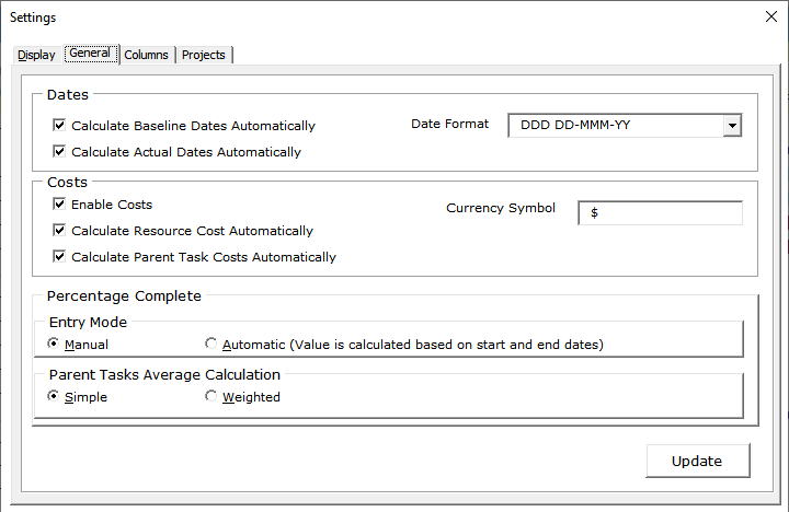
General Settings
Switch over to the General tab to setup cost and date calculations, currency symbol, and the Date format.
Additionally, you can define how the Percentage complete is calculated for the tasks. You can use the Manual or Automatic mode for entry and use Simple or Weighted calculation for the Parent task roll-up calculation.
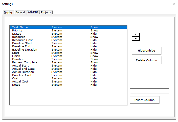
Columns Settings
Finally, we have the columns tab where you can hide or unhide existing columns. You can also insert up to ten custom columns or delete them if required.


You can watch this video tutorial on «How to Create a Gantt Chart in Excel»
GANTT CHART EXCEL – THE SMART WAY TO PLAN
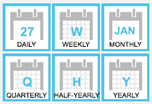
In Conclusion, the beauty of Gantt Chart Excel is we have seven calendar views to choose from namely Hourly, Daily, Weekly, Monthly, Quarterly, Half-Yearly and Yearly View.
From here you can easily customize the Gantt chart by changing timeline colors, and adding various details like percent complete, costs etc… As shown below, with some tweaks you can create a timeline that’s sure to impress.
Gantt Charts Made Super Easy
Manage your Project Timeline, Tasks and Workload like a Pro.

Jory MacKay
Jory is a writer, content strategist and award-winning editor of the Unsplash Book. He contributes to Inc., Fast Company, Quartz, and more.
July 18, 2018 · 7 min read
🎁 Bonus Material: Gantt Chart Excel Template

At the core of project management is a simple idea: Know what you want to build, the steps you need to take to get there, and how long each one will take to complete.
Sounds easy enough right? But as any seasoned project manager will tell you, it rarely stays that way. All of a sudden deadlines change, scope creeps up, resources change, or your team gets split to work on different projects. To stay on track no matter what happens you need a way to quickly see what needs to be done, track progress, and see what’s coming up behind the next curve.
Gantt charts are one of the most powerful tools for seeing your path from 0–100% and identifying where issues might creep up. With a Gantt Chart, you get a quick, intuitive view of each task according to its time commitment and dependencies (i.e. what needs to get done before you can do that task).
Like most aspects of project management, Gantt Charts are simple in concept, but slightly more complicated in execution.
In this guide, we’ll run you through everything you need to know about how (and when) to use Gantt Charts, best practices for making them, and show you a step-by-step guide of how to create your own using Microsoft Excel and other more powerful project management tools.
We recommend you download the template first and follow along as we run through the guide.
Why (and when to) use a Gantt Chart
A Gantt Chart is a visual representation of tasks over time that is incredibly useful for planning projects of almost any size and complexity. With a Gantt Chart you can quickly see:
- The project’s start and finish dates
- Each individual project task and who is responsible for them
- When tasks start and finish and how long they should take
- How tasks group together, overlap and depend on each other
- The project’s progress and whether you’re keeping up with the schedule
In other words, a Gantt Chart can be used by anyone who is running or just wants to keep track of a project. While originally written out on paper, most modern project management tools like Planio offer Gantt Charts as an option for viewing your tasks.

Not only are Gantt Charts great for keeping track of your tasks. But seeing everything in a visual manner like this has some other major benefits.
First, a Gantt Chart promotes detailed planning. Simply listing your tasks forces you to break them down into the smallest pieces to see their dependencies (the basis of task management!) Also, by including start and finish dates, it forces you to imagine the project all the way to completion, rather than get stuck in the messy middle.
Next, Gantt Charts show potential risks and resource overload. With timelines clearly planned, you can quickly see where expectations might be high and you’ll need more resources (either time, people, or money).
Lastly, Gantt Charts are easy to read, which makes them great tools for improving project communication. Everyone understands a basic bar chart, which helps bring added clarity and motivation for hitting deadlines.
When you see a Gantt Chart, it will be broken down into two halves:
- On the left side: is each individual task with related information about what’s expected, who’s responsible, and what (if any) dependencies they have.
- On the right side: is a visual representation of those tasks across a calendar, which lets you see how long everything should take, the sequence of tasks, and their progress.

As you can probably tell, the power of the Gantt Chart is in its flexibility. They can be used for everything from developing an app, to redesigning a website, to remodelling your house.
Gantt Chart vs. Agile, Scrum, and Kanban
While Gantt Charts are great for keeping track of most projects, they make the most sense if you’re using traditional project management methods.
Where agile project management relies on working in sprints and constantly iterating projects based on user feedback, traditional project management is built around larger milestones—a grouping of tasks—that are completed in sequence.
Before you dive into making your own Gantt Chart, make sure that it aligns with the way you build projects.
A step-by-step guide how to create a Gantt Chart in Excel
The great thing about Gantt Charts is just how simple of a concept they are. In fact, they’ve been around for over 100 years, with the earliest versions being created by Henry Gantt between 1910–1915.
Back then, however, Gantt Charts were drawn on paper. Meaning whenever a detail changed they’d have to recreate the entire chart. Today, we have the flexibility to create and adjust Gantt Charts quickly and easily with tools as commonplace as Microsoft Excel.
Building a Gantt Chart in Excel can be a bit of an arduous process, however. So rather than start from scratch, we’ve put together a free Gantt Chart Excel template you can download, customize, and even import into other project management tools.
If you haven’t already, download our free Gantt Chart Excel template and follow along.
Step 1: Name your project
Gantt Charts are all about clarity. So your first step should be to name both the project workbook and the chart itself.
Click once on the chart. In the top toolbar select Chart Design > Add Chart Element > Chart Title and select Above Chart.

Use something simple, yet specific like Website redesign or App V2.0. And remember to also include your name in the Project Title section at the top of the workbook alongside your company name and the team lead who will be responsible for any questions about the Gantt Chart.
Step 2: Add your tasks
The table beside your Gantt Chart is where you’ll list your tasks and any information about them. Start by simply giving them names. You want to go granular here as each task should represent a piece of work that is clearly defined and do-able in the given time frame.
Just click on each cell in the table and rename it. The names will automatically update on the chart itself.

Step 3: Update task start and end dates (and additional information)
The power of a Gantt Chart comes once you can see each task’s proposed timeline and how they stack up.
Click on each task and update the Start and End date. The duration will automatically be calculated to tell you how long you’ve scheduled for the task.
You might notice that your chart gets a bit weird once you start changing dates around. There’s a simple process for fixing this:
- Hover over the first task’s Start Date. Right click and select Format Cells. Use the side navigation to select General. Write down the number you see (for me, it’s
43125) and then hit Cancel. - Now, hover over the dates in the top axis of your Gantt Chart. Right click and select Format Axis.
- Select the bar chart if you’re not already there and then replace the Minimum Bounds with the number you wrote down.
- You can adjust the Maximum Bound to get rid of white space on the right of your Gantt Chart. Just play around and see what works.


As you can see, we’ve included a few extra data points to our Excel Gantt Chart table: Assigned to, % done, Priority, Description, and Sprint/Milestone. Include as much information here as you can for clarity. These tables can also be automatically imported into Planio if you’d rather have more flexibility over your Gantt Chart and project management.
Step 4: Add milestones and color-code tasks
It makes sense to break up your tasks by Milestones—a collection of tasks that represent some piece of your project being completed. This could be finishing coding a feature or redesigning a landing page—anything that marks the end of a chunk of work.
In our Excel Gantt Chart, we’re using both labelling in the table and color coding to see our Milestones. Here’s how to update both:
For the Milestone description: Click once on the cell associated to the task. Type in the name of the Milestone. Next, go into the top toolbar and click on the Paint Bucket Tool. Select a color that will represent that Milestone. Repeat for each task in the Milestone.

For the Gantt Chart: Now you want to change the colors on your Gantt Chart tasks to be the same as your descriptions. Click once on any bar in the Gantt Chart to select all of them and then right click on just the bar you want to change and select Format Data Point. From there, make sure your fill is set to Solid Fill, and then select the paint bucket and use the same color as in the table.

Step 5: Add more tasks and finalize your Excel Gantt Chart
The Gantt Chart Excel template we’ve provided you with has space for 17 tasks. But if your project is more complex, you can quickly and easily add more rows to your table and auto-update your chart:
- Select the last filled row in your table by clicking on the number beside the task’s name.
- Using the top toolbar select Insert > Rows. A new row will be automatically added underneath the selected one with all the appropriate formulas. Repeat as necessary.


Once your Gantt Chart is completed with all of the tasks, you can make some final edits to customize it in Excel. Change fonts. Play around with the date ranges to make the Gantt Chart clear and straightforward. Then, print or share with your team.
Import your excel Gantt Chart to Planio for more flexibility and control
Building a Gantt Chart using our Excel template is easy. But it’s not necessarily the best way to see your project if you’re going to be updating it regularly and adding in additional information. Instead, using a dedicated project management tool is a much easier and more powerful way to create, update, and use Gantt Charts.
In Planio, you can take what you’ve already built in Excel and transfer it into a Planio project in just 2 steps.
- First, prepare your CSV file: A CSV file is simply the table you created for your tasks in Excel. You can save most Excel sheets as CSV files by clicking File > Save As… and then selecting Comma Separated Values as the format from the drop-down menu. We’ve set up our Gantt Chart Excel template using headers recognized by Planio, which means you don’t need to edit or adjust anything.
- Next, import your project CSV into Planio: Open your Planio project (or start a new one) and then use the side navigation bar to select Issues > Import. Select the CSV file you just saved. Finally, you have to map the values from the CSV files to issues in Planio (if you haven’t changed any headers in your Excel file, this shouldn’t be an issue). Then, simply click Import. If you have any issues, check out this support article.
Project management is all about clarity. Gantt Charts give you that.

No matter what tool you use to build your Gantt Chart, the goal should always be clarity. Adding unnecessary complexity is a recipe for disaster and it’s your role as a project manager or team lead to walk the line between keeping your project organized and not overwhelming your team with details.
Gantt Charts are a great way to do this, giving you a simple, visual way to see your tasks, timeline, and how it’s all going to play out. Grab our free Gantt Chart Excel Template and try it out for yourself!
Microsoft Excel is a popular tool to create data-driven charts. However, it does not come with Gantt charts. If you’re looking for a step-by-step tutorial on how to make a Gantt chart in Excel, this article is for you.
In this article you’ll learn:
- What is a Gantt chart?
- What are the important elements of a Gantt chart?
- Advantages and disadvantages of creating Gantt charts in Excel
- Step-by-step process to create a Gantt chart using Excel
- Free Excel Gantt chart templates
- A simpler and free alternative to making Excel Gantt charts
Let’s get started.
What is a Gantt Chart?
A Gantt chart is a visual representation of a project’s timeline. It helps project managers, stakeholders, and team members understand:
- A project’s roadmap,
- Important milestones along the way,
- Work dependencies,
- Required resources,
- And the risks involved.
Like most charts, a Gantt chart has two axes. The horizontal axis represents the project’s timeline. On the other hand, the vertical axis lists the activities or tasks to complete to finish the project.
Important elements of a Gantt chart
A Gantt chart has 5 important elements. These are:
- Tasks: Project tasks are listed along the vertical axis. In the early stages, these are often high-level tasks. On the other hand, as the project progresses, tasks become more detailed.
- Timeline: A dateline runs across the horizontal axis of a Gantt chart. It is divided into days, weeks, and months.
- Bars: Each bar represents a task on the Gantt chart. Because of the timeline, you can visualize each task with its start date, end date, and duration.
- Milestones: Milestones represent important dates by which certain tasks must be completed. Project milestones make the project more manageable and risk-free.
- Resources: Each task may have one or more team members assigned to complete a task.
Types of Gantt Charts
Most projects have two types of timelines charts. These are:
- Project plan timeline chart: A project timeline helps visually plan a project, track its progress, and identify resources/risks on the way.
- Team timeline chart: A team timeline helps visually plan resource availability and allocation. It also helps manage the workload of your team members.
There are a lot of ways you can make a Gantt chart.
You can use a whiteboard, or spreadsheet software like Microsoft Excel, or an online tool like Toggl Plan.
Each tool has its own advantages and disadvantages. Let’s look at the pros and cons of using Excel to create a project Gantt chart.
Advantages of Excel Gantt Charts
Using Microsoft Excel to create a Gantt chart may sound like a no-brainer for the below reasons:
- Easy to get started: Over a billion people use the MS Office. It’s reasonable to assume that using Excel has almost a zero learning curve.
- No need to sign up for a new tool: Since most people already have access to Microsoft Excel, there isn’t a need to purchase or sign up for a new tool.
- Plays along nicely with other Office tools: Charts created in Excel can be easily embedded into a presentation and document. This is great for presentations and reports.
- Customizable: Excel makes it easy to customize charts. You can easily color charts to match your business brand.
Disadvantages of Excel Gantt Charts
Getting started with Excel charts is easy. But, collaborating with stakeholders and team members to keep the Gantt chart updated is hard. Particularly, if you’re working with a remote team.
Excel Gantt charts have the following disadvantages:
- Can’t work collaboratively: It’s almost impossible to work collaboratively on an Excel project plan. Whether it’s for creating a plan with stakeholders or keeping track of the project’s progress with team members.
- No access control: It’s often chaotic when multiple people work on the same spreadsheet. It takes just one mistake to ruin all the hard work.
- Hard to keep up-to-date: Plans change and need adjustments from time to time. You may need to update rows upon rows of data to accommodate these changes.
- Multiple versions: Often managers combat these disadvantages by keeping backup copies of Excel sheets. But, keeping track of all these versions can quickly become a nightmare.
How to make a Gantt chart in Excel?
Even with all these big drawbacks, there are times when it makes sense to create a Gantt chart using Excel. Particularly, in the early stages of a project. Or when you have to quickly present a project plan visually.
Here’s how you can make one using a stacked bar chart:
Note: The screenshots below are from Excel 2019. Some of these screenshots are slightly different in Excel 2010, 2013, and 2016. However, these steps work for all Excel 2010+ versions.
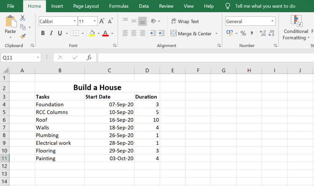
1. Add Project Data to Excel
Let’s start by adding our project’s planned timeline in text format.
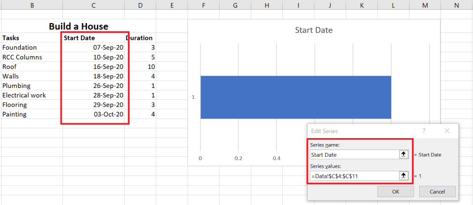
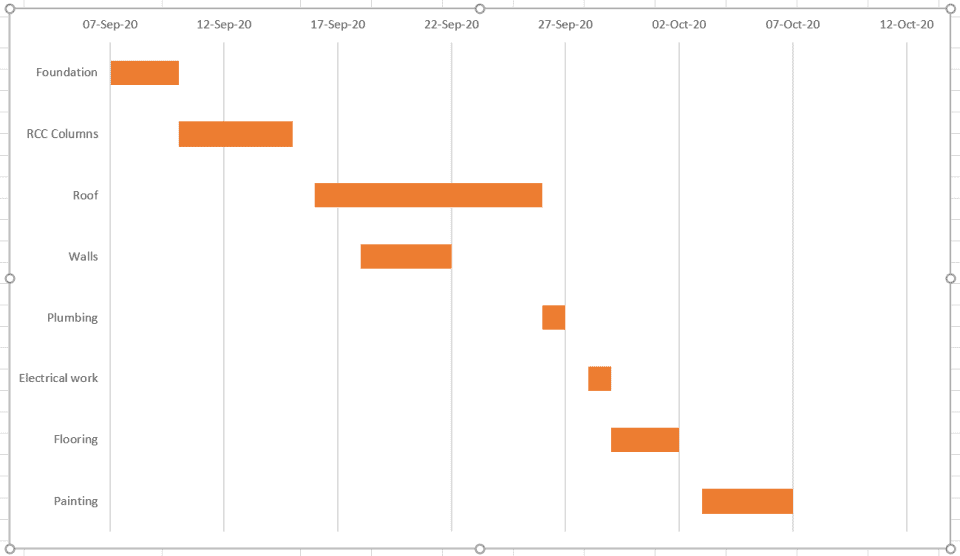
Create a new spreadsheet and columns for tasks. Each task has the task name, a start date, and duration. Here’s a sample spreadsheet for a simple construction project.
2. Insert a Stacked Bar Chart
Excel does not come with an inbuilt Gantt chart.
Instead, we’ll improvise and create one using a stacked bar chart.
To do that, select your task information. Next, click on the Insert Tab > Bar Chart > Stacked Bar Chart.

Next, let’s populate the chart with our task data. To do that, right-click on the chart. Then click Select Data…
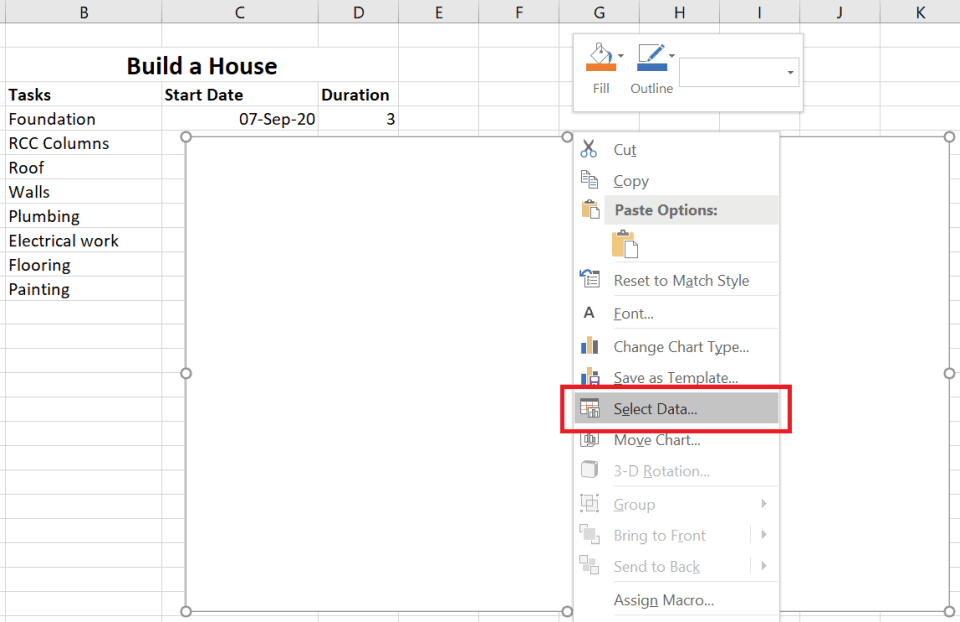
This opens the Select Data Source dialog. Here we’ll set the Legend Entries to task start dates and durations. Also, we’ll set the Horizontal Axis Labels to display task names.
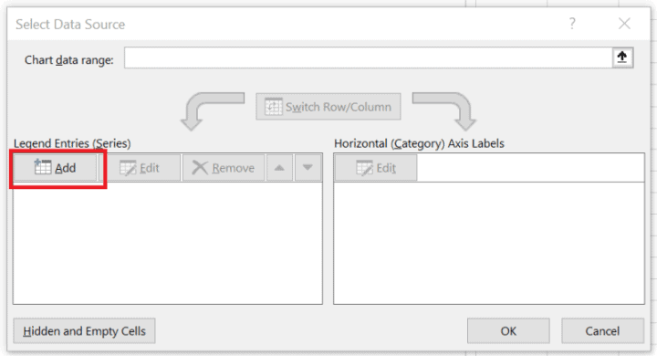
Click on the Add button in the Legend Entries (Series) section to add the range of start dates and durations.
Task start date:
- Set the Series name to “Start Dates”.
- Set the Series values to the cell range that contains the task start dates.
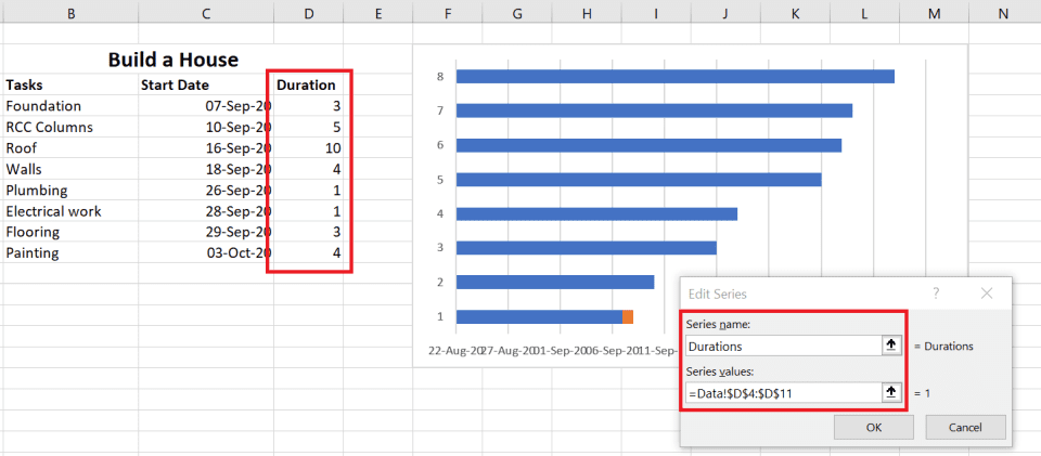
Task durations:
- Set the Series name to “Durations”.
- Set the Series values to the cell range that contains the task durations.
Next, we want to add the tasks to the vertical axis. This is done by editing the Horizontal (Category) axis labels.

Click on the Edit button to add task names to the Horizontal (Category) axis labels.
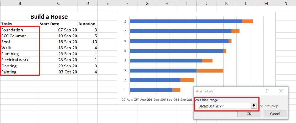
3. Format the chart to make it look like a Gantt Chart
The stacked bar is ready. Your tasks are laid out on the chart as blue and orange bars. But, it doesn’t look like a Gantt chart.
Let’s format it to look like one.
Right-click on the blue part of the bar. Then click on Format Data Series… to open the Formatting dialog.
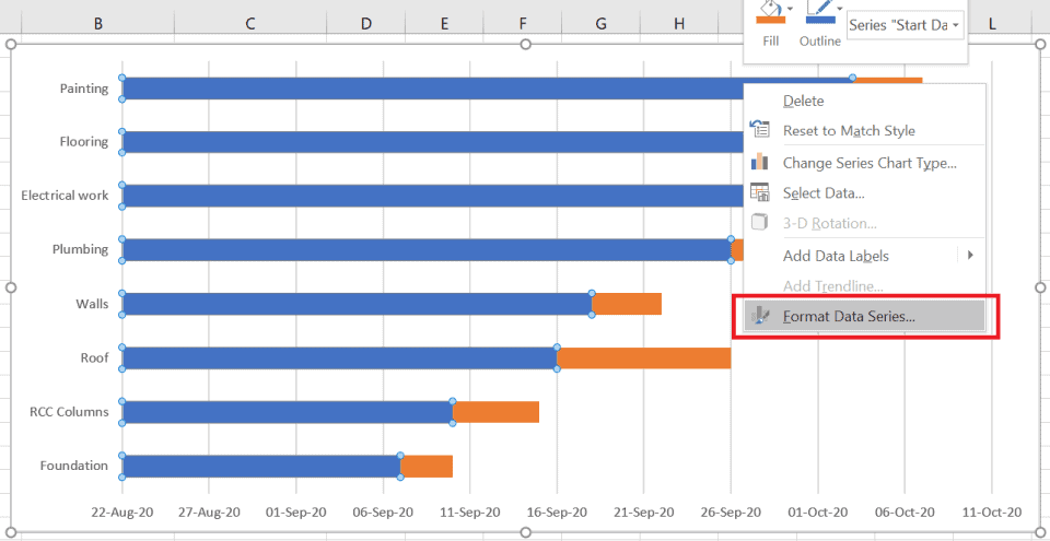
On the dialog, set the Fill option to No fill.
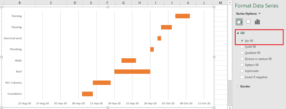
Now our chart looks a bit more like a Gantt chart. But still has a couple of issues:
- The tasks on the vertical axis are in reverse order.
- And, the start date range on the horizontal axis is too wide.
4. Fix the task order
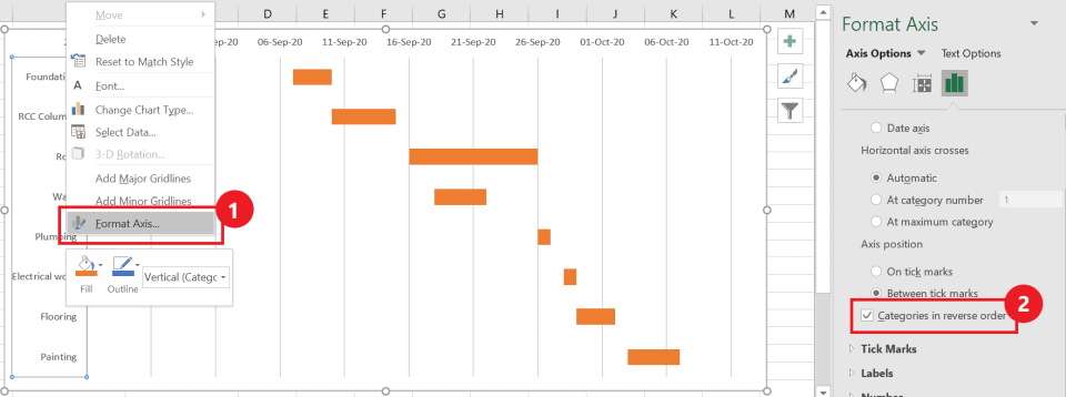
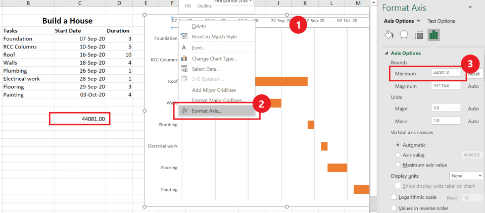
To fix the first issue, right-click on the vertical axis.
Then click on the Format Axis… context menu to open the Format Axis dialog.
On this dialog, check Axis Options > Categories in reverse order. The tasks should now appear in the right order.
5. Fix the task durations range
Next, let’s fix the Minimum Bound of the horizontal axis. This can be done from Axis Options > Minimum Bound in the Format Axis dialog box
Unfortunately, it’s not that easy. That’s because Excel handles dates as numbers. We’ll first need to convert the project start date into a number that Excel understands
To do that, copy the first start date from your task data, and paste it into an empty cell. Next, set the formatting of the cell to Number from the Home tab > Number Format group. That should give you the Number formatted start date
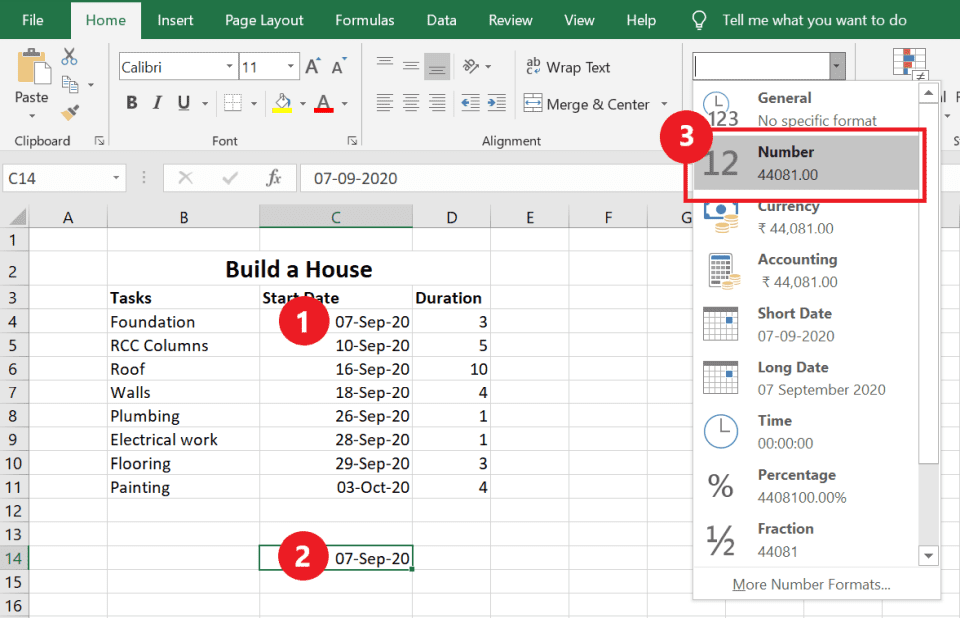
Next, right-click on the horizontal axis and open the Format Axis dialog box. Set Axis Options > Minimum Bound to the Number formatted start date.
With that done, your Excel Gantt chart is ready. Any changes you make to the data will also reflect automatically in the chart.
Gantt Chart Templates for Excel
Microsoft Office comes with free and premium project timeline templates for making Excel Gantt charts. Here’re some templates you may find useful.
- Simple Gantt Chart Template: This is a free template that you can download from the official MS Office Templates website. However, this template does not have any options to add milestones.
- Milestone and Task Project Timeline Template: This is a premium template. It offers more features than a simple Gantt chart. However, this template is available only for Office 365 subscribers.
- Agile Gantt Chart Template: This is another premium template for Agile project teams. Like all premium templates, it’s only available for Office 365 subscribers.
Using these templates, you can somewhat simplify the process of creating a Gantt chart in Excel. However, these templates still need you to add all that data. And, collaborating with your team is still not very smooth.
A Simple & Free Alternative to Excel Gantt Charts
Most people know how to create charts in MS Excel. That’s why it’s a natural choice to turn to when they want to create a Gantt chart.
But, as you’ve seen, creating a Gantt chart in Excel is quite a task. And, it’s almost impossible to collaborate with stakeholders and team members. Plus, it’s hard to keep the Excel sheet up-to-date
That’s where Toggl Plan can help.
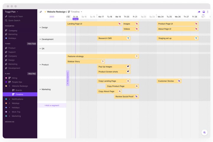
With Toggl Plan, you can:
- Create a Gantt chart timeline to plan and track a project’s schedule.
- Create a team timeline to manage resource availability and workloads.
- Add project milestones to manage project risk better.
- Collaborate with stakeholders. Add them to a timeline or share a read-only view.
- Assign tasks to multiple team members, and track progress as they complete work.
Toggl Plan’s Gantt charts are easy to use. You can just click to add tasks on the timeline. And move them around with simple drag and drop
Best of all, Toggl Plan is completely free for solo users. Teams can try our 14-day free trial. Paid plans are very affordable starting at $9 /user/month.
Try out Toggl Plan for free.

Jitesh is an SEO and content specialist. He manages content projects at Toggl and loves sharing actionable tips to deliver projects profitably.