Вариант 1: График функции X^2
В качестве первого примера для Excel рассмотрим самую популярную функцию F(x)=X^2. График от этой функции в большинстве случаев должен содержать точки, что мы и реализуем при его составлении в будущем, а пока разберем основные составляющие.
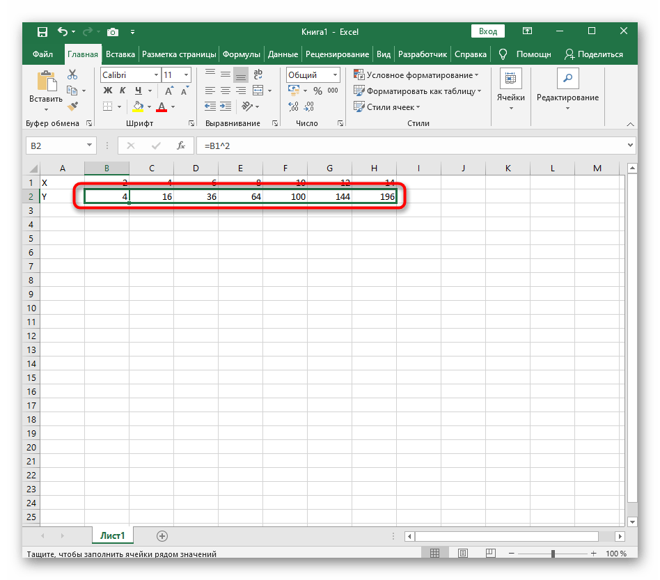
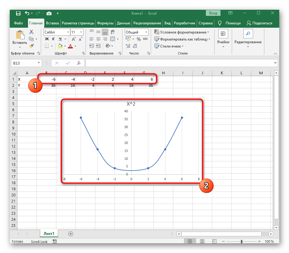
- Создайте строку X, где укажите необходимый диапазон чисел для графика функции.
- Ниже сделайте то же самое с Y, но можно обойтись и без ручного вычисления всех значений, к тому же это будет удобно, если они изначально не заданы и их нужно рассчитать.
- Нажмите по первой ячейке и впишите
=B1^2, что значит автоматическое возведение указанной ячейки в квадрат. - Растяните функцию, зажав правый нижний угол ячейки, и приведя таблицу в тот вид, который продемонстрирован на следующем скриншоте.
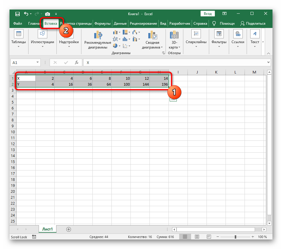
- Диапазон данных для построения графика функции указан, а это означает, что можно выделять его и переходить на вкладку «Вставка».
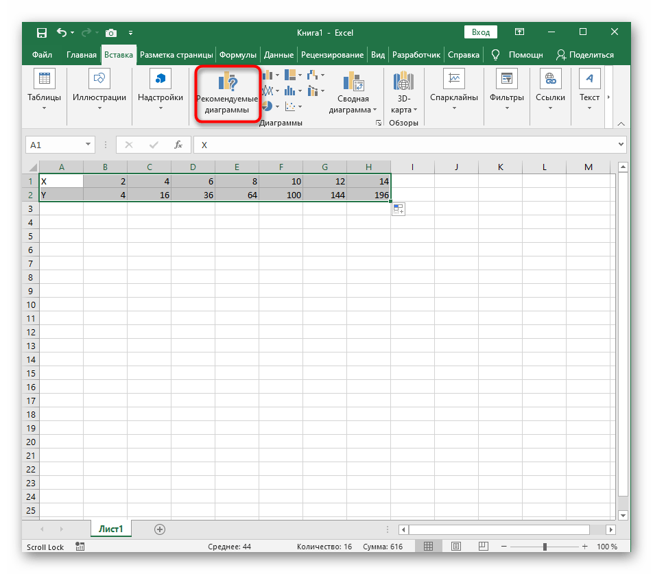
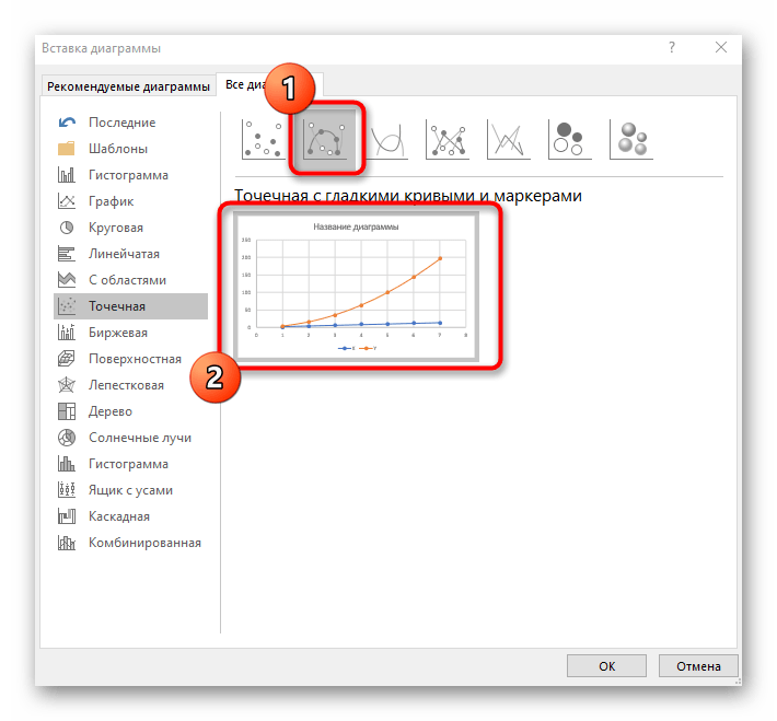
- На ней сразу же щелкайте по кнопке «Рекомендуемые диаграммы».
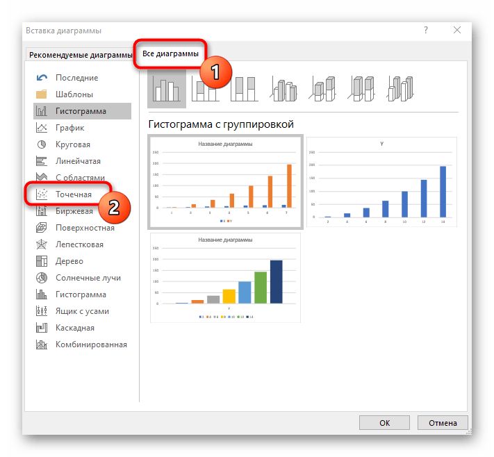
- В новом окне перейдите на вкладку «Все диаграммы» и в списке найдите «Точечная».
- Подойдет вариант «Точечная с гладкими кривыми и маркерами».
- После ее вставки в таблицу обратите внимание, что мы добавили равнозначный диапазон отрицательных и плюсовых значений, чтобы получить примерно стандартное представление параболы.
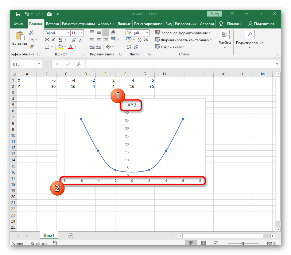
- Сейчас вы можете поменять название диаграммы и убедиться в том, что маркеры значений выставлены так, как это нужно для дальнейшего взаимодействия с этим графиком.
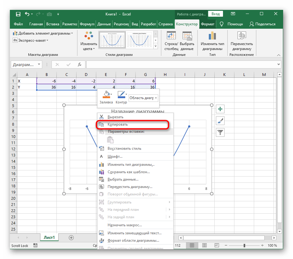
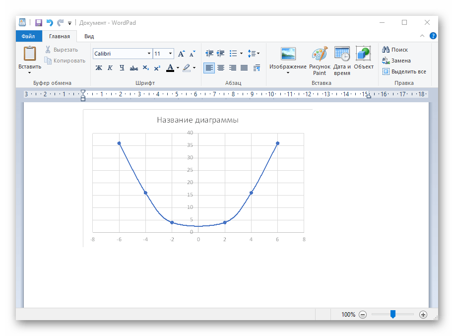
- Из дополнительных возможностей отметим копирование и перенос графика в любой текстовый редактор. Для этого щелкните в нем по пустому месту ПКМ и из контекстного меню выберите «Копировать».
- Откройте лист в используемом текстовом редакторе и через это же контекстное меню вставьте график или используйте горячую клавишу Ctrl + V.
Если график должен быть точечным, но функция не соответствует указанной, составляйте его точно в таком же порядке, формируя требуемые вычисления в таблице, чтобы оптимизировать их и упростить весь процесс работы с данными.
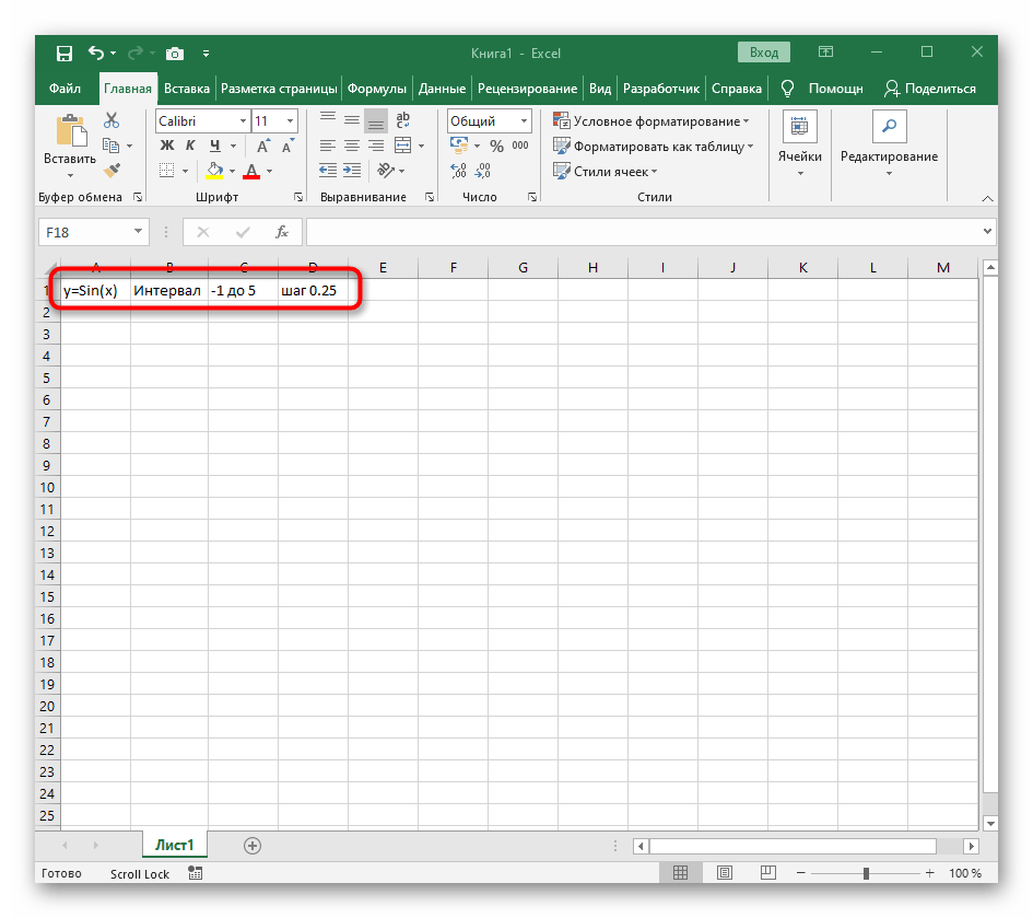
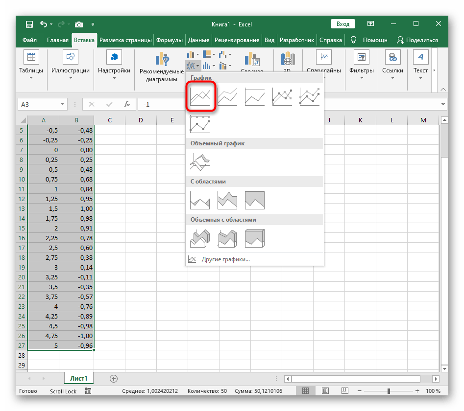
Вариант 2: График функции y=sin(x)
Функций очень много и разобрать их в рамках этой статьи просто невозможно, поэтому в качестве альтернативы предыдущему варианту предлагаем остановиться на еще одном популярном, но сложном — y=sin(x). То есть изначально есть диапазон значений X, затем нужно посчитать синус, чему и будет равняться Y. В этом тоже поможет созданная таблица, из которой потом и построим график функции.

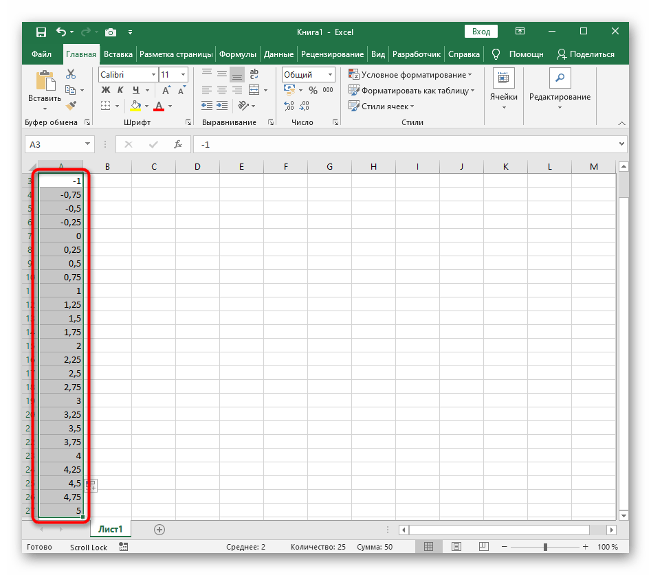
- Для удобства укажем всю необходимую информацию на листе в Excel. Это будет сама функция sin(x), интервал значений от -1 до 5 и их шаг весом в 0.25.
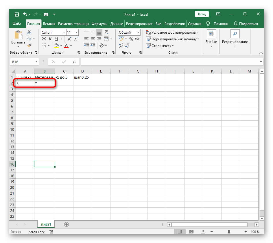
- Создайте сразу два столбца — X и Y, куда будете записывать данные.
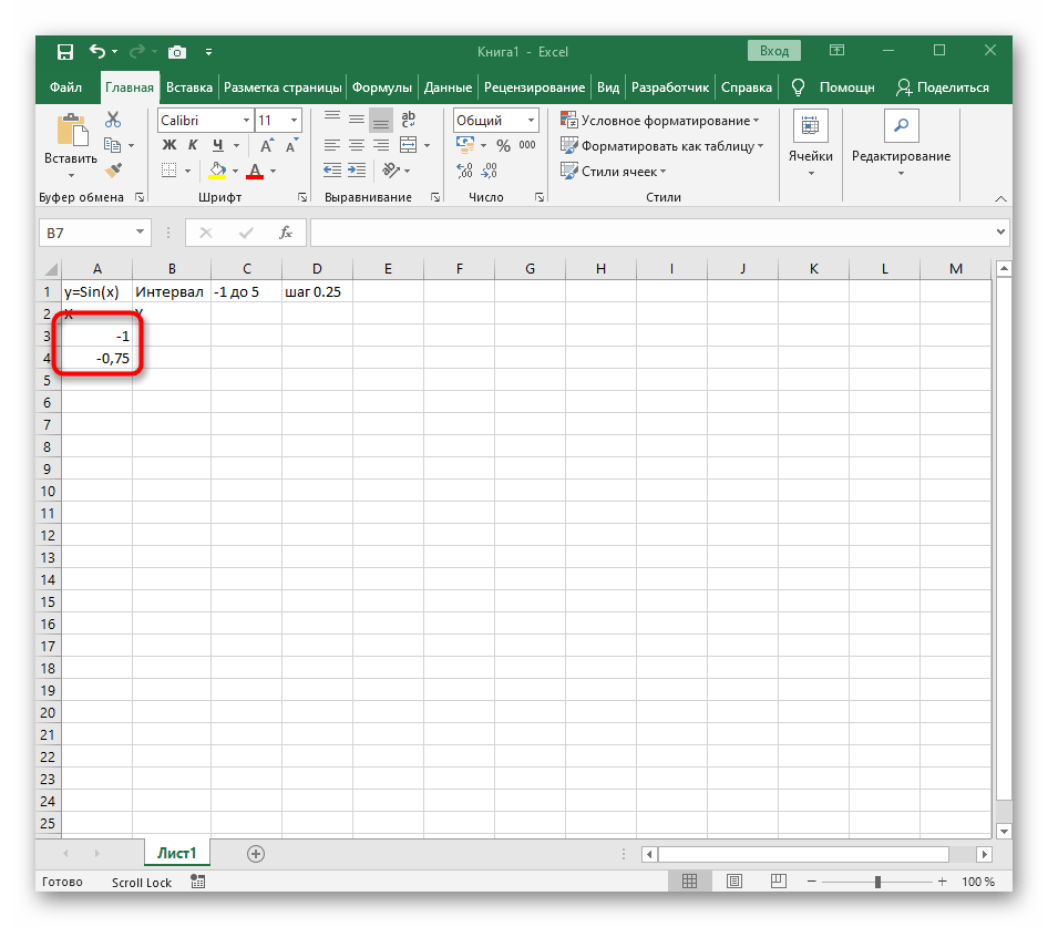
- Запишите самостоятельно первые два или три значения с указанным шагом.
- Далее растяните столбец с X так же, как обычно растягиваете функции, чтобы автоматически не заполнять каждый шаг.
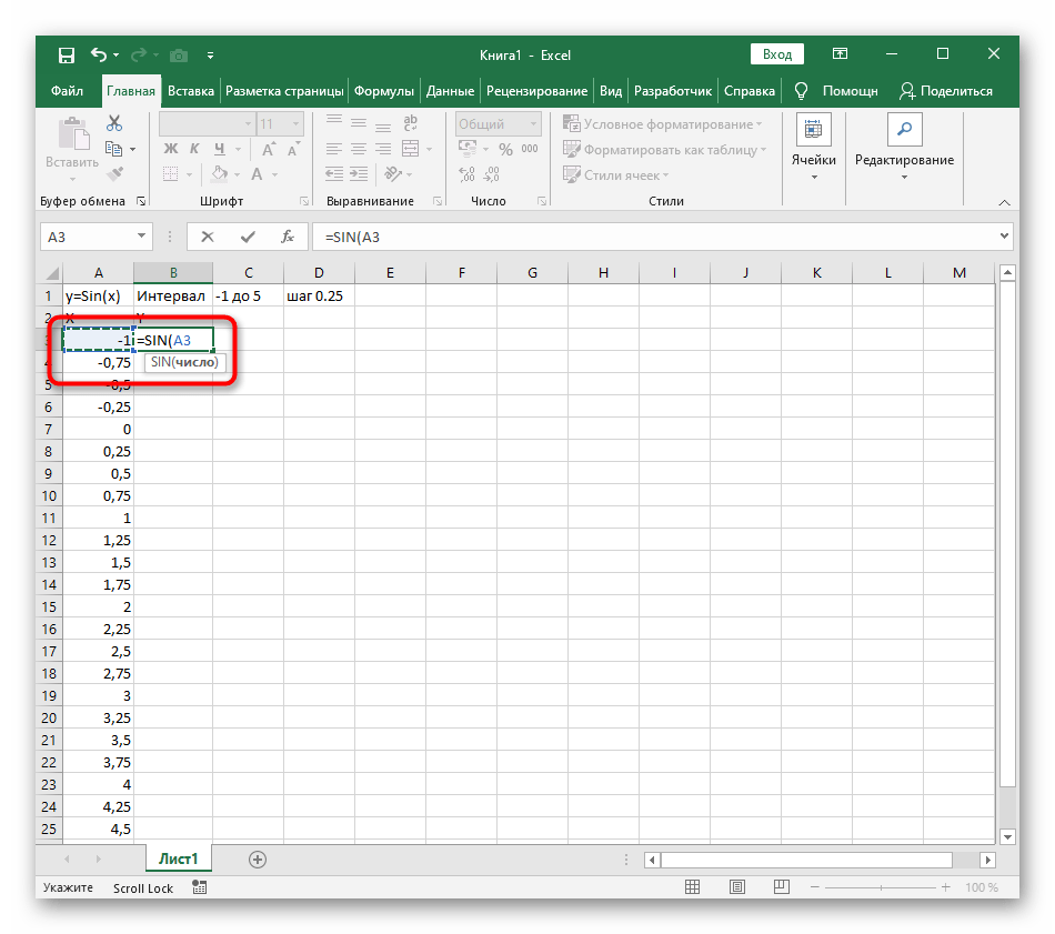
- Перейдите к столбцу Y и объявите функцию
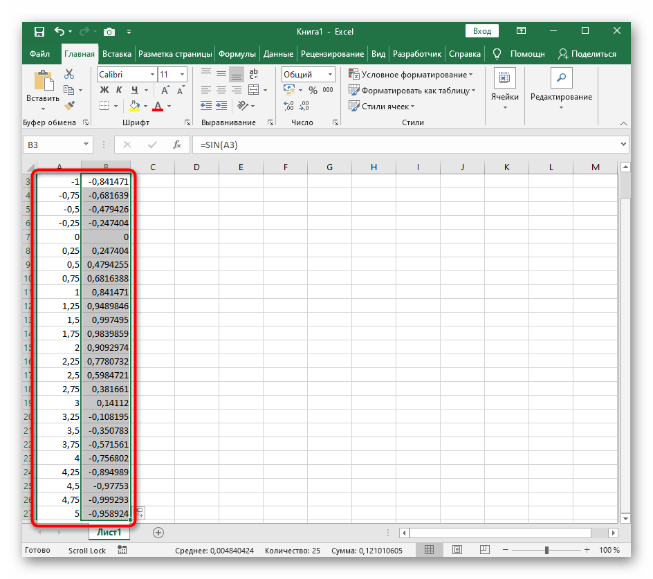
=SIN(, а в качестве числа укажите первое значение X. - Сама функция автоматически высчитает синус заданного числа.
- Растяните столбец точно так же, как это было показано ранее.
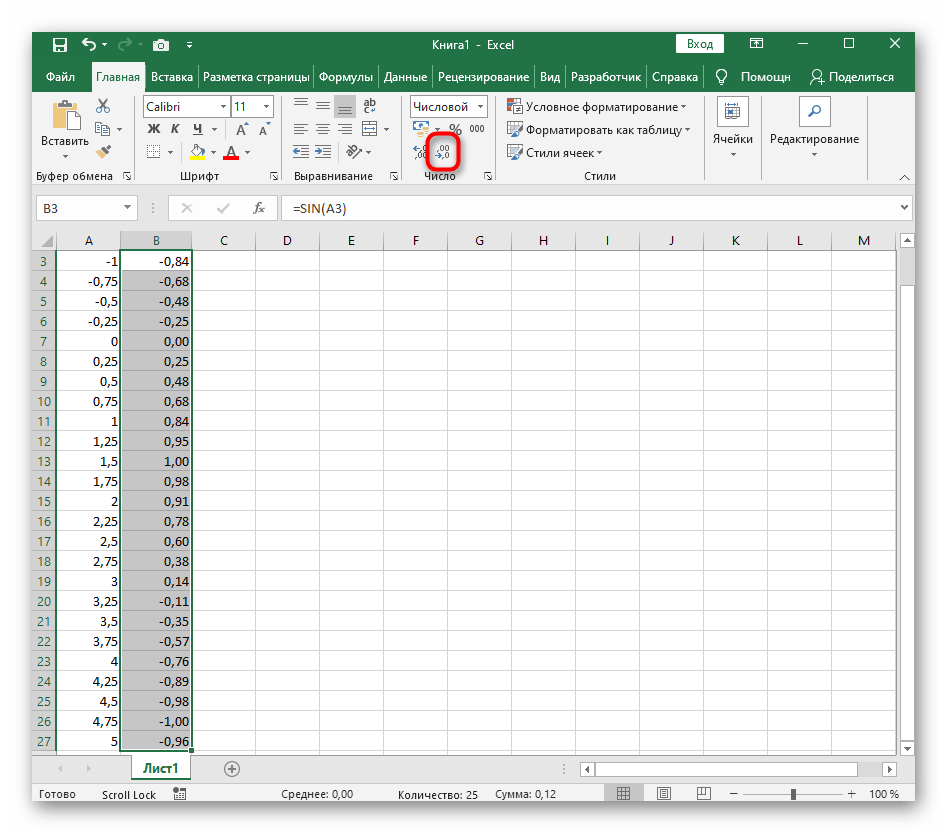
- Если чисел после запятой слишком много, уменьшите разрядность, несколько раз нажав по соответствующей кнопке.
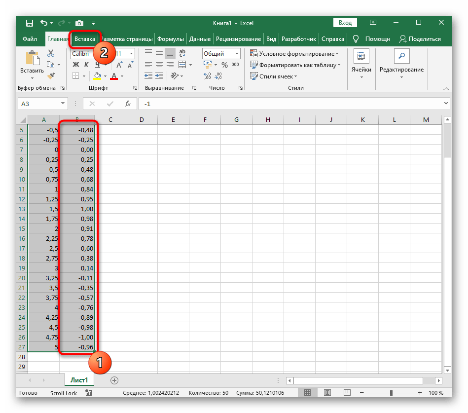
- Выделите столбец с Y и перейдите на вкладку «Вставка».
- Создайте стандартный график, развернув выпадающее меню.
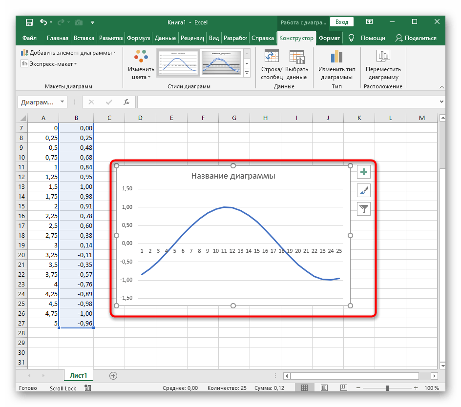
- График функции от y=sin(x) успешно построен и отображается правильно. Редактируйте его название и отображаемые шаги для простоты понимания.
Еще статьи по данной теме:
Помогла ли Вам статья?
(Note: This guide on how to graph a function in Excel is suitable for all Excel versions including Office 365)
Time and time, Excel has proven to be a beneficial tool for performing various calculations. Excel offers calculations and simplifications on a vast amount of mathematical functions ranging from simple addition functions to complex quadratic, exponential, and trigonometric functions.
In addition to calculating the values, Excel also has the ability to provide a relationship between the input and output values. This representation in the form of graphs provides an easy way to compare and interpret the data.
In this article, I will show you how to use a function in Excel and how to graph a function in Excel using 2 easy ways.
You’ll Learn:
- What are Functions?
- How to Use Functions in Excel?
- By using Functions from Excel Library
- By Manually Entering the Function
- How to Graph a Function in Excel?
- How to Customize the Graph?
Watch our video on how to graph a function in Excel
Related Reads:
VLOOKUP vs INDEX/MATCH vs XLOOKUP
How to Use Logical Functions in Excel ?
Logical Functions in Excel (IF, IFS, AND, OR, COUNTIF, SUMIF)
What are Functions?
Before we get to using a function, let us know what are functions.
Generally, functions are a set of calculations having a finite set of operations together with a variable to arrive at the output. In other words, they provide a relationship between the input and the output.
Let us see an example to know more about functions.
You all might have heard about the trigonometric functions like the Pythagoras theorem (c2=a2+b2) or quadratic equations like ax2+bx+c=0.
You all might have heard about the formula to calculate the radius of a circle. We use the formula πr2, where r is the radius of the circle and is a variable. For the different radii of the circle, the area will also be different.
In this case, the radius(r) is considered the input, and the area is the output. When it comes to plotting the points on a graph, the inputs are taken along the x-axis and the outputs are plotted along the y-axis.
How to Use Functions in Excel?
In Excel, you can use the functions to establish a relationship between the input and output easily. There are two ways to use functions in Excel.
1. By using Functions from Excel Library
If you are going to be operating on any mainstream function, Excel has a huge library of built-in functions you can choose from. You can just select the functions, enter the values and Excel gives you the output.
- Select a cell and enter any value. Let the input value be Angle and output value be Sine Value since we’ll be operating on a sine function. In this case, I have entered the value 0 in cell A4. You can also enter multiple values as inputs.

- Now, to add a function, click on any destination cell.
- Navigate to Formulas in the menu bar. Under Function Library, you will find a variety of categories consisting of different functions like Financial, Logical, Math&Trig, etc. Depending on your operation, choose the function from the Function Library.

If you are having a hard time trying to find the location of the function, click on Insert Function from the Function Library or from any of the dropdowns from the categories.

- This opens up a new Insert Function dialog box. You can choose the category and select the function you want. In case, if you are still unable to find the appropriate function, you can type the description and Excel shows you a list of related functions.

- Now that you have found the function, click Okay.
- This opens up another dialog box asking you to enter the arguments for the function. You can enter any constant value or if you want to select or add the name of the cell in the text box and click OK. In this case, I will pass the argument as A4 since this cell houses the value for the input.

- This gives the Sine value for the given input. Now, you can use the drag handle to perform the function on other cells too.

2. By Manually Entering the Function
There are some functions that might not be available in the Excel Function Library. In such cases, you can manually create a function and get the output.
Manually entering the function in Excel is very simple. Just add an “=” before the function in the destination cell and type them. In the case of variables, select or enter the cell number to get the output.
Consider the example of a quadratic equation y=4x2+2x+5. In this case, x is the input and y is the output to be calculated. To obtain multiple values for the quadratic function, add different inputs in different cells.
Enter the inputs in one column. Let it be called x. The inputs can be positive, decimal, negative, or even zero.

Here, the destination cell is B4. So in the place of x, now enter the function =4(A4)2+2(A4)+5 in the destination cell. Always remember to add “*” in place of multiplication when entering functions manually. Press Enter.

This gives you the output corresponding to the function and the input. You can use the drag handle to add the function to other cells and get a series of outputs.

Also Read:
How to Use AVERAGEIF in Excel? With 5 Different Criteria
IFERROR Excel-The Ultimate Guide to Catching Errors in Excel
How to Filter in Excel? A Step-by-Step Guide
How to Graph a Function in Excel?
Once you have the input and output for the required function, it is fairly easy to plot a graph.
- To plot a graph, select the x-axis(input) and y-axis(output) of the graph.

- Go to the Insert menu. Under Charts, select Scatter. Though there are ways to represent your data using other graphical representations like bar charts or pie charts, scatter represents the graph by specifying each point in the function.

- Click on the type of scatter chart to represent the data. This plots a graph for the function with the inputs and outputs along the x-axis and y-axis respectively.

How to Customize the Graph
When you click on the scatter chart, the graph usually populates in the center of the Excel sheet. You can move the graph to its desired places by clicking on the graph and dragging it. Move the pointer to the edges of the graph to resize the chart area.
You can also customize the chart by using the shortcut options which appear when you click on the chart.

Use the Chart Element option to add, show or hide any elements like headers, legends, and other projections.

Use the Chart Styles option to change the style and color of the chart. Changing the style and color gives the chart a more suitable appearance to present the data.

When your chart contains more than one data representation, you can use the Filter option to add or remove any data based on your preferences.

For in-depth and extensive customization of the chart, you can use the Chart Design and Format options in the Main menu.
Using the Chart Design option, you can change the layout of the chart, the color of the chart, switch axes, and move the chart between sheets.

Using the Format option, you can add any shapes, or text to add cues about the chart, align, and resize the chart.

Suggested Reads:
How to Add Leading Zeros in Excel? 4 Easy Methods
Excel String Compare – 5 Easy Methods
How to Hide and Unhide Columns in Excel? (3 Easy Steps)
Closing Thoughts
Plotting a function in the form of a graph gives an insight into the usage of the function easily interpret the data.
In this article, we saw how to use a function, and graph a function in Excel. We also learned how to customize the graph in Excel.
If you need more high-quality Excel guides, please check out our free Excel resources center. Simon Sez IT has been teaching Excel for over ten years. For a low, monthly fee you can get access to 130+ IT training courses. Click here for advanced Excel courses with in-depth training modules.
Simon Calder

Chris “Simon” Calder was working as a Project Manager in IT for one of Los Angeles’ most prestigious cultural institutions, LACMA.He taught himself to use Microsoft Project from a giant textbook and hated every moment of it. Online learning was in its infancy then, but he spotted an opportunity and made an online MS Project course — the rest, as they say, is history!
Learning how to graph functions in Excel can be daunting, but it is a good skill to learn. Luckily, Excel has many wonderful features that make the process easy to learn and use. This article outlines the process with step-by-step instructions to help you graph functions in Excel in no time.
We’ll go over what graph functions are, discuss the top reasons you should learn how to graph functions in Excel, and show you the benefits of using this software program. This detailed step-by-step guide will have you using Excel like a pro.

Find Your Bootcamp Match
- Career Karma matches you with top tech bootcamps
- Access exclusive scholarships and prep courses
Select your interest
First name
Last name
Phone number
By continuing you agree to our Terms of Service and Privacy Policy, and you consent to receive offers and opportunities from Career Karma by telephone, text message, and email.
What Are Graph Functions in Excel?
Graph functions in Excel are preset formulas used to determine an output variable using input variables. This function calculates the necessary variables you want to define and uses them to display the data visually on a graph or chart.
Graph functions make it easier for businesses to track their performance and predict possible future sales, solutions, and problems. This tool allows you to make statistical calculations quickly and creates a visual representation of complex data.
Why Learning How to Graph Functions in Excel is Useful
- Excel Helps You Visualize Your Data Quickly. Excel has a wide variety of helpful functionalities that can execute simple or complex calculations. You can use it to turn your function and data into a graph or dynamic chart in only a few simple steps.
- You Can Improve and Gain Excel Skills. Many businesses use Excel to perform complex and day-to-day tasks. Learning how to graph functions in Excel will develop your Excel skills which can open up more opportunities for you to get promoted or apply for higher-paying jobs.
- Excel Helps You Learn Which Graph to Use. There are many graph types in Excel you can choose from such as column graphs and bubble charts. Trying different chart options will help you understand which are the best graphs to use for the kinds of data you want to display. One scenario might call for a bubble chart, while another requires a scatter chart.
- You Can See Your Data in a New Way. Graphing functions in Excel can help you see your data in a new light. This can help you view your data differently and see any problems with the data set that you may have missed before. You can add trendlines on charts to ensure they are easy to interpret.
How to Graph Functions in Excel: A Step-By-Step Guide
Step 1: Write Down the Headers
Open the program and create a new worksheet to start your graph function in Excel. First, you’ll need to write your headers into cells. These headers will determine your input and output columns. You can either name them “x” and “y”, or you can be specific and name them “sales” and “profit”, for example. Cell A1 is your input column, cell B1 is your output column.
Step 2: Insert Your Input Variables
Now, you need to enter the values for the horizontal x-axis. Start by typing the first value in cell A2, the next value in cell A3, and continue in that column until every input variable is written. Select all the values in the input column by dragging the cursor down until you have selected them all, open the “Formula” tab at the top of the page, and click “Define Name”. Write the “x” in the name box and click “OK”.
Step 3: Enter your Formula
You’ll then need to write the formula into cell B2 for your graphing function. Start by writing the “=” symbol in the B2 cell followed by the formula. Don’t leave any spaces after the “=” or else the formula won’t work.
For example, if you want to find out what levels of sales you need to break even, write “=(A2*50)-2500” in the cell. The “*” symbol represents multiplication, the number 50 is for the cost of each product and 2500 is what you paid for the products and advertising costs. You can use this calculation method to track anything.
Step 4: Put the Formula Into the Output Column
Now that your formula is written out and ready to use, copy the formula you have written in cell B2 by clicking on it and selecting the “Copy” icon at the top of the Home tab. Select all of the cells in your output column starting with cell B3, then select the arrow on the “Paste” option and click on “Formulas” to paste the formula into the cells of your current selection. You should end up with a value in each cell up to the column up to the last input and output variable.
Step 5: Create Your Graph
With all the difficult work done, you can now create your graph. Select all the cells in your worksheet containing variables, including the headers in your selection. Open the “Insert” tab, go to the “Chart” menu and select the type of graph you want to use out of the many options you have available.
You can go for a scatter plot with smooth lines, a column chart, or any other chart type that will work with your data set. You can also use a trendline to make data trends more obvious. Excel has several trendline options.
Benefits of Graph Functions in Excel
- It’s Easy to Learn and Use. Many industries use Excel because it’s simple, widely available, and equally easy to access and understand for people. Microsoft has many training videos, and other establishments offer fantastic online Excel courses and training that can show you how to graph functions and use all of its other functionalities.
- It Lets You Identify Trends and Issues. Looking at raw data or even data in a table can sometimes be challenging to interpret. Using Excel to graph functions can help you better assess business trends and possible problems.
- It Lets You Easily Create Data-Driven Reports. Excel is a fantastic software with many formulas and functions you can use to easily graph functions the data you enter into a table.
- It Has Plenty of Customization Options. Excel allows you to quickly and easily customize your table and individual chart elements. You can customize your chart title and chart style and change a graph after you’ve made it if you need to.
- It’s Cheap. Microsoft 365, which comes with Excel, costs around $6 to $9 per month, depending on whether you buy it for personal or business use. It’s a cost-effective program considering everything you can do on it.
Importance of Learning How to Use Excel Sheets
Learning how to use Excel sheets is essential for many professionals. Excel’s automated functionalities make admin and data entry and analysis jobs much easier. According to Statista, over one million companies use Office 365. Learning how to use this program will make you a valuable asset to your company. Learning how to use Excel can also open you up to job opportunities due to the sheer number of them that use it.
If you want to broaden your horizons and learn how to use Excel sheets, you can enroll in an Excel bootcamp. Bootcamps are short-term, intensive learning programs that can teach you all you need to know about a specific topic.
How to Graph Functions in Excel FAQ
Can you add multiple functions to one graph?
Yes, you can add more functions to a graph after creating the first. First, go to “Chart Tools” and select the “Design” tab, then click the “Select Data Source” button. Add your new variables by clicking “Add” below the “Series” option. There, you can add the new variables and press “OK” to finish the process.
How do I add a title to my graph in Excel?
You can add a heading to your graph in excel by following simple steps. Click the “Chart Title” option and type in your header when you are on the chart. Next, click on the + symbol at the top-right of the graph and select the arrow. Click on Centered Overlay, and your title should appear on your graph.
What professions use Excel often?
Professions that use Excel include sales managers, quality analysts, economists, construction managers, and statisticians, among many others. There is a wide range of jobs that use Excel skills.
Why is a graph better than looking at raw data?
Using a graph to represent data is much better than looking at raw data because a graph is easier to understand and interpret.
Содержание
- How to Graph an Equation / Function – Excel & Google Sheets
- How to Graph an Equation / Function in Excel
- Set up your Table
- Fill in Y Column
- Creating Scatterplot
- Add Equation Formula to Graph
- Final Scatterplot with Equation
- How to Graph an Equation / Function in Google Sheets
- Creating a Scatterplot
- Adding Equation
- Final Scatterplot with Equation
- Business Calculus with Excel
- Section 1.4 Graphing functions with Excel
- Example 1.4.1 . A basic graph.
- Example 1.4.3 . A graph with parameters.
- Example 1.4.5 . Controlling the viewing window.
- Example 1.4.7 . Graphing more than one function.
- Formatting a chart.
- Online graphing tools: Wolfram Alpha.
- Exercises Exercises 1.4 Graphing functions with Excel
How to Graph an Equation / Function – Excel & Google Sheets
This tutorial will demonstrate how to graph a Function in Excel & Google Sheets.
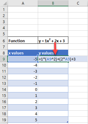
How to Graph an Equation / Function in Excel
Set up your Table
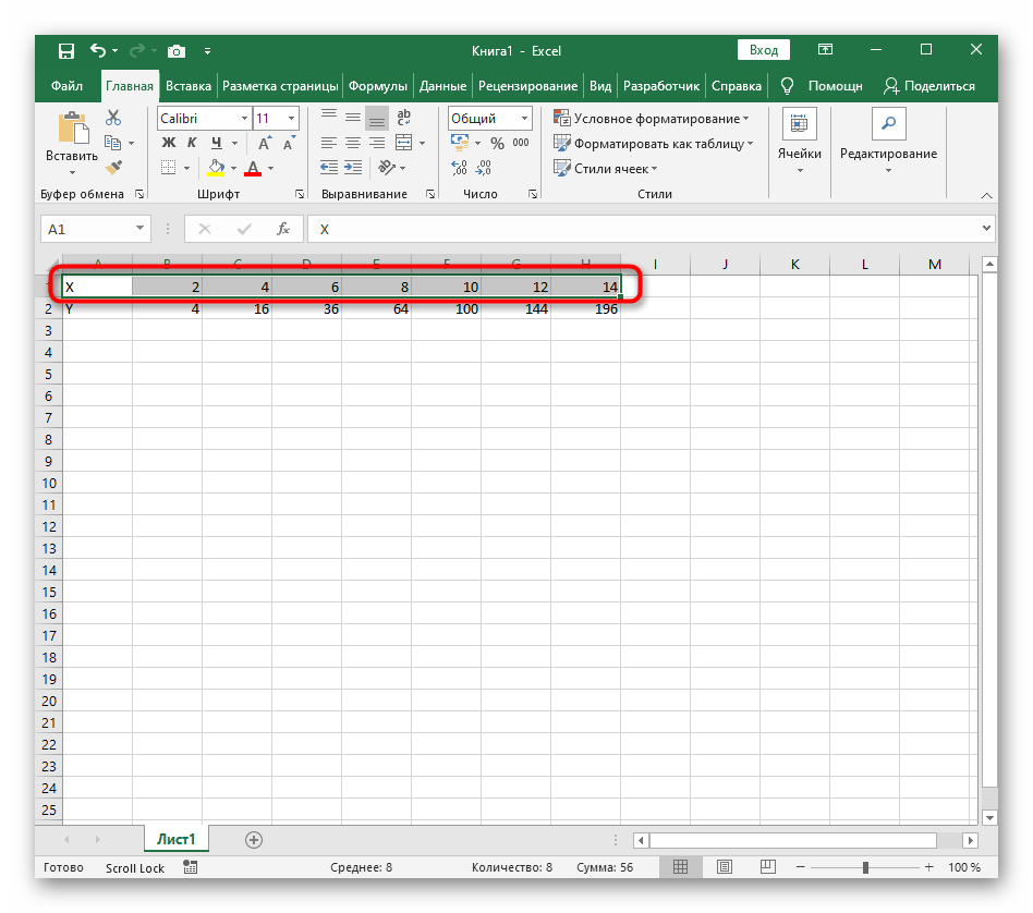
- Create the Function that you want to graph
- Under the X Column, create a range. In this example, we’re range from -5 to 5
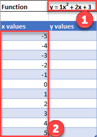
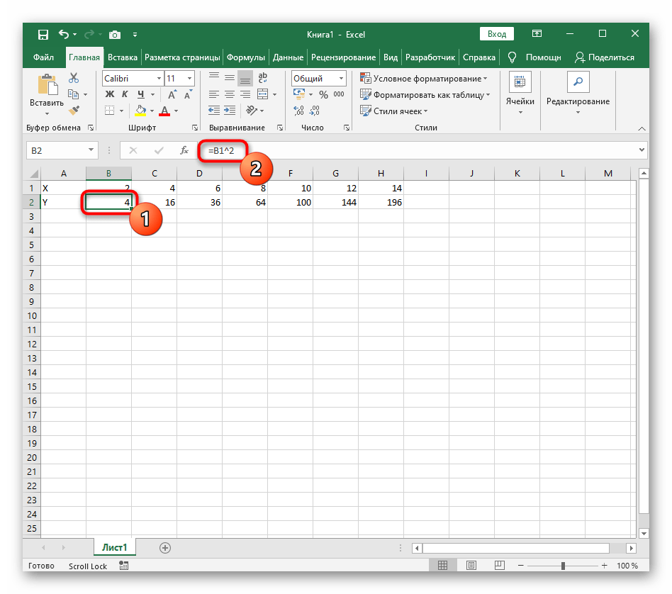
Fill in Y Column
Create a formula using the Function, substituting x with what is in Column B.
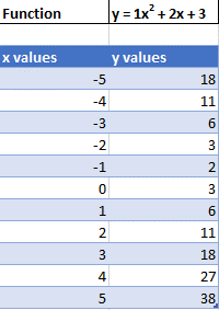
After using this formula for all the rows, you should have a table that looks like below.
Creating Scatterplot
- Highlight Dataset
- Select Insert
- Select Scatterplot
- Select Scatter with Smooth Lines
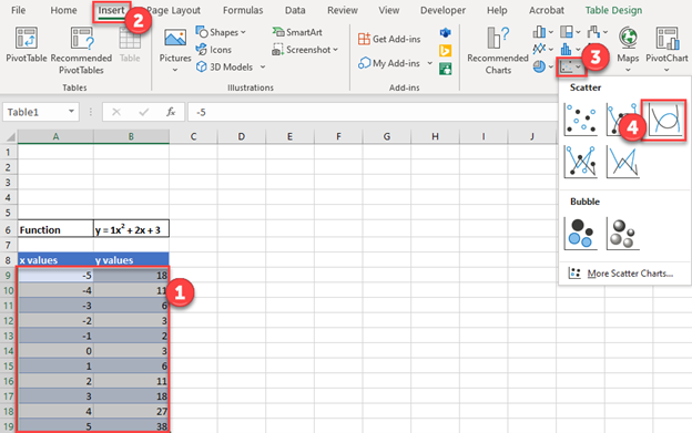
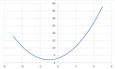
This will create a graph that should look similar to below.
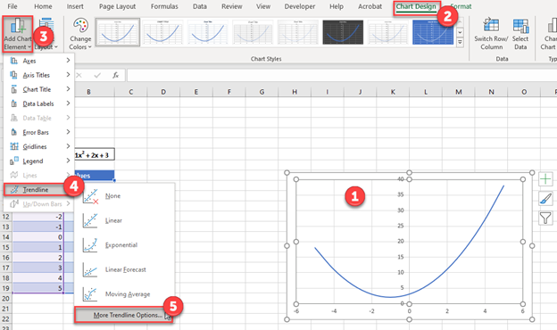
Add Equation Formula to Graph
- Click Graph
- Select Chart Design
- Click Add Chart Element
- Click Trendline
- Select More Trendline Options
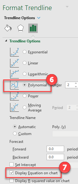
6. Select Polynomial
7. Check Display Equation on Chart
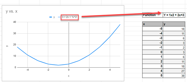
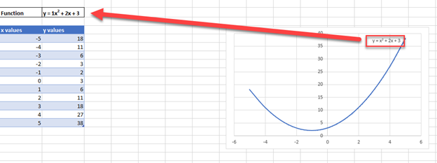
Final Scatterplot with Equation
Your final equation on the graph should match the function that you began with.
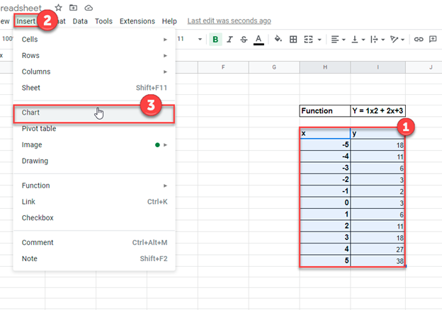
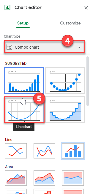
How to Graph an Equation / Function in Google Sheets
Creating a Scatterplot
- Using the same table that we made as explained above, highlight the table
- Click Insert
- Select Chart
4. Click on the dropdown under Chart Type
5. Select Line Chart
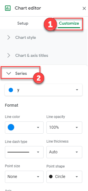
Adding Equation
- Click on Customize
- Select Series
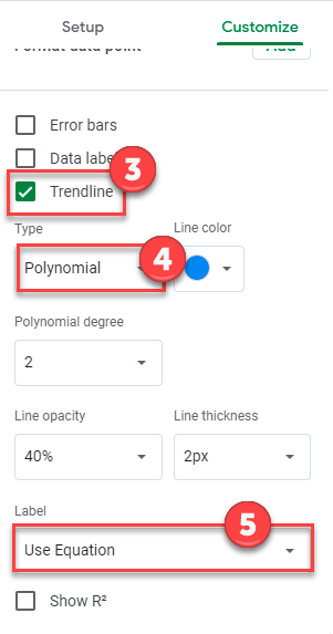
3. Check Trendline
4. Under Type, Select Polynomial
5. Under Label, Select Use Equation
Final Scatterplot with Equation
As you can see, similar to the exercise in Excel, the equation matches the function that we began with.
Источник
Business Calculus with Excel
Mike May, S.J., Anneke Bart
Section 1.4 Graphing functions with Excel
One area where Excel is different from a graphing calculator is in producing the graph of a function that has been defined by a formula. It is not difficult, but it is not as straight forward as with a calculator. It is a skill worth developing however. When we are given a formula as part of a problem, we will want to easily see a graph of the function.
We will walk through the process for producing graphs for three examples of increasing complexity. For the first example we have a specific function and specific range in mind, say (y=x^2-6 x) over (-10 le x le 10text<.>) For the second example, we would like to use parameters in the formula, for example, (y = a x^2 + b x + ctext<,>) with specified values of a, b, and c, and have the ability to easily change the values of the parameters and see the graph. For the third example we would also like to have the ability to change the domain, graphing over (xLow le x le xHightext<,>) where (xLow) and (xHigh) can easily be changed.
Example 1.4.1 . A basic graph.
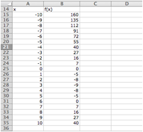
Graphing (y=x^2-6 x) over (-10 le x le 10)
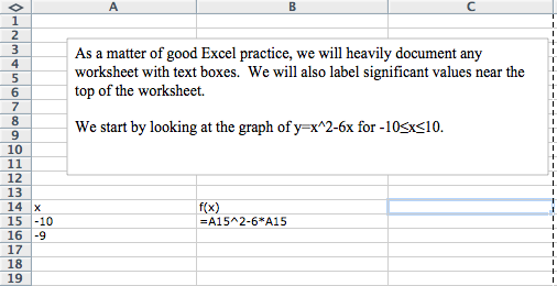
We start by producing a column for (x) and one for (f(x)text<.>) In the column for (x) we start with values (-10) and (-9text<,>) so that we can complete the column with a quick fill. Similarly, we start the (f(x)) columns in the first cell with the “ (x) ” replaced by the appropriate cell reference. In this case the formula for (f(x)) is in cell B15 and (x) is in cell A15 .
We then use quick fill and quick copy to fill out the table.
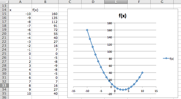
With the values of the cells filled in we highlight the cells we want to graph ( A14 through B35 ) and add a scatter plot for the highlighted values.
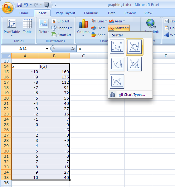
(The location of the scatterplot will be a bit different with Macs. The scatterplot is in the Charts ribbon, under other, on Macs.) This gives the desired graph.
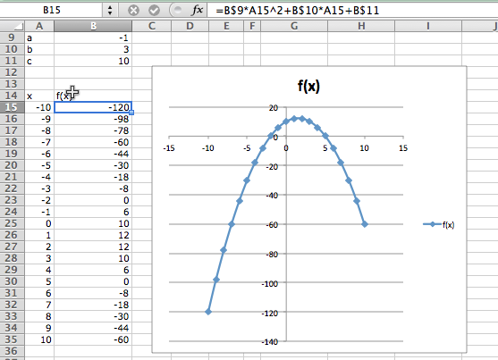
Example 1.4.3 . A graph with parameters.
Graphing (y=x^2-6 x) as an example of (y = a x^2 + b x + c) over the domain (-10 le x le 10text<.>)
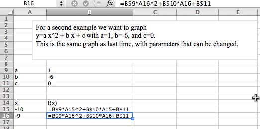
For the second example, we want the same graph, but we want the ability to easily convert the graph of our first quadratic into a different quadratic function. The solution is to consider (atext<,>) (btext<,>) and (c) to be parameters that we can change.
Toward the top of the worksheet, we put the labels (atext<,>) (btext<,>) and (ctext<,>) and give values for those parameters. In this case the values of (atext<,>) (btext<,>) and (c) are in cells B9 , B10 , and B11 respectively.
Now we set up the problem in the same way we did above except that we are using absolute references for (atext<,>) (btext<,>) and (ctext<,>) and relative references for (xtext<.>)
Now, we once again do a quick fill to complete the table, and then add a scatterplot.
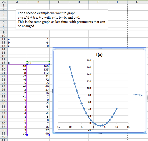
The difference with this second example is that if I now want to look at the graph of (y = -x^2 + 3 x + 10text<,>) I simply change the values of the parameters (atext<,>) (btext<,>) and (ctext<.>)
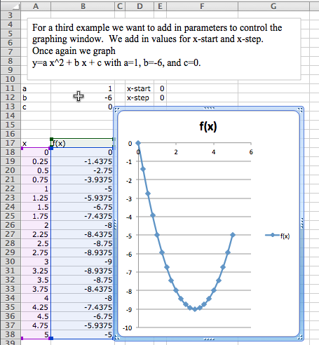
Example 1.4.5 . Controlling the viewing window.
Graphing (y=x^2 — 6 x) as an example of (y = a x^2 + b x + c) over the domain (-10 le x le 10text<,>) but with the ability to easily change the domain of the graph.
Often, when we graph, we will want to change the domain of the graph. Most easily, I may want to zoom in on a particular region to get a better view of some interesting feature. I may want to look closely at several different regions.
To do this we will again plot 21 points, but we want to have control of the starting point and the change in x between the first and second points. First we add labels and values for x-start and x-step . Then we need a bit of care in defining the values of (xtext<.>) The first value of (x) (cell A18 ) is the value of x-start . Every other value of x is defined as the previous value of x plus the value of x-step .
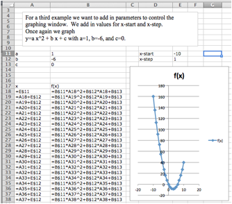
In this case I want a better look at the vertex of the parabola. I decide I want to see the graph for (0 le x le 5text<.>) My value for x-start is 0. My value for x-step is one twentieth of the distance from 0 to 5, or ((5-0)/20 = 0.25text<.>) I plug those values in and see the graph.
Example 1.4.7 . Graphing more than one function.
We would also like to put two or more graphs together. For our examples, we will want to use the functions (f(x) = x — 3text<,>) (g(x) = (x^2 — x)/10text<,>) and (h(x) = x^3 — xtext<.>) We start by using the procedure given above to make a chart of values for the three functions.
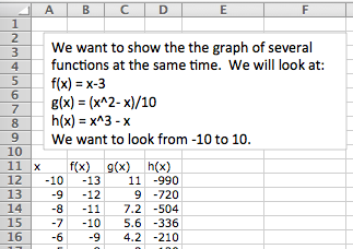
We then simply select the cells for (x) and the functions we want graphed together and produce a scatterplot as before. (To graph (g(x)) and (h(x)) together, we want to select the columns for (xtext<,>) (g(x)text<,>) and (h(x)text<.>) )
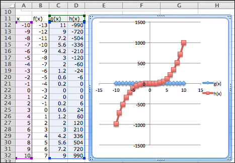
One problem with the graph of (g(x)) and (h(x)) together is that the functions have different orders of magnitude, so we do not see that (y = g(x)) is a parabola. One remedy is to use a secondary axis for the graph of (h(x)text<.>) (Simply double click on one of the points for (h(x)text<,>) and select secondary axis from the axes tab.)

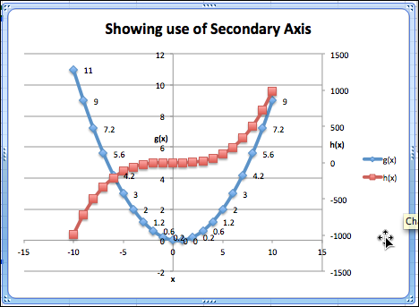
Formatting a chart.
Excel has a lot of ways to add formatting to a graph or chart, many more than we want to be concerned with at this point. We simply point out a few and leave it to the reader to explore how this should be used for a good visual presentation. If you click once on the chart to select it, the Chart tab in the home ribbon, adds sub-tabs for layout and format. With Chart Title, you can add a title to the chart, then edit it. The Axes icon allows you to add titles for the axes. If you select a data point form (g(x)text<,>) you can then use the Data Labels icon to add values next to the points. The chart with these annotations is given below. The rule of thumb to follow is to add enough annotations for a reader to be able to easily understand what is happening in the chart.
It is also worthwhile to note that you can manually set the y-range of a graph by double clicking on the axis and setting the values. This is particularly useful of the function has a vertical asymptote.
Online graphing tools: Wolfram Alpha.
Throughout this book, we are limiting ourselves to mathematical tools that the student can reasonably expect to find in a generic work environment. That is one of the reasons for focusing on using spreadsheets and Excel. A second reason is that we will spend a significant amount of time on functions defined by data points, where we then try to construct a formula. However when we are starting with a formula, there are easier ways to produce a graph. The simplest is to use the free website, Wolfram Alpha  3  . For example to obtain a graph of the functions (f(x) = x^2 — 3 xtext<,>) as (x) ranges from (-5) to (5text<,>) we simply type “ plot x^2 — 3 x for x from -5 to 5 ” and obtain:

We will return to Wolfram Alpha from time to time, when we have nice formulas to manipulate.
Exercises Exercises 1.4 Graphing functions with Excel
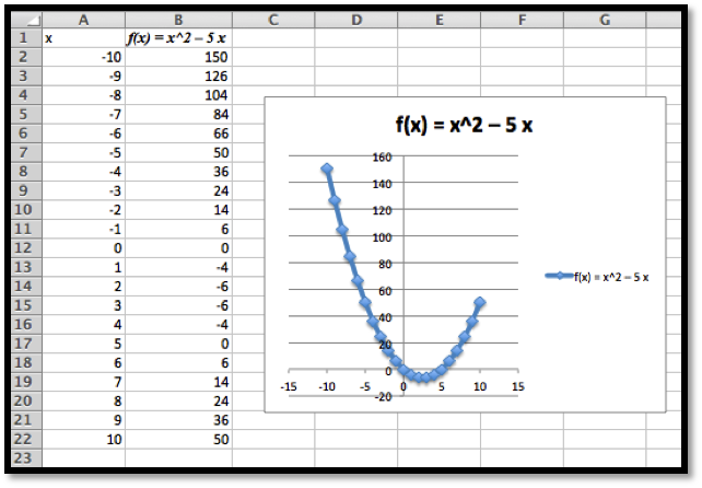
Produce a worksheet that with a graph of the function (f(x) = x^2 — 5 xtext<,>) with (x) going from -10 to 10 by 1.
The entry in cell B2 is =A2^2-5*A2 ; remember to use quickfill to complete the table
Produce a worksheet that with a graph of the function (g(x) = (x^2 — 5 x)/(x^2 + 7 x + 10)text<,>) with (x) going from -10 to 10 by 1. Explain why the graph is inaccurate. (Pay attention to places where there should be asymptotes.)
2* – Extra credit) — Fix the graph from problem 2 by adjusting the set of (x) -values used.
Produce a worksheet with a graph of (h(x) = x^3 + a x^2 + b x + c) for (x) from -10 to 10, where the values of (atext<,>) (btext<,>) and (c) can be changed and the graph will update automatically. For initial values, use (a = -2text<,>) (b = 1text<,>) and (c = -11text<.>)
The entry in B5 should be =A5^3+$B$1*A5^2+$B$2*A5+$B$3 . Note that the references to (atext<,>) (b) and (c) are absolute references.

Produce a worksheet with a graph of (k(x) = (x^2 + a x + b)/( x + c)) for x from -10 to 10, where the values of (atext<,>) (btext<,>) and (c) can be changed and the graph will update automatically. For initial values, use (a = -5text<,>) (b = 2text<,>) and (c = -11text<.>)
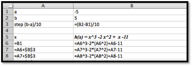
Produce a worksheet with a graph of (h(x) = x^3 -2 x^2 + x -11) for (x) going from a to b, where the values of (a) and (b) can be changed and the graph will update automatically. For initial values, use (a = -5) and (b = 5text<.>)
The entries are (a) and (btext<,>) and the step size. We assume here that we are using 10 points to create a graph.
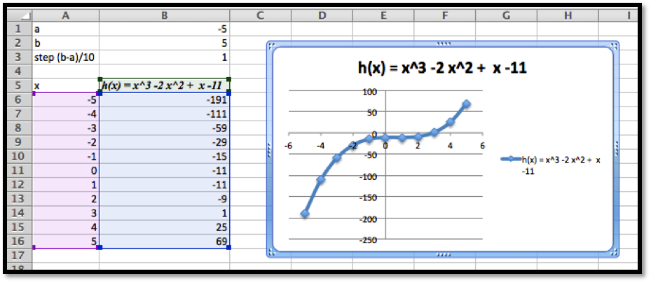
The data and the graph looks as follows, and changing (a) and (b) allows us to quickly find several different graphs of the same function.
Produce a worksheet with a graph of (k(x) = (x^2 -5 x + 2)/( x -11)) for (x) going from (a) to (btext<,>) where the values of a and b can be changed and the graph will update automatically. For initial values, use (a = -5) and (b = 5text<.>)
(Writing assignment) Write a report of 2 pages or less on the graph of the function (f(x) = (x^2 + 7 x + 10)/(x^2 — 3 x +2)text<.>) The report should be in Word (or other word processor) format with at least 2 graphs that illustrate different features by looking at different viewing windows.
Produce a worksheet with graphs of (f(x) = 2 x + 5) and (g(x) = x^3 — 9 xtext<,>) for x going from -10 to 10. Use secondary axes so that both graphs use the full plotting window.
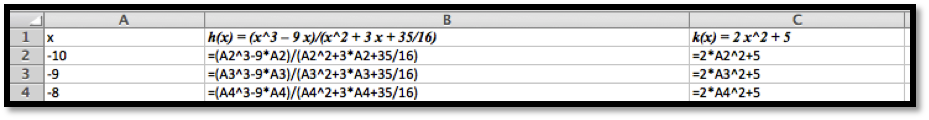
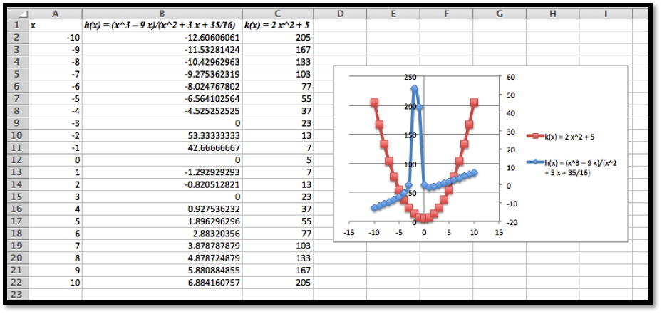
Produce a worksheet with graphs of (h(x) = (x^3 — 9 x)/(x^2 + 3 x + 35/16)) and (k(x) = 2 x^2 + 5text<,>) for x going from -10 to 10. Use secondary axes so that both graphs use the full plotting window. Adjust the range of (y) values used to make the graph reasonable.
The entries should look like this:
Using secondary axes we are able to show the important feature of each of the graphs.
Produce a worksheet with graphs of (f(x) = 2 x + 3) and (g(x) = -2 x +5text<,>) for (x) going from -10 to 10. Add a title to the chart. Do something interesting with the fonts or other options and explain what you did.
Use Wolfram Alpha to produce a graph of (f(x) = x^3 — 16 xtext<,>) for (x) going from -5 to 5. Use your favorite screen capture software and paste the result into an Excel worksheet.
Using Wolfram, the command and the resulting graph look like this:
Источник
Return to Charts Home
This tutorial will demonstrate how to graph a Function in Excel & Google Sheets.
How to Graph an Equation / Function in Excel
Set up your Table
- Create the Function that you want to graph
- Under the X Column, create a range. In this example, we’re range from -5 to 5
Fill in Y Column
Create a formula using the Function, substituting x with what is in Column B.
After using this formula for all the rows, you should have a table that looks like below.
Creating Scatterplot
- Highlight Dataset
- Select Insert
- Select Scatterplot
- Select Scatter with Smooth Lines
This will create a graph that should look similar to below.
Add Equation Formula to Graph
- Click Graph
- Select Chart Design
- Click Add Chart Element
- Click Trendline
- Select More Trendline Options
6. Select Polynomial
7. Check Display Equation on Chart
Final Scatterplot with Equation
Your final equation on the graph should match the function that you began with.
How to Graph an Equation / Function in Google Sheets
Creating a Scatterplot
- Using the same table that we made as explained above, highlight the table
- Click Insert
- Select Chart
4. Click on the dropdown under Chart Type
5. Select Line Chart
Adding Equation
- Click on Customize
- Select Series
3. Check Trendline
4. Under Type, Select Polynomial
5. Under Label, Select Use Equation
Final Scatterplot with Equation
As you can see, similar to the exercise in Excel, the equation matches the function that we began with.