
Excel Chart Templates — Free Downloads

PINE BI: Ultimate Excel Charting Add-in: Insert custom charts with a simple click & other charting tools!
Excel also allows almost unlimited chart customizations, by which you can create many advanced chart types, not found in Excel. Below you will also find these advanced chart templates available for download.
You will also find some chart templates available for download for standard Excel charts.
Instead, click here if you are looking for information about creating, saving, and using Chart Templates within Excel.
Advanced Chart Templates

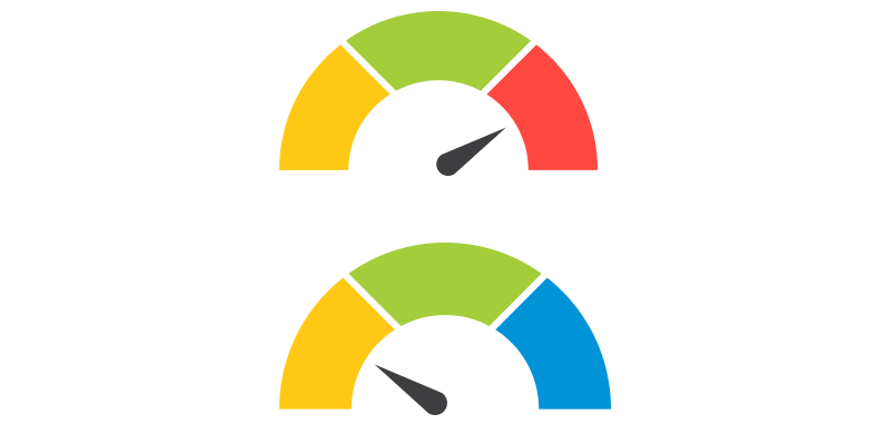
Gauge Chart
Also known as: Dial Chart, Speedometer Chart
Description: Gauge charts use needles to show information as a reading on a dial. They are often used when comparing KPIs or business results against a stated goal.
Learn More: Gauge Chart Tutorial
Gauge Chart Builder Add-in
7 Different Gauge Chart Templates. 5 Style Presets. 9 Color Palettes. Fully customizable.

Tornado Chart
Also known as: Sales Funnel Chart, Butterfly Chart
Description: A Tornado Chart is a modified version of the bar chart where the data categories are displayed vertically in a way that resembles a tornado.
Learn More: Tornado Chart Tutorial

Burndown Chart
Also known as: N/A
Description: Burndown charts represent work left to do vs. time. It is useful for predicting when all work will be completed.
Learn More: Burndown Chart Tutorial

Step Chart
Also known as: N/A
Description: A Step Chart is a line chart that uses vertical and horizontal lines to connect data points in a series, creating a step-like progression.
Learn More: Step Chart Tutorial

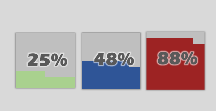
Thermometer Chart
Also known as: Goal Chart
Description: Thermometer charts show the current completed percentage of a task or goal relative to the goal.
Learn More: Thermometer Tutorial

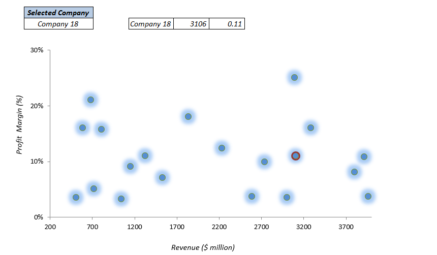
Quadrant Chart
Also known as: N/A
Description: Quadrant charts are scatter charts with a background that is divided into four equal sections, allowing you to categorize data points into the four quadrants
Learn More: Quadrant Tutorial

Ogive Chart
Also known as: Cumulative Frequency Graph
Description: Ogive charts are graphs used in statistics to illustrate cumulative frequencies.
Learn More: Ogive Chart Tutorial

Bullet Chart
Also known as: Steven Few’s Bullet Graph
Description: A modified column or bar chart used for tracking performance(s) against goal(s). Alternative to Gauge chart.
Learn More: Bullet Chart Tutorial

Mekko Chart
Also known as: Marimekko Chart, Mosaic Plot
Description: 2D stacked chart where the column width usually represents the relative size of a segment and the height breaks down each segment.
Learn More: Mekko Chart Tutorial

Normal Distribution Curve
Also known as: Bell Curve, Gaussian Curve, Bell Plot
Description: Symmetrical graph that illustrates the tendency of data to cluster around the mean.
Learn More: Bell Curve Tutorial

Stem and Leaf Plot
Also known as: Stemplot
Description: Diagram that splits each data point into a «stem» (the first number(s)) and «leaf» (usually last digit) to display the frequency distribution of a data set.
Learn More: Stem and Leaf Tutorial

Polar Plot
Also known as: N/A
Description: A polar plot is used to define points in space within what is called the polar coordinate system.
Learn More: Polar Plot Tutorial

Venn Diagram
Also known as: N/A
Description: A Venn Diagram uses circles to show relationships among sets where sets have some commonalities.
Learn More: Venn Diagram Tutorial

Panel Chart
Also known as: N/A
Description: Panel charts are charts that have multiple regions, each region displaying a different set of data, rather than showing all data in a single region.
Learn More: Panel Chart Tutorial

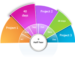
Timeline Chart
Also known as: Milestone Chart
Description: Timeline charts are used to visualize status of projects in chronological order.
Learn More: Timeline Chart Tutorial

Progress (Bar and Circle) Charts
Also known as: N/A
Description: Progress charts are used to display your progress towards a goal.
Learn More: Progress Chart Tutorial

Population Pyramid
Also known as: N/A
Description: Population Pyramids are used to visually display subsets within a population.
Learn More: Population Pyramid Tutorial

Excel Basic Chart Templates

Column Charts
Description: A Column Chart is a data visualization where each item is represented by a rectangle, where the magnitude of the values determines the height of the rectangle.
Learn More: Column Chart Tutorial

Bar Charts
Description: A Bar Chart is a data visualization where each item is represented by a rectangle, where the magnitude of the values determines the width of the rectangle.
Learn More: Bar Chart Tutorial

Area Charts
Description: An Area Chart is similar to a line chart, except the area below the line is colored in to emphasize magnitude.
Learn More: Area Chart Tutorial

Line Charts
Description: A line chart is a graph that uses lines to connect individual data points over a time interval.
Learn More: Line Chart Tutorial

Pareto Chart
Description: A Pareto Chart is a hybrid of column and line charts that displays the relative importance of factors in a data set.
Learn More: Pareto Chart Tutorial

Waterfall Chart
Also Known As: Bridge Chart, Flying Bricks Chart, Cascade Chart, or Mario Chart
Description: A Waterfall Chart visually breaks down the cumulative impact of sequential positive or negative values on a final outcome (ex. various income and expense items on the final profitability).
Learn More: Waterfall Chart Tutorial

Sales Funnel Chart
Description: A Sales Funnel Chart dissects different stages of a process, typically sorting the values in descending order (from largest to smallest) in a way that visually looks like a funnel—hence the name.
Learn More: Sales Funnel Chart Tutorial

Candlestick Charts
Description: A candlestick chart shows the open, high, low, close prices of an asset over a period of time.
Learn More: Candlestick Chart Tutorial
Plot a course for interesting and inventive new ways to share your data—find customizable chart design templates that’ll take your visuals up a level. Whether you use charts in research, in presentations, or to keep track of personal projects, there’s a chart template that’ll help you get started.

Document your data easily with customizable chart designs
Charts serve a lot of purposes: To display data, to keep track of plans and goals, to impart and organize information. Charts can also be kind of a snooze. But they don’t have to be. Start all your chart plotting with a designer-created customizable template. Charts aren’t strangers to presentations; businesses of all sizes often find themselves in need of audience-ready charts. Starting with a template is a great way to get clear, quality charts every time. Charts can be a great way to share data quickly and visually at a glance. Try them out in resumes, sales materials, and anywhere else high-level data needs to be organized.
Excel Chart Templates are great! This page is yours when you need to use dynamic, interactive charts and graphs! With the help of data visualization, you can support decision-makers.
Table of contents:
- 25+ Free Excel Chart Templates
- How to build a chart template in Excel
- How to use chart templates
- Manage templates
All charts are free, and you can download and use them quickly. However, if you are working on an Excel dashboard, you should have to use them. This section is built (not just) for pros. You can create all the demonstrated charts from the ground up, but we recommend using free templates.
This definitive guide will help you how to tell stories with data using charts and graphs. If you are looking for ready-to-use chart templates, check the list below!
Sankey Diagram (Flow Diagram)
The Sankey diagram is a high-level data visualization tool, not just in Excel. We use it to show the flow of resources. The main advantage of using it is that the flow chart enables you to show and analyze complex processes visually.
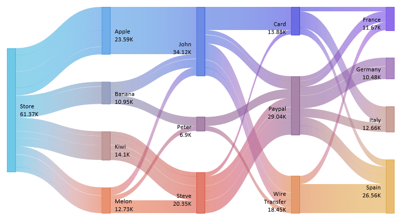
You can select blocks to highlight the selected path and generate custom views, which is useful for decision-making support. The visualization is dynamic, so you can build various scenarios without rebuilding the chart.
Stream Graph
You can create various graphs in Excel, like a stream graph based on a standard stacked area chart. If you are working with numeric data types, a streamgraph is a smart choice to show the evolution of a variable on a flowing shape.
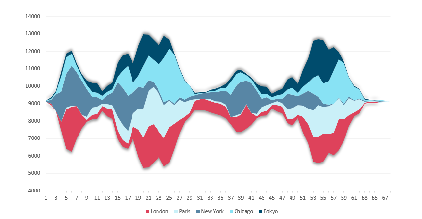
If you want to understand how the stream chart works quickly, you can imagine that you want to see how sales have evolved over a given period in multiple locations.
We rarely use area or stacked area charts in Excel, but the exception proves the rule! Nevertheless, the graph is famous; you can create it in Excel, Power BI, Java, Python, or R to present your data in a visually-effective way.
Read more on how to build it.
Dynamic Chart Template with Rollover Hyperlink Effect
Everyone loves advanced dynamic charts! Take a closer look at the template. If you want to visualize multiple periods on a chart, we recommend using the “mouse-over” method.
First, create a Named Range for the actual selection. After that, create a line chart using the dynamic range. Next, carefully plan the Design of the navigation area. Finally, implement the hyperlink rollover effect using the Excel HYPERLINK and ISERROR functions.
Here is the guide on how to build it.
Mekko Chart (Market Segmentation Graph)
The Marimekko chart is the most powerful tool for looking at the overall market. It helps drive discussions about growth opportunities and is known as a market map. You can segment an industry or company by customer, region, or product.
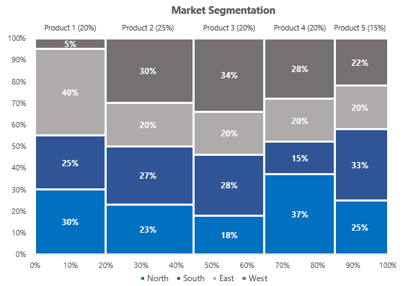
It makes it easy for your audience to understand each part or bar’s relationship to the total. The graph breaks down a market by combining multiple bars into a single map using a variable-width 100% stacked bar chart. In the example, you’ll learn how to convert sales data of each region across different products. It’s easy to calculate the individual parts of total sales. Read our definitive guide!
Bubble Chart Template
A bubble chart is a member of a scatter chart type. In this case, we replace the data points with different size bubbles. We recommend using it to visualize your project milestones or sales over time.
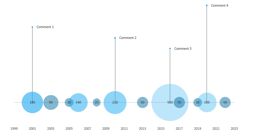
Prepare and organize your data, then insert a bubble chart. Next, create data points for the chart labels (comments). Next, modify the label positions and clean the chart. Then create error bars to connect the bubble chart and the labels. Finally, add values and the description for the comment labels.
Read more.
Radial Bar Chart
A radial bar chart in Excel provides easy comparison options for multiple categories. Use the circular bar template to show the sales visually effectively. Unfortunately, Excel does not support this chart template by default, but no worries!

Click on the chart, and select a data point. Next, Right-click, choose the Select Data option and swap rows and columns. After that, you can apply the No Fill option on all rings. Read our step-by-step guide and download the template to learn more about comparing categories.
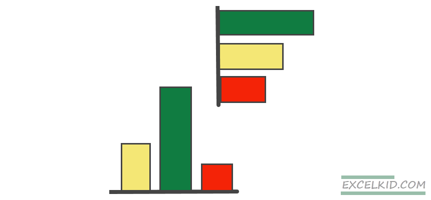
Conditional Bar Chart Template
Learn how to create a grouped chart to analyze the variance. Excel’s conditional formatting is a great feature; we recommend highlighting the plan vs. actual data. In the example, the first series is based on the actual data for the sales of five products. First, use the MAX function to find the largest data in a range. After that, highlight the maximum value using blue. The chart on the right side shows the variance.
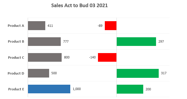
Let’s see the trick! Select the chart! Right-click and click ‘Format data series.’ Under the Fill group, select the ‘Invert if negative’ checkbox. Pick your preferred colors! If the value is positive, use green as usual. Elsewhere we’ll apply red. Right-click and choose the Group command from the context menu. That’s all! Take a closer look at the template and download the practice file.
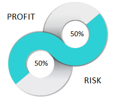
Progress Circle Chart
Sometimes simplicity is the ultimate sophistication. For example, you can combine two doughnut charts and apply custom formatting to create infographic-style visualization in Microsoft Excel.
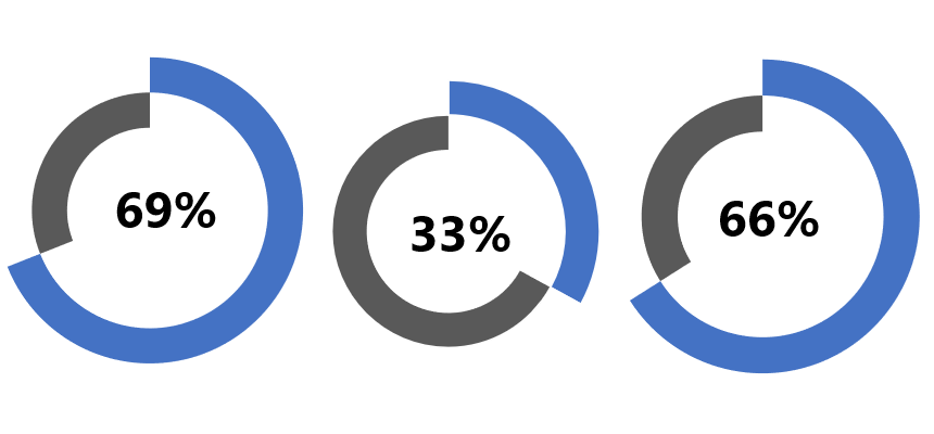
The main advantage of using progress charts is saving space on the main dashboard screen. So, first, learn how to build this stunning graph in minutes and save it as a reusable Excel template. Then, if you are in a hurry, download the template.
Panel Chart (Small Multiples)
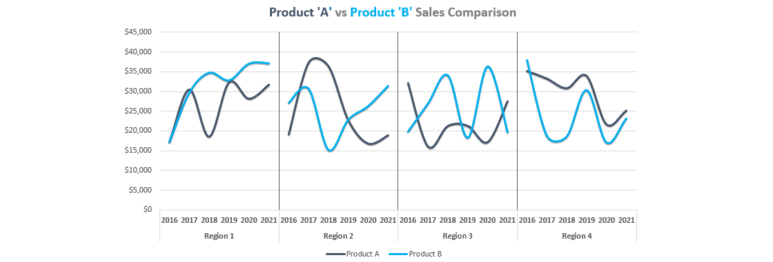
Take a closer look at the small multiples (panel charts). This tutorial will show how to create a proper layout for your data to create a panel chart in Microsoft Excel. Instead of a busy line or column charts, you’ll get grouped graphs. To build sales comparisons, make your data table first. After that, summarize your data. Finally, calculate the position of the dividers for the x-axis. The best thing is that you don’t need to use pivot tables. Instead, check our step-by-step tutorial and create your chart template!
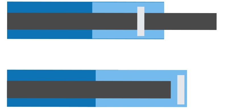
Progress Bar Chart (Score Meter Template)
The horizontal progress bar chart (or score meter template) shows the actual value on a percentage scale. You can create it using a few simple steps using stacked bar charts.
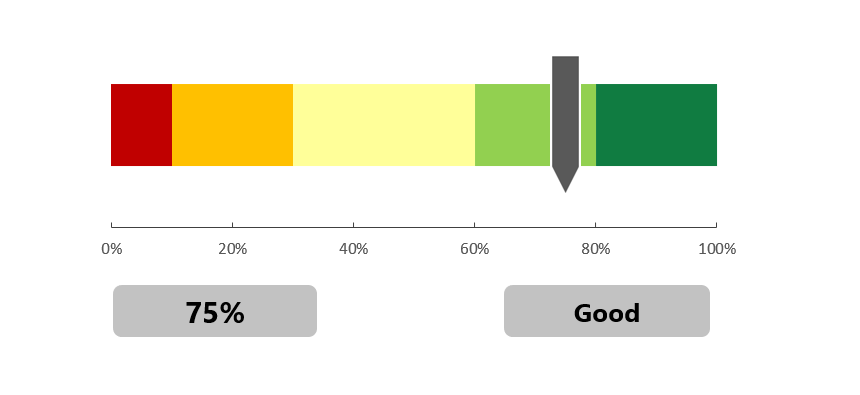
Insert a stacked bar chart, then add two additional series to create an indicator clearly showing the selected value. Using different colors, you can create multiple categories, for example, quality scales. Learn more about this template.
People Graph

Do you like infographics? Use the people graph instead of columns or bars to present your data set using shapes and icons. The result is a great-looking chart. So, it’s easy to tell a story based on your data. Please take a closer look at our latest infographics. The article provides free Excel chart resources. Excel 2013 and above versions are required to use this chart template. You can find the add-in under the ‘Insert Tab.’ Select the data range, then click on the people graph icon. A new chart will appear; you can apply various formatting tricks like themes, shape styles, and colors.
Conditional Formatting Bar (or Column) Chart Template
If you want to create an advanced bar or column chart based on conditional formatting, the following template is for you! Define groups and apply the RAG reporting standard using red, amber, and green colors.
The first step is to create a conditionally formatted chart to define intervals and create groups using the IF function. Next, insert a bar or a column chart, depending on your visualization. Another important step is to format chart series and customize the gap with and the overlap between series. As a last step, you can apply different color schemes for each group.
Learn more about the relationship between conditional formatting and Excel charts.
Forecast Chart
The next one is a basic chart template. For example, in some cases, you want to show the actual and forecasted values on the same graph. What’s the secret?

Create three series and use the IF function. If the latest data point (value) exceeds the actual value, apply a green arrow elsewhere and use a red marker. To build it, we’ll combine three simple line charts to create a forecast. Read the guide!
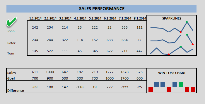
Sparklines
Use sparklines to show data trends! In a nutshell, sparklines are tiny in-cell graphs. With its help, you can show powerful insights in a small space, which is important if you want to tell your story on a single page. In Excel, we use three types: line, column, and win/loss.

It is good to know that a sparkline is not a chart object; instead, it exists as a shape within a cell.
Read more about sparklines!
Gauge Chart
The gauges (speedometers) logic is simple: it provides information about a single data point (value). Therefore, using red, yellow, and green colors (that follow RAG reporting – red, amber, green), it’s easy to compare the actual value to a goal (plan value). We have said quite many times why we love this chart type.

Note: a Dual gauge can display more thane one KPI. It is helpful if you want to create a plan versus actual comparisons. Gauge charts are easy to readable and grab the attention of the audience. Almost all BI solutions use this graph to support strategic decisions.
Learn more about gauges!
Bullet Chart

What are bullet graphs? A bullet graph is an excellent alternative to gauges. The chart transforms data using length and height, position, and color to show actual vs. target using bands. Save more space using bullet graphs! Tell a story using segmented bar charts to display complex data. In our detailed guide, you can learn how to track progress easily. Check the example!
Waterfall Chart Templates
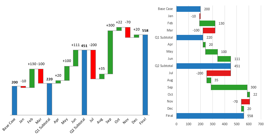
To support financial reports, you frequently use waterfall charts. Bridge charts are based on a combination chart. It is easy to build the graph in seconds if you have Excel 2016 or a newer version. For Excel 2010 and Excel 2013 users, we provide an in-depth guide and free templates.
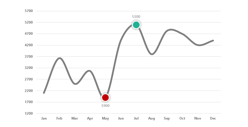
Highlight Data Points in a line or bar chart
Sometimes we need to highlight one or more data points in a line or a bar chart in Excel. The method is straightforward: create one or more additional series, find the high and low points, and finally use the NA function to hide the unnecessary data points. Format the marker to create stunning visualization in a few steps.
You can find more examples here.
Dynamic Charts
Sometimes we use dynamic charts to display the key metrics from a vast amount of data. Apply Excel Form controls (drop-down list, spin buttons, radio buttons) to improve your charts.
Use the first template to highlight a data point based on your selection. The second is a combination chart example; it uses two dynamic line charts and a bar chart. Finally, learn how to create interactive tooltips for your charts.
Learn more
Org Chart
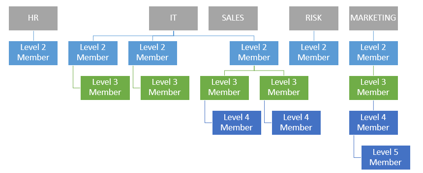
This template is a bit special. If you are working with Microsoft Excel, you’ll face some limits. Building a company structure from the ground up using SmartArt (built-in shape objects) is a time-consuming task. How to speed up your daily work and routine tasks? We know the correct answer. Use our free chart add-in and build an org structure in seconds. You’ll find a useful article about making a human map using powerful VBA tools. Get the add-in!
Traffic Light Chart Template
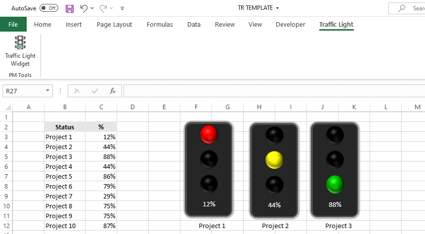
In Project Management, you have various tricks to track a project and show its actual status. First, you can apply a formula-based rule and traffic light icons in conditional formatting. Furthermore, there are color-formatted shapes to highlight the KPIs. The best way to implement a stoplight is by using automated charts. Learn how to use our free widgets and manage multiple indicators simultaneously. It’s a straightforward reporting tool.
Download
Waffle Chart Template
I met with the waffle chart several times while reading newspapers and magazines. Another name for them is a pie chart or square pie chart. However, a square or waffle chart template is a valuable alternative to other Excel charts.
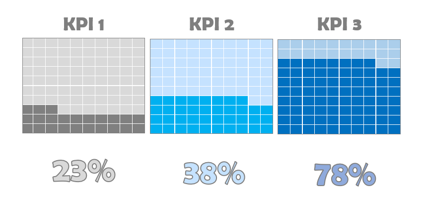
The most significant advantage of using a waffle chart is that it is exciting and forwards the attention to your dashboard. On the other hand, the way of inserting it into your document can be confusing. However, the chart contains information presented as cells and values, so it is tricky to clean it up and export it as a built-in Excel chart.
Pareto Chart
The Pareto chart demonstrates the relative weight of the examined factors and helps us focus the development effort on the most important factors. A few improvements in the key factors can bring larger results instead of working on less critical fields.
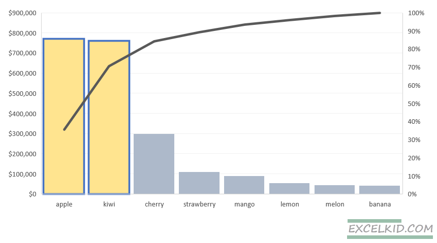
Learn more on how to create it.
How to build a chart template in Excel?
The goal is to build reusable charts! Things to do before creating a chart template and modifying existing charts:
- Get rid of junk parts: The newly inserted chart contains unwanted elements. Using proper chart formatting, you need to remove the extra legends, labels, borders, or grids.
- Create easy-to-read charts: To improve readability, format the chart first. For example, remove the background, and decrease the gap between bars.
To create a custom chart and store it as a template, save the graph as a template! After that, open a new project: your saved chart template will appear and be ready to use.
Steps to build a chart template in Excel:
- Create a default chart and customize it
- Right-click the selected chart, then select ‘Save as Template’
- In the File name box, add a name for the new chart template
- Click Save to save the chart as a chart template (*.crtx)
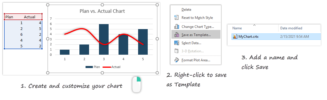
That’s easy! You’ll find your chart template in the templates folder from now on.
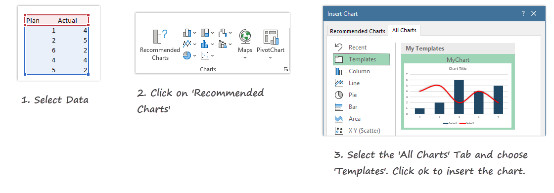
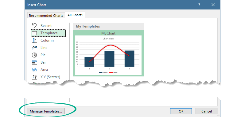
How to use chart templates
OK, now we have a chart template; let’s see how to use it!
Steps to apply a chart template:
- Select the data that you want to display
- Click on ‘Recommended Charts’ under the Insert Tab
- Select the All Charts Tab
- Choose the template
- Click OK
How to manage chart Templates
Excel will save all chart templates to your computer (local drive). You can find your prepared chart under the location below:
C:Users[username]AppDataRoamingMicrosoftTemplatesCharts
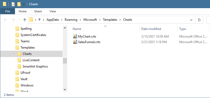
You can reach this folder directly also.
To get the Template Gallery from Excel, click the ‘Manage Templates’ button.
Delete the chart if it’s not necessary anymore.
Stay tuned.
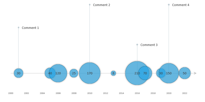
The timeline template uses a custom bubble chart, a great Excel visualization tool if you want to show data over time. For example, use the bubble timeline graph to identify trends, highs, and lows.
Track your team’s performance or your company’s market share over time. To create an easy-to-read graph in a few steps, follow our guide or download the template.
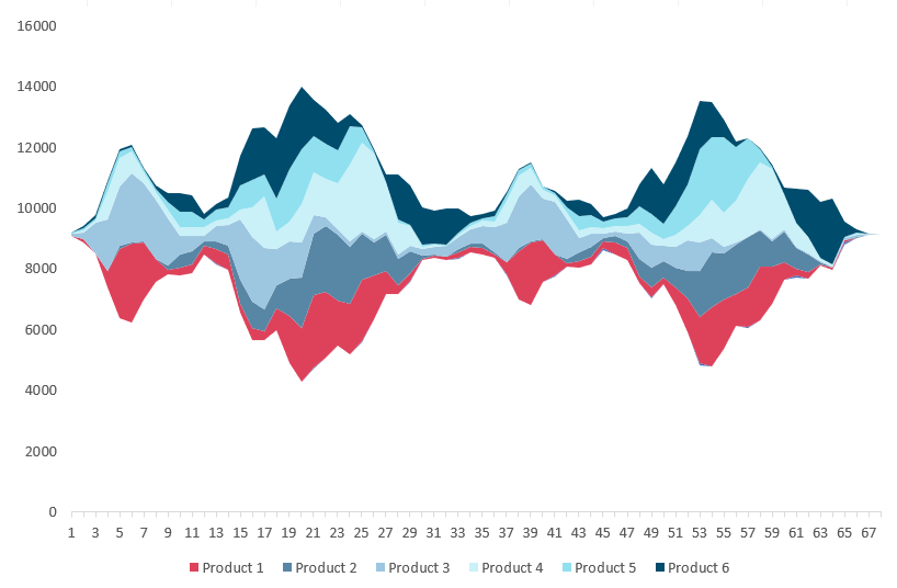
If you want to visualize a huge amount of data, use the stream graph. The chart is based on a stacked area chart and represents the evolutions of numeric values. The chart handles multiple categories and uses different colors to identify each series.
This tutorial covers creating a stream graph template step-by-step using Microsoft Excel.
In this guide, you’ll learn how to create a chart template using a cycle plot. The chart is great for comparison purposes. It’s a combo chart and uses error bars, line charts, and dummy series. We’ll prepare the data first then build a pivot table to create a layout for the template. Using a panel chart, we can manage multiple data series in a single graph.
It is not a standard, built-in Excel graph, but they’re not too hard to create. Our tutorial describes all the important steps to build a panel chart.
This Excel chart template is based on a combo chart. You can create gauges easily, and it’s only a few steps necessary. First, prepare your data set and build the zones for the given criteria. After that, insert a donut and a pie chart. Because we want to use a single data point for tracking KPIs, format the pie series. Let’s see the doughnut series. Use the red, yellow, and green scheme for the given slices. That’s all. Download the free chart template!
Speedometers are great alternatives to bullet charts. If you need to build a perfect dashboard, we strongly recommend using it. In this tutorial, you will learn how to build a widget from the ground up! We’ll talk about the simple formula that is behind the graph.
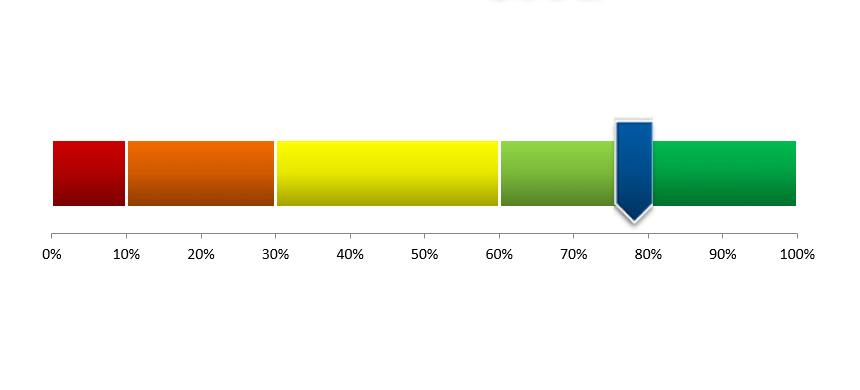
The score meter chart template is a smart chart that helps you to display values on a quality scale. Are you want to show your KPIs using a dynamic chart? You have to follow only a few steps! The template is based on multiple stacked bar charts. First, create a simple table for your data set. Split the range (from 0% to 100%) into five areas, like poor, uncertain, fair, good, and excellent.
You’ll use an array formula to decide that in the FREQUENCY column, what value will correspond to the actual value. Apply a custom color scale for each section from red to green. Your chart template is ready to use!
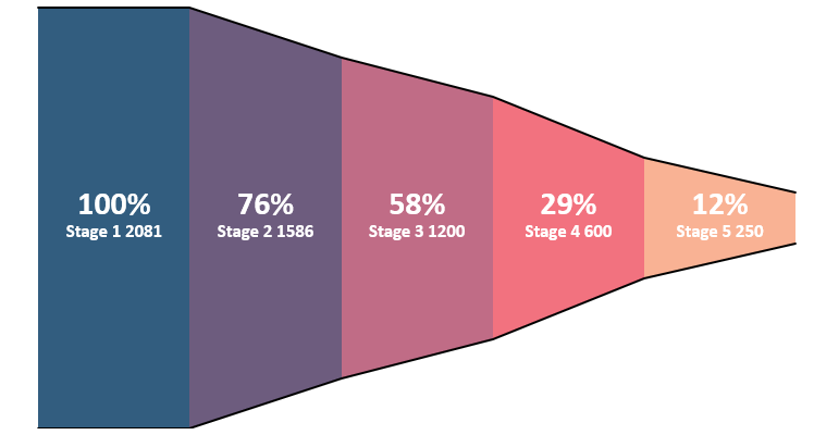
Sometimes we need to build custom charts. What if you want to analyze your sales funnel? As we mentioned above, some built-in Excel charts are outdated. The funnel a marketing tool that raises many interesting questions. The graph show areas using multiple levels in a process. If you are using Microsoft Excel, you have only a basic chart with limited functions. Read more about our automated solution! Get the best funnel chart that you have ever seen. Take a closer look at the video to see what is under the hood.
No one likes to work with useless reports. The Bullet Chart is one of the best usable chart types in Excel. It is a solution to reach your goal: creating a dashboard to show the data on a single screen. A bullet chart is an answer to this. At first glance, a gauge chart is a great tool, but it can be useful if you want to show only one data point. Otherwise, – if you need to show more than one value – a bullet graph is a widely accepted tool. It is the best possible choice for displaying the differences between plan vs. actual values. Is this simple little tool able to compete with it? It will turn out by the end of the article! You have to show all important KPIs on one page. So, the bullet chart is a great choice if you want to create Excel chart templates.

How to use conditional formatting on charts? Formatting cells is easy in Excel. Custom shapes can improve this useful function; you can highlight elements and build a dynamic chart template. As you know, Excel charts have some limits.
Take a closer look at the chart template; we will show you how all this is possible. In a nutshell, conditional formatting charts can do way more things than most of you think. Control your dynamic shapes using a small VBA code. Download the sample workbook, and play with the graph!
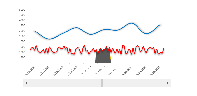
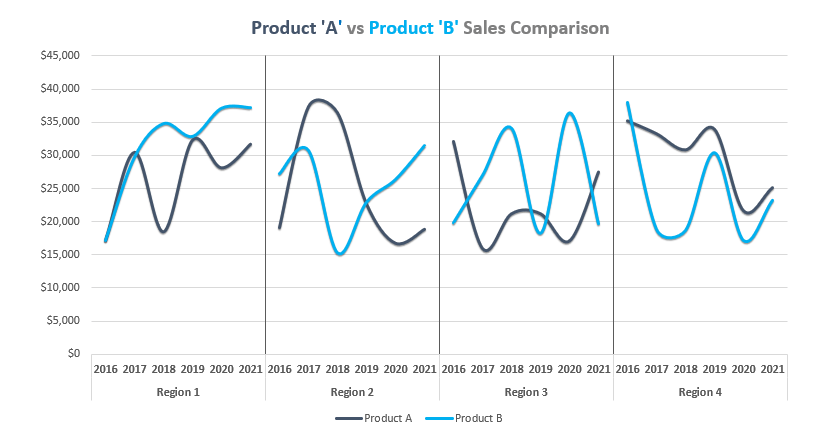
The scrolling period chart template helps you if you want to track a longer period and within it a highlighted period. There are two options to show the results of a period. The first one is when we create a detailed statement. This variant is especially for analysts, and every little detail is displayed on the chart.
In the second case, we are building a graph and only show the key events. The purpose of this is that the manager overviewing the report wouldn’t get lost in the details. You can make strategic decisions based on the graph. Good to know that it’s a combo chart; we need a line chart and an area type.

The org chart template is nothing else than a snapshot of the organized corporate structure. Not only Excel but Word and PowerPoint also contain tools for this job. Today’s article will show a quick solution. Using our small add-in, you can create an org chart with only a few clicks. If you have the mood, use VBA SmartArt objects to build advanced chart types in a short time.
You can achieve great results if we use Microsoft Excel to increase efficiency and reduce the time consumed by work. We spent a lot of time figuring out more and more automatization. The demonstrated example will show you again that Excel’s possibilities are almost endless. Download the chart tool!
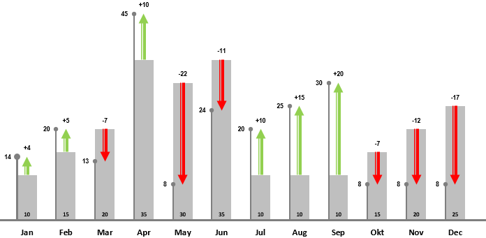
In this tutorial, you will learn how to transform bars into a stunning variance chart. If you are using a variance chart template, you only need to provide the actual value and the target value. For example, you want to compare the sales of two companies for the last 12 months. Note: we recommend you using combo charts for financial purposes.
How to create the template? As first, add data for the bars. We are using grey bars to display the plan value. On the lollipop chart, we’ll show the actual value. With the help of green and red arrows, it’s easy to show the differences. The green arrows are pointing upward, and the red arrows are pointing downward on the final chart. That is all! The template provides dynamic updates. If you change single or multiple values, the chart will reflect.

We are using variance charts in everyday work in Excel. Comparing the planned value with the actual value is your goal if you are in sales. The chart template is based on a modern report. Using a simple drop-down list, you can take a closer look at the sales performance by year. It’s a bit special because, under the hood, you’ll apply conditional formatting instead of a default chart.
We recommend you using Excel form controls to create advanced dynamic charts. With the help of a drop-down list, you can show two different periods on the same chart. It can be helpful if you have a small space for your chart. Don’t hesitate and download our free chart template.
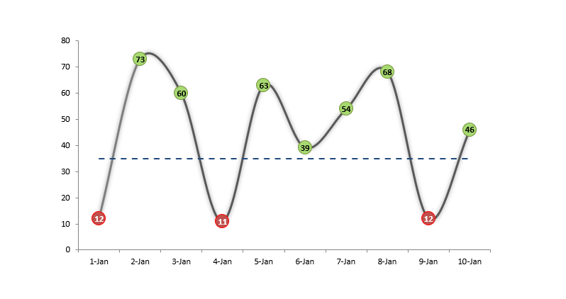
The conditional color chart template is an interesting experiment for extending Excel toolbox. Today’s article will help us in the solution of a very rare but important issue. So far we could mostly have the opportunity to use Excel conditional formatting function with cells, and with a little thinking we can easily make a spectacular Excel chart template also. What is this all about? When we color or assign distinctive signs the cells than we talking about conditional formatting. The aim of today’s presentation is to display values by assigning color codes in connection of if they are larger or smaller than a given parameter (average).
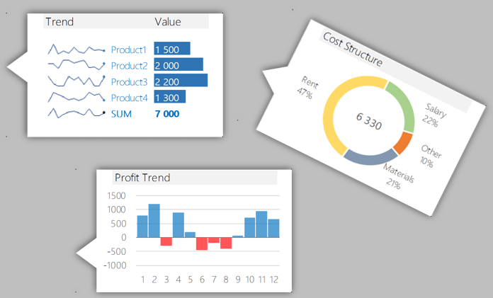
Would you like to see some great interactive charts and templates? With the help of these, the graphs speak for themselves. We were working hard to create better and diverse data visualizations for you. I hope you will find the result of today’s guide useful. Let us see the details: the sample data set is simple. There are income, expenses, and profit is the difference between these two. In the column Plan / Actual, we can see how the planned income and expenditures take shape compare to the actual data. In the last column, you can find the differences in percent. If the value is over 100 %, then we over-fulfilled the plan; obviously, this is the goal. The template uses linked picture technic.
Today’s presentation, the Quick KPI Chart will give you lots and lots of help if the phrase key performance indicator is not new to you. Small, Simple, Smart, Quick are the words that first come to mind when we think about an excel template or excel dashboard. Many people or even excel gurus think it is astoundingly complicated workflow to create an excel dashboard. Fortunately there are situations when we don’t have to struggle for making something spectacular. We’ll introduce such little trick in today’s article. We hope that after you have reached the end of the article and tried the excel template, again take a big step toward getting to know the possibilities of Excel. As you will see, there are no limits!
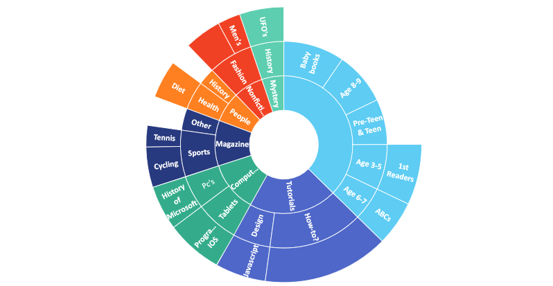
The sunburst chart comes in Excel 2016. The template is great if you are using a higher level of data visualization. In the example, you need to show hierarchical data in a circular format. On the graph, each level of the hierarchy is represented as a ring. In the article, we will show all the advantages of this smart chart: the items on the top-level show up in the inner ring.
Sub-categories are displayed as outer rings. Segments in each ring are sized proportionally using a value series. It’s easy to show multiple categories on a circular format graph. All right; starting with the basics, let us see how the sunburst chart template is good!
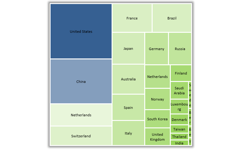
Excel Treemap Chart was introduced in Excel 2016. What if you are using Microsoft Excel 2013? In this version, it’s not a default chart. Our new chart utility is ready to use and works fine with Office 2013. With its help, you can create new – never-before-seen templates. Compare the sales by years, manage the risks easily!
From now on, you can create advanced heatmaps with zero programming skills. Otherwise, time-consuming tasks will turn into a daily routine. You will see why the treemap chart is universal. We don’t want to use up your patience, so let’s start right away!
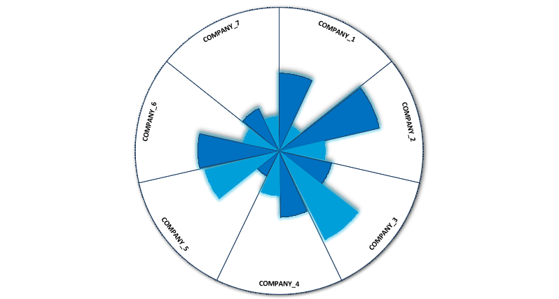
The radar chart shows multiple categories (scoring, risk, or sales) on one graph. It’s fully able for easy comparison. The solution, in a nutshell: All groups turn into points on the graph. The distance from the center displays the value of the score in the given category. A line connecting each data point in the category represents the data source. Multiple data sources become multiple colored areas on the chart. This guide will show you how to build a spider chart. The free editable worksheet is available for download!
From Excel 2013, you can use a new chart type named sparklines. Sparkline is mini charts located in single cells. Each cell shows a series of data in your range. It helps bring meaning and context to numbers being reported. Select the data and insert chart!
This type of graph – compared with classic chart templates – is meant to be embedded into what they are reporting.
To create new styles, use the Design tab on the ribbon and customize your sparklines to match whatever visual style you need. If you find a space-saving method, use sparklines instead of charts.
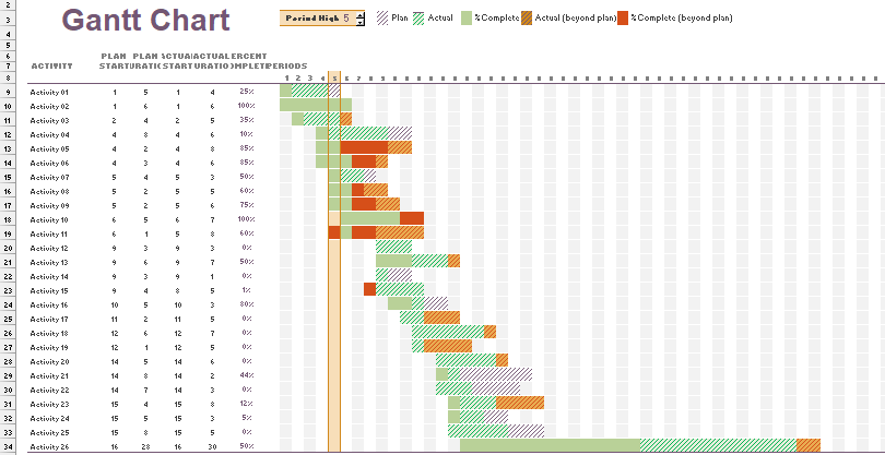
Gantt chart templates are useful tools for managing and scheduling projects in Excel. If you want to build a graph, you have two options. With a few steps, you can turn a simple bar chart into a Gantt Chart. In this case, Chart Formatting is important. As first, right-click on any of the bars on the chart to modify existing charts. Remove extra spaces between the graphs using the Gap Width. Another solution is based on conditional formatting. You can use different colors to highlight the task status.
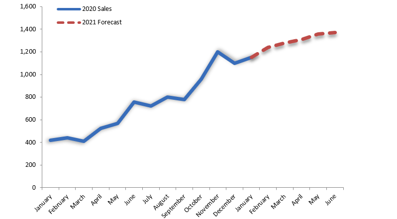
How to create a sales forecast chart in Excel? We need to show the actual value and the forecasted values on the same chart in some cases. In the example, we will show two graphs and apply a simple trick. The first graph shows the monthly data for two years. Insert a graph with two series. You can find the dates in column B. Enter the actual values in column C.
The main task is to leave some cells with blanks below. Now add the forecasted values in column D from that date down with blanks above. Format the two series the way you want them to appear. Use one line chart with solid and another line chart with a dashed line. If you want to insert new months, delete a forecast value and replace it with the actual value.
Free download ready-made examples of templates for dashboards, dynamic charts and diagrams with interactive functionality.
Dashboard and chart templates catalog
 Added value excel dashboard example free download
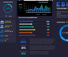 Dashboard for EBITDA analysis of investments in Excel download
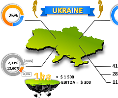 Presentation of cost of arable land download in Excel
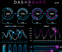
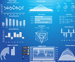 Cloud Audit Dashboard download free in Excel
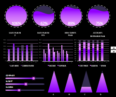
 Beautiful dashboard for brand strength analysis in Excel
 A simple example of creating infographic elements in Excel
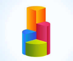 Data rating chart for visualization download in Excel
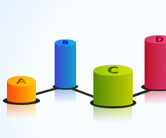 Ranking chart for data visualization download in Excel
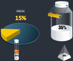 3D infographics for Excel presentation cheese sales report
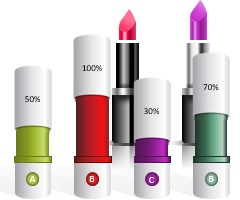
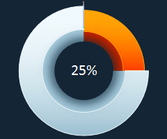 Easy example of 3D Pie chart with value than 100% in Excel
 Comparison chart and creating 20/80 infographics in Excel
 Associative techniques for visualizing data sampling in Excel
 Dashboard for diversification analysis and test of business niches in Excel
 Medical Dashboard for analysis of patient history in Excel
 Comparative analysis of sales by day of the week in Excel
 5 beautiful ideas for creating interactive infographics Excel
 Business Intelligence Dashboard for manager and sales in Excel
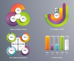 Dashboard for analyzing sales ranking factors in Excel
 Beautiful chart for presentation of reports in Excel
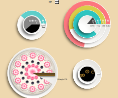 Download Cafe Products Sales Analysis in Excel template
 Chart with data visualization for laboratory work in Excel
1
2
3