
Excel for Microsoft 365 Excel 2021 Excel 2019 Excel 2016 Excel 2013 Excel 2010 Excel 2007 More…Less
Microsoft Office Excel has a number of features that make it easy to manage and analyze data. To take full advantage of these features, it is important that you organize and format data in a worksheet according to the following guidelines.
In this article
-
Data organization guidelines
-
Data format guidelines
Data organization guidelines
Put similar items in the same column Design the data so that all rows have similar items in the same column.
Keep a range of data separate Leave at least one blank column and one blank row between a related data range and other data on the worksheet. Excel can then more easily detect and select the range when you sort, filter, or insert automatic subtotals.
Position critical data above or below the range Avoid placing critical data to the left or right of the range because the data might be hidden when you filter the range.
Avoid blank rows and columns in a range Avoid putting blank rows and columns within a range of data. Do this to ensure that Excel can more easily detect and select the related data range.
Display all rows and columns in a range Make sure that any hidden rows or columns are displayed before you make changes to a range of data. When rows and columns in a range are not displayed, data can be deleted inadvertently. For more information, see Hide or display rows and columns.
Top of Page
Data format guidelines
Use column labels to identify data Create column labels in the first row of the range of data by applying a different format to the data. Excel can then use these labels to create reports and to find and organize data. Use a font, alignment, format, pattern, border, or capitalization style for column labels that is different from the format that you assign to the data in the range. Format the cells as text before you type the column labels. For more information, see Ways to format a worksheet.
Use cell borders to distinguish data When you want to separate labels from data, use cell borders — not blank rows or dashed lines — to insert lines below the labels. For more information, see Apply or remove cell borders on a worksheet.
Avoid leading or trailing spaces to avoid errors Avoid inserting spaces at the beginning or end of a cell to indent data. These extra spaces can affect sorting, searching, and the format that is applied to a cell. Instead of typing spaces to indent data, you can use the Increase Indent command within the cell. For more information, see Reposition the data in a cell.
Extend data formats and formulas When you add new rows of data to the end of a data range, Excel extends consistent formatting and formulas. Three of the five preceding cells must use the same format for that format to be extended. All of the preceding formulas must be consistent for a formula to be extended. For more information, see Fill data automatically in worksheet cells.
Use an Excel table format to work with related data You can turn a contiguous range of cells on your worksheet into an Excel table. Data that is defined by the table can be manipulated independently of data outside of the table, and you can use specific table features to quickly sort, filter, total, or calculate the data in the table. You can also use the table feature to compartmentalize sets of related data by organizing that data in multiple tables on a single worksheet. For more information, see Overview of Excel tables.
Top of Page
Need more help?
Want more options?
Explore subscription benefits, browse training courses, learn how to secure your device, and more.
Communities help you ask and answer questions, give feedback, and hear from experts with rich knowledge.
Formatting in Excel (2016, 2013 & 2010 and Others)
Formatting in Excel is a neat trick used to change the appearance of the data represented in the worksheet. We can do formatting in multiple ways, such as we can format the font of the cells or format the table by using the “Styles” and “Format” tabs available in the “Home” tab.
Table of contents
- Formatting in Excel (2016, 2013 & 2010 and Others)
- How to Format Data in Excel? (Step by Step)
- Shortcut Keys to Format Data in Excel
- Things to Remember
- Recommended Articles
How to Format Data in Excel? (Step by Step)
Let us understand the working of data formatting in Excel by simple examples. Now, suppose we have a simple report of sales for an organization as below:
You can download this Formatting Excel Template here – Formatting Excel Template

This report is not attractive to viewers. Therefore, we need to format the data.
Now, to format data in Excel, we must do the following:
- Bold the text of the column header.
- Make the font size larger.
- Adjust the column width using the shortcut key (Alt+H+O+I) after selecting the whole table (Ctrl+A).
- Align the data in the center.
- Apply the outline border by using (Alt+H+B+T)
- Apply background color using the “Fill Color” command available in the “Font” group on the “Home” tab
We will be applying the same format for the table’s last “Total” row by using the “Format Painter” command available in the “Clipboard” group on the “Home” tab.

As the amount collected is a currency, we should format the same as “Currency” using the command available in the “Number” group placed on the “Home” tab.

After selecting the cells we need to format as currency, we need to open the “Format Cells” dialog box by clicking the above arrow.
Choose “Currency” and click on “OK.“

We can also apply the outline border to the table.

We will be creating the label for the report by using “Shapes.” To make the shape above the table, we need to add two new rows. So, we will select the row by “Shift+Spacebar” and then insert two rows by pressing “Ctrl+’+” twice.
We must choose an appropriate shape from the “Shapes” command available in the “Illustration” group in the “Insert” tab to insert the shape.

Create the shape according to the requirement and with the same color as the heads of the column. Then, add the text on the shape by right-clicking on the shapes and choosing “Edit Text.”

We can also use the “Format” contextual tab for formatting the shape using various commands such as “Shape Outline,” “Shape Fill,” “Text Fill,” “Text Outline,” etc. We can also apply the excel formatting on textText formatting in Excel include changing the colour, font name, font size, alignment, font appearance in bold, underlining, italic, background colour of the font cell, and so on.read more using the commands available in the “Font” group placed on the “Home” tab.


We can also use “Conditional Formatting” to take the viewers’ attention to the “Top 3” salesperson and “Bottom 3” salesperson.
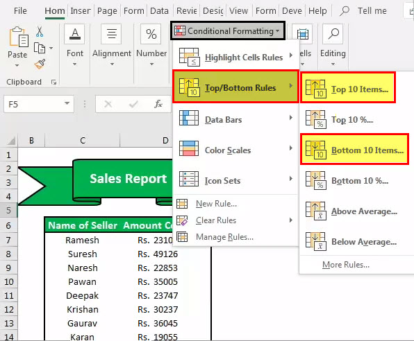
Format the cells that rank in the “Top 3” with “Green Fill with Dark Green Text.”

Also, format the cells that rank in the “Bottom 3” with “Light Red with Dark Red Text.”

We can also apply another conditional formatting option, “Data Bars.”

We can also create a chart to display the data, part of “Data Formatting Excel.”

Shortcut Keys to Format Data in Excel
- To make the text bold: Ctrl+B or Ctrl+2
- To make the text italic: Ctrl+I or Ctrl+3
- To make the text underline: Ctrl+U or Ctrl+4
- To make the font size of the text larger: Alt+H, FG
- To make the font size of the text smaller: Alt+H, FK
- To open the ”Font” dialog box: Alt+H,FN
- To open the ”Alignment” dialog box: Alt+H, FA
- To center align cell contents: Alt+H, A, then C
- To add borders: Alt+H, B
- To open the ”Format Cells” dialog box: Ctrl+1
- To apply or remove strikethrough data formatting Excel: Ctrl+5
- To apply an outline border to the selected cells: Ctrl+Shift+Ampersand(&)
- To apply the “Percentage” format with no decimal places: Ctrl+Shift+Percent (%)
- To add a non-adjacent cell or range to a selection of cells using the arrow keys: Shift+F8
Things to Remember
- While data formatting in Excel, we must make the title stand out, good and bold, it ensures it conveys the content we are showing. Next, we should enlarge the column and row heads and put them in a second color. Readers may quickly scan the column and row headings to get a sense of how the information on the worksheet is organized. This way, it can help them view what is most important on the page and where they should begin.
Recommended Articles
This article is a guide to Formatting in Excel. We discuss formatting data in Excel, Excel examples, and downloadable Excel templates here. You may also look at these useful functions in Excel: –
- Conditional Formatting in the Pivot Table
- Filters in Excel
- Examples of Data Table in Excel
- Gantt Chart in Excel
37
37 people found this article helpful
How to Create a Report in Excel
Using charts, graphs, and pivot tables makes it easy
Updated on September 25, 2022
What to Know
- Create a report using charts: Select Insert > Recommended Charts, then choose the one you want to add to the report sheet.
- Create a report with pivot tables: Select Insert > PivotTable. Select the data range you want to analyze in the Table/Range field.
- Print: Go to File > Print, change the orientation to Landscape, scaling to Fit All Columns on One Page, and select Print Entire Workbook.
This article explains how to create a report in Microsoft Excel using key skills like creating basic charts and tables, creating pivot tables, and printing the report. The information in this article applies to Excel 2019, Excel 2016, Excel 2013, Excel 2010, and Excel for Mac.
Creating Basic Charts and Tables for an Excel Report
Creating reports usually means collecting information and presenting it all in a single sheet that serves as the report sheet for all of the information. These report sheets should be formatted in a way that’s easy to print as well.
One of the most common tools people use in Excel to create reports is the chart and table tools. To create a chart in an Excel report sheet:
-
Select Insert from the menu, and in the charts group, select the type of chart you want to add to the report sheet.
-
In the Chart Design menu, in the Data group, select Select Data.
-
Select the sheet with the data and select all cells containing the data you want to chart (include headers).
-
The chart will update in your report sheet with the data. The headers will be used to populate the labels in the two axis.
-
Repeat the above steps to create new charts and graphs that appropriately represent the data you want to show in your report. When you need to create a new report, you can just paste the new data into the data sheets, and the charts and graphs update automatically.
There are different ways to lay out a report using Excel. You can include graphs and charts on the same page as tabular (numeric) data, or you can create multiple sheets so visual reporting is on one sheet, tabular data is on another sheet, and so on.
Using PivotTables to Generate a Report From an Excel Spreadsheet
Pivot tables are another powerful tool for creating reports in Excel. Pivot tables help with digging more deeply into data.
-
Select the sheet with the data you want to analyze. Select Insert > PivotTable.
-
In the Create PivotTable dialogue, in the Table/Range field, select the range of data you want to analyze. In the Location field, select the first cell of the worksheet where you want the analysis to go. Select OK to finish.
-
This will launch the pivot table creation process in the new sheet. In the PivotTable Fields area, the first field you select will be the reference field.
In this example, this pivot table will show website traffic information by month. So, first, you’d select Month.
-
Next, drag the data fields you want to show data for into the values area of the PivotTable fields pane. You’ll see the data imported from the source sheet into your pivot table.
-
The pivot table collates all of the data for multiple items by adding them (by default). In this example, you can see which months had the most page views. If you want a different analysis, just select the drop-down arrow next to the item in the Values pane, then select Value Field Settings.
-
In the Value Field Settings dialog box, change the calculation type to whichever you prefer.
-
This will update the data in the pivot table accordingly. Using this approach, you can perform any analysis you like on source data, and create pivot charts that display the information in your report in the way you need.
How to Print Your Excel Report
You can generate a printed report from all the sheets you created, but first you need to add page headers.
-
Select Insert > Text > Header & Footer.
-
Type the title for the report page, then format it to use larger than normal text. Repeat this process for each report sheet you plan to print.
-
Next, hide the sheets you don’t want included in the report. To do this, right-click the sheet tab and select Hide.
-
To print your report, select File > Print. Change orientation to Landscape, and scaling to Fit All Columns on One Page.
-
Select Print Entire Workbook. Now when you print your report, only the report sheets you created will print as individual pages.
You can either print your report out on paper, or print it as a PDF and send it out as an email attachment.
FAQ
-
How do I create an expense report in Excel?
Open an Excel spreadsheet, turn off gridlines, and enter your basic expense report information, such as a title, time period, and employee name. Add data columns for Date and Description, and then add columns for expense specifics, such as Hotel, Meals, and Phone. Enter your information and create an Excel table.
-
How do I create a scenario summary report in Excel?
To use Excel’s scenario manager function, select the cells with the information you’re exploring, and then go to the ribbon and select Data. Select What-If Analysis > Scenario Manager. In the Scenario Manager dialog box, select Add. Name the scenario and change your data to see various outcomes.
-
How do I export a Salesforce report to Excel?
In Salesforce, go to Reports and find the report you want to export. Select Export and choose an export view (Formatted Report or Details Only). Formatted Report will export in .xlsx format, while Details Only gives you other choices. Select Export when ready.
Thanks for letting us know!
Get the Latest Tech News Delivered Every Day
Subscribe
Constructing of financial analyses for evaluation of business activity and investment projects. Forming reports and documents forms in Excel for accounts department, marketing department, warehouse facilities, and other structures of the company.
Forming of reports analyses with examples
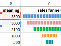 Chart of funnel sales in Excel download for free.
How to make the sales funnel in Excel using formulas, the SmartArt drawing and the Charts tool. The description of different methods with step-by-step instructions and illustrations.
 Calculation of the financial activity ratio in Excel.
The coefficient of the financial activity shows how much the enterprise depends on borrowed funds. It characterizes financial stability and profitability. How to calculate the indicator by the formula?
 Financial analysis in Excel with an example.
The financial and statistical analysis in Excel: automation of calculations. How to analyze the time series and forecast sales, taking into account the trend component and seasonality?
 Coefficient of pair correlation in Excel.
The correlation coefficient (the paired correlation coefficient) allows us to discover the interconnection between the series of values. How to calculate the coefficient of pair correlation? The construction of the correlation matrix.
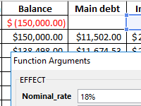 Calculation of the effective interest rate on loan in Excel.
Calculation of the effective interest rate on the loan, leasing and government bonds is performed using the functions EFFECT, IRR, XIRR, FV, etc. Let’s look at examples of how real interest is considered.
 Budgeting of the enterprise in Excel with discounts.
Template for planning the budget of the trading company with the calculation of providing customers discounts. The main advantage is the ability to create loyalty programs with control over the company’s profit. Management of discounts, their impact on margin.
 Turnover ratio of receivables in Excel.
The factor of turnover of receivables shows the rate of conversion of goods sold into the money supply. Formula by balance, calculation of the indicator in days.
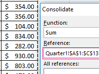 Data consolidating in Excel with examples of usage.
Let’s look at the example of practical work how to do data consolidation. Combining the ranges on different sheets and in different books. Consolidated report using formulas.
Formatting Data in Excel (Table of Contents)
- Formatting in Excel
- How to Format Data in Excel?
Introduction to Data Formatting in Excel
Data Formatting in excel is very useful, which allows us to format the data in any way we want. We can change the format of data to make it as per standards or our requirements. This brings uniformity in terms of the same type of fonts, shapes, alignment and font color. This is normally used in all types of work such as official, report creation, anything we want to print. This also allows other people to read and understand the meaning properly if everything is in the standard format.
There are a lot of ways to format data in excel. Follow the below guidelines while formatting the data/report in excel:
- The column heading/row heading is a very important part of the report. It describes the information about data. Thus, the heading should be in bold. The shortcut key is CTRL + B. It’s also available in the Font section in the toolbar.
- The header font size should be larger than the other content of the data.
- The header field background color should be other than white color so that it should be properly visible in the data.
- Make the outline border of the heading field. There are a lot of border styles. For border style, Go to the Font section and click on an icon as per the below screenshot:
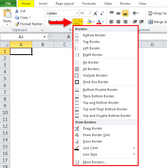
- Choose the appropriate border style. With this, we can add a border of the cells.
- The header font should be aligned in the center.
- To make the size of cells enough, so that the data written within the cell should be in a proper reading manner.
- For number formatting, there are a lot of styles available. For this, Go to the number section and click on the combo box like the below screenshot:
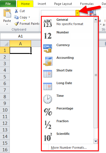
- Depending on the data, whether it should be in decimal, percentage, number, date, or formatting can be done.
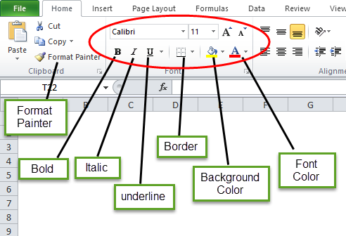
In the below image, we have shown different font styles:
“B” is to make the font bold, “I” is for italic, “U” is for make underline, etc.
How to Format Data in Excel?
Let’s take the below data and will understand the data formatting in excel one by one.
You can download this Data Formatting Excel Template here – Data Formatting Excel Template
Formatting in Excel – Example #1
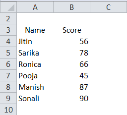
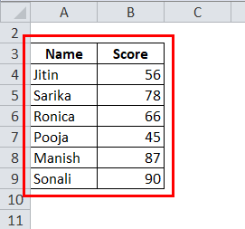
We have the above-unorganized data, which is looking very simple. Now we will do data formatting in excel and will make this data in a presentable format.
- First, select the header field and make it bold.
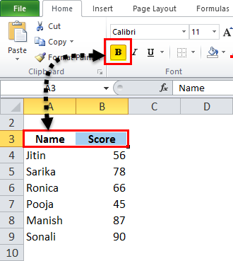
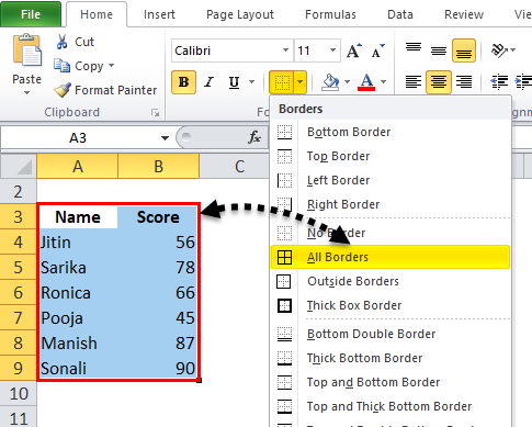
- Select the whole data and choose the “All Border option” under the border.
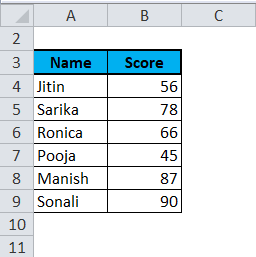
So the Data will look like this :
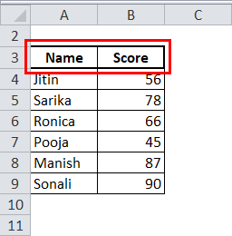
- Now select the header field and make the thick border by selecting the “Thick box border” under the border.
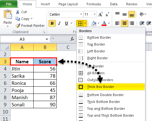
After that, the Data will look like this :
- Make the header field in the center.
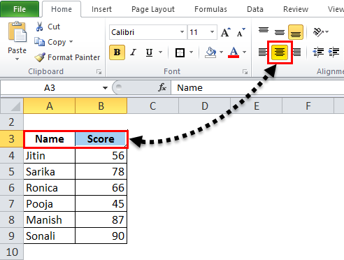
- Also, choose a background color other than white. Here we will use a light blue color.
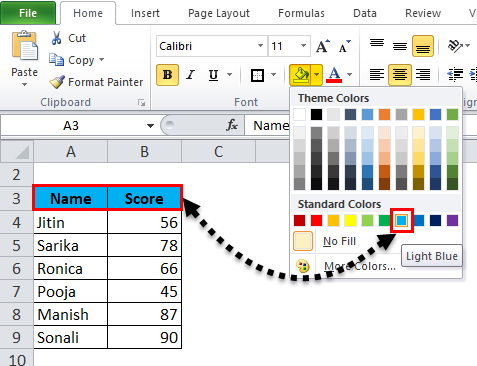
Now the data is looking more presentable.
Formatting in Excel – Example #2
In this example, we will learn more about the style of formatting the report or data.
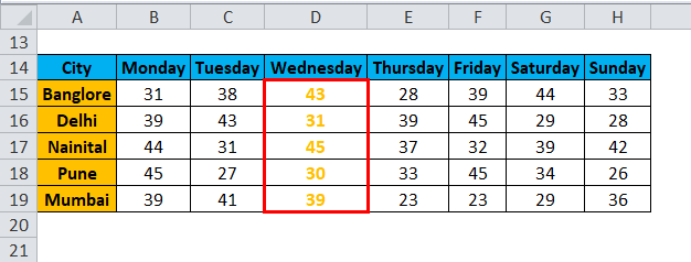
Let’s take an example of weather prediction of different cities day wise.
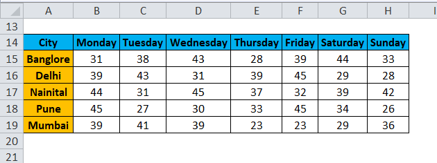
Now we want to highlight the Wednesday data.
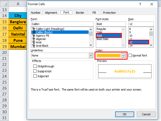
- Select the whole records of that data and do the right-click. A drop-down box will appear. Select the “Format Cells” option.
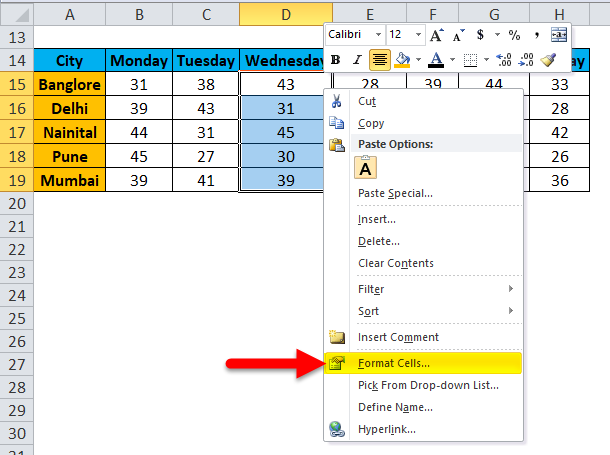
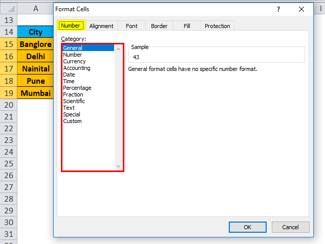
- This will open a Format Cells dialog box. As we can see, there are a lot of options available to change the font style in various styles as we want.
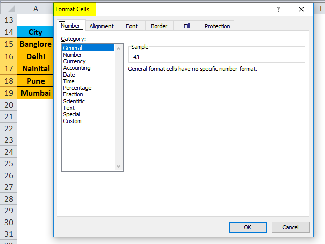
- Through the Number button, we can change the data type like decimal, percentage etc.
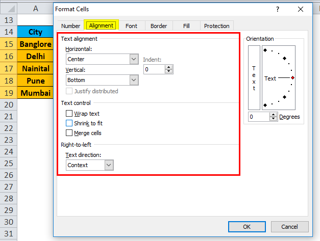
- Through the Alignment button, we can align the font in a different style.
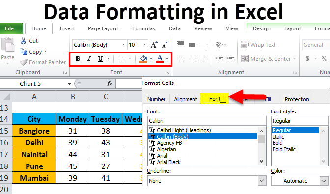
- Click on the Font button. This button has a lot of font styles available. We can change the font type, style, size, color etc.
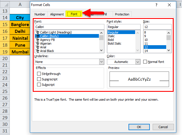
- In this example, we are choosing a bold font size of 12, the color of Orange. We also can make the border of this data to look more visible by clicking on the Border button.
- Now our data is looking like the below screenshot:
Formatting in Excel – Example #3
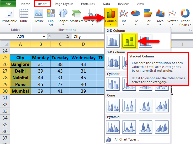
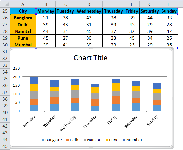
Again we are assuming the same data. Now we want to present this data in pictorial format.

- Select whole data and go to the Insert menu. Click on Column Chart, Select Stacked Column under 2-D Column Chart.
- Our Data will look like as below:
Benefits of Data Formatting in Excel:
- Data looks more presentable.
- Through formatting, we can highlight specific data like profit or loss in business.
- Through the chart, we can easily analyze the data.
- Data Formatting saves a lot of time and effort.
Things to Remember
- There are a lot of shortcut keys available for data formatting in excel. Through which we can save a lot of time and effort.
- CTRL+B – BOLD
- CTRL+I – ITALIC
- CTRL+U – UNDERLINE
- ALT+H+B – Border Style
- CTRL+C – Copy the data, CTRL+X – Cut the data, CTRL+V – Paste the data.
- ALT+H+V – It will open the paste dialog box. Here a lot of paste options available.
- When we insert the chart for the data as we created in Example 3, it will open the chart tools menu. Through this option, we can do the formatting of the chart as per our requirements.
- Excel provides a very interesting feature through which we can do a quick analysis of our data. For this, Select the data and do the right-click. It will open a list of items. Select the “Quick Analysis” option.
- It will open the conditional formatting toolbox.
We can add more conditions in the data through this option, like if data is less than 40 or greater than 60, so how the data look in this condition.
Recommended Articles
This has been a guide to Formatting in Excel. Here we discuss how to Format Data in Excel along with excel examples and downloadable excel templates. You may also look at these useful functions in excel –
- Excel VBA Format
- Format Cells in Excel
- Excel Conditional Formatting for Dates
- Excel Date Format