
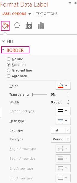
There are a lot of formatting options for data labels. You can use leader lines to connect the labels, change the shape of the label, and resize a data label. And they’re all done in the Format Data Labels task pane. To get there, after adding your data labels, select the data label to format, and then click Chart Elements  > Data Labels > More Options.
To go to the appropriate area, click one of the four icons (Fill & Line, Effects, Size & Properties (Layout & Properties in Outlook or Word), or Label Options) shown here.

Tip: Make sure that only one data label is selected, and then to quickly apply custom data label formatting to the other data points in the series, click Label Options >Data Label Series > Clone Current Label.
Here are step-by-step instructions for the some of the most popular things you can do. If you want to know more about titles in data labels, see Edit titles or data labels in a chart.
A line that connects a data label and its associated data point is called a leader line—helpful when you’ve placed a data label away from a data point. To add a leader line to your chart, click the label and drag it after you see the four headed arrow. If you move the data label, the leader line automatically adjusts and follows it. In earlier versions, only pie charts had this functionality—now all chart types with data labels have this.

-
Click the connecting lines you want to change.
-
Click Fill & Line > Line, and then make the changes that you want.


There are many things you can do to change the look of the data label like changing the border color of the data label for emphasis.
-
Click the data labels whose border you want to change. Click twice to change the border for just one data label.
-
Click Fill & Line > Border, and then make the changes you want.
Tip: You can really make your label pop by adding an effect. Click Effects and then pick the effect you want. Just be careful not to go overboard adding effects.

You can make your data label just about any shape to personalize your chart.
-
Right-click the data label you want to change, and then click Change Data Label Shapes.
-
Pick the shape you want.

Click the data label and drag it to the size you want.
Tip: You can set other size (Excel and PowerPoint) and alignment options in Size & Properties (Layout & Properties in Outlook or Word). Double-click the data label and then click Size & Properties.

You can add a built-in chart field, such as the series or category name, to the data label. But much more powerful is adding a cell reference with explanatory text or a calculated value.

-
Click the data label, right click it, and then click Insert Data Label Field.
If you have selected the entire data series, you won’t see this command. Make sure that you have selected just one data label.
-
Click the field you want to add to the data label.
-
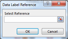
To link the data label to a cell reference, click [Cell] Choose Cell and then enter a cell reference.


Tip: To switch from custom text back to the pre-built data labels, click Reset Label Text under Label Options.
-
To format data labels, select your chart, and then in the Chart Design tab, click Add Chart Element > Data Labels > More Data Label Options.
-
Click Label Options and under Label Contains, pick the options you want. To make data labels easier to read, you can move them inside the data points or even outside of the chart.


To format data labels, select your chart, and then in the Chart Design tab, click Add Chart Element > Data Labels > More Data Label Options. Click Label Options and under Label Contains, pick the options you want.
Contents
- 1 How do you edit data labels in Excel?
- 2 How do I format all data labels in Excel?
- 3 How do I add text to a data label in Excel?
- 4 What are data labels in Excel?
- 5 How do I change axis labels in Excel?
- 6 How do I change the order of data labels in an Excel chart?
- 7 How do I change data labels to percentages?
- 8 How do you select all data labels?
- 9 How do I change data labels to millions in Excel?
- 10 How do I change data labels to percentages in Excel?
- 11 How do I make labels from Excel?
- 12 How do you use labels in Excel?
- 13 How do I label data directly in Excel?
- 14 How do I change horizontal axis labels in Excel 2020?
- 15 How do I make data labels vertical in Excel?
- 16 How do you rearrange data labels?
- 17 How do I change data labels to percentages in Excel pie chart?
- 18 How do you change the legend on Excel?
- 19 How do I change the color of data labels in Excel?
- 20 How do you abbreviate data labels in Excel?
How do you edit data labels in Excel?
Edit the contents of a title or data label that is linked to data on the worksheet
- In the worksheet, click the cell that contains the title or data label text that you want to change.
- Edit the existing contents, or type the new text or value, and then press ENTER. The changes you made automatically appear on the chart.
How do I format all data labels in Excel?
To format data labels in Excel, choose the set of data labels to format. To do this, click the “Format” tab within the “Chart Tools” contextual tab in the Ribbon. Then select the data labels to format from the “Chart Elements” drop-down in the “Current Selection” button group.
How do I add text to a data label in Excel?
Click the chart, and then click the Chart Design tab. Click Add Chart Element and select Data Labels, and then select a location for the data label option. Note: The options will differ depending on your chart type. If you want to show your data label inside a text bubble shape, click Data Callout.
What are data labels in Excel?
Data labels are used to display source data in a chart directly.When first enabled, data labels will show only values, but the Label Options area in the format task pane offers many other settings. You can set data labels to show the category name, the series name, and even values from cells.
How do I change axis labels in Excel?
Right-click the category labels you want to change, and click Select Data.
- In the Horizontal (Category) Axis Labels box, click Edit.
- In the Axis label range box, enter the labels you want to use, separated by commas.
How do I change the order of data labels in an Excel chart?
Under Chart Tools, on the Design tab, in the Data group, click Select Data. In the Select Data Source dialog box, in the Legend Entries (Series) box, click the data series that you want to change the order of. Click the Move Up or Move Down arrows to move the data series to the position that you want.
How do I change data labels to percentages?
To display percentage values as labels on a pie chart
- Add a pie chart to your report.
- On the design surface, right-click on the pie and select Show Data Labels.
- On the design surface, right-click on the labels and select Series Label Properties.
- Type #PERCENT for the Label data option.
How do you select all data labels?
For example, if you wanted to select every label in a series, then left-click on one of the labels and press CTRL+A. All of the labels in that series will be highlighted. As a bonus, you can continue pressing CTRL+A to select all of the labels in all series, and CTRL+A again to select all labels in the chart.
How do I change data labels to millions in Excel?
Follow These Steps
- Select the cell you’d like to format. ( A1 in the example)
- Click the ribbon Home, right-click on the cell, then expand the default to show “Format Cells” dialog.
- In the Format Cells dialog box, on the Number tab, select Custom, then enter #,, “Million” where it says General.
How do I change data labels to percentages in Excel?
Select the decimal number cells, and then click Home > % to change the decimal numbers to percentage format. 7. Then go to the stacked column, and select the label you want to show as percentage, then type = in the formula bar and select percentage cell, and press Enter key.
How do I make labels from Excel?
Add a label or text box to a worksheet
- Click Developer, click Insert, and then click Label .
- Click the worksheet location where you want the upper-left corner of the label to appear.
- To specify the control properties, right-click the control, and then click Format Control.
How do you use labels in Excel?
Use labels to quickly define Excel range names
- Select any cell in the range and press [Ctrl]+[Shift]+* to select the contiguous range.
- Choose Name from the Insert menu and then choose Create.
- Excel will display the Create Names dialog box; it does a good job of finding the label text.
- Click OK.
How do I label data directly in Excel?
In Microsoft Excel, right-click on the data point on the far right side of the line and select Add Data Label. Then, right-click on that same data point again and select Format Data Label. In the Label Contains section, place a check mark in either the Series Name or Category Name box.
How do I change horizontal axis labels in Excel 2020?
Right-click the category labels to change, and click Select Data. In Horizontal (Category) Axis Labels, click Edit. In Axis label range, enter the labels you want to use, separated by commas.
How do I make data labels vertical in Excel?
Rotate Axis labels
- #1 right click on the X Axis label, and select Format Axis from the popup menu list.
- # 2 click the Size & Properties button in the Format Axis pane.
- #3 click Text direction list box, and choose Vertical from the drop down list box.
- #4 the X Axis text has been rotated from horizontal to vertical.
How do you rearrange data labels?
Move data labels
- Click any data label once to select all of them, or double-click a specific data label you want to move.
- Right-click the selection >Chart Elements.
- If you decide the labels make your chart look too cluttered, you can remove any or all of them by clicking the data labels and then pressing Delete.
How do I change data labels to percentages in Excel pie chart?
Right click the pie chart again and select Format Data Labels from the right-clicking menu. 4. In the opening Format Data Labels pane, check the Percentage box and uncheck the Value box in the Label Options section. Then the percentages are shown in the pie chart as below screenshot shown.
How do you change the legend on Excel?
- Select your chart in Excel, and click Design > Select Data.
- Click on the legend name you want to change in the Select Data Source dialog box, and click Edit.
- Type a legend name into the Series name text box, and click OK.
How do I change the color of data labels in Excel?
Go to tab “Home” on the ribbon if you are not already there. The font and font size drop-down lists allow you to pick a font and size for your data labels, the “fill color” button lets you choose a background color and the “Font color” button lets you change the font color of the data labels.
How do you abbreviate data labels in Excel?
Select the numbers you need to abbreviate, and right click to select Format Cells from the context menu. 3. Click OK to close dialog, now the large numbers are abbreviated. Tip: If you just need to abbreviate the large number as thousand “K” or million “M”, you can type #,”K” or #,,”M” into the textbox.
Try the Excel Course for Free!

Format Data Labels in Excel: Overview
You can format data labels in Excel if you choose to add data labels to a chart. To format data labels in Excel, choose the set of data labels to format. To do this, click the “Format” tab within the “Chart Tools” contextual tab in the Ribbon. Then select the data labels to format from the “Chart Elements” drop-down in the “Current Selection” button group. Then click the “Format Selection” button that appears below the drop-down menu in the same area.
Alternatively, you can right-click the desired set of data labels to format within the chart. Then select the “Format Data Labels…” command from the pop-up menu that appears to format data labels in Excel. Using either method then displays the “Format Data Labels” task pane at the right side of the screen.

Format Data Labels in Excel- Instructions: A picture of the “Format Data Labels” task pane in Excel.
This task pane is where you format data labels in Excel. In the “Label Options” category, which is shown by default, you set the values and positioning of the data labels. You can also choose other formatting categories to display within the task pane. To do this, click the options to set, like the “Label Options” or “Text Options” choice. Then click the desired category icon to edit. The formatting options for the category then appear in collapsible and expandable lists at the bottom of the task pane.
Click the titles of each category list to expand and collapse the options within that category. Set any options you want within the task pane to immediately apply them to the chart. Then click the “X” in the upper-right corner of the task pane to close it.
Format Data Labels in Excel: Instructions
- To format data labels in Excel, choose the set of data labels to format.
- One way to do this is to click the “Format” tab within the “Chart Tools” contextual tab in the Ribbon.
- Then select the data labels to format from the “Current Selection” button group.
- Then click the “Format Selection” button that appears below the drop-down menu in the same area.
- Alternatively, right-click the desired set of data labels to format within the actual chart.
- Then select the “Format Data Labels…” command from the pop-up menu that appears to format data labels in Excel.
- Using either method then displays the “Format Data Labels” task pane at the right side of the screen.
- Set the values and positioning of the data labels in the “Label Options” category, which is shown by default.
- To choose other formatting categories to show in the task pane, click the desired options to set.
- Then click the desired category icon to edit.
- The formatting options for the category appear in collapsible and expandable lists at the bottom of the task pane.
- Click the titles of each category list to expand and collapse the display of the options in that category.
- To immediately apply changes to the chart, set any options you want within the task pane.
- Then click the “X” in the upper-right corner of the task pane to close it.
Format Data Labels in Excel: Video Lesson
The following video lesson, titled “Formatting Data Labels,” shows you how to format data labels in Excel. This video lesson is from our complete Excel tutorial, titled “Mastering Excel Made Easy v.2019 and 365.”
Tagged under:
change, chart, charts, class, course, data label, data labels, excel, excel 2013, Excel 2016, Excel 2019, format, Format Data Labels in Excel, formatting, help, how-to, instructions, learn, lesson, Microsoft Office 2019, Microsoft Office 365, Office 2019, office 365, overview, task pane, teach, training, tutorial, video
-
#2
Instead of selecting the entire chart, right click one of the data points and select «Format Data Labels».
-
#3
This still only formats one set of data series labels. Maybe there’s a bug? I have Office 64 bit.
-
#4
If you want to format all data labels for more than one series, here is one example of a VBA solution:
Code:
Sub x()
Dim objSeries As Series
   With ActiveChart
     For Each objSeries In .SeriesCollection
        With objSeries.Format.Line
                           .Transparency = 0
                           .Weight = 0.75
                           .ForeColor.RGB = 0
        End With
     Next
  End With
End Sub
-
#5
Thank you. That’s awesome. But if I need to resort to VBA to change the font size of all my data point labels I’m going to visit Redmond right now.
Do I really have to click on first data label -> change font size to 10, click on second data label -> change font size to 10, repeat ad nauseam???
-
#6
No, VBA isn’t necessary within a single series (the «Format Data Labels» option should work just fine). For more than one series, buy your plane ticket to Redmond and let us know how it goes.
-
#7
My wording may have been wrong here. Just to clarify, I have a single bar chart. I want to enlarge the data point labels all at the same time as opposed to clicking on them one bar at a time. But I see no way of doing that because when I select them via drop down menu as you suggest above, Excel automatically selects only the labels on the first bar.
This is either a bug or someone at MS really needs to be fired.
-
#8
Try this: click somewhere in the white space of the plot area. Then right click one of the data labels and select «Format Data Labels». Report back.
-
#9
Still selects only the bar I’m clicking (it’s a clustered bar — three brands on the x axis and three bars per brand (for example, dollars, units, volume)). As soon as I right click on one of the labels (for example, dollars), it only highlights the dollars labels. There’s no option to for example, right click and select «all data point labels.»
Now if I just select the whole graph and then change the font size, it changes everything (of course) title, axes labels, etc. I’d like to just increase the size of all data point labels on the graph.
Since I switched to Excel 2010, I’ve had to do this one series (for example, dollars or if brands were clustered, brand a) and then enlarge, brand b, then enlarge, brand c, and so on… TEDIOUS
-
#10
Gotta be one series at a time I’m afraid.
how to do it in Excel: adding data labels
Today’s post is a tactical one for folks creating visuals in Excel: how to embed labels for your data series in your graphs, instead of relying on default Excel legends.
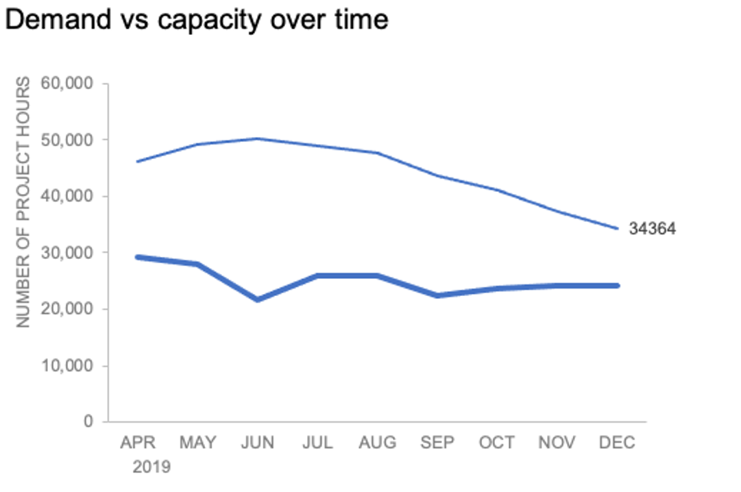
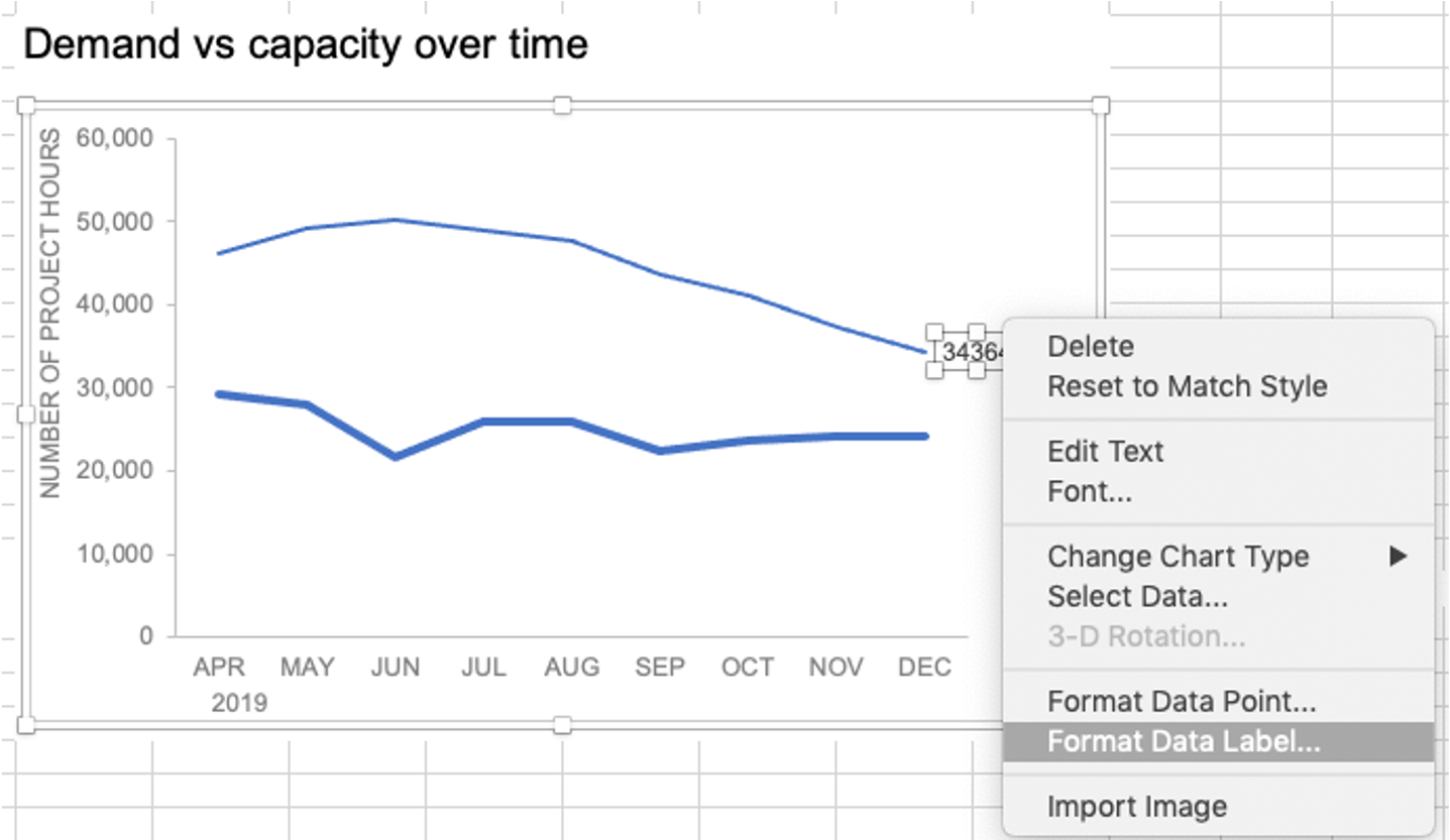
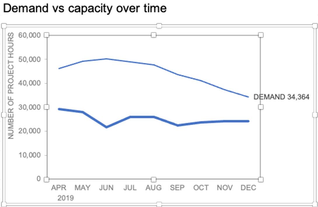
To illustrate, let’s look at an example from storytelling with data: Let’s Practice!. The graph below shows demand and capacity (in project hours) over time.

There are a few different techniques we could use to create labels that look like this.
Option 1: The “brute force” technique
The data labels for the two lines are not, technically, “data labels” at all. A text box was added to this graph, and then the numbers and category labels were simply typed in manually. This is what we affectionately refer to as “brute-forcing” your tool to make it look the way you want it to, regardless of its defaults. Remember: your audience only sees the end result of your work, even if the behind-the-scenes steps aren’t exactly elegant.

One benefit of this approach is that I have greater control over the formatting: size, position, and color of the labels. I can easily make them appear how I want them to appear by simply adjusting the formatting, which is much easier to do with a text box than with a genuine data label. The downside is that this method may not scale easily with many graphs, or those that will be frequently updated with new data—as the data changes, the text labels won’t move with them.
Option 2: Embedding labels directly
Let’s look now at an alternative approach: embedding the labels directly. You can download the corresponding Excel file to follow along with these steps:
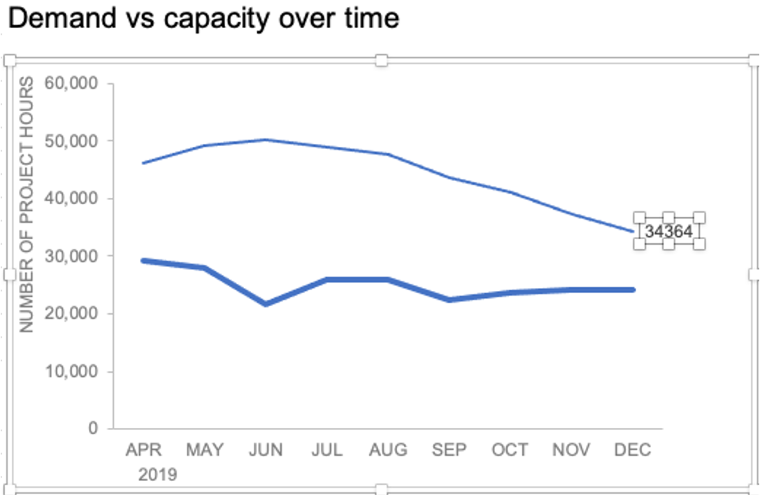
Right-click on a point and choose Add Data Label. You can choose any point to add a label—I’m strategically choosing the endpoint because that’s where a label would best align with my design.

Excel defaults to labeling the numeric value, as shown below.
Now let’s adjust the formatting. Click the label (not the data point, but the label itself) twice, so that these white boxes appear around it:
Right-click and choose Format Data Label:
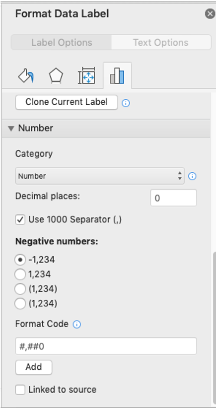
In the Label Options menu that appears, you can choose to add or remove fields by checking (or unchecking) the corresponding box under Label Contains. To add the word “Demand”, I’ll check the Series Name box.

The label appeared in all-caps (“DEMAND”) because it’s referencing the underlying data—I could adjust the header in Column M to “Demand” if I didn’t want the entire word capitalized (this is a stylistic choice).

To adjust the number formatting, navigate back to the Format Data Label menu and scroll to the Number section at the bottom. I’ll choose Number in the Category drop-down and change Decimal places to 0 (side note: checking the Linked to source box is a good option if you want the labels to reformat when the formatting of the underlying source data changes).
My resulting visual looks like this:

From here, I can manually adjust the label alignment by highlighting the graph and making the Plot area smaller so that the label doesn’t overlap the line:
I’ll repeat the same steps to add the Capacity label:

The final thing I’ll do is clean up the formatting of those labels—move the numbers in front of the words, change the number format to be rounded to the thousands place, switch the colors of the labels to match the lines they refer to, and make the font for “24K Capacity” bold.

This post was inspired by a recent conversation during our bi-weekly office hour sessions. Do you ever need quick input on a graph or slide, or wish you could pick the SWD team’s brain on a project? Subscribe to premium membership for personalized support and get your questions answered. Our team has enjoyed getting to know many of you during these fun and interactive sessions!