
17 авг. 2022 г.
читать 3 мин
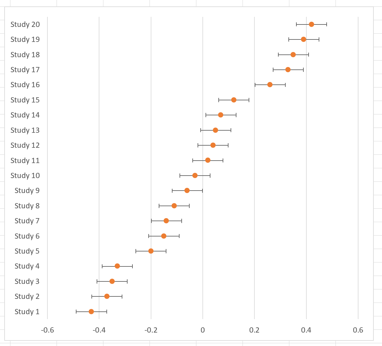
Лесная диаграмма (иногда называемая «блоббограммой») используется в метаанализе для визуализации результатов нескольких исследований на одном графике.

На оси x отображается представляющее интерес значение в исследованиях (часто отношение шансов, величина эффекта или средняя разница), а на оси y — результаты каждого отдельного исследования.
Этот тип графика предлагает удобный способ визуализировать результаты нескольких исследований одновременно.
В следующем пошаговом примере показано, как создать лесной участок в Excel.
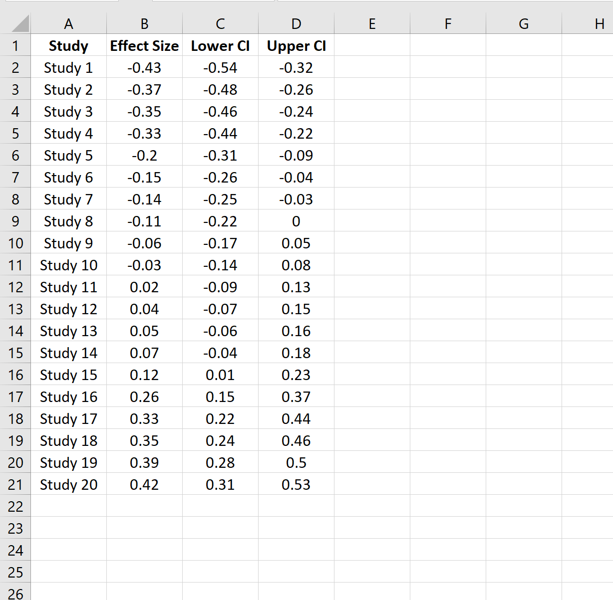
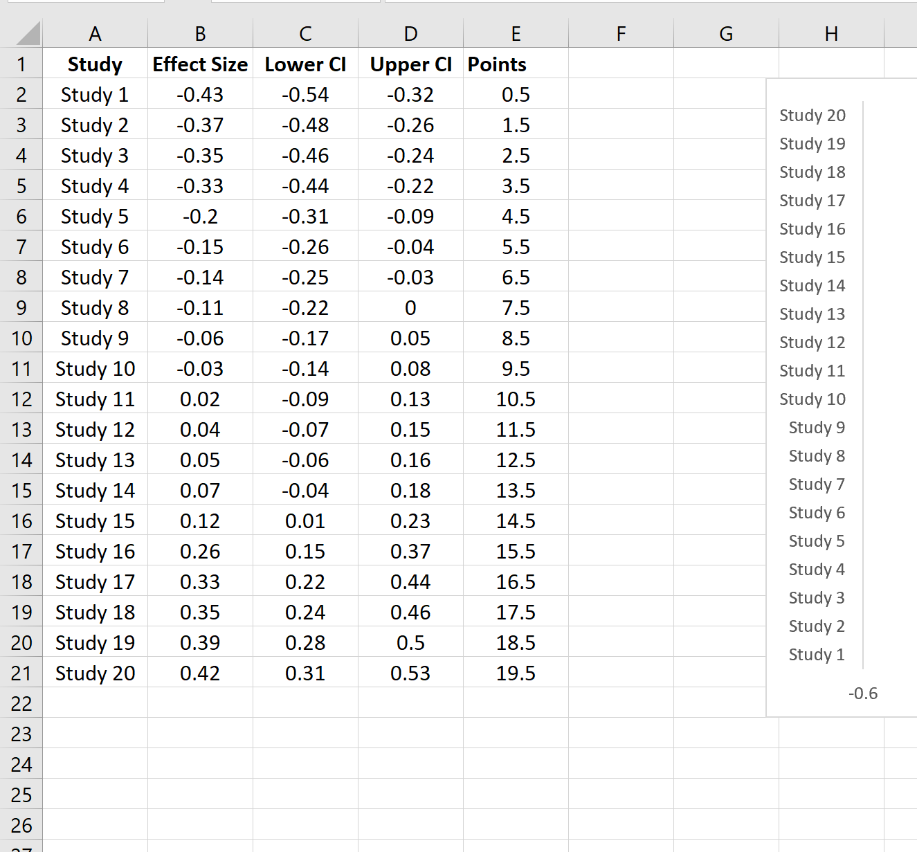
Шаг 1: введите данные
Сначала мы введем данные для каждого исследования в следующем формате:
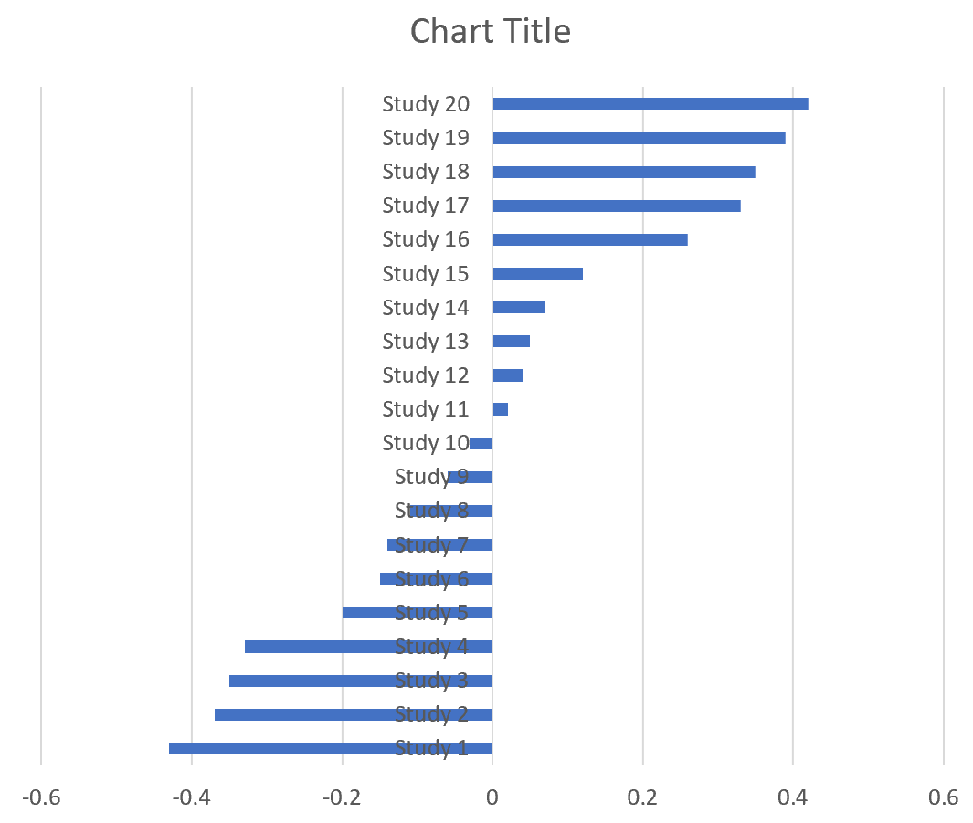
Шаг 2: Создайте горизонтальную гистограмму
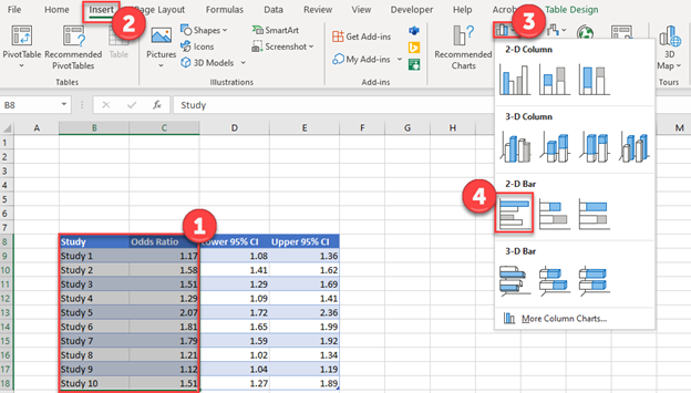
Затем выделите ячейки в диапазоне A2:B21. На верхней ленте щелкните вкладку « Вставка », а затем выберите параметр «Двухмерная кластеризованная полоса» в разделе « Диаграммы ». Появится следующая горизонтальная гистограмма:
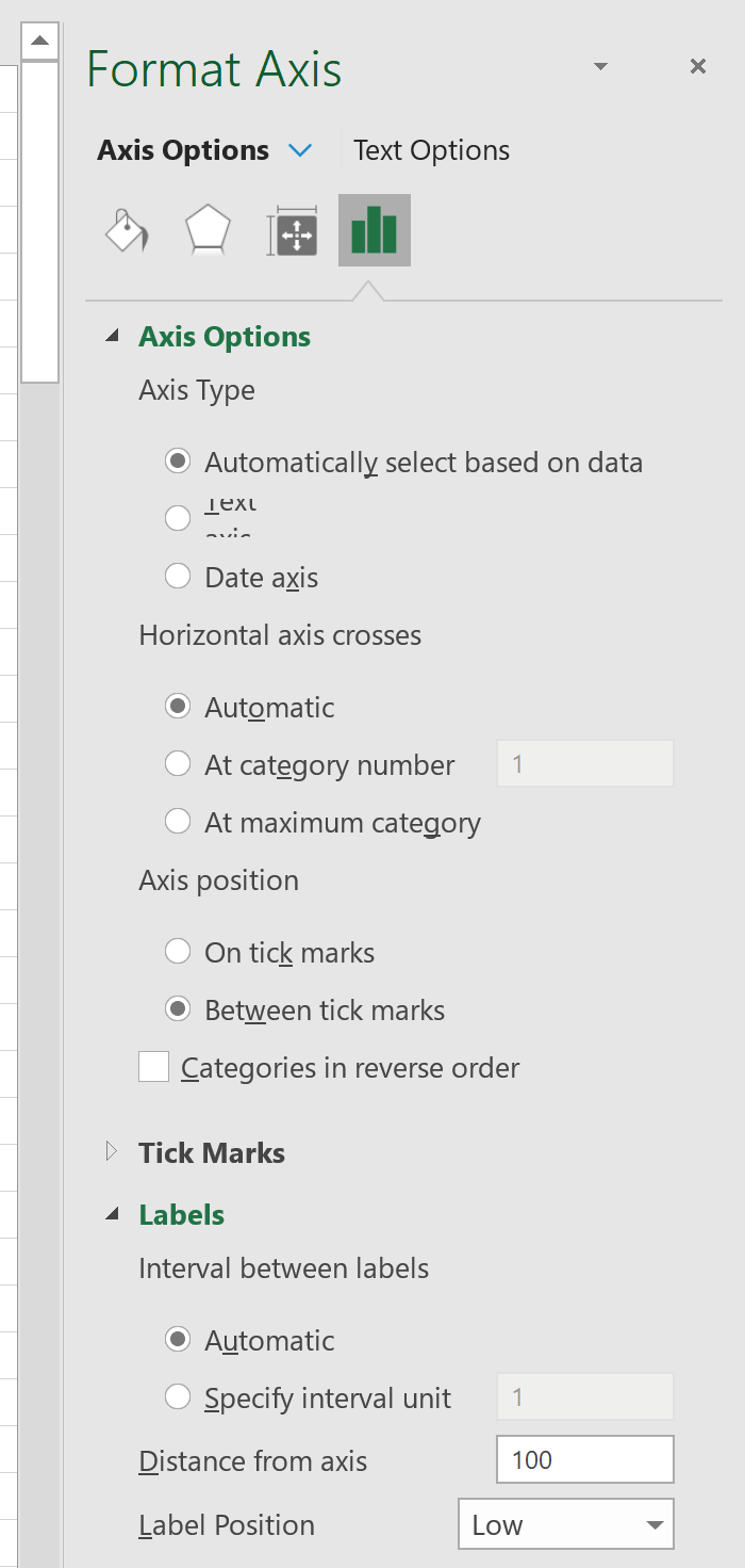
Шаг 3: Переместите метки осей на левую сторону
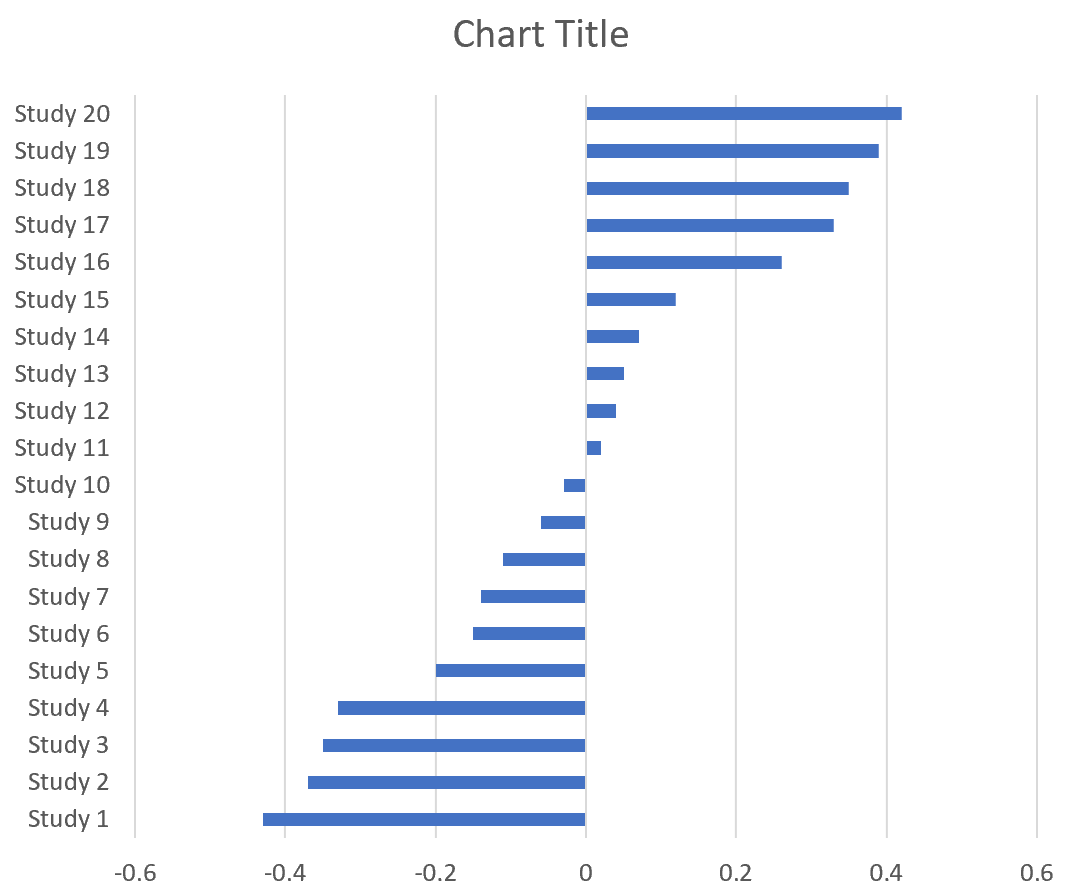
Затем дважды щелкните метки вертикальной оси. На панели « Формат оси» , которая появляется в правой части экрана, установите для параметра « Положение метки » значение «Низкое».
Это переместит метки вертикальной оси в левую часть графика:
Шаг 4: Добавьте точки диаграммы рассеяния
Затем мы добавим новую серию под названием « Точки », которую будем использовать для добавления точек диаграммы рассеяния на график:
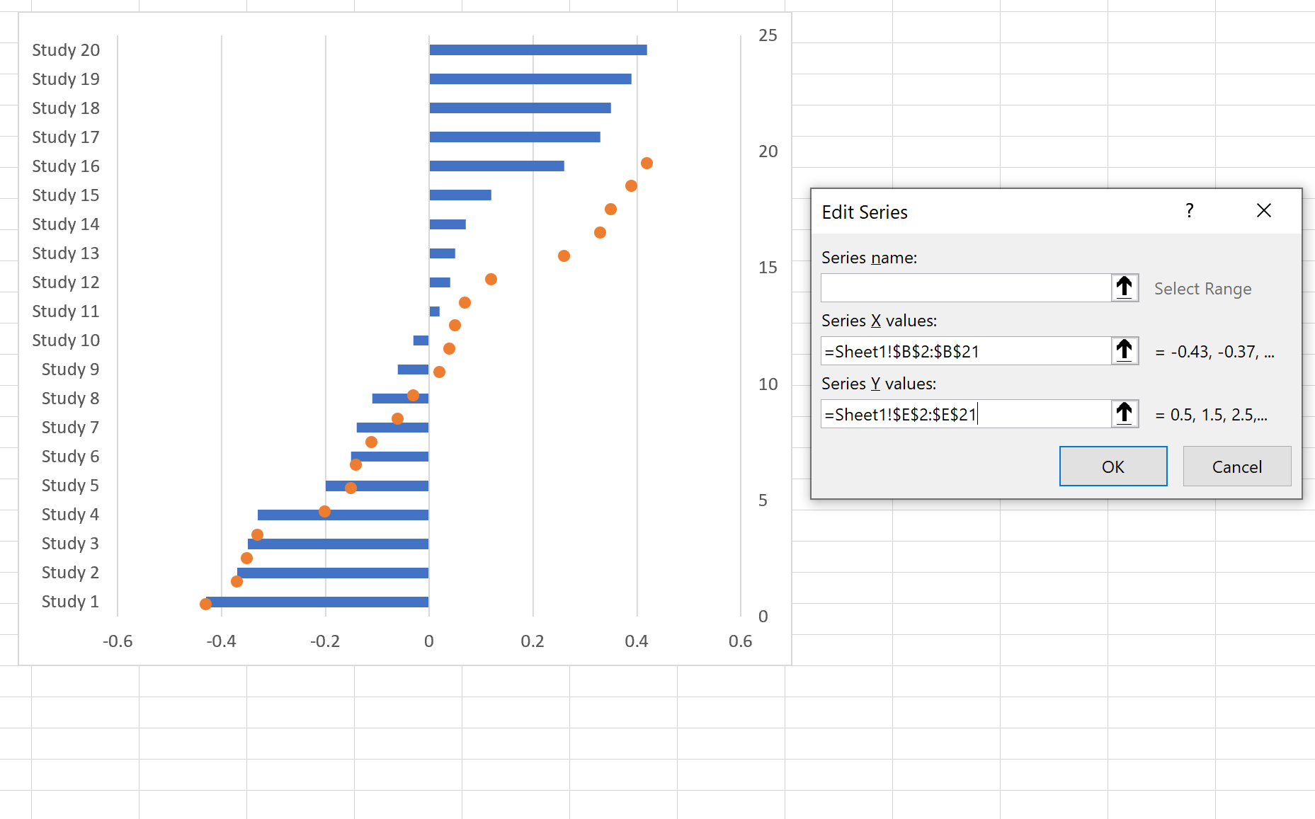
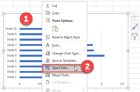
Затем щелкните правой кнопкой мыши в любом месте графика и выберите « Выбрать данные ». В появившемся новом окне нажмите « Добавить », чтобы добавить новую серию. Затем оставьте поле «Имя серии» пустым и нажмите « ОК ». Это добавит к графику одну полосу:
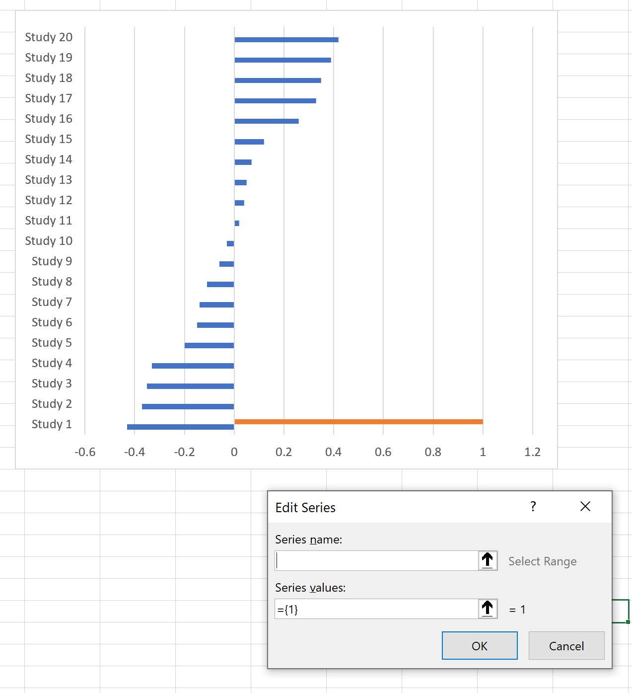
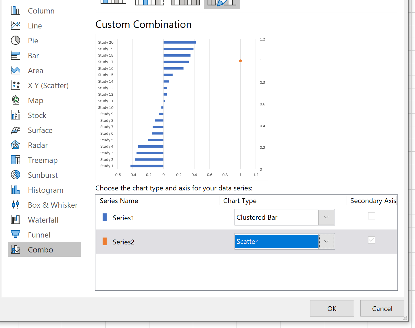
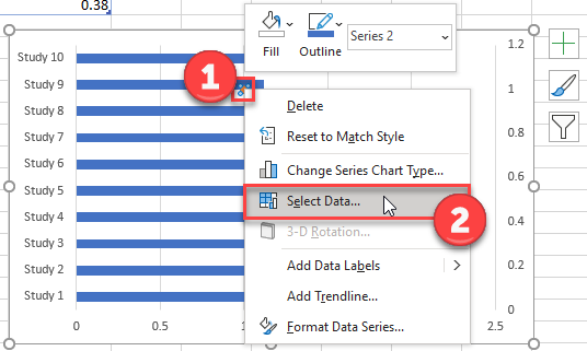
Затем щелкните правой кнопкой мыши одиночную оранжевую полосу и выберите «Изменить тип диаграммы серии».В появившемся новом окне измените Series2 на диаграмму рассеяния:
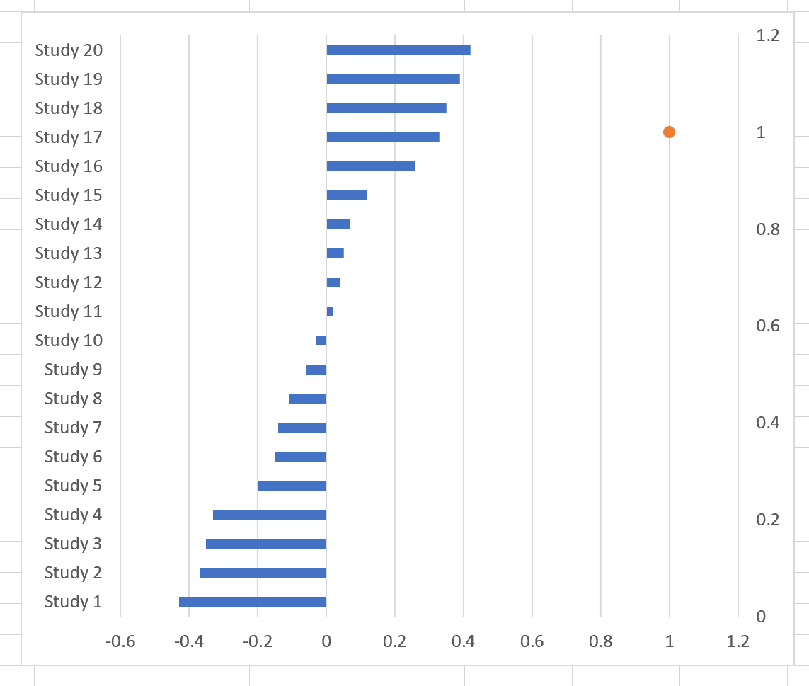
После того, как вы нажмете OK , на графике появится одна точка диаграммы рассеяния:
Затем щелкните правой кнопкой мыши одиночную оранжевую точку и выберите « Выбрать данные ». В появившемся окне нажмите Series2 и затем нажмите Edit .
Используйте диапазон ячеек, содержащий размер эффекта, для значений x и диапазон ячеек, содержащий точки, для значений y. Затем нажмите ОК .
На график будут добавлены следующие точки диаграммы рассеяния:
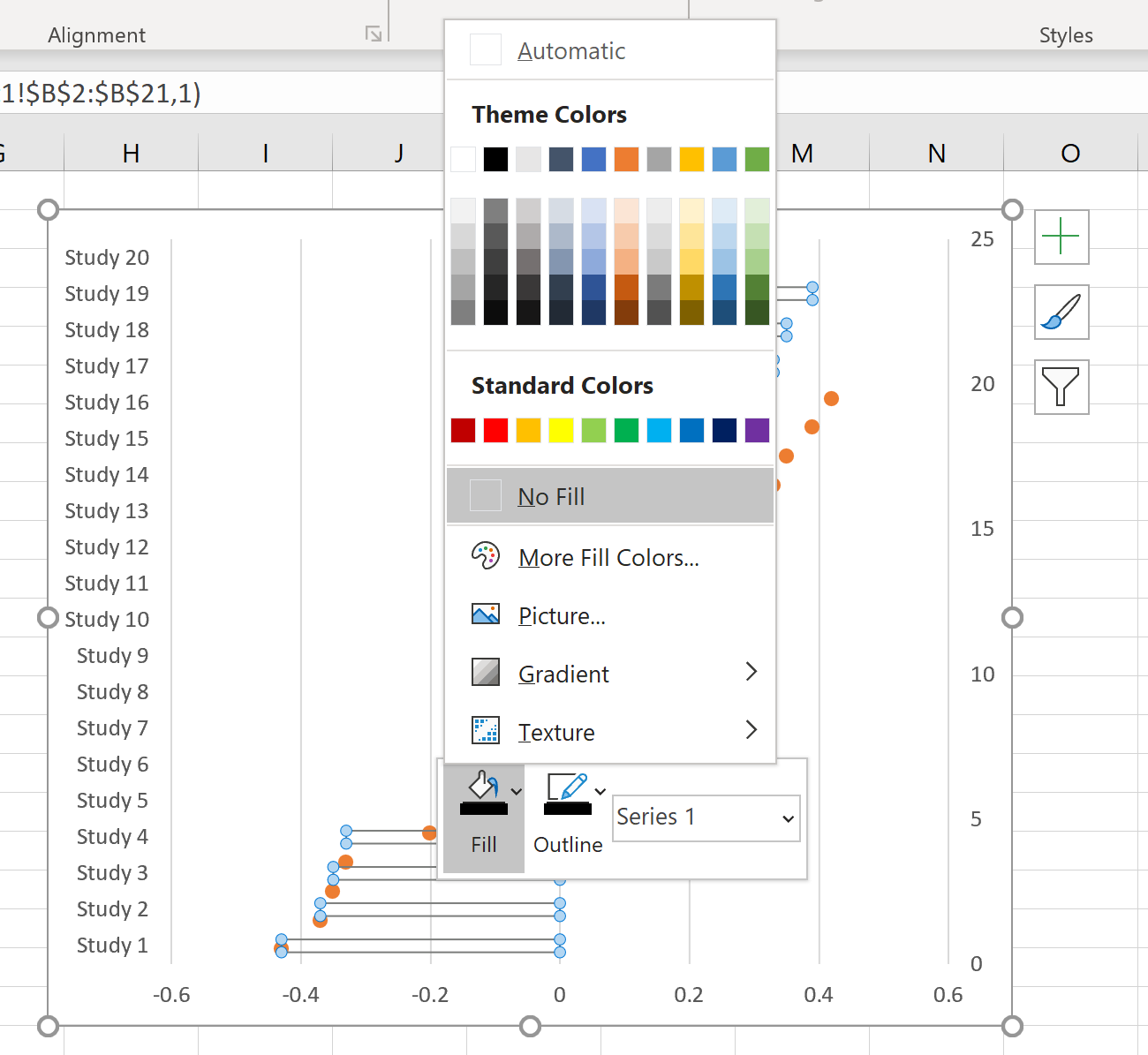
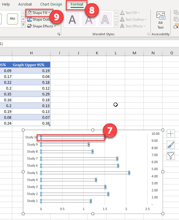
Шаг 5: Удалите бары
Затем щелкните правой кнопкой мыши любой из столбцов на графике и измените цвет заливки на No Fill :
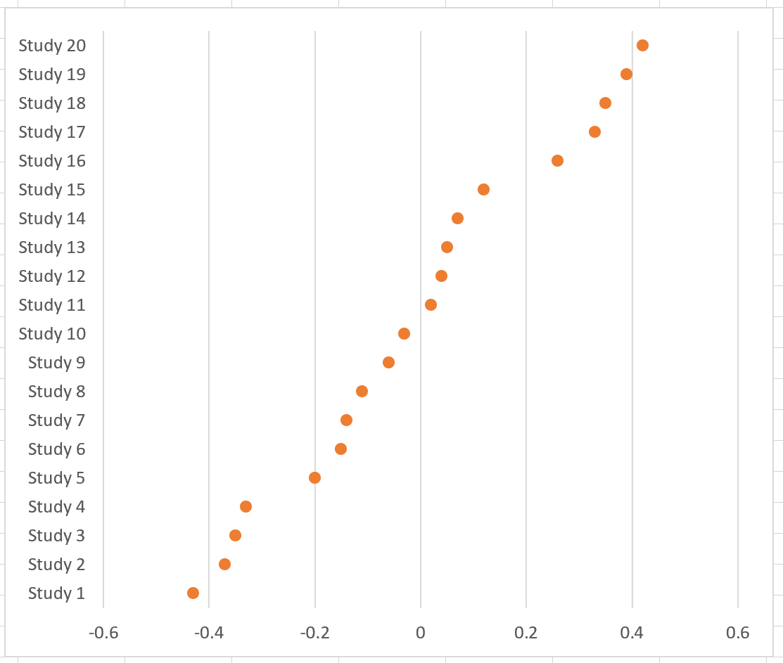
Затем дважды щелкните ось Y справа и измените границы оси на минимальное значение 0 и максимальное значение 20. Затем щелкните ось Y справа и удалите ее. У вас останется следующий сюжет:
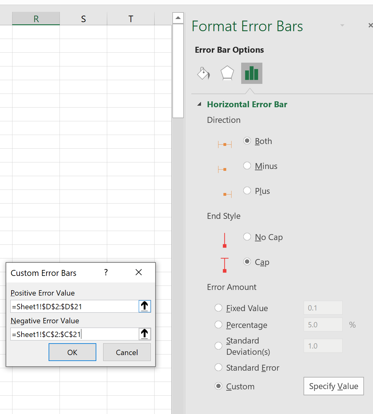
Шаг 6: Добавьте планки погрешностей
Затем щелкните крошечный зеленый знак плюса в правом верхнем углу графика. В раскрывающемся меню установите флажок рядом с Error Bars.Затем щелкните одну из полос вертикальных ошибок в любой из точек и нажмите «Удалить», чтобы удалить полосы вертикальных ошибок из каждой точки.
Затем нажмите « Дополнительные параметры » в раскрывающемся списке рядом с «Панель ошибок». На панели, которая появляется справа, укажите пользовательские планки погрешностей, которые будут использоваться для верхней и нижней границ доверительных интервалов:
Это приведет к следующим полосам ошибок на графике:
Шаг 7: Добавьте метки заголовка и оси
Наконец, не стесняйтесь добавлять заголовок и метки осей и изменять цвета диаграммы, чтобы она выглядела более эстетично:
Вы можете найти больше руководств по визуализации Excel на этой странице .
Forest plots are an excellent way to convey a multitude of information in a single picture. Forest plots have become a recognized and well-understood technique of displaying several estimates concurrently, whether used to demonstrate various outcomes in a single research or the cumulative knowledge of an entire subject. This article investigates advanced uses of the forest plot with the goal of demonstrating Excel’s versatility in producing both basic and sophisticated forest plots. Forest plots are widely used to display meta-analysis findings. Unfortunately, no conventional forest plot graph option is available in Excel. In a meta-analysis, a forest plot is used to show the findings of many research in one figure.

The x-axis represents the value of the interest in the research (often an odds ratio, effect size, or mean difference), while the y-axis represents the findings of each particular study. This style of display makes it easy to see the findings of several research at once.
Creating a Forest Plot in Excel
The following step-by-step example illustrates how to make a forest plot in Excel.
Step 1: Enter the Data: First, we’ll enter each study data in the following format.

Step 2: Create a Clustered Bar Chart: Then, highlight the cells in the A2:B9 range. Click the Insert tab along the top ribbon, then the 2-D clustered bar option in the Charts section.

The horizontal bar chart shown below will appear:

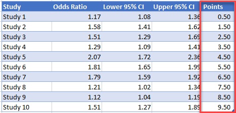
Step 3: Add scatterplot Points: After that, we’ll create a new series called Points, that we’ll use to add scatterplot points to the graph:

After then, right-click anywhere on the plot and choose Data.

Step 4: Add Series: To add a new series, click Add in the select data source box that displays.

Then, leave the Series Name field empty and click OK. This will result in the addition of a single bar to the plot:

Step 5: Change Chart Type: Next, right-click the single orange bar and select Change Series Chart Type from the menu that appears. Change Series2 to a scatterplot in the new window that appears:

When you click OK, the chart will show a single scatterplot point.

Step 6: Update Series: After that, right-click the single orange spot and choose Data.

Click Series2 and then Edit in the box that displays.

For the x-values, use the cell range containing Odds Ratio, and for the y-values, use the cell range containing Points. Then press the OK button. The scatterplot points listed below will be included in the plot.

Step 7: Remove the Bars: Then, right-click on any of the plot’s bars and change the fill color to No Fill.

Then, on the right, double-click the y-axis and set the axis boundaries to a minimum of 0 and a maximum of 8.

Then, on the right, click and erase the y-axis. The following plot will be left.

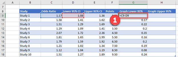
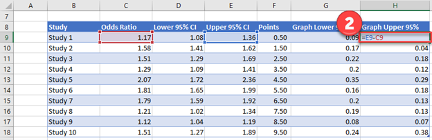
Step 8: Add Error Bars: For Graph Lower, take the Odds Ratio – Lower 95% CI.

For Graph Upper, take the Upper 95% CI – Odds Ratio.

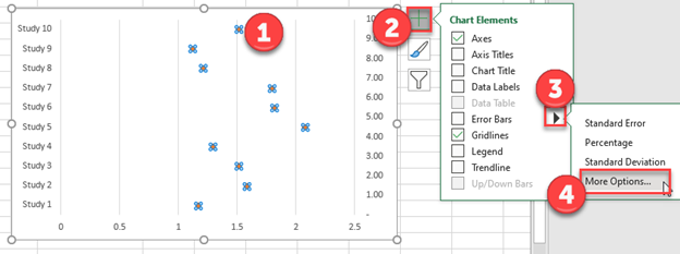
Step 9: Add Error Bars: Then, in the upper right corner of the plot, click the little green + sign. Check the box next to Error Bars in the selection menu. Then, on any of the points, click on one of the vertical error bars and select delete to remove the vertical error bars.

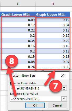
Then, under the selection next to Error Bars, select More Options. In the right-hand pane, enter the custom error bars to be used for the top and lower boundaries of the confidence intervals:

Step 10: Final Graph: As a result, As you can see, the chart resembles a forest plot:
Содержание
- Forest Plot – Excel
- Creating a Forest Plot in Excel
- Create a Clustered Graph
- Add Points
- Add a Series
- Change Chart Type
- Update Series
- Add Error Bars
- Add Error Bars
- Final Graph
- Как создать лесной участок в Excel
- Шаг 1: введите данные
- Шаг 2: Создайте горизонтальную гистограмму
- Шаг 3: Переместите метки осей на левую сторону
- Шаг 4: Добавьте точки диаграммы рассеяния
- Шаг 5: Удалите бары
- Шаг 6: Добавьте планки погрешностей
- Шаг 7: Добавьте метки заголовка и оси
- How to Create a Forest Plot in Excel?
- Creating a Forest Plot in Excel
Forest Plot – Excel
This tutorial will demonstrate how to create a Forest Plot in Excel.
Creating a Forest Plot in Excel
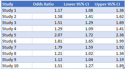
We’ll start with the below data. This dataset shows the Odds Ratio of ten different studies along with their lower and upper Confidence Intervals.
Create a Clustered Graph
- Highlight the Study and Odds Ratio Columns
- Select Insert
- Click Bar Graphs
- Select Horizontal Clustered Graph
Add Points
Add a points Column that starts at .5 and add 1 to each one until you get to the ending value
Add a Series
- Right click on Graph
- Click Select Data
3. Select Add Series
![]()
4. Leave everything blank and Click OK
![]()
Change Chart Type
- Right click on Graph
- Select Change Chart Type
![]()
3. Change Series2 to Scatter
![]()
Update Series
- Click on Datapoint
- Click Select Data
3. Click on Series2
4. Select Edit
![]()
5. Select Odds Ratio for X Values
6. Select Points for Y Values
![]()
7. Click on the Bar Series
8. Select Format
9. Change Shape Fill to No Fill
Add Error Bars
- For the Graph Lower, take Odds Ratio – Lower 95% CI
2. For the Graph Upper, take Upper 95% CI – Odds Ratio
Add Error Bars
- Select Scatterplot Series
- Select + Sign in top right
- Select arrow next to Arrow Bars
- Click More Options
5. Select Custom
6. Click Specify Value
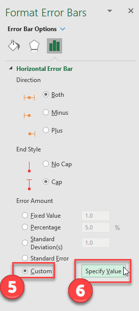
7. For Positive Error Values, Copy Graph Upper 95%
8. For Negative Error Value, Select Graph Lower 95%
9. Select the Vertical Line and delete to get rid of them so that we only see the horizontal error bars
10. Delete the axis on the right side
Final Graph
After making some optional adjustments, you can see the final graph below.
Источник
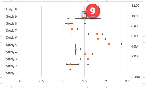
Как создать лесной участок в Excel
Лесная диаграмма (иногда называемая «блоббограммой») используется в метаанализе для визуализации результатов нескольких исследований на одном графике.
На оси x отображается представляющее интерес значение в исследованиях (часто отношение шансов, величина эффекта или средняя разница), а на оси y — результаты каждого отдельного исследования.
Этот тип графика предлагает удобный способ визуализировать результаты нескольких исследований одновременно.
В следующем пошаговом примере показано, как создать лесной участок в Excel.
Шаг 1: введите данные
Сначала мы введем данные для каждого исследования в следующем формате:
Шаг 2: Создайте горизонтальную гистограмму
Затем выделите ячейки в диапазоне A2:B21. На верхней ленте щелкните вкладку « Вставка », а затем выберите параметр «Двухмерная кластеризованная полоса» в разделе « Диаграммы ». Появится следующая горизонтальная гистограмма:
Шаг 3: Переместите метки осей на левую сторону
Затем дважды щелкните метки вертикальной оси. На панели « Формат оси» , которая появляется в правой части экрана, установите для параметра « Положение метки » значение «Низкое».
Это переместит метки вертикальной оси в левую часть графика:
Шаг 4: Добавьте точки диаграммы рассеяния
Затем мы добавим новую серию под названием « Точки », которую будем использовать для добавления точек диаграммы рассеяния на график:
Затем щелкните правой кнопкой мыши в любом месте графика и выберите « Выбрать данные ». В появившемся новом окне нажмите « Добавить », чтобы добавить новую серию. Затем оставьте поле «Имя серии» пустым и нажмите « ОК ». Это добавит к графику одну полосу:
Затем щелкните правой кнопкой мыши одиночную оранжевую полосу и выберите «Изменить тип диаграммы серии».В появившемся новом окне измените Series2 на диаграмму рассеяния:
После того, как вы нажмете OK , на графике появится одна точка диаграммы рассеяния:
Затем щелкните правой кнопкой мыши одиночную оранжевую точку и выберите « Выбрать данные ». В появившемся окне нажмите Series2 и затем нажмите Edit .
Используйте диапазон ячеек, содержащий размер эффекта, для значений x и диапазон ячеек, содержащий точки, для значений y. Затем нажмите ОК .
На график будут добавлены следующие точки диаграммы рассеяния:
Шаг 5: Удалите бары
Затем щелкните правой кнопкой мыши любой из столбцов на графике и измените цвет заливки на No Fill :
Затем дважды щелкните ось Y справа и измените границы оси на минимальное значение 0 и максимальное значение 20. Затем щелкните ось Y справа и удалите ее. У вас останется следующий сюжет:
Шаг 6: Добавьте планки погрешностей
Затем щелкните крошечный зеленый знак плюса в правом верхнем углу графика. В раскрывающемся меню установите флажок рядом с Error Bars.Затем щелкните одну из полос вертикальных ошибок в любой из точек и нажмите «Удалить», чтобы удалить полосы вертикальных ошибок из каждой точки.
Затем нажмите « Дополнительные параметры » в раскрывающемся списке рядом с «Панель ошибок». На панели, которая появляется справа, укажите пользовательские планки погрешностей, которые будут использоваться для верхней и нижней границ доверительных интервалов:
Это приведет к следующим полосам ошибок на графике:
Шаг 7: Добавьте метки заголовка и оси
Наконец, не стесняйтесь добавлять заголовок и метки осей и изменять цвета диаграммы, чтобы она выглядела более эстетично:
Вы можете найти больше руководств по визуализации Excel на этой странице .
Источник
How to Create a Forest Plot in Excel?
Forest plots are an excellent way to convey a multitude of information in a single picture. Forest plots have become a recognized and well-understood technique of displaying several estimates concurrently, whether used to demonstrate various outcomes in a single research or the cumulative knowledge of an entire subject. This article investigates advanced uses of the forest plot with the goal of demonstrating Excel’s versatility in producing both basic and sophisticated forest plots. Forest plots are widely used to display meta-analysis findings. Unfortunately, no conventional forest plot graph option is available in Excel. In a meta-analysis, a forest plot is used to show the findings of many research in one figure.
The x-axis represents the value of the interest in the research (often an odds ratio, effect size, or mean difference), while the y-axis represents the findings of each particular study. This style of display makes it easy to see the findings of several research at once.
Creating a Forest Plot in Excel
The following step-by-step example illustrates how to make a forest plot in Excel.
Step 1: Enter the Data: First, we’ll enter each study data in the following format.
Step 2: Create a Clustered Bar Chart: Then, highlight the cells in the A2:B9 range. Click the Insert tab along the top ribbon, then the 2-D clustered bar option in the Charts section.
The horizontal bar chart shown below will appear:
Step 3: Add scatterplot Points: After that, we’ll create a new series called Points, that we’ll use to add scatterplot points to the graph:
After then, right-click anywhere on the plot and choose Data.
Step 4: Add Series: To add a new series, click Add in the select data source box that displays.
Then, leave the Series Name field empty and click OK. This will result in the addition of a single bar to the plot:
Step 5: Change Chart Type: Next, right-click the single orange bar and select Change Series Chart Type from the menu that appears. Change Series2 to a scatterplot in the new window that appears:
When you click OK, the chart will show a single scatterplot point.
Step 6: Update Series: After that, right-click the single orange spot and choose Data.
Click Series2 and then Edit in the box that displays.
For the x-values, use the cell range containing Odds Ratio, and for the y-values, use the cell range containing Points. Then press the OK button. The scatterplot points listed below will be included in the plot.
Step 7: Remove the Bars: Then, right-click on any of the plot’s bars and change the fill color to No Fill.
Then, on the right, double-click the y-axis and set the axis boundaries to a minimum of 0 and a maximum of 8.
Then, on the right, click and erase the y-axis. The following plot will be left.
Step 8: Add Error Bars: For Graph Lower, take the Odds Ratio – Lower 95% CI.
For Graph Upper, take the Upper 95% CI – Odds Ratio.
Step 9: Add Error Bars: Then, in the upper right corner of the plot, click the little green + sign. Check the box next to Error Bars in the selection menu. Then, on any of the points, click on one of the vertical error bars and select delete to remove the vertical error bars.
Then, under the selection next to Error Bars, select More Options. In the right-hand pane, enter the custom error bars to be used for the top and lower boundaries of the confidence intervals:
Step 10: Final Graph: As a result, As you can see, the chart resembles a forest plot:
Источник
A forest plot is an efficient figure for presenting several effect sizes and their confidence intervals (and when used in the context of a meta-analysis, the overall effect size) (.pdf). They can be created in a variety of tools, including R and meta-analytic software. Here I will describe how to create these plots using Excel.* Note: It is very possible (if not likely) that this entire task is easier with R or with other meta-analytic software. The purpose here is to show how this can be done with a tool that many of us are familiar with (if fact, I will assume that you have working knowledge about Excel).
Some people offer special Excel meta-analysis plugins to create forest plots, but these are not necessary. Instead, I will build on a short peer-reviewed paper that describes how to make forest plots in Excel (see their template). In short, I borrow their method and expand it to show how it can be very customizable. I used Excel 2007 and I know that Excel 2010 is very similar. I don’t know how either newer or older versions of Excel will work. [Update: These instructions seem to work well enough with Excel 2013 too.]
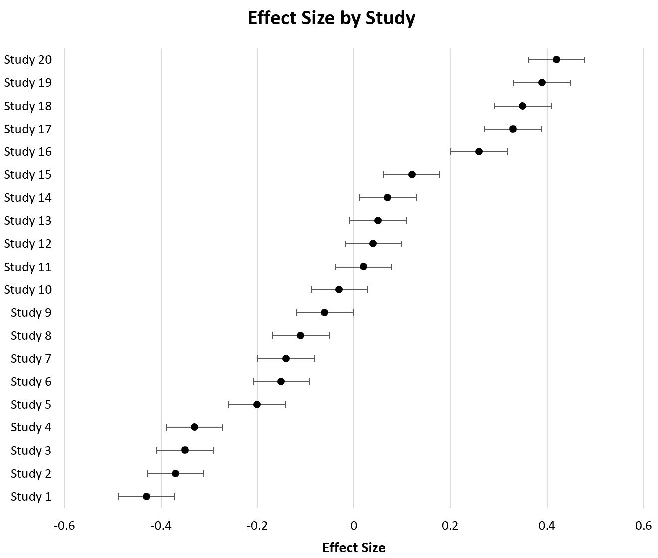
The key insight for making forest plots in Excel is that scatter plots do not need to be used to make scatter plots. Instead, they can be treated as a blank canvas where you place things using X-Y coordinates. I will make a forest plot of the association between religious fundamentalism and the feeling thermometers for 20+ groups from the 2012 ANES (higher numbers = more fundamentalism and more positive feelings).
You can find the Excel file to use as a template here.
1. Setup your Excel spreadsheet like the figure below. The first column is the list of the target groups I looked at in the ANES. The second column is the order that I want them in for the forest plot. They are ordered so that in the forest plot they range from most positive at the top to the most negative at the bottom. The next two columns are the low and high values of the 95% confidence intervals of the correlation.** And the last two columns are the CIs that are used when making the figure (distance between the CI and the r).

2. Create a scatter plot using the second column as your Y-axis values and the third column (with the correlations) as your X-axis values. Make several adjustments: (a) Adjust the y-axis to range from 0 to 24 (in the case of the current data) and remove all tick marks and labels. (b) Get rid of the gridlines. (c) Adjust the x-axis to a range that makes sense (for this example, -.80 to +.80 works well) with a major unit that makes sense (for this example, .2). (d) Make the data points look good. I prefer black squares, adjust the size as it makes sense of your application. This is the start.

3. Now add in custom horizontal confidence intervals using the last two columns. (more info on adding custom error bars in Excel) This, more or less, gets you to the place where previous examples will get you, typically with an added suggestion to use text boxes to add labels. Don’t use text boxes. There is a better way…
4. Now you need to add a new series to the scatterplot that you will use to place the labels (in this case, the names of the groups). I added a new column with the entry -.58 for all of the groups (this number can be modified based on aesthetics). Then create the new series with this new column as the x-values and the same y-values as before. This will make a vertical line of markers on the left side of the figure and these new data points will be used to anchor your labels. Now, make those invisible by removing their fill and their border.
5. Right click on the now invisible markers and click “add data labels”. Right click again and click “format data labels”. Select “left” for label position.
6. Now select the “1” label, put an “=” in the formula box, and then click on the label for the 1 position (Atheists). Do this for each of the labels and soon you’ll have labels for each of the groups. (here is another explanation for how to add custom labels with clearer step-by-step instructions for this step)

7. Now, you can finish things up. Most concretely: Add a label at the bottom.

But you can also go further if you’d like. You can add vertical lines to indicate heuristic cutoffs for small, medium, and large effects. You can text information about the size of the effects. You can change the color or shape of the labels to highlight different comparisons (e.g., effects that are p < .05 different from zero). See below for an example with some of these additions.

You can find the Excel file for both of these forest plots here.
*Note that Cumming’s Excel files for his book can also help with forest plots, but they are not always as customizable and flexible as I’d like.
**The sample size here is >5000, so these CIs are preeeeetttttty small.
Asked
11 years, 7 months ago
Viewed
57k times
$begingroup$
A friend of mine asked me on how to do it in excel, and after playing with it a bit (and googling it) I gave up.
Does any one have a suggestion on how it might be done?
![]()
asked Sep 12, 2011 at 5:24
![]()
Tal GaliliTal Galili
20.7k33 gold badges138 silver badges202 bronze badges
$endgroup$
$begingroup$
Excel gets a bad rap (I suspect because of those horrible 3d graphs and inappropriate pie charts), but this is fairly easily accomplished in Excel charts. It simply takes knowing how to arrange elements on the chart.
This example by Jon Peltier on how to make box plots in Excel can be very easily adapted to forest plots. In fact he has a free utility to make error bars, although doing it yourself is not all that difficult.
If you plan on doing work in Excel and that involves making charts, it would do everyone good to peruse the work on Jon’s blog.
answered Sep 12, 2011 at 12:19
![]()
Andy WAndy W
15.6k8 gold badges75 silver badges197 bronze badges
$endgroup$
0