
You can split fonts into two main styles. There are serif fonts (with lines flicking out of each letter) and sans-serif fonts (without the lines). Serif fonts tend to be easier to read, but they look more formal. This article will show you some of the best ones in Word.
The best serif fonts in Microsoft Word are Times New Roman, Garamond, and Palatino Linotype. They all work well to show a more formal look in your writing. They’re also very easy to read, making them solid choices if you’re looking to write an essay or academic paper.
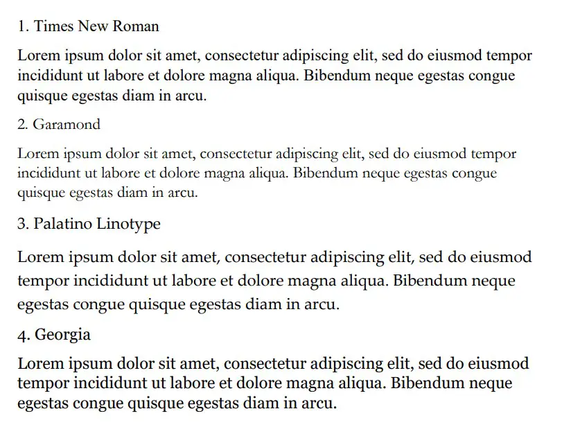
Times New Roman
Times New Roman is the default Microsoft Word font. You really can’t go wrong with it. Everyone knows what it looks like, and everyone uses it as the default serif font in Word. If you don’t actively change your font, it’s likely that you’re writing in Times New Roman.
It is a very professional font that has been proven to be one of the easiest to read on paper. It also makes your writing look more trustworthy, which works wonders when you use it for something like an academic or scientific paper.
You will find that Times New Roman is one of the most popular fonts in the world. It’s such a good choice because of how popular it is, and it can fit in just about anywhere in your writing. It works well for titles and in the main body of the text.
Garamond
Garamond is another great serif font that works really well. It comes in at a close second to Times New Roman, which is saying a lot considering how popular Times New Roman is. Garamond is fairly easy to read, and it even comes in slightly smaller in size.
Garamond is a great font that makes your writing much more concise. The smaller size of this font allows you to fit more words onto your page without feeling like you’re writing an essay full of gibberish and waffle.
If people decided to choose a different serif font in place of Times New Roman, it’s likely that Garamond would rank quite highly as their next favorite pick.
Palatino Linotype
Palatino Linotype is a great font choice that a lot of people enjoy using. It feels a bit fresher than some of the other serif fonts, and the size of the letters makes it a little more appealing when you are writing it for more informal purposes.
You will find that Palatino Linotype looks good wherever you put it. It can be both in a heading or in the main text body. As long as you like the look of the font, you’ll find a great place to put it to make sure it fits in.
The letters on Palatino Linotype feel a little more “open” than those of Times New Roman and Garamond. That’s what makes it a better choice if you’re looking for something that’s a little bit easier to read or comes across with more informal energy.
Georgia
Georgia is a very popular choice that a lot of essay writers are recommended to use. Many academics also vouch for Georgia, making it a really good choice if you’re looking to capture a more formal and trustworthy look.
People say that Georgia works really well as a heading. While this is definitely true, there is nothing wrong with using it as part of the main body of your text either. It can work in just about any situation, which makes it a great serif font choice.
While it’s not as popular as Times New Roman, it’s definitely up there in terms of how many people use it. It’s a fairly generic serif font, so there aren’t any specific style choices that stand it out from some of the rest.
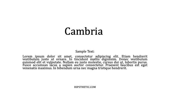
Cambria
Cambria is another great serif font that is a default choice in Microsoft Word. While it isn’t automatically set as a font choice, it is automatic if you use the specific Word style that allows you to write headings and sub-headings.
Cambria is one of the best choices to introduce new ideas with headings and sub-headings. Of course, you don’t have to be limited to including it as a heading. If you want it as the text body, too, that’s fine.
You’ll find that this ranks highly in popularity compared to many of the other fonts. It looks really good on the page because of the more “square” feel that the letters have.
Bodoni MT
Bodoni MT is a classical serif font that works well. People like to use this font for novels, which shows that it must be an easy-to-read choice. The purpose of novels is to have thousands of words page after page, so having an easy-to-read font is always going to be ideal.
Bodoni MT is one of the thicker fonts on this list. It almost looks like it is written in bold, which really helps it to stand out from some of the other options. It works really well when it’s used to write multiple words at the same time.
The serif style looks very similar to some of the best fonts on this list, too. While this doesn’t allow Bodoni MT to be unique, it does allow it to have a familiar look and feel to it.
Bookman Old Style
Bookman Old Style is another great font that is common for novels. Again, if it works well in novels, you can bet that it works well in any situation when you might need someone to read through what you’re writing carefully.
Bookman Old Style is a large font. It allows the letters to appear more free and open compared to many of the other choices. This makes it a great font that’s worth trying out.
Lucida Bright
Lucida Bright is a good font choice. It’s part of the famous Lucida font family, and it works really well to show a large serif style. Lucida Bright is one of the larger fonts on this list, making it a great choice if you’re trying to make your writing really easy to read.
Some people would argue that Lucida Bright is too large for most formal documents. It does mean that you’ll take up a few extra pages because of your larger font choice, but this isn’t always a problem. Sometimes, it’s refreshing to include a larger font.
Modern No. 20
Modern No. 20 is an interesting serif font that doesn’t often get used. It’s a great choice nonetheless, and it applies to situations where some of the other serif fonts might feel a bit too pretentious or samey.
Modern No. 20 has very sharp serifs on its letters. While all of the fonts discussed so far have decent serif accents, Modern No. 20 seems to have some of the largest serifs that really help it to bring a unique style to your writing.
It’s much smaller than most of the other options too. It makes for a great choice if you’re trying to include a lot of information in one area without feeling like you have to fill up a lot of pages to get it to work.
Rockwell
Rockwell is a great option that many people like to use. It comes from the Rockwell family, which has made its name with more obvious and impactful fonts like ExtraBold and Condensed. Rockwell on its own is a great option for your serif-font needs.
It fits a similar style to most of the other serif fonts. There is nothing particularly unique that makes it stand out, which is usually a good thing. People don’t like their serif fonts to look out of place in their writing, and Rockwell will fit in no matter where you put it.
Poor Richard
Poor Richard is a great font in Microsoft Word that deserves more attention. It’s a very attractive font that comes with small lower-case letters. The capital letters tend to dwarf the lower-case ones, making it an interesting font style that the other serif fonts don’t have.
This font style is both a blessing and a curse, depending on how you look at it. It’s a blessing because it means that Poor Richard has a unique personality that allows it to stand out from the rest of the serif crowd.
It’s a curse because the uniqueness and size of the font in its style mean it doesn’t work very well formally. You’ll find that Poor Richard is a much better serif font for your informal writing.
Perpetua
Perpetua follows the same general idea as Poor Richard. It’s not all that popular, but it deserves to be. It’s a great font with an interesting style (most of which comes from the way some of the letters go below the written line, like the “p’s” and “q’s”).
Perpetua works really well in formal and informal contexts. It’s worth trying to use it yourself to see whether you can get along with it. A lot of people think it’s an attractive font, but it doesn’t often get used because it’s not a very well-known name.
You may also like:
12 Smallest Fonts In Microsoft Word
12 Best Cursive Fonts in Microsoft Word
12 Most Scary Fonts for Halooween in Microsoft Word

Martin holds a Master’s degree in Finance and International Business. He has six years of experience in professional communication with clients, executives, and colleagues. Furthermore, he has teaching experience from Aarhus University. Martin has been featured as an expert in communication and teaching on Forbes and Shopify. Read more about Martin here.
![]()
Written by Allen Wyatt (last updated December 25, 2021)
This tip applies to Word 97, 2000, 2002, and 2003
When you are applying formatting to various parts of your document, you may find it useful to actually see a sample of a font before you apply it. For instance, the drop-down font list on the Formatting toolbar can be very handy if the fonts names are displayed using the representative typeface, rather than just a simple listing of typeface names.
Beginning with Word 2000 you can control whether Word uses typefaces to show font names. You do this by following these steps:
- Choose Customize from the Tools menu. Word displays the Customize dialog box.
- Make sure the Options tab is selected. (See Figure 1.)
- Ensure the List Font Names in Their Font check box is checked.
- Click on OK.
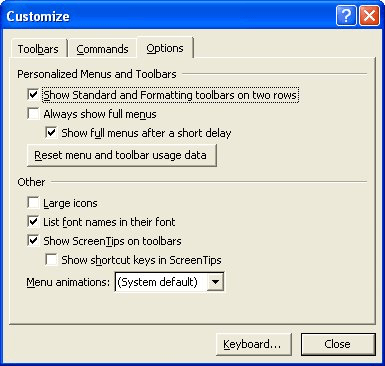
Figure 1. The Options tab of the Customize dialog box.
If you check out the font drop-down list, you will notice that it now uses the various typefaces to display font names.
Remember that this feature is only available beginning with Word 2000. Regardless of the version of Word you are using, you can always use the Font dialog box to display what a font will look like. Simply select the text you want to format and then press Ctrl+D. The font dialog box is displayed, with the selected text appearing as the sample at the bottom of the dialog box. As you select different fonts in the dialog box you can easily see the effect it has on the selected text.
WordTips is your source for cost-effective Microsoft Word training.
(Microsoft Word is the most popular word processing software in the world.)
This tip (1550) applies to Microsoft Word 97, 2000, 2002, and 2003.
Author Bio
With more than 50 non-fiction books and numerous magazine articles to his credit, Allen Wyatt is an internationally recognized author. He is president of Sharon Parq Associates, a computer and publishing services company. Learn more about Allen…
MORE FROM ALLEN
Putting Bold Words in an Index
There are several ways you can create an index in Word, but the first step is always to figure out what should go in the …
Discover More
Standard Text before a Sequence Number
When you use fields to number items within a document, you may want to add some standard text before each field. There …
Discover More
Grabbing the MRU List
The MRU (most recently used) list informs you which documents were the last to be opened and edited in Word. You can …
Discover More
|
02-26-2021, 12:13 AM |
|||
|
|||
|
General Question on List of Font Names Hello Has Anyone got an idea that The List of Font.Names on MS-Word Document in Home Button and Userform.Textbox.Font.Names are Equal or is the List of Font Names limited in userform.Textbox. So Basicially How many Font Names will be there in Word Document against the Font Names available in Userform. Textbox or Is the List equal Does this to depend on MS-Office Version and Window versions too ? Or is the same for all the MS-Office and Windows versions Because on basis of above I was planning to upload dropdown with all the Font Names in Combobox ? Thanks and Regards
|


|
02-26-2021, 04:52 AM |
|
How are you adding the names to the listbox. Try the following which adds all the font names to the list box ListBox1. On my PC the count is 660 fonts. Code: Private Sub UserForm_Initialize()
Dim arrFonts As Variant
Dim lng_Index As Long
With ListBox1
.Clear
ReDim arrFonts(Application.FontNames.Count - 1)
For lng_Index = 0 To Application.FontNames.Count - 1
arrFonts(lng_Index) = Application.FontNames(lng_Index + 1)
Next lng_Index
SortArray arrFonts
.List = arrFonts
MsgBox .ListCount
End With
End Sub
Private Function SortArray(Arr As Variant) As Variant
Dim i As Long
Dim j As Long
Dim Temp As Variant
For i = LBound(Arr) To UBound(Arr) - 1
For j = i + 1 To UBound(Arr)
If UCase(Arr(i)) > UCase(Arr(j)) Then
Temp = Arr(j)
Arr(j) = Arr(i)
Arr(i) = Temp
End If
Next j
Next i
SortArray = Arr
End Function
__________________
|
|
02-26-2021, 05:27 AM |
|||
|
|||
|
GMayor Indeed Quick response Instead of Listbox I’ve used Combobox. Hope you dont mind Quote: Try the following which adds all the font names to the list box ListBox1. On my PC the count is 660 fonts. I am getting count as 160 in Msgbox Quote: How are you adding the names to the listbox I really did not have idea to incorporate the Font names into Combo or Listbox. The method you have only showed by coding. Quote: On my PC the count is 660 fonts. Are the 660 fonts on Word Document in Home button outof which only 160 fonts Count are for Textbox and Labels SamD
|
|
02-26-2021, 09:51 PM |
|
The home tab lists the fonts the current printer is able to print.
__________________
|
|
02-26-2021, 10:33 PM |
|||
|
|||
|
Quote: The home tab lists the fonts the current printer is able to print. OK. Great So any Particular macro to get only list of Home Tab Fonts Why you got 660 count and why i got 160 count. Is it b’cos ComboBox has limitation SamD
|

|
02-27-2021, 05:04 AM |
|
Quote:
Originally Posted by SamDsouza Why you got 660 count and why i got 160 count. Is it b’cos ComboBox has limitation It’s because I have more fonts installed.
__________________
|

|
02-27-2021, 09:33 PM |
|||
|
|||
|
Quote: It’s because I have more fonts installed Any Ideas ? From Where can we install the same ? SamD
|
|
02-27-2021, 10:20 PM |
|
Sam Fonts can come from a variety of sources and there is no reason why you would need the same list of fonts that Graham has unless you are sharing files with him and have included the whole gamut in a document. A well designed document shouldn’t actually use more than one or two typefaces so it is highly unlikely that you NEED 600+ fonts. Loading hundreds of fonts you will never use is also not advised as it makes life more difficult and potentially slows applications down (eg opening the app or displaying available fonts).
__________________
|
|
02-28-2021, 01:56 AM |
|
I would go further.You simply don’t need that many fonts. The only reason I have so many is that they are often installed with assorted software regardless of whether you actually want them or not and also with various language versions of Windows. I rarely use more than four fonts in any normal circumstances. One day I may get round to removing some of the unused ones, no doubt to find that some software doesn’t work properly without them, but I am sure I could manage with standard fonts Calibri, Times New Roman and Tahoma (which I use for my userforms). For Word projects it is best to declare which standard fonts (if you want the project to be widely used) are available to that project.
__________________
|
|
02-28-2021, 05:22 AM |
|
You can usually find all the installed fonts in:
__________________
|
|
02-28-2021, 07:24 PM |
|||
|
|||
|
Thank you very much GMayor for the macro and suggestions After going through your suggestions Thank you once more SamD
|
In this tutorial, you will learn about how to see list of fonts used in a Word document. By default, there is no option in MS Word that can help you know which fonts are exactly used in a word document. That means if you want to know the same, then the only option you have is to open the document and then manually check the fonts. But today, I came across a free tool which can help you see which fonts are used in any Word document.
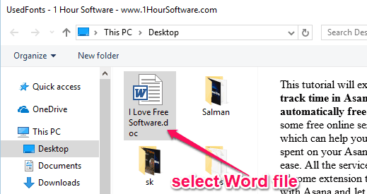
For that, you would need to simply open this software, select a Word file, and voila you get the result instantly. Do note that it supports only the “DOC” files. There are also many font identifiers available which can help you find fonts from images and webpages. But, none of them has the option to find fonts used in a Word document.
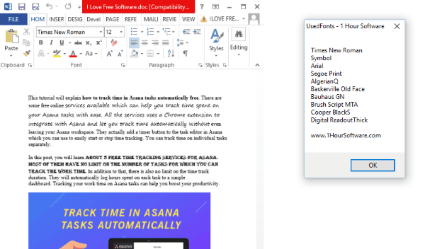
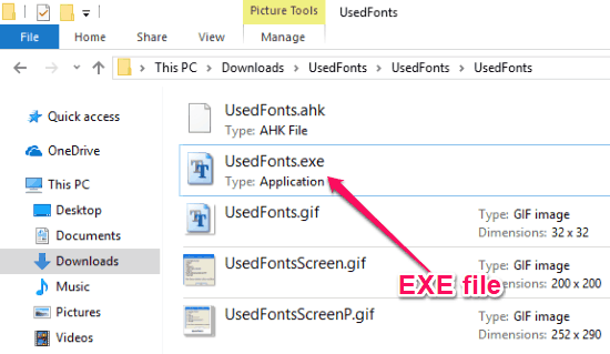
To get started, the first thing you need to do is download “UsedFonts” on your PC. The link is given at the end of this post. After that, extract the archive and then you can see a “UsedFonts.exe” file inside the extracted folder.
Now, to see the list of fonts used in a Word document, simply double-click on the EXE file. Then it will ask you to select the source Word document from your PC. Remember, it only supports DOC file.
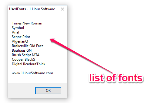
As soon as you do that, it will automatically analyze the text in the Word document and generate a list of fonts used in the document. You can see the list of fonts in a small popup window, as shown below.
Closing Words:
So, if you have been looking for a way to find out which fonts are used in a Word document, then this tutorial can be helpful for you. UsedFonts makes it super easy for you to do that. No Rocket Science required, as all you gotta do is select a Word file in this tool and the rest is done automatically. Go ahead try it out for free.
Get “UsedFonts” from here.
|
Editor Ratings: |
|
|
User Ratings: [Total: 1 Average: 4] |
|
| Home Page URL: | Click Here |
| Works With: | Windows |
| Free/Paid: | Free |
|
Tags: fonts |
Not many people consider the importance of choosing and using the right font to project professionalism on your on-screen documents or printed materials. If you’re a business owner, student, or anyone who wants to add some professionalism to your materials, resume, research papers, or office materials, then you’ve come to the right place. We curated a list of fonts that are all easily accessible and can be for professional use.
Microsoft Word
Microsoft Word is a great tool that you can use to create a diversity of professional documents. We decided to create our list of professional fonts around Microsoft Word since most people are accustomed to this software, as it is very convenient, straightforward, and easy to use. It also houses a lot of great fonts featuring different styles such as handwriting fonts, cursive fonts, and decorative fonts. that you can choose from.
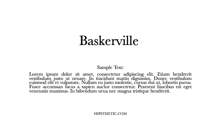
Baskerville
John Baskerville designed this Typeface in the 750s. The Typeface exhibits evenly spaced clean serif characters that shows a significant variance of thick and think strokes. Baskerville is a considerable font to use in resumes, presentations, and documents.
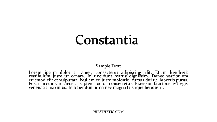
Constantia
John Hudson designed this Typeface for both paper publishing and electronic text use. The font features outspread serif characters for an easy-to-read look and feel.
Cambria
This familiar font is often used as the font has been designed for printed materials and on-screen documents. You can never go wrong using Cambria as it is one of those easily accessible professional fonts in word.
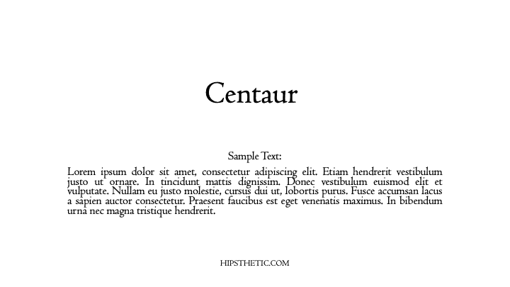
Centaur
This font by Bruce Rogers was initially designed to be used by the Metropolitan Museum for titles. Eventually, Centaur was worked on to use in-text and remains to have that unique characteristic of the font being legible in both large and small text sizes.
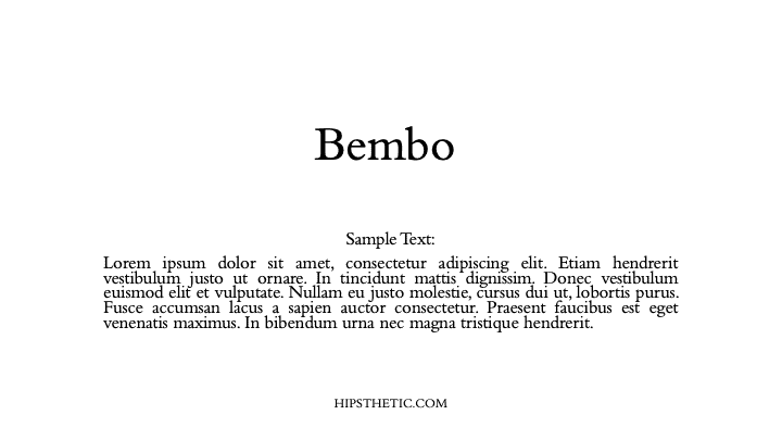
Bembo
Initially, they used the Bembo typeface for Pietro Bembo’s Book called “De Aetna.” Hence, where the font got its name. The Bembo font gives that roman serif typeface that we are vastly familiar with today.
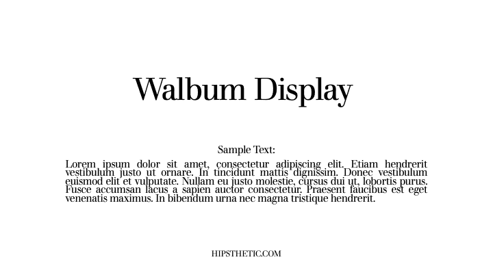
Walbum Display
Justus Erich Walbum initially made the Walbum font family in Germany during the 1800s. This modern serif font creates a nice soft blend of characters that fit in any printed material type. This font is accessible to the eyes and comfortable to read from large printed documents to small on-screen texts.
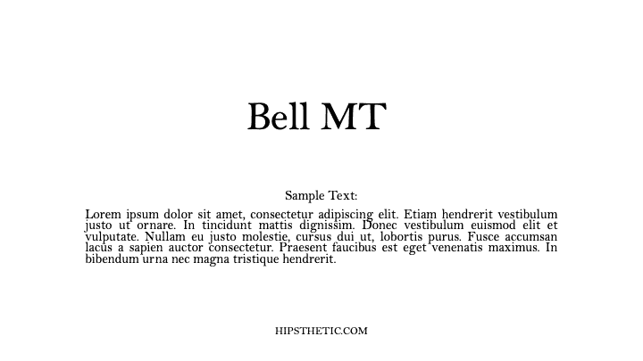
Bell MT
Richard Austin made the Bell MT font for John Bell around 1788. In its first version, the font did not appear to have bold weight on its characters. The Bell Mt that we are familiar with today stemmed from a revision in 1992 to its new TrueType form. This font is one of those professional fonts in word that you can use in long articles, books, and magazines.
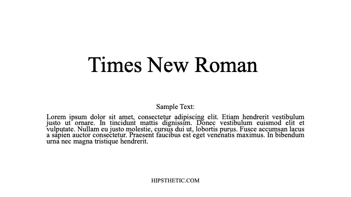
Times New Roman
This font is a classic, widely popular professional font in word that is definitely always dependable to use in any professional document or text. If you’re looking for something easy and familiar to use, for both legal and non-legal documents, Times New Roman is the way to go.
Sans Serif Professional Fonts in Word
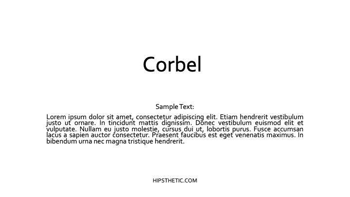
Corbel
The Corbel font projects a crisp, clean appearance on screen and paper. The font’s characters project soft fluid curves that add to its legibility and function in all sizes.
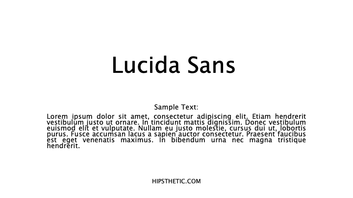
Lucida Sans
A notable characteristic of the Lucida Sans is its considerable height making it very easy to read and pleasing to the eye. This font is widely used in professional documents such as manuals, memos, directories, and more.
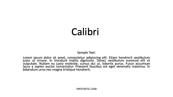
Calibri
Calibri is no doubt a very familiar font for most. This modern sans serif typeface has that subtle round corners on its characters that give that affable but appropriate look on your printed text or on-screen documents.
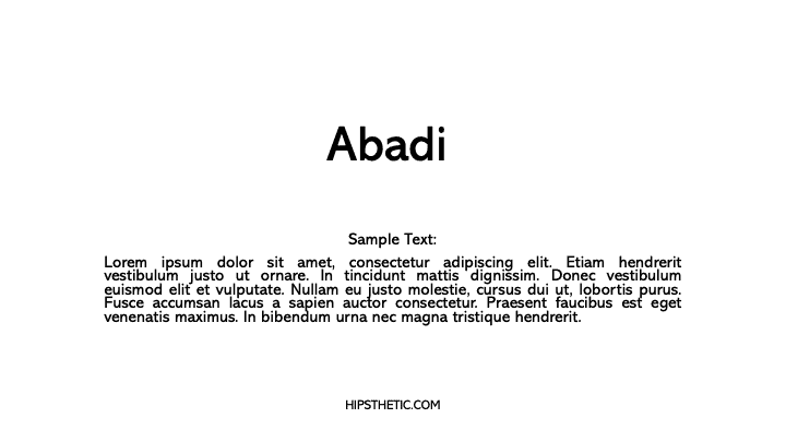
Abadi
The Abadi typeface showcases a subtle humanistic character with an array of different weights to choose from. The font was first introduced in 1988 as a versatile sans serif typeface used in newspapers, advertising, magazines, and more.
Professional Fonts
We hope you enjoyed our list of the best professional fonts in Word. If you’re looking for more fonts to add to your list, check out our post on Professional Looking Fonts on Word, Canva, & Google Docs.
In MS Word, an entire family of fonts is usually referred to as a Typeface (like Times New Roman). People also prefer using font style or font type.
And “Font” as a word, is reserved for a combination of different features such as font style, size, color and weight (like Arial, 12 pt, Red, Bold).
Therefore, the word “Font” in MS Word often means a whole family of display features such as the typeface, color, weight, and/or size.
If this distinction makes sense to you, let’s now see how we can explore the list of font styles in MS Word as well as how to add new font types or typeface.
Below is an illustration of the various fonts and how they look when applied.


Below is the list of All fonts in MS Word. The above pictures are illustrations of how these fonts look like.
| Abadi MT Condensed Light | Impact |
| Albertus Extra Bold | Incised901 Bd BT |
| Albertus Medium | Incised901 BT |
| Allegro | Incised901 Lt BT |
| Amazone BT | Informal011 BT |
| AmerType Md BT | Jester |
| Antique Olive | Kabel Bk BT |
| Arial | Kabel Ult BT |
| Arial Black | Kaufmann Bd BT |
| Arial MT | Kaufmann BT |
| Arial Narrow | Korinna BT |
| Arrus BT | Letter Gothic |
| Aurora Cn BT | Lithograph |
| AvantGarde Bk BT | Lithograph Light |
| AvantGarde Md BT | Long Island |
| BankGothic Md BT | Lucida Console |
| Bazooka | Lucida Handwriting |
| Benguiat Bk BT | Lucida Sans |
| BernhardFashion BT | Lucida Sans Unicode |
| BernhardMod BT | Lydian BT |
| BinnerD | Marigold |
| Book Antiqua | Market |
| Bookman Old Style | Matisse ITC |
| Boulder | Monotype Corsiva |
| Bremen Bd BT | MS LineDraw |
| Calisto MT | News GothicMT |
| Calligrapher | NewsGoth BT |
| CaslonOpnface BT | OCR A Extended |
| Century Gothic | Old Century |
| Century Schoolbook | Onyx BT |
| Cezanne | OzHandicraft BT |
| CG Omega | Pegasus |
| CG Times | Pickwick |
| Charlesworth | Poster |
| Charter Bd BT | PosterBodoni BT |
| Charter BT | PTBarnum BT |
| Chaucer | Pythagoras |
| ChelthmITC Bk BT | Ribbon131 Bd BT |
| Clarendon Condensed | Sceptre |
| CloisterBlack BT | Serifa BT |
| Comic Sans MS | Serifa Th BT |
| Copperplate Gothic Bold | ShelleyVolante BT |
| Copperplate Gothic Light | Sherwood |
| CopperplGoth Bd BT | Signboard |
| Cornerstone | Socket |
| Coronet | Souvenir Lt BT |
| Courier | Staccato222 BT |
| Courier New | Steamer |
| Cuckoo | Storybook |
| Dauphin | Subway |
| Denmark | Swis721 BlkEx BT |
| English 111 Vivace BT | Swiss911 XCm BT |
| EngraversGothic BT | Tahoma |
| Exotc350 Bd BT | Technical |
| Fransiscan | Teletype |
| Freefrm721 Blk BT | Tempus Sans ITC |
| FrnkGothITC Bk BT | Times |
| Futura Bk BT | Times New Roman |
| Futura Lt BT | Times New Roman PS |
| Futura Md BT | Trebuchet MS |
| Futura ZBlk BT | Tristan |
| FuturaBlack BT | Tubular |
| Galliard BT | TypoUpright BT |
| Garamond | Unicorn |
| Geneva | Univers |
| Geometr231 BT | Univers Condensed |
| Geometr231 Hv BT | Vagabond |
| Geometr231 Lt BT | Verdana |
| GeoSlab 703 Lt BT | Westminster |
| GeoSlab 703 XBd BT | ZapfEllipt BT |
| GoudyHandtooled BT | ZapfHumnst BT |
| GoudyOLSt BT | ZapfHumnst Dm BT |
| Haettenschweiler | Zurich BlkEx BT |
| Heather | Zurich Ex BT |
| Helvetica | |
| Herald | |
| Humanst 521 Cn BT | |
| Humanst521 BT | |
| Humanst521 Lt BT |
How to add new fonts to Word
Despite the fact that Microsoft Word and the other office apps have plenty of font styles, you may need to add new fancy fonts into your Word document.
You have no problem because, in this tutorial, I will show how to add any new font into MS Word and use it in your projects.
However, there are several ways you can add new fonts in MS Word.
I’ll go through each option one after the other here in this article.
Option 1: Using the Microsoft Store
Using the Microsoft Store, you can add new fonts into your
Word document or other office apps.
The steps are outlined below:
- Go to Settings on your PC
To open settings on your PC, type settings in the search bar
and press the Enter key.

- Click on Fonts > Get more fonts in
Microsoft Store

Upon clicking on Get more fonts, the Microsoft Store will open with a list of available fonts in the store.
- If you find the font you want to add, click on
it.

- Then click on the Get button to download the font.

Of course, some of the fonts aren’t free. Some of them require you to make a little contribution before you can download.
After completing the above steps, the downloaded font family
will be available in Word and the other office apps like Excel or PowerPoint.
Option 2: Using the Font Installer
Microsoft Store doesn’t have lots of fonts. Therefore, you may not get the font you are looking for from there.
However, you can download whatever new font you want from other sources and install it into MS Word or other office apps.
Obey the steps below:
- Download the font you wish to add to MS Word.
Download Fonts Here: AbstractFonts.Com
There are several places you can download awesome fonts from. The above link also has a lot of amazing free fonts for you to explore. Click here for more resources on free fonts.
- After downloading the new font you want to add, browse to the folder that has the font file.
Note: The font may be in a zip file. If that’s the case, you
should unzip the file first.

- Right-Click on the font file. A shortcut menu will
appear, select Install or Install for all users.

After applying all the steps above, the installed font will
now be available in your list of fonts in MS Word and the other office apps.

These are the various ways you may add new fonts into MS Word.