
This article is cropped to provide you with 2 quick and manageable ways to auto fit tables to contents or Page in your Word document.
Inserting a table to hold data is now inevitable in Word using. More often than not, we don’t stop in merely having a table but try to make it look great in document. This means we will need to properly adjust table size accordingly.
Now, let’s first take a look at occasions when we must change a table size:
- It’s pretty often to insert a new page in landscape orientation. Then you originally perfect table could be too small in the new page setup.
- The size of table cells intends to change according to word numbers. This absolutely will undermine the document outlook.
See the example below:
Next, let’s get down to our business today to introduce you the 2 solutions here.
Method 1: Alter Manually
- First and foremost, click to select the whole table.
- Then, click “Layout” tab under “Table Tools”.
- Next, go to “Cell Size” group to click “AutoFit”.
- And on the drop-down menu, choose what you need accordingly, such as “AutoFit Contents” or “AutoFit Window”. The former means to change table size according to contents size, while the latter refers to change of table size due to page setup.


Here is what you may get:

As you can see, this method works best when there are only a few tables to manage. However, when a large number of tables are involved, let’s take a more smart and quick way.
Method 2: Use VBA Codes to Do it in Batch
- To begin with, make sure your “Developer” tab is available in the Ribbon and click it. If not, click here and jump to this article: How to Insert Background Music into Your Word Document
- Then, click “Visual Basic” in “Code” group to open VBA editor.
- On the left “Project” pane, find the project with document name after it. And click “ThisDocument”.
- Next, click “Insert” on toolbar.
- And choose “Module” on the list.

- Now the editing area shall expand on the right side. If you want to AutoFit tables according to contents, you should paste the following codes there:

Private Sub AutoFitContentsForAllTables()
  If ActiveDocument.Tables.Count > 0 Then
    Dim objTable As Object

    Application.Browser.Target = wdBrowseTable
    For Each objTable In ActiveDocument.Tables
      objTable.AutoFitBehavior (wdAutoFitContent)
    Next
  End If
End Sub
- Or if you need to AutoFit tables according to window width, the bellowing codes are helpful:
Private Sub AutoFitWindowForAllTables()
  If ActiveDocument.Tables.Count > 0 Then
    Dim objTable As Object

    Application.Browser.Target = wdBrowseTable
    For Each objTable In ActiveDocument.Tables
      objTable.AutoFitBehavior (wdAutoFitWindow)
    Next
  End If
End Sub
- Once you finish there, just click “Run”.


Take Care of Your Information
Generally, there must be hundreds of thousands irreplaceable information stored on your digital devices. To be honest, it’s quite tiresome to manage every piece of them properly. One way we can do without much cost should be taking backups. It helps to keep these files stay safe and sound. However, no guarantee can be made. For instance, the Word we use almost every day can stop working all of a sudden. That time you will need a tool to recover corrupt Word.
Author Introduction:
Vera Chen is a data recovery expert in DataNumen, Inc., which is the world leader in data recovery technologies, including damaged Excel fix tool and pdf repair software products. For more information visit www.datanumen.com
To do this, use the Shrink One Page command. Word will attempt to shrink the document by one page by reducing the size and spacing of the text. For example, it will shrink the document above to 1 page, or it might shrink a 3-page document down to 2.
Tip: Save a copy of your document before using this command. In order to shrink the document, Word decreases the font size of each font used in the document. You can undo the command by pressing Ctrl + Z. However, after you save the document and close it, there is no quick way to restore the original font size.
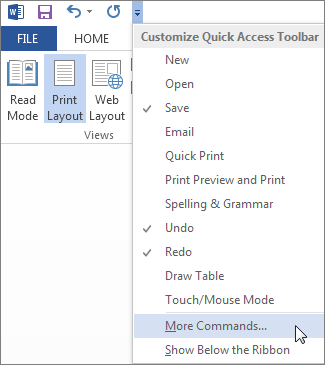
Shrink One Page isn’t a commonly used command, so the button isn’t shown by default. You can, however, quickly add it. The quickest way to add the button is to add it to the Quick Access Toolbar.
-
In the Quick Access toolbar at the top of the Word window, click Customize Quick Access Toolbar (the small down arrow) and choose More Commands.

-
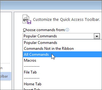
Under Choose commands from, click All Commands.
-
Scroll down through the list of commands until you find Shrink One Page.
-
Click Shrink One Page to select it, and then click the Add button.
-
Click OK.

Once the button is available, just click it to shrink the text.

-
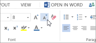
Click Edit Document > Edit in Word for the web if you haven’t done so already.
-
Press Ctrl+A to select all the text in your document.
-
Click Home > Shrink Font one or more times.
As you click Shrink Font, Word decreases the size of every font in your document.
-
Click View > Reading View to see if you shrank the text enough.
Tip: If this doesn’t work and you have the Word desktop program, click the Open in Word button to open your document in Word and shrink text to fit there.
Hi, I can’t figure how to get the height of a block to fit the height of the content. I’m using a block group with block columns and have an image in the left column. I want the height of the image to be the same as the height of the block. But no matter what I try, I keep ending up with an extra 10px in the block height. Here’s the current setup:
(1080 x 280) <div class=”wp-block-group__inner-container”>
(1080 x 280) <div class=”wp-block-columns are-vertically-aligned-center”>
(1080 x 280) <div class=”wp-block-column is-vertically-aligned-center” style=”flex-basis:25.8%”>
(270 x 278) <figure class=”wp-block-image size-large”>
(270 x 270) <img src="https://mysite.com/wp-content/uploads/2020/07/my-Podcast-e1595051172802.jpg" alt="My Podcast" />
</figure>
</div>
(776 x 114) <div class=”wp-block-column is-vertically-aligned-center” style=”flex-basis:74.2%”>
(776 x 32) <p>Episode 39 | 18 mins | Sep 20, 2019</p>
(776 x 133) <figure class=”wp-block-audio aligncenter”>
(737 x 40) <audio controls="" src="https://mysite.com/wp-content/uploads/2020/07/Ep.49-My-Podcast-Redux-93019-2.43-PM.mp3" controlslist="nodownload"></audio></figure>
</div>
</div>
</div>
Appreciate any suggestion! thanks in advance.
The page I need help with: [log in to see the link]

От автора: сегодня мы рассмотрим fit-content и fit-content(), которые являются специальными значениями для width и grid. Это … сложно — не как концепция, а в практическом применении.
Минимальное и максимальное содержание
Прежде чем приступить к рассмотрению fit-content, мы должны кратко рассмотреть два особых значения для width: min-content и max-content. Они нужны вам для понимания fit-content.
Обычно (то есть со значением width:auto) блок занимает столько места по горизонтали, сколько может. Вы можете изменить горизонтальное пространство, указав для width конкретное значение, но вы также можете указать браузеру определить его значение по содержимому поля. Вот что делают min-content и max-content:
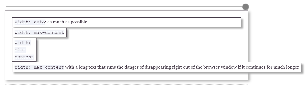
min-content означает: минимальная ширина контейнера с содержимым. На практике это означает, что браузеры видят, какой элемент контента самый широкий, и устанавливают для ширины поля это значение. Самый широкий фрагмент контента — это самое длинное слово в тексте, самое широкое изображение, видео или другой объект.

Практический курс по верстке адаптивного сайта с нуля!
Изучите курс и узнайте, как верстать современные сайты на HTML5 и CSS3
Узнать подробнее
max-content означает: максимальная ширина контейнера с содержимым . В случае текста это означает, что весь текст помещается в одну строку, а поле становится настолько широким, насколько это необходимо, чтобы вместить всю строку. В общем, это нежелательный эффект. Самым большим элементом контента также может быть изображением или видео; в этом случае браузеры используют эту ширину для определения ширины поля.
Если вы используете hyphens:auto или что-то подобное, браузер будет разбивать слова в правильных точках переноса, прежде чем определять минимальную ширину.
Quick Chromia
Все браузеры на базе Chromium на Android (протестированные в Chrome (v90), Samsung Internet (v87) и Edge (v77)) прерывают текст width:max-content в приведенном выше примере на тире и, таким образом, принимают ‘width: max-‘ в качестве максимального содержимого, при условии, что страница НЕ имеет мета-области просмотра. Ни один другой браузер не делает этого, в том числе Chrome на Mac.

Кроме того, Chromia на Android делает размер шрифта немного меньше, когда вы изменяете размер полей ниже максимально возможной ширины.
Этих ошибок НЕ возникает в UC (на основе Chromium 78). Кажется, UC принимает здесь свои собственные решения и невосприимчив к подобным ошибкам.
fit-content
По сути, понимание fit-content состоит в следующем:
|
box { width: auto; min-width: min-content; max-width: max-content; } |
Таким образом, размер контейнера составляет от минимума min-content до максимума max-content.
Я не уверен, полезен ли этот эффект вне элемента flexbox или grid, но теперь у вас есть пример его использования.
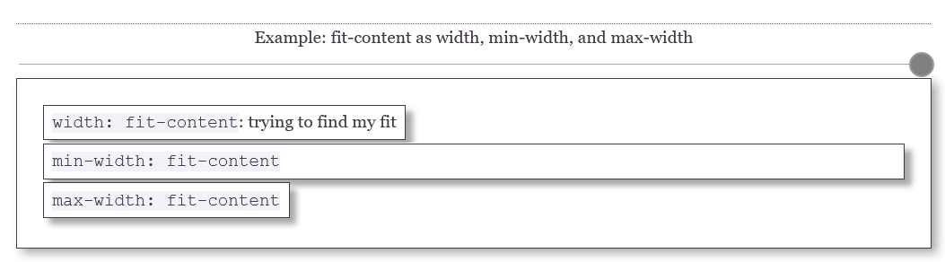
fit-content как min- или max-width
Вы также можете использовать fit-content как min-width или max-width. Первое означает, что ширина поля варьируется между min-content и auto, а вторая — между 0 и max-content.
Я считаю это бесполезным и потенциально сбивающим с толку. На самом деле вы имеете в виду что min-width:min-content или max-width:max-content. Если вы так напишете, ваш CSS будет более понятным.
Поэтому я считаю, что лучше не использовать fit-content для min-width или max-width; но только для width.
-moz-
К сожалению, хотя fit-content работает во всех браузерах, для Firefox по-прежнему нужено указывть префикс. Таким образом, окончательный код становится:
|
box { width: -moz-fit-content; width: fit-content; } |
(Эти префиксы становится все труднее обслуживать с течением времени. fit-content имеет отличную кроссбраузерную поддержку, поэтому я не понимаю, почему Firefox не переходит на обычный вариант.)
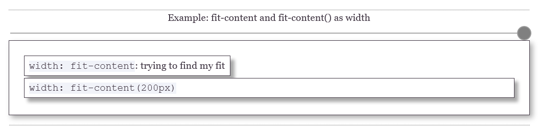
fit-content в flexbox и grid: nope
fit-content не работает в flexbox и grid. В приведенном ниже примере центральное поле имеет width:fit-content; и это не работает. Если бы это сработало, средний прямоугольник имел бы ширину max-content; т.е. настолько малым, насколько он должен быть, чтобы содержать текст.
Практический курс по верстке адаптивного сайта с нуля!
Изучите курс и узнайте, как верстать современные сайты на HTML5 и CSS3
Узнать подробнее

Обратите внимание, что элементы grid и flexbox имеют min-width: min-content по умолчанию.
fit-content()
Ниже приведён пример использования fit-content().
Grid
Вы можете использовать fit-content(value) в шаблонах сетки, например:
|
1fr fit-content(200px) 1fr |
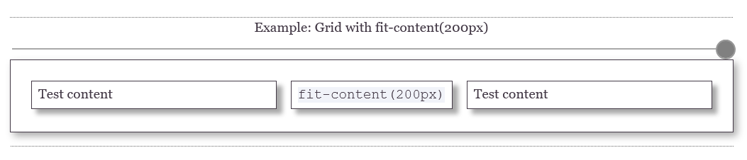
Это означает:
|
1fr min(max-content-size, max(min-content, 200px)) 1fr |
Аргумент max() становится min-content или равным 200 пикселей, в зависимости от того, что больше. Затем он сравнивается с максимальным размером содержимого, который представляет собой фактическую ширину, доступную из-за ограничений сетки, но с максимальным размером max-content. Итак, окончательная формула больше похожа на вот такую, где ширина в сетке равна available-size-:
|
1fr min(min(max-content,available-size), max(min-content, 200px)) 1fr |
Несколько примечаний:
Здесь мы говорим о функции fit-content(). ключевое слово fit-content не работает в определениях grid.
Для Firefox не нужено указывть -moz-.
нужен аргумент для fit-content(); пустая функция не работает. Кроме того, в единицах измерения недопустимый аргумент fr.
MDN упоминает о fit-content(stretch). Он нигде не работает и больше нигде не упоминается. Я предполагаю, что это взято из более старой версии спецификации
Я протестировал большинство из этих вещей на следующем примере, вы также можете попробовать фрагменты синтаксиса, которые пока не работают — возможно, они начнут работать позже.
В некоторых ситуациях, использование fit-content и fit-content() очень полезно. Ниже вы можете поэкспериментировать с fit-content() в grid.
Автор: Peter-Paul Koch
Источник: www.quirksmode.org
Редакция: Команда webformyself.
Читайте нас в Telegram, VK, Яндекс.Дзен
Практический курс по верстке адаптивного сайта с нуля!
Изучите курс и узнайте, как верстать современные сайты на HTML5 и CSS3
Узнать подробнее

Верстка. Быстрый старт
Практический курс по верстке адаптивного сайта с нуля!
Смотреть
Using Microsoft Interop for word, after adding a table to the document, how can the column width be set for all columns so that it fits the largest item there? For example, if the column header is only two letters, and each cell underneath is only one digit, the column should only be about a centimeter wide.
asked Apr 12, 2016 at 7:54
1
If you only have one table in your document, you would use something like this (where oDoc is your active document.)
oDoc.Tables(0).AllowAutoFit = True;
oDoc.Tables(0).AutoFitBehavior(Word.WdAutoFitBehavior.wdAutoFitContent);
If you have more than one table, you’d want to choose the index of the one you wish to update or loop through them.
shA.t
16.4k5 gold badges53 silver badges111 bronze badges
answered Apr 12, 2016 at 17:30
veevanveevan
1941 silver badge5 bronze badges
In the Word object model AutoFit is what the feature is called that allows (or doesn’t allow) table columns to resize to fit the content, the width of the window/page or prevents them from resizing automatically.
To force the table columns to resize to fit their content:
tbl.AutoFitBehavior(Word.WdAutoFitBehavior.wdAutoFitContent);
To change the width of a single column to fit to the content:
tbl.Columns[index].AutoFit();
This can also be done for all columns:
tlb.Columns.AutoFit();
answered Apr 12, 2016 at 17:32
Cindy MeisterCindy Meister
24.9k21 gold badges35 silver badges43 bronze badges