
In this Article
- Creating an Embedded Chart Using VBA
- Specifying a Chart Type Using VBA
- Adding a Chart Title Using VBA
- Changing the Chart Background Color Using VBA
- Changing the Chart Plot Area Color Using VBA
- Adding a Legend Using VBA
- Adding Data Labels Using VBA
- Adding an X-axis and Title in VBA
- Adding a Y-axis and Title in VBA
- Changing the Number Format of An Axis
- Changing the Formatting of the Font in a Chart
- Deleting a Chart Using VBA
- Referring to the ChartObjects Collection
- Inserting a Chart on Its Own Chart Sheet
Excel charts and graphs are used to visually display data. In this tutorial, we are going to cover how to use VBA to create and manipulate charts and chart elements.
You can create embedded charts in a worksheet or charts on their own chart sheets.
Creating an Embedded Chart Using VBA
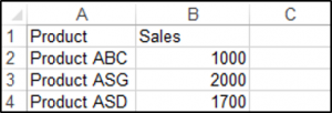
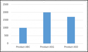
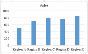
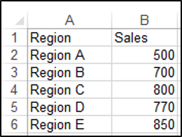
We have the range A1:B4 which contains the source data, shown below:
You can create a chart using the ChartObjects.Add method. The following code will create an embedded chart on the worksheet:
Sub CreateEmbeddedChartUsingChartObject()
Dim embeddedchart As ChartObject
Set embeddedchart = Sheets("Sheet1").ChartObjects.Add(Left:=180, Width:=300, Top:=7, Height:=200)
embeddedchart.Chart.SetSourceData Source:=Sheets("Sheet1").Range("A1:B4")
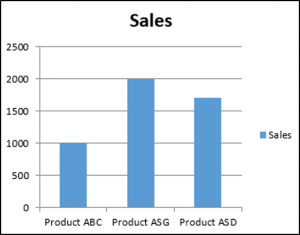
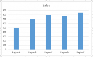
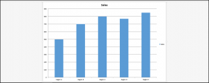
End SubThe result is:
You can also create a chart using the Shapes.AddChart method. The following code will create an embedded chart on the worksheet:
Sub CreateEmbeddedChartUsingShapesAddChart()
Dim embeddedchart As Shape
Set embeddedchart = Sheets("Sheet1").Shapes.AddChart
embeddedchart.Chart.SetSourceData Source:=Sheets("Sheet1").Range("A1:B4")
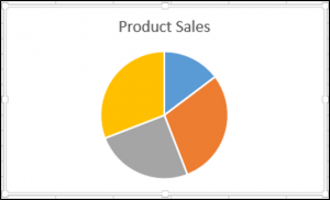
End SubSpecifying a Chart Type Using VBA
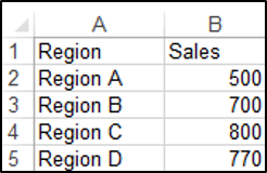
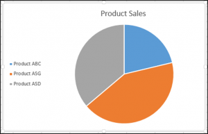
We have the range A1:B5 which contains the source data, shown below:
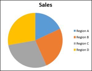
You can specify a chart type using the ChartType Property. The following code will create a pie chart on the worksheet since the ChartType Property has been set to xlPie:
Sub SpecifyAChartType()

Dim chrt As ChartObject

Set chrt = Sheets("Sheet1").ChartObjects.Add(Left:=180, Width:=270, Top:=7, Height:=210)
chrt.Chart.SetSourceData Source:=Sheets("Sheet1").Range("A1:B5")
chrt.Chart.ChartType = xlPie

End Sub
The result is:
These are some of the popular chart types that are usually specified, although there are others:
- xlArea
- xlPie
- xlLine
- xlRadar
- xlXYScatter
- xlSurface
- xlBubble
- xlBarClustered
- xlColumnClustered
Adding a Chart Title Using VBA
We have a chart selected in the worksheet as shown below:
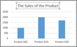
You have to add a chart title first using the Chart.SetElement method and then specify the text of the chart title by setting the ChartTitle.Text property.
The following code shows you how to add a chart title and specify the text of the title of the Active Chart:
Sub AddingAndSettingAChartTitle()

ActiveChart.SetElement (msoElementChartTitleAboveChart)
    ActiveChart.ChartTitle.Text = "The Sales of the Product"

End Sub
The result is:
Note: You must select the chart first to make it the Active Chart to be able to use the ActiveChart object in your code.
Changing the Chart Background Color Using VBA
We have a chart selected in the worksheet as shown below:
You can change the background color of the entire chart by setting the RGB property of the FillFormat object of the ChartArea object. The following code will give the chart a light orange background color:
Sub AddingABackgroundColorToTheChartArea()

ActiveChart.ChartArea.Format.Fill.ForeColor.RGB = RGB(253, 242, 227)

End Sub
The result is:
You can also change the background color of the entire chart by setting the ColorIndex property of the Interior object of the ChartArea object. The following code will give the chart an orange background color:
Sub AddingABackgroundColorToTheChartArea()

ActiveChart.ChartArea.Interior.ColorIndex = 40

End Sub
The result is:
Note: The ColorIndex property allows you to specify a color based on a value from 1 to 56, drawn from the preset palette, to see which values represent the different colors, click here.
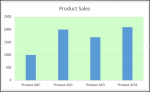
Changing the Chart Plot Area Color Using VBA
We have a chart selected in the worksheet as shown below:
You can change the background color of just the plot area of the chart, by setting the RGB property of the FillFormat object of the PlotArea object. The following code will give the plot area of the chart a light green background color:
Sub AddingABackgroundColorToThePlotArea()

ActiveChart.PlotArea.Format.Fill.ForeColor.RGB = RGB(208, 254, 202)

End Sub
The result is:
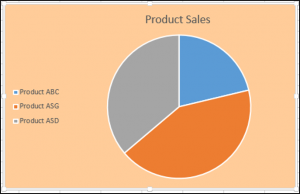
Adding a Legend Using VBA
We have a chart selected in the worksheet, as shown below:

You can add a legend using the Chart.SetElement method. The following code adds a legend to the left of the chart:
Sub AddingALegend()

ActiveChart.SetElement (msoElementLegendLeft)

End Sub
The result is:
You can specify the position of the legend in the following ways:
- msoElementLegendLeft – displays the legend on the left side of the chart.
- msoElementLegendLeftOverlay – overlays the legend on the left side of the chart.
- msoElementLegendRight – displays the legend on the right side of the chart.
- msoElementLegendRightOverlay – overlays the legend on the right side of the chart.
- msoElementLegendBottom – displays the legend at the bottom of the chart.
- msoElementLegendTop – displays the legend at the top of the chart.
VBA Coding Made Easy
Stop searching for VBA code online. Learn more about AutoMacro — A VBA Code Builder that allows beginners to code procedures from scratch with minimal coding knowledge and with many time-saving features for all users!
Learn More
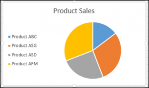
Adding Data Labels Using VBA
We have a chart selected in the worksheet, as shown below:
You can add data labels using the Chart.SetElement method. The following code adds data labels to the inside end of the chart:
Sub AddingADataLabels()

ActiveChart.SetElement msoElementDataLabelInsideEnd

End Sub
The result is:

You can specify how the data labels are positioned in the following ways:
- msoElementDataLabelShow – display data labels.
- msoElementDataLabelRight – displays data labels on the right of the chart.
- msoElementDataLabelLeft – displays data labels on the left of the chart.
- msoElementDataLabelTop – displays data labels at the top of the chart.
- msoElementDataLabelBestFit – determines the best fit.
- msoElementDataLabelBottom – displays data labels at the bottom of the chart.
- msoElementDataLabelCallout – displays data labels as a callout.
- msoElementDataLabelCenter – displays data labels on the center.
- msoElementDataLabelInsideBase – displays data labels on the inside base.
- msoElementDataLabelOutSideEnd – displays data labels on the outside end of the chart.
- msoElementDataLabelInsideEnd – displays data labels on the inside end of the chart.
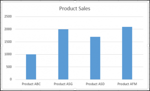
Adding an X-axis and Title in VBA
We have a chart selected in the worksheet, as shown below:
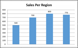
You can add an X-axis and X-axis title using the Chart.SetElement method. The following code adds an X-axis and X-axis title to the chart:
Sub AddingAnXAxisandXTitle()

With ActiveChart
.SetElement msoElementPrimaryCategoryAxisShow
.SetElement msoElementPrimaryCategoryAxisTitleHorizontal
End With


End Sub
The result is:
Adding a Y-axis and Title in VBA
We have a chart selected in the worksheet, as shown below:
You can add a Y-axis and Y-axis title using the Chart.SetElement method. The following code adds an Y-axis and Y-axis title to the chart:
Sub AddingAYAxisandYTitle()

With ActiveChart
.SetElement msoElementPrimaryValueAxisShow
.SetElement msoElementPrimaryValueAxisTitleHorizontal
End With
End Sub
The result is:
VBA Programming | Code Generator does work for you!
Changing the Number Format of An Axis
We have a chart selected in the worksheet, as shown below:
You can change the number format of an axis. The following code changes the number format of the y-axis to currency:
Sub ChangingTheNumberFormat()

ActiveChart.Axes(xlValue).TickLabels.NumberFormat = "$#,##0.00"

End Sub
The result is:
Changing the Formatting of the Font in a Chart
We have the following chart selected in the worksheet as shown below:

You can change the formatting of the entire chart font, by referring to the font object and changing its name, font weight, and size. The following code changes the type, weight and size of the font of the entire chart.
Sub ChangingTheFontFormatting()

With ActiveChart


.ChartArea.Format.TextFrame2.TextRange.Font.Name = "Times New Roman"
.ChartArea.Format.TextFrame2.TextRange.Font.Bold = True
.ChartArea.Format.TextFrame2.TextRange.Font.Size = 14

End With
The result is:
Deleting a Chart Using VBA
We have a chart selected in the worksheet, as shown below:
We can use the following code in order to delete this chart:
Sub DeletingTheChart()

ActiveChart.Parent.Delete

End Sub
Referring to the ChartObjects Collection
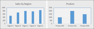
You can access all the embedded charts in your worksheet or workbook by referring to the ChartObjects collection. We have two charts on the same sheet shown below:
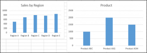
We will refer to the ChartObjects collection in order to give both charts on the worksheet the same height, width, delete the gridlines, make the background color the same, give the charts the same plot area color and make the plot area line color the same color:
Sub ReferringToAllTheChartsOnASheet()

Dim cht As ChartObject

For Each cht In ActiveSheet.ChartObjects
cht.Height = 144.85
cht.Width = 246.61

cht.Chart.Axes(xlValue).MajorGridlines.Delete
cht.Chart.PlotArea.Format.Fill.ForeColor.RGB = RGB(242, 242, 242)
cht.Chart.ChartArea.Format.Fill.ForeColor.RGB = RGB(234, 234, 234)
cht.Chart.PlotArea.Format.Line.ForeColor.RGB = RGB(18, 97, 172)

Next cht

End Sub
The result is:
Inserting a Chart on Its Own Chart Sheet
We have the range A1:B6 which contains the source data, shown below:
You can create a chart using the Charts.Add method. The following code will create a chart on its own chart sheet:
Sub InsertingAChartOnItsOwnChartSheet()

Sheets("Sheet1").Range("A1:B6").Select
Charts.Add

End Sub
The result is:
See some of our other charting tutorials:
Charts in Excel
Create a Bar Chart in VBA
Chart Elements in Excel VBA (Part 2) — Chart Title, Chart Area, Plot Area, Chart Axes, Chart Series, Data Labels, Chart Legend
Contents:
Chart Series
DataLabels Object / DataLabel Object
Chart Legend
This chapter discusses some important chart elements contained on a chart, which include: chart area (ChartArea object); chart title (ChartTitle object); plot area (PlotArea object); chart series (Series object — single series in a chart, SeriesCollection object — a collection of all the Series objects in a chart, Error Bars, Leader Lines, Trendlines, Point object — single points, Points object — collection of all Point objects in a series); chart axis (Axis Object — a single axis, Axes Object — collection of all the Axis objects in a chart, Gridlines object — major & minor gridlines, TickLabels Object — tick marks on an axis); chart Legend (Legend object, LegendEntry object — a single legend entry, LegendEntries object — a collection of legend entries, LegendKey object); data labels (DataLabel object — a single data label, DataLabels object — all data labels in a chart or series).
Individual chart elements can be formatted & manipulated in vba code, such as: Chart Area (A 2-D chart’s chart area contains: the axes, the chart title, the axis titles & the legend. A 3-D chart’s chart area contains the chart title & the legend, without including the plot area); Plot Area (area where chart data is plotted — the Plot Area is surrounded by the Chart Area. A 2-D chart’s plot area contains: the data markers, gridlines, data labels, trendlines & optional chart items placed in the chart area. A 3-D chart’s plot area additionally contains: the walls, floor, axes, axis titles & tick-mark labels in the chart.); Data Series (chart series are related data points plotted in a chart, each series having a distinct color or pattern and is represented in the chart legend); Chart Axis (the plot area is bordered by a line that is used as a frame of reference for measurement — axis which displays categories is referred as the x-axis, axis which displays values is referred as y-axis, for 3-D charts the z-axis represents depth of the chart); Chart or Axis Title (descriptive text displaying title for chart or axis, by default centered at the chart top or aligned to an axis); Tick Marks (small lines of measurement which intersect an axis, equated to divisions on a ruler); Gridlines (tick marks are extended by Gridlines from horizontal or vertical axis across the chart’s plot area which enables easier display & readability of chart data); Data Labels (applied to a chart series, a label provides additional information about a data marker or a point in a series — you can apply data labels to each or all points of a data series to display the series name / category names / data values / percentages / bubble size), Chart Legend (a graphic visually linking a legend entry with its associated series or trendline so that any formatting change in one automatically changes the other’s formatting).
This Chapter illustrates Chart Series, Data Labels & Chart Legend. Chart Elements — Chart Title, Chart Area, Plot Area & Chart Axes — are illustrated in Part 1.
Chart Series
A SeriesCollection object refers to a collection of all the Series objects in a chart. The Series object refers to a single series in a chart, and is a member of the SeriesCollection object.
The SeriesCollection method of the Chart object (SeriesCollection Method) returns either a single Series object or the SeriesCollection object. Syntax: objChart.SeriesCollection(Index). The Index argument (optional) specifies the number or name of the series — index number represents the order in which the series were added, with the first series added to the chart being index number 1 ie. objChart.SeriesCollection(1), and the last added series index number being objChart.SeriesCollection(objSeriesCollection.Count).
SeriesCollection.Item Method. To refer to a single Series (ie. Series object) from Series collection, use the the Item Method of the SeriesCollection object. Syntax: objSeriesCollection.Item(Index), where the Index argument is necessary, and it specifies the number or name of the series — index number represents the order in which the series were added, with the first series added to the chart being index number 1, as explained above. Use the Count Property of the SeriesCollection object to return the number of Series in a Series Collection viz. MsgBox Sheets(«Sheet1»).ChartObjects(1).Chart.SeriesCollection.Count.
Sub SeriesCollectionObj_SeriesObj()
‘series collection & series object
Dim objSeries As Series
’embedded chart
With Sheets(«Sheet12»).ChartObjects(1).Chart
‘returns number of series in the series collection
MsgBox .SeriesCollection.count
‘refer single series (series object) — last series in the series collection — you can alternatively use: With .SeriesCollection(.SeriesCollection.count)
With .SeriesCollection.Item(.SeriesCollection.count)
‘turn on data labels
.HasDataLabels = True
End With
‘refer series collection using the Chart.SeriesCollection method — each series object in the series collection
For Each objSeries In .SeriesCollection
‘return name of each series in the series collection
MsgBox objSeries.Name
If objSeries.HasDataLabels = True Then
‘return series name if data labels is turned on
MsgBox objSeries.Name & » series has data labels»
End If
Next objSeries
End With
End Sub
The Add method of the SeriesCollection object is used to create a new series and add to the chart as a member of its SeriesCollection. Syntax: objSeriesCollection.Add(Source, Rowcol, SeriesLabels, CategoryLabels, Replace). All arguments except the Source argument are optional to specify. The Source argument specifies the range for Source Data, for the new series. The Rowcol argument can either specify, xlRows (value 1) which specifies that values for the new series are in the rows of the source range, or, xlColumns (value 2) which specifies that values for the new series are in the columns of the source range. For the SeriesLabels & CategoryLabels argument, True setting will indicate that the Series Lables (name of the data series) or Category Labels are contained in the first row or column of the source range, False setting indicates otherwise, and omitting the argument will make Excel attempt to determine if Labels are located in the first row or column. Setting the Replace argument to True where CategoryLabels is True, the current categories existing for the series will be replaced by the categories specified in the source range, and setting Replace to False (default) will not replace. You cannot use this method for PivotChart reports.
You can also use the NewSeries Method of the SeriesCollection object, to create a new series — Syntax: objSeriesCollection.NewSeries. Using this method returns a Series object representing the new series whereas the Add method does not return a Series object. This method however, like the Add method, also cannot be used for PivotChart reports.
The Extend Method of the SeriesCollection object is used to extend an existing series collection by adding new data points. Syntax: objSeriesCollection.Extend(Source, Rowcol, CategoryLabels). All arguments have the same meaning as in the SeriesCollection.Add method above, and only the Source argument is necessary to specify. Ex. to extend the chart series by adding data points as per values in cells B6:C6 in Sheet1: Sheets(«Sheet1»).ChartObjects(1).Chart.SeriesCollection.Extend Source:=Worksheets(«Sheet12»).Range(«B6:C6»). This method also cannot be used for PivotChart reports.
|
Commonly used Properties of the Series object: |
||
| Property | Syntax | Description |
| AxisGroup Property | objSeries.AxisGroup | Returns a value per XlAxisGroup Enumeration (value 1 for xlPrimary, or value 2 for xlSecondary), specifying the AxisGroup for the series object. |
| Type Property | objSeries.Type | Sets or returns the series type as per the following constants: xl3DArea, xl3DBar, xl3DColumn, xl3DSurface, xlArea, xlBar, xlColumn, xlDoughnut, xlLine, xlPie, xlRadar, xlXYScatter. |
| Format Property | objSeries.Format | Returns a ChartFormat object which contains the line, fill & effect formatting for a chart element. The ChartFormat object provides access to the new Office Art formatting options that are available in Excel 2007 so that by using this object you can apply many new graphics to chart elements using vba formatting. |
| Name Property | objSeries.Name | returns the name of the Series object, as a string value. |
| Shadow Property | objSeries.Shadow |
Sets or returns a Boolean value determining if the series has a shadow or not. Use True to add a shadow: Sheets(«Sheet1»).ChartObjects(1).Chart.SeriesCollection(1).Shadow = True |
| PlotOrder Property | objSeries.PlotOrder | Sets or returns the plot order for a series within a collection of series with the same chart type (ie. within the chart group). Note that when the plot order of one series is changed within a chart group, the plot orders of the other series plotted in that chart group will also be adjusted. Also, in a chart where series are not plotted with the same format (ie. where you have more than one chart type), the plot order for the entire chart cannot be set. Ex. code to to make the series which is 3rd in plot order in Chart1 to appear as 1st in plot order — Sheets(«Sheet1»).ChartObjects(1).Chart.SeriesCollection(3).PlotOrder = 1 — this makes series one to appear second in the plot order, and pushes the series 2 to series 3. |
| XValues Property | objSeries.Xvalues | Using the XValues Property, the x values (ie. values for the x-axis or horizontal axis) for a chart series are set or returned as an array. You can set this property to either the values contained in a range of cells (ie. Range object) or to an array of values, but not to both as a combination. This property is read-only for PivotChart reports. |
| Values Property | objSeries.Values | Using the Values Property, the values (ie. values for the value axis or y-axis) for a chart series are set or returned as an array. You can set this property to either the values contained in a range of cells (ie. Range object) or to an array of values, but not to both as a combination. |
| Has3DEffect Property | objSeries.Has3DEffect | This property (read-write) uses a Boolean value, & applies only to bubble charts — to set (or return) a three-dimensional appearance for the series, use True. |
| BubbleSizes Property | objSeries.BubbleSizes |
The BubbleSizes Property of the Series object, sets or returns a string that refers to the worksheet cells which contain size data to set the bubble sizes (ie. size of the marker points). To set the cell reference you need to use R1C1-style notation, viz. objSeries.BubbleSizes = «=Sheet1!r2c4:r7c4», and using the property to return the cell reference returns a string value in A1-style notation viz. Sheet1!$D$2:$D$7. You can also use the BubbleScale property of the ChartGroup object, to set or return a scale factor for the bubbles in a chart group, as an integer value between 0 to 300 which corresponds to a percentage of the original or default bubble size, viz. to scale the bubbles to 40% of their original size: Sheets(«Sheet1»).ChartObjects(1).Chart.ChartGroups(1).BubbleScale = 40 Both the BubbleSizes & BubbleScale properties are applicable only to Bubble charts. A ChartGroup object represents all (can be one or more) series plotted in a chart with the same format (line, bar, bubble, …). |
|
Sub Series_XValues_Values_BubbleSizes_BubbleScale() Dim ws As Worksheet With ws.ChartObjects(1).Chart With .SeriesCollection(1) .Name = ws.Range(«B1») End With End With End Sub |
||
| HasDataLabels Property | objSeries.HasDataLabels | This property (read-write) uses a Boolean value — a chart series will have data labels only if the HasDataLabels property (of the Series object) is True viz. set to True for the data labels to be visible: objSeries.HasDataLabels = True. To turn on data labels for series 2 of a chart: Sheets(«Sheet1»).ChartObjects(1).Chart.SeriesCollection(2).HasDataLabels = True. To turn off data labels for a series, set to False. |
| MarkerSize Property | objSeries.MarkerSize | This property sets or returns the data-marker size for data markers on a chart series, in points, which can be a value within 2 & 72. |
| MarkerStyle Property | objSeries.MarkerStyle | Sets or returns the marker style — this property is read-write, and for a series, or for a point, in a line / scatter / radar chart, it specifies the marker style as per constants defined in the XlMarkerStyle Enumeration — xlMarkerStyleSquare (value 1: square markers); xlMarkerStyleDiamond (value 2: diamond-shaped markers); xlMarkerStyleTriangle (value 3: triangular markers); xlMarkerStyleStar (value 5: square markers with an asterisk); xlMarkerStyleCircle (value 8: circular markers); xlMarkerStylePlus (value 9: square markers with plus sign); xlMarkerStyleDash (value -4115: long bar markers); xlMarkerStyleDot (value -4118: short bar markers); xlMarkerStylePicture (value -4147: picture markers); xlMarkerStyleX (value -4168: square markers with an X); xlMarkerStyleAutomatic (value -4105: automatic markers); xlMarkerStyleNone (value -4142: no markers). |
| Smooth Property | objSeries.Smooth | This property (read-write) uses a Boolean value & is applicable only to Line & Scatter charts, & is used to turn on (True) or turn off (False — default) curve smoothing. Refer below codes where True sets the curve for a line chart to be smooth. |
|
‘chart series without markers where Smooth is False (default) — refer Image 1a
‘chart series without markers where Smooth is True — refer Image 1b |
||
|
MarkerBackground Color Property |
objSeries. MarkerBackgroundColor |
For a line, xy scatter & radar chart, this property sets the background color of point markers (ie. fill color for all markers in the series) using RGB values, and also returns the background color of point markers as a color index value (ie. as an index into the current color palette). |
|
MarkerBackground ColorIndex Property |
objSeries. MarkerBackgroundColorIndex |
For a line, xy scatter & radar chart, this property sets or returns the background color of point markers (ie. fill color for all markers in the series) — this property specifies color as an index value into the current color palette, or as one of the constants — xlColorIndexAutomatic (value -4105: color is automatic) or xlColorIndexNone (value -4142: no color). |
|
MarkerForeground Color Property |
objSeries. MarkerForegroundColor |
For a line, xy scatter & radar chart, this property sets the foreground color of point markers (marker line ie. outline around the marker, color for all markers in the series) using RGB values, and also returns the foreground color of point markers as a color index value (ie. as an index into the current color palette). |
|
MarkerForeground Color Property |
objSeries. MarkerForegroundColor |
For a line, xy scatter & radar chart, this property sets or returns the foreground color of point markers (marker line ie. outline around the marker, color for all markers in the series) — this property specifies color as an index value into the current color palette, or as one of the constants — xlColorIndexAutomatic (value -4105: color is automatic) or xlColorIndexNone (value -4142: no color). |
|
Sub Series_Line_Markers() ’embedded chart — refer series 1 ‘using the Line Property of the ChartFormat object, returns a LineFormat object that contains line formatting properties End With ‘refer series 2 ‘sets the fill color for all markers in the series using RGB values (MarkerBackgroundColor property of Series object), to red ‘use the MarkerStyle Property of the Point object set the marker style for a point Next ‘use the Points Method of the Series object to return a single point (Point object) — refer point no 3 ‘use the MarkerStyle Property of the Point object set the marker style for a point End With End With End Sub |
||
| BarShape Property | objSeries.BarShape | For a column chart or a 3-D bar chart, this property sets or returns the shape used with a series, by specifying the shape as per constants defined in XlBarShape Enumeration: xlBox (value 0 — Box); xlPyramidToPoint (value 1 — Pyramid, coming to point at value); xlPyramidToMax (value 2 — Pyramid, truncated at value); xlCylinder (value 3 — Cylinder); xlConeToPoint (value 4 — Cone, coming to point at value); xlConeToMax (value 5 — Cone, truncated at value). |
|
‘set the bar shape, for series 1 of embedded chart 1 in Sheet 1, to Cylinder Sheets(«Sheet1»).ChartObjects(1).Chart.SeriesCollection(1).BarShape = xlCylinder |
||
| PictureType Property | objSeries.PictureType | Sets or returns the picture display format on a column or bar picture chart, as per constants defined in XlChartPictureType Enumeration — xlStretch (value 1, picture is stretched the full length of the stacked bar), xlStack (value 2, picture is sized to repeat a maximum of 15 times in the longest stacked bar), xlStackScale (value 3, picture is sized to a specified number of units & repeated the length of the bar). |
| PictureUnit2 Property | objSeries.PictureUnit2 | The PictureUnit2 Property sets or returns the stack or scale unit for each picture (ie. n units per picture) as a double value, only where the PictureType property is set to xlStackScale or else the property has no effect. |
| ApplyPictToFront Property / ApplyPictToEnd Property / ApplyPictToSides Property | objSeries.ApplyPictToFront / objSeries.ApplyPictToEnd / objSeries.ApplyPictToSides | For a series where pictures are already applied, these properties are used to change the picture orientation — True displays the pictures on the front of the column or bar of the point(s) / on the end of the column or bar of the point(s) / on the sides of the column or bar of the point(s), respectively. |
|
Sub Series_Picture() ‘for the Plot Area Fill, ie. FillFormat object ‘use the UserPicture Method of the FillFormat object to set an image to the specified fill ‘use the PictureType Property to set the picture display format on a column chart ‘set PictureType Property for point 2 to xlStack (picture is sized to repeat a maximum of 15 times) ‘set point 3 to xlStackScale — picture is sized to a specified no. of units & repeated the length of the bar End With End Sub |
||
| ErrorBars Property | objSeries.ErrorBars | ErrorBars: You can turn on error bars for a series, which indicate the degree of uncertainty for chart data. Error bars can be used for data series only in area, bar, column, line & scatter groups on a 2-D chart, where xy scatter & bubble charts can display error bars for the x values or the y values or both. Error bars (x or y) can either be turned on for all points in a series, or none of them — you cannot have a single error bar. Use the ErrorBar method to create the error bars. The ErrorBars property of the series object is used to return a reference to the ErrorBars object. Use the ErrorBars object to manipulate the appearance of error bars. |
| Formula Property / FormulaR1C1 Property | objSeries.Formula / objSeries.FormulaR1C1 |
The Formula Property sets or returns a String value for the series formula in A1-style notation, in the same format as displayed in the formula bar with the equal sign. When a series is selected, the formula bar displays that series’ formula. Using the Formula property will return this formula as a string value. The series formula describes data in the series, with the four elements: =objSeries(Series Name, X-Values, Y-Values, Plot Order). The FormulaR1C1 Property of the Series object is also similar to the Formula property except that it sets or returns the series formula using R1C1 format for cell references. The Series Name can be a text string within double quotation marks viz. «Profit ($)», a reference to a range consisting of one or more worksheet cells viz. Sheet1!$B$1, a reference to a named range, or it can be left blank. The X-Values can be a literal array of numeric values or text labels enclosed in curly braces viz. {2009,2010,2011,2012} or {«Jan»,»Feb»,»Mar»,»Apr»,»May»,»June»}, a reference to a range consisting of one or more worksheet cells viz. Sheet1!$A$2:$A$5 or Sheet1!R2C1:R5C1, a reference to a named range, or it can be left blank. The Y-Values can be a literal array of numeric values enclosed in curly braces viz. {6000,7200,4700,8100}, a reference to a range consisting of one or more worksheet cells viz. Sheet1!$B$2:$B$5 or Sheet1!R2C2:R5C2, or a reference to a named range. The Plot Order should be a whole number with a value between 1 & the total number of series. |
|
FormulaLocal Property / FormulaR1C1Local Property |
objSeries.FormulaLocal / objSeries.FormulaR1C1Local | Formula property of the Series object constructs & returns formula strings using English functions & US number formats — the FormulaLocal property of the Series object is the same as the Formula property, where the user’s language settings are used and not English to create the formula so that formula strings are used as they appear on the worksheet & constructed using the Office UI language & WRS number formats. The FormulaR1C1Local Property of the Series object sets or returns the series formula using R1C1-style notation in the language of the user ie. where the user’s language settings are used. |
|
Sub Series_Formulas_1() Dim ws As Worksheet, srs As Series With oChObj.Chart .ChartType = xlLineMarkers End With End Sub |
||
|
Sub Series_Formulas_2() Dim oChObj As ChartObject, srs As Series, strOld As String, strNew As String With oChObj.Chart Set srs = .SeriesCollection(1) ‘using the vba Replace function to replace part formula — refer Image 4b: ‘using the worksheet Substitute function to change or replace the whole series formula — refer Image 4b: End With End Sub |
||
| LeaderLines Property | objSeries.LeaderLines | Use the LeaderLines property of the Series object to get a reference to the LeaderLines object which manipulates the appearance of leader lines. LeaderLines are lines which connect data labels to the data points in a series, & are available only for pie charts. |
| HasLeaderLines Property | objSeries.HasLeaderLines | This property (read-write) uses a Boolean value & is applicable only to pie-charts — a chart series will have leader lines only if the HasLeaderLines property (of the Series object) is True viz. the leader lines will be visible only if this property returns True or is set to True: objSeries.HasLeaderLines = True. |
|
Commonly used Methods of the Series object: |
||
| Method | Syntax | Description |
| Delete Method | objSeries.Delete | deletes the series object |
| Select Method | objSeries.Select | selects the series object |
| ClearFormats Method | objSeries.ClearFormats | clears all formatting from a chart series (from a Series object) |
| Points Method | objSeries.Points(Index) | Returns (read-only) either a single point (Point object) or all points (Points object — collection of all Point objects) in a series. The Index argument (optional) specifies the number or name of the point — refer below code. |
|
‘use the Points Method of the Series object to return a collection of all the points (Points object) ‘use the MarkerStyle Property of the Point object set the marker style for a point Next ‘use the Points Method of the Series object to return a single point (Point object) |
||
| DataLabels Method | objSeries.DataLabels(Index) | Returns (read-only) either a single data label (DataLabel object) or all data labels (DataLabels object) in a series. The Index argument (optional) specifies the number of the data label. The DataLabels object is a collection of all DataLabel objects for each point, and where the series does not have definable points (viz. an area series) the DataLabels object comprises of a single DataLabel object. The DataLabel Property of the Point object returns a DataLabel object (ie. single data label) associated with that point. Using the ApplyDataLabels Method of the Series Object / Chart Object you can apply labels to all points of a data series or to all data series of a chart uniformly, |
|
Sub Series_DataLabels_1() ‘series 1 of embedded chart ‘set the HasDataLabels Property to True to turn on data labels for a series ‘using the DataLabels Method & the Index argument to return a single data label in a series ‘Points Method of the Series object returns a single point (Point object) & the DataLabel Property of the Point object returns a DataLabel object (ie. single data label) associated with that point ‘using the DataLabels Method to return all data labels in a series End With End Sub |
||
| ApplyDataLabels Method |
objSeries. ApplyDataLabels(Type, LegendKey, AutoText, HasLeaderLines, ShowSeriesName, ShowCategoryName, ShowValue, ShowPercentage, ShowBubbleSize, Separator) |
Use this method to apply data labels to a chart series. All arguments are optional to specify. The Type argument specifies the type of data label applied to a chart: xlDataLabelsShowValue (value 2 — Default) — value for the point; xlDataLabelsShowPercent (value 3) — percentage of the total, & is available only for pie charts & doughnut charts; xlDataLabelsShowLabel (value 4) — category for the point; xlDataLabelsShowLabelAndPercent (value 5) — category for the point & percentage of the total, & is available only for pie charts & doughnut charts; xlDataLabelsShowBubbleSizes (value 6) — show bubble size in reference to the absolute value; xlDataLabelsShowNone (value -4142) — no data labels displayed. Set the LegendKey argument to True to display legend key next to the data points, where False is the default value. Set the AutoText argument to True to automatically generate appropriate text based on content. Set the HasLeaderLines argument to True to display leader lines for the series; For the arguments of ShowSeriesName / ShowCategoryName / ShowValue / ShowPercentage / ShowBubbleSize, pass a boolean value to enable (ie. display) or disable the series name / category names / data values / percentages / bubble size, for the data label. The Separator argument specifies the separator for the data label. |
|
Apply Data Lables, & display Category Names, Values & Percentages separated by «/» (forward slash) & also display Legend Keys for a chart series: Sheets(«Sheet1″).ChartObjects(1).Chart.SeriesCollection(1).ApplyDataLabels Type:=xlDataLabelsShowLabelAndPercent, LegendKey:=True, ShowValue:=True, Separator:=»/« |
||
| Trendlines Method | objSeries.Trendlines(Index) |
A trendline shows the trend or direction of data in a chart series, reflecting the data fluctuations. The Trendlines Method returns (read-only) either a single Trendline (Trendline object) or all Trendlines (Trendlines object) in a single series. The Index argument (optional) specifies the number or name of the Trendline — index number represents the order in which the trendlines were added, with the first trendline added to the series having index number 1 ie. objSeries.Trendlines(1), and the last added trendline being objSeries.Trendlines(objSeries.Trendlines.Count). You can manipulate a trendline by using the Trendline Object through its properties & methods. Use the Type Property of the Trendline object to set or return the type of trendline as per constants specified in XlTrendlineType Enumeration: xlPolynomial (value 3); xlPower (value 4); xlExponential (value 5); xlMovingAvg (value 6); xlLinear (value -4132); xlLogarithmic (value -4133). These constants represent using an equation to calculate the least squares fit through points, for example the xlLinear constant uses the linear equation. |
|
To create a new trendline for a series, use the Add Method of the Trendlines object. Syntax: objTrendlines.Add(Type, Order, Period, Forward, Backward, Intercept, DisplayEquation, DisplayRSquared, Name). Trendlines are not allowed for 3-D, pie, doughnut & radar chart types. All arguments are optional to specify. The Type argument specifies the type of trendline to add, as per constants specified in XlTrendlineType Enumeration — refer above. The Order argument specifies the trendline order if the Type is xlPolynomial, & should be an integer between 2 to 6. The Period argument specifies the trendline period for the xlMovingAvg Type, & is an integer greater than 1 & less than the number of data points in the series to include for the moving average. Use the Forward & Backward arguments to project a trendline beyond the series in either direction wherein the axis is automatically scaled for the new range: the Forward argument specifies the number of periods (units in the case of scatter charts) for which the trendline is extended forward to; the Backward argument specifies the number of periods (units in the case of scatter charts) for which the trendline is extended backwards to. The Intercept argument specifies where the x-axis is crossed by the trendline, where the intercept is automatically set by the regression, as default when the argument is omitted. The DisplayEquation argument when set to True (default is False) displays the trendline formula or equation in the same data label that displats the R-squared value. The DisplayRSquared argument when set to True (default is False) displays the trendline’s R-squared value in the same data label that displats the equation. The Name argument displays the text for the trendline name in its legend, and is the argument is omitted the name is generated automatically by Microsoft Excel. |
||
|
Example: Add & manipulate trendlines for scatter chart — refer Image 5
Sub Series_Trendlines_1() ‘add 3 trendlines for series 1 (Profit) ‘delete existing trendlines — deleting a single trendline will reindex the collection, hence trendlines should be deleted in reverse order .Trendlines(i).Delete Next i ‘the Type argument specifies the type of trendline to add With .Trendlines(1) .Format.Line.Weight = 2 End With With .Trendlines(2) .Type = xlMovingAvg End With With .Trendlines(3) .Order = 4 End With End With ‘add 1 trendline for series 2 (Advt Exp) ‘delete existing trendlines — deleting a single trendline will reindex the collection, hence trendlines should be deleted in reverse order .Trendlines(i).Delete Next i ‘set trendline color to dark red End With End With With Sheets(«Sheet1»).ChartObjects(1).Chart.Legend ‘set font color to dark red for the legend entry of trendline «2Period MvgAvg (Advt)» End With End Sub |
||
| ErrorBar Method | objSeries.ErrorBar(Direction, Include, Type, Amount, MinusValues) |
The ErrorBar method is used to apply error bars to a series. The Direction, Include & Type arguments are necessary to specify, while the Amount & MinusValues arguments are optional. The Direction argument specifies the direction of the bars as to the axis values which receives error bars: xlY (value 1) specifies bars for y-axis values in the Y direction; xlX (value -4168) specifies bars for x-axis values in the X direction. The Include argument specifies the error-bar parts which are to be included: xlErrorBarIncludeBoth (value 1) — includes both positive & negative error range; xlErrorBarIncludePlusValues (value 2) — includes only positive error range; xlErrorBarIncludeMinusValues (value 3) — includes only negative error range; xlErrorBarIncludeNone (value -4142) — no error bar range included. The Type argument specifies the type as to the range marked by error bars: xlErrorBarTypeFixedValue (value 1) — error bars with fixed-length; xlErrorBarTypePercent (value 2) — percentage of range to be covered by the error bars; xlErrorBarTypeStError (value 4) — shows standard error range; xlErrorBarTypeCustom (value -4114) — range is set by fixed values or cell values; xlErrorBarTypeStDev (value -4155) — Shows range for specified number of standard deviations. The Amount argument specifies the error amount, and when Type is xlErrorBarTypeCustom it is used for only the positive error amount. The MinusValues argument specifies the negative error amount when Type is xlErrorBarTypeCustom. |


Child Objects for the Series Object: Above, we have discussed: the ChartFormat object — use the Format Property — objSeries.Format — to return the ChartFormat object which contains the line, fill & effect formatting for the chart series; ErrorBars object — use the ErrorBars Property — objSeries.ErrorBars — to turn on error bars for a series which indicate the degree of uncertainty for chart data; LeaderLines object — use the LeaderLines property — objSeries.LeaderLines — to get a reference to the LeaderLines object which manipulates the appearance of leader lines. Some other child objects which are often used with the Series Object include: ChartFillFormat Object — use the Fill Property — objSeries.Fill — to return a ChartFillFormat object (valid only for charts), to manipulate fill formatting for chart elements; Interior Object — use the Interior property — objSeries.Interior — to return the Interior object, to manipulate the chart element’s interior (inside area); Border Object — use the Border Property — objSeries.Border — to return a Border object, to manipulate a chart element’s border.
Example: Create & manipulate error bars for a 2-D line chart — refer Images 6a & 6b
To download Excel file with live code, click here.


Sub ErrorBars_1()
‘create & manipulate error bars for a 2-D line chart — refer Images 6a & 6b
Dim oChObj As ChartObject, rngSourceData As Range, ws As Worksheet
Set ws = Sheets(«Sheet1»)
Set rngSourceData = ws.Range(«B1:C7»)
Set oChObj = ws.ChartObjects.Add(Left:=ws.Columns(«A»).Left, Width:=290, Top:=ws.Rows(8).Top, Height:=190)
With oChObj.Chart
.ChartType = xlLineMarkers
.SetSourceData Source:=rngSourceData, PlotBy:=xlColumns
.Axes(xlCategory).CategoryNames = ws.Range(«A2:A7»)
.HasTitle = True
With .ChartTitle
.Caption = ws.Range(«B1″) & » — » & ws.Range(«C1»)
.Font.Size = 12
.Font.Bold = True
End With
With .SeriesCollection(1)
‘specifies bars for y-axis values which receives error bars; includes both positive & negative error range; range to be covered by the error bars is specified as percentage; error amount specified as 10%;
.ErrorBar Direction:=xlY, Include:=xlErrorBarIncludeBoth, Type:=xlErrorBarTypePercent, Amount:=10
‘where you specify bars to include only positive error range, the error bar will NOT be drawn in the negative direction — refer Image 28b
‘where a positive error bar has negative values, it will be drawn in the negative direction.
‘.ErrorBar Direction:=xlY, Include:=xlErrorBarIncludePlusValues, Type:=xlErrorBarTypePercent, Amount:=10
‘set color/style formatting for the vertical(Y) Error Bars
With .ErrorBars
.Format.Line.Visible = msoFalse
.Format.Line.Visible = msoTrue
‘using ErrorBars.EndStyle Property — to not apply caps, use xlNoCap
.EndStyle = xlCap
‘.Format.Line.DashStyle = msoLineSysDash
.Format.Line.Transparency = 0
.Format.Line.Weight = 1.5
.Format.Line.ForeColor.RGB = RGB(255, 0, 0)
End With
End With
End With
End Sub
For below Examples, refer section on «Create Line, Column, Pie, Scatter, Bubble charts».
Example: Create a pie chart with leader lines & custom color the slices of the pie — refer above section.
Example: Create XY Scatter chart having single series with X & Y values — refer above section.
Example: Create XY Scatter chart with multiple series where all series share the same Y values with distinct X values — refer above section.
Example: Create Bubble chart multiple series where all series share the same Y values with distinct X values — refer above section.
Example: Create & manipulate both X & Y error bars, types xlErrorBarTypePercent & xlErrorBarTypeCustom, for a bubble chart — refer above section.
Example: Setting forth the object heirarchy for formatting series line & points of embedded chart (chart type line & markers) — refer Image 7 — series 4

Sub Object_Heirarchy()
‘Setting forth the object heirarchy for formatting series line & points of embedded chart (chart type line & markers)
‘refer Image 7 — series 4
‘—————————————————
‘set red inside color (ie. fill color) for all markers of a chart series — does not set the series line color or the border color for markers
‘Setting forth the object heirarchy:
‘»Sheet1″ contains a collection of embedded charts (ChartObjects object)
‘»Chart 5″ is the name of a single embedded chart (ChartObject object) in that collection
‘the Chart Property of the ChartObject returns a Chart object which refers to a chart contained in the ChartObject object
‘The Chart object has SeriesCollection object (a collection of all the Series objects in a chart), and one of the Series object has an index number 4
‘The Format property of the Series object returns a ChartFormat object which contains the line, fill & effect formatting for that Series
‘The Fill Property of the ChartFormat Object returns a FillFormat object containing fill formatting properties
‘The ForeColor Property returns a ColorFormat object that represents the foreground fill ‘ solid color
‘The RGB property (explicit Red-Green-Blue value) sets a color for the ColorFormat object
Sheets(«Sheet1»).ChartObjects(«Chart 5»).Chart.SeriesCollection(4).Format.Fill.ForeColor.RGB = RGB(0, 255, 0)
‘—————————————————
‘set the Line color AND the Marker Border Line (for all markers) color of a chart series
‘Setting forth the object heirarchy:
‘»Sheet1″ contains a collection of embedded charts (ChartObjects object)
‘»Chart 5″ is the name of a single embedded chart (ChartObject object) in that collection
‘the Chart Property of the ChartObject returns a Chart object which refers to a chart contained in the ChartObject object
‘The Chart object has SeriesCollection object (a collection of all the Series objects in a chart), and one of the Series object has an index number 4
‘The Format property of the Series object returns a ChartFormat object which contains the line, fill & effect formatting for that Series
‘The Line Property of the ChartFormat Object returns a LineFormat object (can be a Line itself or a border) containing line & arrowhead formatting properties
‘The ForeColor Property returns a ColorFormat object that represents the foreground fill / solid color
‘The RGB property (explicit Red-Green-Blue value) sets a color for the ColorFormat object
Sheets(«Sheet1»).ChartObjects(«Chart 5»).Chart.SeriesCollection(4).Format.Line.ForeColor.RGB = RGB(255, 0, 0)
‘—————————————————
‘set the dash style for BOTH the Series Line AND the Marker Border Line, for a single point of a chart series — for marker point no 3 & series line point no 2 to point no 3
‘Setting forth the object heirarchy:
‘»Sheet1″ contains a collection of embedded charts (ChartObjects object)
‘»Chart 5″ is the name of a single embedded chart (ChartObject object) in that collection
‘The Chart Property of the ChartObject returns a Chart object which refers to a chart contained in the ChartObject object
‘The Chart object has SeriesCollection object (a collection of all the Series objects in a chart), and one of the Series object has an index number 4
‘The Points Method of the Series object returns a Point object (single point)
‘The Format property of the Series object returns a ChartFormat object which contains the line, fill & effect formatting for that Series
‘The Line Property of the ChartFormat Object returns a LineFormat object (can be a Line itself or a border) containing line & arrowhead formatting properties
‘The DashStyle Property of the LineFormat object sets the dash style for the line
Sheets(«Sheet1»).ChartObjects(«Chart 5»).Chart.SeriesCollection(4).Points(3).Format.Line.DashStyle = msoLineDashDotDot
‘—————————————————
‘set color for chart series line, for a single point — series line from point no 1 to point no 2
‘Setting forth the object heirarchy:
‘»Sheet1″ contains a collection of embedded charts (ChartObjects object)
‘»Chart 5″ is the name of a single embedded chart (ChartObject object) in that collection
‘The Chart Property of the ChartObject returns a Chart object which refers to a chart contained in the ChartObject object
‘The Chart object has SeriesCollection object (a collection of all the Series objects in a chart), and one of the Series object has an index number 4
‘The Points Method of the Series object returns a Point object (single point)
‘The Border Property returns a Border object
‘The Color Property (of the Border object) sets the primary color for the Border object
‘The RGB function creates a color value
Sheets(«Sheet1»).ChartObjects(4).Chart.SeriesCollection(4).Points(2).Border.Color = RGB(0, 0, 255)
‘—————————————————
End Sub
A Combination Chart means where two or more chart types are combined for a single chart. Combination charts can be created using the Chart.ApplyCustomType Method, however the ApplyCustomType Method may not work in Excel 2007, & you might alternatively need to use ApplyChartTemplate Method or ApplyLayout Method of the Chart object
Below is an illustration to create a Combination Chart in Excel 2007 — a dynamic Column-Line chart (clustered columns combined with line marker), wherein first you create a clustered column chart type and then add a new series of Type «xlLine» on secondary axis.
Example: Combination Chart — create a dynamic ColumnLine chart — clustered columns combined with line marker — refer Image 8

Sub Chart_Combination_ColumnLine_Dynamic()
‘Combination Chart (where two or more chart types are combined for a single chart), without using the Chart.ApplyCustomType Method
‘create a dynamic Column-Line chart — clustered columns combined with line marker — create a clustered column chart type and then add a new series of Type «xlLine» on secondary axis — refer Image 8
‘Dynamic Chart — the parent data is given in the range «A10:F16». You can select the Student Names in range «A3:A6» and the appropriate data will update from the Parent Data
Dim rngSourceData As Range, ws As Worksheet
Set ws = Sheets(«Sheet1»)
Set rngSourceData = ws.Range(«B2:E6»)
‘declare a ChartObject
Dim oChObj As ChartObject
‘delete existing embedded charts in the worksheet
For Each oChObj In ws.ChartObjects
oChObj.Delete
Next
‘the Add method (of the ChartObjects object) is used to create a new empty embedded chart and add it to the collection (ChartObjects object) in the specified sheet — left edge align to the left edge of column I, top edge align to the
top of row 2
Set oChObj = ws.ChartObjects.Add(Left:=ws.Columns(«I»).Left, Width:=370, Top:=ws.Rows(2).Top, Height:=210)
‘using the Chart Property of the ChartObject object returns a Chart object which refers to a chart (contained in the ChartObject object)
With oChObj.Chart
‘use ChartType Property of the Chart object to set type of chart — Clustered Column
.ChartType = xlColumnClustered
‘use SetSourceData Method of the Chart object to set the range of source data for the chart
.SetSourceData Source:=rngSourceData, PlotBy:=xlColumns
‘the ChartTitle object exists and can be used only if the HasTitle property (of the Chart object) is True
.HasTitle = True
‘refer the Axis object — category axis
With .Axes(xlCategory, xlPrimary)
‘use the CategoryNames property for setting the category names for a category axis, as a text array, to the values contained in a range of cells (ie. Range object) or to a text array containing category names.
.CategoryNames = ws.Range(«A3:A6»)
‘the TickLabels object represents all the tick-mark labels (as a unit) — set font to bold
.TickLabels.Font.Bold = True
End With
‘use the NewSeries Method of the SeriesCollection object, to create a new series. Using this method returns a Series object representing the new series whereas the Add method does not return a Series object.
Dim MySeries As Series
Set MySeries = .SeriesCollection.NewSeries
‘plot the new series as line with markers, on secondary axis
With MySeries
.Type = xlLine
‘set the axis group (Primary axis group) for the specified series using the Series.AxisGroup Property
.AxisGroup = xlSecondary
‘using the MarkerStyle Property of the Series object to set the marker style for the series, per the XlMarkerStyle constants (using a diamond-shaped marker here)
.MarkerStyle = xlMarkerStyleDiamond
‘using the MarkerSize property of the Series object to set the data-marker size, in points
.MarkerSize = 7
.Name = ws.Range(«F2»)
‘using the Values property of the Series object, set Y values for new series
.Values = ws.Range(«F3:F6»)
‘set red color for series line
.Border.ColorIndex = 3
‘set red border line color for marker
.MarkerForegroundColor = RGB(255, 0, 0)
‘set red inside color (ie. fill color) for marker
.MarkerBackgroundColor = RGB(255, 0, 0)
End With
‘Format property of the Series object returns returns the ChartFormat object — use the Fill Property of the ChartFormat object to return a FillFormat object (which contains fill formatting properties), to set the foreground fill color for
the Series
‘set fill color for each series (columns)
.SeriesCollection(ws.Range(«B2»).Value).Format.Fill.ForeColor.RGB = RGB(0, 176, 240)
.SeriesCollection(ws.Range(«C2»).Value).Format.Fill.ForeColor.RGB = RGB(228, 108, 10)
.SeriesCollection(ws.Range(«D2»).Value).Format.Fill.ForeColor.RGB = RGB(126, 194, 52)
.SeriesCollection(ws.Range(«E2»).Value).Format.Fill.ForeColor.RGB = RGB(153, 130, 180)
‘set fill color for chart area
.ChartArea.Format.Fill.ForeColor.RGB = RGB(252, 213, 181)
‘set fill color for plot area
.PlotArea.Format.Fill.ForeColor.RGB = RGB(242, 220, 219)
‘the ChartTitle object represents the chart title
With .ChartTitle
‘set the text for the chart title, using the Text Property of the ChartTitle object
.Text = «Column-Line Chart: Student Marks«
‘set the font to Bold Arial 11 points
.Font.Name = «Arial«
.Font.Size = 11
.Font.Bold = True
‘set font color for chart title
.Font.Color = RGB(0, 30, 90)
‘set fill color for the ChartTitle
.Format.Fill.ForeColor.RGB = RGB(255, 192, 0)
‘set border color using Color Property of the Border object
.Border.Color = RGB(0, 30, 90)
End With
End With
End Sub
Example: Part 5 of 8 — Manipulate Chart Series — refer Image 1.5

Sub EmbChart_ChartSeries_5()
‘manipulate Chart Series — refer Image 1.5
Dim wsData As Worksheet, wsChart As Worksheet
‘declare a ChartObject object
Dim oChObj As ChartObject
Set wsData = Sheets(«Sheet18»)
Set wsChart = Sheets(«Sheet19»)
‘set ChartObject object by index number
Set oChObj = wsChart.ChartObjects(1)
‘using the Chart Property of the ChartObject returns a Chart object which refers to a chart
With oChObj.Chart
‘using the Chart.SeriesCollection Method to return a single series (Series object) by its name
With .SeriesCollection(wsData.Range(«C1»).Value)
‘using the MarkerStyle Property of the Series object to set the marker style for the series, per the XlMarkerStyle constants (using a diamond-shaped marker here)
.MarkerStyle = xlMarkerStyleDiamond
‘using the MarkerSize property of the Series object to set the data-marker size, in points
.MarkerSize = 8
‘use the Border property to return a Border object — set the primary color of the Border using the Color property of the Border object — use the RGB function to create a color value, or use the ColorIndex Property of the Border object
to set the border color
‘set red color for series line
.Border.Color = RGB(255, 0, 0)
‘alternatively:
‘.Border.ColorIndex = 3
‘set red line color for marker border
.MarkerForegroundColorIndex = 3
‘alternatively:
‘.MarkerForegroundColor = RGB(255, 0, 0)
‘set red inside color (ie. fill color) for marker
.MarkerBackgroundColorIndex = 3
‘alternatively:
‘.MarkerBackgroundColor = RGB(255, 0, 0)
‘you might need to differentiate a period or point for an important happening
‘use the Points Method of the Series object to return a single point (Point object) ie. point no 3
With .Points(3)
‘use the MarkerStyle Property of the Point object to set the marker style for a point: xlMarkerStyleCircle — Circular marker
.MarkerStyle = xlMarkerStyleCircle
‘Use the Format Property of the Point object to return the ChartFormat object which contains the line, fill & effect formatting for the series, and provides access to the Office Art formatting options so that you can apply many new
graphics. The Line property of the ChartFormat object returns a LineFormat object that contains line formatting properties.
‘this sets — the Marker weight (marker’s border line width) & color, and also sets the series line thickness & color — for point no 2 to point no 3
.Format.Line.Weight = 3
.Format.Line.Visible = msoFalse
.Format.Line.Visible = msoTrue
‘dark red
.Format.Line.ForeColor.RGB = RGB(192, 0, 0)
‘set orange inside color (ie. fill color) for marker
.MarkerBackgroundColor = RGB(255, 192, 0)
End With
End With
‘———————————————-
‘Series2
With .SeriesCollection(wsData.Range(«D1»).Value)
‘set blue color for series line
.Border.ColorIndex = 5
‘set blue border line color for marker
.MarkerForegroundColor = RGB(0, 0, 255)
‘set blue inside color (ie. fill color) for marker
.MarkerBackgroundColor = RGB(0, 0, 255)
.Format.Line.Style = msoLineThinThin
‘use the Points Method of the Series object to return a single point (Point object) or a collection of all the points (Points collection)
Dim pt As Point
For Each pt In .Points
With pt
‘use the MarkerStyle Property of the Point object set the marker style for a point
.MarkerStyle = xlMarkerStyleCircle
‘this sets the Marker weight (marker’s border line width) and also sets the series line width / thickness
.Format.Line.Weight = 3
End With
Next
End With
‘———————————————-
‘use the NewSeries Method of the SeriesCollection object, to create a new series. Using this method returns a Series object representing the new series whereas the Add method does not return a Series object.
With .SeriesCollection.NewSeries
‘set the axis group (Primary axis group) for the specified series using the Series.AxisGroup Property
.AxisGroup = xlPrimary
‘using the MarkerStyle Property of the Series object to set the marker style for the series, per the XlMarkerStyle constants (using a diamond-shaped marker here)
.MarkerStyle = xlMarkerStyleDiamond
‘using the MarkerSize property of the Series object to set the data-marker size, in points
.MarkerSize = 8
.Name = wsData.Range(«E1»)
‘using the Values property of the Series object, set Y values for new series
.Values = wsData.Range(«E2:E9»)
‘using the XValues property of the Series object, set an array of X values or Category Labels, for new series
.XValues = wsData.Range(«A2:B9»)
‘use the Format Property of the Series object to return the ChartFormat object which contains the line, fill & effect formatting for the series
With .Format
‘set red inside color (ie. fill color) for marker
.Fill.ForeColor.RGB = RGB(149, 55, 53)
‘using the Line Property of the ChartFormat object, returns a LineFormat object that contains line formatting properties
‘switching the line visibility off & on seems necessary to set the line colour using the ForeColor Property of the LineFormat object (in Excel 2007)
.Line.Visible = msoFalse
.Line.Visible = msoTrue
‘set the Series Line color AND the Marker Border Line color
.Line.ForeColor.RGB = RGB(149, 55, 53)
‘using the Style Property of the LineFormat object to set the style for the line (using a MsoLineStyle value)
.Line.Style = msoLineSingle
‘using the DashStyle Property of the LineFormat object to set the dash style for the line (using a MsoLineDashStyle constant) — this sets the dash style for BOTH the Series Line AND the Marker Border Line — set a solid line
.Line.DashStyle = msoLineSolid
‘using the Weight Property of the LineFormat object to set the weight for the line
‘sets both Series Line width AND Marker Border Line width to 2.5 pts
.Line.Weight = 2.5
End With
‘use the Weight Property of the Border object to set the border weight (using a XlBorderWeight enumeration value)
‘reapply series line thickness only — sets series line width to 2 pts (so that Marker Border Line width remains at 2.5 pts)
.Border.Weight = xlMedium
‘using the LineStyle Property of the Border object to set (reapply) the line style for the series line, using the XlLineStyle Enumeration of xlDash to specify the line style
.Border.LineStyle = xlDash
End With
End With
End Sub
DataLabels Object / DataLabel Object
Above we have discussed using the DataLabels Method to return (read-only) either a single data label (DataLabel object) or all data labels (DataLabels object) in a series, and using the ApplyDataLabels Method to to apply data labels to a chart series. We now explain how you can manipulate the data label(s) for a series, using the properties & methods of the DataLabels Object / DataLabel Object. DataLabels.Count Property — objDataLabels.Count — returns the number of data labels in a collection / series. The DataLabels.Item Method — objDataLabels.Item(Index) — returns a single data label in the collection or series.
Example: Manipulate data labels in a series, using the DataLabels object / DataLabel object
Sub Series_DataLabels_1()
‘manipulate data labels in a series, using the DataLabels object / DataLabel object
Dim i As Integer
‘refer series 1 of embedded chart
With Sheets(«Sheet1»).ChartObjects(1).Chart.SeriesCollection(1)
‘a chart series will have data labels only if the HasDataLabels property (of the Series object) is True
If .HasDataLabels = True Then
MsgBox «No of data labels in series is » & .DataLabels.count
‘use the Format property of the DataLabels object to return a ChartFormat object which contains the line, fill & effect formatting for the data labels collection
With .DataLabels.Format.Fill
‘set white background for all data labels
.ForeColor.RGB = RGB(255, 255, 255)
End With
‘use the Border property of the DataLabels object to return a Border object for the data labels collection
With .DataLabels.Border
‘set linestyle as dotted line
.LineStyle = xlDot
‘set the weight / thickness
.Weight = xlThin
‘set line color to red
.Color = vbRed
End With
‘Count property returns the number of data labels in a series
For i = 1 To .DataLabels.count
‘set the format code for data labels, using a String value
.DataLabels(i).NumberFormat = «0.0«
‘use the Font property of the DataLabel object to return a Font object for a data label
With .DataLabels(i).Font
.Bold = True
‘set different font color for each data label
.ColorIndex = 2 + i
‘set increasing font size, subject to maximum of 10 points
.Size = WorksheetFunction.Min(10, 7 + i)
End With
‘return caption of each data label
MsgBox .DataLabels(i).Caption
Next i
Else
‘if series does not have data labels
MsgBox «No Data Labels in Series»
End If
End With
End Sub
|
Some Common Properties & Methods for DataLabels Object / DataLabel Object: |
||
| Property / Method |
Syntax | Description |
| Format Property | objDataLabels.Format / objDataLabel.Format | Returns a ChartFormat object which contains the line, fill & effect formatting for data labels. |
| HorizontalAlignment Property | objDataLabels.HorizontalAlignment / objDataLabel.HorizontalAlignment | Sets or returns the horizontal alignment for data labels as per constants — xlLeft, xlRight, xlCenter, xlJustify, xlDistributed. |
| VerticalAlignment Property | objDataLabels.VerticalAlignment / objDataLabel.VerticalAlignment | Sets or returns the vertical alignment for data labels as per constants — xlBottom, xlTop, xlCenter, xlJustify, xlDistributed. |
| AutoScaleFont Property | objDataLabels.AutoScaleFont / objDataLabel.AutoScaleFont | Set (or returns) True (default) where the text font size of data labels will change whenever the chart size changes. False setting will keep the font at the same size even when there is a change in the parent chart size. |
| AutoText Property | objDataLabels.AutoText / objDataLabel.AutoText | Set to True for series to automatically generate appropriate caption or text of data labels, based on context. Set this property to False to turn off Auto Text. This property is Read-Write. |
| NumberFormat Property | objDataLabels.NumberFormat / objDataLabel.NumberFormat | Sets or returns the format code (similar to the Format Codes option in the Format Cells dialog box) using a String value |
| NumberFormatLocal Property | objDataLabels.NumberFormatLocal / objDataLabel.NumberFormatLocal | Sets or returns the format code as a String in the language of the user. |
| DataLabels.NumberFormatLinked | objDataLabels.NumberFormatLinked / objDataLabel.NumberFormatLinked | Boolean, read-write: To link the number format to the cells so that the number format in the labels changes when changes are made in the cells, use the True setting. |
| Orientation Property | objDataLabels.Orientation / objDataLabel.Orientation | Sets or returns the text orientation as an integer value from -90 to 90 degrees or as per the constants xlHorizontal, xlVertical, xlDownward, xlUpward. |
| Position Property | objDataLabels.Position / objDataLabel.Position | Sets or returns the data label position — xlLabelPositionAbove (value 0, Data label above the data point); xlLabelPositionBelow (value 1, Data label below the data point); xlLabelPositionOutsideEnd (value 2, Data label outside the data point at the top edge); xlLabelPositionInsideEnd (value 3, Data label inside the data point at the top edge); xlLabelPositionInsideBase (value 4, Data label inside the data point at the bottom edge); xlLabelPositionBestFit (value 5, Data label positioned by Microsoft Excel); xlLabelPositionMixed (value 6, Data labels in multiple positions); xlLabelPositionCustom (value 7, Custom position for Data label); xlLabelPositionCenter (value -4108, Data label is centered on the data point or is inside a bar or pie chart); xlLabelPositionLeft (value -4131, Data label to the left of the data point); xlLabelPositionRight (value -4152, Data label to the right of the data point) . |
| ReadingOrder Property | objDataLabels.ReadingOrder / objDataLabel.ReadingOrder | Sets or returns the reading order per the constants — xlRTL (right-to-left), xlLTR (left-to-right), or xlContext. |
| Separator Property | objDataLabels.Separator / objDataLabel.Separator | Sets or returns the separator used for the data labels. Using a string will set that string as the separator; using the constant xlDataLabelSeparatorDefault (= 1) will set the default data label separator, which could be a comma or a newline, depending on the data label. When the property returns 1, it means that the default separator of comma «,» has not been changed, & setting the property to a value of 1 will change back to the default separator. To use this property, the chart must be active, else you will get a run-time error. |
| Shadow Property | objDataLabels.Shadow / objDataLabel.Shadow | Sets or returns a Boolean value determining if the data labels have a shadow or not . Use True to add a shadow. |
| ShowBubbleSize Property | objDataLabels.ShowBubbleSize / objDataLabel.ShowBubbleSize | Boolean, read-write: True setting displays the bubble size for the data labels. To use this property, the chart must be active, else you will get a run-time error. |
| ShowCategoryName Property | objDataLabels.ShowCategoryName / objDataLabel.ShowCategoryName | Boolean, read-write: True setting displays the category name for the data labels. To use this property, the chart must be active, else you will get a run-time error. |
| ShowLegendKey Property | objDataLabels.ShowLegendKey / objDataLabel.ShowLegendKey | Boolean, read-write: True setting displays the legend key for the data labels. |
| ShowPercentage Property | objDataLabels.ShowPercentage / objDataLabel.ShowPercentage | Boolean, read-write: True setting displays the percentage value for the data labels. To use this property, the chart must be active, else you will get a run-time error. |
| ShowSeriesName Property | objDataLabels.ShowSeriesName / objDataLabel.ShowSeriesName | Boolean, read-write: True setting enables the series name to be shown for the data labels. To use this property, the chart must be active, else you will get a run-time error. |
| ShowValue Property | objDataLabels.ShowValue / objDataLabel.ShowValue | Boolean, read-write: True setting enables the value to be displayed for the data labels. To use this property, the chart must be active, else you will get a run-time error. |
| Delete Method | objDataLabels.Delete | Deletes the DataLabels collection |
| Select Method | objDataLabels.Select | Selects the data labels |
|
Some Properties of the DataLabel object ONLY: |
||
| Caption Property | objDataLabel.Caption | Sets or returns the text for a data label, as a string value. |
| Text Property | objDataLabel.Text | Sets or returns the text for a data label, as a string value. |
| Characters Property | objDataLabel.Characters(Start, Length) | Use the Characters property which returns a Characters object representing a range of characters within the text string of data label, and this will enable formatting these specific characters. Both arguments are optional — the Start argument specifies the first character for the range of characters where 1 is the default value which means that omitting the argument will start the range of characters returned from the first character. The Length argument specifies the number of characters & omitting it will return all characters after the character specified in the Start argument. |
| Left Property | objDataLabel.Left | Sets or returns the distance, in points, from the left edge of the chart area to the left edge of the data label. |
| Top Property | objDataLabel.Top | Sets or returns the distance, in points, from the top edge of the chart area to the top edge of the data label. |
Child Objects for DataLabels Object / DataLabel Object: Above, we have discussed the ChartFormat object — use the Format Property — objDataLabels.Format — to return the ChartFormat object which contains the line, fill & effect formatting for the chart DataLabels / DataLabel objects. Some other child objects which are often used with both DataLabels / DataLabel Objects include: ChartFillFormat Object — use the Fill Property — objDataLabels.Fill — to return a ChartFillFormat object (valid only for charts), to manipulate fill formatting for chart elements; Interior Object — use the Interior property — objDataLabels.Interior — to return the Interior object, to manipulate the chart element’s interior (inside area); Border Object — use the Border Property— objDataLabels.Border — to return a Border object, to manipulate a chart element’s border; Font Object — use the Font Property — objDataLabels.Font — to return a Font object, to manipulate the font attributes viz. font name, font size, font color, … For the DataLabel object, there is an additional child object as discussed above — the Characters object — use the Characters property — objDataLabel.Characters(Start, Length) — to return a Characters object representing a range of characters within the text string of data label, and this will enable formatting these specific characters.
Example: Apply & manipulate data labels in a chart — refer image 9
To download Excel file with live code, click here.

Sub Series_DataLabels()
‘apply & manipulate data labels in a chart — refer image 9
Dim i As Integer
‘refer embedded chart
With Sheets(«Sheet1»).ChartObjects(1).Chart
‘refer series «Avg» of embedded chart
With .SeriesCollection(«Avg»)
.ApplyDataLabels ShowCategoryName:=False, AutoText:=True, LegendKey:=False
With .DataLabels
.AutoScaleFont = True
.Font.Size = 10
.Font.Italic = True
‘use ColorIndex 3 for red, 5 for blue, 4 for green, 6 for yellow, …
.Font.ColorIndex = 3
.ShowSeriesName = True
.Position = xlLabelPositionRight
.Orientation = xlHorizontal
.Separator = xlDataLabelSeparatorDefault
End With
End With
‘refer series «Total» of embedded chart
With .SeriesCollection(«Total»)
.ApplyDataLabels ShowCategoryName:=True, LegendKey:=False
With .DataLabels
.ShowValue = False
.ShowSeriesName = True
.AutoScaleFont = False
.Font.Name = «Arial«
.Font.Size = 9
.Font.Bold = True
.Font.Color = RGB(0, 32, 96)
.Position = xlLabelPositionAbove
.Orientation = 10
.Separator = « / «
End With
End With
‘refer series «Physics» of embedded chart
With .SeriesCollection(«Physics»)
.ApplyDataLabels
With .DataLabels
.AutoScaleFont = False
.Font.Name = «Calibri«
.Font.Size = 9
.Font.Bold = True
.Font.Color = RGB(0, 176, 240)
.Position = xlLabelPositionAbove
.ShowValue = True
.Orientation = -7
.ShowCategoryName = True
.ShowSeriesName = True
.Separator = «—«
End With
‘set below position the data point, for every odd data label in series
For i = 1 To .DataLabels.count
If i Mod 2 <> 0 Then
.DataLabels(i).Position = xlLabelPositionBelow
End If
Next i
End With
End With
End Sub
Chart Legend
The Legend Property of the Chart object returns a Legend object, which refers to the chart legend and can be manipulated through its properties & methods. Syntax: objChart.Legend. The Legend is visible and the Legend object’s properties & methods can be used only if the HasLegend property (of the Chart object) is True. The HasLegend property uses a Boolean value — True displays and turns on a legend for the chart (Read-write) — Syntax: objChart.HasLegend.
There can be only one Legend in a chart, and multiple LegendEntry objects can be contained in the Legend object. The LegendEntries Object is a collection of LegendEntries containing all LegendEntry objects in a Legend. The LegendEntries Method of the Legend object is used to return a single legend entry (LegendEntry object) or a collection of legend entries (LegendEntries object) for the legend — Syntax: objLegend.LegendEntries(Index). To return a single LegendEntry object use the Index argument, where the index is the number of the legend entry’s position in the legend starting from top ie. LegendEntries(1), to bottom ie. LegendEntries(LegendEntries.Count). A Legend entry cannot be returned by name.
A Legend Entry has 2 parts — text & entry marker. The text part refers to the series (or trendline) name which is associated with the legend entry. The legend entry is visually linked with its associated series or trendline, by the entry marker which can be formatted using the LegendKey object (using the LegendKey object will format both the entry marker & its associated series or trendline). To restore a legend entry after its deletion, you will need to remove and recreate the legend (wherein the legend entry was contained) by first setting the HasLegend property of the chart to False and then setting it back to True. The Text part cannot be changed, font can be formatted but not the pattern, and you cannot return the legend entry’s associated series or trendline.
The LegendKey object controls the appearance of the series or trendline associated with a legend entry. The LegendKey Object refers to the legend key in a Legend which is a graphic visually linking a legend entry with its associated series or trendline so that any formatting change in one automatically changes the other’s formatting. In this manner the LegendKey object contains the formatting properties for the entry marker and its associated series or trendline. The LegendKey object is returned by using the LegendKey property of the Legend Entry, & a LegendKey object is contained in each LegendEntry object.
|
Commonly used Properties of the Legend object: |
||
| Property | Syntax | Description |
| AutoScaleFont Property | objLegend.AutoScaleFont | Set (or returns) True (default) where the legend’s text font size will change whenever the chart size changes. False setting will keep the legend font at the same size even when there is a change in the parent chart size. |
| Format Property | objLegend.Format | Returns a ChartFormat object which contains the line, fill & effect formatting for a chart element. The ChartFormat object provides access to the new Office Art formatting options that are available in Excel 2007 so that by using this object you can apply many new graphics to chart elements using vba formatting. |
| Height Property | objLegend.Height | Sets or returns the height, in points, of the legend. |
|
‘to set height of legend to 105 points |
||
| Width Property | objLegend.Width | Sets or returns the width, in points, of the legend. |
| ‘to set width of legend to 78 points Sheets(«Sheet1»).ChartObjects(1).Chart.Legend.Width = 78 |
||
| Left Property | objLegend.Left | Sets or returns the distance, in points, from the legend’s left edge to the left edge of the chart area |
| ‘to return distance from legend’s left edge to chart’s left edge Sheets(«Sheet1»).ChartObjects(1).Chart.Legend.Left = 290 |
||
| Top Property | objLegend.Top | Sets or returns the distance, in points, from the legend’s top edge to the top edge of the chart area. |
| ‘to return distance from legend’s top edge to chart’s top edge Sheets(«Sheet1»).ChartObjects(1).Chart.Legend.Top |
||
| Name Property | objLegend.Name | returns the name of the Legend object, as a string value. |
| Parent Property | objLegend.Parent |
returns the parent object for the Legend viz. returns the chart name: MsgBox Sheets(«Sheet1»).ChartObjects(1).Chart.Legend.Parent.Name |
| Shadow Property | objLegend.Shadow |
Sets or returns a Boolean value determining if the chart legend has a shadow or not. Use True to add a shadow: Sheets(«Sheet1»).ChartObjects(1).Chart.Legend.Shadow = True |
| Position Property | objLegend.Position | Sets or returns the position for the legend on the chart, as per values defined in XlLegendPosition Enumeration: xlLegendPositionCorner (value 2) — upper right-hand corner of the chart border; xlLegendPositionBottom (value -4107) — below the chart; xlLegendPositionLeft (value -4131) — left of the chart; xlLegendPositionRight (value -4152) — right of the chart; xlLegendPositionTop (value -4160) — above the chart; xlLegendPositionCustom (value -4161) — custom position. |
|
‘displays the legend above the chart at the top & returns the value -4160 Sheets(«Sheet1»).ChartObjects(1).Chart.Legend.Position = xlLegendPositionTop MsgBox Sheets(«Sheet1»).ChartObjects(1).Chart.Legend.Position |
||
| IncludeInLayout Property |
objLegend.IncludeInLayout |
This property (read-write) uses a Boolean value — True (default) value will have the legend occupy the chart layout space when chart layout is being determined. In Excel, when you «Format Legend», In the legend properties window there is a checkbox «Show the legend without overlapping the chart» — this check box is selected when the property returns «True», & you can deslect the check box (sets property to False) for the legend to cover or overlap the chart or plot area if you need more space on your chart. |
Example: Manipulate legend font (font for all legend entries) — use the Font property of the Legend object to return the Font object
Sub legend_Font()
‘manipulate legend font (font for all legend entries) — use the Font property of the Legend object to return the Font object
With Sheets(«Sheet1»).ChartObjects(1).Chart.Legend.Font
.Name = «Arial«
.Italic = True
.Size = 9
.Color = RGB(0, 0, 255)
.Strikethrough = False
.Superscript = False
.Subscript = False
.Background = xlAutomatic
.Underline = xlUnderlineStyleSingle
End With
End Sub
Example: format shadow, border & fill for chart Legend — refer Image 1

Sub legend_Format()
‘format shadow, border & fill for chart legend — refer Image 1
‘remove shadow, border & fill for chart legend — set fill / interior color — remove fill
With Sheets(«Sheet1»).ChartObjects(1).Chart.Legend
‘remove shadow
.Shadow = False
‘remove border
.Format.Line.Visible = False
‘remove fill
.Format.Fill.Visible = msoFalse
‘sets fill / interior color
.Interior.Color = RGB(230, 185, 184)
‘changes fill / interior color to green
.Interior.Color = vbGreen
‘.Interior.ColorIndex = 4
‘remove fill
.Format.Fill.Visible = msoFalse
End With
With Sheets(«Sheet1»).ChartObjects(1).Chart.Legend
‘turn on the border for the chart area
.Format.Line.Visible = True
‘using the Weight Property of the LineFormat object, to set the weight of the border
.Format.Line.Weight = 1.25
‘use the ColorIndex Property of the Border object to set the border color: to set no line color use ColorIndex = xlNone, or use ColorIndex 3 for red, 5 for blue, 4 for green, 6 for yellow, and so on.
.Border.ColorIndex = 3
.Border.LineStyle = xlDot
.Shadow = True
End With
With Sheets(«Sheet1»).ChartObjects(1).Chart.Legend.Format.Shadow
.Visible = msoTrue
‘specify the type of shadow displayed as second shadow type
‘.Type = msoShadow2
‘set the style as outer shadow effect
.Style = msoShadowStyleOuterShadow
‘set blurr degree of the shadow
.Blur = 4
‘do not rotate the shadow when rotating the shape
.RotateWithShape = msoFalse
‘set the fill color
.ForeColor.RGB = RGB(255, 0, 0)
‘set the horizontal offset of the shadow from the legend, in points — a positive value offsets the shadow to the right while a negative value offsets it to the left
.OffsetX = 2
‘set the vertical offset of the shadow from the legend, in points — a positive value offsets the shadow to the right while a negative value offsets it to the left
.OffsetY = 4
‘set the degree of transparency as a value from 0.0 (opaque) through 1.0 (clear)
.Transparency = 0.4
‘set the size of the shadow
.Size = 100
End With
With Sheets(«Sheet1»).ChartObjects(1).Chart.Legend.Format.Fill
‘set the fill to be visible
.Visible = msoTrue
‘set the fill color that is mapped to the theme color scheme — specify the Accent 2 theme color
.ForeColor.ObjectThemeColor = msoThemeColorAccent2
‘set a value to lighten or darken a color — a number from -1 (darkest) to 1 (lightest) where Zero (0) is neutral
.ForeColor.TintAndShade = 0.65
‘specify fill to a two-color gradient — gradient running vertically down the shape — and specify gradient variant as 2
.TwoColorGradient msoGradientVertical, 2
End With
End Sub
|
Commonly used Methods of the Legend object: |
||
| Method | Syntax | Description |
| Delete Method | objLegend.Delete |
deletes the Legend — Sheets(«Sheet1»).ChartObjects(1).Chart.Legend.Delete |
| Select Method | objLegend.Select | selects the Legend |
| Clear Method | objLegend.Clear | clears the Legend |
| LegendEntries Method | objLegend.LegendEntries(Index) | The LegendEntries Method of the Legend object is used to return a single legend entry (LegendEntry object) or a collection of legend entries (LegendEntries object) for the legend. To return a single LegendEntry object use the Index argument, where the index is the number of the legend entry’s position in the legend starting from top ie. LegendEntries(1), to bottom ie. LegendEntries(LegendEntries.Count). A Legend entry cannot be returned by name. |
|
‘activate worksheet ‘using the LegendEntries Method of the Legend object to return a single legend entry ‘using Font property of the LegendEntry object, returns a Font object that represents the font End With |
||
|
Dim objLE As LegendEntry, i As Integer With Sheets(«Sheet1»).ChartObjects(1).Chart.Legend ‘set font of each legend entry to italic objLE.Font.Italic = True Next ‘set font of even legend entries to bold If i Mod 2 = 0 Then .LegendEntries(i).Font.Bold = True End If Next i End With |
Use the LegendKey Property of the LegendEntry object to return a LegendKey object which represents the legend entry’s associated legend key. The legend key is a graphic visually linking a legend entry with its associated series or trendline so that any formatting change in one automatically changes the other’s formatting. In this manner the LegendKey object contains the formatting properties for the entry marker and its associated series or trendline. This legend key, besides having the the ChartFormat object (returned by its Format property: objLegendKey.Format) which contains the line, fill & effect formatting, has its Interior, Border & ChartFillFormat child objects.
Sub LegendKey_1()
‘format legend key, series markers / points & series line
‘use the legend key’s Interior / Fill / Border / Format properties to return Interior Object / ChartFillFormat Object / Border Object / ChartFormat object respectively
‘for markers / points of legend entry 1
With Sheets(«Sheet1»).ChartObjects(1).Chart.Legend.LegendEntries(1).LegendKey
With .Interior
‘set the interior pattern for markers / points to automatic — let Excel control it
.Pattern = xlPatternAutomatic
‘set the interior pattern to Checkerboard
.Pattern = xlChecker
‘set the color of the interior pattern as an RGB value, to yellow.
.PatternColor = RGB(255, 255, 0)
‘set the color of the interior pattern as an index into the current color palette, to yellow
‘.PatternColorIndex = 6
End With
End With
‘for markers / points of legend entry 2
With Sheets(«Sheet1»).ChartObjects(1).Chart.Legend.LegendEntries(2).LegendKey
With .Fill
‘remove fill color from legend key & all points in the associated series
.Visible = msoFalse
‘set a solid fill of uniform color
.Solid
‘set the interior color to Yellow
.ForeColor.SchemeColor = 6
End With
End With
With Sheets(«Sheet1»).ChartObjects(1).Chart.Legend.LegendEntries(3).LegendKey
‘sets the marker background / fill color, as an index, for the legend entry & all points in the associated series (which must support data markers).
.MarkerBackgroundColorIndex = 5
‘set the marker foreground (border line) color as an RGB value for all points in the associated series
.MarkerForegroundColor = RGB(255, 255, 0)
‘sets the data-marker size, in points
.MarkerSize = 8
‘set the marker style as Triangular markers
.MarkerStyle = xlMarkerStyleTriangle
‘this sets the Marker weight (marker’s border line width) and also sets the series line thickness
.Format.Line.Weight = 2
End With
With Sheets(«Sheet1»).ChartObjects(1).Chart.Legend.LegendEntries(4).LegendKey
With .Format.Fill
‘remove marker fill color from legend key & all points in the associated series
.Visible = msoFalse
‘sets the marker fill color for the legend entry & all points in the associated series (which must support data markers).
.ForeColor.RGB = RGB(255, 0, 0)
End With
End With
With Sheets(«Sheet1»).ChartObjects(1).Chart.Legend.LegendEntries(5).LegendKey
‘legend key’s border property returns the series line
With .Border
‘set series linestyle as continuous line
.LineStyle = xlContinuous
‘set series linestyle as dotted line
.LineStyle = xlDot
‘set the weight / thickness
.Weight = xlMedium
‘set the line color to red
.Color = vbRed
End With
End With
End Sub
Child Objects for the Legend Object: Above we have discussed: the ChartFormat object — use the Format Property — objLegend.Format — to return the ChartFormat object which contains the line, fill & effect formatting for the chart legend. Some other child objects which are often used with the Legend Object include: ChartFillFormat Object — use the Fill Property — objLegend.Fill — to return a ChartFillFormat object (valid only for charts), to manipulate fill formatting for chart elements; Interior Object — use the Interior property — objLegend.Interior — to return the Interior object, to manipulate the chart element’s interior (inside area); Border Object — use the Border Property — objLegend.Border — to return a Border object, to manipulate a chart element’s border; Font Object — use the Font Property — objLegend.Font — to return a Font object, to manipulate the font attributes viz. font name, font size, font color, … The difference between ChartFillFormat object & the Interior object may be somewhat blurred, but seemingly the ChartFillFormat object emphasises gradient & texture fills, whereas the Interior object emphasises solid fills & pattern fills (though ChartFillFormat object also has a Pattern property).
Example: Part 8 of 8 — Manipulate Chart Legend — refer Image 1.8
To download Excel file with live code, click here.

Sub EmbChart_Legend_8()
‘manipulate Chart Legend — refer Image 1.8
Dim wsChart As Worksheet
‘declare a ChartObject object
Dim oChObj As ChartObject
Set wsChart = Sheets(«Sheet19»)
‘set ChartObject object by name
Set oChObj = wsChart.ChartObjects(«QtrlySalesProfitChart»)
‘using the Chart Property of the ChartObject object returns a Chart object which refers to a chart
With oChObj.Chart
‘use the Legend Property of the Chart object to return the Legend object, which represents the chart Legend
With .Legend
‘use the Font property of the Legend object to return the Font object — set font for the Legend (all legend entries) to bold
.Font.Bold = True
‘set font for the Legend (all legend entries) to italic
.Font.Italic = True
‘the LegendEntry object represents a legend entry in a chart legend, which is a member of the LegendEntries collection
‘use the LegendEntries method of the Legend object to return the LegendEntries Object (LegendEntries collection) which is a collection of all the LegendEntry objects in a chart legend
‘set font color of the legend entry 1 (index number represents the legend entry’s position in the legend), which is at the top of the legend, to red
.LegendEntries(1).Font.ColorIndex = 3
‘set font color of the legend entry 2
.LegendEntries(2).Font.Color = RGB(149, 55, 53)
‘set font color of the legend entry 3 to blue
.LegendEntries(3).Font.ColorIndex = 5
‘use the LegendKey property (of the LegendEntry object) to return the LegendKey object which refers to the legend key in a Legend which is a graphic visually linking a legend entry with its associated series or trendline so that any
formatting change in one automatically changes the other’s formatting
‘using the MarkerStyle Property of the LegendKey object to set the marker style for a point or marker in the line chart — use the XlMarkerStyle Enumeration of xlMarkerStyleTriangle for Triangular markers
.LegendEntries(2).LegendKey.MarkerStyle = xlMarkerStyleTriangle
‘set the data-marker size, in points, using the MarkerSize Property of the LegendKey object
.LegendEntries(2).LegendKey.MarkerSize = 8
‘set the marker foreground (marker border line) color as an RGB value for all points in the associated series — set color to black
.LegendEntries(2).LegendKey.MarkerForegroundColor = RGB(0, 0, 0)
End With
End With
End Sub
Свойства — участники объекта Chart
Объекты, вложенные в Chart, представлены на рис. 3.18, а на следующем рисунке показана структура объектов ChartGroup и Series.

Рис.
3.18.
Структура объекта Chart
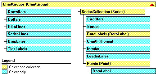
Рис.
3.19.
Структура объектов ChartGroup и Series
Давайте познакомимся с объектами, вложенными в Chart:
- PivotLayout — это новый объект, появившийся в Office 2000. Его появление связано с усилением внимания к обработке многомерных источников данных, а, следовательно, и к сводным таблицам и диаграммам. Объект имеет много свойств, позволяющих добраться до полей сводной таблицы, и много методов, например, метод AddFields, позволяющий добавить новое поле. С его помощью можно также работать с осями сводной диаграммы.
- ChartArea — представляет область, отведенную под диаграмму. Для двумерных диаграмм эта область включает заголовок диаграммы, легенду, оси и их заголовки, а для трехмерных — только заголовок диаграммы и легенду. Вложенные в ChartArea объекты: Border, Font, Interior, FillFormat позволяют задать границы области, используемый для подписей шрифт, формат заполнения, цвет, образец заполнения фона и другие характеристики. Терминальные свойства Height, Width, Left, Top задают границы области. Методы Select, Clear, Copy позволяют выделить область, очистить ее содержимое или поместить его в буфер.
- PlotArea — задает внутреннюю часть области диаграммы, отведенную непосредственно для графического отображения данных. Эту область окружает область объекта ChartArea. В область объекта PlotArea для двумерных диаграмм входят маркеры данных, линии сетки, линии тренда и те возможные элементы диаграммы, которые помещаются в ее область. Для трехмерных диаграмм к этой области относятся также оси и их заголовки, а также нижняя грань и боковые грани трехмерного куба, рисуемого для создания иллюзии трехмерного пространства. PlotArea имеет свойства и методы, сходные с объектом ChartArea.
- ChartTitle — является «полноценным» объектом. Помимо свойства Text, задающего текст заголовка диаграммы в него встроены собственные объекты: Border, Font, Interior, FillFormat. Кроме этого можно задать ориентацию заголовка, выравнивание, расположение. Есть даже собственные методы — Select и Delete.
-
Axes(Axis) — С осями диаграммы есть смысл разобраться подробнее. Во-первых, есть некоторая путаница в классификации — что есть Axes -метод или свойство? Будем считать, что есть и метод и свойство. Метод Axes(Type, AxisGroup) возвращает одну ось — объект Axis. Параметр Type имеет три значения: xlValue, xlCategory, или xlSeriesAxis (только для трехмерных диаграмм), указывающих, какая из трех возможных осей возвращается. Второй параметр — AxisGroup указывает, какая ось возвращается — основная или вспомогательная. Этот параметр имеет два значения: xlPrimary или xlSecondary. Для трехмерных диаграмм возможно использование только основных осей. Свойство Axes (или метод, вызываемый без параметров) возвращает коллекцию осей. Метод Item этой коллекции позволяет добраться до нужной оси. Пример работы с этим объектом был приведен. Замечу, что вспомогательные оси полезны,
когда на диаграмме
отображаются несколько рядов данных, имеющих разные масштабы. Соответствующий пример построения такой оси уже был приведен. -
SeriesCollection(Series) — коллекция рядов данных. Как обычно, параметр Index или метод Item позволяют добраться до элемента коллекции — объекта класса Series, представляющего конкретный ряд данных. Коллекция имеет следующие методы:
- Add, позволяющий добавить новый ряд данных,
- Extend, добавляющий новые точки в ряды данных коллекции,
- NewSeries, создающий новый ряд данных и возвращающий в качестве результата объект класса Series.
Конечно, непросто устроен и объект Series, задающий сам ряд данных. Его структура показана на рис. 3.19, а некоторые из основных его свойств были продемонстрированы в предыдущем примере.
- DataTable — объект, представляющий таблицу данных. Основными методами являются Select и Delete, основные свойства связаны с рамкой, строящейся вокруг таблицы. Вся содержательная работа с данными таблицы ведется через другие объекты (ряды данных). Так что по существу этот объект представляет рамку таблицы данных.
- Legend — задает легенду диаграммы. O сущности этого объекта мы уже говорили, так что его поведение должно быть понятно.
- Shapes — эта коллекция нам хорошо знакома. В диаграммах она используется редко, но иногда можно категории изображать рисунками, что повышает эстетику диаграммы.
-
ChartGroups(ChartGroup) — возвращает коллекцию групп. Элементами коллекции являются объекты класса ChartGroup. Каждый такой объект представляет группу, связанную с одним или несколькими рядами данных, отображаемых диаграммой одного и того же типа, о чем я уже подробно рассказывал. Параметр Index позволяет добраться до конкретной группы в коллекции. Поскольку при форматировании одной из группы индексы изменяются, то иногда удобнее пользоваться специальными методами, которые возвращают группы фиксированного типа. Такими методами являются: AreaGroups, BarGroups, ColumnGroups, DoughnutGroups, LineGroups и PieGroups. Эти методы для двумерных диаграмм возвращают коллекцию групп типа, указанного методом. К конкретной группе можно добраться опять — таки с помощью индекса. Для трехмерных диаграмм может быть только одна группа определенного формата. Поэтому есть методы, возвращающие эту единственную группу: Area3DGroup, Bar3DGroup,
Column3DGroup, Line3DGroup, Pie3DGroup, SurfaceGroup. - Floor, Walls и Corners объекты используются при работе с трехмерными диаграммами. При отображении таких диаграмм для создания иллюзии трехмерного пространства диаграмма отображается на фоне открытого куба, имеющего основание, заданное объектом Floor, и две боковые грани — объекты Walls. Объект Corners задает углы куба. Манипулируя этими объектами, можно, например, развернуть куб или изменить заливку и узор стенок куба, добиваясь большей наглядности изображения.
Терминальные свойства объекта Chart
Основные терминальные свойства сведены в таблицу.
| Свойство | Описание |
|---|---|
| ChartType | Позволяет прочесть или задать тип и формат стандартной диаграммы. Возможные значения задаются константами, которых около сотни. Напомним, что с каждым из 14 стандартных типов связано до 10 форматов. |
| AutoScaling | Булево свойство, имеющее значение True, когда трехмерная диаграмма автоматически масштабируется так, чтобы совпадать по размеру с двумерной. Свойство RightAngleAxes должно также иметь значение True. |
| BarShape | Мы ранее говорили, что двумерные гистограммы изображаются в виде прямоугольников. Для изображения трехмерных гистограмм обычно используются параллелепипеды, но можно применять и другие геометрические фигуры. Свойство BarShape задает вид используемой фигуры. Оно имеет следующие значения: xlBox, xlConeToMax, xlConeToPoint, xlCylinder, xlPyramidToMax, или xlPyramidToPoint. Использовать это свойство вряд ли стоит. Все эти фигуры- «изыски от лукавого». |
| DepthPercent, HeightPercent | Свойства применимы только к трехмерным диаграммам. Позволяют установить глубину и высоту диаграммы в процентах относительно ее ширины. |
| DisplayBlanksAs | Устанавливает способ интерпретации данных при встрече с пустой ячейкой. Следующие константы: xlNotPlotted, xlInterpolated, или xlZero задают три возможные стратегии- игнорировать ячейку, провести интерполяцию или считать нулем. |
| Elevation, Rotation, Perspective, RightAngleAxes | Можно попытаться повысить наглядность изображения диаграммы. Свойство Elevation задает возвышение (в градусах) точки, с которой Вы смотрите на диаграмму. Rotation задает поворот вокруг оси Z, а Perspective — перспективу. Булево свойство RightAngleAxes задает «угол зрения». |
| GapDepth | Задает в трехмерной диаграмме расстояние между рядами данных. Значение может быть в интервале от 0 до 500. |
| HasAxis, HasDataTable, HasLegend, HasTitle | Булевы свойства, показывающие, какие элементы диаграммы присутствуют в ней. |
| PlotBy | Имеет два значения: xlColumns и xlRows, указывающие столбцы или строки следует использовать как ряды данных. |
| PlotVisibleOnly | Булево свойство, имеющее значение True, если отображаются только данные из видимых ячеек. В противном случае диаграмма отображает все данные, включая скрытые ячейки. |
| ProtectContents, ProtectData, ProtectDrawingObjects, ProtectFormatting, ProtectGoalSeek, ProtectionMode, ProtectSelection | Булевы свойства, позволяющие установить защиту соответствующих элементов диаграммы. Часть из них имеет статус «только для чтения». |
| ShowWindow | Булево свойство, применяемое только к встроенным диаграммам. Имеет значение True, если диаграмма отображается в отдельном окне. |
| Visible | Напомним, имеет три значения: True, False и xlVeryHidden. |
Методы объекта Chart
Мы не будем рассматривать методы, которые так или иначе уже встречались. Рассмотрим только основные методы, определяющие новое поведение объекта Chart:
-
Sub ChartWizard([Source], [Gallery], [Format], [PlotBy], [CategoryLabels], [SeriesLabels], [HasLegend], [Title], [CategoryTitle], [ValueTitle], [ExtraTitle]) Этот метод позволяет построить или модифицировать существующую диаграмму. В отличие от мастера диаграмм (ChartWizard), который вызывается при построении диаграммы вручную, метод не является интерактивным, более того он не позволяет задать все возможные свойства. С его помощью можно выполнить основную работу, а детали строятся с использованием других свойств и методов объекта Chart. В одном из ранее приведенных примеров (процедуре AddChart ) я демонстрировал применение этого метода для программного построения диаграммы. Дадим краткое описание параметров метода, все из которых являются необязательными:
- Source — объект Range, содержащий исходные данные для построения новой диаграммы. Если параметр опущен, то метод позволяет отредактировать существующую диаграмму — либо выделенную диаграмму рабочего листа, либо диаграмму активного листа диаграмм.
- Gallery — задает тип диаграммы и может быть одной из следующих констант: xlArea, xlBar, xlColumn, xlLine, xlPie, xlRadar, xlXYScatter, xlCombination, xl3DArea, xl3DBar, xl3DColumn, xl3DLine, xl3DPie, xl3DSurface, xlDoughnut, или xlDefaultAutoFormat.
- Format — задает формат для данного типа диаграммы. Каждому типу диаграммы соответствует некоторое число возможных форматов. Параметр задает номер формата, по умолчанию выбирается первый формат данного типа.
- PlotBy — соответствует терминальному свойству PlotBy.
- CategoryLabels и SeriesLabels — целые, указывающие число строк или столбцов с метками категорий и рядов данных в области, заданной параметром Source. Указывать эти числа нужно на единицу меньше фактического значения.
- Остальные параметры позволяют добавить легенду, задать название диаграммы и ее осей — они совпадают с соответствующими терминальными свойствами.
- Sub SetSourceData(Source As Range, [PlotBy]) Устанавливает источник данных диаграммы. Второй параметр соответствует терминальному свойству PlotBy.
- Sub ApplyCustomType(ChartType As XlChartType, [TypeName]) Метод позволяет модифицировать диаграмму, применив к ней новый тип — стандартный или настраиваемый. Если этот тип стандартный, то тогда первый параметр полностью его определяет. Его возможные значения совпадают со значениями соответствующего терминального свойства ChartType. Если же тип настраиваемый, то первый параметр должен иметь одно из следующих значений: xlBuiltIn, xlUserDefined или xlAnyGallery. В этом случае второй параметр задает имя типа диаграммы.
- Function Export(Filename As String, [FilterName], [Interactive]) As Boolean Позволяет экспортировать диаграмму, преобразуя ее в графический формат. Первый параметр задает имя файла, в который будет записана диаграмма в графическом формате, второй — задает имя графического фильтра в том виде, как оно записано в системном регистре. Булев параметр Interactive должен иметь значение True, если мы хотим вызвать диалоговое окно в процессе фильтрации. Функция Export возвращает значение True в случае успешного завершения работы.
- Sub GetChartElement(X As Long, Y As Long, ElementID As Long, Arg1 As Long, Arg2 As Long). Представьте себе, что пользователь щелкнул кнопку мыши где-то над диаграммой. Обработав это событие, можно получить координаты курсора мыши — X и Y. Если теперь вызвать метод GetChartElement с этими координатами, то он вернет значение параметра ElementID — идентификатор элемента диаграммы и значения двух параметров, связанных с этим элементом. Конечно, параметры зависят от типа того элемента, чьи координаты X и Y заданы.
-
Function Location(Where As XlChartLocation, [Name]) As Chart. Передвигает диаграмму в новое местоположение. Параметр Where имеет следующие значения: xlLocationAsNewSheet, xlLocationAsObject, или xlLocationAutomatic.
В первом случае диаграмма помещается на новый лист диаграммы и параметр Name задает имя этого листа. Во втором случае диаграмма помещается как встроенный объект и Name задает имя рабочего листа. Вот пример, в котором диаграмму, построенную на рабочем листе книги «BookOne» мы переносим на отдельный лист диаграмм:
Public Sub MoveChart() Workbooks("BookOne").Worksheets("Sheet1").ChartObjects(4) _ .Chart.Location Where:=xlLocationAsNewSheet, Name:="Динамика продаж" End Sub - Sub SetSourceData(Source As Range, [PlotBy]) Позволяет установить новый источник данных. Параметры в пояснениях не нуждаются.
В заключение приведем процедуру, создающую трехмерную диаграмму по данным нашего примера с дилерами и продажами:
Public Sub Chart3D()
	Workbooks("BookFour").Activate
	With Worksheets("Лист3")
		Dim myRange As Range
		Set myRange = .Range("C23:F27")
		Dim myChart As ChartObject
		'Создаем контейнер объекта Chart
		Set myChart = .ChartObjects.Add(myRange.Left - 100, _
		myRange.Top + myRange.Height, 400, 300)
	End With
	'Определяем параметры объекта Chart
	With myChart.Chart
		.ChartType = xl3DColumn
		.SetSourceData Source:=myRange, PlotBy:=xlRows
		.Location Where:=xlLocationAsObject, Name:="Лист3"
	End With
	With ActiveChart
		.HasTitle = True
		.ChartTitle.Characters.Text = "Динамика продаж"
	End With
	'Диалог с пользователем
	If MsgBox("Хотите изменить угол зрения?", vbYesNo) = vbYes Then
		ActiveChart.RightAngleAxes = True
	End If
End Sub
Дадим некоторые комментарии к этой программе:
- В качестве источника данных выступает известная по предыдущим примерам таблица Excel.
- Я ввел объекты myRange и myChart класса ChartObjects. Это позволило задать нужные размеры и положение диаграммы, привязанное к таблице данных.
- Ранее при построении диаграмм я использовал метод ChartWizard и работу с коллекциями SEriesCollection. Теперь продемонстрирован еще один способ, когда задаются свойства и методы объекта Chart, в частности, для указания источника данных используется метод SetSourceData.
- Свойство ChartType позволяет указать тип диаграммы, а метод Location определяет ее, как встроенный объект.
- В диалоге с пользователем изменяется угол зрения, задаваемый булевым свойством RightAngleAxes.
- Задав еще заголовок диаграммы, и приняв остальные свойства диаграммы по умолчанию, я получил диаграмму, представленную на рис.3.14.
События объекта Chart
В отличие от объекта Worksheet, все события которого могут быть обработаны на верхнем уровне, объект Chart имеет специфические события, сообщения о которых направляются только ему одному. Встроенные диаграммы и листы диаграмм, имеют одни и те же события. Разница состоит в том, что события встроенных диаграмм по умолчанию выключены, поэтому необходимо потрудиться, чтобы стало возможным их подключение и написание обработчиков событий. Рассмотрим список событий, связанных с объектом Chart:
| Событие | Появляется, когда пользователь или программа |
|---|---|
| Activate | Активизировал лист диаграмм. Естественно, его нет у встроенных диаграмм. |
| BeforeDoubleClick | Дважды щелкает кнопкой мыши на диаграмме |
| BeforeRightClick | Щелкает правой кнопкой мыши на диаграмме |
| Calculate | Добавил или изменил данные на диаграмме. |
| Deactivate | Активизировал новый лист и тем самым деактивировал старый. |
| DragOver | Перетащил данные, расположив их поверх диаграммы. |
| DragPlot | Перетащил диапазон ячеек, расположив их поверх диаграммы. |
| MouseDown | Нажал кнопку мыши при позиционировании ее над диаграммой. |
| MouseMove | Передвигает указатель мыши по диаграмме. |
| MouseUp | Закончил перемещение мыши и освободил кнопку. |
| Resize | Изменил размер диаграммы. |
| Select | Выделил некоторый элемент диаграммы |
| SeriesChange | Изменил значение точки ряда данных. |
Построение обработчиков событий
Обработчики событий для объектов Workbook, Worksheet и объектов Chart, задающих листы диаграмм, построить нетрудно. Все эти события по умолчанию включены, поэтому для построения обработчика достаточно перейти в окно проектов, выбрать модуль, обрабатывающий события этого объекта, в окне объектов этого модуля выбрать нужный объект, а затем в окне событий и процедур выбрать из списка имя события. В результате этих действий появится заготовка, содержащая заголовок обработчика события, после чего останется написать код обработчика. Более сложно строятся обработчики событий для объектов Chart, задающих встроенные диаграммы. О том как создаются обработчики событий для тех объектов, у которых события по умолчанию выключены, я подробно рассказал при рассмотрении событий объекта Application. Остается только коротко напомнить схему действий:
- Вначале нужно создать класс, в котором следует объявить объект Chart с событиями (With Events)
- Затем нужно объявить глобальный объект созданного класса — объект, уже имеющий события. После этого остается написать инициализирующую процедуру, в которой связывается глобальный объект с объектом, задающим встроенную диаграмму.
- Поскольку объект Chart с событиями появляется в окне созданного класса, то к нему применяется обычная схема создания обработчиков событий.
- После запуска инициализирующей процедуры, объект, задающий встроенную диаграмму, будет реагировать на события.
Возможно, следует обратиться к началу главы, где все подробно описано на примере работы с объектом Application.
Программное создание графика (диаграммы) в VBA Excel с помощью метода Charts.Add на основе данных из диапазона ячеек на рабочем листе. Примеры.
Метод Charts.Add
В настоящее время на сайте разработчиков описывается метод Charts.Add2, который, очевидно, заменил метод Charts.Add. Тесты показали, что Charts.Add продолжает работать в новых версиях VBA Excel, поэтому в примерах используется именно он.
Синтаксис
|
Charts.Add ([Before], [After], [Count]) |
|
Charts.Add2 ([Before], [After], [Count], [NewLayout]) |
Параметры
Параметры методов Charts.Add и Charts.Add2:
| Параметр | Описание |
|---|---|
| Before | Имя листа, перед которым добавляется новый лист с диаграммой. Необязательный параметр. |
| After | Имя листа, после которого добавляется новый лист с диаграммой. Необязательный параметр. |
| Count | Количество добавляемых листов с диаграммой. Значение по умолчанию – 1. Необязательный параметр. |
| NewLayout | Если NewLayout имеет значение True, диаграмма вставляется с использованием новых правил динамического форматирования (заголовок имеет значение «включено», а условные обозначения – только при наличии нескольких рядов). Необязательный параметр. |
Если параметры Before и After опущены, новый лист с диаграммой вставляется перед активным листом.
Примеры
Таблицы
В качестве источников данных для примеров используются следующие таблицы:

Пример 1
Программное создание объекта Chart с типом графика по умолчанию и по исходным данным из диапазона «A2:B26»:
|
Sub Primer1() Dim myChart As Chart ‘создаем объект Chart с расположением нового листа по умолчанию Set myChart = ThisWorkbook.Charts.Add With myChart ‘назначаем объекту Chart источник данных .SetSourceData (Sheets(«Лист1»).Range(«A2:B26»)) ‘переносим диаграмму на «Лист1» (отдельный лист диаграммы удаляется) .Location xlLocationAsObject, «Лист1» End With End Sub |
Результат работы кода VBA Excel из первого примера:

Пример 2
Программное создание объекта Chart с двумя линейными графиками по исходным данным из диапазона «A2:C26»:
|
Sub Primer2() Dim myChart As Chart Set myChart = ThisWorkbook.Charts.Add With myChart .SetSourceData (Sheets(«Лист1»).Range(«A2:C26»)) ‘задаем тип диаграммы (линейный график с маркерами) .ChartType = xlLineMarkers .Location xlLocationAsObject, «Лист1» End With End Sub |
Результат работы кода VBA Excel из второго примера:

Пример 3
Программное создание объекта Chart с круговой диаграммой, разделенной на сектора, по исходным данным из диапазона «E2:F7»:
|
Sub Primer3() Dim myChart As Chart Set myChart = ThisWorkbook.Charts.Add With myChart .SetSourceData (Sheets(«Лист1»).Range(«E2:F7»)) ‘задаем тип диаграммы (пирог — круг, разделенный на сектора) .ChartType = xlPie ‘задаем стиль диаграммы (с отображением процентов) .ChartStyle = 261 .Location xlLocationAsObject, «Лист1» End With End Sub |
Результат работы кода VBA Excel из третьего примера:

Примечание
В примерах использовались следующие методы и свойства объекта Chart:
| Компонент | Описание |
|---|---|
| Метод SetSourceData | Задает диапазон исходных данных для диаграммы. |
| Метод Location | Перемещает диаграмму в заданное расположение (новый лист, существующий лист, элемент управления). |
| Свойство ChartType | Возвращает или задает тип диаграммы. Смотрите константы. |
| Свойство ChartStyle | Возвращает или задает стиль диаграммы. Значение нужного стиля можно узнать, записав макрос. |
Excel Chart VBA Examples and Tutorials
Excel charts are one of the awesome tools available to represent the data in rich visualized graphs. Here are the most frequently used Excel Chart VBA Examples and Tutorials. You can access chart objects, properties and dealing with the methods.
Here are the top most Excel Chart VBA Examples and Tutorials, show you how to deal with chart axis, chart titles, background colors,chart data source, chart types, series and many other chart objects.
Excel Chart VBA Examples and Tutorials – Learning Path
- Example tutorials on Creating Charts using Excel VBA:
- Example tutorials on Chart Type using Excel VBA:
- Example Tutorials on Formatting Chart Objects using Excel VBA:
- Example Tutorials on Chart Collection in Excel VBA:
- Other useful Examples and tutorials on Excel VBA Charting:
- Excel VBA Charting Constants and Enumerations:
- Example File for Free Download:
Creating Charts using Excel VBA
We can create the chart using different methods in Excel VBA, following are the various Excel Chart VBA Examples and Tutorials to show you creating charts in Excel using VBA.
1. Adding New Chart for Selected Data using Sapes.AddChart Method in Excel VBA
The following Excel Chart VBA Examples works similarly when we select some data and click on charts from Insert Menu and to create a new chart. This will create basic chart in an existing worksheet.
Sub ExAddingNewChartforSelectedData_Sapes_AddChart_Method()
Range("C5:D7").Select
ActiveSheet.Shapes.AddChart.Select
End Sub
2. Adding New Chart for Selected Data using Charts.Add Method : Creating Chart Sheet in Excel VBA
The following Excel Chart VBA Examples method will add new chart into new worksheet by default. You can specify a location to embedded in a particular worksheet.
'Here is the other method to add charts using Chart Object. It will add a new chart for the selected data as new chart sheet.
Sub ExAddingNewChartforSelectedData_Charts_Add_Method_SheetChart()
Range("C5:D7").Select
Charts.Add
End Sub
3. Adding New Chart for Selected Data using Charts.Add Method : In Existing Sheet using Excel VBA
We can use the Charts.Add method to create a chart in existing worksheet. We can specify the position and location as shown below. This will create a new chart in a specific worksheet.
Sub ExAddingNewChartforSelectedData_Charts_Add_Method_InSheet()

Range("C5:D7").Select
Charts.Add
ActiveChart.Location Where:=xlLocationAsObject, Name:="Sheet1"

End Sub
4. Difference between embedded Chart and Chart Sheet in Excel:
Both are similar except event handlers, Chart Sheets will have the event handlers,we can write event programming for Chart Sheets. And the other type embedded charts can not support the event handlers. We can write classes to handle the events for the embedded chart, but not recommended.
We have seen multiple methods to create charts, but we cant set the chart at particular position using the above codes. You can use the ChartObjects.Add method to specify the position of the chart.
5. Adding New Chart for Selected Data using ChartObjects.Add Method in Excel VBA
ChartObjects.Add method is the best method as it is very easy to play with the chart objects to change the settings.
Sub ExAddingNewChartforSelectedData_ChartObjects_Add_Method()
With ActiveSheet.ChartObjects.Add(Left:=300, Width:=300, Top:=10, Height:=300)
.Chart.SetSourceData Source:=Sheets("Temp").Range("C5:D7")
End With
End Sub
6. Assigning Charts to an Object in Excel VBA
Here is another Excel Chart VBA Examples with ChartObjects, here we will assign to an Object and play with that.
Sub ExAddingNewChartforSelectedData_ChartObjects_Object()
Dim cht As Object
Set cht = ActiveSheet.ChartObjects.Add(Left:=300, Width:=300, Top:=10, Height:=300)
cht.Chart.SetSourceData Source:=Sheets("Temp").Range("C5:D7")
End Sub
7. Changing the Chart Position in Excel VBA
The following VBA example will show you how to change the chart position.
Sub ExAddingNewChartforSelectedData_Object_Position()
Dim cht As Object
Set cht = ActiveSheet.ChartObjects.Add(Left:=300, Width:=300, Top:=10, Height:=300)
cht.Chart.SetSourceData Source:=Sheets("Temp").Range("C5:D7")
cht.Left = 350
cht.Width = 400
cht.Top = 30
cht.Height = 200
End Sub
8. Align Chart Object at a Particular Range or Cell in Excel VBA
You can set the top,left, height and width properties of a chart object to align in a particular position.
Sub AlignChartAtParticularRange()
' Chart Align

With ActiveSheet.ChartObjects(1)
.Left = Range("A6").Left
.Top = Range("A7").Top
.Width = Range("D6").Left
.Height = Range("D16").Top - Range("D6").Top
End With

End Sub
9. Use with statement while dealing with Charts and avoid the accessing the same object repeatedly in Excel VBA
If you are dealing with the same object, it is better to use with statement. It will make the program more clear to understand and executes faster.
Sub ExChartPostion_Object_Position()
Dim cht As Object
Set cht = ActiveSheet.ChartObjects.Add(Left:=300, Width:=300, Top:=10, Height:=300)
With cht
.Chart.SetSourceData Source:=Sheets("Temp").Range("C5:D7")
.Left = 350
.Width = 400
.Top = 30
.Height = 200
End With
End Sub
10. You can use ActiveChart Object to access the active chart in Excel VBA
Active chart is the chart which is currently selected or activated in your active sheet.
Sub ExChartPostion_ActiveChart()
ActiveSheet.ChartObjects.Add(Left:=300, Width:=300, Top:=10, Height:=300).Activate
With ActiveChart
.SetSourceData Source:=Sheets("Temp").Range("C5:D7")
.Parent.Left = 350
.Parent.Width = 400
.Parent.Top = 30
.Parent.Height = 200
End With
End Sub
Top
Setting Chart Types using Excel VBA
We have verity of chart in Excel, we can use VBA to change and set the suitable chart type based on the data which we want to present. Below are the Excel Chart VBA Examples and Tutorials to change the chart type.
We can use Chart.Type property to set the chart type, here we can pass Excel chart constants or chart enumerations to set the chart type. Please refer the following table to understand the excel constants and enumerations.
11. Example to Change Chart type using Excel Chart Enumerations in Excel VBA
This Excel Chart VBA Example will use 1 as excel enumeration to plot the Aria Chart. Please check here list of enumerations available for Excel VBA Charting
Sub Ex_ChartType_Enumeration()
Dim cht As Object
Set cht = ActiveSheet.ChartObjects.Add(Left:=300, Width:=300, Top:=10, Height:=300)
With cht
.Chart.SetSourceData Source:=Sheets("Temp").Range("C5:D7")
.Chart.Type = 1 ' for aria chart
End With
End Sub
12. Example to Change Chart type using Excel Chart Constants in VBA
This Excel Chart VBA Example will use xlArea as excel constant to plot the Aria Chart. Please check here for list of enumerations available in Excel VBA Charting
Sub Ex_ChartType_xlConstant()
Dim cht As Object
Set cht = ActiveSheet.ChartObjects.Add(Left:=300, Width:=300, Top:=10, Height:=300)
With cht
.Chart.SetSourceData Source:=Sheets("Temp").Range("C5:D7")
.Chart.Type = xlArea
End With
End Sub
xlConstants is recommended than Excel Enumeration, as it is easy to understand and remember. Following are frequently used chart type examples:
13. Example to set the type as a Pie Chart in Excel VBA
The following VBA code using xlPie constant to plot the Pie chart. Please check here for list of enumerations available in Excel VBA Charting
Sub Ex_ChartType_Pie_Chart()
Dim cht As Object
Set cht = ActiveSheet.ChartObjects.Add(Left:=300, Width:=300, Top:=10, Height:=300)
With cht
.Chart.SetSourceData Source:=Sheets("Temp").Range("C5:D7")
.Chart.Type = xlPie
End With
End Sub
14. Example to set the chart type as a Line Chart in Excel VBA
The following VBA code using xlLine constant to plot the Pie chart. Please check here for list of enumerations available in Excel VBA Charting
Sub Ex_ChartType_Line_Chart()
Dim cht As Object
Set cht = ActiveSheet.ChartObjects.Add(Left:=300, Width:=300, Top:=10, Height:=300)
With cht
.Chart.SetSourceData Source:=Sheets("Temp").Range("C5:D7")
.Chart.Type = xlLine
End With
End Sub
15. Example to set the chart type as a Bar Chart in Excel VBA
The following VBA code using xlBar constant to plot the Pie chart. Please check here for list of enumerations available in Excel VBA Charting
Sub Ex_ChartType_Bar_Chart()
Dim cht As Object
Set cht = ActiveSheet.ChartObjects.Add(Left:=300, Width:=300, Top:=10, Height:=300)
With cht
.Chart.SetSourceData Source:=Sheets("Temp").Range("C5:D7")
.Chart.Type = xlBar
End With
End Sub
16. Example to set the chart type as a XYScatter Chart in Excel VBA
The following code using xlXYScatter constant to plot the Pie chart. Please check here for list of enumerations available in Excel VBA Charting
Sub Ex_ChartType_XYScatter_Chart()
Dim cht As Object
Set cht = ActiveSheet.ChartObjects.Add(Left:=300, Width:=300, Top:=10, Height:=300)
With cht
.Chart.SetSourceData Source:=Sheets("Temp").Range("C5:D7")
.Chart.Type = xlXYScatter
End With
End Sub
Here is the complete list of Excel Chart Types, Chart Enumerations and Chart Constants:
Top
Formatting Chart Objects using Excel VBA
Below are Excel Chart VBA Examples to show you how to change background colors of charts, series and changing the different properties of charts like Chart Legends, Line Styles, Number Formatting. You can also find the examples on Chart Axis and Chart Axes Setting and Number Formats.
17. Changing Chart Background Color – Chart Aria Interior Color in Excel VBA
The following VBA code will change the background color of the Excel Chart.
Sub Ex_ChartAriaInteriorColor()
Dim cht As Object
Set cht = ActiveSheet.ChartObjects.Add(Left:=300, Width:=300, Top:=10, Height:=300)
With cht
.Chart.SetSourceData Source:=Sheets("Temp").Range("C5:D7")
.Chart.ChartArea.Interior.ColorIndex = 3
End With
End Sub
18. Changing PlotAria Background Color – PlotAria Interior Color in Excel VBA
The following code will change the background color of Plot Area in Excel VBA.
Sub Ex_PlotAriaInteriorColor()
Dim cht As Object
Set cht = ActiveSheet.ChartObjects.Add(Left:=300, Width:=300, Top:=10, Height:=300)
With cht
.Chart.SetSourceData Source:=Sheets("Temp").Range("C5:D7")
.Chart.PlotArea.Interior.ColorIndex = 5
End With
End Sub
19.Changing Chart Series Background Color – Series Interior Color in Excel VBA
The following code is for changing the background color of a series using Excel VBA.
Sub Ex_SeriesInteriorColor()
Dim cht As Object
Set cht = ActiveSheet.ChartObjects.Add(Left:=300, Width:=300, Top:=10, Height:=300)
With cht
.Chart.SetSourceData Source:=Sheets("Temp").Range("C5:D7")
.Chart.SeriesCollection(1).Format.Fill.ForeColor.RGB = rgbRed
.Chart.SeriesCollection(2).Interior.ColorIndex = 5

End With
End Sub
20. Changing Chart Series Marker Style in Excel VBA
Here is the code to change the series marker style using Excel VBA, you can change to circle, diamond, square,etc. Check the excel constants and enumerations for more options available in excel vba.
Sub Ex_ChangingMarkerStyle()
Dim cht As Object
Set cht = ActiveSheet.ChartObjects.Add(Left:=300, Width:=300, Top:=10, Height:=300)
With cht
.Chart.SetSourceData Source:=Sheets("Temp").Range("C5:D7")
.Chart.Type = xlLine
.Chart.SeriesCollection(1).MarkerStyle = 7
End With
End Sub
21. Changing Chart Series Line Style in Excel VBA
Here is the code to change the line color using Excel VBA, it will change the line style from solid to dash. Check the excel constants for more options.
Sub Ex_ChangingLineStyle()
Dim cht As Object
Set cht = ActiveSheet.ChartObjects.Add(Left:=300, Width:=300, Top:=10, Height:=300)
With cht
.Chart.SetSourceData Source:=Sheets("Temp").Range("C5:D7")
.Chart.Type = xlLine
.Chart.SeriesCollection(1).Border.LineStyle = xlDash
End With
End Sub
22. Changing Chart Series Border Color in Excel VBA
Here is the code for changing series borders in Excel VBA.
Sub Ex_ChangingBorderColor()
Dim cht As Object
Set cht = ActiveSheet.ChartObjects.Add(Left:=300, Width:=300, Top:=10, Height:=300)
With cht
.Chart.SetSourceData Source:=Sheets("Temp").Range("C5:D7")
.Chart.Type = xlBar
.Chart.SeriesCollection(1).Border.ColorIndex = 3
End With
End Sub
23. Change Chart Axis NumberFormat in Excel VBA
This code will change the chart axis number format using excel vba.
Sub Ex_ChangeAxisNumberFormat()
Dim cht As Object
Set cht = ActiveSheet.ChartObjects.Add(Left:=300, Width:=300, Top:=10, Height:=300)
With cht
.Chart.SetSourceData Source:=Sheets("Temp").Range("C5:D7")
.Chart.Type = xlLine
.Chart.Axes(xlValue).TickLabels.NumberFormat = "0.00"
End With
End Sub
24. Formatting Axis Labels: Changing Axis Font to Bold using Excel VBA
The following example is for formating Axis labels using Excel VBA.
Sub Ex_ChangeAxisFormatFontBold()
Dim cht As Object
Set cht = ActiveSheet.ChartObjects.Add(Left:=300, Width:=300, Top:=10, Height:=300)
With cht
.Chart.SetSourceData Source:=Sheets("Temp").Range("C5:D7")
.Chart.Type = xlLine
.Chart.Axes(xlCategory).TickLabels.Font.FontStyle = "Bold"
End With
End Sub
25. Two Y-axes Left and Right of Charts(Primary Axis and Secondary Axis) using Excel VBA
This code will set the series 2 into secondary Axis using Excel VBA.
Sub Ex_ChangeAxistoSecondary()
Dim cht As Object
Set cht = ActiveSheet.ChartObjects.Add(Left:=300, Width:=300, Top:=10, Height:=300)
With cht
.Chart.SetSourceData Source:=Sheets("Temp").Range("C5:D7")
.Chart.Type = xlLine
.Chart.SeriesCollection(2).AxisGroup = 2
End With
End Sub
Top
Chart Collection in Excel VBA
You can use ChartObject Collection to loop through the all charts in worksheet or workbook using Excel VBA. And do whatever you want to do with that particular chart. Here are Excel Chart VBA Examples to deal with Charts using VBA.
26. Set equal widths and heights for all charts available in a Worksheet using Excel VBA
Following is the Excel VBA code to change the chart width and height.
Sub Ex_ChartCollections_Change_widths_heights()
Dim cht As Object
For Each cht In ActiveSheet.ChartObjects
cht.Width = 400
cht.Height = 200
Next

End Sub
27. Delete All Charts in a Worksheet using Excel VBA
Following is the Excel VBA example to delete all charts in worksheet.
Sub Ex_DeleteAllCharts()
Dim cht As Object
For Each cht In ActiveSheet.ChartObjects
cht.Delete
Next

End Sub
Top
Other useful Examples and tutorials on Excel VBA Charting
28. Set Chart Data Source using Excel VBA
Below is the Excel Chart VBA Example to set the chart data source. You can set it by using .SetSourceData Source property of a chart
Sub Ex_ChartDataSource()

Dim cht As Chart

'Add new chart
ActiveSheet.Shapes.AddChart.Select
With ActiveChart
'Specify source data and orientation
.SetSourceData Source:=Sheet1.Range("A1:C5")
End With

End Sub
29. Swap or Switch Rows and Columns in Excel Charts using VBA
Here is the excel VBA code to swap the Rows to Columns.
Sub Ex_SwitchRowsColumns()

Dim cht As Chart

'Add new chart
ActiveSheet.Shapes.AddChart.Select
With ActiveChart
'Specify source data and orientation
.SetSourceData Source:=Sheets("Temp").Range("C5:D7"), PlotBy:=xlRows ' you can use xlColumns to swith it
End With

End Sub
30. Set Chart Data Labels and Legends using Excel VBA
You can set Chart Data Labels and Legends by using SetElement property in Excl VBA
Sub Ex_AddDataLabels()

Dim cht As Chart

'Add new chart
ActiveSheet.Shapes.AddChart.Select
With ActiveChart
'Specify source data and orientation
.SetSourceData Source:=Sheet1.Range("A1:B5"), PlotBy:=xlColumns
'Set Chart type
.ChartType = xlPie
'set data label at center
.SetElement (msoElementDataLabelCenter)
'set legend at bottom
.SetElement (msoElementLegendBottom)
End With
End Sub
31. Changing Axis Titles of a Chart in Excel VBA
Following is the code to change the chart Axis titles using Excel VBA..
Sub Ex_ChangeAxisTitles()
activechart.chartobjects(1).activate
ActiveChart.Axes(xlCategory).HasTitle = True
ActiveChart.Axes(xlCategory).AxisTitle.Text = "Quarter"

ActiveChart.Axes(xlValue).HasTitle = True
ActiveChart.Axes(xlValue).AxisTitle.Text = "Sales"

End Sub
32. Change Titles of a Chart using Excel VBA
Following is the code to change the chart titles using Excel VBA..
Sub Ex_ChangeChartTitles()
ActiveSheet.ChartObjects(1).Activate
ActiveChart.HasTitle = True
ActiveChart.ChartTitle.Text = "Overal Summary"

End Sub
33. Send an Excel Chart to an Outlook email using VBA
Download Example File:
ANALYSIS TABS – SendExcelChartToOutLook.xlsm
Following is the code to Send an Excel Chart to an Outlook email using VBA.
Sub SendChartThroughMail()
'Add refernce to Microsoft Outlook object Library

Dim olMail As MailItem
Dim objOL As Object
Dim sImgPath As String

Dim sHi As String
Dim sBody As String
Dim sThanks As String

' Saving chart as image
sImgPath = ThisWorkbook.Path & "Temp_" & Format(Now(), "DD_MM_YY_HH_MM_SS") & ".bmp"
Sheets("Sheet1").ChartObjects(1).Chart.Export sImgPath

'creating html body with image
sHi = "<font size='3' color='black'>" & "Hi," & "<br> <br>" & "Here is the required solution: " & "<br> <br> </font>"

sBody = "<p align='Left'><img src=""cid:" & Mid(sImgPath, InStrRev(sImgPath, "") + 1) & """ width=400 height=300 > <br> <br>"

sThanks = "<font size='3'>" & "Many thanks - ANALYSISTABS.COM <br>The Complete Reference For Analyst <br> website:<A HREF=""https://www.analysistabs.com""> analysistabs.com</A>" & "<br> <br> </font>"

'sending the email

Set objOL = CreateObject("Outlook.Application")
Set olMail = objOL.CreateItem(olMailItem)

With olMail
.To = "youremail@orgdomain.com"
.Subject = "ANALYSISTABS.COM: Test Mail with chart"
.Attachments.Add sImgPath
.HTMLBody = sHi & sBody & sThanks
.Display
End With

'Delete the saved chart
Kill sImgPath

'Free-up the objects
Set olMail = Nothing
Set olApp = Nothing

End Sub
Top
Excel VBA Chart Constants and Enumerations
Chart Types, Constants and Enumerations
| CHART TYPE | VBA CONSTANT | VALUE |
|
AREA Charts |
||
| AREA | xlArea | 1 |
| STACKED AREA | xlAreaStacked | 76 |
| 100% STACKED AREA | xlAreaStacked100 | 77 |
| 3D AREA | xl3DArea | -4098 |
| 3D STACKED AREA | xl3DAreaStacked | 78 |
| 3D 100% STACKED AREA | xl3DAreaStacked100 | 79 |
|
BAR Charts |
||
| 3D CLUSTERED BAR | xl3DBarClustered | 60 |
| 3D STACKED BAR | xl3DBarStacked | 61 |
| 3D 100% STACKED BAR | xl3DBarStacked100 | 62 |
| CLUSTERED BAR | xlBarClustered | 57 |
| STACKED BAR | xlBarStacked | 58 |
| 100% STACKED BAR | xlBarStacked100 | 59 |
| CLUSTERED CONE BAR | xlConeBarClustered | 102 |
| STACKED CONE BAR | xlConeBarStacked | 103 |
| 100% STACKED CONE BAR | xlConeBarStacked100 | 104 |
| CLUSTERED CYLINDER BAR | xlCylinderBarClustered | 95 |
| STACKED CYLINDER BAR | xlCylinderBarStacked | 96 |
| 100% STACKED CYLINDER BAR | xlCylinderBarStacked100 | 97 |
| CLUSTERED PYRAMID BAR | xlPyramidBarClustered | 109 |
| STACKED PYRAMID BAR | xlPyramidBarStacked | 110 |
| 100% STACKED PYRAMID BAR | xlPyramidBarStacked100 | 111 |
| BUBBLE Charts | ||
| 3D BUBBLE, BUBBLE WITH 3D EFFECTS | xlBubble3DEffect | 87 |
| BUBBLE | xlBubble | 15 |
|
COLUMN Charts |
||
| 3D CLUSTERED COLUMN | xl3DColumnClustered | 54 |
| 3D COLUMN | xl3DColumn | -4100 |
| 3D CONE COLUMN | xlConeCol | 105 |
| 3D CYLINDER COLUMN | xlCylinderCol | 98 |
| 3D PYRAMID COLUMN | xlPyramidCol | 112 |
| 3D STACKED COLUMN | xl3DColumnStacked | 55 |
| 3D 100% STACKED COLUMN | xl3DColumnStacked100 | 56 |
| CLUSTERED COLUMN | xlColumnClustered | 51 |
| STACKED COLUMN | xlColumnStacked | 52 |
| 100% STACKED COLUMN | xlColumnStacked100 | 53 |
| CLUSTERED CONE COLUMN | xlConeColClustered | 99 |
| STACKED CONE COLUMN | xlConeColStacked | 100 |
| 100% STACKED CONE COLUMN | xlConeColStacked100 | 101 |
| CLUSTERED CYLINDER COLUMN | xlCylinderColClustered | 92 |
| STACKED CYLINDER COLUMN | xlCylinderColStacked | 93 |
| 100% STACKED CYLINDER COLUMN | xlCylinderColStacked100 | 94 |
| CLUSTERED PYRAMID COLUMN | xlPyramidColClustered | 106 |
| STACKED PYRAMID COLUMN | xlPyramidColStacked | 107 |
| 100% STACKED PYRAMID COLUMN | xlPyramidColStacked100 | 108 |
|
DOUGHNUT Charts |
||
| DOUGHNUT | xlDoughnut | -4120 |
| EXPLODED DOUGHNUT | xlDoughnutExploded | 80 |
|
LINE Charts |
||
| 3D LINE | xl3DLine | -4101 |
| LINE | xlLine | 4 |
| LINE WITH MARKERS | xlLineMarkers | 65 |
| STACKED LINE | xlLineStacked | 63 |
| 100% STACKED LINE | xlLineStacked100 | 64 |
| STACKED LINE WITH MARKERS | xlLineMarkersStacked | 66 |
| 100% STACKED LINE WITH MARKERS | xlLineMarkersStacked100 | 67 |
|
PIE Charts |
||
| 3D PIE | xl3DPie | -4102 |
| 3D EXPLODED PIE | xl3DPieExploded | 70 |
| BAR OF PIE | xlBarOfPie | 71 |
| EXPLODED PIE | xlPieExploded | 69 |
| PIE | xlPie | 5 |
| PIE OF PIE | xlPieOfPie | 68 |
|
RADAR Charts |
||
| RADAR | xlRadar | -4151 |
| FILLED RADAR | xlRadarFilled | 82 |
| RADAR WITH DATA MARKERS | xlRadarMarkers | 81 |
|
SCATTER Charts |
||
| SCATTER | xlXYScatter | -4169 |
| SCATTER WITH LINES | xlXYScatterLines | 74 |
| SCATTER WITH LINES AND NO DATA MARKERS | xlXYScatterLinesNoMarkers | 75 |
| SCATTER WITH SMOOTH LINES | xlXYScatterSmooth | 72 |
| SCATTER WITH SMOOTH LINES AND NO DATA MARKERS | xlXYScatterSmoothNoMarkers | 73 |
|
STOCK Charts |
||
| STOCK HLC (HIGH-LOW-CLOSE) | xlStockHLC | 88 |
| STOCK OHLC (OPEN-HIGH-LOW-CLOSE) | xlStockOHLC | 89 |
| STOCK VHLC (VOLUME-HIGH-LOW-CLOSE) | xlStockVHLC | 90 |
| STOCK VOHLC (VOLUME-OPEN-HIGH-LOW-CLOSE) | xlStockVOHLC | 91 |
|
SURFACE Charts |
||
| 3D SURFACE | xlSurface | 83 |
| 3D SURFACE WIREFRAME | xlSurfaceWireframe | 84 |
| SURFACE TOP VIEW | xlSurfaceTopView | 85 |
| SURFACE TOP VIEW WIREFRAME | xlSurfaceTopViewWireframe | 86 |
Marker Styles, Constants and Enumerations
| Marker Styles | Name | Value |
| Automatic markers | xlMarkerStyleAutomatic | -4105 |
| Circular markers | xlMarkerStyleCircle | 8 |
| Long bar markers | xlMarkerStyleDash | -4115 |
| Diamond-shaped markers | xlMarkerStyleDiamond | 2 |
| Short bar markers | xlMarkerStyleDot | -4118 |
| No markers | xlMarkerStyleNone | -4142 |
| Picture markers | xlMarkerStylePicture | -4147 |
| Square markers with a plus sign | xlMarkerStylePlus | 9 |
| Square markers | xlMarkerStyleSquare | 1 |
| Square markers with an asterisk | xlMarkerStyleStar | 5 |
| Triangular markers | xlMarkerStyleTriangle | 3 |
| Square markers with an X | xlMarkerStyleX | -4168 |
Line Styles, Constants and Enumerations
| Line Style | Value |
| xlContinuous | 1 |
| xlDash | -4115 |
| xlDashDot | 4 |
| xlDashDotDot | 5 |
| xlDot | -4118 |
| xlDouble | -4119 |
| xlLineStyleNone | -4142 |
| xlSlantDashDot | 13 |
Example file to Download
You can download the example file and have a look into the working codes.
ANALYSISTABS- Chart VBA Examples
Reference:
MSDN
A Powerful & Multi-purpose Templates for project management. Now seamlessly manage your projects, tasks, meetings, presentations, teams, customers, stakeholders and time. This page describes all the amazing new features and options that come with our premium templates.
Save Up to 85% LIMITED TIME OFFER

All-in-One Pack
120+ Project Management Templates
Essential Pack
50+ Project Management Templates
Excel Pack
50+ Excel PM Templates
PowerPoint Pack
50+ Excel PM Templates
MS Word Pack
25+ Word PM Templates
Ultimate Project Management Template
Ultimate Resource Management Template
Project Portfolio Management Templates
Related Posts
VBA Reference
Effortlessly
Manage Your Projects
120+ Project Management Templates
Seamlessly manage your projects with our powerful & multi-purpose templates for project management.
120+ PM Templates Includes:
30 Comments
-
Tim
December 18, 2013 at 11:33 PM — ReplyHI there PNRao,
This is a really great reference – in the past, I’ve beat around the object browser as well. I use MS Graph in an MS Access application (currently A2007 in process of being upgraded from A2003). I have numerous controls to do some of the tasks you’ve identified here and others as well. I also have a button for the very few advanced users UI have to be able to actually open MS Graph in a separate window and do formatting there. What I’m trying to figure out how to do is enumerate through ALL properties of a chart and save them as an array or tab delimited string in a database (Oracle in this case) field.
Is there anyway to do this? I’ve done lots of the sorts of enumeration that you show show excellently here. What I would very much like to do is to be able to enumerate all formatting properties of a chart to be able to store it (above) and retrieve.
Do you have any ideas? Thanks in advance,
—
Tim -
PNRao
December 19, 2013 at 11:30 AM — ReplyHi Tim,
It is good idea to store all properties as enumerations in a field and draw the charts based on the requirement. You can consider the following things to save in the data base.
1. Chart Type
2. Data Source
3. Axes (Primary/Secondary)
4. Border
5. Number Format
6. Legend Alignment
7. Data Labels
8. Chart titleYou can make all the above properties as dynamic and the other things like Colors and minimum and maximum axis should be automatic.
And you can provide UI to format the charts using drop-down lists and Text boxes. For example, you can show different chart types in drop-down and chart type can be changed based on the user selection. You can provide text box to enter the chart title, it should save in your database for chart titles enumeration to reflect on your chart.
Hope this helps, let me know if you need any help on this.
Thanks
PNRao! -
kamran
February 28, 2014 at 3:44 PM — ReplyOne of the best Tutorial for VBA macro.
-
Antoni
April 23, 2014 at 9:02 PM — ReplyHi,
My boss has asked me to do many graphics chars, i love the example and explanations that have left at this web, I would like to do what our friend says PNRao, please have you any example of how to do it?
Thank you very much.
Antoni. -
PNRao
April 24, 2014 at 8:48 PM — ReplyHi Antoni,
We can automate charting using VBA. We have provided some examples in download page. You can download and see the examples, let us know if you need any help.
Thanks-PNRao!
-
Antoni
April 25, 2014 at 8:15 PM — ReplyHi PNRao,
I can’t found examples in the Download section, can you help me please?, or can you send me a links?
Thank you.
-
PNRao
April 26, 2014 at 12:08 AM — ReplyHi Antoni,
I have added the example file at end of the post. Please download and see the code.Thanks-PNRao!
-
Sam
May 4, 2014 at 9:32 AM — ReplyHi,
I am having a task, in which i need to copy chart from one excel sheet to another excel sheet.
So can you please help me in this.
Thanks,
Sam -
PNRao
May 4, 2014 at 11:40 AM — ReplyHi Sam,
You can use the Copy method as shown below:
[vb]
Sub sbVBA_Chart_Copy()
Sheet1.ChartObjects(«Chart 1»).Copy ‘Sheet name and Chart Object name to be copied
Sheet2.Activate ‘Activate your destination Sheet
Range(«G1»).Select ‘Select your destination cell
ActiveSheet.Paste ‘Now Paste
End Sub
[/vb]Thanks-PNRao!
-
Ross
December 29, 2014 at 9:02 PM — ReplyHi PNRao,
Thanks for the above it’s really helpful, although I’m still stuck!
Is there a way to so that when making a graph it has a certain destination within the sheet so it’s not pasted over my data?
Thank you!!
-
เสื้อคู่
May 25, 2015 at 3:43 PM — ReplyHi, this weekend is pleasant in favor of me, since this moment i am reading
this great informative post here at my residence. -
Nkhoma Kenneth
October 4, 2015 at 1:27 PM — ReplyThanks very much for the tutorial, it is a great one indeed and very helpful.
Thanks to you, i have learn’t something.
-
Richard
December 1, 2015 at 4:59 PM — ReplyHi Guys
Great info – ThanksI’m trying to automate some graph formatting, and whilst I’ve worked out how to change the range for a xlTimeScale based graph, I want an easy way for the user to define which graphs need to be scaled to current month rather than all year.
I thought of putting a text string into the Alt Text Description box (found under / but how do I read that field from a macro?
If it were a shape I could use something like shapeDesc = sheet(1).Shapes(1).AlternativeText but that doesn’t work for ChartObjects.
Any ideas?
Thanks
RichardAlways learning …

-
Richard
December 1, 2015 at 7:44 PM — ReplyHah! Got it guys.
I’ve decided to scroll through each sheet. In each sheet scroll through each Shape. If the Shape.Type = msoChart Then I can pick up the Alternative Text and act accordingly.Code extract:
For lShtCtr = 1 To ThisWorkbook.Sheets.Count
Debug.Print “Checking worksheet ” & lShtCtr & ” ” & Sheets(lShtCtr).Name & “. Detected ” & ThisWorkbook.Sheets(lShtCtr).Shapes.Count & ” shapes.”
For lShapeCtr = 1 To ThisWorkbook.Sheets(lShtCtr).Shapes.Count
If ThisWorkbook.Sheets(lShtCtr).Shapes(lShapeCtr).Type = msoChart Then
myText = ThisWorkbook.Sheets(lShtCtr).Shapes(lShapeCtr).AlternativeText
Debug.Print “Alt Text in ” & ThisWorkbook.Sheets(lShtCtr).Shapes(lShapeCtr).Name & ” =:” & myText
If InStr(1, myText, “#AutoScale”, vbTextCompare) > 0 Then
Debug.Print “Scaling axes on ” & ThisWorkbook.Sheets(lShtCtr).Shapes(lShapeCtr).Name
Call ScaleAxes(ThisWorkbook.Sheets(lShtCtr), ThisWorkbook.Sheets(lShtCtr).Shapes(lShapeCtr).Name)
End If ‘myText contains #AutoScale
End If ‘Shape.Type = msoChart
Next lShapeCtr
Next lShtCtrThe debug.print allow you to see what is going on. I’ve used the magic key phrase ‘#AutoScale’ as my command
Thanks
RichardAlways learning
-
Krishnaprasad Menon
January 2, 2016 at 10:45 AM — ReplyVery nice tutorial.. Chart creating example file is not available on download… Kindly make it available
-
PNRao
January 2, 2016 at 11:38 PM — ReplyThanks for your valuable feedback and reporting an issue, we have fixed it.
Thanks-PNRao!
-
HS
March 19, 2016 at 5:12 PM — ReplyVery quickly this site will be famous amid all blogging and site-building
users, due to it’s good posts -
chris
May 9, 2016 at 1:05 AM — Replyi want to explode on a pie chart the piece with the max value. How can i do this? Also what if I have on a pie two pieces with the same max value? Thank you.
-
Nagaraju
July 1, 2016 at 12:17 PM — ReplyHi All,
I’m trying to open website through Vba code….It was done…I need small information that if need code how to search search any information in google and display.
Regards,
Nagu -
Salty
August 25, 2016 at 11:12 PM — ReplyHi
This comment relates to your Example 13, above, but may apply to all of the Chart.Type examples.
Using Excel 2016 on Windows 8, I had to change one line as follows:
From > Chart.Type = xlPie
To > Chart.Chart.Type = xlPie -
Salty
August 29, 2016 at 9:01 AM — ReplyHi
Sorry, I sent you a typo in my August 25 2016 comment. It should have said:
It should have said
To > Chart.ChartType = xlPie -
Raspreet Singh Jaggi
October 21, 2016 at 3:22 PM — ReplyYour codes are very much helpful Mr.PNRao.
-
Dwayne
November 29, 2016 at 10:01 AM — ReplyHi all,
That was quite a read! I’ve come away with many ideas for future spreadsheets..I do have one quick query, I’m using the following script to change the data range for a chart I’m using;
Sub RECPLINE()
ActiveSheet.ChartObjects(“Chart 1”).Activate
ActiveChart.SeriesCollection(1).Select
ActiveChart.SetSourceData Source:=Range(“=Data!$AR$3:$AW$31”)
End SubInstead of having 6 charts crammed into one screen, I aim to have one chart and 6 buttons to change the data range in the chart.
Everything works fine, but I have formatted the visual aspects of the chart to be more appealing. After saving and re-opening the spreadsheet, the first chart has kept the formatting, but all the other charts adopt the standard formatting when the data range is changed..Is there any way I can force the existing visual changes, or will I have to code the changes into the VBA script each time I change the data range?
Any help would be greatly appreciated!
Cheers,
Dwayne. -
Rommel Pastidio
January 29, 2018 at 1:47 PM — ReplyHi PNrao,
The codes here is very useful, for now I am creating excel with VBA for charting. can you help me with below inquiry?
1. if I plot a chart using VBA how can I add comment on the point (if out of specs)? -
anil reddy
March 28, 2019 at 5:47 PM — Replyhi PNrao
how to do data validation using vba
-
paulus
May 20, 2019 at 12:21 PM — Replyhow can i specify range for x-axis and for y-axis when coding for a line graph, and all my data in rows. for example row 1 is my x-axis and row 2 is my y-axis?
-
amol
June 3, 2019 at 4:29 PM — ReplysBody = ” ”
Can you please explain above code…
-
amol
June 3, 2019 at 4:30 PM — ReplyMid(sImgPath, InStrRev(sImgPath, “) + 1)
kindly explain the above code…
-
PNRao
July 4, 2019 at 6:10 PM — Reply
Sub ttt()'Let us say, you have the file path and name asigned to the variable
sImgPath = "C:MainFolderSubFolderYourFileName.xlsm"'You can extract the filename using the given code
Filename = Mid(sImgPath, InStrRev(sImgPath, ") + 1)'Explaination
'InStrRev function checks find the fist finding posing of the given string (") in the sImgPath from the right
'i.e; InStrRev(sImgPath, ") expression results the value 24 in the above code
'And the mid function will return the substing from the given starting positions
'.ie;Mid(sImgPath,24+1) returns the substing of sImgPath from the 25th position
'="YourFileName.xlsm"End Sub
-
PNRao
July 4, 2019 at 6:12 PM — ReplyThis will assign blank space to the sBody variable.

Effectively Manage Your
Projects and Resources
ANALYSISTABS.COM provides free and premium project management tools, templates and dashboards for effectively managing the projects and analyzing the data.
We’re a crew of professionals expertise in Excel VBA, Business Analysis, Project Management. We’re Sharing our map to Project success with innovative tools, templates, tutorials and tips.
Project Management
Excel VBA
Download Free Excel 2007, 2010, 2013 Add-in for Creating Innovative Dashboards, Tools for Data Mining, Analysis, Visualization. Learn VBA for MS Excel, Word, PowerPoint, Access, Outlook to develop applications for retail, insurance, banking, finance, telecom, healthcare domains.
Page load link
Go to Top