
Excel is the most powerful tool to manage and analyze various types of Data. This Microsoft Excel tutorial for beginners covers in-depth lessons for Excel learning and how to use various Excel formulas, tables and charts for managing small to large scale business process. This Excel for beginners course will help you learn Excel basics.
What should I know?
Nothing! This Free Excel training course assumes you are a beginner to Excel.
Microsoft Excel Syllabus
Introduction
| 👉 Lesson 1 | Introduction to Microsoft Excel 101 — Notes About MS Excel |
| 👉 Lesson 2 | Excel Basic Formulas — Add, Subtract, Multiply & Divide in Excel |
| 👉 Lesson 3 | Excel Data Validation — Filters & Grouping in Excel |
| 👉 Lesson 4 | Excel Formulas & Functions — Learn with Basic Examples |
| 👉 Lesson 5 | Logical Functions in Excel — IF, AND, OR, Nested IF & NOT |
| 👉 Lesson 6 | How to Create Charts in Excel — Types & Examples |
| 👉 Lesson 7 | How to make Budget in Excel — Personal Finance Tutorial |
Advance Stuff
| 👉 Lesson 1 | How to Import XML Data into Excel — Learn with Example |
| 👉 Lesson 2 | How to Import CSV Data into Excel — Learn with Example |
| 👉 Lesson 3 | How to Import SQL Database Data into Excel — Learn with Example |
| 👉 Lesson 4 | How to Create Pivot Table in Excel — Beginners Tutorial |
| 👉 Lesson 5 | Advanced Excel Charts & Graphs — Learn with Template |
| 👉 Lesson 6 | Microsoft Office 365 Cloud — Benefits of MS Excel Cloud |
| 👉 Lesson 7 | CSV vs Excel — What is the Difference? |
| 👉 Lesson 8 | Excel VLOOKUP Tutorial for Beginners — Learn with Examples |
| 👉 Lesson 9 | Excel ISBLANK Function — Learn with Example |
| 👉 Lesson 10 | Sparklines in Excel — What is, How to Use, Types & Examples |
| 👉 Lesson 11 | SUMIF function in Excel — Learn with EXAMPLE |
| 👉 Lesson 12 | Microsoft Excel Interview Questions — Top 40 MS Excel Interview Q & A |
| 👉 Lesson 13 | Top Excel Formulas — Top 10 Excel Formulas Asked in an Interview |
| 👉 Lesson 14 | Best Excel Course — 15 Best Excel Course & Classes Online |
| 👉 Lesson 15 | BEST Excel Alternatives — 20 BEST Free Excel Alternatives Software |
| 👉 Lesson 16 | BEST Excel Books — 15 BEST Excel Books |
| 👉 Lesson 17 | Best Microsoft Courses — 13 Best Free Microsoft Courses & Certification |
| 👉 Lesson 18 | BEST Online Data Entry Courses — 6 BEST Online Data Entry Courses & Training Certificates |
| 👉 Lesson 19 | Excel Tutorial PDF — Download Excel Tutorial for Beginners PDF |
Macros & VBA in Excel
| 👉 Lesson 1 | Macro Tutorial — How to Write Macros in Excel |
| 👉 Lesson 2 | VBA in Excel — What is Visual Basic for Applications, How to Use |
| 👉 Lesson 3 | VBA Variables — Data Types & Constants in VBA |
| 👉 Lesson 4 | Excel VBA Arrays — What is, How to Use & Types of Arrays |
| 👉 Lesson 5 | VBA Controls — VBA Form Control & ActiveX Controls in Excel |
| 👉 Lesson 6 | VBA Arithmetic Operators — Multiplication, Division & Addition |
| 👉 Lesson 7 | VBA String Operators — VBA String Manipulation Functions |
| 👉 Lesson 8 | VBA Comparison Operators — Not equal, Less than or Equal to |
| 👉 Lesson 9 | VBA Logical Operators — AND, OR, NOT, IF NOT in Excel |
| 👉 Lesson 10 | Excel VBA Subroutine — How to Call Sub in VBA with Example |
| 👉 Lesson 11 | Excel VBA Function Tutorial — Return, Call, Examples |
| 👉 Lesson 12 | Excel VBA Range Object — Range Property in VBA |
Examples in Each Chapter
We use practical examples to give the user a better understanding of the concepts.
Copy Values Tool
Example values can be copied from the tutorial and into your spreadsheet, making it easy for you to tag along
step-by-step:
Case Based Learning
We have created active learning activities, so you can test and build your knowledge. Making the learning experience more fun and engaging.
Solve Case »
Why Study Excel?
Excel is the world’s most used spreadsheet program.
Example use areas:
- Data analytics
- Project management
- Finance and accounting
Test Yourself With Exercises
My Learning
Track your progress with the free «My Learning» program here at W3Schools.
Log in to your account, and start earning points!
This is an optional feature. You can study W3Schools without using My Learning.

Sign in with Microsoft
Sign in or create an account.
Hello,
Select a different account.
You have multiple accounts
Choose the account you want to sign in with.
More resources

Need more help?
Thank you for your feedback!
×

The following Excel tutorial videos were created specifically for students who want to learn how to use a spreadsheet for a report, science project, or presentation. If you have never used a spreadsheet before, start with the introduction. Watching all of the videos will take about 25 minutes. See the Google Sheets Tutorials page if you want to use Google Sheets instead of Excel.
1. Introduction to Spreadsheets (3:20)
View Transcript
A spreadsheet lets you organize data and calculations.
My friend Sarah has been practicing her typing speed, and she’s given me some data on her timed typing tests: how many words she typed, and how many minutes she had to type them in.
In a spreadsheet, you always put each piece of data in its own cell, so I’ll put the labels in different cells in the top row.
In Row 2, I’ll pick one of her typing tests and record the number of words she typed, in cell A2, and how long it took, in cell B2. I’ll put the data from each of her tests in a new row, until they’re all in the spreadsheet.
My goal will be to calculate her typing speed in words per minute for each test.
Before I do the calculations, I’d like to style my data. I’ll add a cell border so it’s easier to see where my data is.
I can style the headers myself by making them bold or changing a font, or I can use a preset setting.
Either way, it’s nice to draw attention to what I measured.
You can see some of my labels are too long for the cell, so I can resize them by hovering between two columns until I get a double-sided arrow, then I can click and drag to change the column’s width.
You can see that words are aligned on the left side of the cell, and numbers are all pushed to the right.
If I want, I can put them all on either side or in the middle.
Now I’m ready to calculate the words per minute for each typing test.
I can start any calculation in a spreadsheet by typing the equals sign, then I just click on the cells I want to use; so the first words per minute calculation will be «= A2/B2».
I can copy this formula and paste it into all the other cells in the table.
Then, if I click one of those cells, I can see which numbers it is using in its calculation.
Some of my results have decimals and some don’t. I think it looks cleaner for all of them to have the same number of decimal places.
I can select the values and specify that they are numbers. Then I can decrease to only show 1 decimal place.
Now that I have the words per minute for each of Sarah’s tests, I’d also like to find her average words per minute.
I could calculate this by adding up each of her words per minute results and dividing by the total number of tests she took.
If I do that, I’ll want to be sure to include parentheses because the order of operations always applies.
To make things simpler, I can use a function, by typing = Average() , and selecting the cells I want to average out.
I can use functions to find Sarah’s minimum and maximum typing rates as well.
So that’s an intro on some of the functionality you can use with spreadsheets. They give you a lot of great options.
Check out our videos for tips and tricks to go a little deeper.
2. Choosing a Chart Type (1:54)
Transcript
So you’ve made a hypothesis and finished an experiment? Exciting! So now how do you share your results?
Scientists love graphs. But which kind of graph is best for your experiment? …
… view rest of transcript
There’s some cool graph options out there. Let’s see which one’s best for you.
First, think about what kind of information you have. What are your inputs and your outputs?
There’s 3 kinds of input. It could be time, like if you measured the temperature of water every 5 minutes.
There’s numerical, like if you measured the height of a catapult projectile at different distances away from the catapult.
And there’s categories, like if you measure the pH of different kinds of liquids.
Once you know which kind of input you have, there’s just one more question to ask yourself.
Is your output—what you actually measured—a number, like the temperature of water or the pH of a liquid?
Or is it more like a tally of responses, like how many people preferred one scenario over another?
Take a minute to think about your data from your experiment, then pick the chart type that matches it.
If your input is time, a line graph is a great choice.
If your input is numerical, check out an XY scatter plot.
If your input is different categories, try using a bar graph, column chart, or pictograph.
And if you have survey results or you want to show the percent of a whole, look at using a Pie chart.
Finally, if you want to show how survey results or the percent of a whole changed over time, check out a time-based area chart.
Once you know which chart type would showcase your results well, check out the video that walks you through how to create that chart yourself.
3. Create a Line Chart (4:32)
Download Line Chart Example (LineChart.xlsx)
Transcript
A line chart shows a trend of how values change over time.
It takes 3 steps to create a line chart.
- Organize the data
- Create a chart
- Add labels and style it
Before we make the chart, we’ll put our data into Excel. So how do we organize it so it can turn into a chart? …
… view rest of transcript
We start with the title. We want to be as descriptive as possible.
Imagine someone is going to find your chart, without any explanation of what it’s about. Help them figure out what they’re looking at.
Then we’ll organize our data into columns.
The first column holds the Date or Time values, which will be listed across the X axis of your chart.
Then, you’ll put each set of data you recorded in its own column to the right of the X values.
For example, I recorded the daily high and low temperature, and I’d like one line to show the high, and one line to show the low.
It’s very important to label your data with the units you measured in. For mine, are these degrees Fahrenheit or Celsius?
If you measured a distance, was it in inches, centimeters, or thousands of miles?
Just showing numbers by themselves isn’t as easy to understand as if you include their units.
Now that our columns are labeled, we just fill in all the data. The times should match up with the data we recorded at those times.
Once our data is in the spreadsheet, we’re ready to make the line graph!
This is easy. We select our data.
Click Insert > Line Graph > Line with Markers.
Voila! We have a line chart.
It even gave us a legend with our labels.
Now, we add a chart title and axis titles.
We can link the chart title to the one we already wrote.
Select the box the title is in.
In the formula bar type «=A1»
Now we’ll add a label for the X axis, and link it to the label we wrote.
In the formula bar, type «=A2»
For the Y axis, if we have more than one line we need a generic label to show what the numbers on the side mean.
For mine, I can say Temperature (F).
Yours might be Plant Height (cm).
Our last step is to make the chart look nice.
For some charts, you don’t need the Y axis to start at 0.
Like for temperature, we can zoom in on the data I measured, instead of squishing it all to the top.
If that works for your data, we’ll select the axis and change the minimum.
At this point, our chart is looking really good.
We can easily add more lines.
Just insert a new column and add the data.
Excel automatically adds a line with those values to the chart.
Now for my favorite part.
We can style our chart with different colors and designs by selecting the chart > Design, pick settings that we like.
For more specific changes to the lines on your chart, you can go to the paint bucket, officially the «Fill and Line» menu.
Here, you can change the color, size, and other details for each line individually.
Now we have a great-looking line graph.
It shows what we measured, the units we recorded them in, and how the values changed over time.
If you want a head start on creating your own line graph, you can download the Excel file I used for this video.
4. Create a Column or Bar Chart (4:44)
Download Column Chart Example (ColumnChart.xlsx)
Transcript
A column chart compares one measurement for different things or categories.
For example, you could compare the average lifespan of different kinds of animals, the pH of different liquids, or the GDP of different countries.
Excel makes it easy to create a column chart …
… view rest of transcript
You’ll label 2 columns: the first is the kind of categories you have, and the second is what you measured for those categories.
It’s very important to label your data with the units you measured in. For mine, the rainfall is measured in inches, but I have to label it or someone could think it was centimeters.
Next, you’ll type your categories in the first column, and put their values in the second column.
Once your data is in the spreadsheet, you are ready to make the column chart!
This is easy. We select our data.
Then all we have to do is go to the Insert tab, find the Column Chart option, and choose Clustered Column.
If you want to do a bar chart instead, you can select that here—the only difference is that your bars go side-to-side instead of up and down.
You will automatically get a title, but you can change it if you’d like.
The only thing you have to add is labels for the axes. You already wrote the label of the X axis, so you can link to it by going to the formula bar and typing equals, then selecting the cell with the name of your categories.
For the Y axis, you can either link to the value you wrote before, or you can type a different description of your measurement.
Either way, be sure to include the units.
You can display more than one value for each category.
If you’ve already created a chart, the easiest way to add data is to type the category title and all of the values in the next column.
Then, you can select the chart; that will highlight the data it’s using.
Find the lower-right corner of the highlighted area, and drag it to include your new data.
Then you’ll want to check that your Chart Title and Axis Title are still correct.
If you have more than one column for each category, you should add a legend to you chart, to make it clear what each column represents.
You can change your chart type at any time, if you decide a bar chart would be better than a column chart for your data.
Select the chart, then go to Design, Change chart Type. Then you’ll find Bar on the side menu.
Now our chart has all the information it needs—everything else I’ll show you is styling.
You can adjust how many decimal places the Y axis shows by selecting the axis and going to Axis Options > Number. Select Number from the dropdown list, and type the number of decimal places you’d like to display.
You can also specify the maximum value of your Y axis—just be sure that it’s high enough to show all your data.
You can style the chart with different colors and designs by selecting the chart, go to Design, and pick from a good selection of pre-set styles.
One especially cool feature of column charts is that you can use a picture instead of a solid color.
Select one of your column series, then go to the bucket fill and line menu. Choose Picture or Texture fill.
Find a picture you’d like to use, and then change it from Stretch to Stack. You can add different pictures for each of the column series.
Technically, this kind of chart is called a pictograph, and you can make it from either a column chart or a bar chart.
So that’s how you make a column chart!
If you want a head start on creating your own column chart, you can download the Excel file I used for this video.
5. Create an XY Scatter Plot (6:06)
Download XY Scatter Plot Example (XYScatterPlot.xlsx)
Transcript
A scatter graph or scatter plot can help you visualize how two numerical values are related. One dot represents both measurements for a single instance.
For example, you could graph the size of different trees in a forest. Each dot on this graph represents one tree, and shows its circumference and its height …
… view rest of transcript
Looking at it, I can see that the trees that are bigger around than other trees are also taller than other trees.
Scatter graphs can compare any 2 numbers—you could look at people’s height vs weight, city size vs population, or the amount of time students studied vs their grade on a test.
Whatever you want to show on the scatter graph, you start with putting your data in Excel.
You’ll label 2 columns: the first will be your X axis, and the second will be your Y axis.
If you had any control over one of the variables, you’ll want to put that one first.
For example, if you gave different amounts of water to each tree, that’s an «independent» variable you controlled, and should go across the bottom of your graph, and in the first column of your data.
If you didn’t have anything to do with either measurement, you can pick either one for this first column.
It’s very important to label your data with the units you measured in.
For mine, the circumference and height were both measured in meters, but I have to label it or someone might assume I measured in feet.
Once your data is in the spreadsheet, you are ready to make the scatter chart!
This is easy. First, you will select your data.
Then go to the Insert tab, find the XY Scatter Chart option, and choose Scatter.
The first thing to do is add a title. You want to describe both of your measurements, usually in the format of «Y Measurement» vs «X Measurement», with units at the end.
Next, you’ll add labels for the axes.
If you want to use the same wording you used when you labeled your data, you can link to that text by going to the formula bar and typing equals, then selecting the cell that has your data label.
If you would like to change the wording, you can select the Axis Title and type a different description of your measurement; be sure to include the units here as well.
At this point, you have a nice looking graph that has the data and the labels. Let’s take a look at how you would display more than one set of data on your chart.
There’s 2 different ways you could add data to your chart, and it depends on whether the new data uses the same X values you already recorded, or if it has different X values.
Let’s first look at adding data with the same X values.
Suppose that for each Circumference of my trees, I knew the average height of Douglas Firs in the area, and wanted to include those values on my chart.
I’d record these values in a new column to the right of my data, so for the 0.30 meter circumference tree, the average height is 8.40 meters, and so on.
Now I can select the graph and find where my data is highlighted.
I’ll find the lower right corner of the highlighting, then drag it to include my new data.
You can see it gets added as a new dataset with its own color.
I would want to add a legend to my chart to make it clear which dataset was which, and I might need to update my Title and Axis labels.
Now, let’s look at how we would add data if the X values are not the same.
Suppose I went to a different forest and measured the circumference and height of trees there.
I’d record the data in a different area of my sheet, including both the X and the Y values.
I need to be sure that the headers of my first dataset apply to my new dataset—so for mine, I’d record circumference in the first column and height in the second column, and since the units for my first dataset were measured in meters. I’d need to record the new data in meters as well.
Once you have your second dataset in the workbook, you select the chart, and on the Design tab go to «select data.»
You will add a series and name it—whatever you want to appear in the legend.
Then you’ll select the X values and the Y values of your dataset.
When you’re done, you may also want to update the name of your original series.
Again, you’d want to add a legend to your chart. You may need to update your Title and Axis labels.
You can show a trendline of each dataset.
If you select a series, right click, and choose Add Trendline, it will add a straight line that shows the general trend of your data.
If your data looks more like a curve than a straight line, some of the other options might be a better match.
When you’ve found the trendline type you want to use, you can check the box to display the trendline’s equation on your chart—this may be especially helpful for future analysis of your data.
You can style the chart with different colors and designs by selecting the chart, go to Design, and pick from a selection of pre-set styles.
If you want a head start on creating your own scatter graph, you are welcome to download the Excel file I used for this video, and then add your own data to it.
6. Create a Pie Chart (4:28)
Download Pie Chart Example (PieChart.xlsx)
Transcript
A pie chart shows how different categories make up a whole.
For example, you could survey students about their favorite animal, and make a pie graph of the results …
… view rest of transcript
Out of the students in this survey, you can see that more than half prefer horses, and about a third prefer dolphins.
The remaining students had a lot of different favorite animals.
Pie charts are best when you’d like to emphasize one especially big value or one especially small value.
This chart would be great for showing that a lot of students like horses, or for calling out that my hypothesis was wrong, if I thought that most students would prefer dogs.
It’s important to know that pie charts are not always the right answer for making comparisons.
If your numbers are closer together, like 25%, 30%, and 40%, it’s hard to tell from a pie chart which values are bigger.
A column chart is usually a better option, since it’s easier to compare similar values, and it’s easier to read when you have lots of categories.
If you do want to make a pie chart, you’ll label 2 columns: the first is the kind of categories you have, and the second is what you measured in those categories.
Next, you’ll fill in the categories in the first column, and their values in the second column.
Once your data is in the spreadsheet, you are ready to make the pie chart!
This is easy. You select your data. Then all you have to do is go to the Insert tab, find the pie chart option, and choose pie.
Now you’re going to update your title.
You want it to be descriptive enough that if someone found your chart without any explanation, they’d know what they were looking at.
If you’ve already created a chart and you want to add another slice to your pie, the easiest way to do that is to type the missing category and number at the bottom of your dataset.
Remember that if you’re using percentages, they need to add up to 100%, so be sure your data is still accurate after you add a new value.
Then, you can select the chart; that will highlight the data it’s using.
Find the lower-right corner of the highlighted area, and drag it to include your new data.
You can change your chart type at any time, if you decide a column chart would be better than a pie chart for your data, especially as you start adding more categories.
Select the chart, then go to Design, Change Chart Type. Then you’ll find Column on the side menu.
You can preview other chart options to experiment with as well.
Now your chart has all the information it needs—everything else I’ll show you is styling.
You can style the chart with different colors and designs by selecting the chart, go to Design, and pick from a good selection of pre-set styles.
Now you can do more customization on top of the styling.
You can add labels by right-clicking the chart and choosing add data callouts.
On the label options section, you can change the separator to a space so it doesn’t take up as much vertical room.
You may want to emphasize one slice of the pie chart more than the others.
If so, you can select the slice, and the side bar will say «Format Data Point».
Then under series options, you can increase the point explosion to pull it out from the rest of the pie.
On the fill and line bucket menu, you can change the colors of the whole pie, and you can change one slice at a time.
So that’s how to create a pie chart!
If you want a head start on creating your own chart, you can look in the description for a link to download this file.
7. Printing a Chart in Excel (1:57)
This video shows various ways to print a chart in Excel, including how to copy a chart from Excel into a report in Word.
Transcript
After you have made a chart and you are ready to print it, you have a few different options to customize what you print and how big it is. …
… view rest of transcript
There’s the basic print, which will print everything exactly as you see it in Excel—except of course without the gridlines that separate each cell.
This is the default if you have a cell selected when you print.
If you select a chart before you print, Excel will only print the chart—and it will automatically fit the chart onto one page.
If you want to print a specific part of your worksheet, then you can select the cells you want to print.
And then make sure that under the print settings you are printing the selection.
If you want Excel to remember where your print selection was so you can re-print the same selection later, you can save it as a print area.
You will go to Page Layout > Print Area > set print area.
If you are printing for a poster, you may want everything to print larger than it shows on your screen.
In that case, you can use custom scaling to increase the size of everything you print.
One note is you can’t do that if you select a chart first, so you’ll have to either print a selection or a range in order to change the custom scaling.
If you’re not going to print straight from Excel, and instead you’re going to copy your chart into a Word report or a Power Point presentation, I would recommend pasting it as a picture.
This will keep all the formatting and numbers the same, even if you update your Excel file later on.
So that’s how to print a chart!
Basic Spreadsheet Terminology
Though versions of Excel look different, there are some common features and common words used to describe those features. You need to know some of these words to understand some of the instructions given in various Excel tutorials.
The picture below shows an Excel 2010 workbook file named My_Workbook.xls. A spreadsheet file is called a workbook. A workbook may contain one or more worksheets, shown as tabs at the bottom of the Excel window. Each worksheet is made up of cells in a rectangular grid. The rows are numbered. The columns are labeled with letters. A group of cells is called a range.
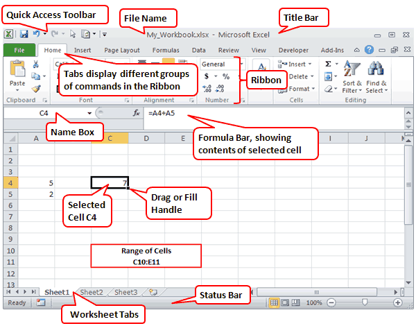
In the image above, cell C4 is currently selected. The Formula Bar is showing that cell C4 contains a formula, which you can identify because it starts with an equal sign (=). The formula is adding the values found in cells A4 and A5.
Almost everything else you need to know about Excel is explained in Microsoft’s own getting started guide found online or in Excel’s Help system.
- 1 Min 24 Sec — How to Freeze Panes in Excel (lock the upper rows or left column from scrolling)
- 2 Min 46 Sec — How to Use AutoFill in Excel (to quickly create lists of numbers, month names, etc.)
- 6 Min 10 Sec — How to Use FlashFill in Excel (to quickly reformat lists)
These Excel tutorials for beginners include screenshots and examples with detailed step-by-step instructions. Follow the links below to learn everything you need to get up and running with Microsoft’s popular spreadsheet software.
This article applies to Excel 2019, Excel 2016, Excel 2013, Excel 2010, Excel for Mac, and Excel for Android.
Understand the Excel Screen Elements
Understand the Basic Excel Screen Elements covers the main elements of an Excel worksheet. These elements include:
- Cells and active cells
- Add sheet icon
- Column letters
- Row numbers
- Status bar
- Formula bar
- Name box
- Ribbon and ribbon tabs
- File tab
Explore a Basic Excel Spreadsheet
Excel Step by Step Basic Tutorial covers the basics of creating and formatting a basic spreadsheet in Excel. You’ll learn how to:
- Enter data
- Create simple formulas
- Define a named range
- Copy formulas with the fill handle
- Apply number formatting
- Add cell formatting
Create Formulas With Excel Math
To learn how to add, subtract, multiply, and divide in Excel, see How to Use Basic Math Formulas Like Addition and Subtraction in Excel. This tutorial also covers exponents and changing the order of operations in formulas. Each topic includes a step-by-step example of how to create a formula that carries out one or more of the four basic math operations in Excel.
Add Numbers With the SUM Function
Adding rows and columns of numbers is one of the most common operations in Excel. To make this job easier, use the SUM function. Quickly Sum Columns or Rows of Numbers in Excel shows you how to:
- Understand the SUM function syntax and arguments
- Enter the SUM function
- Add numbers quickly with AutoSUM
- Use the SUM function dialog box
Move or Copy Data
When you want to duplicate or move data to a new location, see Shortcut Keys to Cut, Copy, and Paste Data in Excel. It shows you how to:
- Copy data
- Paste data with the clipboard
- Copy and paste using shortcut keys
- Copy data using the context menu
- Copy data using menu options on the Home tab
- Move data with shortcut keys
- Move data with the context menu and using the Home tab
Add and Remove Columns and Rows
Need to adjust the layout of your data? How to Add and Delete Rows and Columns in Excel explains how to expand or shrink the work area as needed. You’ll learn the best ways to add or remove singular or multiple columns and rows using a keyboard shortcut or the context menu.
Hide and Unhide Columns and Rows
How to Hide and Unhide Columns, Rows, and Cells in Excel teaches you how to hide sections of the worksheet to make it easier to focus on important data. It’s easy to bring them back when you need to see the hidden data again.
Enter the Date
To learn how to use a simple keyboard shortcut to set the date and time, see Use Shortcut Keys to Add the Current Date/Time in Excel. If you prefer to have the date automatically update every time the worksheet is opened, see Use Today’s Date within Worksheet Calculations in Excel.
Enter Data in Excel
Dos and Dont’s of Entering Data in Excel covers best practices for data entry and shows you how to:
- Plan the worksheet
- Lay out the data
- Enter headings and data units
- Protect worksheet formulas
- Use cell references in formulas
- Sort data
Build a Column Chart
How to Use Charts and Graphs in Excel explains how to use bar graphs to show comparisons between items of data. Each column in the chart represents a different data value from the worksheet.
Create a Line Graph
How to Make and Format a Line Graph in Excel in 5 Steps shows you how to track trends over time. Each line in the graph shows the changes in the value for one data value from the worksheet.
Visualize Data With a Pie Chart
Understanding Excel Chart Data Series, Data Points, and Data Labels covers how to use pie charts to visualize percentages. A single data series is plotted and each slice of the pie represents a single data value from the worksheet.
Thanks for letting us know!
Get the Latest Tech News Delivered Every Day
Subscribe