
Excel for Microsoft 365 Word for Microsoft 365 Outlook for Microsoft 365 PowerPoint for Microsoft 365 Excel for Microsoft 365 for Mac Word for Microsoft 365 for Mac PowerPoint for Microsoft 365 for Mac Excel 2021 Word 2021 Outlook 2021 PowerPoint 2021 Excel 2021 for Mac Word 2021 for Mac PowerPoint 2021 for Mac Excel 2019 Word 2019 Outlook 2019 PowerPoint 2019 Excel 2019 for Mac Word 2019 for Mac PowerPoint 2019 for Mac Excel 2016 Word 2016 Outlook 2016 PowerPoint 2016 Excel 2016 for Mac Word 2016 for Mac PowerPoint 2016 for Mac Excel 2013 Word 2013 Outlook 2013 PowerPoint 2013 Excel 2010 Word 2010 Outlook 2010 PowerPoint 2010 Excel 2007 Excel for Mac 2011 Word for Mac 2011 PowerPoint for Mac 2011 Excel Starter 2010 More…Less
This topic covers the different trendline options that are available in Office.
Use this type of trendline to create a best-fit straight line for simple linear data sets. Your data is linear if the pattern in its data points looks like a line. A linear trendline usually shows that something is increasing or decreasing at a steady rate.
A linear trendline uses this equation to calculate the least squares fit for a line:
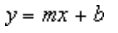
where m is the slope and b is the intercept.
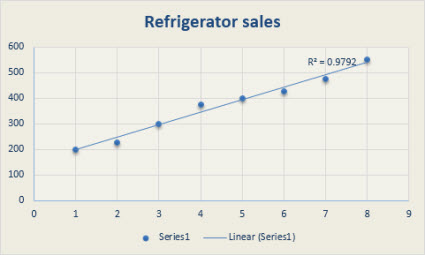
The following linear trendline shows that refrigerator sales have consistently increased over an 8-year period. Notice that the R-squared value (a number from 0 to 1 that reveals how closely the estimated values for the trendline correspond to your actual data) is 0.9792, which is a good fit of the line to the data.
Showing a best-fit curved line, this trendline is useful when the rate of change in the data increases or decreases quickly and then levels out. A logarithmic trendline can use negative and positive values.
A logarithmic trendline uses this equation to calculate the least squares fit through points:
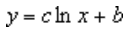
where c and b are constants and ln is the natural logarithm function.
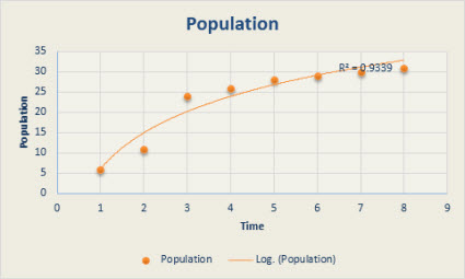
The following logarithmic trendline shows predicted population growth of animals in a fixed-space area, where population leveled out as space for the animals decreased. Note that the R-squared value is 0.933, which is a relatively good fit of the line to the data.
This trendline is useful when your data fluctuates. For example, when you analyze gains and losses over a large data set. The order of the polynomial can be determined by the number of fluctuations in the data or by how many bends (hills and valleys) appear in the curve. Typically, an Order 2 polynomial trendline has only one hill or valley, an Order 3 has one or two hills or valleys, and an Order 4 has up to three hills or valleys.
A polynomial or curvilinear trendline uses this equation to calculate the least squares fit through points:
where b and  are constants.
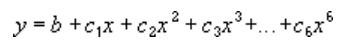
The following Order 2 polynomial trendline (one hill) shows the relationship between driving speed and fuel consumption. Notice that the R-squared value is 0.979, which is close to 1 so the line’s a good fit to the data.
Showing a curved line, this trendline is useful for data sets that compare measurements that increase at a specific rate. For example, the acceleration of a race car at 1-second intervals. You cannot create a power trendline if your data contains zero or negative values.
A power trendline uses this equation to calculate the least squares fit through points:

where c and b are constants.
Note: This option is not available when your data includes negative or zero values.
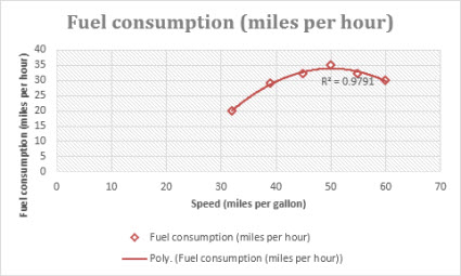
The following distance measurement chart shows distance in meters by seconds. The power trendline clearly demonstrates the increasing acceleration. Note that the R-squared value is 0.986, which is an almost perfect fit of the line to the data.
Showing a curved line, this trendline is useful when data values rise or fall at constantly increasing rates. You cannot create an exponential trendline if your data contains zero or negative values.
An exponential trendline uses this equation to calculate the least squares fit through points:

where c and b are constants and e is the base of the natural logarithm.
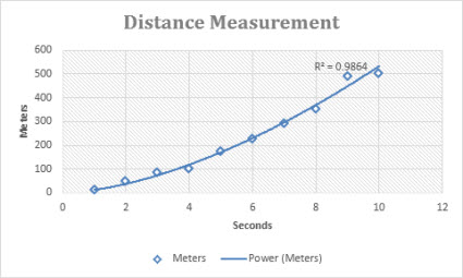
The following exponential trendline is shows the decreasing amount of carbon 14 in an object as it ages. Note that the R-squared value is 0.990, which means the line fits the data almost perfectly.
This trendline evens out fluctuations in data to show a pattern or trend more clearly. A moving average uses a specific number of data points (set by the Period option), averages them, and uses the average value as a point in the line. For example, if Period is set to 2, the average of the first two data points is used as the first point in the moving average trendline. The average of the second and third data points is used as the second point in the trendline, etc.
A moving average trendline uses this equation:
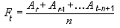
The number of points in a moving average trendline equals the total number of points in the series, minus the number you specify for the period.
In a scatter chart, the trendline is based on the order of the x values in the chart. For a better result, sort the x values before you add a moving average.
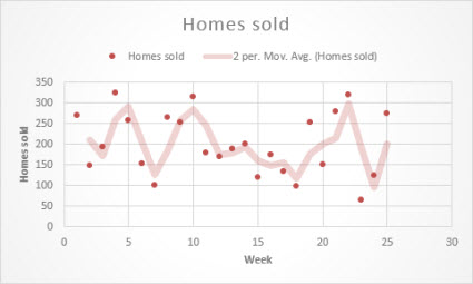
The following moving average trendline shows a pattern in the number of homes sold over a 26-week period.
Important: Beginning with Excel version 2005, Excel adjusted the way it calculates the R2 value for linear trendlines on charts where the trendline intercept is set to zero (0). This adjustment corrects calculations that yielded incorrect R2 values and aligns the R2 calculation with the LINEST function. As a result, you may see different R2 values displayed on charts previously created in prior Excel versions. For more information, see Changes to internal calculations of linear trendlines in a chart.
Need more help?
You can always ask an expert in the Excel Tech Community or get support in the Answers community.
See Also
Add a trend or moving average line to a chart
Need more help?
Want more options?
Explore subscription benefits, browse training courses, learn how to secure your device, and more.
Communities help you ask and answer questions, give feedback, and hear from experts with rich knowledge.
Trendline is applied for illustrating price change trends. The element of technical analysis is a geometrical representation of the mean values of the analyzed indicator.
Here’s how to add a trendline to a chart in Excel.
Adding a trendline to a chart
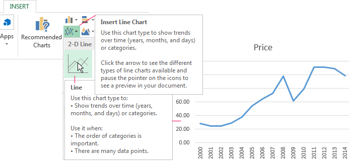
For example, let’s take average oil prices since 2000 from open sources. Type the analysis data in the spreadsheet:

- Create a chart based on the spreadsheet. Select the range A1:P2 and click on the «Insert»-«Charts»-«Insert Line Chart»-«Line». Choose a simple graph out of the offered chart types. The horizontal direction represents year, and the vertical one shows price.
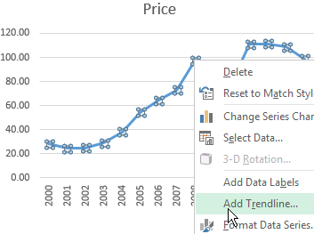
- Right-click the chart itself. Click «Add Trendline».
- The window for setting line parameters opens. Select the line type and enter R-squared value (the approximation accuracy value) in the chart.
- A skew line appears on the chart.
Trendline in Excel is an approximating function chart. It is used for making predictions based on statistical data. To this end, we need to extend the line and determine its values.
If R2 = 1, the approximation error is zero. In our example, the choice of the linear approximation has given a low accuracy and poor result. The prediction will be inaccurate.
Note: that a trendline can not be added to the following types of charts and graphs:
- radar;
- circular;
- surface;
- doughnut;
- stereogram;
- stacked.
Equation of trendline in Excel
In the example above the linear approximation has been chosen only for illustrating the algorithm. The R-squared value demonstrates that the choice has not been successful.
It is necessary to choose the type of representation that will best illustrates the trend of changes in the data entered by the user. Let’s examine the options.
Linear approximation
Its geometric representation is a straight line. Hence, linear approximation is used to illustrate the indicator which increases or decreases at a constant rate.
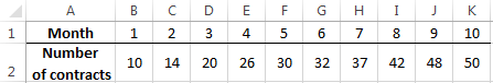
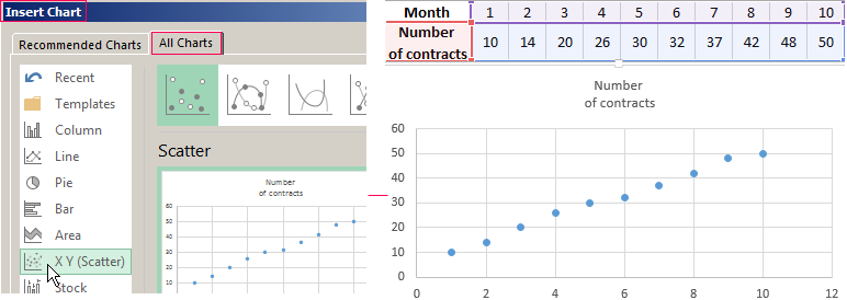
Let’s consider the conditional number of contracts concluded by a manager for 10 months:
Based on the Excel spreadsheet data make a scatter chart (it will help illustrate a linear type):
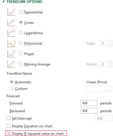
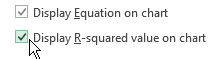
Highlight the chart, select «Add Trendline». In the settings, select the linear type. Add the R-squared value and the equation of a trendline (simply tick the box at the bottom of the «Options» window).
We get the result:
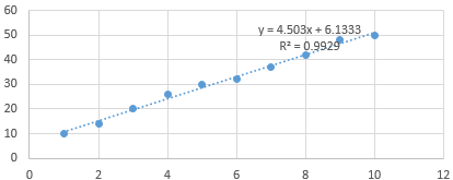
Note that in the linear approximation type data points are located very close to the line. This type uses the following equation:
y = 4,503x + 6,1333
- where 4,503 – slope indicator;
- 6,1333 — offset;
- y — sequence of values,
- x — period number.
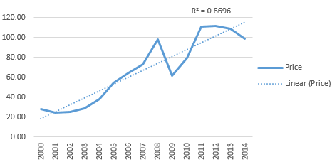
The straight line on the graph shows a steady increase in the quality of the manager’s job. The R-squared value is equal to 0.9929, indicating a good agreement between the calculated straight line and the source data. Forecasts must be accurate.
To predict the number of concluded contracts, for example, in period 11, it is necessary to put number 11 instead of x in the equation. After calculating, we find out that in period 11 the manager will conclude 55-56 contracts.
The exponential trendline
This type is useful if the input values change with increasing speed. Exponential approximation is not applied if there are zero or negative characteristics.
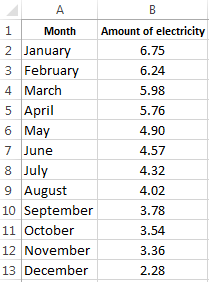
Let’s create an exponential trendline in Excel. Take for example the conditional values of electric power supply in X region:
Make the chart «Line with Markers». Add the exponential line.
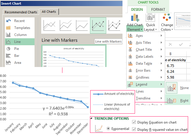
The equation is as follows:
y = 7,6403е^-0,084x
where:
- 7.6403 and -0.084 – constants;
- e – base of natural logarithm.
The indicator of R-squared value is 0.938, which means that the curve corresponds to the data, the error is minimal, and the forecasts will be accurate.
Logarithmic trendline and sales forecast
It is used for the following indicator changes: first, rapid growth or decrease, then — relative stability. The optimized curve adapts well to this value «behavior». The logarithmic trend is suitable for forecasting sales of a new product that has just entered the market.
The initial task of the manufacturer is to expand the customer base. When the goods have their buyer, it will be necessary to hold and serve him.
Make a chart and add a logarithmic trend line for a conditional product sales forecast:
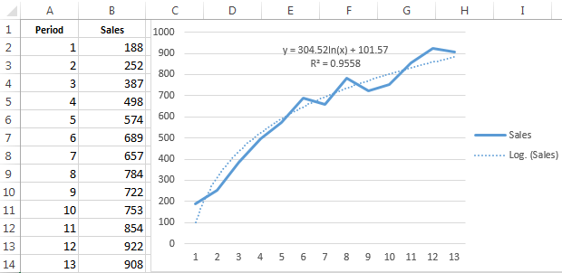
R2 is close in value to 1 (0.9558), indicating the minimum error of approximation. Let’s forecast sales volume for further periods. To do this, put period number instead of x in the equation.
For example:

To calculate forecast figures we use the formula: =304.52*LN(A18)+101.57, where A18 is period number.
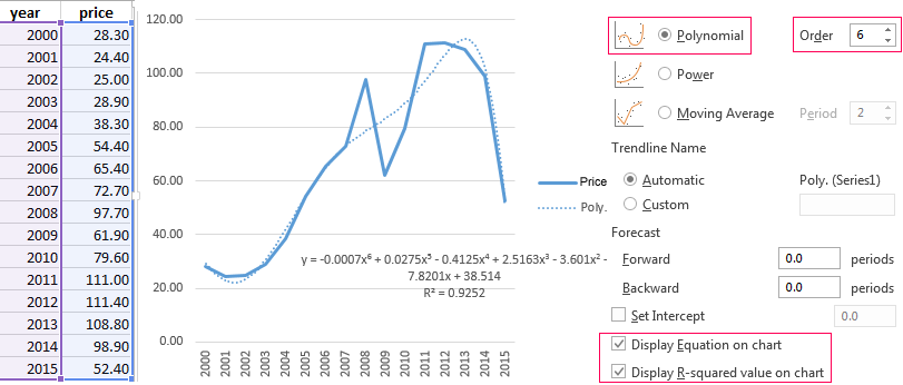
Polynomial trendline in Excel
This curve features alternate increase and decrease. The degree (by the number of minimum and maximum values) is determined for polynomials. For example, one extreme (minimum and maximum) is the second degree, two extremes make the third degree, three extremes – the fourth one.
A polynomial trend in Excel is used for the analysis of a large data set of unstable value. Let’s look at the example of the first set of values (oil prices).
Table of oil price dynamics by years:
| Year | 2000 | 2001 | 2002 | 2003 | 2004 | 2005 | 2006 | 2007 | 2008 | 2009 | 2010 | 2011 | 2012 | 2013 | 2014 | 2015 |
| Price per barrel | 28.30 | 24.40 | 25.00 | 28.90 | 38.30 | 54.40 | 65.40 | 72.70 | 97.70 | 61.90 | 79.60 | 111.00 | 111.40 | 108.80 | 98.90 | 52.40 |
Download examples of graphs with a trendline
To get this R-squared value (0.9252), we had to put the sixth degree.
However, this trend allows for making more or less accurate predictions.
A trend line (or trendline, also known as a line of best fit) is a straight or curved line on a chart that shows a general pattern or the general direction of the data. The trend line displays the approximated values obtained using some mathematical function. The choice of function for constructing a trend line is usually determined by the nature of the data.
Trends can be described by various equations — linear, logarithmic, exponential, and so on. The more accurately the equation describes the data, the less distinct is the trend line. The trend line can also be used to forecast future trends and make forecasts:

Excel makes adding a trend line to a chart quite simple.
Notes:
- In Excel, trendlines can be added for 2-dimensional charts only: a 2-D area, bar, line, column, stock, scatter, or bubble chart. You cannot add a trendline for 3-D or stacked charts, pie, radar, and similar.
- When creating a trend line, you should remember that Excel treats any data along the axes as numbers:
- Excel generates a mathematically correct trend line using data values only for the XY scatter plot because the Y-axis and the X-axis are real numeric values for this type of chart. Excel treats the Category axis values for all other chart types as the list {1, 2, 3, … n}, where n is the number of text elements on the axis.
- If one of the chart’s axes is based on text data, Excel uses the list {1, 2, 3, … n} to calculate the trend and its formula, where n is the number of text elements on the axis.
Attention! Excel takes the first value as x = 1, not x = 0 as usual. So, don’t expect a proper intersection with Y-axis.
For example, for a line chart, the vertical (Value) axis crosses the horizontal (Category) axis at a non-zero position — see the example above.
- If one of the chart axes is a time scale with dates, Excel uses numbers that correspond to dates to calculate the trend and its equation (e.g., «January 1, 2020» is 43831, «December 1, 2020» is 44166). Thus, trends degenerate because the value differences of the secondary axis are extremely small compared to the magnitude of the primary time axis values:

To solve this issue, you can change the data values to text values (see how to change the axis labels format below).
- If you change the chart type to one that does not support trendlines, the trendline will not be displayed.

Add a trend line
To add a trendline, select the data series to which you want to add a trendline, and do one of the following:
- On the Chart Design tab, in the Chart Layouts group, click the Add Chart Element dropdown list:

From the Add Chart Element dropdown list, choose the Trendline list, where select the desirable trend function if available (see more about different options below) or click More Trendline Options… to open the Format Trendline pane:

- Right-click on the selected data series and select Add Trendline… in the popup menu:

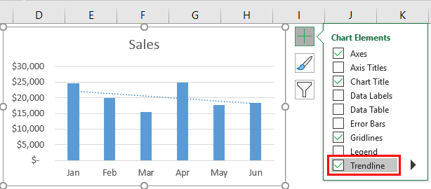
- Click the Chart Elements button:

In the Chart elements list, choose the Trendline list, then select the desired trend function (see more about different trend functions below) or click More Options… to open the Format Trendline pane:


Notes:
- If there are several data series on the chart, click the Chart Elements list without selecting any data series, choose the Trendline list, then select the option you prefer (anyone, including More Options…).
Excel will show a list of the data series from the chart. Select the one you need and click OK:

- You can add several trend lines to the same data series. After adding the first trendline, just add another one. To select the needed trendline if you can’t find them on the chart, see how to select an invisible element in the chart.
Excel displays several trendlines for the same data series; see examples below.

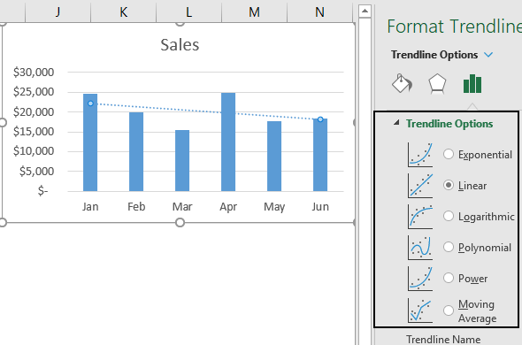
Trendline types
The type of trend line that you choose depends on your data. You can see all possible trend lines that Excel can add to the chart on the Format Trendline pane, on the Trendline Options tab, in the Trendline Options group:

- Exponential trendlines can only be added for data with positive values. They are best suited for data that increases or decreases rapidly (the rate of data change is continuously increasing):

The exponential trend lines are common if the vertical axis has a log scale.
See more about the exponential trendline equation and formulas, calculating the trendline values, and creating a forecast.
- Linear trends are most common and can be added for data with positive and negative values. They are used in the simplest cases when the data increases or decreases at a constant rate:
Linear trendlines are used to estimate a linear relationship in the data.
See more about the linear trendline equation and formulas, how to calculate the trendline values, and build a forecast.
- Logarithmic trendlines can be used for data with positive and negative values. They are best used for data increases or decreases very quickly at the beginning but then slow down and level off over time:
The logarithmic trend lines are common if the horizontal axis has a log scale.
Note: To create a logarithmic trendline for the displayed data, you should remember that Excel «understands» dates as numbers. If you use an axis as the timeline with dates, Excel treats them as numbers. So, you won’t see an expected logarithmic trend because the logarithm function degenerates into a line parallel to the X-axis for large X-values (for example, «January 1, 2020» = 43831, «December 1, 2020» = 44166):

See below for how to solve that issue.
See more about the logarithmic trendline equation and formulas, calculating the trendline values, and creating a forecast.
- Polynomial trend lines can be added for data with both positive and negative values. Use them to describe data that alternately increase and decrease, fluctuate — go up and down, and you need to evaluate the ups and downs of a large set of data.
Additionally, for polynomial trendlines, you can specify the degree of the polynomial in the Order field. This value determines the maximum number of extrema (maxima and minima) of the curve:
- A polynomial trendline of the second degree (Quadratic polynomial trend line with Order 2, used by default) can describe only one maximum or minimum (one hill or valley).
- A polynomial trendline of the third degree (Cubic polynomial trend line with Order 3) has one or two extrema.
- A polynomial trendline of the fourth degree (polynomial trend line with Order 4) can have no more than three extrema:
Excel allows to choose from 2nd to 6th degree in the Order field:
See more about the polynomial trendline equation and formulas, calculating the trendline values, and creating a forecast.
- Power trendlines can only be added for data with positive values. They are best suited for data that shows a steady increase or decrease in the rate of growth or decline.
In other words, you can try this type of trend line if you see that the trend is:
- non-linear due to uneven data changes,
- not polynomial due to the absence of fluctuations and extrema,
- non-exponential, which implies extreme behavior at the end of a trend,
- not logarithmic, which implies extreme behavior at the beginning of a trend:
Note: The difference between a linear trend line and a power trend line is noticeable only when the first or first few values are close to zero or the difference between the values increases very significantly. If you analyze data far from zero or with a small growth rate, the difference between a linear and a power trend will not be significant.
The power trend lines are common if both the vertical and horizontal axes are in log scales.
See more about the power trendline equation and formulas, calculating the trendline values, and creating a forecast.
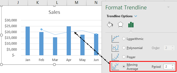
- A Moving Average trendline (also known as rolling average, running average, or moving mean) can only be added for the data with positive values. It is suitable for data with large fluctuations — it smooths out data that has a lot of variation (that is, «noisy» data):
The Moving Average is a series of straight lines based on the average of the previous points. In the Period field, specify how many points are used for calculating the average:
Notes:
- Excel offers to choose the Period value from two to the number of data points minus one. For this example, from 2 to 11.
- The number of points in a Moving Average trendline equals the total number of points in the data series plus one and minus the number specified in the Period field.


Delete a trendline
To delete a trendline, select it (see how to select invisible chart elements for more details), then do one of the following:
- Right-click the selection and choose Delete in the popup menu:

- Press Delete.

Change the axis labels format
If Excel incorrectly treats dates on the axis as numbers, change the axis label format from date to text.
Excel treats text values as a numbered sequence of elements (1, 2, 3, etc.). To change the axis labels, do the following:
1. Right-click on the axis for which you need to change the format of the labels and choose Format Axis… in the popup menu:

2. On the Format Axis pane, on the Axis Options tab, in the Axis Options group, under Axis Type, select the Text axis option:

See also this tip in French:
Comment ajouter une courbe de tendance.
A trendline, often called “the best-fit line,” is a line that shows the trend of the data. As you have seen in many charts, it shows the overall trend or pattern, or direction from the existing data points. Excel provides the option of plotting the trend line on the chart. When we add this trend line to the chart, it looks like a line chart without any ups and downs.
Table of contents
- Excel Trend Line
- How to Add and Insert Trend Line in Excel?
- How to Format the Trendline in Excel Chart?
- Things to Remember
- Recommended Articles
How to Add and Insert Trend Line in Excel?
You can download this Trend Line Excel Template here – Trend Line Excel Template
To add a trendline in Excel, we need to insert the chart for the available data. Before adding a trend line, remember the Excel charts supporting the trendline. For example, we can add a trendline to a column chart, line chart, bar chart, scattered chart or XY chart, stock chart, or In Excel, a bubble chart is a type of scatter plot that uses bubbles to display values and comparisons. Like scatter plots, bubble charts compare data on both horizontal and vertical axes.read more.
But we cannot add a trendline to 3-D or stacked charts, radar charts, Making a pie chart in excel can help you with the pictorial representation of your data and simplifies the analysis process. There are multiple kinds of pie chart options available on excel to serve the varying user needs.read more, and similar kinds of charts.
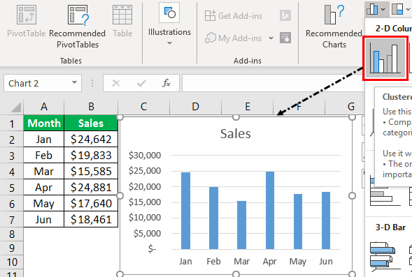
- The best example of plotting a trendline is monthly sales numbers. Below are the monthly sales numbers to create a chart.

- To add a trendline, we need to create a column or line chart in Excel for the above data. Therefore, we will insert a column chart in Excel for this data.

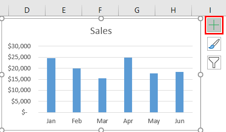
- Once the chart is inserted, adding the trend line is easy in Excel 2013 and the above versions. Select the chart. It will show the PLUS icon on the right side.

- Click on this PLUS icon to see various options related to this chart. For example, we can see the “Trendline” option at the end of the options. Click on this to add a trend line.

- So, our trendline is added to the chart. If you have inserted the LINE CHART in place of COLUMN CHART, all the steps are the same as inserting the trendline in Excel.
We can also add trend lines in multiple ways. Another way is to select column bars and right-click on the bars to see options. From the options, choose “ADD TRENDLINE.”


It will add the default trend line of “Linear Trend Line.” The best-fit trend line shows whether the data is trending upwards or downwards.
We have several trend line types, below are the types of the trend line.
- Exponential Trendline
- Linear Trendline
- Logarithmic Trendline
- Polynomial Trendline
- Power Trendline
- Moving Average Trendline
All these trendlines are part of the statistics. One of the other popular trendlines is the “Moving Average” trendline.
The “Moving Average” trendline shows the trend of the average of a specific number of periods. For example, the quarterly trend of the data. Right-click on column bars to apply the moving average trendline and choose “Add Trendline.” It will open the “Format Trendline” window to the right end of the worksheet.
In the above window, choose the “Moving Average” option and set the period to 2. It will add the trendline for the average of every 2 periods.
How to Format the Trendline in Excel Chart?
The default trendline does not have any special effects on the trend line. Therefore, we need to format the trend line to make it more appealing.
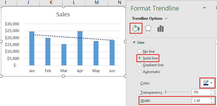
Select the trend line and press Ctrl +1. Then, in the “Format Trendline” window, choose “FILL” and “LINE,” make the width 2 pt, and the color dark blue.
This Excel trendline can also forecast the sales numbers for the next months. To do this, go to “Trendline Options, “Forecast,” and make “Forward” to 3 periods.
As shown in the above image, we have added a forward trend for 3 periods, increasing the trend line for 3 months.

From this chart, our trendline shows a continuous decline in sales numbers.
Things to Remember
- A trendline is a built-in tool in Excel.
- The “Moving Average” trendline shows the average trend line of the mentioned periods.
- We must always format the default trendline to make it more appealing.
Recommended Articles
This article has been a guide to TrendLine in Excel. Here, we learn how to add and insert the trendline in Excel, examples, and a downloadable Excel template. You may learn more about Excel from the following articles: –
- Excel Rotate Pie Chart
- Plots in Excel
- Grouped Bar Chart in Excel
- How to Make Dot Plots in Excel?
In this article, I will show you how to add a trendline in Excel charts.
A trendline, as the name suggests, is a line that shows the trend.
You’ll find it in many charts where the overall intent is to see the trend that emerges from the existing data.
For example, suppose you have a dataset of weekly visitors in a theme park as shown below:
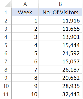
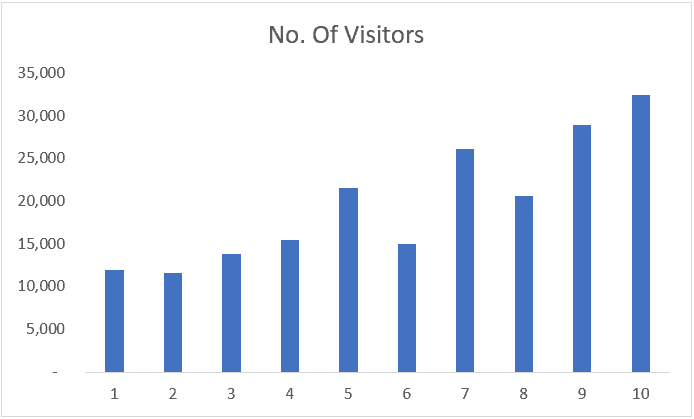
If you plot this data in a line chart or column chart, you will see the data points to be fluctuating – as in some weeks the visitor numbers decreased as well.
A trendline in this chart will help you quickly decipher the overall trend (even when there are ups and downs in your data points).
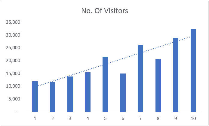
With the above chart, you can quickly make out that the trend is going up, despite a few bad weeks in footfall.
Adding a Trendline in Line or Column Chart
Below are the steps to add a trendline to a chart in Excel 2013, 2016 and above versions:
- Select the chart in which you want to add the trendline
- Click on the plus icon – this appears when the chart is selected.

- Select the Trendline option.

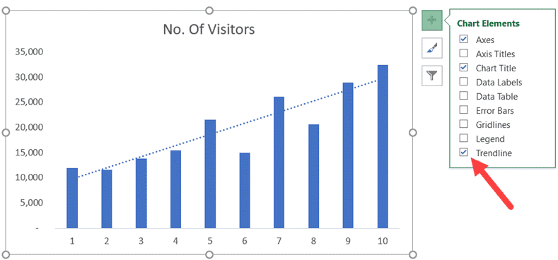
That’s it! This will add the trendline to your chart (the steps will be the same for a line chart as well).
Another way to add a trendline is to right-click on the series for which you want to insert the trendline and click on the ‘Add Trendline’ option.
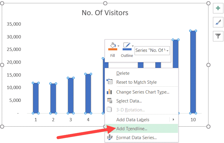
The trendline that is added in the chart above is a linear trendline. In layman terms, a linear trendline is the best fit straight line that shows whether the data is trending up or down.
Also read: How to Add Axis Titles in Charts in Excel?
Types of Trendlines in Excel
By default, Excel inserts a linear trendline.
However, there are other variations as well that you can use:
- Exponential
- Linear
- Logarithmic
- Polynomial
- Power
- Moving Average
Here is a good article that explains what these trend lines are and when to use these.
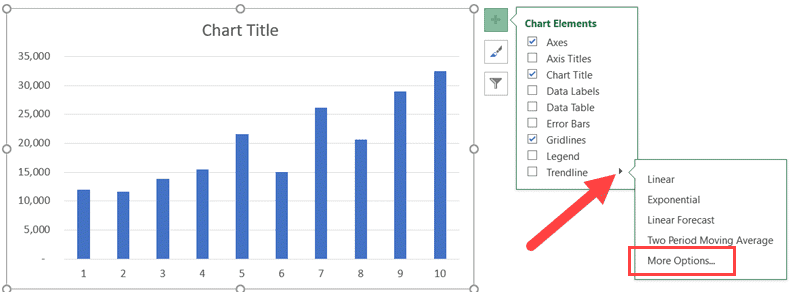
To select any of these other variations. click on the small triangle icon that appears when you click on the plus icon of the chart element. It will show you all the trendlines that you can use in Excel.
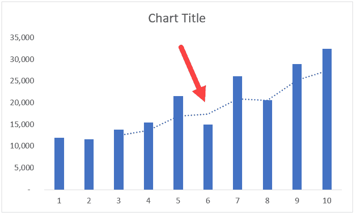
Apart from linear trendline, another useful option is a moving average trendline. This is often used to show the trend by considering an average of the specified number of periods.
For example, if you do a 3-part moving average, it will show you the trend based on the past three periods.
This is useful as it shows the trend better by smoothening any fluctuations.
Below is an example where even though there was a dip in the value, the trend remained steady as it was smoothened by the other two period values.
Formatting the TrendLine
There are many formatting options available to you when it comes to trendlines.
To get all the options, right-click on the trendline and click on the ‘Format Trendline’ option.
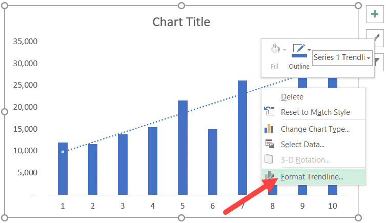
This will open the ‘Format Trendline’ pane or the right.
Through this pane, you can make the following changes:
- Change the color or width of the trendline. This can help when you want it to stand out by using a different color.
- Change the trendline type (linear, logarithmic, exponential, etc).
- Adding a forecast period.
- Setting an intercept (start the trendline from 0 or from a specific number).
- Display equation or R-squared value on the chart
Let’s see how to use some of these formatting options.
Change the Color and Width of the Trendline
To change the color of the trendline, select the Fill & Line option in the Format Trendline pane.
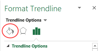
In the options, you can change the color option and the width value.

Note: If you’re using a trendline in reports or dashboards, it is a good idea to make it stand out by increasing the width and using a contrast color. At the same time, you can lighten the color of the data bars (or lines) to make the importance of the trendline more clear.
Also read: How to Add Axis Titles in Charts in Excel?
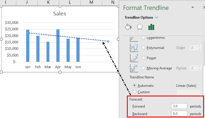
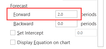
Adding Forecast Period to the Trendline
You can extend the trendline to a couple of periods to show how it would be if the past trend continues.
Something as shown below:
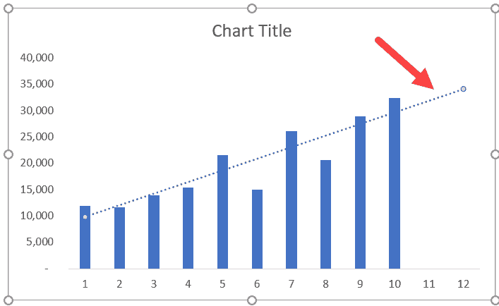
To do this, change the forecast ‘Forward’ Period value in the ‘Format Trendline’ pane options.
Setting an Intercept for the Trendline
You can specify where you want the trendline to intercept with the vertical axis.
By default (when you don’t specify anything), it will automatically decide the intercept based on the data set.
For example, in the below chart, the intercept will be somewhere a little above the 5,000 value (shown with a solid red line – which I have drawn manually and is not exact).
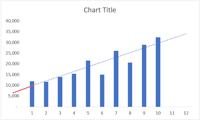
If you want the trendline to intercept at 0, you can do that changing it by modifying the ‘Set Intercept’ value.
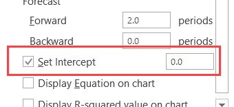
Note that you can only change the intercept value when you’re working with exponential, linear, or polynomial trendlines.
Hope you find this tutorial useful.
You may also like the following Excel Charting tutorials:
- Creating a Step Chart in Excel
- Creating a Histogram in Excel.
- Creating a Bell-curve in Excel
- Creating a Waffle Chart in Excel
- Creating Combination Charts in Excel
- Actual Vs Target Charts in Excel
- How to handle data gaps in Excel charts
- How to Find Slope in Excel? Using Formula and Chart
- How to Insert/Draw a Line in Excel (Straight Line, Arrows, Connectors)