
Most companies (and people) don’t want to pore through pages and pages of spreadsheets when it’s so quick to turn those rows and columns into a visual chart or graph. But someone has to do it…and that person must be you.
Ready to turn your boring Excel spreadsheet into something a little more interesting?
In Excel, you’ve got everything you need at your fingertips. Excel users can leverage the power of visuals without any additional extensions. You can create a graph or chart right inside Excel rather than exporting it into some other tool.
What is the difference between Charts and Graphs?
According to reference.com…“The difference between graphs and charts is mainly in the way the data is compiled and the way it is represented. Graphs are usually focused on raw data and showing the trends and changes in that data over time. Charts are best used when data can be categorized or averaged to create more simplistic and easily consumed figures.“
So technically, charts and graphs mean separate things, but in the real world, you’ll hear the terms used interchangeably. People generally accept both so don’t worry too much about it!

In this post, you’ll learn exactly how to create a graph in Excel and improve your visuals and reporting…but first let’s talk about charts. Understanding exactly how charts play out in Excel will help with understanding graphs in Excel.
Charts in Excel
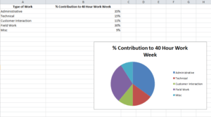
Charts are usually considered more aesthetically pleasing than graphs. Something like a pie chart is used to convey to readers the relative share of a particular segment of the data set with respect to other segments that are available. If instead of the changes in hours worked and annual leaves over 5 years, you want to present the percentage contributions of the different types of tasks that make up a 40 hour work week for employees in your organization then you can definitely insert a pie chart into your spreadsheet for the desired impact.
Graphs in Excel
Graphs represent variations in values of data points over a given duration of time. They are simpler than charts because you are dealing with different data parameters. Comparing and contrasting segments of the same set against one another is more difficult.
So if you are trying to see how the number of hours worked per week and the frequency of annual leaves for employees in your company has fluctuated over the past 5 years, you can create a simple line graph and track the spikes and dips to get a fair idea.
Types of Graphs Available in Excel
Excel offers three varieties of graphs:
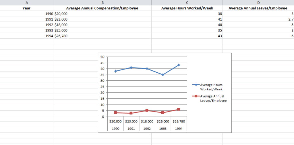
- Line Graphs: Both 2 dimensional and three dimensional line graphs are available in all the versions of Microsoft Excel. Line graphs are great for showing trends over time. Simultaneously plot more than one data parameter – like employee compensation, average number of hours worked in a week and average number of annual leaves against the same X axis or time.
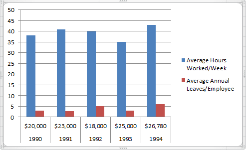
- Column Graphs: Column graphs also help viewers see how parameters change over time. But they can be called “graphs” when only a single data parameter is used. If multiple parameters are called into action, viewers can’t really get any insights about how each individual parameter has changed. As you can see in the Column graph below, average numbers of hours worked in a week and average number of annual leaves when plotted side by side do not provide the same clarity as the Line graph.
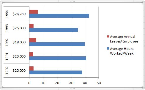
- Bar Graphs: Bar graphs are very similar to column graphs but here the constant parameter (say time) is assigned to the Y axis and the variables are plotted against the X axis.
1. Fill the Excel Sheet with Your Data & Assign the Right Data Types
The first step is to actually populate an Excel spreadsheet with the data that you need. If you have imported this data from a different software, then it’s probably been compiled in a .csv (comma separated values) formatted document.
If this is the case, use an online CSV to Excel converter like the one here to generate the Excel file or open it in Excel and save the file with an Excel extension.
After converting the file, you still may need to clean up the rows and the columns. It is better to work with a clean spreadsheet so that the Excel graph you’re creating is clean and easy to modify or change.
If that doesn’t work, you may also need to manually enter the data into the spreadsheet or copy and paste it over before creating the Excel graph.
Excel has two components to its spreadsheets:
- The rows that are horizontal and marked with numbers
- The columns that are vertical and marked with alphabets
After all the data values have been set and accounted for, make sure that you visit the Number section under the Home tab and assign the right data type to the various columns. If you do not do this, chances are your graphs will not show up right.
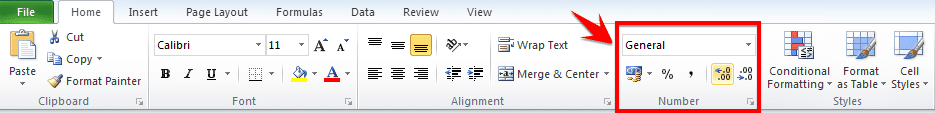
For example if column B is measuring time, ensure that you choose the option Time from the drop down menu and assign it to B.
Choose the Type of Excel Graph You Want to Create
This will depend on the type of data you have and the number of different parameters you will be tracking simultaneously.
If you are looking to take note of trends over time then Line graphs are your best bet. This is what we will be using for the purpose of the tutorial.
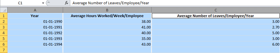
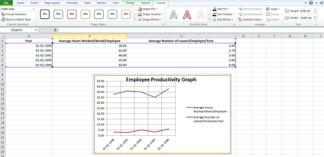
Let us assume that we are tracking Average Number of Hours Worked/Week/Employee and Average Number of Leaves/Employee/Year against a five year time span.
Highlight The Data Sets That You Want To Use
For a graph to be created, you need to select the different data parameters.
To do this, bring your cursor over the cell marked A. You will see it transform into a tiny arrow pointing downwards. When this happens, click on the cell A and the entire column will be selected.
Repeat the process with columns B and C, pressing the Ctrl (Control) button on Windows or using the Command key with Mac users.
Your final selection should look something like this:
Create the Basic Excel Graph
With the columns selected, visit the Insert tab and choose the option 2D Line Graph.
You will immediately see a graph appear below your data values.

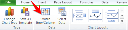
Sometimes if you do not assign the right data type to your columns in the first step, the graph may not show in a way that you want it to. For example, Excel may plot the parameter Average Number of Leaves/Employee/Year along the X axis instead of the Year. In this case, you can use the option Switch Row/Column under the Design tab of Chart Tools to play around with various combinations of X axis and Y axis parameters till you hit on the perfect rendition.
Improve Your Excel Graph with the Chart Tools
To change colors or to change the design of your graph, go to Chart Tools in the Excel header.
You can select from the design, layout and format. Each will change up the look and feel of your Excel graph.
Design: Design allows you to move your graph and re-position it. It gives you the freedom to change the chart type. You can even experiment with different chart layouts. This may conform more to your brand guidelines, your personal style, or your manager’s preference.

Layout: This allows you to change the title of the axis, the title of your chart and the position of the legend. You might go with vertical text along the Y axis and horizontal text along the X axis. You can even adjust the grid lines. You have every formatting tool conceivable at your fingertips to improve the look and feel of your graph.
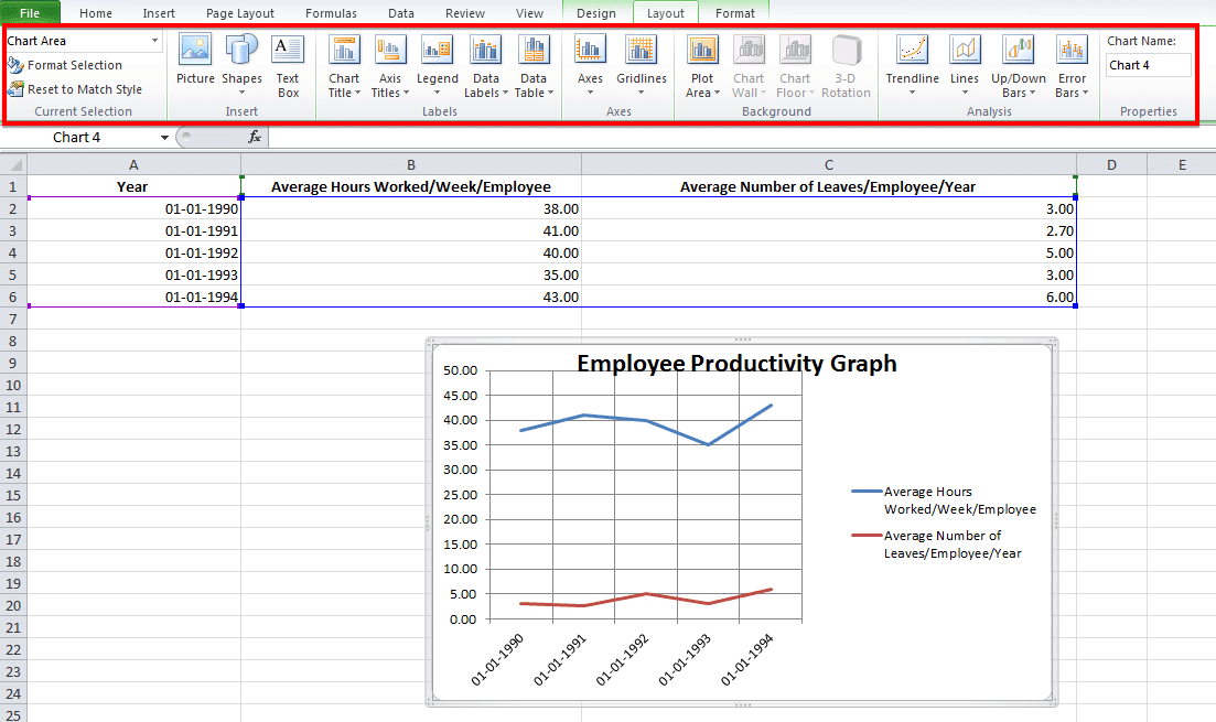
Format: The Format tab allows you to add a border in your chosen width and color around the graph to properly separate it from the data points that are filled in the rows and columns.
And there you have it. An accurate visual representation of the data that you have imported or entered manually to help your team members and stakeholders better engage with the information and utilize it to create strategies or be more aware of all the constraints while taking decisions!
Challenges with Making a Graph In Excel
When manipulating simple data sets, you can create a graph fairly easily.
But when you start adding in several types of data with multiple parameters, then there will be glitches. Here are some of the challenges that you’re going to have:
- Data sorting can be problematic when creating graphs. Online tutorials might recommend data sorting to make your “charts” look more aesthetically appealing. But beware of when the X axis is a time-based parameter! Sorting data values by magnitude may mess up the flow of the graph because the dates are sorted randomly. You may not be able to spot the trends very well.

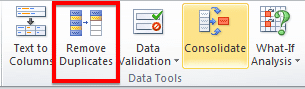
You may forget to remove duplicates. This is especially true if you have imported the data from a third-party application. Generally, this type of information is not filtered of redundancies. And you might end up corrupting the integrity of your information if duplicates sneak into your pictorial representation of trends. When working with copious volumes of data, it is best to use the Remove Duplicates option on your rows.
Creating graphs in Excel doesn’t have to be overly complex, but, much like with creating Gantt charts in Excel, there can be some easier tools to help you do it. If you’re trying to create graphs for workloads, budget allocations or monitoring projects, check out project management software instead.
Many of those functions are automated and without manual data entry. And you won’t be left wondering about who has the latest data sets. Most project management solutions, like Workzone, have file sharing and some visualization capabilities built-in.
![]()
Download Article
![]()
Download Article
If you’re looking for a great way to visualize data in Microsoft Excel, you can create a graph or chart. Whether you’re using Windows or macOS, creating a graph from your Excel data is quick and easy, and you can even customize the graph to look exactly how you want. This wikiHow tutorial will walk you through making a graph in Excel.
Steps
-

1
Open Microsoft Excel. Its app icon resembles a green box with a white «X» on it.
-
2
Click Blank workbook. It’s a white box in the upper-left side of the window.
Advertisement
-
3
Consider the type of graph you want to make. There are three basic types of graph that you can create in Excel, each of which works best for certain types of data:[1]
- Bar — Displays one or more sets of data using vertical bars. Best for listing differences in data over time or comparing two similar sets of data.
- Line — Displays one or more sets of data using horizontal lines. Best for showing growth or decline in data over time.
- Pie — Displays one set of data as fractions of a whole. Best for showing a visual distribution of data.
-
4
Add your graph’s headers. The headers, which determine the labels for individual sections of data, should go in the top row of the spreadsheet, starting with cell B1 and moving right from there.
- For example, to create a set of data called «Number of Lights» and another set called «Power Bill», you would type Number of Lights into cell B1 and Power Bill into C1
- Always leave cell A1 blank.
-
5
Add your graph’s labels. The labels that separate rows of data go in the A column (starting in cell A2). Things like time (e.g., «Day 1», «Day 2», etc.) are usually used as labels.
- For example, if you’re comparing your budget with your friend’s budget in a bar graph, you might label each column by week or month.
- You should add a label for each row of data.
-
6
Enter your graph’s data. Starting in the cell immediately below your first header and immediately to the right of your first label (most likely B2), enter the numbers that you want to use for your graph.
- You can press the Tab ↹ key once you’re done typing in one cell to enter the data and jump one cell to the right if you’re filling in multiple cells in a row.
-
7
Select your data. Click and drag your mouse from the top-left corner of the data group (e.g., cell A1) to the bottom-right corner, making sure to select the headers and labels as well.
-
8
Click the Insert tab. It’s near the top of the Excel window. Doing so will open a toolbar below the Insert tab.
-
9
Select a graph type. In the «Charts» section of the Insert toolbar, click the visual representation of the type of graph that you want to use. A drop-down menu with different options will appear.
- A bar graph resembles a series of vertical bars.
- A line graph resembles two or more squiggly lines.
- A pie graph resembles a sectioned-off circle.
-
10
Select a graph format. In your selected graph’s drop-down menu, click a version of the graph (e.g., 3D) that you want to use in your Excel document. The graph will be created in your document.
- You can also hover over a format to see a preview of what it will look like when using your data.
-
11
Add a title to the graph. Double-click the «Chart Title» text at the top of the chart, then delete the «Chart Title» text, replace it with your own, and click a blank space on the graph.
- On a Mac, you’ll instead click the Design tab, click Add Chart Element, select Chart Title, click a location, and type in the graph’s title.[2]
- On a Mac, you’ll instead click the Design tab, click Add Chart Element, select Chart Title, click a location, and type in the graph’s title.[2]
-
12
Save your document. To do so:
- Windows — Click File, click Save As, double-click This PC, click a save location on the left side of the window, type the document’s name into the «File name» text box, and click Save.
- Mac — Click File, click Save As…, enter the document’s name in the «Save As» field, select a save location by clicking the «Where» box and clicking a folder, and click Save.


Advertisement
Add New Question
-
Question
How do I change the horizontal axis to a vertical axis in Excel?

Click «Edit» and then press «Move.» If this doesn’t work, double click the axis and use the dots to move it.
-
Question
How do I print a graph only in Excel?
Type control p on your laptop or go to print on the page font of your screen?
-
Question
How do I label a Series?
Jayna Akanova
Community Answer
Right-click the chart with the data series you want to rename, and click Select Data. In the Select Data Source dialog box, under Legend Entries (Series), select the data series, and click Edit. In the Series name box, type the name you want to use.

See more answers
Ask a Question
200 characters left
Include your email address to get a message when this question is answered.
Submit
Advertisement
-
You can change the graph’s visual appearance on the Design tab.
-
If you don’t want to select a specific type of graph, you can click Recommended Charts and then select a graph from Excel’s recommendation window.
Thanks for submitting a tip for review!
Advertisement
-
Some graph formats won’t include all of your data, or will display it in a confusing manner. It’s important to choose a graph format that works with your data.
Advertisement
About This Article
Article SummaryX
1. Enter the graph’s headers.
2. Add the graph’s labels.
3. Enter the graph’s data.
4. Select all data including headers and labels.
5. Click Insert.
6. Select a graph type.
7. Select a graph format.
8. Add a title to the graph.
Did this summary help you?
Thanks to all authors for creating a page that has been read 1,722,157 times.
Is this article up to date?
I know this is an older post, but posting so that maybe the next person to have this doesn’t spend over an hour trying to resolve it. I am using Excel version 2011 for Office365.
I had the exact same issue that «The111» asked about, but none of the solutions offered by «soandos» or others worked.
The solution I was told is that there is a character at the end of the «data» in the cell and therefore Excel treats it as text. If you select the cell, you will notice you can press backspace. Although I could not open the file «The111» attached to verify, I did see this empty character in my data set.
The solution is to use Find and Replace > copy that empty character from any cell you are having issues with > paste it into Replace and then select Replace All.
That should fix the issue. Note, note sure exactly what this empty character is, but as an experiment I tried using F&R and just pressing the spacebar once to give what I thought would be the same thing; however, when using the spacebar and then pressing Replace, it would give a message that it couldn’t find anything to replace. Just a FYI.
Image of solution process
-
#2
It sounds like you have some non-numeric data where you should have numbers, so Excel cannot parse the range properly. It usually helps to set up the data a special way. Put your X values in the first column, Y values in subsequent column, keep the cell above the X values blank, and put labels in the cells above the Y values. This is a more foolproof way to ensure that Excel gets your range correctly.
If this doesn’t work, you can select the chart, go to the Edit Data dialog, then series by series, edit the ranges containing X and Y values and series names. You also may have to fix the non-numerics. Sometimes imported data looks numeric but is interpreted as text. If you don’t apply a horizontal alignment to the range (I rarely do to help with this issue), text is left aligned and numbers are right aligned. If you have left aligned numbers, select and copy a blank cell, then select the left aligned numbers, use Paste Special, and choose the Operation — Add option to add the blank (zero) to the numbers. This coerces Excel to interpret the cells at numeric values and converts them, so your chart should work.
-
#3
How to fix this:

Last edited: Jan 18, 2008
-
#4
Delete the chart. Insert a row above your data. Keep A1 blank, enter labels in B1 through D1, say «First», «Second», and «Third». select this entire range and rebuild the chart.
-
#5
K thx!
But now it looks like this 

-
#6
Select the range, and remove the horizontal alignment, You will see a lot of values left-aligned, which means they are text, not numbers. Excel plots text as if it had a zero value. It looks like these are all of the numbers containing a decimal point.
To fix: copy a blank cell, select the text you need to convert to numbers, use Paste Special, and choose the Operation — Add option. This adds the blank (zero) to the cell value, which Excel is forced to interpret as a number, and thus converts the text to numbers. You shouldn’t have to recreate the chart, the points will move after making this correction.
-
#7
Thx, but the problem actually had to do with me using a fullstop instead of using comma, really is stupid that Excel can’t interpret fullstops oh well. THX for the help, really couldn’t have done it without it!
-
#8
This is a function of how the regional settings on your computer are set up. If you’re set up to use comma decimal separators, then you have to enter numbers with commas as decimal separators.
-
#9
Hi!
Hey, when the box is green it means that the data is in text format, likely as the decimal point is not really a decimal point. What i do is in an adjacent column write the formula «=VALUE(A1)» (if the original value is in A1) this copies the number across and changes it to a number. You can tell as usually numbers are right aligned and text is left aligned. Now do the drag down («dark Black Cross» trick in the bottom corner of the cell) to drag this formula down the column to copy the rest of your data. Now when you do your chart, reference the cells with the new values and your set!
Good luck!!
Over the past years, one of the things we’ve learned is that Microsoft Excel is like a Hallmark movie.
Some of us can’t get enough of them and others just can’t stand it. 💔😬
Regardless of your preference, if you’re a manager or business owner, you’ll probably have to rely on Excel for business insights.
Tools like Microsoft Excel graphs are helpful for data analysis and tracking.
And wayyy better than endless spreadsheets that can easily trigger a migraine.
Then why not turn your boring Excel spreadsheet into something interesting?
In this article, we’ll learn what an Excel graph is, how to make a graph in Excel, and its drawbacks. We’ll also suggest an alternative to create effortless graphs.
Let’s graph away!
What are Graphs & Charts in Microsoft Excel?
Graphs in Excel are graphical representations of variations in values of data points over a given period.
In other words, it’s a diagram that represents changes in comparison to one or more variables.
Too technical? 👀
Take a look at the image for clarity:

Wondering if graphs and charts in Excel are the same?
Graphs are mostly numerical representations of data as it shows how one variable is affecting or changing another.
On the other hand, charts are visual representations where variables may or may not be associated. They’re also considered more aesthetically pleasing than graphs. For example, a pie chart. 🥧
However, if you’re wondering how to make a chart in Excel, it isn’t very different from making a graph.
But for now, let’s focus on the main plot: graphs!✨
Steps To Make a Graph in Excel
The first (and obvious step) is to open a new Excel file or a blank Excel worksheet.
Done?
Then let’s learn how to create a graph in Excel.
⭐️ Step 1: fill the Excel sheet with data
Start by populating your Excel spreadsheet with the data you need.
You may import this data from different software, insert it manually, or copy and paste it.
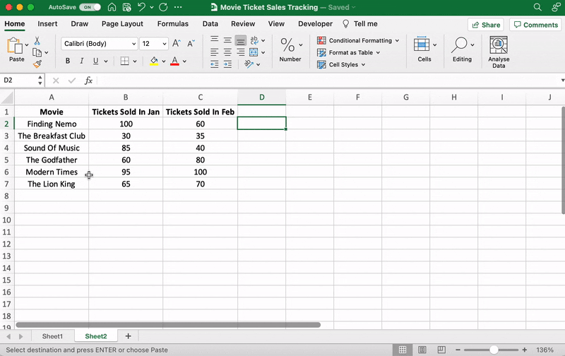
For our example, let’s say you’re an owner of a movie theater in a small town, and you often screen older movies. You probably want to track the sales of your tickets to see which movie is a hit so you can screen it frequently.
Let’s do that by comparing the ticket sales in January and February.
Here’s what your data might look like:

Column A contains the movie names.
Column B contains tickets sold in January.
And column C contains tickets sold in February.
You can bold headings and center align your text for better readability.
Done? Okay, get ready to pick a graph.
⭐️ Step 2: determine the Excel graph type you want
The type of graph you pick will depend on the data you have and the number of different parameters you want to track.
You’ll find the different graph types under the Excel Insert tab, in the Excel Ribbon, arranged close to one another like this:

Note: The Excel Ribbon is where you can find the Home, Insert, and Draw tabs.
Here are some of the different Excel graph or chart type options you can choose from:
- Line graph
- Column graph or bar graph
- Pie graph or chart
- Combo chart
- Area chart
- Scatter plot chart
➡️ Fun fact: Excel can help you decide the graph or chart type with the Recommended Charts (formerly known as Chart Wizard) option.
If you want to take notes of trends (increase or decrease) over time, then a line graph is perfect.
But for a long time frame and more data, a bar graph is the best option.
We’ll use these two graphs for the purpose of this Excel tutorial.
How To Create a Line Graph in Excel – 3 Steps
A line graph in Excel typically has two axes (horizontal and vertical) to function.
You need to enter the data in two columns.
Lucky for us, we’ve already done this when creating the ticket sales data table.
⭐️ Step 1: select data to turn into a line graph
Click and drag from the top-left cell (A1) in your ticket sales data to the bottom-right cell (C7) to select. Don’t forget to include column headers.
This will highlight all the data you want to display in your line graph.

⭐️ Step 2: insert line graph
Now that you’ve selected your data, it’s time to add the line graph.
Look for the line graph icon under the Insert tab.

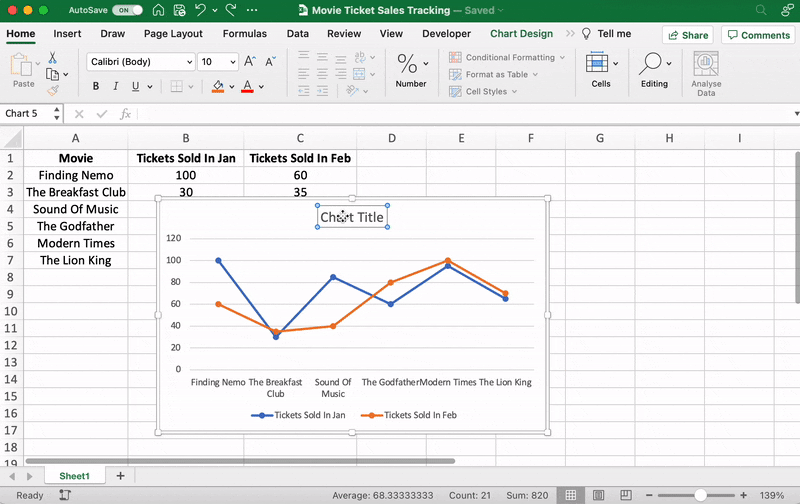
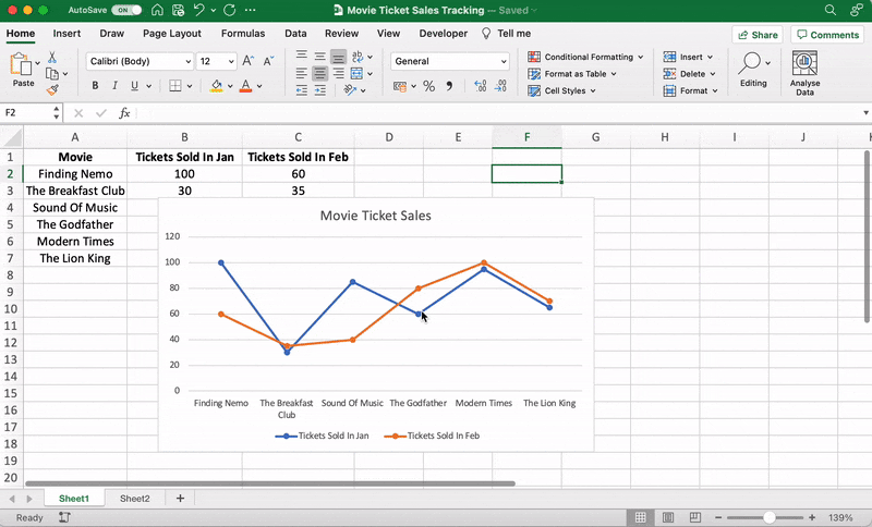
With the data selected, go to Insert > Line. Click on the icon, and a dropdown menu will appear to select the type of line chart you want.
For this example, we’ll choose the fourth 2-D line graph (Line with Markers).
Excel will add your line graph representing your selected data series.

You’ll then notice the names of the movies appear on the horizontal axis and the number of tickets sold on the vertical axis.
⭐️ Step 3: customize your line graph
After adding the line graph, you’ll notice a new tab called Chart Design on your Excel Ribbon.
Select the Design tab to make the line graph your own by choosing the chart style you prefer.

You can also change the graph’s title.
Select the Chart Title > double click to name > type in the name you wish to call it. To save it, simply click anywhere outside the graph’s title box or chart area.
We’ll name our graph “Movie Ticket Sales.”
Anything else you need to tweak?
If you spot anything, now is the time to make those edits!
For example, here you can see The Godfather and Modern Times are smooshed together.
Let’s give them some space.
How?
Just drag any corner of the graph until it’s how you desire.

These are just some examples. You can customize every chart element if you like including the Axis Labels (the color of the lines that represent each data point, etc.)
Just double click on any chart element to open a sidebar for formatting like this:
That’s it! You’ve successfully created a line graph in Excel!
Now, let’s learn how to make a bar graph. 📊
3 Steps To Create a Bar Graph in Excel
Any Excel graph or Excel chart begins with a populated sheet.
We’ve already done this, so copy and paste the movie ticket sales data to a new sheet tab in the same Excel workbook.
⭐️ Step 1: select data to turn into a bar graph
Like step 1 for the line graph, you need to select the data you wish to turn into a bar graph.
Drag from cell A1 to C7 to highlight the data.
⭐️ Step 2: insert bar graph
Highlight your data, go to the Insert tab, and click on the Column chart or graph icon. A dropdown menu should appear.
Select Clustered Bar under the 2-D bar options.
Note: you can choose a different type of bar chart option like a 3D clustered column or 2D stacked bar, etc.
As soon as you click on the bar graph option, it’ll be added to your Excel sheet.

⭐️ Step 3: customize your Excel bar graph
Now, you can go to the Chart Design tab in the Excel Ribbon to personalize it.
Click on the Design tab to apply a bar style you prefer from the many options.

You know the next step! Change the bar graph’s title.
Select the Excel Chart Title > double click on the title box > type in “Movie Ticket Sales.”
Then click anywhere on the excel sheet to save it.

Note: you can also add other graph elements such as Axis Title, Data Label, Data Table, etc., with the Add Chart Element option. You’ll find it under the Chart Design tab.
And that’s a wrap. 🎬
You’ve successfully created a bar graph in Excel!
Well, that was fun.
But the question is, do you have the time for graphs in your busy work schedule?
And that’s just the teaser when it comes to Excel graph drawbacks.
Read on to watch the full movie. 👀
Bonus: Check out these Excel Alternatives!
Create Effortless Graphs With ClickUp
If ClickUp were a Hallmark movie, graphs and this project management tool would be the perfect match.
A forever kind-of-love. ❤️
Whether you want to create graphs to monitor time, projects, people, ticket sales… you name it because we can do it all within a few clicks.
All without the drawbacks of using Excel!
Excel can be:
- Time-consuming and manual
- Complex and pricey
- Error-prone
The best part?
Most of those functions are automated without manual data entry. Phew.
1. Line Chart Widgets
The Line Chart Widget is a Custom Widget on our Dashboard. Use this ClickUp production to visualize literally anything in the form of a line graph.
It can be tracking profits, total daily sales, or how many movies you’ve watched in a month.
Like we said, a-n-y-t-h-i-n-g!

Visualize any set of values as a line graph with the Line Chart Widget on ClickUp’s Dashboard!
And that’s not it. You can visualize your data in many different ways too.
Just use any of these Custom Widgets:
- Calculations
- Bar charts
- Battery chart
- Pie chart
- And more

Present your data visually as a pie chart with Custome Widgets in ClickUp!
2. Gantt Chart view
Just like it’s difficult to love just one movie genre, we totally get that graphs alone don’t work.
And that’s why we have charts too!
Specifically, ClickUp’s Gantt chart, an interactive chart with live updates and progress tracking that can help you:
- Plan projects
- Assign tasks and assignees
- Schedule a timeline
- Manage dependencies
- And more

Drawing a relationship from one task to a future task in ClickUp’s Gantt Chart view!
3. Table view
If you’re a fan of the Excel grids, ClickUp has your back.
Starring… ClickUp Table view!
This view lets you visualize your tasks in the spreadsheet style.
It’s super fast and allows easy navigation between fields, bulk edits, and data export.
➡️ Fun fact: you can quickly copy and paste your table’s data into other programs, like MS Excel. Just click and drag to highlight the cells you want to copy.
Highlight data from your table in ClickUp to copy and paste into other programs!
And that was just the trailer for you. 📽️
Here are some more powerful ClickUp features in store for:
- Send and receive emails right from your project management tool with Email in ClickUp
- Work even when the wifi acts up with Offline Mode
- Work how you like with multiple ClickUp Views, including Calendar, Mind Maps, Chat, etc.
- Reduce your workload with ClickUp Automations
- Track time spent on tasks with ClickUp’s Native Time Tracker
- Share Table view or Dashboards with clients and external users using Public Sharing and Permissions
- View all graphs and charts on the go with ClickUp mobile apps
Now Showing: ClickUp 🎥🍿
You can surely make tons of graphs in Excel.
No doubt there.
But does that make it a smart choice?
I mean, if you have to Google how to make a graph in Excel, maybe that’s your red flag. 🚩
Tools are supposed to make your life easier.
Take ClickUp, for instance.
Our project management tool can be your graph maker, chart creator, spreadsheet builder, time tracker, workload manager…
It’s a hallmark for a quality tool that can be your all-in-one solution.
Get your ClickUp ticket for free today and enjoy watching your graphs come to life in minutes!
Related readings:
- How to create Gantt charts in Excel
- How to create a Kanban board in Excel
- How to create a burndown chart in Excel
- How to create a flowchart in Excel
- How to show dependencies in Excel
- How to create a KPI dashboard in Excel
- How to create a dashboard in Excel
- How to create a database in Excel
- How to make a work breakdown structure in Excel