Click on any of the graphs; in the formula bar you will see the ‘Formula’ that creates this graph, for example =SERIES(Sheet1!$A$3;Sheet1!$B$2:$N$2;Sheet1!$B$3:$N$3;1)
- The first parameter is the Title of each graph;
- the second parameter is the X-range
- the third parameter is the Y-range
- the fourth parameter is the sequential count.
Your problem is the second parameter; but not just anyone: typically, all your graphs share this parameter, and you can only edit it in #1. Here is what you need to do:
- use cursor down or up to step through all graphs, until you see graph 1 in the formula bar (not necessarily your first graph; and it doesn’t really matter which one of yours it is)
- in this formula, edit the X-range to include the remaining columns, for example, change
$B2:$N2to$B2:$W2. - edit the Y-range to include the remaining columns too, for example, change
$B3:$N3to$B3:$W3. Press<RET>. Your first graph should now show all data points. - repeat this for all other graphs (X might be automatically ok, but Y needs to be adjusted.
Note that there are more fancy ways to do so, by using the Excel-supplied dialogs and controls, but they are very different in each version, and some of them behave counter-intuitive. Generally, Excel tries to be clever, and sometimes that helps, and sometimes not. I always use the ‘manual’ way as described, and once you understood the four parameters, it is straight forward, and you can create any kind of special graphs with it.
-
#2
It sounds like you have some non-numeric data where you should have numbers, so Excel cannot parse the range properly. It usually helps to set up the data a special way. Put your X values in the first column, Y values in subsequent column, keep the cell above the X values blank, and put labels in the cells above the Y values. This is a more foolproof way to ensure that Excel gets your range correctly.
If this doesn’t work, you can select the chart, go to the Edit Data dialog, then series by series, edit the ranges containing X and Y values and series names. You also may have to fix the non-numerics. Sometimes imported data looks numeric but is interpreted as text. If you don’t apply a horizontal alignment to the range (I rarely do to help with this issue), text is left aligned and numbers are right aligned. If you have left aligned numbers, select and copy a blank cell, then select the left aligned numbers, use Paste Special, and choose the Operation — Add option to add the blank (zero) to the numbers. This coerces Excel to interpret the cells at numeric values and converts them, so your chart should work.
-
#3
How to fix this:

Last edited: Jan 18, 2008
-
#4
Delete the chart. Insert a row above your data. Keep A1 blank, enter labels in B1 through D1, say «First», «Second», and «Third». select this entire range and rebuild the chart.
-
#5
K thx!
But now it looks like this 

-
#6
Select the range, and remove the horizontal alignment, You will see a lot of values left-aligned, which means they are text, not numbers. Excel plots text as if it had a zero value. It looks like these are all of the numbers containing a decimal point.
To fix: copy a blank cell, select the text you need to convert to numbers, use Paste Special, and choose the Operation — Add option. This adds the blank (zero) to the cell value, which Excel is forced to interpret as a number, and thus converts the text to numbers. You shouldn’t have to recreate the chart, the points will move after making this correction.
-
#7
Thx, but the problem actually had to do with me using a fullstop instead of using comma, really is stupid that Excel can’t interpret fullstops oh well. THX for the help, really couldn’t have done it without it!
-
#8
This is a function of how the regional settings on your computer are set up. If you’re set up to use comma decimal separators, then you have to enter numbers with commas as decimal separators.
-
#9
Hi!
Hey, when the box is green it means that the data is in text format, likely as the decimal point is not really a decimal point. What i do is in an adjacent column write the formula «=VALUE(A1)» (if the original value is in A1) this copies the number across and changes it to a number. You can tell as usually numbers are right aligned and text is left aligned. Now do the drag down («dark Black Cross» trick in the bottom corner of the cell) to drag this formula down the column to copy the rest of your data. Now when you do your chart, reference the cells with the new values and your set!
Good luck!!
After you input your data and select the cell range, you’re ready to choose the chart type. In this example, we’ll create a clustered column chart from the data we used in the previous section.
Step 1: Select Chart Type
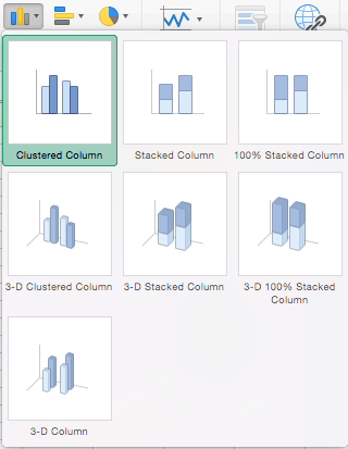
Once your data is highlighted in the Workbook, click the Insert tab on the top banner. About halfway across the toolbar is a section with several chart options. Excel provides Recommended Charts based on popularity, but you can click any of the dropdown menus to select a different template.
Step 2: Create Your Chart
- From the Insert tab, click the column chart icon and select Clustered Column.
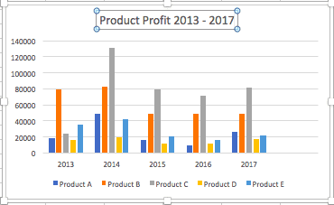
- Excel will automatically create a clustered chart column from your selected data. The chart will appear in the center of your workbook.
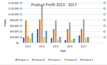
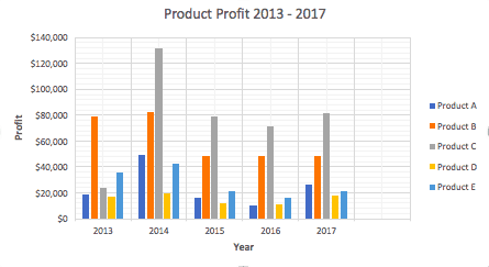
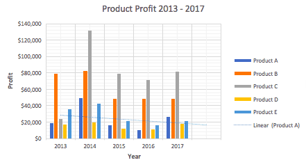
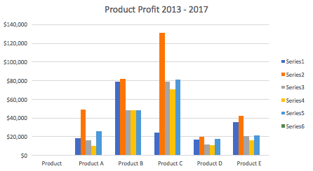
- To name your chart, double click the Chart Title text in the chart and type a title. We’ll call this chart “Product Profit 2013 — 2017.”
We’ll use this chart for the rest of the walkthrough. You can download this same chart to follow along.
Download Sample Column Chart Template
There are two tabs on the toolbar that you will use to make adjustments to your chart: Chart Design and Format. Excel automatically applies design, layout, and format presets to charts and graphs, but you can add customization by exploring the tabs. Next, we’ll walk you through all the available adjustments in Chart Design.
Step 3: Add Chart Elements
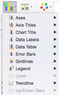
Adding chart elements to your chart or graph will enhance it by clarifying data or providing additional context. You can select a chart element by clicking on the Add Chart Element dropdown menu in the top left-hand corner (beneath the Home tab).
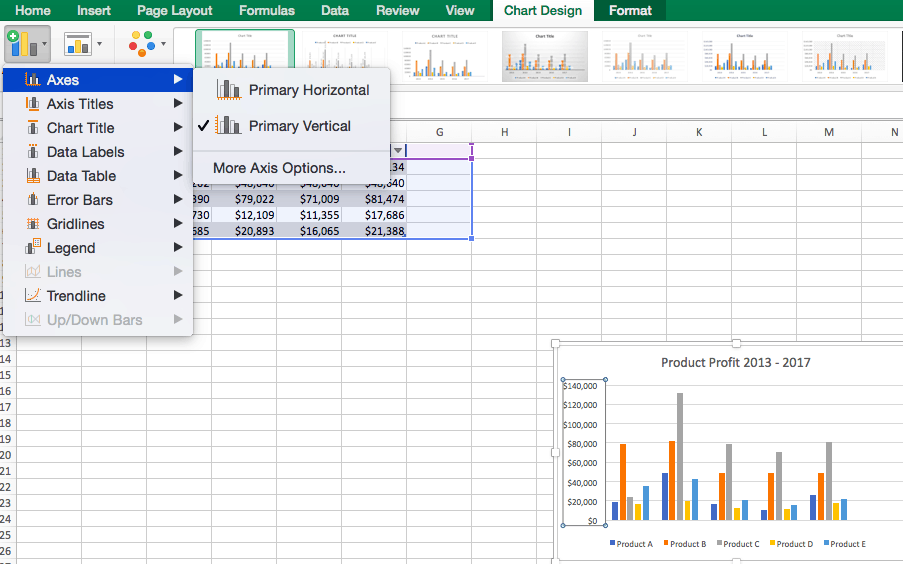
To Display or Hide Axes:
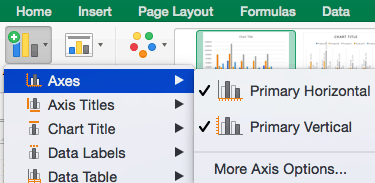
- Select Axes. Excel will automatically pull the column and row headers from your selected cell range to display both horizontal and vertical axes on your chart (Under Axes, there is a check mark next to Primary Horizontal and Primary Vertical.)
- Uncheck these options to remove the display axis on your chart. In this example, clicking Primary Horizontal will remove the year labels on the horizontal axis of your chart.
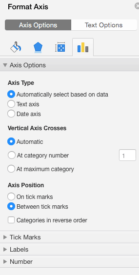
- Click More Axis Options… from the Axes dropdown menu to open a window with additional formatting and text options such as adding tick marks, labels, or numbers, or to change text color and size.
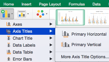
To Add Axis Titles:
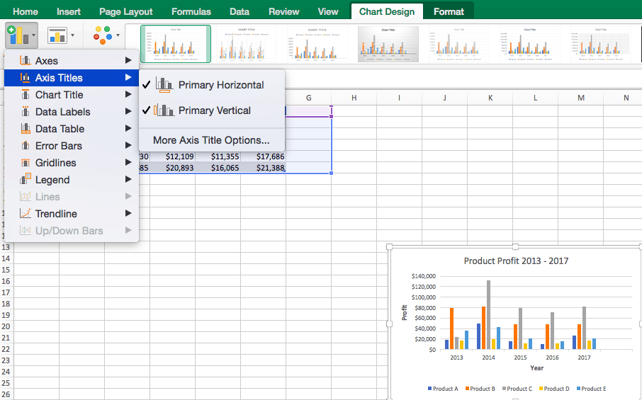
- Click Add Chart Element and click Axis Titles from the dropdown menu. Excel will not automatically add axis titles to your chart; therefore, both Primary Horizontal and Primary Vertical will be unchecked.
- To create axis titles, click Primary Horizontal or Primary Vertical and a text box will appear on the chart. We clicked both in this example. Type your axis titles. In this example, the we added the titles “Year” (horizontal) and “Profit” (vertical).
To Remove or Move Chart Title:
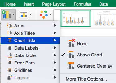
- Click Add Chart Element and click Chart Title. You will see four options: None, Above Chart, Centered Overlay, and More Title Options.
- Click None to remove chart title.
- Click Above Chart to place the title above the chart. If you create a chart title, Excel will automatically place it above the chart.
- Click Centered Overlay to place the title within the gridlines of the chart. Be careful with this option: you don’t want the title to cover any of your data or clutter your graph (as in the example below).
To Add Data Labels:
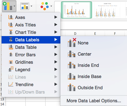
- Click Add Chart Element and click Data Labels. There are six options for data labels: None (default), Center, Inside End, Inside Base, Outside End, and More Data Label Title Options.
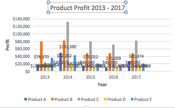
- The four placement options will add specific labels to each data point measured in your chart. Click the option you want. This customization can be helpful if you have a small amount of precise data, or if you have a lot of extra space in your chart. For a clustered column chart, however, adding data labels will likely look too cluttered. For example, here is what selecting Center data labels looks like:
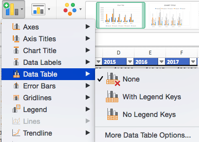
To Add a Data Table:
- Click Add Chart Element and click Data Table. There are three pre-formatted options along with an extended menu that can be found by clicking More Data Table Options:
Note: If you choose to include a data table, you’ll probably want to make your chart larger to accommodate the table. Simply click the corner of your chart and use drag-and-drop to resize your chart.
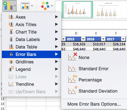
To Add Error Bars:
- Click Add Chart Element and click Error Bars. In addition to More Error Bars Options, there are four options: None (default), Standard Error, 5% (Percentage), and Standard Deviation. Adding error bars provide a visual representation of the potential error in the shown data, based on different standard equations for isolating error.
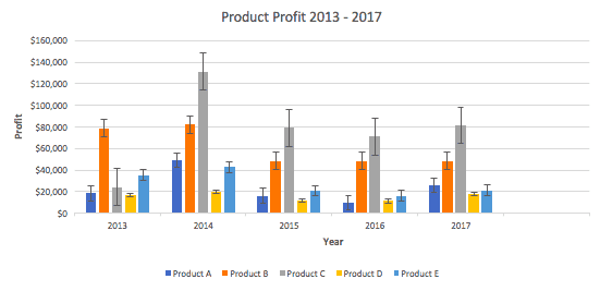
- For example, when we click Standard Error from the options we get a chart that looks like the image below.
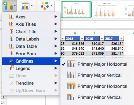
To Add Gridlines:
- Click Add Chart Element and click Gridlines. In addition to More Grid Line Options, there are four options: Primary Major Horizontal, Primary Major Vertical, Primary Minor Horizontal, and Primary Minor Vertical. For a column chart, Excel will add Primary Major Horizontal gridlines by default.
- You can select as many different gridlines as you want by clicking the options. For example, here is what our chart looks like when we click all four gridline options.
To Add a Legend:
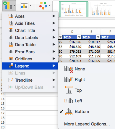
- Click Add Chart Element and click Legend. In addition to More Legend Options, there are five options for legend placement: None, Right, Top, Left, and Bottom.
- Legend placement will depend on the style and format of your chart. Check the option that looks best on your chart. Here is our chart when we click the Right legend placement.
To Add Lines: Lines are not available for clustered column charts. However, in other chart types where you only compare two variables, you can add lines (e.g. target, average, reference, etc.) to your chart by checking the appropriate option.
To Add a Trendline:
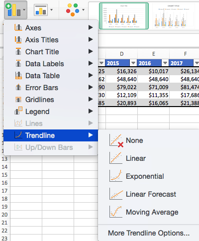
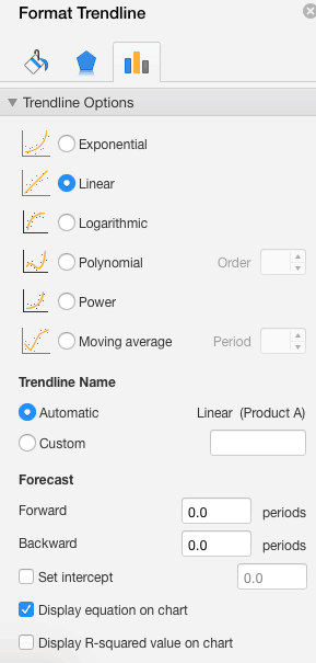
- Click Add Chart Element and click Trendline. In addition to More Trendline Options, there are five options: None (default), Linear, Exponential, Linear Forecast, and Moving Average. Check the appropriate option for your data set. In this example, we will click Linear.
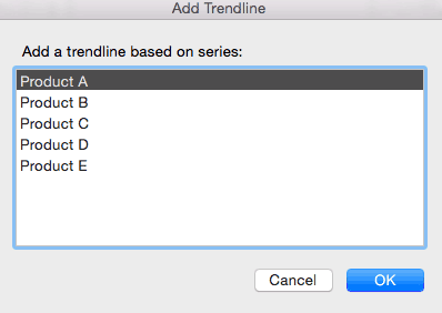
- Because we are comparing five different products over time, Excel creates a trendline for each individual product. To create a linear trendline for Product A, click Product A and click the blue OK button.
- The chart will now display a dotted trendline to represent the linear progression of Product A. Note that Excel has also added Linear (Product A) to the legend.
- To display the trendline equation on your chart, double click the trendline. A Format Trendline window will open on the right side of your screen. Click the box next to Display equation on chart at the bottom of the window. The equation now appears on your chart.
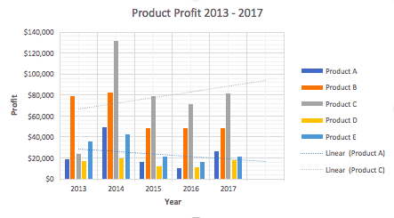
Note: You can create separate trendlines for as many variables in your chart as you like. For example, here is our chart with trendlines for Product A and Product C.
To Add Up/Down Bars: Up/Down Bars are not available for a column chart, but you can use them in a line chart to show increases and decreases among data points.
Step 4: Adjust Quick Layout
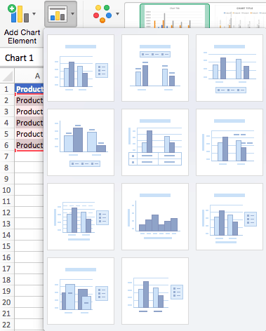
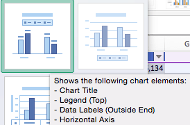
- The second dropdown menu on the toolbar is Quick Layout, which allows you to quickly change the layout of elements in your chart (titles, legend, clusters etc.).
- There are 11 quick layout options. Hover your cursor over the different options for an explanation and click the one you want to apply.
Step 5: Change Colors
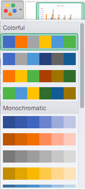
The next dropdown menu in the toolbar is Change Colors. Click the icon and choose the color palette that fits your needs (these needs could be aesthetic, or to match your brand’s colors and style).
Step 6: Change Style
For cluster column charts, there are 14 chart styles available. Excel will default to Style 1, but you can select any of the other styles to change the chart appearance. Use the arrow on the right of the image bar to view other options.
Step 7: Switch Row/Column
- Click the Switch Row/Column on the toolbar to flip the axes. Note: It is not always intuitive to flip axes for every chart, for example, if you have more than two variables.
In this example, switching the row and column swaps the product and year (profit remains on the y-axis). The chart is now clustered by product (not year), and the color-coded legend refers to the year (not product). To avoid confusion here, click on the legend and change the titles from Series to Years.
Step 8: Select Data
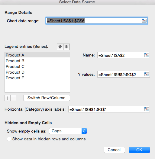
- Click the Select Data icon on the toolbar to change the range of your data.
- A window will open. Type the cell range you want and click the OK button. The chart will automatically update to reflect this new data range.
Step 9: Change Chart Type
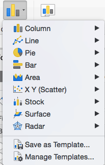
- Click the Change Chart Type dropdown menu.
- Here you can change your chart type to any of the nine chart categories that Excel offers. Of course, make sure that your data is appropriate for the chart type you choose.
-
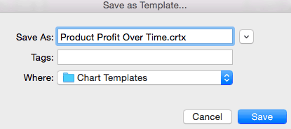
You can also save your chart as a template by clicking Save as Template…
- A dialogue box will open where you can name your template. Excel will automatically create a folder for your templates for easy organization. Click the blue Save button.
Step 10: Move Chart
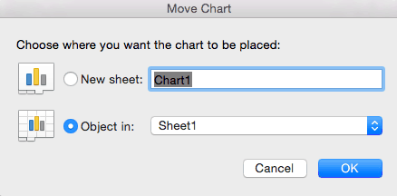
- Click the Move Chart icon on the far right of the toolbar.
- A dialogue box appears where you can choose where to place your chart. You can either create a new sheet with this chart (New sheet) or place this chart as an object in another sheet (Object in). Click the blue OK button.
Step 11: Change Formatting
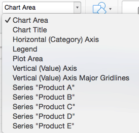
- The Format tab allows you to change formatting of all elements and text in the chart, including colors, size, shape, fill, and alignment, and the ability to insert shapes. Click the Format tab and use the shortcuts available to create a chart that reflects your organization’s brand (colors, images, etc.).
- Click the dropdown menu on the top left side of the toolbar and click the chart element you are editing.
Step 12: Delete a Chart
To delete a chart, simply click on it and click the Delete key on your keyboard.
I am currently creating a column chart that compares two years of sales data (2012 and 2013). I want to show the data in a table below the column graph that also includes a percentage change. I have this all figured out, but cannot seem to figure out a way to eliminate the percentage change column from the graph itself.
So my question is how can I keep the % change data in the chart below the graph but eliminate it from the column graph itself??
Thank you.
Patrick Wilson
asked Nov 6, 2013 at 21:11
If it’s in the table it’s in the chart. A few work arounds:
- Make the series fill for % bars no fill and same for the outline
- Plot it on a second axis and format such that this axis is not displayed
- Fake the table, using cells and don’t use the data table. Format and position the chart above it.
In my experience the 3rd one is the most work, but the best. Chart tables are hard to format.
chris neilsen
52.2k10 gold badges84 silver badges122 bronze badges
answered Nov 6, 2013 at 21:21
RossRoss
3001 silver badge8 bronze badges
I change the chart type (ie. bar chart) and the switch back to the pie chart and it worked. Hope it works for others. Scott
answered Feb 16, 2017 at 20:24
For a bar chart, I change the chart to a combo, make the data I don’t want shown a line and then format it so that there is no fill or border, and delete the legend and select «Data Table with Legend Keys» No color will show next to the row of data not visible on the on the chart.
answered Dec 14, 2018 at 22:57


