
Вы можете создать графический элемент SmartArt с макетом диаграммы Венна в Excel, Outlook, PowerPoint и Word. Диаграммы Венна идеально подходят для иллюстрации сходства и различий между несколькими различными группами или понятиями.
Общие сведения о диаграммах Венна
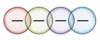
На диаграммах Венна можно с помощью перекрывающихся кругов продемонстрировать сходство, различия и связи между понятиями, идеями, категориями или группами. Сходство между группами представлено перекрывающимися частями кругов, а различия — неперекрывающимся.
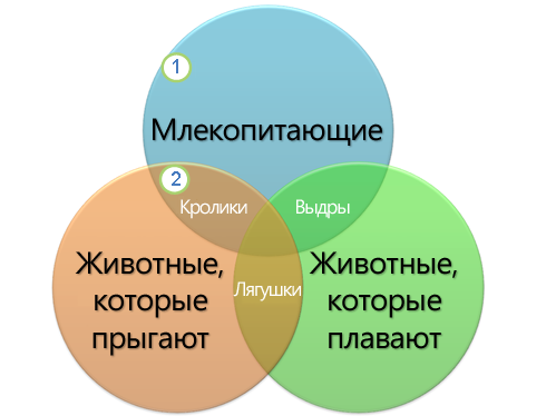
1 Каждая большая группа представлена одним из кругов.
2 Каждая область перекрытия соответствует сходству между двумя большими группами или входящими в них более мелкими.
В этой статье
-
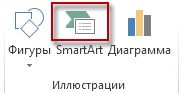
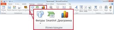
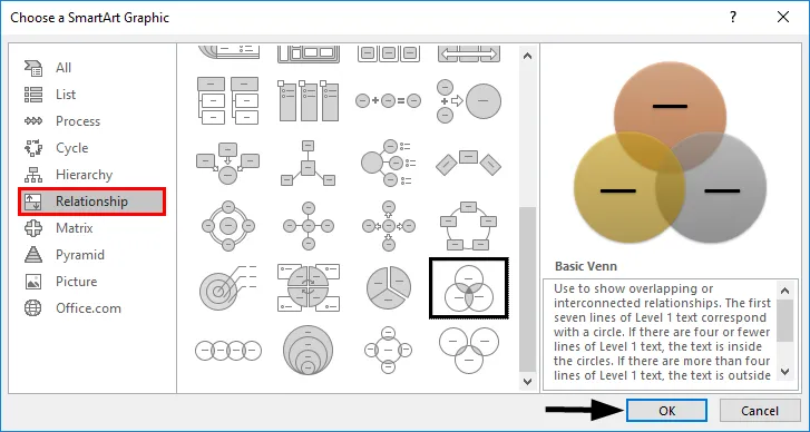
На вкладке Вставка в группе Иллюстрации нажмите кнопку SmartArt.

Пример группы Иллюстрации на вкладке Вставка в PowerPoint 2013
-
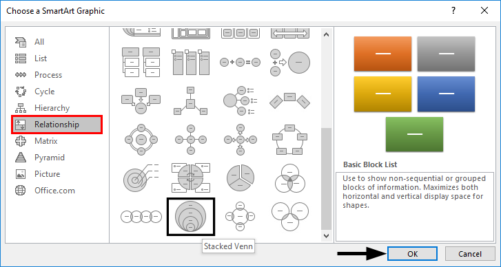
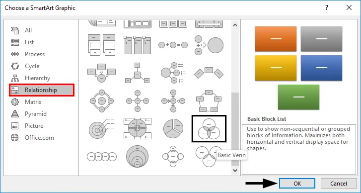
В коллекции Выбор рисунка SmartArt нажмите кнопку Отношение, выберите макет диаграммы Венна (например, Простая Венна), а затем нажмите кнопку ОК.

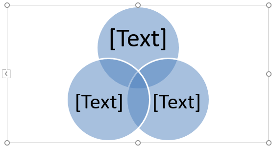
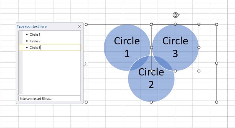
Добавление текста в главные круги
-
Выделите фигуру в графическом элементе SmartArt.
-
Выполните одно из указанных ниже действий.
-
В области текста щелкните элемент [Текст] и введите свой текст (или выберите маркер и введите текст).
-
Скопируйте текст из другого места или программы, в области текста щелкните элемент [Текст], а затем вставьте скопированное содержимое.
-
Щелкните круг в графическом элементе SmartArt, а затем введите текст.
Примечание: Если область текста не отображается, вы можете открыть ее, щелкнув соответствующий элемент управления в левой части рисунка SmartArt.
-
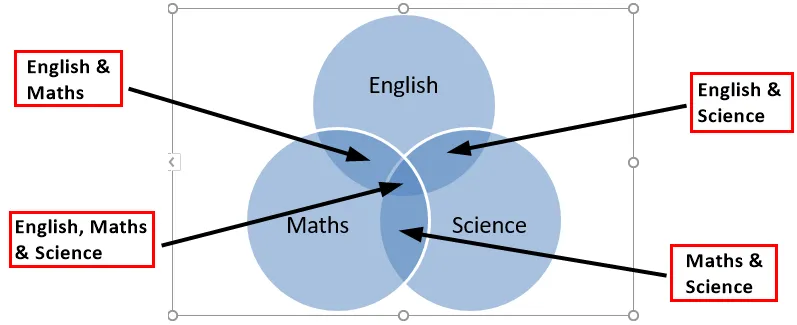
Добавление текста в перекрывающиеся части кругов
В перекрывающиеся части диаграммы Венна невозможно добавить текст через описанную выше область. Вместо этого поверх них можно вставить надписи.
В Excel, Outlook и Word:
-
На вкладке Вставка в группе Текст:
-
В Excel нажмите кнопку Надпись.
-
В Outlook нажмите кнопку Надпись и выберите пункт Нарисовать надпись.
-
В Word нажмите кнопку Надпись и в нижней части коллекции выберите пункт Нарисовать надпись.
-
-
Затем сделайте следующее:
-
Щелкните и перетащите пересекающийся круг. Нарисуйте текстовое поле необходимого размера.
-
Чтобы добавить текст, щелкните внутри поля и введите текст.
-
Чтобы изменить фоновый цвет с белого на цвет пересекающегося круга, щелкните правой кнопкой текстовое поле и выберите пункт Формат фигуры.
-
В области Формат фигуры в разделе Заливка выберите пункт Без заливки.
-
Чтобы удалить линии вокруг надписи, выберите надпись, щелкните элемент Линия в области Формат фигуры и выберите пункт Нет линий.
Примечания:
-
(ПРИМЕЧАНИЯ.) Чтобы изменить расположение текстового поля, щелкните его и, когда курсор примет вид крестообразной стрелки (
), перетащите текстовое поле в новое место. -
Чтобы отформатировать текст, выделите его и воспользуйтесь элементами форматирования в группе Шрифт на вкладке Главная.
-
-
 ), перетащите текстовое поле в новое место.
 В PowerPoint:
-
На вкладке Вставка в группе Текст нажмите кнопку Надпись.
-
Щелкните и перетащите пересекающийся круг. Нарисуйте текстовое поле необходимого размера.
-
Чтобы добавить текст, щелкните внутри поля и введите текст.
-
Щелкните существующий круг, который расположен ближе всего к месту вставки нового круга.
-
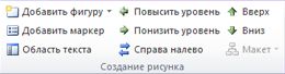
На вкладке Конструктор вкладки Работа с рисунками SmartArt в группе Создание рисунка щелкните стрелку рядом с командой Добавить фигуру.
Если вкладка Работа с рисунками SmartArt или Конструктор не отображается, выделите графический элемент SmartArt. Чтобы открыть вкладку Конструктор, возможно, потребуется дважды щелкнуть графический элемент SmartArt.
-
Выполните одно из указанных ниже действий.
-
Чтобы вставить круг, перекрывающий выделенный круг, после него, выберите пункт Добавить фигуру после.
-
Чтобы вставить круг, перекрывающий выделенный круг, перед ним, выберите пункт Добавить фигуру перед.
-
Примечания:
-
(ПРИМЕЧАНИЯ.) При добавлении круга в диаграмму Венна поэкспериментируйте с его расположением относительно выделенного круга, чтобы добиться нужного вида.
-
Чтобы добавить круг из области текста, щелкните существующий круг, поместите указатель мыши перед тем местом, куда нужно вставить фигуру, или после него и нажмите клавишу ВВОД.
-
Чтобы удалить круг из диаграммы Венна, щелкните его и нажмите клавишу DELETE.
-
Чтобы переместить круг, щелкните его и перетащите на новое место.
-
Чтобы круг перемещался с очень маленьким шагом, удерживайте нажатой клавишу CTRL и нажимайте клавиши со стрелками.
-
Щелкните правой кнопкой мыши диаграмму Венна, которую необходимо изменить.
-
Выберите параметр макета в группе Макеты на вкладке Конструктор в разделе Работа с рисунками SmartArt. При выборе параметра макета можно предварительно просмотреть, как будет выглядеть графический элемент SmartArt. Выберите нужный макет.
-
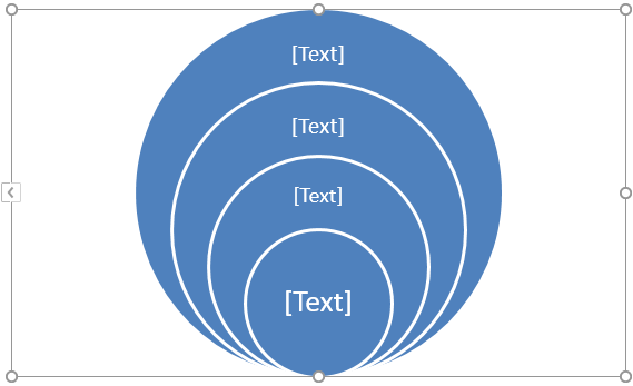
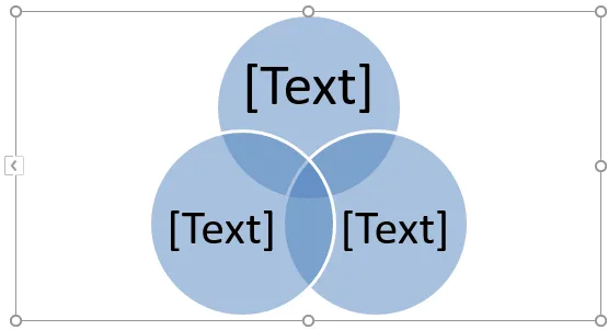
Чтобы отобразить отношения наложения в последовательности, выберите пункт Линейная Венна.
-
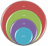
Чтобы отобразить отношения наложения с акцентом на рост или градацию, выберите пункт Венна в столбик.
-
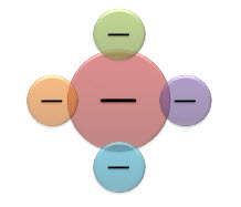
Чтобы отобразить как отношения наложения, так и отношение к центральной идее, выберите пункт Радиальная Венна.
-
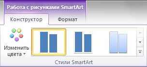
Чтобы быстро красить графический элемент SmartArt в качестве дизайнера, можно изменить цвета диаграммы Венна. Вы также можете добавить эффекты, такие как свечение, сглаживание или объемные эффекты.
К кругам графического элемента SmartArt можно применять сочетания цветов, основанные на цвета темы.
Щелкните графический элемент SmartArt, цвет которого нужно изменить.
-
В разделе Работа с рисунками SmartArt на вкладке Конструктор в группе Стили SmartArt нажмите кнопку Изменить цвета.
Если вкладка Работа с рисунками SmartArt или Конструктор не отображается, выделите графический элемент SmartArt.
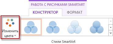
Совет: (СОВЕТ.) Если навести указатель мыши на эскиз, можно увидеть, как изменяются цвета рисунка SmartArt.
Изменение цвета линии или стиля границы круга
-
В графическом элементе SmartArt щелкните правой кнопкой мыши границу круга, которую требуется изменить, и выберите пункт Формат фигуры.
-
В области Формат фигуры при необходимости щелкните стрелку рядом с пунктом Линия, чтобы отобразить все параметры, а затем выполните одно из следующих действий:
-
Чтобы изменить цвет границы круга, нажмите кнопку Цвет
и выберите нужный цвет. -
Чтобы изменить тип линии границы круга, выберите нужные параметры, такие как Прозрачность, Ширина или Тип штриха.
-
 и выберите нужный цвет.
Изменение цвета фона круга на диаграмме Венна
Щелкните графический элемент SmartArt, который нужно изменить.
-
Щелкните правой кнопкой мыши границу круга и выберите команду Формат фигуры.
-
В области Формат фигуры в группе Заливка выберите пункт Сплошная заливка.
-
Нажмите кнопку Цвет
и выберите нужный цвет.-
Для выбора цвета фона, который не входит в цвета темы, нажмите кнопку Другие цвета, а затем щелкните необходимый цвет на вкладке Обычные либо создайте собственный цвет на вкладке Спектр. Пользовательские цвета и цвета на вкладке Обычные не обновляются при последующем изменении тема документа.
-
Чтобы увеличить прозрачность фигур на диаграмме, переместите ползунок Прозрачность или введите число в поле рядом с ним. Значение прозрачности можно изменять от 0 (полная непрозрачность, значение по умолчанию) до 100 % (полная прозрачность).
-
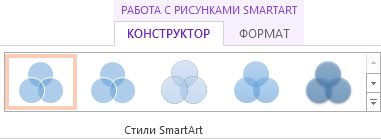
Стиль SmartArt — это сочетание различных эффектов, таких как тип линий, рельеф или поворот объемной фигуры, которые можно применять к кругам графического элемента SmartArt для придания ему неповторимого вида.
Щелкните графический элемент SmartArt, который нужно изменить.
-
В разделе Работа с рисунками SmartArt на вкладке Конструктор в группе Стили SmartArt выберите нужный стиль SmartArt.
Чтобы просмотреть другие стили SmartArt, нажмите кнопку Дополнительные параметры
.
 .
. Примечание: Если навести указатель мыши на эскиз, можно увидеть, как изменяется стиль графического элемента SmartArt.
Совет: Если вы используете PowerPoint 2013 или PowerPoint 2016, вы можете анимировать диаграмму Венна, чтобы выделить каждый круг. Дополнительные сведения о применении анимации к графическим элементам SmartArt см. в статье Анимация графического элемента SmartArt.
См. также
Выбор графического элемента SmartArt
Дополнительные сведения о графических элементах SmartArt
Добавление фигур
В этой статье
-
На вкладке Вставка в группе Иллюстрации нажмите кнопку SmartArt.
-
В коллекции Выбор рисунка SmartArt нажмите кнопку Отношение, выберите макет диаграммы Венна (например, Простая Венна), а затем нажмите кнопку ОК.
Добавление текста в главные круги
-
Выберите графический элемент SmartArt.
-
В группе Инструменты SmartArtна вкладке Конструктор в группе Создание рисунка нажмите кнопку Области текста.
Если вы не видите вкладку Инструменты SmartArt или Конструктор, убедитесь, что вы выбрали графический элемент SmartArt. Чтобы открыть вкладку Конструктор, может потребоваться дважды щелкнуть графический элемент SmartArt. -
Выполните одно из следующих действий:
-
В области текста щелкните элемент [Текст] и введите содержимое.
-
Скопируйте текст из другого места или программы, в области текста щелкните элемент [Текст], а затем вставьте скопированное содержимое.
-
Щелкните круг в графическом элементе SmartArt, а затем введите текст.
-
В области текста в области Введите текст выберите маркер и введите текст.
Примечание: Вы также можете открыть текстовую области, щелкнув его.
Добавление текста в перекрывающиеся части кругов
В перекрывающиеся части диаграммы Венна невозможно добавить текст через описанную выше область. Вместо этого поверх них можно вставить надписи.
Чтобы вставить текстовое поле, сделайте следующее:
-
На вкладке Вставка в группе Текст нажмите кнопку Надпись.
-
Перетащите указатель, чтобы создать надпись.
-
Вы выберите текстовое поле и введите текст.
-
Расположить текстовое поле на перекрывающихся кругах.
-
Щелкните графический элемент SmartArt, в который вы хотите добавить еще один кружок.
-
Щелкните существующий круг, который расположен ближе всего к месту вставки нового круга.
-
На вкладке Конструктор вкладки Работа с рисунками SmartArt в группе Создание рисунка щелкните стрелку рядом с командой Добавить фигуру.
Если вкладка Работа с рисунками SmartArt или Конструктор не отображается, выделите графический элемент SmartArt. Чтобы открыть вкладку Конструктор, возможно, потребуется дважды щелкнуть графический элемент SmartArt.
-
Выполните одно из указанных ниже действий.
-
Чтобы вставить круг, перекрывающий выделенный круг, после него, выберите пункт Добавить фигуру после.
-
Чтобы вставить круг, перекрывающий выделенный круг, перед ним, выберите пункт Добавить фигуру перед.
-
-
(ПРИМЕЧАНИЯ.) При добавлении круга в диаграмму Венна поэкспериментируйте с его расположением относительно выделенного круга, чтобы добиться нужного вида.
-
Чтобы добавить круг из области текста, щелкните существующий круг, наведите указатель мыши на то место, куда вы хотите добавить круг, или после него, а затем нажмите ввод.
-
Чтобы удалить круг из диаграммы Венна, щелкните его и нажмите кнопку DELETE.
-
Чтобы переместить круг, щелкните его и перетащите на новое место.
-
Чтобы круг перемещался с очень маленьким шагом, удерживайте нажатой клавишу CTRL и нажимайте клавиши со стрелками.
-
Щелкните правой кнопкой мыши диаграмму Венна, которую вы хотите изменить, и выберите изменить макет.
-
В диалоговом окне Выбор графического элементов SmartArt в области слева нажмите кнопку Связь и в правой области сделайте следующее:
-
Чтобы отобразить отношения наложения в последовательности, выберите пункт Линейная Венна.
-
Чтобы отобразить отношения наложения с акцентом на рост или градацию, выберите пункт Венна в столбик.
-
Чтобы отобразить как отношения наложения, так и отношение к центральной идее, выберите пункт Радиальная Венна.
-
Примечание: Чтобы изменить макет SmartArt, можно также выбрать нужный параметр в разделе Работа с рисунками SmartArt на вкладке Конструктор в группе Макеты. При выборе варианта макета можно предварительно просмотреть, как будет выглядеть графический элемент SmartArt.
Чтобы быстро красить графический элемент SmartArt в качестве дизайнера, можно изменить цвета диаграммы Венна. Вы также можете добавить эффекты, такие как свечение, сглаживание или объемные эффекты.
К кругам графического элемента SmartArt можно применять сочетания цветов, основанные на цвета темы.
Щелкните графический элемент SmartArt, цвет которого нужно изменить.
-
В разделе Работа с рисунками SmartArt на вкладке Конструктор в группе Стили SmartArt нажмите кнопку Изменить цвета.
Если вкладка Работа с рисунками SmartArt или Конструктор не отображается, выделите графический элемент SmartArt.
Совет: (СОВЕТ.) Если навести указатель мыши на эскиз, можно увидеть, как изменяются цвета рисунка SmartArt.
Изменение цвета линии или стиля границы круга
-
В графическом элементе SmartArt щелкните правой кнопкой мыши границу круга, которую требуется изменить, и выберите пункт Формат фигуры.
-
В диалоговом окне Формат фигуры сделайте следующее:
-
Чтобы изменить цвет границы круга, в области слева щелкните Цвет линии, в области Цвет линии щелкните Цвет
и выберите нужный цвет. -
Чтобы изменить тип линии границы круга, в области слева в области Тип линии выберите пункт Тип линии, а затем выберите нужные стили.
-
Изменение цвета фона круга на диаграмме Венна
Щелкните графический элемент SmartArt, который нужно изменить.
-
Щелкните правой кнопкой мыши границу круга и выберите команду Формат фигуры.
-
В диалоговом окне Формат фигуры в области слева нажмите кнопку Заливка, а затем в области Заливка выберите сплошная заливка.
-
Нажмите кнопку Цвет
и выберите нужный цвет.-
Для выбора цвета фона, который не входит в цвета темы, нажмите кнопку Другие цвета, а затем щелкните необходимый цвет на вкладке Обычные либо создайте собственный цвет на вкладке Спектр. Пользовательские цвета и цвета на вкладке Обычные не обновляются при последующем изменении тема документа.
-
Чтобы увеличить прозрачность фигур на диаграмме, переместите ползунок Прозрачность или введите число в поле рядом с ним. Значение прозрачности можно изменять от 0 (полная непрозрачность, значение по умолчанию) до 100 % (полная прозрачность).
-
Стиль SmartArt — это сочетание различных эффектов, таких как тип линий, рельеф или поворот объемной фигуры, которые можно применять к кругам графического элемента SmartArt для придания ему неповторимого вида.
Щелкните графический элемент SmartArt, который нужно изменить.
-
В разделе Работа с рисунками SmartArt на вкладке Конструктор в группе Стили SmartArt выберите нужный стиль SmartArt.
Чтобы просмотреть другие стили SmartArt, нажмите кнопку Дополнительные параметры
.
-
Если навести указатель мыши на эскиз, можно увидеть, как изменяется стиль графического элемента SmartArt.
Если вы используете PowerPoint 2010, вы можете анимировать диаграмму Венна, чтобы выделить каждый круг. Дополнительные сведения о том, как анимировать графический элемент SmartArt, см. в этой теме.
-
Щелкните диаграмму Венна, которую вы хотите анимировать.
-
На вкладке Анимация в группе Анимация нажмите кнопку Дополнительные
и выберите нужный эффект анимации. -
Чтобы каждый круг диаграммы Венна был последовательно вводиться, на вкладке Анимация в группе Анимация нажмите кнопку Параметры эффектов ивыберите один за одним.
Примечание: При копировании диаграммы Венна с примененной к ней анимацией на другой слайд также копируется анимация.
См. также
Выбор графического элемента SmartArt
This tutorial will demonstrate how to create a Venn diagram in all versions of Excel: 2007, 2010, 2013, 2016, and 2019.
Venn Diagram – Free Template Download
Download our free Venn Diagram Template for Excel.
Download Now
In this Article
- Venn Diagram – Free Template Download
- Getting Started
- Prep Chart Data
- Step #1: Find the number of elements belonging exclusively to one set.
- Step #2: Compute the chart values for the intersection areas of two circles.
- Step #3: Copy the number linked to the intersection area of three sets into column Chart Value.
- Step #4: Outline the x- and y-axis values for the Venn diagram circles.
- Step #5: Find the Circle Size values illustrating the relative shares (optional).
- Step #6: Create custom data labels.
- Step #7: Create an empty XY scatter plot.
- Step #8: Add the chart data.
- Step #9: Change the horizontal and vertical axis scale ranges.
- Step #10: Remove the axes and the gridlines.
- Step #11: Enlarge the data markers.
- Step #12: Draw the circles.
- Step #13: Change the x- and y-axis coordinates to adjust the overlapping areas (optional).
- Step #14: Add data labels.
- Step #15: Customize data labels.
- Step #16: Add text boxes linked to the intersection values.
- Step #17: Hide the data markers.
- Step #18: Add the chart title.
- Download Venn Diagram Template
A Venn diagram is a chart that compares two or more sets (collections of data) and illustrates the differences and commonalities between them with overlapping circles. Here’s how it works: the circle represents all the elements in a given set while the areas of intersection characterize the elements that simultaneously belong to multiple sets.
The diagram helps demonstrate all the possible relationships between the sets, providing a bottomless well of analytical data—which is why it has been widely used across many industries.
Unfortunately, this chart type is not supported in Excel, so you will have to build it from scratch on your own. Also, don’t forget to check out our Chart Creator Add-in, a tool for building stunning advanced Excel charts while barely lifting a finger.
By the end of this step-by-step tutorial, you will learn how build a dynamic Venn diagram with two or three categories in Excel completely from the ground up.
Getting Started
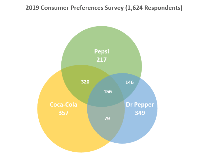
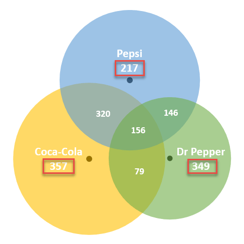
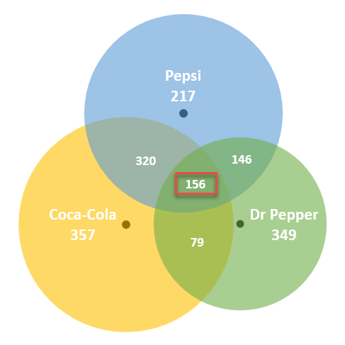
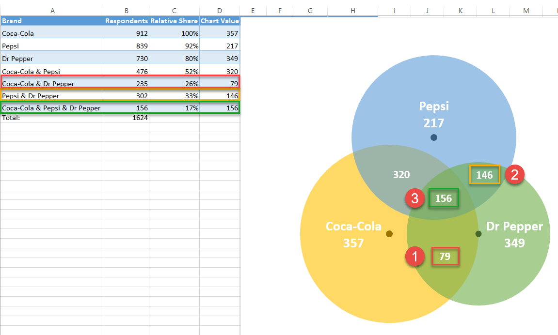
First, we need some raw data to work with. To show you the ropes, as you may have guessed from the example diagram above, we are going to analyze the results of a fictitious survey gauging the brand preferences of 1,624 respondents who drink cola on a daily basis. The brands in question are Coca-Cola, Pepsi, and Dr Pepper.
From all these soft drink lovers, some turned out to be brand evangelists who stuck exclusively to one brand while others opted for two or three brands at once.
With all that said, consider the following table containing the survey results:
 Here’s a quick overview of the table elements:
- Brand – This column defines the sets in the survey as well as all possible combinations of the sets.
- Respondents – This column represents the corresponding values for each set in general and each combination in particular.
- Relative Share (optional) – You may want to compare your data in other ways, such as determining the relative share of each set in relation to the largest set. This column exists for such a purpose. Since Coke is the biggest kid on the block, cell B2 will be our reference value (100%).
So, without further ado, let’s get to work.
Prep Chart Data
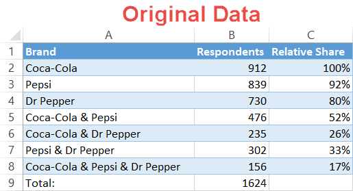
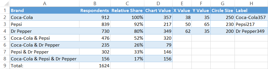
Before you can plot your Venn diagram, you need to compute all the necessary chart data. The first six steps extensively cover how to determine the pieces of the puzzle. By the end of Step #6, your data should look like this:
 For those of you who want to skip the theoretical part and spring right into action, here is the algorithm for you to follow:
- Step #1 – Calculate Chart Values:
- Type “=B2-B5-B6+B8” into cell D2.
- Type “=B3-B5-B7+B8” into cell D3.
- Type “=B4-B6-B7+B8” into cell D4.
- Step #2 – Calculate Chart Values cont.:
- Enter “=B5-$B$8” into D5 and copy the formula down into D6 and D7.
- Step #3 – Calculate Chart Values cont.:
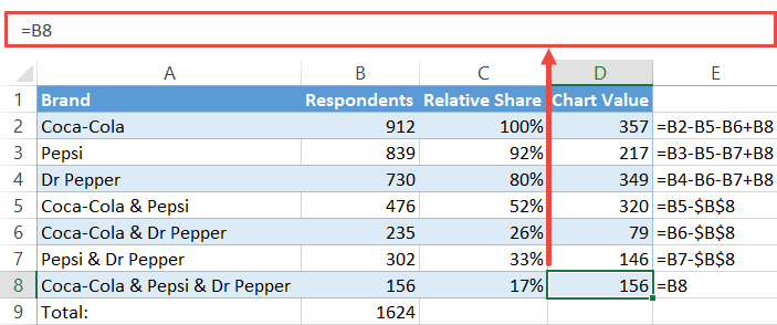
- Set cell D8 equal to B8 by typing “=B8” into D8.
- Step #4 – Position the Bubbles:
- Add the constant values for X and Y to your worksheet just the way you can see on the screenshot above (E2:F4).
- Step #5 – Calculate the Circle Sizes:
- Enter “=250*C2” into G2 and copy it down into the next two cells (G3:G4).
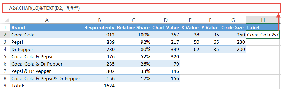
- Step #6 – Create the Diagram Labels:
- Copy “=A2&CHAR(10)&TEXT(D2, “#,##”)” into H2 and copy the formula into the next two cells (H3:H4).
Now let’s break down each step into more detail.
Step #1: Find the number of elements belonging exclusively to one set.
Unfortunately, you can’t simply take the numbers from the original data table and run with them. If you were to do so, you would actually count some of the survey answers multiple times, effectively skewing the data.
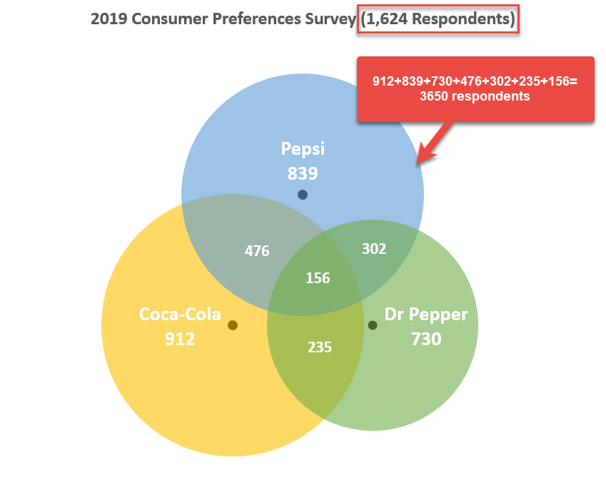
Why is that the case? Well, since a Venn diagram is made up of intersecting areas closely related to one another, any given set can be a part of multiple other sets at once, resulting in duplicate values.
For example, the set “Coca-Cola” (B2) includes all the respondents who voted for the brand, pulling answers from four different categories:
- Cola-Cola & Pepsi
- Coca-Cola & Dr Pepper
- Coca-Cola & Pepsi & Dr Pepper
- Only Coca-Cola
That’s why you need to separate the wheat from the chaff and find a corresponding chart value for each survey option from the original table.
That being said, our first step is to differentiate the respondents who chose solely one cola brand from everybody else. These folks are characterized by the following numbers on the diagram:
- 357 for Coca-Cola
- 217 for Pepsi
- 349 for Dr Pepper
Pick a corresponding value from your actual data (B5) and subtract from it the value representing the area where all the three circles overlap (B8).
Let’s find out how many respondents actually answered “Coca-Cola & Pepsi” by entering this formula into cell D5:
=B5-$B$8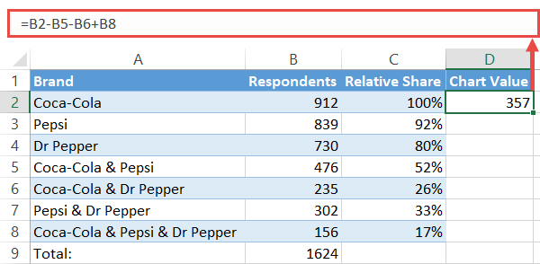
By the same token, use these formulas to find the chart values for categories “Pepsi” (A3) and “Dr Pepper” (A4):
- For “Pepsi,” enter “=B3-B5-B7+B8” in D3.
- For “Dr Pepper,” type “=B4-B6-B7+B8” in D4.
Step #2: Compute the chart values for the intersection areas of two circles.
When computing the numbers representing the intersection of two sets—where the values within a given intersection area simultaneously belong to two sets—the same issue of duplicate values arises.
Fortunately for us, it should only take a moment to work around the problem. Again, these are the numbers we are looking for:
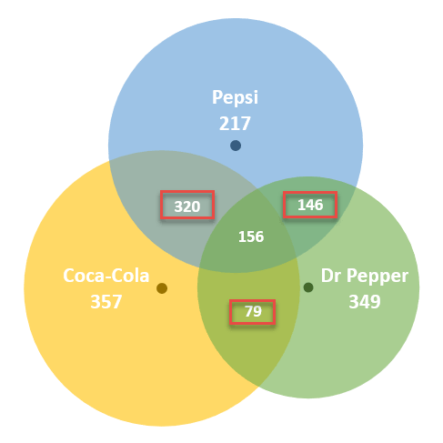
Pick a corresponding value from your actual data (B5) and subtract from it the value representing the area where all the three circles overlap (B8).
Let’s find out how many respondents actually answered “Coca-Cola & Pepsi” by entering this formula into cell D5:
=B5-$B$8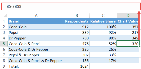
Copy the formula into cells D6 and D7 by dragging down the fill handle.
Step #3: Copy the number linked to the intersection area of three sets into column Chart Value.
The only value that you can take from your original data is the one right in the middle of the diagram.
Complete the column of chart values by copying the number of respondents who chose all the three brands into the adjacent cell (D8). Simply type “=B8” into D8.
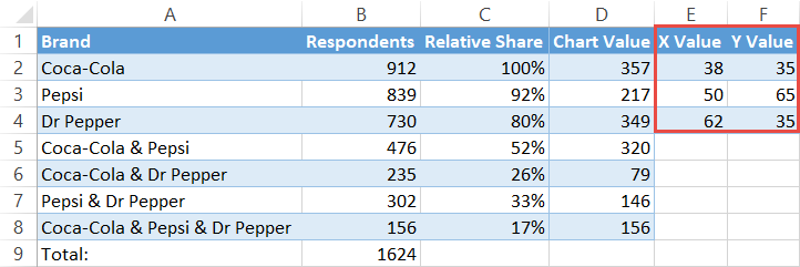
Step #4: Outline the x- and y-axis values for the Venn diagram circles.
In a blank cell near the table with your data, map out the x- and y-axis coordinates which will be used as the centers of the circles.
The following values are constants that will determine the position of Venn diagram circles on the chart plot, giving you full control over how far away from each other the circles will end up being placed.
In Step #13, you will learn how to change the size of the overlapping areas by modifying these values.
For now, all you have to do is copy them into your spreadsheet:
| X Value | Y Value |
| 38 | 35 |
| 50 | 65 |
| 62 | 35 |
For Venn diagrams with only two categories, use these coordinates:
| X Value | Y Value |
| 39 | 50 |
| 66 | 50 |
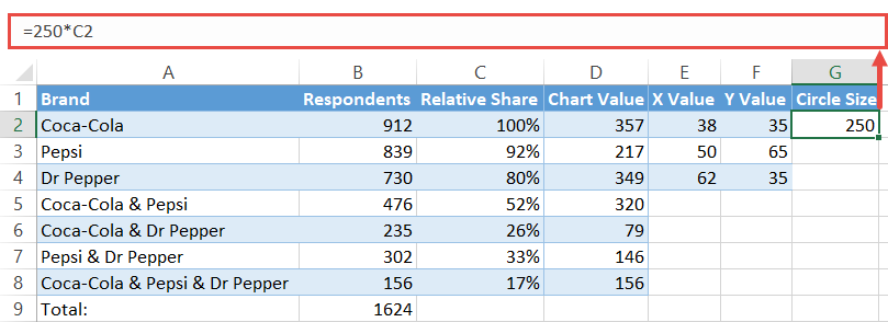
Step #5: Find the Circle Size values illustrating the relative shares (optional).
If you don’t need this data, move on to Step #7.
To make the circles proportional to the reference value (C2), set up a column labeled “Circle Size” and copy this formula into G2.
=250*C2For the record, the number “250” is a constant value based on the coordinates to help the circles overlap.
Execute the formula for the remaining two cells (G3:G4) which signify the other two circles of the diagram by dragging the fill handle.
Step #6: Create custom data labels.
Before we can finally proceed to building the diagram, let’s quickly design custom data labels that will contain the name of a given set along with the corresponding value that counts the number of respondents who chose solely one cola brand.
Set up another dummy column (column H) and enter the following formula into H2:
=A2&CHAR(10)&TEXT(D2, "#,##")Execute the formula for the remaining cells (H3:H4).
Once you have followed all the steps outlined above, your data should look like this:
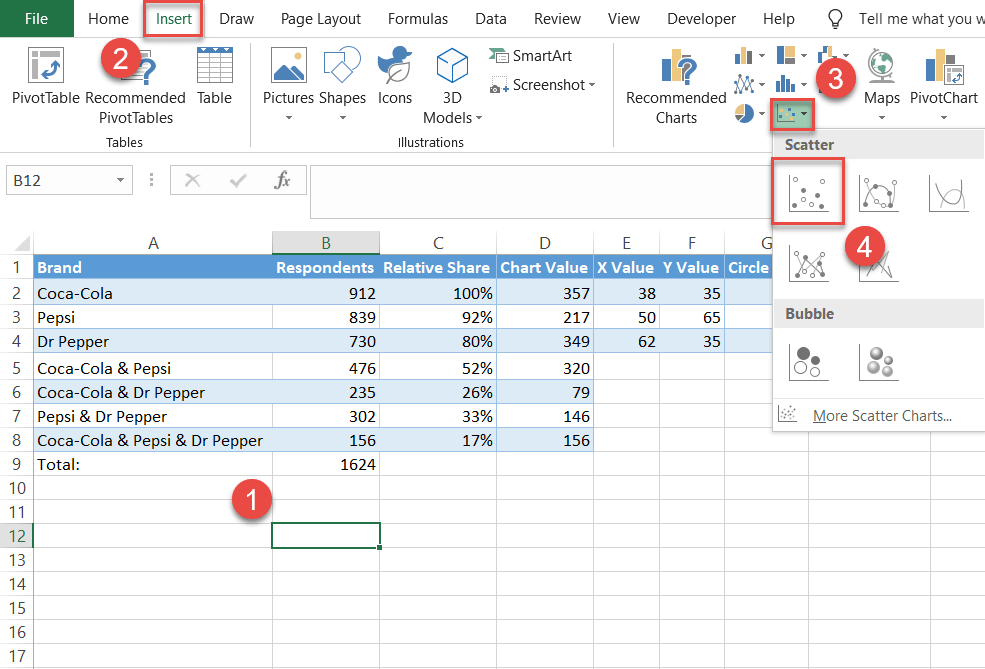
Step #7: Create an empty XY scatter plot.
At last, you have all the chart data to build a stunning Venn diagram. As a jumping-off point, set up an empty scatter plot.
- Select any empty cell.
- Go to the Insert tab.
- Click the “Insert Scatter (X,Y) or Bubble Chart” icon.
- Choose “Scatter.”
Step #8: Add the chart data.
Add the x- and y-axis values to outline the position of the circles. Right-click on the chart plot and pick “Select Data” from the menu that appears.
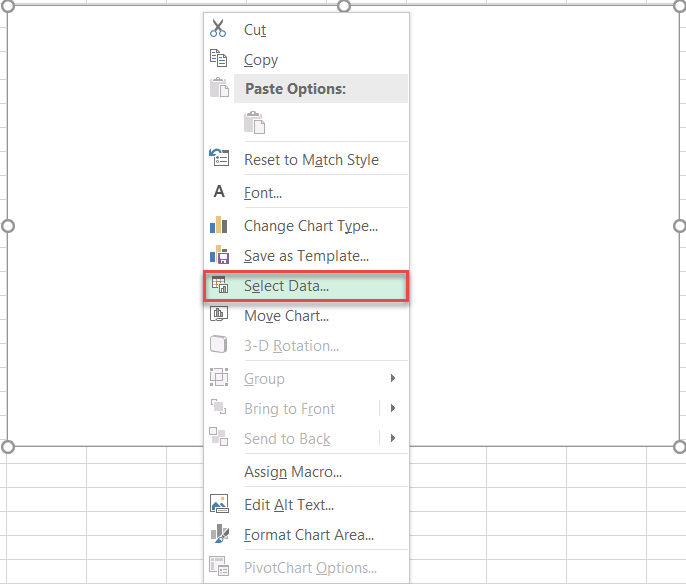
In the Select Data Source dialog box, choose “Add.”
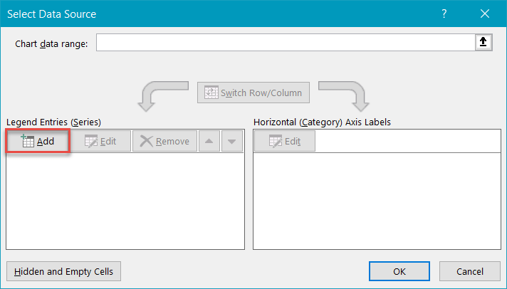
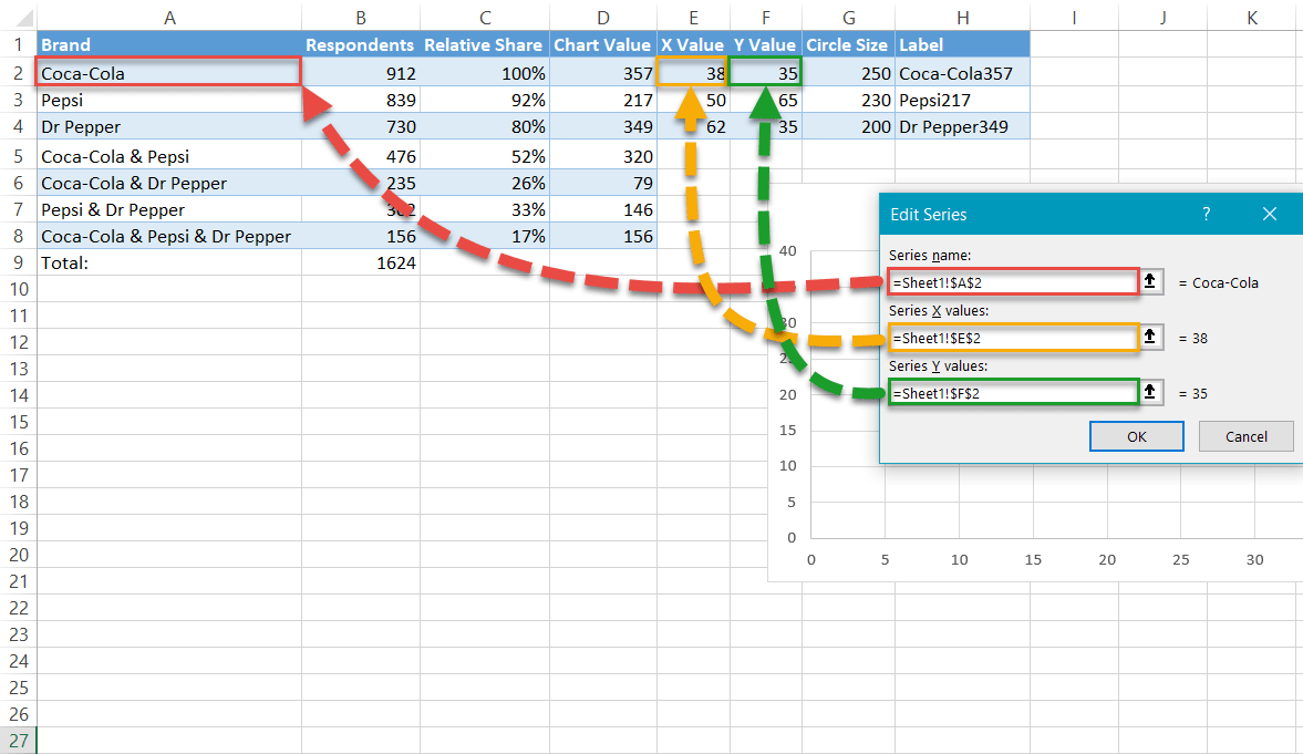
Once there, add a new data series named “Coca-Cola:”
- For “Series name,” highlight cell B2.
- For “Series X values,” select cell E2.
- For “Series Y values,” select cell F2.
Use this method to create Series “Pepsi” (B3, E3, F3) and Series “Dr Pepper” (B4, E4, F4).
Step #9: Change the horizontal and vertical axis scale ranges.
Rescale the axes to start at 0 and end at 100 to center the data markers near the middle of the chart area.
Right-click on the vertical axis and select “Format Axis.”
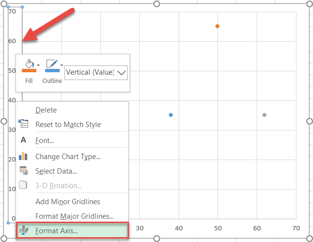
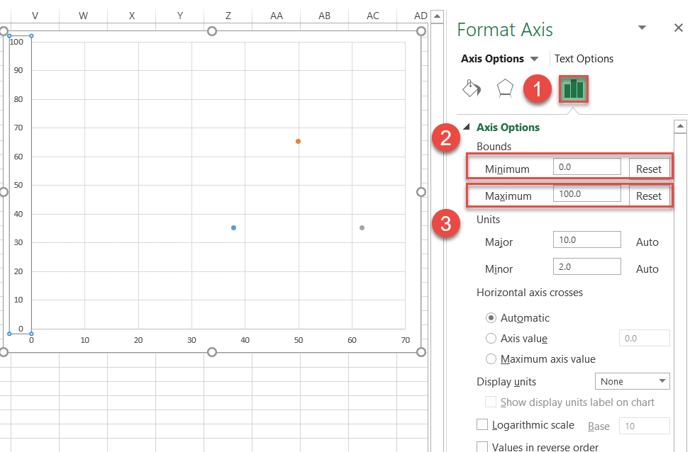
In the Format Axis task pane, do the following:
- Navigate to the Axis Options tab.
- Set the Minimum Bounds to “0.”
- Set the Maximum Bounds to “100.”
Jump to the horizontal axis and repeat the same process.
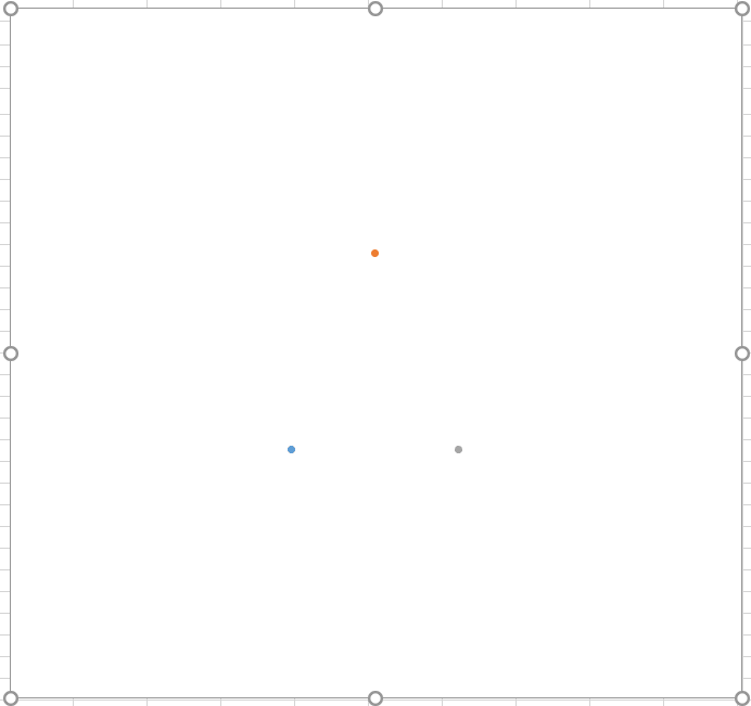
Step #10: Remove the axes and the gridlines.
Clean up the chart by erasing the axes and gridlines. Right-click each element and select “Delete.”
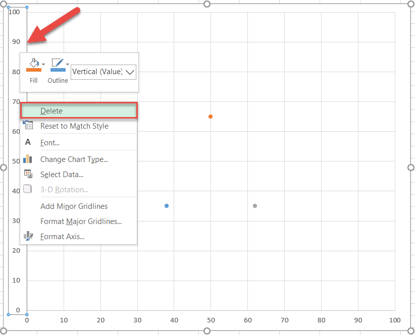
Now would be a good time to make your chart larger so you can better see your new fancy Venn diagram. Select the chart and drag the handles to enlarge it.
Here is what you should have at this point—minimalism at its finest:
Step #11: Enlarge the data markers.
To streamline the process, make the markers larger or they will get buried beneath the circles further down the road.
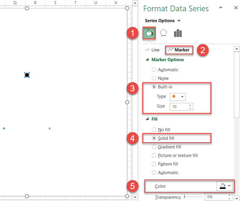
Right-click on any of the three data markers and choose “Format Data Series.”
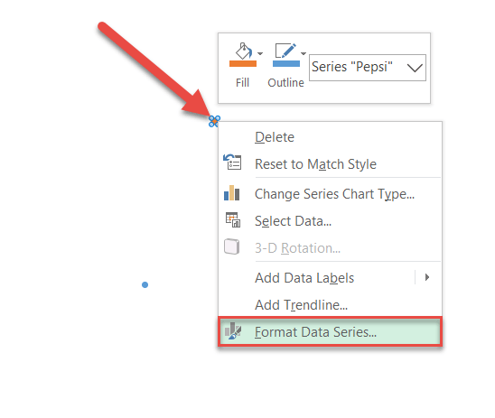
In the task pane, follow these simple steps:
- Click the “Fill & Line” icon.
- Switch to the Marker tab.
- Under “Marker Options,” check the “Built-in” radio button and set the Size value to “10.”
- Under “Fill,” select “Solid Fill.”
- Click the “Fill Color” icon to open the color palette and choose black.
Rinse and repeat for each data series.
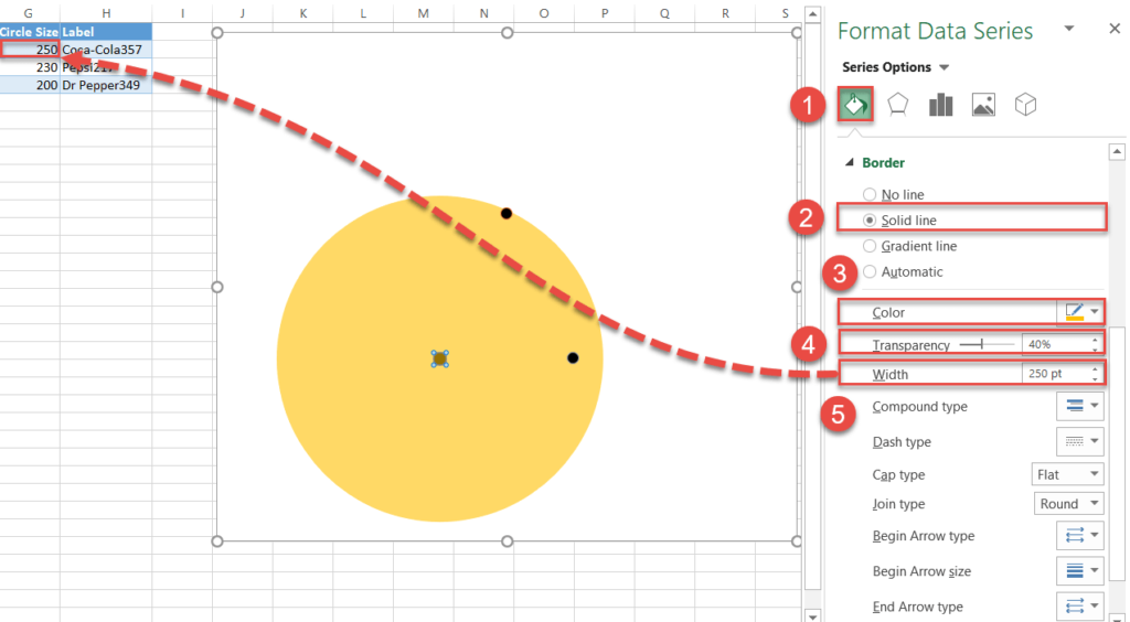
Step #12: Draw the circles.
Without closing the tab, scroll down to the Border section and create the circles for the Venn diagram by following these instructions:
- Click “Solid line.”
- Open the color palette and choose different colors for each data marker:
- For Series “Coca-Cola,” pick gold.
- For Series “Pepsi,” select green.
- For Series “Dr Pepper,” choose blue.
- Change “Transparency” to “40%.”
- Change “Width” for each data series to the corresponding values in column Circle Size (column G):
- For Series “Coca-Cola,” enter “250” (G2).
- For Series “Pepsi,” type in “230” (G3).
- For Series “Dr Pepper,” set the value to “200” (G4).
NOTE: If you want the circles to be the same, simply set the Width value to “250” for each.
Step #13: Change the x- and y-axis coordinates to adjust the overlapping areas (optional).
Normally, you should leave the X and Y coordinates determining the position of circles unaltered. However, for those looking to customize the way the circles should overlap, here is how you do it.
To refresh your memory, take a look at the coordinates underlying the Venn diagram used in the tutorial.
| X Value | Y Value |
| 38 | 35 |
| 50 | 65 |
| 62 | 35 |
These are the x- and y-axis values positioning the first (Series “Coca-Cola”), second (Series “Pepsi”), and third (Series “Dr Pepper”) circle respectively. Here is how it works:
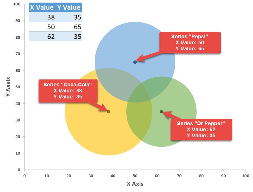
As you may have guessed, you can effortlessly change how much the circles overlap by modifying the coordinates—which allows you to move the circles left and right (x-axis values) and up and down (y-axis values) however you see fit.
For instance, let’s push the circle representing Series “Coca-Cola” a bit upward—thereby increasing the overlapping area between Series “Coca-Cola” and Series “Pepsi”—since we have a comparatively large number of respondents drinking only these two brands.
To pull off the trick, simply alter the corresponding y-axis value.
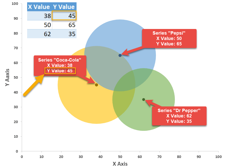
Using this method will take your Venn diagrams to a whole new level, making them unbelievably versatile.
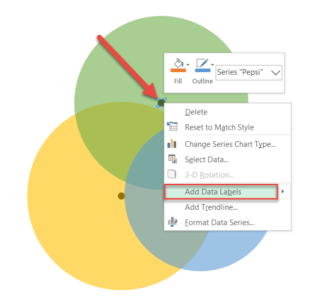
Step #14: Add data labels.
The rest of the steps will be dedicated to making the diagram more informative.
Repeat the process outlined in steps 14 and 15 for each data series.
First, let’s add data labels. Right-click on the data marker representing Series “Pepsi” and choose “Add Data Labels.”
Step #15: Customize data labels.
Replace the default values with the custom labels you previously designed. Right-click on any data label and choose “Format Data Labels.”
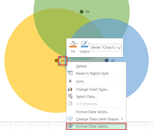
Once the task pane pops up, do the following:
- Go to the Label Options tab.
- Click “Value From Cells.”
- Highlight the corresponding cell from column Label (H2 for Coca-Cola, H3 for Pepsi, and H4 for Dr Pepper).
- Click “OK.”
- Uncheck the “Y Value” box.
- Uncheck the “Show Leader Lines” box.
- Under “Label Position,” choose the following:
- For Series “Pepsi,” click “Above.”
- For Series “Coca-Cola,” select “Left.”
- For Series “Dr Pepper,” pick “Right.”
- Adjust font size/boldness/color under Home > Font.
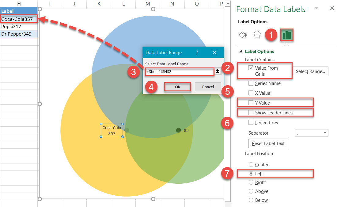
When you have finished this step, your diagram should look like this:
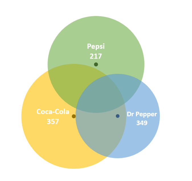
Step #16: Add text boxes linked to the intersection values.
Insert four text boxes for each overlapping part of the diagram to display the corresponding number of people who opted for multiple brands at once.
- Select the plot area.
- Go to the Insert tab.
- Click the “Text Box” button.
- Create a text box.
- Type “=” into the Formula Bar.
- Highlight the corresponding cell from column Chart Value (column D).
- Adjust font size/boldness/color to match the other labels under Home > Font.
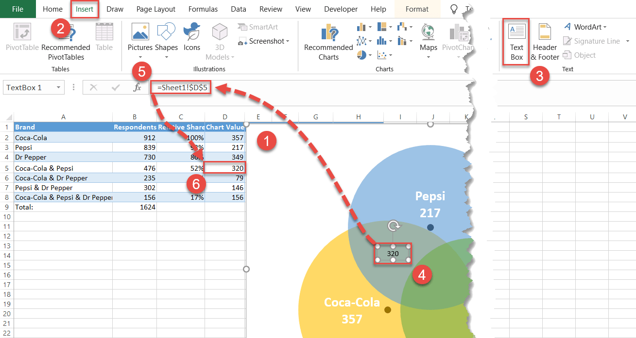
In the same way, add the rest of the overlap values to the chart. Here is another screenshot to help you navigate through the process.
Step #17: Hide the data markers.
You no longer need the data markers supporting the diagram, so let’s make them invisible. Right-click on any data marker, open the Format Data Series tab, and do the following:
- Click the “Fill & Line” icon.
- Switch to the Marker tab.
- Under “Fill,” choose “No fill.”
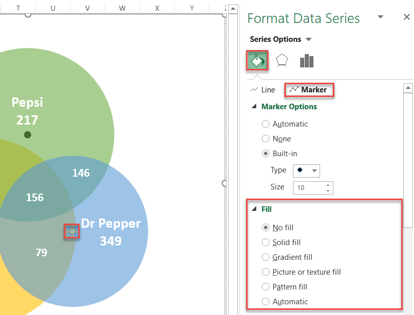
Repeat the process for each data marker.
Step #18: Add the chart title.
Finally, add the chart title:
- Select the plot area.
- Click the “Chart Elements” icon.
- Check the “Chart Title” box.
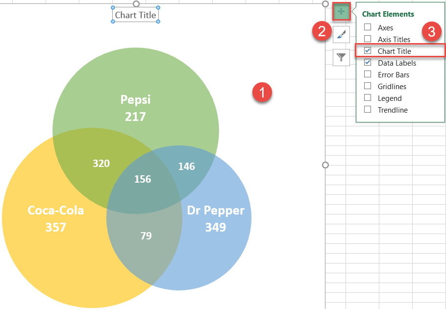
Change the chart title to fit your data, and your stellar Venn diagram is ready!
Download Venn Diagram Template
Download our free Venn Diagram Template for Excel.
Download Now
Содержание
- Начиная
- Подготовить данные диаграммы
- Шаг №1: Найдите количество элементов, принадлежащих исключительно одному набору.
- Шаг № 2: Вычислите значения диаграммы для областей пересечения двух кругов.
- Шаг № 3: Скопируйте число, связанное с областью пересечения трех наборов, в столбец «Значение диаграммы».
- Шаг №4: Обведите значения по осям x и y для кругов диаграммы Венна.
- Шаг № 5: Найдите значения размера круга, иллюстрирующие относительные доли (необязательно).
- Шаг № 6: Создайте собственные метки данных.
- Шаг № 7: Создайте пустой график рассеяния XY.
- Шаг № 8: Добавьте данные диаграммы.
- Шаг № 9: Измените диапазон шкалы горизонтальной и вертикальной оси.
- Шаг № 10: Удалите оси и линии сетки.
- Шаг № 11: Увеличьте маркеры данных.
- Шаг № 12: Нарисуйте круги.
- Шаг № 13: Измените координаты оси X и Y, чтобы настроить области перекрытия (необязательно).
- Шаг № 14: Добавьте метки данных.
- Шаг № 15: Настройте метки данных.
- Шаг №16: Добавьте текстовые поля, связанные со значениями пересечения.
- Шаг № 17: Скройте маркеры данных.
- Шаг № 18: Добавьте заголовок диаграммы.
В этом руководстве будет показано, как создать диаграмму Венна во всех версиях Excel: 2007, 2010, 2013, 2016 и 2022.
Диаграмма Венна — это диаграмма, которая сравнивает два или более наборов (наборов данных) и иллюстрирует различия и сходства между ними с перекрывающимися кругами. Вот как это работает: круг представляет все элементы в данном наборе, а области пересечения характеризуют элементы, которые одновременно принадлежат к нескольким наборам.
Диаграмма помогает продемонстрировать все возможные взаимосвязи между наборами, обеспечивая бездонный колодец аналитических данных — вот почему она широко используется во многих отраслях.
К сожалению, этот тип диаграммы не поддерживается в Excel, поэтому вам придется создавать его с нуля самостоятельно. Кроме того, не забудьте попробовать нашу надстройку для создания диаграмм, инструмент для создания потрясающих расширенных диаграмм Excel, не поднимая пальца.
К концу этого пошагового руководства вы узнаете, как построить динамическую диаграмму Венна с двумя или тремя категориями в Excel полностью с нуля.

Начиная
Во-первых, нам нужны необработанные данные для работы. Чтобы показать вам основы, как вы, возможно, догадались из приведенного выше примера диаграммы, мы собираемся проанализировать результаты вымышленного опроса, в котором оцениваются предпочтения брендов 1624 респондентов, которые пьют колу ежедневно. Речь идет о брендах Coca-Cola, Pepsi и Dr Pepper.
Из всех этих любителей безалкогольных напитков некоторые оказались проповедниками бренда, которые придерживались исключительно одного бренда, а другие выбрали сразу два или три бренда.
С учетом всего вышесказанного, обратите внимание на следующую таблицу, содержащую результаты опроса:
 Вот краткий обзор элементов таблицы:
- Марка — В этом столбце определяются наборы в опросе, а также все возможные комбинации наборов.
- Респонденты — В этом столбце представлены соответствующие значения для каждого набора в целом и каждой комбинации в частности.
- Относительная доля (необязательно) — Вы можете сравнить свои данные другими способами, например, определить относительную долю каждого набора по отношению к самому большому набору. Этот столбец существует для такой цели. Поскольку кока-кола — самый большой ребенок в округе, ячейка B2 будет нашим эталонным значением (100%).
Итак, без лишних слов, приступим к работе.
Подготовить данные диаграммы
Прежде чем вы сможете построить диаграмму Венна, вам необходимо вычислить все необходимые данные диаграммы. Первые шесть шагов подробно описывают, как определять части головоломки. К концу шага 6 ваши данные должны выглядеть так:
 Для тех из вас, кто хочет пропустить теоретическую часть и сразу приступить к делу, вот алгоритм, которому вы должны следовать:
- Шаг № 1 — Расчет значений диаграммы:
- Тип «= B2-B5-B6 + B8”В камеру D2.
- Тип «= B3-B5-B7 + B8”В камеру D3.
- Тип «= B4-B6-B7 + B8 ” в камеру D4.
- Шаг № 2 — Расчет значений диаграммы (продолжение):
- Входить “= B5- $ B $ 8» в D5 и скопируйте формулу в D6 а также D7.
- Шаг № 3 — Расчет значений диаграммы (продолжение):
- Установите ячейку D8 равной B8, набрав «= B8» в D8.
- Шаг № 4 — Расположите пузыри:
- Добавьте на лист постоянные значения для X и Y, как показано на скриншоте выше (E2: F4).
- Шаг № 5 — Рассчитайте размеры круга:
- Входить «= 250 * C2» в G2 и скопируйте его в следующие две ячейки (G3:G4).
- Шаг № 6 — Создайте метки диаграмм:
- Копировать «= A2 & СИМВОЛ (10) & ТЕКСТ (D2; «#, ##»)» в H2 и скопируйте формулу в следующие две ячейки (H3: H4).
Теперь давайте разберем каждый шаг более подробно.
Шаг №1: Найдите количество элементов, принадлежащих исключительно одному набору.
К сожалению, вы не можете просто взять числа из исходной таблицы данных и использовать их. Если бы вы сделали это, вы бы фактически пересчитали некоторые ответы на опрос несколько раз, что фактически исказило бы данные.

Почему так? Итак, поскольку диаграмма Венна состоит из пересекающихся областей, тесно связанных друг с другом, любой заданный набор может быть частью нескольких других наборов одновременно, что приводит к дублированию значений.
Например, набор «Кока-Кола» (Би 2) включает в себя все респонденты, проголосовавшие за бренд, получили ответы из четырех разных категорий:
- Кола-Кола и Пепси
- Coca-Cola и Dr Pepper
- Coca-Cola, Pepsi и Dr Pepper
- Только Кока-Кола
Вот почему вам нужно отделить пшеницу от плевел и найти соответствующее значение диаграммы для каждого варианта опроса из исходной таблицы.
При этом наш первый шаг — отличить респондентов, выбравших только одну марку колы, от всех остальных. Эти люди характеризуются следующими цифрами на диаграмме:
- 357 для Coca-Cola
- 217 для Pepsi
- 349 для Dr Pepper

Выберите соответствующее значение из ваших фактических данных (B5) и вычтите из него значение, представляющее область, где все три круга перекрываются (B8).
Давайте узнаем, сколько респондентов на самом деле ответили «Кока-Кола и Пепси » введя эту формулу в ячейку D5:

Точно так же используйте эти формулы, чтобы найти значения диаграммы для категорий. «Пепси» (А3) а также «Доктор Пеппер» (A4):
- Для «Пепси,» входить «= B3-B5-B7 + B8» в D3.
- Для «доктор Пеппер,» тип «= B4-B6-B7 + B8» в D4.
Шаг № 2: Вычислите значения диаграммы для областей пересечения двух кругов.
При вычислении чисел, представляющих пересечение двух наборов, когда значения в пределах данной области пересечения одновременно принадлежат двум наборам, возникает та же проблема повторяющихся значений.
К счастью для нас, нужно всего лишь мгновение, чтобы обойти проблему. Опять же, это числа, которые мы ищем:

Выберите соответствующее значение из ваших фактических данных (B5) и вычтите из него значение, представляющее область, где все три круга перекрываются (B8).
Давайте выясним, сколько респондентов на самом деле ответили «Кока-Кола и Пепси » введя эту формулу в ячейку D5:

Скопируйте формулу в ячейки D6 а также D7 перетащив маркер заполнения вниз.
Шаг № 3: Скопируйте число, связанное с областью пересечения трех наборов, в столбец «Значение диаграммы».
Единственное значение, которое вы можете извлечь из исходных данных, — это значение прямо в середине диаграммы.

Заполните столбец значений диаграммы, скопировав количество респондентов, выбравших все три бренда, в соседнюю ячейку (D8). Просто введите «= B8» в D8.

Шаг №4: Обведите значения по осям x и y для кругов диаграммы Венна.
В пустой ячейке рядом с таблицей с вашими данными нарисуйте координаты осей x и y, которые будут использоваться в качестве центров кругов.
Следующие значения являются константами, которые будут определять положение кругов диаграммы Венна на графике, что дает вам полный контроль над тем, как далеко друг от друга будут размещены круги.
На шаге № 13 вы узнаете, как изменить размер перекрывающихся областей, изменив эти значения.
На данный момент все, что вам нужно сделать, это скопировать их в свою электронную таблицу:
| Значение X | Значение Y |
| 38 | 35 |
| 50 | 65 |
| 62 | 35 |

Для диаграмм Венна только двух категорий используйте эти координаты:
| Значение X | Значение Y |
| 39 | 50 |
| 66 | 50 |
Шаг № 5: Найдите значения размера круга, иллюстрирующие относительные доли (необязательно).
Если вам не нужны эти данные, перейдите к Шаг # 7.
Чтобы круги были пропорциональны опорному значению (C2), настройте столбец с надписью «Размер круга»И скопируйте эту формулу в G2.
Для справки: число «250”- это постоянное значение, основанное на координатах, чтобы круги перекрывались.
Выполните формулу для оставшихся двух ячеек (G3: G4), которые обозначают два других круга диаграммы, перетаскивая маркер заливки.

Шаг № 6: Создайте собственные метки данных.
Прежде чем мы наконец приступим к построению диаграммы, давайте быстро создадим пользовательские метки данных, которые будут содержать название данного набора вместе с соответствующим значением, которое подсчитывает количество респондентов, выбравших только одну марку колы.
Настройте еще один фиктивный столбец (столбец H) и введите следующую формулу в H2:
| 1 | = A2 & СИМВОЛ (10) & ТЕКСТ (D2; «#, ##») |
Выполните формулу для остальных ячеек (H3: H4).

После того, как вы выполнили все шаги, описанные выше, ваши данные должны выглядеть следующим образом:

Шаг № 7: Создайте пустой график рассеяния XY.
Наконец-то у вас есть все данные диаграммы, чтобы построить потрясающую диаграмму Венна. В качестве отправной точки настройте пустой график разброса.
- Выберите любую пустую ячейку.
- Перейти к Вставлять таб.
- Щелкните значок «Вставить точечную (X, Y) или пузырьковую диаграмму» значок.
- Выбирать «Разброс.”

Шаг № 8: Добавьте данные диаграммы.
Добавьте значения осей x и y, чтобы очертить положение кругов. Щелкните правой кнопкой мыши график и выберите «Выбрать данные»В появившемся меню.

в Выберите источник данных диалоговом окне выберите «Добавлять.”

Оказавшись там, добавьте новую серию данных с именем «Кока-Кола:”
- Для «Название серии,«Выделить ячейку Би 2.
- Для «Значения серии X,«Выберите ячейку E2.
- Для «Значения серии Y,«Выберите ячейку F2.
Используйте этот метод для создания Серии “Пепси” (B3, E3, F3) а также Серии “доктор Пеппер” (B4, E4, F4).

Шаг № 9: Измените диапазон шкалы горизонтальной и вертикальной оси.
Измените масштаб осей так, чтобы они начинались с 0 и заканчивались на 100, чтобы центрировать маркеры данных около середины области диаграммы.
Щелкните правой кнопкой мыши вертикальную ось и выберите «Ось формата.”

в Ось формата область задач, сделайте следующее:
- Перейдите к Параметры оси таб.
- Установить Минимальные границы к «0.”
- Установить Максимальные границы к «100.”
Перейти к горизонтальной оси и повторить тот же процесс.

Шаг № 10: Удалите оси и линии сетки.
Очистите диаграмму, удалив оси и линии сетки. Щелкните правой кнопкой мыши каждый элемент и выберите «Удалить.”

Сейчас самое время увеличить вашу диаграмму, чтобы вы могли лучше видеть свою новую причудливую диаграмму Венна. Выберите диаграмму и перетащите маркеры, чтобы увеличить ее.
Вот что у вас должно получиться — минимализм в лучшем виде:

Шаг № 11: Увеличьте маркеры данных.
Чтобы упростить процесс, сделайте маркеры больше, иначе они будут погребены под кругами дальше по дороге.
Щелкните правой кнопкой мыши любой из трех маркеров данных и выберите «Форматировать ряд данных.”

На панели задач выполните следующие простые шаги:
- Щелкните значок «Заливка и линия» значок.
- Переключитесь на Маркер таб.
- Под «Параметры маркера,» проверить «Встроенный«И установите Размер значение «10.”
- Под «Наполнять,» Выбрать «Сплошная заливка.”
- Щелкните значок «Цвет заливки», Чтобы открыть цветовую палитру и выбрать чернить.
Промойте и повторите для каждой серии данных.

Шаг № 12: Нарисуйте круги.
Не закрывая вкладку, прокрутите вниз до Граница раздел и создайте круги для диаграммы Венна, следуя этим инструкциям:
- Нажмите «Сплошная линия.”
- Откройте цветовую палитру и выберите разные цвета для каждого маркера данных:
- Для Серии “Кока-Кола,» выбирать золото.
- Для Серии “Пепси,» Выбрать зеленый.
- Для Серии “Доктор Пеппер,» выбирать синий.
- Изменять «Прозрачность» к «40%.”
- Изменять «Ширина”Для каждой серии данных к соответствующим значениям в столбец Размер круга (столбец G):
- Для Серии “Кока-Кола,» входить «250» (G2).
- Для Серии “Пепси,» введите “230” (G3).
- Для Серии “Доктор Пеппер,”Установите значение на «200» (G4).
ПРИМЕЧАНИЕ: Если вы хотите, чтобы круги были одинаковыми, просто установите Ширина значение «250» для каждого.

Шаг № 13: Измените координаты оси X и Y, чтобы настроить области перекрытия (необязательно).
Обычно координаты X и Y, определяющие положение кругов, следует оставлять неизменными. Однако для тех, кто хочет настроить способ перекрытия кругов, вот как это сделать.
Чтобы освежить память, взгляните на координаты, лежащие в основе диаграммы Венна, используемой в учебнике.
| Значение X | Значение Y |
| 38 | 35 |
| 50 | 65 |
| 62 | 35 |
Это значения по осям x и y, определяющие положение первого (Серия «Кока-Кола»), второй (Серия «Пепси»), а третий (Серия «Dr Pepper») круг соответственно. Вот как это работает:

Как вы, возможно, догадались, вы можете легко изменить степень перекрытия кругов, изменив координаты, что позволяет вам перемещать круги влево и вправо (значения оси X) и вверх и вниз (значения оси Y), как вы сочтете нужным. .
Например, давайте нажмем круг, представляющий Серия «Кока-Кола» немного вверх — тем самым увеличивая площадь перекрытия между Серия «Кока-Кола» а также Серия «Пепси»-Поскольку у нас сравнительно большое количество респондентов пьют только эти два бренда.
Чтобы осуществить трюк, просто измените соответствующее значение оси Y.

Использование этого метода поднимет ваши диаграммы Венна на совершенно новый уровень, сделав их невероятно универсальными.
Шаг № 14: Добавьте метки данных.
Остальные шаги будут посвящены тому, чтобы сделать диаграмму более информативной.
Повторите процесс, описанный в шагах 14 и 15 для каждой серии данных.
Во-первых, давайте добавим метки данных. Щелкните правой кнопкой мыши маркер данных, представляющий Серия «Пепси» и выберите «Добавьте метки данных.”

Шаг № 15: Настройте метки данных.
Замените значения по умолчанию на ранее созданные вами пользовательские метки. Щелкните правой кнопкой мыши любую метку данных и выберите «Отформатируйте метки данных.”

Когда появится панель задач, сделайте следующее:
- Перейти к Параметры метки таб.
- Нажмите «Значение из ячеек.”
- Выделите соответствующую ячейку в столбце Ярлык (H2 для Coca-Cola, H3 для Pepsi и H4 для Dr Pepper).
- Нажмите «OK.”
- Снимите флажок «Значение Y» коробка.
- Снимите флажок «Показать линии выноски» коробка.
- Под «Положение ярлыка,”Выберите следующее:
- Для Серии “Пепси,«Нажмите»Выше.”
- Для Серии “Кока-Кола,» Выбрать «Левый.”
- Для Серии “Доктор Пеппер,» выбирать «Верно.”
- Отрегулируйте размер / жирность / цвет шрифта под Дом > Шрифт.

Когда вы закончите этот шаг, ваша диаграмма должна выглядеть так:

Шаг №16: Добавьте текстовые поля, связанные со значениями пересечения.
Вставьте четыре текстовых поля для каждой перекрывающейся части диаграммы, чтобы отобразить соответствующее количество людей, выбравших сразу несколько брендов.
- Выберите область построения.
- Перейти к Вставлять таб.
- Щелкните значок «Текстовое окно» кнопка.
- Создайте текстовое поле.
- Тип «=”В Панель формул.
- Выделите соответствующую ячейку из столбец Диаграмма Значение (столбец D).
- Отрегулируйте размер / полужирность / цвет шрифта, чтобы они соответствовали другим меткам в Дом > Шрифт.

Таким же образом добавьте на диаграмму остальные значения перекрытия. Вот еще один снимок экрана, который поможет вам сориентироваться в процессе.

Шаг № 17: Скройте маркеры данных.
Маркеры данных, поддерживающие диаграмму, больше не нужны, поэтому давайте сделаем их невидимыми. Щелкните правой кнопкой мыши любой маркер данных, откройте Форматировать ряд данных tab и сделайте следующее:
- Щелкните значок «Заливка и линия» значок.
- Переключитесь на Маркер таб.
- Под «Наполнять,» выбирать «Без заливки.”

Повторите процесс для каждого маркера данных.
Шаг № 18: Добавьте заголовок диаграммы.
Наконец, добавьте заголовок диаграммы:
- Выберите область построения.
- Щелкните значок «Элементы диаграммы» значок.
- Проверить «Заголовок диаграммы» коробка.

Измените заголовок диаграммы в соответствии с вашими данными, и ваша звездная диаграмма Венна готова!
Excel Venn Diagram (Table of Contents)
- Introduction to Venn Diagrams in Excel
- How to Create Venn Diagram in Excel?
Introduction to Venn Diagrams in Excel
A Venn diagram is a diagram or illustration of the relationships between and among sets (different groups of objects). It is a pictorial representation of logical or mathematical sets that are drawn in an enclosing rectangle (rectangle representing the universal set) as circles.
Each circle represents a set, and the points inside the circle represent the elements of the set. The interior of the circle represents elements that are not in the set. Common elements of the sets are represented as intersections of the circles. Venn diagrams are called so as John Venn invented them.
How to Create Venn Diagram in Excel?
Let’s understand how to Create Venn Diagram in Excel with a few examples.
You can download this Venn Diagram Excel Template here – Venn Diagram Excel Template
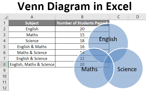
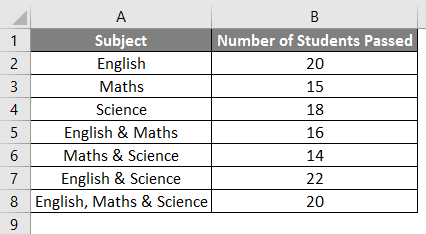
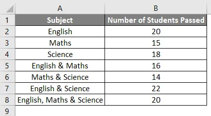
Example #1
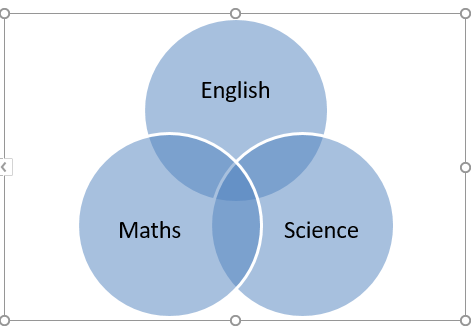
Let’s say we wish to draw a Venn diagram for the number of students who passed (out of 25) in the subjects: Maths, English, and Science. We have the following students’ data in an Excel sheet.
Now the following steps can be used to create a Venn diagram for the same in Excel.
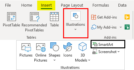
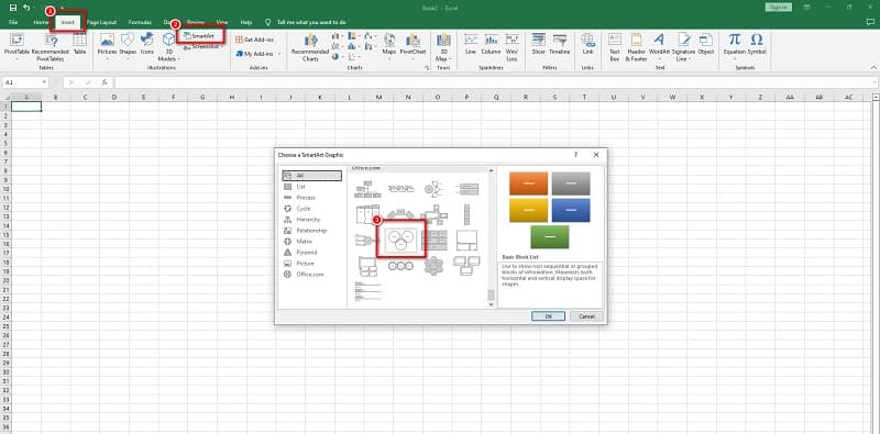
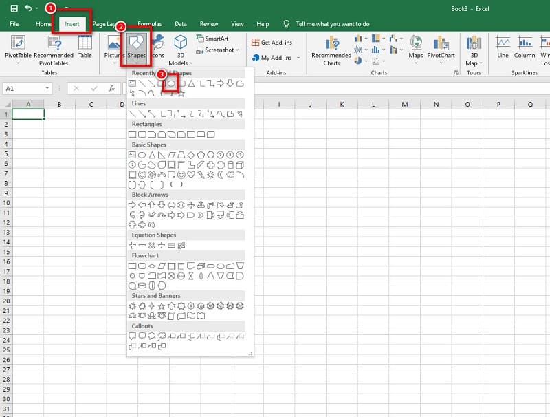
- Click on the ‘Insert’ tab and then click on ‘SmartArt’ in the ‘Illustrations’ group as follows:
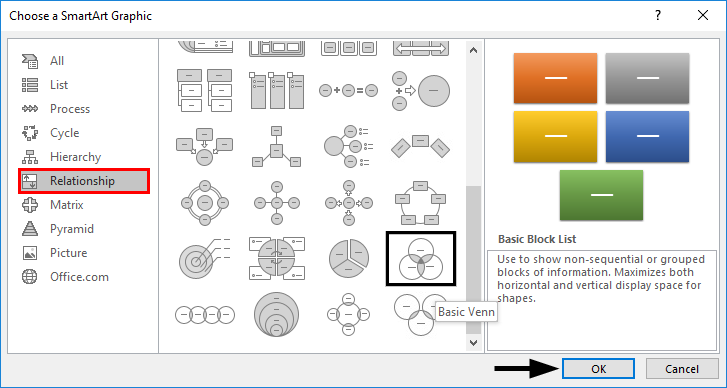
- Now click on ‘Relationship’ in the new window and then select a Venn diagram layout (Basic Venn) and click ‘OK.
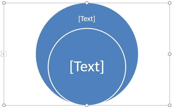
- This will display a Venn diagram layout as follows:
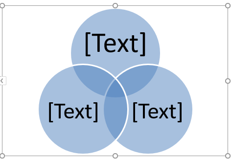
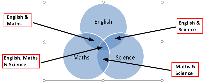
- Now the text on the circles can be changed by clicking on [Text] in the Text pane in circles and then renaming it so as to depict what the circles represent.
- We can add text in overlapping portions of the circles by inserting a text box.
Example #2
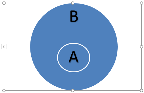
Let’s say there are two sets A & B defined as A= {1, 2}, and B= {2, 3}, and we wish to find A U B (A union B). A union is defined as something that is present in either of the groups or sets.
So A U B means the elements or numbers from either A or B.
- A U B= {1, 2} U {2, 3}
- A U B= {1, 2, 3}
So let’s see how this can be represented in a Venn diagram.
- Click on the ‘Insert’ tab and then click on ‘SmartArt’ in the ‘Illustrations’ group as follows.
- Now click on ‘Relationship’ in the new window and then select a Venn diagram layout (Basic Venn) and click ‘OK.

- This will display a Venn diagram layout as follows.
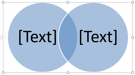
We can also choose ‘Linear Venn’ instead of the ‘Basic Venn’ layout and then delete some circles. Now since there are only two sets (A & B) in this case, we delete one of the circles from the Venn diagram as follows.
- Click one of the circle and press the ‘Delete’ button. This will lead us to a Venn diagram below:
- Now the text on the circles can be changed by clicking on [Text] in the Text pane in circles and then renaming it so as to depict what the circles represent.

Just like Union, there is another term generally used for sets which are ‘Intersection’ which means something that is present in all of the groups or sets.
So, in this case, An intersection B (A ∩ B) would be numbers or elements that are present in both A & B.
- A ∩ B= {2}
Just like deletion, we can even add circles to the Venn diagram by following the below steps.
- Right-click the existing circle, which is closest to where the new circle is to be added. Now click on ‘Add Shape’, and then click on ‘Add Shape After’ or ‘Add Shape Before’.
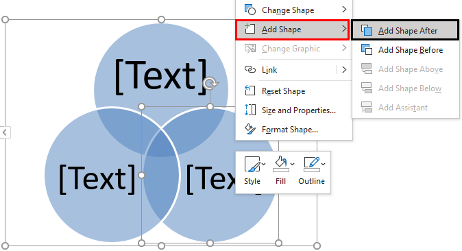
After adding the shape, the output is shown below.
Example #3
Let’s say there are two sets A & B defined as A= {1, 3, 5} and B= {1, 2, 3, 4, 5, 6}, and we wish to find A U B (A union B). So as seen in the above example, A U B means the elements or numbers from either A or B.
- A U B= {1, 3, 5} U {1, 2, 3, 4, 5, 6}
- A U B= {1, 2, 3, 4, 5, 6}
So let’s see how this can be represented in a Venn diagram.
- Click on the ‘Insert’ tab and then click on ‘SmartArt’ in the ‘Illustrations’ group as follows.
- Now click on ‘Relationship’ in the new window and then select a Venn diagram layout (Stacked Venn) and click ‘OK.
- This will display a Venn diagram layout as follows.
Now since there are only two sets (A & B) in this case, so we delete the extra circles from the Venn diagram by right-clicking on them and pressing ‘Delete’. This will lead us to a Venn diagram as below.
A is a subset of B, so if B represents the outer circle, A will represent the inner circle. Also, since all the elements of A are also present in B, so we can reposition the inner circle by dragging it.
In this case, A U B will be equal to B as A is a subset of B. Also, A U B will be equal to A.
Things to Remember About Venn Diagram in Excel
- Venn diagrams illustrate simple set relationships. They are generally used in probability, statistics, computer science, and physics.
- Overlapping circles are used in Venn diagrams to show the similarities, differences, and relationships between different group of objects. The overlapping portions represent the similarities between groups, and the non-overlapping portions represent the differences.
- Venn diagrams enable us to organize information visually so as to see relationships between two or more set of items. Venn diagram can also be created via drawing tools available in Excel.
- We can even apply a SmartArtStyle to the Venn diagram. To do this, click on the ‘Design’ tab in the “SmartArt Tools and then click on the layout that is desired :
- We can even apply color combinations to the circles in the Venn diagram and change their colors as desired. Also, we can add soft edges, glows, and 3D effects. To do this, click on the ‘Design’ tab in the “SmartArt Tools and then click on ‘Change Colors’ and select the desired color theme:
Recommended Articles
This is a guide to Venn Diagram in Excel. Here we discuss creating Venn Diagrams in Excel and practical examples, and a downloadable excel template. You can also go through our other suggested articles –
- Dot Plots in Excel
- Family Tree in Excel
- Marimekko Chart Excel
- Interactive Chart in Excel
(Note: This guide on how to create a Venn diagram in Excel is suitable for all Excel versions including Office 365)
We all know how graphical presentation helps in better interpretation of data. Especially when a large amount of data is present with intricate details, pictorial representations greatly improve the readability of information.
The Venn diagram is one such very important way of data presentation.
In this guide, I will show you what a Venn diagram is, why we use them, and how to create a Venn diagram in Excel using 2 easy methods.
You’ll Learn:
- What Is a Venn diagram?
- How to Create a Venn Diagram in Excel?
- By Using SmartArt
- Move the Diagram
- Add Text
- Add a Shape
- Additional Elements
- By Using Shapes
- Move/Resize the Shape
- Add Text
- Customize
- By Using SmartArt

Watch our video on how to create a Venn diagram in Excel
Related Reads:
How to Make a Pie Chart in Excel? A Step by Step Guide
How to Make a Pareto Chart Excel Dashboard? 4 Easy Steps
How to Create a Step Chart in Excel?
What Is a Venn diagram?
The concept of the Venn diagram is not new to us. We have learned them from our high school.
The Venn diagram consists of two or more circles. Each circle represents one type of data. To represent the similarities in the data, the circles can overlap either partially or completely.
This type of representation is mostly used to represent the similarities and differences between one or a group of data.
How to Create a Venn Diagram in Excel?
Creating a Venn diagram in Excel is pretty much similar to creating and customizing other graphs and charts.
Imagine: You run a cafe. To analyze the demand and supply, you want to take a survey from the visitors. People are given 3 choices and are asked to choose their favorite beverage: milk, tea, or coffee. They can even choose either both or all three of them.

I will show you how to create a Venn diagram in Excel in 2 simple ways.
By Using SmartArt
By using SmartArt, you can easily create a Venn diagram in Excel. Just select a suitable template, change the text, and add additional customization based on your preferences.
To create a SmartArt Venn diagram, navigate to Insert. Under Illustrations, from the dropdown click on SmartArt.

This opens up a Choose a SmartArt Graphic dialog box which shows the different templates to create a SmartArt graphic.

Click on Relationship. Scroll down and click on the Venn diagram you want to select.

Clicking on the choice of your Venn diagram shows up the description for the selected graphic. Click OK.

This populates the basic layout of the Venn diagram in the middle of the Excel sheet.

Now, let us see how to customize and format the Venn diagram based on your needs.
Move the Diagram
The circles usually populate the center of the chart. In some cases, this might be a little inconvenient to present other data. You can move the whole chart or individual circles depending on your preferences.
To move the whole chart, click anywhere near the circle. This shows anchor points all around the circle. Now, hover your mouse pointer anywhere on the borderline. This changes the mouse pointer to a four-sided pointer. Click and drag to move the chart.
If you want to resize the chart, place your mouse pointer on the anchor points. This changes the mouse pointer to a two-sided pointer. Click and drag to resize the chart.

Likewise, you can move each circle and resize them. Click on the circle. Use the borderline to move the circle and use the anchor points to resize the circles.

Add Text
The basic Venn diagram that populates the center of the sheet only contains [Text]. This pertains to the header of the individual circles of the Venn diagram.
You can change the headers of the individual circles by clicking on them and typing the relevant text. In most cases, Excel automatically adjusts the font size of the text to the size of the chart. You can also double-click on the text to change the font style, text, color, and alignment.

If there are more Venn elements, you can click on the arrow button to the left of the chart or click on the Text Pane under SmartArt Design to open the header pane. This way, you can change the headers of all the elements in one go.

Once you have added the headers, there will also be a necessity to add text inside the circles and in between the overlapping spaces.
You can add text inside the circles using bullets. Select the circle you want to add bullets. Navigate to SmartArt Design, under Create Graphic, and click on Add Bullet. This adds bullet points to the selected circle.

One drawback is that you cannot add text to the overlapping spaces using bullet points.
To do that, navigate to Insert. Under Illustrations, click the dropdown from Shapes and select the Text Box.

This gives you the liberty to enter any text anywhere you want. Left-click and drag the cursor to create a text box in your preferred place. Enter your text.

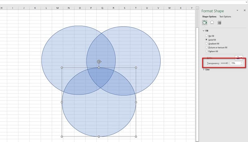
Though the text is added, you can see the text box is populating oddly. To remove that, right-click on the text box and click on Format Shape. This opens a Format Shape pane on the right side of the Excel sheet.

Under Shape Options, select No Fill in both Fill and Line dropdowns.

This removes the background of the text box. Now, you can go to the Text Options and customize the text to your preference.
Add a Shape
The basic Venn diagram only consists of three circles to represent three parameters. However, in some cases, there might be a need for more than three circles to represent data. In such cases, you can add shape to the existing Venn diagram.
Navigate to SmartArt Design. Under Create Graphic, click on Add Shape.

This adds another shape to the original Venn diagram to represent the data.

In case you feel like there is no need for an additional shape, you can always delete them. Just select the shape you want to delete and click on the Delete key.

This deleted the additional shape and the chart returned to its original format.
Additional Elements
You can use the SmartArt Design and Format option in the main menu to add additional customizations.
In some cases, the usual three circles partially overlapping Venn diagram might be an ideal choice to represent the data. Navigate to SmartArt Design and change the layout of the chart to any preferred Venn diagram.

You can also change the look of the Venn diagram from the SmartArt Styles option. You can also choose your preferred color of the chart from the Change Colors dropdown.

Suggested Reads:
How to Make an Excel Bullet Chart – 2 Easy Examples
Pivot Charts in Excel Tutorial
How to Insert Bullet Points in Excel? 5 Easy Methods
By Using Shapes
This is a less common way to create Venn diagrams. However, this method lets you customize the Venn diagram in your favored way.
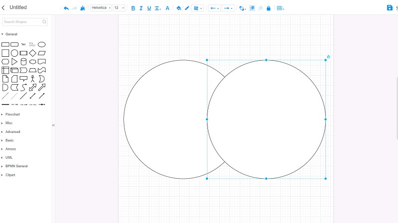
To create a Venn diagram using Shapes, navigate to Insert. Under Illustrations, from the Shapes dropdown, select Oval.

This lets you draw any shape in any dimension depending on your preference.
To create a basic three-circle Venn diagram, click, drag the mouse pointer, and draw three circles.

Initially, the circles would be opaque and show no resemblance to a Venn diagram. To change them, we need to reduce their opacity.
Select all the three circles by holding Ctrl. Right-click on the circles and click on Format Object.

This opens up a Format Shape pane on the right side of the screen. In Shape Options, under Fill, increase or decrease the transparency of the Solid fill.

This gives us the required Venn Diagram.
Move/Resize the Shape
You can move or resize the shape by clicking and dragging on the anchor points. If the mouse pointer turns to a four-way pointer, you can move the shape. If the mouse pointer is a two-way pointer, you can resize the shapes.
Add Text
You can add text to the shapes by selecting the text box from the shapes. We have already seen how to add text using Text Box from the SmartArt method.
Customize
You can change the style, color, and layout of the shapes and text using the Shape Format option.

You can also group the elements, move, align, and resize them using the Arrange and Resize options in the Shape Format menu.
Also Read:
How to Convert Text to Numbers in Excel? 5 Easy Methods
How to Move Rows in Excel? 5 Easy Methods
How to Use the ROUND Function in Excel?
Frequently Asked Questions
What is a Venn diagram template?
A Venn diagram template is an outline of the Venn diagram that you can use to build your own diagram. You can use the template to create Venn diagrams for other data.
How to create a Venn diagram in Excel?
You can create a Venn diagram in two ways in Excel. You can either use the SmartArt design, choose a template and edit them, or you can use Shapes to create a manual Venn diagram and customize them from scratch.
How to create non-proportional Venn diagrams in Excel?
When using the SmartArt, you can select the template and then resize the Venn circles. When creating a Venn diagram using shapes, you can straight away draw the shapes to suit your purpose.
Closing Thoughts
Venn diagrams provide a very feasible way to depict information with overlapping or similar data. Creating the Venn diagram and customizing them based on your requirement and preferences helps you present the data in a neat and organized way.
In this article, we saw what a Venn diagram is and how to create a Venn diagram in Excel in 2 easy ways. You can either use the template from SmartArt or use the Shapes to draw and create your own Venn diagram.
If you need more high-quality Excel guides, please check out our free Excel resources center. Simon Sez IT has been teaching Excel for over ten years. For a low, monthly fee you can get access to 130+ IT training courses. Click here for advanced Excel courses with in-depth training modules.
Simon Calder

Chris “Simon” Calder was working as a Project Manager in IT for one of Los Angeles’ most prestigious cultural institutions, LACMA.He taught himself to use Microsoft Project from a giant textbook and hated every moment of it. Online learning was in its infancy then, but he spotted an opportunity and made an online MS Project course — the rest, as they say, is history!
Simple Steps on How to Make a Venn Diagram on Excel
“Can I use Microsoft Excel to make a Venn Diagram?” — Yes, you can!Microsoft Excel is the leading spreadsheet software program that Microsoft develops. This application is also the most popular data visualization tool and has become the industry standard. And did you know Microsoft Excel has a feature where you can create a Venn Diagram? Yes, you read that right. This tool allows you to make a Venn Diagram using its SmartArt Graphics. So, if you want to compare specific ideas, you can use Microsoft Excel to create a Venn Diagram. Continually read this guidepost to learn how to make a Venn Diagram in Excel easily.

- Part 1. Bonus: Free Online Diagram Maker
- Part 2. Steps to Make a Venn Diagram in Excel
- Part 3. Pros and Cons of Using Excel to Make a Venn Diagram
- Part 4. FAQs about How to Make a Venn Diagram in Excel
Part 1. Bonus: Free Online Diagram Maker
Venn Diagram is a helpful tool for comparing ideas, topics, or objects. It is commonly used for educational and organizational purposes. Creating a Venn Diagram is easy. However, finding a perfect tool to create one is quite challenging. So, we searched for the best Venn Diagram maker that you can easily use.
MindOnMap is the best Venn Diagram maker that you can use online. It is completely free and safe to use. This online application enables you to create a Venn Diagram using the Flowchart option. Moreover, beginners can use this tool because it has an intuitive user interface. This mind map designer can help you process easier, quicker, and more professionally. What’s impressive about creating a Venn Diagram using MindOnMap is that it has ready-made themes that you can use for diagramming.
Furthermore, you can use shapes, arrows, clipart, flowcharts, and more to help you produce a professionally made output. Also, you can export your diagrams or maps in different formats, including PNG, JPEG, SVG, and PDF. And you can share your project with others, allowing them to access the project you are making. It is also the best alternative to create a Venn Diagram in Excel.
How to create a Venn Diagram using MindOnMap
1
Open your browser on your desktop and search MindOnMap.com in your search box. Click this link to be directed to the official page of MindOnMap.
2
Then, log in or sign up for your account. But if you have already logged in to your account, click the Create Your Mind Map button.

3
After that, click the New button at the top left side of the interface. And on the following interface, choose the Flowchart option to create your Venn Diagram.

4
And then, you will see a blank canvas where you will make your Venn Diagram. But first, on the General panel, select the Circle shape to create the circles we need for making the Venn Diagram. Then, add the circle to the blank canvas; copy-paste the circle so that the second circle will have the same shape as the first one. Then, select both circles and hit CTRL + G on your keyboard to group them.
5
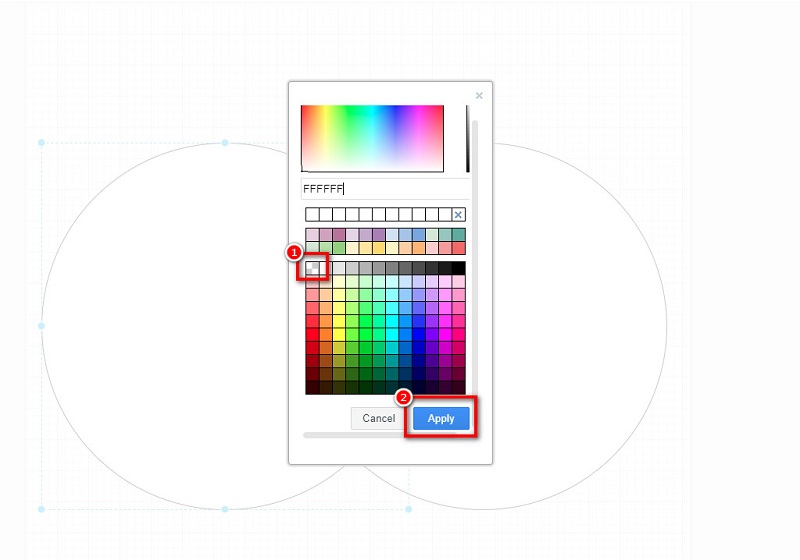
Remove the fill of the circles by selecting them. Click the Fill Color icon, and click the None option. Hit the Apply button to remove the shape’s color fill. You can change the Line color of your circles based on your preference.
6
Next, input the text you want to include by clicking the Text icon on the General panel.
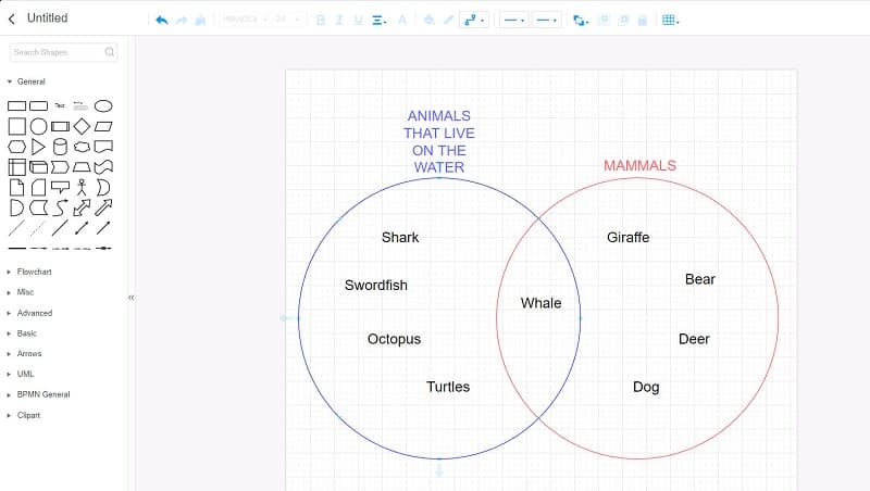
7
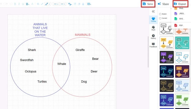
Finally, press Save to save your output. Hit the Export button if you like to save your output and save it in a different format.
Part 2. Steps to Make a Venn Diagram in Excel
Venn Diagrams are ideal graphic diagrams illustrating similarities and differences between different concepts. There are various types of Venn diagrams, like two-circle, three-circle, and four-circle diagrams. And using Microsoft Excel, you can create a fantastic Venn Diagram. By clicking the SmartArt graphic option, you can see the list of diagram templates that you can use to create a Venn Diagram. However, Excel can only create a three-circle diagram.
Nonetheless, it’s still an excellent app for making a Venn diagram. You can easily add text to the circles using the text box. And with its easy-to-use interface, you can easily create a Venn diagram. You can download Microsoft Excel for free so if you want to create a Venn Diagram with this application, follow the instructions below.
How to make a Venn Diagram on Excel
1
Download Microsoft Excel on your computer if it is not installed yet. Run the app once it is downloaded.
2
Go to the Insert tab on a new worksheet, then on the Illustrations panel, click the SmartArt button to open the SmartArt Graphic window. And under the Relationship category, select the Basic Venn diagram and click the OK button.
3
After clicking the button, you can immediately insert the text you want to include in your diagram.
4
You can change the color of your Venn Diagram by clicking the Change colors button. You can also change the style of your circles in the SmartArt Styles.
There is another method on how to make a Venn Diagram in Excel, which is by using the Regular Shapes. You can use this method if you do not have access to SmartArt Graphics.
1
Like the SmartArt Graphics, go to the Insert tab and click the Shape button. Select the Oval shape, then draw the circles on your blank sheet.
2
And then, increase the fill transparency of each circle in the Format Shape pane. Take note that if you do not increase the fill transparency of the circles, it will not appear like they are overlapping.
And that’s it! Those are the steps on how to do a Venn Diagram in Excel. Follow those simple steps to create a Venn Diagram.
Part 3. Pros and Cons of Using Excel to Make a Venn Diagram
PROS
- You can download Excel on all platforms, like Windows, Mac, and Linux.
- It allows you to create a Venn Diagram with its simple user interface easily.
- It has ready-made Venn Diagram templates that you can use.
CONS
- You can only create a three-circle Venn Diagram.
- Does not contain many icons, clipart, or stickers.
Part 4. FAQs about How to Make a Venn Diagram in Excel
Is Excel the best tool to create a Venn Diagram?
No. Although Microsoft Excel is an excellent tool for creating a Venn Diagram, it is not the best choice. Some of the best Venn Diagram maker tools are GitMind, MindOnMap, Canva, and Lucidchart.
How do I put text in the middle of my Venn Diagram in Excel?
To begin, rotate the oval to have the same overlapping portions of the circles. And then, move the oval to place your text over the overlapping portions of the shapes. Next, right-click the oval, click Add text then type in your text.
Can I make a Venn Diagram in Microsoft Word?
Yes, you can. Microsoft Word is a word processor application that is popular. It also has a feature where you can create a Venn Diagram. 1. Go to the Insert tab. 2. In the Illustration group, select the SmartArt option. 3. Go to Relationship and select the Venn Diagram layout. 4. Click OK to create one.
Conclusion
This article has taught you how to draw a Venn Diagram in Excel. After reading this guidepost, you will learn the necessary steps for creating a Venn Diagram. Excel is an offline tool. So, if you want to save space on your device and use an online tool, use MindOnMap.

- Введение в диаграмму Венна в Excel
Диаграмма Excel Венна (Оглавление)
- Введение в диаграмму Венна в Excel
- Как создать диаграмму Венна в Excel?
Введение в диаграмму Венна в Excel
Диаграмма Венна представляет собой диаграмму или иллюстрацию взаимосвязей между множествами (различными группами объектов). Это графическое представление логических или математических наборов, которые нарисованы в окружающем прямоугольнике (прямоугольник, представляющий универсальный набор) в виде кругов.
Каждый круг представляет собой набор, а точки внутри круга представляют элементы набора. Интерьер круга представляет собой элементы, которых нет в наборе. Общие элементы множеств представлены в виде пересечений окружностей. Диаграммы Венна называются так, как их изобрел Джон Венн.
Как создать диаграмму Венна в Excel?
Давайте разберемся, как создать диаграмму Венна в Excel, на нескольких примерах.
Вы можете скачать этот шаблон Excel для Венна здесь — Шаблон Excel для Венна
Пример № 1
Допустим, мы хотим нарисовать диаграмму Венна для числа студентов, которые сдали (из 25) предметы по математике, английскому языку и естественным наукам. У нас есть следующие данные студентов в листе Excel.
Теперь следующие шаги можно использовать для создания диаграммы Венна для того же самого в Excel.
- Нажмите на вкладку «Вставка», а затем нажмите «SmartArt» в группе «Иллюстрации» следующим образом:

- Теперь нажмите «Отношения» в новом окне, затем выберите макет диаграммы Венна (Basic Venn) и нажмите «ОК».
- Это отобразит схему диаграммы Венна следующим образом:
- Теперь текст на кругах можно изменить, щелкнув (Текст) на панели «Текст» в кругах, а затем переименовав его, чтобы отобразить, что представляют собой кружки.
- Мы можем добавить текст в перекрывающихся частях кругов, вставив текстовое поле.
Пример № 2
Допустим, есть два набора A и B, определенные как A = (1, 2) и B = (2, 3), и мы хотим найти AUB (объединение B). Объединение определяется как нечто, присутствующее в группах или наборах.
Таким образом, AUB означает элементы или числа из A или B.
- AUB = (1, 2) U (2, 3)
- AUB = (1, 2, 3)
Итак, давайте посмотрим, как это можно представить на диаграмме Венна.
- Нажмите на вкладку «Вставить», а затем нажмите «SmartArt» в группе «Иллюстрации» следующим образом.
- Теперь нажмите «Отношения» в новом окне, затем выберите макет диаграммы Венна (Basic Venn) и нажмите «ОК».
- Это отобразит схему диаграммы Венна следующим образом.
Мы также можем выбрать «Линейный Венн» вместо макета «Базовый Венн», а затем удалить несколько кругов. Теперь, так как в этом случае есть только два набора (A и B), мы удаляем один из круга из диаграммы Венна следующим образом.
- Нажмите на один из кружков и нажмите кнопку «Удалить». Это приведет нас к диаграмме Венна ниже:
- Теперь текст на кругах можно изменить, щелкнув (Текст) на панели «Текст» в кругах, а затем переименовав его, чтобы отобразить, что представляют собой кружки.
Точно так же как Союз, есть другой термин, обычно используемый для наборов, который является ‘Пересечением’, что означает кое-что, что присутствует во всех группах или наборах.
Таким образом, в этом случае пересечение B (A ∩ B) будет числами или элементами, которые присутствуют как в A, так и в B.
- A ∩ B = (2)
Как и удаление, мы даже можем добавить круги на диаграмму Венна, выполнив следующие шаги.
- Щелкните правой кнопкой мыши существующий круг, который находится ближе всего к тому месту, где должен быть добавлен новый круг. Теперь нажмите «Добавить фигуру», а затем нажмите «Добавить фигуру после» или «Добавить фигуру до».

После добавления формы результат будет показан ниже.
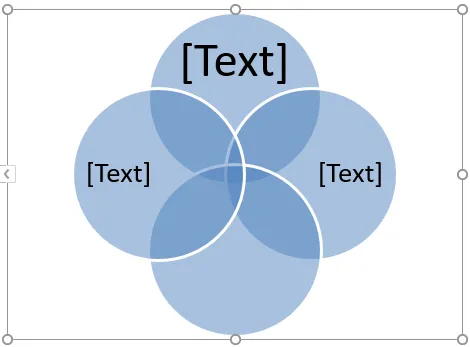
Пример № 3
Допустим, есть два набора A и B, определенные как A = (1, 3, 5) и B = (1, 2, 3, 4, 5, 6), и мы хотим найти AUB (объединение B). Таким образом, как видно из приведенного выше примера, AUB означает элементы или числа из A или B.
- AUB = (1, 3, 5) U (1, 2, 3, 4, 5, 6)
- AUB = (1, 2, 3, 4, 5, 6)
Итак, давайте посмотрим, как это можно представить на диаграмме Венна.
- Нажмите на вкладку «Вставить», а затем нажмите «SmartArt» в группе «Иллюстрации» следующим образом.
- Теперь нажмите «Отношения» в новом окне, затем выберите макет диаграммы Венна (Stacked Venn) и нажмите «ОК».
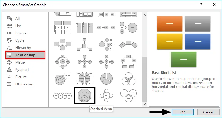
- Это отобразит схему диаграммы Венна следующим образом.
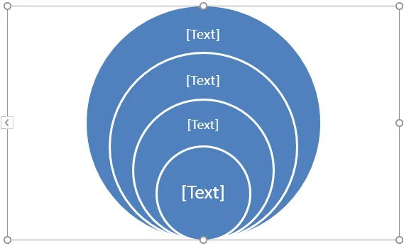
Теперь, так как в этом случае есть только два набора (A & B), поэтому мы удаляем лишние круги из диаграммы Венна, щелкая их правой кнопкой мыши и нажимая «Удалить». Это приведет нас к диаграмме Венна, как показано ниже.
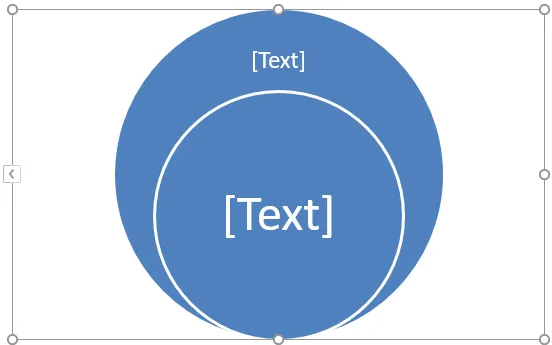
A является подмножеством B, поэтому, если B представляет внешний круг, A будет представлять внутренний круг. Кроме того, поскольку все элементы A также присутствуют в B, поэтому мы можем переместить внутренний круг, перетаскивая его.
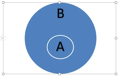
В этом случае AUB будет равен B, так как A является подмножеством B. Также AUB будет равен A.
Что нужно помнить о диаграмме Венна в Excel
- Диаграммы Венна иллюстрируют простые отношения множеств. Они обычно используются в вероятности, статистике, информатике и физике.
- Пересекающиеся круги используются на диаграммах Венна, чтобы показать сходства, различия и взаимосвязи между различными группами объектов. Перекрывающиеся части представляют сходства между группами, а неперекрывающиеся части представляют различия.
- Диаграммы Венна позволяют нам визуально организовать информацию таким образом, чтобы увидеть взаимосвязи между двумя или более наборами элементов. Диаграмму Венна также можно создать с помощью инструментов рисования, доступных в Excel.
- Мы даже можем применить SmartArtStyle к диаграмме Венна. Для этого перейдите на вкладку «Дизайн» в «Инструменты SmartArt», а затем нажмите на нужный макет:
- Мы даже можем применить цветовые комбинации к кругу на диаграмме Венна и изменить их цвета по желанию. Также мы можем добавить мягкие края, сияние и 3D-эффекты. Для этого перейдите на вкладку «Дизайн» в «Инструменты SmartArt», затем нажмите «Изменить цвета» и выберите нужную цветовую тему:
Рекомендуемые статьи
Это руководство к диаграмме Венна в Excel. Здесь мы обсудим, как создать диаграмму Венна в Excel вместе с практическими примерами и загружаемым шаблоном Excel. Вы также можете просмотреть наши другие предлагаемые статьи —
- Excel SUMIFS с датами
- Функция поиска в Excel
- Панель инструментов KPI в Excel
- Точечные графики в Excel
How to Create a Venn Diagram in Excel? (2 Methods)
Below are the two methods to create a Venn diagram in Excel.
- Create a Venn Diagram using Excel Smart Art
- Create a Venn diagram using Excel Shapes
Table of contents
- How to Create a Venn Diagram in Excel? (2 Methods)
- #1 Create a Venn Diagram Using Excel Smart Art
- #2 Create Venn Diagram Using Shapes in Excel
- Things to Remember
- Recommended Articles
You can download this Venn Diagram Excel Template here – Venn Diagram Excel Template
Now let us discuss each of the methods in detail along with an example
#1 Create a Venn Diagram Using Excel Smart Art
Follow the steps to create a Venn diagram in Excel.
- We must first go to the “Insert” tab and click on “SmartArt.”

- Now, we can see the SmartArt window below.

- Select the “Relationship” category.

- After that, we must scroll down and select the “Basic Venn” diagram.

- Once the choice is made, we will now have the selection below the “Basic Venn” diagram.

- Now, click on “Text” to enter the text as VLOOKUP, HLOOKUP, INDEX + MATCH.

This diagram shows that all three formulas belong to one category, LOOKUP functions. - Now, we can play around with the formatting of the smart art under the “Design” tab. First, click on the “Design” tab >> “Change Colors.”

- We can change the color as per our liking.

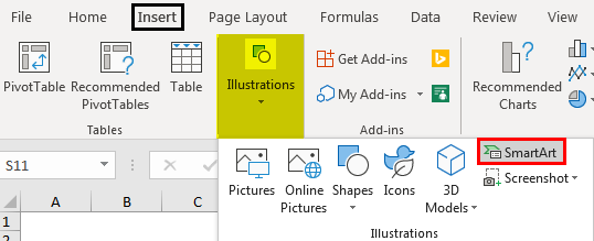
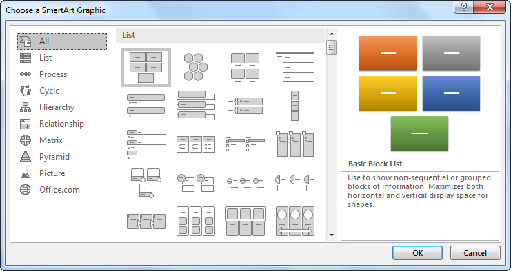
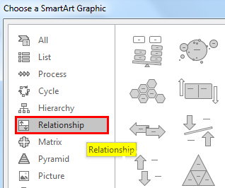
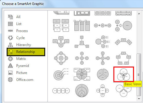


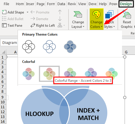

Like this, we have many Venn Diagram examplesA Venn diagram is one kind of chart in Excel and is used in the analysis of the relationship presented among the two or more groups through intersecting parts of the circles.read more based on our requirements. We can choose different Venn diagrams.
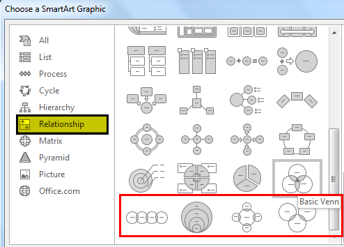
#2 Create Venn Diagram Using Shapes in Excel
- Step 1: We must go to the Insert tabIn excel “INSERT” tab plays an important role in analyzing the data. Like all the other tabs in the ribbon INSERT tab offers its own features and tools. Under Insert Tab we have several other groups including tables, illustration, add-ins, charts, Power map, sparklines, filters, etc.read more, click on “Illustrations,” and select “Shapes,” then choose “Oval” shape.

- Step 2: First, we must draw an oval shape.
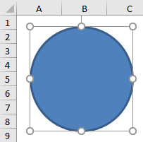
- Step 3: Like this, we can draw two more oval shapes in the form of a Venn diagram. And, make the “Fill” as “No Fill.”

- Step 4: Now, we must insert “Text” boxes for each circle.

- Step 5: We have inserted 5 text boxes. In the first box, we must write “VLOOKUP.” In the second box, we must write “INDEX + MATCH.” Finally, in the third box, we must write “HLOOKUP.”

- Step 6: We have another two boxes. You must be wondering what we need to write with these boxes. In the middle text box, write “LOOKUP” functions, and in the other box, we must write “One Dimensional.”

- Step 7: From this diagram, we can interpret as there are three formulas: VLOOKUP, HLOOKUP, and INDEX + MATCH. All these are LOOKUP functions so related to each other.
The middle text box Lookup Function in excelThe LOOKUP excel function searches a value in a range (single row or single column) and returns a corresponding match from the same position of another range (single row or single column). The corresponding match is a piece of information associated with the value being searched.
read more belongs to all the circles.
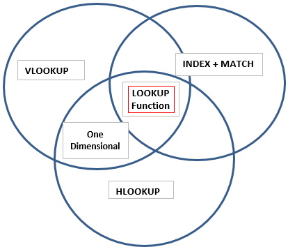
Then we have one more box which says “One Dimensional.” However, it applies only to the boxes “VLOOKUP” and “HLOOKUP.” So, this shows that the feature “One Dimensional” applies only to those two formula circles.
Like this, we can create a relationship between two or more similar things using Venn diagrams.
Things to Remember
- The built-in Venn diagram does not support all kinds of diagrams for relationship creation.
- For our own needs, we need to draw Venn diagrams through shapes.
- We can format shapes with different colors and sizes.
Recommended Articles
This article has been a guide to Venn Diagram in Excel. We discuss creating a Venn diagram using SmartArt and Shapes in Excel with examples and a downloadable Excel template. You may learn more about Excel from the following articles: –
- Venn Diagram Examples
- Download Fishbone Diagram Template
- Extract Data from PDF to Excel
- Box and Whisker Plot in Excel