
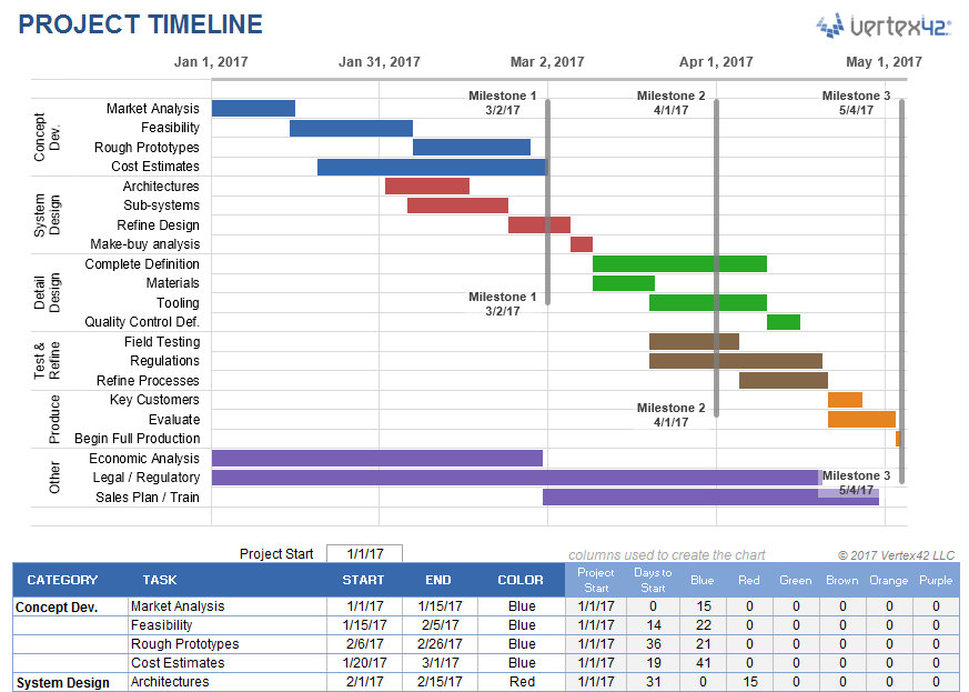
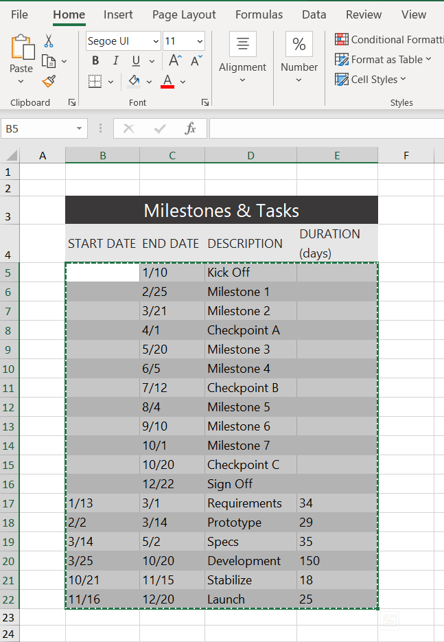
A project timeline can be created in Excel using charts linked to data tables, so that the chart updates when you edit the data table. The first template on this page uses a stacked bar chart technique and also includes up to 4 milestones as vertical lines. This template is a cross between my project schedule and task list templates. I’ve populated the template with some generic product development terminology, but it is designed for you to enter your own tasks and dates. The second template uses a scatter chart with data labels and leader lines to create a more traditional type of timeline.
Advertisement
⤓ Download
For: Excel 2013 or later
«No installation, no macros — just a simple spreadsheet» — by
License: Private Use
(not for distribution or resale)
Using the Project Timeline Template
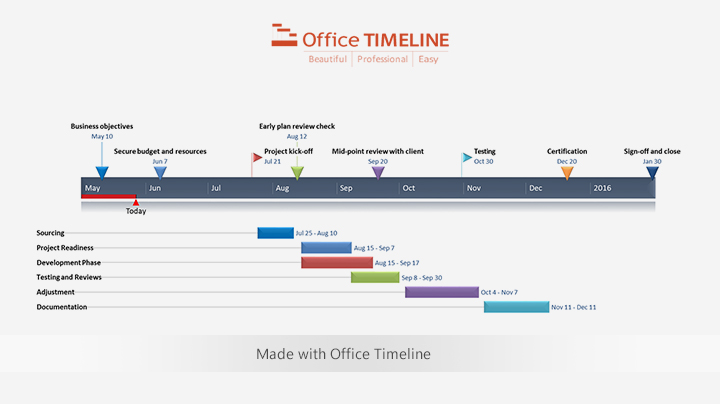
Grouping Tasks Using Different Colors: One of the key features of this template is the ability to choose a different color for the bars in the timeline via a drop-down box in the Color column. This makes it easy to identify the different phases or categories of tasks. You can insert and delete tasks by just inserting or deleting rows in the spreadsheet’s data table.
The example above shows some of the steps in a product development cycle (Concept Development, System Design, Detail Design, Testing and Refining, Production, etc.), with different colors representing different phases of the cycle. However, there are other ways to use this type of timeline. Another common way to group tasks within a project timeline is by key organization function, such as Marketing, Design, Testing, Manufacturing, Finance, Sales, Quality Assurance, Legal, etc.
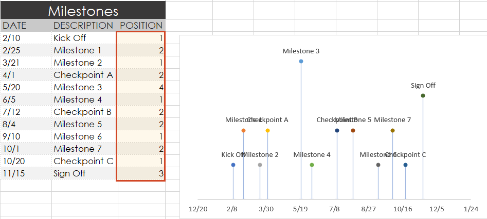
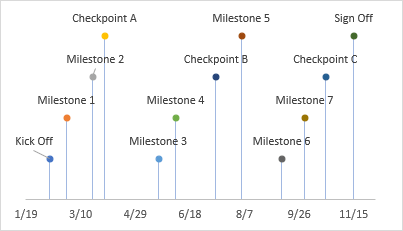
Milestones: With any project timeline, you will most likely want to define at least a couple key milestones. In the above example you will see 3 milestones as vertical lines. You can edit the milestone labels and dates via the data table. The template lets you show up to 4 milestones. Adding more is possible but would require you to create the new data series yourself (you can’t just insert rows for more milestones like you can with the tasks).
Can I Add More Colors? This project timeline is set up to allow up to 6 different color choices. Adding more colors is possible, but that would require more Excel experience. Some general steps to follow to attempt adding more colors:
- Add a new column to the right of the current data table.
- Copy the formulas in the previous column into the new column.
- Select the timeline and drag the range marker to the right to include the new column.
- Add some data to see what color the new column uses and then update the column label.
- Update the list used for the data validation drop-down box in the Color column to include the new label.
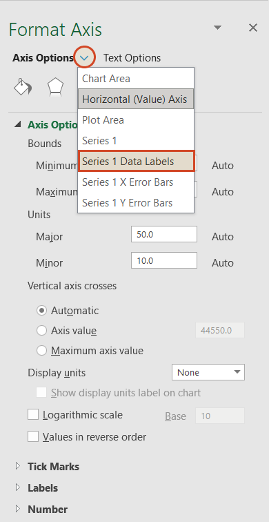
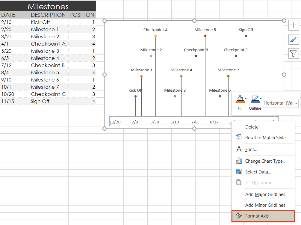
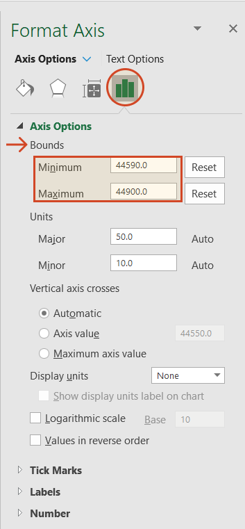
Dates Not Changing in the Chart? To edit the range of dates shown in the chart, you need to edit the Minimum and Maximum bounds of the horizontal axis. Right-click on the axis and select Format Axis.
Want More Flexibility / Ease of Use? If you don’t care about automation and just want a simple way to create a high-level project timeline, you might want to try the Project Schedule Template. Colors are modified by just changing the background colors of the cells in the spreadsheet.
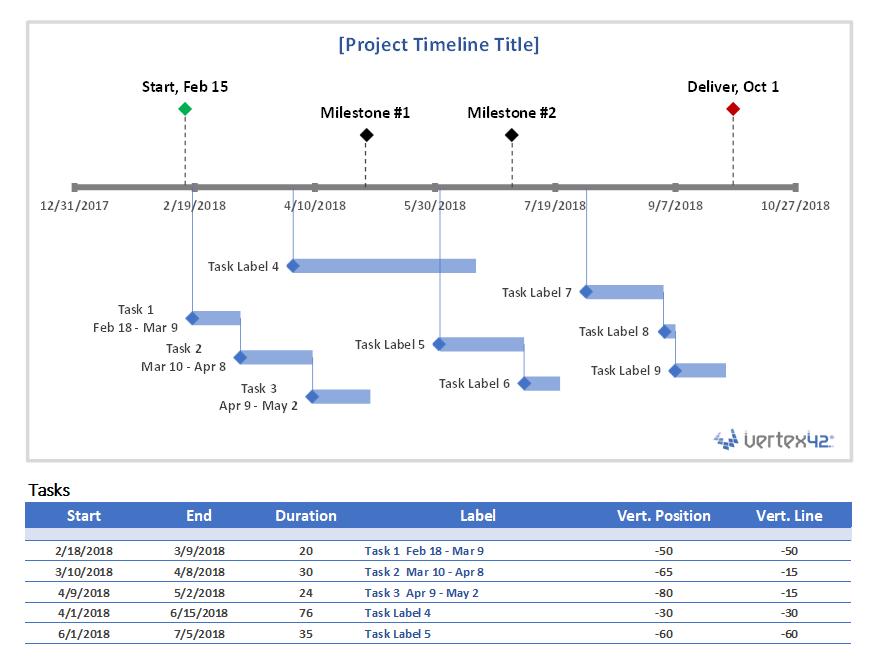
Project Timeline Chart
for Excel
Description
This project timeline uses two different scatter chart series to display milestones above the timeline and tasks with durations below the timeline. The durations are created using X Error bars. The length of the leaderlines for the tasks can be defined by the user to show task dependencies.
The vertical positions of the tasks and milestones are adjusted by the user. This may work great for some timelines, but if you have more than 20 tasks to show, you may be better of using a Gantt Chart.
This template is based on the original Vertex42 Excel Timeline Template, which was one of the first timeline templates developed for Excel using the technique of leaderlines and error bars for durations. This new project timeline works only in the more recent versions of Excel (2013 or later) because of the new feature in Excel that allows you to specify a range of cells for Data Labels.
To learn how to create a timeline using a scatter chart, see the video demos for the Bubble Chart Timeline and Vertical Timeline templates.
Use a Graphic as a Data Point Marker in a Project Timeline
You can add graphics to a project timeline to make it more interesting or visually appealing. For example, you may want to mark the final milestone with a finish-line flag, as shown in the image below. To do this, you will first need to create a graphic using your favorite image editing app, or download one. The diamond ![]() and flag
and flag ![]() that I use in my project timelines were created from screenshots of common unicode characters.
that I use in my project timelines were created from screenshots of common unicode characters.
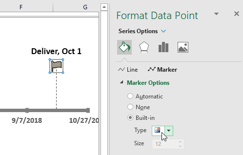
Steps for using a graphic as a data point marker:
- Select a single data point by clicking on it and then clicking on it again.
- Right-click on the selected data point to open the Format Data Point task pane.
- Click on the Bucket > Marker > Marker Options > Built-in, then select the picture icon from the Type drop-down.
- Select the image from your computer.
To see other examples of using graphics in a timeline, see my original Timeline Template.
More Project Timelines
Project Planner Template
Create a project plan using a gantt chart that shows the planned schedule vs. the actual schedule.
Gantt Chart Template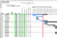
The Gantt Chart template (and especially the Pro version) is great for project scheduling and detailed task scheduling.
Smartsheet Contributor
Kate Eby
August 3, 2017
In this article, you’ll learn how to create a timeline in Excel with step-by-step instructions. We’ve also provided a pre-built timeline template in Excel to save you time.
Included on this page, you’ll find a free timeline template for Excel, how to make a timeline in Excel, and how to customize the Excel timeline.
How would you like to create your timeline?
Use a pre-built timeline template in Smartsheet
Time to complete: 3 minutes
— or —
Manually create a timeline in Excel
Time to complete: 30 minutes
Download A Free Excel Timeline Template

Smartshee
Download Timeline Template for Excel
The easiest way to make a timeline in Excel is to use a pre-made template. A Microsoft Excel template is especially useful if you don’t have a lot of experience making a project timeline. All you need to do is enter your project information and dates into a table and the Excel timeline will automatically reflect the changes.
When you add your own dates to the table, the Gantt chart will automatically adjust, but the spacing will be off. There may be a lot of extra white space at the beginning of your chart, with dates that you did not enter. The solution is to adjust the spacing between the dates display at the top of your chart.
- Click on a date at the top of your Gantt chart. A box should appear around all the dates.
- Right-click and select Format Axis.
- In the pop-up box, on the left, select Scale.
- Adjust the number in the box labeled Minimum. You will have to add numbers incrementally to the box to adjust the spacing and get it to look the way you would like.
Create Your Timeline
This article will show you how to create a timeline in Excel, using a template in the context of planning a business conference. Hosting a successful business conference can take months of planning and it’s the type of project where a timeline is essential. It involves plenty of moving parts and usually has quite a few stakeholders.
In this scenario, an event planner would start by making a list of tasks. These tasks may include managing a budget, scouting and securing a conference site, hosting speakers, hotel arrangements, conference schedule, and more. With all this information, you can either look at a timeline template in Excel or find a more robust solution to first make a Gantt chart and use that to create a timeline. This tutorial will show you how to do both.
How to Make a Timeline in Excel
First, make a task list to figure out what you want the timeline to show. Maybe you want it to show milestones that are currently in a Gantt chart — if that’s the case, look for an Excel timeline template that only requires inputting milestone data.
Perhaps you want to show how different parts of a particular project appear on a timeline. Then, look for an Excel project timeline template. This will have more fields for you to customize and displays more information on the timeline, like how long it will take for a certain task to get done.
Choose an Excel Timeline Template
Microsoft also offers a few timeline templates in Excel designed to give you a broad overview of your conference planning timeline. The Excel timelines aren’t tied to Gantt chart data, so you’ll be manually inputting your own data in the pre-defined template fields. These aren’t set in stone; you can change names and add fields as needed.
- To find an Excel timeline template from Microsoft, open Microsoft Excel and type “Timeline” in the search box and click Enter. Note: this template was found using the latest version of Excel on Windows 8.
- Double-click on the Excel Project Timeline template to open the spreadsheet.
Add Your Information to the Timeline in Excel
When the template opens, you will see a pre-formatted Excel spreadsheet with information already filled out in the fields. This content is just a placeholder. At the top of the template is a timeline. Scroll down to see the preformatted chart where you can add conference planning details and due dates. One of the benefits of using an Excel project timeline template is that the formatting is already complete, and all you need to do is customize it.
- Click the Project Timeline field (1C) at the top of the spreadsheet and enter your conference name.
- Scroll down in the spreadsheet and enter a start date.
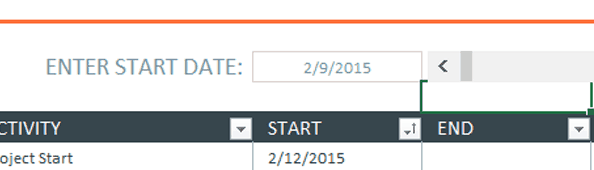
Since you’re planning a conference, you’ll want to choose the planning kick-off date. Note: There’s already a formula that picks the start date as the day you started using the event planning template. If you don’t want to use that date, click the cell, delete the formula and add your date. You’ll notice that the preformatted dates for Start and End will change.
- Enter the first major task to complete. Add tasks to the Activity column by double-clicking on the field that reads Milestone.
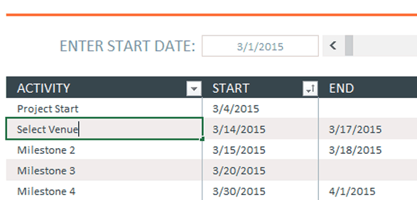
- Click the Tab key to navigate to the corresponding Start field and type in the date that you’ll start researching possible conference venues. Click the Tab key again to enter a date in the End field. This should be the date that you’ll want to have picked the venue.
- Repeat steps 3 and 4 to complete the remainder of the chart.
Customize the Excel Timeline
Once you have entered all the conference milestones in the chart, you can easily change the look of the timeline. You can change the display of the timeline data and make it more colorful.
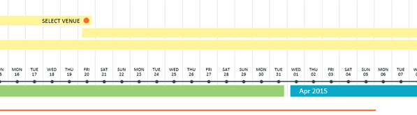
If the conference planning timeline extends past a month (and it probably will), you can see more data on the timeline by clicking the arrows in the gray bar next to the Start date box. When you do this, you will scroll through the Excel timeline.
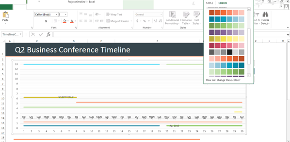
- To change the overall chart presentation, click on the chart and gthen click on the box with a paintbrush icon.
- A pop-up box will appear displaying different timeline chart styles. Mouse over the formats to see it appear on the timeline. If you see one you like, click it. The timeline will be updated to reflect that style.
Change the Color Palette of the Excel Timeline
- Click on the chart.
- Click on the paintbrush icon and click Color at the top of the pop-up box.
- Mouse over the timeline color to see it appear on the timeline. If you see one you like, click it and the timeline will be updated to reflect that style.
This timeline template only displays the most basic information. It’s great to share with stakeholders and executives to give them a high-level view of tasks required to put on a conference. However, it doesn’t include things like a budget, nor does it display tasks that are being completed on time or who is responsible for each task. If you want to create a more detailed conference planning timeline, consider creating a Gantt chart in Excel.
Use a Smartsheet Template to Create a Robust Timeline
There are a lot of details that go into planning a conference. It’s essential to find a place to keep all that information in one place, where multiple stakeholders can access it.
Smartsheet has quite a few event timeline templates that can help you get started. You can view your data as a task list or as a Gantt chart, giving you a quick view of progress made. You can also add attachments, import contact data, assign tasks, automatically schedule update requests, and collaborate wherever you are, on any device. There’s even a template for an Event Registration Web Form that can help streamline the registration process.
Create Your Timeline in Smartsheet
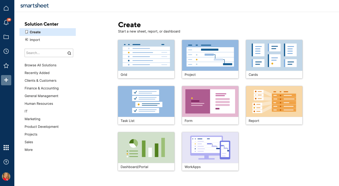
Select a Project Planning Template in Smartsheet
- To get started with Smartsheet, login to your account and navigate to the ‘+’ tab on the left side navigation bar, or sign up for a free 30-day trial.
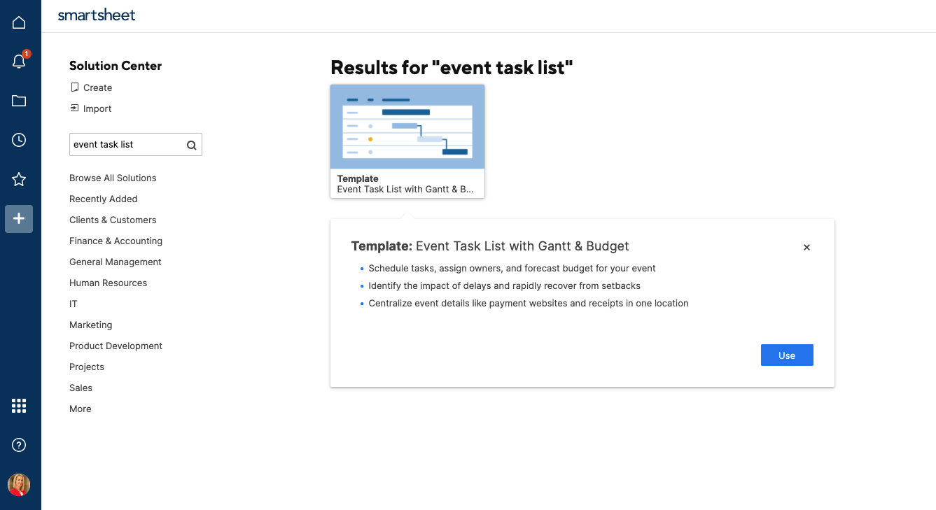
- Type “Event Task List” in the Search box and click the magnifying glass icon. You’ll see a few options, but for this example, click on Event Task List with Gantt & Budget and then click the «Use» button in the pop-up window.
- Next, name the template, choose where to save it, and click the OK button.
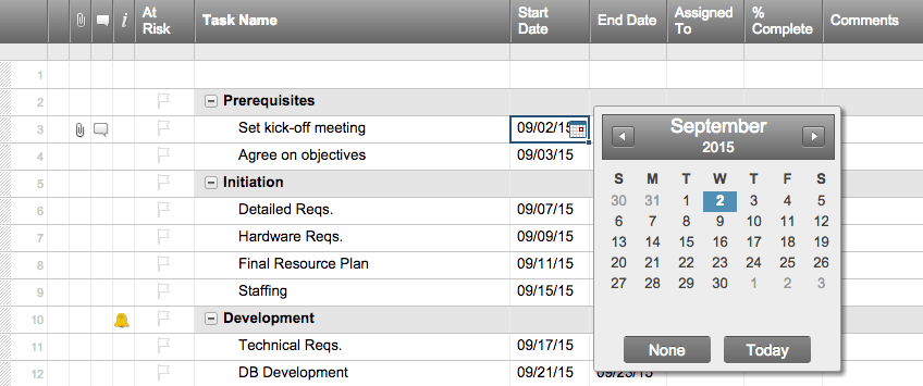
Add Your Information to the Template
A pre-formatted template will open, complete with sections, sub-tasks, sample attachments, progress tracking, and budget formulas. There will also be some sample content for reference.
- To delete the yellow box at the top of the template, click on the box, right-click, and select Delete Row.
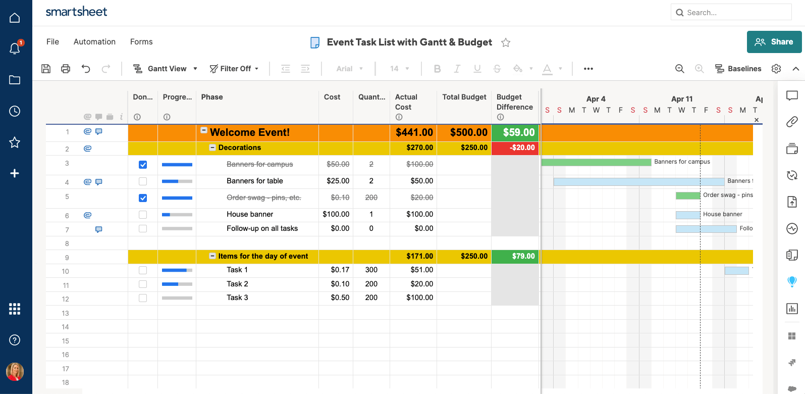
- Double-click the ‘Welcome Event’ cell highlight the existing content, and type in your information.
- Double-click the yellow Decorations text, highlight the existing content, and type in your information. This title should be one of the main categories for planning your conference (“Select Venue,” “Recruit Sponsors,” “Registration,” etc).
- Click on a blank cell in the Phase column and type in another category. Highlight the entire row, from the Done column through the Started column, click the paint bucket icon, and click yellow. Repeat for as many category rows needed.
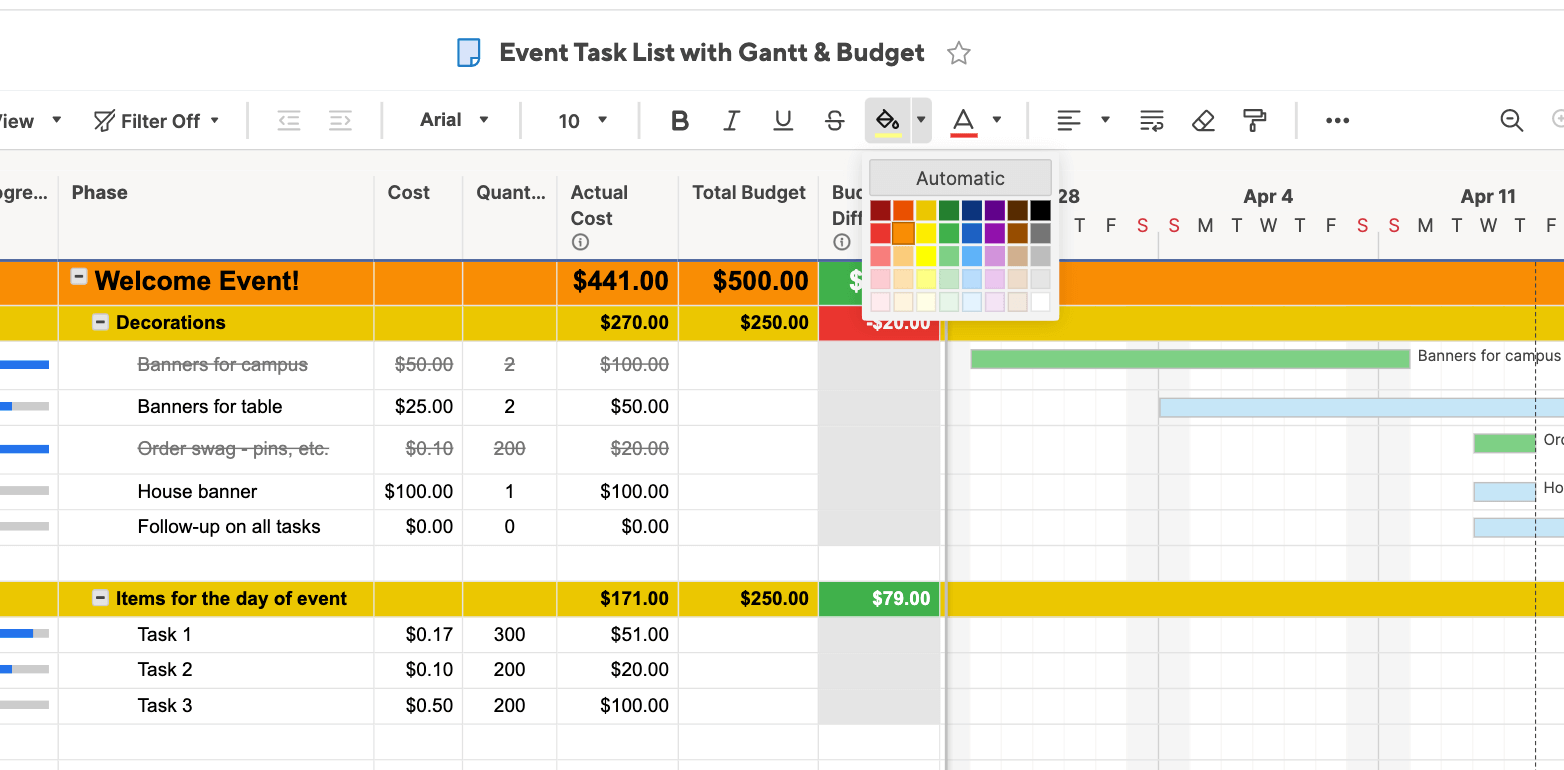
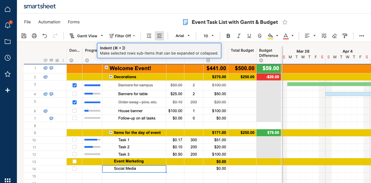
- Click on the cell under the new category created (in this example, it’s “Event Marketing”) and add a sub-sub-task, such as “Social Media.” Next, click the Indent button in the toolbar to turn the new categories you just created into sub-tasks. Repeat for all new categories.
- The Total Budget column will automatically calculate, based on the costs you input into the corresponding columns.
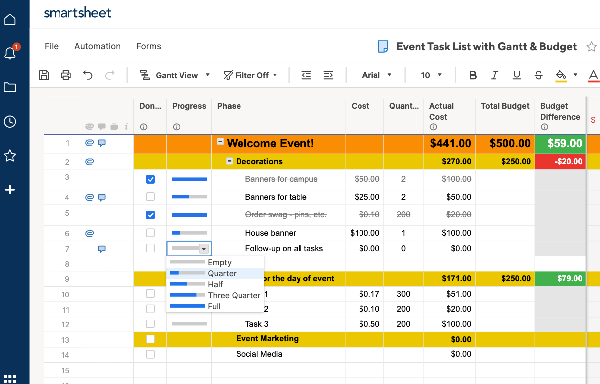
- Enter start and due dates for each task in the Due and Started columns. When a part of the project is completed, double-click on the date cell and click the letter strikethrough button on the left-hand toolbar (the button with the “S” with a line through it).
- For each row, under the Status column, click the cell and choose a symbol that matches the progress in the drop-down menu. This can be a green check, a yellow exclamation point, or a red ‘X’ mark. This will let you easily view how much of a specific task has been accomplished, or if it is on hold.
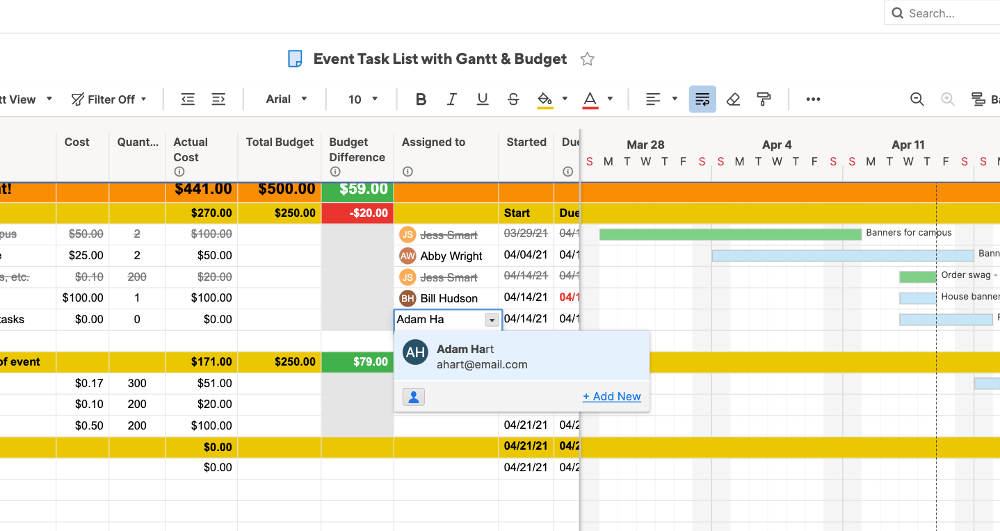
- Under the Assigned To column, click a cell and select the assignee from the pop-up menu. You can even add contacts who don’t work for the company.
When you assign tasks to people in Smartsheet, their contact information is automatically linked.
- To view the data you just entered as a Gantt chart, click on the Gantt View button in the toolbar.
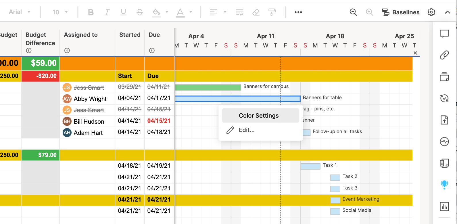
You can customize the appearance of your Gantt chart with just a couple clicks. To change the colors of the task bars:
- Right-click on a task bar and select Color Settings.
- A color palette will appear, letting you change the color of the bar.
- If you want to apply the same color to multiple task bars, click the task bars while holding down the Shift button. This will select all the bars. Then, release the Shift button, right-click on any of the selected bars, and click Color Settings.
Turn a Smartsheet Template into a Project Timeline
You’ve already inputted all your information in Smartsheet and with just a couple clicks, you can create a beautiful timeline to highlight your event planning progress.
Smartsheet is integrated with Office Timeline, a graphical add-on tool for PowerPoint, which allows you to create a professional, attractive visual representation of your project plan.
If you don’t have Office Timeline installed in your PowerPoint app, simply download it for a free trial, install, and restart PowerPoint.
- Open PowerPoint and create a new slide.
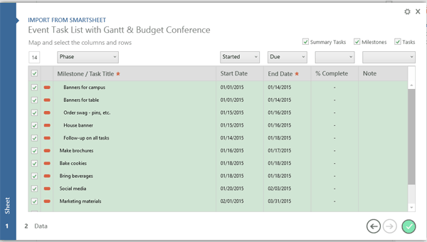
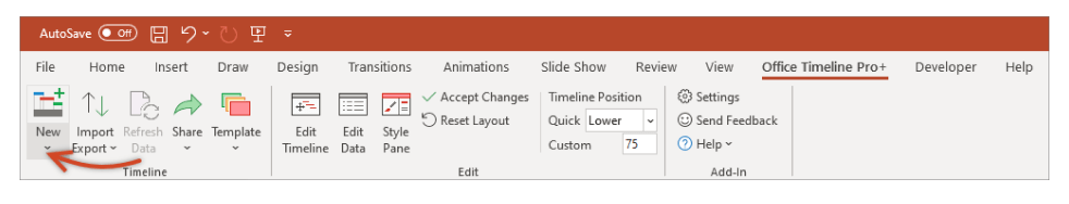
- Click on the Office Timeline Free tab (Note: if you purchased Office Timeline, it will say Office Timeline) and select the drop-down arrow under the New button in the ribbon bar. Highlight Import Data and then click Import from Smartsheet.
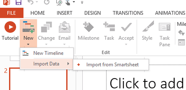
- Follow the prompts to login to your Smartsheet account. Click on the box next to the Smartsheet project you want to import and click the green circle with a checkmark in it.
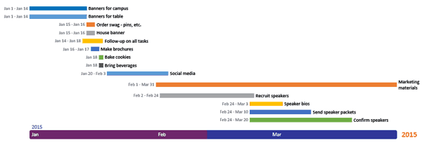
Once your project timeline is created, you can customize it even further. You can choose which events you want displayed in the timeline, color-code tasks assigned to specific stakeholders, and add your branding and colors to the layout.
Gain Real-Time Visibility into Timelines and Planning Efforts with Smartsheet
From simple task management and project planning to complex resource and portfolio management, Smartsheet helps you improve collaboration and increase work velocity — empowering you to get more done.
The Smartsheet platform makes it easy to plan, capture, manage, and report on work from anywhere, helping your team be more effective and get more done. Report on key metrics and get real-time visibility into work as it happens with roll-up reports, dashboards, and automated workflows built to keep your team connected and informed.
When teams have clarity into the work getting done, there’s no telling how much more they can accomplish in the same amount of time. Try Smartsheet for free, today.
Предположим, мы работаем над долгим и сложным проектом, состоящим из нескольких этапов. Задача — наглядно показать всю хронологию работ по проекту, расположив ключевые моменты проекта (вехи, milestones) на оси времени. Примерно вот так:

В теории управления проектами подобный график обычно называют календарем или временной шкалой проекта (project timeline), хотя я также встречал еще один русскоязычный аналог -«лента времени». В любом случае, главное — не как назвать, а как построить. Поехали…
Шаг 1. Исходные данные
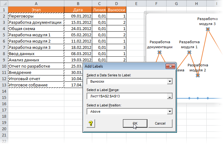
Для построения нам потребуется оформить исходную информацию по вехам проекта в виде следующей таблицы:

Обратите внимание на два дополнительных служебных столбца:
- Линия — столбец с одинаковой константой около нуля по всем ячейкам. Даст на графике горизонтальную линию, параллельную оси Х, на которой будут видны узлы — вехи проекта. В принципе, можно было бы использовать и полный ноль, но тогда график совпадает с осью X, что дает проблемы потом с настройкой внешнего вида диаграммы в Excel 2007-2010. Новый Excel 2013 нули воспринимает спокойно.
- Выноски — невидимые столбцы для поднятия подписей к вехам на заданную (разную) величину, чтобы подписи не накладывались. Значения 1,2,3 и т.д. задают уровень поднятия подписей над осью времени и выбираются произвольно.
Шаг 2. Строим основу
Теперь выделяем в таблице все, кроме первого столбца (т.е. диапазон B1:D13 в нашем примере) и строим обычный плоский график с маркерами на вкладке Вставка — График — График с маркерами (Insert — Chart — Line with markers):


Убираем линии сетки, вертикальную и горизонтальную шкалы и легенду. Сделать это можно вручную (выделение мышью и клавиша Delete) или отключив ненужные элементы на вкладке Макет (Layout). В итоге должно получиться следующее:

Теперь выделите ряд Выноски (т.е. ломаную оранжевую линию) и на вкладке Макет выберите команду Линии — Линии проекции (Layout — Lines — Projection Lines):

От каждой точки верхнего графика будет опущен перпендикуляр на нижний. В новом Excel 2013 эта опция находится на вкладке Конструктор — Добавить элемент диаграммы (Design — Add Chart Element).
Шаг 3. Добавляем названия этапов
Эта часть будет простой у тех, кто уже осмелился на установку нового Excel 2013 и более сложной у тех, кто еще работает со старыми версиями.
В Excel 2013 все просто. Как я уже писал здесь, он умеет делать подписи к точкам данных просто беря текст из любого заданного пользователем диапазона. Для этого нужно выделить ряд с данными (оранжевый) и на вкладке Конструктор выбрать Добавить элемент диаграммы — Подписи — Дополнительные параметры (Design — Add Chart Element — Data Labels), а затем в появившейся справа панели установить флажок Значения из ячеек (Values from cells) и выделить диапазон A2:A13:

В версиях Excel 2007-2010 и старше такой возможности нет, но у вас есть два альтернативных варианта:
- Добавьте любые подписи к оранжевому графику (значения, например). Затем выделяйте по очереди каждую подпись, ставьте в строке формул знак «равно» и щелкайте по ячейке с названием этапа из столбца А. Текст выделенной подписи будет автоматически браться из выделенной ячейки:

- При большом количестве этапов первый вариант, конечно, не радует своей «рукопашностью». Поэтому для оптовой вставки подписей из ячеек можно использовать дополнительные надстройки на VBA. В частности, надстройку XYChartLabeler (автор — Rob Bovey, Excel MVP). Скачиваете надстройку, устанавливаете и получаете на вкладке Надстройки (Add-ins) кнопку XY Chart Labeler — Add Chart Labels. После нажатия на нее появляется диалоговое окно, где и можно задать диапазон с данными для подписей на диаграмме:

Шаг 4. Прячем линии и наводим блеск
Внесем последние правки, чтобы довести нашу уже почти готовую диаграмму до полного и окончательного шедевра:
- Выделяем ряд Выноски (оранжевую линию), щелкаем по ней правой кнопкой мыши и выбираем Формат ряда данных (Format Data Series). В открывшемся окне убираем заливку и цвет линий. Оранжевый график, фактически, исчезает из диаграммы — остаются только подписи. Что и требуется.
- Добавляем подписи-даты к синей оси времени на вкладке Макет — Подписи данных — Дополнительные параметры подписей данных — Имена категорий (Layout — Data Labels — More options — Category names). В этом же диалоговом окне подписи можно расположить под графиком и развернуть на 90 градусов, при желании.
Ссылки по теме
- График проекта (диаграмма Ганта) в Excel с помощью условного форматирования
- Видеоурок по созданию графика проекта (диаграммы Ганта) в Excel 2010
- Новые возможности диаграмм в Microsoft Excel 2013
Want to learn how to create a timeline in Excel?
A project timeline is a record of all the important events and milestones in a project.
And like it or not, Microsoft Excel is still a commonly used tool for this purpose.
In this article, you’ll learn about what a project timeline is, how to create one in Excel, and a better alternative to the process!
Let’s get started!
What Is A Project Timeline?
A project timeline chart is a visualization of the chronological order of events in a project. It’s a series of tasks (assigned to individuals or teams) that need to be completed within a set time frame.
Here’s what a comprehensive project timeline chart contains:
- Tasks in various phases
- Start date and end date of tasks
- Dependencies between tasks
- Milestones
In short, it’s something your project team will refer to track what’s done and what needs to be done.
How To Create A Project Timeline In Excel?
There are two main approaches to create a timeline in Excel.
Let’s dive right in.
1. SmartArt tools graphics
SmartArt tools are the best choice for a basic, to-the-point project timeline in Excel.
Here’s how you can create an Excel timeline chart using SmartArt.
- Click on the Insert tab on the overhead task pane
- Select Insert a SmartArt Graphic tool
- Under this, choose the Process option
- Find the Basic Timeline chart type and click on it
- Edit the text in the text pane to reflect your project timeline
Add as many fields as you want in the SmartArt text box by simply hitting Enter in the text pane to open up the respective dialog box.
Excel also lets you change the SmartArt timeline layout after you’ve inserted the text.
You can change it to a:
- Line chart
- Basic bar chart
- Stacked bar chart
And of course, feel free to play around with the Excel chart color schemes in the SmartArt Design tab.

A SmartArt graphic is perfect for a high-level project timeline that displays all the important milestones. However, it may not be sufficient to display all the tasks and activities that lead up to them.
For this, your Excel dashboard will need something more complex: like a scatter plot Excel chart.
2. Scatter plot charts
Scatter plot charts display every complex data point at one glance.
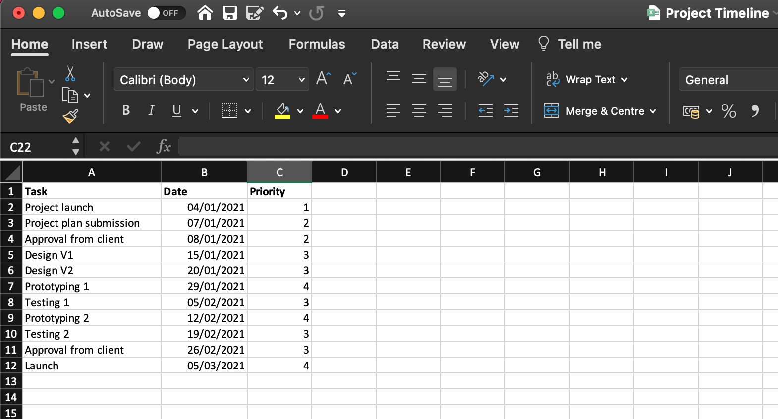
First, lay the foundation for the chart by making a data table with basic information such as:
- Task (or milestone) name
- Due date
- Priority level (1-4, in increasing order)
When you add dates, make sure your cells are formatted to reflect the correct date format. For example, DD/MM/YYYY, MM/DD/YYYY, etc.
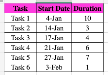
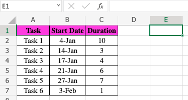
Here’s what a sample data table looks like:
To generate a scatter plot chart from this:
- Drag and select the data table
- Click on the Insert tab in the top menu
- Click on the Scatter chart icon
- Select your preferred chart layout
Format this basic scatter chart to show your data even more clearly:
- Select the chart
- Click on the Chart Design tab on the overhead task pane
- Click on the Add Chart Element icon in the top left corner
- Add a Data Label and Data Callout
- Edit the chart title
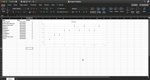
Keep exploring to customize the scatter plot chart further.
While scatter plot charts are slightly more complex than a SmartArt graphic, they may still not be enough for your horizontal timeline.
And let’s not forget that the purpose of a project timeline is to manage time on a project. How’s one supposed to do that while attending Excel 101 classes to create a simple chart?
The answer lies in using a project timeline template:
3 Excel Project Timeline Templates
Don’t we all know an Excel wizard?
Someone who makes us feel like we skipped a class?
Well, now you can be one of them too!
Thankfully you won’t have to read moth-eaten books and sit in ancient libraries to become an Excel expert.
Just let an Excel project timeline template do the magic.
1. Excel Gantt chart timeline template
2. Excel timeline template for milestones
3. Excel project schedule template
An Excel template should ease your project timeline worries. For some time. 👀
Meanwhile, the clock is ticking on the long-term issues of Excel project management:
3 Limitations Of Using Excel To Create A Project Timeline
Excel is like the old t-shirt that you never want to give away.
Why should you?
It fits you just right and has the coolest hashtags!
But if you want to achieve audacious goals, you’ll need to move beyond both of them. 💔
Here’s why you need to move on from Microsoft Excel for your project timeline needs.
1. No individual to-do lists
Sure, being able to access gigantic spreadsheets and data series with conditional formatting is great.
But you know what’s better?
Something that tells you what you need to do.
After all, Excel can’t help you build a functional to-do list and assign it to individual team members.
Unless your idea of a team meeting is looking into your spreadsheet’s soul with a magnifying glass, Excel won’t cut it for to-do lists.
However, let’s say you physically type out each person’s deliveries in a sheet, you still have the problem of…
2. Manual follow-ups
In the age of customized app notifications and uber-smart reminders, Excel project management depends on manual follow-ups.
What will your strategy be? Email colleagues, conduct hourly check-ins, or tap on everyone’s shoulders to ask if they’re done with their task. 🤯
Not only is it terribly inconvenient (and frankly annoying) it gives you no idea about your project’s progress.
3. Non-collaborative
Do you work in a non-hierarchical Agile environment where the whole team is involved in the decision-making process?
Well, guess what?
An Excel file can’t handle this.
Microsoft Excel (and other MS tools like Powerpoint) believe in single ownership of documents with limited support for collaboration.
And that’s hardly the complete list of why Excel can’t deliver.
Read all about why Excel project management SHOULDN’T be your go-to solution.
Luckily, we can point you in the direction of smoother workflows and efficient project management.
Check out ClickUp!
Create Effortless Project Timelines With ClickUp
Excel is a smart, handy tool that’s also occasionally clunky and very intimidating.
But what if you could have a tool that can do everything Excel does, except far better?
The answer is ClickUp!
It’s an award-winning project management tool that ensures end-to-end project management without the need to toggle between windows.
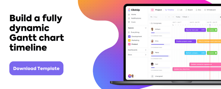
Just use the Timeline view, Gantt Chart, and Table view to get a complete picture of your project timeline on ClickUp.
1. Timeline view
ClickUp’s Timeline view is for those who want more from their timelines!
It gives you more tasks per row and more customization options than you can imagine.
2. Gantt chart view
If you’re plotting a project timeline, chances are you’re also plotting a Gantt chart.
It’s one step above a linear timeline as it lets you visualize project progress (as opposed to just the scheduled tasks) and trace dependencies clearly.
And with ClickUp on your side, it’s never been easier to create a Gantt chart!
Simple Gantt Chart Template by ClickUp

Use ClickUp’s Simple Gantt Chart Template is a great way to plan out tasks and estimate how long they will take.
Easily view the relationships between tasks in an easy-to-read timeline, so you can quickly adjust resources when needed. Plus, all changes are synchronized across teams, making it simple to stay up-to-date with everyone’s progress.
Make the most of your Gantt chart experience by managing Dependencies.
- Draw lines between tasks to schedule dependencies
- Reschedule them with drag and drop actions
- Delete them by hovering over and clicking on the dependency line and then selecting Delete
Find out the progress percentage of your project by hovering over the progress bar.
3. Table view
You may be wondering, “Hey, that all sounds good, but Microsoft Excel feels like home.”
That’s why we have the ClickUp’s Table view.

It’s a condensed look at your project timeline.
But you can also enhance it to show as much background information as you want.
Amp up your spreadsheet experience with these functions:
- Drag to copy your table and paste it into any Excel-type software
- Pin columns and change the row height for handy data analysis
- Navigate the spreadsheet with keyboard shortcuts
The Time’s Up For Excel Project Timelines!
Deadlines, coordination, reviews. Project time management is an endless struggle. And your project timeline is the one tool that helps you consistently navigate this.
Excel may seem like a simple way out, but it’s not the friendly, long-term companion it promises to be.
Try ClickUp for free today.
Related readings:
- How to create a timesheet in Excel
- How to create a form in Excel
- How to make a calendar in Excel
- How to create a Kanban board in Excel
- How to create a mind map in Excel
- How to create a KPI dashboard in Excel
- How to create a flowchart in Excel
- How to create a database in Excel
- How to Display Work Breakdown Structures in Excel

![]()
Office Timeline Pro+ is here!
Align programs and projects on one slide with multi-level Swimlanes.
A timeline is a type of chart which visually shows a series of events in chronological order over a linear timescale. The power of a timeline is that it’s a visual representation, which makes it easy to understand critical milestones in a project and the progress of a project schedule. Timelines are particularly powerful for project scheduling or project management when paired with a Gantt chart, as shown at the end of this tutorial.
![]()
Play Video
Options for making an Excel timeline
Microsoft Excel has a Scatter chart that can be formatted to create a timeline. If you need to create and update a timeline for recurring communications with clients and executives, it would be simpler and faster to
create a PowerPoint timeline.
On this page you can see both ways to create a timeline using these popular Microsoft Office tools. We will give you step-by-step instructions for making a timeline in Excel by formatting a Scatter chart. We will also show you how to instantly create an executive timeline in PowerPoint by pasting your project data from Excel.
Which tutorial would you like to see?
![]()
30 mins
Manually create timeline in Excel
![]()
Download Excel timeline template
How to create an Excel timeline in 7 steps
1. List your key events or dates in an Excel table.
-
List out the key events, important decision points or critical deliverables of your project. These will be called Milestones and they will be used to create a timeline.
-
Create a table out of these Milestones and next to each milestone add the due date of that particular milestone.
-
To create a timeline in Excel, you will also need to add another column to your table that includes some plotting numbers. Add the new column next to your milestone description column and list out a repetitive sequence of numbers such as 1, 2, 3, 4 or 5, 10, 15, 20 etc. Excel will use these plotting points to vary the height of each milestone when plotting them on your timeline template.
For this demonstration we’ll format the table in the image below into a Scatter chart and then into an Excel timeline. Then we’ll use it again to make a timeline in PowerPoint.
2. Make a timeline in Excel by setting it up as a Scatter chart.
-
From the timeline worksheet in Excel, click on any blank cell.
-
Then from the Excel ribbon, select the Insert tab and navigate to the Charts section of the ribbon.
-
In the Charts section of the ribbon drop down the Scatter or Bubble Chart menu.
-
Select Scatter which will insert a blank white chart space onto your Excel worksheet.

3. Add Milestone data to your timeline.
-
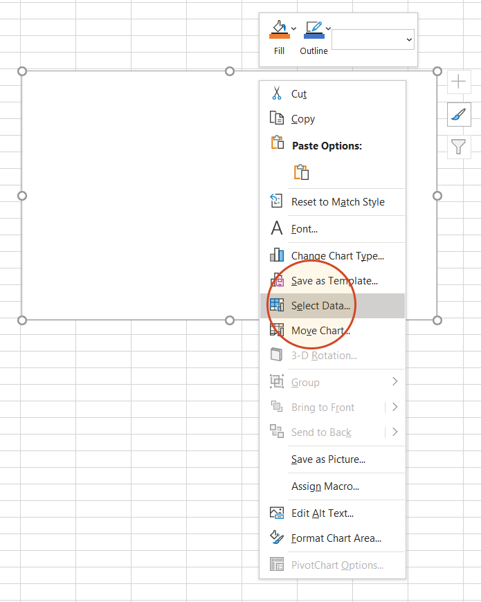
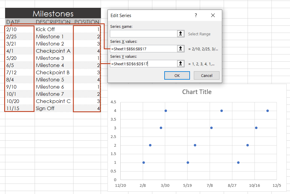
Right-click the blank white chart and click Select Data to bring up Excel’s Select Data Source window.
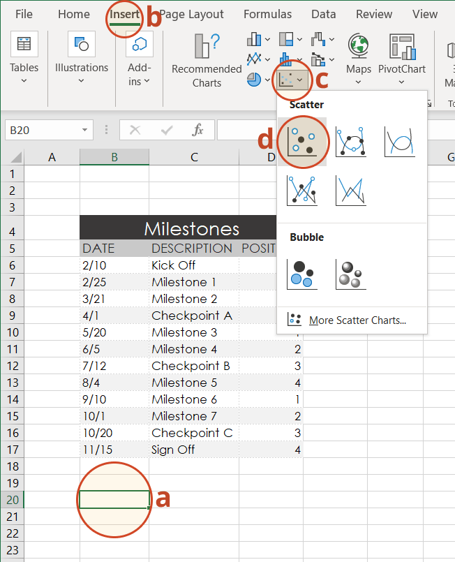
-
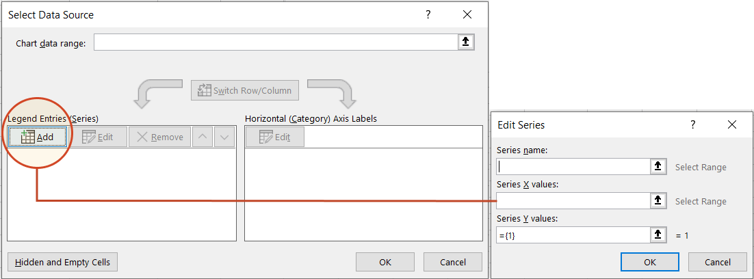
On the left side of Excel’s Data Source window, you will see a table named Legend Entries (Series). Click on the Add button to bring up the Edit Series window. Here you add the dates that will make your timeline.
-
We will enter the dates into the field named Series X values . Click in the Series X values window on the arrow button
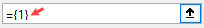
. Then select your range by clicking the first date of your timeline (ours is 2/10) and dragging down to the last date (ours is 11/15).Following the same path, we will enter the plotting numbers series into the field named Series Y values. Click in the Series Y value window and remove the value
that Excel places in the field by default. Then select your range by clicking on the first plotting number of your timeline (ours is 1) and then dragging down to the last plotting number of your timeline (ours is 4). -
Click OK and then click OK again to create a scatter chart.
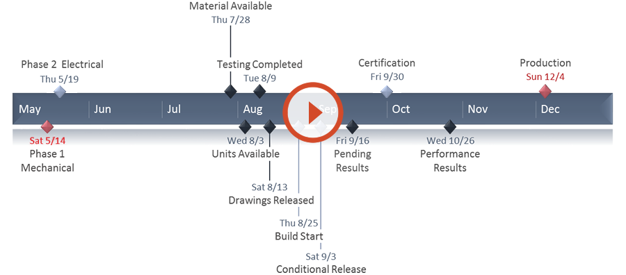
4. Turn your Scatter chart into a timeline.
-
Click on your chart to bring up a set of controls which will be presented to the upper right of your timeline’s chart. Click on the Plus button (+) to open the Chart Elements menu.
-
In the timeline’s Chart Elements control box, uncheck Gridlines and Chart Title.
-
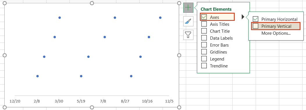
Staying in the Charts Elements control box, hover your mouse over the word Axes (but don’t uncheck it) to get an expansion arrow just to the right. Click on the expansion arrow to get additional axis options for your chart. Here you should uncheck Primary Vertical but leave Primary Horizontal checked.
-
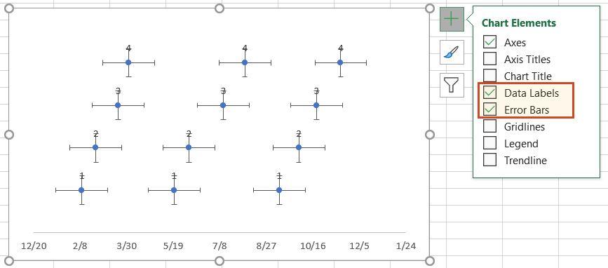
Staying in the Charts Elements control box just a little longer, add Data Labels and Error Bars.
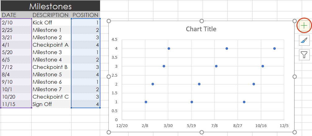
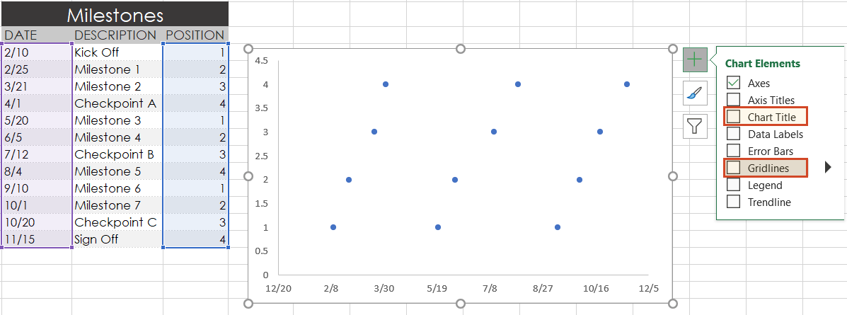
Your timeline chart should now look something like this:
5. Format chart to look like a timeline.
-
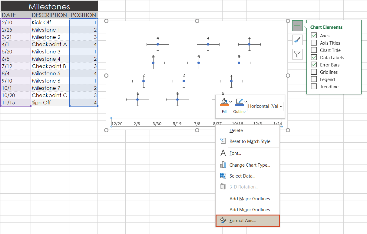
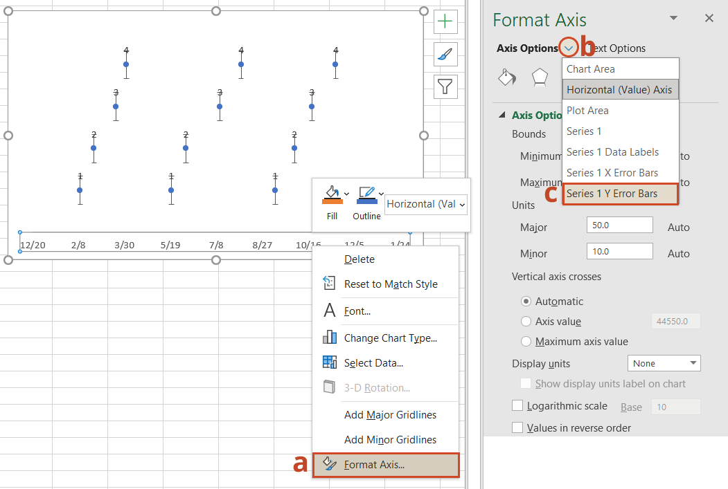
To make a timeline in Excel, we will need to format the Scatter chart by adding connectors from your milestone points. Right-click on any one of the dates at the bottom of your timeline and select Format Axis to bring up Excel’s Format Axis menu.
-
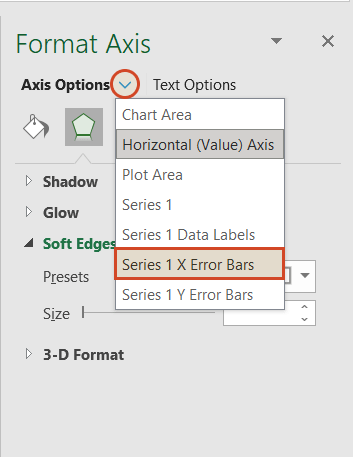
Drop down the arrow next to the title Axis Options and select Series 1 X Error Bars.
-
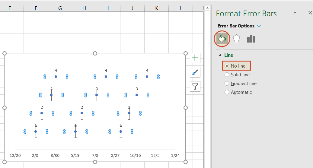
Under the Error Bar Options menu, click on the paint can icon to reveal the Fill & Line controls. Select No line, which will remove the horizontal lines around each of the plotted milestones on your timeline.
-
In a similar process, we will also adjust your timeline’s Y axis. Again, from the timeline, right-click on any one of your timeline’s dates at the bottom of the chart and select Format Axis. Drop down the arrow next to the title Axis Options and select Series 1 Y Error Bars.
-
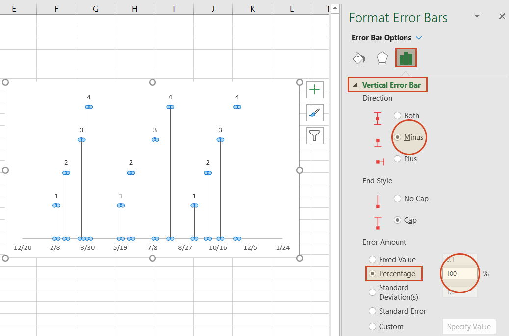
Right-clicking on any bar in the chart will open the Format Error Bars menu. From the Vertical Error Bar, set the direction to Minus. Then set the Error Amount to Percentage, and type in 100%. This will create connectors from your timeline’s milestones to their respective points on your timeband.
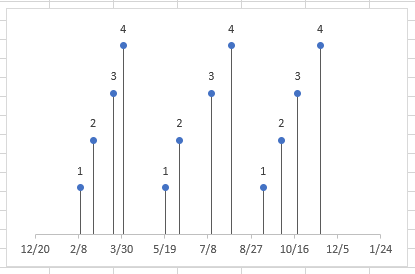
Your Excel timeline should now look something like the picture below.
6. Add titles to your timeline’s milestones.
You have built a Scatter chart as an Excel timeline. Now we will format it into a proper timeline.
-
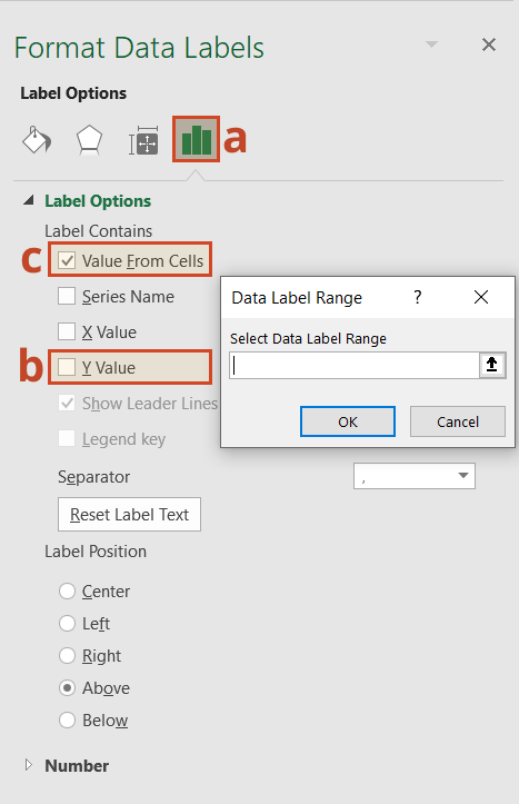
To finish making your timeline, we will add the milestone descriptions. Staying in the Format Axis menu, again drop down the menu arrow next to the title Axis Options. This time choose select Series 1 Data Labels to bring up the Format Data Labels menu.
-
Click the Label Options icon. Uncheck Y Value, and then put a check next to Value From Cells. This will bring up an Excel data entry window called Data Label Range.
-
In the Select Data Label Range window, you will enter your timeline’s milestone descriptions from the timeline table you built in step 1. To do this simply click on the description for the first milestone in your timeline table, (ours is Kick Off), then drag down to the last milestone in your timeline (ours is Sign Off). Click OK.
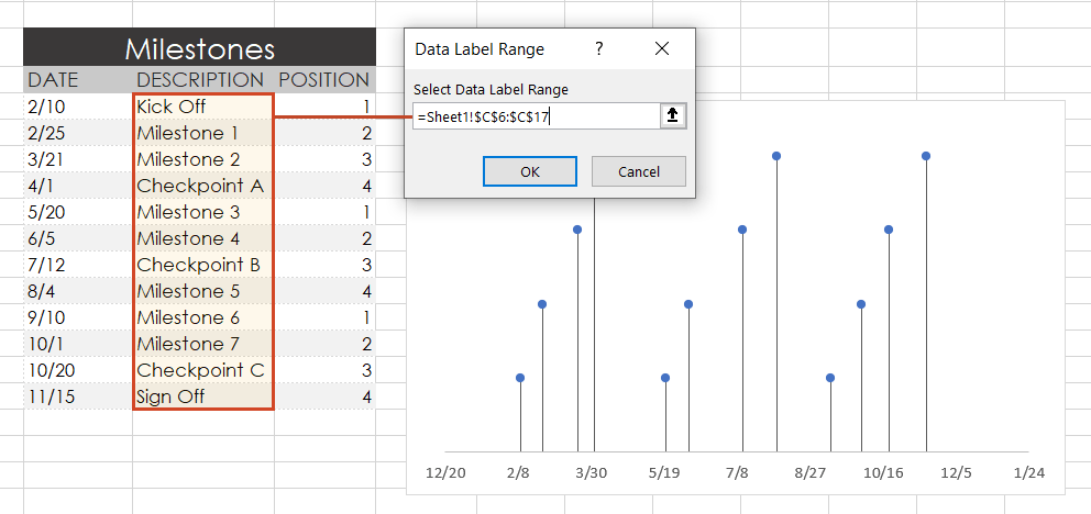
Your Excel timeline template should finally look more like this now:
7. Styling options for your timeline.
Now you can apply some styling choices to improve the aspect of your timeline.
-
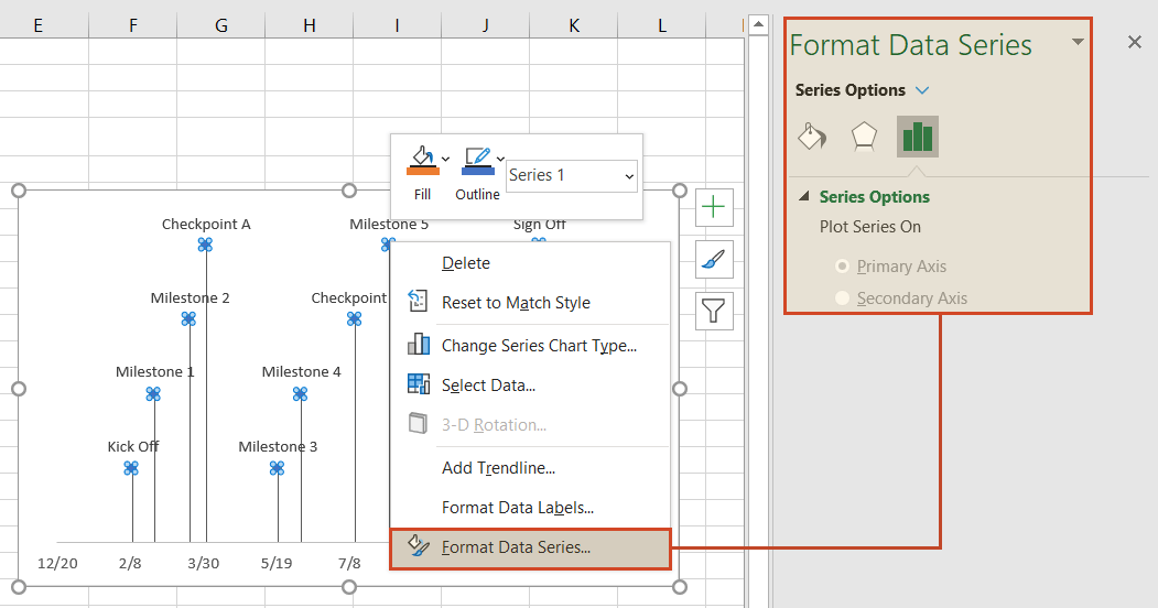
Coloring your timeline’s milestone markers.
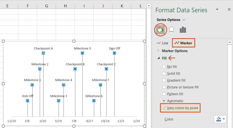
From your timeline, right-click on any of the milestone points (caps) and select Format Data Series to bring up the Series Options menu.
Select the paint can icon for Fill & Line options and, then choose the tab for Marker. You may also need to select Fill to reveal its menu. Then you can choose coloring options for your timeline’s milestone markers. In our example, we selected Vary colors by point, which lets Excel pick the milestone colors for our timeline.
-
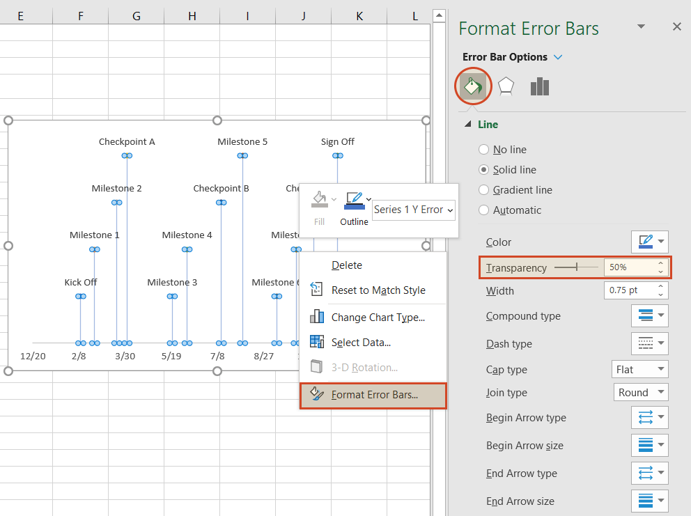
Change the vertical connector’s transparency.
On your timeline, right-click on any of the vertical connectors that connect your milestones with the timeband below. Select Format Error Bars to bring up the Vertical Error Bar menu. Again, select the paint can icon to choose Excel’s Line & Fill options. Here you can make formatting adjustments (color, size, style, etc.) to your timeline’s connector lines. In our example we set the transparency of the lines to 50%.
-
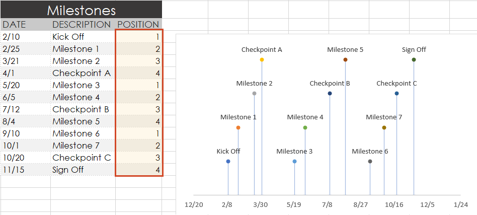
Vary the height of each milestone so their descriptions are not overlapping the neighboring milestone.
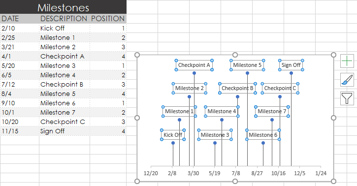
Remember the repeated sequence of numbers you added to your timeline table in step 1. Well, those set the height of each milestone on your timeline. By adjusting these numbers, you can play around with different height positions for each milestone. For example, to optimize our timeline, we used the number sequence, 1, 2, 3, 4, 1, 2, 3, 4.
Look how the descriptions would overlap if we changed the order (Don’t try this at home! 😊):
-
Trim off the empty space to the left or right of your Excel timeline by adjusting its minimum and maximum bounds.
Again right-click on any of the dates below your timeband. Select Format Axis.
Under the heading Bounds, adjusting the Minimum number upward will move your first milestone left on your timeline, closer to the vertical Axis. Likewise, adjusting the Maximum number down will move your last milestone right on your timeline, closer to the right edge of your chart.
-
Finished! Our timeline now looks like this:
To help you get started quickly, we have included a practical Excel template that you can download for free and learn how to create timelines in Excel.
![]()
Download a pre-built Excel timeline file
FAQs about timelines in Excel
Is there a timeline template in Excel?
Yes, there are several predefined timeline templates in Excel. To explore them, go to File > New, and check the templates preview list. If you cannot find what you need, use the “More templates” option and type “timeline” in the “Search for online templates” box to browse the collection of timeline templates.
If you’re not happy with the limitations that come along with the standard timeline templates in Excel, have a look at the library of professional timeline templates produced with Office Timeline and try our timeline creator.
How do you make a timeline in Word or other office tools?
There are two ways to make timelines in Word, Excel, PowerPoint and Outlook: using SmartArt and using Charts. Here’s an overview of the steps required by each option.
A. Using SmartArt. This method is mostly manual, but if you want to create a basic timeline with SmartArt, you should follow these 5 steps:
- Go to Insert > SmartArt;
- In Choose a SmartArt Graphic box, select Process on the left and then pick a layout that you like and click OK;
- In the SmartArt graphic, click [Text]. Fill in the data by typing or pasting your text;
- You can add items in the timeline: Right click on a shape, then Add Shape > Add Shape After/Before;
- You can move items around by dragging and dropping them as you like.
After you create the timeline, you can add or move dates, and you can style your timeline further, apply different styles or change layouts and colors.
See more detailed instructions on using SmartArt to make timelines in our tutorial on how to make a timeline in Word.
B. Using Charts. You have various options: Column Charts, Bar Charts or Scatter Charts. In all the Office programs, this method will work with Excel data tables, so, you’ll need to group your data in Excel. Please note you’ll need some formatting to get a usable timeline. There are three basic steps for using Charts:
- Go to Insert > Chart > Insert Column or Bar Chart > 2-D Bar/3-D Bar;
- Select Stacked Bar (not 100% Stacked Bar);
- Format and style the newly created bar chart until you get the timeline that you like.
If you need more detailed instructions check out our series or tutorials on how to make timelines with your usual office tools.
Where can I create a timeline?
You can create timelines online or using offline tools. In both cases, you can choose between automated and manual work.
1. Let’s start with the most efficient way to make a timeline: using automation. This method is time saving and offers the best results, especially with more complex projects.
-
Offline tools: Office Timeline Add-in with its professional and free timeline maker versions. Office Timeline is a PowerPoint add-in that helps you quickly make and manage professional timelines and Gantt charts. It allows using templates, making timelines from scratch and importing data from Excel, Microsoft Project, Smartsheet or Wrike.
-
Online, with Office Timeline Online – premium and free versions. Office Timeline Online is an easy-to-use timeline creator that helps you with professional PowerPoint timeline creation in minutes, but also with slides updating and online sharing.
2. There are also manual ways to make a timeline from scratch, or from templates:
-
Offline, you can make timelines in any Office application, by using templates or designing your timeline using shapes and objects.
-
Online, you can make timelines in Google Docs editor.
However, these methods are not specialized for timeline creation, so they require more time and detailed instructions, and creative solutions to make timelines from graphics. In the end, you may find that the result might not be worth all the time and effort.
What is the best program to make a timeline?
There are several options of good timeline creators – online and offline, depending on your needs. We have found several options of automated tools, specialized in timeline creation, that meet the basic criteria for a good timeline creator: professional looking timelines, complex features, ease of use and good price-quality ratio. Our top three timeline creators are: Office Timeline – with its web-based app and the desktop add-in, Tiki-Toki and Sutori – both web-based.
Visit our blog to see the complete list of 10 best timeline makers that might be worth your while.
Make a great looking timeline from Excel directly in PowerPoint
There is an easier way to put your Excel data into a good-looking timeline. PowerPoint is better suited than Excel for making impressive timelines that clients and executives want to see.
In the tutorial below, we will show you how to quickly paste the Excel table you created above in Step 1 into PowerPoint using Office Timeline, a user-friendly PowerPoint add-in that instantly makes and updates timelines from Excel. To begin, you will need to install Office Timeline, which will add a timeline creator tab to PowerPoint.
1. Open PowerPoint and paste your table into the Office Timeline wizard.
-
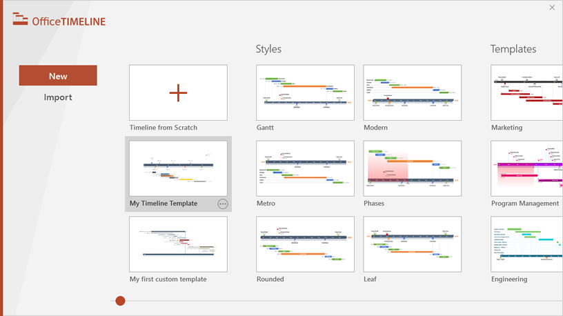
Inside PowerPoint, click on the Office Timeline tab, and then click the New icon.
This will open a gallery where you can choose between various timeline styles, stock templates and even custom templates.
-
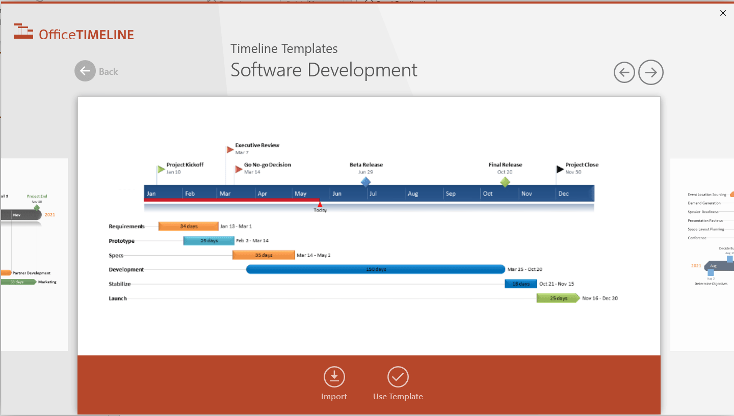
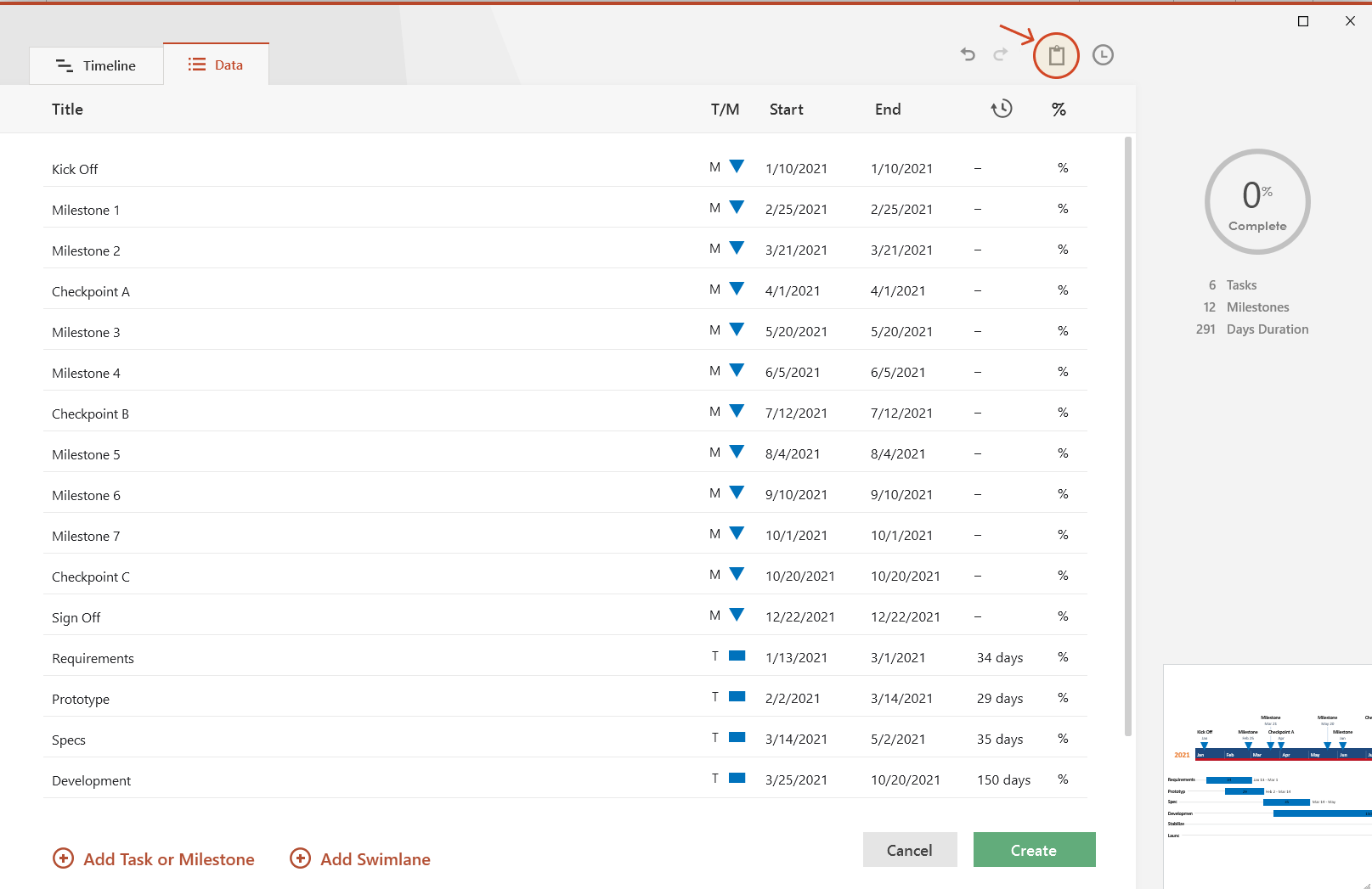
From the gallery, double-click the style or template you wish to use for your timeline to open its preview window and then select Use Template. (You can find more designs in our timeline templates library.) For this demonstration, we will choose the Software Development timeline template. If you prefer to import and refresh your Excel table, rather than copy-paste, click on the Import button in the preview window.
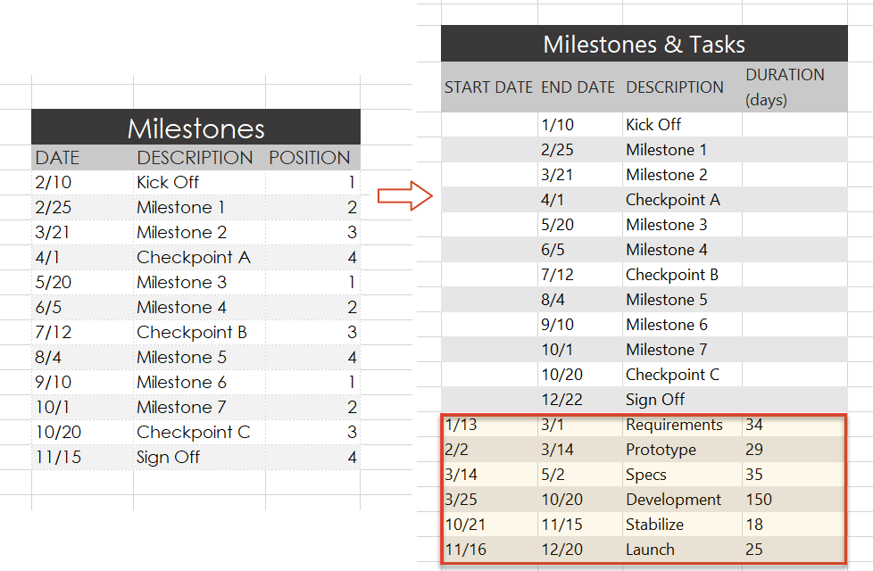
-
Copy the data from Excel
We have updated our data a bit, so that we get the timeline, but also a more detailed view of our project: we deleted the Timeline column, as we don’t need it, and added a list of tasks (with start and end dates and duration).
Copy the data from your Excel table, but make sure not to include the column headers.
-
Now, simply paste the section into PowerPoint by using the Paste button in the upper-right corner of the Data Entry wizard.
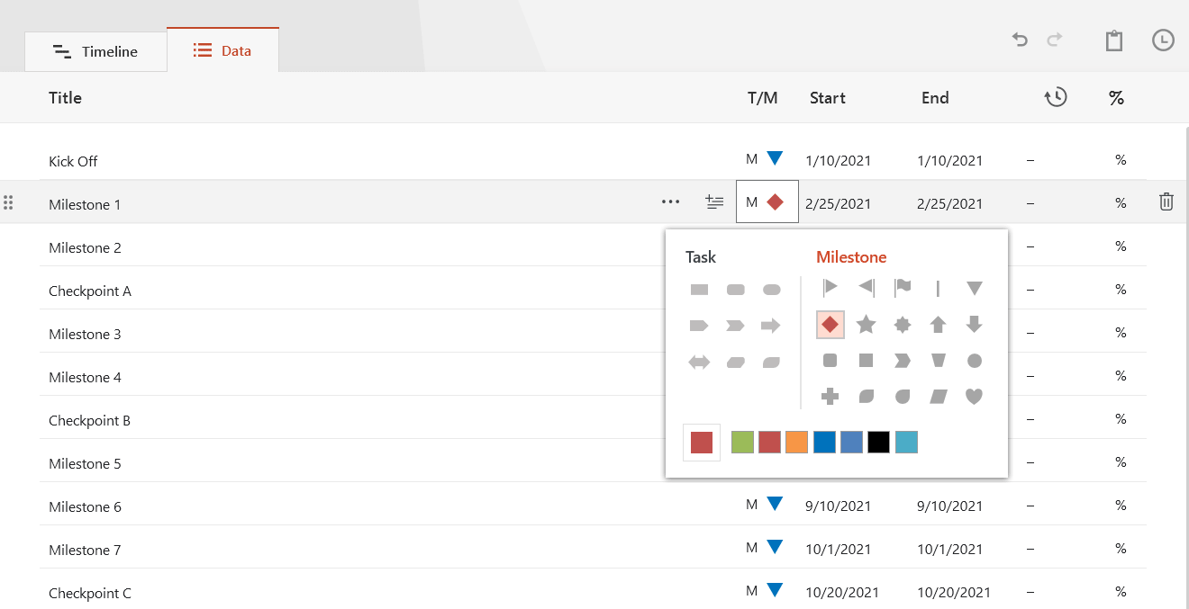
Make edits if necessary (such as changing milestone shapes and colors or adding and removing items) and click the Create button.
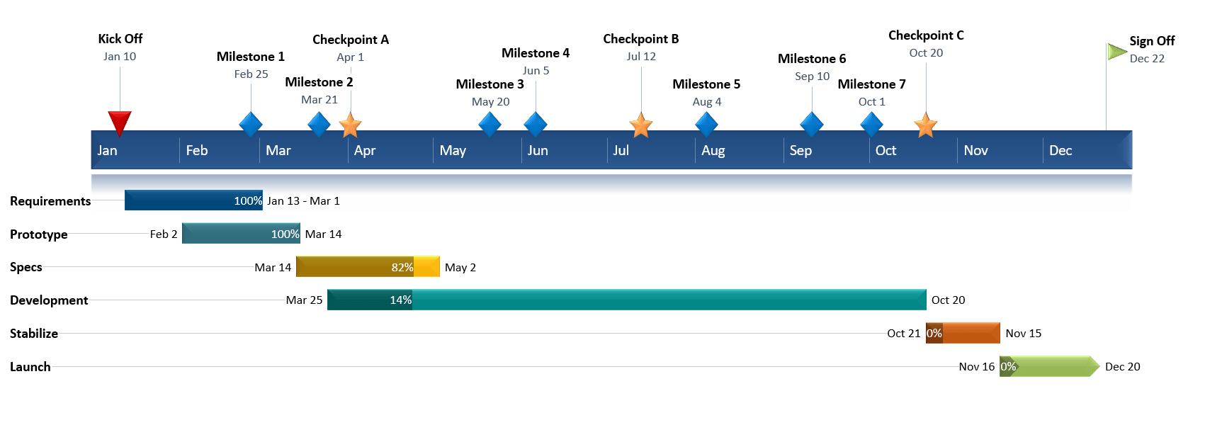
2. Instantly, you will have a new timeline slide in PowerPoint.
-
Depending on the template or style you selected from the gallery, you will have a timeline similar to this:
-
You can easily customize the timeline further using Office Timeline. In our example above, we added percent complete, removed the Today’s Date marker, changed milestones, adjusted colors, and added tasks to create a Gantt chart.
![]()
Download PowerPoint timeline template file
How to make a PowerPoint timeline from Excel in under 60 seconds:
![]()
Play Video
You can also use Office Timeline’s online timeline maker to easily build timelines and other similar visuals that you can instantly update and share with executives and teams.
See our free timeline template collection

Incident Response Plan
Free, downloadable timeline graphic using hours and minutes to give a clear overview on how an organization needs to plan its reaction to incidents so that outage be limited and activity resumed as soon as possible.

Crisis Management Plan
Professionally-designed timeline example structured in swimlanes that covers all the steps and processes one needs to follow in a crisis management process, from when the crisis occurs to response, business continuity process, recovery, and review.

Swimlane Diagram
Swimlane PowerPoint template that clearly lays out the framework of a project, from scheduling activities to task assignment and resource management.

Marketing Swimlanes Roadmap
Swimlane diagram example that provides a crisp, well-structured illustration of the tasks and milestones of your marketing campaign, according to the phase of the campaign to which they belong.

Marketing Plan
Free marketing timeline model that, once customized, effectively outlines your overall marketing strategy and serves as a solid visual aid to support marketing plan presentations.

Project Plan
Intuitive PowerPoint slide that serves as a quick yet visually effective alternative to complex project management tools to produce clear, well-laid-out plans for launching a project.

Sales Plan
Easy-to-edit sales plan sample for sales leaders, marketers or account executives to lay out objectives against a timeband in weeks; it can be customized to show campaign plans and targets in months, quarters or years.

Example Timeline
Visual template with Today’s Date indicator that helps enterprise workers get a quick start on creating timelines for project reviews, status reports, or any presentations that require a simple project schedule.

Blank Timeline
Generic timeline example that can be easily customized to quickly make an impressive, high-level summary of important events in a chronological order.
Learning how to create a project timeline in Microsoft Excel is useful when planning complex projects by having a visual component.
One of the most significant parts of project management is the project timeline. From the beginning to the end of the project, the flow of tasks must be planned and determined.
The project timeline is a set of actions that must be completed in a specific order to complete the project within the specified time frame. Simply put, the project timeline is a timetable with to-do lists.
All of the tasks provided will have a start date, duration/period, and end date so that you can keep track of the project’s progress and ensure that it is completed on time.
In other words, information that is clearly presented and exhibited will be much easier for the human brain to process. As a result, when planning large projects with many moving parts, the visual component is critical.
The simplest way to create a project timeline in Microsoft Excel is by using the smart tools through graphical representations. In today’s tutorial, we will be exploring using scatter charts in Excel.
Have you not heard it? Don’t worry as we will go through each chart or Excel tool and explain what it is and how it can help us create a project timeline in Microsoft Excel.
This will be the scatter plot that appears on your sheet.
You may download a copy of the spreadsheet by clicking on the link below.
Once you are ready to start the tutorial, we can jump into creating the project timelines using different charts together!
Creating a Project Timeline Manually in Microsoft Excel
In this example, we will be building our own timeline table to visualize a product creation process. This section will walk you through each step of creating a project timeline in Microsoft Excel.
Follow these steps to start creating a project timeline for your product creation:
- First, we need to figure out the timeline for product creation, from the number of tasks or processes to be performed, the datelines, and also the number of days used to perform a task.
- Once all the above are made known, we list them out tidily on the sheet.
- Now we will start creating the project timeline. Click on the cell you want to start on, in this example, it will be E1.
- We will create a title by entering
Project Timelinein E1 and also list down the tasks accordingly vertically.

- Next, we list down all the relevant dates. Since the project starts on the 4th of January, we will key in
4 Janin cell F2. The cell will automatically recognize4 Janas a date and format the cell accordingly.
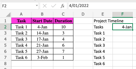
- Then, we will drag the corner dot of F2 to fill in the rest of the dates horizontally until it reaches the 3rd of February.
![]()
- Once we reach the 3rd of February, we then select the entire row of columns and double click on the line of the column heading. This helps to adjust the width of all the selected columns to fit the inputs keyed into the cells.

- A shortcut to select all the columns is to select column F, then press simultaneously Shift + Command + Right Arrow Key.
- Lastly, you can customize and design the project timeline table as to your preference, and it’s done!
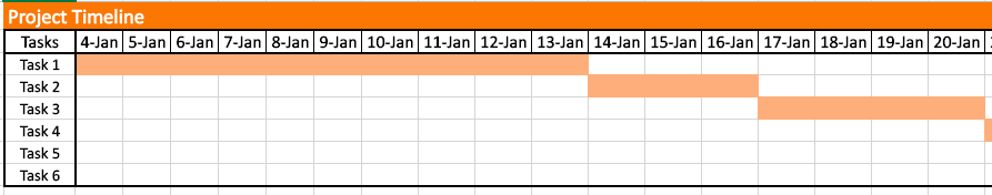
With this project timeline table, it is much easier to visualize which days you would need to meet which task’s deadlines and have a neater calendar to follow.
Creating a Project Timeline Using a Scatter Plot in Microsoft Excel
Dots are used to indicate values for two different numeric variables in a scatter plot (also known as a scatter chart or scatter graph).
The values for each data point are indicated by the position of each dot on the horizontal and vertical axes. Scatter plots are used to see how variables relate to one another.
In this example, we are using the scatter plot to indicate the importance of a task in a project timeline. This means that the higher the dot or task is on the scatter plot, the more important the task is.
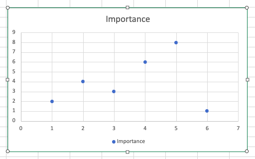
- Similar to the previous example, we will need to list down the specific tasks of a project and rate the importance of each task out of a total score of 10.
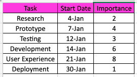
- Once the data are neatly displayed, we will select all the data to create a scatter plot. Select Insert, then select Scatter Chart and select the Scatter with only Markers.

- This will be the scatter plot that appears on your sheet.
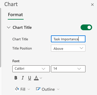
- Next, we need to edit the scatter plot. Double click on the graph itself, and a Chart Editing Box will pop up on the right of your sheet.

- First, we will rename the chart title to
Task Importance.
- Next, we need to change the Number Format. Make sure you input as per below. This will help to translate and format the dates shown in the graph.

- Another thing to make sure of is to remove all major gridlines on both horizontal and vertical axis to give the graph and clean and professional look.
- The last thing to edit is the market itself. To find that section, click Series “Importance” and select the dropdown for Market Options. You can then customize it to your liking.

- Once all the above are done, your scatter plot will look like this.

- To create a more informative scatter plot, we can also add labels next to the markers. Simply select the dropdown for Data Labels, tick Category Name, and customize the font as per your preference.
- Your scatter plot will look like these once labels are added.

By using the scatter plot, anyone can easily identify the most important task to focus on throughout the project timeline.
There you go! Now you know two different ways to display and visualize the timeline for any project.
Don’t forget to check out the rest of Microsoft Excel’s great features to help you improve and simplify your work in the real world!
Make sure to subscribe to our newsletter to be the first to know about the latest guides and tutorials from us.

Get emails from us about Microsoft Excel.
Our goal this year is to create lots of rich, bite-sized tutorials for Microsoft Excel users like you. If you liked this one, you’d love what we are working on! Readers receive ✨ early access ✨ to new content.

Hello! I am currently working in the audit field and also a fellow excel enthusiast! Dealing with Excel worksheets daily, lets me discover a vast variety of functions and combinations of formulas that allows endless possibilities. Can’t wait to showcase more functions that you never knew existed!
Временная шкала проекта (Project Timeline)
Предположим, мы работаем над долгим и сложным проектом, состоящим из нескольких этапов. Задача — наглядно показать всю хронологию работ по проекту, расположив ключевые моменты проекта (вехи, milestones) на оси времени. Примерно вот так:
В теории управления проектами подобный график обычно называют календарем или временной шкалой проекта (project timeline), хотя я также встречал еще один русскоязычный аналог -«лента времени». В любом случае, главное — не как назвать, а как построить. Поехали.
Шаг 1. Исходные данные
Для построения нам потребуется оформить исходную информацию по вехам проекта в виде следующей таблицы:
Обратите внимание на два дополнительных служебных столбца:
- Линия — столбец с одинаковой константой около нуля по всем ячейкам. Даст на графике горизонтальную линию, параллельную оси Х, на которой будут видны узлы — вехи проекта. В принципе, можно было бы использовать и полный ноль, но тогда график совпадает с осью X, что дает проблемы потом с настройкой внешнего вида диаграммы в Excel 2007-2010. Новый Excel 2013 нули воспринимает спокойно.
- Выноски — невидимые столбцы для поднятия подписей к вехам на заданную (разную) величину, чтобы подписи не накладывались. Значения 1,2,3 и т.д. задают уровень поднятия подписей над осью времени и выбираются произвольно.
Шаг 2. Строим основу
Теперь выделяем в таблице все, кроме первого столбца (т.е. диапазон B1:D13 в нашем примере) и строим обычный плоский график с маркерами на вкладке Вставка — График — График с маркерами (Insert — Chart — Line with markers) :
Убираем линии сетки, вертикальную и горизонтальную шкалы и легенду. Сделать это можно вручную (выделение мышью и клавиша Delete) или отключив ненужные элементы на вкладке Макет (Layout) . В итоге должно получиться следующее:
Теперь выделите ряд Выноски (т.е. ломаную оранжевую линию) и на вкладке Макет выберите команду Линии — Линии проекции (Layout — Lines — Projection Lines) :
От каждой точки верхнего графика будет опущен перпендикуляр на нижний. В новом Excel 2013 эта опция находится на вкладке Конструктор — Добавить элемент диаграммы (Design — Add Chart Element) .
Шаг 3. Добавляем названия этапов
Эта часть будет простой у тех, кто уже осмелился на установку нового Excel 2013 и более сложной у тех, кто еще работает со старыми версиями.
В Excel 2013 все просто. Как я уже писал здесь, он умеет делать подписи к точкам данных просто беря текст из любого заданного пользователем диапазона. Для этого нужно выделить ряд с данными (оранжевый) и на вкладке Конструктор выбрать Добавить элемент диаграммы — Подписи — Дополнительные параметры (Design — Add Chart Element — Data Labels) , а затем в появившейся справа панели установить флажок Значения из ячеек (Values from cells) и выделить диапазон A2:A13:
В версиях Excel 2007-2010 и старше такой возможности нет, но у вас есть два альтернативных варианта:
-
Добавьте любые подписи к оранжевому графику (значения, например). Затем выделяйте по очереди каждую подпись, ставьте в строке формул знак «равно» и щелкайте по ячейке с названием этапа из столбца А. Текст выделенной подписи будет автоматически браться из выделенной ячейки:

При большом количестве этапов первый вариант, конечно, не радует своей «рукопашностью». Поэтому для оптовой вставки подписей из ячеек можно использовать дополнительные надстройки на VBA. В частности, надстройку XYChartLabeler (автор — Rob Bovey, Excel MVP). Скачиваете надстройку, устанавливаете и получаете на вкладке Надстройки (Add-ins) кнопку XY Chart Labeler — Add Chart Labels. После нажатия на нее появляется диалоговое окно, где и можно задать диапазон с данными для подписей на диаграмме:
Шаг 4. Прячем линии и наводим блеск
Внесем последние правки, чтобы довести нашу уже почти готовую диаграмму до полного и окончательного шедевра:
- Выделяем ряд Выноски (оранжевую линию), щелкаем по ней правой кнопкой мыши и выбираем Формат ряда данных (Format Data Series) . В открывшемся окне убираем заливку и цвет линий. Оранжевый график, фактически, исчезает из диаграммы — остаются только подписи. Что и требуется.
- Добавляем подписи-даты к синей оси времени на вкладке Макет — Подписи данных — Дополнительные параметры подписей данных — Имена категорий (Layout — Data Labels — More options — Category names) . В этом же диалоговом окне подписи можно расположить под графиком и развернуть на 90 градусов, при желании.
Excel 2013. Срезы сводных таблиц; создание временной шкалы
В Excel 2010 появился новый инструмент анализа данных – срезы сводных таблиц. [1] С помощью срезов можно фильтровать сводные таблицы подобно тому, как это происходит с помощью области фильтра списка полей сводной таблицы. Различие заключается в том, что срезы обеспечивают дружественный интерфейс, позволяющий просматривать текущее состояние фильтра.
Чтобы создать срез поместите указатель мыши в область сводной таблицы, выберите контекстную вкладку ленты Анализ и щелкните на кнопке Вставить срез (рис. 1). Также, встав на сводную таблицу, можно перейти на вкладку Вставка и в области Фильтры выбрать команду Срез.
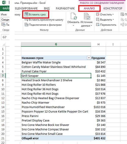
Рис. 1. Создание среза: шаг 1 – команда Вставить срез
Скачать заметку в формате Word или pdf, примеры в формате Excel
Появится диалоговое окно Вставка срезов (рис. 2). Устанавливаемые в этом окне флажки определяют критерии фильтрации. В рассматриваемом случае выполняется фильтрация по срезу Категория оборудования. Можно задать одновременно несколько срезов.
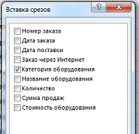
Рис. 2. Создание среза: шаг 2 – выбор критерия, по которому осуществляется фильтрация с помощью среза
Когда срез создан (рис. 3) можно щелкнуть на значениях фильтра для выполнения фильтрации сводной таблицы. Для выбора нескольких фильтров во время щелчка мышью удерживайте клавишу Ctrl.
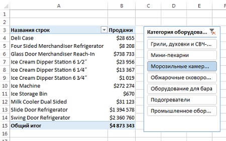
Рис. 3. Настройка фильтра с помощью среза
Еще одно преимущество, связанное с использованием срезов, заключается в том, что каждый срез может быть связан с несколькими сводными таблицами. Другими словами, в случае применения фильтра к какому-либо срезу произойдет его применение к нескольким сводным таблицам. Для подключения среза к нескольким сводным таблицам щелкните на нем правой кнопкой мыши и в контекстном меню выберите пункт Подключения к отчетам. На экране появляется диалоговое окно Подключения сводной таблицы. В этом окне установите флажки, соответствующие сводным таблицам, которые будут фильтроваться с помощью данного среза (рис. 4).
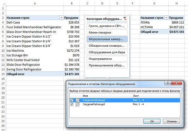
Рис. 4. Подключение одного фильтра к нескольким сводным таблицам
С этого момента любой фильтр, примененный к срезу, будет также применен ко всем подключенным к нему сводным таблицам. Срезы имеют одно уникальное преимущество по сравнению с областью фильтра сводной таблицы: они позволяют контролировать состояние фильтров для нескольких сводных таблицы. Область же фильтра позволяет контролировать состояние только той сводной таблицы, в которой она находится.
Обратите внимание на то, что срезы не являются частью сводной таблицы. Они представляют собой отдельные объекты, которые могут использоваться самыми разными способами.
Заметьте, что показанный на рис. 4 список сводных таблиц выглядит довольно абстрактно (СводнаяТаблица2, СводнаяТаблица3). Эти обобщенные имена автоматически присваиваются сводным таблицам и применяются для идентификации. На самом деле довольно сложно распознать нужную вам сводную таблицу на основе подобных обобщенных названий. Поэтому лучше выбирать более осмысленные названия, облегчающие идентификацию сводных таблиц. Чтобы изменить название сводной таблицы, установите указатель мыши в произвольном ее месте, выберите контекстную вкладку Анализ и введите понятное имя в поле Имя сводной таблицы, находящемся в левой части ленты (рис. 5).
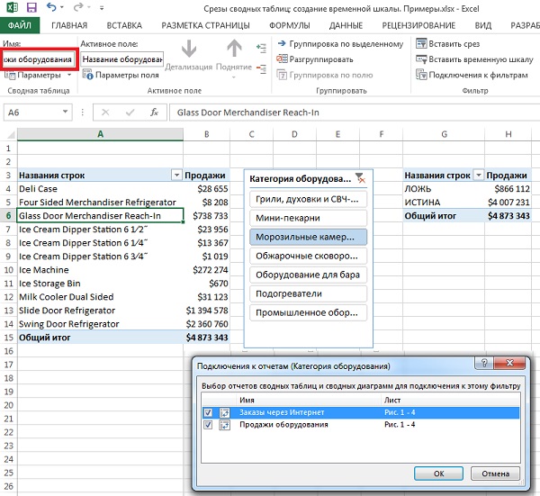
Рис. 5. Присвоение сводной таблицы «говорящего» имени
Создание временной шкалы
Временная шкала появилась в Excel 2013. Этот фильтр напоминает стандартный срез тем, что для фильтрации сводной таблицы используется механизм визуального выбора фильтра вместо прежних полей фильтра. Различие же заключается в том, что временная шкала предназначена исключительно для работы с полями даты и обеспечения визуального способа фильтрации и группирования дат в сводной таблице.
Необходимое условие создания временной шкалы — наличие поля сводной таблицы, в которой все данные имеют формат даты. Недостаточно иметь столбец данных, включающий несколько дат. Все значения, находящиеся в поле даты, следует отформатировать с помощью корректного формата даты. Если хотя бы одно значение в столбце даты пустое или не является корректной датой, Excel не сможет создать временную шкалу.
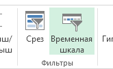
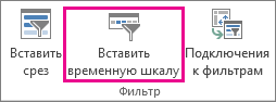
Чтобы создать временную шкалу, поместите указатель мыши в область сводной таблицы, выберите вкладку ленты Анализ и щелкните на значке Вставить временную шкалу (рис. 6). Также, встав на сводную таблицу, можно перейти на вкладку Вставка и в области Фильтры выбрать команду Временная шкала.
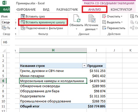
Рис. 6. Создание временной шкалы – шаг 1 – Вставить временную шкалу
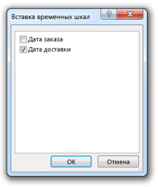
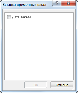
На экране появится диалоговое окно Вставка временных шкал (рис. 7). В этом окне отображаются все поля дат, доступные в выбранной сводной таблицы. Выберите поля, для которых будут созданы временные шкалы.
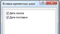
Рис. 7. Создание временной шкалы – шаг 2 – выбор полей, для которых будут созданы временные шкалы
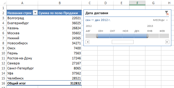
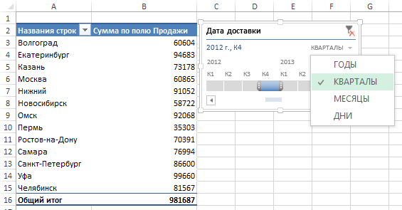
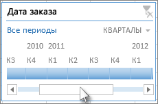
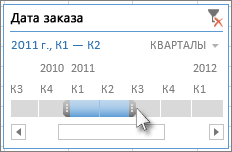
После создания временной шкалы у вас появится возможность фильтровать данные в сводной таблице с помощью этого динамического механизма выбора данных. Как показано на рис. 8, после щелчка на фильтре Апрель будут отображены данные сводной таблицы, относящиеся к апрелю.
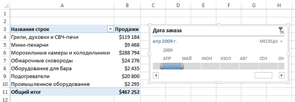
Рис. 8. Щелкните на выбранной дате для фильтрации сводной таблицы
Вы можете выбрать связный диапазон, щелкнув на левую крайнюю точку, и нажав Shift, щелкнуть на правой крайней точке. Вы также можете потянуть за границы диапазона в одну и другой сторону.
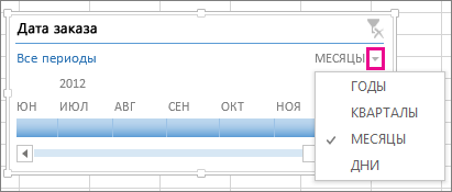
Если вам нужно отфильтровать сводную таблицу по кварталам, щелкните на раскрывающемся списке временного периода и выберите параметр Кварталы. В случае необходимости можно также выбрать параметр Годы или Дни (рис. 9).
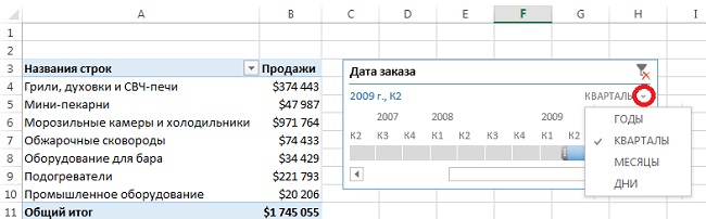
Рис. 9. Быстрое переключение между параметрами Годы, Кварталы, Месяцы или Дни
Временным шкалам не присуща обратная совместимость, поэтому они могут использоваться только в Excel 2013. Если открыть соответствующую рабочую книгу в Excel 2010 либо в более ранней версии Excel, временные шкалы будут отключены.
Временным шкалам не присуща обратная совместимость, поэтому они могут использоваться только в Excel 2013. Если открыть соответствующую рабочую книгу в Excel 2010 либо в более ранней версии Excel, временные шкалы будут отключены.
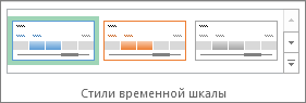
Макет любого среза можно изменить, кликнув на срезе и перейдя на контекстную вкладку Параметры из набора контекстных вкладок Инструменты для среза. Количество колонок с полями, отображаемыми в области среза, можно увеличить. Это особенно полезно, если элементов много. Перейдите в область Кнопки контекстной вкладки Параметры. С помощью кнопки-счетчика Столбцы увеличьте количество столбцов среза. Воспользуйтесь маркерами изменения размера для расширения либо сужения среза. Для каждого поля среза можно выбрать другой цвет с помощью коллекции Стили срезов (рис. 10).
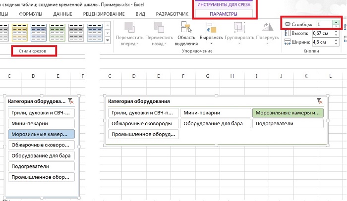
Рис. 10. Форматирование срезов
В области среза могут отображаться до трех цветов. Темный цвет соответствует выделенным элементам. Белые квадратики часто означают, что запись, служащая источником данных для среза, отсутствует. Серые квадратики соответствуют невыделенным элементам.
Путем щелчка на кнопке Настройка среза, находящейся на контекстной вкладке Параметры, можно изменить название среза и порядок отображения его полей. Чтобы изменить стиль среза, щелкните правой кнопкой мыши на существующем стиле и в контекстном меню выберите параметр Дублировать. Теперь можете изменять шрифт, цвета и другие элементы стиля среза (подробнее о создании собственного стиля оформления см. Создание стиля сводной таблицы).
Блог о программе Microsoft Excel: приемы, хитрости, секреты, трюки
Новая временная шкала в Excel 2013
Недавно наткнулся на одно из новшеств Excel 2013 – временная шкала. Работает точно по такому же принципу, что и любой стандартный срез – т.е. позволяет визуально отображать параметры фильтрации, вместо старых полей фильтров. Разница заключается в том, что Временная шкала обрабатывает только временные данные в сводной таблице.
Если у вас Excel 2013, поместите курсор в любом месте сводной таблицы, на вкладках ленты выберите Вставить. В группе фильтры вы найдете Временную шкалу.
Кликнув по иконке вы активируете диалоговое окно, в котором необходимо выбрать поле для нашей Временной шкалы.
Как только Временная шкала будет создана, на экране появится срез, который позволяет фильтровать данные, используя полосу прокрутки.
Так, кликнув на поле Октябрь, сводная таблица отобразит данные, касающиеся только это временного промежутка.

Размер ползунка не ограничивается только одним месяцем, вы можете расширить границы фильтрации путем перетаскивания рамок.
Во временной шкале существует возможность установить заданные временные промежутки. Если щелкнуть по иконке треугольника, находящегося правее поля Месяцы, срез позволит изменить рамки по уже заданным критериям: Годы, Кварталы, Месяцы и Дни.
Несколько вещей, которые необходимо учитывать при использовании Временной шкалы:
Временная шкала может быть создана только для поля, где все данные отформатированы как даты. Не достаточно того, чтобы поле имело только несколько ячеек с датами. Если хотя бы одна ячейка будет пустой или будет отформатирована не как дата, Excel не будет создавать временную шкалу.
Временные шкалы не совместимы с предыдущими версиями Excel, т.е. они могут быть использованы только в Excel 2013. Если вы откроете книгу с временной шкалой в более ранних версиях, срезы будут отключены.
Как и все срезы, временные шкалы очень хороши для использования в дашбордах.
По умолчанию, временные шкалы выводятся на печать. Это может иметь положительный или отрицательный отклик (все зависит от вашей политики). Вы можете отключить данную опцию, убрав флажок с поля Выводить объект на печать, находящееся во вкладке Свойства, диалогового окна Формат временной шкалы.
Ко всему вышесказанному добавлю, что мне очень понравилось работать со срезом Временна шкала. По сравнению с предыдущей версией, налицо явный прогресс. В отличие от Excel 2010, где временная шкала была представлена в виде списка дат, новый вариант позволяет динамически изменять размеры границ.
Создание временной шкалы сводной таблицы для фильтрации дат
Вместо настройки фильтров для отображения дат вы можете воспользоваться временной шкалой сводной таблицы. Это параметр динамического фильтра, позволяющий легко фильтровать по дате или времени и переходить к нужному периоду с помощью ползунка. Чтобы добавить эту шкалу на лист, на вкладке Анализ нажмите кнопку Вставить временную шкалу.
Как и срез для фильтрации данных, временную шкалу можно добавить один раз и затем использовать в любой момент для изменения диапазона времени сводной таблицы.
Ниже описано, как это сделать.
Щелкните в любом месте сводной таблицы, чтобы отобразить группу Работа со сводными таблицами, и на вкладке Анализ нажмите кнопку Вставить временную шкалу.
В диалоговом окне Вставка временных шкал установите флажки рядом с нужными полями дат и нажмите кнопку ОК.
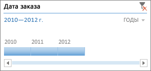
Использование временной шкалы для фильтрации по периоду времени
Вставив временную шкалу, вы можете фильтровать данные по периоду времени на одном из четырех уровней (годы, кварталы, месяцы или дни).
Нажмите на стрелку рядом с отображаемым временным уровнем и выберите нужный вариант.
Перетащите полосу прокрутки временной шкалы к периоду времени, который вы хотите проанализировать.
В элементе управления отрезка времени нажмите на плитку периода времени и перетащите ее, чтобы добавить дополнительные плитки для выбора нужного диапазона дат. С помощью маркеров отрезка времени отрегулируйте диапазон дат с обеих сторон.
Использование временной шкалы с несколькими сводными таблицами
Если ваши сводные таблицы имеют один и тот же источник данных, вы можете использовать одну временную шкалу для фильтрации по нескольким сводным таблицам. Щелкните временную шкалу, а затем на вкладке Параметры нажмите кнопку Подключения к отчетам и выберите сводные таблицы, которые вы хотите добавить.
Очистка временной шкалы
Чтобы очистить временную шкалу, нажмите кнопку Очистить фильтр  .
.
Совет: Если нужно объединить срезы с временной шкалой для фильтрации одного и того же поля дат, установите флажок Разрешить несколько фильтров для поля в диалоговом окне Параметры сводной таблицы (Работа со сводными таблицами > Анализ > Параметры > вкладка Итоги и фильтры).
Настройка временной шкалы
Если временная шкала включает в себя данные сводной таблицы, вы можете переместить ее в более удобное расположение и изменить ее размер. Кроме того, вы можете изменить стиль временной шкалы — это удобно, если у вас несколько шкал.
Чтобы переместить временную шкалу, просто перетащите ее в нужное расположение.
Чтобы изменить размер временной шкалы, нажмите на нее, а затем выберите нужный размер, перетаскивая маркеры размера.
Чтобы изменить стиль временной шкалы, нажмите на нее, чтобы отобразить меню Инструменты временной шкалы, и выберите нужный стиль на вкладкеПараметры.
Дополнительные сведения
Вы всегда можете задать вопрос специалисту Excel Tech Community, попросить помощи в сообществе Answers community, а также предложить новую функцию или улучшение на веб-сайте Excel User Voice.
Отображение этапов работ на шкале времени

Программа предназначена для отображения этапов выполнения работ на шкале времени в Excel.
В качестве исходных данных выступает таблица, заголовками которой являются названия этапов, а в строках, для каждой работы, указана дата каждого этапа.
Шкала времени состоит из двух строк, заполненных датами при помощи формул.
В первой строке — дата начала временного интервала, во второй строке — дата его окончания.
Для каждой даты, макрос ищет её место на шкале времени (подходящий временной интервал),
и располагает значок, соответствующий текущему этапу, в соответствующей ячейке.
Значок этапа ставится в соответствии с положением даты во временном интервале.
Например, если интервал временной шкалы — 1 месяц, а дата — 22-е число, — то значок будет расположен в правой части ячейки.
Если же дата — это первое число месяца, — то значок будет размещен вплотную к левому краю ячейки
Запуск макроса осуществляется нажатием клавиши F5 (как в большинстве других программ, эта клавиша используется для обновления страницы)
При запуске макроса, все существующие на листе фигуры (значки) удаляются, и расставляются заново.
Для пересчёта формул (таблицы со случайными датами) нажмите клавишу F9.
Если после пересчёта формул запустить макрос — значки будут расставлены в другом порядке (поскольку даты в таблице изменятся)
На втором листе файла, можно задать значки для вставки на временную шкалу.
Единственное требование к значкам — чтобы они целиком умещались в ячейку
(для каждого этапа, макрос ищет значок, расположенный внутри ячейки, — при помощи функции getShape)
В первом прикреплённом к статье файле (с расширением XLSB) используются формулы =СЛУЧМЕЖДУ() и =КОНМЕСЯЦА() для формирования массива случайных дат и шкалы времени,
поэтому первый файл не будет работать в версиях Excel до 2007-й (формула =СЛУЧМЕЖДУ() появилась только в Excel 2007)
Во втором файле (с расширением XLS) — та же самая программа, только формулы в таблицах заменены значениями.
Второй файл подойдёт для тестирования макроса в старых версиях Excel (97 — 2003)
Ещё один прикреплённый файл — timeline_v2.xlsb — это новая версия программы, с использованием модулей классов.
(работает только в Excel 2007 и новее, по причинам, описанным выше)
Она позволяет создавать более сложные графики этапов на шкале времени
(задаётся тип этапа — начало, середина, или окнчание)
Поддерживаются также двойные этапы, где картинка показывает их протяженность (от начала до конца) 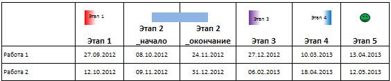
A project timeline is the list of tasks recorded to be accomplished to finish the project within the given period. In simple words, it is nothing but the project schedule/timetable. All the tasks listed will have a start date, duration, and end date so that it becomes easy to track the project’s status and complete it within the given timeline.
A project timeline is one of the important aspects of project management. It is required to plan and determine the flow of tasks from the beginning to the end of the project.
The easiest way of representing the project timeline in Excel is through graphical representation. It can be created using the charts in Excel. It is called the “Gantt Chart.” Gantt chart (named after its inventor Henry Laurence Gantt) is one of the Bar Charts in ExcelBar charts in excel are helpful in the representation of the single data on the horizontal bar, with categories displayed on the Y-axis and values on the X-axis. To create a bar chart, we need at least two independent and dependent variables.read more and a popular tool used in project management, which helps visualize the project schedule.
Table of contents
- Project Timeline in Excel
- How to Create a Project Timeline in Excel? (Step by Step)
- Example #1
- Example #2
- Things to Remember
- Recommended Articles
- How to Create a Project Timeline in Excel? (Step by Step)
How to Create a Project Timeline in Excel? (Step by Step)
Below are the steps for creating a simple Gantt chart to represent the project timeline in Excel.
Example #1
Creating a Gantt chart using a normal stacked bar graph:The stacked bar chart in Excel represents data in the shape of bars, with the bars representing different segments or categories for comparison. A stacked bar chart is used to compare different types of data in terms of their values.read more
- List down the tasks/activities that need to be completed in the Excel sheet(as shown below).
- Enter the start date for each task in the column next to the activities.
- Update the task’s “Duration” next to the “Starting Date” column (duration is the number of days required for the particular task/activity to be completed).
- We can insert the “Ending Date” for the activities next to the “Duration” column. This column is optional because this is just for reference and will not be used in the chart.

Note: We can insert duration directly or use a formula to determine duration.

The above table calculates duration using the formula: Ending Date (-) Starting Date.
In the formula, “+1” is used to include the day of the starting date.
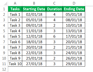
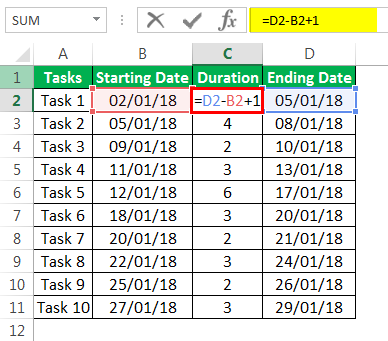
Now, let us begin to build a chart.
In the ribbon, go to the “INSERT” tab and select the “Bar graph” option in the “Charts” sub-tab. Next, choose the “Stacked” bar (the second option in the “2-D Bar“ section).
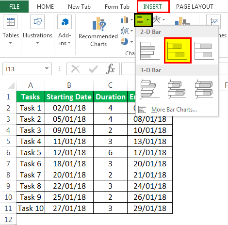
By selecting this graph, a blank chart area may appear. Select that empty area and right-click to choose the “Select Data” option.
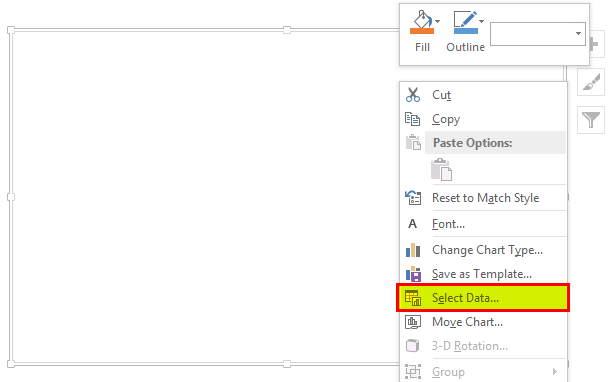
- “The “Select Data Source” window may appear to select the data. Next, click on the “Add” button under “Legend Entries (Series).”
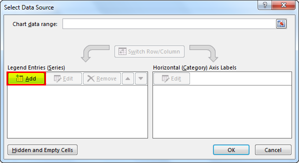
When the “Edit Series” pop-up appears, select the “Starting Date” label as the “Series name.” In this example, cell B1. Also, choose the list of dates in the “Series values” field. Then, press the “OK” button.
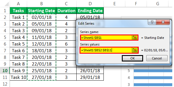
Again, press the “Add” button to select the “Series name” and values of the “Duration” column the same as above.
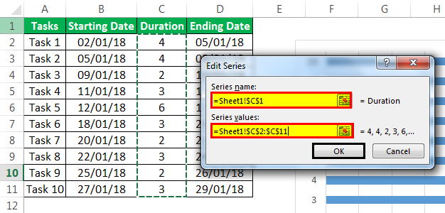
After adding both the “Starting Date” and “Duration” data into the chart,
- Click on “Edit” under the “Horizontal (Category) Axis Labels” on the right-hand side of the “Select Data Source” window.
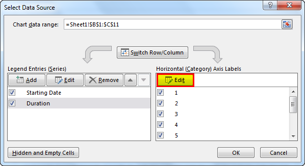
- In the “Axis Labels” range, select the list of tasks starting from “Task 1” to the end and click on “OK.”
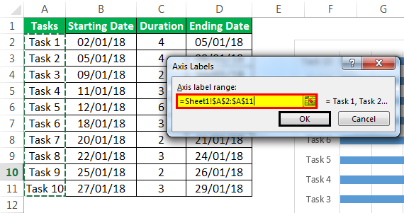
Below is the output we can see after completing all the above steps.

The above chart shows the list of tasks on the Y-axis and dates on the X-axis. But, the list of tasks shown in the chart is in reverse order.
To change this:
- We must select the axis data and right-click to select “Format Axis.”
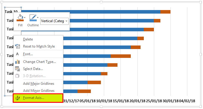
- In a “Format Axis” panel, under the “Axis Options” section, check the “Categories in reverse order” box.
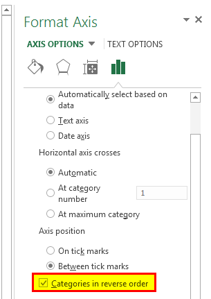
When the categories are reversed, we may see the chart below.
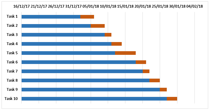
We need to make a blue bar invisible to show only the orange bars, which indicate the duration.
- Click on the blue bar to select and right-click “Format Data Series.”
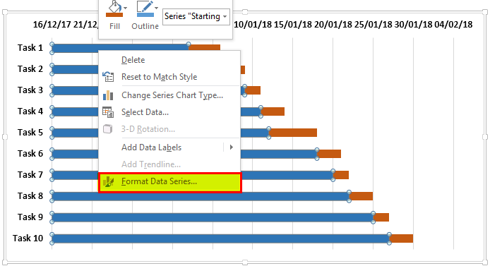
- In the “Format Data Series” panel, select “No Fill” under the “Fill” section and “No line” under the “Border” section.
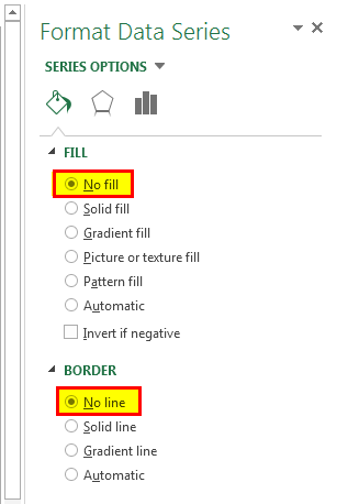
- The chart looks as below.
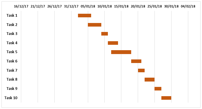
Now, the project timeline Excel Gantt chart is almost completed.
Remove the white space at the beginning of the chart.
- Right-click on the date given for the first task in a table and select “Format Cells.”
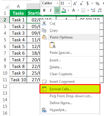
- Note the number in the window under the “Number tab” and “General” categories.
(In this example, it is 43102)
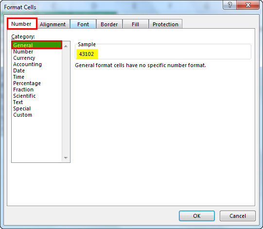
- Click on the dates on the top of the chart and right-click, select “Format Axis.”
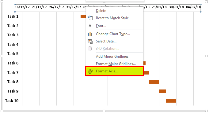
- In the panel, change the “Minimum” number under the “Bounds” options to the number you have noted.
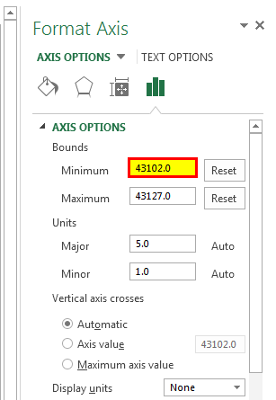
- The units of date can adjust the scale as you want to see in the chart. (in this example, we have considered “Units” as 5)
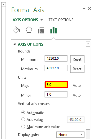
The chart may look like the one given below.
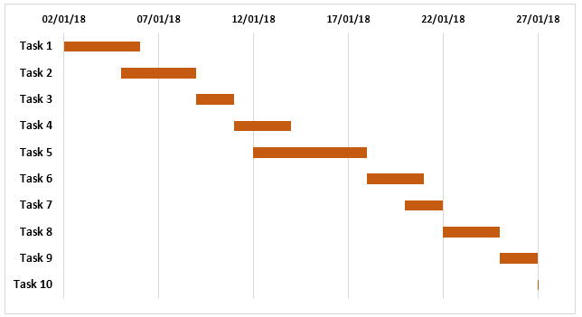
Trim the chart to make it look nicer by eliminating the white space between the bars.
- Click on the bar anywhere. Then, right-click and select “Format Data Series.”
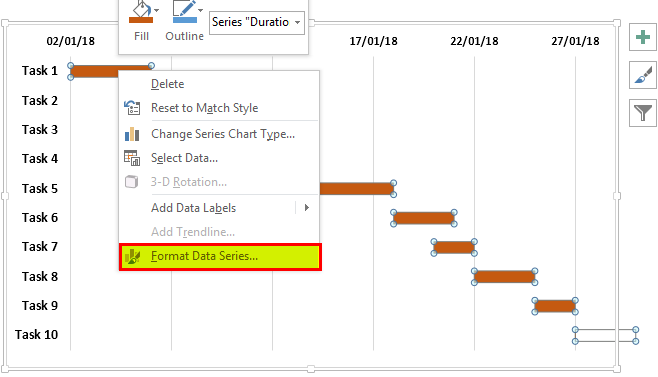
- Keep the “Series Overlap” at 100% and adjust the “Gap Width” to 10% under the “Plot Series On” section.
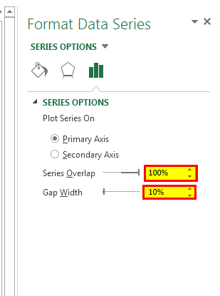
- We can add the data labels to the bars by selecting “Add Data Labels” using right-click.
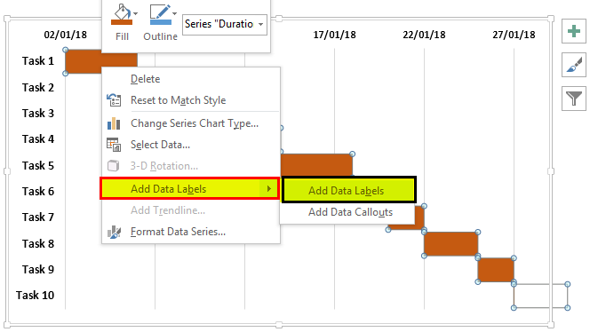
The data labels are added to the charts.
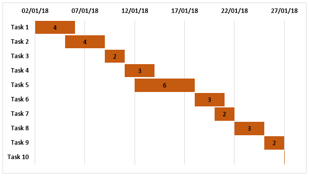
- We can apply 3-D format to the chart to give some effects by removing the gridlines, and the color of the bar and font can be changed as required in the “Format Data Series” panel.
- We can show the dates horizontally by changing the text alignment if required to show all dates.
Ultimately, the project timeline Gantt chart in Excel may look like this.
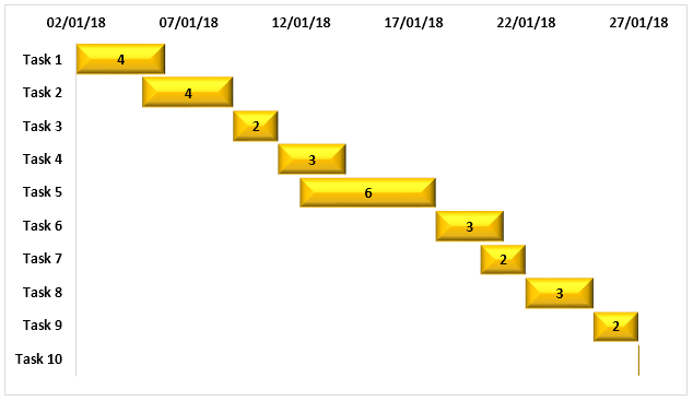
Example #2
Creating a Gantt chart using the project timeline templateA project timeline template is an excel chart that systematically tracks the start and end dates, status, and duration of every task involved in a project. It provides an idea to the project manager about the expected time a project may take to complete.read more available in Excel:
Gantt charts can be created using Microsoft’s template readily available in Excel.
- Click on the “Start” button and select “Excel” to have a new Excel sheet opened.
- While opening, it shows the options to choose from. Search for “Gantt Project PlannerA project planner template, also known as a project tracker, is a tool used by project managers to track the progress of a project, make amendments, and manage any changes.read more to create a project timeline in Excel.
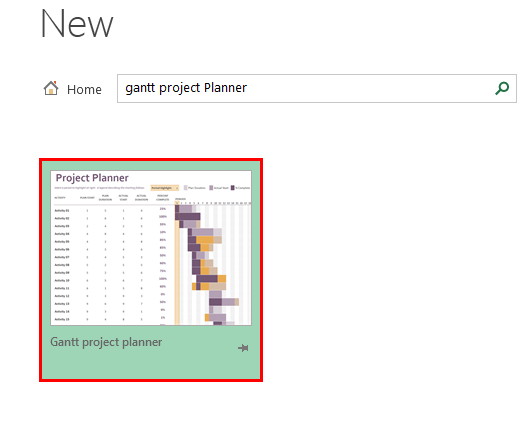
- Click on “Gantt project planner” and click on “Create” in the pop-up window.
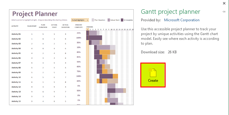
The template is ready to start by entering your project details in the given column per the headers and seeing the bars reflecting the timeline.
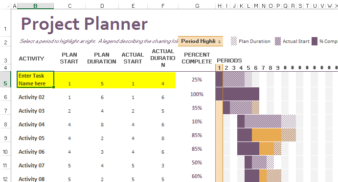
Things to Remember
- The Gantt chart is a Stacked Column GraphA stacked column chart in Excel is a column chart where multiple series of the data representation of various categories are stacked over each other. The stacked series are vertical.read more representing the Excel project timeline in horizontal bars.
- The horizontal bars indicate the duration of the task/activity of the project timeline in Excel.
- The chart reflects the addition or deletion of any activity within the source range, or the source data can be adjusted by extending the range of rows.
- This chart does not provide detailed information about the project and lacks real-time monitoring ability.
Recommended Articles
This article is a guide to Project Timeline in Excel. We discuss creating a project timeline Excel template using a Gantt chart and project planner, practical examples, and a downloadable Excel template. You may learn more about Excel from the following articles: –
- Histogram Chart in Excel
- Sparklines in Excel
- Combination Charts in ExcelA combination chart or combo chart in excel is a combination of two or more two different charts. We can create a combo chart from the insert menu in the chart tab. Also, to combine two charts, we must have two different data sets but one common field.read more
- Gauge Excel ChartExcel’s gauge chart resembles a speedometer. It visualizes data with dials and combines two doughnut charts and pie charts.read more