
One of the great things about being on the Excel team is the opportunity to meet with a broad set of customers. In talking with Excel users, it’s obvious that significant confusion exists about what exactly is “big data.” Many customers are left on their own to make sense of a cacophony of acronyms, technologies, architectures, business models and vertical scenarios.
It is therefore unsurprising that some folks have come up with wildly different ways to define what “big data” means. We’ve heard from some folks who thought big data was working two thousand rows of data. And we’ve heard from vendors who claim to have been doing big data for decades and don’t see it as something new. The wide range of interpretations sometimes reminds us of the old parable of the blind men and an elephant, where a group of men touch an elephant to learn what it is. Each man feels a different part, but only one part, such as the tail or the tusk. They then compare notes and learn that they are in complete disagreement.
Defining big data
On the Excel team, we’ve taken pointers from analysts to define big data as data that includes any of the following:
- High volume—Both in terms of data items and dimensionality.
- High velocity—Arriving at a very high rate, with usually an assumption of low latency between data arrival and deriving value.
- High variety—Embraces the ability for data shape and meaning to evolve over time.
And which requires:
- Cost-effective processing—As we mentioned, many of the vendors claim they’ve been doing big data for decades. Technically this is accurate, however, many of these solutions rely on expensive scale-up machines with custom hardware and SAN storages underneath to get enough horsepower. The most promising aspect of big data is the innovation that allows a choice to trade off some aspects of a solution to gain unprecedented lower cost of building and deploying solutions.
- Innovative types of analysis—Doing the same old analysis on more data is generally a good sign you’re doing scale-up and not big data.
- Novel business value—Between this principle and the previous one, if a data set doesn’t really change how you do analysis or what you do with your analytic result, then it’s likely not big data.
At the same time, savvy technologists also realize sometimes their needs are best met with tried and trusted technologies. When they need to build a mission critical system that requires ACID transactions, a robust query language and enterprise-grade security, relational databases usually fit the bill quite well, especially as relational vendors advance their offerings to bring some of the benefits of new technologies to their existing customers. This calls for a more mature understanding of the needs and technologies to create the best fit.
Excel’s role in big data
There are a variety of different technology demands for dealing with big data: storage and infrastructure, capture and processing of data, ad-hoc and exploratory analysis, pre-built vertical solutions, and operational analytics baked into custom applications.
The sweet spot for Excel in the big data scenario categories is exploratory/ad hoc analysis. Here, business analysts want to use their favorite analysis tool against new data stores to get unprecedented richness of insight. They expect the tools to go beyond embracing the “volume, velocity and variety” aspects of big data by also allowing them to ask new types of questions they weren’t able to ask earlier: including more predictive and prescriptive experiences and the ability to include more unstructured data (like social feeds) as first-class input into their analytic workflow.
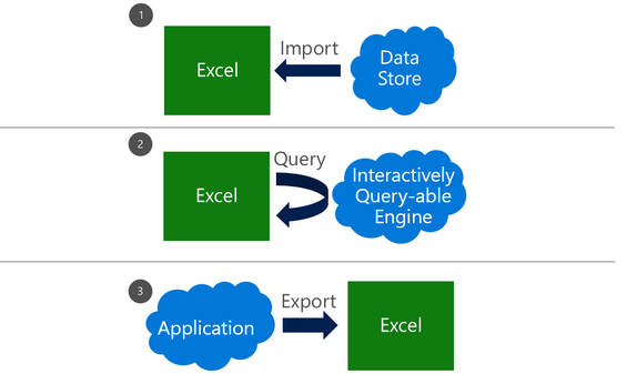
Broadly speaking, there are three patterns of using Excel with external data, each with its own set of dependencies and use cases. These can be combined together in a single workbook to meet appropriate needs.

When working with big data, there are a number of technologies and techniques that can be applied to make these three patterns successful.
Import data into Excel
Many customers use a connection to bring external data into Excel as a refreshable snapshot. The advantage here is that it creates a self-contained document that can be used for working offline, but refreshed with new data when online. Since the data is contained in Excel, customers can also transform it to reflect their own personal context or analytics needs.
When importing big data into Excel, there are a few key challenges that need to be accounted for:
- Querying big data—Data sources designed for big data, such as SaaS, HDFS and large relational sources, can sometimes require specialized tools. Thankfully, Excel has a solution: Power Query, which is built into Excel 2016 and available separately as a download for earlier versions. Power Query provides several modern sets of connectors for Excel customers, including connectors for relational, HDFS, SaaS (Dynamics CRM, SalesForce), etc.
- Transforming data—Big data, like all data, is rarely perfectly clean. Power Query provides the ability to create a coherent, repeatable and auditable set of data transformation steps. By combining simple actions into a series of applied steps, you can create a reliably clean and transformed set of data to work with.
- Handling large data sources—Power Query is designed to only pull down the “head” of the data set to give you a live preview of the data that is fast and fluid, without requiring the entire set to be loaded into memory. Then you can work with the queries, filter down to just the subset of data you wish to work with, and import that.
- Handling semi-structured data—A frequent need we see, especially in big data cases, is reading data that’s not as cleanly structured as traditional relational database data. It may be spread out across several files in a folder or very hierarchical in nature. Power Query provides elegant ways of treating both of these cases. All files in a folder can be processed as a unit in Power Query so you can write powerful transforms that work on groups (even filtered groups!) of files in a folder. In addition, several data stores as well as SaaS offerings embrace the JSON data format as a way of dealing with complex, nested and hierarchical data. Power Query has a built-in support for extracting structure out of JSON-formatted data, making it much easier to take advantage of this complex data within Excel.
- Handling large volumes of data in Excel—Since Excel 2013, the “Data Model” feature in Excel has provided support for larger volumes of data than the 1M row limit per worksheet. Data Model also embraces the Tables, Columns, Relationships representation as first-class objects, as well as delivering pre-built commonly used business scenarios like year-over-year growth or working with organizational hierarchies. For several customers, the headroom Data Model is sufficient for dealing with their own large data volumes. In addition to the product documentation, several of our MVPs have provided great content on Power Pivot and the Data Model. Here are a couple of articles from Rob Collie and Chandoo.
Live query of an external source
Sometimes, either the sheer volume of data or the pattern of the analysis mean that importing all of the source data into Excel is either prohibitive or problematic (e.g., by creating data disclosure concerns).
Customers using OLAP PivotTables are already intimately familiar with the power of combining lightweight client side experiences in PivotTables and PivotCharts with scalable external engines. Interactively querying external sources with a business-friendly metadata layer in PivotTables allows users to explore and find useful aggregations and slices of data easily and rapidly.
One very simple way to create such an interactive query table external source with a large volume of data is to “upsize” a data model into a standalone SQL Server Analysis Services database. Once a user has created a data model, the process of turning it into a SQL Server Analysis Services cube is relatively straightforward for a BI professional, which in turn enables a centrally managed and controlled asset that can provide sophisticated security and data partitioning support.
As new technologies become available, look for more connectors that provide this level of interactivity with those external sources.
Export from an application to Excel
Due to the user familiarity of Excel, “Export to Excel” is a commonly requested feature in various applications. This typically creates a static export of a subset of data in the source application, typically exported for reporting purposes, free from the underlying business rules. As more applications are hosted in the browser, we’re adding new APIs that extend integration options with Excel Online.
Summary
We hope we were able to give you a set of patterns to help make discussions on big data more productive within your own teams. We’re constantly looking for better ways to help our customers make sense of the technology landscape and welcome your feedback!
—Ashvini Sharma and Charlie Ellis, program managers for the Excel team
Содержание
- How to use Excel to query big data? MDX for Kylin! (Part-I)
- Target audiences
- What you will learn
- Why Kylin need MDX?
- Multidimensional database and business semantic layer
- Build a business metrics platform with MDX
- MDX Overview
- What is MDX?
- Key concepts of MDX
- Comparison of MDX and SQL
- MDX for Kylin Overview
- What is MDX for Kylin?
- How to create business metrics
- Dataset as semantic model
- Process of calculating
- Summary
- Technical advantages of MDX for Kylin
- Contact us
- Excel and big data
- Why bother dealing with big data?
- Hands-on big data with Excel
- How large is a reliable sample of records?
- How to extract random samples of records
- Are samples extracted from big data with Excel reliable at all?
- All-in-one, continuous metrics
- Categorical metrics
- Can the reliability of this Experiment have happened by chance?
- Closing
How to use Excel to query big data? MDX for Kylin! (Part-I)
During the Kylin community discussion at the beginning of this year, we talked about the positioning of multidimensional databases and the idea of building a Kylin-based business semantic layer. After some development efforts, we are delighted to announce the beta release of the MDX for Kylin , an MDX query engine for Apache Kylin to allow Kylin users to use Excel for data analysis.
Target audiences
- Kylin users who are not familiar with MDX
- Data engineers who are interested in building a metrics platform based on Kylin
- Data analysts who are interested in massive data analysis with Excel
What you will learn
- Basic concepts of MDX and MDX for Kylin
- Quickstart tutorial for MDX for Kylin
- Demonstration of how to use MDX for Kylin to define complex business metrics
Why Kylin need MDX?
Multidimensional database and business semantic layer
The primary difference between multidimensional databases and relational databases lies in business semantics. As the must-have skill of data analysts, SQL (Structured Query Language) is extremely expressive, but if we are talking in the context of “every professional will be an analyst”, it is still too complex for non-technical users. For them, data lakes and data warehouses are like dark rooms that hold a huge amount of data; they cannot see, understand, or use the data for lack of the fundamental knowledge of databases and SQL syntax.
How to make data lakes and data warehouses “easy” for a non-technical user to use? One solution is to introduce a more user-friendly “relational data model — multidimensional data model”. If relational models are to provide a technique-oriented description of the data, multidimensional models intend to provide a business-oriented description of the data. In multidimensional databases, measures correspond to the business metrics that everyone is familiar with. Measures provide the analytic perspective to check and compare these business metrics. For example, it is like comparing the KPIs between this month and last month, or the performance of different business departments. By mapping the relational model to a multidimensional model, we add a business semantic layer on top of the technical data, thus helping non-technical users understand, explore, and use data.
In Kylin Roadmap, support to multidimensional query languages (such as MDX and DAX) is an important part, as we aim to enhance the business semantic capability of Kylin as a multi-dimensional database. Users can use MDX to convert the Kylin data model into business-friendly language, so they can perform multidimensional analysis with Excel, Tableau and other BI tools and understand the business values from their data.
Build a business metrics platform with MDX
When building complex business metrics, MDX provides the following advantages if compared to SQL:
- Better support for complex analysis scenarios, such as semi-accumulation, many-to-many, and time window analysis;
- More BI support: “Kylin + MDX” can be exposed as relational database tables through the SQL interface, or XMLA-compliant data source with business semantics. It allows MDX queries and integration with Excel and other BI tools through the XMLA protocol;
- Flexible defining of MDX semantic model based on Kylin data model, it will convert the underlying data structure into a business-friendly language and add business value to data. With MDX model, we offer users a unified business semantic layer, they no longer need to worry about the underlying technology or implementation complexity when analyzing data. For more information, see The future of Apache Kylin,SSAS Disadvantages: Opportunities for SSAS in the Cloud Era, andSemantic Layer: The BI Trend You Don’t Want to Miss .
MDX Overview
What is MDX?
MDX (Multi Dimensional eXpression) is a query language for OLAP Cube. It was first introduced by Microsoft in 1997 as part of the OLEDB for OLAP specification and later integrated into SSAS. Since then, it has been widely adopted by OLAP databases.
MDX is similar to SQL in many ways and also offers some SQL features though maybe not as intuitive or effective as SQL. For example, you can include SELECT, FROM, or WHERE clause in your MDX queries. But it is not an extension of SQL. You can use these keywords to dig into specific parts of the Cube.
Key concepts of MDX
Please learn some basic MDX concepts before we continue.
- Dimensions, Levels, Members, and Measures
- Cell, Tuple, and Set
- Query Axis and Slicer Axis
For detailed information about these concepts, see MDX Syntax Elements (MDX).
Comparison of MDX and SQL
The query objects are different. MDX is to query the cube, with data already joined and aggregated, so users needn’t specify the join relation when querying. SQL is to query a table with detailed records. Users need to specify the join relation among the tables when querying.
Another difference is the query result. SQL returns a 2d data subset, while MDX returns the cubes.
MDX for Kylin Overview
What is MDX for Kylin?
MDX for Kylin is an MDX query engine which developed based on Mondrian, contributed by Kyligence, and with Apache Kylin as data source. Like Microsoft SSAS, MDX for Kylin can also integrate many data analysis tools, including Microsoft Excel and Tableau, to provide a better user experience for big data analysis.
How to create business metrics
Atomic metrics and business metrics
In Kylin Cube, we will perform certain aggregate calculations (such as Sum/Max/Min/Count/Count Distinct, exclude TopN) on a single column when creating measures, and the measures created are called atomic metrics.
In actual business scenarios, we can run complex calculations based on these atomic metrics to create composite metrics with business implications, and these metrics are called business metrics.
Hierarchy, Calculated Measure, and NamedSet
Hierarchy: Hierarchies are collections of dimension-based hierarchies that can empower data analysts with advanced analytical capabilities. For example, you can create a time hierarchy with year, quarter, month, week, and day as its hierarchy. Then data analysts can do a YOY analysis on the sales volume, or dig into the “Quarter > Month > Week > Day” hierarchy for more detailed analysis.
Calculated Measure: Calculated Measure are metrics/indexes acquired by running composite computing on the atomic metrics with MDX expressions. We mainly use calculated measures to create business metrics.
NamedSet: NamedSet is for the scenario when you need to reuse a set of members in MDX for Kylin. A NamedSet uses specified expressions to get the set members. It can be placed directly on the axis or used in expressions of Calculated Measure for or other Namedset.
Dataset as semantic model
In Kylin 4, we create a data model based on the relationship among tables, and define different dimensions and measures on the Cube. These measures are atomic metrics.
In MDX for Kylin, we join related Kylin Cubes to create datasets and create business metrics based on atomic metrics.
Process of calculating
The client(BI/Excel) sends an MDX query to MDX for Kylin, which will then be parsed into SQL and sent to Kylin. After that, Kylin will answer the SQL query based on the pre-computed Cuboid and return the result to MDX for Kylin. Then, MDX for Kylin will do some derived metrics calculation, and return the multidimensional data results to the client.
Summary
MDX for Kylin supports MDX interface enhancing the semantic capability and creates a unified data analysis and management user experience. Now users can better leverage the value of data. The figure below shows the process of how raw data is processed into business metrics.
Technical advantages of MDX for Kylin
If compared with other open-source MDX query engines, MDX for Kylin has the following advantages:
- Better support to BIs (Excel/Tableau/Power BI, etc.)and compliance with XMLA protocol
- Optimize the MDX Query for BIs
- Accelerate MDX queries with Kylin’s pre-computing capability
- Easy-to-use interface for metrics definition and management
If you want to see the detail of how to use MDX for Kylin? Please check next article.
If you want to check the official documentation of MDX for Kylin, please check the User Manual . For developers who want to contribute, please check Github.
Feel free to leave your suggestion, ask a question or report a bug by referring link .
Источник
Excel and big data

Today we discuss how to handle big data with Excel. This article is for marketers such as brand builders, marketing officers, business analysts and the like, who want to be hands-on with data, even when it is a lot of data.
Why bother dealing with big data?
If you are not the hammer you are the nail. We, the marketers, should defend our role of strategic decision-makers by staying in control of the data analysis function that we are losing to the new generation of software coders and data managers. This requires us to improve our ability to deal with large datasets, which may have several benefits. Perhaps the most appealing one from a career standpoint is to reaffirm our value in the new world of highly-engineered, relentlessly growing and often inflexible IT systems, filled with lots of data someone thinks could be very useful if only appropriately analyzed.
To this extent many IT departments are employing Data Architects, Big Data Managers, Data Visualizers and Data Squeezers. These programmers, specializing in different kinds of software, are in some cases already bypassing collaboration with the marketers and going straight into the development of applications used for business analytics purposes. These guys are the new competitors to the business leader role, and I wonder how long it will take until they begin making the strategic decisions too. We should not let this happen, unless we like being the nail!
Hands-on big data with Excel
MS Excel is a much loved application, someone says by some 750 million users. But it does not seem to be the appropriate application for the analysis of large datasets. In fact, Excel limits the number of rows in a spreadsheet to about one million; this may seem a lot, but rows of big data come in the millions, billions and even more. At this point Excel would appear to be of little help with big data analysis, but this is not true. Read on.
Consider you have a large dataset, such as 20 million rows from visitors to your website, or 200 million rows of tweets, or 2 billion rows of daily option prices. Suppose also you want to investigate this data to search for associations, clusters, trends, differences or anything else that might be of interest to you. How can you analyze this huge mass of data without using cryptic, expensive software managed by expert users only?
Well, you do not necessarily have to – you can use data samples instead. It is the same concept behind common population survey. to investigate the preferences of adult males living in the USA, you do not ask 120 million persons; a random sample can do it. The same concept applies to data records too, and in both cases there are at least three legitimate questions to ask:
- How many records do we need in order to have a sample we can make accurate estimates with?
- How do we extract random records from the main dataset?
- Are samples from big datasets reliable at all?
How large is a reliable sample of records?
For our example we will use a database holding 200,184,345 records containing data from the purchase orders of one product line of a given company during 12 months.
There are several different sampling techniques. In broad terms they divide into two types: random and non-random sampling. Non-random techniques are used only when it is not possible to obtain a random sample. And the simple random sampling technique is appropriate to approximate the probability of something happening in the larger population, as in our example.
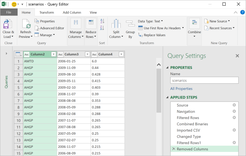
A sample of 66,327 randomly selected records can approximate the underlying characteristics of the dataset it comes from at the 99% confidence interval and 0.5% error level. This sample size is definitely manageable in Excel.
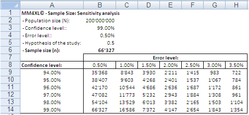 Image 1: Random sample sizes produced with the bernoullian formula
according to population size, confidence interval and error level.
The confidence level tells us that if we extract 100 random samples of 66,327 records each from the same population, 99 samples may be assumed to reproduce the underlying characteristics of the dataset they come from. The 0.5% error level says the values we obtain should be read in the plus or minus 0.5% interval, for instance after transforming the records in contingency tables.
How to extract random samples of records
Sampling statistics is the solution. We used the tool Sample Manager of MM4XL software to quantify and extract the samples used for this document. If you do not have MM4XL, you can generate random record numbers as follows:
- Enter in Excel 66,327 times the formula =RAND()*[Dataset size]
- Transform the formulas in values
- Round the numbers to no decimals
- Make sure there are no duplicates [2]
- Sort the range and you get a list of numbers as shown in the following image
Extract these record numbers from the main dataset: This is your sample of random records. The number 3,076 in cell A22 shown above means that record number 3,076 of the main dataset is included in the sample. To reduce the risk of extracting records biased by the lack of randomness, before extracting the records of the sample, it is a good habit to sort the main list, for instance alphabetically by the person’s first name or by any other variable that is not directly related to the values of the variable(s) object of the study.
If we are ready to accept the approximation imposed by a sample, we can enjoy the freedom of being hands-on with our data again. In fact, although 66,327 records can be managed fairly well in Excel, we still have a sample large enough to uncover tiny areas of interest.
Large sample sizes enable us to manage very large datasets in Excel, an environment most of us are familiar with. But what is the reliability of such samples in real life?
The key question is: Can a random sample reproduce accurately enough the underlying characteristics of the population it is extracted from? To find some evidence we:
- Measured several characteristics of our whole dataset, the underlying population.
- Then we extracted random samples from the main dataset and we measured the same characteristics as for the whole dataset.
- Finally we ran several confirmatory tests comparing the measurements conducted on both samples and main dataset.
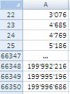
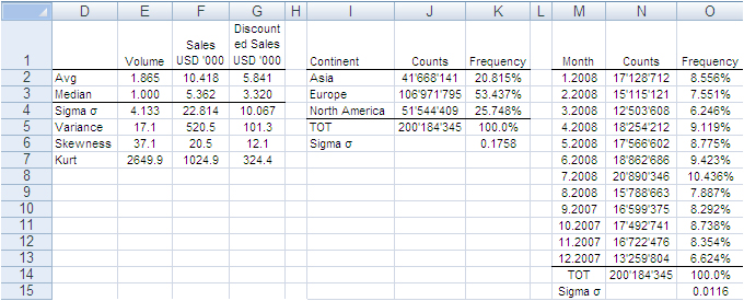
The image below shows the fields of our records. They can be read as follows: Record number 1 (row 2) is a purchase order from North America, received on September 2007, concerning one single item priced USD 13,159 and sold for USD 11,800.
The next image shows the measures computed on the single variables. The Average and Median value were computed for the fields “Volume”, “Sales” and “Discounted Sales” (see range D1:G3). Counts and Count Frequencies were found for the variables “Continent” (see range I1:K4) and “Month” (see range M1:O13). For instance, 1.865 in cell E2 stands for the average number of items in one purchase order. USD 5,841 in G2 stands for the average selling price of one sold item. In K2, 20.815% is the share of items (products) sold to Asia and, in O2, 8.556% is the share of items sold during January 2008. We will test whether random samples can approximate the average values and the percent frequencies shown in the following image.
In accordance with the ASTM manual[1], we drew 20 randomly selected samples of 66,327 records each from the population of 200,184,345 records. For each sample we computed the same values shown in the image above and to each value we applied a Z-test to identify any anomalous values in the samples. The Z-tests were run for both continuous and discrete variables.
All-in-one, continuous metrics
The next table shows test results for the variables “Volume”, “Sales” and “Discounted Sales”. Cell B1, for instance, tells us on average one purchase order (a record) of the main dataset accounts for a sales “Volume” equal to 1.865 items with an “Average Sales” value of USD 10’418 and an “Average Discounted Sales” value of USD 5’841. For sample values departing severely from the control values in row 2 the probability is high that a Z-test at the 99% probability level captures the anomaly.
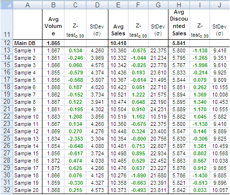
According to the “Z-Test” columns of the image above, no one single sample reports average values different from the averages of the main dataset. For instance, the “Average Volume” of Sample 3 and that of the main dataset differ only by 0.001 units per purchase order, or a difference of about 0.5%. The other two variables show a similar scenario. This means that Sample 3 produced quite accurate values at the global level (all records counted in one single metric).
Categorical metrics
We tested the variable “Continent”, which splits into three categories: Asia, Europe and North America. Columns B:D of the following table show the share of orders coming from each continent. The data in row 15 refer to the main dataset. In this case too, the difference between main dataset and samples is quite small, and the Z-Test (columns E:G) shows no evidence of bias, with the exception of slight deviations in Europe for sample 5, 8, 9, and 18-20.
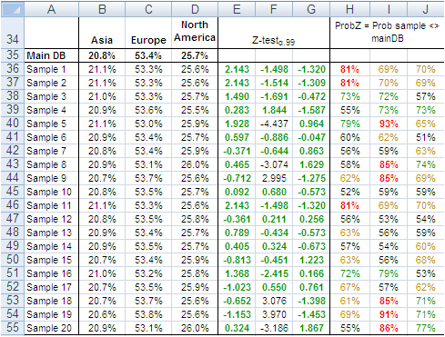
The “Probability” values in column H:J measure the likelihood a sample value is different from the same value of the main dataset. For instance, 21.1% in B36 is smaller than 20.8% in B35. However, because the former comes from a sample, we need to verify from a statistical point of view the probability the difference between the two values is caused by a bias in the sampling method. The 95% is a common level of acceptance when dealing with this kind of issue. With small sample sizes (30), the 90% probability threshold can still be used, although this implies higher risk of erroneously considering two values equal when in fact they are different. For the sake of test reliability we worked with the 99% probability threshold. In H36 we read the probability B36 is different from B35 equals 81%, the very beginning of the area where anomalous differences can be found. Only the share of Sample 5 and 19 for Europe is above 90%. All other values lie well away from a worrying position.
This also means that the share of purchase orders incoming from the three continents reproduced with random samples do not show evidence of dramatic differences outside the expected boundaries. This can also be intuitively confirmed simply by looking at the average sample values in the range B36:D55 of the above image; they do not differ dramatically from the population values in the range B35:D35.
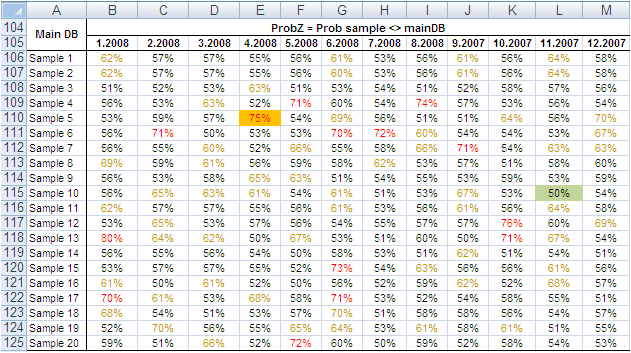
Finally, we tested the variable “Month”, which splits into 12 categories and therefore could generate weaker Z-Test results due to the shrinking size of the sample by category. Columns B:M in the following table show the probability that the sampled number of purchase orders by month differs from the same value from the main dataset. No one sampled value is different from the correspondent value from the main dataset with a probability larger than 75% and only a small number of values have a probability larger than 70%.
The results of the tests conducted on all samples did not find severe anomalies that would discourage the application of the method described in this paper. The analysis of big datasets by means of random samples produces reliable results.
Can the reliability of this Experiment have happened by chance?
So far, the random samples have performed well in reproducing the underlying characteristics of the dataset they come from. To verify whether this could have happened by chance, we repeated the test using two non-random samples: the first time taking the very first 66,327 records of the main dataset and the second time taking the very last 66,327 records.
The results in short: out of 42 tests conducted with both discrete and categorical variables from the two non-random samples, only three had green Z-Test values. That is, these three sample values were not judged different from the same value from the main dataset. The remaining 39 values, however, lay in a deep red region, meaning they produced an unreliable representation of the main data.
These test results too support the validity of the approach by means of random samples, and confirm that the results of our experiment are not by chance. Therefore, the analysis of large datasets by means of random samples is a legitimate and viable option.
Closing
This is a great time for fact-and-data driven marketers: There is a large and growing demand for analytics, but there are not enough data scientists available to meet it yet. Statistics and software coding are the two areas we should deepen our knowledge of. At that stage a new generation of marketers will be born, and we look forward to their contribution to the relentless evolving world of brand building. Software tools like MM4XL can help us along the way because they are written for business people rather than statisticians. Such tools should become a key component of our toolbox for generating insights from data and making better business decisions.
Enjoy the analysis of big data with Excel and read my future articles for fact-and-data driven business decision-makers.
Thank you for reading my post. If you liked this post then please click Share to make it visible to your network. If you would like to read my future posts click Follow and feel free to also connect with me via LinkedIn.
I’d appreciate if you would post this article to your social network.
You might also be interested in my book Mapping Markets for Strategic Purposes.
[1] Manual on the Presentation of Data and Control Chart Analysis, 7th edition. ASTM International, E11.10 Subcommittee on Sampling and Data Analysis.
[2] My sincere thanks to Darwin Hanson, who caught a couple of issues: (1) RND is a VBA function, and I meant of course the spreadsheet function RAND; and (2) you must double-check the random numbers and get rid of duplicates.
Источник
Today we discuss how to handle big data with Excel. This article is for marketers such as brand builders, marketing officers, business analysts and the like, who want to be hands-on with data, even when it is a lot of data.
Why bother dealing with big data?
If you are not the hammer you are the nail. We, the marketers, should defend our role of strategic decision-makers by staying in control of the data analysis function that we are losing to the new generation of software coders and data managers. This requires us to improve our ability to deal with large datasets, which may have several benefits. Perhaps the most appealing one from a career standpoint is to reaffirm our value in the new world of highly-engineered, relentlessly growing and often inflexible IT systems, filled with lots of data someone thinks could be very useful if only appropriately analyzed.
To this extent many IT departments are employing Data Architects, Big Data Managers, Data Visualizers and Data Squeezers. These programmers, specializing in different kinds of software, are in some cases already bypassing collaboration with the marketers and going straight into the development of applications used for business analytics purposes. These guys are the new competitors to the business leader role, and I wonder how long it will take until they begin making the strategic decisions too. We should not let this happen, unless we like being the nail!
Hands-on big data with Excel
MS Excel is a much loved application, someone says by some 750 million users. But it does not seem to be the appropriate application for the analysis of large datasets. In fact, Excel limits the number of rows in a spreadsheet to about one million; this may seem a lot, but rows of big data come in the millions, billions and even more. At this point Excel would appear to be of little help with big data analysis, but this is not true. Read on.
Consider you have a large dataset, such as 20 million rows from visitors to your website, or 200 million rows of tweets, or 2 billion rows of daily option prices. Suppose also you want to investigate this data to search for associations, clusters, trends, differences or anything else that might be of interest to you. How can you analyze this huge mass of data without using cryptic, expensive software managed by expert users only?
Well, you do not necessarily have to – you can use data samples instead. It is the same concept behind common population survey. to investigate the preferences of adult males living in the USA, you do not ask 120 million persons; a random sample can do it. The same concept applies to data records too, and in both cases there are at least three legitimate questions to ask:
- How many records do we need in order to have a sample we can make accurate estimates with?
- How do we extract random records from the main dataset?
- Are samples from big datasets reliable at all?
How large is a reliable sample of records?
For our example we will use a database holding 200,184,345 records containing data from the purchase orders of one product line of a given company during 12 months.
There are several different sampling techniques. In broad terms they divide into two types: random and non-random sampling. Non-random techniques are used only when it is not possible to obtain a random sample. And the simple random sampling technique is appropriate to approximate the probability of something happening in the larger population, as in our example.
A sample of 66,327 randomly selected records can approximate the underlying characteristics of the dataset it comes from at the 99% confidence interval and 0.5% error level. This sample size is definitely manageable in Excel.
Image 1: Random sample sizes produced with the bernoullian formula
according to population size, confidence interval and error level.
SEE ALSO: Easy and accurate random sample size design calculation
The confidence level tells us that if we extract 100 random samples of 66,327 records each from the same population, 99 samples may be assumed to reproduce the underlying characteristics of the dataset they come from. The 0.5% error level says the values we obtain should be read in the plus or minus 0.5% interval, for instance after transforming the records in contingency tables.
How to extract random samples of records
Sampling statistics is the solution. We used the tool Sample Manager of MM4XL software to quantify and extract the samples used for this document. If you do not have MM4XL, you can generate random record numbers as follows:
- Enter in Excel 66,327 times the formula =RAND()*[Dataset size]
- Transform the formulas in values
- Round the numbers to no decimals
- Make sure there are no duplicates [2]
- Sort the range and you get a list of numbers as shown in the following image
Extract these record numbers from the main dataset: This is your sample of random records. The number 3,076 in cell A22 shown above means that record number 3,076 of the main dataset is included in the sample. To reduce the risk of extracting records biased by the lack of randomness, before extracting the records of the sample, it is a good habit to sort the main list, for instance alphabetically by the person’s first name or by any other variable that is not directly related to the values of the variable(s) object of the study.
If we are ready to accept the approximation imposed by a sample, we can enjoy the freedom of being hands-on with our data again. In fact, although 66,327 records can be managed fairly well in Excel, we still have a sample large enough to uncover tiny areas of interest.
Large sample sizes enable us to manage very large datasets in Excel, an environment most of us are familiar with. But what is the reliability of such samples in real life?
Are samples extracted from big data with Excel reliable at all?
The key question is: Can a random sample reproduce accurately enough the underlying characteristics of the population it is extracted from? To find some evidence we:
- Measured several characteristics of our whole dataset, the underlying population.
- Then we extracted random samples from the main dataset and we measured the same characteristics as for the whole dataset.
- Finally we ran several confirmatory tests comparing the measurements conducted on both samples and main dataset.
The image below shows the fields of our records. They can be read as follows: Record number 1 (row 2) is a purchase order from North America, received on September 2007, concerning one single item priced USD 13,159 and sold for USD 11,800.
The next image shows the measures computed on the single variables. The Average and Median value were computed for the fields “Volume”, “Sales” and “Discounted Sales” (see range D1:G3). Counts and Count Frequencies were found for the variables “Continent” (see range I1:K4) and “Month” (see range M1:O13). For instance, 1.865 in cell E2 stands for the average number of items in one purchase order. USD 5,841 in G2 stands for the average selling price of one sold item. In K2, 20.815% is the share of items (products) sold to Asia and, in O2, 8.556% is the share of items sold during January 2008. We will test whether random samples can approximate the average values and the percent frequencies shown in the following image.
In accordance with the ASTM manual[1], we drew 20 randomly selected samples of 66,327 records each from the population of 200,184,345 records. For each sample we computed the same values shown in the image above and to each value we applied a Z-test to identify any anomalous values in the samples. The Z-tests were run for both continuous and discrete variables.
All-in-one, continuous metrics
The next table shows test results for the variables “Volume”, “Sales” and “Discounted Sales”. Cell B1, for instance, tells us on average one purchase order (a record) of the main dataset accounts for a sales “Volume” equal to 1.865 items with an “Average Sales” value of USD 10’418 and an “Average Discounted Sales” value of USD 5’841. For sample values departing severely from the control values in row 2 the probability is high that a Z-test at the 99% probability level captures the anomaly.
According to the “Z-Test” columns of the image above, no one single sample reports average values different from the averages of the main dataset. For instance, the “Average Volume” of Sample 3 and that of the main dataset differ only by 0.001 units per purchase order, or a difference of about 0.5%. The other two variables show a similar scenario. This means that Sample 3 produced quite accurate values at the global level (all records counted in one single metric).
Categorical metrics
We tested the variable “Continent”, which splits into three categories: Asia, Europe and North America. Columns B:D of the following table show the share of orders coming from each continent. The data in row 15 refer to the main dataset. In this case too, the difference between main dataset and samples is quite small, and the Z-Test (columns E:G) shows no evidence of bias, with the exception of slight deviations in Europe for sample 5, 8, 9, and 18-20.
The “Probability” values in column H:J measure the likelihood a sample value is different from the same value of the main dataset. For instance, 21.1% in B36 is smaller than 20.8% in B35. However, because the former comes from a sample, we need to verify from a statistical point of view the probability the difference between the two values is caused by a bias in the sampling method. The 95% is a common level of acceptance when dealing with this kind of issue. With small sample sizes (30), the 90% probability threshold can still be used, although this implies higher risk of erroneously considering two values equal when in fact they are different. For the sake of test reliability we worked with the 99% probability threshold. In H36 we read the probability B36 is different from B35 equals 81%, the very beginning of the area where anomalous differences can be found. Only the share of Sample 5 and 19 for Europe is above 90%. All other values lie well away from a worrying position.
This also means that the share of purchase orders incoming from the three continents reproduced with random samples do not show evidence of dramatic differences outside the expected boundaries. This can also be intuitively confirmed simply by looking at the average sample values in the range B36:D55 of the above image; they do not differ dramatically from the population values in the range B35:D35.
Finally, we tested the variable “Month”, which splits into 12 categories and therefore could generate weaker Z-Test results due to the shrinking size of the sample by category. Columns B:M in the following table show the probability that the sampled number of purchase orders by month differs from the same value from the main dataset. No one sampled value is different from the correspondent value from the main dataset with a probability larger than 75% and only a small number of values have a probability larger than 70%.
The results of the tests conducted on all samples did not find severe anomalies that would discourage the application of the method described in this paper. The analysis of big datasets by means of random samples produces reliable results.
Can the reliability of this Experiment have happened by chance?
So far, the random samples have performed well in reproducing the underlying characteristics of the dataset they come from. To verify whether this could have happened by chance, we repeated the test using two non-random samples: the first time taking the very first 66,327 records of the main dataset and the second time taking the very last 66,327 records.
The results in short: out of 42 tests conducted with both discrete and categorical variables from the two non-random samples, only three had green Z-Test values. That is, these three sample values were not judged different from the same value from the main dataset. The remaining 39 values, however, lay in a deep red region, meaning they produced an unreliable representation of the main data.
These test results too support the validity of the approach by means of random samples, and confirm that the results of our experiment are not by chance. Therefore, the analysis of large datasets by means of random samples is a legitimate and viable option.
Closing
This is a great time for fact-and-data driven marketers: There is a large and growing demand for analytics, but there are not enough data scientists available to meet it yet. Statistics and software coding are the two areas we should deepen our knowledge of. At that stage a new generation of marketers will be born, and we look forward to their contribution to the relentless evolving world of brand building. Software tools like MM4XL can help us along the way because they are written for business people rather than statisticians. Such tools should become a key component of our toolbox for generating insights from data and making better business decisions.
Enjoy the analysis of big data with Excel and read my future articles for fact-and-data driven business decision-makers.
Thank you for reading my post. If you liked this post then please click Share to make it visible to your network. If you would like to read my future posts click Follow and feel free to also connect with me via LinkedIn.
I’d appreciate if you would post this article to your social network.
You might also be interested in my book Mapping Markets for Strategic Purposes.
[1] Manual on the Presentation of Data and Control Chart Analysis, 7th edition. ASTM International, E11.10 Subcommittee on Sampling and Data Analysis.
[2] My sincere thanks to Darwin Hanson, who caught a couple of issues: (1) RND is a VBA function, and I meant of course the spreadsheet function RAND; and (2) you must double-check the random numbers and get rid of duplicates.


![]()
![]()
Содержание
MS Excel
27 сентября, 2017
Евгений Довженко о том, как можно эффективно работать даже с огромными массивами данных.

Любой сотрудник компании, работающий в отделе продаж, финансов, маркетинга, логистики, сталкивается с необходимостью работать с данными, анализировать их.

Excel — незаменимый помощник для достижения этих целей. Мы импортируем информацию, «подтягиваем» ее, систематизируем. На ее основе строим диаграммы, сводные таблицы, планируем, прогнозируем.
Однако в Excel до недавнего времени было 2 важных ограничения:

Мы не могли разместить на рабочем листе Excel более миллиона строк (а наши данные о продажах за 2 года занимают, например, 10 млн строк).

Мы знали, как создать и настроить интерактивные и обновляемые отчеты, но это отнимало много времени.
Единственный инструмент в Excel — сводные таблицы — позволял быстро обрабатывать наши данные.
С другой стороны, есть категория пользователей, которые работают со сложными BI-системами. Это системы бизнес-аналитики (business intelligence), которые дают возможность быстро визуализировать, «крутить» данные и извлекать из них ценную информацию (data mining). Однако внедрение и поддержка таких систем требует значительного участия IT-специалистов и больших финансовых вложений.
До Excel 2010 было четкое разделение на анализ малого и большого объема данных: Excel с одной стороны и сложные BI-системы — с другой.
Начиная с версии 2010, в Excel добавили инструменты, в названиях которых присутствует слово power: Power Query, Power Pivot и Power View. Они позволили сгладить грань между пользователями Excel и комплексных BI-систем.
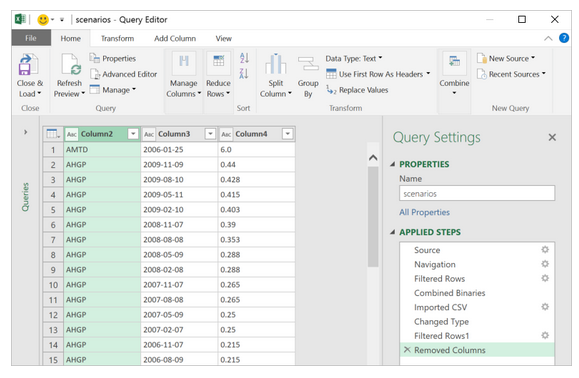
Power Query
Чтобы работать с данными, к ним нужно подключиться, отобрать, преобразовать или, другими словами, привести их к нужному виду.
Для этого и необходим Power Query. До версии Excel 2013 включительно этот инструмент был в виде надстройки, которую можно было установить бесплатно с сайта Microsoft.
В версии 2016 это уже встроенный в программу инструментарий, находящийся на вкладке «Данные» (Data) в разделе «Скачать и преобразовать» (Get and Transform).
Перечень источников информации, к которым можно подключаться — огромный: от баз данных (их в последней версии 10) до Facebook и Google таблиц (рис. 1).
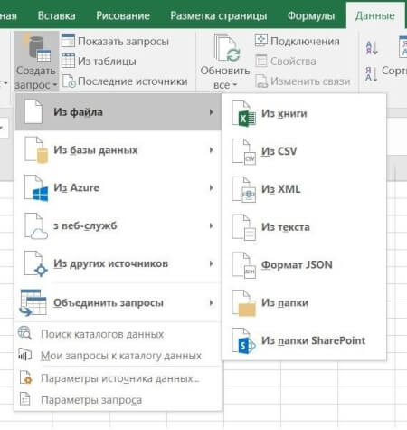
Рис 1. Выбор источника данных в Power Query
Вот некоторые возможности Power Query по подготовке и преобразованию данных:

отбор строк и столбцов, создание пользовательских (вычисляемых) столбцов

преобразование данных с помощью числовых, текстовых функций, функций даты и времени

транспонирование таблицы, разворачивание по столбцам (Pivot) и наоборот — сворачивание данных, организованных по столбцам, в построчный вид (Unpivot)

объединение нескольких таблиц: как вниз — одну под другую, так и связывание по общей колонке (единому ключу)
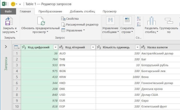
Рис 2. Окно редактора Power Query
Ну и конечно, после выгрузки подготовленных данных в Excel они будут автоматически обновляться, если в источнике данных появятся новые строки.
Пример
Компания в своей аналитике использует текущие курсы трех валют, которые ежедневно обновляются на сайте Национального банка.
Таблица на сайте непригодна для прямого использования (рисунок 2-1):

все валюты не нужны

в колонке «Курс» в качестве разделителя целой и дробной частей используется точка (в наших региональных настройках — запятая)

в колонке «Курс» отображается показатель за разное количество единиц валюты: за 100, за 1000 и т. д. (указано в отдельной колонке «Количество единиц»)
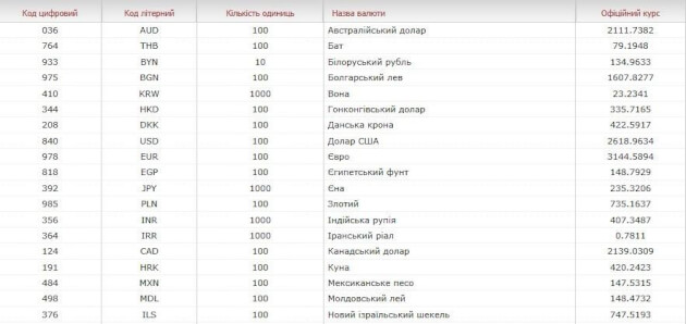
Рис. 2-1. Так выглядит таблица с курсами валют на сайте Нацбанка.
С помощью Power Query мы подключаемся к таблице текущих курсов валют на сайте НБУ и в этом редакторе готовим запрос на извлечение данных:

В колонке «Курс» меняем точку на запятую (инструмент «Замена значений»).

Создаем вычисляемый столбец, в котором курсы валют в колонке «Курс» делятся на количество единиц валюты из колонки «Количество единиц».

Удаляем лишние столбцы и оставляем только строки валют, с которыми работаем.

Выгружаем полученную таблицу на рабочий лист Excel.
Результат показан на рисунке 2-2.
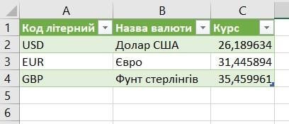
Рис. 2-2. Так выглядит результирующая таблица в нашем Excel файле.
Курсы валют на сайте Нацбанка меняются каждый день. Но при обновлении данных в документе Excel наш, один раз подготовленный, запрос пройдет через все шаги, и результирующая таблица всегда будет в нужном виде, но уже с актуальными курсами.
Power Pivot
У вас данные находятся в разрозненных источниках? Некоторые таблицы содержат больше 1 млн строк? Вам нужно все это объединить в одну модель данных и анализировать с помощью, например, сводной таблицы Excel? Здесь понадобится Power Pivot — надстройка Excel, которая по умолчанию включена в версии Pro Plus и выше (начиная с версии 2010).
В Power Pivot вы можете добавлять данные из разных источников, связывать таблицы между собой (рисунок 3). Таблицы при этом не обязательно должны находиться на рабочих листах Excel. Вместо этого они по-прежнему будут храниться в файле Excel, но просматривать их можно в окне Power Pivot (рис. 4). Поэтому нет ограничения на количество строк — в вашем файле Excel могут находиться таблицы и в сотни миллионов строк.
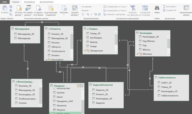
Рис. 3. Окно Power Pivot в представлении диаграммы
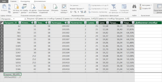
Рис. 4. Окно Power Pivot в представлении данных
Вот некоторые возможности Power Pivot, помимо описанных выше:

добавлять вычисляемые столбцы и поля (меры), в том числе основанные на расчетах из нескольких таблиц

создавать и мониторить в сводной таблице ключевые показатели эффективности (KPI)

создавать иерархические структуры (например, по географическому признаку — регион, область, город, район)
И обрабатывать все это с помощью сводной таблицы Excel, построенной на модели данных.
Пример. У предприятия в базе данных (или отдельных файлах Excel) в 5 таблицах хранится информация о продажах, клиентах, товаре и его классификации, менеджерах по продажам и закупочных ценах продукции. Необходимо провести анализ по объемам продаж и маржинальности по менеджерам.
С помощью Power Pivot:

добавляем все 5 таблиц в модель данных

связываем таблицы по общим ключам (столбцам)

в таблице «Продажи» создаем вычисляемый столбец «Продажи в закупочных ценах», умножив количество штук из таблицы «Продажи» на закупочную цену из таблицы «Цена закупки»

создаем вычисляемое поле (меру) «Маржа»

с помощью инструмента «Ключевые показатели эффективности» устанавливаем цель по маржинальности и настраиваем визуализацию — как выполнение цели будет визуализироваться в сводной таблице
Теперь можно «крутить» эти данные в сводной таблице или в отчете Power View (следующий инструмент) и анализировать маржинальность по товарам, менеджерам, регионам, клиентам.
Power View
Иногда сводная таблица — не лучший вариант визуализации данных. В таком случае можно создавать отчеты Power View. Как и Power Pivot, Power View — это надстройка Excel, которая по умолчанию включена в версии Pro Plus и выше (начиная с версии 2010).
В отличие от сводной таблицы, в отчет Power View можно добавлять диаграммы и другие визуальные объекты. Здесь нет такого количества настроек, как в диаграммах Excel. Но в том то и сила инструмента — мы не тратим время на настройку, а быстро создаем отчет, визуализирующий данные в определенном разрезе.
Вот некоторые возможности Power View:

— быстро добавлять в отчет таблицы, диаграммы (без необходимости настройки)

организовывать срезы и фильтры

уходить на разные уровни детализации данных

добавлять карты и располагать на них данные

создавать анимированные диаграммы
Пример отчета Power View — на рисунке 5.
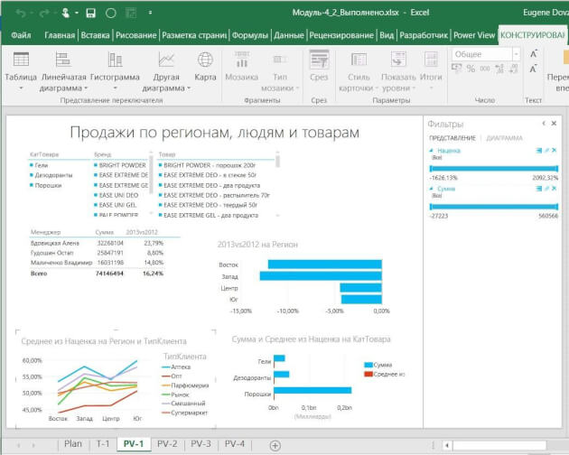
Рис. 5. Пример отчета Power View
Даже самые внушительные массивы данных можно систематизировать и визуализировать — главное не ограничиваться поверхностными возможностями Excel, а брать из его функций все возможное.


Хотите получать дайджест статей?
Одно письмо с лучшими материалами за неделю. Подписывайтесь, чтобы ничего не упустить.
Спасибо за подписку!
Курс по теме:
«Advanced Excel»
Программы
Ведет
Никита
Свидло
![]()
16 мая
13 июня


Excel does not only have the ability to handle small data but also very big data as well. Big data can be described as data that has a high variety, high velocity or high volume. High variety entails huge shape of data which changes quickly over a period of time. High velocity entails that the data arrives very fast requiring a lot of updates and changes. High volume entails a huge dimension of data with a lot of items. Furthermore, big data requires novel value of business, innovative analysis types and processing that is cost effective.
Big data and the role of Excel
There are various technology that can be used to manipulate big data: custom application from operation analytics, vertical solutions that are pre-built, exploratory and ad-hoc analysis, processing, capture, infrastructure and storage.
A major case is the ad hoc/exploratory analysis. In this case, analysts love to use the tools for analysis they are most comfortable with to get great knowledge about the sets of data they receive. In most cases, their usage go beyond variety, velocity and volume as they also want to be able to give queries to the data, so as to get prescriptive and predictive experiences as well as get social feeds and other unstructured data.
There are broadly 3 ways external data can be manipulated in excel, with each way having the cases where they can be used as well as dependency sets. All of these can however be carried out on 1 workbook.
How to import data
A lot of customers import data from outside by using a connection as a snapshot that is refreshable. A document that is self-contained is subsequently created, which can be worked on, even when there is no network. It is also possible for customers to change the data so that it shows their analytic needs or personal context.
You should however take note of these challenges when importing huge data:
-
Huge data querying: Sources of data for huge data including HDFS, SaaS as well as relational sources that are large might need special tools in some cases. Power query has a lot of new connectors that has this ability.
-
Data transformation: Every data including huge ones could have some noise. Power query also aids in setting up steps of transformation that would make an auditable, repeatable and coherent data set. This would aid in the creation of a transformed and reliable data set that is clean.
-
Large sources of data handling: It is possible to quickly get fluid data preview with the aid of power query. Queries can subsequently be worked with to be used to filter data subsets.
-
Semi-structured data handling: This is very much required in cases of huge data. Elegant methods are offered by power query towards manipulating very hierarchical data or data that are in many files.
-
Large data volume handling: Data model, which is available in the 2013 version of Microsoft Excel has the ability to manipulate data that requires more than the initial limit of 1 million rows.
External source live query
It is possible for a data model to be upsized to a SQL database Server Analysis Services that is standalone towards supporting live query from external sources.
Export to Excel
It is possible to export, from a lot of other applications, to Excel.