
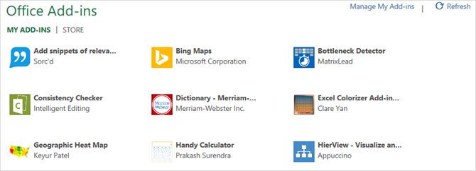
Microsoft Excel has an array of useful features for creating powerful spreadsheets with charts and tables. But, when you want to take your spreadsheet to the next level, beyond fancy text or themes, you may need the help of an add-in.
With these handy tools, you can create more visually stimulating representations of your data. For printing, presenting, or providing a better view of your spreadsheets and what they contain, check out these awesome Excel add-ins.
1. Excel Colorizer
For an easy way to add color to your spreadsheet data, the Excel Colorizer add-in works great. To make your data simpler to read, just pick the colors and pattern and let the add-in do the rest of the work.
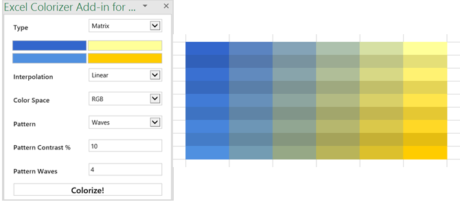
You can choose a type from uniform, horizontal, vertical, or matrix and pick your four colors. Then, adjust the interpolation to smooth or linear and the color space to RGB or HSV. You can also pick the pattern from interlaced or waves. So, select your data, make it look amazing, and hit Colorize! to finish.
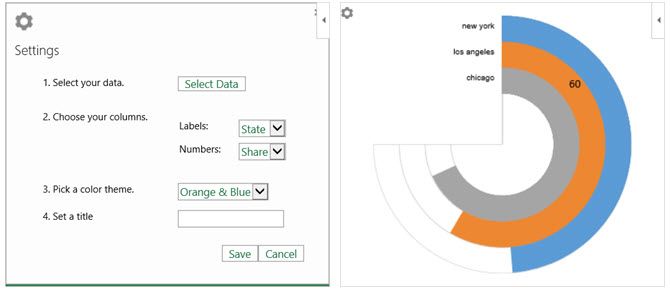
2. Radial Bar Chart [Broken URL Removed]
While Microsoft Excel offers many chart options, Radial Bar Chart gives you one more. This add-in follows its name in providing exactly what it says: a radial bar chart. Access the add-in, select the cells containing your data, and then adjust the chart as you like.
You can pick the labels, numbers, and set a title. Hit Save and your chart will be created automatically. Move or resize your chart and run your mouse over the bars to display the data for each. The add-in is quick, simple, and gives you another chart style option for your data.
3. HierView
For displaying an organizational chart, HierView is the add-in for you. Your data should include a row identifier with the information included across the columns. Then, configure your data with filtering, automatic refreshing, column names, and data per node.
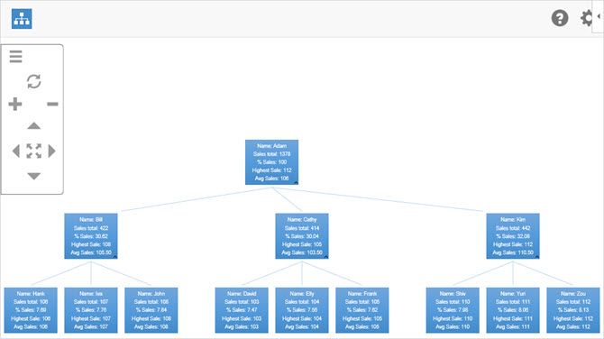
Once your chart is complete, you can zoom in or out, move in all four directions, or fit the chart to the plotted area. You can also move the entire chart or resize it if needed. Adjust the settings or get help at any time with the convenient buttons at the top of the chart.
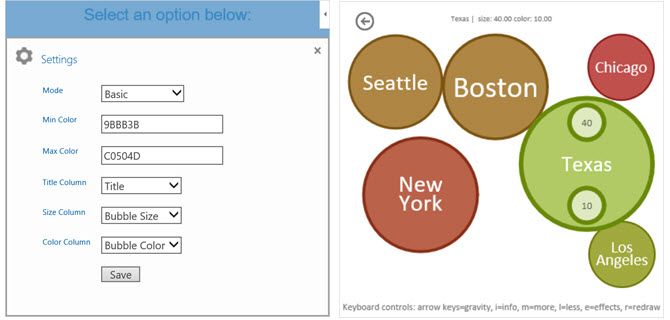
4. Bubbles
Would your data look better in a bubble? If so, then Bubbles is the add-in you should try. This interactive bubble chart tool lets you display information in a unique way. Just open the add-in and select your table of data. When the chart is created, you can move the bubbles around while presenting or leave them as they are.
Bubbles has a few settings you can adjust for basic or detailed mode, color range, and the title and column displays. You can also use the keyboard shortcuts shown at the bottom of the chart for things like hiding or showing more information or bouncing the bubbles about.
5. Bing Maps
If adding a map to your spreadsheet is useful, the Bing Maps add-in makes it simple. Your data can include addresses, cities, states, zip codes, or countries as well as longitude and latitude. Just open the add-in, select your data cells, and click the Location button on the map.
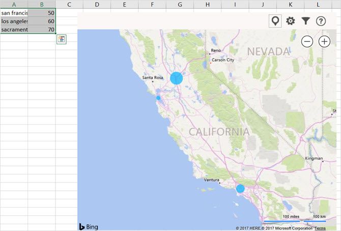
The Bing Maps tool is ideal for displaying numeric data related to locations. So, if you work in sales, you can show new markets to cover or if you work for a company with multiple locations, you can present those facilities to clients clearly.
6. Geographic Heat Map
When a heat map is what you really need, the Geographic Heat Map add-in is terrific. From the same developer as the Radial Bar Chart add-in, you have similar settings. Select your data, choose a U.S. or world map, pick your column headings, and add a title.
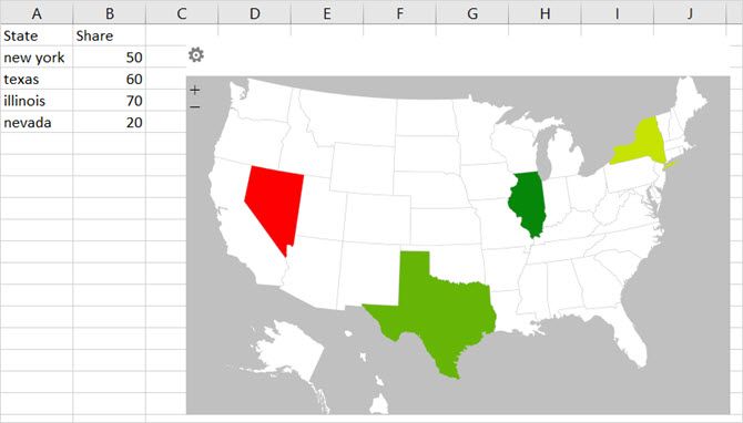
You can reselect the data set if you add more columns or rows and if you change a value already in the set, you will see the heat map update automatically. For a fast glance at data related to countries, states, or regions, you can pop this heat map into your spreadsheet easily.
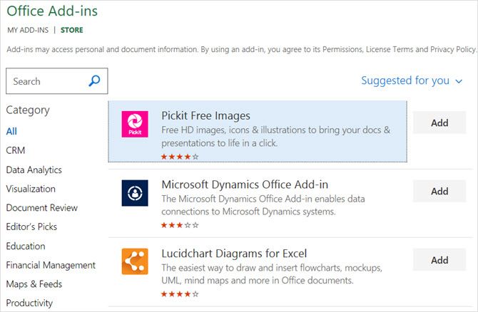
7. Pickit Free Images
For adding photos and other images to your spreadsheets, Pickit Free Images is the perfect tool. Once you access the add-in, you have a few options for finding the image you need. You can do a keyword search, browse through collections, or pick a category from a huge selection.

Click a spot to put it in your spreadsheet, select the image you want, and hit the Insert button. You can move, resize, or crop images as needed. And, if you create a free Pickit account, you can mark favorites to reuse and follow fellow users or categories to stay up-to-date on new uploads.
8. Web Video Player
Maybe your company has videos on YouTube or tutorials on Vimeo that would be beneficial to your workbook. With the Web Video Player add-in, you can pop a video from either of these sources right into your spreadsheet.
Open the add-in and then either enter the URL of the video or click to visit YouTube or Vimeo to obtain the link. Hit the Set Video button and you are done. Then, when you open the spreadsheet, the video is there and ready for you to click the Play button.
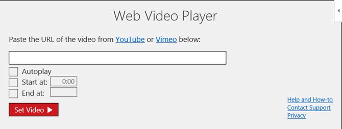
For a one-time $5 fee, you can set your videos to play automatically or start and end at specific spots in the clip. This option is included within the add-in.
Find, Install, and Use Add-Ins
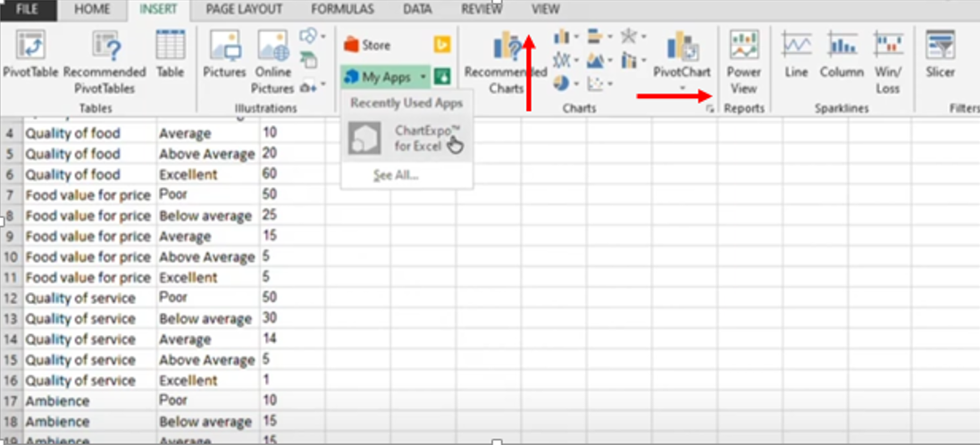
You can access the add-ins store easily from within Excel. Open a workbook, select the Insert tab, and click Store. When the Office Add-Ins Store opens, browse by category or search for a specific add-in. You can also visit the Microsoft AppsSource site on the web and browse or search there.
When you find the add-in you want, you can select it for further details or simply install it. However, it is wise to view the description first to check the terms and conditions, privacy statements, and system requirements.
After you install an add-in, open the Insert tab and select the My Add-ins button. When the pop-up window opens, you can view your installed add-ins and double-click one to open it. You can also click the arrow on the My Add-ins button to quickly select a recently-used one.
How Do You Make Your Data Stand Out?
Maybe you format your spreadsheets by hand or use completely different add-ins than those listed here.
Let us know what your preferred method is to make your data visually appealing in Excel by sharing it in the comments below.
Image Credit: spaxiax/Depositphotos
Following versions of Excel are supported by ChartExpo

Excel 2013 SP1 or later on Windows

Excel 2016 or later on Mac

Excel 365 on Windows & Mac
The ChartExpo Excel add-in simplifies data visualization and offers a wide range of custom Excel charts for you to use.
Finally, charting is fun and accessible to everyone.
With an ever-growing library of advanced Excel charts, there is an option for all your charting needs.
No matter what Excel chart types you need, ChartExpo has it.
If we don’t have what you need, we’ll create it for you! It takes just three clicks to start making graphs in Excel with ChartExpo.
There’s no coding, scripts or complicated settings to navigate.
It’s an easy-to-use charting tool that anyone can benefit from.
Start finding meaning behind your numbers.

Build Advanced Excel Charts Simply
As the data grows, the need for advanced Excel charts rises. Traditional graphs in Excel don’t always offer the depth of visualization that you need for more sophisticated data sets.
With ChartExpo’s Excel add-in, the doors open up to a library of advanced Excel charts that are exceptionally easy to use.
Choose from new Excel chart types, like Sankey, Pareto, Likert, dayparting, polar, comparison, survey charts and so many more.
Excel is a familiar and intuitive tool used by millions, but it does have some deficiencies, especially when it comes to charting and visual data storytelling.
When the need arises for advanced Excel charts to accurately convey your ideas and results, these shortcomings of Excel will get in your way and slow down your visual analysis.
ChartExpo doesn’t just offer new advanced Excel charts to capture your data visually. The real value is the simple ways that this charting tool transforms even the most complex spreadsheet into a refined, digestible visualization.
Simplify Your Analysis
Your data is already complex enough. Visualizations need to improve your understanding of your spreadsheets, not to detract from it.
ChartExpo’s advanced charting options can demystify convoluted spreadsheets by simplifying the information through visuals.
An advanced chart shouldn’t be overwhelming or difficult to understand. The most effective visual analysis occurs when you take complicated information and depict it in the simplest format.
Simple is not basic and rudimentary. When you solve a complex problem with a simple solution, simple becomes revolutionary. This is the case when you tell the entire story of a spreadsheet with a single chart.
Thus, the most effective data stories are the ones that present the information in the simplest and most direct manner. This allows the audience to arrive at the correct conclusions instantaneously.
Start simplifying your visual analysis today.
Fast Discovery Creates Swift Action
The instant insights you receive from ChartExpo’s advanced Excel visualizations save you both time and money. After all, the faster you can reach the right data conclusions, the better the value.
ChartExpo’s easy-to-use, advanced charts for Excel make experiencing those monumental “Aha!” moments a regular occurrence.
An “Aha!” moment is when you finally “see” your data and reach the conclusions you’ve been trying to find in your spreadsheets.
With the right Excel charts, these sudden bursts of inspiration rise to the surface. You don’t have to exert tons of effort to uncover insights. They are right in front of your eyes the moment you visualize them!
Fast discovery leads to swift action. The faster you act on data, the more weight those actions carry. This is because your data may have a short shelf-life. So, you don’t want to waste too much time analyzing the information and choosing how to react.
Instead, you want to quickly discover the most important details hidden in your data and respond as promptly as possible.
Mitigate Risks, Capitalize on Opportunities
Trends, shifts, outliers and other patterns in your data are either positive or negative. Negative changes present potential risks, while positive ones represent emerging opportunities for you to seize.
This is why it’s imperative that you use advanced Excel charts to respond swiftly to your data and insights.
Think of a risk change as a leaky pipe. The longer you let the leak exist without fixing it, the more damage it causes. Water damage eats at surrounding wood and other materials, creates mold, etc. However, if you detect the problem as soon as it starts, you can fix it with no damage.
Time is also an important element to positive data trends and shifts. When you identify this type of change in your custom Excel charts, you want to be one of the first to act.
Many of these trends are like fads; they come and they go. You want to get in on the ground floor and be the first to capitalize. Otherwise, you’ll be rushing to catch up with the trend, instead of already riding the wave.
Speed is especially critical in businesses. You may be interacting with lots of the same data as your competitors. You gain a significant edge over these other entities if you can leverage the insights hidden within this sea of data faster than your competitors,
By empowering your spreadsheets with ChartExpo’s excel add-in for data analysis; you can stop leaks and capitalize on top trends faster and more efficiently.
That’s a competitive advantage you don’t want to miss!
More Charting Options, More Advantage
The competitive advantage you receive from acting on insights faster is key to any data user’s success. Another element of a winning visual analysis strategy is having a deep bench of charting options available to use.
ChartExpo’s interface makes it quick and easy to perform visual analysis from multiple angles. Each custom Excel chart type you use will showcase your data in a new light and reveal fresh insights that are both valuable and actionable.
Since ChartExpo allows you to visualize your data with new advanced Excel charts in as few as 3 clicks, it’s incredibly easy to cycle through multiple chart types and find the best ways to convey your findings and insights.
Every time you view your data with a new visualization, your understanding expands and you gain further details that flush out your data story.
Including multiple visualizations in your reports empowers your visual data storytelling by showcasing the information from several angles.
Plus, ChartExpo graphs in Excel are interactive, making it easier for you and audiences to engage with your data and uncover new insights.
More Excel chart types mean more value.

Custom Excel Charts for any Data and any User
Your data needs are unique, meaning you want to go beyond traditional Excel chart types. Thanks to ChartExpo’s custom Excel charts, you can customize any element of your graphs. Each change is simple to make and helps you deliver completely customized charts.
Custom charts help you communicate data findings to audiences, leading to more effective collaboration that helps you uncover even more exciting trends, patterns and insights.
Start making your own graphs in Excel that will wow your audiences.
Every Excel user is different and so is their data. Custom Excel charts help you match the right visualization to your data sets, while also personalizing your charts in ways you see fit.
Through ChartExpo’s simple visualization tool, you can customize any element in your charts, even down to the colors, fonts, axes and more.
These customization options ensure that you always present your data in the best ways possible, thereby empowering your visual data storytelling
Chart Type
To reiterate, data is unique and capturing its value and insights requires you to match your numbers with the proper graphs in Excel.
Unfortunately, this isn’t always possible with the stock Excel charting options. The traditional visualizations available with the Excel software handcuff you into using only a handful of basic charts.
The ChartExpo tool vastly improves these lackluster charting options by providing you with a library of advanced Excel chart types for you to customize your visualizations and strengthen your data storytelling.
With so many Excel chart types to choose from, there’s an option for all of your data objectives. If you need to portray the results of a survey, use the CSAT Score Survey Chart or Likert Chart options. Alternatively, if you want to depict different stages in a complex process, the Sankey Diagram is an excellent choice.
You can even leverage the word cloud or text relationship charts to express new keyword opportunities. No matter your reasoning for using Excel, ChartExpo has you covered with its ever-growing selection of visualizations.
If you can’t find the right graphs in Excel with ChartExpo, we’ll build it for you. The engineers behind ChartExpo are always listening to our users and finding new ways to deliver the best custom Excel charts.
ChartExpo’s user-friendly design makes it easy to find the best visualization for your data needs. Excel chart type categories help you find the right graph for every project.
Once you find the right category, it’s a simple matter of selecting each Excel chart type until you find the one that best suits your data and objectives.
Title
Every good story needs a great title; visual data stories are no exception. A proper chart title showcases what information is portrayed and establishes the audience’s expectations as to what conclusions they may draw from the graph.
Thus, your chart title has a direct purpose and definite value. It’s not an area of advanced Excel charting that you want to overlook.
The best chart titles manage to entirely explain what’s being shown in the chart using the fewest words. Concise titles are the most effective because they are easier to understand, look more professional and save time. The fewer words you use, the less chance of confusing your audiences!
Unfortunately, making short titles isn’t always easy, especially when using multiple variables to accurately describe your chart.
You may find yourself making minor changes to your title repeatedly to find the perfect one. Luckily, ChartExpo makes it easy to create new titles or update existing ones.
In fact, you can edit any component of your chart in a few simple steps. Customizing or updating your charts is never a hassle!
Colors, Fonts and More
Your chart title explains what data you’re depicting. It’s an essential part of compelling visual data storytelling. Smaller components, like the colors, fonts and other details you choose, also matter.
Not only do these elements make your graphs in Excel more engaging, but they can also help you convey your results more effectively.
For instance, color is a valuable tool to keep different data categories separated, like in a stacked bar chart.
You can even use colors to depict what’s actually being shown. If you’re visualizing weather data, blue can represent cooler temperatures, while red depicts warmer ones.
On the other hand, fonts need to be legible and professional. You also don’t want to choose a font that distracts from the chart itself. Many businesses elect to use fonts that match their branding and other correspondences.
Keep your audience in mind whenever you choose fonts, colors or other small details. You want to try and view your data as an unbiased party and answer critical questions, such as, “Do the colors/fonts add to the visual analysis or take away from it?”
Similar to editing your title, ChartExpo also makes it fast and simple to edit your visualization’s fonts, colors and other minor (yet still important) components.
Axes
Chart axes represent your variables and allow you to compare distinctly different items or categories from your spreadsheet.
A typical chart will have two axes, enabling you to chart two items in your spreadsheet, a metric and a dimension.
That said, you may run into times when you need advanced Excel charts with more axes to depict your data accurately. As you add axes, you can compare and contrast more items in one chart.
ChartExpo has several multi-axis Excel chart types to choose from, making it exceptionally easy to add or remove variables and axes.
These advanced Excel charts can even compare data with vastly different ranges, allowing you to compare data values that are extremely different from one another. This would be difficult to achieve with traditional Excel charts.
ChartExpo also includes Excel chart types with unique axes. For example, the radar chart features a circular axis perfect for tracking changes over time
Be careful of adding too many axes and variables. This will overload your Excel charts and make it challenging to extract insight and act on the information shown.
Deliver a Complete Presentation
The impact of all of these small components to your visual data storytelling may seem small. However, getting each of these elements correct vastly improves your ability to convey visual data and engage audiences.
ChartExpo makes it effortless to edit every component of your custom Excel charts. This makes it easy to make even small changes without starting over or waiting for a new chart to load each time.
It also means that finding the correct mix of chart type, title, colors, fonts and more is much easier. You can keep making adjustments until you find the right combination!
These complete, custom Excel charts will empower your reports and help you deliver outstanding presentations with beautiful, engaging charts. Audiences won’t want to put your data down.
An outstanding data presentation does a lot for your internal communication. Plus, it helps build organizational trust and understanding of what the data shows and how to use it.
Once you create your first custom Excel charts with ChartExpo, you’ll see the impact it has on your presentations.

The Easiest Way to Make Graphs in Excel
You spend enough time collecting data, creating spreadsheets and organizing your columns and rows to extract insights.
Creating advanced Excel charts is the best way to discover and communicate these insights. Don’t let it become another time-consuming step in the process.
With ChartExpo’s intuitive, easy-to-use Excel add-in for data analysis, you can make beautiful, insightful graphs in Excel in just 3 clicks.
The time you save through effortless advanced Excel chart creation is time you can spend on other projects and deeper data analysis.
Building advanced charts within the Excel interface comes with several obstacles. It’s common to find yourself cycling through multiple tabs and spreadsheets just to create one visualization.
Not only does this slow down your visual analysis and keep you from those all-important insights, but it also heightens the risk for errors to occur.
ChartExpo allows you to overcome these obstacles. The most significant weaknesses of Excel charting become your best sources of strength thanks to the easy-to-use charting interface.
Universal Charting
There shouldn’t be a skill gap to creating outstanding visualizations. Yet, producing advanced Excel charts without ChartExpo’s easy-to-use system requires a deep understanding of how the spreadsheet tool works.
This can make it challenging for novice Excel users to create effective, advanced charts in Excel. There are so many settings, shortcuts, inputs and other components that you have to learn to make charts and graphs in Excel.
ChartExpo eliminates this hassle with a highly intuitive charting interface. This means anyone can conduct deep visual analysis, no matter how complex the data is.
All it takes is three clicks. First, select which part(s) of your spreadsheet you want to chart. Second, click the chart type you want to use. Finally, you tap the “Create Chart” button.
That’s all it takes. There are no fancy scripts, complex coding or extensive options and settings to navigate.
Making edits to your custom Excel charts is also easy with ChartExpo. And, every adjustment to your chart updates the visualization instantly, so you can immediately see the difference in every change you make.
This feature also enables you to cycle through ChartExpo’s massive, growing library of chart and graph types. You can see how your data looks across these various visualization options and discover the best ways to present the information.
You shouldn’t have to be an Excel wizard to transform your spreadsheets into engaging data stories. With ChartExpo, you don’t have to be.
Code-Free Environment Means no Stress
ChartExpo’s codeless environment does a lot to even the gap between advanced Excel users and novice ones. Even if you’re already a master at Excel, there’s still significant value to gain from a codeless, script-free tool.
It’s critical to keep in mind that this is an Excel add-in for data analysis. It doesn’t aim to replace Excel or your spreadsheets.
The goal of ChartExpo is to supercharge your visual data storytelling through Excel by providing a library of easy-to-use charts for fast, but detailed, analysis.
By removing the coding requirement, ChartExpo eliminates potential obstacles and makes charting and data storytelling more accessible than ever.
Remember, you might interact with your data and create Excel charts often, but other parties don’t have the same level of familiarity. ChartExpo’s easy-to-use interface means that anyone on your team can interact, alter and share charts, or create ones of their own.
The more parties involved in visual analysis, the more potential insight your organization can gain.
Remove the tiresome coding and make charting an accessible, engaging activity.
Faster Charting Saves Time and Money
Your time is valuable, no matter what types of data you’re dealing with or what your objectives and goals are.
Chances are, you’re juggling multiple projects and responsibilities at the same time. When charting and visual analysis takes too long, it eats away time from these other tasks and adds unnecessary stress and pressure to your daily to-do list.
The 3-click process means you can make sophisticated visualizations in just minutes. This leaves you with more time to focus on the visual analysis itself to capture even greater insights.
There’s no more fussing across multiple spreadsheets and tabs in the pursuit of making a simple chart. ChartExpo simplifies the arduous process to save you all the headaches from traditional Excel charting.
The other significant source of wasted time in Excel charting is how long it can take for the application to load and display your chart. An advanced Excel chart can take up to 15 minutes to process and appear.
When you make adjustments to your spreadsheet or chart, you may end up waiting even longer for your visualization to update.
Meanwhile, creating or editing Excel charts with ChartExpo happens instantly. There’s no disruption to your visual analysis! As soon as you click Create Chart, your visualization appears. There’s no waiting!
By saving time with smoother, more efficient charting, you also save money. That’s something that every Excel user can get behind.
Optimize Your Workload
Thanks to ChartExpo saving you substantial time in the visualization process, you can greatly optimize your workload and finish more high-priority tasks and projects in less time.
The speed at which you can glean insights and discover new trends, shifts and other patterns with ChartExpo enables you to analyze more of your total data.
When you’re working with massive spreadsheets and mountains of data, trying to analyze all of it feels like an impossible task.
By alleviating the time pressures of some of the more tedious steps in the analysis process, such as charting, you have more time to explore other areas of your data.
Applying the proper chart to your data allows you to physically see how data points relate to one another. Noteworthy patterns and other events rise to the surface.
It’s these now-visible insights that expand your actionable intelligence and provide you with a deeper understanding of the data. ChartExpo’s data visualization software puts insights in clear view.
The faster you detect and analyze insights, the sooner you can react appropriately. In a business setting, this can mean gaining a significant competitive edge through continuous improvements to your key metrics.
Start optimizing your visual analysis with ChartExpo and see the benefits for yourself.

Explore New Excel Chart Types
With ChartExpo’s extensive library of Excel chart types, you have all new graphs and visualizations to explore.
These advanced Excel charts give you fresh angles to view your data. Each new perspective offers the chance to see new, previously undiscovered insights. You’ll see the unseen and gain actionable intelligence that others don’t have access to with their existing Excel chart types.
Begin exploring and communicating your data in new ways today.
ChartExpo opens the door to many new Excel chart types ready to solve your most complicated data sets.
Within the standard Excel program, you only have a handful of chart types to choose from. This limits how much freedom you have when designing custom Excel charts.
Even with advanced tools and techniques, it would be impossible to create some of the advanced Excel charts included with ChartExpo.
Excel Chart Types to Choose From
ChartExpo has no shortage of Excel chart types, giving you more freedom and capability in the visual analysis stage.
Many of the options included in the ChartExpo library have very specialized purposes. If you have very niche data needs, explore the advanced Excel charts included with ChartExpo. You may just find the perfect visualization!
Here’s a complete rundown of the Excel chart types available with ChartExpo:
| Sankey Chart | Likert Scale Chart | Pareto Bar Chart | Pareto Column Chart | CSAT Score Survey Chart |
| Radar Chart | Comparison Bar Chart | Gauge Chart | Chord Diagram | Sunburst Chart |
| Funnel Chart | World Map Chart | Column Chart | Grouped Bar Chart | Grouped Column Chart |
| Sentiment Trend Chart | Tree Map Sentiment Chart | Sentiment Matrix Chart | SM Comparison Chart | Sentiment Sparkline Chart |
| Comparison Sentiment Chart | Double Bar Graph | CSAT Score Chart (NPS Chart) | Customer Satisfaction Chart | Credit Score Chart |
| Rating Chart | Area Chart | Stacked Area Chart | Bar Chart | Stacked Bar Chart |
| Stacked Column Chart | Line Chart | Multi Series Line Chart | Crosstab Chart | Pie Chart |
| Donut Chart | Tree Map | USA Map Chart | Word Cloud Chart | Partition Chart |
| Area Line Chart | Sequence Chart | Sparkline Chart | Co-occurrence Chart | Tornado Chart |
| Dual Axis Grouped Bar Chart | Dual Axis Grouped Column Chart | Multi Series Sparkline Chart | Slope Chart | Dual Axis Radar Chart |
| Matrix Chart | 24 Hour Chart | Bid Chart | Tag Cloud Chart | Progress Chart |
| Performance Bar Chart | Dual Axis Line Chart | Double Axis Line and Bar Chart | Multi Axis Line Chart | Radial Chart |
| Quality Score Chart | Scatter Plot | Text Relationship Chart | Components Trend Chart | Control Chart |
| Context Diagram | Dot Plot | Grouped Dot Plot | Box and Whisker Column Chart | Box and Whisker Bar Chart |
| Overlapping Bar Chart | Dot Plot (ORA) |
Since the ChartExpo library is constantly growing, this list is always changing and increasing. Moreover, many of these Excel chart types have multiple variations, meaning this list is longer than it appears!
With so many Excel chart types to choose from, there is sure to be a specialized visualization for your various visual analysis projects, whether you’re looking at financial data, marketing metrics or any other information.
An Ever-Growing Library
Using a library of advanced Excel charts means you should find specialty visualizations for all of your needs, but what happens if you still can’t find what you’re looking for?
ChartExpo’s goal is to continue to deliver innovative visualizations that handle the current data needs of our users. Since data is always growing and evolving, our visualizations need to do the same!
If you have very specific or niche charting needs that aren’t covered by our list, we urge you to get in contact with us!
Depending on the situation, we may be able to work with you to create a visualization that solves your data challenges.
By solving our users’ needs and staying up-to-date on the latest data challenges facing the world, ChartExpo’s library of visualization options continues to grow and grow.
Change Chart Types to Discover New Insights
When you combine the expansive lexicon of charting options with the instant visualization power of ChartExpo, you have a tool capable of steadily generating insights.
These discoveries will improve your understanding of complex data and fuel better decisions regarding what to do with the latest figures.
Every new chart you use to visualize your data provides a new perspective and the opportunity to capture previously-unseen insights. The easy-to-use ChartExpo system allows you to simultaneously view your data from multiple angles.
You don’t have to wait for your chart to load each time you select a new type! This massive time-saver allows you to get more out of your data and your Excel charting options.
You can view the same data using multiple charts simultaneously, giving you the best view of your data and potential insights.
While most Excel users are drowning in data and starving for insight, you’ll be swiftly creating visualizations that yield deeper intelligence.
That’s the advantage of using ChartExpo!
Prevent Analysis Fatigue
When you only have traditional Excel charts to work with, you may not always have the perfect visualization to depict your data.
This puts you at a disadvantage for two reasons. First, it limits your ability to connect your data to the best chart, which means you may miss valuable insights.
The second problem is efficiency. Trying to fit your data into a chart that doesn’t exactly capture the information correctly is like trying to fit a round peg through a square hole. It’s going to take more time and energy to make it fit.
This tedium makes you very susceptible to analysis fatigue. Analysis fatigue manifests when you exert so much time and energy on a single analysis that it creates a paralyzing effect.
It’s essentially the result of having too much data that it becomes overwhelming, especially when you’re working with clunky, time-consuming charts. You put in an abundance of effort and receive very little value or intelligence in return.
ChartExpo’s hassle-free charting environment remedies analysis fatigue by speeding up and improving the visualization process. With more Excel chart types, you can go from raw data to insight in far fewer steps.
This saves time and headaches to ensure you’re always on top of your data, instead of struggling to catch up to it!

Simple Excel Add-ins For Data Analysis
There are many Excel add-ins for data analysis available to users. However, not all of these tools are valuable.
ChartExpo provides value in three fundamental ways:
- ChartExpo’s Excel add-in increases the number of available Excel chart types ten-fold.
- You can create advanced Excel charts with a simple 3 clicks.
- Every advanced Excel chart is entirely customizable, opening the door to limitless opportunities.
As an Excel add-in, it integrates into your existing spreadsheet platform. There’s no complicated software to navigate, just simple custom Excel charts ready to use.
Not Another New Tool to Learn
There are plenty of third-party tools and software available to data users. Yet, all of these solutions have one problem in common: familiarity.
See, we like tools that we’re used to. We also despise change. So, when adding a new solution to the arsenal, you want to ensure it meshes with your existing tools and strategies.
That’s why ChartExpo is an Excel add-in for data analysis, instead of a stand-alone tool. It integrates directly into the Excel environment, meaning you don’t have to master an entirely new piece of software.
Once you’ve downloaded the tool, you simply click “My Apps” from the top Excel menu bar and select ChartExpo.
Then, you’re just three clicks away from a beautiful visualization. Your first click selects the relevant data, the second chooses the chart type and the third finalizes and creates the chart.
The ChartExpo tool opens right in the Excel interface, so you don’t even have to switch tabs or copy-paste and details from one to the next.
This is just another way that ChartExpo simplifies the visual analysis process and allows you to be more efficient in your visual data storytelling.
Integrates Easily Into Excel
The process to integrate ChartExpo into the Excel interface is exceptionally easy.
Once you’ve created your account and downloaded the ChartExpo Excel add-in for data analysis, you should see it appear under the “My Apps” menu. If you can’t find this option, look under the “Insert” tab at the very top of your page.
After you open the ChartExpo tool, it’s a simple three-step process to begin creating new graphs in Excel.
- Select the data from your spreadsheet that you want to include as each axis variable. Depending on your chart type, you may have to enter multiple data columns representing these different metrics or dimensions.
- With your data selected, you now want to choose your chart type. ChartExpo divides visualizations into different categories to help you find suitable options for the job. Don’t forget, you can test how your data looks using multiple Excel chart types.
- After finding the perfect chart, all that’s left to do is hit the “Create Chart” button. The graph will appear alongside your spreadsheet data, allowing you to easily refer back to your data table as you conduct your visual analysis.
If you want to make any changes to your chart, like editing the title, colors or other small details, you can select individual components to modify.
Code-Free Charting
To make the learning curve for ChartExpo even easier, this Excel add-in for data analysis is designed to be entirely codeless. There are no scripts or languages to learn, just an intuitive interface.
The codeless Excel add-in holds many advantages. When you don’t have to worry about coding each chart, you can create visualizations much more efficiently.
Zero coding or scripting also means more people can engage in the visual analysis process.
While you may be familiar with all of the hidden features of Excel, not everyone in your organization has the same level of proficiency. ChartExpo closes the skill gap in creating advanced Excel charts and allows more parties to get involved in the visualization process.
This enhances your team’s visual analysis efforts by introducing more individuals to the world of charting. More people mean more hands on deck for discovering insights and tapping into your data intelligence.
You shouldn’t have to be an Excel pro to make advanced charts and graphs. With ChartExpo, anyone can start designing custom Excel charts today!
Experienced Excel users may argue that, without scripts and codes, they don’t have the freedom to make their own custom charts.
However, with ChartExpo’s colossal library of visualizations, you don’t need to make your own charts. Every Excel chart type you could want is already included!
Get More Value from Excel
ChartExpo for Excel costs $10 a month per user. You may be wondering why pay for an Excel add-in when Excel itself is free?
To answer this question, let’s recap how ChartExpo adds value to Excel users and visual data storytellers.
- ChartExpo saves you time in the chart creation process. When you save time, you also save money!
- Faster charting also allows you to promptly detect and resolve any risks or opportunities hidden in your data.
- With new Excel chart types, you’ll always have the perfect visualization for your data, regardless of the subject or complexity.
- More charting options increase the number of angles to view your data from, enabling you to discover deeper insights.
- The easy-to-use charting system makes visual analysis more accessible. You can start encouraging your entire team to create custom Excel charts!
- This intuitive Excel add-in for data analysis will also reduce stress and headaches caused by traditional charting.
- The advanced Excel charts will empower your reports and help you convey complex data to other audiences.
The list of valuable advantages provided by ChartExpo goes on and on. The bottom line is ChartExpo adds tremendous worth to your visual analysis that quickly makes up for this $10 per month cost.
You’ll be extracting so much more insight and value from your data; you won’t even notice this small monthly expense!
After you input your data and select the cell range, you’re ready to choose the chart type. In this example, we’ll create a clustered column chart from the data we used in the previous section.
Step 1: Select Chart Type
Once your data is highlighted in the Workbook, click the Insert tab on the top banner. About halfway across the toolbar is a section with several chart options. Excel provides Recommended Charts based on popularity, but you can click any of the dropdown menus to select a different template.

Step 2: Create Your Chart
- From the Insert tab, click the column chart icon and select Clustered Column.

- Excel will automatically create a clustered chart column from your selected data. The chart will appear in the center of your workbook.
- To name your chart, double click the Chart Title text in the chart and type a title. We’ll call this chart “Product Profit 2013 — 2017.”

We’ll use this chart for the rest of the walkthrough. You can download this same chart to follow along.
Download Sample Column Chart Template
There are two tabs on the toolbar that you will use to make adjustments to your chart: Chart Design and Format. Excel automatically applies design, layout, and format presets to charts and graphs, but you can add customization by exploring the tabs. Next, we’ll walk you through all the available adjustments in Chart Design.

Step 3: Add Chart Elements
Adding chart elements to your chart or graph will enhance it by clarifying data or providing additional context. You can select a chart element by clicking on the Add Chart Element dropdown menu in the top left-hand corner (beneath the Home tab).

To Display or Hide Axes:
- Select Axes. Excel will automatically pull the column and row headers from your selected cell range to display both horizontal and vertical axes on your chart (Under Axes, there is a check mark next to Primary Horizontal and Primary Vertical.)

- Uncheck these options to remove the display axis on your chart. In this example, clicking Primary Horizontal will remove the year labels on the horizontal axis of your chart.

- Click More Axis Options… from the Axes dropdown menu to open a window with additional formatting and text options such as adding tick marks, labels, or numbers, or to change text color and size.


To Add Axis Titles:
- Click Add Chart Element and click Axis Titles from the dropdown menu. Excel will not automatically add axis titles to your chart; therefore, both Primary Horizontal and Primary Vertical will be unchecked.
- To create axis titles, click Primary Horizontal or Primary Vertical and a text box will appear on the chart. We clicked both in this example. Type your axis titles. In this example, the we added the titles “Year” (horizontal) and “Profit” (vertical).


To Remove or Move Chart Title:
- Click Add Chart Element and click Chart Title. You will see four options: None, Above Chart, Centered Overlay, and More Title Options.

- Click None to remove chart title.
- Click Above Chart to place the title above the chart. If you create a chart title, Excel will automatically place it above the chart.
- Click Centered Overlay to place the title within the gridlines of the chart. Be careful with this option: you don’t want the title to cover any of your data or clutter your graph (as in the example below).


To Add Data Labels:
- Click Add Chart Element and click Data Labels. There are six options for data labels: None (default), Center, Inside End, Inside Base, Outside End, and More Data Label Title Options.

- The four placement options will add specific labels to each data point measured in your chart. Click the option you want. This customization can be helpful if you have a small amount of precise data, or if you have a lot of extra space in your chart. For a clustered column chart, however, adding data labels will likely look too cluttered. For example, here is what selecting Center data labels looks like:


To Add a Data Table:
- Click Add Chart Element and click Data Table. There are three pre-formatted options along with an extended menu that can be found by clicking More Data Table Options:


Note: If you choose to include a data table, you’ll probably want to make your chart larger to accommodate the table. Simply click the corner of your chart and use drag-and-drop to resize your chart.
To Add Error Bars:
- Click Add Chart Element and click Error Bars. In addition to More Error Bars Options, there are four options: None (default), Standard Error, 5% (Percentage), and Standard Deviation. Adding error bars provide a visual representation of the potential error in the shown data, based on different standard equations for isolating error.

- For example, when we click Standard Error from the options we get a chart that looks like the image below.


To Add Gridlines:
- Click Add Chart Element and click Gridlines. In addition to More Grid Line Options, there are four options: Primary Major Horizontal, Primary Major Vertical, Primary Minor Horizontal, and Primary Minor Vertical. For a column chart, Excel will add Primary Major Horizontal gridlines by default.

- You can select as many different gridlines as you want by clicking the options. For example, here is what our chart looks like when we click all four gridline options.

To Add a Legend:
- Click Add Chart Element and click Legend. In addition to More Legend Options, there are five options for legend placement: None, Right, Top, Left, and Bottom.

- Legend placement will depend on the style and format of your chart. Check the option that looks best on your chart. Here is our chart when we click the Right legend placement.


To Add Lines: Lines are not available for clustered column charts. However, in other chart types where you only compare two variables, you can add lines (e.g. target, average, reference, etc.) to your chart by checking the appropriate option.
To Add a Trendline:
- Click Add Chart Element and click Trendline. In addition to More Trendline Options, there are five options: None (default), Linear, Exponential, Linear Forecast, and Moving Average. Check the appropriate option for your data set. In this example, we will click Linear.

- Because we are comparing five different products over time, Excel creates a trendline for each individual product. To create a linear trendline for Product A, click Product A and click the blue OK button.

- The chart will now display a dotted trendline to represent the linear progression of Product A. Note that Excel has also added Linear (Product A) to the legend.

- To display the trendline equation on your chart, double click the trendline. A Format Trendline window will open on the right side of your screen. Click the box next to Display equation on chart at the bottom of the window. The equation now appears on your chart.


Note: You can create separate trendlines for as many variables in your chart as you like. For example, here is our chart with trendlines for Product A and Product C.

To Add Up/Down Bars: Up/Down Bars are not available for a column chart, but you can use them in a line chart to show increases and decreases among data points.
Step 4: Adjust Quick Layout
- The second dropdown menu on the toolbar is Quick Layout, which allows you to quickly change the layout of elements in your chart (titles, legend, clusters etc.).

- There are 11 quick layout options. Hover your cursor over the different options for an explanation and click the one you want to apply.


Step 5: Change Colors
The next dropdown menu in the toolbar is Change Colors. Click the icon and choose the color palette that fits your needs (these needs could be aesthetic, or to match your brand’s colors and style).

Step 6: Change Style
For cluster column charts, there are 14 chart styles available. Excel will default to Style 1, but you can select any of the other styles to change the chart appearance. Use the arrow on the right of the image bar to view other options.

Step 7: Switch Row/Column
- Click the Switch Row/Column on the toolbar to flip the axes. Note: It is not always intuitive to flip axes for every chart, for example, if you have more than two variables.


In this example, switching the row and column swaps the product and year (profit remains on the y-axis). The chart is now clustered by product (not year), and the color-coded legend refers to the year (not product). To avoid confusion here, click on the legend and change the titles from Series to Years.

Step 8: Select Data
- Click the Select Data icon on the toolbar to change the range of your data.
- A window will open. Type the cell range you want and click the OK button. The chart will automatically update to reflect this new data range.


Step 9: Change Chart Type
- Click the Change Chart Type dropdown menu.

- Here you can change your chart type to any of the nine chart categories that Excel offers. Of course, make sure that your data is appropriate for the chart type you choose.

-
You can also save your chart as a template by clicking Save as Template…
- A dialogue box will open where you can name your template. Excel will automatically create a folder for your templates for easy organization. Click the blue Save button.


Step 10: Move Chart
- Click the Move Chart icon on the far right of the toolbar.
- A dialogue box appears where you can choose where to place your chart. You can either create a new sheet with this chart (New sheet) or place this chart as an object in another sheet (Object in). Click the blue OK button.


Step 11: Change Formatting
- The Format tab allows you to change formatting of all elements and text in the chart, including colors, size, shape, fill, and alignment, and the ability to insert shapes. Click the Format tab and use the shortcuts available to create a chart that reflects your organization’s brand (colors, images, etc.).

- Click the dropdown menu on the top left side of the toolbar and click the chart element you are editing.


Step 12: Delete a Chart
To delete a chart, simply click on it and click the Delete key on your keyboard.
Over the past years, one of the things we’ve learned is that Microsoft Excel is like a Hallmark movie.
Some of us can’t get enough of them and others just can’t stand it. 💔😬
Regardless of your preference, if you’re a manager or business owner, you’ll probably have to rely on Excel for business insights.
Tools like Microsoft Excel graphs are helpful for data analysis and tracking.
And wayyy better than endless spreadsheets that can easily trigger a migraine.
Then why not turn your boring Excel spreadsheet into something interesting?
In this article, we’ll learn what an Excel graph is, how to make a graph in Excel, and its drawbacks. We’ll also suggest an alternative to create effortless graphs.
Let’s graph away!
What are Graphs & Charts in Microsoft Excel?
Graphs in Excel are graphical representations of variations in values of data points over a given period.
In other words, it’s a diagram that represents changes in comparison to one or more variables.
Too technical? 👀
Take a look at the image for clarity:

Wondering if graphs and charts in Excel are the same?
Graphs are mostly numerical representations of data as it shows how one variable is affecting or changing another.
On the other hand, charts are visual representations where variables may or may not be associated. They’re also considered more aesthetically pleasing than graphs. For example, a pie chart. 🥧
However, if you’re wondering how to make a chart in Excel, it isn’t very different from making a graph.
But for now, let’s focus on the main plot: graphs!✨
Steps To Make a Graph in Excel
The first (and obvious step) is to open a new Excel file or a blank Excel worksheet.
Done?
Then let’s learn how to create a graph in Excel.
⭐️ Step 1: fill the Excel sheet with data
Start by populating your Excel spreadsheet with the data you need.
You may import this data from different software, insert it manually, or copy and paste it.
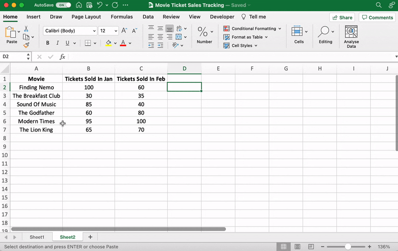
For our example, let’s say you’re an owner of a movie theater in a small town, and you often screen older movies. You probably want to track the sales of your tickets to see which movie is a hit so you can screen it frequently.
Let’s do that by comparing the ticket sales in January and February.
Here’s what your data might look like:

Column A contains the movie names.
Column B contains tickets sold in January.
And column C contains tickets sold in February.
You can bold headings and center align your text for better readability.
Done? Okay, get ready to pick a graph.
⭐️ Step 2: determine the Excel graph type you want
The type of graph you pick will depend on the data you have and the number of different parameters you want to track.
You’ll find the different graph types under the Excel Insert tab, in the Excel Ribbon, arranged close to one another like this:

Note: The Excel Ribbon is where you can find the Home, Insert, and Draw tabs.
Here are some of the different Excel graph or chart type options you can choose from:
- Line graph
- Column graph or bar graph
- Pie graph or chart
- Combo chart
- Area chart
- Scatter plot chart
➡️ Fun fact: Excel can help you decide the graph or chart type with the Recommended Charts (formerly known as Chart Wizard) option.
If you want to take notes of trends (increase or decrease) over time, then a line graph is perfect.
But for a long time frame and more data, a bar graph is the best option.
We’ll use these two graphs for the purpose of this Excel tutorial.
How To Create a Line Graph in Excel – 3 Steps
A line graph in Excel typically has two axes (horizontal and vertical) to function.
You need to enter the data in two columns.
Lucky for us, we’ve already done this when creating the ticket sales data table.
⭐️ Step 1: select data to turn into a line graph
Click and drag from the top-left cell (A1) in your ticket sales data to the bottom-right cell (C7) to select. Don’t forget to include column headers.
This will highlight all the data you want to display in your line graph.

⭐️ Step 2: insert line graph
Now that you’ve selected your data, it’s time to add the line graph.
Look for the line graph icon under the Insert tab.

With the data selected, go to Insert > Line. Click on the icon, and a dropdown menu will appear to select the type of line chart you want.
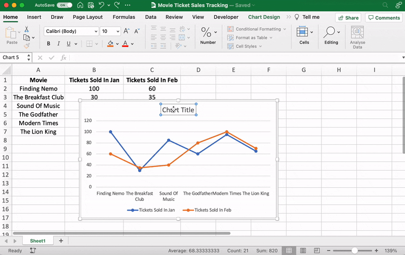
For this example, we’ll choose the fourth 2-D line graph (Line with Markers).
Excel will add your line graph representing your selected data series.

You’ll then notice the names of the movies appear on the horizontal axis and the number of tickets sold on the vertical axis.
⭐️ Step 3: customize your line graph
After adding the line graph, you’ll notice a new tab called Chart Design on your Excel Ribbon.
Select the Design tab to make the line graph your own by choosing the chart style you prefer.

You can also change the graph’s title.
Select the Chart Title > double click to name > type in the name you wish to call it. To save it, simply click anywhere outside the graph’s title box or chart area.
We’ll name our graph “Movie Ticket Sales.”
Anything else you need to tweak?
If you spot anything, now is the time to make those edits!
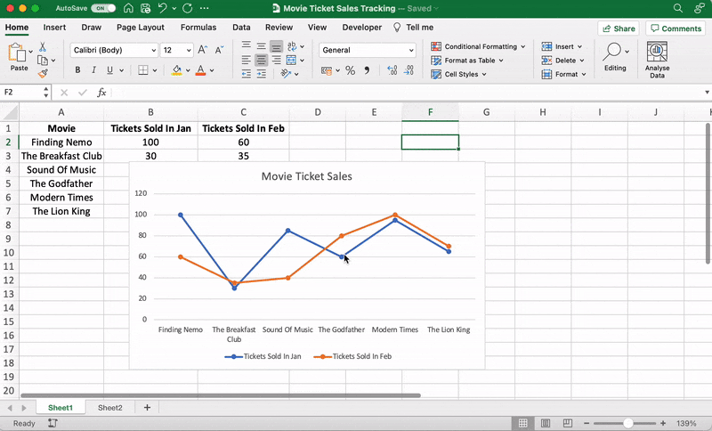
For example, here you can see The Godfather and Modern Times are smooshed together.
Let’s give them some space.
How?
Just drag any corner of the graph until it’s how you desire.

These are just some examples. You can customize every chart element if you like including the Axis Labels (the color of the lines that represent each data point, etc.)
Just double click on any chart element to open a sidebar for formatting like this:
That’s it! You’ve successfully created a line graph in Excel!
Now, let’s learn how to make a bar graph. 📊
3 Steps To Create a Bar Graph in Excel
Any Excel graph or Excel chart begins with a populated sheet.
We’ve already done this, so copy and paste the movie ticket sales data to a new sheet tab in the same Excel workbook.
⭐️ Step 1: select data to turn into a bar graph
Like step 1 for the line graph, you need to select the data you wish to turn into a bar graph.
Drag from cell A1 to C7 to highlight the data.
⭐️ Step 2: insert bar graph
Highlight your data, go to the Insert tab, and click on the Column chart or graph icon. A dropdown menu should appear.
Select Clustered Bar under the 2-D bar options.
Note: you can choose a different type of bar chart option like a 3D clustered column or 2D stacked bar, etc.
As soon as you click on the bar graph option, it’ll be added to your Excel sheet.

⭐️ Step 3: customize your Excel bar graph
Now, you can go to the Chart Design tab in the Excel Ribbon to personalize it.
Click on the Design tab to apply a bar style you prefer from the many options.

You know the next step! Change the bar graph’s title.
Select the Excel Chart Title > double click on the title box > type in “Movie Ticket Sales.”
Then click anywhere on the excel sheet to save it.

Note: you can also add other graph elements such as Axis Title, Data Label, Data Table, etc., with the Add Chart Element option. You’ll find it under the Chart Design tab.
And that’s a wrap. 🎬
You’ve successfully created a bar graph in Excel!
Well, that was fun.
But the question is, do you have the time for graphs in your busy work schedule?
And that’s just the teaser when it comes to Excel graph drawbacks.
Read on to watch the full movie. 👀
Bonus: Check out these Excel Alternatives!
Create Effortless Graphs With ClickUp
If ClickUp were a Hallmark movie, graphs and this project management tool would be the perfect match.
A forever kind-of-love. ❤️
Whether you want to create graphs to monitor time, projects, people, ticket sales… you name it because we can do it all within a few clicks.
All without the drawbacks of using Excel!
Excel can be:
- Time-consuming and manual
- Complex and pricey
- Error-prone
The best part?
Most of those functions are automated without manual data entry. Phew.
1. Line Chart Widgets
The Line Chart Widget is a Custom Widget on our Dashboard. Use this ClickUp production to visualize literally anything in the form of a line graph.
It can be tracking profits, total daily sales, or how many movies you’ve watched in a month.
Like we said, a-n-y-t-h-i-n-g!

Visualize any set of values as a line graph with the Line Chart Widget on ClickUp’s Dashboard!
And that’s not it. You can visualize your data in many different ways too.
Just use any of these Custom Widgets:
- Calculations
- Bar charts
- Battery chart
- Pie chart
- And more

Present your data visually as a pie chart with Custome Widgets in ClickUp!
2. Gantt Chart view
Just like it’s difficult to love just one movie genre, we totally get that graphs alone don’t work.
And that’s why we have charts too!
Specifically, ClickUp’s Gantt chart, an interactive chart with live updates and progress tracking that can help you:
- Plan projects
- Assign tasks and assignees
- Schedule a timeline
- Manage dependencies
- And more

Drawing a relationship from one task to a future task in ClickUp’s Gantt Chart view!
3. Table view
If you’re a fan of the Excel grids, ClickUp has your back.
Starring… ClickUp Table view!
This view lets you visualize your tasks in the spreadsheet style.
It’s super fast and allows easy navigation between fields, bulk edits, and data export.
➡️ Fun fact: you can quickly copy and paste your table’s data into other programs, like MS Excel. Just click and drag to highlight the cells you want to copy.
Highlight data from your table in ClickUp to copy and paste into other programs!
And that was just the trailer for you. 📽️
Here are some more powerful ClickUp features in store for:
- Send and receive emails right from your project management tool with Email in ClickUp
- Work even when the wifi acts up with Offline Mode
- Work how you like with multiple ClickUp Views, including Calendar, Mind Maps, Chat, etc.
- Reduce your workload with ClickUp Automations
- Track time spent on tasks with ClickUp’s Native Time Tracker
- Share Table view or Dashboards with clients and external users using Public Sharing and Permissions
- View all graphs and charts on the go with ClickUp mobile apps
Now Showing: ClickUp 🎥🍿
You can surely make tons of graphs in Excel.
No doubt there.
But does that make it a smart choice?
I mean, if you have to Google how to make a graph in Excel, maybe that’s your red flag. 🚩
Tools are supposed to make your life easier.
Take ClickUp, for instance.
Our project management tool can be your graph maker, chart creator, spreadsheet builder, time tracker, workload manager…
It’s a hallmark for a quality tool that can be your all-in-one solution.
Get your ClickUp ticket for free today and enjoy watching your graphs come to life in minutes!
Related readings:
- How to create Gantt charts in Excel
- How to create a Kanban board in Excel
- How to create a burndown chart in Excel
- How to create a flowchart in Excel
- How to show dependencies in Excel
- How to create a KPI dashboard in Excel
- How to create a dashboard in Excel
- How to create a database in Excel
- How to make a work breakdown structure in Excel