
[icon name=”area-chart” class=”” unprefixed_class=””] Area
[icon name=”bar-chart” class=”” unprefixed_class=””] Bar
[icon name=”line-chart” class=”” unprefixed_class=””] Bar, Line
[icon name=”circle-thin” class=”” unprefixed_class=””] Bubble
[icon name=”column” class=”” unprefixed_class=””] Column
[icon name=”line-chart” class=”” unprefixed_class=””] Column, Line
[icon name=”paint-brush” class=”” unprefixed_class=””] Formatting Charts
[icon name=”info-circle” class=”” unprefixed_class=””] Infographic
[icon name=”line-chart” class=”” unprefixed_class=””] Line
[icon name=”plus-circle” class=”” unprefixed_class=””] New Chart Types
[icon name=”pie-chart” class=”” unprefixed_class=””] Pie
[icon name=”table” class=”” unprefixed_class=””] Pivot Charts
[icon name=”ellipsis-h” class=”” unprefixed_class=””] Scatter
[icon name=”check” class=”” unprefixed_class=””] Smart Art
[icon name=”lightbulb-o” class=”” unprefixed_class=””] Sparklines
Click on any Excel Charts link below and it will take you to the free example tutorial & downloadable Excel workbook for you to practice!
How to Make Charts or Graphs in Excel?
Steps in making graphs in Excel:
- Numerical Data: The first thing required in your Excel is numerical data. Charts or graphs can only be built using numerical data sets.
- Data Headings: These are often called data labels. The headings of each column should be understandable and readable.
- Data in Proper Order: It is very important how the data looks in Excel. If the information to build a chart is bits and pieces, we might find it difficult to construct a chart. So arrange the data properly.
Table of contents
- How to Make Charts or Graphs in Excel?
- Examples (Step by Step)
- Example #1
- Example #2
- Things to Remember
- Recommended Articles
- Examples (Step by Step)
Examples (Step by Step)
Below are some examples of how to make charts in Excel.
You can download this Make Chart Excel Template here – Make Chart Excel Template
Example #1
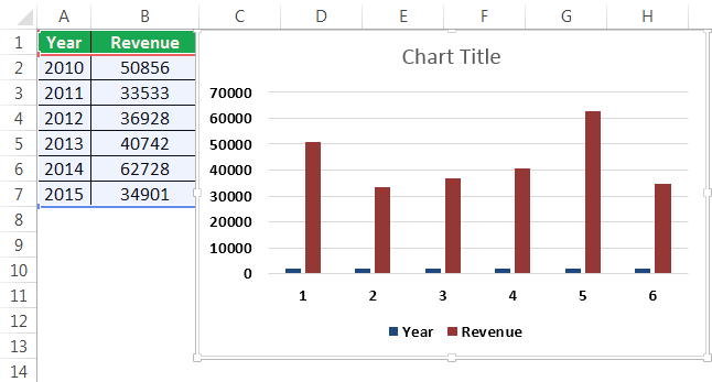
Assume we have passed six years of sales data. We want to show them in visuals or graphs.
- First, we must select the date range we are using for a graph.

- Then, go to the “INSERT” tab > under the “Charts” section, and select the “COLUMN” chart. We can see many other types under the “Column” chart but prefer the first one.

- As soon as we have selected the chart, we can see the below chart in Excel.

- It is not the finished product yet. We need to make some arrangements here. So, we must select the blue-colored bars and press the “Delete” button. Else, right-click on bars and choose “Delete.”

- Now, we do not know which bar represents which year. So, right-click on the chart and select “Select Data.”

- In the below window, we must click on “EDIT,” which is on the right-hand side.

- After we click on the “EDIT option,” we will see a small dialog box below. It will ask to select the “Horizontal Axis Labels.” So, choose the “Year” column.

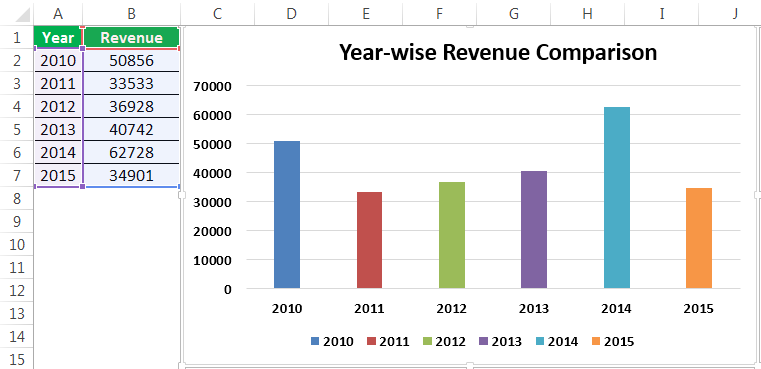
- Now, we have the “Year” name below each bar.

- After that, change the heading or title of the chart as per the requirement by double-clicking on the existing header.
- Add “Data Labels” for each bar. The “Data Labels” are each bar’s numbers to convey the message perfectly. Right-click on the column bars and select “Add Data Labels.”

- Change the color of the column bars to different colors. Next, select the bars and press “Ctrl + 1.” We may see the format chart dialog box on the right-hand side.

- Now, go to the “FILL” option, and select the option “Vary colors by point.”

Now, we have a neatly arranged chart in front of us.


Example #2
We have seen how to create a graph with auto-selection of the data range. Next, we will show you how to build an Excel chart with a manual data selection.
- Step 1: First, we must place the cursor in the empty cell and click on the “Insert Chart.”

- Step 2: After we click on the “Insert Chart,” we can see a blank chart.

- Step 3: Right-click on the chart and choose the “Select Data” option.

- Step 4: In the below window, click on “Add.”

- Step 5: In the below window, under “Series name,” select the heading of the data series, and under the “Series values,” select data series values.

- Step 6: Now, the default chart is ready.

Now, we must apply the steps shown in the previous example to modify the chart. Next, refer to steps 5 to 12 to alter the chart.
Things to Remember
- For the same data, we can insert all types of charts. It is important to identify a suitable chart.
- If the data is smaller, it is easy to plot a graph without any hurdles.
- In the case of percentage data, we must select the PIE chartMaking a pie chart in excel can help you with the pictorial representation of your data and simplifies the analysis process. There are multiple kinds of pie chart options available on excel to serve the varying user needs.read more.
- We must try using different charts for the same data to identify the best fit chart for the data set.
Recommended Articles
This article is a guide to Making Charts in Excel. Here, we discuss how to make charts or graphs in Excel, practical examples, and a downloadable Excel template. You may learn more about Excel from the following articles: –
- Organization Chart in Excel
- Examples of Line Chart in Excel
- Excel Chart Templates
- 8 Types of Charts in Excel
- Infographics in Excel
Reader Interactions
A picture is worth of thousand words; a chart is worth of thousand sets of data. In this tutorial, we are going to learn how we can use graph in Excel to visualize our data.
What is a chart?
A chart is a visual representative of data in both columns and rows. Charts are usually used to analyse trends and patterns in data sets. Let’s say you have been recording the sales figures in Excel for the past three years. Using charts, you can easily tell which year had the most sales and which year had the least. You can also draw charts to compare set targets against actual achievements.
We will use the following data for this tutorial.
Note: we will be using Excel 2013. If you have a lower version, then some of the more advanced features may not be available to you.
| Item | 2012 | 2013 | 2014 | 2015 |
|---|---|---|---|---|
| Desktop Computers | 20 | 12 | 13 | 12 |
| Laptops | 34 | 45 | 40 | 39 |
| Monitors | 12 | 10 | 17 | 15 |
| Printers | 78 | 13 | 90 | 14 |
Different scenarios require different types of charts. Towards this end, Excel provides a number of chart types that you can work with. The type of chart that you choose depends on the type of data that you want to visualize. To help simplify things for the users, Excel 2013 and above has an option that analyses your data and makes a recommendation of the chart type that you should use.
The following table shows some of the most commonly used Excel charts and when you should consider using them.
| S/N | CHART TYPE | WHEN SHOULD I USE IT? | EXAMPLE |
|---|---|---|---|
| 1 | Pie Chart | When you want to quantify items and show them as percentages. |
|
| 2 | Bar Chart | When you want to compare values across a few categories. The values run horizontally |
|
| 3 | Column chart | When you want to compare values across a few categories. The values run vertically |
|
| 4 | Line chart | When you want to visualize trends over a period of time i.e. months, days, years, etc. |
|
| 5 | Combo Chart | When you want to highlight different types of information |
|


The importance of charts
- Allows you to visualize data graphically
- It’s easier to analyse trends and patterns using charts in MS Excel
- Easy to interpret compared to data in cells
Step by step example of creating charts in Excel
In this tutorial, we are going to plot a simple column chart in Excel that will display the sold quantities against the sales year. Below are the steps to create chart in MS Excel:
- Open Excel
- Enter the data from the sample data table above
- Your workbook should now look as follows

To get the desired chart you have to follow the following steps

- Select the data you want to represent in graph
- Click on INSERT tab from the ribbon
- Click on the Column chart drop down button
- Select the chart type you want
You should be able to see the following chart

Tutorial Exercise
When you select the chart, the ribbon activates the following tab

Try to apply the different chart styles, and other options presented in your chart.
Download the above Excel Template
Summary
Charts are a powerful way of graphically visualizing your data. Excel has many types of charts that you can use depending on your needs.
Conditional formatting is also another power formatting feature of Excel that helps us easily see the data that meets a specified condition
While Excel is mostly used for data entry and analysis, it also has some great chart types that you can use to make your reports/dashboards better.
Apart from the default charts that are available in Excel, there are many advanced charts that you can easily create and use in your day-to-day work.
In this tutorial, I will list an example of advanced charts that can be useful when creating reports/dashboards in Excel.
What is an Advanced Chart?
For the purpose of this tutorial, I am considering any Excel chart type that is not available by default as an advanced chart.
For example, if you go to the insert tab, all the charts that you can see and directly insert from there are not covered as advanced charts. For creating an advanced chart, you will need to do some extra work (and a little bit of muggle magic).
Note: Some chart types (such as Histogram, Pareto, Sales Funnel, etc.) were added as default chart types in Excel 2016. I have still included these as advanced charts as I show how to create these in Excel 2013 and prior versions.
How to Use This Tutorial?
Here are some pointers that may help make this tutorial more useful to use.
- Since there are many advanced charts that I’ll be covering in this article, I will not be able to show you exactly how to make these in this tutorial itself. However, I will link to the tutorials where I show exactly how these advanced charts are made.
- For some charts, I have a video tutorial as well. I have embedded these videos in this tutorial itself.
- For every advance chart, I have listed the scenarios in which you can use it and some of its salient features.
- In most of the cases, I have also provided a download file that you can use to see how that advanced chart is made in Excel.
Let’s get started and learn some awesome charting tricks.
Examples of Advanced Charts in Excel
Below is a list of all the advanced charts covered in this tutorial. You can click on any of it and jump to that section immediately.
Actual Vs Target Charts
Actual Vs Target charts are useful if you have to report a data that has the target value and the actual or achieved value.
This could be the case when you want to show the sales achieved versus the target or the employee satisfaction ratings vs the target rating.
By default, you can not create such a chart, but it can be done by creating combination charts and playing with the chart type and the formatting.
While I have only shown two ways to create this chart, there can be many other ways. The idea is to have a target value that looks prominent and clearly shows whether the target has been achieved or not.
Below is a video on how to create an actual vs target chart in Excel:
Click here to read more about the Actual Vs Target Charts | Download Example file
Milestone Chart
A milestone chart allows you to plot milestones on a timeline. This chart type can be useful when you’re planning a new project and want to visually show the planned milestones during a certain period (or chart the milestones that have been achieved in the past).
A milestone chart visually shows you the milestones and the distance between each milestone (as shown below).
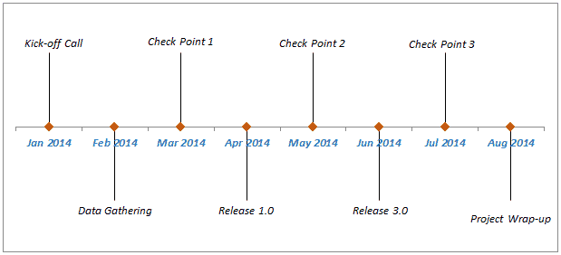
When I was in my day job, we used to create a milestone chart when we were planning a new project and had to report interim updates and deliverables. We showed the dates when we planned the check-in call and interim/final deliverables.
While you can have this data in a boring table, plotting it as a milestone chart helps visually see the progress (as well as the time between milestones).
Below is a video where I show how to create a milestone chart in Excel:
Click here to read more about the milestone chart in Excel | Download example file
Gantt Chart
Gantt chart is quite popular with project managers.
It is used to for creating a schedule for a project or tracking the progress.
With a Gantt chart, you can visually see:
- What all tasks/activities are schedules
- On what date a task starts and ends
- Number of days it takes for each task to get completed
- Any overlap on a date with other activities.
Below is an example of a Gantt chart (which is about Alfred – the butler – creating the Batsuit for Batman).
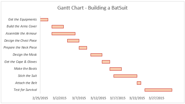
The biggest benefit of using a Gantt chart is that it shows you if there are any days where multiple activities/tasks overlap. This can help you plan better for your project.
Another good use of this kind of Gantt chart can be to plot leaves taken by your team members. It will show you the dates when more than one team member is on leave, and you can plan ahead.
Click here to read more about the Gantt Chart in Excel | Download example file
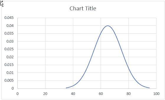
Bell Curve
A bell curve (also known as normal distribution curve) is a way to plot and analyze data that looks like a bell curve.
It is often used during employee appraisals or in schools/colleges to grade students.
While a bell curve is nothing but a ‘scatter line chart’ that you can insert with a single click, the reason I have added it as one of the advanced charts is that there is some pre-work needed before creating this chart.
If you have the employee ratings data or student marks data, you can not directly plot it as a bell curve.
You need to calculate the mean and the standard deviation values and then use these to create the bell curve.
Click here to read how to make a bell curve in Excel
Sales Funnel Chart
In any sales process, there are stages. A typical sales stage could look something as shown below:
Opportunity Identified –> Validated –> Qualified –> Proposal –> Win
If you think about the numbers, you would realize that this forms a sales funnel.
Many opportunities are ‘identified’, but only a part of it is in the ‘Validated’ category, and even lesser ends up as a potential lead.
In the end, there are only a handful of deals that are won.
If you try and visualize it, it would look something as shown below:
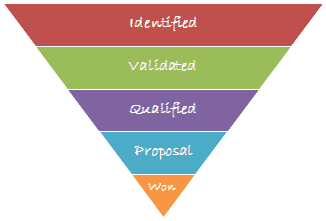
If you have these numbers in Excel, then you can easily create a sales funnel chart. If you’re using Excel 2016, you have the option to insert the sales funnel chart directly from the insert tab.
But for versions prior to Excel 2016, you’ll have to use some charting trickery.
Below is the video where I show how to create a sales funnel chart in Excel 2013 or prior versions:
Click here to read the tutorial on creating a sales funnel chart | Download example file
Pareto Chart
Pareto Chart is based on the Pareto principle (also known as the 80/20 rule), which is a well-known concept in project management.
According to this principle, ~80% of the problems can be attributed to about ~20% of the issues (or ~80% of your results could be a direct outcome of ~20% of your efforts, and so on..).
This type of chart is useful when you want to identify the 20% things that are causing 80% of the result. For example, in a hotel, you can create a Pareto chart to check the 20% of the issues that are leading to 80% of the customer complaints.
Or if you’re a project manager, you can use this to identify 20% of the projects that are generating 80% of the revenue.
If you’re using Excel 2016, you can insert the Pareto chart from the Insert tab, but if you’re using Excel 2013 or prior versions, then you need to take a few additional steps.
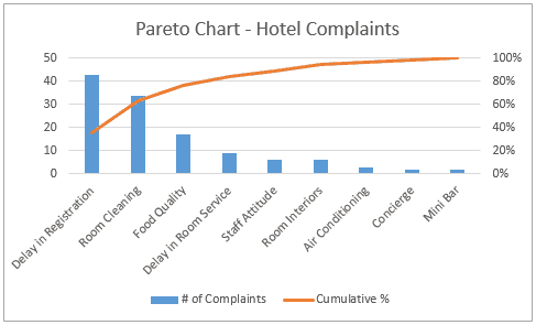
Below is a video where I show how to create a Pareto chart in Excel 2013 and prior versions:
Click here to read the tutorial on creating Pareto Chart in Excel | Download example file
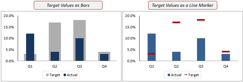
Bullet Chart
Bullet chart is well suited for dashboards as it can punch a lot of information and takes very little space.
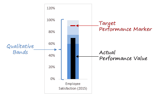
Bullet charts were designed by the dashboard expert Stephen Few, and since then it has been widely accepted as one of the best charting representations where you need to show performance against a target.
This single bar chart is power-packed with analysis. It has:
- Qualitative Bands: These bands help in identifying the performance level. For example, 0-60% is Poor performance (shown as a dark blue band), 60-75% is Fair, 75-90% is Good and 90-100% is Excellent.
- Target Performance Marker: This shows the target value. For example, here in the above case, 90% is the target value.
- Actual Performance Marker: This column shows the actual performance. In the above example, the black column indicates that the performance is good (based on its position in the qualitative bands), but it doesn’t meet the target.
Below is a video on how to create a bullet chart in Excel
Click here to read the tutorial on how to create a bullet chart in Excel | Download example file
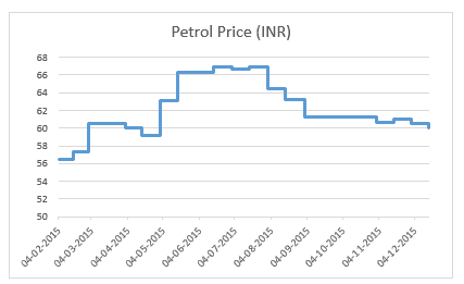
Step Chart
A step chart can be useful when you want to show the changes that occur at irregular intervals. For example, price rise in milk products, petrol, tax rate, interest rates, etc.
While Excel does not have an inbuilt feature to create a step chart, it can easily be created by rearranging the data set.
Below is an example of a step chart.
Now if you’re thinking why not use a line chart instead, have a look at the below charts.
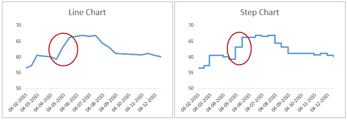
Both of these charts look similar, but the line chart is a bit misleading. It gives you the impression that the petrol prices have gone up consistently during May 2015 and June 2015 (see image below). But if you look at the step chart, you’ll notice that the price increase took place only on two occasions.
Below is a video where I show how to create a step chart in Excel.
Click here to read how to create a Step chart in Excel | Download example file
Waffle Chart
A waffle chart is a pie chart alternative that is quite commonly used in dashboards. It’s also called the squared pie chart.
Related Article: Creating a Pie Chart in Excel
In terms of Excel charting, a Waffle chart doesn’t really use any of the charting tools. It’s rather created using cells in the worksheets and conditional formatting.
Nevertheless, it looks like a proper chart and you can use it to jazz up your dashboards.
Below is an example of Waffle chart in Excel.
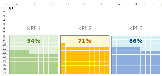
What do I like in a Waffle Chart?
- A waffle chart looks cool and can jazz up your dashboard.
- It’s really simple to read and understand. In the KPI waffle chart shown above, each chart has one data point and a quick glance would tell you the extent of the goal achieved per KPI.
- It grabs readers attention and can effectively be used to highlight a specific metric/KPI.
- It doesn’t misrepresent or distort a data point (which a pie chart is sometimes guilty of doing).
What are the shortcomings?
- In terms of value, it’s no more than a data point (or a few data points). It’s almost equivalent to having the value in a cell (without all the colors and jazz).
- It takes some work to create it in Excel (not as easy as a bar/column or a pie chart).
- You can try and use more than one data point per waffle chart as shown below, but as soon as you go beyond a couple of data points, it gets confusing.
Click here to read how to create a waffle chart in Excel | Download example file
Thermometer Chart
A thermometer chart is another example where you can show the performance against a target value (similar to Actual vs Target chart or bullet chart).
It’s called a thermometer chart as you can make it look like a thermometer.
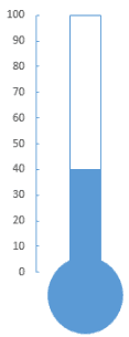
Note: Thermometer chart can be used when you’re measuring the performance of one KPI only. If you have to analyze multiple KPIs or metrics, you need to either create multiple thermometer charts or opt for a regular actual vs target chart I covered earlier.
Below is a video where I show how to create a thermometer chart in Excel.
Click here to read how to make a thermometer chart in Excel | Download example file
These are some of the advanced charts that you can create easily and use in your daily work. Using these charts can really spice up your reports or dashboards, and at the same time, it also helps in conveying more information as compared with a regular Excel chart.
If there is any chart type that you use (and can be considered an advanced chart), let me know in the comments section. I will continue to add more advanced charts to tutorials based on your feedback.
You May Also Like the Following Excel Tips & Tutorials:
- Excel Sparklines – A Complete Guide with Examples.
- How to Create a Heat Map in Excel.
- How to Save Excel Charts as Images
A picture is worth a thousand words — that’s true. A picture creates the ideal image in the human mind, and nothing beats that! When it comes to data, a chart is worth more than a thousand data sets. Regardless of your level of expertise, you would gain a fresh perspective of how charts work, and how to create one by merely looking at these Excel charts examples.


When it comes to making informed business decisions, you need data. And that goes beyond looking at the raw, unrefined data represented in an Excel sheet, you would need to translate your data into digestible information.
Speaking of translating data into digestible information, that’s where Excel charts come into play. And to get a good grasp of Excel charts, you’ve got to take a close look at these Best Excel charts examples.
In this blog all the visualizations are made by ChartExpo library. You can follow this guide on how to add Excel Add-in to use this library to present your data efficiently.
Before diving into Excel charts examples, here are few types of Excel charts you should get a good grasp of.
Types of Excel charts
Every data representation is unique. To get the best out of your data visuals, you’ve got to know what your audience is looking for and structure the data in such a way as to meet their needs. Simply put, your choice of chart is dependent on the type of data you want to visualize. If you’re a newbie, here are some Excel chart examples, and you will see how to create charts using these Excel charts examples?
1. Pie Chart:
Pie Chart is a good fit for people who want to quantify items, and represent these items in percentages.
Within the circular graph of the Pie Chart, there are slices of pie that show the relative size of the data. Whether you are managing a business, or you desire to represent your data to a team of stakeholders in your corporation, a Pie Chart will help you compare areas of growth like profit, exposure, and turnover.
Why you should use the Pie Chart?
- The Pie Chart is simple and easy-to-understand
- With the Pie Chart, you get to visually represent data as a fractional part of the whole
- You can easily manipulate pieces of data in the Pie Chart. This way, you get to emphasize your points
- The Pie Chart offers data comparison for your audience. No technical skill is needed to digest the data comparison represented in the Pie Chart. It’s a great way that easily helps you to analyze the information.
| Product | Unit Sold |
| Smart Phones | 15 |
| Accessories | 38 |
| Laptops | 8 |
| LCD | 18 |
| Headsets | 13 |
| Smart Watches | 9 |
A typical Pie Chart that’s created using Excel charts will look like the image below.

Visualization Source: ChartExpo
You know there is another alternative of Pie Chart is to use Donut Chart, it can also represent the same data to better analyze the results.
Donut Chart is like a pie chart but only difference is center area is cut and empty.

Visualization Source: ChartExpo
2. Double Bar Graph:
The Bar Chart is a graph with rectangular bars. A typical Bar Chart can be plotted vertically or horizontally. When plotted vertically, you would see the bars standing up. But with the horizontal plot, the bars would be lying flat from left to right.
Double bar graph is a form of bar graph which can show your data side by side by presenting the data based on the length of the bars.
| Search Terms | Previous Month | Current Month |
| Smart Phones | 10 | 15 |
| Accessories | 50 | 38 |
| Laptops | 15 | 8 |
| LCD | 10 | 18 |
| Headsets | 10 | 13 |
| Smart Watches | 5 | 9 |

Visualization Source: ChartExpo
3. Multi-Axis Line Chart:
With a Line Chart, a series of data points are connected using a continuous line. A Line Chart pretty much helps you to represent the history of data points using a single, continuous line. It’s easy-to-understand, simple, and represents changes over time. With Multi-Axis Line Chart, you get the option to have multiple values on the same visualization based on different scales.
Analyzing data points can be quite overwhelming. If you are like most marketers, you will most likely experience paralysis by analysis — but you can overcome that using a Multi-Axis Line Chart. With this visualization, you get to easily identify trends and pinpoint patterns.
Creating Multi-Axis Line Chart is easy. All you’ve got to do is download the ChartExpo add-in for Excel, and create a Line Chart similar to the one below.
Let’s say you run an online business, and you’ve gathered sample data as below.
| Date | Clicks | Impressions | Conversions |
| 5/1/2021 | 1483 | 18766 | 55 |
| 5/2/2021 | 1313 | 18788 | 57 |
| 5/3/2021 | 1345 | 18743 | 60 |
| 5/4/2021 | 1256 | 18788 | 63 |
| 5/5/2021 | 1304 | 16406 | 59 |
| 5/6/2021 | 1407 | 17765 | 60 |
| 5/7/2021 | 1498 | 20532 | 65 |
| 5/8/2021 | 1597 | 20016 | 58 |
| 5/9/2021 | 1587 | 20122 | 61 |
| 5/10/2021 | 1483 | 20125 | 64 |
| 5/11/2021 | 1565 | 23783 | 59 |
| 5/12/2021 | 1587 | 22942 | 57 |
| 5/13/2021 | 1599 | 23127 | 70 |
| 5/14/2021 | 1620 | 24548 | 78 |
| 5/15/2021 | 1788 | 23448 | 80 |
| 5/16/2021 | 1768 | 23408 | 91 |
| 5/17/2021 | 1987 | 25473 | 89 |
| 5/18/2021 | 1939 | 24959 | 81 |
| 5/19/2021 | 1987 | 23710 | 86 |
| 5/20/2021 | 1964 | 24221 | 98 |
| 5/21/2021 | 1740 | 23317 | 89 |
| 5/22/2021 | 1748 | 24431 | 85 |
| 5/23/2021 | 1876 | 23785 | 79 |
| 5/24/2021 | 1826 | 22247 | 83 |
| 5/25/2021 | 1920 | 23851 | 83 |
| 5/26/2021 | 1886 | 24875 | 90 |
| 5/27/2021 | 1769 | 24015 | 94 |
| 5/28/2021 | 1869 | 25689 | 104 |
| 5/29/2021 | 1823 | 24416 | 99 |
| 5/30/2021 | 1899 | 25874 | 114 |
| 5/31/2021 | 1924 | 26146 | 98 |
By merely using a Multi-Axis Line Chart, you get to easily monitor the trends over time.

Visualization Source: ChartExpo
4. Comparison Bar Chart
The Comparison Bar Chart represents sections of the same data category using bars. The bars in a Comparison Bar Chart are usually placed adjacent to each other. If you’re looking for a reliable way of visually comparing data, then the Comparison Bar Chart is your best shot.
Aside from comparing items between different groups, the Comparison Bar Chart helps in tracking changes in your data points over a period. To get the most out of your Comparison Bar Chart, the changes in your item over a period have to be large.
Creating the Comparison Bar Chart using Excel is quite easy — all you need is to gather a reliable data sample as shown below.
| Country | Social Media | Usage |
| USA | 190,000,000 | |
| USA | 110,000,000 | |
| USA | 48,650,000 | |
| USA | 160,000,000 | |
| India | 270,000,000 | |
| India | 69,000,000 | |
| India | 7,750,000 | |
| India | 59,000,000 | |
| UK | 37,000,000 | |
| UK | 23,000,000 | |
| UK | 14,100,000 | |
| UK | 27,000,000 |
After gathering your data sample, you’ve got to proceed to create a comparison Bar Chart similar to the one displayed below.

Visualization Source: ChartExpo
5. Grouped Bar Chart
The Grouped Bar Chart, clustered Bar Chart, or the multi-series Bar Chart is somewhat an extension of the Bar Chart. With the Grouped Bar Chart, you get to plot numeric values for levels of two categorical data points instead of one.
Just like the regular Bar Chart, the Grouped Bar Chart shows the distribution of data points across various data categories. However, with the Grouped Bar Chart, you get to compare two various categorical variables instead of one.
The Grouped Bar Chart is used to show how the second category data point changes within each level of the first. You can also use it to show how the first category data points change across levels of the second.
Creating the Grouped Bar Chart using Excel is somewhat straightforward. First, you’ve got to gather data similar to the one below.
| Country | 0-14 Years | 15-64 Years | 64 Years and above |
| United Kingdom | 5,000,000 | 20,000,000 | 3,000,000 |
| Germany | 6,000,000 | 29,000,000 | 5,000,000 |
| Mexico | 17,000,000 | 31,000,000 | 2,000,000 |
| Japan | 9,000,000 | 44,000,000 | 10,000,000 |
| Russia | 13,000,000 | 49,000,000 | 5,000,000 |
| Brazil | 26,000,000 | 55,000,000 | 3,000,000 |
After gathering data from reliable sources, you’ve got to proceed to plot your Grouped Bar Chart similar to the image displayed below.

Visualization Source: ChartExpo
6. Sentiment Trend Chart
Sentiment trend chart is a coolest data visualization to show your versatile data in a single visualization. For Example, if you have feedback data and you want to analyze positive vs. negative and also want to see the trend then this chart is a good option. Let’s suppose you have a following data.
| Month | Positive Feedback | Negative Feedback |
| Jan | 43 | 57 |
| Feb | 46 | 54 |
| Mar | 43 | 57 |
| Apr | 48 | 52 |
| May | 47 | 53 |
| Jun | 38 | 20 |
| July | 60 | 30 |
| Aug | 89 | 40 |
| Sep | 67 | 50 |
| Oct | 60 | 55 |
| Nov | 54 | 24 |
| Dec | 89 | 40 |
Next, you’ve got to use the data to create a Sentiment Trend that is similar to the image shown below.

Visualization Source: ChartExpo
There is a complete guide available which you can follow to see how you can create trend chart in Excel.
7. Sankey Chart
Sankey diagrams are a specific type of flow diagram used for visualization of material, cost or any flows of data. They have directed connection (between at least two nodes) featuring flows in a process, production system or supply chain.
Creating one in Excel is somewhat easy — all you’ve got to do is install the ChartExpo Excel add-in and start creating Sankey Diagram.
Let’s suppose you have a following data.
| Lead Source | Lead Owner | Duration | Lead Status | Leads |
| Webinar | Oliver | 3-6 Months | Qualified | 39 |
| Webinar | Oliver | 3-6 Months | New | 73 |
| Webinar | Oliver | 6-12 Months | Nurturing | 156 |
| Webinar | George | 3-6 Months | New | 46 |
| Webinar | George | 6-12 Months | Qualified | 104 |
| Webinar | George | 6-12 Months | Nurturing | 41 |
| Webinar | Amelia | 3-6 Months | Qualified | 73 |
| Webinar | Amelia | 3-6 Months | Nurturing | 46 |
| Webinar | Amelia | 6-12 Months | Nurturing | 43 |
Final visualization you will have as shown below.

Visualization Source: ChartExpo
8. Pareto Bar Chart
The Pareto Bar Chart, also known as Pareto analysis or the Pareto diagram is a mix of a line graph and a bar graph. It pretty much shows the frequency of defects and other cumulative impacts. With the Pareto Bar Chart, you get to easily identify defects and observe the overall improvement of a data point with time.
A close study reveals the Pareto Bar Chart as a mix of a bar graph and a line graph. Each bar in the chart shows the type of problem (or defect). Most times, the bar height is used to show the unit of measurement — and it could be the cost or frequency of occurrence, depending on the data set.
Moving on, the bars in the Pareto analysis are typically arranged in descending order (from the tallest bar to the shortest). This way, you get to easily identify the defect by merely looking at the chart.
Finally, the Line Chart found in the Pareto diagram shows the cumulative percentage of the defects.
Just like all data visualization tools, your first point of call is to gather data similar to the one shown below.
| Campaigns | Current Conversions | Previous Conversions |
| Campaign 1 | 540 | 510 |
| Campaign 2 | 550 | 545 |
| Campaign 3 | 115 | 99 |
| Campaign 4 | 572 | 533 |
| Campaign 5 | 93 | 85 |
| Campaign 6 | 88 | 63 |
| Campaign 7 | 497 | 485 |
| Campaign 8 | 115 | 80 |
| Campaign 9 | 489 | 470 |
| Campaign 10 | 87 | 67 |
| Campaign 11 | 107 | 115 |
| Campaign 12 | 570 | 580 |
| Campaign 13 | 97 | 90 |
Next, you’ve got to plot your Pareto Bar Chart similar to the one shown below.

Visualization Source: ChartExpo


So visualization in Excel doesn’t end here. There are lots of charts available in ChartExpo library which you can explore and use for your data analysis.
FAQs:
How can you create a chart in Excel?
Creating a chart in Excel is easy — you can do that by using the ChartExpo Excel add-in. By merely downloading the add-in, you would see a wide range of chart types. All you’ve got to do is choose the right chart for your data visualization and use it.
What are the types of charts in MS Excel?
There are various types of charts in the ChartExpo Excel add-in. You get to create Line graphs, bar graphs, grouped Column Charts, Column Charts, Comparison Charts, and lots of other visualization charts.
Simply put, the ChartExpo tool would help you create any visualization needed for your data representation.
Why you should use the correct Excel Chart?
By using the right Excel chart, you would accurately represent your data. This will, in turn, lead to the right interpretation of your data visual. Also, using the correct Excel Chart will help you make more informed marketing and business decisions in the long run.
If you want your audience (or stakeholders) to accurately interpret your data, then choosing the right Excel Chart is your best shot.
What criteria should you consider before selecting an Excel chart?
Your choice of Excel chart should be dependent on the type of data you want to report and analyze. To a large extent, it should also be dependent on what you want to do with the data. Do you want to find the relationship among data sets, or do you want to categorize your data and pinpoint the distribution of your data sets? Whatever your reason may be, an Excel chart will help you do just that.
Wrap Up:
Regardless of your level of skill set, you can easily create Excel charts by merely studying these Excel chart examples. But first, you’ve got to identify your primary reason for creating an Excel chart.
Not just that, you’ve got to know who your target audience is. This way, you can easily create an Excel chart that’s easy to understand.
Furthermore, no coding skill is required for the creation of an Excel chart using the ChartExpo add-in. If you’ve got a good grasp of how Microsoft Excel works, then creating a compelling Excel chart using any of the Excel chart templates above will be a breeze.
It’s no news that humans are visual creatures, and if you can effectively communicate using visuals, then your job is half done. Other factors that would determine whether your message was received by your audience or not could be beyond your control.
Your turn…
Which Excel chart template appeals most to you, and what kind of data will you use it to represent?