
Creating and Editing Beautiful Charts and Diagrams in Excel 2019

The greatest benefit of Excel 2019 compared to other Microsoft Office software is its ability to quickly generate charts, graphs and diagrams. After you enter data into your spreadsheet, adding a chart to your worksheet is as simple as clicking a few buttons, formatting the chart, and clicking the save button. You have several options for the type of chart that you want to add to your spreadsheet, and you can even add effects and 3D elements.
Set Up Your Data
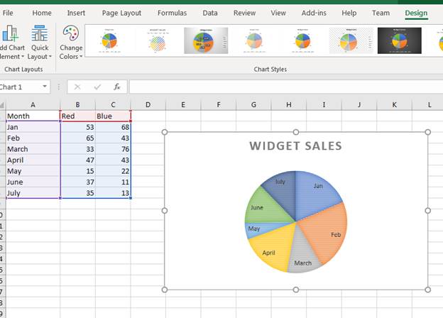
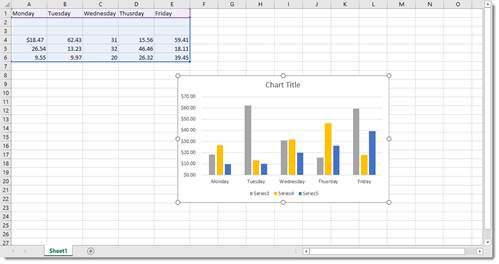
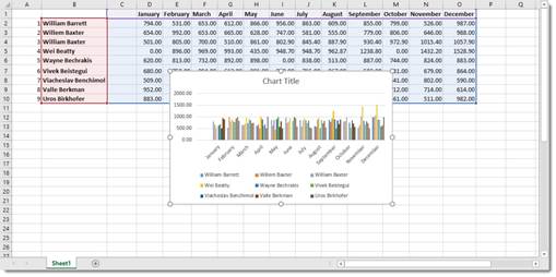
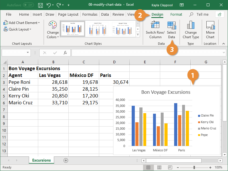
Before you can create a chart, you need some data stored in a spreadsheet. This can be test data or data from a previous spreadsheet. For this article’s examples, we’ll use a chart of products sold. The scenario is an ecommerce store that sells red and blue widgets. The following spreadsheet shows the sample data setup:
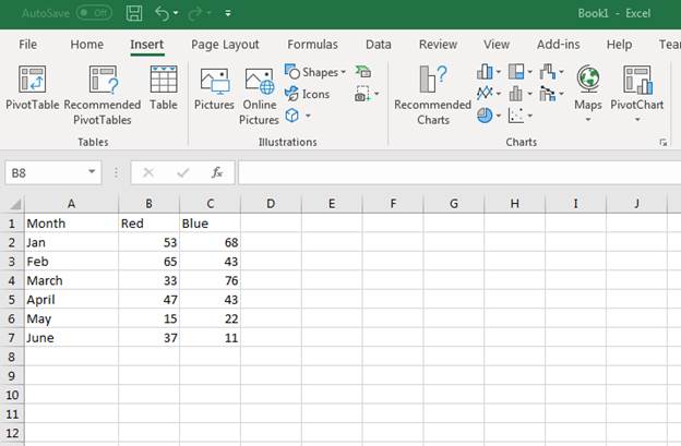
(Sample data for a new chart)
Notice that the «A» column is used for the first six months of the year. Column «B» has the number of sales for Red widgets by month. Column «C» has the number of Blue widgets sold by month. Suppose we want to see a graph to visually represent the number of sales each month. This can be done by inserting an Excel 2019 chart into the spreadsheet that contains the data.
Inserting a Standard Chart
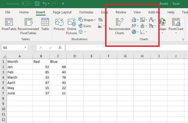
Any chart or diagram that you want to make can be found in the «Insert» tab on Excel.
(Location of chart buttons)
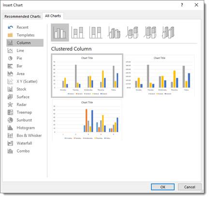
Each type of chart is shown using an icon on the button. With Excel, you can make bar, line, pie, scatter, hierarchy and several others. You might be wondering which type of chart is the best for your data, and Excel has a new «Recommended Charts» function that makes a suggestion for you based on the data stored.
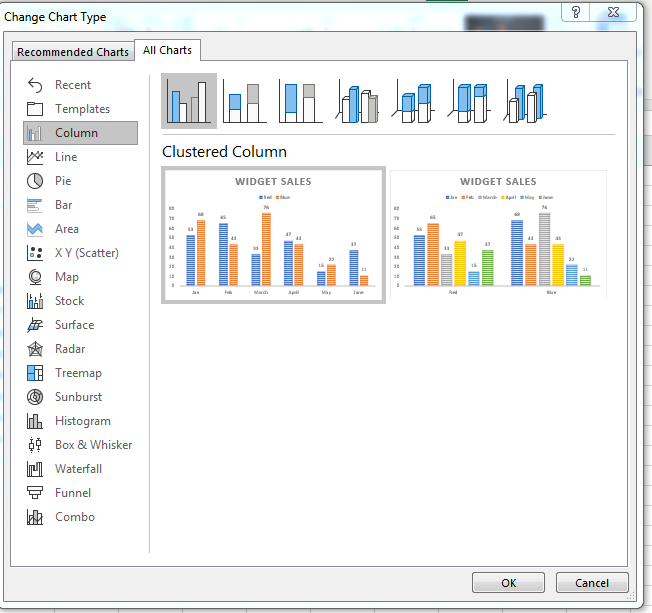
When you select the data for your chart, make sure that you select the row and column header cells. Excel will use these headers for the labels inserted into your chart’s image. Select cells A1 to C7 to select all data. Next, click the «Recommended Charts» button. A new window displays showing a list of recommended charts for the data selected.
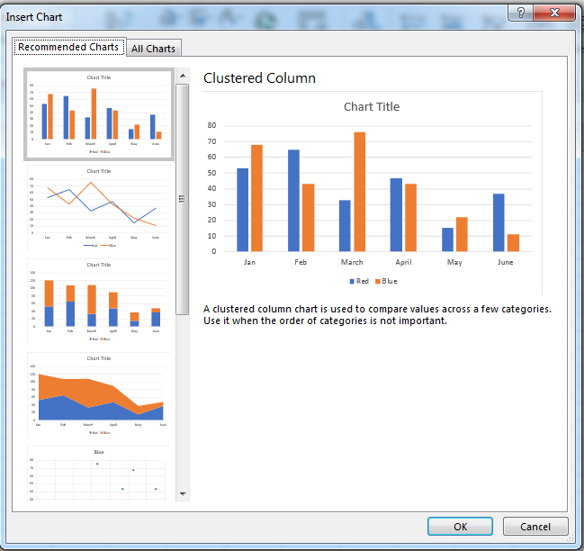
(Recommended chart window)
The recommendations Excel displays use column and row headers, and then add data to show you a visual representation of the chart that you’re about to insert into the spreadsheet. In the image above, Excel shows you several charts to choose from. For this example, a clustered column chart (the first option in the image above) is chosen. Excel automatically draws the chart and inserts it into the spreadsheet.
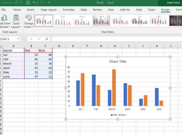
(Inserted clustered column chart)
A clustered chart makes a comparison of sales for each widget based on the months of the year. For instance, in January 53 red widgets were sold and 68 blue widgets were sold. The red widget sales numbers are shown in blue, and the blue widget sales are shown in yellow.
It doesn’t make sense to display red widgets in blue, so we want to change the colors used in the bar graphs. Excel provides formatting option for charts where you can change labels, colors and even change the chart type on the fly.
To change a bar’s color, click it in the chart. A window on the right displays a list of formatting and effects that you can add to the selected component in the chart.
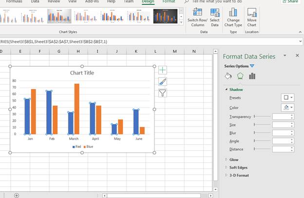
(Bar chart effects and color options)
You’ll see in the format window that you have several options. The paint bucket icons is the «Fill» button that lets you change colors and the type of pattern displayed in the selected bar (in this scenario it’s the blue bars). Click the paint bucket icon, and then click the drop down next to the «Color» label.
With the red widget sales bar shown as red, the orange bar should be a new color. We can change the blue sales bar to blue, and then the bar chart is more intuitive. After you change colors and formatting in a chart, Excel automatically changes any labels associated with a chart component.
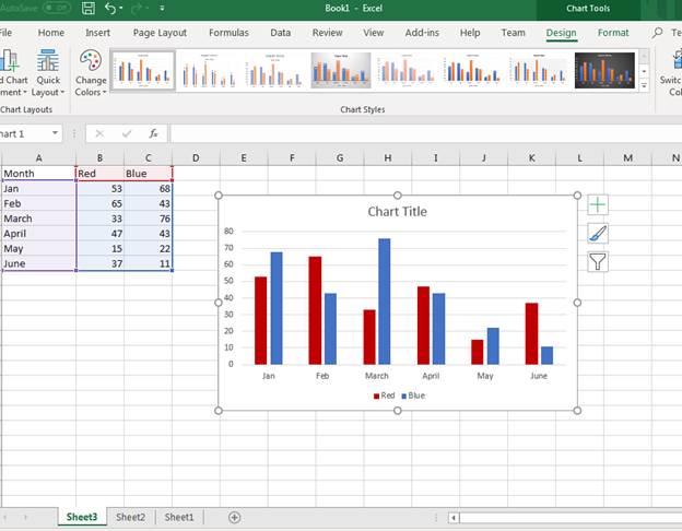
(New chart colors updated in a sales chart)
To the left of the chart, you can see the data highlighted letting you know what Excel is using in the chart. Purple is the bar labels and the blue highlighted data is used to populate bar values. The red highlighted cells are the color labels at the bottom of the chart.
Since the spreadsheet chart has no title, Excel doesn’t know what value to give the chart title component. The default chart title is labeled «Chart Title.» You can change the chart title component by double clicking the text box. Type a new chart name for the title. In this example, the chart title was changed to «Widget Sales.»
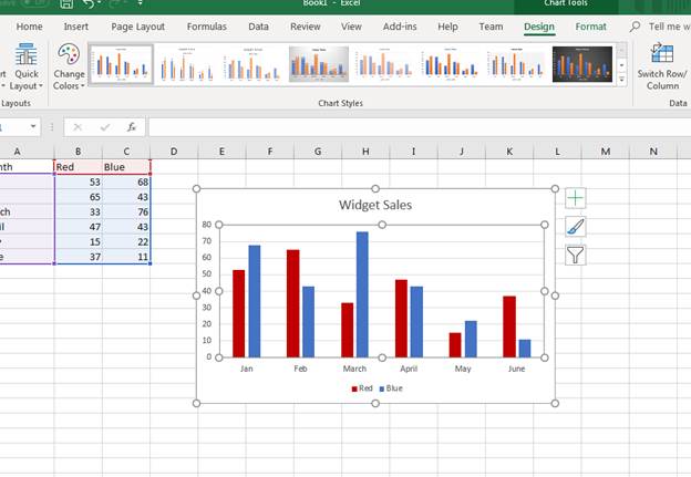
(Title change in a sales chart)
Changing a Chart’s Design
The «Format» tab displayed as an option for each image that you added to a spreadsheet. When you add a chart to a spreadsheet, the «Design» tab displays as an option. You can change several elements of a chart including the type of chart that displays in the «Design» tab. The tab is displayed by default when you first create a chart, but you need to select the tab after you’ve finished adding effects.
You have several options in the «Design» tab.
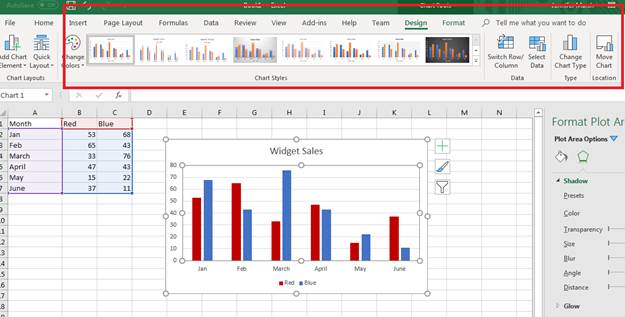
(Design tab options for a chart)
The «Chart Styles» section is where you can change the type of bar chart. Click any one of these bar chart types to change the way it displays in Excel. The downside of using this option is that Excel reverts color and effect changes back to the default. After you change the bar chart type, you again need to redo color changes and any special effects such as shadows, glow effects and 3D formatting.
You can also change the entire chart type and switch to a new one using the «Change Chart Type» button. This button is in the «Type» section to the right of the «Chart Styles» section. Click this button and a new «Change Chart Type» window displays.
(Change Chart Type options)
Since we only used the recommended chart type function, the complete list of chart type options wasn’t initially displayed during the first chart creation. When you have a full list of chart types, you can see that Excel has several types that you can choose from. Excel orders chart types by the most commonly used, so the first few are what you’ll likely use in your own spreadsheets.
In this example, we’ll switch the chart type to a pie chart. Click the «Pie» option in the left panel. You can then choose a sub-type at the top of the window. In the image above, notice that there are several bar types. You can choose sub-types in any chart selection to make your charts visually appealing.
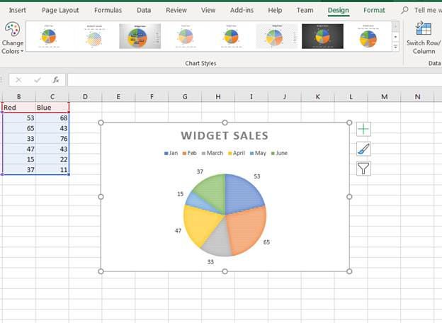
(A bar chart changed to a pie chart)
With a chart changed to a new type, you can still have access to the «Design» tab to make more revisions. Notice that the pie chart also changes to the default colors created by Excel. You can click any part of the pie chart to change its effects just like you did with the bar chart and the formatting window opens.
If you want to change the sub-type for a chart, you can use the «Quick Layout» button that displays a dropdown of options.
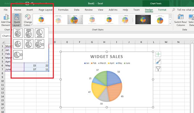
(Quick Layout options to change the chart sub-type)
The dropdown displays the sub-type options that display data in different ways for a pie chart. For instance, you can show the values within the colored areas versus the default layout that shows values outside of the colored sections. You can show a percentage indicated by the icon that shows a percent section in the icon. This feature of Excel 2019 makes it much faster and easier when choosing a new sub-type for your charts.
Click one of the options in the dropdown to change the bar chart to a different layout. Notice that the right of the chart image has several buttons. You can use these to quickly change the way a chart displays visually to users. With Excel, you have several options to pick and choose the way your charts and graphs display. You can match colors to brands or change them based on the data being used. These options along with the ease of how you can create charts is what makes Excel a great option for creating spreadsheets.
Changing Chart Data
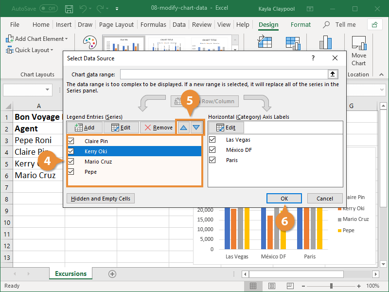
As you continue to develop your spreadsheet, you might add more data to your chart. For instance, you might add another month to your chart. It could be August and now you want data shown from the month of July. You can change data in a chart using the «Select Data» option.
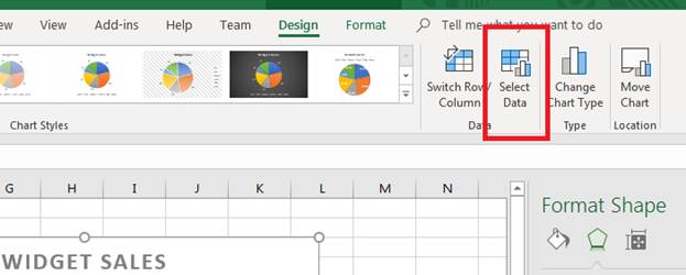
(Select Data button)
By clicking the «Select Data» button, a window opens that asks for new data. We’ve added a new row with data that reflects the number of sales in July. We now want to add this data to the pie chart.
Click the «Select Data» button and a new window opens.
(The «Select Data» window provides options to change data used in a chart)
Notice that you can switch columns and rows. This option is beneficial when you need to change the way a chart uses data when it doesn’t translate well during chart propagation. The arrow button next to the «Chart data range» text box opens a new window that lets you choose a new range of cells for chart values. Use this to select the newly added July row stored in the spreadsheet data.
Press «Enter» when you are done with your selection, and then click «OK» to add the new range to your pie chart. Excel automatically updates the graph and displays the new results.
(Updated chart data)
Use Excel’s chart options to create graphs that represent your data in a visual format. Excel has several chart options, so any diagram or layout that you think best represents your information is available. After you create a chart, you don’t have to stick to the data chosen. You can choose new data and update it continuously as you add more information to your spreadsheet.
Remember that any changes that you don’t like can be immediately changed using the «Undo» button in the quickbar at the top of your Excel window.
Chart Recommendations
In prior versions of Excel, you had the Chart Wizard to help you create charts. That was a great tool and a great help, but Excel offers you something even better: Recommended Charts tool. This is under the Insert tab on the Ribbon in the Charts group (as pictured above).
To create a chart this way, first select the data that you want to put into a chart. Include labels and data.
When you click on the Recommended Charts button, a dialogue box opens like the one pictured below.
Based on your data, Excel recommends a chart for you to use.
On the left side of this dialogue box is all the chart recommendations.
On the right is a preview of what the chart will look like with your data.
Choose the chart that you want to use, then click OK.
The chart is embedded in your worksheet for you:
You’ll also notice that the Chart Tools Format tab opens in the Ribbon:
The tools shown above will help you customize your charts
Types of Charts
To the right of the Recommended Charts button on the ribbon, you’ll see this:
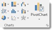
You can use these buttons and their dropdown menus to create these types and styles of charts. We’re going to go from left to right, starting at the top left, and cover all the buttons above.
Insert Column or Bar Chart. This is the first button, located in the top left corner. With this, you can preview data as a 2-D or 3-D vertical column chart or as a 2-D or 3-D horizontal bar chart.
Insert Hierarchy Chart. Use this chart to compare a part to a whole or to show the hierarchy of several columns or categories.
Insert Waterfall or Stock Chart. The waterfall chart is used to show how a starting value is affected by a series of positive and negative values, while the stock chart is used to show the trend of a stock’s value over time.
Insert Line or Area Chart. This lets you preview data as a 2-D or 3-D line or area chart.
Insert Statistic Chart. Use these charts to show a statistical analysis of your data. Chart types include Histogram, Pareto, and Box and Whisker charts.
Insert Combo Chart. These charts are best when you have mixed data or want to emphasize different types of information. You can preview your data as a 2-D combo clustered column and line chart – or clustered column and stacked area chart.
Insert Pie or Doughnut Chart. You can preview data as a 2-D or 3-D pie or 2-D doughnut chart.
Insert Scatter (X,Y) or Bubble Chart. Preview data as a 2-D scatter or bubble chart.
Insert Surface, or Radar Chart. With this, you can preview data as a 2-D stock chart that uses typical stock symbols, a 2-D or 3-D surface chart, or even a 3-D radar chart.
More Chart Types
Excel brings with it some new chart types to help you better illustrate data that you include in your worksheets.
These chart types include:
- Treemap. A treemap chart displays hierarchically structured data. The data appears as rectangles that contain other rectangles. A set of rectangles on the save level in the hierarchy equal a column or an expression. Individual rectangles on the same level equal a category in a column. For example, a rectangle that represents a state may contain other rectangles that represent cities in that state.
- Waterfall. As explained by Microsoft, «Waterfall charts are ideal for showing how you have arrived at a net value, by breaking down the cumulative effect of positive and negative contributions. This is very helpful for many different scenarios, from visualizing financial statements to navigating data about population, births and deaths».
- Pareto. A Pareto chart contains both bars and a line graph. Individual values are represented by bars. The cumulative total is represented by the line.
- Histogram. A histogram chart displays numerical data in bins. The bins are represented by bars. It’s used for continuous data.
- Box and Whisker. A Box and Whisker chart, as explained by Microsoft, is «A box and whisker chart shows distribution of data into quartiles, highlighting the mean and outliers. The boxes may have lines extending vertically called ‘whiskers’. These lines indicate variability outside the upper and lower quartiles, and any point outside those lines or whiskers is considered an outlier.»
- Sunburst. A sunburst chart is a pie chart that shows relational datasets. The inner rings of the chart relate to the outer rings. It’s a hierarchal chart with the inner rings at the top of the hierarchy.
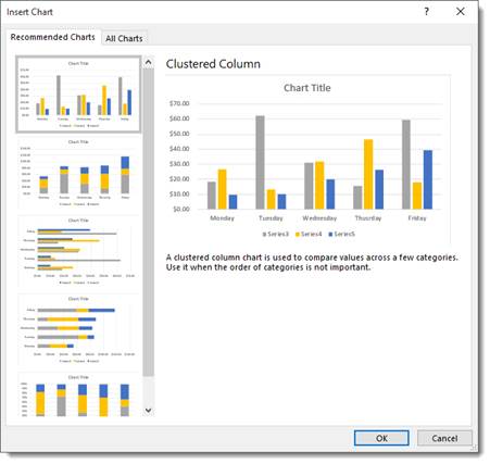
Creating Charts Using the Ribbon
By using the chart options we discussed in the last section, we can quickly and easily create a chart, then embed it into our worksheet.
Let’s insert a bar chart into our worksheet below.
Start out by selecting the data you want to use in the chart.
Now click the Insert Column or Bar Chart button on the Ribbon.
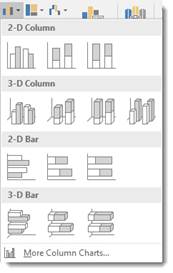
Choose the bar chart you want to use, or click More Column Charts.
If you click More Column Charts, this is what you’ll see:
On the right side of the window, you will see a list of different chart types. Click Bar.
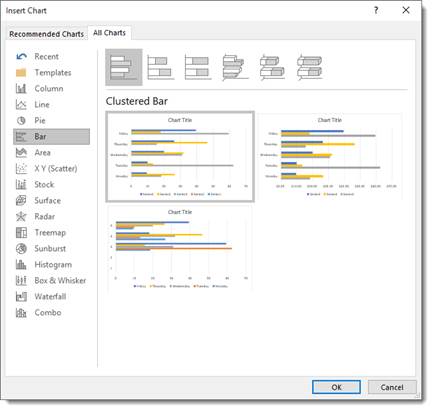
At the top, you’ll see bar charts illustrated in gray. These are different styles of bar charts. You can click on any of the styles and see a preview of your data in that style of chart (in color) in the box below.
Select the type of chart you want, then click OK.
Excel embeds the chart in your worksheet for you:
Creating a Chart from Scratch
So far in this article, we’ve taught you how to create charts by selecting your data first. However, you don’t have to do it that way (although it’s the easiest). In other words, you can start to create your chart without selecting data first.
Let’s learn how.
Click the Insert Column or Bar Chart button on the Ribbon again. However, this time, don’t select any data before you do it.
Select the type of bar chart that you want to use.
You’ll see a blank area on your worksheet where your chart will be embedded, and you’ll also notice the Chart Design and the Chart Format tabs open on the Ribbon.
Click the Select Data button under the Design tab.
The Select Data Source dialog window will open.
The data range refers to the number of cells you’d like to use. For instance, «=Sheet1!$A$1:$G$8» refers to cells A1 through G8 on worksheet one.
It’s actually much easier to select the data range by dragging your mouse over it. To do that, click the Data Range button  next to the text box.
You’ll see another box that looks like this:
This window is simply asking you to define the data range, and you can do it easily by clicking on a cell, holding the mouse button, and dragging it over all of the cells you’d like to add. MS Excel automatically enters the selected cell coordinates into the data range window. When you are finished, you can either click the button on the right  or push Enter.
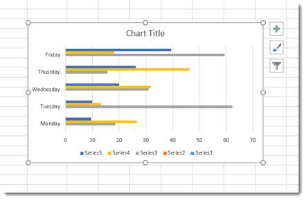
When you hit Enter, the chart appears in your worksheet:
Now you can use the Select Data Source dialogue box to add legend entries – or edit and remove them.
You can also edit your axis labels.
Note that your axis labels were your row labels. These appear as colors representing each day of the week.
Your legend entries were your column labels. These appear on the left, vertically.
Your data appears as the bars.
If you want, you can switch rows and columns so that the days of the week appear on the left and your axis labels become legend entries.
Uncheck any entries that you don’t want to appear in the chart.
Click OK when you’re finished.
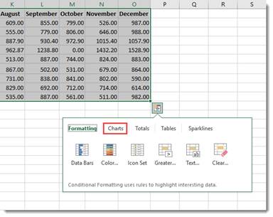
Creating Charts Using the Quick Analysis Tool
To use the Quick Analysis tool for creating charts, select that data that you want to include in chart. Click on the Quick Analysis tool button at the bottom right of the selected data (circled in red below):
Click Charts (circled in red):
Select the type of chart you want.
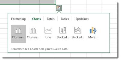
We’re going to choose a clustered chart.
The chart is embedded in your spreadsheet:
Modifying and Moving a Chart
There are a number of ways to modify a chart after it’s made.
You can right click on the plot area as we’ve done below.
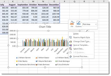
From the menu, you can delete the chart, reset, change the chart type, save the chart as a template, or select data to include in the chart. You can also format the chart area.
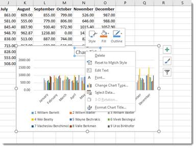
You can also click on the chart’s title to change or format it.
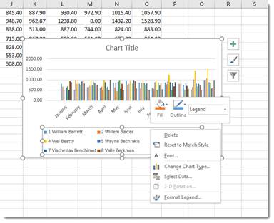
You can also right click on the legend or any other aspect of the chart to move it around and make changes. We’re going to talk about modifying chart elements in another section.
If you want to move a chart, simply click and drag any of its bounding box borders:
You can use the handles on the bounding box (the little circles indicated by the arrows above) to resize your chart. Drag it in to make it smaller, out to make it larger.
Chart Sheets
If you want a chart to appear on its own sheet in the workbook, simply click somewhere in the plot of the chart or select the data in your spreadsheet. Hit F11 on your keyboard.
The chart is moved to its own sheet as a clustered column chart.
Note that the sheet is named Chart1 by default. You can change that name the same way that you change any other worksheet name.
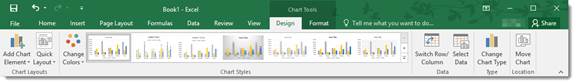
The Design Tab and Customizing Charts
The tools on the Design tab help you to customize your charts so that you achieve the look, feel, and purpose that you want.
The Design tab is pictured below. You can mouse over any tools to learn their names.

We’re going to cover all the aspects of the Design tab, starting with groups and breaking them down into tools.
Chart Layouts is the first group on the left. It contains the Add Chart Element tool and the Quick Layout tool. The Add Chart Element tool allows you to modify some elements, such as titles, data labels, legend, etc. The Quick Layout tool allows you to select a new layout for your chart.
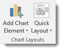
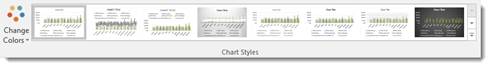
Chart Styles gives you different styles of charts to choose from. You can also change the colors used in your charts using the Change Colors tool.
The Data group allows you to reverse rows and columns in your chart. We also talked about doing this earlier. It also gives you the Select Data tool, which we used in a prior section.
The Type group contains Change Chart Type. You can change the type of chart by using this tool.
The Location group has the Move Chart tool that allows you to move the chart to a different place within your worksheet – or to another worksheet.
Customizing Chart Elements with the Chart Elements Button
The Chart Elements button appears as a plus sign whenever your chart is selected.
In the snapshot below, you can see it to the right of our chart.
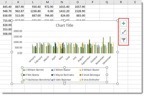
When you click it, you’ll see a list of chart elements that you can add to your chart.
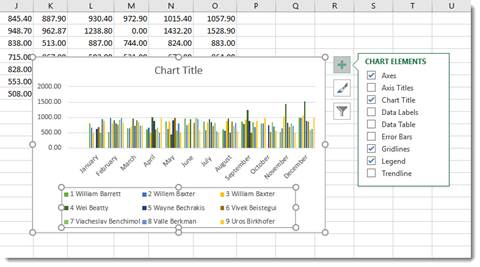
The elements that are in your chart have checkmarks beside them. You can uncheck them to remove the elements. To add an element, simply put a checkmark in the box beside it.
If you want to remove or add just a part of an element, or specify its layout as with Data Labels, you’ll use the Chart Elements continuation menu.
Here’s how to do this.
Start by putting a checkmark beside Data Labels (as an example).
You’ll see an arrow appear to the right of the word Data Labels (indicated in red below.)
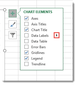
Click the arrow and you’ll see the continuation menu.
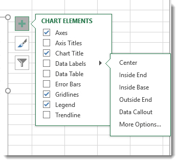
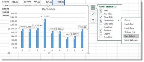
Select a layout option.
We’re going to choose Data Callout.
Formatting a Chart
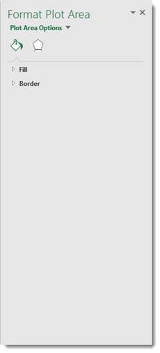
To format a chart, you can double click in the plot area or the chart area. If you double click in the chart area, it opens the Format Chart Area pane on the right side of your window. If you double click in the plot area, it opens the Format Plot area on the right side of your screen, as shown below.
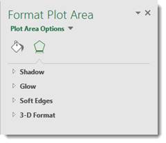
At the top of the pane, are the options.

Fill & Line looks like a bucket pouring green paint and allows you to format the fill and lines of your chart.
The Effects button is the one on the right, which allows you to add special effects to your chart to customize the look.
Take time to play around with the different formatting options for your charts. It’s a lot of fun to do, and you will discover interesting combinations of effects that will produce charts you’ll love.
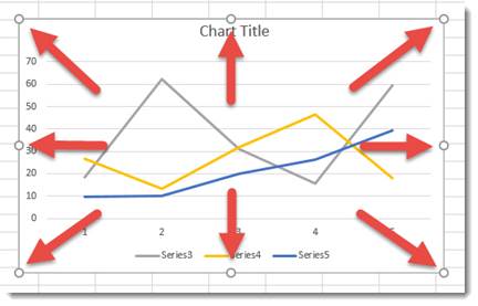
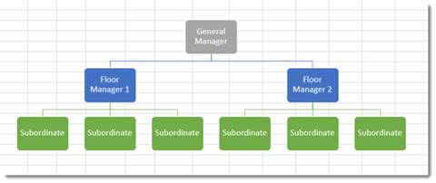
Organizational Charts or Diagrams with SmartArt
While an ordinary chart simply represents data, diagrams and organizational charts explain the causal relationship between elements. The following organizational chart, for instance, explains the relationship between managers and subordinates.
The simplest way to create an organizational chart is to click the Insert tab, then SmartArt. The SmartArt icon has been scaled down in Excel 2019, so we’ve circled it in red below.
The SmartArt dialogue box appears:
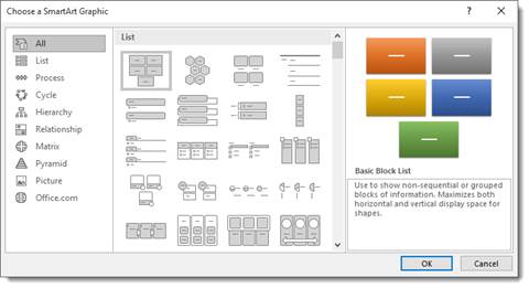
Choose the type of organizational chart or diagram you want on the left. You can choose a style from the middle section called List.
Once you choose your chart or diagram, click OK.
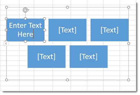
It appears in your spreadsheet:
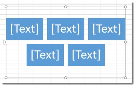
Click on the areas marked text to add your own.
In the Ribbon, the SmartArt Design and Format tabs appear.
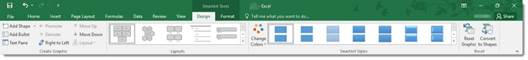
You can use these tools to change the layout, apply a style, change the colors, and other formatting elements.
View Animation in Charts
One of the debated new features in Excel 2019 is the animation added to charts.
Here’s how the animation works.
After you create a chart, then change the data for the chart in the spreadsheet, you can watch your chart and see it change too – in full animation.
In other words, if you have a bar chart, and you change the data so that a bar will be shorter, you can watch the bar slowly become shorter right after you change the data.
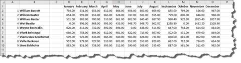
Sparklines
A sparkline is simply a small chart that’s aligned with a row of your data. It typically shows trend information.
Let’s learn how to add one in the spreadsheet below:
To insert a sparkline, go to the Ribbon, click the Insert tab, then the Sparklines group.
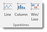
Choose the type of sparkline you want to add.
We’re going to choose Line.
You’ll see this dialogue box.
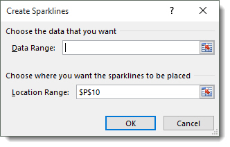
Select the cells in your spreadsheet that you want to use for your sparkline. Just drag your mouse to select the cells.
Next, enter the absolute reference for the cell where you want the sparkline to appear.
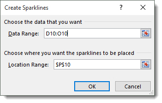
Click OK.
The sparkline now appears in the location you specified.
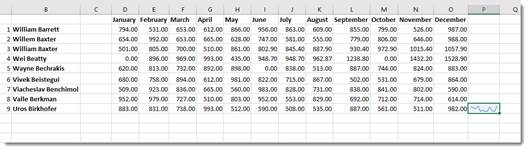
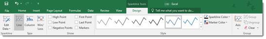
You can also format your sparkline using the Sparkline Tools Design tab that opens in the Ribbon.
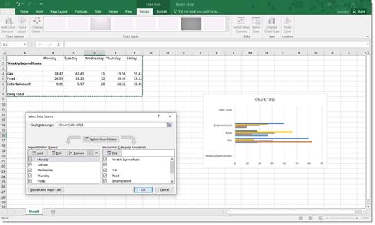
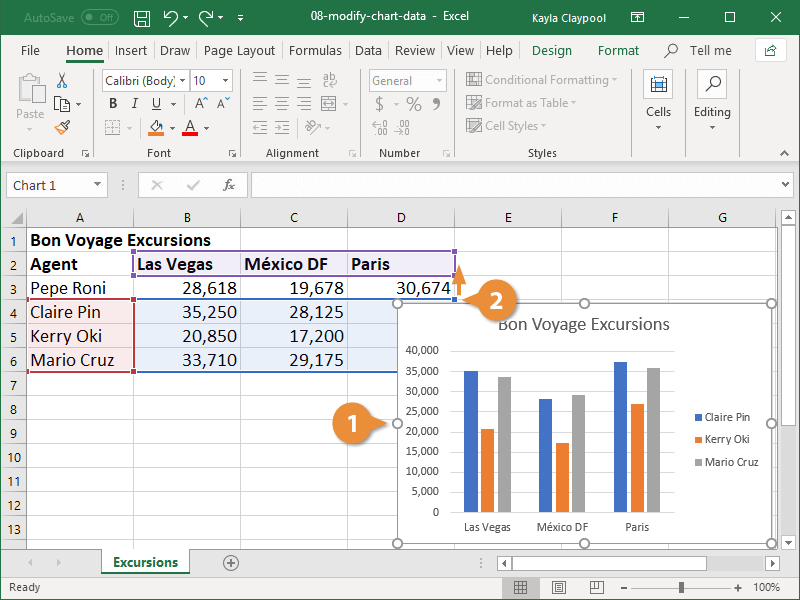
In this tutorial I am going to show you how to update, change and manage the data used by charts in Excel.
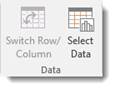
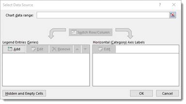
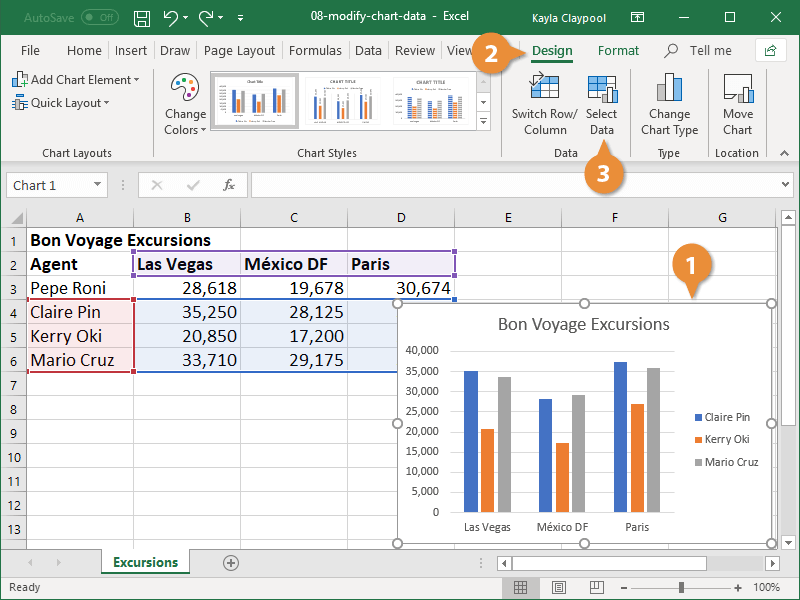
This tutorial is split up in order to breakdown the Select Data Source window into small and easy to understand parts. To edit the data selection of a chart, right click the chart and select the Select Data option — or select the chart, go to the Design tab, and click the Select Data button from the left side of the ribbon menu.
From now on the tutorial will discuss features from this pop-up window:
How to Change the Data Used in a Chart
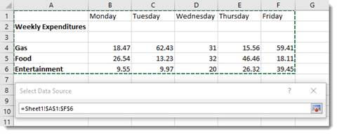
To change the data used in a chart, clear the current data reference in the Chart data range box at the top of the window (click the button to the right of the box to minimize the window if required) then select your new data. In the previous tutorial I only had 10 items for my chart. I will now expand this with a new selection:

Then click ok to update the chart:
How to Add Data to a Chart in Excel
To add another data series to your chart, simply click the Add button. The following window will open:
This allows you to select a new series name and a reference to the cells which contain the new series data. Click ok to update the chart:
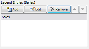
How to Remove Data from a Chart in Excel
To remove a data series, select it then click the Remove button. For example I am going to remove the data series I just added:
Then click ok to update the chart.
Note: I have added the Costs data series back in for the rest of the tutorial.
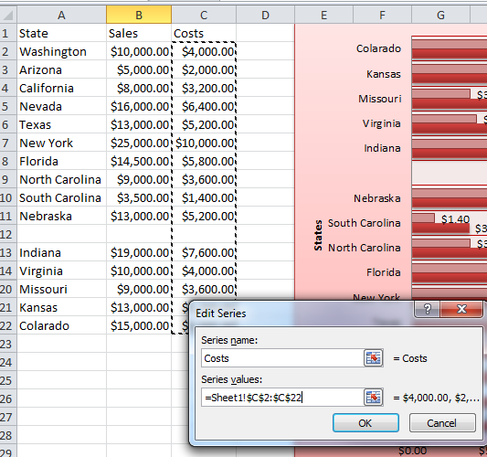
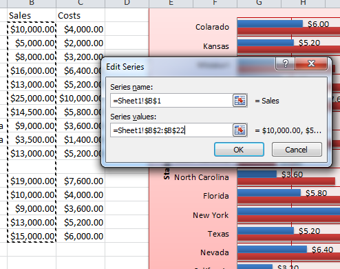
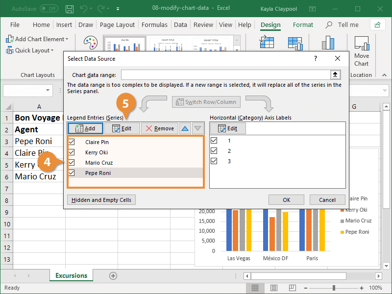
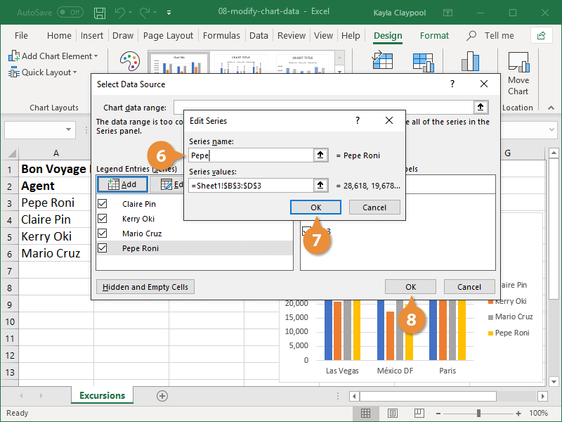
How to Edit Data in a Chart in Excel
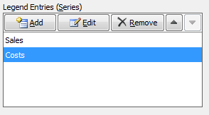
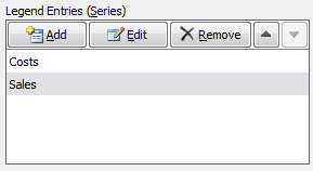
To edit a data series, select it then click the Edit button under the Legend Entries section. The following window will open allowing you to change the series name and referenced data:
How to Move Data Series Up/Down in Excel
To move a series up and down, select it then click the up/down arrows to rearrange. So for example I am going to move the Costs data series up:

Then click ok to update the chart:
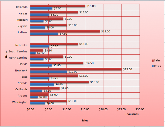
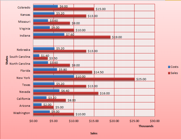
Notice how the bars have swapped round.
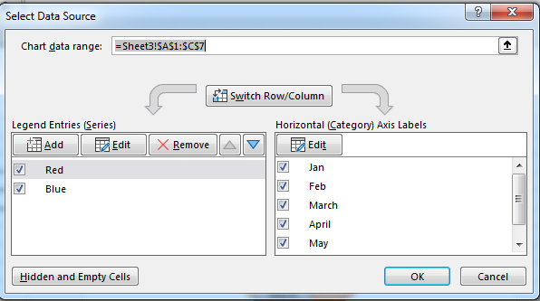
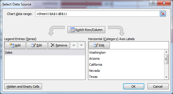
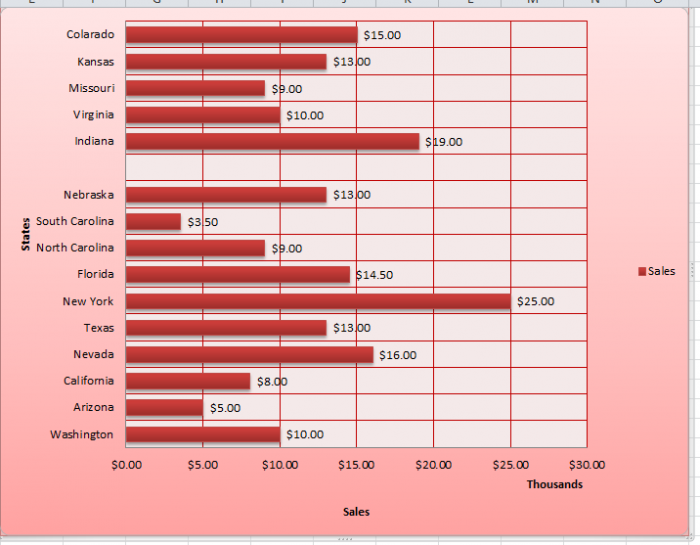
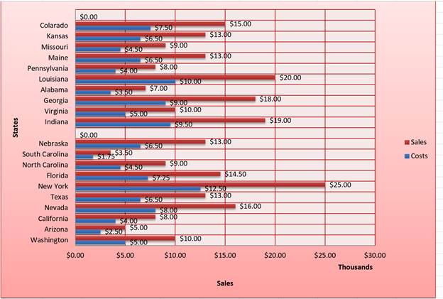
Switching Rows/Columns in Charts in Excel
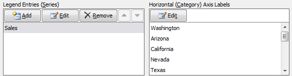
Switching the Row/Column of your data can come in handy if data in a worksheet has a poor layout. It can also give you an alternative layout for your chart, which may be better depending on how you plan on using your chart. Basically what this feature does is swap your Legend Entries (Series) round with your Horizontal Axis Labels (Category). This only works with 1 data series so I have removed Costs for this example:
Here is how the Select Data Source window looks before:
I then click the Switch Row/Column button, then ok to update the chart.
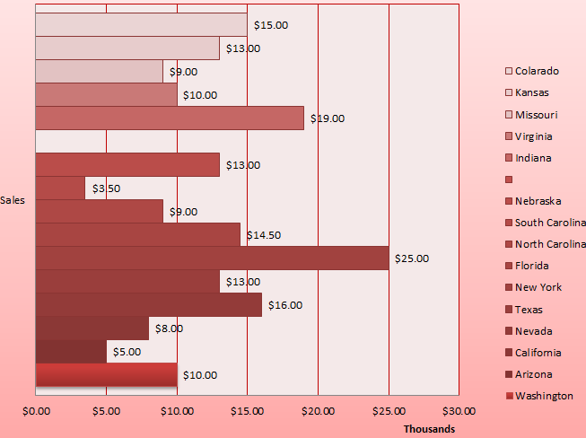
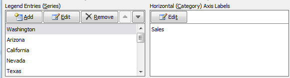
Notice how the States are now my key and Sales is on my Y-axis and the Legend Entries / Horizontal Axis Labels are swapped round:
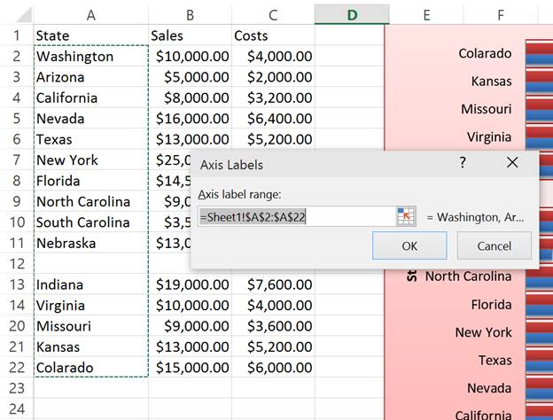
Editing the Horizontal Axis labels for a Chart in Excel
To edit the Horizontal Axis Labels, click the Edit button under the Horizontal Axis Labels section. This allows you to choose different labels for your charts data if you need to, just make sure the new selection is the same as the old one so all of your data will have labels.
The following window will open allowing you to edit the cell references for the labels:
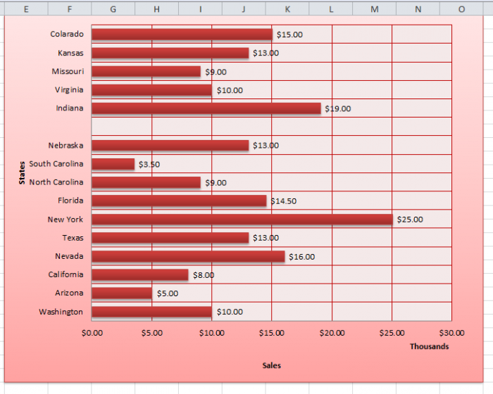
Hidden and Empty Cells in Charts in Excel
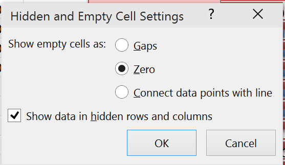
If youve looked at the accompanying Excel workbook, you may have noticed that the source data for my chart has an empty row and a few hidden cells. To edit how a chart interprets such cells, click the Hidden and Empty Cells button in the bottom left corner of the window. This will open the following pop-up:
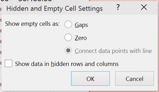
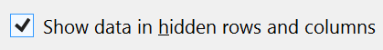
To include hidden cells, ensure the Show data in hidden rows and columns checkbox is checked.
Click ok to update the chart and it will now include the data I have hidden between rows 14:20.
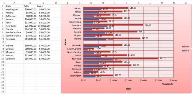
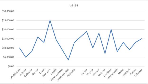
For bar/column charts, empty cells will always be displayed as gaps. In order to make use of these options I have inserted a new line chart for the same data:
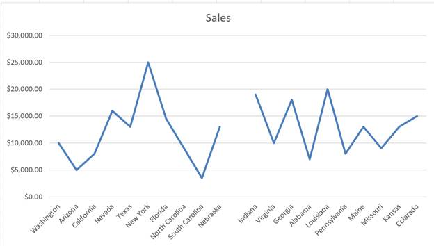
The default option for empty cells is Gaps. This leaves a gap between data entries as you can see above. If you change this to show Zero for empty cells:
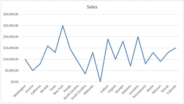
The line chart now goes down to 0 for the empty cells. For this example this is between Nebraska and Indiana.
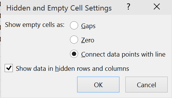
Now if you change this to the last option, Connect data points with line, instead of going down to Zero for empty cells, a line is drawn over the gap between the last 2 data points that werent empty:
How to Use Data from Another Worksheet for a Chart in Excel
It is worth noting that you can select data from another worksheet within the workbook and not just from within the same worksheet.
To demonstrate this, I am going to change the Costs data series to take a different set of values contained within Sheet2 instead of Sheet1.
To do this, I select the series, click the edit button and adjust the cell references as follows:
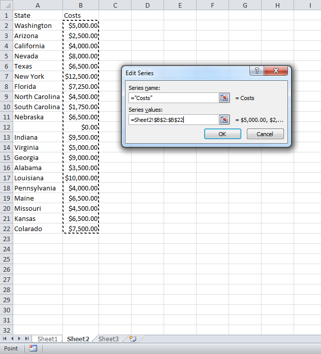
In order to select data from another sheet, select the desired sheet first and then the cell range you require. Click ok and then the chart will update:
Once youve done that, youve basically done almost everything with Data in Charts in Excel that you will ever need to do. This tutorial should get you going for just about all of your charting data related needs and, if it doesnt, make sure to check out our other tutorials!
Similar Content on TeachExcel
Highlight, Sort, and Group the Top and Bottom Performers in a List in Excel
Tutorial:
How to highlight the rows of the top and bottom performers in a list of data.
This allows…
Loop through a Range of Cells in a UDF in Excel
Tutorial:
How to loop through a range of cells in a UDF, User Defined Function, in Excel. This is …
Show All Formulas in a Worksheet in Excel
Tutorial:
Display all formulas instead of their output values.
This allows you to quickly troubles…
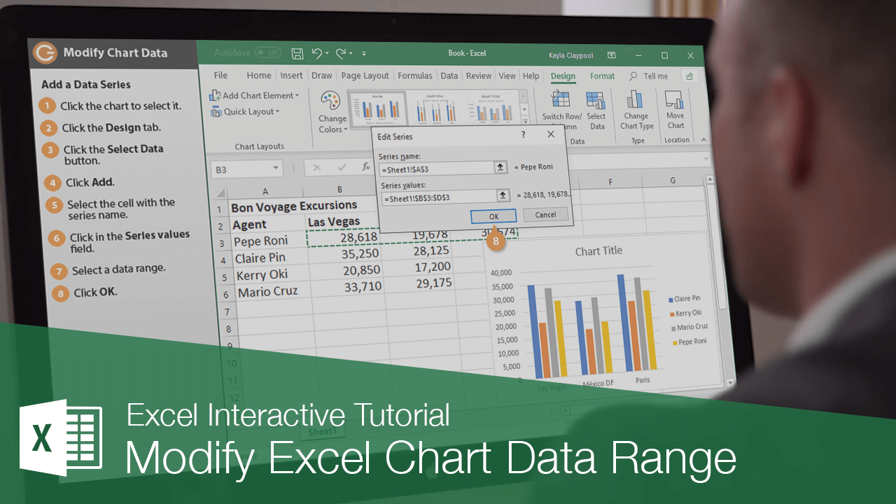
How to Create and Manage a Chart in Excel
Tutorial: In this tutorial I am going to introduce you to creating and managing charts in Excel. Bef…
Create and Manage Tables in Excel
Tutorial:
Here, I’ll show you everything you need to know to get started using tables in Excel; how…
FV Function — Get the Future Value in Excel
Tutorial:
The Future Value function (FV) in Excel will return the future value of an investment ba…
Subscribe for Weekly Tutorials
BONUS: subscribe now to download our Top Tutorials Ebook!
Transcript
In this lesson we’ll look at how to keep your chart updated with the latest values, and how to add more data to your chart when needed.
Let’s take a look.
After you’ve created a chart, you normally don’t need to worry about updating the chart manually. That’s because Excel will automatically update the chart when the source data changes, as long as the calculation is set to Automatic.
You can verify that Calculation is set to automatic on the Formulas toolbar. Just click Calculation Options and confirm that Automatic is checked.
For this chart, the source values are in the range B7:C11. If we edit any values in this range, the chart is automatically updated. However, if we add data at the bottom of the range, the chart is not updated to include this new information. That’s because the chart’s reference to the source data is static and doesn’t expand automatically.
To fix this problem, just select the chart, and drag one of the data handles down to include the cells that contain new values. The chart will then immediately update.
The opposite problem can occur if you delete information in cells that contain source data for the chart. In this case, you may see space left in the chart for values that no longer exist. You can fix this problem in the same way. Select the chart, and use a data handle to resize the data range so that the blank cells are no longer included.
You can use this same approach to add a new data series. For example, let’s add the values in the expense column to our chart. Just select the chart and drag to expand the data range to include the new column. Because a column chart can easily handle more than one data series, the chart is updated to include Expenses.
Note that not all chart types in Excel can be used to plot multiple data series. To exclude Expenses from the chart again, just select the chart and adjust the data range to exclude the values in the expense column.
Once you see data in a chart, you may find there are some tweaks and changes that need to be made. Here are a few ways to change the data in your chart.
Add a Data Series
If you need to add additional data from the spreadsheet to the chart after it’s created, you can adjust the source data area.
- Select the chart.
- In the worksheet, click a sizing handle for the source data and drag it to include the additional data.

The new data needs to be in cells adjacent to the existing chart data.
Rename a Data Series
Charts are not completely tied to the source data. You can change the name and values of a data series without changing the data in the worksheet.
- Select the chart
- Click the Design tab.
- Click the Select Data button.
- Select the series you want to change under Legend Entries (Series).
- Click the Edit button.
- Type the label you want to use for the series in the Series name field.
- Click OK.
- Click OK again.
The name is updated in the chart, but the worksheet data remains unchanged.
Reorder a Data Series
You can also change the order of data in the chart without changing the order of the source data.
- Select the chart
- Click the Design tab.
- Click the Select Data button.
- From the Select Data Source dialog box, select the data series you want to move.
- Click the Move Up or Move down button.
- Click OK.
The chart is updated to display the new order of data, but the worksheet data remains unchanged.

FREE Quick Reference
Click to Download
Free to distribute with our compliments; we hope you will consider our paid training.
It is not always possible to immediately create a graph and a chart in Excel that corresponding to all user requirements.
Initially, it is difficult to determine in which type of graphs and diagrams it is better to present data: in a three-dimensional split diagram, in a cylindrical histogram with accumulation or in a graph with markers.
Sometimes the legend is more of a hindrance than it helps in presenting of the data and it’s better to turn it off. And sometimes you need to connect a table with data to prepare the presentation in other programs (for example, PowerPoint). Therefore, you should learn how to use the settings of charts and diagrams in Excel.
Changing graphs and charts
Create to a data plate as shown below. You already know how to build a diagram in Excel based on the data. Select the data table and select the «INSERT» – «Insert Column Chart» – «Clustered Column».
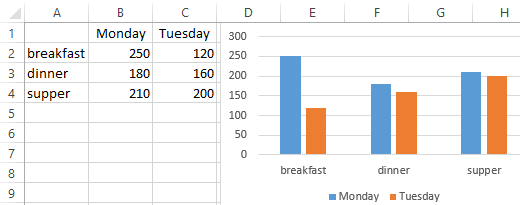
The result was a graph to be edited:
- to delete the legend;
- to add a table;
- to change diagram type.
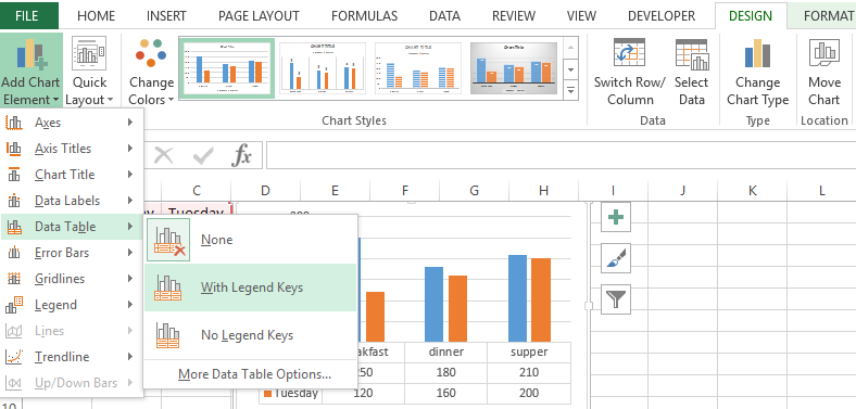
The legend of the chart in Excel
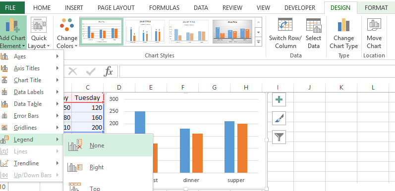
You can add a legend to the diagram. To solve this problem, we perform the following sequence of actions:
- Click the left mouse button on the chart to activate it (highlight) and select the tool: «CHART TOOLS» – «DESIGN»-«Add Chart Element»-«Legend».
- From the drop-down list of options for the «Legend» tool, point to the option: «None (Do not add the legend)». And the legend will be removed from the schedule.
The table on the chart
Now you need to add a table to the diagram:
- Activate the graph by clicking on it and select the «CHART TOOLS»-«DESIGN»-«Add Chart Element»-«Data Table».
- From the drop-down list of options for the Data Table tool, point to the option: «With Legend Keys».
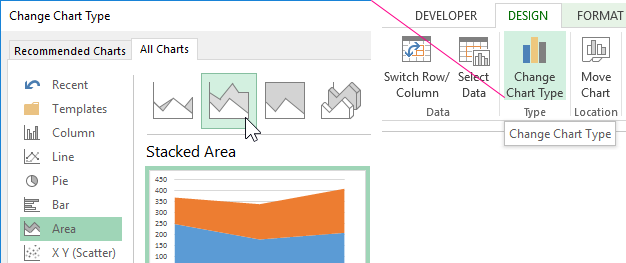
The types of graphs in Excel
Next you need to change the type of the graph:
- Select the tool «CHART TOOLS» – «DESIGN» – «Change Chart Type».
- In the window «Change Chart Type» dialog box that appears, specify the names of the graph type groups in the left column – «Area», and in the right window select «Stacked Area».
For complete completion, you also need to sign the axes on the Excel diagram. To do this, select the tool: «CHART TOOLS»-«DESIGN»-«Add Chart Element»-«Axis Titles»-«Primary Vertical».
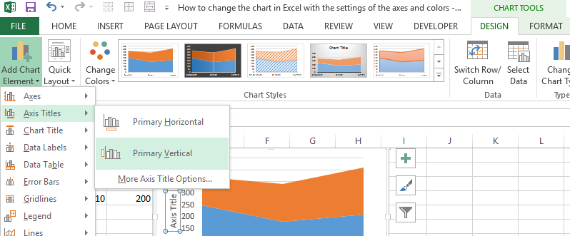
Near the vertical axis there was a place for its title. To change the text of the vertical axis header, double click on it with the left mouse button and enter your text.
Delete the graph to go to the next task. To do this, activate it and press the key on the keyboard – DELETE.
How to change the color of the chart in Excel?
On the basis of the original table, create a new graph: «INSERT» – «Insert Column Chart» – «Clustered Column». Now our task is to change the fill of the first column to the gradient:
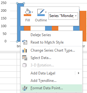
- Click once on the first series of columns in the graph. All of them will be allocated automatically. The second time, click on the first column of the graph (which should be changed) and now only it will be selected.
- Right-click on the first column to open the context menu and select the «Format Data Point» option.
- In the «Format data point format» dialog box in the left section, select the «Fill» option, and in the right section, select the «Gradient fill» option.
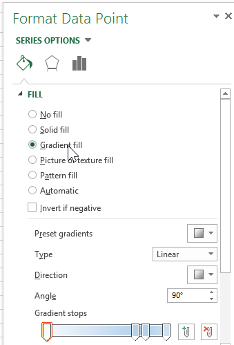
For you now available tools for complex gradient fill design on the diagram:
- the name of the workpiece;
- a type;
- a direction;
- an angle;
- gradient points;
- a colour;
- brightness;
- transparency.
Experiment with these settings, and then click «Close». Pay attention to the «Workpiece Name» available ready templates: flame, ocean, gold, etc.
How do I change the data in an Excel chart?
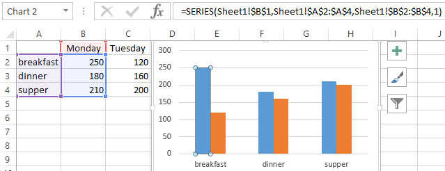
The diagram in Excel is not a static picture. There is a constant connection between the graph and the data. When the data is changed, the «picture» dynamically adapts to the changes and, in this way, displays the actual indicators.
The dynamic relationship of the graph with the data is demonstrated on the finished example. Change the values in the cells of the B2:C4 range of the source table and you will see that the parameters are automatically redrawn. All the metrics are automatically updated. It is very convenient. There is no need to recreate the histogram.
At some point, you may need to change data that’s already plotted in an XY scatter chart. In our worksheet, we have the data from the previous section already plotted, but there’s an additional column of data in column D. In this section, we’ll look at three ways to change the chart to use the new column as Y data instead of the old data.
For the first method, right-click anywhere in the chart area and choose Select Data. The Select Data Source window will appear:
Note that the Chart data range contains the B and C column ranges, and that the chart contains one series, shown in the box at lower left. Click the Edit button just above that series to edit the input data.
You may enter a Series name by clicking inside the first box, then selecting the header for column D, but this is optional.
The X values should remain the same. To edit the Y values, select the entry in the third box, and delete it. Select the new data (click in cell D3 and drag down to the end of the column). Click OK. Note that the series has been updated with the new name from cell D2. Click OK again, and you’ll see that the chart now shows a sine wave.
Another way to edit the data shown in the chart is to left-click on the data displayed in the chart. The data columns for the curve will become highlighted. Hover the mouse over the border of the Y Data until the mouse pointer changes to a pointer with four arrows:
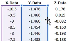
Click and drag over to the Z-Data column. This will move the selection, and the chart will update.
The last method to edit the series is through the formula bar. Left-click on the curve in the chart. If you look at the formula bar, you’ll see it’s referencing column B for the X data and column C for the Y data:
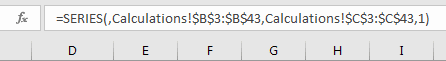
Simply change the “C”s to “D”s and the chart will update accordingly.