
What are Dynamic Charts in Excel?
A dynamic chart is a special chart in Excel which updates itself when the range of the chart is updated. In static charts, the chart does not change itself when the range is updated.
To create a dynamic chart in Excel, the range or the source of data needs to be dynamic in nature. A dynamic chart range can be created in the following two ways:
- Use name ranges and the OFFSET functionThe OFFSET function in excel returns the value of a cell or a range (of adjacent cells) which is a particular number of rows and columns from the reference point. read more
- Use Excel tablesIn excel, tables are a range with data in rows and columns, and they expand when new data is inserted in the range in any new row or column in the table. To use a table, click on the table and select the data range.read more
Table of contents
- What are Dynamic Charts in Excel?
- #1 How to Create a Dynamic Chart in Excel Using Name Range?
- #2 How to Create a Dynamic Chart Using Excel Tables?
- Frequently Asked Questions
- Recommended Articles
Let us explain both the methods with an example.
#1 How to Create a Dynamic Chart in Excel Using Name Range?
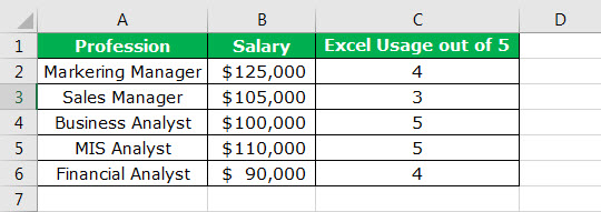
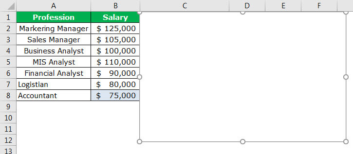
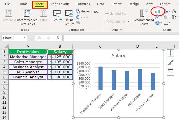
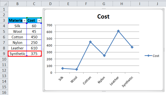
The following table shows the professions that require a working knowledge of Excel. For every profession, the expected salary and the usage of Excel on a scale of 5 are listed.
You can download this Dynamic Chart Excel Template here – Dynamic Chart Excel Template
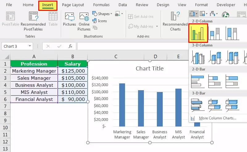
We have inserted a simple column chart using the Insert feature of Excel.
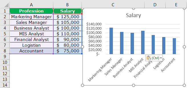
In case there are additions to the column of professions, the chart will not incorporate the range automatically. To prove this, let us add two new professions, “logistician” and “accountant” along with their respective salaries.
The chart is still taking the range A2:A6, as shown in the following image.

To make the range dynamic
, we need to give a name to the range of cells. The following steps will help create a dynamic chart range:
- In the Formulas tab, select “Name Manager.”

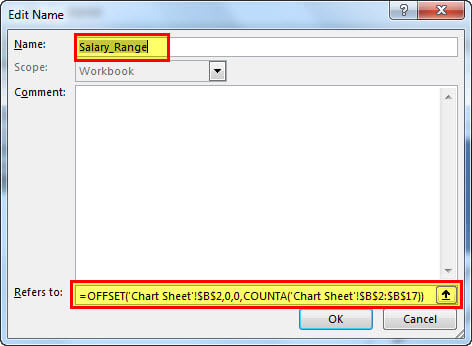
- After clicking on “Name Manager” in Excel, apply the formula shown in the succeeding image. A dynamic chart range for the salary column is created.
Note: While creating a name range, there should not be any blank values. This is because, in the presence of blank cells, the OFFSET function will not do accurate calculations.

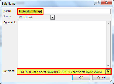
- Click on “Name Manager” again and apply the formula shown in the following image. A dynamic chart range for the profession column is created.
With this, we have created two dynamic chart ranges–“Salary_Range” and “Profession_Range.”
- Now, we insert a column chart using the named ranges. In the Insert tab, select column chart.

- Select a 2D clustered column chart from the various column charts in excel. Presently, it will insert a blank chart.

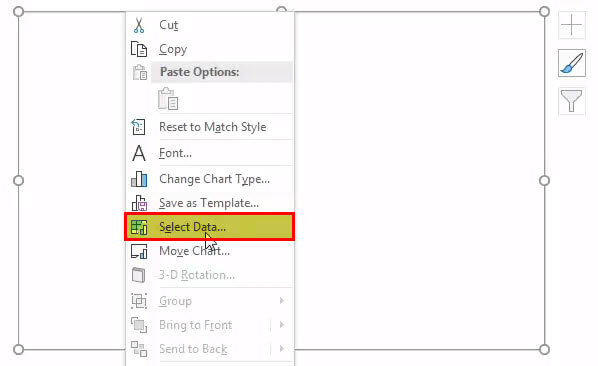
- Right-click on the blank chart area and click “Select Data.”

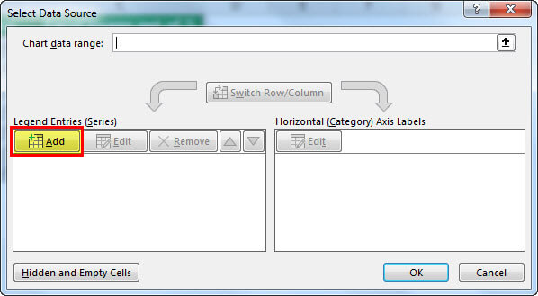
- A box opens, as shown in the following image. Click the Add button.

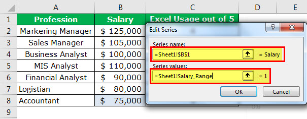
- On clicking the Add button, you will be asked to select the “series name” and “series values.”

- In “series name,” select the entire salary column. In “series values,” mention the name range created for the salary column, i.e., “Salary_Range.”
Note: The name range needs to be mentioned along with the sheet name, i.e., “=‘Chart Sheet’!Salary_Range.” Always place the sheet name within single quotes followed by an exclamation mark like =‘Chart Sheet’!.

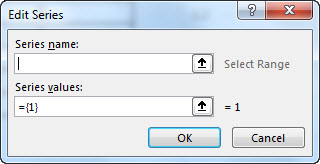
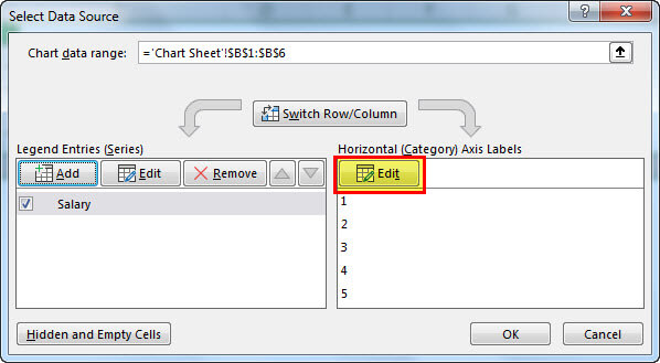
- Click the “Ok” button to open the following box. Then click on the Edit option.
- On clicking the “Edit” option, a box shown in the succeeding image opens. The “axis label range” is to be filled in.

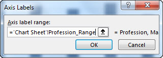
- In “axis label range,” we need to mention the second name range we had created.
Note: The name range needs to be mentioned along with the sheet name, i.e., “=‘Chart Sheet’!Profession_Range.”
- Click the “Ok” button to open one more box. Click the “Ok” button in the next box again.
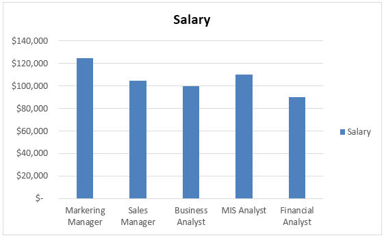
The chart appears as shown in the following image.

- Add the two new professions, “logistician” and “accountant” along with their respective salaries. The chart updates automatically.


An update in the source data updates the dynamic range instantly. It is followed by an update in the Excel chart.
#2 How to Create a Dynamic Chart Using Excel Tables?
It is easy to create a dynamic chart using an Excel table. This is because as soon as new data is added, the table expands to incorporate this data.
Let us work with the same data that we used under the previous heading. The steps to create a dynamic chart using excel tables are listed as follows:
- Step 1: Select the source data and press CTRL+T. A table is created.
- Step 2: Once the table is created, select the data from A1:B6. In the Insert tabIn excel “INSERT” tab plays an important role in analyzing the data. Like all the other tabs in the ribbon INSERT tab offers its own features and tools. Under Insert Tab we have several other groups including tables, illustration, add-ins, charts, Power map, sparklines, filters, etc.read more, click on the column chartColumn chart is used to represent data in vertical columns. The height of the column represents the value for the specific data series in a chart, the column chart represents the comparison in the form of column from left to right.read more. A chart appears as shown in the following image.
- Step 3: Add the two new professions (“Logistician” and “Accountant”) and their respective salaries to the list. The chart updates automatically.
Frequently Asked Questions
#1 – What is the difference between static and dynamic charts in Excel?
The differences between a static chart and a dynamic chart are listed as follows:
– A static chart does not change in appearance throughout its usage, while a dynamic chart reacts to the actions performed by the user.
– The display of a static chart remains the same irrespective of a change in its source of data. On the other hand, the display of a dynamic chart changes with an expansion or contraction of data.
– Static charts are used in reports and are created for documentation purposes. In contrast, dynamic charts are used in businesses where there is a need to evolve the chart elements in response to the changing business conditions.
– A static chart is a snapshot of the existing data and is non-interactive in nature. In contrast, a dynamic chart is data-aware, implying that it is connected with the changes in business data.
#2 – How to title a dynamic chart in Excel?
The steps to title a dynamic chart in Excel are as follows:
1- Click on the existing title of the dynamic chart.
2 – In the Formula bar, type the “equal to” sign.
Click on the cell containing the text that you want to be the title of the chart.
3 – In the Formula bar, the worksheet name followed by the cell address that you have linked appears.
4 – Click the Enter button and the title of the chart is ready.
With a change in the content of the cell that has been linked, the chart title automatically updates.
#3 – How to add an axis title to a dynamic chart in Excel?
The steps to add an axis title to a dynamic chart in Excel are as follows:
1 – Select the chart and in the Design tab, go to Chart Layouts.
2 – Open the drop-down menu under “Add Chart Element.” In the earlier versions of Excel, go to “labels” in the Layout tab and click on “axis title.”
3 – From the “axis titles” option, select the desired position of the axis. You can choose the position of both axes, horizontal and vertical, from “primary horizontal” and “primary vertical” respectively.
4 – Type the text of the axis title in the axis title text box.
Note: If you change the chart layout to one that does not support axis titles, these titles would no longer appear on the dynamic chart.
- A dynamic chart in Excel updates itself with an update in the range of the chart.
- To create a dynamic chart range, use either the OFFSET formula or the Excel table.
- An OFFSET formula does not work accurately in the presence of blank cells.
- A sheet name should always be placed within single quotes followed by an exclamation mark.
- It is easy to create a dynamic chart with the help of Excel tables as the table expands with the addition of data.
- While giving a reference in chart data, first type the name and then press F3; the entire defined name list opens.
Recommended Articles
This has been a guide to Dynamic Chart in Excel. Here we discuss the two ways to create a dynamic chart in excel using name range and Excel tables, along with examples and downloadable excel templates. You may also look at these useful functions in excel –
- Surface Chart in ExcelSurface Chart is a three-dimensional excel chart that plots the data points in three dimensions. You can see the mesh kind of surface which helps us to find the optimum combination between two kinds of data points.read more
- Dynamic Tables in ExcelDynamic tables in Excel are ones in which the table automatically adjusts its size when a new value is inserted. It can be done in one of two ways: by using the offset function or by creating a data table from the table section.read more
- Pareto Chart in Excel
When you create a chart in Excel and the source data changes, you need to update the chart’s data source to make sure it reflects the new data.
In case you work with charts that are frequently updated, it’s better to create a dynamic chart range.
What is a Dynamic Chart Range?
A dynamic chart range is a data range that updates automatically when you change the data source.
This dynamic range is then used as the source data in a chart. As the data changes, the dynamic range updates instantly which leads to an update in the chart.
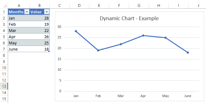
Below is an example of a chart that uses a dynamic chart range.
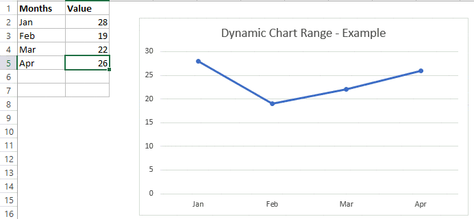
Note that the chart updates with the new data points for May and June as soon as the data in entered.
How to Create a Dynamic Chart Range in Excel?
There are two ways to create a dynamic chart range in Excel:
- Using Excel Table
- Using Formulas
In most of the cases, using Excel Table is the best way to create dynamic ranges in Excel.
Let’s see how each of these methods work.
Click here to download the example file.
Using Excel Table
Using Excel Table is the best way to create dynamic ranges as it updates automatically when a new data point is added to it.
Excel Table feature was introduced in Excel 2007 version of Windows and if you’re versions prior to it, you won’t be able to use it (see the next section on creating dynamic chart range using formulas).
Pro Tip: To convert a range of cells to an Excel Table, select the cells and use the keyboard shortcut – Control + T (hold the Control key and press the T key).
In the example below, you can see that as soon as I add new data, the Excel Table expands to include this data as a part of the table (note that the border and formatting expand to include it in the table).

Now, we need to use this Excel table while creating the charts.
Here are the exact steps to create a dynamic line chart using the Excel table:
That’s it!
The above steps would insert a line chart which would automatically update when you add more data to the Excel table.
Note that while adding new data automatically updates the chart, deleting data would not completely remove the data points. For example, if you remove 2 data points, the chart will show some empty space on the right. To correct this, drag the blue mark at the bottom right of the Excel table to remove the deleted data points from the table (as shown below).
While I have taken the example of a line chart, you can also create other chart types such as column/bar charts using this technique.

Using Excel Formulas
As I mentioned, using Excel table is the best way to create dynamic chart ranges.
However, if you can’t use Excel table for some reason (possibly if you are using Excel 2003), there is another (slightly complicated) way to create dynamic chart ranges using Excel formulas and named ranges.
Suppose you have the data set as shown below:

To create a dynamic chart range from this data, we need to:
- Create two dynamic named ranges using the OFFSET formula (one each for ‘Values’ and ‘Months’ column). Adding/deleting a data point would automatically update these named ranges.
- Insert a chart that uses the named ranges as a data source.
Let me explain each step in detail now.
Step 1 – Creating Dynamic Named Ranges
Below are the steps to create dynamic named ranges:
- Go to the ‘Formulas’ Tab.

- Click on ‘Name Manager’.

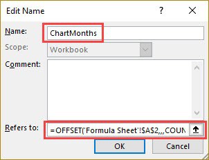
- In the Name Manager dialog box, specify the name as ChartValues and enter the following formula in Refers to part: =OFFSET(Formula!$B$2,,,COUNTIF(Formula!$B$2:$B$100,”<>”))

- Click OK.
- In the Name Manager dialog box, click on New.
- In the Name Manager dialog box, specify the name as ChartMonths and enter the following formula in Refers to part: =OFFSET(Formula!$A$2,,,COUNTIF(Formula!$A$2:$A$100,”<>”))
- Click Ok.
- Click Close.


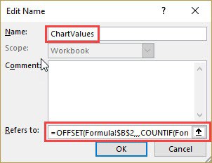
The above steps have created two named ranges in the Workbook – ChartValue and ChartMonth (these refer to the values and months range in the data set respectively).
If you go and update the value column by adding one more data point, the ChartValue named range would now automatically update to show the additional data point in it.
The magic is done by the OFFSET function here.
In the ‘ChartValue’ named range formula, we have specified B2 as the reference point. OFFSET formula starts there and extends to cover all the filled cells in the column.
The Same logic works in the ChartMonth named range formula as well.
Step 2 – Create a Chart Using these Named Ranges
Now all you need to do is insert a chart that will use the named ranges as the data source.
Here are the steps to insert a chart and use dynamic chart ranges:
That’s it! Now your chart is using a dynamic range and will update when you add/delete data points in the chart.
A few important things to know when using named ranges with charts:
- There should not be any blank cells in the chart data. If there is a blank, named range would not refer to the correct dataset (as the total count would lead to it referring to less number of cells).
- You need to follow the naming convention when using the sheet name in chart source. For example, if the sheet name is a single word, such as Formula, then you can use =Formula!ChartValue. But if there is more than one word, such as Formula Chart, then you need to use =’Formula Chart’!ChartValue.
You May Also Like the Following Excel Tutorials:
- How to Create a Thermometer Chart in Excel.
- How to Make a Bell Curve in Excel.
- Creating a Step Chart in Excel.
- Creating a Pareto Chart in Excel.
- How to Make a Histogram in Excel
- How to Add Error Bars in Excel (Horizontal/Vertical/Custom)
Dynamic Chart in Excel (Table of Contents)
- Dynamic Chart in Excel
- How to Create a Dynamic Chart in Excel?
Dynamic Chart in Excel
Dynamic Chart in excel automatically gets updated whenever we insert a new value in the selected table. To create a dynamic chart, first, we need to create a dynamic range in excel. For this, we need to change the data into Table format from the Insert menu tab in the first step. By that created table will automatically change to the format we need, and the created chart using that table will be a Dynamic chart, and the chart created by using such type of data will be updated with the format that we need. We need to delete every previously used data if we want to keep fix set of data into Charts.
The two main methods used to prepare a dynamic chart are as follows:
- By Using Excel Table
- Using Named Range
How to Create a Dynamic Chart in Excel?
Dynamic Chart in Excel is very simple and easy to create. Let’s understand the working of Dynamic Chart in Excel by Some Examples.
You can download this Dynamic Chart Excel Template here – Dynamic Chart Excel Template
Example #1 – By Using Excel Table
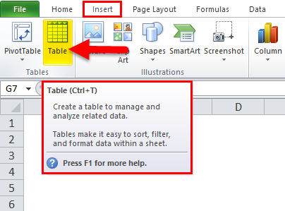
This is one of the easiest methods to make the dynamic chart in excel, which is available in the excel versions of 2007 and beyond. The basic steps to be followed are:
- Create a table in Excel by selecting the table option from the Insert
- A Dialog box will appear to give the Range for the Table and Select option ‘ My Table has Headers ‘
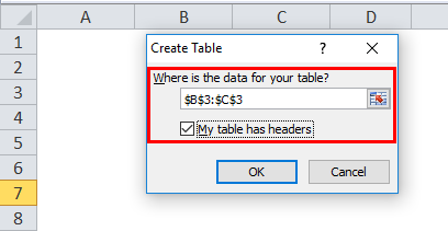
- Enter the data in the selected table.
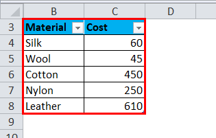
- Select the table and insert a suitable chart for it.
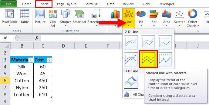
- A stacked Line with the Markers Chart is inserted. Your chart will look like as given below:
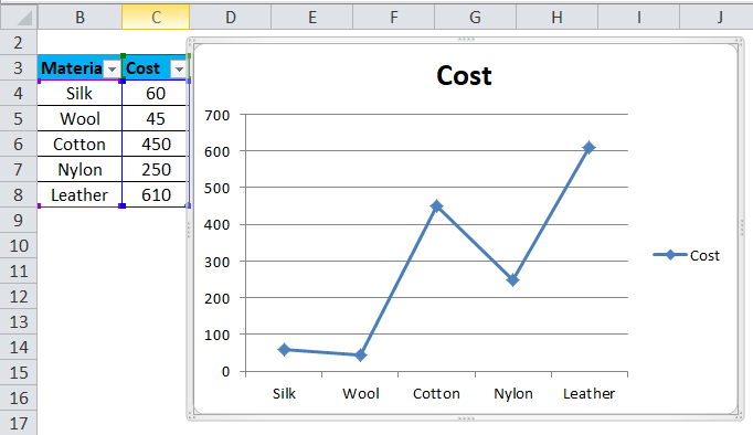
- Change the data in the table and which in turn will change the chart.
In step 4, it can be observed that after changing the dynamic input range of the column, the graph is automatically updated. There is no need to change the graph, which turns out to be an efficient way to analyze the data.
Example #2 – By Using Named Range
This method is used in the scenario where the user is using an older version of Excel, such as Excel 2003. It is easy to use, but it is not as flexible as the table method used in excels for the dynamic chart. There are 2 steps in implementing this method:
- Creating a dynamic named range for the dynamic chart.
- Creating a chart by using named ranges.
Creating a dynamic named range for the Dynamic Chart
In this step, an OFFSET function (Formula) is used for creating a dynamic named range for the particular dynamic chart to be prepared. This OFFSET function will return a cell or range of cells that are specified to the referred rows and columns. The basic steps to be followed are:
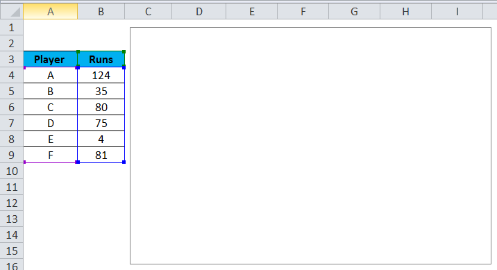
- Make a table of data as shown in the previous method.
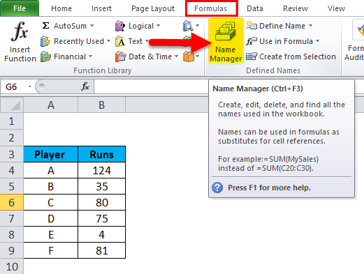
- From the ‘Formulas’ tab, click on ‘Name Manager’.
- A Name Manager Dialog box will appear in that Click on “New”.
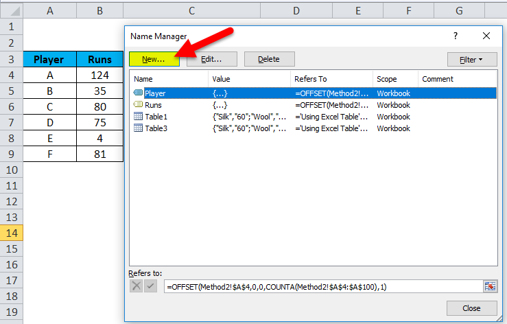
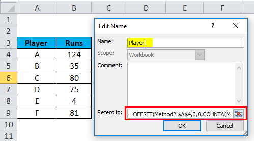
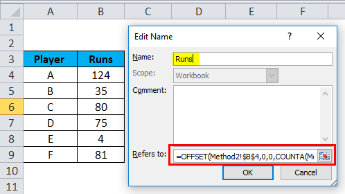
- In the appeared dialogue box from the ‘Name Manager’ option, assign the name in the tab for the name option, and enter the OFFSET formula in the ‘ Refers To ‘ tab.
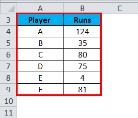
As two names have been taken in the example (Player and Runs), two name ranges will be defined, and the OFFSET formula for both the names will be as:
- Player =OFFSET($A$4,0,0,COUNTA($A$4:$A$100),1)
- Runs =OFFSET($B$4,0,0,COUNTA($B$4:$B$100),1)
The formula used here makes use of the COUNTA function as well. It gets the count of a number of non-blank cells in the target column, and the counts go to the height argument of the OFFSET function, which instructs the number of rows to return. In Step 1 of method 2, defining a named range for the dynamic chart is demonstrated, where a table is made for two names and the OFFSET formula is used to define the range and create name ranges in order to make the chart dynamic.
Creating a chart by using named ranges
In this step, a chart is selected and inserted, and the created name ranges are used to represent the data and make the chart a dynamic chart. The steps to be followed are:
- From the ‘Insert’ tab, select the ‘Line’ chart option.
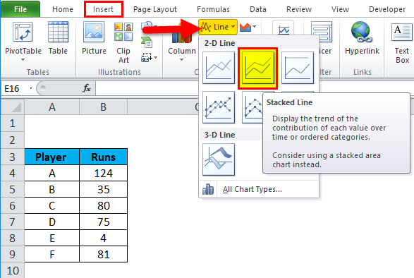
- A Stacked Line chart is inserted.
- Select the entire chart, either right-click or go to the ‘select data’ option or from the ‘Design’ tab go to ‘select data’ option.
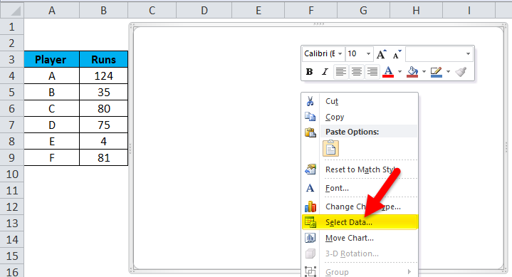
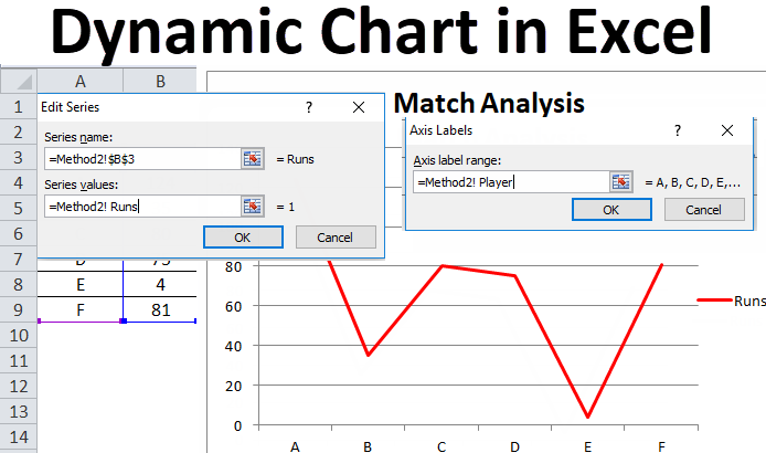
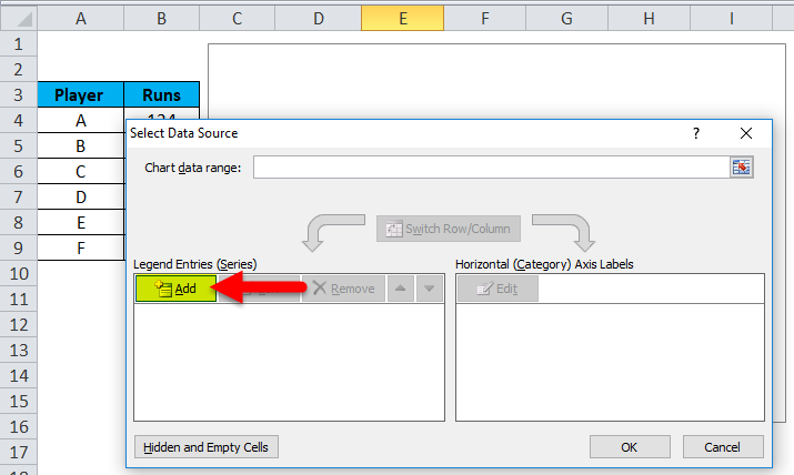
- After the select data option is being selected, the ‘Select Data Source dialogue box will appear. In that, click on the ‘Add’ button.
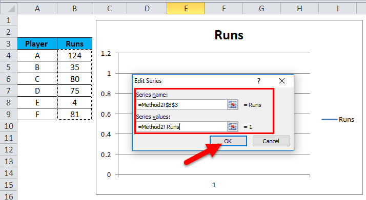
- From the Add option, another dialogue box will appear. In that, in the series name tab, select the name given for the range and in the series value, enter the worksheet name before the named range (Method2! Runs). Click OK
- Click on the Edit button from the horizontal category axis label.
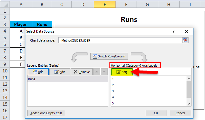
- In the axis labels, the dialogue box enters the worksheet name and then named range (Method2! Player). Click OK.
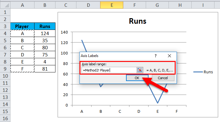
- Give a Chart Title as Match Analysis.
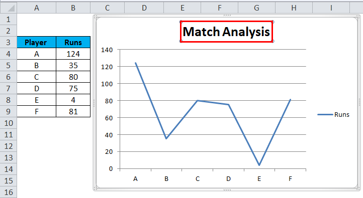
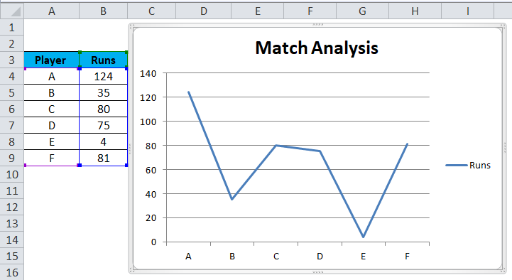
After following these steps, a dynamic chart is created by using the formula method and also it will be updated automatically after inserting or deleting the data.
Pros of Dynamic Chart in Excel
- A dynamic chart is a time-efficient tool. Saves time in updating the chart automatically whenever new data is added to the existing data.
- Quick visualization of data is provided in case of customization is done to the existing data.
- The OFFSET formula used overcomes the limitations seen with VLOOKUP in Excel.
- A dynamic chart is extremely helpful for a financial analyst who tracks the data of companies. It helps them understand the trend in a company’s ratios and financial stability by just inserting the updated result.
Cons of Dynamic Chart in Excel
- In the case of a few, hundreds of formulas used in the excel workbook can affect the Microsoft Excel performance with respect to its recalculation needed whenever the data is changed.
- Dynamic charts represent information in an easier way, but also it makes more complicated aspects of the information less apparent.
- For a user who is not used to use excel, the user may find it difficult to understand the functionality of the process.
- In comparison with the normal chart, dynamic chart processing is tedious and time-consuming.
Things to Remember About Dynamic Chart in Excel
- When creating name ranges for charts, there should not be any blank space in the table data or datasheet.
- The naming convention should be followed, especially while creating a chart using name ranges.
- In the case of the first method, i.e., using an excel table, the chart will update automatically whenever the data is being deleted, but there would be blank space in on the right side of the chart. So, in this case, drag the blue mark at the bottom of the excel table.
Recommended Articles
This has been a guide to Dynamic chart in Excel. Here we discuss its uses and how to create a Dynamic Chart in Excel with excel examples and downloadable excel templates. You may also look at these useful functions in excel –
- Marimekko Chart Excel
- Interactive Chart in Excel
- Surface Charts in Excel
- Comparison Chart in Excel
I have a strong reason for you to use a dynamic chart range. It happens sometimes that you create a chart and at the time when you update it you have to change its range manually.
Even when you delete some data, you have to change its range. Maybe it looks like that changing a chart range is no big deal. But what, when you have to update data frequently?
You do need a dynamic chart range.
Are you sure, I need a Dynamic Chart Range?
Yes, 100%. Alright, let me show you something.

Below, you have a chart with the month-wise amount and when you add the amount for Jun, chart values are the same, there is no change. Now the thing is, you have to update the chart range manually to include Jun in the chart. So what do you think, using a dynamic chart range is a time-saver?
Using Data Table for Dynamic Chart Range
If you are using the 2007 version of excel or above then using a data table instead of a normal range is the best way.
All you have to do, convert your normal range into a table (use shortcut key Ctrl + T) and then use that table to create a chart. Now, whenever you add data to your table it will automatically update the chart as well.
In the above chart, when I have added the amount for Jun, the chart gets updated automatically. The only thing that leads you to use the next method is when you delete data from a table, your chart will not get updated.

The solution to this problem is when you want to remove data from the chart just delete that cell by using the delete option.
Using Dynamic Named Range
Using a dynamic named range for a chart is a bit tricky but it’s a one-time setup. Once you do that, it’s super easy to manage it. So, I have split the entire process into two steps.
- Creating a dynamic named range.
- Changing source data for the chart to dynamic named range.
Creating a Dynamic Named Range for Dynamic Chart
To create a dynamic named range we can use OFFSET Function.
Quick Intro to Offset: It can return a range’s reference which is a specified number of rows and columns from a cell or range of cells. We have the following data to create a named range.

In column A we have months and amounts in column B. And, we have to create dynamic named ranges for both of the columns so that when you update data your chart will update automatically.
Download this file to follow along.
Here are the steps.
- Go to Formulas Tab -> Defined Names -> Name Manager.
- Click on “New” to create a named range.
- Now, in the new name window, enter the following formula (I will tell you further how it work).
- =OFFSET(Sheet2!$B$2,0,0,COUNTA(Sheet2!$B:$B)-1,1)
- Name your range “amount”.
- Click OK.
- Now, create another named range by using following formula.
- =OFFSET(Sheet2!$A$2,0,0,COUNTA(Sheet2!$A:$A)-1,1)
- Name it “month”.
- Click Ok.


At this point, we have two named ranges, “month” & “amount”. Now, let me tell you how it works. In the above formulas, I have used the count function to count the total number of cells with a value. Then I have used that count value as a height in offset to refer to a range.

In the month range, we have used A2 as starting point for offset and counting the total number of cells having in column B with counta (-1 to exclude heading) which gives reference to A2:A7.
Changing Source Data for the Chart to the Dynamic Named Range
Now, we have to change source data to named ranges we have just created. Oh, I am sorry I forget to tell you to create a chart, please insert a line chart. Here are the further steps.
- Right click on your chart and select “Select Data”.
- Under legend entries, click on edit.
- In series values, change range reference with named range “amount”.
- Click OK.
- In horizontal axis, click edit.
- Enter named range “months” for the axis label.
- Click Ok.


All is done. Congratulations, now your chart has a dynamic range.
Important Note: While using named range in your chart source make sure to add worksheet name along with it.
Sample File

Last Words
Using a dynamic chart range is a super time saver & it will save you a lot of effort. You don’t have to change your data range again and again. Every time when you update your data your chart is instantly updated.
More Charting Tips and Tutorials
- How to Add a Horizontal Line in a Chart in Excel
- How to Add a Vertical Line in a Chart in Excel
- How to Create a Bullet Chart in Excel
- How to Create a Dynamic Chart Title in Excel
- How to Create Interactive Charts In Excel
- How to Create a Sales Funnel Chart in Excel
- How to Create a HEAT MAP in Excel
- How to Create a HISTOGRAM in Excel
- How to Create a Pictograph in Excel
- How to Create a Milestone Chart in Excel
- How to Insert a People Graph in Excel
- How to Create PIVOT CHART in Excel
- How to Create a Population Pyramid Chart in Excel
- How to Create a SPEEDOMETER Chart [Gauge] in Excel
- How to Create a Step Chart in Excel
- How to Create a Thermometer Chart in Excel
- How to Create a Tornado Chart in Excel
- How to Create Waffle Chart in Excel
This tutorial will demonstrate how to create a dynamic chart range in all versions of Excel: 2007, 2010, 2013, 2016, and 2019.
In this Article
- Dynamic Chart Range – Free Template Download
- Dynamic Chart Ranges – Intro
- The Table Method
- Step #1: Convert the data range into a table.
- Step #2: Create a chart based on the table.
- The Dynamic Named Range Method
- Step #1: Create the dynamic named ranges.
- Step #2: Create an empty chart.
- Step #3: Add the named range/ranges containing the actual values.
- Step #4: Insert the named range with the axis labels.
- Download Dynamic Chart Range Template
Dynamic Chart Range – Free Template Download
Download our free Dynamic Chart Range Template for Excel.
Download Now
By default, when you expand or contract a data set used for plotting a chart in Excel, the underlying source data also has to be manually adjusted.
However, by creating dynamic chart ranges, you can avoid this hassle.
Dynamic chart ranges allow you to automatically update the source data every time you add or remove values from the data range, saving a great deal of time and effort.
In this tutorial, you will learn everything you need to know to unleash the power of Dynamic Chart Ranges.
Dynamic Chart Ranges – Intro
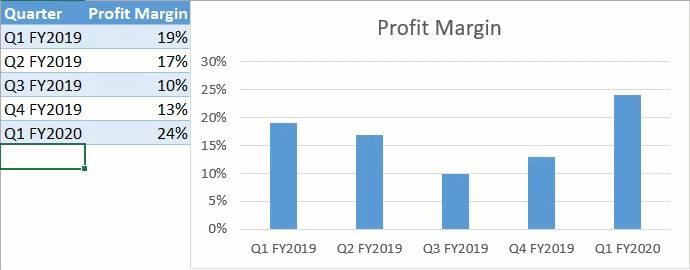
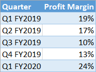
Consider the following sample data set analyzing profit margin fluctuations:
Basically, there are two ways to set up a dynamic chart range:
- Converting the data range into a table
- Using dynamic named ranges as the chart’s source data.
Both methods have their pros and cons, so we will talk about each of them in greater detail to help you determine which will work best for you.
Without further ado, let’s get started.
Download our free Dynamic Chart Range Template for Excel.
Download Now
The Table Method
Let me start off by showing you the fastest and easiest way to accomplish the task at hand. So, here’s the drill: Turn the data range into a table, and you’re golden—easier than shelling peas.
That way, everything you type into the cells at the end of that table will automatically be included in the chart’s source data.
Here is how you can make that happen in just two simple steps.
Step #1: Convert the data range into a table.
Right out of the gate, transform the cell range containing your chart data into a table.
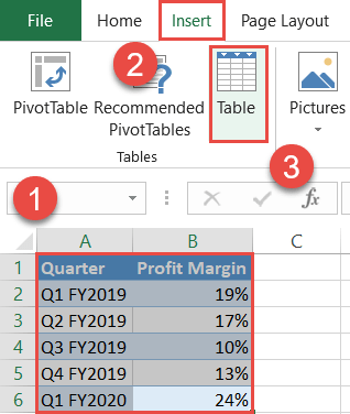
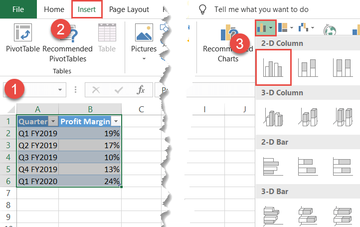
- Highlight the entire data range (A1:B6).
- Click the Insert tab.
- Hit the “Table” button.
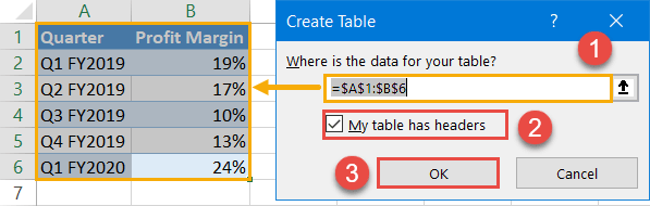
In the Create Table dialog box, do the following:
- Double-check that the highlighted cell range matches the entire data table.
- If your table contains no header row, uncheck the “My table has headers” box.
- Click “OK.“
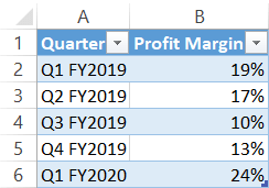
As a result, you should end up with this table:
Step #2: Create a chart based on the table.
The foundation has been laid, which means you can now set up a chart using the table.
- Highlight the entire table (A1:B6).
- Navigate to the Insert tab.
- Create any 2-D chart. For illustration purposes, let’s set up a simple column chart (Insert Column or Bar Chart > Clustered Column).
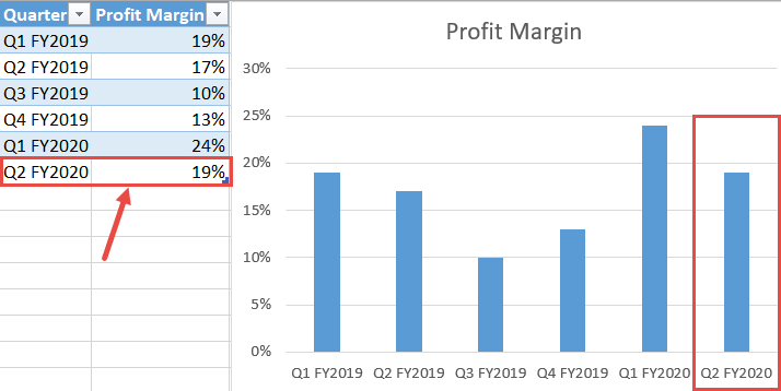
That’s it! To test the technique, try adding new data points at the bottom of the table to see them automatically charted on the plot. How much simpler can it get?
NOTE: With this approach, the data set should never contain empty cells in it—that will ruin the chart.
The Dynamic Named Range Method
Though easy to apply, the previously demonstrated, Table Method has some serious cons. For instance, the chart gets messed up whenever the fresh data set ends up being smaller than the initial data table—plus, sometimes you simply don’t want the data range to be converted into a table.
Opting for named ranges may take slightly more time and effort on your part, but the technique negates the cons of the table method and, on top of that, makes the dynamic range a lot more comfortable to work with in the long haul.
Step #1: Create the dynamic named ranges.
To start with, set up the named ranges that will eventually be used as the source data for your future chart.
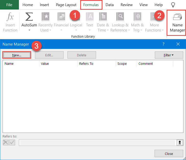
- Go to the Formulas tab.
- Click “Name Manager.”
- In the Name Manager dialog box that appears, select “New.”
In the New Name dialog box, create a brand new named range:
- Type “Quarter” next to the “Name” field. For your convenience, make the name of the dynamic range match the corresponding header row cell of column A (A1).
- In the “Scope” field, select the current worksheet. In our case, that’s Sheet1.
- Enter the following formula into the “Refers to” field: =OFFSET(Sheet1!$A$2,0,0,COUNTA(Sheet1!$A:$A)-1,1)
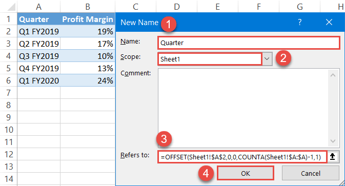
In plain English, every time you change any cell in the worksheet, the OFFSET function returns only the actual values in column A, leaving out the header row cell (A1), while the COUNTA function recalculates the number of the values in the column each time the worksheet is updated—effectively doing all the dirty work for you.
Let’s break down the formula in greater detail to help you understand how it works:
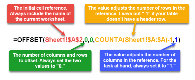
NOTE: The name of a named range must start with a letter or underscore and should contain no spaces.
By the same token, set up another named range based on column Profit Margin (column B) with the help of this formula and label it “Profit_Margin”:
=OFFSET(Sheet1!$B$2,0,0,COUNTA(Sheet1!$B:$B)-1,1)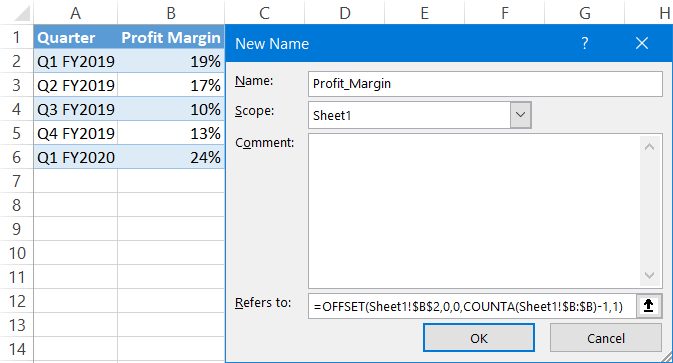
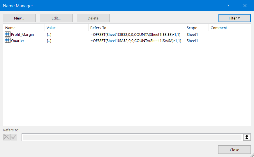
Repeat the same process if your data table contains multiple columns with actual values. In our case, as a result, you should have two named ranges ready for action:
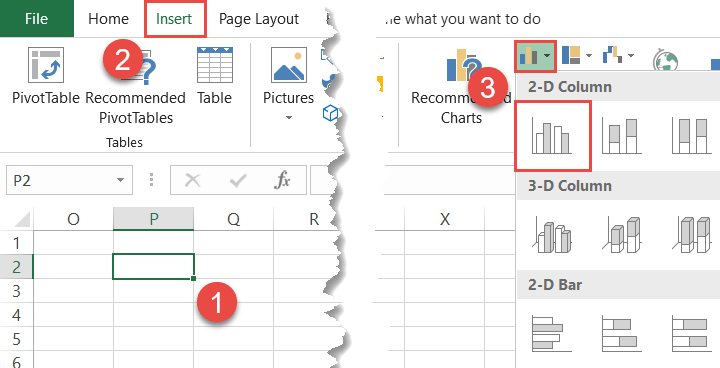
Step #2: Create an empty chart.
We’ve made it through the trickiest part. Now, it’s time to set up an empty chart so that you can manually insert the dynamic named ranges into it.
- Select any empty cell in the current worksheet (Sheet1).
- Go back over to the Insert tab.
- Set up any 2-D chart you want. For our example, we will create a column chart (Insert Column or Bar Chart > Clustered Column).
Step #3: Add the named range/ranges containing the actual values.
First, insert the named range (Profit_Margin) linked to the actual values (column B) into the chart.
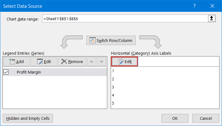
Right-click on the empty chart and choose “Select Data” from the contextual menu.
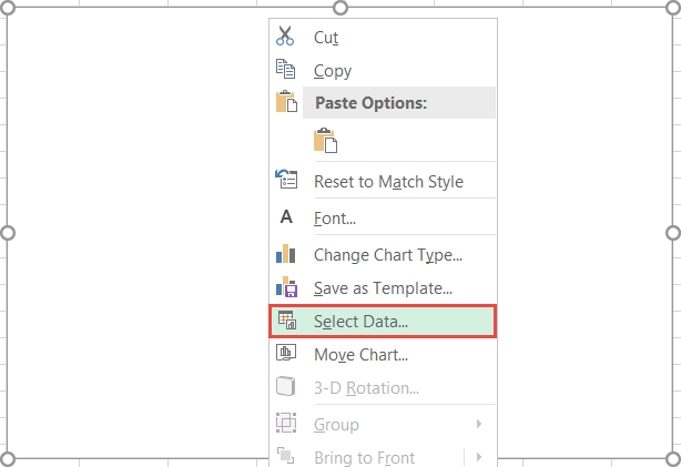
In the Select Data Source dialog window, click “Add.”
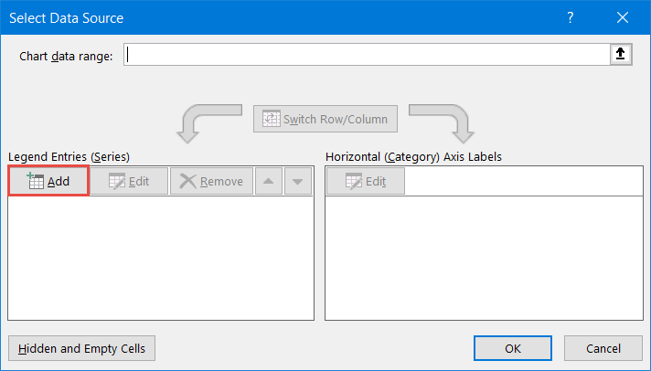
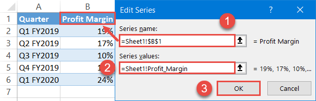
In the Edit Series box, create a new data series:
- Under “Series name,” highlight the corresponding header row cell (B1).
- Under “Series values,” specify the named range to be plotted on the chart by typing the following: “=Sheet1!Profit_Margin.” The reference is made up of two parts: the names of the current worksheet (=Sheet1) and the respective dynamic named range (Profit_Margin). The exclamation mark is used to bind the two variables together.
- Select “OK.”
Once there, Excel will automatically chart the values:
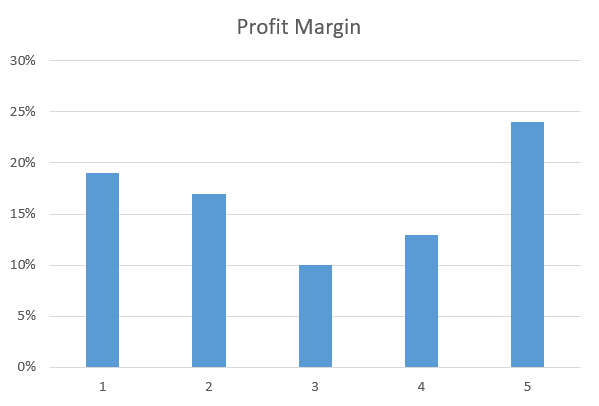
Step #4: Insert the named range with the axis labels.
Finally, replace the default category axis labels with the named range comprised of column A (Quarter).
In the Select Data Source dialog box, under “Horizontal (Category) Axis Labels,” select the “Edit” button.
Then, insert the named range into the chart by entering the following reference under “Axis label range:”
=Sheet1!Quarter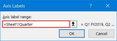
Finally, the column chart based on the dynamic chart range is ready:
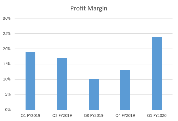
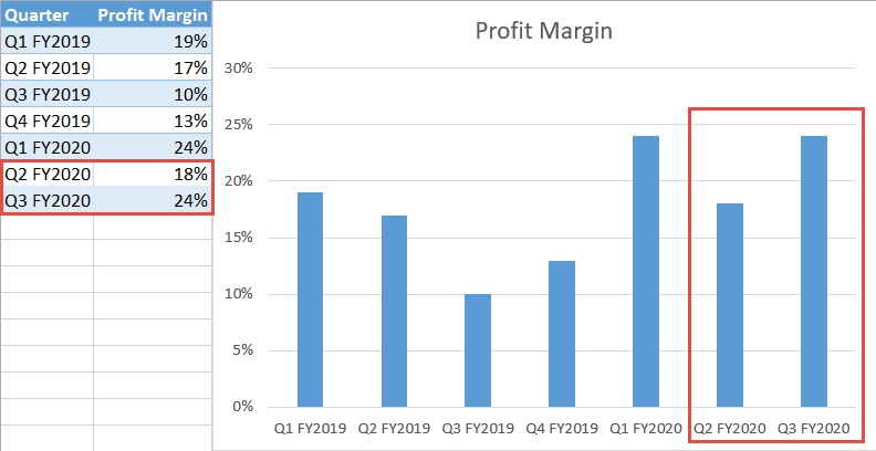
Check this out: The chart gets updated automatically whenever you add or remove data in the dynamic range.
Download Dynamic Chart Range Template
Download our free Dynamic Chart Range Template for Excel.
Download Now