
The word-break CSS property sets whether line breaks appear wherever the text would otherwise overflow its content box.
Try it
Syntax
/* Keyword values */
word-break: normal;
word-break: break-all;
word-break: keep-all;
word-break: break-word; /* deprecated */

/* Global values */
word-break: inherit;
word-break: initial;
word-break: revert;
word-break: revert-layer;
word-break: unset;
The word-break property is specified as a single keyword chosen from the list of values below.
Values
normal-
Use the default line break rule.
break-all-
To prevent overflow, word breaks should be inserted between any two characters (excluding Chinese/Japanese/Korean text).
keep-all-
Word breaks should not be used for Chinese/Japanese/Korean (CJK) text. Non-CJK text behavior is the same as for
normal. break-word
Deprecated
-
Has the same effect as
word-break: normalandoverflow-wrap: anywhere, regardless of the actual value of theoverflow-wrapproperty.
Note: In contrast to word-break: break-word and overflow-wrap: break-word (see overflow-wrap), word-break: break-all will create a break at the exact place where text would otherwise overflow its container (even if putting an entire word on its own line would negate the need for a break).
Note: While word-break: break-word is deprecated, it has the same effect, when specified, as word-break: normal and overflow-wrap: anywhere — regardless of the actual value of the overflow-wrap property.
Formal definition
| Initial value | normal |
|---|---|
| Applies to | all elements |
| Inherited | yes |
| Computed value | as specified |
| Animation type | discrete |
Formal syntax
word-break =
  normal      |
  keep-all    |
  break-all   |
  break-word
Examples
HTML
<p>1. <code>word-break: normal</code></p>
<p class="normal narrow">
  This is a long and Honorificabilitudinitatibus califragilisticexpialidocious
  Taumatawhakatangihangakoauauotamateaturipukakapikimaungahoronukupokaiwhenuakitanatahu
  グレートブリテンおよび北アイルランド連合王国という言葉は本当に長い言葉
</p>

<p>2. <code>word-break: break-all</code></p>
<p class="breakAll narrow">
  This is a long and Honorificabilitudinitatibus califragilisticexpialidocious
  Taumatawhakatangihangakoauauotamateaturipukakapikimaungahoronukupokaiwhenuakitanatahu
  グレートブリテンおよび北アイルランド連合王国という言葉は本当に長い言葉
</p>

<p>3. <code>word-break: keep-all</code></p>
<p class="keepAll narrow">
  This is a long and Honorificabilitudinitatibus califragilisticexpialidocious
  Taumatawhakatangihangakoauauotamateaturipukakapikimaungahoronukupokaiwhenuakitanatahu
  グレートブリテンおよび北アイルランド連合王国という言葉は本当に長い言葉
</p>

<p>4. <code>word-break: break-word</code></p>
<p class="breakWord narrow">
  This is a long and Honorificabilitudinitatibus califragilisticexpialidocious
  Taumatawhakatangihangakoauauotamateaturipukakapikimaungahoronukupokaiwhenuakitanatahu
  グレートブリテンおよび北アイルランド連合王国という言葉は本当に長い言葉
</p>
CSS
.narrow {
  padding: 10px;
  border: 1px solid;
  width: 500px;
  margin: 0 auto;
  font-size: 20px;
  line-height: 1.5;
  letter-spacing: 1px;
}

.normal {
  word-break: normal;
}

.breakAll {
  word-break: break-all;
}

.keepAll {
  word-break: keep-all;
}

.breakWord {
  word-break: break-word;
}
Specifications
| Specification |
|---|
| CSS Text Module Level 3 # word-break-property |
Browser compatibility
BCD tables only load in the browser
See also
Okay, this is really confusing me. I have some content inside of a div like so:
<div style="background-color: green; width: 200px; height: 300px;">

Thisisatest.Thisisatest.Thisisatest.Thisisatest.Thisisatest.Thisisatest.

</div>
However, the content overflows the DIV (as expected) because the ‘word’ is too long.
How can I force the browser to ‘break’ the word where necessary to fit all of the content inside?
Pardeep Jain
83k37 gold badges159 silver badges215 bronze badges
asked Jun 17, 2010 at 4:26
Nathan OsmanNathan Osman
70.5k71 gold badges254 silver badges359 bronze badges
2
Use word-wrap:break-word;
It even works in IE6, which is a pleasant surprise.
word-wrap: break-word has been replaced with overflow-wrap: break-word; which works in every modern browser. IE, being a dead browser, will forever rely on the deprecated and non-standard word-wrap instead.
Existing uses of word-wrap today still work as it is an alias for overflow-wrap per the specification.
TylerH
20.6k64 gold badges76 silver badges97 bronze badges
answered Jun 17, 2010 at 5:36
5
I am not sure about the browser compatibility
word-break: break-all;
Also you can use the <wbr> tag
<wbr>(word break) means: «The browser
may insert a line break here, if it
wishes.» It the browser does not think
a line break necessary nothing
happens.
TylerH
20.6k64 gold badges76 silver badges97 bronze badges
answered Jun 17, 2010 at 4:29
rahulrahul
183k49 gold badges232 silver badges262 bronze badges
6
I was just Googling the same issue, and posted my final solution HERE. It’s relevant to this question too.
You can do this easily with a div by giving it the style word-wrap: break-word (and you may need to set its width, too).
div {
    word-wrap: break-word;         /* All browsers since IE 5.5+ */
    overflow-wrap: break-word;     /* Renamed property in CSS3 draft spec */
    width: 100%;
}
However, for tables, you also need to apply: table-layout: fixed. This means the columns widths are no longer fluid, but are defined based on the widths of the columns in the first row only (or via specified widths). Read more here.
Sample code:
table {
    table-layout: fixed;
    width: 100%;
}

table td {
    word-wrap: break-word;         /* All browsers since IE 5.5+ */
    overflow-wrap: break-word;     /* Renamed property in CSS3 draft spec */
}
TylerH
20.6k64 gold badges76 silver badges97 bronze badges
answered Nov 26, 2013 at 1:01
Simon EastSimon East
54.6k17 gold badges138 silver badges133 bronze badges
3
is the HTML entity for a unicode character called the zero-width space (ZWSP) which is an invisible character which specifies a line-break opportunity. Similarly the hyphen’s purpose is to specify a line-break opportunity within a word boundary.
answered Mar 10, 2015 at 8:25
davidcondreydavidcondrey
33.9k17 gold badges114 silver badges135 bronze badges
2
Found that using the following worked across most major browsers (Chrome, IE, Safari iOS/OSX) except Firefox (v50.0.2) when using flexbox and relying on width: auto.
.your_element {
    word-wrap: break-word;
    overflow-wrap: break-word;
    word-break: break-word;
}
Note: you may need to add browser vendor prefixes if you are not using an autoprefixer.
Another thing to watch out for is text using for spacing can cause line breaks mid-word.
TylerH
20.6k64 gold badges76 silver badges97 bronze badges
answered Dec 2, 2016 at 1:14
AndrewAndrew
5,4855 gold badges35 silver badges40 bronze badges
1
Whitespace is preserved by the browser. Text will wrap when necessary, and on line breaks
.pre-wrap {
    white-space: pre-wrap;
    word-break: break-word;
}
DEMO
td {
   word-break: break-word;
   white-space: pre-wrap;
   -moz-white-space: pre-wrap;
}

table {
    width: 100px;
    border: 1px solid black;
    display: block;
}
<table>
<tr><th>list</th>
<td>
1.longtextlongtextlongtextlongtextlongtextlongtextlongtextlongtextlongtextlongtextlongtextlongtext
2.breaklinebreaklinebreaklinebreaklinebreaklinebreaklinebreaklinebreaklinebreaklinebreaklinebreakline
</td>
</tr>
</table>
TylerH
20.6k64 gold badges76 silver badges97 bronze badges
answered Feb 26, 2019 at 8:52
Tính Ngô QuangTính Ngô Quang
4,2861 gold badge33 silver badges33 bronze badges
CSS word-wrap:break-word;, tested in FireFox 3.6.3
answered Jun 17, 2010 at 4:37
BabikerBabiker
18.1k28 gold badges77 silver badges125 bronze badges
0
Remove white-space: nowrap, if there is any.
Implement:
white-space: inherit;
word-break: break-word;
TylerH
20.6k64 gold badges76 silver badges97 bronze badges
answered Apr 24, 2018 at 14:09
1
I solved my problem with code below.
display: table-caption;
answered Jan 4, 2017 at 19:20
1
From MDN:
The
overflow-wrapCSS property specifies whether or not the browser should insert line breaks within words to prevent text from overflowing its content box.In contrast to
word-break,overflow-wrapwill only create a break if an entire word cannot be placed on its own line without overflowing.
So you can use:
overflow-wrap: break-word;
Can I use?
answered Nov 7, 2017 at 6:53
Shiva127Shiva127
2,3231 gold badge26 silver badges26 bronze badges
First you should identify the width of your element. E.g:
#sampleDiv{
  width: 80%;
  word-wrap:break-word;
}
<div id="sampleDiv">aaaaaaaaaaaaaaaaaaaaaaaaaaaaaaaaaaaaaa</div>so that when the text reaches the element width, it will be broken down into lines.
TylerH
20.6k64 gold badges76 silver badges97 bronze badges
answered Feb 20, 2014 at 10:22
As mentioned in @davidcondrey’s reply, there is not just the ZWSP, but also the SHY ­ that can be used in very long, constructed words (think German or Dutch) that have to be broken on the spot you want it to be.
Invisible, but it gives a hyphen the moment it’s needed, thus keeping both word connected and line filled to the utmost.
That way the word luchthavenpolitieagent might be noted as lucht­haven­politie­agent which gives longer parts than the syllables of the word.
Though I never read anything official about it, these soft hyphens manage to get higher priority in browsers than the official hyphens in the single words of the construct (if they have some extension for it at all).
In practice, no browser is capable of breaking such a long, constructed word by itself; on smaller screens resulting in a new line for it, or in some cases even a one-word-line (like when two of those constructed words follow up).
FYI: it’s Dutch for airport police officer
answered Nov 4, 2019 at 22:35
word-break: normal seems better to use than word-break: break-word because break-word breaks initials such as EN
word-break: normal
answered Jan 16, 2020 at 11:24
MatoeilMatoeil
6,75111 gold badges52 silver badges77 bronze badges
.word-break {
   word-break: keep-all;
   word-wrap: break-word;
}
answered May 10, 2022 at 18:46
You can use a grid system for this.
<div class="container" style="background-color: green; width: 200px; height: 300px;">
   <div class="row">Thisisatest.Thisisatest.Thisisatest.</div>
   <div class="row">Thisisatest.Thisisatest.Thisisatest.</div>
 </div>
answered Feb 16, 2022 at 6:32
Do this:
<div id="sampleDiv">aaaaaaaaaaaaaaaaaaaaaaaaaaaaaaaaaaaaaa</div>

#sampleDiv{
   overflow-wrap: break-word;
}
answered Sep 21, 2016 at 13:21
amit bendeamit bende
2663 silver badges4 bronze badges
just try this in our style
white-space: normal;
answered May 7, 2015 at 9:26
2
| Internet Explorer | Chrome | Opera | Safari | Firefox | Android | iOS |
| 5.5+ | 1.0+ | 3.1 | 15.0+ | 2.0+ | 2.0+ |
Краткая информация
| Значение по умолчанию | normal |
|---|---|
| Наследуется | Да |
| Применяется | Ко всем элементам |
| Процентная запись | Неприменима |
| Ссылка на спецификацию | http://dev.w3.org/csswg/css3-text/#word-break |
Версии CSS
| CSS 1 | CSS 2 | CSS 2.1 | CSS 3 |
|---|---|---|---|
Описание
Свойство word-break указывает, как делать перенос строк внутри слов, которые не помещаются по ширине в заданную область.
Синтаксис
word-break: normal | break-all | keep-all
Значения
- normal
- Используются правила переноса строк по умолчанию. Как правило, в этом случае строки не переносятся или переносятся в тех местах, где явно задан перенос (например, с помощью тега <br>).
- break-all
- Перенос строк добавляется автоматически, чтобы слово поместилось в заданную ширину блока. Значение не работает для текста на китайском, корейском или японском языке.
- keep-all
- Не разрешает перенос строк в словах на китайском, корейском или японском языке. Для остальных языков действует как normal.
Пример
HTML5CSS3IECrOpSaFx 15
<!DOCTYPE html>
<html>
 <head>
  <meta charset="utf-8">
  <title>word-break</title>
  <style>
   .col {
    background: #f0f0f0; /* Цвет фона */
    width: 180px; /* Ширина блока */
    padding: 10px; /* Поля */
    word-break: break-all; /* Перенос слов */
   }
  </style>
 </head>
 <body>
  <div class="col">
   <p>Cуществительное</p>
   <p>высокопревосходительство</p>
   <p>Одушевленное существительное</p>
   <p>одиннадцатиклассница</p>
   <p>Химическое вещество</p>
   <p>метоксихлордиэтиламинометилбутиламиноакридин</p>
  </div>
 </body>
</html>
Результат данного примера показан на рис. 1.
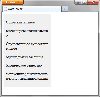
Рис. 1. Перенос длинных слов
CSS по теме
Статьи по теме
Рецепты CSS
The word-break property specifies where the lines should be broken.
Normally, line breaks only occur in certain spaces when there is a space or a hyphen. But when the word-break property is set to the break-all value, the browser will break lines at any point.
This property is one of the CSS3 properties.
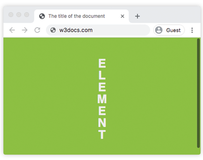
word-break: normal | break-all | keep-all | break-word | initial | inherit;Example of the word-break property:
<!DOCTYPE html>
<html>
  <head>
    <title>The title of the document</title>
    <style>
      html,
      body {
        height: 100%;
      }
      body {
        font-family: Helvetica, san serif;
        display: flex;
        justify-content: center;
        align-items: center;
        background-color: #8ebf42;
      }
      p {
        word-break: break-all;
        line-height: 1;
        text-transform: uppercase;
        text-align: center;
        font-size: 30px;
        font-weight: bold;
        color: #eee;
        width: 1em;
      }
    </style>
  </head>
  <body>
    <p>element</p>
  </body>
</html>
Result
In the following example the words break in the text.
Example of the word-break property with the «break-all» value:
<!DOCTYPE html>
<html>
  <head>
    <title>The title of the document</title>
    <style>
      body {
        font-size: 0.95em;
        line-height: 1.5;
        font-family: 'Helvetica Neue', Helvetica, Arial, sans-serif;
      }
      .container {
        margin: 50px auto;
        max-width: 700px;
      }
      .text {
        padding: 20px;
        background-color: #666;
        color: white;
        text-align: justify;
      }
      .break {
        word-break: break-all;
      }
      strong {
        background-color: #000;
      }
    </style>
  </head>
  <body>
    <h2>Word-break property example</h2>
    <div class="container">
      <h3>Text breaks inside words</h3>
      <p class="text break">
        Lorem Ipsum is simply dummy text of the printing and typesetting industry. Lorem <strong>Ipsum</strong> has been the industry's standard dummy text ever since the 1500s, when an <strong>unknown</strong> printer took a galley of type and scrambled it to make a type specimen book. It has survived not only five centuries, but also the leap into electronic typesetting, <strong>remaining</strong> essentially unchanged.
      </p>
    </div>
  </body>
</html>Свойство word-break указывает, как делать перенос строк внутри слов, которые не помещаются по ширине в заданную область.
Краткая информация
| Значение по умолчанию | normal |
|---|---|
| Наследуется | Да |
| Применяется | Ко всем элементам |
| Анимируется | Нет |
Синтаксис
word-break: normal | break-all | keep-allСинтаксис
| Описание | Пример | |
|---|---|---|
| <тип> | Указывает тип значения. | <размер> |
| A && B | Значения должны выводиться в указанном порядке. | <размер> && <цвет> |
| A | B | Указывает, что надо выбрать только одно значение из предложенных (A или B). | normal | small-caps |
| A || B | Каждое значение может использоваться самостоятельно или совместно с другими в произвольном порядке. | width || count |
| [ ] | Группирует значения. | [ crop || cross ] |
| * | Повторять ноль или больше раз. | [,<время>]* |
| + | Повторять один или больше раз. | <число>+ |
| ? | Указанный тип, слово или группа не является обязательным. | inset? |
| {A, B} | Повторять не менее A, но не более B раз. | <радиус>{1,4} |
| # | Повторять один или больше раз через запятую. | <время># |
Значения
- normal
- Используются правила переноса строк по умолчанию. Как правило, в этом случае строки не переносятся или переносятся в тех местах, где явно задан перенос (например, с помощью <br>).
- break-all
- Перенос строк добавляется автоматически, чтобы слово поместилось в заданную ширину блока. Значение не работает для текста на китайском, корейском или японском языке.
- keep-all
- Не разрешает перенос строк в словах на китайском, корейском или японском языке. Для остальных языков действует как normal.
Пример
<!DOCTYPE html>
<html>
<head>
<meta charset=»utf-8″>
<title>word-break</title>
<style>
.col {
background: #f0f0f0; /* Цвет фона */
width: 180px; /* Ширина блока */
padding: 10px; /* Поля */
word-break: break-all; /* Перенос слов */
}
</style>
</head>
<body>
<div class=»col»>
<p>Cуществительное</p>
<p>высокопревосходительство</p>
<p>Одушевленное существительное</p>
<p>одиннадцатиклассница</p>
<p>Химическое вещество</p>
<p>метоксихлордиэтиламинометилбутиламиноакридин</p>
</div>
</body>
</html>
Результат данного примера показан на рис. 1.
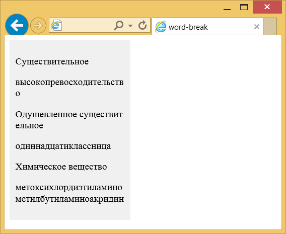
Рис. 1. Перенос длинных слов
Объектная модель
Объект.style.wordBreak
Примечание
Chrome до версии 44, Opera до версии 31, Safari до версии 9, Android и Opera Mobile не поддерживают значение keep-all.
Спецификация
| Спецификация | Статус |
|---|---|
| CSS Text Level 3 | Рабочий проект |
Спецификация
Каждая спецификация проходит несколько стадий одобрения.
- Recommendation (Рекомендация) — спецификация одобрена W3C и рекомендована как стандарт.
- Candidate Recommendation (Возможная рекомендация) — группа, отвечающая за стандарт, удовлетворена, как он соответствует своим целям, но требуется помощь сообщества разработчиков по реализации стандарта.
- Proposed Recommendation (Предлагаемая рекомендация) — на этом этапе документ представлен на рассмотрение Консультативного совета W3C для окончательного утверждения.
- Working Draft (Рабочий проект) — более зрелая версия черновика после обсуждения и внесения поправок для рассмотрения сообществом.
- Editor’s draft (Редакторский черновик) — черновая версия стандарта после внесения правок редакторами проекта.
- Draft (Черновик спецификации) — первая черновая версия стандарта.
Браузеры
| 5.5 | 12 | 1 | 44 | 15 | 31 | 3.1 | 9 | 15 |
| 2.1 | 15 | 37 | 3.2 | 9.2 |
Браузеры
В таблице браузеров применяются следующие обозначения.
- — элемент полностью поддерживается браузером;
- — элемент браузером не воспринимается и игнорируется;
- — при работе возможно появление различных ошибок, либо элемент поддерживается с оговорками.
Число указывает версию браузреа, начиная с которой элемент поддерживается.