
Want to create a burndown chart in Excel?
Burndown charts are one of the most intuitive ways of measuring your project’s progress against targets and deadlines.
And tracking them in Microsoft Excel is the go-to option for many teams.
But are the rows and columns in Excel giving you vertigo?
Fear no more.
This article will explain what a burndown chart is, the three steps of creating one in Excel, and a better Excel alternative to the process!

What Is a Burndown Chart?
A burndown chart is a visual representation of how much work is remaining against the amount of work completed in a sprint or a project.
In a typical Agile Scrum project, there could be two kinds of burndown charts:
- Sprint burndown chart: to track the amount of work left in a particular sprint (a 2-week iteration). It’s also known as a release burndown chart
- Product burndown chart: to track the amount of work left in the entire project
We bet you’re asking, “all that’s fine, but how do I recognize a burndown chart?”
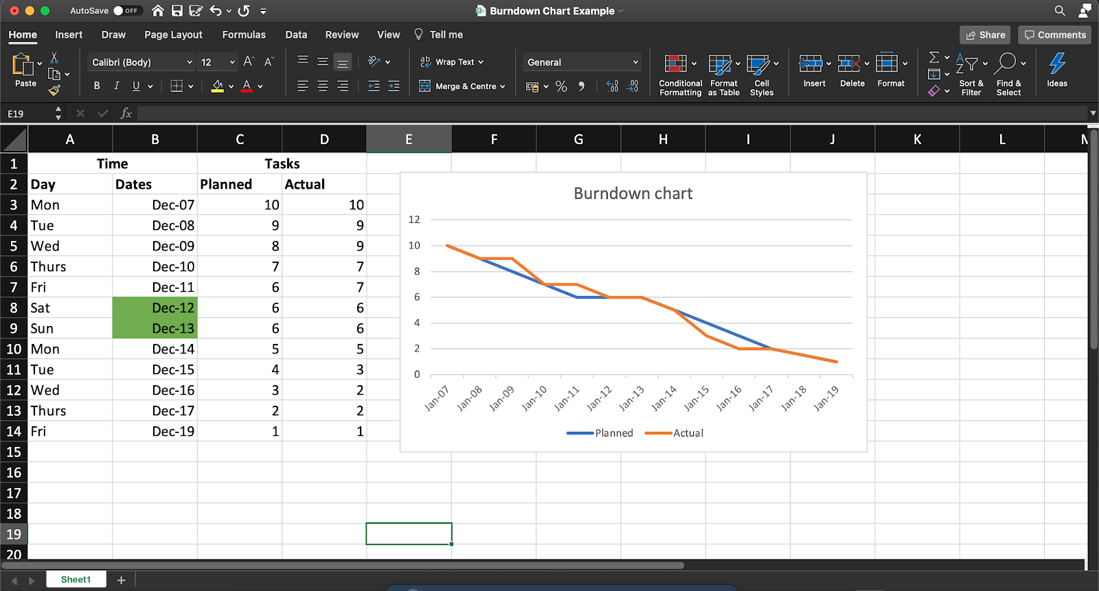
Here’s what a typical sprint burndown chart looks like.
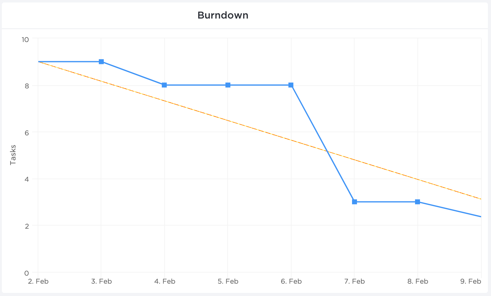
Now let’s break this down.
The ‘X’ axis (horizontal) represents the time set aside for a particular sprint or project completion.
The ‘Y’ axis (vertical) represents the remaining work.
The top left corner is where the project (or sprint) begins, and the bottom right corner is where it ends.
As for the two lines running between the two points, here’s what they represent:
- Ideal work remaining line (orange)
This represents how the team will ‘burn down’ all the remaining work if all things went as planned. It’s an ideal estimation that works as a baseline for all project calculations.
- Actual work remaining line (blue)
This is a representation of the actual work done and how much is left in the pipeline. It’s usually not a straight line as it’s subject to real-life events and delays in the team’s way. Ideally, you want the actual work line to stay under the ideal line.
But how does one create this chart?
You could always use handy project management tools that automatically generate such essential charts. On the other hand, you could opt for a more manual approach with good ol’ Microsoft Excel.
How to Create a Burndown Chart in Excel
Here’s how you can make a burn down chart in Excel in three simple steps.
In this article, we’ll focus on creating a work burndown chart for a sprint.
This example sprint is 10 days long and contains 10 tasks.
Ready to get down to cell-ular level in Excel?! Bring your microscopes 🔍
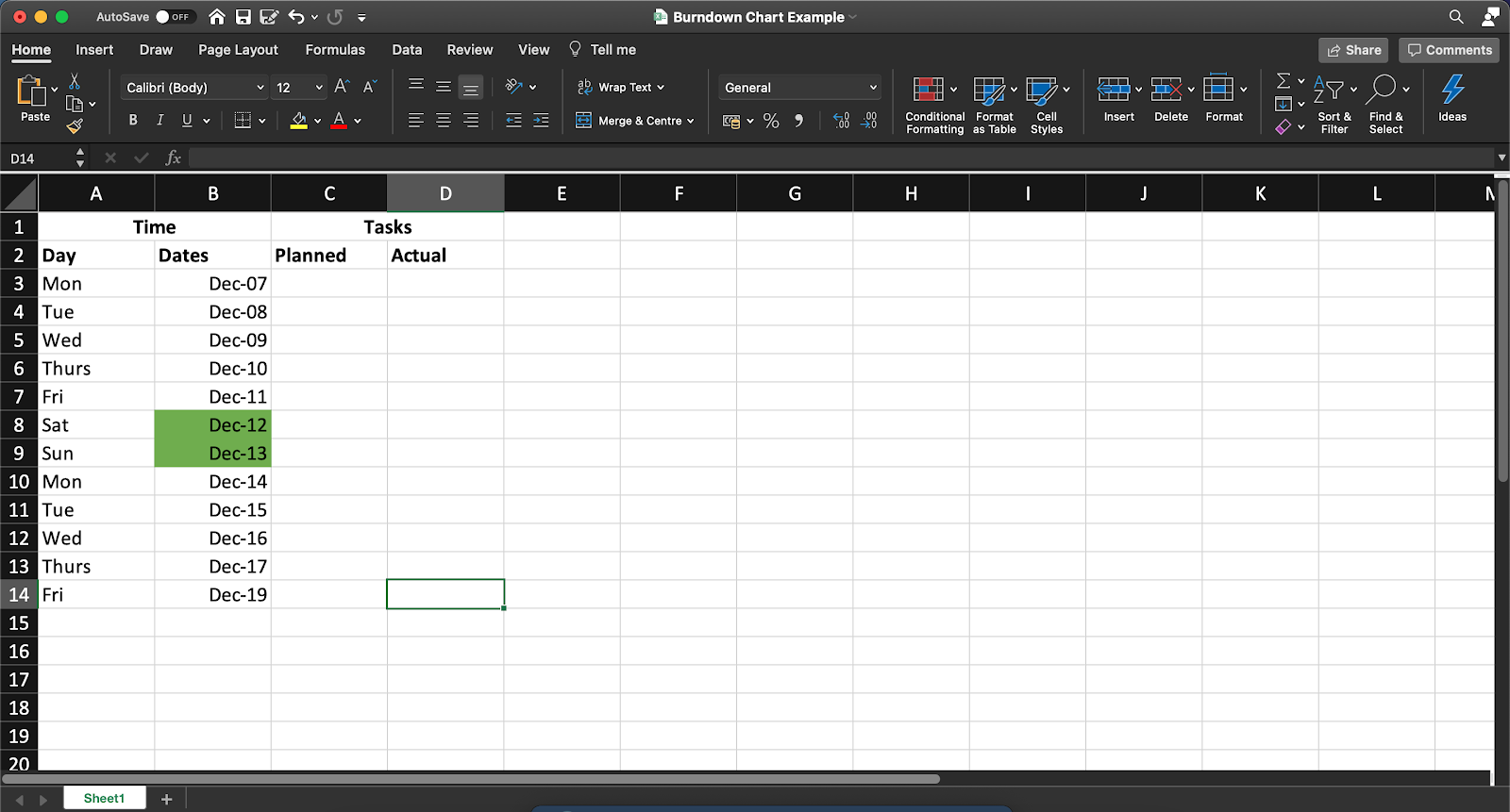
Step 1: Create a table
We’ll lay the groundwork for the work burndown chart with a table. This will contain your basic information on time and the tasks remaining.
For the tasks, split it into two columns, representing the number of remaining tasks you estimate you’ll have (your planned effort) and the actual tasks remaining on that day.
Open a new sheet in Excel and create columns as per your project’s needs.
You can add details to this table for your work burndown chart, such as:
- The name of each product backlog item
- Story points
- Estimated effort (in hours)
- Actual effort (in hours)
- Remaining effort (in hours)
Step 2: Add data in the planned column
Now, we add our values to the planned column, representing how many tasks you ideally want remaining at the end of each day of the 10-day sprint.
Remember, this is an ideal scenario.
So whatever numbers you add here do not account for any real-world complications that your team may face in the sprint duration.
In our example, we’ve assumed an ideal burndown rate of one task or user story per working day. We’ve not accounted for weekends, and hence the number of tasks doesn’t reduce on Saturday and Sunday in this table.
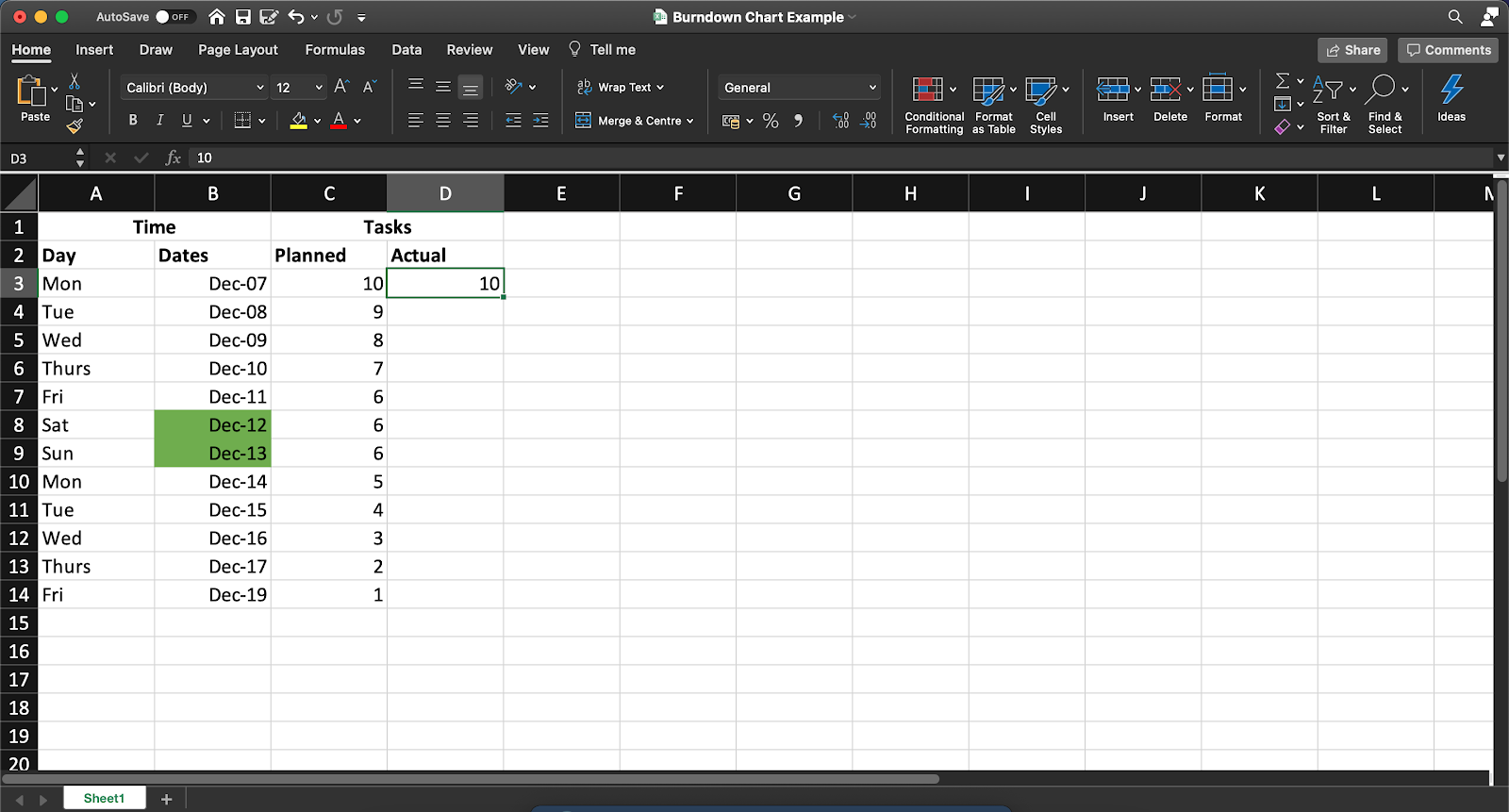
Note: You’ll have to manually update the Actual column at the end of each day to reflect the number of tasks that actually remain.
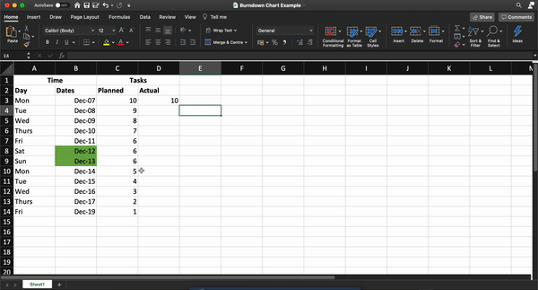
Step 3: Generate a chart
Once you’ve assembled your hard-earned data in one place, Excel will take over the rest of your process!
To do this, follow these steps:
- Select the ‘Dates,’ ‘Planned,’ and ‘Actual’ columns
- Click on Insert in the top menu bar
- Click on the line chart icon
- Select any simple line chart from here
Once you’ve generated your graph, you can change the values in the ‘Actual’ column to edit the chart.
Your final Excel work burndown chart may resemble this:
So what do you think? Easy enough to create an Excel burndown chart, right?
After all, it’s just three simple steps.
But if you’d like to skip them too, we have a solution to help you cut to the chase.
4 Excel Burndown Chart Templates
Let’s face it. Between day-zero and your project deadline, you’re barely going to have time to breathe.
So building a project burn down chart from scratch is pretty much out of the question.
That’s why we’ve gathered three simple Excel burndown templates to make your life easier; so you can focus on what you do best.
Productive too, but being fabulous is never bad!
Just pick a burndown chart excel template from here.
1. Simple Burndown Chart Template
Use this ClickUp Burndown Chart Whiteboard template to visualize your “Sprint” points expectation and actual burn rate.
2. Actual and estimated hours burndown chart template

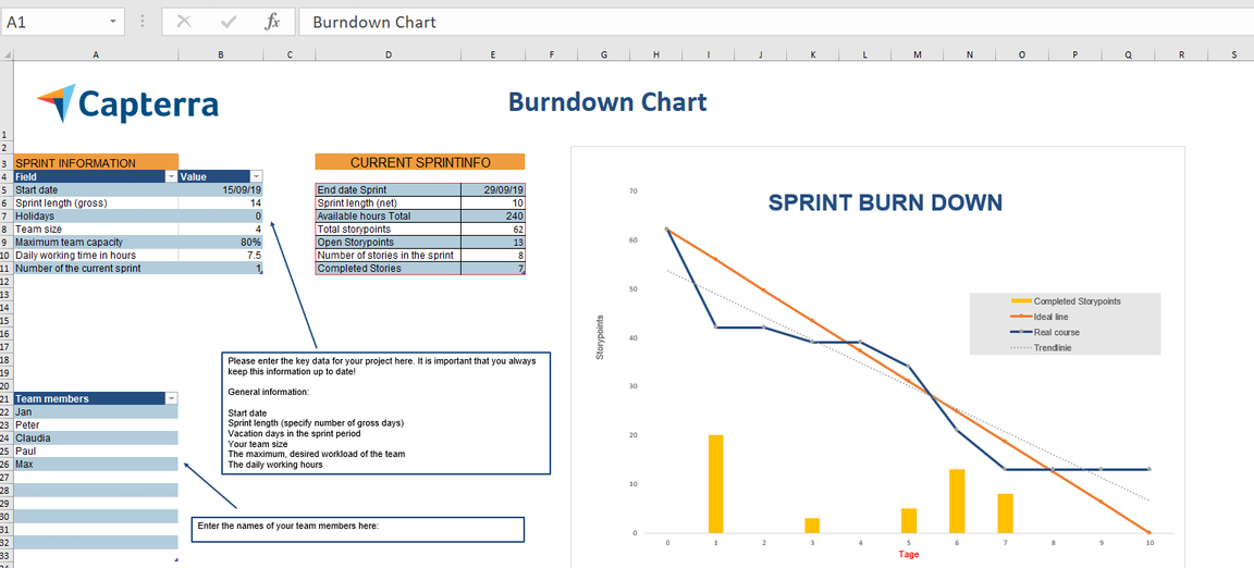
3. Agile Scrum burndown chart Excel template
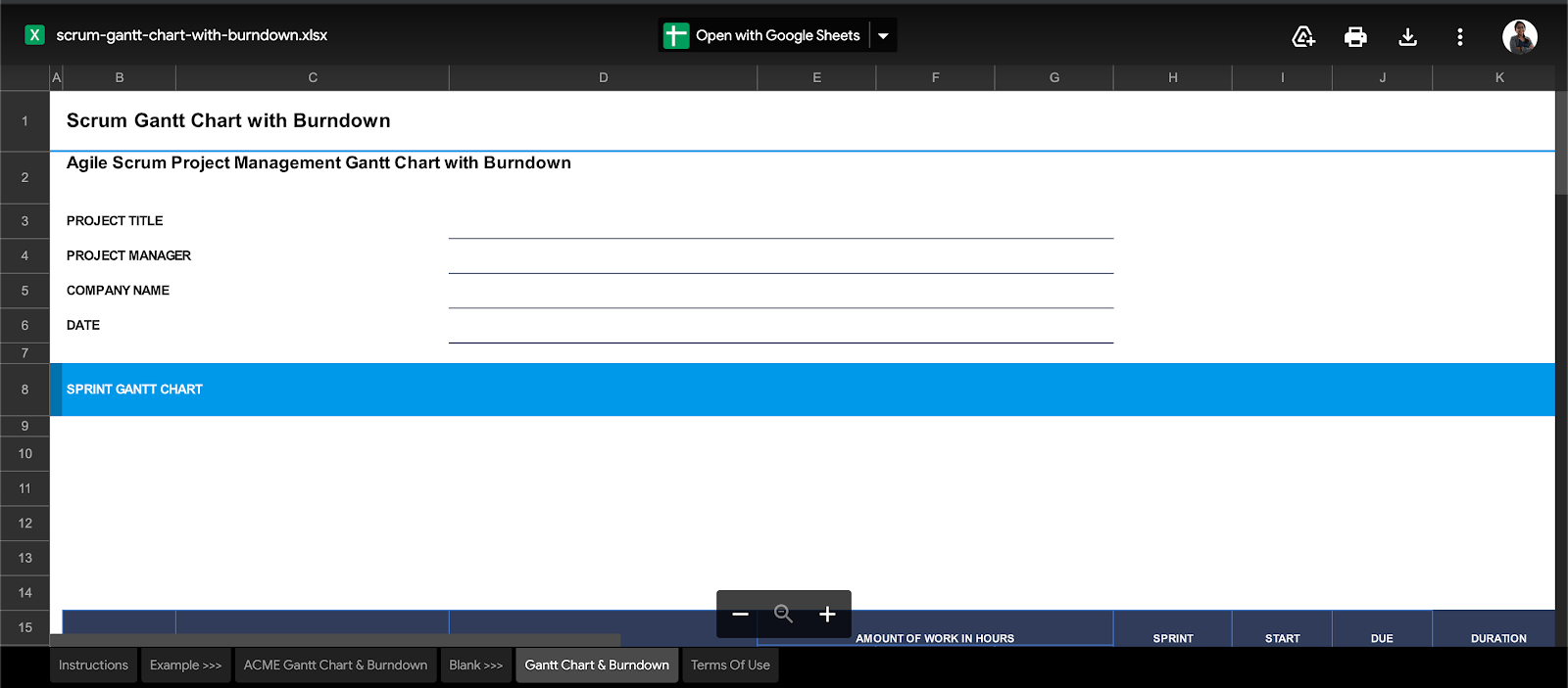
4. Gantt chart + burndown chart template
However, even with templates to save the day, it’s not all smooth sailing with Excel work burndown charts.
The 3 Limitations of Excel for Burndown Charts
When it comes to data management, Excel is a lot of things. It makes data simple, reliable, readily available. But some things about it will make you feel like Cinderella’s stepsisters, trying on those glass slippers.
Because Excel will never be enough for all your burndown chart needs.
Take a look at its glaring flaws.
1. Tedious, manual process
The point of a burndown chart is to give you quick, visual feedback about the sprint’s progress.
But working on Excel defeats this purpose.
Think about it.
Each sprint or project is different.
What’re you going to do?
Build a different table for each of them?
Pfff, please. That’s way too much effort.
Even if you decide to work with templates, how will you present these charts?
Last we checked, if you’re a Scrum master, presenting an MS Excel or Google spreadsheet at your daily scrum isn’t really the best idea.
This means you’ll need to migrate the charts and tables to your company’s intranet or wherever else you’re presenting!
2. Non-collaborative
If working in an Agile Scrum team is like sharing a large, family-sized pizza, MS Excel is like a lonely slice. 🍕
It’s awesome, as long as it’s only a party of one. 👀
Excel does provide basic support for collaborative editing.
It’s simply not smooth enough for an entire Agile team.
3. Inadequate mobile support
Mobile-friendliness is one of the top 10 things to watch out for in any software.
But looking at your Excel burndown chart on your phone is going to be like trying to fit the world map on your palm!
This is just the tip of the iceberg for why Excel is inadequate for most teams. Check out what makes Excel really unfit for project management.
Essentially, Excel is like a set of training wheels for your bicycle.
Everyone needs them. But they also eventually outgrow them.
And that’s the point!
You learn the basics of data management on MS Excel.
But as you move up the project management ladder, it’s time to move on to more significant, better, more powerful tools.
Like ClickUp, the world’s highest-rated productivity tool.
Create Effortless Burndown Charts with ClickUp
ClickUp is your one-stop-shop for every single project management need.
From setting Goals to tracking time on projects, ClickUp has you covered.
As for burndown charts, they’re well within our wheelhouse too!
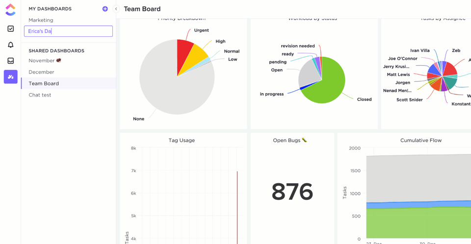
ClickUp Dashboards give you real-time updates about your project’s health at one glance.
And you can populate your Dashboard with Sprint Widgets like burndown charts!
To set one up, first enable the Sprints ClickApp that lets you set and measure sprints on your project.
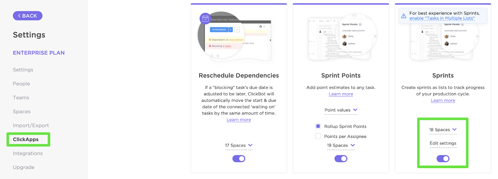
You can customize your Sprint Widgets by:
- Selecting the source of data
- Setting the time range
- Setting the workload type
Now that your data is in place, here’s how you can add a Burndown chart (or any other Sprint Widget) to your Dashboard:
- Enable Dashboards ClickApp (if you don’t find them by default)
- Click on the ‘+’ sign in the sidebar to add a new Dashboard
- On the Dashboard, click on ‘+ Add Widget’
And just like that, you’ll have the Burndown chart that’ll update you on project progress in real-time. Pretty nifty, right?
But notice how we said Sprint Widgets.
Yes, there are more!
These are some other handy Agile Widgets you can add to your Dashboard:
- Burnup chart: measure the scope of completed against the total work
- Velocity chart: calculate the amount of work your team can handle in a sprint
- Cumulative flow diagram chart: identify potential bottlenecks in the sprint’s progress
- Lead time chart: measure the time taken to complete a project (or a portion of it) from start to finish
- Cycle time chart: calculate the time taken to complete a single task from start to finish
And that isn’t all!
ClickUp is full of more project-friendly features such as:
- Gantt charts: take a look at everything in your project’s timeline at one glance
- Time Tracking: keep a record of time spent per task
- Assigned Comments: assign tasks to team members by tagging them in comments
- Goals: split your sprint Goals into easy-to-achieve Targets
- Automation: choose from over 50+ automations to save time
- Multiple Views: customize your home page by selecting from List, Board, Box, Calendar, or Table views
- Docs: created a detailed knowledge base for your agile and scrum projects
- Powerful iOS and Android mobile apps: for on the go work collaboration
Related Resources:
- How to Create a Timesheet in Excel
- How to Create a To Do List in Excel
- How to Create a Mind Map in Excel
- How to Make a Schedule in Excel
- How to Create a Form in Excel
- How to Make a Dashboard in Excel
- How to Make an Org Chart in Excel
- How to Make a Graph in Excel
- How to Create a Database in Excel
Burn Your Project Tracking Problems Away 🔥
Microsoft Excel laid down the foundation for advanced data management as we know it.
But let’s face it. Your project isn’t a history project.
And creating burndown charts on an Excel spreadsheet is going to keep you stuck in the dark ages of project management.
To run a high-power, fast-paced, Agile project, you’ll need equally nimble software.
Excel can still play a supporting role. But for your showstopper, you need ClickUp.
Set up your sprints, track their progress, manage your teams, all in one place with ClickUp’s features.
So get ClickUp for free today and burn past all your project problems!
Содержание
- Начиная
- Шаг №1: Подготовьте набор данных.
- Шаг № 2: Создайте линейный график.
- Шаг № 3: Измените метки горизонтальной оси.
- Шаг №4: Измените тип диаграммы по умолчанию для серий «Планируемые часы» и «Фактические часы» и переместите их на вторичную ось.
- Шаг № 5: Измените масштаб вторичной оси.
- Шаг № 6: Добавьте последние штрихи.
В этом руководстве будет показано, как создать диаграмму сгорания во всех версиях Excel: 2007, 2010, 2013, 2016 и 2022.
Как хлеб с маслом любого менеджера проекта, отвечающего за группы гибкой разработки программного обеспечения, диаграммы выгорания обычно используются для иллюстрации оставшихся усилий по проекту за определенный период времени.
Однако эта диаграмма не поддерживается в Excel, а это означает, что вам придется перепрыгивать через всевозможные препятствия, чтобы построить ее самостоятельно. Если это звучит устрашающе, попробуйте надстройку Chart Creator, мощный и удобный для новичков инструмент для создания расширенных диаграмм в Excel, едва отрывая палец.
В этом пошаговом руководстве вы узнаете, как создать эту поразительную диаграмму выгорания в Excel с нуля:

Итак, приступим.
Начиная
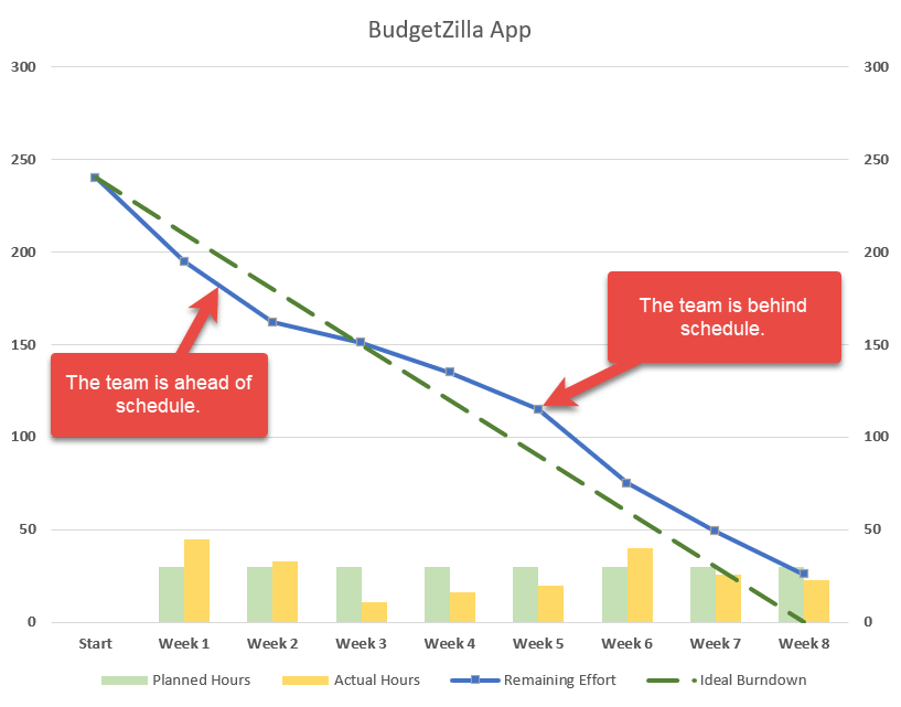
В целях иллюстрации предположим, что ваша небольшая ИТ-компания разрабатывает новое приложение для составления бюджета около шести месяцев. Прежде чем перейти к первому важному этапу, чтобы продемонстрировать клиенту прогресс, у вашей команды было восемь недель на развертывание четырех основных функций. Как опытный менеджер проекта, вы оценили, что на выполнение работы потребуется 240 часов.
Но о чудо, это не сработало. Команда не уложилась в срок. Что ж, в конце концов, жизнь — это не фильм Диснея! Что пошло не так? Пытаясь разобраться в проблеме и выяснить, в какой момент что-то пошло не так, вы решили построить диаграмму сгорания.
Шаг №1: Подготовьте набор данных.
Взгляните на набор данных для диаграммы:

Краткий обзор каждого элемента:
- Исходные данные: Все говорит само за себя — это фактические данные, накопленные за восемь недель.
- Входные данные диаграммы: Эта таблица составит основу диаграммы. Две таблицы должны быть разделены, чтобы получить больший контроль над значениями горизонтальных меток данных (подробнее об этом позже).
Теперь давайте рассмотрим вторую таблицу более подробно, чтобы вы могли легко настроить диаграмму выгорания.
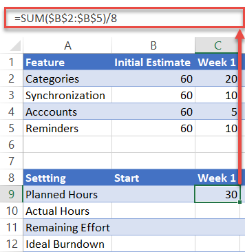
Планируемые часы: Это количество часов в неделю, выделенных на проект. Чтобы вычислить значения, сложите начальную оценку для каждой задачи и разделите эту сумму на количество дней / недель / месяцев. В нашем случае вам нужно ввести следующую формулу в ячейку C9: = СУММ (2 млрд долларов США: 5 млрд долларов США) / 8.
Совет: перетащите маркер заполнения в нижний правый угол выделенной ячейки (C9) по всему диапазону D9: J9 чтобы скопировать формулу в оставшиеся ячейки.

Фактические часы: Эта точка данных показывает общее время, потраченное на проект за определенную неделю. В нашем случае скопируйте = СУММ (C2: C5) в камеру C10 и перетащите формулу через диапазон D10: J10.

Оставшееся усилие: В этой строке отображается количество часов, оставшихся до завершения проекта.
- Для значения в столбце Начало (B11), просто просуммируйте общее расчетное количество часов по следующей формуле: = СУММ (B2: B5).
- Что касается прочего (C11: J11), скопируйте = B11-C10 в камеру C11 и перетащите формулу через остальные ячейки (D11: J11).

Идеальное выгорание: Эта категория представляет собой идеальную тенденцию того, сколько часов вам нужно уделять проекту каждую неделю, чтобы уложиться в срок.
- Для значения в столбце Начало (B12), используйте ту же формулу, что и B11: = СУММ (B2: B5).
- Что касается прочего (C12: J12), скопируйте = B12-C9 в камеру C12 и перетащите формулу по оставшимся ячейкам (D12: J12).

Не хватает времени? Загрузите рабочий лист Excel, используемый в этом руководстве, и настройте индивидуальную диаграмму выгорания менее чем за пять минут!
Шаг № 2: Создайте линейный график.
Подготовив набор данных, пора создать линейную диаграмму.
- Выделите все данные из таблицы входных данных диаграммы (A9: J12).
- Перейдите к Вставлять таб.
- Щелкните значок «Вставить линейную диаграмму или диаграмму с областями» значок.
- Выбирать «Линия.”

Шаг № 3: Измените метки горизонтальной оси.
У каждого проекта есть сроки. Добавьте его на диаграмму, изменив метки горизонтальной оси.
- Щелкните правой кнопкой мыши горизонтальную ось (ряд чисел внизу).
- Выбирать «Выбрать данные.”

В появившемся окне под Ярлыки горизонтальной оси (категории), выберите «Редактировать» кнопка.

Теперь выделите заголовок второй таблицы (B8: J8) и нажмите «Ok”Дважды, чтобы закрыть диалоговое окно. Обратите внимание, что, поскольку вы ранее разделили две таблицы, вы полностью контролируете значения и можете изменять их так, как считаете нужным.

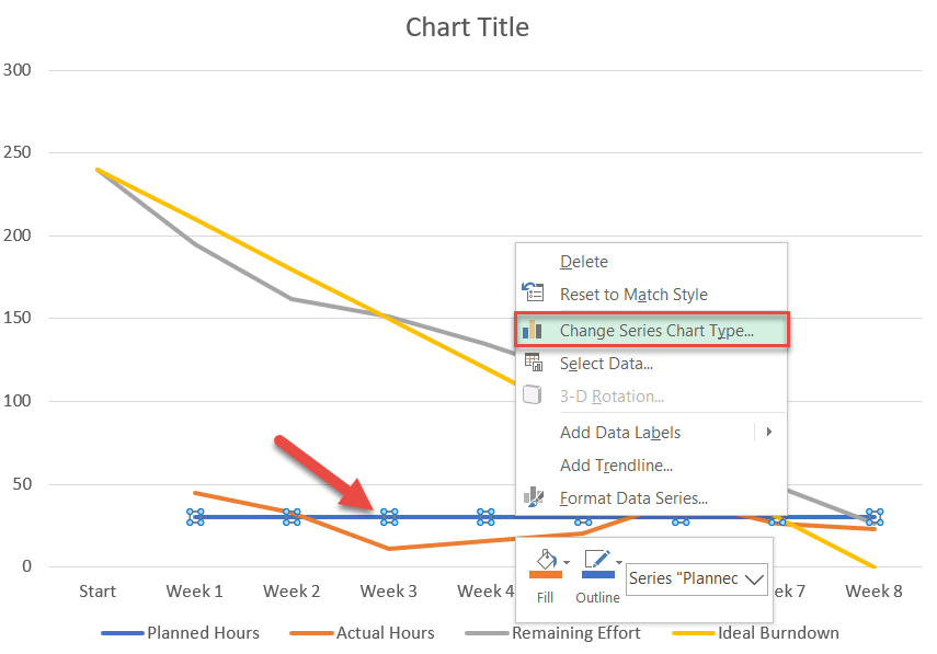
Шаг №4: Измените тип диаграммы по умолчанию для серий «Планируемые часы» и «Фактические часы» и переместите их на вторичную ось.
Преобразуйте ряды данных, представляющие запланированные и фактические часы, в кластерную столбчатую диаграмму.
- На самой диаграмме щелкните правой кнопкой мыши строку для любого Серия «Плановые часы» или Серия «Фактические часы».
- Выбирать «Изменить тип диаграммы серии.”

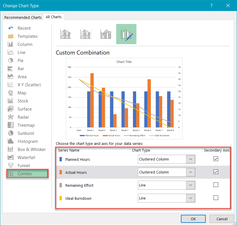
Затем перейдите к Комбо tab и сделайте следующее:
- Для Серия «Планируемые часы», изменение «Тип диаграммы» к «Кластерный столбец. » Также проверьте Вторичная ось коробка.
- Повторите для Серия «Фактические часы».
- Нажмите «OK.”

Шаг № 5: Измените масштаб вторичной оси.
Как вы, возможно, заметили, вместо того, чтобы быть похожей на вишенку на вершине, сгруппированная столбчатая диаграмма занимает половину места, отвлекая все внимание от основной линейной диаграммы. Чтобы обойти проблему, измените масштаб вторичной оси.
Сначала щелкните правой кнопкой мыши дополнительную ось (столбец чисел справа) и выберите «Ось формата.”

Во всплывающей панели задач в Параметры оси вкладка под Границы, установить Максимальные границы значение, соответствующее шкале первичной оси (вертикальный слева от графика).
В нашем случае значение должно быть установлено на 300 (число вверху шкалы первичной оси).

Шаг № 6: Добавьте последние штрихи.
Технически работа сделана, но, поскольку мы отказываемся мириться с посредственностью, давайте «приукрасим» диаграмму, используя то, что предлагает Excel.
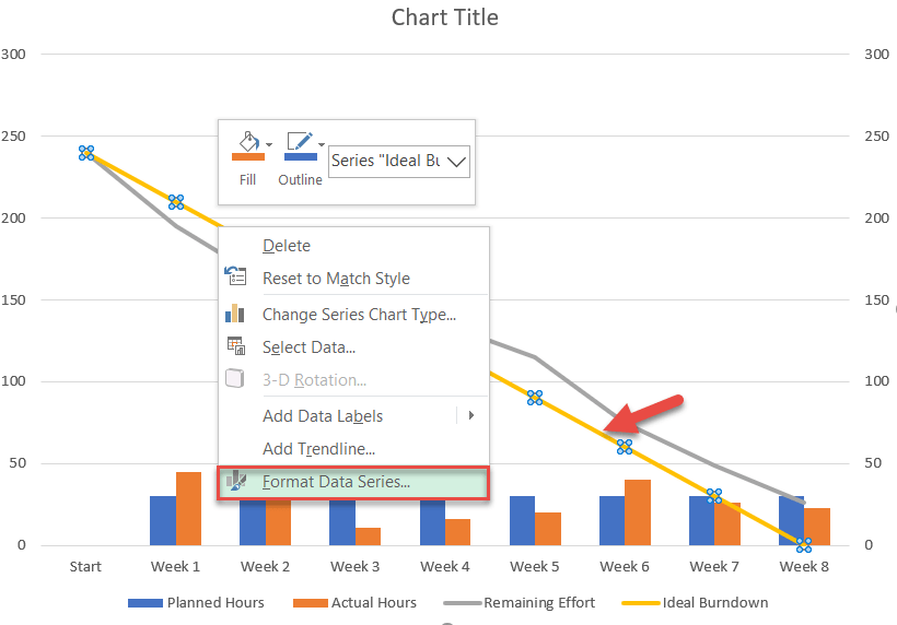
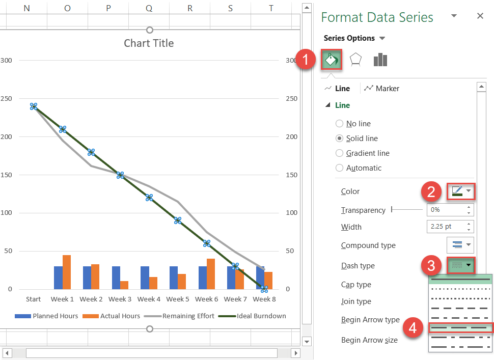
Сначала настройте сплошную линию, представляющую идеальный тренд. Щелкните его правой кнопкой мыши и выберите «Форматировать ряд данных.”

Оказавшись там, сделайте следующее:
- В появившейся панели задач переключитесь на Заливка и линиятаб.
- Щелкните значок Цвет линии значок и выберите темно-зеленый.
- Щелкните значок Тип тире значок.
- Выбирать «Длинный рывок.”

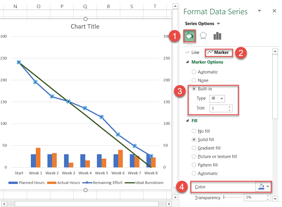
Теперь перейдите к строке, отображающей оставшееся усилие. Выбирать Серия «Остальные усилия» и щелкните правой кнопкой мыши, чтобы открыть «Форматировать ряд данных»Область задач. Затем сделайте следующее:
- Переключитесь на Заливка и линия таб.
- Щелкните значок Цвет линии значок и выберите синий.
- Перейти к Маркер таб.
- Под Параметры маркера, выбирать «Встроенный”И настройте тип и размер маркера.
- Перейдите к «Наполнять»Непосредственно под ним, чтобы назначить пользовательский цвет маркера.

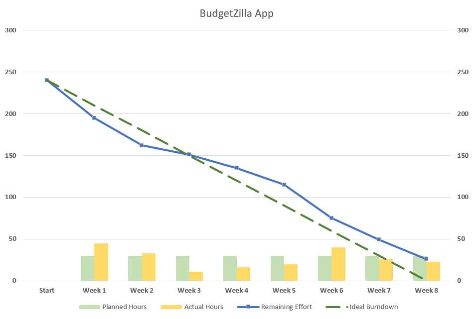
Я также изменил цвета столбцов в сгруппированной столбчатой диаграмме на что-то более светлое, чтобы выделить линейную диаграмму.
В качестве окончательной настройки измените заголовок диаграммы. Вы пересекли финишную черту!

И вуаля, вы только что добавили в свой колчан еще одну стрелу. Графики Burndown помогут вам легко увидеть проблемы, возникающие издалека, и принимать более обоснованные решения при управлении проектами.
This tutorial will demonstrate how to create a burndown chart in all versions of Excel: 2007, 2010, 2013, 2016, and 2019.
Burndown Chart – Free Template Download
Download our free Burndown Chart Template for Excel.
Download Now
In this Article
- Burndown Chart – Free Template Download
- Getting started
- Step #1: Prepare your dataset.
- Step #2: Create a line chart.
- Step #3: Change the horizontal axis labels.
- Step #4: Change the default chart type for Series “Planned Hours” and “Actual Hours” and push them to the secondary axis.
- Step #5: Modify the secondary axis scale.
- Step #6: Add the final touches.
- Download Burndown Chart Template
As the bread and butter of any project manager in charge of agile software development teams, burndown charts are commonly used to illustrate the remaining effort on a project for a given period of time.
However, this chart is not supported in Excel, meaning you will have to jump through all sorts of hoops to build it yourself. If that sounds daunting, check out the Chart Creator Add-in, a powerful, newbie-friendly tool for creating advanced charts in Excel while barely lifting your finger.
In this step-by-step tutorial, you will learn how to create this astounding burndown chart in Excel from scratch:
So, let’s get started.
Getting started
For illustration purposes, suppose your small IT firm has been developing a brand new budgeting app for about six months. Before hitting the first major milestone to show the progress to the client, your team had eight weeks to roll out four core features. As a seasoned project manager, you estimated it would take 240 hours to get the work done.
But lo and behold, that didn’t work out. The team failed to meet the deadline. Well, life is not a Disney movie, after all! What went wrong? In an effort to get to the bottom of the problem to figure out at what point things went off the rails, you set out to build a burndown chart.
Step #1: Prepare your dataset.
Take a quick look at the dataset for the chart:
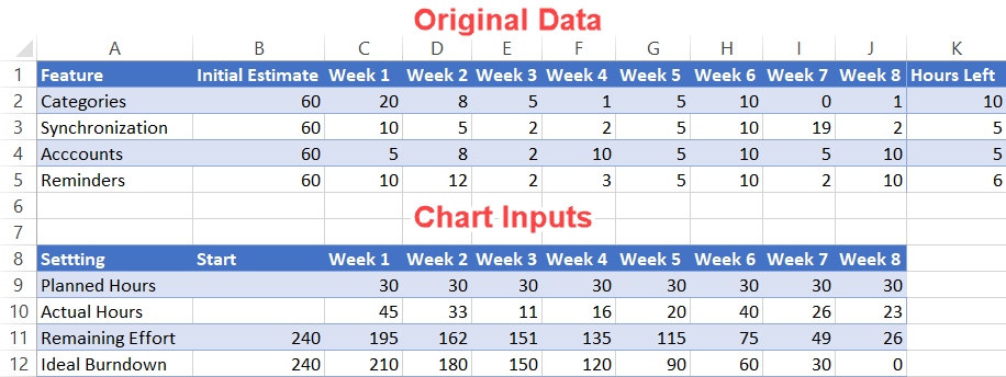
A quick take on each element:
- Original Data: Pretty self-explanatory—this is the actual data accumulated over the eight weeks.
- Chart Inputs: This table will make up the backbone of the chart. The two tables have to be kept separated to gain more control over the horizontal data label values (more on that later).
Now, let’s go over the second table more in detail so that you can easily customize your burndown chart.
Planned Hours: This represents the weekly hours allocated to the project. To calculate the values, add up the initial estimate for each task and divide that sum by the number of days/weeks/months. In our case, you need to enter the following formula into cell C9: =SUM($B$2:$B$5)/8.
Quick tip: drag the fill handle in the bottom right corner of the highlighted cell (C9) across the range D9:J9 to copy the formula into the remaining cells.
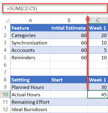
Actual Hours: This data point illustrates the total time spent on the project for a particular week. In our case, copy =SUM(C2:C5) into cell C10 and drag the formula across the range D10:J10.
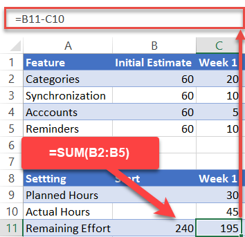
Remaining Effort: This row displays the hours left until project completion.
- For the value in the Start column (B11), just sum up the total estimated hours by using this formula: =SUM(B2:B5).
- For the rest (C11:J11), copy =B11-C10 into cell C11 and drag the formula across the rest of the cells (D11:J11).
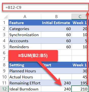
Ideal Burndown: This category represents the ideal trend of how many hours you need to pour into your project each week to meet your deadline.
- For the value in the Start column (B12), use the same formula as B11: =SUM(B2:B5).
- For the rest (C12:J12), copy =B12-C9 into cell C12 and drag the formula across the remaining cells (D12:J12).
Short on time? Download the Excel worksheet used in this tutorial and set up a customized burndown chart in less than five minutes!
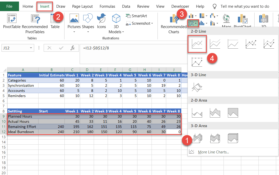
Step #2: Create a line chart.
Having prepared your set of data, it’s time to create a line chart.
- Highlight all the data from the Chart Inputs table (A9:J12).
- Navigate to the Insert tab.
- Click the “Insert Line or Area Chart” icon.
- Choose “Line.”
Step #3: Change the horizontal axis labels.
Every project has a timeline. Add it to the chart by modifying the horizontal axis labels.
- Right-click on the horizontal axis (the row of numbers along the bottom).
- Choose “Select Data.”
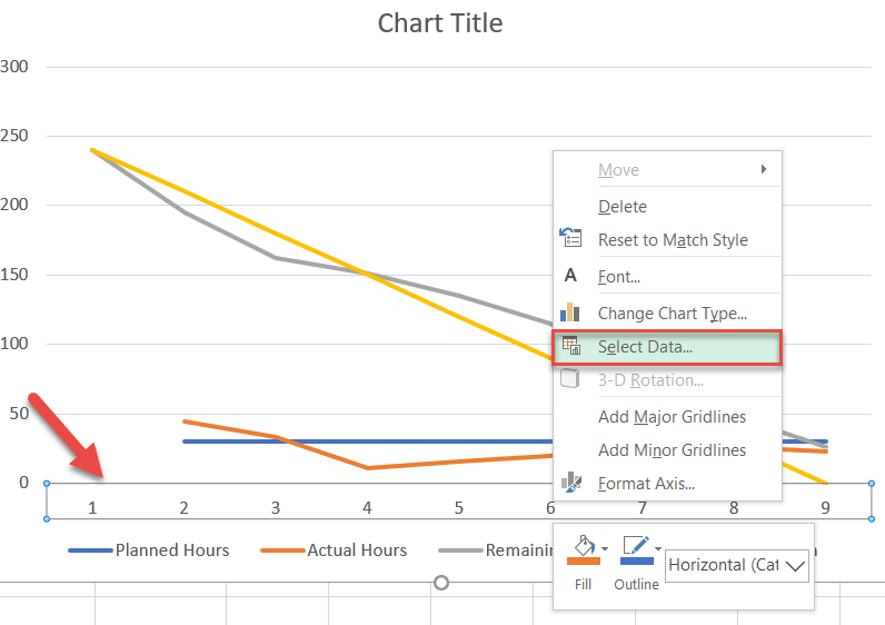
In the window that appears, under Horizontal (Category) Axis Labels, select the “Edit” button.
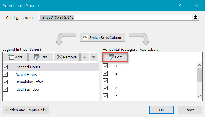
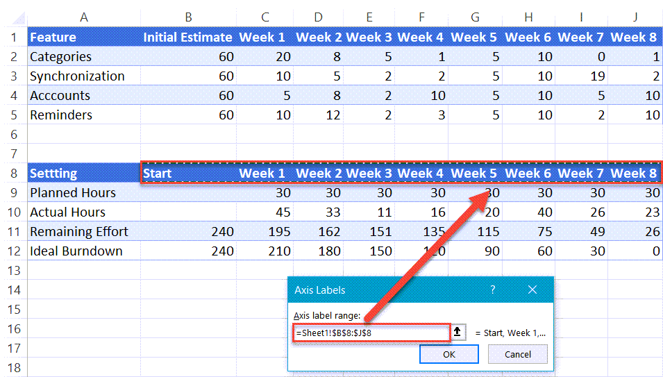
Now, highlight the header of the second table (B8:J8) and click “OK” twice to close the dialog box. Notice that because you have previously separated the two tables, you have complete control over the values and can change them the way you see fit.
Step #4: Change the default chart type for Series “Planned Hours” and “Actual Hours” and push them to the secondary axis.
Transform the data series representing the planned and actual hours into a clustered column chart.
- On the chart itself, right-click the line for either Series “Planned Hours” or Series “Actual Hours.”
- Choose “Change Series Chart Type.”
Next, navigate to the Combo tab and do the following:
- For Series “Planned Hours,” change “Chart Type” to “Clustered Column.” Also, check the Secondary Axis box.
- Repeat for Series “Actual Hours.”
- Click “OK.”
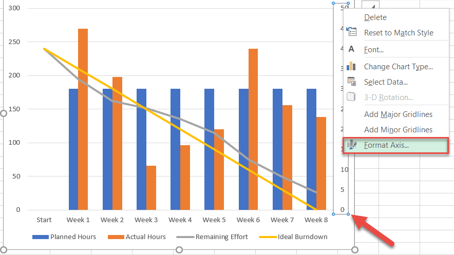
Step #5: Modify the secondary axis scale.
As you may have noticed, instead of being more like a cherry on top, the clustered column chart takes up half the space, stealing all the attention from the primary line chart. To work around the issue, alter the secondary axis scale.
First, right-click on the secondary axis (the column of numbers on the right) and select “Format Axis.”
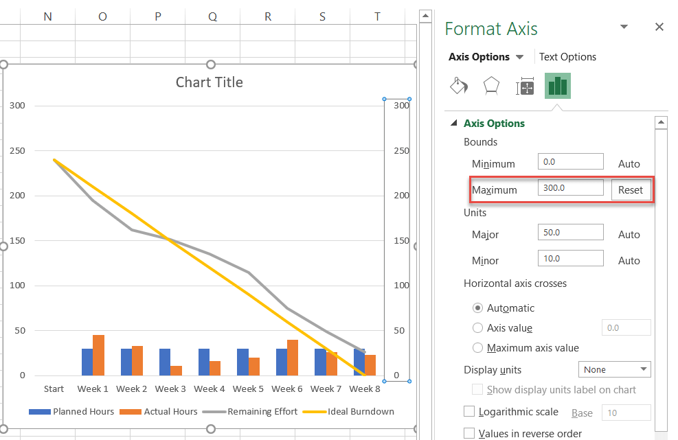
In the task pane that pops up, in the Axis Options tab, under Bounds, set the Maximum Bounds value to match that of the primary axis scale (the vertical one to the left of the chart).
In our case, the value should be set to 300 (the number at the top of the primary axis scale).
Step #6: Add the final touches.
Technically, the job is done, but since we refuse to settle for mediocrity, let’s “dress up” the chart by making use of what Excel has to offer.
First, customize the solid line representing the ideal trend. Right-click on it and select “Format Data Series.”
Once there, do the following:
- In the task pane that appears, switch to the Fill & Line tab.
- Click the Line Color icon and select dark green.
- Click the Dash Type icon.
- Choose “Long Dash.”
Now, move on to the line displaying the remaining effort. Select Series “Remaining Effort” and right-click to open the “Format Data Series” task pane. Then do the following:
- Switch to the Fill & Line tab.
- Click the Line Color icon and select blue.
- Go to the Marker tab.
- Under Marker Options, choose “Built-in” and customize the marker type and size.
- Navigate to the “Fill” section immediately below it to assign a custom marker color.
I also changed the column colors in the clustered column chart to something lighter as a means to accentuate the line chart.
As a final adjustment, change the chart title. You have now crossed the finish line!
And voila, you have just added another arrow to your quiver. Burndown charts will help you easily see trouble coming from a long way off and make better decisions as you manage your projects.
Download Burndown Chart Template
Download our free Burndown Chart Template for Excel.
Download Now
What’s an Excel Burndown Chart For?
In agile or iterative development methodologies such as Scrum an Excel burndown chart is an excellent way to illustrate the progress (or lack of) towards completing all of the tasks or backlog items that are in scope for the current iteration or sprint.
Excel can be an effective tool to track these iterations, or sprints, as well as report on the progress using a burndown chart in Excel.
We’ll break the task of creating an Excel burndown chart into four main groups.
- Set up the sprint’s information.
- Set up the work backlog.
- Set up the burn down table.
- Create the chart.
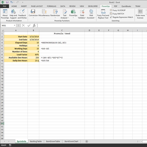
Setting up the Sprint Information for Your Excel Burndown Chart
The key thing the Burn Down chart will show is a plot of the amount of planned work against the amount of remaining work. To figure out the amount of work that can be done in a sprint, in its simplest form, is calculate the total number of developer or person-hours collectively available.
In this tutorial, I set up as below. You can elect to simplify of course.
First, you can get the number of calendar working days between a start and end date. The NETWORKDAYS function in Excel is handy for this. Additionally, you can allow for holidays or other special days and subtract from the calendar working days. This will give you the number of working days for this sprint. In this example, I named the working days cell WorkingDays to make some formulas later easier to read/follow.
Next, the number of developers is provided along with the load factor. In this example I used 80% as an indication of the level of productivity or utilization for development tasks. Remember, things like meetings, training, bio-breaks, vacation, illness, etc all come out of the 100%. Coming up with a factor this best represents your team will help in the overall estimation and capacity determination.
With the information described above you can calculate the total number of developer hours. You can use days too, depending on the level of granularity you need. Eight working hours/day is assumed in this example.
WorkingDays * LoadFactor * NumberOfDevs * 8
The number of developer hours available on a given day is as follows.
TotalDeveloperHours / ElapsedDays
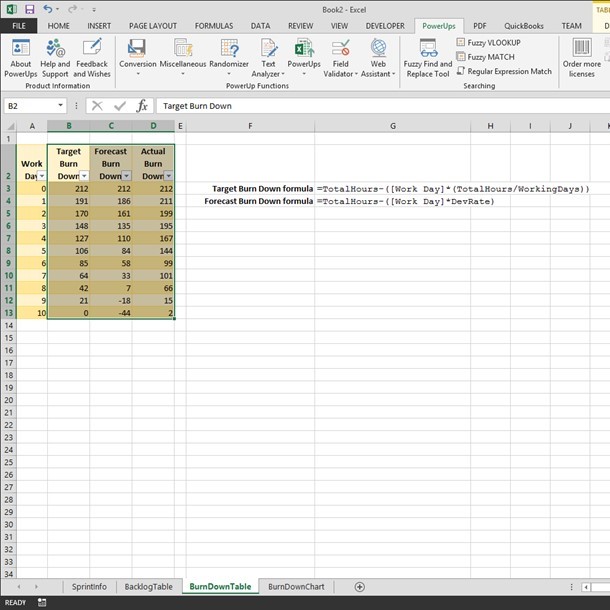
You can see this set up in the sample workbook image below. The formulas used are placed next to the cells.
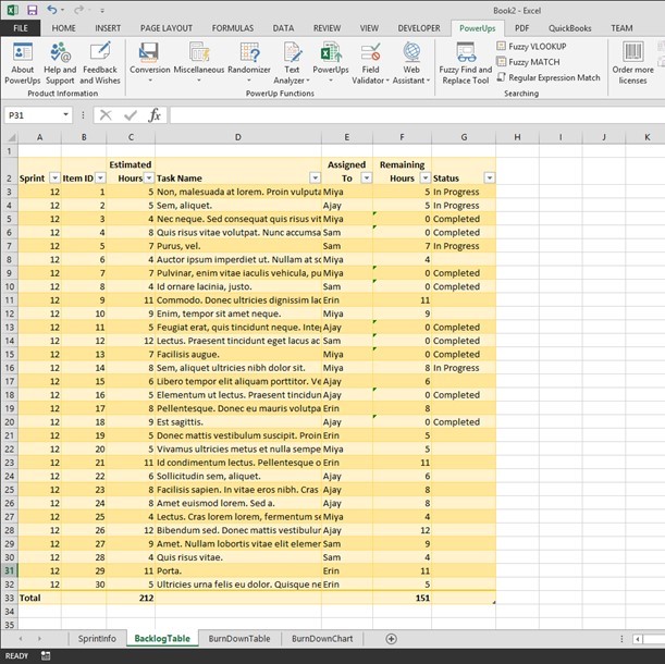
Setting up the Sprint Backlog Table for an Excel Burndown Chart
A sprint, or iteration, is bound by a set amount of time (usually in weeks) and a set of work items to be completed. Items queued up on the work list are called the sprint backlog.
The sprint backlog table needs to have three key columns. They are the work item ID, the amount of time estimated to complete the item, and the amount of time remaining to complete the item. Initially, the amount of time remaining is equal to the initially estimated amount of time.
You can add additional columns to suit your needs. For example, you may want to add columns to identify the sprint number, the name of the task, the person the task is assigned to, and the status of the item. I’ve added these columns for this example too.
At the bottom of the table you will have two number of interest. The first will be the total amount of time estimated for this iteration or sprint. I named this cell TotalHours in Excel. The second will be total number of remaining hours. As mentioned above, these two numbers are the same at the start of the sprint.
The image below shows the sample sprint backlog table I used in this tutorial.
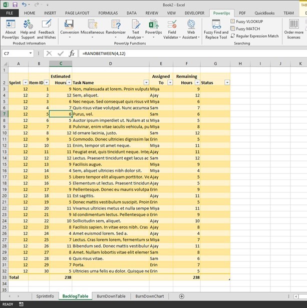
As you work on the items in your sprint, you will update the values for the remaining amount of time (Remaining Hours in this example). When an item is completed, set it’s remaining amount of time to zero. I also chose to indicate a status of “In Progress” in addition to “Completed”. The image below illustrates this.
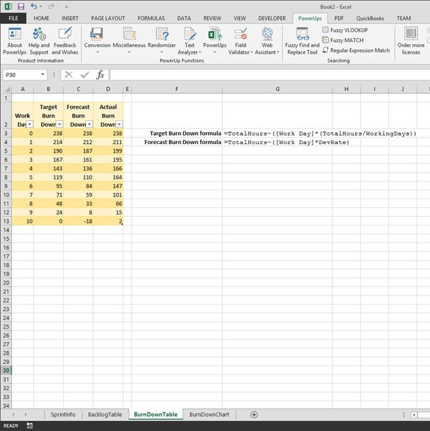
Setting up the Burndown Table for Your Excel Burndown Chart
So far, you have set up to determine the amount of work needed as well as how much work is left to perform. Since an Excel burndown chart needs to show how your team is tracking to completion over time, you’ll set up another table to figure out the ideal rate of completion to compare to the actual rate of completion.
In this table, the first column will list the days in the sprint. Create one row per day.
Next, create a column to represent the ideal progress towards completion. I called the column Target Burn Down. In this column, the formula used is the following.
=TotalHours - ([Work Day]*(TotalHours/WorkingDays))Add another column for the actual progress. I called the column Actual Burn Down. In this column, you will enter the number of actual remaining hours from the sprint backlog table each day. You would do this after polling your team on their progress to date and updating the sprint backlog table data.
In this tutorial example, I also added another column called Forecast Burn Down. I set this up to represent the projected progress based on the number of available developer hours. This would give an idea as to whether the amount of work in the sprint was too much or not enough. The formula is as follows.
=TotalHours - ([Work Day] * DevRate)This table is pictured below.
Creating the Excel Burndown Chart
At this point you’ve the setup work. The actual Excel burndown chart is simply a line chart. Select the columns that track the burndown. In this example we’ll use the Target, Forecast, and Actual Burn Down columns.
Select a line chart type from the Insert tab on the ribbon. I used the 2D line with markers chart type.
In the chart, select the numbers across the x-axis and change the label range to the numbers in the Work Day column. In this example, I just used the numbers from 0 thru 10 for each day. You could the rows Day 1, Day 2, etc.
I changed a couple colors and the Excel burndown chart produced is below.
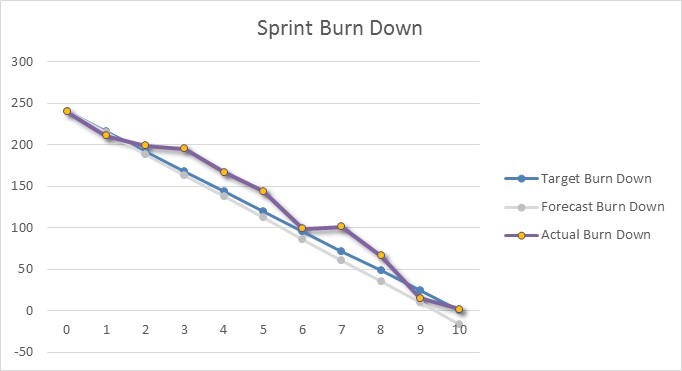
Reading the Excel Burndown Chart
In the Excel burndown chart picture above, any point above the blue line (Target Burn Down) indicates work is not tracking to on-time completion. Conversely, any point below the blue line indicates work is tracking to early completion.
The light gray line in this example shows the amount of work included in the sprint is slightly less than the estimated team capacity.
An Excel burndown chart can be an effective way to illustrate the progress a team is making towards completing all of their items on time and can give the team some easy to see information needed to better manage the sprint to help ensure successful completion.
Get a Jump Start with an Excel Burndown Chart Template
You can get an Excel template for a burndown chart here.
There you go.
Диаграмма выгорания и диаграмма выгорания обычно используются для отслеживания прогресса в направлении завершения проекта. Теперь я расскажу вам, как создать диаграмму выгорания или выгорания в Excel.
Создать диаграмму выгорания
Создать диаграмму выгорания
Содержание
- Создать диаграмму выгорания
- Создать диаграмму выгорания
- Расширенный инструмент диаграмм
- Относительные статьи:
 Создать диаграмму выгорания
 Создать диаграмму выгорания
 Например, есть базовые данные, необходимые для создания диаграммы выгорания, как показано на скриншоте ниже:

Теперь вам нужно добавить новые данные под базовыми данными.
1. Под базовыми данными выберите пустую ячейку, здесь я выбираю ячейку A10, набираю в нее « Оставшееся рабочее время », а в ячейке A11 набираю « Фактический оставшийся труд. часов », см. снимок экрана:

2. Рядом с A10 (тип ячейки «Оставшееся количество рабочих часов») введите эту формулу = SUM (C2: C9) в ячейку C10, затем нажмите Enter , чтобы получить общее количество рабочих часов.
Совет . В формуле C2: C9 – это диапазон ячеек рабочего времени для всех ваших задач.
3. В ячейке D10 рядом с общим количеством рабочих часов введите эту формулу = C10 – ($ C $ 10/5) , затем перетащите дескриптор автозаполнения, чтобы заполнить нужный диапазон. См. Снимок экрана: 
Совет . В формуле C10 – оставшееся рабочее время сделки, $ C $ 10 – общее рабочее время, 5 – количество рабочих дней.
4. Теперь перейдите в ячейку C11 (которая находится рядом с типом ячейки «Фактическое оставшееся рабочее время») и введите в нее общее количество рабочих часов, здесь 35. См. Снимок экрана: 
5. Введите эту формулу = SUM (D2: D9) в D11, а затем перетащите дескриптор заполнения в нужный диапазон.

Теперь вы можете создать диаграмму выгорания.
6. Нажмите Вставить > Line > Line .

7. Щелкните правой кнопкой мыши пустую линейную диаграмму и в контекстном меню выберите Выбрать данные .

8. В диалоговом окне Выбрать источник данных нажмите кнопку Добавить , чтобы открыть диалоговое окно Редактировать серию , и выберите « Оставшееся количество рабочих часов »в качестве первой серии.
В нашем случае мы указываем ячейку A10 в качестве имени серии и указываем C10: H10 в качестве значений серии.


9. Нажмите OK , чтобы вернуться в диалоговое окно Выбор источника данных , затем снова нажмите кнопку Добавить , затем добавьте « Фактическое оставшееся рабочее время »в качестве второй серии в диалоговом окне Редактировать серию . См. Снимок экрана:
В нашем случае мы указываем A11 в качестве имени серии и указываем C11: H11 в качестве значений серии.


10. Нажмите OK , снова вернитесь в диалоговое окно Выбрать источник данных , нажмите кнопку Edit в Горизонтально (Категория) Ярлыки осей , затем выберите Диапазон C1: H1 (ярлыки итогов и дат) в поле Диапазон ярлыков осей в Ярлыки осей . См. Скриншоты:


11. Нажмите OK > OK . Теперь вы видите, что диаграмма выгорания создана.

Вы можете нажать затем перейдите на вкладку Макет и нажмите Легенда > Показать легенду внизу , чтобы отобразить диаграмму выгорания более профессионально. .

В Excel 2013 нажмите Дизайн > Добавить элемент диаграммы > Legend > Bottom .
Создать диаграмму выгорания
Чтобы создать диаграмму выгорания намного проще, чем создать диаграмму выгорания в Excel.
Вы можете создать свои базовые данные, как показано на скриншоте ниже:

1. Нажмите Вставить > Line > Line , чтобы вставить пустую линейную диаграмму.

2. Затем щелкните правой кнопкой мыши пустую линейную диаграмму и в контекстном меню выберите Выбрать данные .

3. Нажмите кнопку Добавить в диалоговом окне Выбрать источник данных , затем добавьте имя и значения серии в диалоговое окно Редактировать серию и нажмите OK , чтобы вернуться в диалоговое окно Выбор источника данных , и снова нажмите Добавить , чтобы добавить вторую серию.

В нашем случае для первой серии мы выбираем ячейку B1 (заголовок столбца Предполагаемая единица проекта) в качестве имени серии и укажите диапазон B2: B19 в качестве значений серии. Измените ячейку или диапазон в соответствии с вашими потребностями. См. Снимок экрана выше.

В нашем случае для второй серии мы выбираем ячейку C1 в качестве имени серии и указываем диапазон C2: C19 в качестве значений серии. Измените ячейку или диапазон в соответствии с вашими потребностями. . См. Снимок экрана выше.

4. Нажмите ОК , теперь перейдите в раздел Ярлыки горизонтальной (категории) оси в диалоговом окне Выбор источника данных и нажмите Изменить , затем выберите значение данных в диалоговом окне Ярлыки осей . И нажмите OK . Теперь ярлыки осей заменены на ярлыки дат. В нашем случае , мы указываем диапазон A2: A19 (столбец даты) как метки горизонтальной оси.


5. Нажмите OK . Теперь диаграмма выгорания завершена.

И вы c и поместите легенду внизу, щелкнув вкладку «Макет» и нажав Легенда > Показать легенду внизу .

В Excel 2013 нажмите Дизайн > Добавить элемент диаграммы > Легенда> Внизу .
Расширенный инструмент диаграмм
|
| Инструмент диаграмм в Kutools for Excel предоставляет некоторые обычно используемые, но сложное создание диаграмм, для которых нужно только щелкнуть щелчком мыши, создана стандартная диаграмма. Все больше и больше диаграмм будет включаться в Инструмент диаграмм. Нажмите, чтобы получить полнофункциональную 30-дневную бесплатную пробную версию! |
 |
| Kutools for Excel: с более чем 300 удобными надстройками Excel, попробуйте бесплатно без ограничений в течение 30 дней. |
Относительные статьи:
- Создание блок-схемы в Excel
- Создать контрольную диаграмму в Excel
- Создать диаграмму эмоций в Excel
- Создать диаграмму вех в Excel