
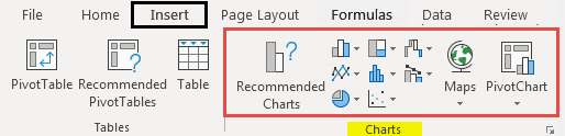
When you create a chart in an Excel worksheet, a Word document, or a PowerPoint presentation, you have a lot of options. Whether you’ll use a chart that’s recommended for your data, one that you’ll pick from the list of all charts, or one from our selection of chart templates, it might help to know a little more about each type of chart.
Click here to start creating a chart.
For a description of each chart type, select an option from the following drop-down list.
Data that’s arranged in columns or rows on a worksheet can be plotted in a column chart. A column chart typically displays categories along the horizontal (category) axis and values along the vertical (value) axis, as shown in this chart:

Types of column charts
-
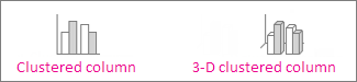
Clustered column and 3-D clustered column

A clustered column chart shows values in 2-D columns. A 3-D clustered column chart shows columns in 3-D format, but it doesn’t use a third value axis (depth axis). Use this chart when you have categories that represent:
-
Ranges of values (for example, item counts).
-
Specific scale arrangements (for example, a Likert scale with entries like Strongly agree, Agree, Neutral, Disagree, Strongly disagree).
-
Names that are not in any specific order (for example, item names, geographic names, or the names of people).
-
-
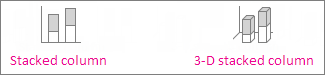
Stacked column and 3-D stacked column A stacked column chart shows values in 2-D stacked columns. A 3-D stacked column chart shows the stacked columns in 3-D format, but it doesn’t use a depth axis. Use this chart when you have multiple data series and you want to emphasize the total.
-
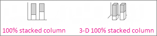
100% stacked column and 3-D 100% stacked column A 100% stacked column chart shows values in 2-D columns that are stacked to represent 100%. A 3-D 100% stacked column chart shows the columns in 3-D format, but it doesn’t use a depth axis. Use this chart when you have two or more data series and you want to emphasize the contributions to the whole, especially if the total is the same for each category.
-
3-D column 3-D column charts use three axes that you can change (a horizontal axis, a vertical axis, and a depth axis), and they compare data points along the horizontal and the depth axes. Use this chart when you want to compare data across both categories and data series.

Data that’s arranged in columns or rows on a worksheet can be plotted in a line chart. In a line chart, category data is distributed evenly along the horizontal axis, and all value data is distributed evenly along the vertical axis. Line charts can show continuous data over time on an evenly scaled axis, so they’re ideal for showing trends in data at equal intervals, like months, quarters, or fiscal years.

Types of line charts
-
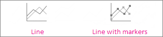
Line and line with markers Shown with or without markers to indicate individual data values, line charts can show trends over time or evenly spaced categories, especially when you have many data points and the order in which they are presented is important. If there are many categories or the values are approximate, use a line chart without markers.
-
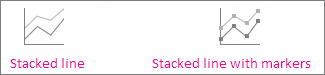
Stacked line and stacked line with markers Shown with or without markers to indicate individual data values, stacked line charts can show the trend of the contribution of each value over time or evenly spaced categories.
-
100% stacked line and 100% stacked line with markers Shown with or without markers to indicate individual data values, 100% stacked line charts can show the trend of the percentage each value contributes over time or evenly spaced categories. If there are many categories or the values are approximate, use a 100% stacked line chart without markers.
-
3-D line 3-D line charts show each row or column of data as a 3-D ribbon. A 3-D line chart has horizontal, vertical, and depth axes that you can change.
Notes:
-
Line charts work best when you have multiple data series in your chart—if you have only one data series, consider using a scatter chart instead.
-
Stacked line charts sum the data, which might not be the result you want. It might not be easy to see that the lines are stacked, so consider using a different line chart type or a stacked area chart instead.
-


Data that’s arranged in one column or row on a worksheet can be plotted in a pie chart. Pie charts show the size of items in one data series, proportional to the sum of the items. The data points in a pie chart are shown as a percentage of the whole pie.

Consider using a pie chart when:
-
You have only one data series.
-
None of the values in your data are negative.
-
Almost none of the values in your data are zero values.
-
You have no more than seven categories, all of which represent parts of the whole pie.
Types of pie charts
-
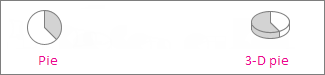
Pie and 3-D pie Pie charts show the contribution of each value to a total in a 2-D or 3-D format. You can pull out slices of a pie chart manually to emphasize the slices.
-
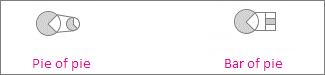
Pie of pie and bar of pie Pie of pie or bar of pie charts show pie charts with smaller values pulled out into a secondary pie or stacked bar chart, which makes them easier to distinguish.
Data that’s arranged in columns or rows only on a worksheet can be plotted in a doughnut chart. Like a pie chart, a doughnut chart shows the relationship of parts to a whole, but it can contain more than one data series.

Types of doughnut charts
-
Doughnut Doughnut charts show data in rings, where each ring represents a data series. If percentages are shown in data labels, each ring will total 100%.
Note: Doughnut charts aren’t easy to read. You may want to use a stacked column charts or Stacked bar chart instead.

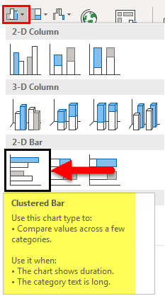
Data that’s arranged in columns or rows on a worksheet can be plotted in a bar chart. Bar charts illustrate comparisons among individual items. In a bar chart, the categories are typically organized along the vertical axis, and the values along the horizontal axis.

Consider using a bar chart when:
-
The axis labels are long.
-
The values that are shown are durations.
Types of bar charts
-
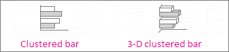
Clustered bar and 3-D clustered bar A clustered bar chart shows bars in 2-D format. A 3-D clustered bar chart shows bars in 3-D format; it doesn’t use a depth axis.
-
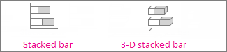
Stacked bar and 3-D stacked bar Stacked bar charts show the relationship of individual items to the whole in 2-D bars. A 3-D stacked bar chart shows bars in 3-D format; it doesn’t use a depth axis.
-
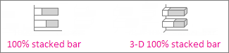
100% stacked bar and 3-D 100% stacked bar A 100% stacked bar shows 2-D bars that compare the percentage that each value contributes to a total across categories. A 3-D 100% stacked bar chart shows bars in 3-D format; it doesn’t use a depth axis.
Data that’s arranged in columns or rows on a worksheet can be plotted in an area chart. Area charts can be used to plot change over time and draw attention to the total value across a trend. By showing the sum of the plotted values, an area chart also shows the relationship of parts to a whole.

Types of area charts
-
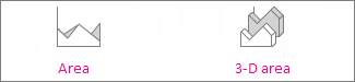
Area and 3-D area Shown in 2-D or in 3-D format, area charts show the trend of values over time or other category data. 3-D area charts use three axes (horizontal, vertical, and depth) that you can change. As a rule, consider using a line chart instead of a non-stacked area chart, because data from one series can be hidden behind data from another series.
-
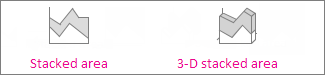
Stacked area and 3-D stacked area Stacked area charts show the trend of the contribution of each value over time or other category data in 2-D format. A 3-D stacked area chart does the same, but it shows areas in 3-D format without using a depth axis.
-
100% stacked area and 3-D 100% stacked area 100% stacked area charts show the trend of the percentage that each value contributes over time or other category data. A 3-D 100% stacked area chart does the same, but it shows areas in 3-D format without using a depth axis.
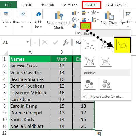
Data that’s arranged in columns and rows on a worksheet can be plotted in an xy (scatter) chart. Place the x values in one row or column, and then enter the corresponding y values in the adjacent rows or columns.
A scatter chart has two value axes: a horizontal (x) and a vertical (y) value axis. It combines x and y values into single data points and shows them in irregular intervals, or clusters. Scatter charts are typically used for showing and comparing numeric values, like scientific, statistical, and engineering data.

Consider using a scatter chart when:
-
You want to change the scale of the horizontal axis.
-
You want to make that axis a logarithmic scale.
-
Values for horizontal axis are not evenly spaced.
-
There are many data points on the horizontal axis.
-
You want to adjust the independent axis scales of a scatter chart to reveal more information about data that includes pairs or grouped sets of values.
-
You want to show similarities between large sets of data instead of differences between data points.
-
You want to compare many data points without regard to time—the more data that you include in a scatter chart, the better the comparisons you can make.
Types of scatter charts
-
Scatter This chart shows data points without connecting lines to compare pairs of values.
-
Scatter with smooth lines and markers and scatter with smooth lines This chart shows a smooth curve that connects the data points. Smooth lines can be shown with or without markers. Use a smooth line without markers if there are many data points.
-
Scatter with straight lines and markers and scatter with straight lines This chart shows straight connecting lines between data points. Straight lines can be shown with or without markers.

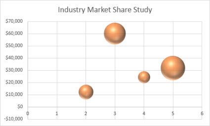
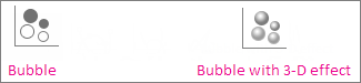
Much like a scatter chart, a bubble chart adds a third column to specify the size of the bubbles it shows to represent the data points in the data series.
Type of bubble charts
-
Bubble or bubble with 3-D effect Both of these bubble charts compare sets of three values instead of two, showing bubbles in 2-D or 3-D format (without using a depth axis). The third value specifies the size of the bubble marker.
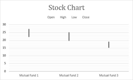
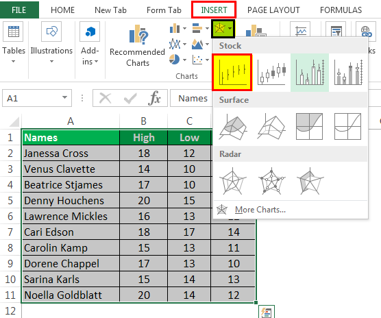
Data that’s arranged in columns or rows in a specific order on a worksheet can be plotted in a stock chart. As the name implies, stock charts can show fluctuations in stock prices. However, this chart can also show fluctuations in other data, like daily rainfall or annual temperatures. Make sure you organize your data in the right order to create a stock chart.
For example, to create a simple high-low-close stock chart, arrange your data with High, Low, and Close entered as column headings, in that order.
Types of stock charts
-
High-low-close This stock chart uses three series of values in the following order: high, low, and then close.
-
Open-high-low-close This stock chart uses four series of values in the following order: open, high, low, and then close.
-
Volume-high-low-close This stock chart uses four series of values in the following order: volume, high, low, and then close. It measures volume by using two value axes: one for the columns that measure volume, and the other for the stock prices.
-
Volume-open-high-low-close This stock chart uses five series of values in the following order: volume, open, high, low, and then close.


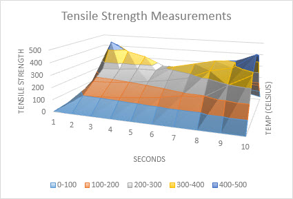
Data that’s arranged in columns or rows on a worksheet can be plotted in a surface chart. This chart is useful when you want to find optimum combinations between two sets of data. As in a topographic map, colors and patterns indicate areas that are in the same range of values. You can create a surface chart when both categories and data series are numeric values.
Types of surface charts
-
3-D surface This chart shows a 3-D view of the data, which can be imagined as a rubber sheet stretched over a 3-D column chart. It is typically used to show relationships between large amounts of data that may otherwise be difficult to see. Color bands in a surface chart do not represent the data series; they indicate the difference between the values.
-
Wireframe 3-D surface Shown without color on the surface, a 3-D surface chart is called a wireframe 3-D surface chart. This chart shows only the lines. A wireframe 3-D surface chart isn’t easy to read, but it can plot large data sets much faster than a 3-D surface chart.
-
Contour Contour charts are surface charts viewed from above, similar to 2-D topographic maps. In a contour chart, color bands represent specific ranges of values. The lines in a contour chart connect interpolated points of equal value.
-
Wireframe contour Wireframe contour charts are also surface charts viewed from above. Without color bands on the surface, a wireframe chart shows only the lines. Wireframe contour charts aren’t easy to read. You may want to use a 3-D surface chart instead.


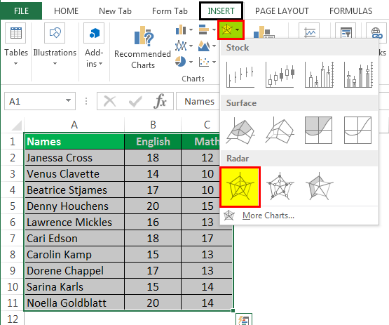
Data that’s arranged in columns or rows on a worksheet can be plotted in a radar chart. Radar charts compare the aggregate values of several data series.

Type of radar charts
-
Radar and radar with markers With or without markers for individual data points, radar charts show changes in values relative to a center point.
-
Filled radar In a filled radar chart, the area covered by a data series is filled with a color.


The treemap chart provides a hierarchical view of your data and an easy way to compare different levels of categorization. The treemap chart displays categories by color and proximity and can easily show lots of data which would be difficult with other chart types. The treemap chart can be plotted when empty (blank) cells exist within the hierarchal structure and treemap charts are good for comparing proportions within the hierarchy.

Note: There are no chart sub-types for treemap charts.
The sunburst chart is ideal for displaying hierarchical data and can be plotted when empty (blank) cells exist within the hierarchal structure . Each level of the hierarchy is represented by one ring or circle with the innermost circle as the top of the hierarchy. A sunburst chart without any hierarchical data (one level of categories), looks similar to a doughnut chart. However, a sunburst chart with multiple levels of categories shows how the outer rings relate to the inner rings. The sunburst chart is most effective at showing how one ring is broken into its contributing pieces.

Note: There are no chart sub-types for sunburst charts.
Data plotted in a histogram chart shows the frequencies within a distribution. Each column of the chart is called a bin, which can be changed to further analyze your data.

Type of histogram charts
-
Histogram The histogram chart shows the distribution of your data grouped into frequency bins.
-
Pareto chart A pareto is a sorted histogram chart that contains both columns sorted in descending order and a line representing the cumulative total percentage.

A box and whisker chart shows distribution of data into quartiles, highlighting the mean and outliers. The boxes may have lines extending vertically called “whiskers”. These lines indicate variability outside the upper and lower quartiles, and any point outside those lines or whiskers is considered an outlier. Use this chart type when there are multiple data sets which relate to each other in some way.

Note: There are no chart sub-types for box and whisker charts.
A waterfall chart shows a running total of your financial data as values are added or subtracted. It’s useful for understanding how an initial value is affected by a series of positive and negative values. The columns are color coded so you can quickly tell positive from negative numbers.

Note: There are no chart sub-types for waterfall charts.
Funnel charts show values across multiple stages in a process.

Typically, the values decrease gradually, allowing the bars to resemble a funnel. Read more about funnel charts here.
Data that’s arranged in columns and rows can be plotted in a combo chart. Combo charts combine two or more chart types to make the data easy to understand, especially when the data is widely varied. Shown with a secondary axis, this chart is even easier to read. In this example, we used a column chart to show the number of homes sold between January and June and then used a line chart to make it easier for readers to quickly identify the average sales price by month.

Type of combo charts
-
Clustered column – line and clustered column – line on secondary axis With or without a secondary axis, this chart combines a clustered column and line chart, showing some data series as columns and others as lines in the same chart.
-
Stacked area – clustered column This chart combines a stacked area and clustered column chart, showing some data series as stacked areas and others as columns in the same chart.
-
Custom combination This chart lets you combine the charts you want to show in the same chart.


You can use a Map Chart to compare values and show categories across geographical regions. Use it when you have geographical regions in your data, like countries/regions, states, counties or postal codes.
For example, Countries by Population uses values. The values represent the total population in each country, with each portrayed using a gradient spectrum of two colors. The color for each region is dictated by where along the spectrum its value falls with respect to the others.

In the following example, Countries by Category, the categories are displayed using a standard legend to show groups or affiliations. Each data point is represented by an entirely different color.

Change a chart type
If you have already have a chart, but you just want to change its type:
-
Select the chart, click the Design tab, and click Change Chart Type.
-
Choose a new chart type in the Change Chart Type box.

Many chart types are available to help you display data in ways that are meaningful to your audience. Here are some examples of the most common chart types and how they can be used.

Data that is arranged in columns or rows on an Excel sheet can be plotted in a column chart. In column charts, categories are typically organized along the horizontal axis and values along the vertical axis.
Column charts are useful to show how data changes over time or to show comparisons among items.
Column charts have the following chart subtypes:
-
Clustered column chart Compares values across categories. A clustered column chart displays values in 2-D vertical rectangles. A clustered column in a 3-D chart displays the data by using a 3-D perspective.
-
Stacked column chart Shows the relationship of individual items to the whole, comparing the contribution of each value to a total across categories. A stacked column chart displays values in 2-D vertical stacked rectangles. A 3-D stacked column chart displays the data by using a 3-D perspective. A 3-D perspective is not a true 3-D chart because a third value axis (depth axis) is not used.
-
100% stacked column chart Compares the percentage that each value contributes to a total across categories. A 100% stacked column chart displays values in 2-D vertical 100% stacked rectangles. A 3-D 100% stacked column chart displays the data by using a 3-D perspective. A 3-D perspective is not a true 3-D chart because a third value axis (depth axis) is not used.
-
3-D column chart Uses three axes that you can change (a horizontal axis, a vertical axis, and a depth axis). They compare data points along the horizontal and the depth axes.

Data that is arranged in columns or rows on an Excel sheet can be plotted in a line chart. Line charts can display continuous data over time, set against a common scale, and are therefore ideal to show trends in data at equal intervals. In a line chart, category data is distributed evenly along the horizontal axis, and all value data is distributed evenly along the vertical axis.
Line charts work well if your category labels are text, and represent evenly spaced values such as months, quarters, or fiscal years.
Line charts have the following chart subtypes:
-
Line chart with or without markers Shows trends over time or ordered categories, especially when there are many data points and the order in which they are presented is important. If there are many categories or the values are approximate, use a line chart without markers.
-
Stacked line chart with or without markers Shows the trend of the contribution of each value over time or ordered categories. If there are many categories or the values are approximate, use a stacked line chart without markers.
-
100% stacked line chart displayed with or without markers Shows the trend of the percentage each value contributes over time or ordered categories. If there are many categories or the values are approximate, use a 100% stacked line chart without markers.
-
3-D line chart Shows each row or column of data as a 3-D ribbon. A 3-D line chart has horizontal, vertical, and depth axes that you can change.

Data that is arranged in one column or row only on an Excel sheet can be plotted in a pie chart. Pie charts show the size of items in one data series, proportional to the sum of the items. The data points in a pie chart are displayed as a percentage of the whole pie.
Consider using a pie chart when you have only one data series that you want to plot, none of the values that you want to plot are negative, almost none of the values that you want to plot are zero values, you don’t have more than seven categories, and the categories represent parts of the whole pie.
Pie charts have the following chart subtypes:
-
Pie chart Displays the contribution of each value to a total in a 2-D or 3-D format. You can pull out slices of a pie chart manually to emphasize the slices.
-
Pie of pie or bar of pie chart Displays pie charts with user-defined values that are extracted from the main pie chart and combined into a secondary pie chart or into a stacked bar chart. These chart types are useful when you want to make small slices in the main pie chart easier to distinguish.
-
Doughnut chart Like a pie chart, a doughnut chart shows the relationship of parts to a whole. However, it can contain more than one data series. Each ring of the doughnut chart represents a data series. Displays data in rings, where each ring represents a data series. If percentages are displayed in data labels, each ring will total 100%.

Data that is arranged in columns or rows on an Excel sheet can be plotted in a bar chart.
Use bar charts to show comparisons among individual items.
Bar charts have the following chart subtypes:
-
Clustered bar and 3-D Clustered bar chart Compares values across categories. In a clustered bar chart, the categories are typically organized along the vertical axis, and the values along the horizontal axis. A clustered bar in 3-D chart displays the horizontal rectangles in 3-D format. It does not display the data on three axes.
-
Stacked bar and 3-D Stacked bar chart Shows the relationship of individual items to the whole. A stacked bar in 3-D chart displays the horizontal rectangles in 3-D format. It does not display the data on three axes.
-
100% stacked bar chart and 100% stacked bar chart in 3-D Compares the percentage that each value contributes to a total across categories. A 100% stacked bar in 3-D chart displays the horizontal rectangles in 3-D format. It does not display the data on three axes.

Data that is arranged in columns and rows on an Excel sheet can be plotted in an xy (scatter) chart. A scatter chart has two value axes. It shows one set of numeric data along the horizontal axis (x-axis) and another along the vertical axis (y-axis). It combines these values into single data points and displays them in irregular intervals, or clusters.
Scatter charts show the relationships among the numeric values in several data series, or plot two groups of numbers as one series of xy coordinates. Scatter charts are typically used for displaying and comparing numeric values, such as scientific, statistical, and engineering data.
Scatter charts have the following chart subtypes:
-
Scatter chart Compares pairs of values. Use a scatter chart with data markers but without lines if you have many data points and connecting lines would make the data more difficult to read. You can also use this chart type when you do not have to show connectivity of the data points.
-
Scatter chart with smooth lines and scatter chart with smooth lines and markers Displays a smooth curve that connects the data points. Smooth lines can be displayed with or without markers. Use a smooth line without markers if there are many data points.
-
Scatter chart with straight lines and scatter chart with straight lines and markers Displays straight connecting lines between data points. Straight lines can be displayed with or without markers.
-
Bubble chart or bubble chart with 3-D effect A bubble chart is a kind of xy (scatter) chart, where the size of the bubble represents the value of a third variable. Compares sets of three values instead of two. The third value determines the size of the bubble marker. You can choose to display bubbles in 2-D format or with a 3-D effect.

Data that is arranged in columns or rows on an Excel sheet can be plotted in an area chart. By displaying the sum of the plotted values, an area chart also shows the relationship of parts to a whole.
Area charts emphasize the magnitude of change over time, and can be used to draw attention to the total value across a trend. For example, data that represents profit over time can be plotted in an area chart to emphasize the total profit.
Area charts have the following chart subtypes:
-
Area chart Displays the trend of values over time or other category data. 3-D area charts use three axes (horizontal, vertical, and depth) that you can change. Generally, consider using a line chart instead of a nonstacked area chart because data from one series can be obscured by data from another series.
-
Stacked area chart Displays the trend of the contribution of each value over time or other category data. A stacked area chart in 3-D is displayed in the same manner but uses a 3-D perspective. A 3-D perspective is not a true 3-D chart because a third value axis (depth axis) is not used.
-
100% stacked area chart Displays the trend of the percentage that each value contributes over time or other category data. A 100% stacked area chart in 3-D is displayed in the same manner but uses a 3-D perspective. A 3-D perspective is not a true 3-D chart because a third value axis (depth axis) is not used.

Data that is arranged in columns or rows in a specific order on an Excel sheet can be plotted in a stock chart.
As its name implies, a stock chart is most frequently used to show the fluctuation of stock prices. However, this chart may also be used for scientific data. For example, you could use a stock chart to indicate the fluctuation of daily or annual temperatures.
Stock charts have the following chart sub-types:
-
High-Low-Close stock chart Illustrates stock prices. It requires three series of values in the correct order: high, low, and then close.
-
Open-High-Low-Close stock chart Requires four series of values in the correct order: open, high, low, and then close.
-
Volume-High-Low-Close stock chart Requires four series of values in the correct order: volume, high, low, and then close. It measures volume by using two value axes: one for the columns that measure volume, and the other for the stock prices.
-
Volume-Open-High-Low-Close stock chart Requires five series of values in the correct order: volume, open, high, low, and then close.

Data that is arranged in columns or rows on an Excel sheet can be plotted in a surface chart. As in a topographic map, colors and patterns indicate areas that are in the same range of values.
A surface chart is useful when you want to find optimal combinations between two sets of data.
Surface charts have the following chart subtypes:
-
3-D surface chart Shows trends in values across two dimensions in a continuous curve. Color bands in a surface chart do not represent the data series. They represent the difference between the values. This chart shows a 3-D view of the data, which can be imagined as a rubber sheet stretched over a 3-D column chart. It is typically used to show relationships between large amounts of data that may otherwise be difficult to see.
-
Wireframe 3-D surface chart Shows only the lines. A wireframe 3-D surface chart is not easy to read, but this chart type is useful for faster plotting of large data sets.
-
Contour chart Surface charts viewed from above, similar to 2-D topographic maps. In a contour chart, color bands represent specific ranges of values. The lines in a contour chart connect interpolated points of equal value.
-
Wireframe contour chart Surface charts viewed from above. Without color bands on the surface, a wireframe chart shows only the lines. Wireframe contour charts are not easy to read. You may want to use a 3-D surface chart instead.

In a radar chart, each category has its own value axis radiating from the center point. Lines connect all the values in the same series.
Use radar charts to compare the aggregate values of several data series.
Radar charts have the following chart subtypes:
-
Radar chart Displays changes in values in relation to a center point.
-
Radar with markers Displays changes in values in relation to a center point with markers.
-
Filled radar chart Displays changes in values in relation to a center point, and fills the area covered by a data series with color.
You can use a Map Chart to compare values and show categories across geographical regions. Use it when you have geographical regions in your data, like countries/regions, states, counties or postal codes.
For more information, see Create a map chart.
Funnel charts show values across multiple stages in a process.
Typically, the values decrease gradually, allowing the bars to resemble a funnel. For more information, see Create a funnel chart.
The treemap chart provides a hierarchical view of your data and an easy way to compare different levels of categorization. The treemap chart displays categories by color and proximity and can easily show lots of data which would be difficult with other chart types. The treemap chart can be plotted when empty (blank) cells exist within the hierarchal structure and treemap charts are good for comparing proportions within the hierarchy.
There are no chart sub-types for treemap charts.
For more information, see Create a treemap chart.
The sunburst chart is ideal for displaying hierarchical data and can be plotted when empty (blank) cells exist within the hierarchal structure . Each level of the hierarchy is represented by one ring or circle with the innermost circle as the top of the hierarchy. A sunburst chart without any hierarchical data (one level of categories), looks similar to a doughnut chart. However, a sunburst chart with multiple levels of categories shows how the outer rings relate to the inner rings. The sunburst chart is most effective at showing how one ring is broken into its contributing pieces.
There are no chart sub-types for sunburst charts.
For more information, see Create a sunburst chart.
A waterfall chart shows a running total of your financial data as values are added or subtracted. It’s useful for understanding how an initial value is affected by a series of positive and negative values. The columns are color coded so you can quickly tell positive from negative numbers.
There are no chart sub-types for waterfall charts.
For more information, see Create a waterfall chart.
Data plotted in a histogram chart shows the frequencies within a distribution. Each column of the chart is called a bin, which can be changed to further analyze your data.
Types of histogram charts
-
Histogram The histogram chart shows the distribution of your data grouped into frequency bins.
-
Pareto chart A pareto is a sorted histogram chart that contains both columns sorted in descending order and a line representing the cumulative total percentage.
More information is available for Histogram and Pareto charts.
A box and whisker chart shows distribution of data into quartiles, highlighting the mean and outliers. The boxes may have lines extending vertically called “whiskers”. These lines indicate variability outside the upper and lower quartiles, and any point outside those lines or whiskers is considered an outlier. Use this chart type when there are multiple data sets which relate to each other in some way.
For more information, see Create a box and whisker chart.
Data that is arranged in columns or rows on an Excel sheet can be plotted in a column chart. In column charts, categories are typically organized along the horizontal axis and values along the vertical axis.
Column charts are useful to show how data changes over time or to show comparisons among items.
Column charts have the following chart subtypes:
-
Clustered column chart Compares values across categories. A clustered column chart displays values in 2-D vertical rectangles. A clustered column in a 3-D chart displays the data by using a 3-D perspective.
-
Stacked column chart Shows the relationship of individual items to the whole, comparing the contribution of each value to a total across categories. A stacked column chart displays values in 2-D vertical stacked rectangles. A 3-D stacked column chart displays the data by using a 3-D perspective. A 3-D perspective is not a true 3-D chart because a third value axis (depth axis) is not used.
-
100% stacked column chart Compares the percentage that each value contributes to a total across categories. A 100% stacked column chart displays values in 2-D vertical 100% stacked rectangles. A 3-D 100% stacked column chart displays the data by using a 3-D perspective. A 3-D perspective is not a true 3-D chart because a third value axis (depth axis) is not used.
-
3-D column chart Uses three axes that you can change (a horizontal axis, a vertical axis, and a depth axis). They compare data points along the horizontal and the depth axes.
-
Cylinder, cone, and pyramid chart Available in the same clustered, stacked, 100% stacked, and 3-D chart types that are provided for rectangular column charts. They show and compare data in the same manner. The only difference is that these chart types display cylinder, cone, and pyramid shapes instead of rectangles.
Data that is arranged in columns or rows on an Excel sheet can be plotted in a line chart. Line charts can display continuous data over time, set against a common scale, and are therefore ideal to show trends in data at equal intervals. In a line chart, category data is distributed evenly along the horizontal axis, and all value data is distributed evenly along the vertical axis.
Line charts work well if your category labels are text, and represent evenly spaced values such as months, quarters, or fiscal years.
Line charts have the following chart subtypes:
-
Line chart with or without markers Shows trends over time or ordered categories, especially when there are many data points and the order in which they are presented is important. If there are many categories or the values are approximate, use a line chart without markers.
-
Stacked line chart with or without markers Shows the trend of the contribution of each value over time or ordered categories. If there are many categories or the values are approximate, use a stacked line chart without markers.
-
100% stacked line chart displayed with or without markers Shows the trend of the percentage each value contributes over time or ordered categories. If there are many categories or the values are approximate, use a 100% stacked line chart without markers.
-
3-D line chart Shows each row or column of data as a 3-D ribbon. A 3-D line chart has horizontal, vertical, and depth axes that you can change.
Data that is arranged in one column or row only on an Excel sheet can be plotted in a pie chart. Pie charts show the size of items in one data series, proportional to the sum of the items. The data points in a pie chart are displayed as a percentage of the whole pie.
Consider using a pie chart when you have only one data series that you want to plot, none of the values that you want to plot are negative, almost none of the values that you want to plot are zero values, you don’t have more than seven categories, and the categories represent parts of the whole pie.
Pie charts have the following chart subtypes:
-
Pie chart Displays the contribution of each value to a total in a 2-D or 3-D format. You can pull out slices of a pie chart manually to emphasize the slices.
-
Pie of pie or bar of pie chart Displays pie charts with user-defined values that are extracted from the main pie chart and combined into a secondary pie chart or into a stacked bar chart. These chart types are useful when you want to make small slices in the main pie chart easier to distinguish.
-
Exploded pie chart Displays the contribution of each value to a total while emphasizing individual values. Exploded pie charts can be displayed in 3-D format. You can change the pie explosion setting for all slices and individual slices. However, you cannot move the slices of an exploded pie manually.
Data that is arranged in columns or rows on an Excel sheet can be plotted in a bar chart.
Use bar charts to show comparisons among individual items.
Bar charts have the following chart subtypes:
-
Clustered bar chart Compares values across categories. In a clustered bar chart, the categories are typically organized along the vertical axis, and the values along the horizontal axis. A clustered bar in 3-D chart displays the horizontal rectangles in 3-D format. It does not display the data on three axes.
-
Stacked bar chart Shows the relationship of individual items to the whole. A stacked bar in 3-D chart displays the horizontal rectangles in 3-D format. It does not display the data on three axes.
-
100% stacked bar chart and 100% stacked bar chart in 3-D Compares the percentage that each value contributes to a total across categories. A 100% stacked bar in 3-D chart displays the horizontal rectangles in 3-D format. It does not display the data on three axes.
-
Horizontal cylinder, cone, and pyramid chart Available in the same clustered, stacked, and 100% stacked chart types that are provided for rectangular bar charts. They show and compare data the same manner. The only difference is that these chart types display cylinder, cone, and pyramid shapes instead of horizontal rectangles.
Data that is arranged in columns or rows on an Excel sheet can be plotted in an area chart. By displaying the sum of the plotted values, an area chart also shows the relationship of parts to a whole.
Area charts emphasize the magnitude of change over time, and can be used to draw attention to the total value across a trend. For example, data that represents profit over time can be plotted in an area chart to emphasize the total profit.
Area charts have the following chart subtypes:
-
Area chart Displays the trend of values over time or other category data. 3-D area charts use three axes (horizontal, vertical, and depth) that you can change. Generally, consider using a line chart instead of a nonstacked area chart because data from one series can be obscured by data from another series.
-
Stacked area chart Displays the trend of the contribution of each value over time or other category data. A stacked area chart in 3-D is displayed in the same manner but uses a 3-D perspective. A 3-D perspective is not a true 3-D chart because a third value axis (depth axis) is not used.
-
100% stacked area chart Displays the trend of the percentage that each value contributes over time or other category data. A 100% stacked area chart in 3-D is displayed in the same manner but uses a 3-D perspective. A 3-D perspective is not a true 3-D chart because a third value axis (depth axis) is not used.
Data that is arranged in columns and rows on an Excel sheet can be plotted in an xy (scatter) chart. A scatter chart has two value axes. It shows one set of numeric data along the horizontal axis (x-axis) and another along the vertical axis (y-axis). It combines these values into single data points and displays them in irregular intervals, or clusters.
Scatter charts show the relationships among the numeric values in several data series, or plot two groups of numbers as one series of xy coordinates. Scatter charts are typically used for displaying and comparing numeric values, such as scientific, statistical, and engineering data.
Scatter charts have the following chart subtypes:
-
Scatter chart with markers only Compares pairs of values. Use a scatter chart with data markers but without lines if you have many data points and connecting lines would make the data more difficult to read. You can also use this chart type when you do not have to show connectivity of the data points.
-
Scatter chart with smooth lines and scatter chart with smooth lines and markers Displays a smooth curve that connects the data points. Smooth lines can be displayed with or without markers. Use a smooth line without markers if there are many data points.
-
Scatter chart with straight lines and scatter chart with straight lines and markers Displays straight connecting lines between data points. Straight lines can be displayed with or without markers.

A bubble chart is a kind of xy (scatter) chart, where the size of the bubble represents the value of a third variable.
Bubble charts have the following chart subtypes:
-
Bubble chart or bubble chart with 3-D effect Compares sets of three values instead of two. The third value determines the size of the bubble marker. You can choose to display bubbles in 2-D format or with a 3-D effect.
Data that is arranged in columns or rows in a specific order on an Excel sheet can be plotted in a stock chart.
As its name implies, a stock chart is most frequently used to show the fluctuation of stock prices. However, this chart may also be used for scientific data. For example, you could use a stock chart to indicate the fluctuation of daily or annual temperatures.
Stock charts have the following chart sub-types:
-
High-low-close stock chart Illustrates stock prices. It requires three series of values in the correct order: high, low, and then close.
-
Open-high-low-close stock chart Requires four series of values in the correct order: open, high, low, and then close.
-
Volume-high-low-close stock chart Requires four series of values in the correct order: volume, high, low, and then close. It measures volume by using two value axes: one for the columns that measure volume, and the other for the stock prices.
-
Volume-open-high-low-close stock chart Requires five series of values in the correct order: volume, open, high, low, and then close.
Data that is arranged in columns or rows on an Excel sheet can be plotted in a surface chart. As in a topographic map, colors and patterns indicate areas that are in the same range of values.
A surface chart is useful when you want to find optimal combinations between two sets of data.
Surface charts have the following chart subtypes:
-
3-D surface chart Shows trends in values across two dimensions in a continuous curve. Color bands in a surface chart do not represent the data series. They represent the difference between the values. This chart shows a 3-D view of the data, which can be imagined as a rubber sheet stretched over a 3-D column chart. It is typically used to show relationships between large amounts of data that may otherwise be difficult to see.
-
Wireframe 3-D surface chart Shows only the lines. A wireframe 3-D surface chart is not easy to read, but this chart type is useful for faster plotting of large data sets.
-
Contour chart Surface charts viewed from above, similar to 2-D topographic maps. In a contour chart, color bands represent specific ranges of values. The lines in a contour chart connect interpolated points of equal value.
-
Wireframe contour chart Surface charts viewed from above. Without color bands on the surface, a wireframe chart shows only the lines. Wireframe contour charts are not easy to read. You may want to use a 3-D surface chart instead.

Like a pie chart, a doughnut chart shows the relationship of parts to a whole. However, it can contain more than one data series. Each ring of the doughnut chart represents a data series.
Doughnut charts have the following chart subtypes:
-
Doughnut chart Displays data in rings, where each ring represents a data series. If percentages are displayed in data labels, each ring will total 100%.
-
Exploded doughnut chart Displays the contribution of each value to a total while emphasizing individual values. However, they can contain more than one data series.
In a radar chart, each category has its own value axis radiating from the center point. Lines connect all the values in the same series.
Use radar charts to compare the aggregate values of several data series.
Radar charts have the following chart subtypes:
-
Radar chart Displays changes in values in relation to a center point.
-
Filled radar chart Displays changes in values in relation to a center point, and fills the area covered by a data series with color.
Change a chart type
If you have already have a chart, but you just want to change its type:
-
Select the chart, click the Chart Design tab, and click Change Chart Type.
-
Select a new chart type in the gallery of available options.

See Also
Create a chart with recommended charts
List of Top 8 Types of Charts in MS Excel
- Column Charts in Excel
- Line Chart in Excel
- Pie Chart in Excel
- Bar Chart in ExcelBar charts in excel are helpful in the representation of the single data on the horizontal bar, with categories displayed on the Y-axis and values on the X-axis. To create a bar chart, we need at least two independent and dependent variables.read more
- Area Chart in ExcelThe area chart in Excel is a line chart that shows the impact and changes in various data series over time by separating them with lines and presenting them in different colors. The line chart is used to create this graph.read more
- Scatter Chart in Excel
- Stock Chart in ExcelStock chart in excel is also known as high low close chart in excel because it used to represent the conditions of data in markets such as stocks, the data is the changes in the prices of the stocks, we can insert it from insert tab and also there are actually four types of stock charts, high low close is the most used one as it has three series of price high end and low, we can use up to six series of prices in stock charts.read more
- Radar Chart in Excel
Let us discuss each of them in detail: –
Table of contents
- List of Top 8 Types of Charts in MS Excel
- Chart #1 – Column Chart
- Chart #2 – Line Chart
- Chart #3 – Pie Chart
- Chart #4 – Bar Chart
- Chart #5 – Area Chart
- Chart #6 – Scatter Chart
- Chart #7 – Stock Chart
- Chart #8 – Radar Chart
- Things to Remember
- Recommended Articles
You can download this Types of Charts Excel Template here – Types of Charts Excel Template
Chart #1 – Column Chart
In this type of chart, the data is plotted in columns. Therefore, it is called a column chartColumn chart is used to represent data in vertical columns. The height of the column represents the value for the specific data series in a chart, the column chart represents the comparison in the form of column from left to right.read more.
A column chart is a bar-shaped chart that has a bar placed on the X-axis. This type of chart in Excel is called a column chart because the bars are placed on the columns. Such charts are very useful in case we want to make a comparison.
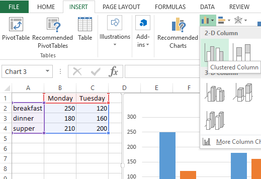
Below are the steps for preparing a column chart in Excel:
- First, select the data and the “Insert” tab, then select the “Column” chart.

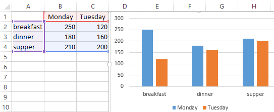
- Then, the column chart looks like as given below:

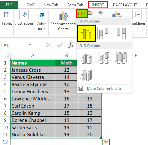
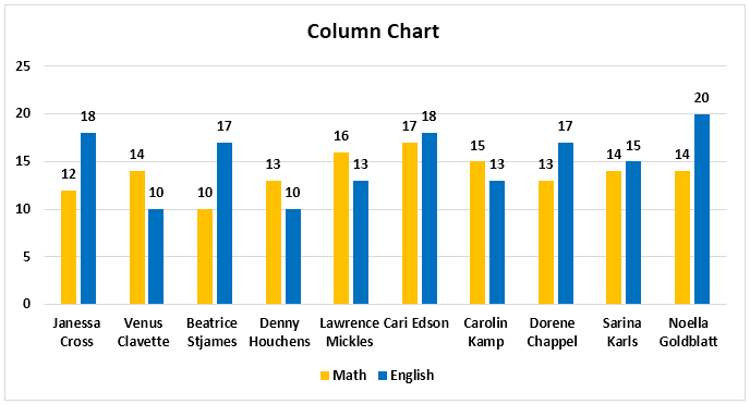
Chart #2 – Line Chart
Line charts are used if we need to show the trend in data. They are more likely used in analysis rather than showing data visually.
In this chart, a line represents the data movement from one point to another.
- Select the data and “Insert” tab, then select the “Line” chart.
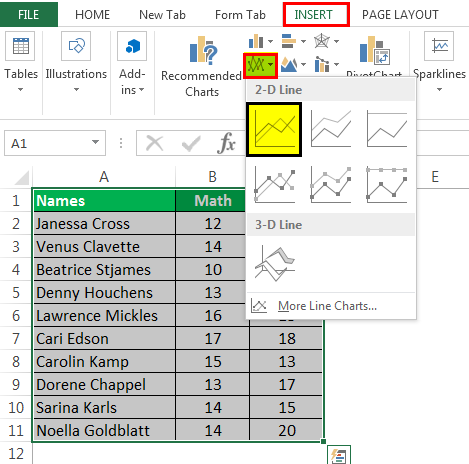
- Then, the line chart looks like as given below:

Chart #3 – Pie Chart
A pie chart is a circle-shaped chart capable of representing only one series of data. A pie chart has various variants that are 3-D charts and doughnut charts.
A circle-shaped chart divides itself into various portions to show the quantitative value.
- Select the data, go to the “Insert” tab, and select the “Pie” chart.
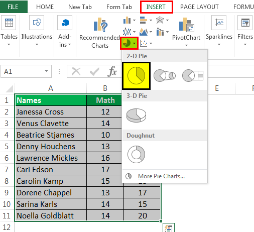
- Then, the pie chart looks like as given below:
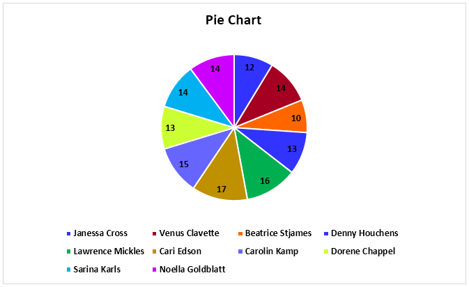
Chart #4 – Bar Chart
In the bar chart, the data is plotted on the Y-axis. That is why this is called a bar chart. Compared to the column chart, these charts use the Y-axis as the primary axis.
This chart is plotted in rows. That is why this is called a row chart.
- Select the data, go to the “Insert” tab, and then select the “Bar” chart.
- Then, the bar chart looks like as given below:

Chart #5 – Area Chart
The area chart and the line charts are the same, but the difference that makes a line chart an area chart is that the space between the axis and the plotted value is colored and is not blank.
Using the stacked area chart, this becomes difficult to understand the data as space is colored with the same color for the magnitude that is the same for various datasets.
- Select the data, go to the “Insert” tab, and select the “Area” chart.
- Then, the area chart looks like as given below:
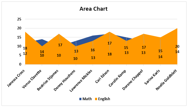
Chart #6 – Scatter Chart
The scatter chart in excelScatter plot in excel is a two dimensional type of chart to represent data, it has various names such XY chart or Scatter diagram in excel, in this chart we have two sets of data on X and Y axis who are co-related to each other, this chart is mostly used in co-relation studies and regression studies of data.read more plots the data on the coordinates.
- Select the Data and go to Insert Tab, then select the Scatter Chart.
- Then, the scatter chart looks like as given below:
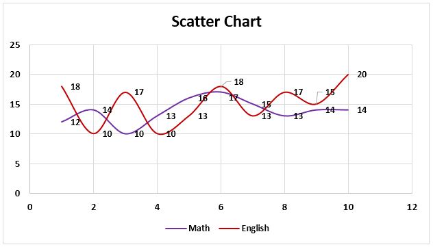
Chart #7 – Stock Chart
Such charts are used in stock exchangesStock exchange refers to a market that facilitates the buying and selling of listed securities such as public company stocks, exchange-traded funds, debt instruments, options, etc., as per the standard regulations and guidelines—for instance, NYSE and NASDAQ.read more or to represent the change in the price of shares.
- Select the data, go to the “Insert” tab, and then select the “Stock” chart.
- Then, the stock chart looks like as given below:
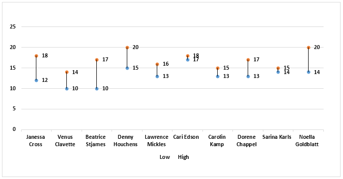
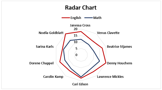
Chart #8 – Radar Chart
The radar chartRadar chart in excel is also known as the spider chart in excel or Web or polar chart in excel, it is used to demonstrate data in two dimensional for two or more than two data series, the axes start on the same point in radar chart, this chart is used to do comparison between more than one or two variables, there are three different types of radar charts available to use in excel.read more is similar to the spider web, often called a web chat.
- Select the data and go to “Insert Tab.” Then, under the “Stock” chart, select the “Radar” chart.
- Then, the radar chart looks like as given below:
Things to Remember
- If we copy a chart from one location to another, the data source will remain the same. However, it means that if we make any changes to the data set, both the charts will change, the primary and the copied.
- For the stock chart, there must be at least two data sets.
- We can only use a pie chart to represent one series of data. They cannot handle two data series.
- To keep the chart easy to understand, we should restrict the data series to two or three. Else, the chart will not be understandable.
- We must add data labels if we have decimals values to represent. If we do not add them, then we cannot understand the chart with accurate precision.
Recommended Articles
This article is a guide to Types of Charts in Excel. Here, we discuss the top 8 types of graphs in Excel, including column charts, line charts, scatter charts, radar charts, etc., along with practical examples and a downloadable Excel template. You may learn more about Excel from the following articles: –
- Create Grouped Bar Chart in ExcelGrouped Bar Chart is a Bar Chart type that blends & compares various categories of 2 or more data sets. It is also known as Multi-Series Bar Chart & helps in the efficient interpretation of differences. read more
- Chart Wizard in ExcelThe Chart Wizard in Excel is a type of wizard that walks users through the process of inserting a chart into an Excel spreadsheet in a step-by-step manner.read more
- How to make Graphs/Charts in Excel?In Excel, a graph or chart lets us visualize information we’ve gathered from our data. It allows us to visualize data in easy-to-understand pictorial ways. The following components are required to create charts or graphs in Excel: 1 — Numerical Data, 2 — Data Headings, and 3 — Data in Proper Order.read more
- Doughnut Excel ChartA doughnut chart is a type of excel chart whose visualization is similar to pie chart. The categories in this chart are parts that, when combined, represent the whole data in the chart. A doughnut chart can only be made using data in rows or columns.read more
Taxes are better calculated on the basis of information from the tables. And for the presentation of the company’s achievements it is better to use charts and diagrams.
The graphs are well suited for analyzing of relative data. For example, the forecast of sales growth dynamics or the assessment of the overall trend of growth in the capacity of the enterprise.
How to build a chart in Excel?
The fastest way to build a chart in Excel – is to create graphs by template:
- The range of the cells A1:C4. You need to fill it with values as shown in the figure:
- Select the range A1:C4 and choose the tool on the «INSERT» tab – «Insert Column Chart» – «Clustered Column».
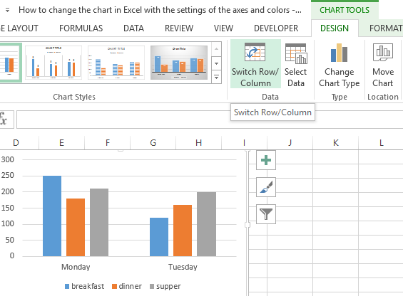
- Click on the graph to activate it and call the additional menu «CHART TOOLS». There are also three tool tabs available: «DESIGN» and «FORMAT».
- To change the axes in the graph, select to the «Constructor» tab, and on it the «Switch Row/Column» tool. Thus, you change the values in the graph: rows per columns.
- Click on any cell to deselect the chart and thus to deactivate its setting mode.
Now you can work in the normal mode.
How to build a chart on the table in Excel?
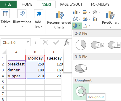
Now we are constructing the diagram according to the data of the Excel table, which must be signed with the title:
- Select the A1:B4 range in the source table.
- Select «INSERT» – «Insert Pie or Doughnut». From the group of different chart types, select the «Doughnut».
- Sign the title of your chart. To do this, make a double-click on the title with the left mouse button and enter the text as shown in the picture:
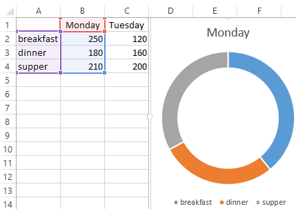
After you sign a new title, click on any cell to deactivate the chart settings and go to normal mode.
Diagrams and charts in Excel
How not to create a table, its data will be less readable than the graphical representation in diagrams and charts. For example, pay attention to the picture:
According to the table, you do not immediately to notice in what month the company’s revenues were the highest, and in what the smallest ones. You can, of course, use the «Sorting» tool, but then the general idea of the seasonality of the firm’s activity is lost.
Pay attention to the chart, which is built according to the same table. Here you do not have to blame your eyes to notice the months with the smallest and the largest indicator of the company’s profitability. And the general presentation of the schedule allows you to track the seasonality of activity of sales, which bring more or less profit in certain periods of the year. The data recorded in the table, is perfectly suitable for detailed calculations and calculations. But the charts and the diagrams provide us with its indisputable advantages:
- improve to the readability of data;
- simplify the general orientation of large amounts of the data;
- allow you to create high-quality presentations of reports.
Friday, September 9, 2011
Peltier Technical Services, Inc., Copyright © 2023, All rights reserved.
Excel 2010 Chart Type Dialog
Excel offers a wide range of standard chart types. Below is the Chart Type dialog from Excel 2010, but all of these standard chart types have been available since Excel 97, and most of them since before that.
What makes my dialog different is that it has been annotated to show which chart types you may use freely, which types you may use with caution, and which types you should avoid. If you’ve been reading this blog for a while, and paying attention, you will probably not be surprised by most of the ratings.
Explanations for the ratings
Preferred
This group comprises the commonest and most easily understood charts you can make. Line charts and XY (Scatter Charts), with and without markers and lines. Simple clustered bar and column charts.
Acceptable
These charts are also readily understood, but might not be the first choice for most data sets. They should be used with “a little” caution.
Stacked charts are tougher to decode. Because the bars do not share a common baseline, their lengths are harder to compare.
Stock charts are tough for non-finance people to get, because they convey a lot of information in a specialized way. However, for people familiar with them, stock charts are very useful.
Use With Caution
This set of charts can be useful, if you understand their limitations and drawbacks, and if the audience is skilled in their interpretation.
Stacked line charts can be confusing if the audience does not understand that each line represents a cumulative total of that line’s data plus all previous lines’ data.
Ordinary 2D pie charts can be useful if the number of data points is small and you only use one at a time. Bar charts generally do a better job.
Area charts are problematic for several reasons. Unstacked charts risk areas in back being obscured by those in front, while stacked ones may have an issue if the audience doesn’t realize they represent cumulative data. Line charts are often a better option.
Bubble charts cause problems with interpretation of bubble sizes. Is the area or the diameter proportional to the data being represented? Also, the resolution isn’t too good. It’s often best to use bubble size to indicate discrete factors.
Radar or spider charts seem like they’d be good at displaying cyclic data, but the spoke length is often confounded by the areas within the lines, and it’s impossible to compare values which are not on the same spoke. Line charts are usually a better choice.
Surface and contour charts are the only 3D charts not rated “AVOID”. They can be useful for showing some data. The X and Y values are not treated as numeric variables, but as categories (though you can still use them for numerical values if the points are equally spaced along the axes). Some orientations may lead to features in front obscuring features in back. The wireframe versions have too many line segments, the filled ones may rely too much on color, and starting in 2007, the filled ones have a weird shading applied which often makes the chart less clear. However, when used with care, these can be useful tools.
AVOID
These charts should be avoided because they are difficult to interpret, and some of them have features which may actually distort data.
Most 3D charts are particularly troublesome. The audience has trouble lining up the data elements with offset axes, some elements hide other elements, and the perspective may stretch some elements and shrink others. In many cases the third dimension is a false dimension, created not with data but with lots of extra non-data ink.
All but the simplest 2D pie charts are problematic: donut charts, pie-of-pie and bar-of-pie charts, exploded pie charts. These all have features that make them even less comprehensible than regular 2D pie charts.
New Dialog
What if we just remove the charts rated “AVOID” from the dialog and do a little rearranging? This isn’t bad:
“Missing” Chart Types
There are various other chart types that aren’t in the Excel dialog, but which you can still make in Excel. You need the savvy to figure out how to arrange the data and how to mix various chart types, and you need the patience to repeat these tasks as necessary. There’s no decent Histogram (despite what the Analysis Toolpak claims), though you can make a column chart and fix it up. Similarly you can make your own Pareto Chart by adding a line series to a column chart. You can make Tornado Charts or simple Gantt Charts by pimping a bar chart. I’ve written some tutorials that show how to make tricky chart types and utilities that will do the work at the click of a button: Waterfall Charts (Bridge Charts), Box and Whisker Charts, Clustered and Stacked Column and Bar Charts, Marimekko Charts, Dot Plots, and Panel Charts.
Excel Types of Graphs (Table of Contents)
- Types of Graphs in Excel
- How to Create Graphs in Excel
Types of Graphs in Excel
We have seen multiple uses of excel in our professional lives; it helps us analyze, sort and extract insights from data. There is one feature of excel that helps us put insights gained from our data into a visual form. This feature helps us display data in an easy to understand pictorial formats. We are talking about graphs in excel. Excel supports most of the commonly used graphs in statistics.
Creating different types of graphs in excel according to our data is very easy and convenient when it comes to analysis, comparing datasets, presentations etc. In this article, we will discuss the six most commonly used types of graphs in excel. We will also discuss how to select the correct graph type for some kinds of data.
Common Types of Graphs in Excel
The most common types of graphs used in Excel are:
- Pie Graph
- Column Graph
- Line Graph
- Area Graph
- Scatter Graph
Let’s understand what the different types of graphs in Excel are and how to create them. We will start with a few examples of types of graphs in Excel.
You can download this Types of Graphs Excel Template here – Types of Graphs Excel Template
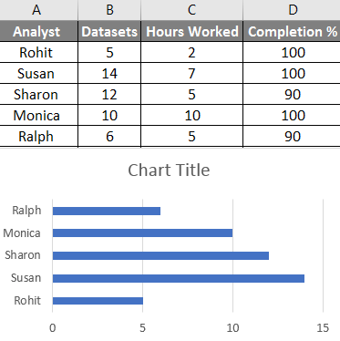
1. The Pie Graph
As the name suggests, the pie graph is a display of data in the form of a pie or circle. This graph type is used for showing proportions of a whole. For example, if we want to compare who did how much work in a team, we would use a pie graph to display it in an easy way to understand.
So our data looks like this:
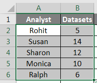
Would now look like this:
We can also use different types of pie graphs such as a 3D pie graph, pie of pie, bar of pie or a doughnut graph to represent the same data.
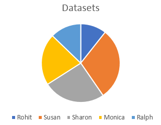
2. The Column or Bar Graph
The next one in the list is a column graph, also called a bar graph in statistics. We use these different types of graphs where we need to see and compare values across a range. The same data that we used in the pie graph example would look like this:
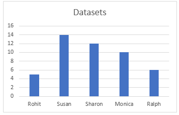
There are different types of bar graphs available in Excel, such as stacked columns, 100% stacked column, 3D columns etc. These types of graphs can be used for expanded datasets. For example, we have been working with only two columns in the last two examples, now; if we want to include the hours worked as a third column and compare the hours worked with the number of datasets visually, we can either use a stacked column or a 100% stacked column which would look like this:
The difference between these is that while a stacked column represents actual values, a 100% stacked column represents the values as percentages. There are 3D version as well as horizontal versions of these graphs in excel.
3. The Line Graph
The next type of graph we are going to discuss is called a line graph. This type of graph is used when we need to visualize data like an increasing or decreasing series over a period. This is an excellent graph in Excel to use for representing trends and comparing performance. For example, if we wanted to see how the current rise compares to the last raise for different people in the earlier examples, we would get something like this:
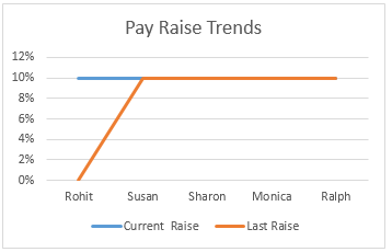
We can see that Rohit is the only one whose pay raise has increased while other’s pay raise percentages have remained constant over the last year. We have different line graphs or line graphs available for use in excel, such as stacked lines and 100% stacked lines.
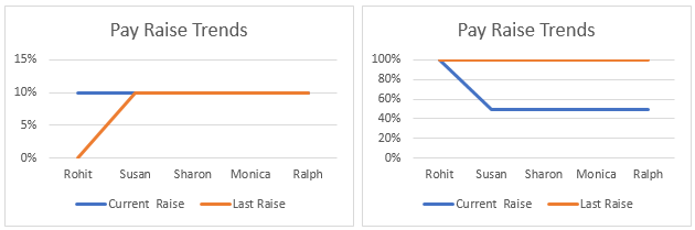
Stacked lines like stacked columns are used to represent percentages instead of the actual values.
4. The Area Graph
The area graph is available within the line graph menu. This is used for the same purpose as the line graph, which visualises trends and compares data. In this example, we represent the relationship between the number of datasets worked on by an analyst and the number of hours they worked.
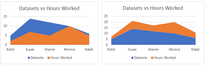
The stacked area graph on the right is used for drawing attention to the difference in magnitude of two categories and displays the values as percentages.
5. The Scatter Graph
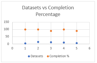
The Scatter graph is a simple representation of data points in excel. It is used when we need to compare at least two sets of data with a limited number of data points.
There are many more types of graphs available in Excel, such as Hierarchy graph, Radar graph, Waterfall graph and Combo graphs which are combinations of two or more graphs. All these are used based on specific conditions fulfilled by the data, such as the type of data, the number of data points etc.
How to Create Graphs in Excel?
Now that we have gone through a few examples of types of graphs in excel, we will learn how to make these graphs. Basically, the same procedure is used to make all the graphs. They are enumerated sequentially below:
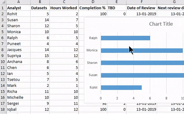
1. First, choose the data you want to represent in the graph. In this case, we will select Analyst and Datasets from the practice table:

2. Click on Insert on the toolbar and navigate to the Charts menu.
3. Select the required graph from the different types of graphs; in this case, we are making a bar graph which is basically a horizontal column graph, but you can select any graph that suits the data you are working on:
4. A graph would appear over your data, move the graph to the required position by clicking on it and dragging it across the screen, or cut/copy the graph and paste it elsewhere where you need it:
By following the above steps and varying the type of graph you select, you can make all types of graphs available in excel. You can modify these different types of graphs like modifying a table, by specifying the data which would go into the x-axis and y-axis by right-clicking on the graph and clicking on select data, then specifying the data in the pop up that appears:
Things to Remember About Types of Graphs in Excel
- Know your data before making a graph. A type of graph that may suit a time series may not be suitable for a set of unpatterned data.
- Sort the data before making graphs.
- Do not use unnecessary styling while making the graph.
Recommended Articles
This has been a guide to Types of Graphs in excel. Here we discussed Different types of Graphs in excel and how to create these different types of Graphs in Excel along with practical examples and a downloadable excel template. You can also go through our other suggested articles –
- Gauge Chart in Excel
- Excel Normal Distribution Graph
- Change Chart Style In Excel
- Excel Chart Templates
Excel предоставляет вам различные типы графиков, которые соответствуют вашим целям. В зависимости от типа данных вы можете создать диаграмму. Вы также можете изменить тип диаграммы позже.
Excel предлагает следующие основные типы диаграмм –
- Столбчатая диаграмма
- Линия Диаграмма
- Круговая диаграмма
- Пончик Диаграмма
- Гистограмма
- Диаграмма площади
- XY (точечная диаграмма)
- Пузырьковая диаграмма
- График акций
- Поверхностная Диаграмма
- Радар Диаграмма
- Комбинированная диаграмма
Каждый из этих типов диаграмм имеет подтипы. В этой главе у вас будет обзор различных типов диаграмм и вы узнаете подтипы для каждого типа диаграмм.
Столбчатая диаграмма
Столбчатая диаграмма обычно отображает категории по горизонтальной оси (категории) и значения по вертикальной оси (значения). Чтобы создать диаграмму столбцов, расположите данные в виде столбцов или строк на рабочем листе.
Столбчатая диаграмма имеет следующие подтипы –
- Кластерная колонна.
- Колонка с накоплением.
- Столбец с накоплением 100%.
- 3-D кластерная колонна.
- Трехмерная столбчатая колонна.
- Трехмерная 100% -ная колонна.
- 3-я колонна.
Линия Диаграмма
Линейные диаграммы могут отображать непрерывные данные с течением времени на равномерно масштабированной оси. Поэтому они идеально подходят для отображения тенденций в данных с равными интервалами, например, месяцами, кварталами или годами.
В линейном графике –
- Данные категории распределяются равномерно по горизонтальной оси.
- Значения данных распределяются равномерно по вертикальной оси.
Чтобы создать линейную диаграмму, расположите данные в виде столбцов или строк на рабочем листе.
Линейный график имеет следующие подтипы –
- Линия
- Линия с накоплением
- 100% накопленная линия
- Линия с маркерами
- Сложенная линия с маркерами
- 100% стопка с маркерами
- 3-D линия
Круговая диаграмма
Круговые диаграммы показывают размер элементов в одном ряду данных, пропорциональный сумме элементов. Точки данных на круговой диаграмме отображаются в процентах от всей круговой диаграммы. Чтобы создать круговую диаграмму, расположите данные в одном столбце или строке на рабочем листе.
Круговая диаграмма имеет следующие подтипы –
- пирог
- 3-D Пирог
- Пирог с пирогом
- Пирог
Пончик Диаграмма
Кольцевая диаграмма показывает отношение частей к целому. Она аналогична круговой диаграмме, с той лишь разницей, что кольцевая диаграмма может содержать более одного ряда данных, тогда как круговая диаграмма может содержать только один ряд данных.
Кольцевая диаграмма содержит кольца, и каждое кольцо представляет один ряд данных. Чтобы создать кольцевую диаграмму, расположите данные в виде столбцов или строк на рабочем листе.
Гистограмма
Гистограммы иллюстрируют сравнения между отдельными элементами. На линейчатой диаграмме категории расположены вдоль вертикальной оси, а значения – вдоль горизонтальной оси. Чтобы создать столбчатую диаграмму, расположите данные в виде столбцов или строк на рабочем листе.
Гистограмма имеет следующие подтипы –
- Кластерный Бар
- С накоплением бар
- 100% с накоплением
- 3-D кластерный бар
- 3D-бар с накоплением
- 3-D 100% Stacked Bar
Диаграмма площади
Графики площадей можно использовать для составления графика изменения во времени и привлечения внимания к общей стоимости по тренду. Показывая сумму нанесенных значений, диаграмма области также показывает отношение частей к целому. Чтобы создать диаграмму области, расположите данные в виде столбцов или строк на рабочем листе.
Диаграмма области имеет следующие подтипы –
- Площадь
- Сложенная область
- 100% накопленная площадь
- 3-D Площадь
- Трехмерная область с накоплением
- 3-D 100% -ая Сложенная Область
XY (точечная диаграмма)
Диаграммы XY (точечные) обычно используются для отображения и сравнения числовых значений, таких как научные, статистические и технические данные.
Точечная диаграмма имеет две оси значений –
- Горизонтальная (х) ось значений
- Вертикальная (у) ось значений
Он объединяет значения x и y в отдельные точки данных и отображает их с нерегулярными интервалами или кластерами. Чтобы создать точечную диаграмму, расположите данные в столбцах и строках на листе.
Поместите значения x в одну строку или столбец, а затем введите соответствующие значения y в соседние строки или столбцы.
Рассмотрите возможность использования точечной диаграммы, когда –
-
Вы хотите изменить масштаб горизонтальной оси.
-
Вы хотите сделать эту ось логарифмической шкалой.
-
Значения для горизонтальной оси распределены неравномерно.
-
На горизонтальной оси много точек данных.
-
Вы хотите настроить шкалы независимых осей точечной диаграммы, чтобы получить больше информации о данных, которые включают пары или сгруппированные наборы значений.
-
Вы хотите показать сходство между большими наборами данных, а не различия между точками данных.
-
Вы хотите сравнить множество точек данных независимо от времени.
-
Чем больше данных вы включите в точечную диаграмму, тем лучше будет сравнение.
-
Вы хотите изменить масштаб горизонтальной оси.
Вы хотите сделать эту ось логарифмической шкалой.
Значения для горизонтальной оси распределены неравномерно.
На горизонтальной оси много точек данных.
Вы хотите настроить шкалы независимых осей точечной диаграммы, чтобы получить больше информации о данных, которые включают пары или сгруппированные наборы значений.
Вы хотите показать сходство между большими наборами данных, а не различия между точками данных.
Вы хотите сравнить множество точек данных независимо от времени.
Чем больше данных вы включите в точечную диаграмму, тем лучше будет сравнение.
Точечная диаграмма имеет следующие подтипы –
-
рассеивать
-
Разброс с гладкими линиями и маркерами
-
Разброс с гладкими линиями
-
Разброс с прямыми линиями и маркерами
-
Скаттер с прямыми линиями
рассеивать
Разброс с гладкими линиями и маркерами
Разброс с гладкими линиями
Разброс с прямыми линиями и маркерами
Скаттер с прямыми линиями
Пузырьковая диаграмма
Пузырьковая диаграмма похожа на точечную диаграмму с дополнительным третьим столбцом, чтобы указать размер пузырьков, отображаемых для представления точек данных в ряду данных.
Пузырьковая диаграмма имеет следующие подтипы –
- Пузырь
- Пузырь с трехмерным эффектом
График акций
Как следует из названия, графики акций могут показывать колебания цен на акции. Тем не менее, биржевую диаграмму также можно использовать для отображения колебаний в других данных, таких как суточные осадки или годовые температуры.
Чтобы создать биржевую диаграмму, расположите данные в столбцах или строках в определенном порядке на листе. Например, чтобы создать простую диаграмму акций с максимальным и минимальным закрытием, расположите ваши данные, указав значения High, Low и Close в качестве заголовков столбцов в указанном порядке.
Биржевая диаграмма имеет следующие подтипы –
- High-Low-Close
- Open-High-Low-Close
- Объемно-High-Low-Close
- Объемно-Open-High-Low-Close
Поверхностная Диаграмма
Диаграмма поверхности полезна, когда вы хотите найти оптимальные комбинации между двумя наборами данных. Как и на топографической карте, цвета и узоры указывают области, которые находятся в одном диапазоне значений.
Чтобы создать диаграмму поверхности –
- Убедитесь, что и категории, и серии данных являются числовыми значениями.
- Расположите данные в столбцах или строках на листе.
Диаграмма поверхности имеет следующие подтипы –
- 3-D поверхность
- Каркас 3-D Поверхность
- контур
- Контур каркаса
Радар Диаграмма
Радарные диаграммы сравнивают совокупные значения нескольких рядов данных. Чтобы создать радиолокационную диаграмму, расположите данные в виде столбцов или строк на рабочем листе.
Радиолокационная карта имеет следующие подтипы –
- радиолокационный
- Радар с маркерами
- Заполненный радар
Комбинированная диаграмма
Комбинированные диаграммы объединяют два или более типов диаграмм, чтобы облегчить понимание данных, особенно когда данные сильно различаются. Он показан со вторичной осью, и его еще легче прочитать. Чтобы создать комбинированную диаграмму, расположите данные в столбцах и строках на листе.
Комбо-диаграмма имеет следующие подтипы –
A picture is worth of thousand words; a chart is worth of thousand sets of data. In this tutorial, we are going to learn how we can use graph in Excel to visualize our data.
What is a chart?
A chart is a visual representative of data in both columns and rows. Charts are usually used to analyse trends and patterns in data sets. Let’s say you have been recording the sales figures in Excel for the past three years. Using charts, you can easily tell which year had the most sales and which year had the least. You can also draw charts to compare set targets against actual achievements.
We will use the following data for this tutorial.
Note: we will be using Excel 2013. If you have a lower version, then some of the more advanced features may not be available to you.
| Item | 2012 | 2013 | 2014 | 2015 |
|---|---|---|---|---|
| Desktop Computers | 20 | 12 | 13 | 12 |
| Laptops | 34 | 45 | 40 | 39 |
| Monitors | 12 | 10 | 17 | 15 |
| Printers | 78 | 13 | 90 | 14 |
Different scenarios require different types of charts. Towards this end, Excel provides a number of chart types that you can work with. The type of chart that you choose depends on the type of data that you want to visualize. To help simplify things for the users, Excel 2013 and above has an option that analyses your data and makes a recommendation of the chart type that you should use.
The following table shows some of the most commonly used Excel charts and when you should consider using them.
| S/N | CHART TYPE | WHEN SHOULD I USE IT? | EXAMPLE |
|---|---|---|---|
| 1 | Pie Chart | When you want to quantify items and show them as percentages. |
|
| 2 | Bar Chart | When you want to compare values across a few categories. The values run horizontally |
|
| 3 | Column chart | When you want to compare values across a few categories. The values run vertically |
|
| 4 | Line chart | When you want to visualize trends over a period of time i.e. months, days, years, etc. |
|
| 5 | Combo Chart | When you want to highlight different types of information |
|


The importance of charts
- Allows you to visualize data graphically
- It’s easier to analyse trends and patterns using charts in MS Excel
- Easy to interpret compared to data in cells
Step by step example of creating charts in Excel
In this tutorial, we are going to plot a simple column chart in Excel that will display the sold quantities against the sales year. Below are the steps to create chart in MS Excel:
- Open Excel
- Enter the data from the sample data table above
- Your workbook should now look as follows

To get the desired chart you have to follow the following steps

- Select the data you want to represent in graph
- Click on INSERT tab from the ribbon
- Click on the Column chart drop down button
- Select the chart type you want
You should be able to see the following chart

Tutorial Exercise
When you select the chart, the ribbon activates the following tab

Try to apply the different chart styles, and other options presented in your chart.
Download the above Excel Template
Summary
Charts are a powerful way of graphically visualizing your data. Excel has many types of charts that you can use depending on your needs.
Conditional formatting is also another power formatting feature of Excel that helps us easily see the data that meets a specified condition
Microsoft Excel поддерживает различные типы диаграмм, позволяя представлять данные понятным для конкретной аудитории способом.
Данные в столбцах или строках листа можно отобразить в виде гистограммы. Гистограммы полезны для представления изменений данных с течением времени и для наглядного сравнения различных величин. В гистограммах категории обычно формируются по горизонтальной оси, а значения — по вертикальной.

Данные, расположенные в столбцах или строках листа, можно представить в виде графика. Графики позволяют изображать непрерывное изменение данных с течением времени в едином масштабе и идеально подходят для представления тенденций изменения данных с равными интервалами.
На графиках данные категорий равномерно распределяются вдоль горизонтальной оси, а все значения равномерно распределяются вдоль вертикальной оси.

Графики можно использовать, если метки категорий являются текстовыми и представляют значения, разделённые равными интервалами, например месяцы, кварталы или финансовые годы. Это особенно важно при наличии нескольких рядов: для отображения одного ряда можно использовать точечную диаграмму. Также графики можно использовать при наличии нескольких разделённых равными интервалами числовых меток, в частности лет. Если числовых меток больше десяти, вместо графика лучше использовать точечную диаграмму.
Данные в одном столбце или строке листа можно представить в виде круговой диаграммы. Круговая диаграмма демонстрирует размер элементов одного ряда данных относительно суммы элементов. Точки данных на круговой диаграмме выводятся как проценты от всего круга.

Данные в столбцах или строках листа можно представить в виде линейчатой диаграммы. Линейчатые диаграммы используют для сравнения отдельных элементов.

Данные в столбцах или строках листа можно представить в виде диаграммы с областями. Диаграммы с областями подчёркивают величину изменений с течением времени и могут использоваться для привлечения внимания к суммарному значению в соответствии с тенденцией. Например, данные, отражающие прибыль в зависимости от времени, можно отобразить на диаграмме с областями для привлечения внимания к общей прибыли.

Данные в столбцах и строках листа можно представить в виде точечной диаграммы. Точечная диаграмма показывает отношения между численными значениями в нескольких рядах данных или отображает две группы чисел как один ряд координат x и y.
Точечная диаграмма имеет две оси значений, при этом одни числовые значения выводятся вдоль горизонтальной оси (оси X), а другие — вдоль вертикальной оси (оси Y). На точечной диаграмме эти значения объединяются в одну точку и выводятся через неравные интервалы или кластеры.
Точечные диаграммы обычно используются для иллюстрации и сравнения числовых значений, например научных, статистических или технических данных.

Данные, расположенные в столбцах или строках листа в определённом порядке, можно представить в виде биржевой диаграммы.
Как следует из названия, биржевые диаграммы чаще всего используются для иллюстрации изменений цен на акции.
Однако их также можно использовать для вывода научных данных.
Например, с помощью биржевой диаграммы можно представить дневные или годичные колебания температуры.

Данные в столбцах или строках листа можно представить в виде поверхностной диаграммы.
Поверхностная диаграмма полезна, если требуется найти оптимальные комбинации данных из двух наборов.
Как на топографической карте, области, относящиеся к одинаковым диапазонам, при этом выделяются цветами и штриховкой.
Поверхностные диаграммы можно использовать для иллюстрации категорий и наборов данных, представляющих собой числовые значения.

Данные, расположенные только в столбцах или строках листа, можно представить в виде кольцевой диаграммы. Как и круговая диаграмма, кольцевая диаграмма демонстрирует отношение частей к целому, но может содержать более одного ряда данных.

На пузырьковой диаграмме можно отобразить данные столбцов листа, при этом значения по оси X выбираются из первого столбца данных, а соответствующие значения по оси Y и значения, определяющие размер пузырьков, выбираются из соседних столбцов.

Данные в столбцах или строках листа можно представить в виде лепестковой диаграммы.

В большинстве случаев возникают затруднения при чтении книг Excel, содержащих большое количество информации. К счастью Excel располагает прекрасным инструментом визуализации данных – построением диаграмм. В этом уроке мы познакомимся с основными типами диаграмм, из каких элементов они состоят, а также построим нашу первую диаграмму.
Диаграммы в Excel способны графически представлять данные, что позволяет легче воспринимать большие объемы информации и оценивать ее. Excel предлагает самые различные типы диаграмм. Среди этого многообразия Вы можете подобрать именно ту диаграмму, которая наиболее точно подходит под Ваши нужды. Чтобы использовать диаграммы максимально эффективно, необходимо знать, как ими пользоваться в Excel. Итак, приступим к знакомству.
Содержание
- Типы диаграмм
- 1. Гистограмма
- 2. График
- 3. Круговые диаграммы
- 4. Линейчатая диаграмма
- 5. Диаграммы с областями
- 6. Поверхностные диаграммы
- Элементы диаграмм
- Как построить диаграмму в Excel
Типы диаграмм
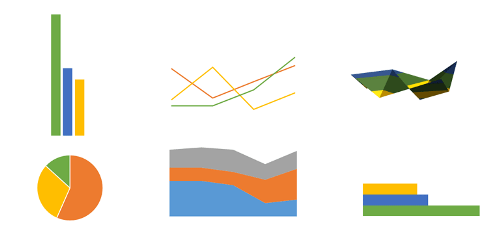
Как Вы уже знаете, Excel располагает большим разнообразием типов диаграмм, каждый из которых имеет свои преимущества. Далее мы познакомимся с некоторыми из них:
1. Гистограмма
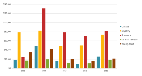
Гистограмма – это один из наиболее распространенных типов диаграмм. Гистограммы используют вертикальные столбцы для представления данных. Их можно применять в самых различных ситуациях, но чаще всего они используются для сравнения значений.
2. График
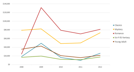
Графики, наряду с гистограммами, также очень популярны. Графики идеальны в отображении изменения непрерывных данных, а также для демонстрации трендов. Точки на графике соединяются линиями, позволяя увидеть динамику с течением времени.
3. Круговые диаграммы
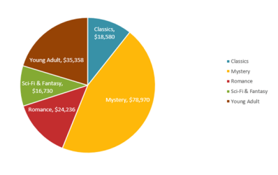
Круговые диаграммы подходят для демонстрации пропорций, т.е. части чего-то относительно целого. Каждое значение представлено в виде доли (сектора) от суммы всех значений (круга). Круговая диаграмма строится для одного ряда данных и, как правило, содержит до 5-8 секторов. Такой подход очень полезен, когда нужно сравнить данные друг с другом.
Значения, используемые для построения круговой диаграммы, должны быть положительными. В противном случае Excel преобразует их в положительные, автоматически отбросив знак «минус».
4. Линейчатая диаграмма
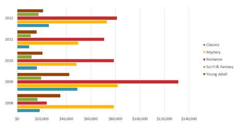
Линейчатые диаграммы – это те же гистограммы, повернутые на 90 градусов, т.е. для представления информации используются не вертикальные столбцы, а горизонтальные.
5. Диаграммы с областями
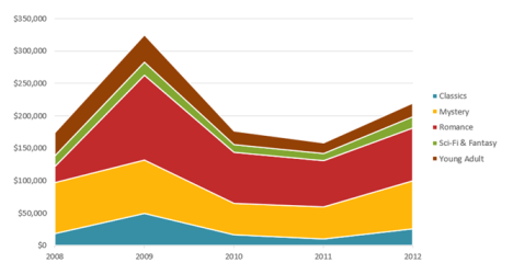
Диаграммы с областями очень похожи на графики, за исключением того, что области под линиями заполнены цветом.
6. Поверхностные диаграммы
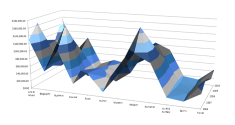
Поверхностные диаграммы в Excel позволяют представить информацию в виде 3D перспективы. Лучше всего эти диаграммы подходят для больших объемов данных, чтобы видеть сразу весь спектр информации.
Элементы диаграмм
Разобравшись с типами диаграмм, следующее, что необходимо сделать, это понять из чего она состоит. Диаграммы в Excel содержат 5 основных элементов, давайте рассмотрим их:
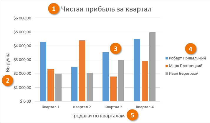
- Заголовок диаграммы должен четко описывать, что представлено на ней.
- Вертикальная ось (также известная как ось Y) является вертикальной частью диаграммы. На вертикальной оси отображаются значения столбцов, поэтому ее называют осью значений. В текущем примере величиной измерения является чистая выручка от продаж каждого продавца.
- Ряд данных состоит из связанных точек (значений) на диаграмме. В текущем примере синие столбы отражает выручку от продаж Роберта Привального. Мы понимаем, что выручка относится именно к этому продавцу, благодаря легенде в правой части диаграммы. Анализируя ряды данных, можно увидеть, что Роберт был лучшим продавцом в первом и третьем квартале и вторым во втором и четвертом.
- Легенда указывает принадлежность каждого ряда к кому-либо или чему-либо. В текущем примере легенда содержит 3 цвета с соответствующими продавцами. Видя легенду достаточно легко определить к какому продавцу относится каждый из столбцов.
- Горизонтальная ось (также известная как ось X) является горизонтальной частью диаграммы. Горизонтальная ось представляет категории. В данном примере каждый квартал содержит свою группу.
Как построить диаграмму в Excel
- Выделите ячейки, на основе которых Вы хотите построить диаграмму, включая заголовки столбцов и названия строк. Эти ячейки являются источником данных для диаграммы. В нашем примере мы выбрали диапазон ячеек A1:F6.
- На вкладке Вставка, выберите необходимую диаграмму. В нашем примере мы выберем Гистограмму.
- В раскрывающемся меню укажите подходящий тип гистограммы.
- Выбранная диаграмма появится на листе Excel.
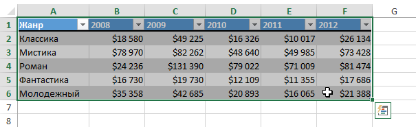
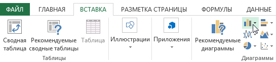
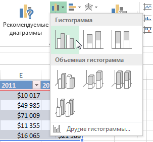
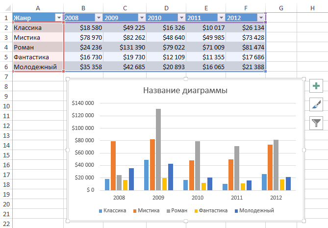
Если Вы не уверены, какой тип диаграммы использовать, команда Рекомендуемые диаграммы предложит различные варианты на базе исходных данных.
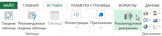
Оцените качество статьи. Нам важно ваше мнение:
Last Updated: January 3, 2023
This article will show you the best types of charts in Excel for data analysis, presentation, and reporting within 15 minutes.
You will learn about the various types of charts in Excel, from column charts, bar charts, line charts, and pie charts to stacked area charts.
How to select the best excel chart?
The type of Excel chart you select for your analysis and reporting depends upon the type of data you want to analyze and report and what you want to do with the data:
- Visualize data (make sense of data esp. big data)
- Classify and categorize data
- Find a relationship among data
- Understand the composition of data
- Understand the distribution of data
- Understand the overlapping of data
- Determine patterns and trends
- Detect outliers and other anomalies in data
- Predict future trends
- Tell meaningful and engaging stories to decision-makers
What are the most popular Excel charts and graphs types?
Following are the most popular Excel charts and graphs:
- Clustered column chart
- Combination chart
- Stacked column chart
- 100% stacked column chart
- Bar chart
- Line chart
- Number chart
- Gauge chart (Speedometer chart)
- Pie chart
- Stacked area chart
- Venn diagram
- Scatter chart
- Histogram
- Actual vs target chart
- Bullet chart
- Funnel chart
When to use a line chart?
#1 Use line charts when you want to show/focus on data trends (uptrend, downtrend, short term trend, sideways trend, long term), especially long term trends (i.e. changes over several months or years) between the values of the data series:

#2 Use line charts when you have too many data points to plot, and the use of a column or bar chart clutters the chart.
#3 Use a line chart instead of a clustered column chart if the order of categories is important:


#4 In a line graph, the x-axis would represent the categories, and the y-axis would represent the measurement values that would be represented periodically.
#5 A line graph should be used when you want to emphasize the changes for values for one variable that are represented on the vertical axis to the other variable represented on the horizontal axis.
#6 Line graphs are better than bar graphs when there are smaller changes.
#7 To read a line graph, first examine the two axes and understand the value points represented on the graph. The second thing is to figure out if there was a rise or fall in the data.
When to use a clustered column chart?
#1 Use a clustered column chart when you want to compare two to four data series. In other words, avoid using column charts if you have just one data series to plot:

Alternatively, avoid creating a column chart with more than four data series.
For example, the following chart contains just five data series, and it has already started looking cluttered:

The chart below contains 11 data series and is very difficult to read and understand:

If you want to create a column chart that contains a lot of data series, then you can try switching ‘row’ and ‘column’ of the chart and see whether it makes any difference:

For example, after switching the row and column of the chart (with 11 data series), it looks like the one below:

Though it still looks cluttered, this chart is much easier to read and understand.
#2 Although the clustered column chart looks like a simple column chart, it is slightly different. A simple column chart is used to represent only a single variable over the other variable, whereas clustered column charts represent multiple data variables.
#3 Use a clustered column chart when the data series you want to compare have the same unit of measurement. So avoid using column charts that compare data series with different units of measurement.
For example, in the chart below, ‘Sales’ and ‘ROI’ have different units of measurement.
The data series ‘Sales’ is of type number. Whereas the data series ‘ROI’ is of type percentage:


#4 Use a clustered column chart when the data series you want to compare are of comparable sizes. So if the values of one data series dwarf the values of the other data series, then do not use the column chart.
For example, in the chart below, the values of the data series ‘Website Traffic’ completely dwarf the values of the data series named ‘Transactions’:

#5 Use a clustered column chart when you want to show the maximum and minimum values of each data series you want to compare.
#6 Use a clustered column chart when you want to focus on short term trends (i.e. changes over days or weeks) and/or the order of categories is not important.
Breaking a clustered column chart
The chart below contains 11 data series and is very difficult to read and understand:

One method of making this chart easier to read and understand is breaking it into several smaller clustered column charts.
For example, you can create one column chart that compares the sales performance of various countries in January.
Create another column chart which just compares the sales performance of various countries in Feb and so on:

The rule of thumb is to avoid presenting too much data in one chart, regardless of the chart type.
When to use a combination chart?
A combination chart is simply a combination of two or more charts.
For example, the combination of a column chart with a line chart.
I use combination charts a lot, and I think you must know how to create them as they are very useful.
#1 Use a combination chart when you want to compare two or more data series that have different units of measurement:

#2 Use a combination chart when you want to compare two or more data series that are not of comparable sizes:

#3 Use a combination chart when you want to display different types of data in different ways that can be represented in the same chart. For example, line, bar and column charts can be used on the same chart.
When to use a stacked column chart?
Use a stacked column chart when you want to compare data series along with their composition, and the overall size of each data series is important:

When to use a 100% stacked column chart?
Use a 100% stacked column chart when you want to compare data series along with their composition but the overall size of each data series is not important:

This chart is used to show the percentage of multiple data series in stacked columns.
When to use a stacked area chart?
Use a stacked area chart when you want to show the trend of composition and emphasize the magnitude of change over time.
For example, the following stacked area chart shows the breakdown of website traffic:

When to use a bar chart?
#1 Use a bar chart whenever the axis labels are too long to fit in a column chart:

What are the different types of bar charts?
Horizontal bar charts – Represent the data horizontally. The data categories are shown on the vertical axis, and data values are shown on the horizontal axis.
Vertical bar charts – Also called a column chart. It represents the numerical values represented in the vertical bars. These are used mainly to display age ranges and salary ranges.
Grouped bar charts – Grouped bar charts represent the different time period numbers that belong to a single category.
Stacked bar charts – It is a bar chart that represents the comparisons between categories of data but with the ability to compare and break down the data.
When to use a pie chart?
#1 Use a pie chart to show a 100% composition of data. In other words, the various pie slices you use must add up to 100%. This means do not create a pie chart where the various pie slices do not represent parts of the whole pie.
For example, the following pie chart is not a good representation of data composition as the two pie slices add up to 82% and not 100%:

#2 Use a pie chart to show the composition of data only when you have got one data series and less than five categories to plot.
For example, the following pie chart shows the breakdown of website traffic sources in the last month:

Here I have got only four categories (search traffic, referral traffic, direct traffic, and campaigns) to plot. So a pie chart is ideal for showing the breakdown.
However, if there were more than four categories to plot, like eight or ten categories, the pie chart would have become cluttered and hard to read.
For example, the following pie chart looks cluttered because it has got too many categories:

#3 Pie charts generally express the part to the whole relationship in your data. When your data is represented in ‘percentage’ or ‘part of’, then a pie chart best meets your needs.
#4 Use a pie chart to show data composition only when the pie slices are of comparable sizes. In other words, do not use a pie chart if the size of one pie slice completely dwarfs the size of the other pie slice(s):

#5 Order your pie slices so that as you look clockwise from top to bottom, the biggest pie slice comes first, followed by the second biggest pie slice and so on. This makes the pie chart easy to read:

These pie charts are made from the following data:

To create a pie chart where the biggest pie slice comes first, followed by the second biggest pie slice and so on.
I have sorted the data in decreasing order (from largest to smallest).
Best practices for using pie charts
Limit the number of pie slices
Always make sure to use a minimal number of slices when creating a pie chart. It is really difficult to read a large number of slices.
If you have more than five categories, it is recommended to use a different chart type.
Make sure all data adds up to 100%
Verify that the pie slices are valued at 100% when added up.
Include annotations: Include percentages and labels for your pie chart to make it easy to read.
Pie charts work best for 25%, 50%, 75% and 100%.
Don’t compare multiple pie charts.
Do not use multiple pie charts for comparison as the slice sizes are really difficult to compare side by side.
When to use a number chart?
If you want to visualize just one type of data and it contains a numeric value that does not fall in any range/interval, then use the number chart:

When to use a gauge chart (also known as a speedometer chart)?
If you want to visualize just one type of data and it contains a numeric value that falls in a range/interval, then use the gauge chart (also known as the speedometer chart):

A gauge chart should be used when you want to validate if your data falls in the acceptable range or not.
A gauge chart would generally have the maximum value as default and thresholds as low, medium and high, which indicates if the data is falling within the acceptable range.
Thresholds would be displayed in red, green and yellow for specified values.
When to use a scatter chart?
#1 Consider using a scatter chart when you want to analyze and report the relationship/correlation between two variables:

This chart shows that the relationship between the two variables (‘x’ and ‘y’) is linear. As the value of the variable ‘x’ increases, there is a corresponding increase in the value of the variable ‘y’.
#2 Create a scatter chart only when ten or more data points are on the horizontal axis. The more data points, the better it is for a scatter chart. Conversely, just a few data points (like five or six) are not good enough for creating a scatter chart.
#3 Use a scatter chart when you want to show ‘why’. For example: why revenue is correlated with average order value or why conversion rate is correlated with the number of transactions.
When to use a histogram?
Use a histogram to show frequency distribution for quantitative data.
A histogram represents the visual representation of numerical data that falls within a specified range of values called ‘bins’. It looks exactly like a vertical graph.

Note: You would need to install the ‘Analysis ToolPak’ to create a histogram in Excel.
When to use an ‘actual vs target’ chart?
The chart below shows whether target sales were achieved in each quarter:

This chart is based on the following data table:

The ‘Actual vs target’ chart is a combination chart that requires some formatting.
You can’t insert this chart straightaway into your Excel spreadsheet.
Use this chart when you have got multiple goals, and you want to show progress towards each goal.
When to use a bullet chart?
The chart below shows the performance of sales in Quarter 4:

This chart is based on the following data table:

If the actual sales are between $0 to $240,000, sales performance is considered ‘Poor’.
If the actual sales are between $240,000 to $300,000 ($240,000 + $60,000) then it is considered ‘Fair’.
If the actual sales are between $300,000 to $360,000 ($240,000 + $60,000 + $60,000) then it is considered ‘Good’.
If the actual sales are between $360,000 to $400,000 ($240,000 + $60,000 + $60,000 + $40,000) then it is considered ‘Excellent’.
A bullet chart is a combination chart (though it looks like a single bar chart) that is used to show progress towards a single goal using a range of predefined qualitative and quantitative parameters.
You can’t insert this chart straightaway into your Excel spreadsheet, and it is also quite tricky to create.
If you have multiple goals and want to show progress towards each goal, then use the ‘Actual vs target’ chart.
But if you have only one goal and want to show progress towards this goal (using both qualitative and quantitative data), then use the bullet chart.
A bullet chart can be a vertical bar chart or a horizontal bar chart.
The choice of vertical or horizontal alignment depends on the space available to use for data visualization.
When to use a funnel chart?
Funnel charts visually represent the progressive reduction of data from one phase to another phase.
The first stage is usually referred to as the intake stage.
The chart below shows different stages of the purchase funnel and how users moved from one stage to the next:

This chart is based on the following data table:

As the name suggests, the funnel chart is used for funnel visualization. It is perfect for showing lead funnels and sales funnels.
A funnel chart provides visual pictures of the stages in the process.
For example, let us take an example of an ecommerce business. Funnel charts can be used to understand how many users have added the products to the cart, provided shipping details and completed the purchase.
It also provides us with information about users who have abandoned the cart.
This chart is available in MS Excel (2016 and above). You just need to select your data table and insert the ‘Funnel’ chart.
Funnel charts are mostly used for the sales process and to identify potential problems.
A funnel consists of a higher value, called the head, and the lower part, which is referred to as the neck.
When to use a Venn diagram?
Use a Venn diagram to show the overlapping of data.
The multi-channel conversion visualizer chart used in Google Analytics to visualize multi-channel attribution is a Venn diagram:

In web analytics, we can use a Venn diagram to determine whether or not a website has got attribution problems.
If there is little to no overlap between two or more marketing channels, the website doesn’t have attribution issues.
If there is a good amount of overlap, the website has attribution issues. You should seriously consider taking multi-channel attribution into account while analyzing and interpreting the performance of marketing campaigns.
To learn more about attribution modelling read this article: Beginners Guide to Google Analytics Attribution Modelling
Another great use of Venn diagrams is in visualizing the backlinks overlaps between websites:

The tool I have used to create this Venn diagram is Venny.
Note: You can create a Venn diagram in Excel. Check out this tutorial on the Microsoft Office website: Create a Venn diagram.
What are the different types of Venn diagrams?
Two set diagrams – Two circles with overlapping properties. This is the most common and simplest form of the Venn diagram used to compare two metrics or variables.
Three set diagrams – This lets you visualize the relationship between three subjects rather than two variables.
Four set diagram– This comprises four circles with overlapping properties. It is a bit more complex than the normal Venn diagram, and each circle represents the different aspect of the data and their comparison to other variables.
Which charts to avoid for reporting purposes?
Throughout this article, I have talked about the charts that should be used.
However, there are some charts that should be avoided for reporting purposes unless your target audience is as data-savvy as you.
Following are those charts:
#1 Charts to avoid > Treemap

#2 Charts to avoid > Waterfall chart

#3 Charts to avoid > Radar chart

#4 Charts to avoid > Bubble chart

The reason you should avoid reporting data via these charts to your clients is simple.
Most people have no idea what you are trying to communicate via these charts.
Use these charts only when your target audience is as data-savvy as you.
How to change the chart type in Excel?
MS Excel allows you to change the chart type.
For example, you can convert a clustered column chart into a stacked column chart. Or you can convert a column chart into a bar chart.
For example, let’s convert the following column chart into a bar chart:

Follow the steps below to change the chart type in excel:
Step-1: Open MS Excel and navigate to the spreadsheet which contains the chart you want to edit
Step-2: Select the chart, and then from the ”Design’ tab, click on the ‘Change Chart Type’ button:

You will now see the ‘Change Chart Type’ dialog box like the one below:

Step-3: Click on ‘Bar’ (from the left-hand navigation) and then click on the ‘OK’ button:

Excel will now change your column chart into a bar chart:

What is data visualization in Excel?
Data visualization is the presentation of data (both qualitative and quantitative data) in graphical format.
In Excel, charts and graphs are used to make a visual representation of data.
What are the benefits of data visualization
Through data visualization you can easily:
- Visualize data (make sense of data, especially big data)
- Classify and categorize data
- Find a relationship among data
- Understand the composition of data
- Understand the distribution of data
- Understand the overlapping of data
- Determine patterns and trends
- Detect outliers and other anomalies in data
- Predict future trends
- Tell meaningful and engaging stories to decision-makers
Data presentation is a very important skill for an optimizer (marketer, analyst). In fact, it is so valuable that LinkedIn lists it as one of the top skills that can get you hired.
Excel charts are commonly used for data visualization and presentation. But selecting the right Excel chart is always a challenge.
If you use an incorrect Excel chart for your analysis, you may misinterpret data and make the wrong business and marketing decisions.
If you use an incorrect Excel chart for your presentation, stakeholders may misinterpret your charts and take wrong decisions.
Therefore selecting the right Excel chart is critically important.
What are the most common data types that can be visualized?
Following are the most common data types that can be visualized:
#1 Quantitative data (also known as interval/ratio data) is the data that can be measured.
For example, ten customers, sales, ROI, weight, etc.
#2 Qualitative data can be classified/categorized but cannot be measured.
For example, colors, satisfaction, rankings, etc.
#3 Discrete data – quantitative data with a finite number of values/observations.
For example, five customers, 17 points, 12 steps, etc.
#4 Continuous data – quantitative data with value / observation within a range/interval.
For example sales in the last year.
#5 Nominal data – qualitative data that cannot be put into a meaningful order (i.e. ranked).
For example {Blue, Yellow, Green, Red, Black}
#6 Ordinal data – qualitative data that can be put into a meaningful order (i.e. ranked).
For example, {very satisfied, satisfied, unsatisfied, very unsatisfied} or {strong dislike, dislike, neutral, like, strong like}.
The anatomy of an Excel chart
To read an Excel chart, you must understand the various components of the chart.
Consider the following data table in Excel:

This data table has got five variables: ‘Month’, ‘Sales’, ‘Cost’, ‘Profit’, and ‘ROI’:

This data table is made up of categories and data series:

Categories – Here, the first category is ‘Jan’, the second category is ‘Feb’, the third category is ‘Mar’, etc.
Data series – A data series is a set of related data points.
Data points – A data point represents an individual unit of data. 10, 20, 30, 40, etc., are examples of data points. In the context of charts, a data point represents a mark on a chart:

Consider the following Excel chart, which is made from the data table mentioned earlier:

This chart is made up of the following chart elements:

- Primary Horizontal Axis:
- Primary Vertical Axis
- Secondary Vertical Axis
- Primary Horizontal Axis Title
- Primary Vertical Axis Title
- Secondary Vertical Axis Title
- Chart Title
- Data Labels
- Gridlines
- Legend
- Trendline
In Excel, categories are plotted on the horizontal axis and data series are plotted on the vertical axis:

From the chart above, we can conclude the following:
- Months are plotted on the primary horizontal axis.
- Sales, cost, and profit are plotted on the primary vertical axis.
- ROI is plotted on the secondary vertical axis.
Following are examples of other Excel chart elements:
- Data Table with legend keys
- Data Table with no legend keys
- Error bars (Standard Error)
- Error bars (Percentage)
- Error bars (Standard Deviation)
- Primary Major Horizontal Gridlines
- Primary Major Vertical Gridlines
- Primary Minor Horizontal Gridlines
- Primary Minor Vertical Gridlines
- Linear Trendline
- Exponential Trendline
- Linear Forecast Trendline
- Moving Average Trendline
#1 Data table with legend keys

#2 Data table with no legend keys

#3 Error bars (standard error)

If you want to see the margin of error as a standard error amount, then use the standard error bar.
About Error Bar
An error bar is a line through a point on a graph, parallel to one of the axes, which can help you see margins of error at a glance.
#4 Error bars (percentage)

If you want to see the margin of error as a percentage, use the percentage error bar.
#5 Error bars (standard deviation)

If you want to see the margin of error as a standard deviation, then use the standard deviation error bar.
#6 Primary major horizontal gridlines

About Chart Gridlines
Chart gridlines are the faint lines that appear on the plot area of a chart. They are used to make the data in a chart that displays axes easier to read. They can appear both horizontal and vertical.
#7 Primary major vertical gridlines

#8 Primary minor horizontal gridlines

#9 Primary minor vertical gridlines

#10 Linear trendline

Use the Linear trendline if your data set is linear (resembles a straight line) and the data values are increasing or decreasing at a steady rate.
About Trendlines
The trendlines are used to graphically display trends in data. A trend is a movement in a particular direction.
A trend can be short (or seasonal), intermediate, or long term. Longer the trend more significant it is. For example, a 3 months trend is not as significant as 3 years trend.
#11 Exponential trendline

Use the exponential trendline if data values increase or decrease at increasingly higher rates.
#12 Linear forecast trendline

Use the Linear forecast trendline if your data set is linear (resembles a straight line), the data values are increasing or decreasing at a steady rate, and you want to forecast the data.
#13 Moving average trendline

Use the moving average trendline if there is a lot of fluctuation in your data.
How to add a chart to an Excel spreadsheet?
To add a chart to an Excel spreadsheet, follow the steps below:
Step-1: Open MS Excel and navigate to the spreadsheet, which contains the data table you want to use for creating a chart.
Step-2: Select data for the chart:

Step-3: Click on the ‘Insert’ tab:

Step-4: Click on the ‘Recommended Charts’ button:

Step-5: Select the chart you want to use from the ‘Insert chart’ dialog box and then click on the ‘ok’ button:

You should now be able to see the chosen chart inserted in your spreadsheet:

How to add, change, or remove a chart element in Excel?
To add, change or remove a chart element in Excel (2013 or above), follow the steps below:
Step-1: Open MS Excel and navigate to the spreadsheet which contains the chart you want to edit.
Step-2: Select the chart, and then from the ”Design’ tab, click on the ‘Add Chart Element‘ drop-down menu:


Step-3: Select the chart element you want to add, change or remove from one of the drop-down menus.
For example, if you want to add a data table to your chart, then click on ‘Data Table‘ > ‘With legend Keys‘:

You can now see your chart along with the data table:

How to add a trendline to a chart in excel?
Follow the steps below:
Step-1: Open MS Excel and navigate to the spreadsheet which contains the chart you want to edit.
Step-2: Select the chart, and then from the ”Design’ tab, click on the ‘Add Chart Element‘ drop-down menu.
Step-3: Click on the ‘Trendline’ drop-down menu and select the type of trendline you want to add to your chart.

How to change the color or style of a chart?
Step-1: Open MS Excel and navigate to the spreadsheet which contains the chart you want to edit.
Step-2: Select the chart, and then from the ”Design’ tab, click on the ‘Change Colors‘ drop-down menu to change the colours used in your chart:

If you want to change the style/design of the chart, then click on one of the styles under the ‘Design’ tab:

How to build data visualizations in Excel?
You can build a data visualization in excel through the following charts and graphs:
- Clustered column chart
- Combination chart
- Stacked column chart
- 100% stacked column chart
- Bar chart
- Line chart
- Number chart
- Gauge chart (Speedometer chart)
- Pie chart
- Stacked area chart
- Venn diagram
- Scatter chart
- Histogram
- Actual vs target chart
- Bullet chart
- Funnel chart
Other articles on Excel charts
- Which Chart Type Works Best for Summarizing Time-Based Data in Excel
- Five Advanced Excel Charts and Graphs
- Data Visualization in Excel Tutorial
- What type of chart to use to compare data in Excel
Articles on data analysis and reporting
- Top 20 reasons why people misinterpret data and reports
- Making Good Marketing Decisions Despite Faulty Analytics Data
- Ten tips to analyse data trends in Google Analytics
- 21 Secrets to Becoming a Champion in Data Reporting
- How to become a champion in data reporting via Storytelling
- Google Analytics Dashboard Tutorial
Frequently asked questions about types of charts in Excel
What is data visualization?
Data visualization is the presentation of data (both qualitative and quantitative data) in graphical format. Through data visualization you can easily: make sense of data (especially big data), classify and categorize data, find relationships among data, understand the composition of data, understand the distribution of data, understand the overlapping of data, determine patterns and trends, detect outliers and other anomalies in data, predict future trends and tell meaningful and engaging stories to decision-makers.
Why is it important to use the correct Excel chart?
If you use an incorrect Excel chart for your analysis, you may misinterpret data and make the wrong business and marketing decisions. If you use an incorrect Excel chart for your presentation, stakeholders may misinterpret your charts and take wrong decisions. Therefore selecting the right Excel chart is critically important.
What is a data series?
A data series is a set of related data points.
What is a data point?
A data point represents an individual unit of data. 10, 20, 30, 40, etc., are examples of data points. In the context of charts, a data point represents a mark on a chart.
What should be the criteria for selecting an Excel chart?
The type of Excel chart you select for your analysis and reporting should depend upon the type of data you want to analyse and report and what you want to do with the data. Do you want to classify and categorize data or find relationships among data or understand the composition, distribution or overlapping of data?
What is quantitative data?
Quantitative data (also known as interval/ratio data) is the data that can be measured. For example, ten customers, sales, ROI, weight etc.
What is qualitative data?
Qualitative data can be classified/categorized but cannot be measured, for example, colours, satisfaction, rankings, etc.
What is discrete data?
It is quantitative data with a finite number of values/observations. For example, five customers, 17 points, 12 steps etc.
What is continuous data?
It is quantitative data with value/observation within a range/interval. For example, sales in the last year.
What is nominal data?
Nominal data is qualitative data that can not be put into a meaningful order (i.e. ranked). For example {Blue, Yellow, Green, Red, Black}
#1 Why digital analytics is the key to online business success.
#2 The number 1 reason why most marketers are not able to scale their advertising and maximize sales.
#3 Why Google and Facebook ads don’t work for most businesses & how to make them work.
#4 Why you won’t get any competitive advantage in the marketplace just by knowing Google Analytics.
#5 The number 1 reason why conversion optimization is not working for your business.
#6 How to advertise on any marketing platform for FREE with an unlimited budget.
#7 How to learn and master digital analytics and conversion optimization in record time.