
High-end desktop publishing programs, such as Adobe InDesign and QuarkXPress, feature lots of tools to help designers produce stunning pages. But these programs are expensive, and novices require training to use them, factors that render their acquisition difficult to justify for most small businesses.
Microsoft’s own Publisher program is a step down from those applications in both power and price, but not every version of Office includes Publisher, and it costs $140 to purchase separately. However, chances are good that you already own a copy of Microsoft Word, and that software has a host of desktop publishing tools that you can use to produce pages that rival the output of the best layout artist.
If you need to create documents with drop caps, pull quotes, columns, text that wraps around images, and similar desktop publishing elements, you can do so in Word. The only problem is that these tools are scattered all across Word’s Ribbon user interface, and some are buried deep in arcane menus. I’ll show you where to find them, and explain how to make the most of them.
1. Use Styles for Consistent Formatting
One way to ensure that a document looks professional and smart is to use the same formatting throughout. You should format every heading the same way, and make all of your body text look the same. You can use Word’s styles to apply formats quickly.
First, choose a Style Set for your document from the Home tab on the Ribbon by clicking Change Styles > Style Set. You’ll see a number of possibilities in the menu that pops up. Choose the look that’s closest to how you want your document to appear.
Once you’ve selected a Style Set, the Styles gallery on the Home tab will display a series of styles that you can use to format text in your document. To apply a style, select a block of text (such as a heading) and click an item, such as Heading 1, in the Style gallery. Typically you’ll use Normal for body text and Heading 1 for headings. You can use other styles for special elements in the document.
If you’re not satisfied with these prefab styles, you can easily modify them: Right-click the style name in the Style gallery, and choose Modify. Make whatever changes you want (click Bold to render all the text in that style in bold type, for example), and click OK. Now all of the text in the document that you have formatted using that style will automatically update to reflect your change.
2. Align and Distribute Objects Evenly
When you embed a series of images on a page, they typically look best when you align each image’s left or right edge along the respective edge of the page. If you place them across the width of a document, they usually look best when their top or bottom edges are aligned. To align a series of images to the left or right down the page margin, click on the first image and then hold down the Shift key while clicking on each additional image until you’ve selected all of them. Next, click the Picture Tools tab on the Ribbon and click Format > Align > Align To Margin. Now click Format > Align > Align Left to align the images down the left margin, or Align Right to line them up down the right margin.
To line up images relative to each other across the page, select the images and click the Picture Tools tab on the Ribbon; then click Format > Align > Align Selected Objects. Finally, click Format > Align once more, and click Align Top (to align their top edges) or Align Bottom (to align their bottom edges). When you click Format > Align, you’ll see that you can also choose Distribute Vertically or Distribute Horizontally to space images evenly down the page margin or space them evenly relative to each other (depending on whether you select Align to Page or Align Selected Objects).
3. Flow Text From One Page to the Next Using a Text Box
To make the best use of the first few pages of a newsletter, you should start a long story on one page and finish it on a later page. That way, you can fit more stories on the front page, which is what your readers will see first. You can accomplish this by placing the story in linked text boxes, so that when the first text box is full, excess text will automatically flow into the second text box.
First, create the text boxes by clicking the Insert tab on the Ribbon, clicking Text Box > Draw Text Box, and then dragging your mouse to draw a text box on the page. Repeat this step to create a second text box on a later page. Next, select the first text box and click Drawing Tools > Format > Create Link. The cursor will change to resemble a jug with a down-pointing arrow in it. Position the cursor over the second empty text box, and click once to link the two text boxes. Now when you type or paste text into the first text box, and there’s too much to fit in the first box, it will overflow into the second box. The best part is that you can edit within either box, and the text will automatically flow back and forth as you cut or pad the story.
4. Wrap Text Around or Through an Image or Shape

When it comes to wrapping text creatively around an image, Word’s tools are superior to those of its Office sibling Publisher. This is the feature to use when you’re working with an image that contains a plain or light-colored area to accommodate text (called copy space).
First, add the image to your Word document, select the image, and choose Picture Tools on the Ribbon toolbar. Click Format > Wrap Text > Tight. Now, with the image still selected, click Format once more and choose Edit Wrap Points. A red line with black markers, called wrap points, will appear around the image. Adjust this line by dragging the wrap points: You can drag the wrap points inward to wrap text over the image, or drag them outward so that the text moves away from the image. Drag on the line itself to create additional wrap points, as desired. When you’re done, click away from the image, and the wrap points will disappear.
Next Page: Create Fancy First Letters
5. Create Fancy First Letters for Paragraphs
In the days of illuminated manuscripts, artists created elaborate illustrations to decorate the first letter of a page or chapter. With Word, you can make drop caps, which are fancy first letters for a paragraph or a page. To start, click inside the paragraph where you wish to add a drop cap, click the Insert tab on the Ribbon toolbar, and then select Drop Cap > Dropped.
Follow up by choosing Drop Cap > Drop Cap Options, and you can configure how the drop cap will look: which font it will use, the number of lines that it will drop, and the distance it will be inset from the text. You might need to experiment with these options to get the best result for any given font. Word treats the drop-cap letter as part of the word that follows it, so a spelling check will still function correctly. (For more information on spelling checking, see “10 Spelling Checker Secrets for Microsoft Word.”)
6. Display Text in Columns
For newsletters, training materials, and similar documents, you can format your text in multiple columns, which makes the text easier to read. Word allows you to turn anything from a small portion of text to an entire document into columns. Most of the time, however, you’ll want the heading items to consume the full width of the page, with just the text arranged in columns.
To achieve this result, select the text that you want to appear in columns, and then click the Page Layout tab on the Ribbon. Next, click Columns, and then indicate the number of columns to use (two is typically sufficient). Word will arrange the selected text accordingly, leaving the remainder of the text to flow across the entire page width.
7. Add Captions to Images
To add numbered captions to images–to point the reader to an illustration in a long document, such as a book or article, for instance–you can choose the Ribbon’s References tab, click the Captions tool, and then select Insert Caption. In many cases, however, you’ll simply want to add a plain text caption without a numbering scheme. In that case, you can create a text box for the caption.

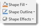
First, insert the image into the document. Then, click the Insert tab on the Ribbon, choose Text Box > Draw Text Box (at the bottom of the menu), and draw a small text box on the page. Click in the text box, and type your caption text. Size the text box to match the width of the image. To remove the border around the text box, click the text box to select it (the appearance will change to display dotted lines), and then go up to the Ribbon to click the Drawing Tools > Format tab; click Shape Outline (you’ll find it between Shape Fill and Shape Effects). Finally, click No Outline.
Group the text box and the image so that they will move together. To do so, click the image to select it, hold down the Shift key, and click the text box. With both items selected, right-click and choose Group from the pop-up menu, and then select Group once again.
8. Use a Pull Quote to Add Visual Interest to a Text-Heavy Page
Pull quotes add visual variety to a text-heavy page; use them to place a sentence or two of interesting text copied from the surrounding page into a box separate from the page text. First, select the words you wish to use, or type some new text. Copy that text, choose Insert on the Ribbon, and click Text Box. Select one of the designs that appear in the Gallery, click in the text box you’ve added to the page, and click Paste to place the text inside it.
Now, click the text box, move it into position on the page, and resize it to suit the text it displays. You should also change the font and increase the line spacing of the text in the pull quote to set it apart visually from the surrounding text; this will ensure that the reader sees it as a separate element instead of mistaking it for regular text. You can learn more about changing text-box shapes in the article “Work Faster in Microsoft Word: 10 Secrets.”
Next Page: Add a Cover Page
9. Add a Cover Page Instantly
Word’s Cover Page feature lets you add an attractive cover page to any document. To add one to yours, click the Insert tab on the Ribbon, click Cover Page, and select a cover page from the gallery. Although you can change every element on the cover page, it’s best to start with one that comes closest to what you want in the end.
When you select a cover page, Word adds it to the beginning of the document. Click inside each of the items on the cover page, and type your text. To remove anything you don’t want, click the item and press Delete. If you decide that you don’t like the cover page at all, you can select a different one, and it will automatically replace the unwanted page.
10. Adjust Paragraph and Line Spacing for Text and Pull Quotes
Desktop publishing applications provide precise tools for making microadjustments to paragraphs and to line spacing. You can accomplish the same goal in Word, however. Select the text you wish to alter, click the Home tab, and then open the Paragraph dialog box by clicking the arrow next to the Paragraph label that points down and to the right. Now click the Indents and Spacing tab to adjust the line spacing within paragraphs (using the Line Spacing tool), as well as the line spacing between paragraphs (using the Before and After tools).
For text-intensive documents, it’s usually best to indent the first line of each paragraph by a half-inch, and to set the line spacing to 1.15 inches with no additional space before or after each paragraph. This is a layout that books often use. Another common spacing option is to add 6 points of space after a paragraph and use no indents at all.
To set your spacing options as your default (Normal) style, click the Home tab, move your mouse pointer to the Styles area, right-click Normal, click Modify, and then click OK. Now this spacing will apply to every document that you format with the Normal style.
July 3, 2018
6 Tips for Using Word as a Desktop Publishing Tool
A quick Google search for using Word as a desktop publishing tool returns hundreds of blog articles about how bad Word is at desktop publishing. As a printing company, we understand that. We also understand, that from a clients point of view, sometimes Word is all you have. If you have no choice but to use Word, we hope that this article will help you in using Word as a desktop publishing tool and how to prepare your files to send to a printing company.
Adjust Your Page Size
Word is a word processing application, so it makes sense that the letter size (8.5×11″) is the default for a new document. But what if your document needs to be smaller or larger? Instead of centering the information for a smaller size document within the 8.5×11 page, change the page size to the dimensions of your final printed piece.
In the menu bar, choose Page Layout > Size. There are a few default sizes to choose from including Legal (8.5×14), Monarch (3.88×7.5) and Ledger (11×17). To change your document to a size that is not listed, scroll to the bottom and click More Paper Sizes. In the Custom Size box you can enter the width and height of your document. If you need to adjust the margins, choose Page Layout > Margins and select one of the preset margins or you can set a custom margin.
You should not use the default 8.5×11 page size for your document if the final size of your print media project is smaller or larger. Printing companies will take your Word document and create a PDF from it. Then they will either send the PDF as it is through the impositioning software for plating, or place the PDF document in a page layout program, like InDesign, to enlarge or reduce based on the final size of your project. Placing an 8.5×11 size PDF into a 5.5×8.5 document and reducing to fit will cause uneven margins. The placed PDF file can be stretched to make the margins even, but your text and images will be skewed.
Understanding How Colors Are Treated in Word
The Word default text color choice is black. Any other color selection you use will be a RGB value. When you insert an image into your Word document, Word will retain the color of that image. If it is RGB, it will stay RGB once you export it as a PDF file. The same goes for CMYK images. When you are designing a print media project, your color setup should always be in CMYK. To find out the difference in RGB and CMYK, please read our blog article “Designing for Print: RGB vs CMYK”>.
If you are planning for your project to be a PMS (Pantone Matching System) spot color job, please work using only black as your color space. For two or more spot colors, you can choose other colors, but they will be RGB when you save the PDF file. You will need to instruct the prepress operator to change the colors to spot before proofing and plating. Placing duotone images from Photoshop is not allowed in Word, as you have to save the duotone image as an EPS or PDF file, and you can not insert an EPS or PDF into Word.
Use High Resolution Images
Anytime you are working on a project that will be offset or digitally printed, your images and support files need to be a resolution of at least 300ppi. Anything lower will have a fuzzy, pixelated look. Unfortunately, a drawback to using Word as a page layout program, is when saving as a PDF document, your images will be downsampled to 200ppi, even if the original has a higher resolution. For this reason, when you send files to the service provider, include any images you used in the Word document so they can be replaced if they need to be. Be careful when pulling images from the internet, or using Word’s built in clip art service, as these images and clip art are probably not 300ppi. We wrote the article “What you should know about LPI, DPI, and PPI” to help explain the differences.
Another drawback to using Word is the inability to place vector files like EPS and AI files. Vector files are easily scaled and will not lose their clarity. If your project uses vector files and you need to insert them into Word, create a JPG or PNG of the file in MS Paint or another image program like Photoshop. You can then place the JPG or PNG as a FPO (for placement only) and instruct the prepress department to replace the FPO with the vector file. Because the prepress department has to adjust your files, you will likely incur a slight charge for this.
Understanding Fonts
You can use any font that is installed in the font folder within your system folder, or any font you have activated using a program like Suitcase Fusion. When you prepare to send your files to the service provider, any fonts you used need to be packaged along with your files. If you do not send the font files, and you only send the Word document, the service provider most likely will not have the same font installed. Without the same fonts installed on their system, the type in your Word document will default to another font.
To avoid any font issues, always send a PDF file to the service provider. It is also highly suggested that you send lasers of your project so the prepress department can make sure that what they have on their computer looks exactly like what you have on yours. Be sure that the lasers you send are the updated and final copy of your project.
How Word Treats Bleeds
You can not create bleeds in Word. If you have an image or graphic that needs to bleed, you will need to instruct the prepress department which elements need to bleed. If it is an image or vector file, you need to package those support files along with the PDF file, for the prepress operator to adjust the bleed. If you do not include the images, then the prepress operator will enlarge the image in order to add bleeds, or your file may be under trimmed in the bindery stage of production. Both of these options may produce unwanted results for your project.
For an explanation of bleeds, please see our article: “Designing for Print Media: Bleeds”.
Export a PDF File
To safely use your Word document for printing, you will need to save it as a PDF file. The PDF file will be the file that your proof and plates are created from. Depending on how you set up your Word document, or if you followed some of the suggestions in this post, your file may need some extra work from the prepress operator of the printing company. Package the PDF file along with the fonts and support files used in the project in a folder to be zipped and uploaded to the printers FTP site.
Microsoft Word, as well as any other word processing application, is far from ideal for setting up an offset printing project. However, if you use these suggestions, they will help you to avoid costly prepress time and poorly quality print files. If you have questions on how to properly set up your files and Word document for offset printing, contact your salesperson or prepress operator to help guide you through the process.
Would you like more helpful print related articles sent to your inbox? Click here to subscribe to our mailing list and receive our bi-weekly article posts every Tuesday and Thursday.
If you own Microsoft Word and aren’t yet ready to purchase desktop publishing software, it is still possible to create the quality publications you need. Anyone competent in Microsoft Word can, with a little practice, develop well-designed documents and publications. Here’s how to maximize Word’s formatting and graphics features to competently create publications.
Microsoft Word’s Desktop Publishing Features
One of the reason’s you can get by without purchasing a desktop publishing application is that Microsoft built so many of the necessary features into Word. The ability to draw lines and borders, for example, allows you to create forms, highlight pull-outs and make headings stand out.
Another publishing standard available in Microsoft Word is the text box feature. It allows you to drop text into the middle of objects while controlling the placement, size and font. In the same way, AutoShapes make drawing geometric figures, arrows or banners a breeze.
These features, combined with the huge template gallery available both within the software and online through the Microsoft Office website, give you tremendous versatility in creating products. Templates for invitations, flyers, banners and just about any type of business publication are readily available and can be completed quickly with no special training. You might also try searching the internet for template collections posted by expert Microsoft Word users.
But let’s get back to those special desktop publishing features that help you create professional products in Word. An extremely powerful tool is the drawing canvas, where you can gather objects, size them and move them about easily before final placement on your document.
While we’re discussing objects, the built-in ease of coloring, formatting and sizing them in Microsoft Word should encourage users to include them to break up text areas. For example, a drab publication can become more enjoyable to read, simply by adding WordArt creations or AutoShapes.
If you’re just not sure you can teach yourself these new skills quickly enough, try an online course in advanced Microsoft Word skills. You can also find help on forums visited by Word experts.
Now that you’re aware of the versatile desktop publishing features within Microsoft Word, begin using it for more than word processing. Allow yourself to push the limits of this powerful application. By doing so, you’ll grow more comfortable with the general concepts of desktop publishing. When you’re finally ready to select desktop publishing software, you’ll have gained valuable knowledge about the features you require and their importance in creating the publications you need.
Word 2016 is much more than just a word processor. You can also use it to create and format books, brochures, flyers, business cards, and the list goes on! In this article, we’re going to start having fun. We’re going to create a newsletter, then a tri-fold brochure. The best part is that we’re not going to use a template for these either. We’re going to do it all by ourselves – from scratch.
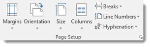
Page and Paper Sizes
If you’re creating something other than a document, you may want to use a different size page than the standard 8.5×11. Word 2016 offers you several page sizes that you can choose from. To choose the paper size you want, go to the Layout tab and choose Size from the Page Setup group.
Choose the page size you want from the dropdown menu.
Textboxes
When you’re creating something like a flyer, brochure, postcard, or business cards, you don’t just type in a document like you do for most other things. Instead, you create text boxes to enter in text. You can also insert text boxes into reports and articles to help make certain text stand out. Text boxes can easily be moved, resized, and repositioned (along with the text inside them) to make creating a layout easy.
To create a textbox, go to the Insert tab and find the Text Box button in the Text group.
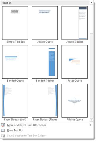
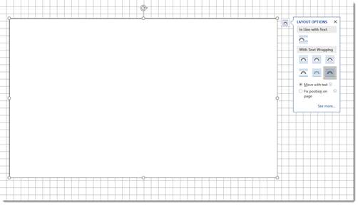
As you can see, there are a lot of built-in textboxes that you can use. However, to show you how to fully use text boxes, we’re going to create our own by selecting Draw Text box.
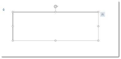
When you do that, your cursor will turn into a plus sign. Simply drag the text box onto the document:
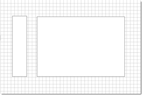
We went ahead and drew another text box. This is the beginning of our layout.
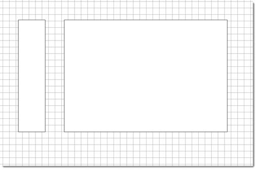
Using the Grid and Rulers
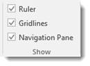
Now that we have our text boxes on the page, we want to line them up and position them correctly. To do this, we’re going to go to the View tab and make sure both Ruler and Grid are checked in the Show group.
Our layout now looks like this:
We use the grid to line up our text boxes. We use the ruler to make sure the text boxes are the measurements we want. We have two text boxes that need to be the same, so we’ll use the ruler to make sure they are.
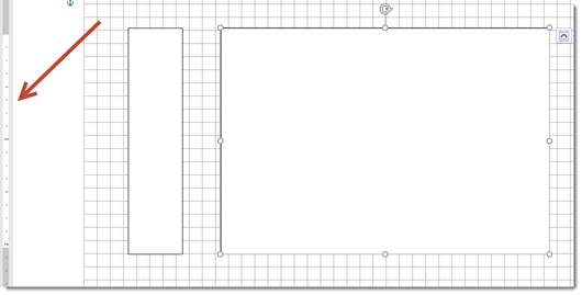
As you can see, we have a text box selected. To the left, we can see a ruler that shows its height.
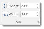
We can also double click anywhere in a text box to bring up the drawing tools Format menu in the Ribbon and change the width or height in the Size group.
As you can see, our textboxes are measured and positioned evenly:
Adding Text to a Textbox
To add text to a textbox, simply click in the textbox and start typing.
You can select the text just as you would with a normal document and change font, font size, font color, add text effects, etc.
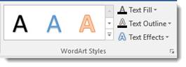
You’ll find more text effects under the Drawing Tools Format tab when you double click your text box, including 3-D and transformations, in the WordArt Styles group.
You can also change the text fill color and the text outline color.
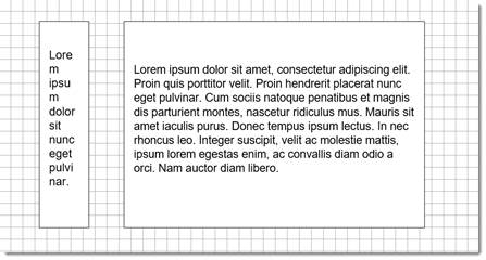
Extra Text
There may be times when you have more text than you do room in your text box. Text boxes have a fixed height and width that you establish when you draw the text box. They will not expand or contract to match the volume of text. This means if the length of your text is longer than the length of your text box, not all of your text will appear, as you can see in the snapshot below.
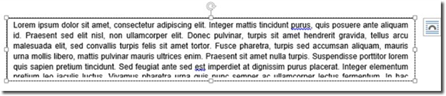
When this happens, you can adjust the font size or the textbox size.
Resize a Textbox
To resize a textbox, drag on the handles (the little squares) to enlarge or reduce it. You can also rotate a text box using the arrow at the top.
Aligning Text in a Text Box
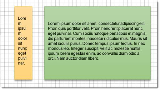
As you can see in our snapshot below, we have white space at the bottom of three textboxes. We want to align our text within the text box so it has a better appearance and not so much white space all at the bottom.
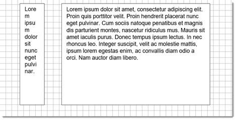
To do this, go to the Drawing Tools Format tab. Go to the Text group, then click the Align Text button.
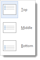
We’re going to choose middle.
Formatting Textboxes
Just as you can format text and tables, you can also format text boxes by adding a fill color, outline, or effects.
To format a text box, double click on it.
Next, go to the Shape Styles group in the Drawing Tools Format tab.
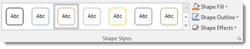
The Shape Style gallery has different themes that you can apply to a text box.
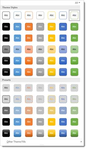
Or you can create you own by using the Shape Fill, Shape Outline, and Shape Effects tools.
Use Shape Fill to add a fill color. Use Shape Outline to add an outline color. You can use Shape Effects in the same way that you use text effects.
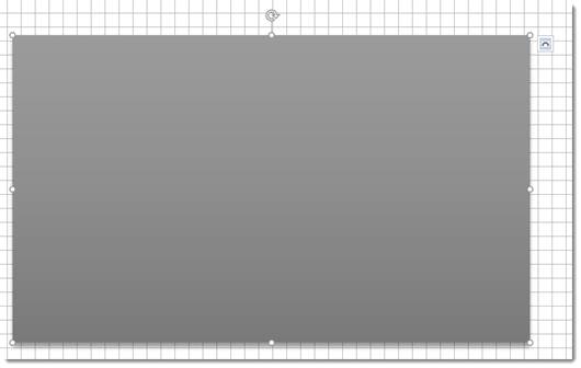
Our text boxes appear below.
We added a theme fill, then added a shadow effect.
Move Text Boxes Forward or Back (Stacking Objects)
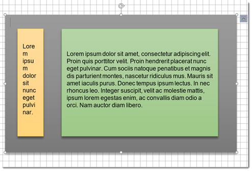
Let’s say we don’t want the white background in the flyer we’ve created above. We can either add a page background, or we can draw another text box behind the ones we already have. This text box will cover most of the page and serve as background.
First, draw the text box.
As you can see, the new text box covers all of the elements we added to our flyer:
If you are ever stacking text boxes in a design, you can always remove the fill color so the text box is transparent by going to the Drawing Tools Format tab. Click on the Shape Fill button, then select No Fill from the dropdown menu.
However, we want to add a fill color to this new text box, as we’ve already done below. We’ve also formatted it.
Now, we’re going to go to the Arrange group under the Drawing Tools Format tab. Click the Send Backward button.
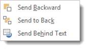
We can choose to send it backward, send it to the back, or send it behind the text.
-
If we choose Send Backward from the dropdown menu, it sends the new text box behind the last text box that we drew.
-
If we choose Send Behind Text, it sends the text box behind all text.
-
If we choose Send to Back, it sends the new text box behind all other text boxes and elements on the page.
We are going to choose Send to Back.
To move text boxes forward, click the Bring Forward button to the left of the Send Backward button. You can then bring the text box forward, which places it on top of the text box that’s currently above it. You can also bring it to the front or bring it in front of the text.
This is a simple newsletter layout. Of course, you can add images and graphics to your creations. You can also use WordArt, different fonts, colors, etc.
NOTE: Just as we stacked text boxes in this section of the article, you can also stack shapes, etc.
Adding Drop Caps
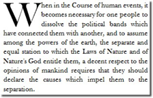
A drop cap is a simple embellishment that, if used correctly, can make your documents look more interesting and professional. Basically, all it is a letter at the beginning of a section or paragraph that is larger than the text that follows it, but instead of extending upward (which is what it would do if you just tried to increase the font size for a single letter) it drops a few lines down:
Creating a drop cap in Word 2016 is incredibly easy. Just go to the Insert tab and click the Drop Cap button in the Text section of the Ribbon. The cursor should be positioned in the paragraph for which you’d like to add the drop cap, but it doesn’t necessarily have to be in front of the letter for which you want to add the effect, because it will drop cap the first letter of the paragraph.
When you click the Drop Cap button, you will see these options:
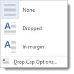
You can choose to place the drop cap within the paragraph or in the margins.
To exercise a little more control over it, click Drop Cap Options.
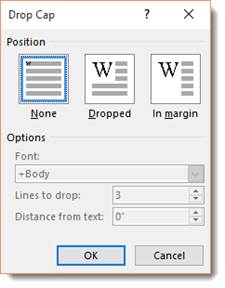
You can have the letter drop as many lines as you’d like, and even choose how much space to put between it and the text that follows.
Click OK when you are finished.
Watermarks
You’re probably familiar with watermarks. They can sometimes be seen stamped into expensive bond paper, and they are visible when you hold twenty-dollar-bills up to the light.
A real watermark is stamped into a page with expensive equipment. Word 2016 just allows you to place a light, printable image behind all the text and objects in a document. You can use it to add an effect to the document, mark it as a sample or draft, or even authenticate it. Just remember, a watermark in Word is essentially a background. It cannot be moved or resized like other objects.
Unlike most objects that can be inserted into a document, the Watermark button isn’t located on the Insert tab. Instead, to place one in your document, go to the Design tab, then the Page Background group. When you click on the button, you will see this dropdown menu.
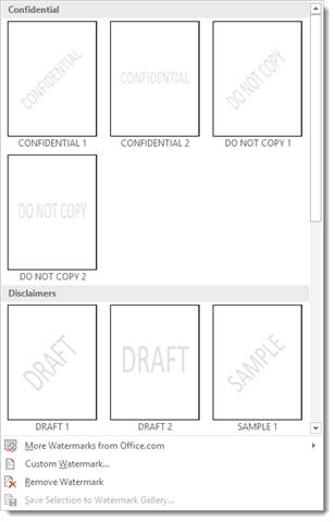
Several watermarks were included with your copy of Word 2016. They are things like «Confidential», «Do Not Copy», «Draft» and «Urgent.» If you are connected to the internet, you can easily browse watermarks that were created the Office community by clicking «More Watermarks from Office.com.»
You can also create custom watermarks using pictures on your computer or text of your own. Just click Custom Watermark.
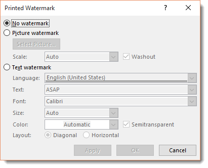
Choose your own language, font size and type, it’s orientation to the page (called «Layout») and more. Type your text in the Text field (in the sample above the text chosen is «ASAP.») Click okay to apply it.
You can remove a watermark at any time by returning to the Design tab, clicking the Watermark button, and selecting Remove Watermark.
Long Documents
Long documents like reports, stories, and novels can be hard to navigate through to find what you need – or to find information about the document itself. In this section, we are going to discuss ways you can organize long documents to make them easier to manage and to navigate.
Managing Documents Over 100 Pages
If you are working on creating and editing a document that is going to be over 100 pages, sometimes it is best to create several smaller documents. You can break the documents up into chapters or sections. Of course, this is not something you have to do. You can create one single document, and you can make it as long as you want. However, when you are working on something and editing it, it can be easier (and quicker) to break it up. You can keep the different chapters or sections (documents) in one folder and name them so they’re easily identified (chapter_1, chapter_2, etc.).
Creating a Master Document
The one reason you may shy away from creating several documents that will eventually be combined into one document is because of the work it will take to actually combine the documents together. For this reason, Word offers you a master document feature. The multiple documents you created (as we suggested in the section above) become subdocuments. When you combine these documents, you create a master document.
There are two ways to create a master document. You can start from scratch by opening a blank Word document, or you can convert an existing word document.
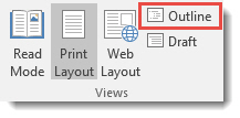
To create a master document, or to add more documents to an existing one, Microsoft insists that you use Outline view. Move over to the View tab and click Outline. (Highlighted in red below.)
A new tab, titled «Outlining» will open in the ribbon:
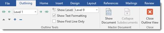
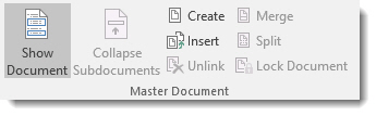
Slide your mouse over to the Master Document group, and click the Show Document button. Doing so simply expands the group, giving you more options.
Now click the Insert button:
In the Insert Subdocument dialogue box, find the documents that you want to insert.
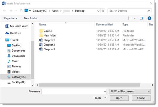
Click Open.
Repeat the steps until all of the sub-documents you want are entered into the master document.
The contents of the documents will initially appear in outline form, but you can easily return to Print Layout View (the default view in Word 2016) by clicking the Close Outline View button. This will show you the actual layout of the document. You can edit the master document just like you would edit any document in Word.
But you must remember that you have not actually inserted the sub-document into the master document. You have created a link to it. Any changes you (or one of your team members) make to the original will automatically appear in the master document and vice versa.
You can delete a sub-document from the master by selecting it in Outline view, and clicking the Unlink button.
If you want to prevent changes made to the master from appearing in the sub-documents, return to Outline view, and in the Master Document group, click the Lock Document button.
Splitting a Document and Creating New Sub-Documents
You can also split text in a master document into more sub-documents. To do so, select the text you would like to use to create a new sub-document, and return to Outline view. Click the Show Documents button, then click the split button.
To create a new sub-document, simply click the Create button in Outline view.
Document Info
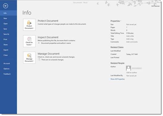
Also called ‘metadata’, document info is all of the information that can identify the document. It can include the name of the author, the date the document was created, the number of pages, copyright information, etc. To view document info, simply select the File tab. You will see the document’s properties on the right side of the page. On the left, you will be able to encrypt the document, inspect it for errors prior to publishing, or check the document in or out.
Using Heading to Create a Table of Contents
Creating a Table of Contents for any body of work that you create in Microsoft Word is also very quick and easy.
The quickest way to create a Table of Contents is to apply a Heading style to all of the chapter titles, subtitles, section headings, etc. Headings are essentially labels for different sections of your document.
For example, when writing a book, you would use headings to create chapters. Then, headings again to create sections within the chapters – and perhaps sections within sections.
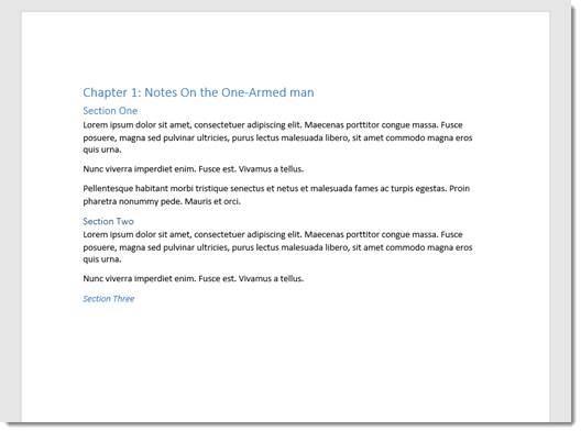
In order to be able to create a Table of Contents in Word, any section or category that you want listed in a Table of Contents should contain a heading.
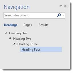
Heading 1 is the top tier of headings. It uses the largest font and is used for the big sections or chapters of a document. We use it for lesson titles.
Heading 2 is the first «subheading» so to speak. Perhaps we’d use that for sections. Its font is smaller than that of Heading 1.
Heading 3 is the «subheading» of a «subheading.» To add subsections to a section, we may use Heading 3.
The same for Heading 4.
The best way to illustrate this is with the Navigation pane in Word, as in the image below. This image shows the hierarchy of each of the default headings and subheadings in Microsoft Word.
To list categories, chapter titles, etc. as headers:
1. Select the text or simply move the cursor into the paragraph.
2. Go to the Home tab in the Ribbon.
3. Go to the Styles group.
4. Select the heading style you want to apply.
Word 2016 also allows you to see a preview of each heading style without applying it. Just hover the mouse pointer over each style for a few seconds, and the selected text in your document will change. If you do not click on it, you can move to the next style and see what that would look like. Click the style to apply the changes.
Collapsible Headings
In Word 2016, you can now collapse headings. Typically, when you create a heading, you have paragraphs of text below it. If you want to see the next heading, you have to scroll down or use the Navigation Pane to navigate to it. In Word 2016, a little arrow appears to the left of a heading when you mouse over it, as in the example below.
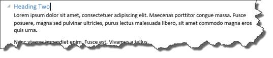
This image shows the text associated with Heading Two. If you click the gray arrow, you can «collapse» all of that text so you are just seeing the next heading under it:
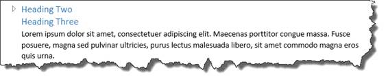
Remember, though, that if you collapse a heading, all of the sub-headings associated with it will also collapse.
To expand the text under a heading, click the arrow again.
Creating a Table of Contents
When you are finished with your document and ready to add a Table of Contents, or TOC, select the place in the document where you want it to appear and put the cursor there.
- Next, click the References tab in the Ribbon.
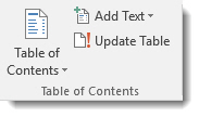
- Click Table of Contents in the Table of Contents group.
- You will see this drop down menu.
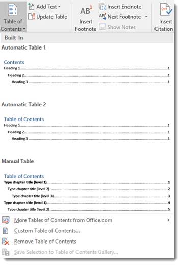
- Select the format you would like to use for your Table of Contents. (Notice how important Headings are in the format.)
Update a Table of Contents
If you have edited your document or made changes to its headings, you can update your Table of Contents without redoing the whole thing.
Here is how:
- Apply all headings to the document so the Table of Contents lists everything.
- Select the References tab in the Ribbon.
- Select Update Table in the Table of Contents group. This is right beside the Table of Contents button.
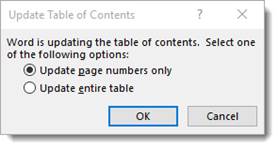
Word will then ask you if you want to update page numbers or the entire table. If you have added headings, you will want to update the entire table.
Add Text to a Table of Contents
You can add headings to your Table of Contents and also create the heading in your document.
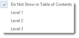
Go to the Table of Contents group, and click the Add Text button.
You can choose that the text not appear in the Table of contents. Or you can choose a level. Level 1 represents Heading 1, Level 2 represents Heading 2, and Level 3 represents Heading 3.
Word processing software is used to create and edit documents like letters, reports and books. There are numerous word processing applications available. Microsoft (MS) Word, which is part of Microsoft Office, is the most frequently used word processing program. Other applications include WordPerfect by Corel Corporation, iWork by Apple, Google Docs and Writer by Apache.

Is MS Word a desktop publishing tool?
Word processors include a number of tools for formatting pages, organizing text into columns, adding page numbers, inserting illustrations, etc. Additionally, header and footer options, indexing and table of content features allow you to create a professional document. Features specific to longer documents, like pagination, footnotes, endnotes and annotations are also available.
Word processors have tools that enable you to control the formatting of all the typographical details at the line, word and character levels like spacing, scaling and emphasizing.
The capabilities word processing software programs are adding to work with page layouts are beginning to blur the line between desktop publishing and word processing. Some users believe that MS Word provides them with all the features needed to produce their publications the same way as any other layout tool. Many businesses also prefer that their forms are in .doc format because they are small in size, can be easily edited and printed, and because MS Word is widely-used.
However…
MS Word does not give you complete control over your document. When it comes to design and positioning using the x and y values, you should use desktop publishing software, like Adobe InDesign, to produce a publication that looks professional and visually appealing.
You should use a desktop publishing tool if you need full-color or high-volume printing because MS Word cannot help with that. You can use MS Word to create complex layouts for brochures or newsletters that you print with your desktop printer, but it is not the best choice for creating digital files for commercial printing.
If you have your materials printed commercially, be aware that you may need to pay a lot for the printing house to rework the files in order to achieve acceptable results from your .doc files. MS Word sometimes has problems handling EPS and TIFF files, which are the standard graphic formats for desktop publishing. Word cannot properly handle the embedded color information in TIFF and EPS images, so the colors you see on-screen will not match the printed colors.
Conclusion
Microsoft Word is a good word processing program and you can use it to create any complex documents normally designed by any other page layout program. However, you need to keep in mind that MS Word documents are best-suited to desktop printing or photocopying and not for commercial printing.