
You’ve got some data in Excel, and you want to summarize it quickly. There’s not much time, and your client or boss needs information right away.
Apply any of these Top 10 Techniques to Summarize Data Quickly with in-built Excel Functions and Features. You’ll get instant results to satisfy most requirements fast.
Microsoft Excel has become the easiest way to analyze data quickly. Several Summary functions, Pivot Tables, What-If Analysis, and other powerful features & methods are available for your use within Microsoft Excel right out of the box. Learn them, and your data analysis will become a breeze.
Here are the Top 10 Ways to Summarize Data in Excel Quickly
These data analysis & summarization tips will work in Microsoft Excel 365, Excel 2019, Excel 2016, Excel 2013, Excel 2010, Excel 2007 & even Excel 2003. Further, they work on Excel for Windows as well as Microsoft Excel running on a Mac.
These Data Summarization Tips are listed in the order of the easiest to implement to the ones that need a bit more time. Some of the more complex data summarization methods will actually add more value to your data analysis.
- Get The Data Ready For Summarization
- Quick Summary With Auto Functions
- Fast Analysis With Sort & Filter
- Summarize Data With SubTotal Feature
- Summarize Data With an Excel Table
- Using Slicers to Summarize by different dimensions
- Summarize With Excel Pivot Tables
- Summarize Data With Excel Functions
- Advanced Excel Functions for Summarizing Data
- Summarize With Descriptive Statistics From Analysis Toolpak
You can apply the different ways to summarize data based on your familiarity with Excel.
The easiest methods of summarization are listed in the beginning.
And the Pivot Table technique is one of my favorite for a quick and dirty data summarization within Microsoft Excel. It always begins to give me numerous insights into the data.
We cover how to use the Pivot Table to Summarize Data in depth later in this article.
Let’s get started by exploring the different methods of summarizing data.
1. Get The Data Ready For Summarization
Before you begin your summarization, it is important to make sure that your original data is in a good shape.
Duplicate, a blank cell or missing values can often spoil your data summarization.
You need to make sure that the data range is correctly set up before you begin to analyze the data. Also, ensure there is no blank columns in between adjacent cells.

Ensure Proper Column Headings.
For each column, make sure that you have a short and unique column heading. Don’t leave any column without a heading, even though it may be obvious. Column Heading will make it easy to analyze data with any tool in Excel. This way the top row becomes the Header row.
Remove any Duplicates.
Duplicate rows can often sneak in from the data capture sources. So whether you capture data from the Web, or SalesForce, SAP or load from Text or CSV files, the first thing is to clean up the duplicates. To remove duplicates, click within the data range, and go to the Data Menu.
Data > Remove Duplicates.
That’s it, your data will now be cleaner.
Get Rid of Blank Rows:
While blank rows make the data look more readable and easier, it is a bane for data analysis. We do not want blanks to sneak in and skew our averages and other statistical calculations. By sorting the data with the different column headings, the blanks will get separated either to the top or to the bottom. Then you can simply delete these rows if they do not contain any other data points.
Don’t leave blank cells as blanks, specially if there is no value.
It is better to have a 0 than a blank value in any cell. For the text column, if the value is not known, it is better to have a NA (Not Available) showing up.
Having the data cleaned up is the first step in any data analysis. Now you can begin to apply the various data summarization methods.
2. Quick Summary With Auto Functions
The fastest way to summarize data is to calculate the Totals, count the number of entries, find out the average value, and figure out the highest and lowest values.
These 5 functions provide the vital stats of the data. These are the most basic and essential functions… just like a visit to a doctor starts with the nurse checking your vitals – height, weight and blood pressure.

These 5 numbers will provide a quick summary of your data. Here’s how to do this.
Here’s How To Create a Summary Section on Top of Your Data
Calculate SUM: Click on the Autosum icon on the Home tab of Microsoft Office to activate the Sum function of Excel. Then select the data range of the column you want to summarize. Here’s an example:
Calculate COUNT: Click on the drop-down icon on the Autosum button on the Home tab of Microsoft Excel. Choose Count from the list. Then select the data range of the column you want to count. You can use the count function only for numeric columns like Salary, Sales, Quantity etc. using this function. So don’t try this on a text column like Country or Department.
Calculate AVERAGE: Click on the drop-down icon on the Autosum button on the Home tab of Microsoft Excel. Choose Average from the list. Then select the data range of the column you want to Average. You can only average the numeric columns like Quantity, Profit, ROI etc. using this function. Here’s an example:
Calculate Highest Values: Click on the drop-down icon on the Autosum button on the Home tab of Microsoft Excel. Choose Maximum from the list. Then select the data range of the column you want to choose for picking up the highest value. You can only pick numeric columns like Quantity, Profit, ROI etc. using this function. Here’s an example:
Calculate Lowest Values: Click on the drop-down icon on the Autosum button on the Home tab of Microsoft Excel. Choose Minimum from the list. Then select the data range of the column you want to choose for picking up the lowest value. You can only pick numeric columns like Quantity, Profit, ROI etc. using this function.
Calculating the Sum, Count, Average, Min & Max are the fastest ways to get started in your journey to view summary data quickly.
3. Fast Analysis With Sort & Filter
If you sort the data by any key column like Country, Department, Category, Product, Zone, Area etc., then it becomes super easy to analyze data.
To sort the data on any column, follow these steps. Go to
Home > Sort & Filter > Sort A to Z or Sort Z to A.
This will sort the data in your chosen way (ascending or descending) for the column you are in.
Then click on the Filter icon. This will set up auto filters on top of all column headings. Now when you filter on any column, only values for that column will be visible. Unfiltered values are hidden, and visible data corresponds to the Filter selections.
After you have filtered for any particular selection, you can also highlight any numeric column, and see the summary being displayed at the bottom Excel bar.
At one time, you can see the Sum, Count, Average, Maximum & Minimum values from the selected range.

Now you can begin to summarize data for any selection, the way you want it.
4. Summarize Data With Subtotal Command:
If the data is already sorted, you are now ready to explore the Subtotal feature of Excel. This hidden gem has been languishing in Excel since the early 1990s, and very few people use it.
To add subtotals to your summary, first, clear all filters. And then Sort on the column that you want to add subtotal for.
The Subtotal feature is available on the Data tab of Excel.

Go to Data > Subtotal.
Choose the function to perform (Sum, Count, average etc), for the numeric column, and group by the desired column.
As an example, to get the subtotals of the number of employees by each department, it should say: At each change in Department, Count, number of Employees.

Click OK, and you should see the subtotal rows from the data in Excel. In the end, you will also see the Grand Totals calculated.

You can clear the subtotals, and perform the subtotals again at any time. To clear the subtotals, go to Data > Subtotal > Remove All. The subtotals and the Grand total row are all removed completely.
5. Summarize Data With an Excel Table
Microsoft Excel 2007 brought a new feature called Tables, which are amazing at doing simple summarization from a table of data.
To begin, stay within the data range on the Excel sheet. Then click
Home > Format as Table.
Select any colour you prefer, and click OK. Excel automatically recognizes whether the data selection has headers or not.
Now you have a new tab added to the Excel menu, at the end. It is called Table Design.

Select it, and check the Total Row checkbox. Now you have an additional total row added at the bottom of the data. Every column on the total row is a total calculator. Simply click on the dropdown showing in the total row cells, and choose an appropriate summarization – sum, count or average. Now that column will show a total sum or total count or total average of that column.
The great thing is that now if you filter the list, the totals will change dynamically. No need to call the Subtotal function every time. This technique of data summarization is better than the manual methods of subtotal.

Begin using the Table features if you haven’t done so already.
6. Using Slicers to Summarize by different dimensions
Beginning Excel 2010, Microsoft added the Slicers functionality which takes the Tables to greater heights.
Instead of filtering each column one by one, you can now create a slice of the data from the Excel spreadsheet at any time.
Go to Table Design > Insert Slicer > Pick the column of your choice that you want to filter on.

Now you can click on any value in the slicer, and the data is instantly filtered. You can make multiple selections, by holding the control key.
And more than 1 slicer can be added, giving you multiple combinations of slices. The total row updates automatically as each selection is made. This is truly slice and dice of data, allowing you to summarize data in Excel spreadsheets just by using a mouse. No formulas or lengthy steps are involved.
7. Summarize With Excel Pivot Tables
Pivot tables have been in Excel for over 30 years. They are the most used feature of Excel, as it allows for business analysts & managers to manipulate and analyze data in countless better ways.
A pivot table is actually a summary table, which allows you to slice and dice the data by different dimensions.

Pivot tables are easy to get started with.
To create a pivot table, Stay within your dataset. Then go to Insert > Pivot Table. The entire dataset is selected. Click OK and a new pivot table is created in a new worksheet by default.
Click on the column that you want to summarize on, from the pivot table field list on the right side of the screen. In our example, we check the Department and Sales amount from the field list. Instantly, the total sales per department are calculated and populated in the pivot table on the left. Notice that Excel generates a unique list of departments, without any duplicates.
To visualize both the Sum & Count of the data points, you can drag one more copy of the Sales into the Values Area section. Then right-click on the value, and choose
Summarize Values by > Count.
Similarly, you can change the calculation type, and pick up Average, Max, Min. This way, you can have all the vital statistics about your data summarized by each department.
Additionally, to see the percentage of sales done by each department,
Right Click on any numeric value in the pivot table, and choose Show Value As > % of Grand Total.
This will instantly calculate the % of contribution done by each department. The grand total will show 100% of the sales.
It is a good idea to sort the % of Grand Total value from highest to lowest by value, showing the highest values on the top.
You can then add a further selection in the rows or columns, to get a 3D view of your data. As you can see, Pivot Table is a powerful tool that can get the analysis done the fastest!
As you learn more about the Pivot Tables, you’ll realize that they can be used to summarize data from a single worksheet or multiple worksheets.
A pivot can even summarize data from multiple workbooks too. This is a must-learn feature of Microsoft Excel. You can attend an Advanced Excel Training in Singapore at Intellisoft, where I teach this class.
- FREE COURSE ON PIVOT TABLES TO ANALYZE DATA – No Signup is required. Click & Start watching Videos For Free and improve your Pivot Table Skills.
8. Summarize Data With Excel Functions

To get the most flexibility, you can actually write your own summary functions within Excel, by using the following formulas.
We have already covered the Autosum features of Excel which generate the Sum, Count & Average. Now we will look at how to write these functions manually.
To Sum a range of data, use =SUM(range) in the formula bar.
To Count a range of numeric data cells, use =COUNT(range). This generates a numeric count.
To count a range of alpha-numeric data cells, use =COUNTA(range). COUNTA can be used to count both numeric and non-numeric data.
To find the average of any data, use =AVERAGE(range).
9. Advanced Excel Functions for Summarizing Data
The real power of Excel functions is when you go beyond the basic summary functions and do some advanced data analysis.
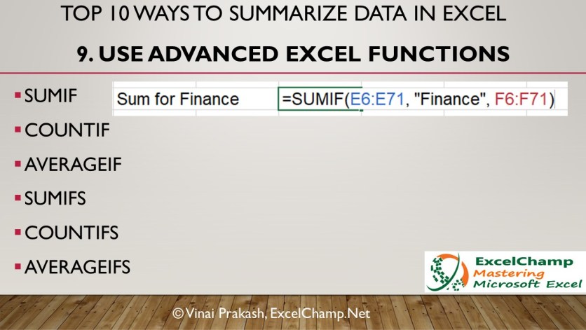 You can use the following Excel formulas
Sum the data conditionally. For example, if we want to summarize the monthly sales only for a particular country, we can use the Excel Sumif function:
=SUMIF(country data range, select_country, monthly sales data range)
Similarly, to count the number of products sold by a country, we can count by using the COUNTIF function of Excel
=COUNTIF(country data range, select_country, monthly sales data range)
And average sales per country can be analyzed by using the following formula of AVERAGEIF.
=AVERAGEIF(country data range, select_country, monthly sales data range)
For multiple, if conditions, you can use the sumifs function to summarize data by your chosen selection. These functions can really cut down your data analysis time when you have large amounts of data to summarize.
10. Summarize With Descriptive Statistics From Analysis Toolpack
Finally, Microsoft Excel has the Data Analysis Toolpak, a hidden Statistical Analysis tool, that can calculate the Median, Standard Deviation, Variance, Analysis of variance (ANOVA), and much more in a single click.
To enable the Data Analysis feature in Excel, you must go to
File > Options > Add Ins.
Then select the Data Analysis ToolPak if it is inactive. You might have to click on the Go button at the bottom. Choose the Toolpak, and click OK. This will add a Data Analysis button on the Data tab of Excel, at the end. Check it out. Once this button is enabled, it stays active, and you can use it subsequently anytime.

To use this Data Analysis ToolPak, go to
Data Analysis > Descriptive Statistics.
Select the Entire numeric column that you want to analyze in the Input Range. Check the Labels in First Row checkbox if your data has a header.
Then check the output box radio button, and key in a cell address where you want the summary statistics to be generated. Check Summary Statistics, and click OK.

The full descriptive statistics are displayed instantly. This final result is a detailed Statistical Analysis of your data.

Multiple Ways to Summarize Data in Excel – Conclusion
There are so many different ways to summarize data in Excel. Mastering them will improve your data analysis skills, and you will be on your way to huge success, by taking action on the insights gleaned from your data analysis.

Go ahead and try them out.
Each technique is a gem, and adds to your skills in Excel data analysis.
Cheers,
Vinai Prakash
About Vinai Prakash: Vinai is a prolific speaker, author, entrepreneur and coach on the topics of Data Analytics, Project Management, Advanced Excel Techniques, SQL, Python, Data Visualization with Power BI & Creating of Excel Dashboard and several other soft skills. He is one of the Best Trainers for Data Analytics Training and is highly sought after for his advice. Contact Vinai for your next Data Analysis Training.
- Join Vinai’s Data Analysis With Excel MasterClass, and learn how to analyze data firsthand.
Contents
- 1 How do I create a report from data in Excel?
- 2 How do you write a summary report?
- 3 How do I create a summary from different sheets in Excel?
- 4 How do you start a summary example?
- 5 What’s a summary report?
- 6 What is Summary function in Excel?
- 7 How do you summarize a data set?
- 8 Which tool in MS Excel is used to summarize data?
- 9 How do you summarize data in a table?
- 10 What are 5 key features of summary writing?
- 11 How do you start a summary paragraph?
- 12 What are the five steps in writing a good summary?
- 13 Is report and summary same?
- 14 What is the example of summary?
- 15 What is a special tool in Excel for summarizing data without formulas?
- 16 How do you report a summary in statistics?
- 17 How do you summarize data using descriptive statistics?
- 18 Which features of MS Excel is used to display summary data report?
How do I create a report from data in Excel?
Create a report using charts: Select Insert > Recommended Charts, then choose the one you want to add to the report sheet. Create a report with pivot tables: Select Insert > PivotTable. Select the data range you want to analyze in the Table/Range field.
How do you write a summary report?
5 Tips for Writing a Summary Report
- Outline the report before the meeting or phone call begins.
- Include only the key points from the event.
- Be concise.
- Use bullet-points to facilitate clarity.
- Re-read your report!
How do I create a summary from different sheets in Excel?
Click Data>Consolidate (in the Data Tools group). In the Function box, click the summary function that you want Excel to use to consolidate the data. The default function is SUM. Select your data.
How do you start a summary example?
Begin the summary by acknowledging the source. For instance, you could begin with a sentence such as: “This is a summary of the article XXXX written by XXXX published in XXXX.” 3. Next, write a topic sentence that conveys the main idea of the text.
A summary report is a short, written communication which may have a variety of purposes, such as: To brief the reader on the details of a particular event. To analyse a particular issue, draw conclusions and make recommendations. To convince the reader of the importance of taking a particular course of action.
What is Summary function in Excel?
Summary Functions
You can add the sum of your values, count all or only numeric values, average them, find the largest or small value in a series, multiply them together to derive their product, or estimate or derive their standard deviation or variance. By default, subtotals and summaries use the Sum function.
How do you summarize a data set?
The three common ways of looking at the center are average (also called mean), mode and median. All three summarize a distribution of the data by describing the typical value of a variable (average), the most frequently repeated number (mode), or the number in the middle of all the other numbers in a data set (median).
Which tool in MS Excel is used to summarize data?
AutoSum is one of the quickest ways to summarize data. Select a cell to the right or below a range of values and click AutoSum.
How do you summarize data in a table?
Summarizing data in a table
- Right-click the field heading of the field you want to summarize and click Summarize.
- Check the box next to the summary statistics you want to include in the output table.
- Type the name and location of the output table you want to create or click the browse button.
- Click OK.
What are 5 key features of summary writing?
- A good summary condenses (shortens) the original text.
- A good summary includes only the most important information.
- A good summary includes only what is in the passage.
- A good summary is written in the summary writer’s own words.
- A good summary is well-written.
How do you start a summary paragraph?
The first line of the summary paragraph should include a strong reporting verb, such as “argue,” “claim,” “contend,” “maintain,” or “insist.” You can also use verbs like “explain,” “discuss,” “illustrate,” “present,” and “state.” This will make the introduction of the summary paragraph clear and concise.
What are the five steps in writing a good summary?
Follow the 4 steps outline below to write a good summary.
- Step 1: Read the text.
- Step 2: Break the text down into sections.
- Step 3: Identify the key points in each section.
- Step 4: Write the summary.
- Step 5: Check the summary against the article.
Is report and summary same?
A summary is a fairly brief restatement–IN YOUR OWN WORDS–of the contents of a passage. Report back what the other writer has said.
What is the example of summary?
Summary is defined as a quick or short review of what happened. An example of summary is the explanation of “Goldilocks and the Three Bears” told in under two minutes.
What is a special tool in Excel for summarizing data without formulas?
PivotTables are one of Excel’s most powerful features – if not THE most powerful feature – and are exceptionally useful at summarizing large volumes of data when preparing analytical reports.
How do you report a summary in statistics?
Reporting Statistical Results in Your Paper
- Means: Always report the mean (average value) along with a measure of variablility (standard deviation(s) or standard error of the mean ).
- Frequencies: Frequency data should be summarized in the text with appropriate measures such as percents, proportions, or ratios.
How do you summarize data using descriptive statistics?
Interpret the key results for Descriptive Statistics
- Step 1: Describe the size of your sample.
- Step 2: Describe the center of your data.
- Step 3: Describe the spread of your data.
- Step 4: Assess the shape and spread of your data distribution.
- Compare data from different groups.
Which features of MS Excel is used to display summary data report?
Learn how to use Excel’s PivotTable feature to generate meaningful reports that summarize data. Excel’s PivotTable feature lets you organize and summarize data into a meaningful report format without changing the data set.
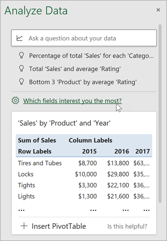
IMPORTANT: Ideas in Excel is now Analyze Data
To better represent how Ideas makes data analysis simpler, faster and more intuitive, the feature has been renamed to Analyze Data. The experience and functionality is the same and still aligns to the same privacy and licensing regulations. If you’re on Semi-Annual Enterprise Channel, you may still see «Ideas» until Excel has been updated.

Analyze Data in Excel empowers you to understand your data through natural language queries that allow you to ask questions about your data without having to write complicated formulas. In addition, Analyze Data provides high-level visual summaries, trends, and patterns.
Have a question? We can answer it!
Simply select a cell in a data range > select the Analyze Data button on the Home tab. Analyze Data in Excel will analyze your data, and return interesting visuals about it in a task pane.
If you’re interested in more specific information, you can enter a question in the query box at the top of the pane, and press Enter. Analyze Data will provide answers with visuals such as tables, charts or PivotTables that can then be inserted into the workbook.
If you are interested in exploring your data, or just want to know what is possible, Analyze Data also provides personalized suggested questions which you can access by selecting on the query box.
Try Suggested Questions
Just ask your question
Select the text box at the top of the Analyze Data pane, and you’ll see a list of suggestions based on your data.

You can also enter a specific question about your data.

Notes:
-
Analyze Data is available to Microsoft 365 subscribers in English, French, Spanish, German, Simplified Chinese, and Japanese. If you are a Microsoft 365 subscriber, make sure you have the latest version of Office. To learn more about the different update channels for Office, see: Overview of update channels for Microsoft 365 apps.
-
The Natural Language Queries functionality in Analyze Data is being made available to customers on a gradual basis. It may not be available in all countries or regions at this time.
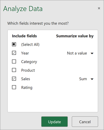
Get specific with Analyze Data
If you do not have a question in mind, in addition to Natural Language, Analyze Data analyzes and provides high-level visual summaries, trends, and patterns.
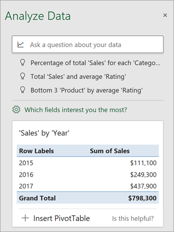
You can save time and get a more focused analysis by selecting only the fields you want to see. When you choose fields and how to summarize them, Analyze Data excludes other available data — speeding up the process and presenting fewer, more targeted suggestions. For example, you might only want to see the sum of sales by year. Or you could ask Analyze Data to display average sales by year.
Select Which fields interest you the most?
Select the fields and how to summarize their data.
Analyze Data offers fewer, more targeted suggestions.
Note: The Not a value option in the field list refers to fields that are not normally summed or averaged. For example, you wouldn’t sum the years displayed, but you might sum the values of the years displayed. If used with another field that is summed or averaged, Not a value works like a row label, but if used by itself, Not a value counts unique values of the selected field.
Analyze Data works best with clean, tabular data.
Here are some tips for getting the most out of Analyze Data:
-
Analyze Data works best with data that’s formatted as an Excel table. To create an Excel table, click anywhere in your data and then press Ctrl+T.
-
Make sure you have good headers for the columns. Headers should be a single row of unique, non-blank labels for each column. Avoid double rows of headers, merged cells, etc.
-
If you have complicated, or nested data, you can use Power Query to convert tables with cross-tabs, or multiple rows of headers.
Didn’t get Analyze Data? It’s probably us, not you.
Here are some reasons why Analyze Data may not work on your data:
-
Analyze Data doesn’t currently support analyzing datasets over 1.5 million cells. There is currently no workaround for this. In the meantime, you can filter your data, then copy it to another location to run Analyze Data on it.
-
String dates like «2017-01-01» will be analyzed as if they are text strings. As a workaround, create a new column that uses the DATE or DATEVALUE functions, and format it as a date.
-
Analyze Data won’t work when Excel is in compatibility mode (i.e. when the file is in .xls format). In the meantime, save your file as an .xlsx, .xlsm, or .xlsb file.
-
Merged cells can also be hard to understand. If you’re trying to center data, like a report header, then as a workaround, remove all merged cells, then format the cells using Center Across Selection. Press Ctrl+1, then go to Alignment > Horizontal > Center Across Selection.
Analyze Data works best with clean, tabular data.
Here are some tips for getting the most out of Analyze Data:
-
Analyze Data works best with data that’s formatted as an Excel table. To create an Excel table, click anywhere in your data and then press
 +T.
+T. -
Make sure you have good headers for the columns. Headers should be a single row of unique, non-blank labels for each column. Avoid double rows of headers, merged cells, etc.
 +T.
+T.Didn’t get Analyze Data? It’s probably us, not you.
Here are some reasons why Analyze Data may not work on your data:
-
Analyze Data doesn’t currently support analyzing datasets over 1.5 million cells. There is currently no workaround for this. In the meantime, you can filter your data, then copy it to another location to run Analyze Data on it.
-
String dates like «2017-01-01» will be analyzed as if they are text strings. As a workaround, create a new column that uses the DATE or DATEVALUE functions, and format it as a date.
-
Analyze Data can’t analyze data when Excel is in compatibility mode (i.e. when the file is in .xls format). In the meantime, save your file as an .xlsx, .xlsm, or xslb file.
-
Merged cells can also be hard to understand. If you’re trying to center data, like a report header, then as a workaround, remove all merged cells, then format the cells using Center Across Selection. Press Ctrl+1, then go to Alignment > Horizontal > Center Across Selection.
Analyze Data works best with clean, tabular data.
Here are some tips for getting the most out of Analyze Data:
-
Analyze Data works best with data that’s formatted as an Excel table. To create an Excel table, click anywhere in your data and then click Home > Tables > Format as Table.
-
Make sure you have good headers for the columns. Headers should be a single row of unique, non-blank labels for each column. Avoid double rows of headers, merged cells, etc.
Didn’t get Analyze Data? It’s probably us, not you.
Here are some reasons why Analyze Data may not work on your data:
-
Analyze Data doesn’t currently support analyzing datasets over 1.5 million cells. There is currently no workaround for this. In the meantime, you can filter your data, then copy it to another location to run Analyze Data on it.
-
String dates like «2017-01-01» will be analyzed as if they are text strings. As a workaround, create a new column that uses the DATE or DATEVALUE functions, and format it as a date.
We’re always improving Analyze Data
Even if you don’t have any of the above conditions, we may not find a recommendation. That’s because we are looking for a specific set of insight classes, and the service doesn’t always find something. We are continually working to expand the analysis types that the service supports.
Here is the current list that is available:
-
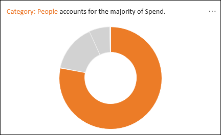
Rank: Ranks and highlights the item that is significantly larger than the rest of the items.
-
Trend: Highlights when there is a steady trend pattern over a time series of data.
-
Outlier: Highlights outliers in time series.
-
Majority: Finds cases where a majority of a total value can be attributed to a single factor.
If you don’t get any results, please send us feedback by going to File > Feedback.
Because Analyze Data analyzes your data with artificial intelligence services, you might be concerned about your data security. You can read the Microsoft privacy statement for more details.
Need more help?
You can always ask an expert in the Excel Tech Community or get support in the Answers community.
Often you may want to create a summary table in Excel to summarize the values in some dataset.
Fortunately this is easy to do using built-in functions in Excel.
The following step-by-step example shows how to create a summary table in Excel in practice.
Step 1: Enter the Original Data
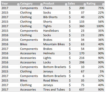
First, we’ll enter the following dataset that contains information about product sales for some company:

Step 2: Find Unique Values
Next, we’ll use the following formula to identify the unique product names in column B:
=UNIQUE(B2:B13)
We can type this formula into cell F2:

We can see that this formula is able to extract the three unique product names from column B.
Step 3: Calculate Summary Statistics for Each Variable
Next, we can calculate the total units sold, average number of units sold, and total revenue for each product by using the following formulas:
Total Units Sold:
=SUMIF($B$2:$B$13, F2, $C$2:$C$13)
Average Number of Units Sold:
=AVERAGEIF($B$2:$B$13, F2, $C$2:$C$13)
Total Revenue:
=SUMIF($B$2:$B$13, F2, $D$2:$D$13)
We can type these formulas into cells G2, H2, and I2, respectively:

We now have a summary table that tells us the total units sold, average units sold, and total revenue for each of the three products from our original dataset.
Step 4: Format the Summary Table (Optional)
Lastly, feel free to add a border around each cell in the summary table and add background colors to make the summary table more aesthetically pleasing:

The summary table is even easier to read now.
Note: We chose to calculate mean values and sum values in our summary table, but feel free to calculate other values of interest such as the minimum, maximum, median, range, and other metrics.
Additional Resources
The following tutorials explain how to perform other common tasks in Excel:
How to Perform Exploratory Data Analysis in Excel
How to Calculate the Sum by Group in Excel
How to Count by Group in Excel
Editor’s Note: This article was originally published in Sept. 2012 and the video tutorial for this article published Dec. 2018; while this program might look a little different, the steps shown in this tutorial are the same.
Number crunching is Excel’s forte, so when you’re ready to move beyond the basic summarizing aggregates, such as SUM() and AVERAGE(), you’ll find a lot of power and flexibility at your disposal. These summarizing tips will help you put Excel‘s summarizing features and functions to work for you.
Note: You can download a demo spreadsheet that illustrates these examples.
LEARN MORE: Office 365 Consumer pricing and features
1: Sort
The easiest way to summarize data is to start with a simple sort if all you need is a quick glance at ordered data. More important, many summarizing tasks require sorted data. If users don’t know that, the resulting analysis will be incorrect. When creating workbook applications for others, automate any required sort process if possible. In lieu of automation, be sure users are well trained and aware of this detail. It’ll mean the difference between valid data and a mess.
2: Selection
Sometimes, all you need is a little selection power; after sorting the data, select a subset. Figure A shows the summarized values for November 12 in the Status bar. This is a one-time deal — something you might rely on in a meeting. You can’t actually use the results in further calculations or summaries.
Figure A
Figure A
The Status bar displays summary values for the selected subset.
3: AutoSum
AutoSum is one of the quickest ways to summarize data. Select a cell to the right or below a range of values and click AutoSum. Excel will enter a SUM() function that references the data above or to the left, as shown in Figure B. You can press [Enter] or change the reference. In addition, you can enter other aggregate functions, such as Average(), Count(), Maximum(), Minimum(), and so on. AutoSum also works with a multiple range of columns (or rows).
Figure B
Figure B
Use AutoSum to get quick summary values.
4: Filter
Filtering might not be on your summarizing radar, but don’t dismiss it. Filtering allows you to selectively review specific data. It won’t summarize the data mathematically, but it will provide a unique view. Then, you can use AutoSum to summarize the visible data, as follows:
- Apply a filter by selecting the data range ([Shift]+[Ctrl]+8).
- Click the Data tab and click Filter in the Sort & Filter group. In Excel 2003, choose Filter from the Data menu and then select AutoFilter.
With the filter in place, display a subset. For instance, the filter in Figure C is the date November 12, which displays a subset of five records. At this point, you have a detailed summary of activity for November 12, but you can go a step further by using AutoSum (#3), which is smart enough to recognize the active filter and substitute the SUBTOTAL() function.
Figure C
Apply a simple filter to summarize data.
5: Subtotals
Sorting and filtering are easy to implement, but some tasks are more complex. Excel’s Subtotal feature summarizes values based on a corresponding value that changes. For this reason, Subtotal relies heavily on sorting (#1). To illustrate, we’ll use Subtotal to return the sum of all units sold on November 12 in our example sheet, as follows:
- Sort the data range by the column that categorizes or groups your values in some way. Our date values are already sorted. Do not skip this step unless the data is already in the appropriate order!
- Click inside the data range and press [Ctrl]+[Shift]+8 to select the sorted data range.
- Click the Data tab.
- Click Subtotal in the Outline group. In Excel 2003, choose Subtotals from the Data menu.
In Figure D, you can see that Excel does a good job of anticipating your task, but you can change the settings. In this case, Subtotal sums the sold values, inserting a subtotal for each date. The At Each Change In column should be the sort column in step 1. Click OK to display the results shown in Figure E.
Figure D
Select the appropriate settings.
Figure E
Excel Subtotal inserts subtotaling rows.
6: Pivot table
Pivot tables are more about structure than summary, but they support some flexible summarizing options. To illustrate, let’s use a pivot table to summarize our example data by dates, as follows:
- Select the data range.
- Click the Insert tab. Then, click PivotTable in the Tables group. In Excel 2003, choose PivotTable and PivotChart Report from the Data menu to launch the wizard, click Next twice, and then click Finish. In this example, you won’t need to change any of the default settings.
- Click OK to insert a pivot table in a new sheet.
- From the task pane, drag the Date field to the Column Labels list, the Personnel field to the Row Labels list, and the Sold field to the Values list. Figure F shows the resulting pivot table, complete with summary values.
Figure F
The pivot table structure offers several ways to summarize data.
Once the table is in place, you can analyze the data in different ways. For instance, you could regroup the table to display values for the month instead of the individual days. Simply right-click the column header area and choose Group from the resulting submenu. Then, choose Months and click OK. The resulting table, shown in Figure G, would be more effective if we had dates in multiple months.
Figure G
You can quickly change the summarizing effect by regrouping the data.
7: Conditional aggregates
Using SUM() or AutoSum (#3), you can discern that 420 units sold during November. When questions are more complex, try Excel’s conditional aggregate functions, SUMIF(), AVERAGEIF(), and COUNTIF(). These functions act upon values that meet a specific condition. To illustrate, let’s use SUMIF()to determine how many units each person sold, as follows:
- Enter a list of conditional values in E5:H5. In this case, that’s the personnel: Alexis, Susan, Kate, and Bill.
- Enter the formula =SUMIF($B$6:$B$13,E$5,$C$6:$C$13) in E6 and copy it to F6:H6, as shown in Figure H.
Figure H
SUM() adds all the values in a range; SUMIF()adds only those values that meet a condition.
The first argument, $B$6:$B$13, identifies the conditional values (the names of the personnel). The second argument, E$5, refers to the individual condition. The final argument, $C$6:$C$13, identifies the values to sum. In other words, the function in E6 will sum only those values in column C where the corresponding value in column B equals “Alexis.”
SEE: Comparison chart: Office suites (Tech Pro Research)
8: Multiple conditional aggregates
The conditional aggregates reviewed in #7 evaluate one condition. When you have multiple conditions, use SUMIFS(), AVERAGEIFS(), and COUNTIFS(). Continuing with the example in #7, we can add a second condition, as follows:
- Create a series of dates in D7:D10 to create the row labels for a simple matrix (refer to Figure I).
- Enter the formula =SUMIFS($C$6:$C$13,$B$6:$B$13,E$5,$A$6:$A$13,$D7) in E7. Copy it to F7:H7.
- Copy the row of formulas to E8:H10.
The result, shown in Figure I, is a simple matrix, similar to a pivot table (#6). The SUMIF() function returns totals for each person. SUMIFS() further reduces the sold values by considering dates.
Figure I
Use SUMIFS() to specify multiple conditions.
9: Dynamic multiple conditional aggregates
In #8, the criteria assume the equality operator (=). But what if users need more flexibility? For instance, Figure J shows a function that uses a bit of concatenation magic to count records that fall within a specific period. The equality operator can’t handle that.
Figure J
Concatenating the operators creates a dynamic formula.
The expression in B3, =COUNTIFS(A5:A12,”>=”&B1,A5:A12,”<=”&B2) relies on the COUNTIFS() function (#8) to evaluate multiple conditions. By concatenating the operators, the expression can evaluate a range of dates instead of a single date. The first range, A5:A12, refers to the dates the function evaluates. The first criteria argument evaluates to >=11/9/2011; the second evaluates to <=11/10/2011. As a result, the function counts any record where the date is later than or equal to 11/9/11 and prior to or equal to 11/10/11. This trick isn’t new, but it certainly simplifies many summarizing tasks.
10: Consolidate
The Consolidate feature’s traditional use is to merge and summarize data from multiple workbooks, but you can use it to summarize data in the same file — a use many people overlook. First, the feature requires a bit of setup:
- The column(s) you’re summarizing must have a heading.
- You must assign a range name to the column(s) you’re summarizing.
- The values you’re summarizing by must be to the left of the values you’re summarizing.
With the above conditions met, you can execute this feature as follows:
- Select the top-left anchor cell where you want to display the summary. (I chose E5.)
- Click the Data tab and then click Consolidate in the Data Tools group. In Excel 2003, choose Consolidate from the Tools menu.
- In the resulting dialog, click the Function drop-down to see what’s available and choose the appropriate function. (I chose Sum.)
- In the Reference control, enter the range name (DataRange refers to A5:C13) that refers to the data you’re summarizing, as shown in Figure K. If any references are in the All References list, delete them.
- Click the appropriate options in the Use Labels In section — usually, that includes both Top Row and Left Column.
- Click OK, and Excel will display a summarized version of your data, as shown in Figure L. (You might have to format the date serial values in column E.)
Figure K
Refer to the data range you’re summarizing by range name; don’t use a cell address.
Figure L
Use Consolidate to summarize data without sorting first.
Affiliate disclosure: TechRepublic may earn a commission from the products and services featured on this page.