

This blog post is brought to you by Diego Oppenheimer a Program Manager on the Excel team.
I am very happy to be writing this blog post today. Not just because I will be showing you another way Excel can make your data analysis easier but also because I will be introducing the new Data Model and Relationships features that will hopefully change the way you use Excel for data analysis forever.
For those of you who are not familiar with the power and usefulness of Pivot Tables you might want to check out this article (Overview of PivotTable and PivotChart reports) or this training (PivotTable I: Get started with PivotTable reports) . Some of these articles are a bit old but the principles and functionality still apply .
Ok, here we go…
Finding a home
Around this time last year my wife and I were considering purchasing a house in the Seattle area, even if it meant dealing with some of the worst traffic in the US. So like any self-respecting Excel nerd I started a spreadsheet with a table of data that fit our parameters. This data was easy to find on the many real-estate sites out there like Zillow.com or Redfin.com. One thing I noticed though was that none of the these sites by themselves had all the relevant data I wanted to make an informed decision and this is where the Data Model came into play by allowing me to combine data from multiple sources and perform a richer analysis.
You can see what I started with below or just download the workbook for yourself.

My first look at the Data Model
If you open the file above you will see I have a table with a lot of data. The first thing I am going to do is create a PivotTable so that I can sift through it easily. Under the INSERT tab, hit PivotTable and the
following dialog should pop-up:
I have highlighted a new option in the create PivotTable dialog which is to “Add this data to the Data Model”. So what is this Data Model I speak of?
“A Data Model is a new approach for integrating data from multiple tables, effectively building a relational data source inside the Excel workbook. Within Excel, Data Models are used transparently, providing data used in PivotTables, PivotCharts, and Power View reports“. Read more here…
In other words, the new Data Model allows for building a “model” where data from a lot of different sources can be combined by creating “relationships” between the data sources. For those of you with some database knowledge this is similar to creating joins between tables, except all the tables live in Excel.
I chose to add this data to my Data Model because I am going to be combining it with data I will get from other sources to make my analysis more complete.
Create the PivotTable
The first thing I want to do is look at the number of houses I have selected by zip code. To do this I drag the ZIP field to ROWS and the LISTING ID field to VALUES. By default, this will give me a SUM of LISTING ID’s, but we want a COUNT. To do this, right click on the header that says SUM of LISTING ID -> Value Field Settings… and change to COUNT. As you can see, I only have to sift through 165 house listings now (L).
I have decided to add a couple more fields to my PivotTable to help with my analysis. I added LIST PRICE, DAYS ON MARKET and SQFT and changed the Value Field Settings to AVERAGE.
At this time my PivotTable looked something like this:

And my Field List like this:
So now I have a layout that shows me the number of houses that met my criteria per Zip code and some extra data like Average Price, Square footage and Days on Market (my realtor says this comes in real handy when negotiating).
What do I know about the Zip codes?
One thing I noticed about all of the real-estate listing sites is that they give you a ton of detail about the listing but don’t really tell you much about the neighborhood. I want to better understand the demographics of the Zip codes I have selected.
Good thing there is a marketplace for just this type of inquiry (http://datamarket.azure.com). This place is great, and you can read all about it here. Make sure you have a Microsoft/Live-ID or sign up for one free.
Type “Demographics” in the search box and find a data set called “2010 Key US Demographics by ZIP Code, Place and County (Trial)”. If I click on that link to the data set, the first option is to “Explore Data Set” and that’s exactly what I want to do.
Next step is to narrow down the data set to only what is relevant, so I make GeographyType: Zip code and StateAbbreviation “WA” and hit “RUN QUERY”. Great, I think I have now what I need.
![]()
To get this into Excel you’re going to need two things from this website, so copy these somewhere:
(1) The URL for the current expressed query
(2) Your private account key
Now that I have all of this figured out, I can easily add what I found to the Data Model. In Excel, go to the DATA tab and select “From Other Sources”, “From Windows Azure Marketplace”.
Fill out the information with what you have saved from the website:


Select that table.
Hit “Finish” and then select “Only Create Connection”:
 |
Note: Some of you might be wondering why I chose “Only Create Connection”. I chose to do so, so that the data was never brought onto the Excel sheet, but directly into the Data Model. I only plan on using it in combination with my original table so there was no need to bring it in as a table onto my sheet or create a new PivotTable or PivotChart. If you’re wondering what that PowerView Report does check out this post by Sean Boon.
Combining my Data
If I go back to my original PivotTable, specifically back to the field list, you might have noticed a small change, particularly around the top.
You can see a tab called “Active” (which is selected) and a tab called “All”. The field list is the best way to explore our newly created Data Model, and the “All” tab lets us do just that. Any connection or table that was added to the Data Model will show up in this tab. Let’s take a look.

We can see that our original Table (Table 1) and the Table we brought in from the Data Market are both there. Great!
Now for some magic. I want to know a bit more about each of my Zip Codes, so what I am going to do is add those fields from the demog1 table to my PivotTable. The first one I’ll add is MedianAge2010 (we want to live around people our age so we have a better chance of meeting neighbors we have something in common with).
There are two things to notice here. First, the median age is the same for every zip code, which gives me a hint that something is wrong:

And second, a little message popped up in the field list.

Excel is telling me that a relationship between the two tables might be needed, so I go ahead and create it.

A couple of things to notice when working with relationships:
· Both columns chosen need to contain the same type of data (Zip Code in this case).
· They only work when one of the table’s columns contains unique values.
· The Related Column (Primary) should always be the one containing the unique (no duplicates) values.
· In a PivotTable, to be able to put something from the Related Table on Values you will have to have a field from the Related Table on Rows or Columns.
To satisfy this last condition, I remove ZIP and add GeographyId to Rows. Now my PivotTable looks something like this:

The reason for all those ugly blank spaces is because I have no houses that match my criteria from Table1 for every single Zip Code from the Marketplace data. I can easily filter these out by clicking the downward arrow next to Row Labels, Value Filters, Does Not Equal

Great, now I only have the Zip Codes I care about. I went ahead and added some more fields, conditional formatting and some sorting to figure out what the best zip code for us is and ended up with this:

Seems like 98103 is a really good candidate, falling in the middle in price and Average SQFT but towards the bottom in both Unemployment and % Vacant units. I can go ahead and add a COUNT of ListingIDs and see that I have 8 houses to go check out in this neighborhood that meet my criteria.
More Details on the Data Model
In this last example, I really am only scratching the surface of what the Data Model can do and I plan on showing much more in future blog posts. Here are some quick facts though:
- Any given workbook will only have one Data Model.
- Any table in Excel can be added to the Data Model.
- Almost all Data Sources can be added to the Data Model (SQL, Odata, Atom feeds, Excel tables and more).
- Tables in the Data Model have no limit in terms of rows.
- Relationships can be defined across multiple tables.
I hope this is enough information to make you dangerous with the new Data Model capabilities. Feel free to leave your questions and comments below or message me on Twitter @doppenhe.
 If you’re importing foreign data or sharing a workbook, the data often ends up in several sheets. As a result, turning data into meaningful information can be difficult. That’s where Excel 2013’s new data modeling capabilities can help even casual users. By building a relationship between sheets, Excel 2013 makes summarizing data spread across multiple sheets easy.
Putting this new feature into practice is easy, but it works mostly behind the scenes. As a result, it can be difficult to get a handle on how to implement it. In the next 10 steps, we’ll define a reporting need and meet it using Excel 2013’s new data model.
This article is for users unfamiliar with the feature and trainers supporting Excel users. This feature isn’t for serious database developers, and please don’t blast me for Microsoft’s unfortunate choice for naming this new feature.
1. Defining the need
Figure A shows two sheets with related data. As you can see, each record in Daily Totals contains a value that’s further described by date, personnel, and city. The records in Sites list the cities in each region. Now, suppose you want to total the values in Daily Totals by region.
Figure A

These two sheets contain records that are related.
Working through your data won’t always be this easy. I’ve purposely kept this example simple to keep the focus on the steps.
2. Convert data to tables
To use Excel’s data model, convert the data into tables. When working with your own data, make sure your data set has a row of headers. Our data sets already have a row of headers. To convert data to a table, do the following:
- Click anywhere inside the data set and click the Insert tab.
- Click Table in the Tables group.
- In the resulting dialog box, shown in Figure B, click OK. In this case, the header option is already checked. When applying this technique to your own data, you’ll want to check or uncheck this option, appropriately.
Figure B

Convert your data to a table.
Use the above steps to convert both data sets. Naming the new tables isn’t necessary, but it will make working with them easier. To that end, click inside a table and click the contextual Design tab. Then, enter a meaningful name in the Table Name field, as shown in Figure C. Name them DailyTotalsTable and SitesTable.
Figure C

Named tables are easier to work with.
3. Finding the related data
There’s no regional information in the data set that contains the values you want to summarize. With data modeling, that’s not a problem. All you need is a relationship between the table with the values you want to summarize and the regional data you’ll use to summarize those values. A relationship is a connection between two tables based on a single column in both. In other words, when two data sets share a similar column of data, they are related by that common column. In the case of our example, the City column relates the two data sets.
4. Create the relationship
Creating a relationship between two data sets is new to Excel, but don’t let that worry you—it’s easy. To create a relationship between the two tables do the following:
- Click the Data tab.
- Click Relationships in the Data Tools group. (If this option is dimmed, return to #2 and create the tables.)
- From the first Table dropdown, choose DailyTotalsTable.
- In the Column (Foreign) dropdown, choose City.
- In the Related Table dropdown, choose SitesTable.
- In the Related Column (Primary) dropdown, choose City, as shown in Figure D.
- Click OK.
- Click Close to return to the sheet.
Figure D

Specify the column that both columns share to create a relationship between the two tables.
5. Generate a blank PivotTable
To summarize the values, we’ll generate a PivotTable. Click inside DailyTotalsTable and click the Insert tab. In the Tables group, click PivotTable. When Excel displays the dialog shown in Figure E, click OK.
Figure E

Generate a blank PivotTable in a new worksheet.
You can use the new Recommended PivotTables option, but it won’t consider your second table, so it’s easier to start with a blank table.
6. Add the second table
Currently, the PivotTable frame evaluates only one table, DailyTotalsTable. Add SitesTable as follows:
- Click the MORE TABLES link shown in Figure F.
- In the resulting dialog, click Yes. Doing so engages the new data modeling feature.
As you can see in Figure G, both tables are now part of your PivotTable structure.
Figure F

Clicking MORE TABLES will engage the data modeling feature.
Figure G

Both tables are now available to you.
7. Add fields
It’s time to start adding fields to the PivotTable. First, click the expand arrow to the left of DailyTotalsTable to see its fields. Check Value and City. Then, use the scroll bar to access SitesTable. Expand its fields and select Region. Doing so adds these fields to the PivotTable frame, as shown in Figure H.
Figure H

Thanks to the data modeling feature, you can add fields from both tables to the PivotTable frame.
8. Add regions to summarize
At this point, the PivotTable probably won’t be perfect, so it’s time to start tweaking a bit. Figure I shows the result of dragging the Region field to the COLUMNS section.
Figure I

Adding Regions summarizes the values accordingly.
9. A quick switch
If you don’t like that layout, you can quickly switch the column and row headings. Simply drag the City field to the COLUMNS section and the Region field to the ROWS section, as shown in Figure J.
Figure J

Switching the rows and columns is easy.
10. Oops!
If you’re paying close attention, you might have noticed the (blank) row. Can you guess where that came from? By reviewing the city headings for those items, you can quickly troubleshoot the problem. Using Figure A, you can determine that there’s no region value for Boston and Cleveland. Fortunately, it’s a quick fix. Add the values to SitesTable, as shown in Figure K.
Figure K

Add the missing regions for Boston and Cleveland.
After adding the new regional records, refresh the PivotTable. To do so, click inside the table and then click the contextual Analyze tab. In the Data group, click Refresh. Figure L shows the refreshed PivotTable.
Figure L

After refreshing the table, it displays the regional values correctly.
11: Bonus
Did you notice the little magnifying glass icon in Figure L? Clicking that will let you drill deeper into the details that aren’t currently visible. Clicking this icon with the Cleveland value selected, displays the dialog shown in Figure M. Figure N shows the results of drilling to the City, the cities in the Central region.
Figure M

This dialog defaults to SitesTable, but you can switch to DailyTotalsTable.
Figure N

Drilling offers quick access to unseen details without creating a new PivotTable.
To access the demo version of the Excel data used here in the examples, download the Excel file here: http://b2b.cbsimg.net/downloads/Frye/11142013Demo.zip

Exploring self-service BI in Microsoft Excel 2013
Self-service business intelligence (BI) is not new to Microsoft Excel. Since Excel S2000, users have been able to connect to an Analysis Services cube to explore data by using PivotTables and PivotCharts. In Excel 2010, PowerPivot was introduced as an add-in based on SQL SERVER TECHNOLOGY. PowerPivot permitted users to import data from a variety of sources and develop a model defining relationships and calculations so that users could then explore by using PivotTables and PivotCharts. In Excel 2013, PowerPivot is still available with some new capabilities, but several other features in Excel make exploring and interacting with data even easier: Excel Data Model, Power Query, Power View, and Power Map.
Get ahead in your career by learning SQL Server through Mindmajix SQL Server Training.
Excel Data Model and PowerPivot
A Data Model is a new approach for integrating data from multiple tables, effectively building a relational data source inside an Excel workbook. Within Excel, Data Models are used transparently, providing tabular data used in PivotTables, PivotCharts, and Power View reports.
In Excel 2013, PowerPivot is built into Excel, so you aren’t required to download and install the add-in, but this applies only to specific versions: Office Professional Plus 2013, Office 365 Professional Plus, and the standalone edition of Excel 2013. When Power BI was announced as a new service for Office 365, PowerPivot was rebranded as Power Pivot, although for now, this new name appears only in online documentation because rebranding occurred after Excel 2013 was released. All references in the product’s user interface continue to display PowerPivot. Nonetheless, from this point forward in this tutorial, we use the new name, Power Pivot.
As part of the integration of Power Pivot into Excel, a type of object called a Data Model was also introduced. You can think of this object as a light version of Power Pivot. It provides storage for data that you import and contains metadata about that data, such as relationships between tables, but it does not contain enhancements to the data, such as calculated columns or column properties that require Power Pivot features. On the other hand, it does use the same built-in xVelocity engine (formerly known as Vertipaq) that was added to Excel 2010 to support Power Pivot. This means that your data is stored in a highly compressed, columnar, in-memory format that is efficient to QUERY.
Related Article: MS Excel Interview Questions
Working with the Data Model
A Data Model is created when you select the Add This Data To The Data Model check box in the Import Data dialog box. This checkbox is automatically selected, without the option to clear it, when you import multiple tables with one connection. However, if you import only a single table, then the check box is not selected, and you must explicitly select it to add the table data to the Data Model.
.png "Import Data dialog box")
Figure 4.1: The Import Data dialog box with the Add This Data To The Data Model check box selected.
You can continue to import data from other sources and add that data to the Data Model. If you import data without adding it to the Data Model, you can add it later. To do this, first, highlight the cells that you want to add or place your cursor in one of the cells of a table or named range that contains your data. Next, click Add To Data Model on the Power Pivot tab on the ribbon or click PivotTable on the Insert tab and then select the Add This Data To The Data Model checkbox in the Create PivotTable dialog box.
Note: There is only one Data Model per Excel workbook.
When you have multiple tables in the Data Model, you can import relationships, when you import the tables from a relational source as a group. Otherwise, you can manually define the relationships between tables when you want to include data from them in a single report. Click Relationships on the Data tab to open the Manage Relationships dialog box, and then click New. Select the table containing the foreign column (that is, the column with values repeating across multiple rows) and the foreign column in the top row, and then select the related table and primary column (that is, the column with distinct values only), as shown in Figure 4.2.
The tables and fields that you add to the Data Model are visible in the Field List when you add a PivotTable, a PivotChart, or a Power View report to the workbook. The result is the same if you import data by using Power Pivot features and then define relationships. The key difference between the Data Model and Power Pivot is the inability to rename tables and columns or use the advanced modeling features of Power Pivot when your data is in the Data Model only. However, the Data Model is an easy way to start interactively exploring data without much effort. You can always open the Power Pivot interface to apply Power Pivot features to the model if additional refinement proves necessary.
.png "Create Relationship dialog box") FIGURE 4.2: Create Relationship dialog box displaying a selection of tables and columns for a new relationship.
FIGURE 4.2: Create Relationship dialog box displaying a selection of tables and columns for a new relationship.
After building your first PivotTable or other types of a report based on the Data Model, you can create another report based on the same Data Model. On the Insert tab, click PivotTable. Then, in the Create PivotTable dialog box, select Use An External Data Source, click Choose Connection, click the Tables tab, and select Tables In Workbook Data Model, as shown in figure 4.3.
.png "Existing Connections dialog box")
FIGURE 4.3: The Existing Connections dialog box displaying the selection of Tables In Workbook Data Model.
Frequently Asked SQL Server Interview Questions & Answers
Managing data as a Power Pivot model
Power Pivot Management Dashboard is a collection of predefined reports and web parts in SharePoint Central Administration that help you administer a SQL Server Power Pivot for SharePoint deployment.
When you need to refine the Data Model in some way, you need to use Power Pivot. You might do this when you need to import a subset of data. Power Pivot allows you to select specific columns for import or to apply a filter to import a selected set of rows. After you import data, you can rename tables and columns, create relationships, and add formatting to improve the display of data in reports. You can also enhance the data with calculations to perform arithmetic or statistical operations or even to cleanse the data, such as replacing empty values with a default string or number.

The SQL Server 2012 release of Power Pivot for Excel is available as a downloadable add-in for Excel 2010, but it is built directly into Excel 2013. In either version of Excel, Power Pivot must be enabled. To do this, click Options on the File tab in Excel, select Add-Ins in the navigation pane of the Excel Options dialogue box, select COM Add-ins in the Manage drop-down list, click the Go button, and select the Microsoft Office PowerPivot for Excel 2013 (or 2010) check box.
The latest release of Power Pivot in Excel 2013 works much like it did when it was introduced as a part of SQL Server 2008 R2, as an add-in for Excel 2010. However, the workbook size limitation has been removed from the 64-bit version of Excel, which means your workbook can be as large as the amount of disk and memory as your computer permits. As you might expect, there are several new features, some changed features, and a few features that have been removed, as described in the following list:
Related Page: SQL Server 2008 R2 – LookUp Enhancement In SSRS
Calculated fields Instead of right-clicking a table in the Field List to add a calculated field (previously called a measure), you click Calculated Fields on the Power Pivot tab (although you can still create a calculated field in the Calculation Area in the Power Pivot window).
Perspectives, in tabular models, define viewable subsets of a model that provide focused, business-specific, or application-specific viewpoints of the model. The list of available perspectives is no longer available at the top of the Field List. Now you can use perspectives to view a subset of the model only when you have the Power Pivot window open. If you publish your workbook to Power Pivot for SharePoint, you can create a connection string that uses the perspective explicitly. In addition to the Data Source and Initial Catalog keywords in the connection string, add Cube=.
KPIs In business terminology, a Key Performance Indicator (KPI) is a quantifiable measurement for gauging business success. In the previous version, you could select a calculated field in the Field List to enable the Create KPI option on the Power Pivot tab. Now you can use the KPIs option to create a new KPI or manage existing KPIs without even making a selection in the Field List, but still having the ability to create a KPI in the Calculation Area in the Power Pivot window.
Descriptions SQL Server stores column descriptions as so-called Extended properties, using the extended property named ‘MS_Description’. You no longer view descriptions for tables, columns, and calculated fields in the Field List when working with a PivotTable or PivotChart. A description is now displayed only as a ScreenTip in the Field List of a Power View report.
Slicers are one-click filtering controls that narrow down the data shown in PivotTables and PivotCharts. Slicers can be used interactively to display data changes when you apply filters. The Slicer is added as an extra control in the PivotTable or chart, and lets you quickly select criteria and instantly show the changes. You could also embed the breakdown by promotion in the report itself, by including the field in the row or column heading, but Slicers do not add extra rows to the table, only provide an interactive view into the data.
The Slicers Vertical and Slicers Horizontal areas are no longer displayed at the bottom of the Field List. Instead, you right-click the field in the Field List and then select Add As Slicer from the submenu. To change the orientation of the slicer, click the slicer to select it, and then click Align Vertically or Align Horizontally on the Power Pivot tab.
Search The Search box has been removed from the Field List. Instead, use the Find option on the Home tab in the Power Pivot window to search for a table, column, or calculated field by name. Full-Text Search in SQL Server and Azure SQL Database lets users and applications run full-text queries against character-based data in SQL Server tables.
Relationships A relationship works by matching data in key columns — usual columns with the same name in both tables. Power Pivot is no longer capable of automatically detecting relationships between tables. You must import relationships when importing a group of tables at one time or manually define the relationships in the model.
Data categorization Data classification is the process of organizing data into categories for its most effective and efficient use. The Advanced tab on the ribbon in the Power Pivot window includes a Data Category list that you use to assign one of the following categories to a column: Address, City, Company, Continent, Country/Region, Country, Date, Image, Image URL, Latitude, Longitude, Organization, Place, Postal Code, Product, State Or Province, or Web URL. Power View uses this categorization to apply the proper visualization to your data where possible. In addition, the Windows Azure Marketplace uses this information to suggest data sources that might be useful to integrate into your Power Pivot model.
Related Page: How To Create A Power View Report In Excel 2013
Upgrading from PowerPivot for Excel 2010
This topic explains the user experience of workbooks created in previous Power Pivot environments and how to upgrade Power Pivot workbooks so that you can take advantage of new features introduced in this release.
To upgrade an existing workbook that was created in Excel 2010, first, open the workbook in Excel 2013. On the Power Pivot tab, click Manage. Excel displays a message explaining that you must upgrade the data model before using Power Pivot for Excel 2013. Click OK to display another message that warns, that the upgraded workbook cannot be used with previous versions of Power Pivot. Click OK to start the upgrade. When the upgrade is complete, another message prompts you to take the workbook out of Excel compatibility mode. Click Yes to save, close, and reopen the workbook and thereby exit Excel compatibility mode.
Explore SQL Server Sample Resumes! Download & Edit, Get Noticed by Top Employers!Download Now!
List of Related Microsoft Certification Courses:
About Author

Arogyalokesh
Arogyalokesh is a Technical Content Writer and manages content creation on various IT platforms at Mindmajix. He is dedicated to creating useful and engaging content on Salesforce, Blockchain, Docker, SQL Server, Tangle, Jira, and few other technologies. Get in touch with him on LinkedIn and Twitter.
 Pivot Tables have been an all time favorite for most analysts and managers, especially for their simplicity and powerhouse utility. Today let’s inject a steroid named DATA MODEL to our standard pivot tables. But these steroids are available only in Excel 2013
What a DATA MODEL can do for you?
A data model can link multiple data sets (converted into tables) and make a single pivot table. It additionally has a few new formulas for advanced analysis.. let’s not just talk about it but experience it!! Ready for the steroid ?
A Case
Consider these 2 data sets. Sales transaction data (get Raw Data here)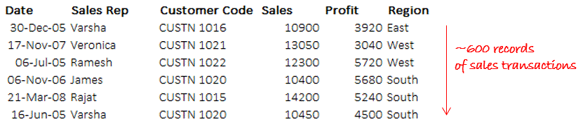
and customer data. Note that the customer code used in the sales transaction data are mentioned in this table with the customer name and their association date 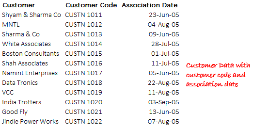
Convert the data into tables
- Place the active cell anywhere inside the data and use the shortcut CTRL T to convert both the data sets into a Table
- Name the Sales Transaction Data as ‘Sales’ and the Customer Table as ‘Customer’
- To name a Table —> go to Design Tab (appears when the active cell is anywhere inside the table) —>Table Name on the extreme left —> Enter name there
 Click the picture to enlarge
Time for some Concepts
To use DATA MODEL effectively you will need a good hold on the following concepts
1. Primary Key
Sound like you have heard it ?? It is the genesis of forming data relationships. Any item (column header) which is unique (non repetitive) in a set of data is the Primary Key. Could you guess what is the primary key in our sales data ? 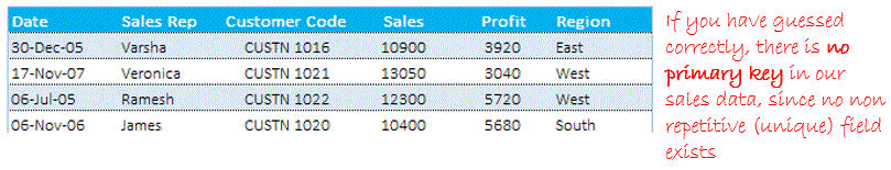 Ok, what is the Primary Key in Customer Table?
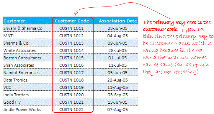
2. Foreign Key
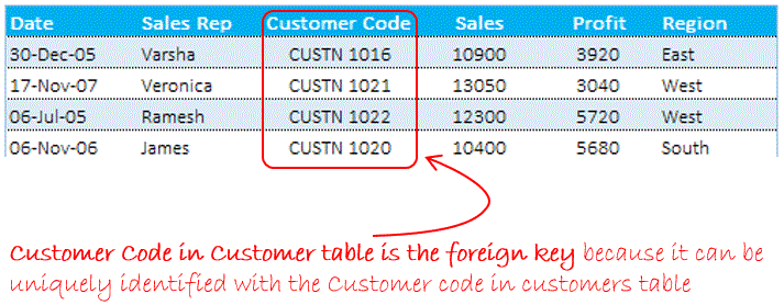
It would be repeated records in a table which can be uniquely identified by unique records in another table.. Eh?? Ok Ok sorry for the weird definition take a look at the example.. Customer Code in Sales Table is a Foreign Key, WHY ? because the records are repetitive and if I want to summarize all transaction of a particular customer code, I can refer to Customer table with unique customer code that matches with the customer codes (multiple entries) in the Sales table!! I hope you got it this time.. NO?? Read again, slowly, you’ll get it
Coming back to Pivot Tables
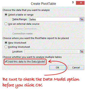
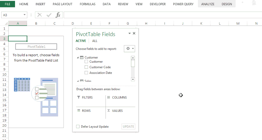
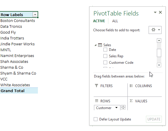
Make a pivot table from the Sales table and be sure to check the data model in the Pivot Table dialogue box
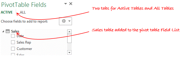
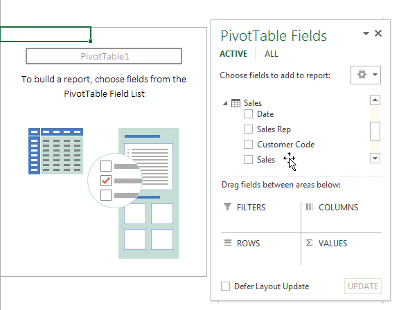
Take a look at the pivot table field list, Sales table has been added. Note a few visual and conceptual differences than the usual Pivot Tables
- A little table symbol in front of Sales – displaying column headers in it
- A separate tab for Active tables and All tables
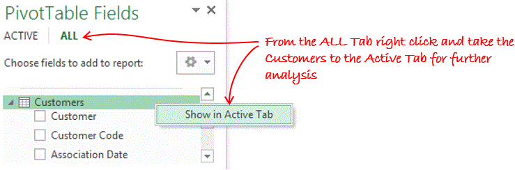
Take the Customers from ALL Tab to the Active Tab
Time to get into a relationship 😛
Yes you read me right.. but for the time being the relationship is primary or foreign and is between the Customer and Sales tables 😆
- In the Analyse Tab —> Click ‘Relationships’
- Click New —> to establish a new relationship.
- In the Create Relationship box —> Table Field —> choose Sales Table —> and Foreign Key here is Customer Code
- In the Related Table Field choose Customers Table —> Primary Key here is Customer Code
Done!!
 Click the picture to enlarge
Time for some magic !
Lets make a pivot table report for Sales – Customer wise. Notice a couple of interesting things going around here..!!
- You have two tables Sales and Customers and their columns to choose from
- I have taken Customer (name) from the Customers table and Sales values from the Sales table and made a pivot out of it
- The VLOOKUP has become redundant here .. Smart isn’t it? 😎
This way you can link multiple tables in a single pivot table
Distinct Count in DATA MODEL
If I ask you the non repetitive count of customer wise sales transactions..?? Oooah!! that would require some serious formula geniuses. DATA MODEL let’s you do that in just seconds
- Simply drag the Date in Values (against Customer in Rows)
- You’ll get the total count of number of transactions customer wise (but they are repetitive and we want a non repetitive count)
- Right click on the count of Dates —> Value field settings —> Distinct Count
- And boom it’s done!! It is new formula available in only in DATA MODEL in Excel 2013, apart from PowerPivot
Download the finished file from down below and try it yourself
Additional things about DATA MODEL (Pros and Cons)
- Identical data type in both columns: Columns that you are connecting in both tables should have same data type (for example we connected Customer Code in Sales Table and Customer Code and Customers Table)
- One to one or One to many relationships only: It means one of the tables must have no duplicate values in the column where relationship is established
- Grouping feature for dates – does not work in DATA MODELS. Don’t get disheartened, there is way to group dates in quarters or months or years 😎
- It becomes too slow or even dead while handling too much data
How did you find this feature?
I found this incredibly useful to perform powerful analysis and getting rid of VLOOKUP for good. What are your views about this feature.. share using comments!! Take Care
Also, learn how to generate a complex report in Excel using a Power Pivot Table
![]() In a simple and easy-to-understand format, this article provides the necessary steps to creating a Power Pivot Data Model in Microsoft Excel 2013, as well as instruction on how to generate a complex report in Excel using a Power Pivot table.
In a simple and easy-to-understand format, this article provides the necessary steps to creating a Power Pivot Data Model in Microsoft Excel 2013, as well as instruction on how to generate a complex report in Excel using a Power Pivot table.
Related: Understanding Power Pivot and Power View in Microsoft Excel 2013
If you are using Excel 2013, Power Pivot is installed by default. If not, you can install it by going to:
Files → Options → Add-ins (This is a tab on the left panel of the screen.)
In the Manage dropdown list, select COM Add-Ins and press Go.

After pressing the Go button, a new screen will open in front of you. Select Microsoft Office Power Pivot for Excel 2013. This will add a new ribbon tab in your Excel ribbon menu as Power Pivot.

Excel 2010
If you are using Excel 2010, you will have to download the Power Pivot setup. Make sure to check the prerequisites and system requirements for Power Pivot for Excel 2010 before installation.
Sample Database
Use the provided sample database script available at the top of the page via the «Download the Code» icon. All you have to do is copy the script and paste it into the new query window of your SQL Server Management Studio (SSMS) and select Execute.
Overview
In this exercise, you will be developing a Power Pivot model by importing SQL Server data into Excel. We will create hierarchies, calculated columns, Key Performance Indicators (KPIs), and add related columns on the basis of DAX language.
The Excel document will look like this:

Step 1: Load Data
In this step, you’ll load data from SQL Server database (DWtest) into Excel 2013 file. To do this, perform the following steps:
1. Create a new Excel 2013 Workbook.
2. Go to the Power Pivot ribbon tab and select the Manage menu item. This will open a new Power Pivot for Excel window. In this screen, we will design our data model.
3. On the Home ribbon tab, select From Database and then select From SQL Server. This will start the table import wizard. On the first screen, you’ll specify the connection parameters (Server Name, Log On to Server and Database Name) with your SQL Server Instance on which you have deployed the Sample Database. I have selected ‘.sql2012’ as my Server. (The peridod «.» indicates that the server is my localhost. sql2012 is my instance name where my database DWTest is deployed.)
I have chosen the Windows Authentication as my connection authentication. Your first screen looks like this:

4. By hitting the Next button, you’ll be asked for how to import your tables. Leave the default option selected: Select from a list of tables and views to choose the data to import. Select Next.

5. On the next screen, you’ll be provided the list of tables in the database that you selected in the first screen of the wizard.
6. Select all tables except sysdiagram and FactTrainingBooking.
7. You can specify friendly names for each table by typing in the Friendly name column in front of each table name. You can also filter the columns that you need to import to your data model by selecting table name and then select Preview and Filter. You can uncheck the columns that you don’t need to import in your data model. You can also hide columns and tables in the data model.


The Applied Filters hyperlink is there because you have unchecked the CityKeyID column of this table. Therefore, it will not be imported into the model.
8. Select Finish. This will process the selected tables. No error should be generated in this step. By clicking the Details hyperlink in the last row of the Details grid, you’l notice the relationships inherited by the wizard from the OLTP database design within the selected tables.

9. Select Close to close the window. This will populate your Power Pivot for Excel screen.
Step 2: Explore the Imported Model
From the screen, you’ll notice that each table is presented with the tab at the bottom. You can rename the tab by right-clicking the respective tab and select Rename.
Also, you can hide columns by right-clicking the respective column header and select Hide from Client Tool‘. You can also hide the entire table in this way.
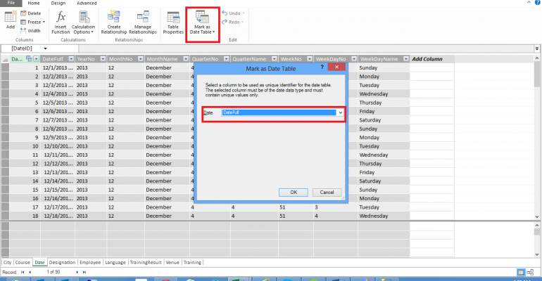
Step 3: Marking the Date Table
In this step, you’ll inform the model about your date table. Follow these steps;
1. Select Date table.
2. Select Mark as Date Table and then click Mark as Date Table. This action will open a screen.

The selected column in the opened screen is the DateFull column containing full date. Click OK.
Step 4: Creating Related Columns
Select the Employee table and perform the following steps:
1. Select Design ribbon item and select Add in Columns group.
2. This will take the cursor in the formula bar.
3. Add the following code in the formula bar: =RELATED(Designation[DesignationDesc])
This will add the designation descriptions in the Employees table from the Designation table on the basis of the relationships defined.
4. You can add City and Language in the same way.
Step 5: Adding Hierarchies
To add hierarchies:
1. Switch to the diagram view by clicking  button at the right bottom of the screen.
2. This will open the model in the diagram view. Here you can perform different tasks by right-clicking the tables and columns. Maximize the Date table by clicking Maximize button.
3. Add Hierarchy in Date table as Calendar by right-clicking YearNo column and select Create Hierarchy. This will add a new hierarchy at the bottom. You can rename it as Calendar by right-clicking, and then select Rename.
4. Right-click on QuarterName and select Add to Hierarchy and then Calendar.
5. Do the same with MonthName, as in step 4.
6. Hide the rest of the columns on the date table other than the newly created hierarchy as you don’t need them. Click the first column. Press shift key and while holding the shift key, click the last column, right above the hierarchy. Right click and the select Hide from Client Tools.
7. Click the Restore button at the top of the Date table. This will return the view of the table back to normal.
8. Hide All the ID columns from all tables to get a better user-friendly look of the model in Excel.
Step 6: Adding Measures
Select the Training table and do the following:
1. Right click the table Header and select Go to. This will return you to the Grid view from the Diagram view.
2. Select cell at the bottom of the TrainingID column. In Home ribbon tab, go to Calculations group and click the AutoSum dropdown. Select Count from the dropdown list. This will add Count Measure on TrainingID Column
3. Select all columns of the Training table, except Score, and hide them from client tools by right clicking them.
4. Select the empty cell at the bottom of the score column. Add Average measure as illustrated in step 2.
5. Go to the Home ribbon tab. In the Formatting section, change the Format of the measure to Decimal Number.
6. You can edit the text of the measure by editing the first portion of the formula in the formula bar. For the just added Average of Score measure, go the formula bar and edit the text before ‘:=’ as Average. This will change the caption of the measure.
Step 7: Adding KPI
1. Right click Average measure. Select Create KPI. This will open a new window.

2. Select Absolute Value. Type 100 as the value.
3. Type 60 in the first box of the thresholds and type 80 in the second box.
4. Click OK.
Step 8: Draw the Model in Excel for Power Pivot Report
1. Go to Home ribbon tab and select Pivot Table and then select Pivot Table again.

2. This will prompt a screen. Select Existing worksheet as in the screen below.

Click OK. This will draw a Pivot Table on the basis of our designed model in the Excel file. Here you can play around with the pivot table. You can still make changes in your Power Pivot model. These changes will reflect in the Excel file automatically.
3. Select Calendar hierarchy in Date table and add it in the Filters. Select Filter from the Excel cell and Select 2013 instead of All.
4. Select CourseName field from Course table and add it in ROWS area. This will add the list of courses in the in the pivot table.
5. Select TrainingresultDesc from TrainingResult Table.
6. Select Score field from Training Table. This will add a column Sum of Score in the Pivot table.
7. Select Value and Status field from Average KPI in Training table. This will lead you to the required report.
Summary
In this exercise, you created a Power Pivot Data Model on SQL Server OLTP database data. You added related columns, measures, hierarchies, and KPI in the model and generated a quick pivot table-based report in Excel 2013. This practice is called Self-Service BI. By practicing, you’ll learn that the steps are simple and the interface is user-friendly.
You can design more complex Power Pivot Models in Excel 2013, but there are some drawbacks. The data is not managed. You have to share the Excel file to a SharePoint Server to share with your peers, or you might face data and connectivity problems. There are also data integrity issues. That’s where Tabular Model comes into play. Tabular Model is a part of Corporate-Business Intelligence (BI)—it’s centrally deployed and you can manage permissions to give access to the data in the model.
**************************************************************************************
Atif-ullah Sheikh is a Database Architect and Consultant for the Microsoft Practice at En Pointe Technologies, an IT solutions provider based in Gardena, California. Sheikh’s areas of expertise include SQL Server Database Design and Development, Business Intelligence, Analysis Services, Reporting Services, Integration Services, SQL Database, Big Data, MS Excel, Power Pivot, Power Query, and Power View.
Email: [email protected]
***************************************************************************************