
What is Line Graphs / Chart in Excel?
A line chart in Excel is created to display trend graphs from time to time. In simple words, a line graph is used to show changes over time to time. By creating a line chart in Excel, we can represent the most typical data.
In Excel, charts and graphs represent data in graphical format. There are so many types of charts in excelExcel offers a variety of chart types based on your requirements. Column Charts, Line Charts, Pie Charts, Bar Charts, Area Charts, Scatter Charts, Stock Chart, and Radar Charts are the different types of charts.read more. The line chart in Excel is the most popular and used.
Table of contents
- What is Line Graphs / Chart in Excel?
- Types of Line Charts / Graphs in Excel
- #1 – 2D Line Graph in Excel
- Stacked Line Graph in Excel
- 100% Stacked Line Graph in Excel
- Line with Markers in Excel
- Stacked Line with Markers
- 100% Stacked Line with Markers
- #2 – 3D Line Graph in Excel
- How to Make a Line Graph in Excel?
- Line Chart in Excel Example #1
- Line Chart in Excel Example #2
- Relevance and Uses of Line Graph in Excel
- Customize Line Chart in Excel
- Things to Remember
- Recommended Articles
- Types of Line Charts / Graphs in Excel
Types of Line Charts / Graphs in Excel
There are different categories of line charts that we can create in Excel.
- 2D Line Charts
- 3D Line Charts
These types of Line graphs in Excel are still divided into different graphs.
You can download this Line Chart Excel Template here – Line Chart Excel Template
#1 – 2D Line Graph in Excel
The 2D line graph in Excel is basic. We can take this graph for a single data set. Below is the image for that.
These are again divided as follows:
Stacked Line Graph in Excel
This stacked line chart in Excel shows how it will change the data over time.
We can show this in the below diagram.
In the graph, all the 4 data sets are represented using 4 line charts in one graph using two axes.
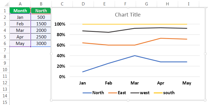
100% Stacked Line Graph in Excel
This graph is similar to the stacked line graph in Excel. The only difference is that this Y-axis shows % values rather than normal values. Also, this graph contains a top line. It is the 100% line. It will run across the top of the chart.
We can show this in the below figure.
Line with Markers in Excel
This type of line graph in Excel will contain pointers at each data point. So, we can use this to represent data for every important point.

The point marks represent the data points where they are present. When hovering the mouse on the point, the values corresponding to that data point are known.
Stacked Line with Markers

100% Stacked Line with Markers

#2 – 3D Line Graph in Excel
This line graph in excel is shown in 3D format.
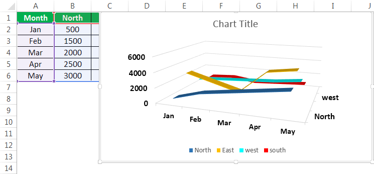
The below line graph is the 3D line graph. All the lines are represented in 3D format.
All these graphs are types of line charts in Excel. The representation is different from chart to chart. As per the requirement, you can create the line chart in Excel.
How to Make a Line Graph in Excel?
Below are examples to create a Line chartThe line chart is a graphical representation of data that contains a series of data points with a line. read more in Excel.
Line Chart in Excel Example #1
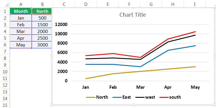
We can use the line graph in multiple data sets also. Here is an example of creating a line chart in Excel.
In the above graph, we have multiple datasets to represent that data. Also, we have used a line graph.

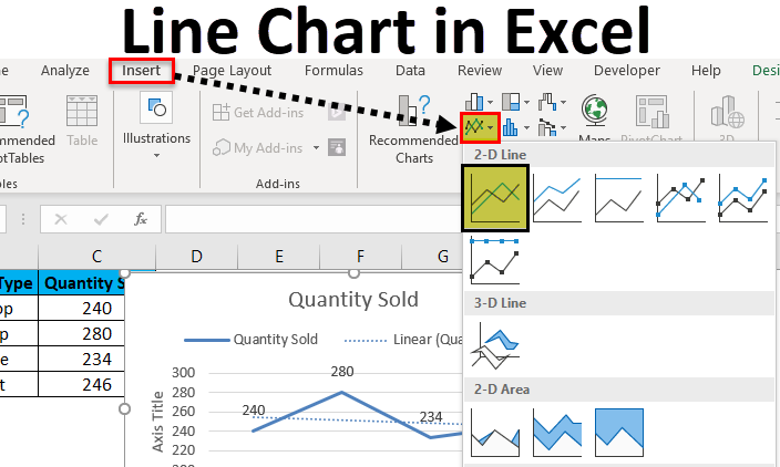
Select all the data and go to the “Insert” tab. Next, select the “Line” graph from “Charts.” It will display the required chart.

Then, the line chart in Excel created looks like as given below:
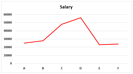
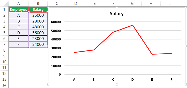
Line Chart in Excel Example #2
There are two columns in the table: Employee and Salary. Those two columns are represented in a line chart using a basic line chart in Excel. The employee names are taken on X-axis, and salary is taken on Y-axis. From those columns, that data is represented in Pictorial form using a line graph.
- Go to the “Insert” menu -> “Charts” Tab -> Select “Line” charts symbol. We can select the customized line chart as per the requirement.

- Then, the chart may look like as given below.


It is the basic process of using a line graph in our representation.
To represent a line graph in Excel, we need two necessary components. They are the horizontal axis and vertical axis.
The horizontal axis is called X-axis, and the vertical axis is called Y-axis.
There is one more component called “legend.” It is the line in which the graph is represented.
One more component is “plot area.” It is the area where it will plot the graph. Hence, it is called the plot area.
We can represent the above explanation in the below diagram.
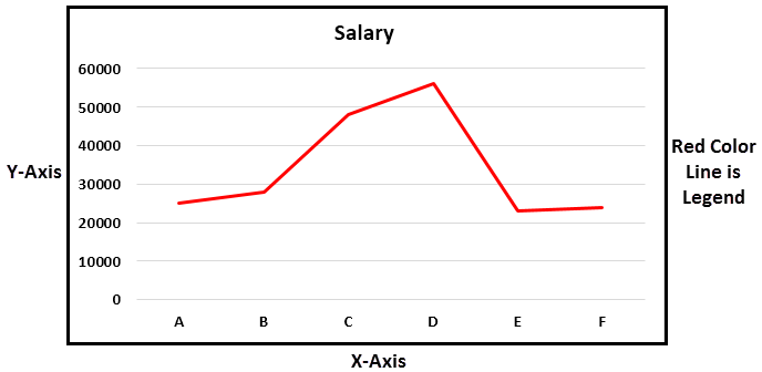
The X-axis and Y-axis are used to represent the scale of the graph. Next, the legend is the blue line in which the graph is represented. It is more useful when the graph contains more than one line to define. Next is the plot area. It is the area where we can plot the graph.
In the line graph, if there are multiple datasets to represent the data, and if the axes are different for all the columns, we can change the scale of the axes and represent the data.
From this line graph, we can easily represent timeline graphs. If the data contains years of data related to time, it can be presented better than other graphs. We can also represent a line graph with points for easy understanding.
For example, sales of a company during a period, salary of an employee over a period, etc.
Relevance and Uses of Line Graph in Excel
We can use the line graph for:
- Single dataset.
The data having a single data set can be represented in Excel using a line graph over a period. It can be illustrated with an example.
- Multiple Datasets
We can also represent the line graph for multiple datasets.

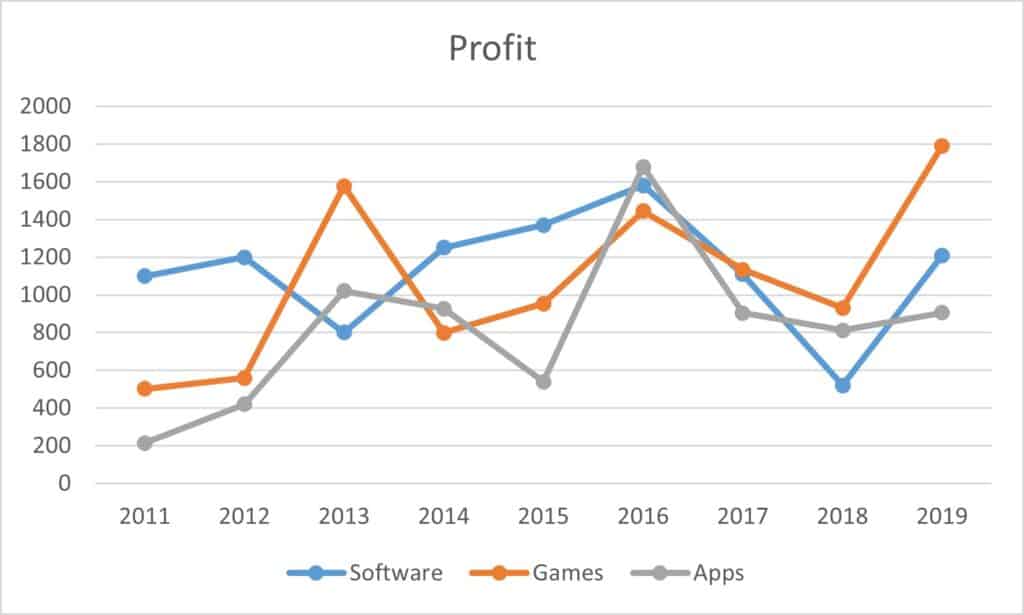
The different data set is represented using another color legend. In the above example, revenue is represented by a blue line. We can represent customer purchase % by using an orange color line, Sales by grey line, and the last one profit% by using a yellow line.
We can customize the graph after inserting the line graph, such as formatting grid lines, changing the chart title to a user-defined name, and changing the axis’s scales. It can be done by right click on the chart.
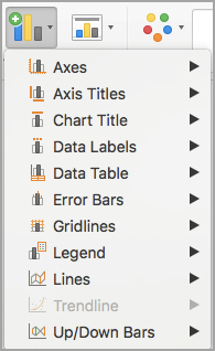
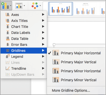
Formatting the grid lines: Gridlines can be removed or changed as per our requirement by using an option called formatting grid lines. It can be done by,
Right-click on Chart-> Format Gridlines.

We can select the types of gridlines as per the requirement or remove the grid lines completely.
The three options on the top right side of the graph are the graph options to customize them.

The “+” symbol will have the checkboxes of what options to select in the graph to exist.
The “paint” symbol is used to select the style of the chart to be used and the color of the line.
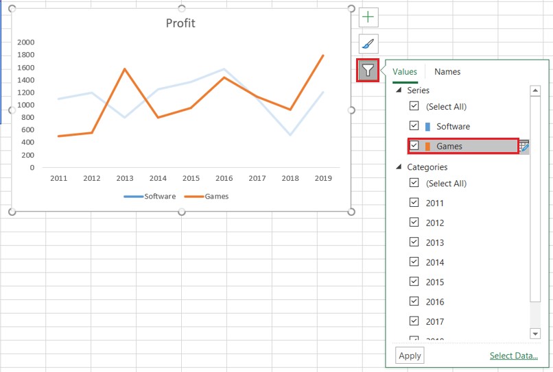
The “filter” symbol indicates what we should represent as part of the data on the graph.
Customize Line Chart in Excel
These are some default customizations made to a line chart in Excel.
#1 – Changing the Line Chart Title:

We can change the chart title as per the user requirement for better understanding or the same as the table’s name for a better experience. For example, we can show that as below.

We should place the cursor in the “Chart Title” area, and we can write a user-defined name in place of the chart title.
#2 – Changing the Color of Legend
The color of the legend can also be changed, as shown in the below screenshot.

#3 – Changing the Scale of the Axis
The scale of the axis can be changed if there is a requirement. For example, If there are more datasets with different scales, we can change the scale of the axis.
A given process can do this.
Right-click on any of the lines. Now, select “Format Data Series.” It will show a window on the right side and select the secondary axisThe secondary axis is the other axis that is used to denote different data sets that cannot be displayed on a single axis. The primary axis, for example, depicts time, whereas the secondary axis displays production.read more. Now, click “OK,” as shown in the below figure.

#4 – Formatting the Gridlines
We can format Gridline in excelGridlines are little lines made of dots to divide cells from each other in a worksheet. The gridlines have slight faint invisibility; you can find it in the page layout tab. This option has a checkbox; for activating the gridlines, you can tick on it and untick if you wish to deactivate gridlines.read more. In addition, they can be changed or removed completely. We can do this as per the requirement.
We can show this in the below figure.

After right-clicking on the gridlines, select “Format Gridlines” from the options, and then it will open a dialog box. In that, we can choose the type of gridlines as per choice.

#5 – Changing the Chart Styles and Color
We can change the chart’s color and style by using the “+” button on the top right corner. For example, we can show this in the below figure.

Things to Remember
- We can format a line graph with points in the graph where there is a data point and can also be formatted as per the user requirement.
- We can also change the color of the line as per the requirement.
- While creating a line chart in Excel, the very important point is that we cannot use these line graphs for categorical data.
Recommended Articles
This article is a guide to Line Graphs and Charts in Excel. We discuss creating a line chart/graph in Excel, practical examples, and a downloadable Excel template. You may also learn more about Excel from the following articles: –
- Examples of 3D Maps in Excel3D map is a new feature provided by Excel in its latest versions of 2016. It introduces map elements in the Excel graph axis in three dimensions. It is an extremely useful tool provided by Excel, like an actual functional mapread more
- How to Create a 3D Plot in Excel?3D plots is also known as surface plots in excel which is used to represent three dimensional data. To represent a three dimensional plot, three dimensional range of data which can be used from the insert tab in excel.read more
- Dynamic Charts in Excel
- Stacked Chart in ExcelIn stacked charts data series are stacked over one another for a particular axes, in stacked column chart the series are stacked vertically while in bar the series are stacked horizontally.read more
Excel Line Chart (Tables of Contents)
- Line Chart in Excel
- How to Create a Line Chart in Excel?
Line Chart in Excel
Line Chart is a graph that shows a series of point trends connected by the straight line in excel. Line Chart is the graphical presentation format in excel. By Line Chart, we can plot the graph to see the trend, growth of any product, etc.
Line Chart can be accessed from the Insert menu under the Chart section in excel.
How to Create a Line Chart in Excel?
It is very simple and easy to create. Let us now see how to create a Line Chart in Excel with the help of some examples.
You can download this Line Chart Excel Template here – Line Chart Excel Template
Example #1
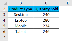
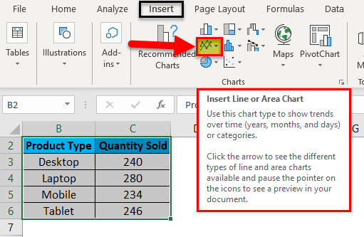
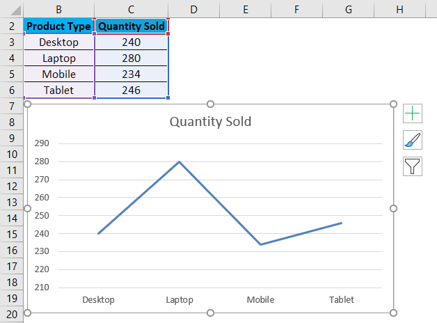
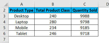
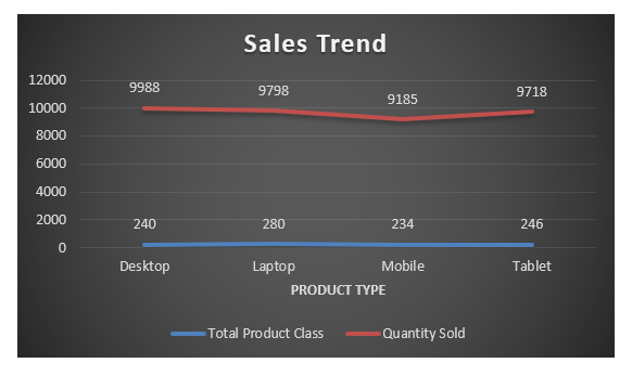
Here we have sales data of some products sold in a random month. Product Type is mentioned in column B, and their sales data are shown in subsequent column C, as shown in the below screenshot.
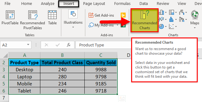
Let’s create a line chart in the above-shown data. For this, first, select the data table and then go to the Insert menu; under Charts, select Insert Line Chart as shown below.
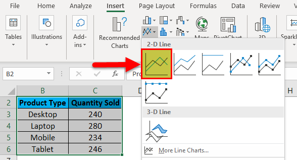
Once we click on the Insert Line Chart icon as shown in the above screenshot, we will get the drop-down menu of different line chart menu available under it. As we can see below, it has 2D, 3D and more line charts. For learning, choose the first basic line chart as shown in the below screenshot.
Once we click on the basic Line chart as shown in the above screenshot, we will get the line chart of Quantity sold, drawn as below.
As we can see, there are some more options available at the right top corner of the Excel Line Chart, by which we can do some more modifications. Let’s see all the available options one by one.
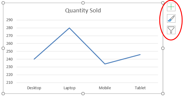
First, click on a cross sign to see more options.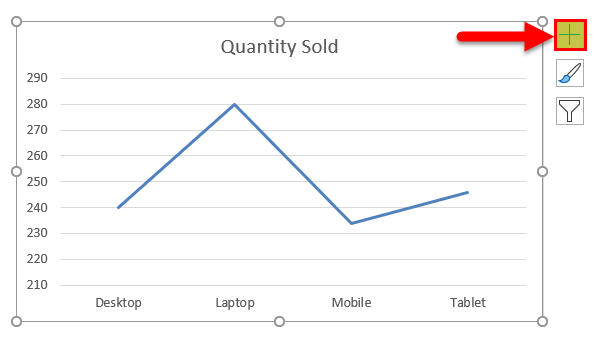
Once we do that, we will get Chart Elements, as shown below. Here, we have already checked some of the elements for an explanation.
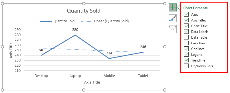
- Axes: These are numbers shown in Y-axis. It represents the range under which data may fall in.
- Axis Title: Axis Title as it is mentioned beside Axes and bottom of product types in the line chart. We can choose/write any text in this title box. It represents the data type.
- Chart Title: Chart title is the heading of the whole Chart. Here, it is mentioned as “Quantity Sold.”
- Data Labels: These are the datum points in the graph, where the line chart points are pointed. Connecting data labels creates line charts in excel. Here, these are 240, 280, 234, and 246.
- Data Table: Data Table is the table that has data used in creating a line chart.
- Error Bars: This shows the kind of error and amount of error the data has. These are Standard Error, Standard Deviation, and Percentage mainly.
- Gridlines: Horizontal thin lines shown in the above chart are Gridlines. Primary Minor Vertical/Horizontal, Primary Major Vertical/Horizontal is the types of gridlines.
- Legends: Different color lines, different types of the line present different data. These are call Legends.
- Trendline: This shows the data trend. Here it is shown by a dotted line.
Now, let’s see the Chart Style, which has the icon as shown in the below screenshot. Once we click on it, we will get different styles listed and supported for that selected data and the Line Chart. These styles may change if we choose some other chart type.
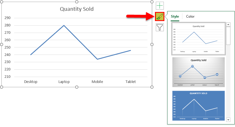
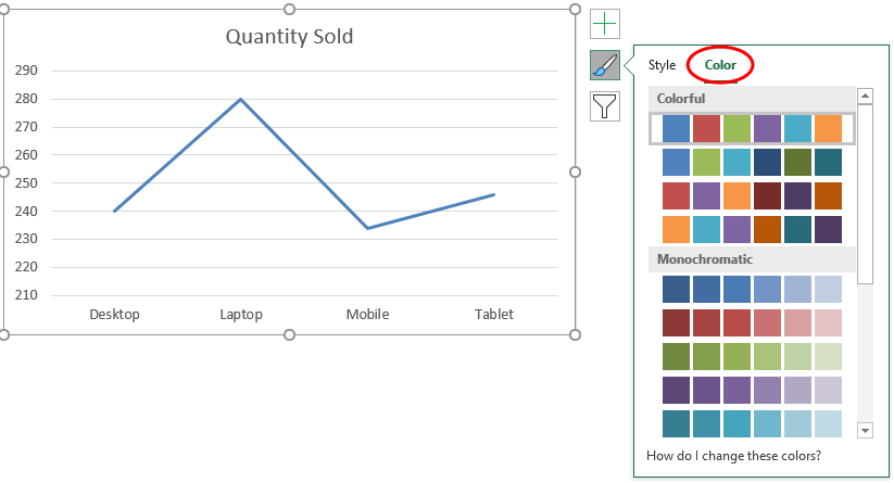
If we click on the Color tab circled in the below screenshot, we will see the different color patterns used to have more one-line data to show. This makes the chart more attractive.
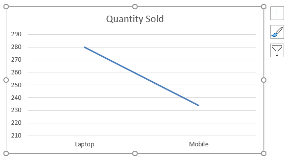
Then we have Chart Filters. This is used to filter the data in the chart itself. We can choose one or more categories to get the data trend. As we can select in below, we have chosen laptops and Mobile in the product to get the data trend.
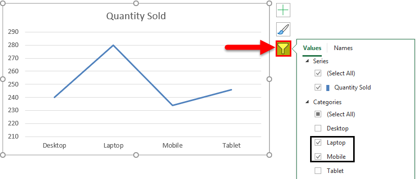
And the same is getting reflected in Line Chart as well.
Example #2
Let’s see one more example of the Line Charts. Now consider the two data sets of a table as shown below.
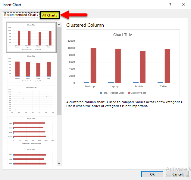
First, select the data table and go to the Insert menu and click on Recommended Charts as shown below. This is another method of creating Line Charts in excel.
Once we click on it, we will get the possible charts that the present selected data can make. If the recommended chart does not have the Line Chart, click the All Charts tab below.
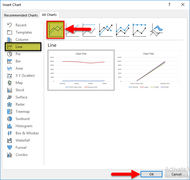
Now, from the All Chart tab, select Line Chart. Here also, we will get the possible type of line chart that may be created by the current data set in excel. Select one type and click on OK, as shown below.
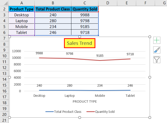
After that, we will get the Line Chart as shown below, which we name as Sales Trend.
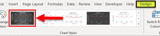
We can decorate the data as discussed in the first example. Also, there is more way of selecting different designs and styles. For this, select the chart first. After selection, Design and Format menu tab becomes active, as shown below. From those, select the Design menu and select under that select and suitable style of chart. Here, we have selected a black color slide to have a classier look.
Pros of Line Chart in Excel
- It gives a great trend projection.
- We can see the error percentage as well, by which the accuracy of data can be determined.
Cons of Line Chart in Excel
- It can be used only for trend projection, pulse data projections only.
Things to Remember about Line Chart in Excel
- Line Chart with a combination of Column Chart gives the best view in excel.
- Always enable the data labels so that the counts can be seen easily. This helps in the presentation a lot.
Recommended Articles
This has been a guide to Line Chart in Excel. Here we discuss how to create a Line Chart in Excel along with excel examples and a downloadable excel template. You may also look at these suggested articles –
- Excel Bubble Chart
- Interactive Chart in Excel
- Pie Chart in Excel
- Line Break in Excel
Home > Microsoft Excel > How to Make a Line Graph in Excel? 4 Best Line Graph Examples
Note: This guide on how to make a line graph in Excel is suitable for all Excel users including Office 365.
Line graphs are one of the most versatile graphs available in Excel. They are very popular because they are easy to plot and easy to interpret.
Line graphs’ main purpose is to help you visualize trends in your data set and understand them better.
In this guide, I’ll show you how to make a line graph in Excel with simple illustrations. I’ll also talk about how to customize a line graph to suit your needs.
Related:
How To Find Duplicates In Excel? The Best Guide
Excel Goal Seek—the Easiest Guide (3 Examples)
Create A Pivot Table In Excel—the Easiest Guide
You’ll learn:
- Line Graphs – An Overview
- Excel Line Chart Types
- How to Make a Line Graph in Excel?
- Best Line Graph Examples
- How to Customize a Line Graph in Excel?
Line Graphs – An Overview
A line graph is nothing but a graphical line, which connects a series of data points from the data set. It is usually used to represent a change in quantity over a period of time.
Generally, the X-axis contains the independent variables like time or date intervals, and the Y-axis contains continuous dependent variables like sales, profit, prices etc.
The idea here is that the slope of these lines shows the general trends in the data. A positive slope signifies an increase in value and a negative slope indicates a decrease in value.
A good example of when to use a line graph is plotting graphs to track changes and trends in a data set over time. A line graph is also best suited to compare how multiple variables change over time and detect any relationship between them.
Keep in mind that line graphs can become clumsy with very large datasets and are not suitable for discrete data variables.
Excel Line Chart Types
Microsoft Excel offers the following types of line charts.
Line: It is the simplest form of the line chart in Excel. The number of columns of data in your selection determines whether to plot a single line chart or multiple line chart.
Stacked Line Chart: The lines in this chart are cumulative, meaning that each higher line includes the lower line’s values. It is used to show how the compositions of the parts of a whole change over time.

100% Stacked Line Chart: This chart is similar to the stacked line chart, except that it uses percentages to compare the parts of the whole, instead of an absolute value.
Line Graph with Markers: This is just a line graph with additional markers for each data point. It makes visualisation and analysis easier.
3-D Line Chart: This is a variation of the basic 2-D line chart, except here the plotted lines are in 3D.

How to Make a Line Graph in Excel?
Now, I’ll demonstrate the steps involved in creating an excel line graph.
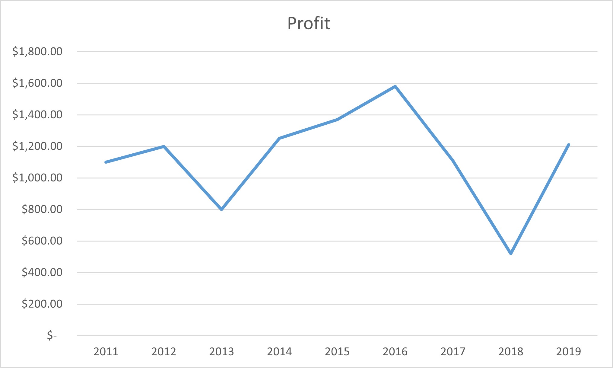
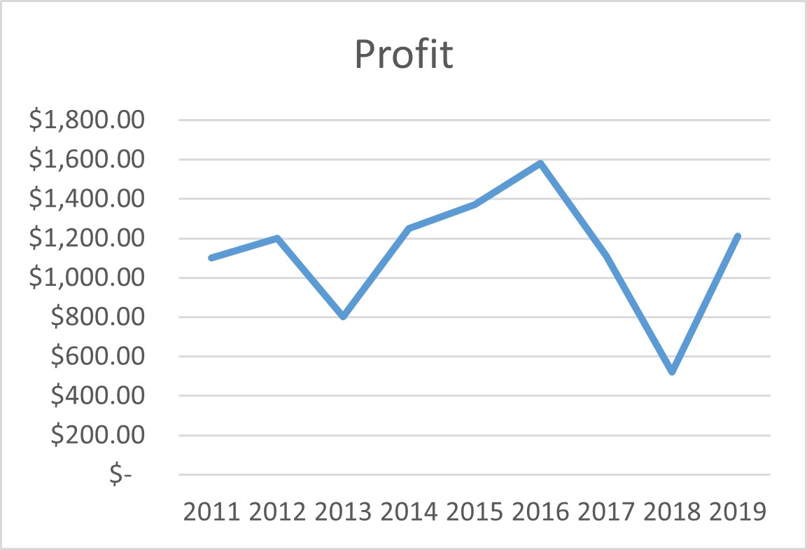
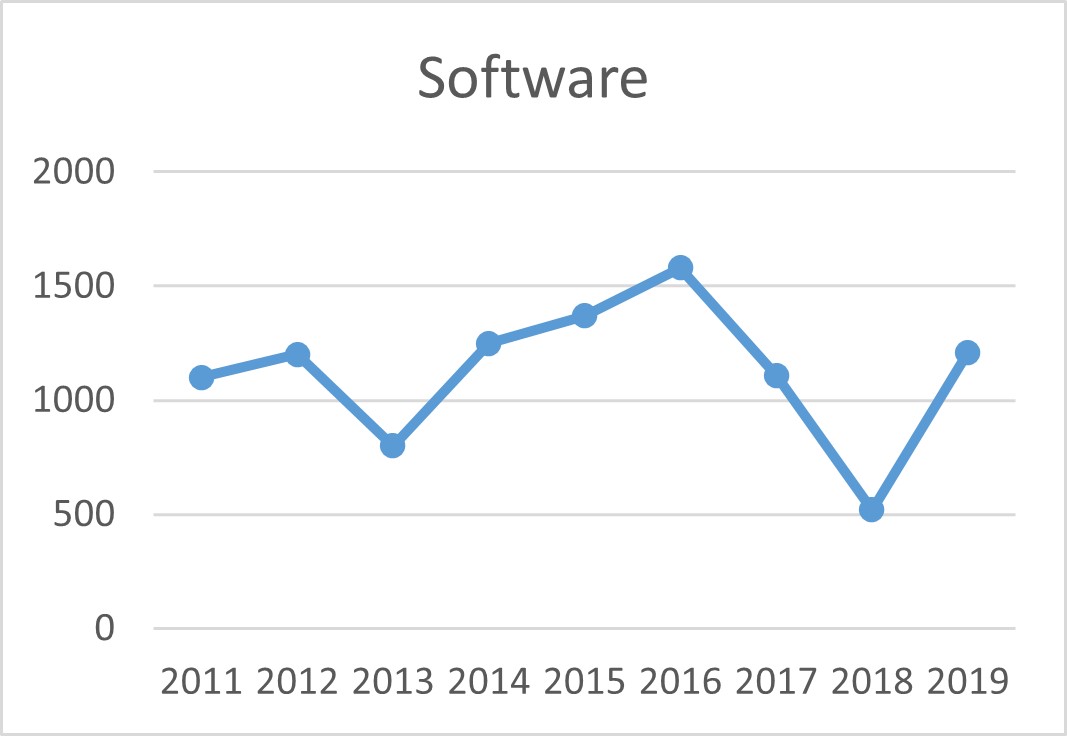
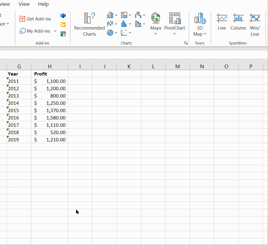
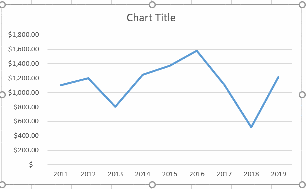
Step 1: Get your data ready. It should have at least two columns of data. The independent variable (time) should come first, followed by the dependent variable.

In this example, I am going to track the profits over the years. Hence, it has two columns.
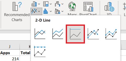
Step 2: Select your data and click on the 2-D Line Graph button. It can be found in Insert Tab > Charts group > Insert Line or Area Chart > Line Chart.
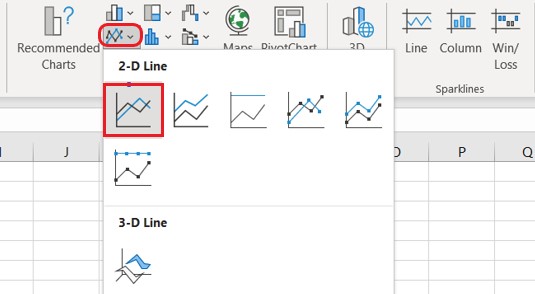
You can choose any of these available 2-D graph types. In this example, I am choosing the 2-D Line graph option.
Step 3: That’s all it takes to plot a line graph in Excel. Your line graph is ready now. But, customize it, if needed. I’ll teach you how to do this later in this same article.
Also Read:
How To Use Excel Countifs: The Best Guide
Excel Conditional Formatting -the Best Guide (Bonus Video)
The Best Excel Project Management Template In 2021
Best Line Graph Examples
Before I explain how to customize these line charts, it is important to know about all the types of line graphs in Excel. Let me show some of the best line graph examples, to help you appreciate their use cases better.
How to Graph Multiple Lines in Excel?
Let’s suppose you have two different product lines in your organisation. Now, you want to compare the profits for these two product lines over the years.
To do this, using multiple line graphs, follow these steps:
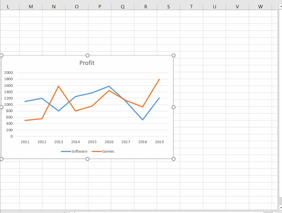
Step 1: Set your data in order. Keep in mind that, your data should contain at least three columns of data. One independent variable (time) and two series of dependent variables.
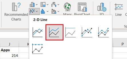
Step 2: Select your data and click on the 2-D Line Graph button. It can be found in Insert Tab > Charts group > Insert Line or Area Chart > Line Chart.

Step 3: Your multiple line graph is ready now. Edit or customize it if needed.

How to Plot a Stacked Line Graph in Excel?
Stacked line graphs will show you how parts of a whole variable change over time. Let’s say you have three product lines in your organisation. You want to find how each product line’s contribution to the total profit changes over time.
To do this using stacked line graphs, follow these steps.
Step 1: Get your data ready. It should contain at least 3 columns of data. One independent variable (time) and two series of dependent variables.

Step 2: Select your data and click on the Stacked Line Graph button. It can be found in Insert Tab > Charts group > Insert Line or Area Chart > Stacked Line
Step 3: Your stacked line graph is ready now. Edit or customize it if needed.


The lines in the stacked line graph are cumulative, i.e. each data series is added to the previous data series. The topmost data line is the sum of all the data lines below. Hence, their data lines will never cross each other, like they do in a normal line chart.
How to Plot a 100% Stacked Line Graph in Excel?
100% Stacked line graphs are similar to stacked line graphs. But, they will show you how parts of a whole variable change over time in percentages rather than absolute values.
Let’s say you have three product lines in your organisation. You want to find how much cumulative percentage of each product line’s contribution to the total profit changes over time.
To do this using 100% stacked line graphs, follow these steps.
Step 1: Get your data ready. It should contain at least 3 columns of data. One independent variable (time) and two series of dependent variables.
Step 2: Select your data and click on the 2-D 100% Stacked Line Graph button. It can be found in Insert Tab > Charts group > Insert Line or Area Chart > 100% Stacked Line
Step 3: The 100% stacked line graph is ready now. Edit or customize it if needed.

The lines in the 100% stacked line graph are cumulative, i.e. percentage contribution of each data series is added to the previous data series.
Hence, the top most data line is the sum of all the percentages of the data lines below and will always be 100%. Hence, the data lines will never cross each other, like they do in a normal line chart.
How to Plot a Line Graph with Markers?
You can add makers to your line graphs to make them more presentable. To do this select any of these: Line with Markers, or Stacked Line with Markers or 100% Stacked Line with Markers under the Line chart drop-down menu.
How to Customize a Line Graph in Excel?
Sometimes, customizing the line graphs is required before presenting them to others.
Here, I’ll show you how to edit the following major features of an Excel line graph.
- Add Titles to a Line Graph in Excel
- Hide or Move Chart Legend
- Show or Hide Gridlines
- Hide or Delete Lines in the Excel Line Graph
- Change Line Type and Color
Add Chart Titles to a Line Graph in Excel
To add titles to an Excel line graph, just double click on the already existing default title. This will enable the option to edit it. Now, you can set your custom title with any font style to your line chart.
Hide or Move Chart Legend in a Line Graph.
To hide or move the chart legend, double click on the existing chart legend. This will open up the Format Legend pane on the right side.
In the Format Legend pane, under Legend Options, you can change the position of the legend. It is also possible to manually change the position by dragging it anywhere on the chart.
To delete the legend, just select it and press Delete.
Show or Hide Gridlines
To hide or unhide the gridlines just click on the “Plus” icon next to the chart to open the Chart Elements toggle menu.
Here, you can switch on or off any of these chart elements.
To hide the gridlines just uncheck the tickbox next to the Gridlines option.

Hide or Delete Lines in the Excel Line Graph
To hide a line temporarily, you can simply hide the original data column which is represented by the line. Do this by selecting the entire column, right-clicking on it and selecting Hide.

The line will appear again once you unhide the column.
Another method to hide data lines temporarily is to click on the Chart Filters option next to the chart and deselect the data series which are not needed.
To permanently delete a data line from your graph, right-click on the unwanted line and click delete.

Change Line Type and Color
To change the line type or colour of a line, double click it to open the Format Data Series pane.
In the Format Data Series pane, under the Fill & Line section change the line colour using the Color Picker and change the line type using the Dash Type options.

Suggested Reads:
Create An Excel Dashboard In 5 Minutes – The Best Guide
Dynamic Dropdown Lists In Excel – Top Data Validation Guide
Predict Future Values Using Excel Forecast Sheet – The Best Guide
FAQs
What are line charts best used for in Excel?
A line chart is best suited for tracking the changes and trends in the data over a period of time.
How do you plot multiple lines in Excel?
The easiest way to plot multiple lines in Excel is to use the simple 2-D line chart. Select the data range, including the multiple columns of data and click on the 2-D Line Chart. Now, Excel will plot these multiple columns of data as multiple lines.
Let’s Wrapup
In this guide, I have explained how to make a line graph in Excel in simple steps. We also saw four important examples of the various line graph types. If you have any doubts regarding Excel line graphs or any other Excel feature, please let us know in the comments below.
If you need more high-quality Excel guides, please check out our free Excel resources centre.
Simon Sez IT has been teaching Excel for over ten years. For a low, monthly fee you can get access to 100+ IT training courses. Click here for advanced Excel courses with in-depth training modules.
Adam Lacey

Adam Lacey is an Excel enthusiast and online learning expert. He combines these two passions at Simon Sez IT where he wears a number of different hats.When Adam isn’t fretting about site traffic or Pivot Tables, you’ll find him on the tennis court or in the kitchen cooking up a storm.
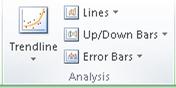
Specific line and bar types are available in 2-D stacked bar and column charts, line charts, pie of pie and bar of pie charts, area charts, and stock charts.
Predefined line and bar types that you can add to a chart
Depending on the chart type that you use, you can add one of the following lines or bars:
-
Series lines These lines connect the data series in 2-D stacked bar and column charts to emphasize the difference in measurement between each data series. Pie of pie and bar of pie charts display series lines by default to connect the main pie chart with the secondary pie or bar chart.

-
Drop lines Available in 2-D and 3-D area and line charts, these lines extend from data points to the horizontal (category) axis to help clarify where one data marker ends and the next data marker starts.
-
High-low lines Available in 2-D line charts and displayed by default in stock charts, high-low lines extend from the highest value to the lowest value in each category.
-
Up-down bars Useful in line charts with multiple data series, up-down bars indicate the difference between data points in the first data series and the last data series. By default, these bars are also added to stock charts, such as Open-High-Low-Close and Volume-Open-High-Low-Close.


Add predefined lines or bars to a chart
-
Click the 2-D stacked bar, column, line, pie of pie, bar of pie, area, or stock chart to which you want to add lines or bars.
This displays the Chart Tools, adding the Design, Layout, and Format tabs.
-
On the Layout tab, in the Analysis group, do one of the following:
-
Click Lines, and then click the line type that you want.
Note: Different line types are available for different chart types.
-
Click Up/Down Bars, and then click Up/Down Bars.
-
Tip: You can change the format of the series lines, drop lines, high-low lines, or up-down bars that you display in a chart by right-clicking the line or bar, and then clicking Format <line or bar type> .
Remove predefined lines or bars from a chart
-
Click the 2-D stacked bar, column, line, pie of pie, bar of pie, area, or stock chart that displays predefined lines or bars.
This displays the Chart Tools, adding the Design, Layout, and Format tabs.
-
On the Layout tab, in the Analysis group, click Lines or Up/Down Bars, and then click None to remove lines or bars from a chart.
Tip: You can also remove lines or bars immediately after you add them to the chart by clicking Undo on the Quick Access Toolbar or by pressing CTRL+Z.
You can add other lines to any data series in an area, bar, column, line, stock, xy (scatter), or bubble chart that is 2-D and not stacked.
Add other lines
-
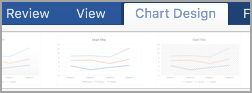
This step applies to Word for Mac only: On the View menu, click Print Layout.
-
In the chart, select the data series that you want to add a line to, and then click the Chart Design tab.
For example, in a line chart, click one of the lines in the chart, and all the data marker of that data series become selected.
-
Click Add Chart Element, and then click Gridlines.
-
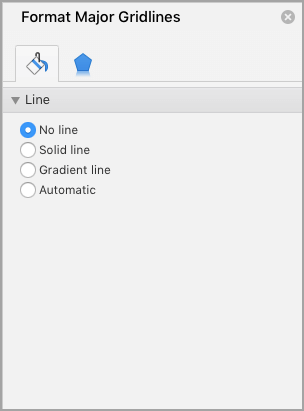
Choose the line option that you want or click More Gridline Options.
Depending on the chart type, some options may not be available.
Remove other lines
-
This step applies to Word for Mac only: On the View menu, click Print Layout.
-
Click the chart with the lines, and then click the Chart Design tab.
-
Click Add Chart Element, click Gridlines, and then click More Gridline Options.
-
Select No line.
You can also click the line and press DELETE .
Like bar and column charts, graphs or line graphs in Excel are useful for providing comparisons of data across one or more data series. In this tutorial, we will discuss how to make a line graph in excel with multiple lines that have a marker for a data series, as is often used by newspapers and magazines to present stock and forex value information.
The difference is that line graphs allow us to spot trends or patterns in data over time. For example, the ups and downs of sales, company profits, temperature, or stock and forex prices during a certain period.
In this guide, you will learn the following
What is a line graph (chart)?
In a line graph in Excel (also called a line chart), we represent data categories on the horizontal axis and data values are on the vertical axis.

Microsoft Excel has several line graph models, namely: line, stacked line, 100% stacked line, line with markers, stacked line with markers, and 100% stacked line with markers which has a marker and one without a marker in 2-D form, as well as a 3-D model line diagram. 3D Line is like the basic line graph but is represented in a 3D format.
When to use line graphs?
Use a line graph if:
- Has multiple data series.
- Have data at equal or sequential intervals, such as days, months, quarters, or fiscal years.
Line diagrams show the data in such a way that fluctuations and developments can be read off quickly. It’s easy to make a line chart in Excel. Follow these steps:
1 Select the data range for which we will make a line graph.


2 On the Insert tab, Charts group, click Line and select Line with Markers.
Quickly Change Diagram Views
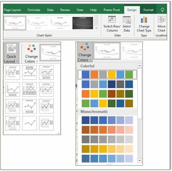
A quick way to change the appearance of a graph is to use Chart Styles, Quick Layout, and Change Colors.
These features are in:
- Excel 2013, 2016, 2019, 365: select in the Design tab.
Tip: Click the brush icon on the top right of the graph to select Chart Styles and Colors. - Excel 2007 & 2010:
- Select Chart Styles and Layout on the Design tab.
- Change the color by changing the Colors on the Page Layout tab.
Displaying graph elements (Data Labels, Gridlines, Graph Title)
See the caption on the figure for the elements on the line graph.

We can show or hide and position these elements at:
- Excel 2007 & 2010: set in the Design tab.
- Excel 2013, 2016, 2019, 365:
- Click the + sign at the top right of the graph.
- Check or clear the element box.
- Click the arrow next to the element name to reposition it.
Tips: we can also access this feature on the Design | tab Chart Layout | Add Chart Element.
Chang the Marker Shape and Diagram Line

Here we will change the appearance of the marker to a circle and create a line on the diagram that is shaped like a thin rope that swings up and down according to the data values.
To change the Marker option, following process:
1 Right-click on the line graph or marker and select Format Data Series.

2 Select Fill & Line.
3 Click Line:
- Set the Width to 1.25 pt to make a thin line.
- Check the Smoothed line box to get rid of the appearance of stiff lines.

4 Click Marker and make the following settings:
- Marker Options: click Built-in. In the Type section, select the circle shape and set the Size to 12.
- Fill: Select Gradient fill. In the Type: section select Linear and Angle: 270 °. In the Gradient stops: adjust the position and color.

FAQ: Line graph in Excel
1. What are Excel charts suitable for?
You can choose between different diagrams in Excel. The purpose of a diagram is to make the values you have marked as easy to understand and clear as possible. There are line, column, bar, pie, ring, and Pareto charts, among others.
2. How do I create a line diagram quickly and easily?
Select the area that you want to transform into a line area. Click on “Insert” in the menu bar and select “Recommended diagrams”. Choose from the recommended graphs for “Line Charts.”
3. What are line charts suitable for?
A line chart is well suited for the types of events that describe a continuous variable. Connecting the data points with lines gives the impression that every value on the line can be a possible event.
4. How do I know which diagram is suitable for my evaluation?
Ask yourself whether you want to show development over time, relations, or a relationship of opposites, for example. You should think about what statement you want to make to the target audience of the diagram.
5. How can I combine a column chart with a line chart?
If you have created a column chart, you can select the item “Data”, “Edit data” in the function bar and thus add a second data series. Now you can select the “Line” display under “Type” under the function bar via “Colors and Style”. The two data series are now shown combined as a column and line chart.