
IMPORTANT: Ideas in Excel is now Analyze Data
To better represent how Ideas makes data analysis simpler, faster and more intuitive, the feature has been renamed to Analyze Data. The experience and functionality is the same and still aligns to the same privacy and licensing regulations. If you’re on Semi-Annual Enterprise Channel, you may still see «Ideas» until Excel has been updated.

Analyze Data in Excel empowers you to understand your data through natural language queries that allow you to ask questions about your data without having to write complicated formulas. In addition, Analyze Data provides high-level visual summaries, trends, and patterns.
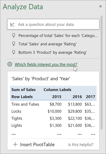
Have a question? We can answer it!
Simply select a cell in a data range > select the Analyze Data button on the Home tab. Analyze Data in Excel will analyze your data, and return interesting visuals about it in a task pane.
If you’re interested in more specific information, you can enter a question in the query box at the top of the pane, and press Enter. Analyze Data will provide answers with visuals such as tables, charts or PivotTables that can then be inserted into the workbook.
If you are interested in exploring your data, or just want to know what is possible, Analyze Data also provides personalized suggested questions which you can access by selecting on the query box.
Try Suggested Questions
Just ask your question
Select the text box at the top of the Analyze Data pane, and you’ll see a list of suggestions based on your data.

You can also enter a specific question about your data.

Notes:
-
Analyze Data is available to Microsoft 365 subscribers in English, French, Spanish, German, Simplified Chinese, and Japanese. If you are a Microsoft 365 subscriber, make sure you have the latest version of Office. To learn more about the different update channels for Office, see: Overview of update channels for Microsoft 365 apps.
-
The Natural Language Queries functionality in Analyze Data is being made available to customers on a gradual basis. It may not be available in all countries or regions at this time.
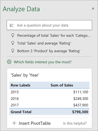
Get specific with Analyze Data
If you do not have a question in mind, in addition to Natural Language, Analyze Data analyzes and provides high-level visual summaries, trends, and patterns.
You can save time and get a more focused analysis by selecting only the fields you want to see. When you choose fields and how to summarize them, Analyze Data excludes other available data — speeding up the process and presenting fewer, more targeted suggestions. For example, you might only want to see the sum of sales by year. Or you could ask Analyze Data to display average sales by year.
Select Which fields interest you the most?
Select the fields and how to summarize their data.
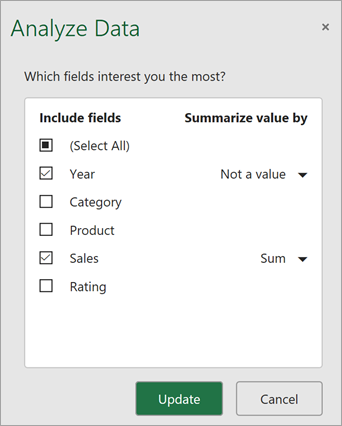
Analyze Data offers fewer, more targeted suggestions.
Note: The Not a value option in the field list refers to fields that are not normally summed or averaged. For example, you wouldn’t sum the years displayed, but you might sum the values of the years displayed. If used with another field that is summed or averaged, Not a value works like a row label, but if used by itself, Not a value counts unique values of the selected field.
Analyze Data works best with clean, tabular data.
Here are some tips for getting the most out of Analyze Data:
-
Analyze Data works best with data that’s formatted as an Excel table. To create an Excel table, click anywhere in your data and then press Ctrl+T.
-
Make sure you have good headers for the columns. Headers should be a single row of unique, non-blank labels for each column. Avoid double rows of headers, merged cells, etc.
-
If you have complicated, or nested data, you can use Power Query to convert tables with cross-tabs, or multiple rows of headers.
Didn’t get Analyze Data? It’s probably us, not you.
Here are some reasons why Analyze Data may not work on your data:
-
Analyze Data doesn’t currently support analyzing datasets over 1.5 million cells. There is currently no workaround for this. In the meantime, you can filter your data, then copy it to another location to run Analyze Data on it.
-
String dates like «2017-01-01» will be analyzed as if they are text strings. As a workaround, create a new column that uses the DATE or DATEVALUE functions, and format it as a date.
-
Analyze Data won’t work when Excel is in compatibility mode (i.e. when the file is in .xls format). In the meantime, save your file as an .xlsx, .xlsm, or .xlsb file.
-
Merged cells can also be hard to understand. If you’re trying to center data, like a report header, then as a workaround, remove all merged cells, then format the cells using Center Across Selection. Press Ctrl+1, then go to Alignment > Horizontal > Center Across Selection.
Analyze Data works best with clean, tabular data.
Here are some tips for getting the most out of Analyze Data:
-
Analyze Data works best with data that’s formatted as an Excel table. To create an Excel table, click anywhere in your data and then press
 +T.
+T. -
Make sure you have good headers for the columns. Headers should be a single row of unique, non-blank labels for each column. Avoid double rows of headers, merged cells, etc.
 +T.
+T.Didn’t get Analyze Data? It’s probably us, not you.
Here are some reasons why Analyze Data may not work on your data:
-
Analyze Data doesn’t currently support analyzing datasets over 1.5 million cells. There is currently no workaround for this. In the meantime, you can filter your data, then copy it to another location to run Analyze Data on it.
-
String dates like «2017-01-01» will be analyzed as if they are text strings. As a workaround, create a new column that uses the DATE or DATEVALUE functions, and format it as a date.
-
Analyze Data can’t analyze data when Excel is in compatibility mode (i.e. when the file is in .xls format). In the meantime, save your file as an .xlsx, .xlsm, or xslb file.
-
Merged cells can also be hard to understand. If you’re trying to center data, like a report header, then as a workaround, remove all merged cells, then format the cells using Center Across Selection. Press Ctrl+1, then go to Alignment > Horizontal > Center Across Selection.
Analyze Data works best with clean, tabular data.
Here are some tips for getting the most out of Analyze Data:
-
Analyze Data works best with data that’s formatted as an Excel table. To create an Excel table, click anywhere in your data and then click Home > Tables > Format as Table.
-
Make sure you have good headers for the columns. Headers should be a single row of unique, non-blank labels for each column. Avoid double rows of headers, merged cells, etc.
Didn’t get Analyze Data? It’s probably us, not you.
Here are some reasons why Analyze Data may not work on your data:
-
Analyze Data doesn’t currently support analyzing datasets over 1.5 million cells. There is currently no workaround for this. In the meantime, you can filter your data, then copy it to another location to run Analyze Data on it.
-
String dates like «2017-01-01» will be analyzed as if they are text strings. As a workaround, create a new column that uses the DATE or DATEVALUE functions, and format it as a date.
We’re always improving Analyze Data
Even if you don’t have any of the above conditions, we may not find a recommendation. That’s because we are looking for a specific set of insight classes, and the service doesn’t always find something. We are continually working to expand the analysis types that the service supports.
Here is the current list that is available:
-
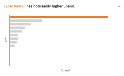
Rank: Ranks and highlights the item that is significantly larger than the rest of the items.
-
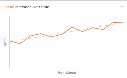
Trend: Highlights when there is a steady trend pattern over a time series of data.
-
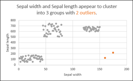
Outlier: Highlights outliers in time series.
-
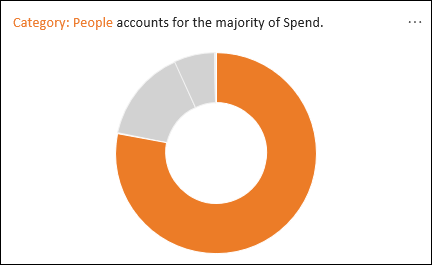
Majority: Finds cases where a majority of a total value can be attributed to a single factor.
If you don’t get any results, please send us feedback by going to File > Feedback.
Because Analyze Data analyzes your data with artificial intelligence services, you might be concerned about your data security. You can read the Microsoft privacy statement for more details.
Need more help?
You can always ask an expert in the Excel Tech Community or get support in the Answers community.
Explore the 30 most popular pages in this section. Below you can find a description of each page. Happy learning!
1 Find Duplicates: This example teaches you how to find duplicate values (or triplicates) and how to find duplicate rows in Excel.
2 Histogram: This example teaches you how to make a histogram in Excel.
3 Regression: This example teaches you how to run a linear regression analysis in Excel and how to interpret the Summary Output.
4 Pareto Chart: A Pareto chart combines a column chart and a line graph. The Pareto principle states that, for many events, roughly 80% of the effects come from 20% of the causes.
5 Remove Duplicates: This example teaches you how to remove duplicates in Excel.
6 Gantt Chart: Excel does not offer Gantt as chart type, but it’s easy to create a Gantt chart by customizing the stacked bar chart type.
7 Line Chart: Line charts are used to display trends over time. Use a line chart if you have text labels, dates or a few numeric labels on the horizontal axis.
8 Correlation: We can use the CORREL function or the Analysis Toolpak add-in in Excel to find the correlation coefficient between two variables.
9 Pie Chart: Pie charts are used to display the contribution of each value (slice) to a total (pie). Pie charts always use one data series.
10 Data Tables: Instead of creating different scenarios, you can create a data table to quickly try out different values for formulas. You can create a one variable data table or a two variable data table.
11 t-Test: This example teaches you how to perform a t-Test in Excel. The t-Test is used to test the null hypothesis that the means of two populations are equal.
12 Advanced Filter: This example teaches you how to apply an advanced filter in Excel to only display records that meet complex criteria.
13 Frequency Distribution: Did you know that you can use pivot tables to easily create a frequency distribution in Excel? You can also use the Analysis Toolpak to create a histogram.
14 Scatter Plot: Use a scatter plot (XY chart) to show scientific XY data. Scatter plots are often used to find out if there’s a relationship between variable X and Y.
15 Anova: This example teaches you how to perform a single factor ANOVA (analysis of variance) in Excel. A single factor or one-way ANOVA is used to test the null hypothesis that the means of several populations are all equal.
16 Compare Two Lists: This example describes how to compare two lists using conditional formatting.
17 Bar Chart: A bar chart is the horizontal version of a column chart. Use a bar chart if you have large text labels.
18 Goal Seek: If you know the result you want from a formula, use Goal Seek in Excel to find the input value that produces this formula result.
19 Box and Whisker Plot: This example teaches you how to create a box and whisker plot in Excel. A box and whisker plot shows the minimum value, first quartile, median, third quartile and maximum value of a data set.
20 Shade Alternate Rows: This example shows you how to use conditional formatting to shade alternate rows.
21 Quick Analysis: Use the Quick Analysis tool in Excel to quickly analyze your data. Quickly calculate totals, quickly insert tables, quickly apply conditional formatting and more.
22 Sparklines: Sparklines in Excel are graphs that fit in one cell. Sparklines are great for displaying trends. Excel offers three sparkline types: Line, Column and Win/Loss.
23 Slicers: Use slicers in Excel to quickly and easily filter pivot tables. Connect multiple slicers to multiple pivot tables to create awesome reports.
24 Trendline: This example teaches you how to add a trendline to a chart in Excel.
25 Pivot Chart: A pivot chart is the visual representation of a pivot table in Excel. Pivot charts and pivot tables are connected with each other.
26 Subtotal: Use the SUBTOTAL function in Excel instead of SUM, COUNT, MAX, etc. to ignore rows hidden by a filter or to ignore manually hidden rows.
27 Combination Chart: A combination chart is a chart that combines two or more chart types in a single chart.
28 Randomize List: This article teaches you how to randomize (shuffle) a list in Excel.
29 Unique Values: To find unique values in Excel, use the Advanced Filter. You can extract unique values or filter for unique values.
30 Icon Sets: Icon Sets in Excel make it very easy to visualize values in a range of cells. Each icon represents a range of values.
Check out all 300 examples.
Do you want to know how to analyze data in excel?
Are you looking for the best way to analyze data in excel?
Keep Reading!
Microsoft Excel is one of the most widely used tools in any industry. While some enjoy playing with pivotal tables and histograms, others limit themselves to simple pie-charts and conditional formatting.
Some may create an artwork out of the dull monochrome Excel, while others may be satisfied with its data analysis. In this discussion, we will make a deep delving analysis of Microsoft Excel and its utility. We will focus on how to analyze data in Excel Analytics, the various tricks, and techniques for it. The discussion will also explore the various ways to analyze data in Excel.
We will discuss the different features of Excel analytics to know how to analyze data in excel (much of which are unexplored to the mass), functions, and best practices.
Our discussion will include, but not be limited to:
(i) Best Way to Analyze Data in Excel
(ii) How to Analyze Sales Data in Excel
(iii) Analyzing Data Sets with Excel
(iv) Data Segregation with Excel
(v) The Importance of Data Reporting
(vi) How to Analyze Data in Excel

Register For a Free Webinar
Date: 15th Apr, 2023 (Saturday)
Time: 11:00 AM to 12:00 PM (IST/GMT +5:30)
How to Analyze Sales Data in Excel: Make Pivot Table your Best Friend
A pivot tool helps us summarize huge amounts of data. One of the best ways to analyze data in excel, it is mostly used to understand and recognize patterns in the data set.
Recognizing patterns in a small dataset is pretty simple. But the enormity of the datasets often calls for additional efforts to find the patterns. In such cases, a pivot table can be a huge advantage as it takes only a few minutes to summarize groups of data using a pivot table.
A data analysis example can be, you have a dataset consisting of regions and number of sales. You may want to know the number of sales based on the regions, which can be used to determine why a region is lacking and how to possibly improve in that area. Using a pivot table, you can create a report in excel within a few minutes and save it for future analysis.
A Pivot Table allows you to summarize data as averages, sums, or counts in Excel from data that is stored in another Spreadsheet, or table. It is great for quickly building reports because you can sort and visualize the data quickly.
Taking a data analysis example like, you may have put together a spreadsheet, which you can copy, and paste into Excel, or use in Google Docs if you would prefer (just click File > Make a Copy).
The spreadsheet contains data with a mock company’s customer purchase information. Since companies purchase at different dates, a pivot table will help us to consolidate this data to allow us to see total buys per company, as well as to compare purchases across companies, for quick analysis.
The Pivot table allows you to take a table with a lot of data in it and rearrange the table so that you only look at only what matters to you.
- a) Whether you are using a Mac or a PC, you can select the whole dataset that you want to look at and select: “Data” -> “Pivot Table”. When you hit that, a new tab should be opened with a table.
Data Set
- b) Once you have your table in front of you, you can drag and drop the Column Labels, Row Labels, and Report Filter
- Column Labels go across the top row of your table (for example Date, Month, Company Name)
- Row Labels go across the left-hand side of your table [for example Date, Month, Company Name (same as with column labels, it depends on how you would prefer to look at the data, vertically or horizontally)]
- The Values section is where you put the data you would like calculated (for example Purchases, Revenue)
- Report Filter helps you refine your results. Add anything you would like to Filter by (for example you want to look at Lead Referral Sources, but exclude Google and Direct)
Pivot tables are a great way to manage the data from your reports. You can copy and paste the data into your own Excel file, or create a copy in Google Apps (File > Make a Copy).

How to Analyze Data in Excel: Analyzing Data Sets with Excel
To know how to analyze data in excel, you can instantly create different types of charts, including line and column charts, or add miniature graphs. You can also apply a table style, create PivotTables, quickly insert totals, and apply conditional formatting. Analyzing large data sets with Excel makes work easier if you follow a few simple rules:
- Select the cells that contain the data you want to analyze.
- Click the Quick Analysis button image button that appears to the bottom right of your selected data (or press CRTL + Q).
- Selected data with Quick Analysis Lens button visible
- In the Quick Analysis gallery, select a tab you want. For example, choose Charts to see your data in a chart.
- Pick an option, or just point to each one to see a preview.
- You might notice that the options you can choose are not always the same. That is often because the options change based on the type of data you have selected in your workbook.

To understand the best way to analyze data in excel, you might want to know which analysis option is suitable for you. Here we offer you a basic overview of some of the best options to choose from.
- Formatting: Formatting lets you highlight parts of your data by adding things like data bars and colors. This lets you quickly see high and low values, among other things.
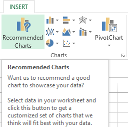
- Charts: Charts Excel recommends different charts, based on the type of data you have selected. If you do not see the chart you want, click More Charts.
- Totals: Totals let you calculate the numbers in columns and rows. For example, Running Total inserts a total that grows as you add items to your data. Click the little black arrows on the right and left to see additional options.
- Tables: Tables make it easy to filter and sort your data. If you do not see the table style you want, click More.
- Sparklines: Sparklines are like tiny graphs that you can show alongside your data. They provide a quick way to see trends.

Ways to Analyze Data in Excel: Tips and Tricks
It is fun to analyze data in MS Excel if you play it right. Here, we offer some quick hacks so that you know how to analyze data in excel.
-
How to Analyze Data in Excel: Data Cleaning
Data Cleaning, one of the very basic excel functions, becomes simpler with a few tips and tricks. You may learn how to use a native Excel feature and how to accomplish the same goal with Power Query. Power Query is a built-in feature in Excel 2016 and an Add-in for Excel 2010/2013. It helps you to extract, transform, and load your data with just a few clicks.
1. Change the format of numbers from text to numeric
Sometimes when you import data from an external source other than Excel, numbers are imported as text. Excel will alert you by showing a green tooltip in the top-left corner of the cell.
Depending on the number of values in the range, you can quickly convert the values to numbers by clicking on ‘Convert to a number’ within the tooltip options.
However, if you have more than 1000 values, you will have to wait a couple of seconds while Excel finishes the conversion.
You may also convert the values to number format is to use Text-to-Columns using the following steps:
- Select the range with the values to be converted.
- Go to Data > Text to Columns.
- Select Delimited and click Next.
- Uncheck all the checkboxes for delimiters (see below) and click Next.
- Text-Columns-Checkboxes
2. Select General and click on Finish
When you have lots of numbers to convert this tip will be much faster than waiting for all the numbers to be converted. In Power Query, you just have to right-click on the column header of the column you want to convert.
- Then go to Change Type.
- Then select the type of number you want (such as Decimal or Whole Number)
- Power-Query-Data-Type
Register For a Free Webinar
Date: 15th Apr, 2023 (Saturday)
Time: 11:00 AM to 12:00 PM (IST/GMT +5:30)
How to Analyze Data in Excel: Data Analysis
Data Analysis is simpler and faster with Excel analytics. Here, we offer some tips for work:
- Create auto expandable ranges with Excel tables: One of the most underused features of MS Excel is Excel Tables. Excel Tables have wonderful properties that allow you to work more efficiently. Some of these features include:
- Formula Auto Fill: Once you enter a formula in a table it will be automatically be copied to the rest of the table.
- Auto Expansion: New items typed below or at the right of the table become part of the table.
- Visible headers: Regardless of your position within the table, your headers will always be visible.
- Automatic Total Row: To calculate the total of a row, you just have to select the desired formula.
- Use Excel Tables as part of a formula: Like in dropdown lists, if you have a formula that depends on a Table, when you add new items to the Table, the reference in the formula will be automatically updated.
- Use Excel Tables as a source for a chart: Charts will be updated automatically as well if you use an Excel Table as a source. As you can see, Excel Tables allow you to create data sources that do not have to be updated when new data is included.
How to Analyze Data in Excel: Data Visualization
Quickly visualize trends with sparklines: Sparklines are a visualization feature of MS Excel that allows you to quickly visualize the overall trend of a set of values. Sparklines are mini-graphs located inside of cells. You may want to visualize the overall trend of monthly sales by a group of salesmen.
To create the sparklines, follow these steps below:
- Select the range that contains the data that you will plot (This step is recommended but not required, you can select the data range later).
- Go to Insert > Sparklines > Select the type of sparkline you want (Line, Column, or Win/Loss). For this specific example, I will choose Lines.
- Click on the range selection button Select Range Excel Button to browse for the location of the sparklines, press Enter and click OK. Make sure you select a location that is proportional to the data source. For example, if the data source range contains 6 rows then the location of the sparkline must contain 6 rows.
To format the sparkline you may try the following:
To change the colour of markers:
- Click on any cell within the sparkline to show the Sparkline Tools menu.
- In the Sparkline tools menu, go to Marker Color and change the colour for the specific markers you want.
For example High points on the green, Low points on red, and the remaining in blue.
To change the width of the lines:
- Click on any cell within the sparkline to show the Sparkline Tools menu.
- In the Sparkline tools contextual menu, go to Sparkline Color > Weight and change the width of the line as you desire.
Save Time with Quick Analysis: One of the major improvements introduced back in Excel 2013 was the Quick Analysis feature. This feature allows you to quickly create graphs, sparklines, PivotTables, PivotCharts, and summary functions by just clicking on a button.
When you select data in Excel 2013 or later, you will see the Quick Analysis button Quick Analysis Excel Button in the bottom-right corner of the range selected. If you click on the Quick Analysis button you will see the following options:
- Formatting
- Charts
- Totals
- Tables
- Sparklines
When you click on any of the options, Excel will show a preview of the possible results you could obtain given the data you selected.
- If you click on the Quick Analysis button and go to charts, you could quickly create the graph below just by clicking a button.
- If you go to Totals, you can quickly insert a row with the average for each column:
- If you click on Sparklines, you can quickly insert Sparklines:
- As you can see, the Quick Analysis feature really allows you to quickly perform different visualizations and analysis with almost no effort.
How to Analyze Data in Excel: Data reporting
Data reporting in Excel analytics requires more than just accounting skills, it also requires a thorough knowledge of excel functionalities and the ability to add beauty to your report.
- Turn Auto Refresh off before editing the Excel workbook. This will stop the table from refreshing when you are making changes on the worksheet. To do this, click on the Refresh icon at the bottom of the Excel Report Designer Task Pane and then select “Switch auto-refresh off”.
- When adding a new row to the layout, select a cell in the table area below where you want to insert the new row. Then right-click and from the context menu select Insert > Table Rows Above.
- When deleting columns or rows make sure you use the Table Delete functions similar to the Insert functions above. To remove a column or row, select a cell in the table area of the row or column you want to remove. Then right-click and from the context menu select Delete and then either Table Columns or Table Rows.
- Remove unneeded rows or columns from the table. Having fewer cells in the layout makes it easier for the table to refresh, so removing any unneeded ones will improve performance.

Excel has several other uses that may not have been covered here. Play around with visualize complex data or organize disparate numbers, to discover the infinite variety of functions in Excel analytics. Strong knowledge of excel is a boon if you are looking forward to a career in data analytics.
Register For a Free Webinar
Date: 15th Apr, 2023 (Saturday)
Time: 11:00 AM to 12:00 PM (IST/GMT +5:30)
This was all about how to analyze data in excel, how to analyze sales data in excel along with a few data analysis example.
Hopefully, you must have understood the best way to analyze data in excel.
We offer one of the best-known courses in Data Analytics Using Excel Course. The course enables you to learn tools such as Advanced Excel, PowerBI, and SQL. The live projects and intensive training program also empower you to come up with solutions for real-life problems.
Data analysis in Excel is provided by construction of a table processor. A lot of the program’s resources are suitable for solving this task.
Excel positions itself as the best universal software product in the world for processing analytical information. From a small enterprise to large corporations, managers spend a significant part of their working hours analyzing their businesses activity. Let’s consider the main analytical tools in Excel and examples of their use in practice.
Excel analysis tools
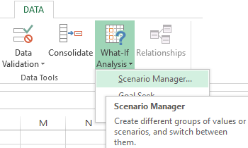
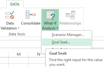
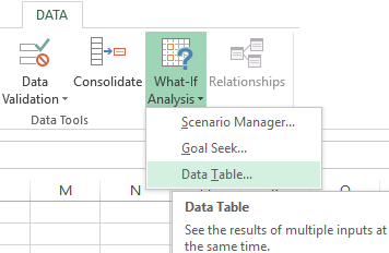
One of the most attractive data analysis is «What-if Analysis». It is located in «DATA» tab.
Analysis tools of «What-if Analysis»:
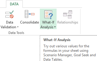
- “Scenario Manager”. It is used to generate, change and save different sets of input data and the results of calculations for a group of formulas.
- «Goal Seek». It is used when the user knows the result of the formula, but the input information for this result is unknown.
- «Data Table». Used in situations when it is necessary to show the effect of variable values on formulas in the form of a table.
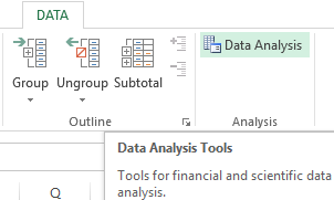
«Data Analysis». This is an Excel add-in. Helps find the best solution for a particular task.
Other tools for analysis:
Analyze data in Excel using built-in functions (mathematical, financial, logical, statistical, etc.).
Summary tables in data analysis
Excel uses summary tables to simplify the viewing, processing and consolidation of data.
The program will treat the entered information as a table, but not as a simple information set. But firstly you should format lists with values according to next steps:
- Go to the «INSERT» tab and click on the «Table» button CTRL+T.
- The «Create Table» dialog box appears.
- Specify the range of data (if it already exist) or the expected range (in which cells the table will be placed).
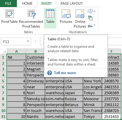
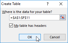
Set the check-mark in the box next to «Table with titles». Press Enter.
The specified default formatting style applies to the specified range.
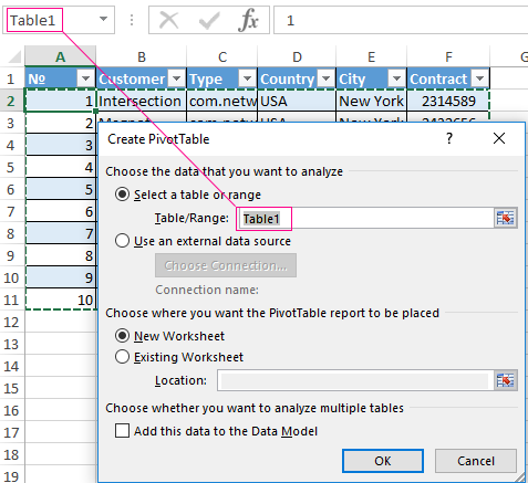
You can compose the report using the «PivotTable».
- Activate any of the cells in the values range. We click the button «PivotTable» («INSERT» — «Tables» — «PivotTable»).
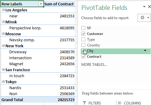
- In the dialog box you specify the range and place where to put the summary report (new sheet).
- The «PivotTable Fields» opens. The left side of the sheet is the report image; the right part is the tools for creating the summary report.
- Select the required fields from the list. Determine the values for the names of rows and columns. The report will be built on the left side of the sheet.
Creating a pivot table is already a way for analyzing information. Moreover, the user selects the information he needs at a particular moment for displaying. Then he can use other tools.
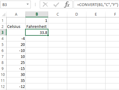
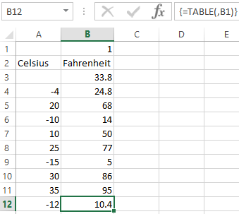
Analysis «What-if Analysis» in Excel: «Data Table»
This is a powerful tool for information analysis. Let’s consider the organization of information using the tool «What-if Analysis» — «Data Table».
Important conditions:
- data must be in one column or one line;
- the formula refers to one input cell.
The procedure for creating analysis:
- We enter the input values in a column. Enter the formula in the next column one line higher.
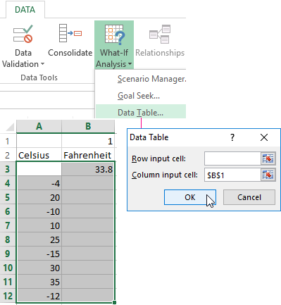
- We select a range of values including a column with input values and a formula A3:B12. Go to the «DATA» tab. Open the «What-if Analysis» tool. We click the «Data Table» button.
- There are two fields in the opened dialog box. Since we create a table with one input we enter the address only in the field «Column input cell:». If the input values are in lines (not in columns), we will enter the cell’s number in the field «Row input cell: » and click OK.
- Download enterprise analysis system
- Download analytical finance table
- Business profitability table
- Cash flow statement
- Example of a point method in financial and economic analytics
When using the features Excel, to analyze the enterprise activity, we use information from the balance sheet and income statement. Each user creates his own form, which reflects the features of the company and important information for decision-making.
Introduction
Data Analysis is mostly about exploring data. In general people have this idea that it’s all about building Machine learning models and predictive stuff. But actually it’s really about the working with the data. The best thing that one can do with data is just understand what they have and start asking questions and just start exploring and from the results or observations one can make incredible like ,for businesses and organizations, help them drive improvements and address the problems are trying to solve.
The first step in the whole process of Data analysis is ‘Getting the Data’. Data comes in all sorts of shapes and sizes and all different places. It could be a simple as files; some text files, or some documents or increasingly commonly if you working in a large organization, data is more likely to be in somewhere like a database. So one needs to go and get it out from there. Now-a-days we live in a connected world, where there are devices running, that are emitting data all the time, in real time. One have got sensors, and this so-called Internet of things is out there. So one have all this data from all these types of places.
Once the data is gathered, the next requirement is of some sort of tool to go and manipulate that data, work with that data, clean up and then start to analyse that data. And that tool might be something that is very commonly used like MS Excel, which is a really powerful tool that a lot of people use to Analyse data Or maybe it’s a bit more specialized; like writing some R code or Python or something like that and then manipulating the data in that language. The crucial step is really understanding the kinds of questions one need to ask and how to think about data in hand.
Example: The Operations Head of a multinational Computer Hardware Production organization has a requirement to analyse production data and identify the defect patterns across all its manufacturing plants across the globe.
Using the proper Data Analysis technique and tool, the operations head can perform an analysis for every item produced on each machine. Also the data about the defects can be obtained and then analysed for questions like ‘number of defects for each plant / machine / per day etc’. Thus through Data Analysis businesses can optimize their Supply-Chain Process and do a predication of Demand- Supply Chain.
Now we understand that Data Analytics can be coined as a process of observing the data in order to draw meaningful and logical insight into the data and the information / trend contained in that data. With the trends and the information gained, the organizations can then make a better decisions. The process of Data Analytics can be classified into four types.
1.1 Types of Analytics
Different type of Data Analytics are as follows:
1.1.1 Descriptive Analytics
Descriptive Analytics explains what has already happened and it is the simplest form of Data Analytics. During the process of Descriptive Analytics data is sliced into smaller chunks and then appropriate information about, what has already happened, from those data chunks is extracted. For instance, for a Banking Client’s data, using descriptive analytics one can find answers to following types of queries:
- Geographical dispersion of Client’s
- What are different Segments of Client’s (HNI etc.,)
- Clients expenditure’s, income patterns etc.,
1.1.2 Diagnostic Analytics
In order to understand ‘Why something’ has happened from the data gathered one can use Diagnostic Analytics. This type of analytics digs deeper in to the data to identify the real cause.
1.1.3 Predictive Analytics
Predictive Analytics, as the name suggest is for making predications based on the trends identified in the Data. This type of Analytics uses different Statistical, Data modelling and Data mining techniques to study, observe and identify trends in the data gathered. Based on these trends, Business Analyst and Data scientist can make forecast for the future time. This type of analytics is of major use while defining the Business Strategies, Objectives and Processes for the specific time periods.
1.1.4 Prescriptive Analytics
Prescriptive Analytics helps to augment the decision making process of organizations by formulating the best solutions among the available options. While identifying the best possible solution among the available solutions, the prescriptive analysis process also considers the business limitations enforced.
1.2 Ares of Analytics
Following are the areas where Analytics is used extensively now-a-days
· Customer Analytics : Through Customer Analytics, the organizations gains the insight about customers and thereby help then make decisions about the customers offers / discounts etc.,.
· Risk Analytics: Risk analysis makes attempts to predict the indecisions of the forthcoming business atmosphere. The results obtained through Risk Analytics that assists in evaluating the probability of project’s success.
· Financial Analytics: is of greater use for Financial Executives. It provides various options to address financial related business queries and also to predict and device financial strategies.
. Performance Analytics: is conduct to optimize the day to day operations. It aids in planning daily operations, budgeting for short period, making strategies for meeting the SLA’s and also to improve the overall operational performance.
2.Data Analysis and Excel
In the market, there are numerous Software and packages available today for performing Data analysis. Now the question arises Why use excel for analysing the data?
2.1Why Use Excel
Excel is extensively used for Data Analysis tool, primarily for following reasons:
- Cost
- Ease of Use
- Learning
MS excel is installed and accessible on almost all the Windows based computers so one need not to put in or invest in any other software for their basic Data analysis requirements. With minimum or almost negligible learning period, a novice in Data analysis can utilize MS excel for analytical purpose as easily as any other Windows based program.
2.2 Formatting and Conditional Formatting
In order to make Data ready and accessible for analysis, Formatting and conditional Formatting features of excel are used.
2.2.1 Formatting
With appropriate formatting techniques in place user is able to present the data more effectively and efficiently to the audience. Using Formatting users can add patterns or trends to the data. Patterns or trends can be implemented either by colors or Icons or formulas etc.
Cells of Microsoft Excel spreadsheet can be formatted manually by selecting fonts, font color, font size, background colors, and borders. In addition, excel provides several predefined table styles for formatting the tables automatically.
2.2.2 Conditional Formatting
Conditional formatting enables users to apply formatting patterns on particular cells of excel spreadsheet, satisfying the specified condition/s.
Through Conditional formatting, data can be visualized in such a manner which makes complex data easy to understand and relevant information can be highlighted, using colors, Bars, Icons etc.,
There are few pre-sets styles defined in excel. These are:
- Data Bars: The horizontal bars which are added to cells, making it look like a Bar Graph
- Color Scales: Changes the color of cells based on the value of cell. Each color scale uses a two- or three-color gradient.
- Icon Sets: Icon are added to the cells based on its value.
2.3 Excel Functions and Formulas
MS excel provides several type of functions which can be of enormous help while analysing big chunks of data. Major type of Excel functions are:
2.3.1 Logical Functions
Logical functions provided by Excel, assesses specific cell or cells for the specified criteria and then return a Boolean Value either True or False. Various Logical functions supported by Excel are
Boolean Operator Functions: AND, OR, XOR, NOT
Functions Returning Constant Value: TRUE and FALSE.
Conditional Functions: IF, IFERROR, IFNA, IFS, SWITCH
2.3.2 Lookup and Reference Functions
Excel LOOKUP functions are used when it is required to look into a single row or column and find a value from the same position in a second row or column i.e., these functions returns the value from a specified range of cells , either a Colum or a Row OR from an Array. There are two forms of Excel Lookup Functions. These are:
Vector Form: searches one column or a row. It ‘looks up’ for a value in a data vector which is a 1-dimensional list of data and then returns corresponding value from a second data vector. In case the function is not able to find an exact lookup value, it returns the closest value below the lookup value.
Array Form: A collection of values in the form of rows and columns is defined as an Array. This functions ‘looks up’ for a supplied value in the first column or row of a supplied data array which is a 2-dimensional table of data. It returns the corresponding value from the last column or row of the array. One Prerequisite for using the Array Form is that Data must be sorted.
Microsoft recommends using the VLOOKUP and HLOOKUP functions instead of using Array form of the Lookup functions.
VLOOKUP: performs a vertical Lookup and searches for the supplied data in the current worksheet. It is used to look for data in a table or a range by row.
HLOOKUP: performs a Horizontal Look up and searches for the value in first or top row of a table or an array of values. It returns a value in the same column from the specified row in the table or array.
Following Reference Functions are provided by Excel
INDEX: function utilizes and index to pick a value from a reference or array. This function returns a reference to a cell (or cells) for requested rows and columns.
OFFSET: This function is used to return a reference offset from a given reference range.
MATCH: This function looks for specified value in an array of cells and then returns the relative location of that element.
2.3.3 Statistical Functions
MS Excel offers a wide range of Statistical Functions that can accomplish majority of Statistical calculations ranging from basic mean, median & mode to complex statistical distribution and probability tests like Anova, CHITEST etc., Major Statistical functions of Excel are listed below:
MIN: returns the minimum value from a list of provided data readings
MAX: returns the maximum value from a list of provided data readings
AVERAGE: returns the average of the list of data readings provided
SUMIFS: calculates the sum of the range of selected cells based on the defined criteria
COUNTIFS: returns the number of cells among the range of cells provided meeting the defined criteria.
PERCENTILE: calculates and returns the K’th percentile of data readings provided, where K is in the range 0 — 1 (both inclusive)
QUARTILE: calculates and returns identified quartile of a set of data readings provided based on percentile value 0 — 1
STDEV: calculates the standard deviation for the given dataset or values representing population sample
MEDIAN: calculates the Median for the given dataset or values
MODE: finds the Mode or most frequently occurring value in the given dataset.
COVAR: Finds the Covariance for the given set of values or dataset
GEOMEAN: Calculates the Geometric mean of the given dataset or values.
2.4 Excel Pivot Tables
MS excel provides another commanding tool called Pivot Table which helps to tabulate and summarize large datasets for easy analysis. Using Pivot Tool, a lot of effort and time can be saved by summarizing the data in few clicks instead of writing thousands of formulas to achieve the same results.
2.4.1 Pivot Tables
Pivot tables were earlier referred as Crosstab. It’s believed that building a Pivot table is very complex and time consuming task but it a myth. Rather, if the data is well organized then it’s a minute job to create a pivot table. Characteristics of Pivot tables are listed below:
- Summarizes, analyses, explores and present the data efficiently
- Instant calculation and summarization of data
- Quickly Pivots or reorganizes the data
- Provides valuable insight (trends and patterns) about a large dataset that is otherwise difficult to identify
- Saves Effort and Time
- Provides Drill Down Capabilities
2.4.2 Analysing data using Pivot Tables
To analyse a dataset using Pivot table, user needs to simply drag and drop the relevant data in the appropriate cells. The tool itself re arrange the data enabling the user to play around with the summarized or reorganized data to discover and identify data trends and patterns. During data analysis following features offered by excel pivot tables are of great help:
Grouping: groups the data according to the Header values. Any field which is added in to the Pivot table either as row or column is can be grouped using the Grouping option. By default, the numeric values, including date and time fields, are grouped by pivot table
Filters: While doing an analysis on a large data it is often required to narrow down the data based on field values to bring out trends in the data. This can be effectively achieved using the Filters feature of the Pivot table.
Slicers: Slicers are just another form of filtering Slicers provided set of buttons based on data values of the field selected for slicer. There are no drop downs in this case. Slicers can be defined for any type of field in the pivot table
Custom Calculation: Very often there is requirement to change the way field values are displayed. For instance, instead of showing the sum or count of the numeric value it is required to display the numeric data in the form of percentages. This can be achieved using the Custom Calculation feature offered by Pivot table.
Calculated Field: In case there is a requirement to do some runtime calculation using the Pivot tables fields then calculated fields are used. These type of fields allows to write custom formulas in the Pivot table using already present fields in Pivot table.
2.5 Analytical Tools of Excel
Excel not only helps in performing basic calculations but is capable of doing complex to very complex data analysis that can be create sophisticated Data Models that can be utilized for financial Modelling, Business planning and Risk evaluations. In fact Excel has now become a first step for all those people who are new in the world of Data Analytics.
2.5.1 What-If Analysis Tools
While analysing large data sets there is often a situation where some pieces data is missing. In such cases, to continue with the data analysis process, it becomes mandatory to fill in the values for the missing data. The What-If analysis tools of Excel comes handy in these situations.
The process of changing the values in excel worksheet cells to observe the changes in the formulas outcome is termed as What-if analysis. With this feature it is possible to play around and experiment with the incomplete datasets also.
Goal Seek: It is used to obtain the results when the starting values are not known. As the name suggest, it tries to find out the goal from the end results. For instance, if the sum of two numbers are provided as 10 and one number is 6 then what the second number is? This can be solved using Goal Seek. In the large volume of data where the data readings are missing then Goal Seek is used to fill up the values with more complex logic
Scenario Manager: This tool enable users to create different circumstances with different set of data values and then switch between them. It allows to change 32 variables concurrently thus enabling to examine the outcomes for different input values at the same time.
Data Tables: Data Table in excel is a tool for doing a comparative analysis of the available values. Using data tables possible outcomes are determined by taking a set of input values. Instead of creating different situations as with Scenario manager, different output values for a formulae for different inputs is determined by making use of data tables.
Solver: Solver is used to find out the optimal solution for a formula according to the defined constraints and specifications. Constraints in Solver tools plays a crucial role. They confine the boundaries for the resources that helps solver to determine a feasible and optimal solution.
2.5.2 Statistical Analysis
One of the component of data analytics is Statistical Analysis which includes collection and examination of data sample of a population. It’s a discipline of science in which large data is collected, studied, explored and manipulated to identify the hidden trends and patterns. In the end results are presented in such a manner that the end user can easily understand the findings about the data.
Statistical Analysis consists of following steps:
- Data collection
- Data Exploration
- Data Modelling
- Study of the Data Model
- Deductions from the data Model
The objective of Statistical Analysis is to identify and discover the Trends and patterns in the Data.
Excel is a widely used software package to implement the statistical concepts and perform the calculations accordingly. It can:
- Hold the data to analyse
- Provide various features and functions to implement statistical Concepts on the data
- Perform statistical calculations according to the functions chosen
- Display the output in various form like table or Chats
Statistical Analysis in excel can be performed using the Data Analysis command. In case data Analysis command is not available then it needs to be enabled by loading the Analysis Toolpack addin in excel.
Major types of Statistical operations or calculations that can be performed using the Data analysis command in excel are as follows:
Moving Average: is used for forecasting purposes by creating a series of Averages for different subsets of the dataset provided.
Hypothesis Testing: determines the characteristics of population by analysing a random sample drawn from the population itself. Two contrary hypothesis are formulated to establish the characteristics. The First Hypothesis called the Null Hypothesis, referred as H0, is assumed to be true until strong evidences are discovered against it by performing the Hypothesis tests. Second one, called Alternate Hypothesis and referred as H1, is assumed to be true when the Null Hypothesis is false.
ANOVA: is a statistical method which observes and reports the variance by comparing the Means of different groups of data. ANOVA stands for Analysis Of Variance. This method allows to test the Null Hypothesis for more than two groups also.
COVARIANCE: is a method which determines the relationship or behaviour between two random variables say X and Y. If Y increases with X then covariance is positive and both variables show similar behaviour. If Y decreases with X then covariance is negative and both variables show opposite behaviour.
CORRELATION: is a measure of extent to which two or more variables vary together. Correlation coefficient vary between -1 to +1. Correlation Coefficient of value +1 indicates perfect correlation and a value of -1 indicates perfect negative correlation. A value of 0 indicates no correlation between the variables
Regression: is most widely used statistical method and is used to define the relationship strength between on dependent variable (denoted as Y) and series of series of changing variables knows as independent variables.
3. Conclusion
Undoubtedly MS excel is a tool which can cover and serve almost all the perspectives of Data analysis and due to this it has become a by default choice for a first step towards the world of Data Analysis. Though excel has almost everything to offer for Data crunching and analysis still there are some limitations of this package like:
· Handling huge data volumes
· Handling streaming data from disparate sources
· Excel’s limitations for scientific applications.
· Many useful functions or tests are still not available in Excel and its Analysis Tools,
Even, with the above mentioned shortcomings, excel is the preferred tool for Data analysis for many users. Also if someone is an experience user in the field of Data Analytics still MS Excel offers something new to learn.
This member has not yet provided a Biography. Assume it’s interesting and varied, and probably something to do with programming.