
Excel for Microsoft 365 Excel for Microsoft 365 for Mac Excel 2021 Excel 2021 for Mac Excel 2019 Excel 2019 for Mac Excel 2016 Excel 2016 for Mac Excel 2013 Excel 2010 Excel 2007 More…Less
If you need to develop complex statistical or engineering analyses, you can save steps and time by using the Analysis ToolPak. You provide the data and parameters for each analysis, and the tool uses the appropriate statistical or engineering macro functions to calculate and display the results in an output table. Some tools generate charts in addition to output tables.
The data analysis functions can be used on only one worksheet at a time. When you perform data analysis on grouped worksheets, results will appear on the first worksheet and empty formatted tables will appear on the remaining worksheets. To perform data analysis on the remainder of the worksheets, recalculate the analysis tool for each worksheet.
The Analysis ToolPak includes the tools described in the following sections. To access these tools, click Data Analysis in the Analysis group on the Data tab. If the Data Analysis command is not available, you need to load the Analysis ToolPak add-in program.
-
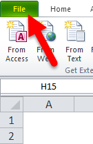
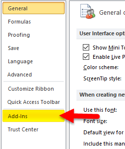
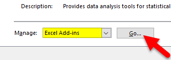
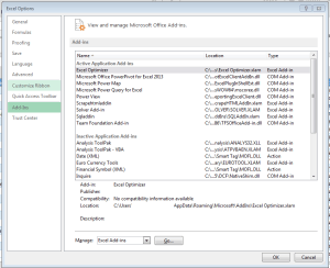
Click the File tab, click Options, and then click the Add-Ins category.
-
In the Manage box, select Excel Add-ins and then click Go.
If you’re using Excel for Mac, in the file menu go to Tools > Excel Add-ins.
-
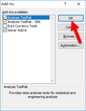
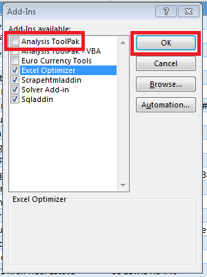
In the Add-Ins box, check the Analysis ToolPak check box, and then click OK.
-
If Analysis ToolPak is not listed in the Add-Ins available box, click Browse to locate it.
-
If you are prompted that the Analysis ToolPak is not currently installed on your computer, click Yes to install it.
-
Note: To include Visual Basic for Application (VBA) functions for the Analysis ToolPak, you can load the Analysis ToolPak — VBA Add-in the same way that you load the Analysis ToolPak. In the Add-ins available box, select the Analysis ToolPak — VBA check box.
The Anova analysis tools provide different types of variance analysis. The tool that you should use depends on the number of factors and the number of samples that you have from the populations that you want to test.
Anova: Single Factor
This tool performs a simple analysis of variance on data for two or more samples. The analysis provides a test of the hypothesis that each sample is drawn from the same underlying probability distribution against the alternative hypothesis that underlying probability distributions are not the same for all samples. If there are only two samples, you can use the worksheet function T.TEST. With more than two samples, there is no convenient generalization of T.TEST, and the Single Factor Anova model can be called upon instead.
Anova: Two-Factor with Replication
This analysis tool is useful when data can be classified along two different dimensions. For example, in an experiment to measure the height of plants, the plants may be given different brands of fertilizer (for example, A, B, C) and might also be kept at different temperatures (for example, low, high). For each of the six possible pairs of {fertilizer, temperature}, we have an equal number of observations of plant height. Using this Anova tool, we can test:
-
Whether the heights of plants for the different fertilizer brands are drawn from the same underlying population. Temperatures are ignored for this analysis.
-
Whether the heights of plants for the different temperature levels are drawn from the same underlying population. Fertilizer brands are ignored for this analysis.
Whether having accounted for the effects of differences between fertilizer brands found in the first bulleted point and differences in temperatures found in the second bulleted point, the six samples representing all pairs of {fertilizer, temperature} values are drawn from the same population. The alternative hypothesis is that there are effects due to specific {fertilizer, temperature} pairs over and above the differences that are based on fertilizer alone or on temperature alone.
Anova: Two-Factor Without Replication
This analysis tool is useful when data is classified on two different dimensions as in the Two-Factor case With Replication. However, for this tool it is assumed that there is only a single observation for each pair (for example, each {fertilizer, temperature} pair in the preceding example).
The CORREL and PEARSON worksheet functions both calculate the correlation coefficient between two measurement variables when measurements on each variable are observed for each of N subjects. (Any missing observation for any subject causes that subject to be ignored in the analysis.) The Correlation analysis tool is particularly useful when there are more than two measurement variables for each of N subjects. It provides an output table, a correlation matrix, that shows the value of CORREL (or PEARSON) applied to each possible pair of measurement variables.
The correlation coefficient, like the covariance, is a measure of the extent to which two measurement variables «vary together.» Unlike the covariance, the correlation coefficient is scaled so that its value is independent of the units in which the two measurement variables are expressed. (For example, if the two measurement variables are weight and height, the value of the correlation coefficient is unchanged if weight is converted from pounds to kilograms.) The value of any correlation coefficient must be between -1 and +1 inclusive.
You can use the correlation analysis tool to examine each pair of measurement variables to determine whether the two measurement variables tend to move together — that is, whether large values of one variable tend to be associated with large values of the other (positive correlation), whether small values of one variable tend to be associated with large values of the other (negative correlation), or whether values of both variables tend to be unrelated (correlation near 0 (zero)).
The Correlation and Covariance tools can both be used in the same setting, when you have N different measurement variables observed on a set of individuals. The Correlation and Covariance tools each give an output table, a matrix, that shows the correlation coefficient or covariance, respectively, between each pair of measurement variables. The difference is that correlation coefficients are scaled to lie between -1 and +1 inclusive. Corresponding covariances are not scaled. Both the correlation coefficient and the covariance are measures of the extent to which two variables «vary together.»
The Covariance tool computes the value of the worksheet function COVARIANCE.P for each pair of measurement variables. (Direct use of COVARIANCE.P rather than the Covariance tool is a reasonable alternative when there are only two measurement variables, that is, N=2.) The entry on the diagonal of the Covariance tool’s output table in row i, column i is the covariance of the i-th measurement variable with itself. This is just the population variance for that variable, as calculated by the worksheet function VAR.P.
You can use the Covariance tool to examine each pair of measurement variables to determine whether the two measurement variables tend to move together — that is, whether large values of one variable tend to be associated with large values of the other (positive covariance), whether small values of one variable tend to be associated with large values of the other (negative covariance), or whether values of both variables tend to be unrelated (covariance near 0 (zero)).
The Descriptive Statistics analysis tool generates a report of univariate statistics for data in the input range, providing information about the central tendency and variability of your data.
The Exponential Smoothing analysis tool predicts a value that is based on the forecast for the prior period, adjusted for the error in that prior forecast. The tool uses the smoothing constant a, the magnitude of which determines how strongly the forecasts respond to errors in the prior forecast.
Note: Values of 0.2 to 0.3 are reasonable smoothing constants. These values indicate that the current forecast should be adjusted 20 percent to 30 percent for error in the prior forecast. Larger constants yield a faster response but can produce erratic projections. Smaller constants can result in long lags for forecast values.
The F-Test Two-Sample for Variances analysis tool performs a two-sample F-test to compare two population variances.
For example, you can use the F-Test tool on samples of times in a swim meet for each of two teams. The tool provides the result of a test of the null hypothesis that these two samples come from distributions with equal variances, against the alternative that the variances are not equal in the underlying distributions.
The tool calculates the value f of an F-statistic (or F-ratio). A value of f close to 1 provides evidence that the underlying population variances are equal. In the output table, if f < 1 «P(F <= f) one-tail» gives the probability of observing a value of the F-statistic less than f when population variances are equal, and «F Critical one-tail» gives the critical value less than 1 for the chosen significance level, Alpha. If f > 1, «P(F <= f) one-tail» gives the probability of observing a value of the F-statistic greater than f when population variances are equal, and «F Critical one-tail» gives the critical value greater than 1 for Alpha.
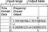
The Fourier Analysis tool solves problems in linear systems and analyzes periodic data by using the Fast Fourier Transform (FFT) method to transform data. This tool also supports inverse transformations, in which the inverse of transformed data returns the original data.
The Histogram analysis tool calculates individual and cumulative frequencies for a cell range of data and data bins. This tool generates data for the number of occurrences of a value in a data set.
For example, in a class of 20 students, you can determine the distribution of scores in letter-grade categories. A histogram table presents the letter-grade boundaries and the number of scores between the lowest bound and the current bound. The single most-frequent score is the mode of the data.
Tip: In Excel 2016, you can now create a histogram or Pareto chart.
The Moving Average analysis tool projects values in the forecast period, based on the average value of the variable over a specific number of preceding periods. A moving average provides trend information that a simple average of all historical data would mask. Use this tool to forecast sales, inventory, or other trends. Each forecast value is based on the following formula.
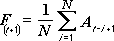
where:
-
N is the number of prior periods to include in the moving average
-
A
j is the actual value at time j -
F
j is the forecasted value at time j
The Random Number Generation analysis tool fills a range with independent random numbers that are drawn from one of several distributions. You can characterize the subjects in a population with a probability distribution. For example, you can use a normal distribution to characterize the population of individuals’ heights, or you can use a Bernoulli distribution of two possible outcomes to characterize the population of coin-flip results.
The Rank and Percentile analysis tool produces a table that contains the ordinal and percentage rank of each value in a data set. You can analyze the relative standing of values in a data set. This tool uses the worksheet functions RANK.EQ andPERCENTRANK.INC. If you want to account for tied values, use the RANK.EQ function, which treats tied values as having the same rank, or use the RANK.AVG function, which returns the average rank for the tied values.
The Regression analysis tool performs linear regression analysis by using the «least squares» method to fit a line through a set of observations. You can analyze how a single dependent variable is affected by the values of one or more independent variables. For example, you can analyze how an athlete’s performance is affected by such factors as age, height, and weight. You can apportion shares in the performance measure to each of these three factors, based on a set of performance data, and then use the results to predict the performance of a new, untested athlete.
The Regression tool uses the worksheet function LINEST.
The Sampling analysis tool creates a sample from a population by treating the input range as a population. When the population is too large to process or chart, you can use a representative sample. You can also create a sample that contains only the values from a particular part of a cycle if you believe that the input data is periodic. For example, if the input range contains quarterly sales figures, sampling with a periodic rate of four places the values from the same quarter in the output range.
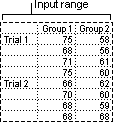
The Two-Sample t-Test analysis tools test for equality of the population means that underlie each sample. The three tools employ different assumptions: that the population variances are equal, that the population variances are not equal, and that the two samples represent before-treatment and after-treatment observations on the same subjects.
For all three tools below, a t-Statistic value, t, is computed and shown as «t Stat» in the output tables. Depending on the data, this value, t, can be negative or nonnegative. Under the assumption of equal underlying population means, if t < 0, «P(T <= t) one-tail» gives the probability that a value of the t-Statistic would be observed that is more negative than t. If t >=0, «P(T <= t) one-tail» gives the probability that a value of the t-Statistic would be observed that is more positive than t. «t Critical one-tail» gives the cutoff value, so that the probability of observing a value of the t-Statistic greater than or equal to «t Critical one-tail» is Alpha.
«P(T <= t) two-tail» gives the probability that a value of the t-Statistic would be observed that is larger in absolute value than t. «P Critical two-tail» gives the cutoff value, so that the probability of an observed t-Statistic larger in absolute value than «P Critical two-tail» is Alpha.
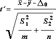
t-Test: Paired Two Sample For Means
You can use a paired test when there is a natural pairing of observations in the samples, such as when a sample group is tested twice — before and after an experiment. This analysis tool and its formula perform a paired two-sample Student’s t-Test to determine whether observations that are taken before a treatment and observations taken after a treatment are likely to have come from distributions with equal population means. This t-Test form does not assume that the variances of both populations are equal.
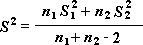
Note: Among the results that are generated by this tool is pooled variance, an accumulated measure of the spread of data about the mean, which is derived from the following formula.
t-Test: Two-Sample Assuming Equal Variances
This analysis tool performs a two-sample student’s t-Test. This t-Test form assumes that the two data sets came from distributions with the same variances. It is referred to as a homoscedastic t-Test. You can use this t-Test to determine whether the two samples are likely to have come from distributions with equal population means.
t-Test: Two-Sample Assuming Unequal Variances
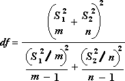
This analysis tool performs a two-sample student’s t-Test. This t-Test form assumes that the two data sets came from distributions with unequal variances. It is referred to as a heteroscedastic t-Test. As with the preceding Equal Variances case, you can use this t-Test to determine whether the two samples are likely to have come from distributions with equal population means. Use this test when there are distinct subjects in the two samples. Use the Paired test, described in the follow example, when there is a single set of subjects and the two samples represent measurements for each subject before and after a treatment.
The following formula is used to determine the statistic value t.
The following formula is used to calculate the degrees of freedom, df. Because the result of the calculation is usually not an integer, the value of df is rounded to the nearest integer to obtain a critical value from the t table. The Excel worksheet function T.TEST uses the calculated df value without rounding, because it is possible to compute a value for T.TEST with a noninteger df. Because of these different approaches to determining the degrees of freedom, the results of T.TEST and this t-Test tool will differ in the Unequal Variances case.
The z-Test: Two Sample for Means analysis tool performs a two sample z-Test for means with known variances. This tool is used to test the null hypothesis that there is no difference between two population means against either one-sided or two-sided alternative hypotheses. If variances are not known, the worksheet function Z.TEST should be used instead.
When you use the z-Test tool, be careful to understand the output. «P(Z <= z) one-tail» is really P(Z >= ABS(z)), the probability of a z-value further from 0 in the same direction as the observed z value when there is no difference between the population means. «P(Z <= z) two-tail» is really P(Z >= ABS(z) or Z <= -ABS(z)), the probability of a z-value further from 0 in either direction than the observed z-value when there is no difference between the population means. The two-tailed result is just the one-tailed result multiplied by 2. The z-Test tool can also be used for the case where the null hypothesis is that there is a specific nonzero value for the difference between the two population means. For example, you can use this test to determine differences between the performances of two car models.
Need more help?
You can always ask an expert in the Excel Tech Community or get support in the Answers community.
See Also
Create a histogram in Excel 2016
Create a Pareto chart in Excel 2016
Load the Analysis ToolPak in Excel
ENGINEERING functions (reference)
Overview of formulas in Excel
How to avoid broken formulas
Find and correct errors in formulas
Excel keyboard shortcuts and function keys
Excel functions (alphabetical)
Excel functions (by category)
Need more help?
Want more options?
Explore subscription benefits, browse training courses, learn how to secure your device, and more.
Communities help you ask and answer questions, give feedback, and hear from experts with rich knowledge.
Excel Tool for Data Analysis (Table of Contents)
- Data Analysis Tool in Excel
- Unleash Data Analysis Tool Pack in Excel
- How to Use the Data Analysis Tool in Excel?
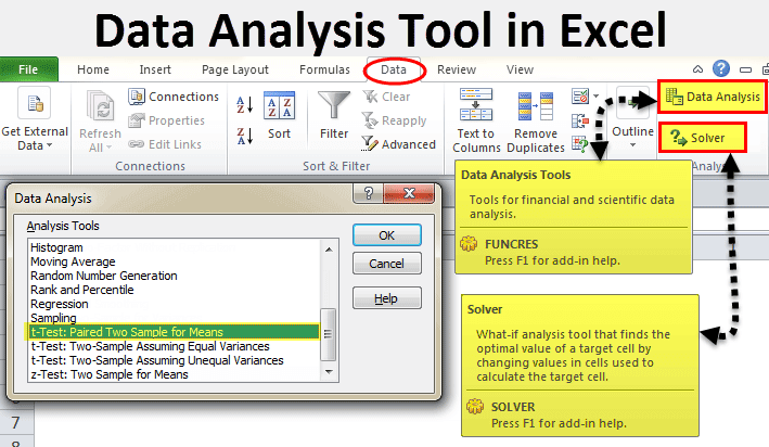
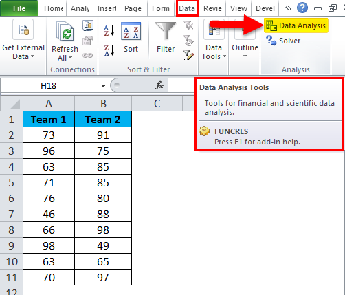
In excel, we have few inbuilt tools which are used for Data Analysis. But these become active only when you select any of them. To enable the Data Analysis tool in Excel, go to the File menu’s Options tab. Once we get the Excel Options window from Add-Ins, select any of the analysis pack, let’s say Analysis Toolpak and click on Go. This will take us to the window from where we can select one or multiple Data analysis tool packs, which can be seen in the Data menu tab.
If you observe excel on your laptop or computer, you may not see the data analysis option by default. You need to unleash it. Usually, a data analysis tool pack is available under the Data tab.
Under the Data Analysis option, we can see many analysis options.
Unleash Data Analysis Tool Pack in Excel
If your excel is not showing this pack, follow the below steps to unleash this option.
Step 1: Go to FILE.
Step 2: Under File, select Options.
Step 3: After selecting Options, select Add-Ins.
Step 4: Once you click on Add-Ins, at the bottom, you will see Manage drop-down list. Select Excel Add-ins and click on Go.
Step 5: Once you click on Go, you will see a new dialogue box. You will see all the available Analysis Tool Pack. I have selected 3 of them and then click on Ok.
Step 6: Now, you will see these options under the Data ribbon.

How to Use the Data Analysis Tool in Excel?
Let’s understand the working of a data analysis tool with some examples.
You can download this Data Analysis Tool Excel Template here – Data Analysis Tool Excel Template
T-test Analysis – Example #1
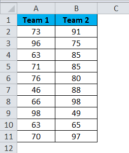
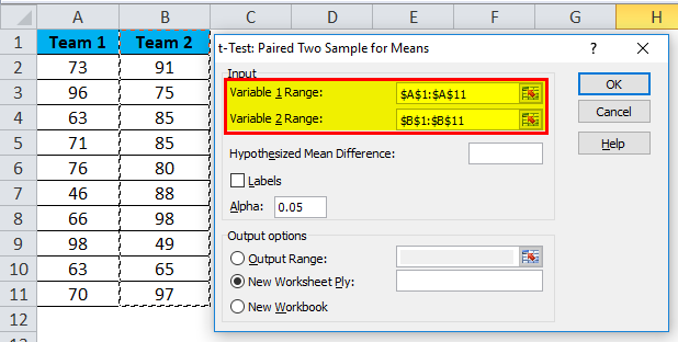
A t-test is returning the probability of the tests. Look at the below data of two teams scoring pattern in the tournament.
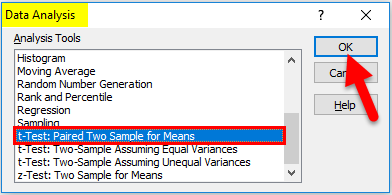
Step 1: Select the Data Analysis option under the DATA tab.
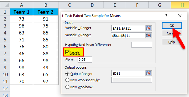
Step 2: Once you click on Data Analysis, you will see a new dialogue box. Scroll down and find the T-test. Under T-test, you will three kinds of T-test; select the first one, i.e. t-Test: Paired Two Sample for Means.
Step 3: After selecting the first t-Test, you will see the below options.
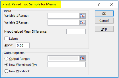
Step 4: Under Variable 1 Range, select team 1 score and under Variable 2 Range, select team 2 score.
Step 5: Output Range selects the cell where you want to display the results.
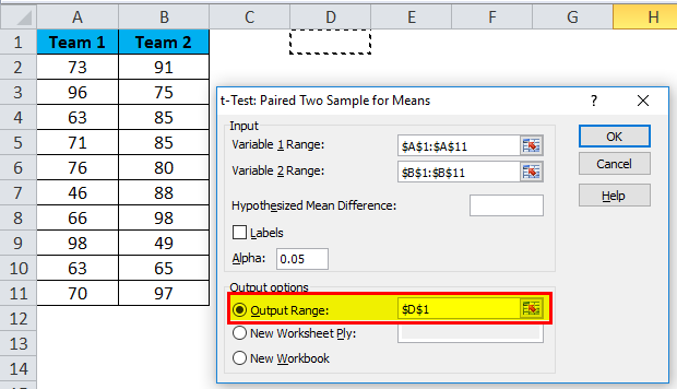
Step 6: Click on Labels because we have selected the ranges, including headings. Click on Ok to finish the test.
Step 7: From the D1 cell, it will start showing the test result.
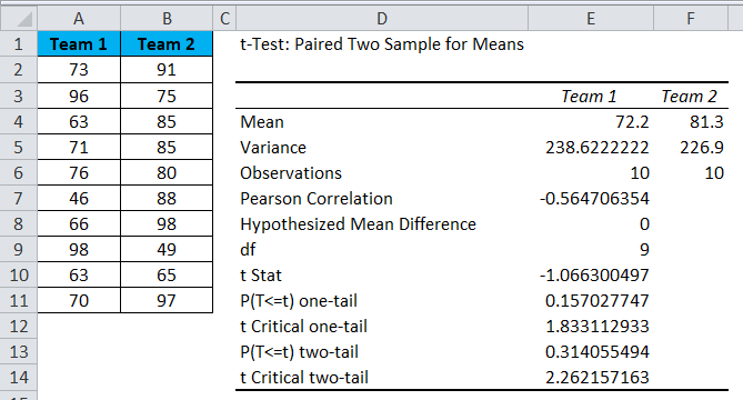
The result will show the mean value of two teams, Variance Value, how many observations are conducted or how many values taken into consideration, Pearson Correlation etc.…
If you P (T<=t) two-tail, it is 0.314, which is higher than the standard expected P-value of 0.05. This means data is not significant.
We can also do the T-test by using the built-in function T.TEST.
SOLVER Option – Example#2
A solver is nothing but solving the problem. SOLVER works like a goal seek in excel.
Look at the below image. I have data of product units, unit price, total cost, and the total profit.
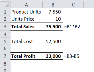
Units sold quantity is 7550 at a selling price of 10 per unit. The total cost is 52500, and the total profit is 23000.
As a proprietor, I want to earn a profit of 30000 by increasing the unit price. As of now, I don’t know how much units price I have to increase. SOLVER will help me to solve this problem.
Step 1: Open SOLVER under the DATA tab.
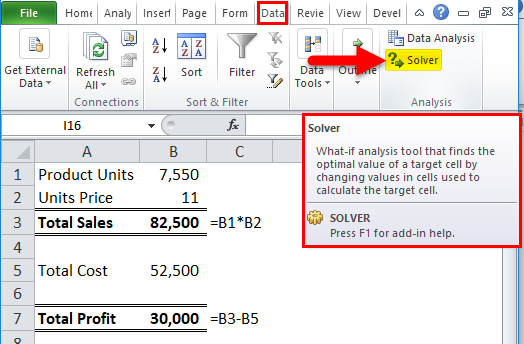
Step 2: Set the objective cell as B7 and the value of 30000 and by changing the cell to B2. Since I don’t have any other special criteria to test, I am clicking on the SOLVE button.
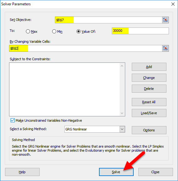
Step 3: The Result will be as below:
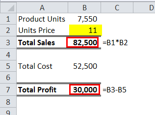
Ok, excel SOLVER solved the problem for me. To make a profit of 30000 I need to sell the products at 11 per unit instead of 10 per unit.
In this way, we can do the analyze the data.
Things to Remember
- We have many other analysis tests like Regression, F-test, ANOVA, Correlation, Descriptive techniques.
- We can add Excel Add-in as a data analysis tool pack.
- Analysis tool pack is available under VBA too.
Recommended Articles
This has been a guide to Data Analysis Tool in Excel. Here we discuss how to use the Excel Data Analysis Tool along with excel examples and a downloadable excel template. You may also look at these useful articles in excel –
- Pareto Analysis in Excel
- What-If Analysis in Excel
- Excel Regression Analysis
- Excel Quick Analysis
Excel offers various in-built tools to analyze big data.
But, these tools are not automatically active. Users need to activate them whenever required.
If you want to activate the data analysis tool in excel, you can do it by selecting the “Options tab” from the file menu option.
After this, choose the analysis pack from the Add-Ins options. Finally, click on the Go option.
You will now find that a window opens on your PC screen where you can select various data analysis tool packs.
You can find the data analysis option on your laptops by default.
For this, you need to unleash the data analysis option.
Below, we have explained all the steps to unleash the data analysis tool.
Moreover, we have detailed how to use the data analysis tools in excel along with the proper steps.
How to unleash a data analysis tool in excel in Windows?
There is always a possibility you are unable to show any data analysis tool in excel.
Below are the steps that users can use to unleash the tool pack.
- Go to the file option given on the left-hand side.
- Now, you will find an “option,” click it to select.
- Once you select the option, click on the Add-Ins.
- At the bottom, there is a Manage drop-down list. Here, you will choose Excel Add-ins, then select Go.
- Now, you will find a new dialogue box open on your screen. All the available Analysis Toolpak will open on your screen. Select all 3 options. Then click on the OK button.
- The two different options will be available on the screen below the data ribbon.
How to add data analysis tool in Excel Mac?
To unleash the Toolpak in excel for mac, you need to follow the following steps:
- Select the Tool menu to find the excel Add-Ins option. Once you find it, select it.
- An Add-Ins box will be available on your screen, choose the Analysis ToolPack option, then click on the OK button.
- If there is no Analysis ToolPack option within the Add-Ins box, select Browse to find it out.
- If the Analysis ToolPack is not installed on the system, select the Yes to install it on your computer.
- Select Quit and always restart Excel to restart its working.
- Now, you will see that there is a Data Analysis Command access on the Data tab.
Steps to use data analysis tool in excel
Example 1: Using Solver
The Solver is the data analysis tool that is used for solving problems. It works just as a goal seeks within excel.
In the below example, we have the list of product units, total cost, unit price, and the total profit.
The unit of the sold material is 7550 that has a selling price of 10/unit.
The total profit is 23,000 whereas the total cost is around 52,500.
Being an owner of the business, I like to increase my profit to 30,000 using the unit prices.
This is the case where the Solver will help me to estimate the times value and solve this issue.
To use the Solver, follow the below-mentioned steps sequentially.
- Open the Solver that is given under the DATA tab.
- Confirm B7 as the objective cell that has the value of 30,000. With the help of shifting the cell value to B2. Select the SOLVE option from the menus.
- You find that there is a result window that opens on the screen.
This signifies that the SOLVER has solved your problem.
Therefore, to get a profit of 30,000, you need to increase the selling price by 1/unit.
This means that you need to sell the product at the value of 11/unit rather than 10/unit.
This is how you can use a data analysis tool in excel.
Example 2: T-test Analysis
A t-test is used for testing the probability value.
Check the below-mentioned example to understand the working of the t-test data analysis tool in excel.
- You can find the Data Analysis option that is given under the Data tab option.
- A new dialogue box will open when you select the data analysis option. Find out the T-test option. Once you reach the options, you will find the different t-test options and select the Paired two-sample option.
- When you choose the t-test option, you will find the below-mentioned options.
- Here, you can select the team 1 score from the variable 1 range and team 2 score option under the variable 2 option.
- Now, the output cell will select the range where you can display the result.
- Select the labels option as we have selected the range that includes the heading. Select the OK so that the test gets finished.
- We will notice that the D1 cell will display the output of the test.
The output will show the teams’ average value, along with the variance values, Pearson Correlations, and much more.
If the value of the P is 0.314, that is much higher than the standard expected value that is 0.05.
It means that details are not significant. Here, you can use the T-test in-built functions.
Key points to remember
There are several analysis tests, such as F-test, Correlation, Regression, ANOVA, Descriptive techniques, that you can use in excel. You can also add Excel Add-ins that will work as the data analysis toolpak. The analysis tool packs are always available under the VBA option.
List of tools that are available for data analysis in excel
- Anova: Two-Factor with Replication
- Correlation
- Descriptive Statistics
- F-Test Two-Sample for Variance
- Histogram
- Random Number Generation
- Regression
- t-Test: Paired Two Sample for Means
- ANOVA: Single Factor
- ANOVA: Two-Factor Without Replication
- Covariance
- Exponential Smoothing
- Fourier Analysis
- Moving Average
- Rank and Percentile
- Sampling
- t-Test: Two-Sample Assuming Unequal Variances
- t-Test: Two-Sample Assuming Equal Variances
- Z-Test: Two-Samples for Mean
Bottom line!
Several organizations use data analysis tool in excel.
Excel plays an important role in managing the operational dashboards and keeping the tracks of each organization.
Excel helps the organization for cataloging the data sets, creating data models, importing the data, and much more.
We have explained the two different data analysis tools that you can use in excel.
Hope you understand the topic.
If you still have any queries regarding data analysis tools in excel, comment in the below section. We will help you in the best possible way.
if you have a question about who can do my excel assignment for me, you don’t need to pay someone to do my excel project, because our experts provide you the best service.
Frequently Asked Question
Where is the data analysis tool in Excel?
To find out the data analysis tool, the user needs to select the File tab.
Choose Options; after it, select the Add-Ins category.
Choose excel add-ins from the Manage box, then choose Go.
Once you get the Analysis ToolPak check box select OK button.
What are the tools of data analysis?
Tableau Public.
Apache Spark.
RapidMiner.
QlikView.
R Programming.
SAS.
Excel.
KNIME.
Is Excel good for data analysis?
Excel considers being a great tool for data analysis.
It’s particularly handy for performing data analysis access by the common person at a company.
With so many data analytics tools out there, why use Excel? The answer is simple: Excel is the world’s most widely used spreadsheet program. It’s also easy to use and completely free.
But beyond that, it’s a powerful tool that can analyze data, save significant amounts of time and prevent monotony and errors.
This five-part tutorial will show you how to use Excel’s business intelligence tools like Power Query, Power Pivot and Power Maps to analyze data. (Also read: What skills are required to get a job in data analytics?)
Let’s get started!
1. Use Power Query to Gather Data
Before you can analyze data in Excel—or anywhere—you need to gather it.
Luckily, in Excel, there are several options to get and organize data. With Power Query, you can gather data from different sources, including databases, CSVs, Xl or XML files. (Also read: 7 Reasons Why You Need a Database Management System.)
Once you get the data from these sources, you can shape them to suit your needs. Power Query also allows you to consolidate the data from different files into a single worksheet.
For instance, if you have 100 different Excel spreadsheets, you can consolidate them into a single workbook, which saves you time.
You can bring data from other applications into Excel as well. For example, you can get data from Salesforce or Google Analytics into Excel, then manipulate that data however you like.
2. Clean Your Data With Auto Filter
Once you’ve gathered your data, the next step is to clean it.
There are many different ways to clean up your data, such as:
Clean the Formatting
Sometimes, you’ll have data that appears out of place. In that case, you can use Excel’s «Auto Filter» to find the values you need.
For example, let’s say you have a list of names with birthdates next to each. Typically, you’d format the birthdate as a number, but for this example we’ll pretend the birthdates are formatted «YYYY-MM-DD» instead.
Here’s how to clean the formatting in Excel:
- Open the «Data» tab.
- Select «Auto Filter.»
- From the drop-down menu, select «Custom» and enter this formula: =LEFT(A2,4). This formula will extract the «4» digits from the birthdate.
- Select «Auto Filter» again (you can just press «Ctrl+F»). This time, choose «Date» as the category and «Custom» as the criteria.
- Enter this formula: =RIGHT(A2, 2). This will extract the «2» digits from the birthdate.
This formula will filter out all the birthdates that don’t have four or two characters.
Remove Duplicate Rows in Excel
In some cases, you’ll have duplicate rows in your list. Here’s how to remove them:
- Open the «Data» tab.
- Select «Remove Duplicates» from the drop-down.
- Tick the «Unique» box.
- Click «OK.» The «Remove Duplicates» dialog box will appear.
- Check all the options.
- Click «OK.»
This will allow you to remove all duplicate rows.
Remove Empty Rows in Excel
You may have blank rows in your Excel spreadsheet. Here’s how to get rid of them:
- Open the «Data» tab.
- Select «Remove Empty Rows» from the drop-down.
- Tick the «Unique» box.
- Click «OK.»
3. Explore Your Data Using Power Pivot
The most powerful way to explore your data is by using Excel’s «Power Pivot» tool.
With Power Pivot, you can analyze your data by creating tables. A Power Pivot table allows you to visualize your data in different ways, like:
Create a Table
- Open the «Data» tab.
- Select «Insert.»
- Click «New.» Once you do that, a new Power Pivot window will appear.
- Click on «Table.»
- Click «Add New.» This will open another window.
- Enter a name for your table.
- Deselect «Selected Items.»
- Click the «OK» button. A new table will be created and you can drag columns and rows to arrange the table’s structure.
- Once you have your table set up, click «OK» to close the window.
- Go to «File» > «Close & Load». This will load your newly created table.
Create Charts and PivotTables
After you’ve created a table, you can create charts and PivotTables to analyze your data. Here’s how:
Pie Charts
- Go to «Insert» → «Chart» → «Chart Types» → «Pie Chart.» A pie chart will be created.
PivotTables
- Go to «Insert» → «PivotTable.»
- Select «Source» → «Get Data» → «From Table» → «Next»→ «Select Table» → «OK.» This will create a PivotTable.
- To create another PivotTable, select «Source» → «Get Data» → «From Table» (this time, select the table you want) → «Next» → «Select Table» → «OK.» This will create another PivotTable.
4. Use Power Maps to Add Advanced Analytic Capabilities (Optional)
At this point, you’ve explored your data and have created charts and PivotTables. Now, it’s time to add some advanced analytic capabilities. (Also read: 9 Reasons to Go for a Data Science Course.)
You can do this with Excel’s «Power Maps» tool.
Power Maps allows you to visualize your data in 3D: You can rotate, zoom, pan and link different data together.
To create a power map:
- Go to «Insert» → «Map» → «New Map.» Once you do that, a new window will appear. You can drag the «Map» section to the right in this window.
- Select the «Data» section and drag it to the right.
- Select «Add» → «New Source» → «From Database.» This will open a new window.
- Choose a database and click «OK.»
- Select «Add» → «New Data Source» → «From File» → «Next» → «Choose File» → «Next» → «Choose File» → «Next» → «Choose File» → «Next.» This will open a new window.
- Select a file and click «OK.»
- In the «Data» section, select the «Fields» section. Drag the «Fields» section to the right and select the «Country» field.
- Still in the «Fields» section, select the «Region» field. In the right panel, click «OK.»
This will create a map. You can change the «Legend» to «Map.»
How to Edit the Map Style
- Click «Style.» This will open a new window.
Here, you can edit attributes such as the map type, map title, center, zoom, pan, rotation, size, color, transparency, opacity, background, border, lighting, shadow and direction.
5. Share Your Excel Report to SharePoint
Finally, you can share (or «publish») your report and share it with others. Here’s how:
- Go to «File» → «Publish.» From there, you can publish your report in different formats. For example, you can publish your report as a PDF, Microsoft Word or Excel document.
You can also share your report on your SharePoint site.
To do this, click «Other Web Locations.» (This will open a new window). From there, you can choose which site you want to publish your report on.
Finally, you can save your report to your local computer. To do this, click «Save.»
Summary
Data analysis (especially with Excel) is incredibly powerful.
With Excel, you can clean and explore data and add advanced data analytics capabilities. Together, these functions help improve decision-making, increase productivity and drive business success. (Also read: Why Network Analytics are Vital for the New Economy.)
Excel is most appreciated for it’s ease of use as a Data Analysis Tool. I mean to explore the basics, as well as the more advanced Data Analysis Excel Tools. Be sure to read through the Other Tools section below for other honorable mentions.
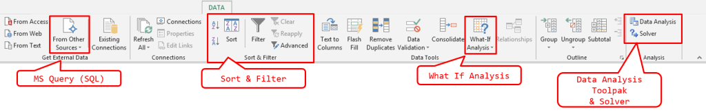
The DATA ribbon tab
As some of you already have noticed MOST (except for the PivotTable for no good reason) of the tools described in this post focus on features available BY DEFAULT within the Excel DATA ribbon tab (see image below). Some of them are AddIn that are installed by default along with MS Office, however, need to be activated manually. Skip to the relevant section of this post to read more.
 In this post I am focusing just on features that allow you to explore data or solve certain analytical problems. I am not focusing on simple data transformation features like removing duplicates, however, I do encourage that you learn more on these non-mentioned features.
Sort & Filter
Let’s kick off with the Sort & Filter group. See below for a quick look at how to use the Sort and Filter feature in Excel on an example data set:
PivotTable
PivotTables are so versatile a tool that most often no other Data Analysis Tool is needed. PivotTables are great for exploring data sets and for visualizing data with the help of automatically generated PivotCharts. See a simple PivotTable example below:
What If Analysis
The What If Analysis button in the DATA ribbon tab facilitates generally two useful features:
- Scenario Manager – the scenario manager allows you to add several scenarios to a certain problem and then generate a summary comparing how the scenario values impact a selected cell value
- Goal Seek –
- Data Tables – creating scenarios
Let’s explore these tools (apart from the last one) on a simple problem case example.
The problem:
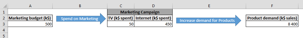
Our example assumes there is a 500k$ Marketing Budget to spend on a Marketing Campaign which can consist of spending on Internet and/or TV ads. What is more, for the sake of the example let’s assume:
- TV ads have a parabolic impact (see below) on Product demand i.e. at first the more you spend the more Product demand you generate, until you reach a peak where Product demand will actually fall (maybe viewers are tired of their favorite programs being bombarded by your ads).
- Internet ads have a linear impact on Product demand i.e. the more you spend the more Product demand you generate
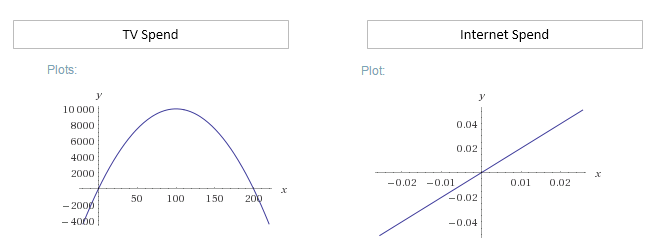
The Product demand cell formula is:
=2*D3+((C3-100)^2*-1+10000)
Scenario Manager
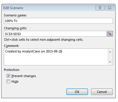
Using the example mentioned above let’s use the Scenario Manager to create 3 separate scenarios:
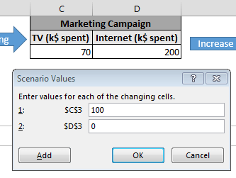
- 100% TV spend – 500k$ spent on TV ads
- 50% TV and Internet spend – 250k$ spent both on TV and Internet ads
- 100% Internet spend – 500k$ spent on Internet ads
Open the Scenario Manager
To add our scenarios go to the DATA ribbon tab, click What If Analysis and then select Scenario Manager....
Click Add to add a new Scenario
Specify the Scenario details – especially the range of Changing Cells that are to be specified by the scenario:
Next provide values as appropriate to your Scenario:
Repeat for each Scenario
You need to Name and specify the Changing Values for each Scenario separately.
Generate a Summary
Hit Summary... to generate a neat worksheet with a summary of your Scenarios. Specify the Result Cells – cells which will be modified in result to your Scenario. In my case it is just the Product demand cell:
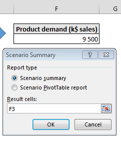
Now admire the results:
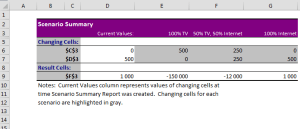
Notice that in this example on purpose I created the formula as such so that it is not directly obvious (unless you work out the formula maximum) what is the best mix of TV and Internet ads. We will work through this example using different tools below.
Goal Seek
Goal Seek calculates the values necessary to achieve a specific goal. The “goal” is an amount returned by a formula. So in short – you should use Goal Seek if you have a function which characteristics are unknown or hard to figure out. Goal Seek is Solver’s younger (less developed) brother.
Some examples of when to use Goal Seek:
- Solving single (changing) parameter mathematical functions (seeking a specific value e.g. 0)
- Doing a quick check if a single parameter can help achieve a specific value for a formula (e.g. financial statements)
Using Goal Seek
Ok let’s learn how to apply Goal Seek. Let’s reuse our above example – let’s say we are aware that our TV ads function is a parabolic or a polynomial at least and we want to quickly locate some of it’s 0 values.
Our Product demand (just for TV ads) looks as so if we ignore the Internet ads:
=((C3-100)^2*-1+10000)
Where C3 is Marketing Spend on TV ads.
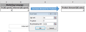
Open Goal Seek
Go to the DATA ribbon tab, click What If Analysis and then select Goal Seek.
Provide the Goal Cell, Value and the Changing Cell
For our example the Goal is our Product demand, and our Changing Cell will be the Marketing Spend on TV ads:
Run Goal Seek and BEWARE!
This is the result I received. Notice that the value I provided into the TV ads cell was 0 to start with.
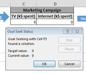
This time Goal Seek came up with the result: 0. Ok now let’s rerun this example. But this time I will type a higher starting value for TV ads spend… say 150k$. Do you think it will provide the same result? See below:
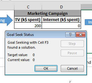
The computed result is different! This time Goal Seek came up with the result: 200. No why is that? Goal Seek is an iterative algorithm that in an iterative manner seeks to reach the Goal Value. However, if a function (cell formula) has several solutions expect that Goal Seek may land at different values.
This is very important to keep in mind!
Goal Seek in VBA
Not many know that you can use Goal Seek easily in VBA too! The parameters are as such:
Range.GoalSeek(Goal, ChangingCell)
where:
- Range – single cell with Goal function (formula)
- Goal – the Goal Value to achieve
- ChangingCell – single cell which will can be modified to achieve the Goal
MSDN provides a sexy example below:
Worksheets("Sheet1").Range("Polynomial").GoalSeek Goal:=15, ChangingCell:=Worksheets("Sheet1").Range("X")
Data Analysis Toolpak
Also know as Analysis Toolpak is a Microsoft AddIn delivered with Excel (usually disabled by default) that provides data analysis capabilities to Excel. Let’s start by enabling this AddIn:
Enabling the Analysis Toolpak
Find Add-Ins in Excel Options
To open the Window go to FILE, select Options and then pick AddIns.
Next from the above window hit Go to progress to Step 2.
Open the Add-Ins window and enable the Add-In
From the Window below select Analysis Toolpak and hit OK:
Using the Analysis Toolpak
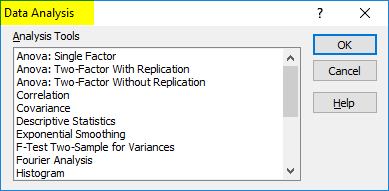
To open the Analysis Toolpak window simply go to the DATA ribbon and you should find at your far right in a new group (Analysis) the Data Analysis button. Hit it to open the whole range of Data Analysis Excel tools.
![]()
Click on the button to see the whole list of different tools:
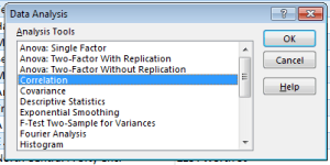
I won’t go through all these tools as they are pretty straightforward. Personally I tend to use only the Correlation feature which creates a nice correlation matrix out of a series of numerical columns.
Solver
Solver is a Microsoft AddIn to Excel that allows you to find optimal solutions for certain decision problems defined by a certain Objective (cell value). It’s like the older brother of the previously mentioned Goal Seek as it allows for more complicated computations and optimization making. Let’s start by enabling it in Excel.
Enabling the Solver AddIn
Find Add-Ins in Excel Options
To open the Window go to FILE, select Options and then pick AddIns.
Next from the above window hit Go to progress to Step 2.
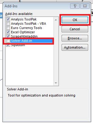
Open the Add-Ins window and enable the Solver Add-In
From the Window below select Solver Add-In and hit OK:
Using the Solver AddIn
Now similarly as above let’s again consider our Problem from above.
As previously let’s exemplify this tool with our Marketing Budget example. Quick reminder – we have 500k$ to spend on TV and Internet ads and we have a formula that calculates our spend to the resulting Product demand.
Now we want to know what is the optimal value of our spend on TV and Internet ads to maximize Product demand. This is exactly what we can calculate with Solver:
To open Solver window simply go to the DATA ribbon and you should find at your far right in a new group (Analysis) the Solver button. Hit it to open the Solver wizard:
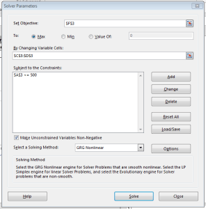
Solver requires that you:
- Specify the Objective – set a single cell that measures your Objective. Next select whether you want to Maximize, Minimize or set this value by changing certain variables (specified later)
- Specify the Changing Variables – specify the variables (cells) which should be modified by Solver to optimize your Objective function (formula)
- Specify your Constraints – specify cells which should evaluate to certain constraints limiting the values of the Changing Variables
I used the settings above to run Solver on my Problem. See the results below:
![]()
The results are perfect (99 for TV ads and 401 for Internet ads)! Solver managed to find the optimal solution to my problem. Some of you probably thought the answer to be 100 and 400 🙂 – that was the hinted answer but not the optimal one! This is the power of Solver.
MS Query (SQL)
If you have been around my blog long enough you might have noticed my affection towards SQL in Excel manifested by my SQL Excel AddIn. I consider SQL a significant tool in the Data Analysis Excel toolbox. There are simply some things you won’t do easily with a PivotTable that can be easily written in a few SQL lines of code.
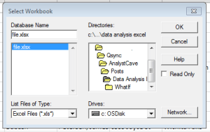
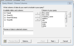
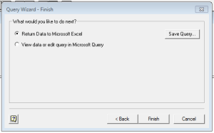
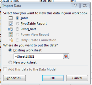
Let’s demonstrate a simple example of how to create a MS Query using the DATA ribbon tab using a simple source worksheet – Sheet1:
Open the MS Query window
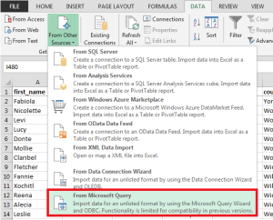
Go to the DATA ribbon tab, click From Other Sources and then select From Microsoft Query.
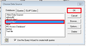
Follow the MS Query window wizard to create your MS Query
This is the hard part. In my example I want to run a query against my working Workbook (Sheet1). See screens below:
Indeed that’s a lot of steps right? Hence, if you consider using MS Query (SQL) I strongly recommend my SQL Excel AddIn. It does the same in just 1 step. It does not add any new features to Excel but simply makes it so easy to create MS Queries in Excel – so you can just use it to create the queries using the AddIn. The AddIn is not required to use them.
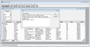
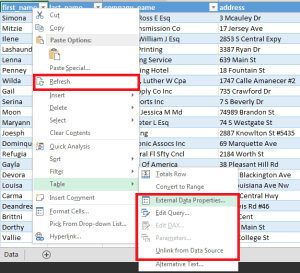
Refresh or Edit your MS Query
This is the wonderful part – your MS Query is represented in Excel as a QueryTable. A queryable Excel Table that can be Refreshed or modified. See the options below available for QueryTables:
Summary: Data Analysis Excel
It is worth at least being aware of the wide range of Excel Data Analysis tools that are available by DEFAULT in Excel. Most Excel users are limited to the PivotTable and maybe Solver (2 common Excel questions asked for Analyst job interviews). However, Excel contains much more Data Analysis Excel tools than just those two.
I personally see much value in the MS Query (SQL) feature which has been so successfully hidden in Excel and made so hard to setup that it is simply neglected. Fortunately, there is a way around that with my SQL AddIn which I myself use on a regular basis. SQL however is a powerful tool (and language) and often allows you to create queries that can replace VBA macros and in most cases will run faster than VBA.