
Шаблоны готовых решений для аналитических расчетов таблиц со статистическими показателями деятельности и функционирования предприятия за определенный промежуток времени.
Ссылки на страницы для скачивания примеров
 Как сделать круговую диаграмму более чем 100%-200% в Excel.
Интересная идея как создавать диаграммы для показателей более чем 100% или 200% и выше. Пошаговая инструкция с файлом примером готового результата – скачать.
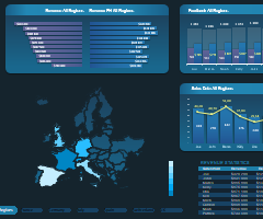 Как создать тепловую карту США или ЕС в Excel: скачать.
Разработка интерактивной тепловой карты США и Евросоюза для визуализации данных в Excel. Скачать готовый шаблон дашборда с фигурами штатов US и стран EU.
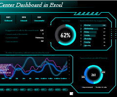 Как сделать красивую диаграмму для дашборда Excel скачать.
Пошаговая инструкция сборки комбинированной диаграммы с оформлением цветовой схемы. Скачать готовый пример с шаблоном дашборда для презентации кол-центра.
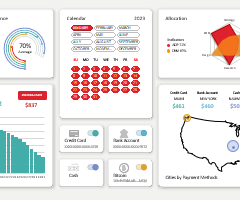 Скачать шаблон календаря Excel для визуализации данных.
Урок по созданию шаблона календаря для дашбордов с пошаговым описанием. К уроку прилагается файл с примером и готовым решением для интерактивного календаря.
 Скачать визуализацию данных Excel с элементом геймификации.
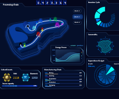
Шаблон с примером универсального дашборда для презентации визуализации данных о бизнес-процессах производственной цепочки с элементами игрофикации.
 Дашборд с планетой Excel скачать для презентации логистики.
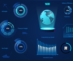
Скачать пример дашборда для эффектно презентации логистических показателей. Применяются элементы анимации инфографики. Сборка красивых диаграмм.
 Как сделать простую презентацию World Map Chart в Excel.
Пошаговая инструкция для создания инфографики с эффектом анимации. Урок с примерами как делать интересную визуализацию данных в Excel. Скачать шаблон примера.
 Как сделать Map Chart для управления логистикой в Excel.
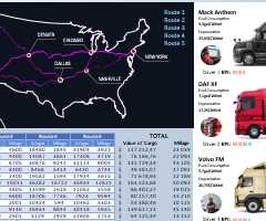
Скачать презентацию отчета эффективности управления логистикой. Как создать свой интерактивный Map Chart с построением маршрутов логистической цепочки поставок.
 Анализ логистики и управления цепочками поставок в Excel.
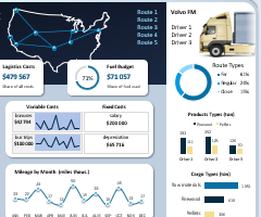
Скачать шаблон презентации отчета для оценки эффективности управления логистикой с визуализацией данных. Как составить ТЗ для разработки дашборда под бизнес?
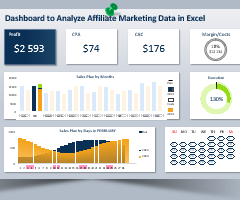
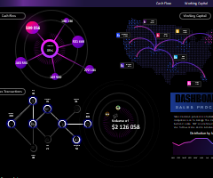 Красивый дашборд для анализа процессов продаж в Excel.
Бесплатно скачать шаблон дашборда со стильным дизайном для презентации отчета о продажах. Пример возможностей Excel в области разработки визуализации данных.
1
2
3
4
5
6
7
8
9
10
11
12
13
14
15
Подготовили подборку разработанных нами интерактивных управленческих отчетов в Excel для экономистов и финансистов. Эти отчеты или дашборды можно скачать, заполнить данные и вносить изменения, а еще разобраться с тем, как они построены и «прокачать» свои навыки в Excel. Но не обещаем, что это будет легко )
Скачивайте файлы — это бесплатно. А если вы хотите научиться строить такие отчеты самостоятельно, приходите к нам на курсы.
Если вы хотите научиться консолидировать бюджеты с использованием Power Query и выполнять расчеты ключевых показателей с помощью DAX-формул, приходите к нам на курс «Бюджетирование с Business Intelligence».
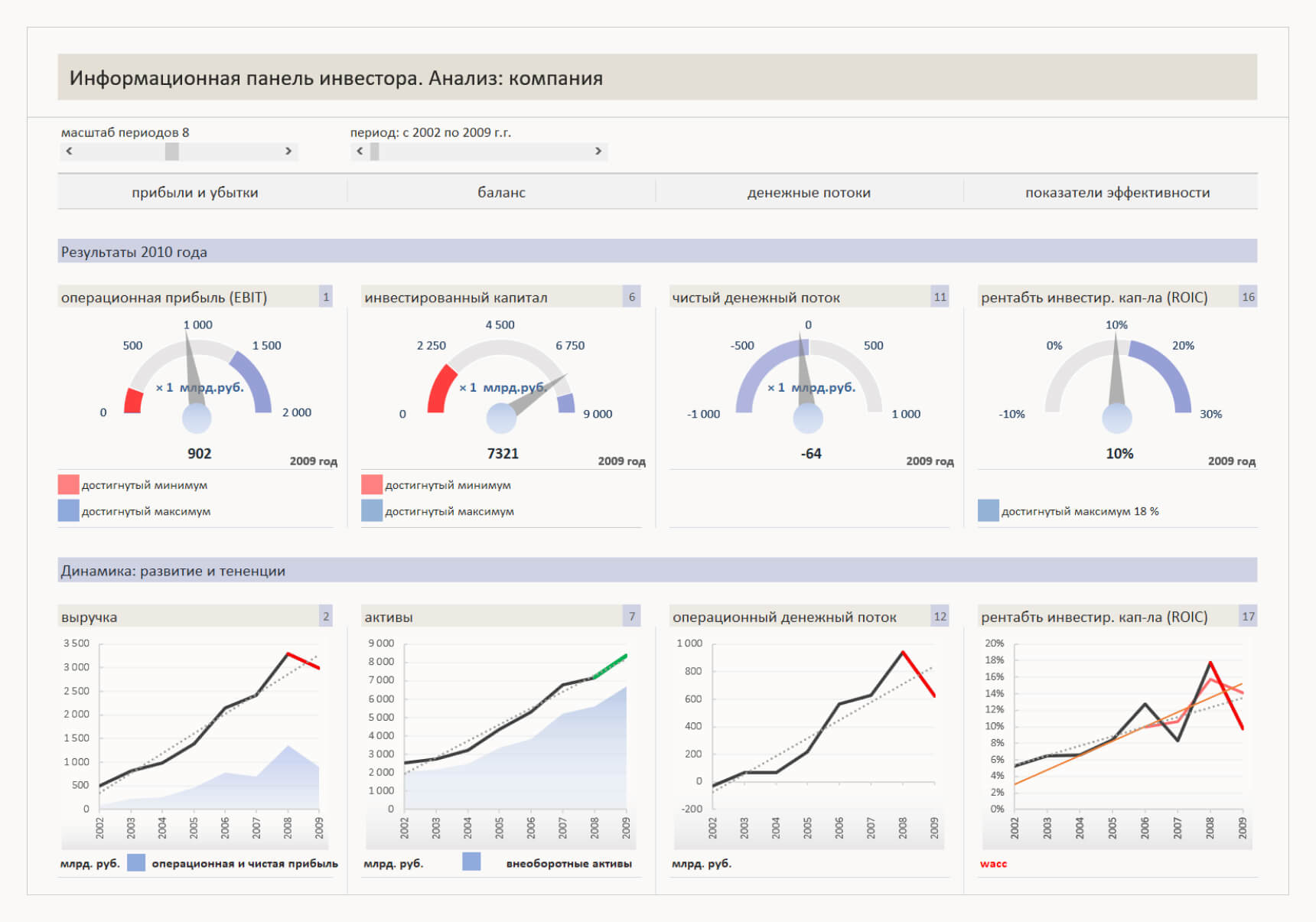
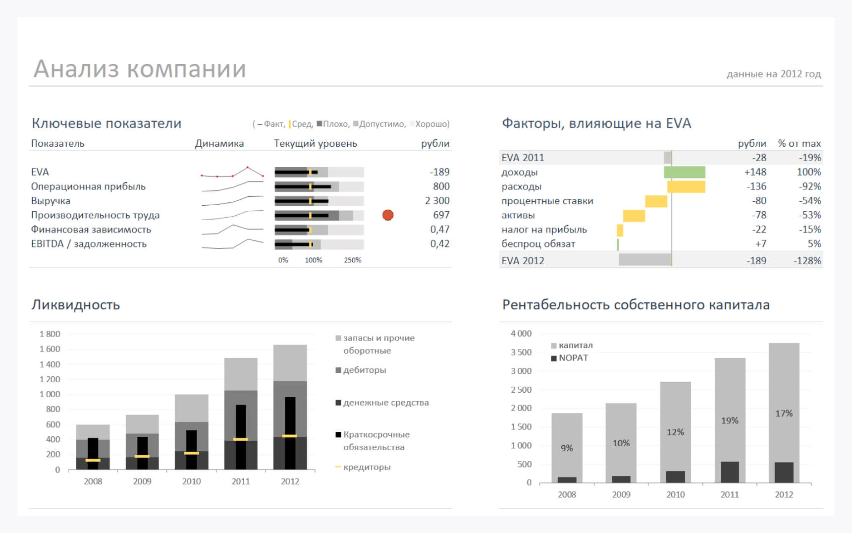
Анализ ключевых показателей и EVA
В отчете проиллюстрированы изменение ключевых показателей, ликвидности, рентабельности собственного капитала и факторы, влияющие на изменение EVA.
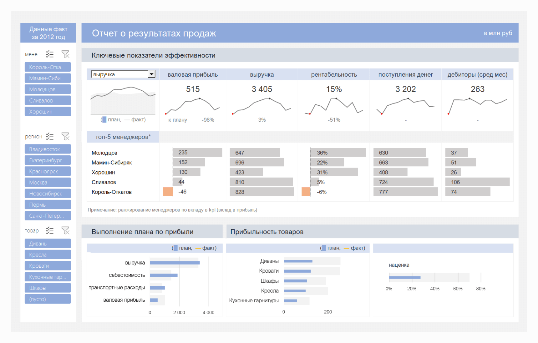
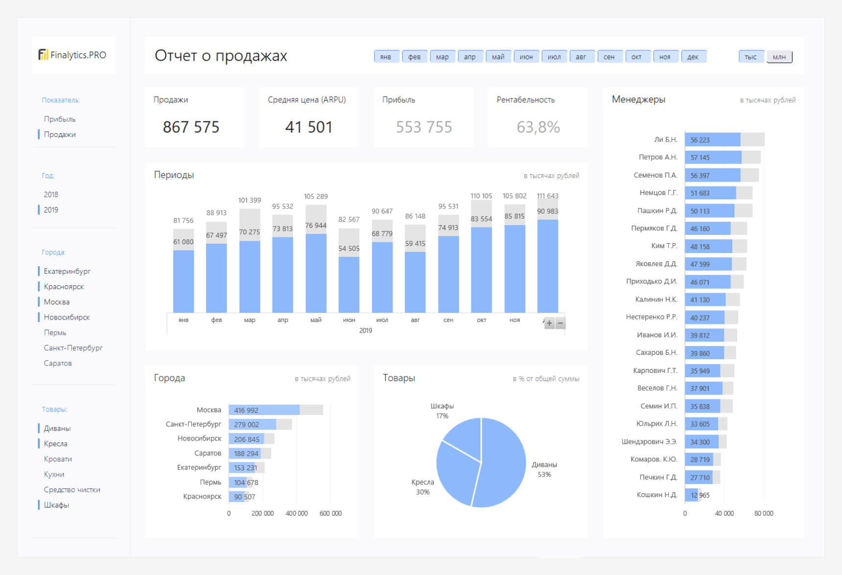
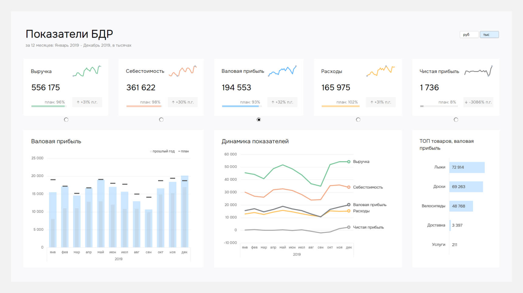
Отчет о результатах продаж
Файл показывает выполнение плана и ключевые показатели эффективности: прибыль, выручку, рентабельность и поступление денег. А также вклад менеджеров в формирование показателей.
- →
Дашборд — это интерактивная информационная панель. Он заменяет десятки таблиц и слайдов. Посмотрите коллекцию дашбордов Института бизнес-аналитики и вдохновитесь на создание персонального монитора управления бизнесом.
Дашборд — это интерактивная информационная панель. Он заменяет десятки таблиц и слайдов.
Для отчетов по маркетингу, продажам и финансам
Для девелоперских и строительных компаний
Для крупных промышленных предприятий
Примеры дашбордов в Power BI
Для проектов с нестандартной визуализацией
Information is power, but gathering the data to produce the right information can be a challenge. If you use Excel, your spreadsheets might be packed with valuable data, but few people have time to dissect it and make sense of the numbers. This is why Excel Dashboards can be so valuable.
An Excel dashboard is a single page that consolidates valuable information into a summary, often using charts and other visuals to help users digest key data and make important business decisions.
A free Excel dashboard template can help you make sense of results and improve strategic planning.
Creating an Excel dashboard can be a complex process. This single page summary often pulls data from many different sources and must do so in a way that makes sense. Since there isn’t much logic in reinventing the wheel, you’ll probably want to start with an Excel dashboard template, provided there is one that closely meets your requirements.
The good news is that there are a ton of free Excel dashboard templates available for download — if you know where to look. Today, we’re going to give you a list of 22 free templates for Excel dashboards that you can download to get started.
You can use these as-is or make changes to them so that they fit your exact requirements. As always, if you need help customizing one of these tools or find that you need to troubleshoot an issue in Excel, our live chat service is always standing by to help.
Free Excel Executive Dashboards. When you own or manage a business, it often becomes useful and necessary to have access to high-level data on results. This helps gauge progress towards achieving goals and provides a starting point to make key business decisions. An executive dashboard is the answer.
1. You can get a free Corporate Summary Excel Dashboard template from Eloquens. This is a feature-rich dashboard that delivers a wide range of metrics on a single page. These include such things as revenue, expenses, and customer satisfaction.
2. Smartsheet also has a free Executive Dashboard template that is a bit more simplified. It gives monthly data in a table for revenue, revenue growth, number of customers, customer growth, average order value (AOV), and progress in AOV. There are also bar and line graphs and totals for the current period.
Excel KPI dashboards allow you to track your performance metrics in one convenient template.
Free Excel KPI Dashboards. You can use an Excel dashboard to track your company’s key performance metrics. In many cases, this will show the data in both table and graph formats.
3. The first free KPI Dashboard template is from Smartsheet. This template allows you to view multiple KPIs, view targets and averages for selected KPIs, and see these in different formats.
4. Trump Excel also offers a KPI Dashboard template at no cost. You can track KPIs for various companies or departments, select one for drilling down to further data, and see the information on scatter and bar charts for further visuals.
5. Excel Dashboard School provides a variety of free Excel templates. One is a Human Resources KPI Scorecard template. This template provides an HR department with an attractive way to gauge essential performance indicators such as employee turnover, recruiting, retention, and training & development.
6. Excel Dashboard School also offers a free Healthcare KPI Dashboard. This is an infographic-style dashboard that depicts healthcare quality information separated by male and female as well as a list of body parts.
Free Excel Financial Dashboard Templates. Many executive and KPI templates report financial figures, but other reports are more targeted to financial analysis. These financial dashboard templates should help you get on the right track if this is your goal.
7. Smartsheet has a free Financial Dashboard template that includes many of the key financial metrics related to a business. These include revenue by product (estimated vs. actual) and revenue broken down by region. These figures are also depicted in graphs and pie charts.
8. Eloquens also has a Revenue and Expenses Excel Dashboard that you can download at no cost. It is a one-page summary that includes a variety of operational metrics like revenue and expenses. The data can be split by operational department, period vs. full year, and region.

Excel Chat can help if you need to troubleshoot issues or customize an Excel dashboard template.
Free Excel Sales and Marketing Dashboard Templates. Most businesses sell something, whether it is a product or service. Keeping track of what is selling best, who is selling the most, and what methods work can be a challenge. These free sales and marketing dashboard templates can put useful data on a single page.
9. Microsoft Office has a free Online Sales Tracker that is a dashboard template. On one page, you’ll get information such as the cost per item, percent markup, total revenue, and profit. There are also different graphs that depict the profit per item or product.
10. Smartsheet has a free Sales Management dashboard template that has a ton of features. You’ll be able to see sales results over time broken down by salesperson, region, outlet, and product mix.
11. If you’re interested in seeing how lead generation is working, there is also a free Lead Generation Dashboard template from Smartsheet. This gives you details on leads generated, leads per source, percentage of goal reached, response time, and untargeted leads.
12. Another way to track leads is with the Marketing Dashboard template from Smartsheet. This is a similar template to the one above, but with a greater emphasis on traffic. It tracks leads per day/month as well as leads per source. It also tracks and displays traffic per source/month and annual traffic/source.
13. You can track and measure the effectiveness of your various social media marketing efforts with this free Social Media Metrics Excel dashboard template from Eloquens. There is a data input tab that allows you to enter data relevant to the activity on your different social platforms. The metrics reported on the dashboard (“heartbeat”) page include Activity, Interaction, Reach, and Subscribers.

Excel dashboard templates can provide helpful visibility into your business data.
14. Smartsheet also has a free Social Media Dashboard template. This allows you to monitor performance across multiple channels (Facebook, Twitter, Pinterest, LinkedIn, YouTube, and Google Plus) so that you can track engagement and make targeting decisions. Some of the areas that the report shows include total visits per period, visits vs. goals, followers, post reach, clicks, favorites, “likes,” and subscribers.
15. Not all online marketing is done via social media. Smartsheet also has a Digital Marketing Dashboard template that allows you to track the effectiveness of your online marketing campaigns across various channels. These include social media, paid ads, email marketing, and organic vs. paid reach.
16. If your company is using email marketing to keep in touch with customers and drive sales, this Email Marketing Dashboard template can help you track these efforts. The report gives you a quick look at new subscribers, unsubscribers, growth, bounce rates, and data for various campaigns.
Free Excel Project Management Dashboard Templates. Whether you are attempting to get one project in on time and under budget or are juggling several at once, it helps to have data at your fingertips. These project management dashboard templates that are free to download can help you stay on track.
17. Smartsheet has a free Project Management Dashboard template that delivers and tracks various KPIs for managing a project. These include deadlines, financial status, and risk mitigation.
18. If your project is more technical, this free Development Operations (DevOps) Dashboard template might be a better choice. It includes areas for reporting and tracking feature vs. bug investment, resolved and unresolved issues, work in progress limits, and a release tracker.

Specialty templates can help you organize information quickly and easily.
Other Free Specialty Excel Dashboard Templates. There are several situations in which you might want to locate and use an Excel dashboard template. Here are a few more.
19. Trump Excel has a free Call Center Performance Dashboard template. This system allows you to view and track such things as total calls, average answer speed, call abandon rate, and average calls per minute.
20. If your company provides support services to clients, you can track this activity with this free Support Dashboard template. This dashboard will display ticket volume and response times, report performance for a period, and compare that to past results.
21. This free HR Dashboard template gives a broad overview of a company’s staff and salaries. It graphically displays the number of employees per department as well as a breakdown of the average salary and salary range per department.
22. You can download a free SEO Dashboard template from Smartsheet that will give you some insight into your Search Engine Optimization efforts. The dashboard will show such things as traffic sources, top ranking keywords, visits/month, backlinks, and conversions.
Some of your projects and ongoing business operations need a dashboard. These visual representations of large amounts of data can streamline your processes and make it easier to communicate results. This list of free Excel dashboard templates should be enough to get you started.
You may find that one of these templates is close to suiting your needs, but not quite perfect. Or maybe there is an issue with a formula or function that pulls data from the corresponding sheets. If you need help customizing or troubleshooting an issue with an Excel dashboard template, Excel Chat is standing by.
Your first live chat session is always free.

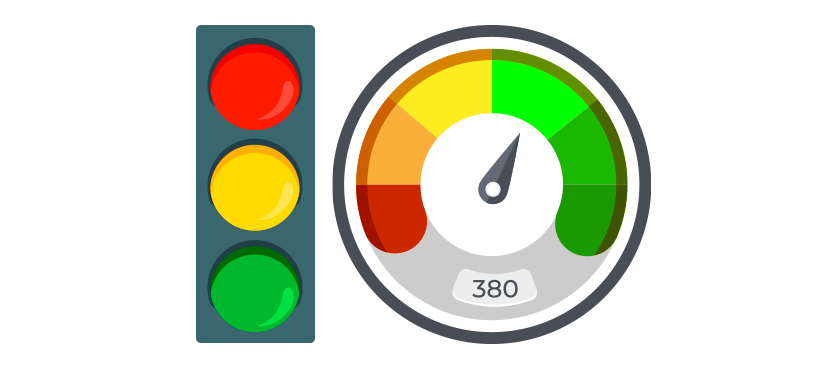
We have good news for the Excel funs! No more traffic jams if you use our traffic light dashboard! Just work or learn using our fully editable and free stoplight template. Before creating a dashboards or templates, set up your goals. It is important to decide what metric is most suitable for you.
In the example, you will learn how to track a project using a smart way. Use key performance indicators, and you can measure all activities easily.
One of the most liked tools is conditional formatting in Microsoft Excel. A traffic light report is an all-round tool, and it is not a difficult task to build it.
As usual, the light has three statuses. Use three different colors (red, yellow, and green) to track the project status!
Before we take a deep dive: just a few words about the solution. We apply a new method besides the VLOOKUP and SUMIF formulas. Learn how to build dashboards from the ground up using a blank Excel workbook.
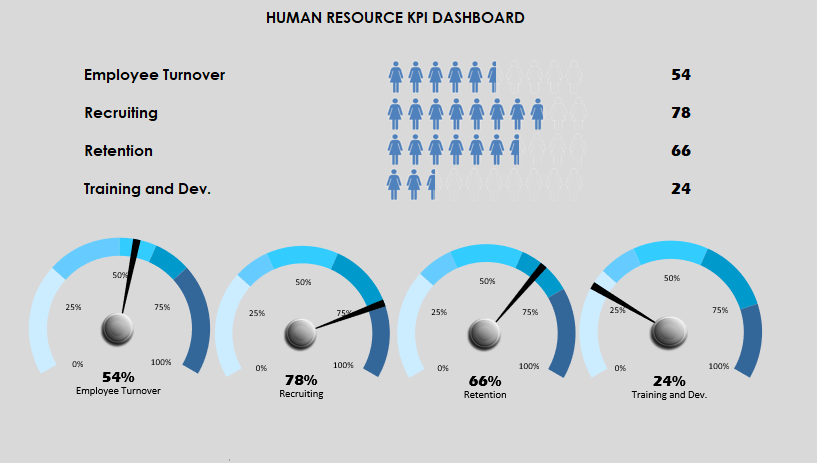
Today’s guide will be about how to create a Human Resources Dashboard Template using typical hr metrics. HR is responsible for recruitment, handling employee records, administer payroll and follow-up work performance. As part of the building of the dashboard, we are focusing on the most frequently used HR KPI measures.
For convenience, we’ve just grouped them under the following four categories: Employee Turnover, Recruiting, Retention, and Training. Using this dashboard, you can easily track your employee human resource data using a single Worksheet. The template is portable and can be deployed in seconds.
We’ll use qualitative and quantitative metrics to provide better dashboards. The published template is an intermediate level spreadsheet. Which is the best way to create a useful and user-friendly dashboard? We will share with you some great data visualization technics like shape-based people graphs and speedometers.
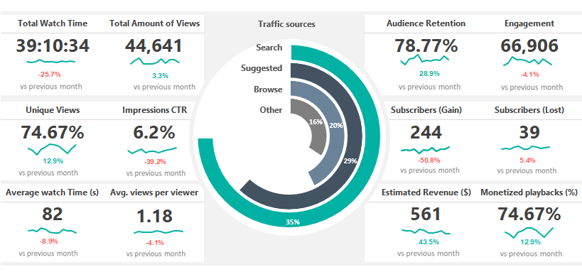
Social Media Dashboard Template is fully optimized for Youtube channel tracking using Microsoft Excel. The free excel dashboard gives you a quick overview and helps you to track views and engagement on your videos. Are people engaging with your video tutorials? Use this spreadsheet to analyze and measure social engagement, and discover trends and know your audience.
Many users need more details to analyze data using an easier way. In the example, you only need to replace your initial data on the ‘data’ sheet. You will able to create various reports for Twitter, Pinterest, or Facebook analytics. It’s important to understand how all of these metrics work. Look at all your data in a single location in Excel. The report enables you to stay on top of social media analytics from all of your favorite social media channels.
The Template uses our latest dashboard framework. You can track the most important metrics like Total watch time, Audience Retention, Engagement, Impressions CTR. Furthermore, you will get information about the revenue if you check the ratio of Estimated revenue and Monetized Playbacks.
Finally, follow the Subscriber’s trend in real-time. Last but not least, analyze the traffic sources on a stunning radial bar chart. Follow our step by step tutorial! Learn more and discover how to build stunning dashboards in a few clicks.
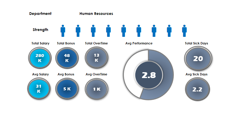
Keep an eye on the HR resources of the company! In today’s excel dashboard guide, you will find two ready to use workbooks. As usual, we will build the dashboards from the ground up.
The first template uses a people graph. You can track the following key metrics: Salary, Bonus, Sick days by branch.
How to show the performance using a new way? The first thing that you should learn an old Excel function. The fact: sparklines will not appear in earlier versions. Making a good dashboard in Excel is a space-saving job. If you are using the REPT function and a little trick, you can fully replace sparklines. Because it is a text function, you can repeat custom fonts in a single cell. Read more, and you will see how it works!
Are you ready to use the linked picture method in Excel? The drop-down list and pivot tables are core functions in Excel. The next dashboard has an easy learning curve. As first, place your data set in the data Worksheet. Insert simple vector graphs into the ‘Data’ Worksheet. Create unique ranges for graphs using the name manager. After that, link the pictures to the ‘Dashboard’ sheet from the ‘Data’ sheet. Finally, use line charts to display the plan and actual values. It is easy!
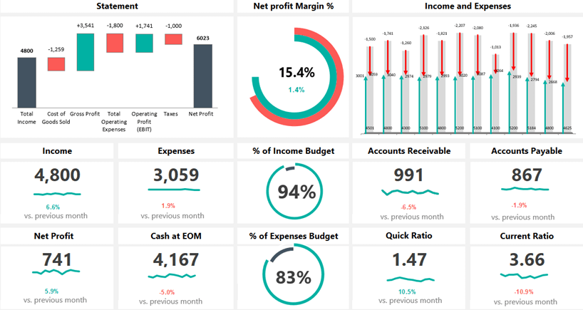
Check our financial dashboard template! One of our favorite spreadsheets will produce a dynamic dashboard! You can track the main financial metrics month by month. Show comparisons and trends using modern chart types, grid layouts, and smart navigation structure.
The included metrics and groups are efficiency, liquidity, and profitability. Our template combines traditional reports of financial information with charts of financial measures. The excel dashboard provides a logical and easily editable structure. You can put your raw data into the ‘Data’ sheet. Apply some calculation on the ‘Calc’ sheet. Finally, show the result on the main dashboard sheet.
If you are looking for a clean dashboard to take a quick overview, you are in the right place at the right time. Using this template, you can easily communicate the result with your staff. You can measure Incomes, Expenses, Net profit, etc. The dynamic waterfall chart helps you to track the yearly performance from the Total income to the Net Profit. We apply infographics-style double doughnut charts to visualize the net profit margin.

Dashboards in Excel – The all-time classic! We have a goal, which is the exact value that it should reach and ranges for tracing purposes. The business world for some time now is heading in the direction that we weigh every possible thing. To quote a phrase: we weight it, it gets better. So we got the idea for the key performance indicator from here. And how right is the before quoted sentence!
Do we know the sources of the information? Where is the dashboard “feed” from? Automated updates are necessary, or is it enough to send daily or weekly reports? If we know the answer to all these questions, then it will be easy for us. If we do not, then we have to find out every little detail by a preliminary survey.
How do I choose the appropriate chart? This always depends on the given project. Think about what you want to visualize. In the newer versions of Excel, you can use the Recommended charts function.
Which is the best solution for creating a dashboard? If you only have a few key performance indicators, then a gauge chart is the best. If there are more of them, we recommend the bullet chart.
Is it rewarding to use a business intelligence or kpi dashboard? If the usual excel dashboard is not enough, then yes. The Excel Power BI was built for cases like this!

Today you will learn how to create a dashboard using key metrics. If you are an Excel newbie, this tutorial is yours! This Excel dashboard will show you how to enhance your story using key performance indicators. Good to know that you can edit the template freely. A great KPI template is simple: create a proper layout and build a wireframe. Pick your key metrics carefully!
Let us see the main steps! As first, you need to clean, group, and sort the data. When it is done, use the name manager. It can help you to define a range. Are you want to highlight the top 5 and bottom 5 performance? No problem, use simple Excel functions to reach your goal.
Dynamic dashboards in Excel are great! If you are using option buttons, form controls, and small macros, you show a large data set in a small place.
You will learn how the OFFSET function work. It is a volatile function, but this is one of the best ways to create a dynamic list in Microsoft Excel. Read more about this KPI Dashboard Template!
In this tutorial, you will learn how to create an Excel Dashboard using form controls. Are you looking for a space-saving solution? We will use a radio button, slider, and some smart technics to build a dynamic dashboard. Furthermore, you will learn how to save time without using pivot tables. If you have a large amount of raw data, the best choice is using built-in Excel tools.
Use these controls on worksheets to help select data. For example, boxes, spinners, and scroll bars are useful for choosing items from a large list. If you want to add a form control, go the ribbon. Now chose the Form Control Menu. Select the right control, which is fit your project. Select the cell or range you want your form control and insert it. You can resize the forms anytime. Easy!
Download the Excel file, which contains the dashboard template. Follow the step by step instructions! We will help you to make the right business decisions.
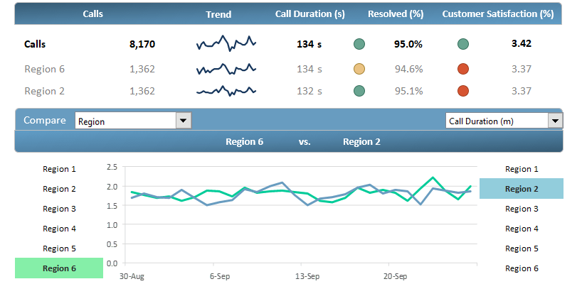
Download our customer service dashboard template and make quick decisions! Use dashboards in Excel to analyze trends and track the performance. We love drill-down methods! With its help, you can transform your data into a custom view. It’s important to display the data in an easily understandable format.
How to create it? The answer is simple. Show the most important metrics! Agents, team leaders, managers depend on a well-organized dashboard to track performance over time.
Our goal is to improve customer service’s performance. Furthermore, we’ll take a snapshot of the plan vs. actual ratio for improvements. In the example, we’ll track and measure the following metrics: Calls, Resolved Calls, Customer Satisfaction.
This excel dashboard allows you to transform data into an advanced template! Get information about various levels, from overall contact center performance to departments and sales representations.
We already know that processing a huge data set is not an easy task. Discover how to convert the results of outgoing calls into an advanced dashboard template!

The Dashboard UX template will show you how to create better Excel dashboards using smart screen tips. You will learn how to make a clickable question mark icon. After that, it’s easy to show or hide the context help.
Would you like to improve the UX? This feature is yours! The ideal case is if you have easy to read dashboards. In some cases, you have to add some comments because a few metrics requires further explanation.
How to build comments to avoid poor report design? For example, provide information to describe a particular data visualization, or to explain data values shown.
There are methods in Excel to avoid help text cluttering up your dashboard template. The best way if you show pop-up windows (text boxes) upon clicking or hovering over a help (question mark) icon.
It is not rocket science, learn how to add any description for your template without any troubles! Download our free template and check how to provide better support for users using a single page dashboard.

SEO Analytics Dashboard Template provides an overview of the performance of your site. With its help, you can track 11 SEO metrics, for example, page views, bounce rate, traffic sources. We have sad quite a number of times that raw data without a visual context is useless. In a nutshell, charts that make life easier.
If you are building a dashboard in Excel, we recommend using sparklines. This mini chart is a smart choice to show trends in a cell or a small space. For the greatest impact, place your chart near the data. Use sparklines if you want to highlight the peaks and show trends.
Use a simple setup, the Excel dashboard template shows the trend over 45 days by default. If you need more options, use the built-in drop-down list and select the period what you want to show. Look at the peaks and lows over days or months; you will see the characteristic of your site. In the example, most of this data comes from Excel. If you need more, you can get real-time data from Google Analytics using Power BI.

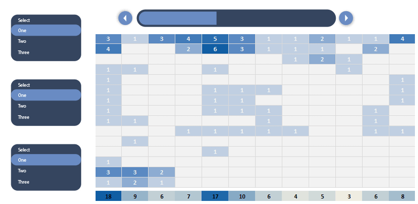
Learn how to create a one-page dashboard template for tracking the actual status of key metrics. Use our call center dashboard to track the weekly activity of a call center. In some cases, less is more. Insert a simple line chart and column chart (combo chart) to display the variance for each week.
You will get answers about how to reduce the time to answer and abandon rate and increase the first call resolution (FCR). Before we start, we will explain to you the most used metrics with the help of a few examples. Using these KPIs, you can track and trace the overall service level easily.
Today’s guide about to create and configure a spin button in Excel and create a dynamic report. This free spreadsheet displays information for the relevant audience. Last but not least: Improve decision making and simplify your data set! Our main goal is to track the ‘Time to Answer’ and ‘Abandon Rate’ and show them on a clean dashboard.

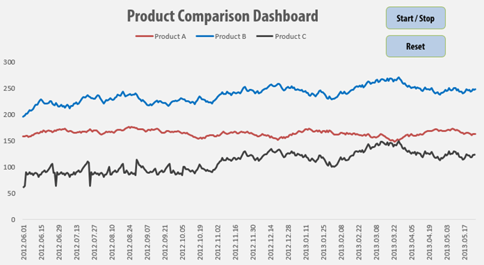
Today we will show you how to build customer analytics in a short time. This Excel dashboard contains many useful ideas, we will explain all of them. Follow our tutorial and learn how to build a dynamic dashboard in Excel.
Let us see the main steps! As usual, you will use the ‘data’ sheet to create an Excel table. If your data is in raw format, you should have to convert the range into a table. For the sake of simplicity, we will use five products and five customers to build a dashboard. Use a line chart to highlight the min and max sales value. Apply the red color for the lowest, and green fill for the highest value.
Select cell I7 and go to the Data tab on the ribbon. Insert a drop-down list. Make sure you checked the list option. Now link the data range – which contains months – to the given cell. From now, you can select the month, and your chart will reflect in real-time. Take a closer look at the ‘calc’ sheet! We will explain how to create a dynamic list using formulas. Read more about this free excel dashboard template!

If you want to create an Excel dashboard using infographics, take a deep into our template! Today’s lesson will be about a custom business spreadsheet. You will see how to build a stunning report using a male and female infographic. The good news: we know how to build a heat map style dashboard in Excel. No more boring pie charts! If you like custom dashboard design, follow our detailed guide, and download the free template.
You need only a few steps to track the main metrics on your dashboard template. As first, go to the ‘Calc’ sheet and plan your structure. Divide your intervals into 16 equal parts. With the help of the PERCENTILE function, you can split the data range. For example, if you want to can decide to examine peoples who score above the 10th percentile. After that, create a gradient color scale. The template contains built-in color schemes. You only have to pick your preferred colors.
Finally, create 16 shapes and assign the colors to them. We are ready! Stay tuned. We’ll improve your dashboard frequently and provide the latest tips and tricks.
In this free example we will use sales data to create a scrolling chart using a simple macro.
We’ll build an interactive report applying Excel’a VBA with exercise file which you can download. We will see the essential things that we need to understand to develop dynamic charts.
Learn advanced tricks to create awesome visualization! We’ll use a small animation because the task is so unique that we don’t get along with the known methods.
What is a widget? We hear and talk a lot about it in our everyday work. Maybe many don’t know what this phrase exactly means.
Widgets are supplements, mini applications that Excel does not include as a default. Do you need new ideas? From gauge chart it is never enough! The quarter style widget is not too frequent but can be excellently use.
Just imagine that you have a template and you notice at the end that you run out of place on the worksheet. We will help you to fix it!

If you are working with an Excel Dashboard and you are in sales, you have to monitor often the sales of your team. It is time to talk about today’s topic. The scrolling list using the OFFSET formula is a handy tool to create dynamic lists. Dashboards in Excel are very popular, and we have made many blog posts about them.
Let us see our data set! The main list contains all states of the US. We only want to show five states in a small window. With the help of a slider (we’ll talk about it later in detail), we’ll create a scrolling-list. Why is this good? Viewers can switch between countries using menus. We can use it in such situations where we only want to show parts of a large data table. Learn more about it. So many reasons why we love Excel dashboard templates!

How to create a dynamic product metrics template? It’s a crucial criteria in designing a report that is should support valuable business decisions.
The interactive window on the right hand site is the most valuable part of the product metrics dashboard. For the chosen product we display the most important indicators on an interactive chart. We visualize the results for the marketing related to 15 different products.
Furthermore, we display trends and graphical elements so the report will be smarter. Sparklines is one of the most popular mini charts. It is great for displaying trends!
We use the gauge chart here for the first time. We’ll learn a lot about that later!
Dynamic charts are core elements of dashboards. In this tutorial, you will get great tips to build a timeline based data visualization. We have said many times that the best dashboards in Excel based on form controls. We love this topic because, in most cases, we have to transform large data sets into a small dashboard screen. At first glance, it is not an easy task.
Today’s goal is to create an interactive dashboard to track the key metrics. As first, place the initial data set. Above all, go to the Developer tab. Insert a blank list box. Fill the list box: right click on the control! Add the input range and the cell link. In the example, the input is the range that contains names.
Insert a column chart! Column charts are used to compare values across categories. Add a line chart. Under the trend options, choose the moving average. Finally, use two periods moving average.
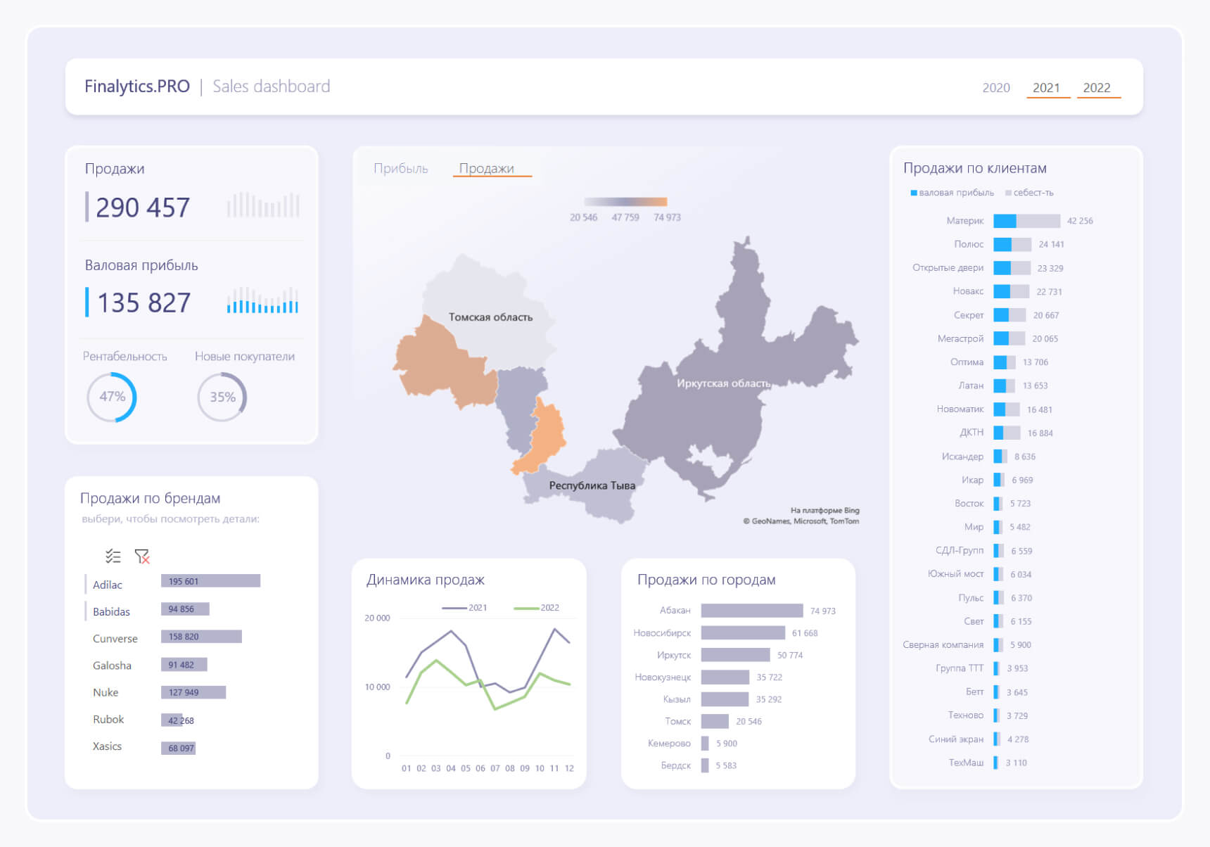
В бизнесе сложно добиться системного роста, если регулярно не отслеживать ключевые показатели, которые влияют на прибыльность компании. Для этого лучше всего подходят дашборды, в которых данные представлены в понятном виде, что существенно облегчает принятие решений.
Пошагово рассмотрим, как построить дашборд по продажам в Excel. Статья будет полезна всем, кто начинает знакомство с этим мощным инструментом аналитики данных.
Дашборд ― динамический отчёт, который состоит из структурированного набора данных и их визуализации на основе диаграмм, графиков и таблиц.
Основные задачи дашборда:
- представить набор данных максимально наглядным и понятным;
- держать под контролем ключевые бизнес―показатели;
- находить взаимосвязи, выявлять негативные и положительные тенденции, находить слабые места в организации рабочих процессов;
- давать оперативную сводку в режиме реального времени.
Построение дашбордов ― такой же hard skill, как владение формулами в Excel. По статистике, пользователь Excel среднего уровня может освоить этот навык за 20 часов обучения и практики.
Для специалистов, которые работают с отчётами, навык построения дашбордов стал необходимостью, а не дополнительным преимуществом.
Чаще всего созданием дашборда занимается аналитик — он обрабатывает огромные массивы данных, оформляет их в красивый и понятный дашборд и передаёт заказчику задачи. Это могут быть руководители, менеджеры по продажам, HR-специалисты, бухгалтеры, маркетологи.
Менеджерам по продажам дашборд помогает управлять продажами. HR-специалистам ― отслеживать основные метрики, связанные с трудовыми ресурсами. Для бухгалтера будет полезен дашборд о движении средств, который отражает финансовое состояние организации. Маркетологи анализируют рекламные кампании и оценивают их эффективность. Руководителю дашборд позволит быстро оценивать состояние ключевых показателей и принимать управленческие решения.
Существует большое количество сервисов для бизнес―аналитики, такие как Tableau, Power BI, Qlik, DataLens, Google Data Studio. Самым доступным можно назвать Excel.
Главное и самое интересное в дашборде ― интерактивность.
Настроить интерактивность можно с помощью следующих приёмов:
- срезы и временные шкалы в сводных таблицах ― эти инструменты упрощают фильтрацию данных и позволяют управлять дашбордом: например, можно более детально посмотреть данные по конкретному менеджеру или заказчику за определённый период времени или в разрезе каналов продаж.
- выпадающие списки, формулы и условное форматирование — использование таких приёмов удобно, когда много разных таблиц и построить сводные таблицы невозможно;
- спарклайны, мини-диаграммы в ячейках, тепловые карты в аналитических таблицах — такой способ чаще всего подходит для тактических целей специалистов или аналитиков, а не для стратегических целей руководителя.
Для этого выбираем наиболее популярный способ с помощью сводных таблиц.
Советуем проделать все шаги вместе с нами. Как говорит гуру мотивации Наполеон Хилл, «мастерство приходит только с практикой и не может появиться лишь в ходе чтения инструкций». Файл с данными для тренировки можно скачать здесь.
Построение любого дашборда начинается со сбора данных. На этом этапе важно привести таблицы в плоский вид, чтобы в дальнейшем на их основе создавать сводные таблицы для дашборда.
Плоская таблица (flat table) ― двумерный массив данных, состоящий из столбцов и строк. Столбцы ― это информационные атрибуты таблицы, строки ― отдельные записи, состоящие из множества атрибутов.
Пример плоской таблицы:
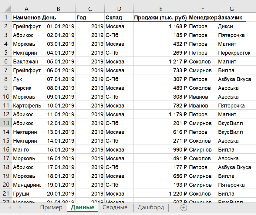
В примере выше атрибуты — это «Наименование», «День», «Год», «Склад», «Продажи (тыс. руб)», «Менеджер», «Заказчик». Они вынесены в заголовок таблицы.
Эта таблица послужит основой для построения нашего дашборда по продажам.
Если известно, для чего и для кого предназначен дашборд, легче понять, какие показатели должны выводиться на экран. Это могут быть любые количественные показатели, важные для организации: прибыль, продажи, численность сотрудников, количество заявок, фонд оплаты труда.
Также необходимо определиться с макетом — структурой — дашборда. Для начала достаточно будет прикинуть её на листе формата А4.
Пример универсальной структуры, которая подойдёт под любые задачи:
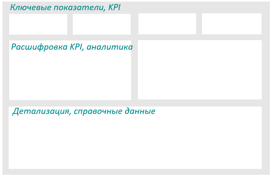
Количество информационных блоков может быть разным: это зависит от того, сколько метрик надо отразить на дашборде. Главное — соблюдать выравнивание по сетке.
Порядок и симметрия в расположении информационных блоков помогают восприятию и внушают больше доверия.
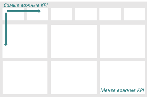
Помимо симметрии важно учитывать и логику расположения информационных блоков. Это связано с нашим восприятием: мы привыкли читать слева направо, поэтому наиболее важные метрики необходимо располагать слева направо и сверху и вниз, менее важные ― справа внизу:
— на основе таблицы с данными, приведённой выше в качестве примера плоской таблицы.
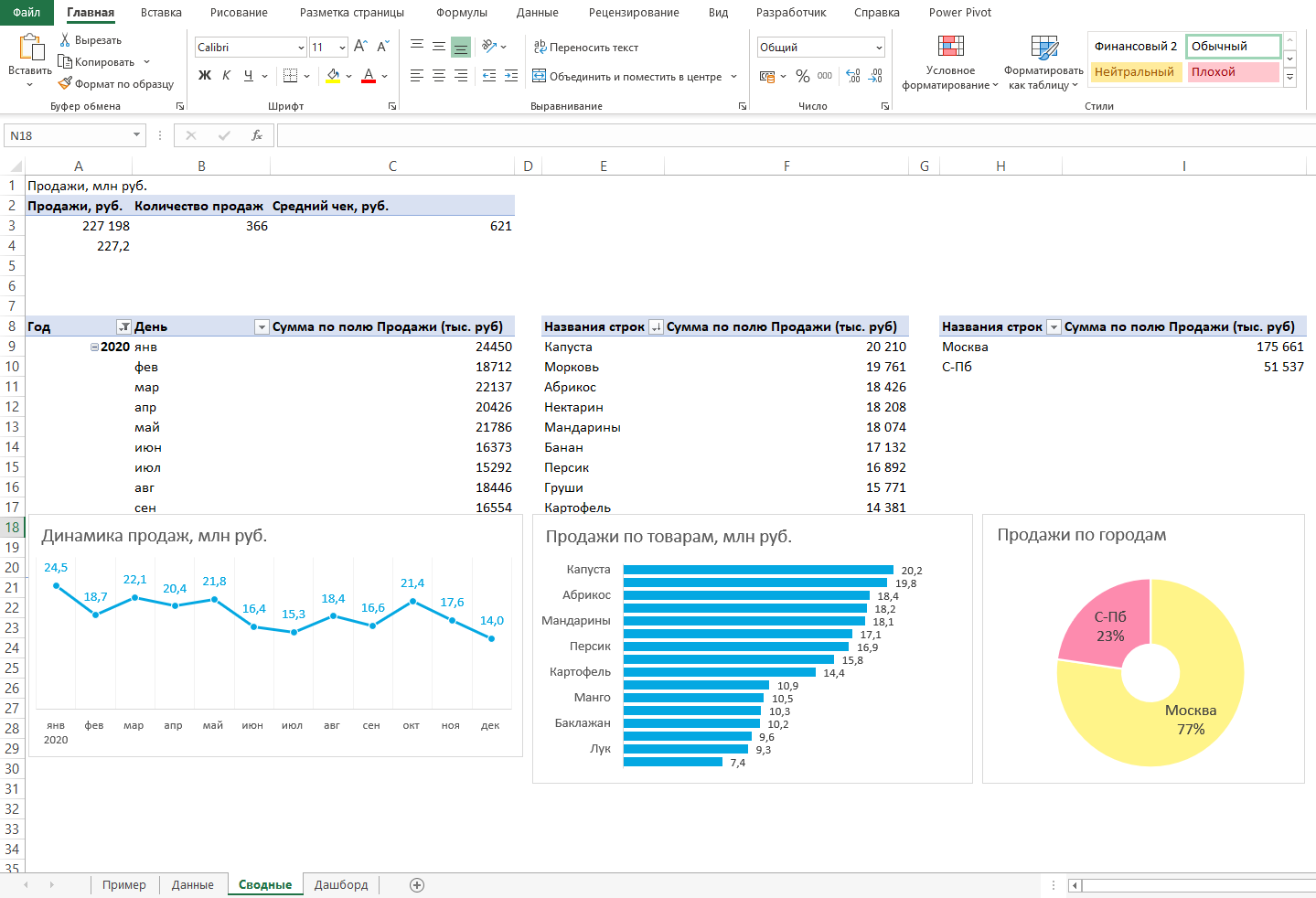
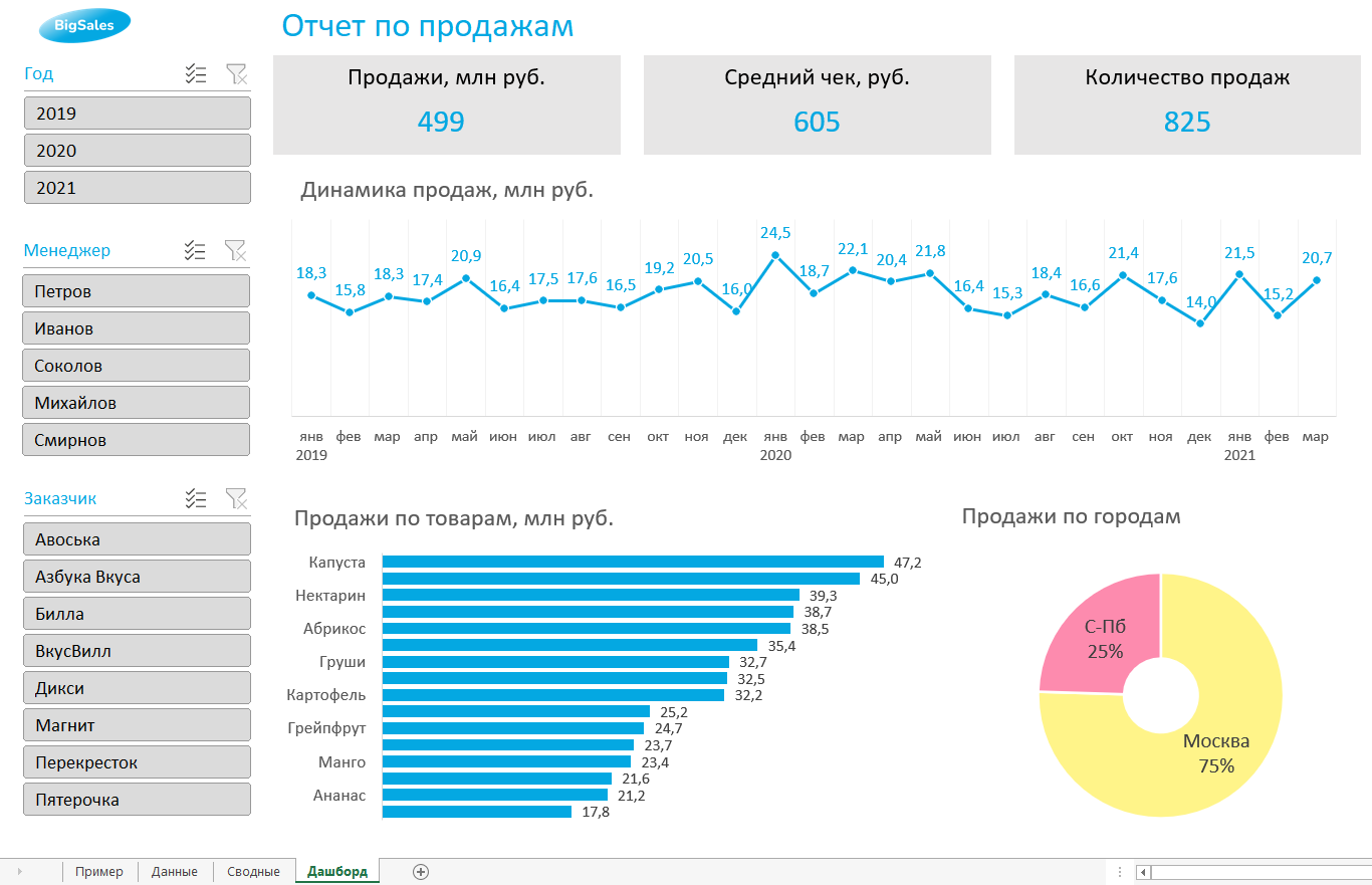
Таблицы будут показывать продажи по месяцам, по товарам и по складу.
Должно получиться вот так:
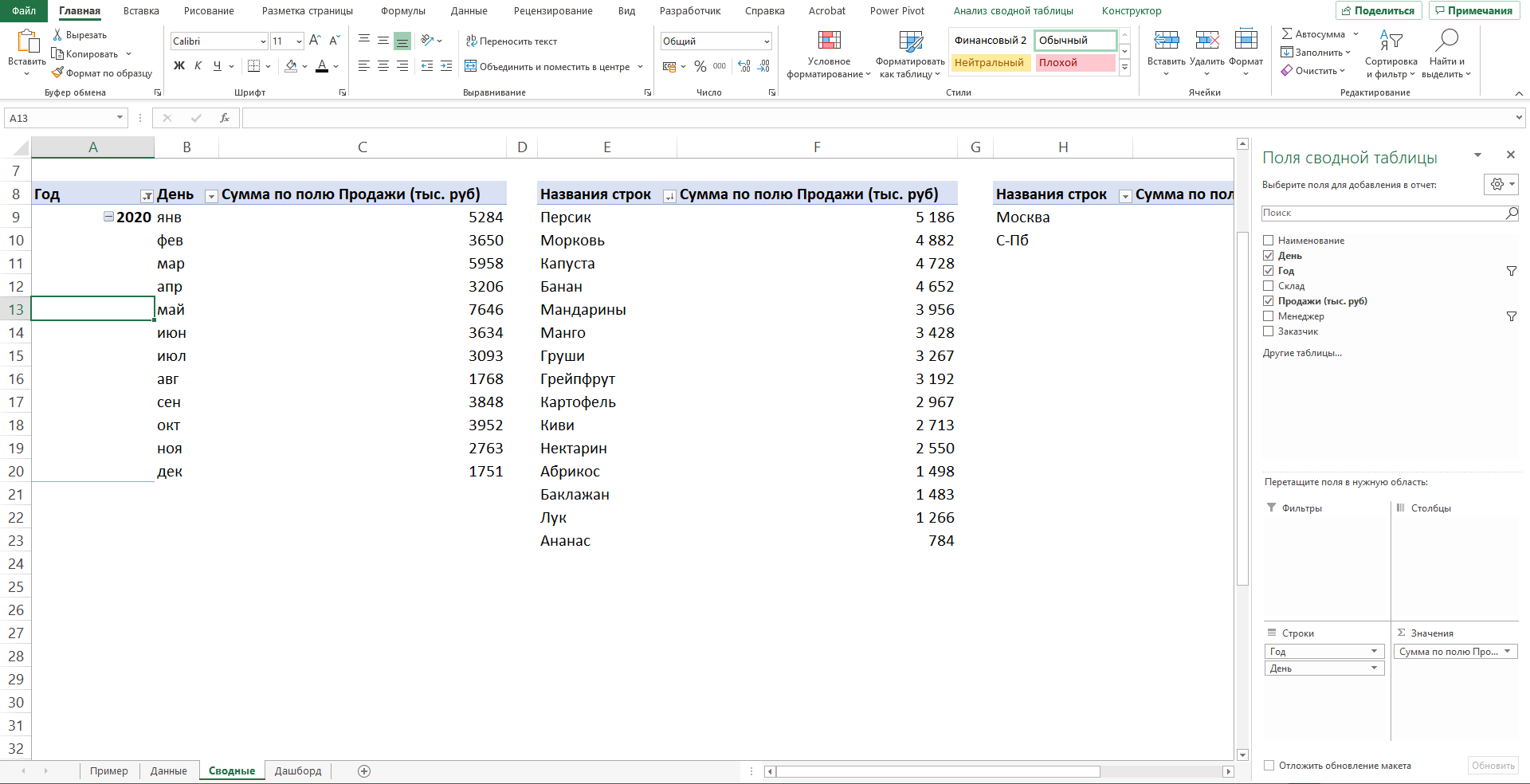
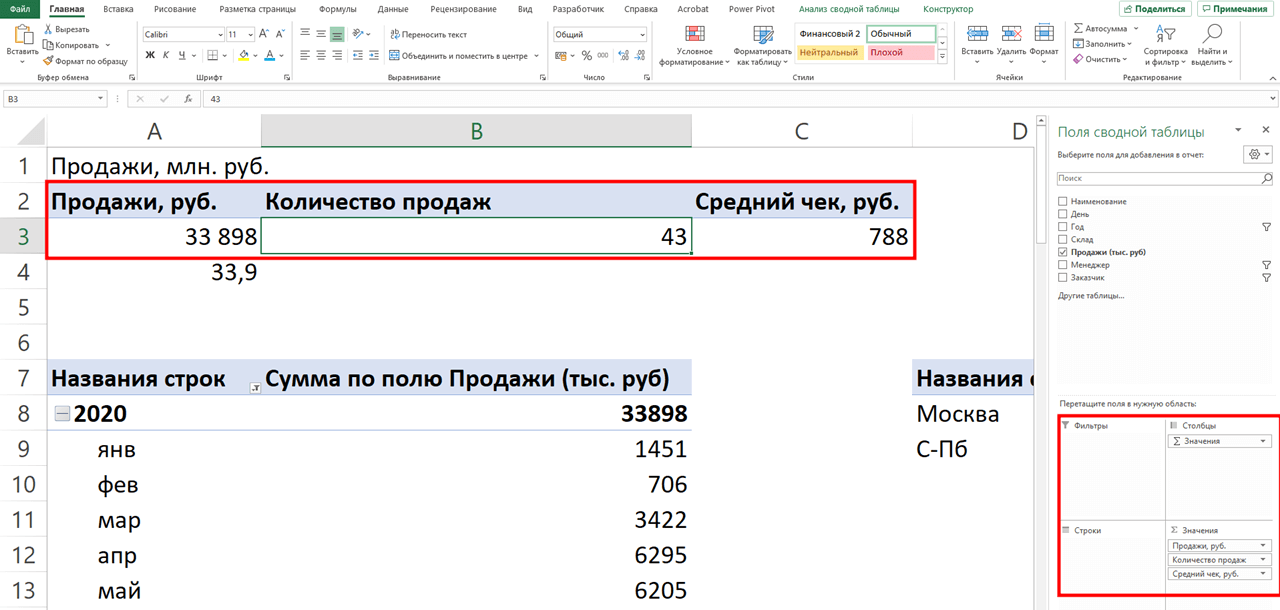
Также построим таблицу для ключевых показателей «Продажи», «Средний чек», «Количество продаж»:
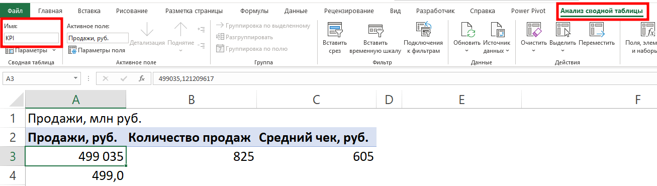
Чтобы в дальнейшем было проще ориентироваться при подключении срезов, присвоим сводным таблицам понятное имя. Для этого перейдём на ленте в раздел Анализ сводной таблицы → Сводные таблицы → в поле Имя укажем название таблицы.
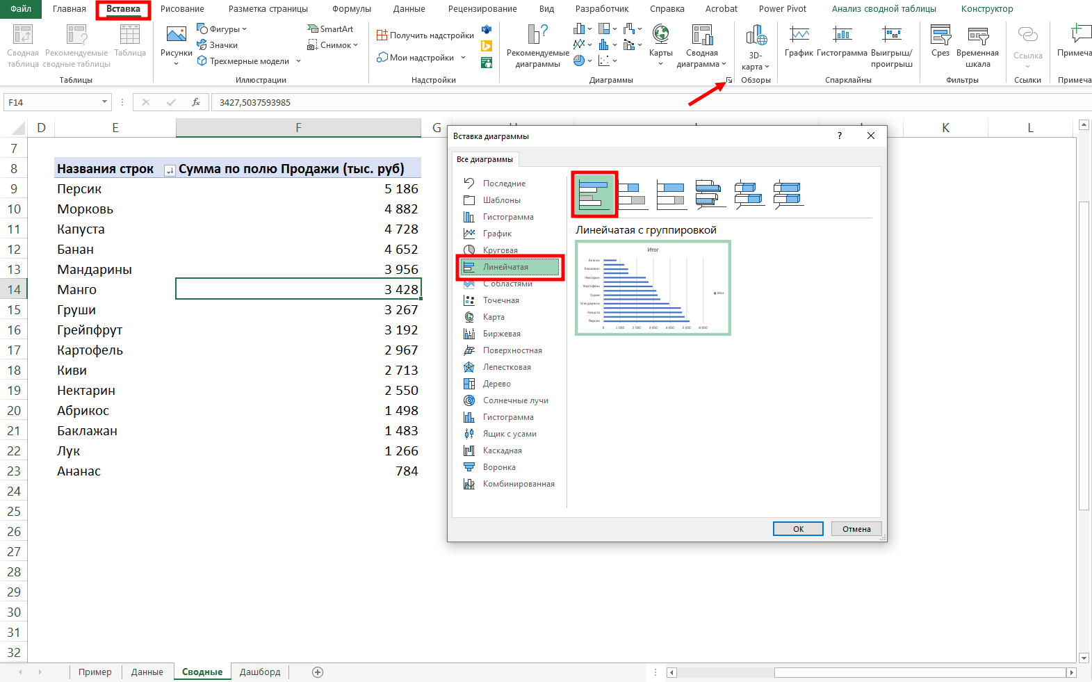
В нашем дашборде будем использовать три типа диаграмм:
- график с маркерами для отражения динамики продаж;
- линейчатую диаграмму для отражения структуры продаж по товарам;
- кольцевую — для отражения структуры продаж по складам.
Выделим диапазон таблицы, перейдём на ленте в раздел Вставка → Диаграммы → Вставка диаграммы → Выберем нужный тип диаграммы → ОК:
Отредактируем диаграммы: добавим названия и подписи данных, скроем кнопки полей, изменим цвет диаграмм, уменьшим боковой зазор, уберём лишние элементы — линии сетки, легенду, нули после запятой у подписей данных. Поменяем порядок категорий на линейчатой диаграмме.
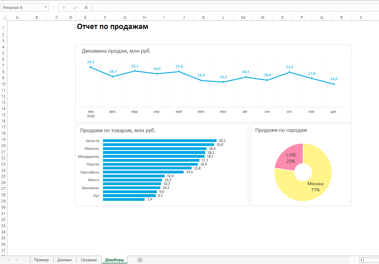
… и распределим их согласно выбранному на втором шаге макету:
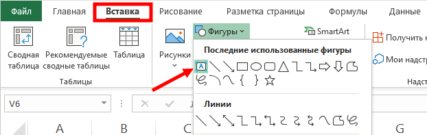
После размещения диаграмм необходимо вставить поля с ключевыми показателями: перейдём на ленте в раздел Вставка ⟶ Фигуры и вставим 3 текстбокса:
Далее сделаем заливку и подпишем каждый блок:
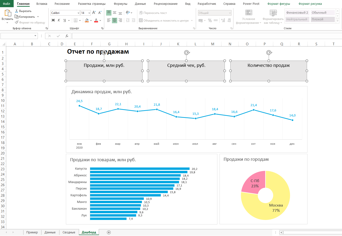
Значения ключевых показателей из сводных таблиц вставим также через текстбоксы — разместим их посередине текстбоксов с названиями KPI. Но прежде в нашем примере сократим значение «Продажи» до миллионов при помощи такого приёма: в сводной таблице рядом с ячейкой со значением поставим формулу с делением этого значения
на 1 000:
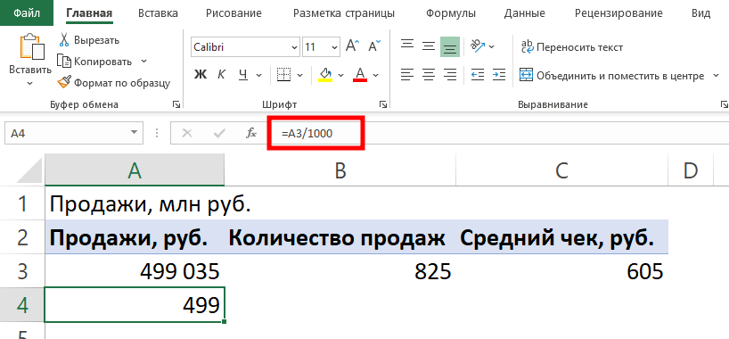
… и сошлёмся уже на эту ячейку:

То же самое проделаем с другими значениями: выделим текстбокс и сошлёмся через поле «Вставить функцию» на короткое значение в сводной таблице:
- Попробуете себя в роли аналитика в крупной ритейл-компании и поможете принять взвешенные решения об открытии новых точек продаж
- Научитесь основам работы с инструментами визуализации данных и решите 4 реальных задачи бизнеса
- 4 задачи — 4 инструмента: DataLens, Excel, Power BI,
Tableau
Срез ― это графический элемент в виде кнопки для представления интерактивного фильтра таблиц и диаграмм. При нажатии на эти кнопки дашборд будет перестраиваться в зависимости от выбранного фильтра.
Эта функция доступна в версиях Excel после 2010 года. Если нет возможности сделать срезы, можно воспользоваться выпадающим списком.
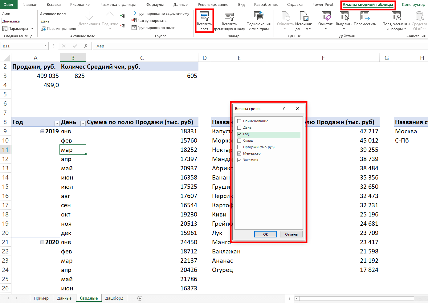
Для создания срезов выделяем любую ячейку сводной таблицы, переходим на ленте в раздел Анализ сводной таблицы ⟶ Вставить срез ⟶ поставим галочки в поля «Год», «Менеджер», «Заказчик», чтобы в дальнейшем можно было фильтровать данные по этим категориям.
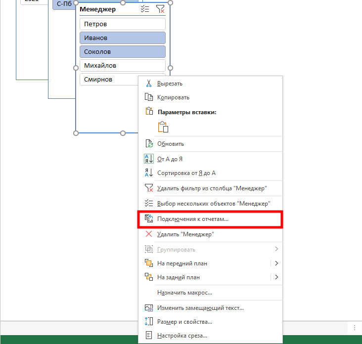
Если срез не работает и при нажатии на кнопки фильтра данные не меняются, подключаем его к нужным сводным таблицам: выделяем срез, кликаем правой кнопкой мыши, выбираем в меню Подключение к отчётам и ставим галочки на требуемых таблицах.
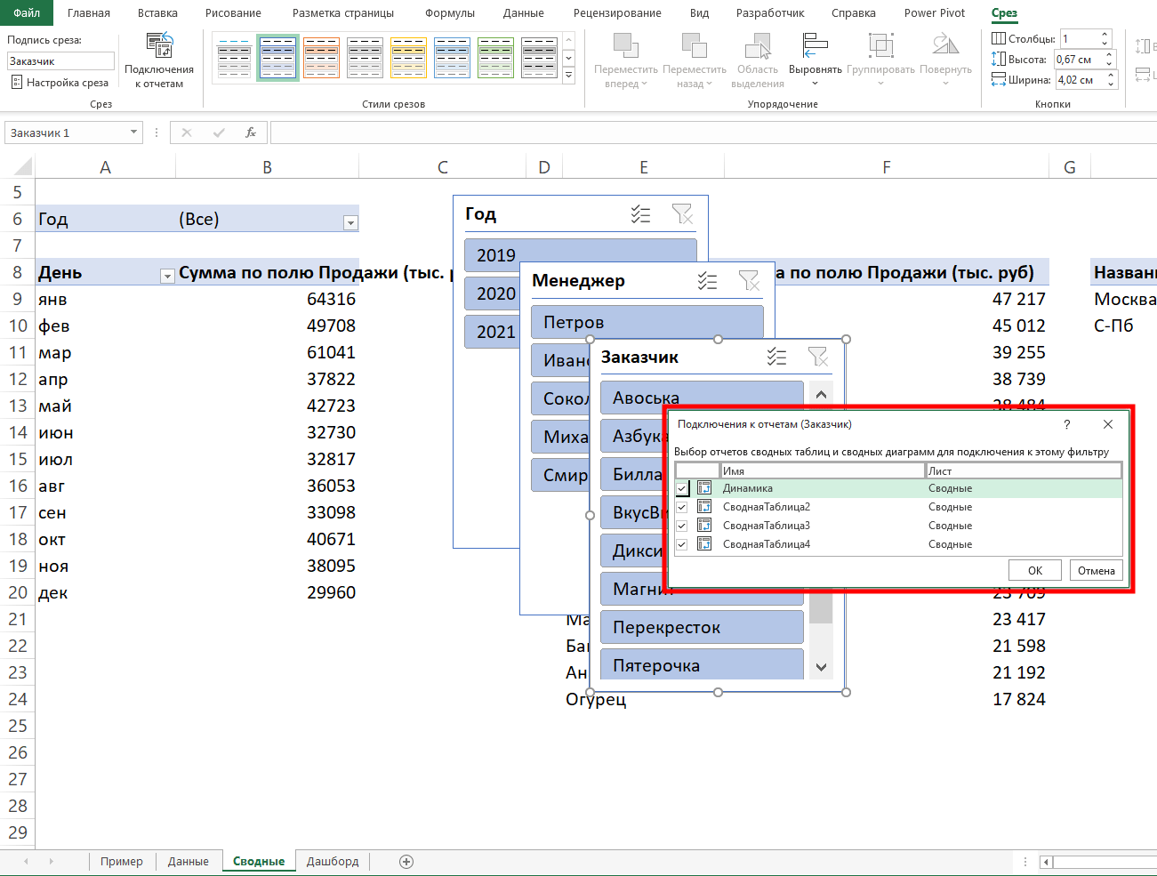
Повторяем эти действия с каждым срезом.
— и располагаем их слева согласно выбранной структуре.
Дашборд готов. Осталось оформить его в едином стиле, подобрать цветовую палитру в корпоративных цветах, выровнять блоки по сетке — и показать коллегам, как пользоваться.
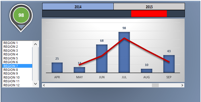
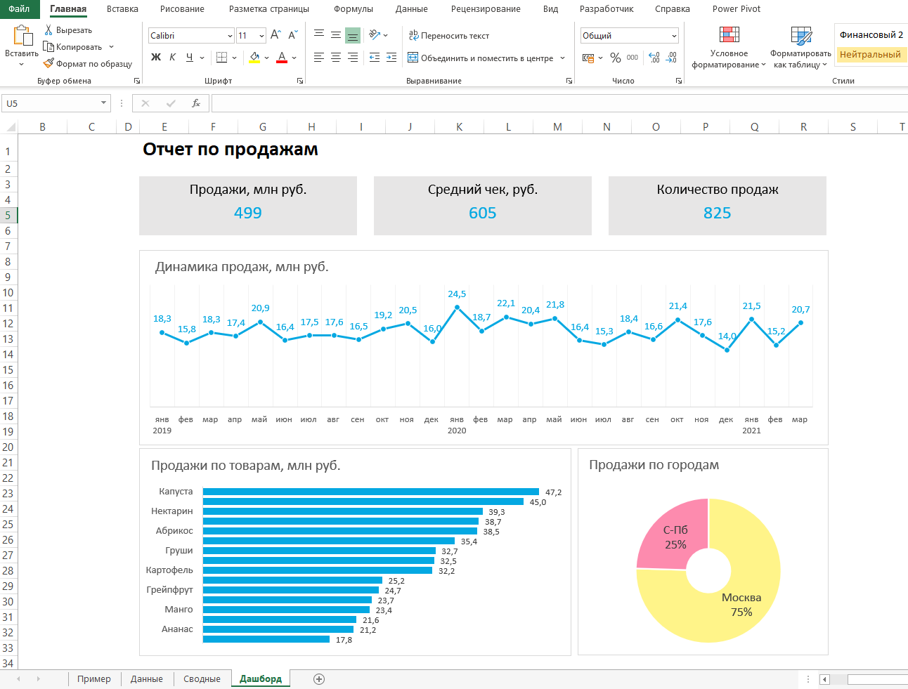
Итак, вот так выглядит наш дашборд для руководителя отдела продаж:
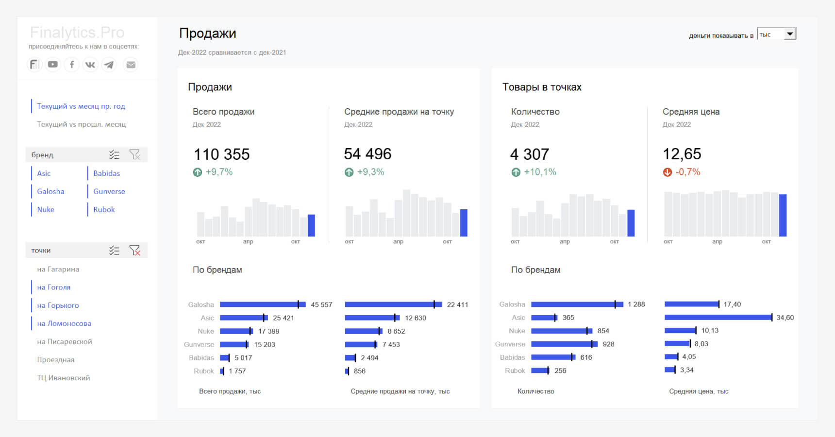
Мы построили самый простой дашборд. Если углубиться в эту тему, то можно использовать сложные диаграммы, настраивать пользовательские форматы срезов, экспериментировать с макетом, вставлять картинки и логотип.
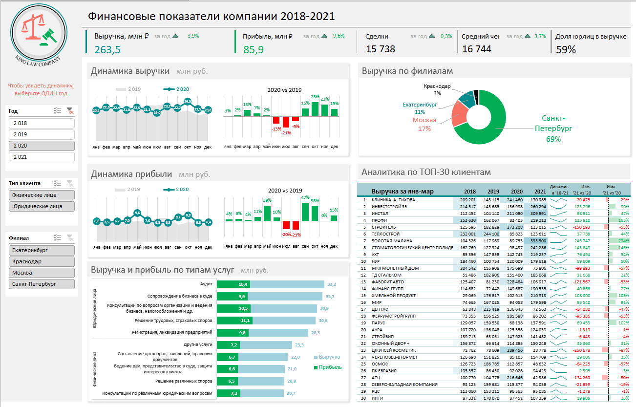
Немного практики — и дашборд может выглядеть так:
Не стоит бояться неизвестного — нужно просто начать делать, чтобы понять, что сложные вещи на самом деле не такие и сложные.
Принцип «от простого к сложному» — самый верный. Когда строят интерактивный дашборд впервые, многие испытывают искреннее восхищение. При нажатии на срезы дашборд перестраивается — очень похоже на магию. Желаем тоже испытать эти ощущения!
Мнение автора и редакции может не совпадать. Хотите написать колонку для Нетологии? Читайте наши условия публикации. Чтобы быть в курсе всех новостей и читать новые статьи, присоединяйтесь к Телеграм-каналу Нетологии.
Excel Dashboard Samples — Free Templates
Executive Dashboard Template
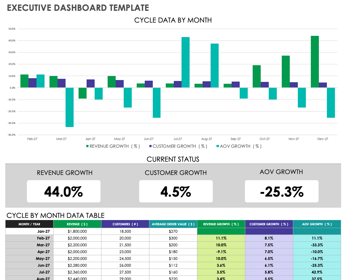
Download the Executive Dashboard Template
An executive dashboard provides a big-picture view of an organization by consolidating KPIs into an easy-to-read, graphical report. Choose your KPIs based on organizational goals and quantifiable measures of success. This template is just one executive dashboard example — to learn more, read our post on executive dashboard types and best practices.
KPI Business Dashboard Template
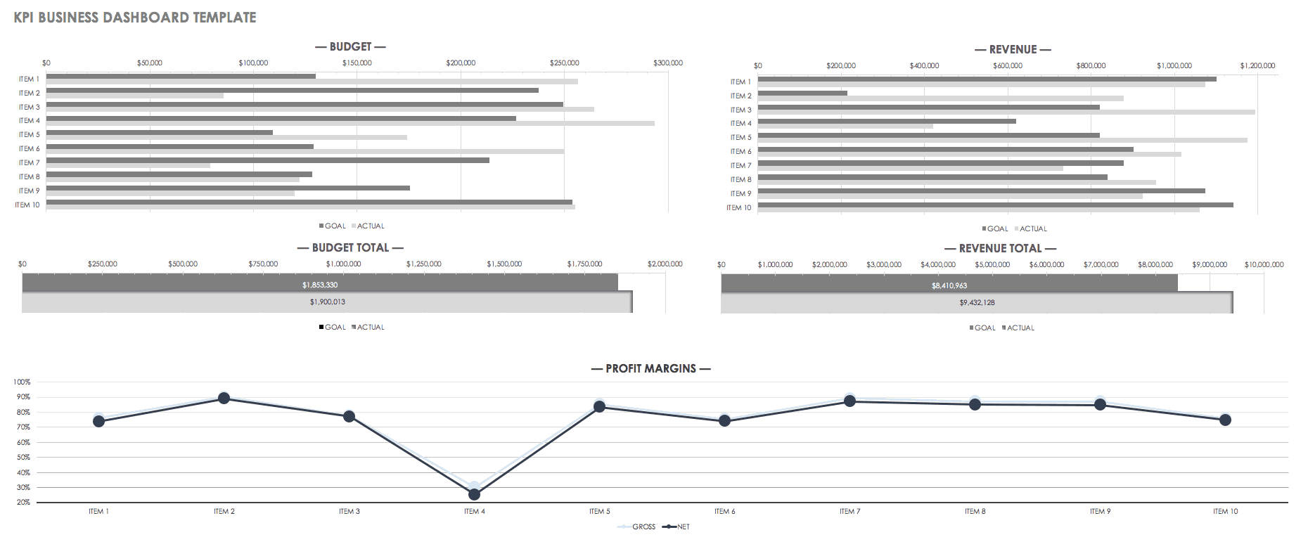
Download the KPI Business Dashboard Template
Track your company’s key performance metrics in a dashboard that shows data in both table and graph formats. This KPI dashboard example offers a simple, eye-catching layout for easy sharing and deciphering. Use the template as is, or customize it to suit your specific needs.
Financial Dashboard Template
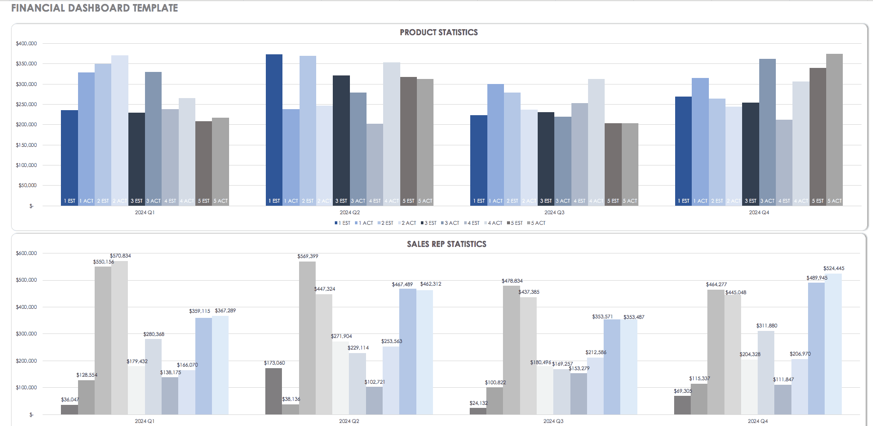
Download the Financial Dashboard Template
A financial dashboard can have various uses, whether you’re tracking sales revenue, analyzing business growth, or making strategic decisions based on fiscal performance. Compare financial data with information from previous years, and make future estimates based on performance. Getting a quick, visual picture of financial data is one of the benefits of using a dashboard.
Sales Management Dashboard Template

Download the Sales Management Dashboard Template
Use this sales management dashboard template to track performance by salesperson, product, region, and more. Having this data at your fingertips can provide insight into any issues that may need to be resolved, enhance employee accountability, and drive progress.
Lead Generation Dashboard Template
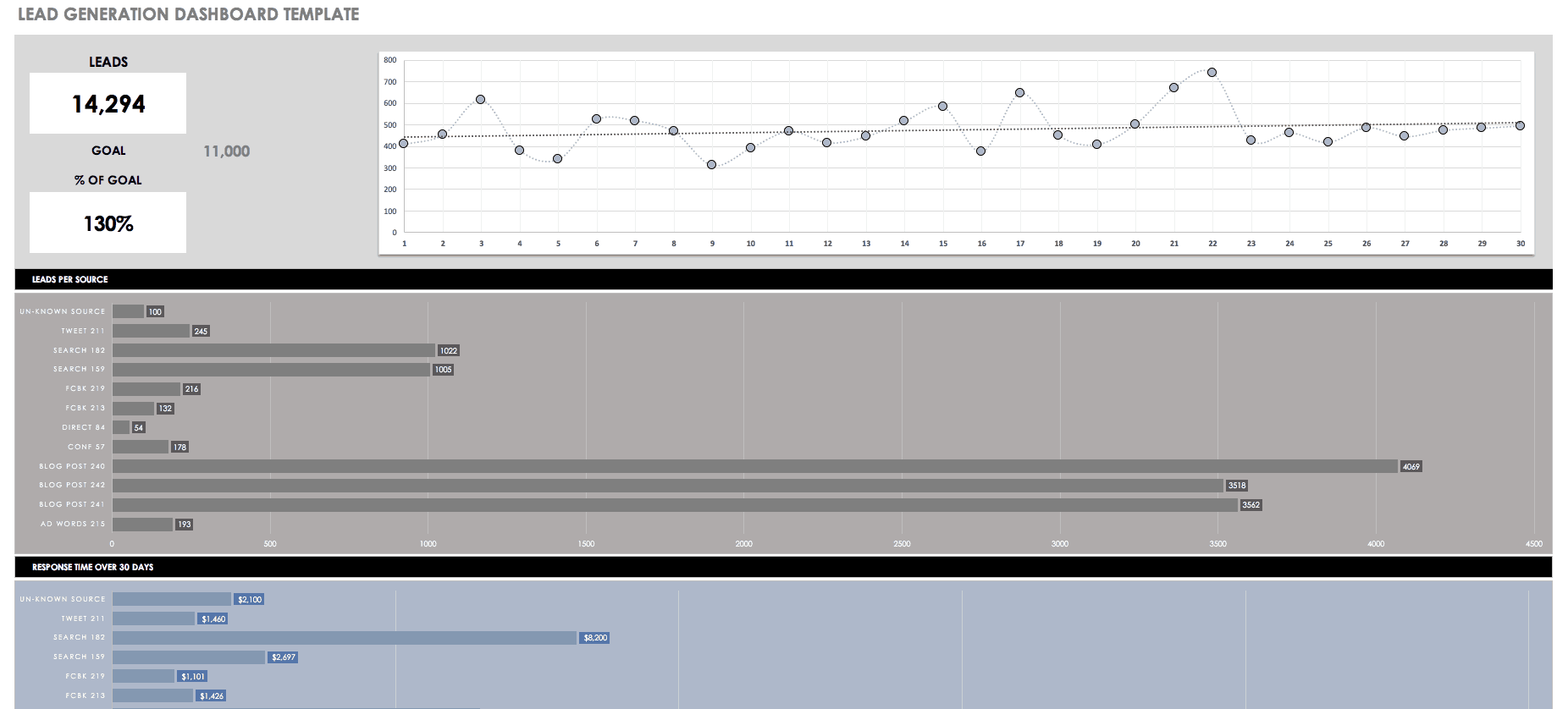
Download the Lead Generation Dashboard Template
Assess your lead generation and conversion performance with this dashboard template. Whether you’re working independently or with a sales team, using a dashboard can give you a clear picture of your most successful lead sources, conversion rates, and how close you are to reaching your goals.
Marketing Dashboard Template
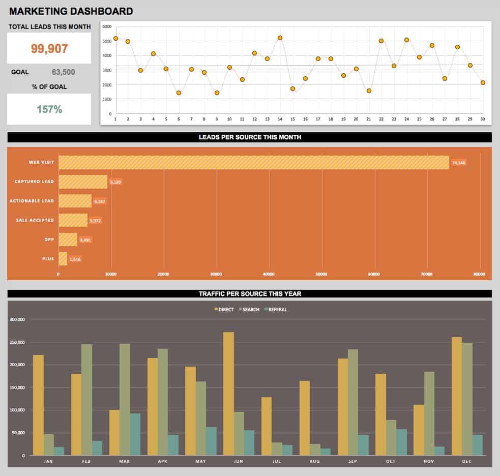
Download the Marketing Dashboard Template
This simple template provides marketing performance metrics at a quick glance to help you gauge the success of your campaigns. Track key metrics in order to drive marketing decisions and goals.
Social Media Dashboard Template
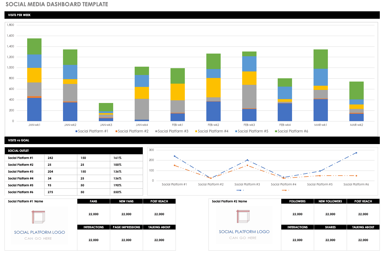
Download the Social Media Dashboard Template
A social media dashboard allows you to monitor your performance on multiple channels in one report. Use this dashboard template to track audience engagement and make strategic decisions about where to focus your social media marketing efforts.
Digital Marketing Dashboard Template
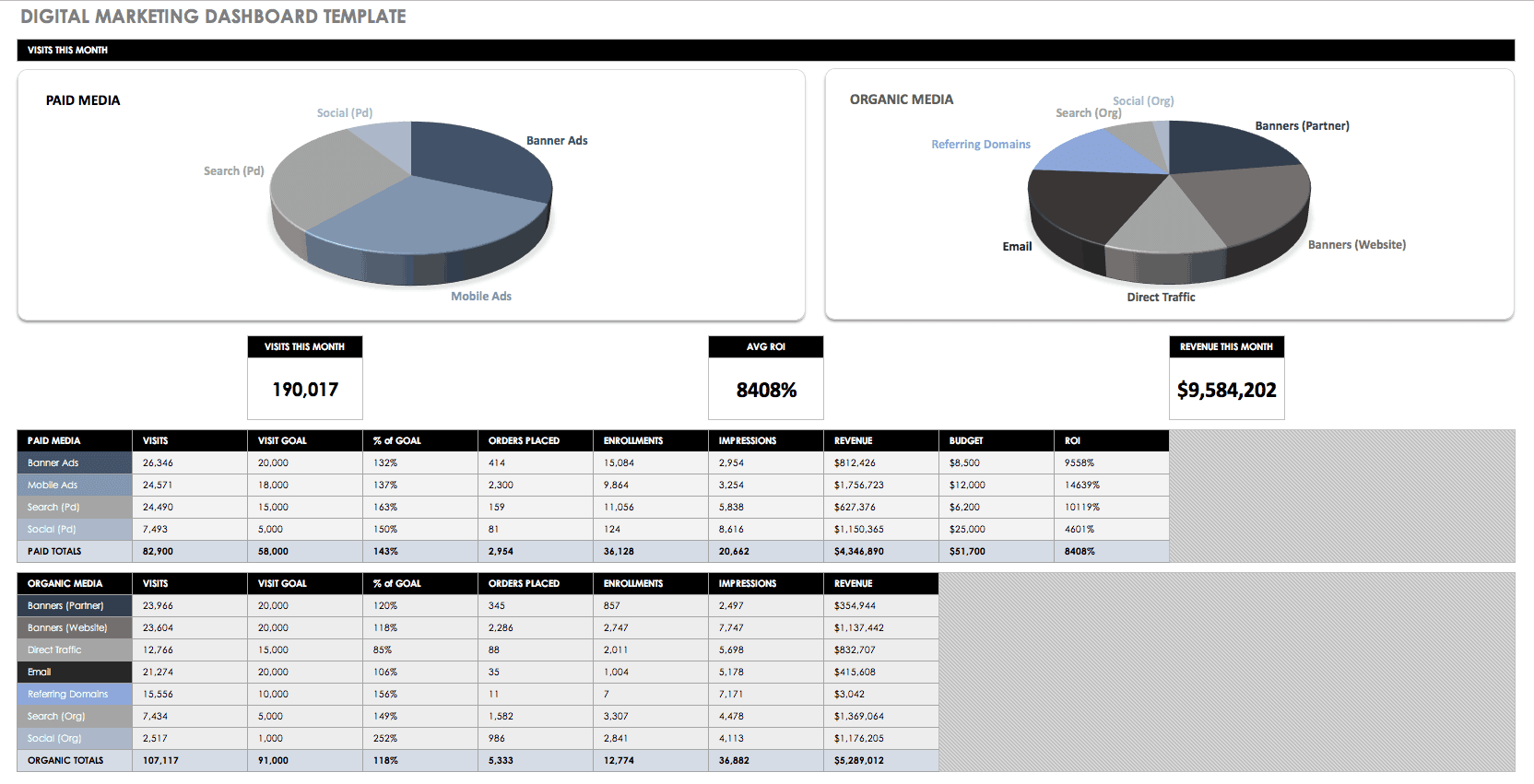
Download the Digital Marketing Dashboard Template
This dashboard template is designed for reviewing a digital marketing campaign across various channels, including paid advertising. Track your return on investment, traffic sources, costs, revenue, and more.
Email Marketing Dashboard Template
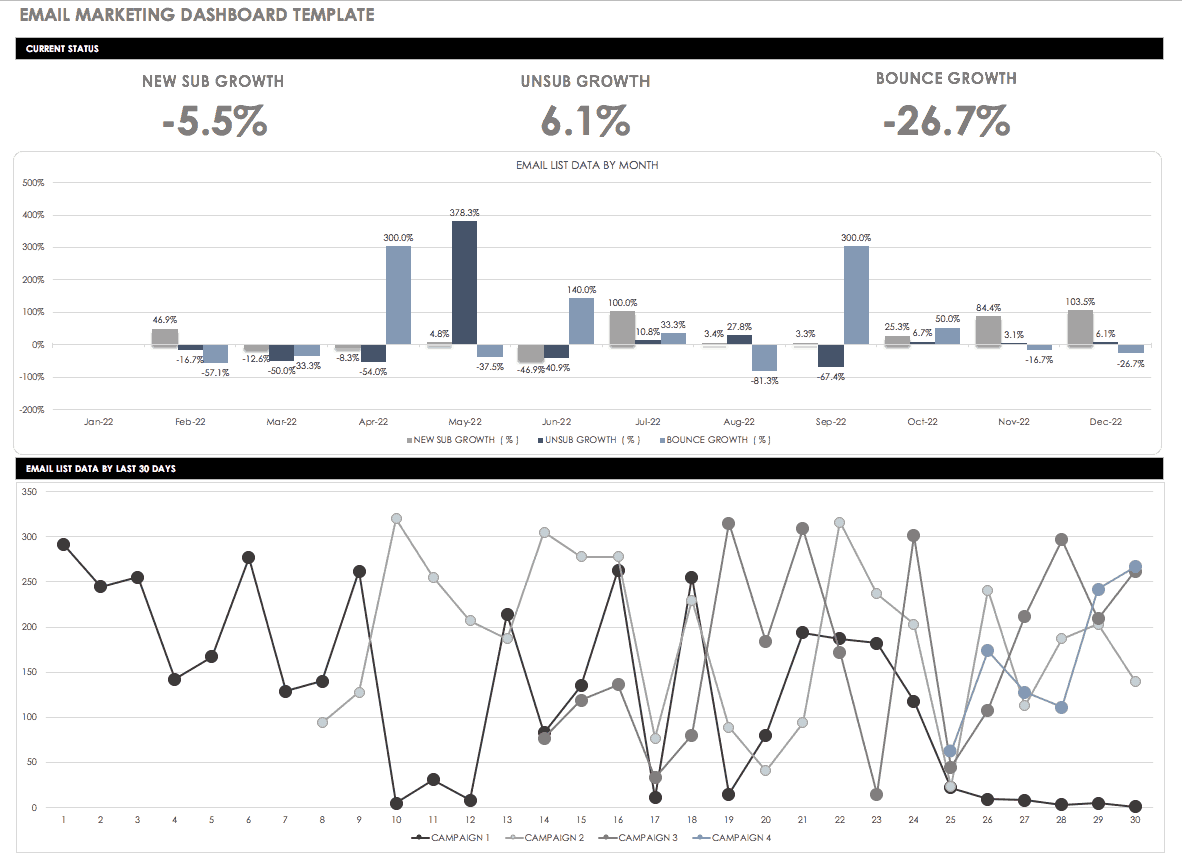
Download the Email Marketing Dashboard Template
Monitor your email marketing efforts by tracking leads, subscribers, and other performance indicators. Use the dashboard to get a clearer idea of what’s working, and adjust your email campaigns as needed.
Project Management Dashboard Template
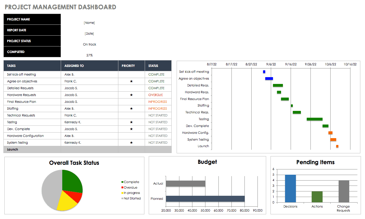
Download the Project Management Dashboard Template
Streamline your project management process by using a dashboard to track your timeline, task status, financial data, risk analysis, revisions, and more. Having all of this data visually represented in one place facilitates communication with team members and helps to keep projects on schedule and within budget.
Development Operations (DevOps) Dashboard Template
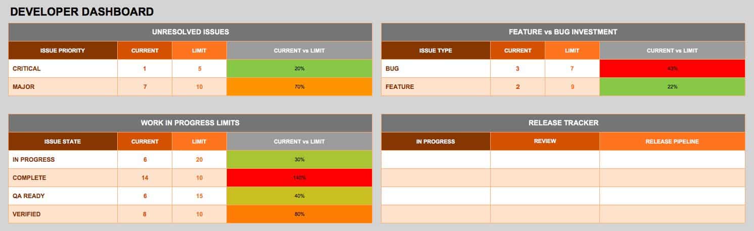
Download the Development Operations (DevOps) Dashboard Template
A DevOps dashboard can help keep developers on track for any project, and supports an Agile approach by highlighting features, releases, and unresolved issues. Use the dashboard for communication among a DevOps team, to monitor performance, and to keep the development process running smoothly.
Product Metrics Dashboard Template
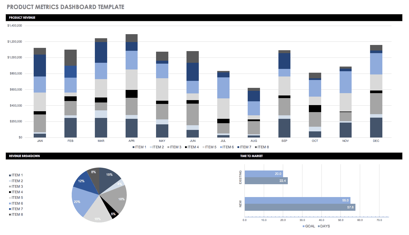
Download the Product Metrics Dashboard Template
Track product revenue and time to market with a product metrics dashboard. This template offers a simple layout for viewing metrics on multiple products. Use it for documenting KPIs and creating consistent reports for stakeholders.
Supply Chain Dashboard Template
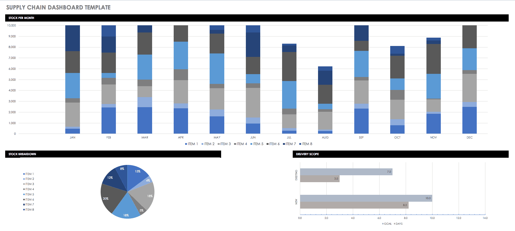
Download the Supply Chain Dashboard Template
A supply chain dashboard can be used for reviewing inventory, orders, and process efficiency. Monitor your supply chain performance with KPIs, and then identify opportunities for greater outcomes once your organization is meeting its measurements for success.
Customer Service Call Center Dashboard
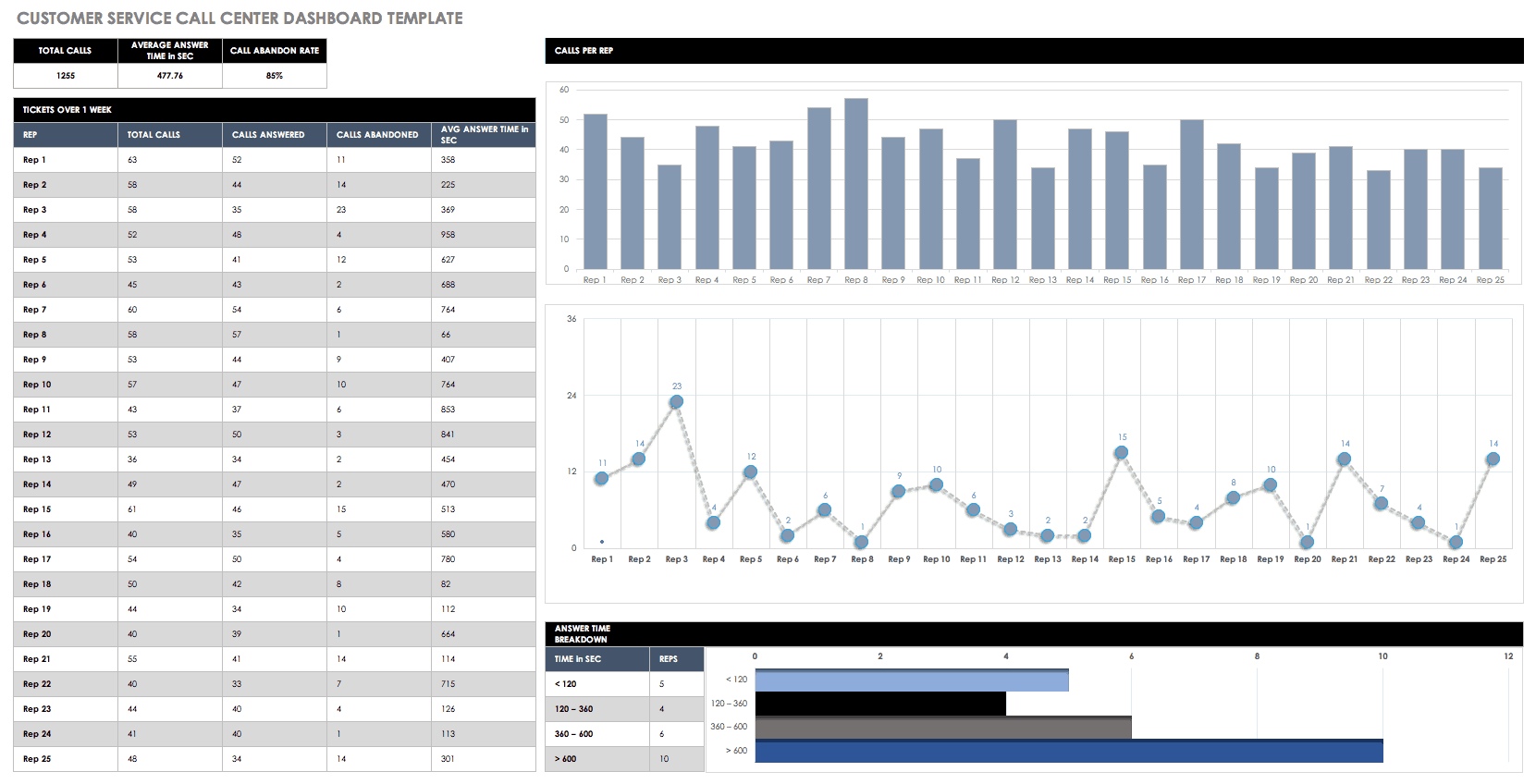
Download the Customer Service Call Center Dashboard
Analyze your weekly call center metrics — including agent performance, customer satisfaction, calls per minute, and more — with a customer service dashboard. A dashboard allows you to compile data at various levels, from overall call center performance to departments and individual agents. Use these key metrics to improve customer service and inform weekly goals.
Web Analytics Dashboard Template
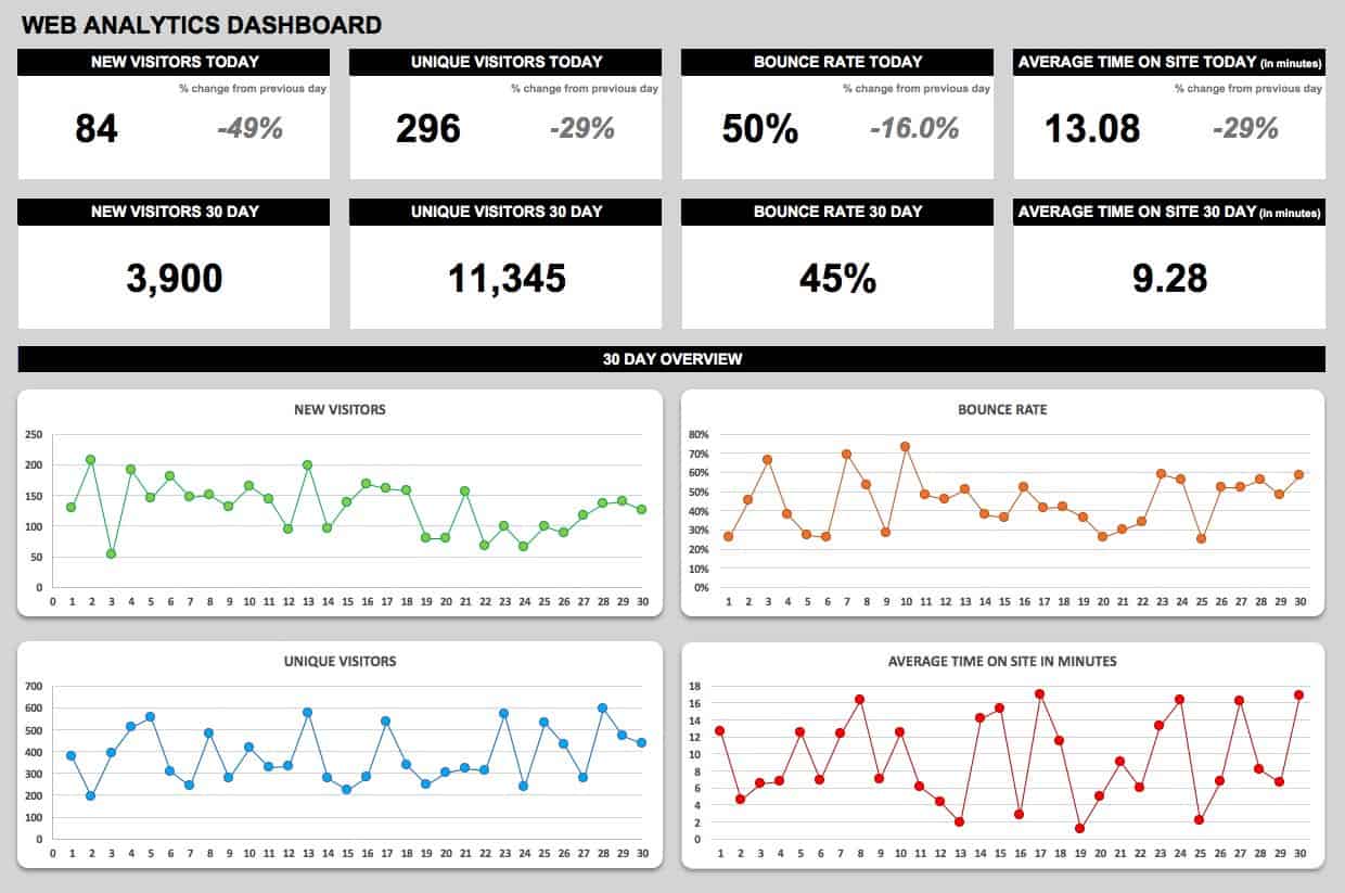
Download the Web Analytics Dashboard Template
Track website analytics over time, including new visitors, bounce rate, and average time on site with a simple dashboard template. Adjust the dashboard metrics to suit your business goals and website performance.
SEO Dashboard Template
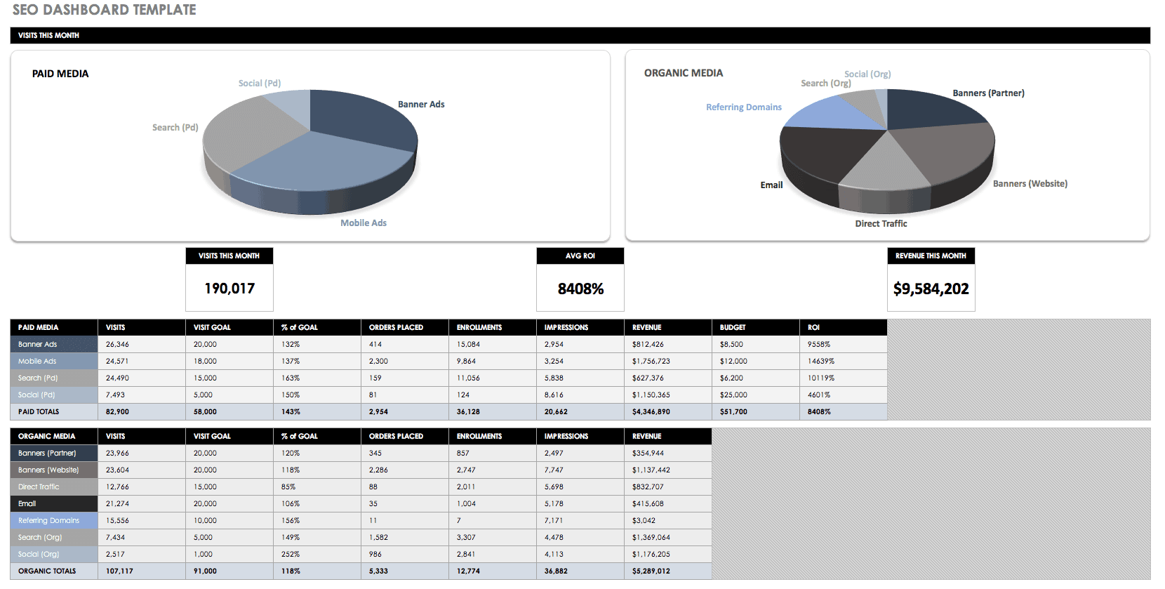
Download the SEO Dashboard Template
Get insight on your SEO efforts by following metrics on how your top keywords are ranking. Additionally, search traffic and conversions, backlinks, and more. An SEO dashboard can give you a snapshot of current performance and direct your goals for future improvement.
Support Dashboard Template
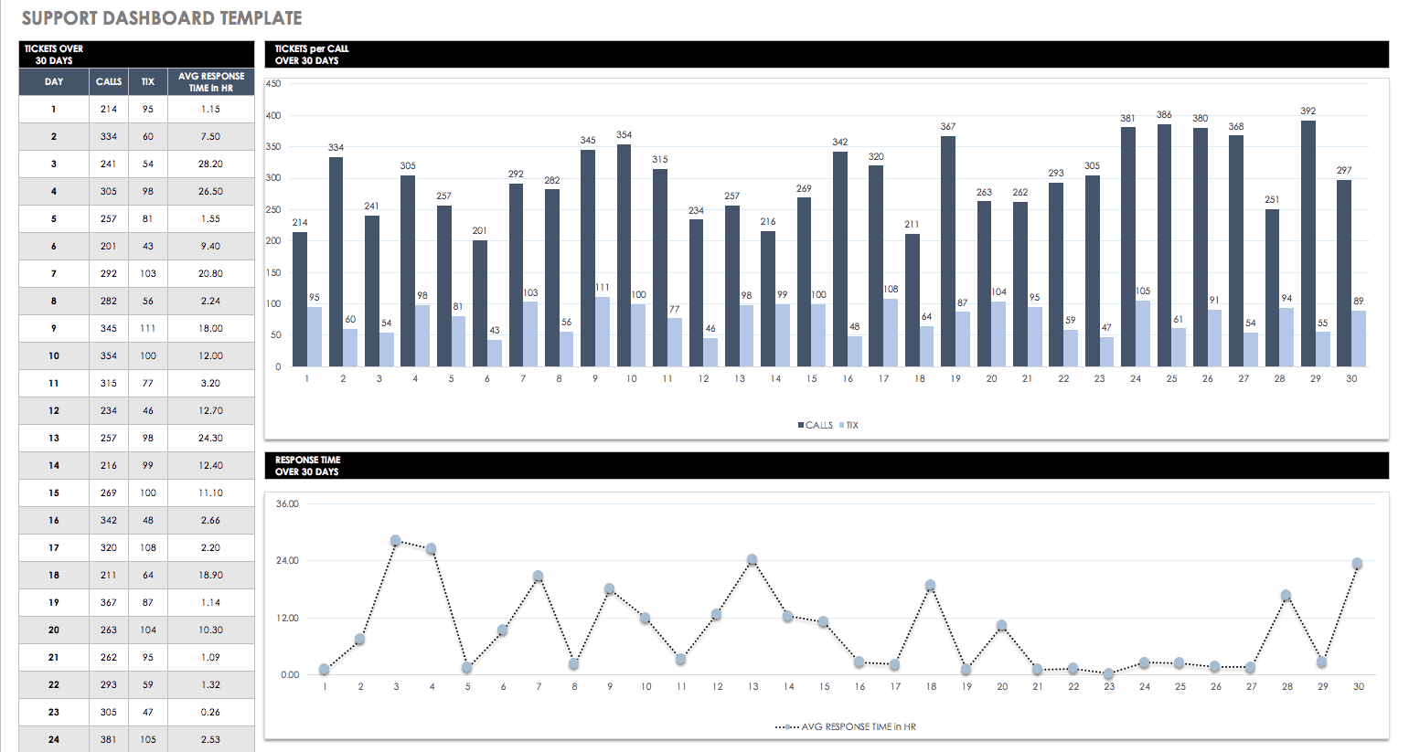
Download the Support Dashboard Template
Use this support dashboard template to track tickets and response time, and assess daily, weekly, and monthly performance. A comprehensive dashboard report can show trends over time for a greater understanding of support performance.
Retail Analysis Dashboard Template
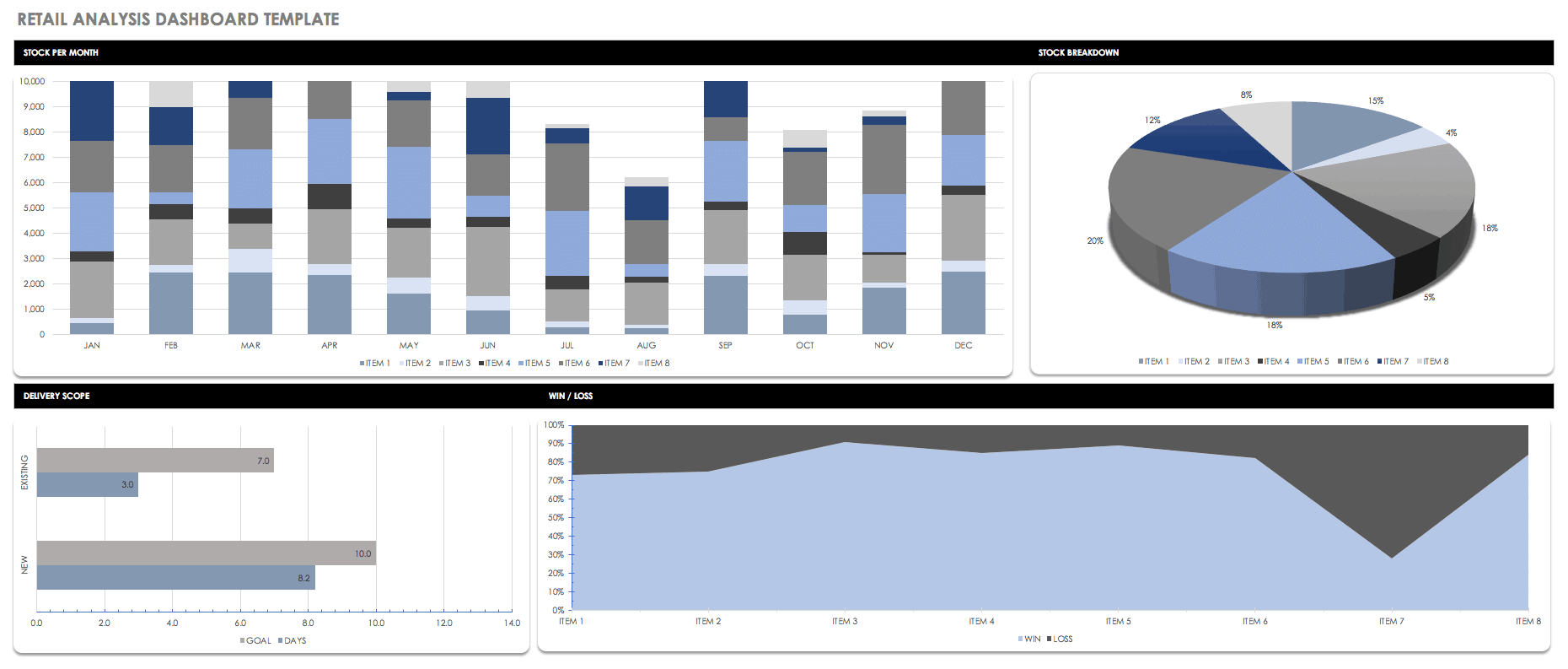
Download the Retail Analysis Dashboard Template
A retail analysis dashboard can provide insight on product, customer, and salesperson performance. Track monthly, quarterly, and yearly metrics to analyze your retail business, obtain a more accurate forecast of future performance, and make strategic decisions.
E-commerce Dashboard Template
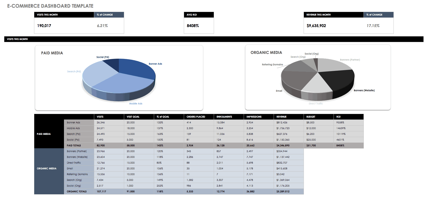
Download the E-commerce Dashboard Template
This sales dashboard template is designed specifically for tracking e-commerce metrics, including user visits and conversions, revenue and profit margin, and more. Compare your current e-commerce performance to previous time periods, and create an action plan for moving forward.
HR Dashboard Template
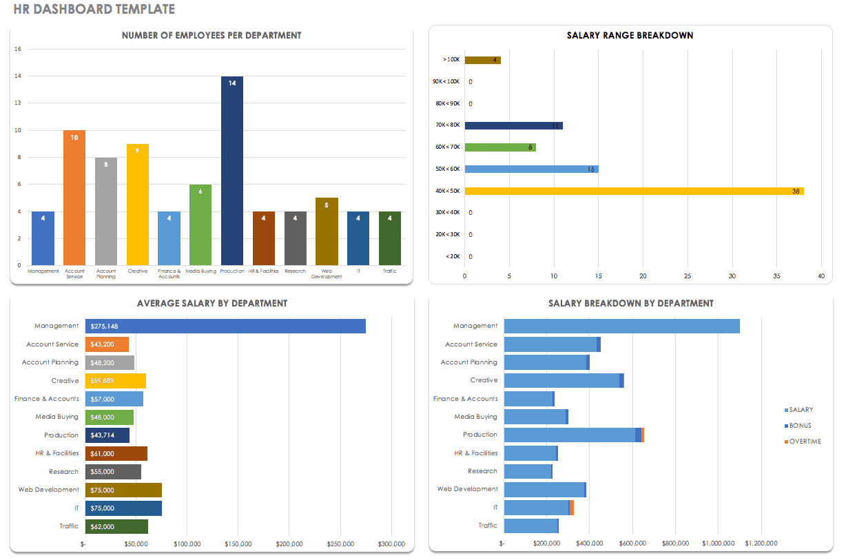
Download the HR Dashboard Template
Get a visual report of human resources data with an HR dashboard. You can adjust this template to include whichever metrics are most useful for your business, whether it’s employee salaries, recruitment, benefits, or employee satisfaction.
Productivity Dashboard Template
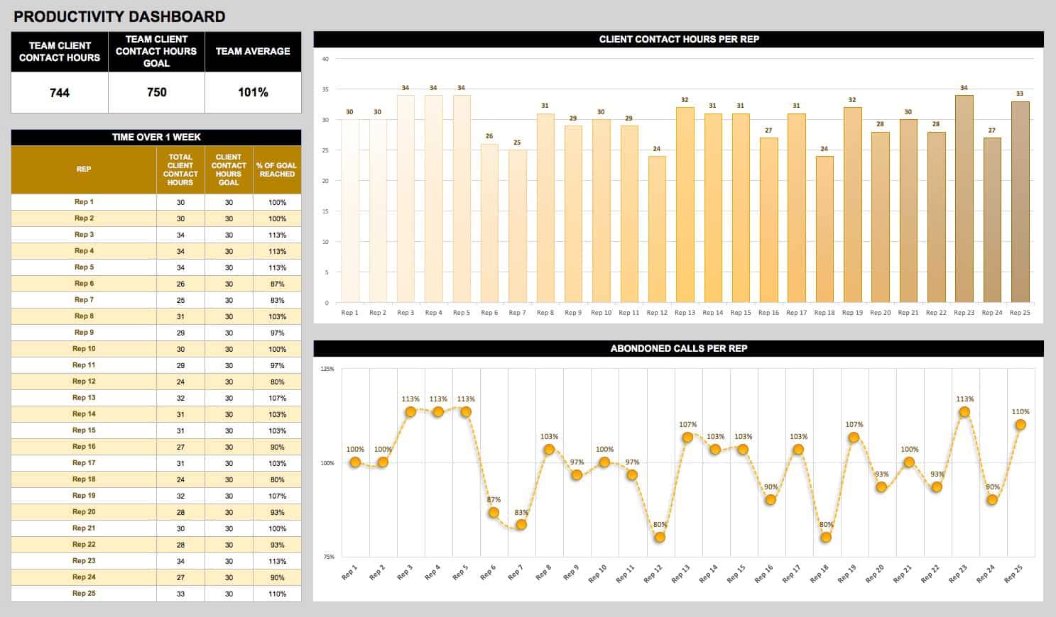
Download Productivity Dashboard Template
Evaluate productivity for a department or team, or for individual employees with a simple dashboard template. You can include employee satisfaction along with productivity KPIs to assess the relationship between performance and satisfaction. This may provide insight into company culture as well as business objectives.
Insurance Claims Dashboard Template
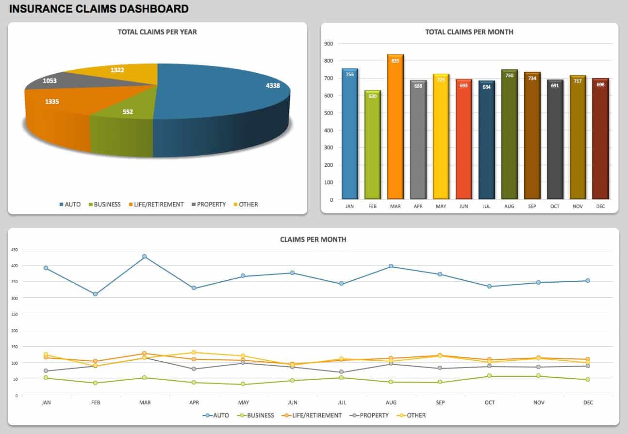
Download the Insurance Claims Dashboard Template
Use an insurance claims dashboard to view data such as claim type, status date, and claimant information. The dashboard format makes it easy to view large sets of data quickly, and is represented in charts and graphs. This template provides the layout for a monthly insurance claims report.
Tips for Creating Great Dashboards
In addition to strategic key performance indicators (KPIs), insights, and recommendations based on data analysis, you should also demonstrate the business impact of the recommended actions. While this may be beyond the scope of data analysis for some dashboards, including the impact will make your recommended actions hold more weight. Of course, the content of a dashboard report will depend on the audience — keep this in mind when customizing your dashboard to make it more effective. Also, focus on a clean, uncluttered design for your dashboard so that viewers can easily identify and drill down into key metrics.
You have a couple options for getting started with your own dashboard. Scroll through the Excel dashboard examples listed below and choose a template to download for free. Read our tutorial on how to create a dashboard in Excel. Or, build your own dashboard in Smartsheet to get access to enhanced collaboration and customization features.
Make Better Decisions, Faster with Smartsheet Dashboards
Empower your people to go above and beyond with a flexible platform designed to match the needs of your team — and adapt as those needs change.
The Smartsheet platform makes it easy to plan, capture, manage, and report on work from anywhere, helping your team be more effective and get more done. Report on key metrics and get real-time visibility into work as it happens with roll-up reports, dashboards, and automated workflows built to keep your team connected and informed.
When teams have clarity into the work getting done, there’s no telling how much more they can accomplish in the same amount of time. Try Smartsheet for free, today.