
17 авг. 2022 г.
читать 3 мин
Часто вам может понадобиться найти уравнение, которое лучше всего соответствует некоторой кривой для набора данных в Excel.

К счастью, это довольно легко сделать с помощью функции Trendline в Excel.
В этом руководстве представлен пошаговый пример того, как подогнать уравнение к кривой в Excel.
Шаг 1: Создайте данные
Во-первых, давайте создадим поддельный набор данных для работы:

Шаг 2: Создайте диаграмму рассеивания
Затем давайте создадим диаграмму рассеяния для визуализации набора данных.
Сначала выделите ячейки A2: B16 следующим образом:

Затем щелкните вкладку « Вставка » на верхней ленте, а затем щелкните первый параметр графика в разделе « Разброс »:

Получается следующая диаграмма рассеяния:

Шаг 3: Добавьте линию тренда
Затем щелкните в любом месте диаграммы рассеяния. Затем нажмите знак + в правом верхнем углу. В раскрывающемся меню щелкните стрелку рядом с линией тренда , а затем выберите « Дополнительные параметры »:

В появившемся справа окне нажмите кнопку рядом с Polynomial.Затем установите флажки рядом с Отображать уравнение на диаграмме и Отображать значение R-квадрата на диаграмме .

Это дает следующую кривую на диаграмме рассеяния:
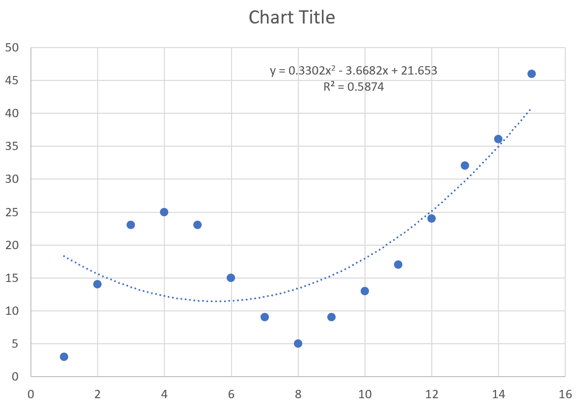
Уравнение кривой выглядит следующим образом:
у = 0,3302 х 2 – 3,6682 х + 21,653
R-квадрат говорит нам о проценте вариации переменной отклика , которая может быть объяснена переменными-предикторами. R-квадрат для этой конкретной кривой равен 0,5874 .
Шаг 4: Выберите лучшую линию тренда
Мы также можем увеличить порядок полинома, который мы используем, чтобы увидеть, лучше ли более гибкая кривая подходит для набора данных.
Например, мы могли бы установить полиномиальный порядок равным 4:

В результате получается следующая кривая:
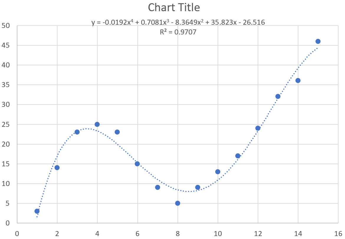
Уравнение кривой выглядит следующим образом:
у = -0,0192 х 4 + 0,7081 х 3 – 8,3649 х 2 + 35,823 х – 26,516
R-квадрат для этой конкретной кривой равен 0,9707 .
Этот R-квадрат значительно выше, чем у предыдущей кривой, что указывает на то, что он гораздо лучше соответствует набору данных.
Мы также можем использовать это уравнение кривой, чтобы предсказать значение переменной ответа на основе переменной-предиктора. Например, если x = 4, то мы можем предсказать, что y = 23,34 :
у = -0,0192(4) 4 + 0,7081(4) 3 – 8,3649(4) 2 + 35,823(4) – 26,516 = 23,34
Вы можете найти больше руководств по Excel на этой странице .
A straight line is not always the best method to fit your data points. For these specific cases, we can use some of the tools available in Excel to do nonlinear regression or curve fitting.
Without any further ado, let’s get started with performing curve fitting in Excel today. We’ll explore the different methods to do so now.
1. Polynomial Curve Fitting Model
Let’s consider some data points in x and y, we find that the data is quadratic after plotting it on a chart. A polynomial function has the form: y = ax2+ bx + c

Although this data is nonlinear, the LINEST function can be utilized to obtain the best fit curve. We can return the coefficients straight to cells when we use LINEST to acquire the coefficients that define the polynomial equation.
There are three coefficients, a for x squared, b for x, and a constant c since the equation is quadratic, or a second-order polynomial. Follow these steps to obtain the coefficients a, b and c:
- Select the cell where you want to calculate and display the coefficients.
- Type the formula =LINEST(y, x^{1,2}, TRUE, FALSE), where y is the cells containing the known y data and x is the cells containing the known x data raised to the first and second power. Finally, the TRUE and FALSE parameters instruct the LINEST function to calculate the y-intercept without forcing it to zero and not to return further regression data, respectively.

- Press the Ctrl+Shift+Enter keys to return the result.

Therefore, the polynomial curve fitting formula for the given dataset is: y = 1.07x2+ 0.01x + 0.04
2. Logarithmic Curve Fitting Model
Let’s consider some data points in x and y, we find that the data is logarithmic after plotting it on a chart. A logarithmic function has the form: y = m.ln(x) + b

Although this data is nonlinear, the LINEST function can be utilized to obtain the best fit curve. We can return the coefficients straight to cells when we use LINEST to acquire the coefficients that define the logarithmic equation.
There are two coefficients, m for ln(x) and a constant b. Follow these steps to obtain the coefficients m and b:
- Select the cell where you want to calculate and display the coefficients.
- Type the formula =LINEST(y, LN(x), TRUE, FALSE), where y is the cells containing the known y data and x is the cells containing the known x data. Finally, the TRUE and FALSE parameters instruct the LINEST function to calculate the y-intercept without forcing it to zero and not to return further regression data, respectively.

- Press the Ctrl+Shift+Enter keys to return the result.

Therefore, the logarithmic curve fitting formula for the given dataset is: y = 0.91ln(x) + 0.18
3. Exponential Curve Fitting Model
Let’s consider some data points in x and y, we find that the data is exponential after plotting it on a chart. A logarithmic function has the form: y = aebx

It’s a little more difficult to find the coefficients, a and b, for this equation since we need to do some algebra first to make the equation take on a “linear” form. To begin, compute the natural log of both sides of the equation to obtain the following: ln(y) = ln(a) + bx.
We can now use LINEST to get ln(a) and b by entering ln(y) as the y values argument using the formula =LINEST(LN(y), x, TRUE, FALSE). From ln(a), we can simply apply the exponential function to get just “a” as a = eln(a) . Follow these steps to obtain the coefficients a and b:
- Select the cell where you want to calculate and display the coefficients.
- Type the formula =LINEST(LN(y), x, TRUE, FALSE), where y is the cells containing the known y data and x is the cells containing the known x data. Finally, the TRUE and FALSE parameters instruct the LINEST function to calculate the y-intercept without forcing it to zero and not to return further regression data, respectively.

- Press the Ctrl+Shift+Enter keys to return the result for b and ln(a).

- To get the value of a, type =EXP(F2), where cell F2 contains the value of ln(a).

- Press the Enter key to display the result.

Therefore, the exponential curve fitting formula for the given dataset is: y = 8.61e-0.38x
4. Power Curve Fitting Model
Let’s consider some data points in x and y, we find that the data is in power model form after plotting it on a chart. A power function has the form: y = axb

It’s a little more difficult to find the coefficients, a and b, for this equation since we need to do some algebra first to make the equation take on a “linear” form. To begin, compute the natural log of both sides of the equation to obtain the following: ln(y) = ln(a) + bln(x). We can now use LINEST to get ln(a) and b by entering ln(y) as the y values argument and ln(x) as the x values argument using the formula =LINEST(LN(y), LN(x), TRUE, FALSE). From ln(a), we can simply apply the exponential function to get just “a” as a = eln(a). Follow these steps to obtain the coefficients a and b:
- Select the cell where you want to calculate and display the coefficients.
- Type the formula =LINEST(LN(y), LN(x), TRUE, FALSE), where y is the cells containing the known y data and x is the cells containing the known x data. Finally, the TRUE and FALSE parameters instruct the LINEST function to calculate the y-intercept without forcing it to zero and not to return further regression data, respectively.

- Press the Ctrl+Shift+Enter keys to return the result for b and ln(a).

- To get the value of a, type =EXP(F2), where cell F2 contains the value of ln(a).

- Press the Enter key to display the result.

Therefore, the power function curve fitting formula for the given dataset is: y = 11.33x-1.56
Conclusion
In this tutorial, we learned how to perform curve fitting In Excel using different models.
References
- LINEST function (microsoft.com)
Often you may want to find the equation that best fits some curve for a dataset in Excel.

Fortunately this is fairly easy to do using the Trendline function in Excel.
This tutorial provides a step-by-step example of how to fit an equation to a curve in Excel.
Step 1: Create the Data
First, let’s create a fake dataset to work with:

Step 2: Create a Scatterplot
Next, let’s create a scatterplot to visualize the dataset.
First, highlight cells A2:B16 as follows:

Next, click the Insert tab along the top ribbon, and then click the first plot option under Scatter:

This produces the following scatterplot:

Step 3: Add a Trendline
Next, click anywhere on the scatterplot. Then click the + sign in the top right corner. In the dropdown menu, click the arrow next to Trendline and then click More Options:

In the window that appears to the right, click the button next to Polynomial. Then check the boxes next to Display Equation on chart and Display R-squared value on chart.

This produces the following curve on the scatterplot:

The equation of the curve is as follows:
y = 0.3302x2 – 3.6682x + 21.653
The R-squared tells us the percentage of the variation in the response variable that can be explained by the predictor variables. The R-squared for this particular curve is 0.5874.
Step 4: Choose the Best Trendline
We can also increase the order of the Polynomial that we use to see if a more flexible curve does a better job of fitting the dataset.
For example, we could choose to set the Polynomial Order to be 4:

This results in the following curve:

The equation of the curve is as follows:
y = -0.0192x4 + 0.7081x3 – 8.3649x2 + 35.823x – 26.516
The R-squared for this particular curve is 0.9707.
This R-squared is considerably higher than that of the previous curve, which indicates that it fits the dataset much more closely.
We can also use this equation of the curve to predict the value of the response variable based on the predictor variable. For example if x = 4 then we would predict that y = 23.34:
y = -0.0192(4)4 + 0.7081(4)3 – 8.3649(4)2 + 35.823(4) – 26.516 = 23.34
You can find more Excel tutorials on this page.
When we have a set of data and we want to determine the relationship between the variables through regression analysis, we can create a curve that best fits our data points. Fortunately, Excel allows us to fit a curve and come up with an equation that represents the best fit curve.
 Figure 1. Final result: Curve fitting
How to fit a curve
In order to fit a curve to our data, we follow these steps:
- Select the data for our graph, B2:C17, which is a tabular result of the relationship between temperature and volume.
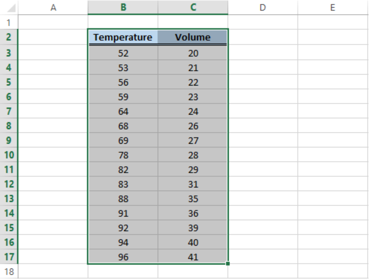 Figure 2. Sample data for curve fitting
- Click Insert tab > Scatter button > Scatter chart
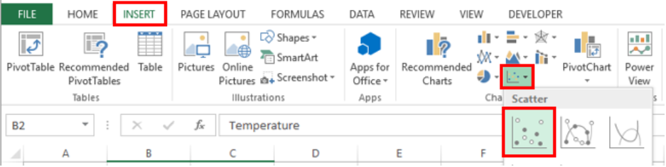 Figure 3. Scatter chart option
- A Scatter plot will be created, and the Design tab will appear in the toolbar under Chart Tools.
- Click Add Chart Element > Trendline > More Trendline Options
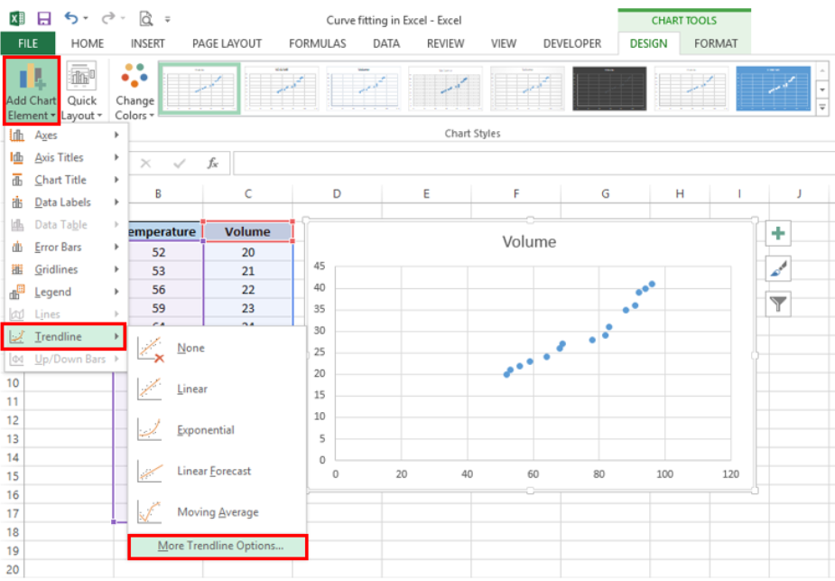 Figure 4. Add Trendline options
- In the Format Trendline window, select Polynomial and set the Order to “2”
- Check the option for “Display Equation on chart”.
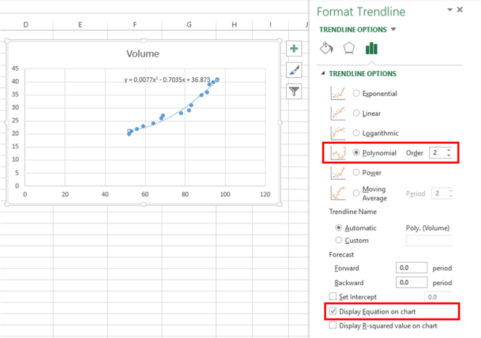 Figure 5. Format Trendline dialog box
Excel will instantly add the best fit curve for our data, and display the polynomial equation on the chart. We can add the R-squared value as a measure of how close our data points are to the regression line. We simply have to check the option for “Display R-squared value on chart”.
In curve fitting, we want the R-squared value to be as close to the value of 1 as possible. The image below shows our scatter plot with a polynomial trendline to the order of 2. The R-squared value is “0.9759”.
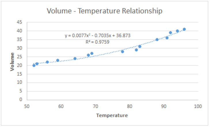 Figure 6. Output: How to fit a curve
Customize the best fit curve
We can further customize our chart by adding axis titles, adjusting the minimum axis values and highlighting the best fit curve by changing the color.
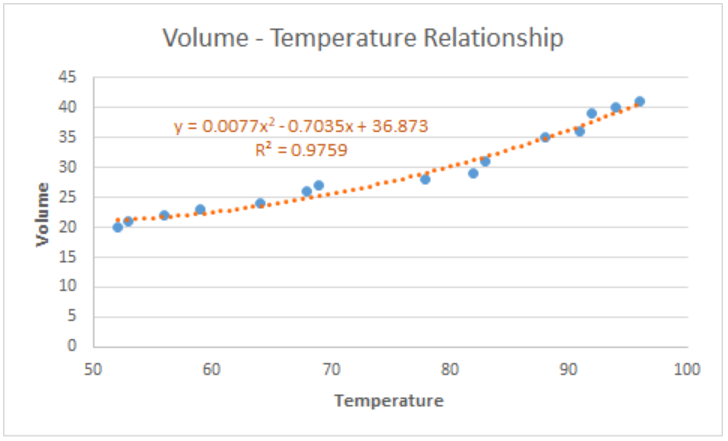 Figure 7. Output: Customize best fit curve
Note:
We can opt to add a linear trendline instead, but a linear curve fit is not the best fit for our data. As shown below, several data points fall far from the linear trendline.
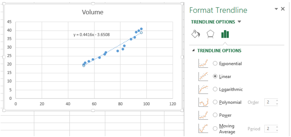 Figure 8. Linear curve fit
Instant Connection to an Excel Expert
Most of the time, the problem you will need to solve will be more complex than a simple application of a formula or function. If you want to save hours of research and frustration, try our live Excelchat service! Our Excel Experts are available 24/7 to answer any Excel question you may have. We guarantee a connection within 30 seconds and a customized solution within 20 minutes.