
Excel for Microsoft 365 Word for Microsoft 365 Outlook for Microsoft 365 PowerPoint for Microsoft 365 Excel for Microsoft 365 for Mac Word for Microsoft 365 for Mac Outlook for Microsoft 365 for Mac PowerPoint for Microsoft 365 for Mac Excel for the web Excel 2021 Word 2021 Outlook 2021 PowerPoint 2021 Excel 2021 for Mac Word 2021 for Mac Outlook 2021 for Mac PowerPoint 2021 for Mac Excel 2019 Word 2019 Outlook 2019 PowerPoint 2019 Excel 2019 for Mac Word 2019 for Mac Outlook 2019 for Mac PowerPoint 2019 for Mac Excel 2016 Word 2016 Outlook 2016 PowerPoint 2016 Excel 2016 for Mac Excel 2013 Excel for iPad Excel for iPhone Excel 2010 Excel 2007 More…Less
A histogram is a column chart that shows frequency data.
Note: This topic only talks about creating a histogram. For information on Pareto (sorted histogram) charts, see Create a Pareto chart.
-
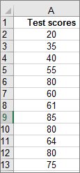
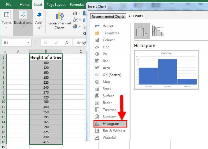
Select your data.
(This is a typical example of data for a histogram.)

-
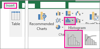
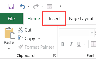
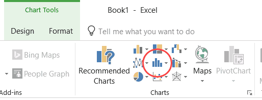
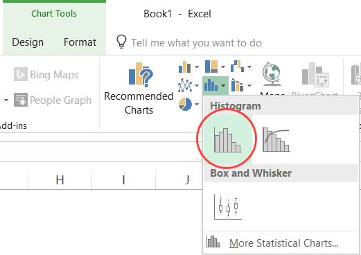
Click Insert > Insert Statistic Chart > Histogram.
You can also create a histogram from the All Charts tab in Recommended Charts.
Tips:
-
Use the Design and Format tabs to customize the look of your chart.
-
If you don’t see these tabs, click anywhere in the histogram to add the Chart Tools to the ribbon.

-
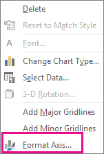
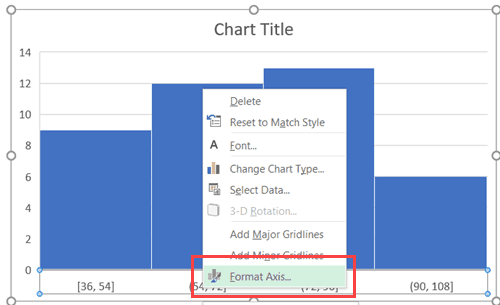
Right-click the horizontal axis of the chart, click Format Axis, and then click Axis Options.
-
Use the information in the following table to decide which options you want to set in the Format Axis task pane.
Option
Description
By Category
Choose this option when the categories (horizontal axis) are text-based instead of numerical. The histogram will group the same categories and sum the values in the value axis.
Tip: To count the number of appearances for text strings, add a column and fill it with the value “1”, then plot the histogram and set the bins to By Category.
Automatic
This is the default setting for histograms. The bin width is calculated using Scott’s normal reference rule.
Bin width
Enter a positive decimal number for the number of data points in each range.
Number of bins
Enter the number of bins for the histogram (including the overflow and underflow bins).
Overflow bin
Select this check box to create a bin for all values above the value in the box to the right. To change the value, enter a different decimal number in the box.
Underflow bin
Select this check box to create a bin for all values below or equal to the value in the box to the right. To change the value, enter a different decimal number in the box.
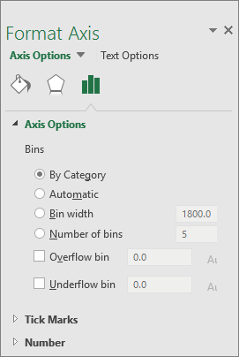
Automatic option (Scott’s normal reference rule)
Scott’s normal reference rule tries to minimize the bias in variance of the histogram compared with the data set, while assuming normally distributed data.
Overflow bin option
Underflow bin option
-
Make sure you have loaded the Analysis ToolPak. For more information, see Load the Analysis ToolPak in Excel.
-
On a worksheet, type the input data in one column, adding a label in the first cell if you want.
Be sure to use quantitative numeric data, like item amounts or test scores. The Histogram tool won’t work with qualitative numeric data, like identification numbers entered as text.
-
In the next column, type the bin numbers in ascending order, adding a label in the first cell if you want.
It’s a good idea to use your own bin numbers because they may be more useful for your analysis. If you don’t enter any bin numbers, the Histogram tool will create evenly distributed bin intervals by using the minimum and maximum values in the input range as start and end points.
-
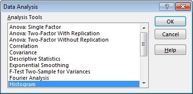
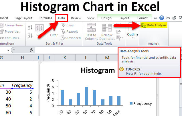
Click Data > Data Analysis.
-
Click Histogram > OK.
-
Under Input, do the following:
-
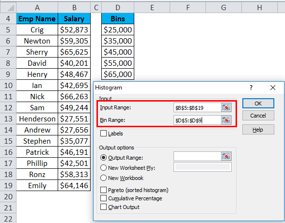
In the Input Range box, enter the cell reference for the data range that has the input numbers.
-
In the Bin Range box, enter the cell reference for the range that has the bin numbers.
If you used column labels on the worksheet, you can include them in the cell references.
Tip: Instead of entering references manually, you can click
to temporarily collapse the dialog box to select the ranges on the worksheet. Clicking the button again expands the dialog box.
-
-
If you included column labels in the cell references, check the Labels box.
-
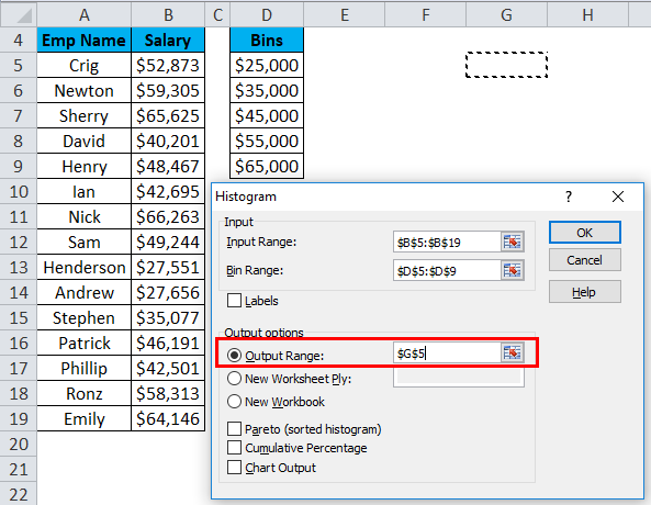
Under Output options, choose an output location.
You can put the histogram on the same worksheet, a new worksheet in the current workbook, or in a new workbook.
-
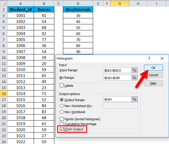
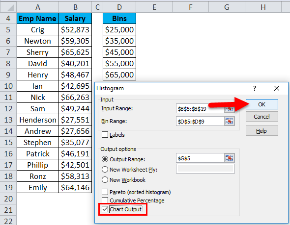
Check one or more of the following boxes:
Pareto (sorted histogram) This shows the data in descending order of frequency.
Cumulative Percentage
This shows cumulative percentages and adds a cumulative percentage line to the histogram chart.
Chart Output
This shows an embedded histogram chart. -
Click OK.
If you want to customize your histogram, you can change text labels, and click anywhere in the histogram chart to use the Chart Elements, Chart Styles, and Chart Filter buttons on the right of the chart.
 to temporarily collapse the dialog box to select the ranges on the worksheet. Clicking the button again expands the dialog box.
-
Select your data.
(This is a typical example of data for a histogram.)
-
Click Insert > Chart.
-
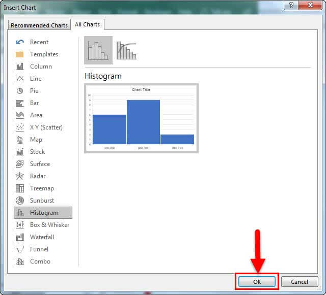
In the Insert Chart dialog box, under All Charts, click Histogram , and click OK.
Tips:
-
Use the Design and Format tabs on the ribbon to customize the look of your chart.
-
If you don’t see these tabs, click anywhere in the histogram to add the Chart Tools to the ribbon.
-
Right-click the horizontal axis of the chart, click Format Axis, and then click Axis Options.
-
Use the information in the following table to decide which options you want to set in the Format Axis task pane.
Option
Description
By Category
Choose this option when the categories (horizontal axis) are text-based instead of numerical. The histogram will group the same categories and sum the values in the value axis.
Tip: To count the number of appearances for text strings, add a column and fill it with the value “1”, then plot the histogram and set the bins to By Category.
Automatic
This is the default setting for histograms.
Bin width
Enter a positive decimal number for the number of data points in each range.
Number of bins
Enter the number of bins for the histogram (including the overflow and underflow bins).
Overflow bin
Select this check box to create a bin for all values above the value in the box to the right. To change the value, enter a different decimal number in the box.
Underflow bin
Select this check box to create a bin for all values below or equal to the value in the box to the right. To change the value, enter a different decimal number in the box.
Follow these steps to create a histogram in Excel for Mac:
-
Select the data.
(This is a typical example of data for a histogram.)
-
On the ribbon, click the Insert tab, then click
(Statistical icon) and under Histogram, select Histogram.
 (Statistical icon) and under Histogram, select Histogram.
Tips:
-
Use the Chart Design and Format tabs to customize the look of your chart.
-
If you don’t see the Chart Design and Format tabs, click anywhere in the histogram to add them to the ribbon.
To create a histogram in Excel 2011 for Mac, you’ll need to download a third-party add-in. See: I can’t find the Analysis Toolpak in Excel 2011 for Mac for more details.
In Excel Online, you can view a histogram (a column chart that shows frequency data), but you can’t create it because it requires the Analysis ToolPak, an Excel add-in that isn’t supported in Excel for the web.
If you have the Excel desktop application, you can use the Edit in Excel button to open Excel on your desktop and create the histogram.
-
Tap to select your data.
-
If you’re on a phone, tap the edit icon
to show the ribbon. and then tap Home. -
Tap Insert > Charts > Histogram.
If necessary, you can customize the elements of the chart.
 to show the ribbon. and then tap Home.
-
Tap to select your data.
-
If you’re on a phone, tap the edit icon
to show the ribbon, and then tap Home. -
Tap Insert > Charts > Histogram.
To create a histogram in Excel, you provide two types of data — the data that you want to analyze, and the bin numbers that represent the intervals by which you want to measure the frequency. You must organize the data in two columns on the worksheet. These columns must contain the following data:
-
Input data This is the data that you want to analyze by using the Histogram tool.
-
Bin numbers These numbers represent the intervals that you want the Histogram tool to use for measuring the input data in the data analysis.
When you use the Histogram tool, Excel counts the number of data points in each data bin. A data point is included in a particular bin if the number is greater than the lowest bound and equal to or less than the greatest bound for the data bin. If you omit the bin range, Excel creates a set of evenly distributed bins between the minimum and maximum values of the input data.
The output of the histogram analysis is displayed on a new worksheet (or in a new workbook) and shows a histogram table and a column chart that reflects the data in the histogram table.
Need more help?
You can always ask an expert in the Excel Tech Community or get support in the Answers community.
See Also
Create a waterfall chart
Create a Pareto chart
Create a sunburst chart in Office
Create a box and whisker chart
Create a treemap chart in Office
Need more help?
Watch Video – 3 Ways to Create a Histogram Chart in Excel
A histogram is a common data analysis tool in the business world. It’s a column chart that shows the frequency of the occurrence of a variable in the specified range.
According to Investopedia, a Histogram is a graphical representation, similar to a bar chart in structure, that organizes a group of data points into user-specified ranges. The histogram condenses a data series into an easily interpreted visual by taking many data points and grouping them into logical ranges or bins.
A simple example of a histogram is the distribution of marks scored in a subject. You can easily create a histogram and see how many students scored less than 35, how many were between 35-50, how many between 50-60 and so on.
There are different ways you can create a histogram in Excel:
- If you’re using Excel 2016, there is an in-built histogram chart option that you can use.
- If you’re using Excel 2013, 2010 or prior versions (and even in Excel 2016), you can create a histogram using Data Analysis Toolpack or by using the FREQUENCY function (covered later in this tutorial)
Let’s see how to make a Histogram in Excel.
Creating a Histogram in Excel 2016
Excel 2016 got a new addition in the charts section where a histogram chart was added as an inbuilt chart.
In case you’re using Excel 2013 or prior versions, check out the next two sections (on creating histograms using Data Analysis Toopack or Frequency formula).
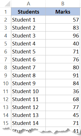
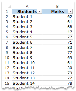
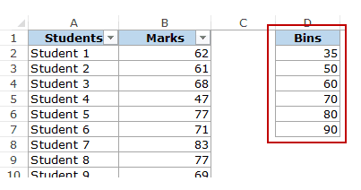
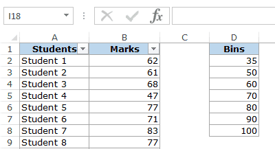
Suppose you have a dataset as shown below. It has the marks (out of 100) of 40 students in a subject.
Here are the steps to create a Histogram chart in Excel 2016:
- Select the entire dataset.
- Click the Insert tab.

- In the Charts group, click on the ‘Insert Static Chart’ option.

- In the HIstogram group, click on the Histogram chart icon.

The above steps would insert a histogram chart based on your data set (as shown below).
Now you can customize this chart by right-clicking on the vertical axis and selecting Format Axis.
This will open a pane on the right with all the relevant axis options.
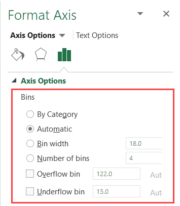
Here are some of the things you can do to customize this histogram chart:
- By Category: This option is used when you have text categories. This could be useful when you have repetitions in categories and you want to know the sum or count of the categories. For example, if you have sales data for items such as Printer, Laptop, Mouse, and Scanner, and you want to know the total sales of each of these items, you can use the By Category option. It isn’t helpful in our example as all our categories are different (Student 1, Student 2, Student3, and so on.)
- Automatic: This option automatically decides what bins to create in the Histogram. For example, in our chart, it decided that there should be four bins. You can change this by using the ‘Bin Width/Number of Bins’ options (covered below).
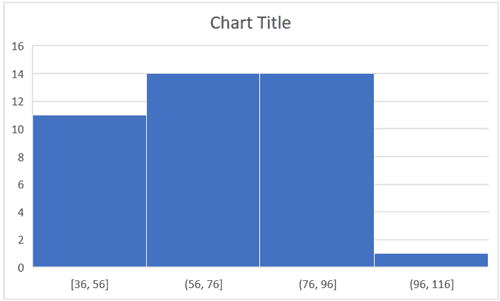
- Bin Width: Here you can define how big the bin should be. If I enter 20 here, it will create bins such as 36-56, 56-76, 76-96, 96-116.

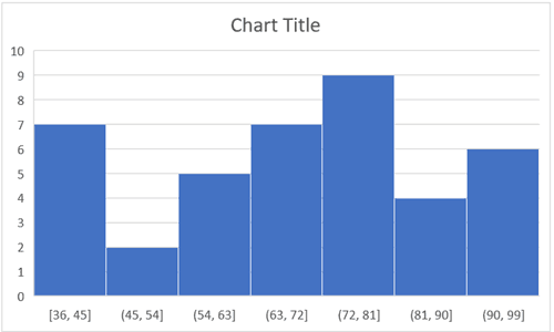
- Number of Bins: Here you can specify how many bins you want. It will automatically create a chart with that many bins. For example, if I specify 7 here, it will create a chart as shown below. At a given point, you can either specify Bin Width or Number of Bins (not both).

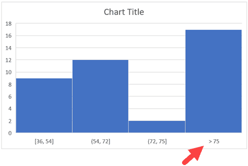
- Overflow Bin: Use this bin if you want all the values above a certain value clubbed together in the Histogram chart. For example, if I want to know the number of students that have scored more than 75, I can enter 75 as the Overflow Bin value. It will show me something as shown below.

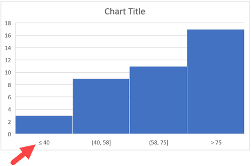
- Underflow Bin: Similar to Overflow Bin, if I want to know the number of students that have scored less than 40, I can enter 4o as the value and show a chart as shown below.

Once you have specified all the settings and have the histogram chart you want, you can further customize it (changing the title, removing gridlines, changing colors, etc.)
Creating a Histogram Using Data Analysis Tool pack
The method covered in this section will also work for all the versions of Excel (including 2016). However, if you’re using Excel 2016, I recommend you use the inbuilt histogram chart (as covered below)
To create a histogram using Data Analysis tool pack, you first need to install the Analysis Toolpak add-in.
This add-in enables you to quickly create the histogram by taking the data and data range (bins) as inputs.
Installing the Data Analysis Tool Pack
To install the Data Analysis Toolpak add-in:
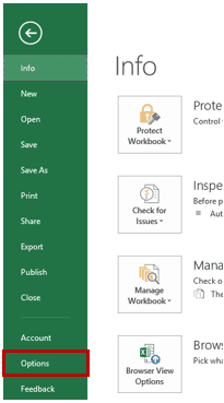
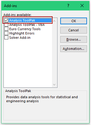
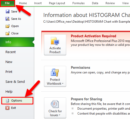
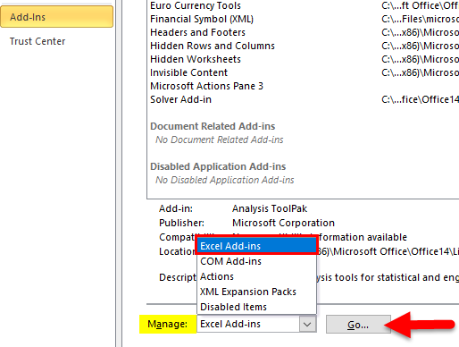
- Click the File tab and then select ‘Options’.
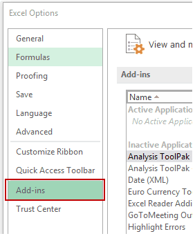
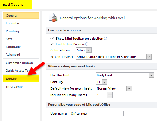
- In the Excel Options dialog box, select Add-ins in the navigation pane.
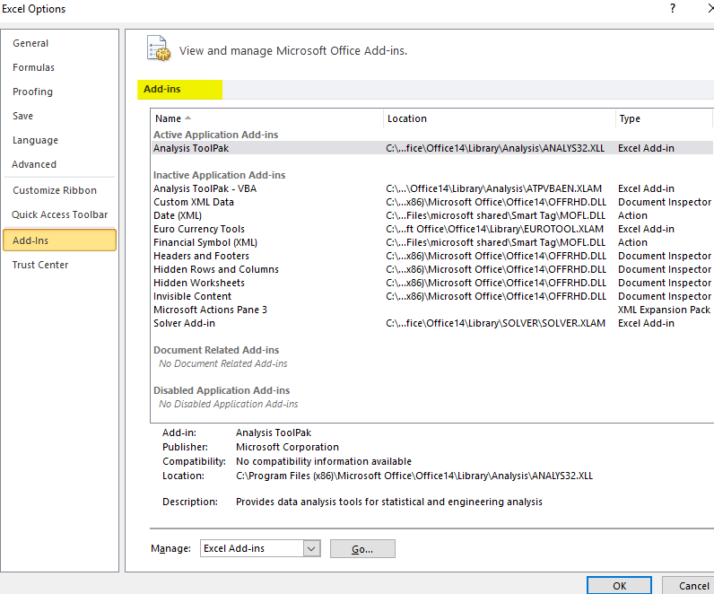
- In the Manage drop-down, select Excel Add-ins and click Go.
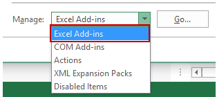
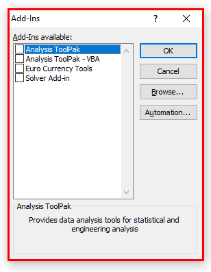
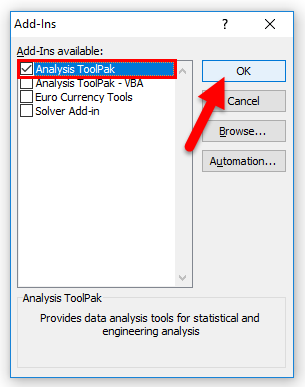
- In the Add-ins dialog box, select Analysis Toolpak and click OK.
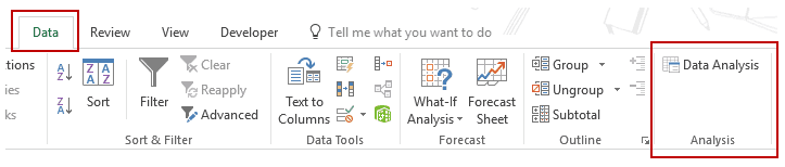
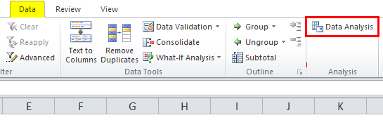
This would install the Analysis Toolpak and you can access it in the Data tab in the Analysis group.
Creating a Histogram using Data Analysis Toolpak
Once you have the Analysis Toolpak enabled, you can use it to create a histogram in Excel.
Suppose you have a dataset as shown below. It has the marks (out of 100) of 40 students in a subject.
To create a histogram using this data, we need to create the data intervals in which we want to find the data frequency. These are called bins.
With the above dataset, the bins would be the marks intervals.
You need to specify these bins separately in an additional column as shown below:
Now that we have all the data in place, let’s see how to create a histogram using this data:
- Click the Data tab.
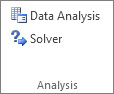
- In the Analysis group, click on Data Analysis.
- In the ‘Data Analysis’ dialog box, select Histogram from the list.
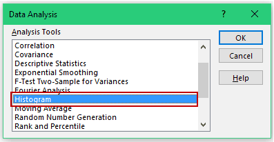
- Click OK.
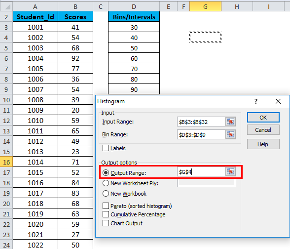
- In the Histogram dialog box:
- Select the Input Range (all the marks in our example)
- Select the Bin Range (cells D2:D7)
- Leave the Labels checkbox unchecked (you need to check it if you included labels in the data selection).
- Specify the Output Range if you want to get the Histogram in the same worksheet. Else, choose New Worksheet/Workbook option to get it in a separate worksheet/workbook.
- Select Chart Output.
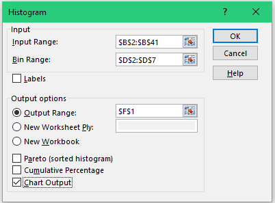
- Click OK.
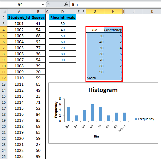
This would insert the frequency distribution table and the chart in the specified location.
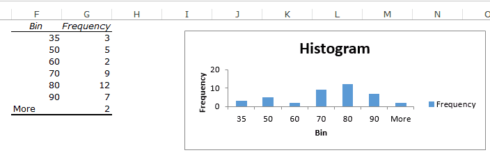
Now there are some things you need to know about the histogram created using the Analysis Toolpak:
- The first bin includes all the values below it. In this case, 35 shows 3 values indicating that there are three students who scored less than 35.
- The last specified bin is 90, however, Excel automatically adds another bin – More. This bin would include any data point which lies after the last specified bin. In this example, it means that there are 2 students who have scored more than 90.
- Note that even if I add the last bin as 100, this additional bin would still be created.
- This creates a static histogram chart. Since Excel creates and pastes the frequency distribution as values, the chart would not update when you change the underlying data. To refresh it, you’ll have to create the histogram again.
- The default chart is not always in the best format. You can change the formatting like any other regular chart.
- Once created, you can not use Control + Z to revert it. You’ll have to manually delete the table and the chart.
If you create a histogram without specifying the bins (i.e., you leave the Bin Range empty), it would still create the histogram. It would automatically create six equally spaced bins and used this data to create the histogram.
Creating a Histogram using FREQUENCY Function
If you want to create a histogram that is dynamic (i.e., updates when you change the data), you need to resort to formulas.
In this section, you’ll learn how to use the FREQUENCY function to create a dynamic histogram in Excel.
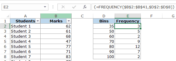
Again, taking the student’s marks data, you need to create the data intervals (bins) in which you want to show the frequency.
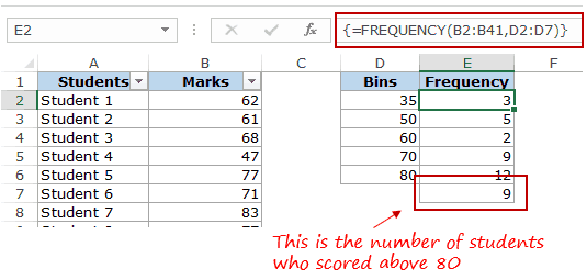
Here is the function that will calculate the frequency for each interval:
=FREQUENCY(B2:B41,D2:D8)
Since this is an array formula, you need to use Control + Shift + Enter, instead of just Enter.
Here are the steps to make sure you get the correct result:
- Select all cells adjacent to the bins. In this case, these are E2:E8.
- Press F2 to get into the edit mode for cell E2.
- Enter the frequency formula: =FREQUENCY(B2:B41,D2:D8)
- Hit Control + Shift + Enter.
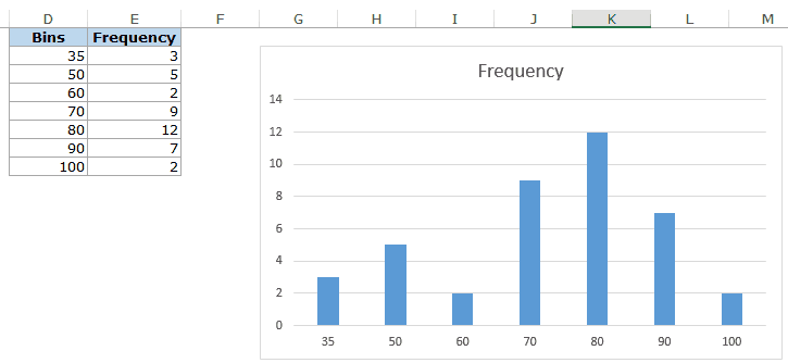
With the result that you get, you can now create a histogram (which is nothing but a simple column chart).
Here are some important things you need to know when using the FREQUENCY function:
- The result is an array and you can not delete a part of the array. If you need to, delete all the cells that have the frequency function.
- When a bin is 35, the frequency function would return a result that includes 35. So 35 means score up to 35, and 50 would mean score more than 35 and up to 50.
Also, let’s say you want to have the specified data intervals till 80, and you want to group all the result above 80 together, you can do that using the FREQUENCY function. In that case, select one more cell than the number of bins. For example, if you have 5 bins, then select 6 cells as shown below:
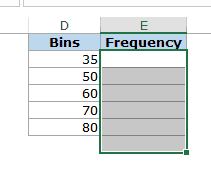
FREQUENCY function would automatically calculate all the values above 80 and return the count.
You May Also Like the Following Excel Tutorials:
- Creating a Pareto Chart in Excel.
- Creating a Gantt Chart in Excel.
- Creating a Milestone Chart in Excel.
- How to Make a Bell Curve in Excel.
- How to Create a Bullet Chart in Excel.
- How to Create a Heat Map in Excel.
- Standard Deviation in Excel.
- Area Chart in Excel.
- Advanced Excel Charts.
- Creating Excel Dashboards.
![]()
Download Article
![]()
Download Article
This wikiHow teaches you how to create a histogram bar chart in Microsoft Excel. A histogram is a column chart that displays frequency data, allowing you to measure things like the number of people who scored within a certain percentage on a test.
-
1
Open Microsoft Excel. Its app icon resembles a white «X» on a green background. You should see the Excel workbook page open.
- On a Mac, this step may open a new, blank Excel sheet. If so, skip the next step.
-
2
Create a new document. Click Blank workbook in the upper-left corner of the window (Windows), or click File and then click New Workbook (Mac).
Advertisement
-
3
Determine both your smallest and your largest data points. This is important in helping figure out what your bin numbers should be and how many you should have.
- For example, if your data range stretches from 17 to 225, your smallest data point would be 17 and the largest would be 225.
-
4
Determine how many bin numbers you should have. Bin numbers are what sort your data into groups in the histogram. The easiest way to come up with bin numbers is by dividing your largest data point (e.g., 225) by the number of points of data in your chart (e.g., 10) and then rounding up or down to the nearest whole number, though you rarely want to have more than 20 or less than 10 numbers. You can use a formula to help if you’re stuck:[1]
- Sturge’s Rule — The formula for this rule is K = 1 + 3.322 * log(N) where K is the number of bin numbers and N is the number of data points; once you solve for K, you’ll round up or down to the nearest whole number. Sturge’s Rule is best used for linear or «clean» sets of data.
- Rice’s Rule — The formula for this rule is cube root (number of data points) * 2 (for a data set with 200 points, you would find the cube root of 200 and then multiply that number by 2). This formula is best used for erratic or inconsistent data.
-
5
Determine your bin numbers. Now that you know how many bin numbers you have, it’s up to you to figure out the most even distribution. Bin numbers should increase in a linear fashion while including both the lowest and the highest data points.
- For example, if you were creating bin numbers for a histogram documenting test scores, you would most likely want to use increments of 10 to represent the different grading brackets. (e.g., 59, 69, 79, 89, 99).
- Increasing in sets of 10s, 20s, or even 100s is fairly standard for bin numbers.
- If you have extreme outliers, you can either leave them out of your bin number range or tailor your bin number range to be low/high enough to include them.
-
6
Add your data in column A. Type each data point into its own cell in column A.
- For example, if you have 40 pieces of data, you would add each piece to cells A1 through A40, respectively.
-
7
Add your bin numbers in column C if you’re on a Mac. Starting in cell C1 and working down, type in each of your bin numbers. Once you’ve completed this step, you can proceed with actually creating the histogram.
- You’ll skip this step on a Windows computer.


Advertisement
-
1
Select your data. Click the top cell in column A, then hold down ⇧ Shift while clicking the last column A cell that contains data.
-
2
Click the Insert tab. It’s in the green ribbon that’s at the top of the Excel window. Doing so switches the toolbar near the top of the window to reflect the Insert menu.
-
3
Click Recommended Charts. You’ll find this option in the «Charts» section of the Insert toolbar. A pop-up window will appear.
-
4
Click the All Charts tab. It’s at the top of the pop-up window.
-
5
Click Histogram. This tab is on the left side of the window.
-
6
Select the Histogram model. Click the left-most bar chart icon to select the Histogram model (rather than the Pareto model), then click OK. Doing so will create a simple histogram with your selected data.
-
7
Open the horizontal axis menu. Right-click the horizontal axis (e.g., the axis with numbers in brackets), click Format Axis… in the resulting drop-down menu, and click the bar chart icon in the «Format Axis» menu that appears on the right side of the window.
-
8
Check the «Bin width» box. It’s in the middle of the menu.[2]
-
9
Enter your bin number interval. Type into the «Bin width» text box the value of an individual bin number, then press ↵ Enter. Excel will automatically format the histogram to display the appropriate number of columns based on your bin number.
- For example, if you decided to use bins that increase by 10, you would type in 10 here.
-
10
Label your graph. This is only necessary if you want to add titles to your graph’s axes or the graph as a whole:
- Axis Titles — Click the green + to the right of the graph, check the «Axis Titles» box, click an Axis Title text box on the left or the bottom of the graph, and type in your preferred title.
- Chart Title — Click the Chart Title text box at the top of the histogram, then type in the title that you want to use.
-
11
Save your histogram. Press Ctrl+S, select a save location, enter a name, and click Save.


Advertisement
-
1
Select your data and the bins. Click the top value in cell A to select it, then hold down ⇧ Shift while clicking the C cell that’s across from the bottom-most A cell that has a value in it. This will highlight all of your data and the corresponding bin numbers.
-
2
Click Insert. It’s a tab in the green Excel ribbon at the top of the window.
-
3
Click the bar chart icon. You’ll find this in the «Charts» section of the Insert toolbar. Doing so will prompt a drop-down menu.
-
4
Click the «Histogram» icon. It’s the set of blue columns below the «Histogram» heading. This will create a histogram with your data and bin numbers.
- Be sure not to click the «Pareto» icon, which resembles blue columns with an orange line.
-
5
Review your histogram. Before saving, make sure that your histogram looks accurate; if not, consider adjusting the bin numbers and redoing the histogram.
-
6
Save your work. Press ⌘ Command+S, enter a name, select a save location if necessary, and click Save.


Advertisement
Add New Question
-
Question
The histograms I’m trying to represent have different class widths represented as different width blocks, and they are not replicating. How do I get different class widths?

You need to go to Setting > Option >Class and then choose your class.
Ask a Question
200 characters left
Include your email address to get a message when this question is answered.
Submit
Advertisement
-
Bins can be as wide or as narrow as you think they should be, so long as they both fit the data and don’t exceed the reasonable number of bins for your data set.
Thanks for submitting a tip for review!
Advertisement
-
Make sure your histogram makes sense before drawing any conclusion from it.
Advertisement
About This Article
Thanks to all authors for creating a page that has been read 1,249,784 times.
Is this article up to date?
How to Make a Histogram in Excel – and Adjust Bin Size (2023)
We love how simple it is to create charts in Excel.
Like all others, making a histogram in Excel is similarly easy and fun. It helps you with data analysis, frequency distribution, and much more. 🎯
You can plot your data (very large ones, too) into a histogram in literally under a few seconds.
To learn what is a histogram, and how can you make and edit it in different ways – continue reading the article below.
Download our free sample workbook here to get your hands on a dataset to practice.
What is a histogram?
Before we narrate long and wordy definitions of what a histogram is, let’s just see what it looks like.

Safe to say a histogram is more like a column/bar chart with each bar representing some numerical data. 📶
In a histogram, each bar represents a certain range for example 1-10, 11- 20, and so on. Excel calls this graphical representation of ranges ‘bins’.
On the y-axis (vertical axis), we plot the number of occurrences of that range in our dataset. Each bar represents the number of data points we have for each range in our data set.
How to create a histogram in Excel
Making a histogram in Excel is surprisingly easy as Excel offers an in-built histogram chart type.
To quickly see how you can make one, consider the data below.

We have a group of children of different ages. A histogram can help us subgroup them based on their ages.
- Select the dataset.

- Go to the Insert Tab > Charts > Recommended Charts.

- Select the tab “All Charts”.

- Click on “Histogram” and choose the first chart type.

And here comes a histogram for your data.

Excel has plotted age groups ( 7 to 17 years, 18 to 28 years, and so on) on the x-axis. The numbers are allocated on the y-axis.
The first bar (for 7 to 17 years) touches 2 on the y-axis. This tells that our dataset has 2 people that fall within this age range.
Kevin (15 years old) and Betty (7 years old). 👩🏼🤝👩🏼

And so, you can readily see how many people we have in each age range.
Pro Tip!
You can also create a histogram chart through Excel’s Analysis Toolpak kit.
You can access it under the Data Tab > Analysis Group > Data analysis.
How to adjust bin sizes/intervals
Excel calls the range (like the age range 7 to 17 years) a bin. This bin size (age range) doesn’t necessarily have to be 10 years. You can set it to any interval – 15, 20, 30, or any number of years.
But how can you do that? Learn it here.
The above graph has the bin size set to 10. To change the bin size:
- Double-click on the graph. This will launch the Format pane to the right of your worksheet.
- Go to Horizontal Axis from the drop-down menu of options as shown below.

- Click on the icon for Axis.

Here you have the option for Bin Width.
- Change it to any value as desired.
For example, let’s set it to 15.

Your histogram takes a whole new look like that.
Note how the bin sizes (age ranges) have now changed to 7 to 22 years, 22 to 37 years, and so on.
Why does the range start from 7 only and not a round number like maybe 5 or 0? 🤔
Take a quick look at our data set for this histogram. The smallest data point (age) that we have is 7, and so, that is where the range starts.
Adjust the Number of Bins
In addition to the Bin size, you can also adjust the number of bins.
In this case, you fix the number of bins (bars) that you need on the graph, and Excel calculates the bin size itself.
- To do so, check the option for “Number of Bins”.
- Set the “Number of Bins” to any number.
We have set it to 6.

And there you have 6 bins to your graph now. Excel has automatically set the bin size to 10.1666.
But the bin size on the horizontal axis is now weird. Excel has taken the decimal places too far.
- To adjust this, go to the Number menu just below.
- Set the category to “Numbers”.
- Turn the decimal places to 0 or any number as desired.

And you have your bin sizes adjusted.
How to add/remove spacing between bars
The histogram bars do not necessarily have to be of a certain width under the default chart type.
You can change the gap between bars (which will change the bin width, too) just as you like.
- Select the histogram and double-click it.
- From the format pane, go to “Series Ages” from the drop-down menu of options as shown below.

- Click on the icon for Axis.
Here you have the option for Gap Width.

- Increase the percentage as desired.
For example, let’s set it to 200%.

The gap width increases between the bars and the bars are narrowed down.
In Excel-language, 1 means TRUE. 0 means FALSE.
That’s it – Now what?
You must have enjoyed the ease and simplicity of creating histogram charts in Excel. 🥳
The guide above explains how you can quickly pull off a histogram in Excel out of any dataset. And then, how can you edit it to fix the size/number of bins in it and the gap width between bars?
Honestly, this is not even an iota of what Excel has to offer. There’s so much more for you to learn.
Especially the VLOOKUP, SUMIF, and IF functions of Excel – you just cannot let go of these functions.
Hop on here to get access to my 30-minute free email course to learn these and many more functions of Excel.
Kasper Langmann2023-02-23T14:44:31+00:00
Page load link
A histogram Excel chart is a data analysis chart used to represent histogram data. In Excel 2016 and older versions, this chart is built-in in Excel. While for previous versions, we used to make this chart manually by using the cumulative frequency method. In the histogram chart, the data comparison is classified into ranges.
In layman’s terms, it is a graphical representation of data using bars of different heights. For example, a histogram chart in Excel is like a bar chart except that it groups numbers into ranges, unlike individual values in a bar chart.
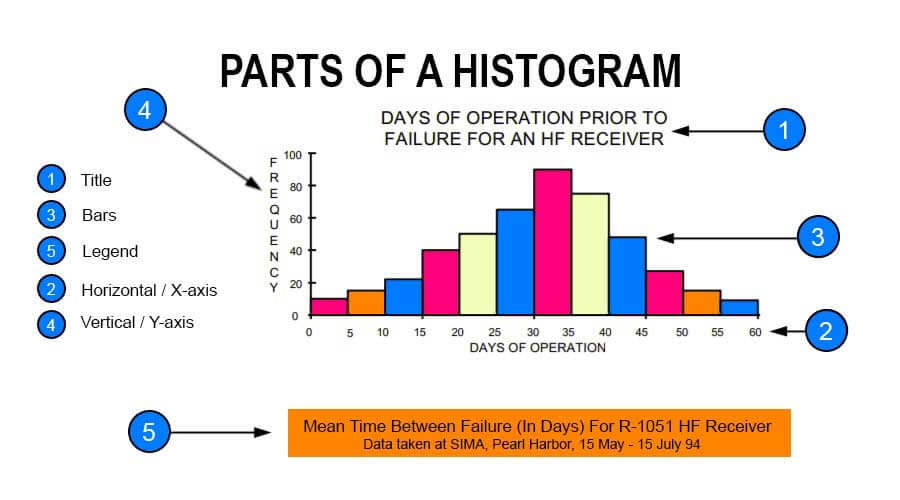
A histogram in Excel comprises five parts: “Title,” “Horizontal,” “Bars” (height and width), “Vertical,” and “Legend.”
- The title describes the information about the histogram.
- (Horizontal) X-axis grouped intervals (and not the individual points).
- Bars have a height and width. The height represents the number of times the set of values within an interval occurred. The width represents the length of the interval covered by the bar.
- (Vertical) Y-axis is the scale that shows you the frequency of the values within an interval.
- Legend describes additional information about the measurements.
Refer to the image given below to understand better. It shows a sample histogram with each component highlighted.
Table of contents
- Histogram in Excel
- Purpose of a Histogram in Excel
- How to Make a Histogram Chart in Excel?
- Different shapes of Histogram Chart in Excel
- Steps to Create a Histogram in Excel
- Examples
- Example #1 – Height of Apple Trees
- Example #2 – Set of Negative and Positive Values
- Pros
- Cons
- Things to Remember
- Histogram Excel Chart Video
- Recommended Articles
Purpose of a Histogram in Excel
The purpose of the histogram chart in Excel is to roughly assess the probability distribution of a given variable by showing the frequencies of observations occurring in a certain range of values.
How to Make a Histogram Chart in Excel?
- Divide the entire range of values into a series of intervals.
- Count how many values fall into each interval.
- The buckets are generally specified as consecutive, non-overlapping intervals of a variable. They must be adjacent and may be of equal size.
- As the adjacent bins are continuous without gaps, the rectangles of a histogram touch each other to indicate that the original variable is continuous.
Different shapes of Histogram Chart in Excel
- Bell-shaped
- Bimodal
- Skewed right
- Skewed left
- Uniform
- Random
Steps to Create a Histogram in Excel
Following are the steps to create a histogram in Excel:
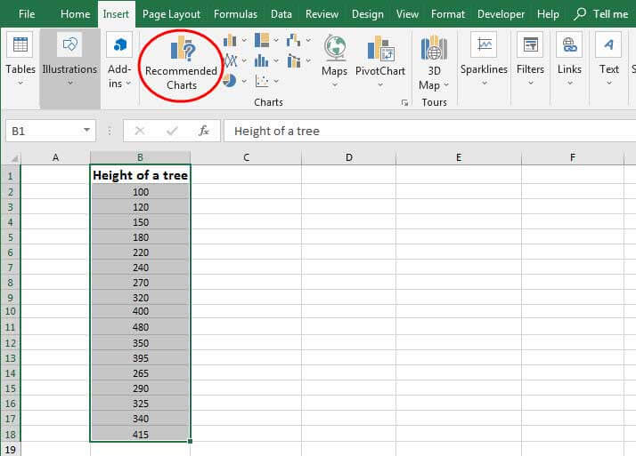
- The first step to building a histogram in Excel is to select the range of cells containing the data to be presented using the histogram. Then, it would be the input for the histogram.

- Click on “Recommended Charts,” as shown in the below figure.

- Select “Histogram” from the presented list.
- Click “OK.”

Examples
A histogram chart in Excel is simple and easy to use. Let us understand working with some examples.
You can download this Histogram Chart Excel Template here – Histogram Chart Excel Template
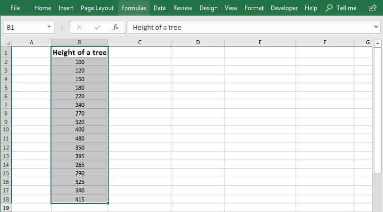
Example #1 – Height of Apple Trees

As shown in the above figure screenshot, the data is about the height of apple trees. The total number of trees is 17. The X-axis of the histogram in Excel shows the height range in cm. The Y-axis indicates trees. The chart shows three bars. One for the range 100-250 cm, the second for the range of 250-400, and the third for the range 400 – 550. So, the width of a bar is 150. So, the readings are in cm. The vertical axis (Y) shows the number of trees under a given range. E.g6 trees are in the range 100-250, 9 trees are in the range 250-400, and 2 trees are in the range 400-550. The legend is the height of the tree represented by green color. So, the bars indicate different heights in cm for the recorded trees.
Example #2 – Set of Negative and Positive Values
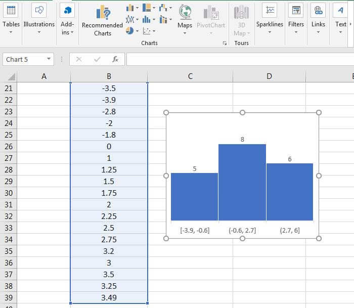
As shown in the above example, the dataset contains positive and negative values. Here also, Excel auto-calculated the range, which is 3.3. The total number of values in the dataset is 19. The 3 bars indicate three different ranges and the total number of input values falling under each range. 5 values are [-3.9, -0.6], 8 values range from -0.6 to 2.7, and 6 values range from 2.7 to 6.
Pros
- The histogram chart in Excel is useful where the entities to be measured can be presented in ranges such as height, weight, scales, frequencies, etc.
- They give a rough idea of the density of the underlying data distribution and often for density estimation.
- They are also used to estimate the underlying variable’s probability density function.
- Different intervals can expose various features of the input data in the histogram in Excel.
Cons
- A histogram chart in Excel can present data that is misleading.
- Too many blocks can make your analysis tough, while a few can miss out on important data.
- A histogram in Excel is not useful for showcasing discrete/categorized entities.
Things to Remember
- The histograms are based on the area and not the height of bars.
- It is a column-based chart that shows frequency data and is useful for depicting continuous data.
- While working on the histograms, one must ensure that the bins are not too small or too large. However, doing so might lead to incorrect observations.
- There is no “ideal” number of bins, and different bin sizes reveal various data features.
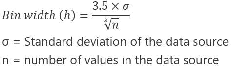
- The number of bins k can be assigned directly or can be calculated from a suggested bin width that has:
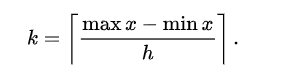
The braces indicate the Ceiling Function in ExcelThe CEILING function is very similar to the FLOOR function in terms of functionality. However, the result is the polar opposite, with the floor function giving a less significant result. The ceiling formula, on the other hand, gives result with a higher significance.read more.
![]() which takes the square root of the number of data points in the sample.
which takes the square root of the number of data points in the sample.
Histogram Excel Chart Video
Recommended Articles
This article is a guide to Histogram Chart in Excel. Here, we discuss its uses and how to create a histogram in Excel, along with Excel examples and downloadable Excel templates. You may also look at these useful functions in Excel: –
- How to Create a Wizard Chart in Excel?
- Histogram Formula
- Divide in Excel Formula
- ODD Function in Excel
A histogram is a popular chart for data analysis in Excel. It is similar to a column chart and is used to present the distribution of values in specified ranges.
Excel provides a few different methods to create a histogram. In this article, we’ll show you two different methods and explain the advantages and disadvantages of each method.
We’ll cover:
- What is a histogram?
- How is a histogram different from a column chart?
- How to create a histogram in Excel with the histogram chart
- How to create a histogram in Excel using a formula
So, let’s dive in.
1. What is a histogram?
A histogram is a chart that shows the frequency distribution of a set of values. The frequency distribution of these values are arranged into specified ranges known as bins.
Examples of using a histogram include grouping performance scores into ranges, grouping values into ranges of years, or survey responses grouped into age brackets. A histogram is a type of data visualization. You can learn all about what data visualization is in this guide, and see some data visualization examples here.
2. How is a histogram different to a column chart?
A histogram is very similar to a column chart, but they are not exactly the same. A few differences between the two charts include:
- The purpose of a histogram is to present frequency distribution e.g., the count of exam scores grouped into ranges. Column charts compare values e.g., the total sales value of six different products.
- The X axis of a histogram must be in order of its size e.g., 1-5, 6-10, 11-15. A column chart does not need to be in a specific order. The order depends on its purpose.
- The X axis is formed of intervals or bins in a histogram. A column chart typically has text values in this axis, such as names of cities.
- There are no gaps between the columns of a conventional histogram.
- 100% of the values in a data set must be included in a histogram. A column chart could be used to compare only the top 5 products.
3. How to create a histogram in Excel with the histogram chart
The first method to create a histogram in Excel is to use the built-in histogram chart.
This chart is available in Excel 2016 and later, so if you have an earlier version of Excel, you can follow the second method provided in this post.

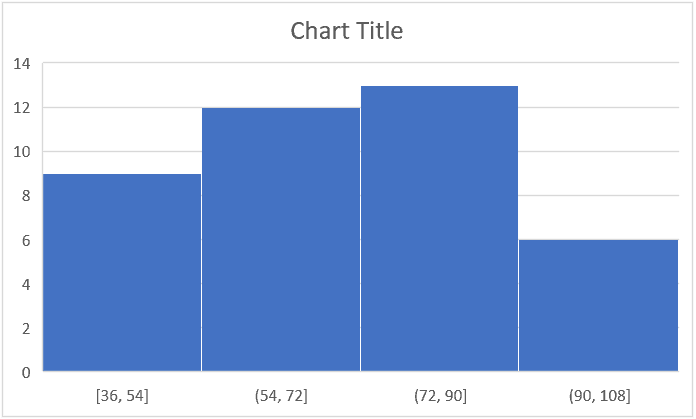
There are 41 scores in this data, and we want to create a histogram that distributes the scores over intervals of 10 starting from the score of 40, and ending with 100 (the maximum score).
- Select range A1:B42.
- Click Insert > Insert Statistic Chart > Histogram.

The following histogram is inserted. It has grouped the scores into four bins.

This is nothing like what we require, so we need to edit the axis options.
- Right click on the category axis (x-axis) and click Format Axis.
- Click the Axis Options category.
- Type 40 for the Underflow bin. This is the score that the bins will start from.
- Type 90 for the Overflow bin. Scores of 91 or above will be included in this final bin.
- Specify a Bin width of 10. This creates bins in intervals of 10 from 40.

An alternative to specifying a bin width would be to use the option to specify the number of bins required.

The histogram is now looking good.

An important thing to know is that the upper value of a bin is included, and the lower value is not (except for the first bin).
So, if there is a score of 60, this is included in the (50, 60] bin and not the (60, 70] bin. This is specified by the different brackets in the axis, but this is not clear to the reader.
Some general improvements can be made to the histogram chart, such as editing the chart title, adding data labels, and changing the colors of the columns.
These techniques are not covered in this article as our focus is on creating the histogram. There are many chart formatting options.

The advantages of using this method to create a histogram are that we do not need to prepare bins in advance or write complex formulas. It is all controlled by the built-in chart and the options available.
The disadvantages are that it is only available in Excel 2016 or later and that you are confined to the abilities of the built-in chart. It lacks versatility.
4. How to create a histogram using a formula in Excel
Using a formula to count the occurrences in each bin provides more flexibility for your histogram. This is my preferred method and also works in all versions of Excel.
This method involves inserting a column chart instead of the histogram option and then formatting it to look like a conventional histogram.
We will use the same exam score data used in the previous example, but two of the scores have been changed to less than 40.
First we need to create the source data for our chart. This is the bins and the frequency of exam scores in each of those bins.
The following image shows the source created in this example. The bins are typed into range G4:G10 and the COUNTIFS function is used to count the occurrences of the scores for each bin.
=COUNTIFS($B$2:$B$42,”>=”&E4,$B$2:$B$42,”<=”&F4)
The values in ranges E4:E10 and F4:F10 have been used to assist the COUNTIFS function. It makes it easier to change if the size of the bins changes in the future. These columns will be hidden as nobody wants to see them.

To create the histogram:
- Select range G4:H10
- Click Insert > Insert Column or Bar Chart > Clustered Column.

The following column chart is inserted. It looks great already, but we will make some general improvements and then remove the gap between each column.

3. I have made the following changes to the column chart.
- Edited the chart title to “Exam Score Distribution”
- Formatted the columns to a green colour
- Removed the value axis (y-axis)
- Removed the horizontal gridlines
- Added data labels above each column

4. To remove the gap between each column, right click on one of the columns and click Format Data Series.

5. From the Format Data Series pane, Click the Series Options category and change the Gap Width to 0.

The gap between the column is removed making it look like a typical histogram.

By creating our own bins, this method provided more flexibility for our histogram. The first bin is for scores less than 40. And then the bins are in intervals of 10. The rigidity of the built-in histogram chart prevents this freedom.
This chart is also very easy to change in the future, as we just need to edit the values in the cells of the source data.
Finally, because the category axis (x-axis) is generated from range G4:G10, we were able to make it appear how we wanted.
Final thoughts
Histograms are used to present the distribution of data arranged in intervals, known as bins. There are a few different methods to create a histogram in Excel. The method you choose will depend on your data, the level of flexibility required and how often your data changes.
For a hands-on introduction to the field of data analytics, try out this free five-day short course. And, for more Excel tutorials, check out the following:
- How to use the IFERROR function in Excel
- How to use the COUNTIFS function in Excel
- Convert text to numbers in Excel (4 methods)
Histogram chart (Table of Contents)
- Histogram in Excel
- Why is the histogram chart important in excel?
- Types/Shapes of the Histogram chart
- Where is the Histogram chart found?
- How to Create a Histogram Chart in Excel?
Histogram in Excel
Histogram Chart in excel is a data analysis tool used to show the periodic rise and drop in the data with the help of vertical columns. We can find the Histogram chart option if we are using Excel 2016, but for the older version MS Excel such as 2013 and 2010, we need to find this option in the Data Analysis option, which is available under the Data Analysis option.
Uses of Histogram Chart in Excel
A histogram is a graphical representation of the distribution of numerical data. A histogram is a column chart that shows the frequency of data in a certain range in a simpler way. It provides the visualization of numerical data by using the number of data points that fall within a specified range of values (also called “bins”).
A histogram chart in excel is classified or made up of 5 parts:
- Title: The title describes the information about the histogram.
- X-axis: The X-axis is the grouped interval that shows the scale of values in which the measurements lie.
- Y-axis: The Y-axis is the scale that shows the number of times that the values occurred within the intervals set corresponds to the X-axis.
- The bars: This parameter has a height and width. The height of the bar shows the number of times that the values occurred within the interval. The width of the bars shows the interval or distance, or area that is covered.
- Legend: This provides additional information about measurements.
Why is the histogram chart important in Excel?
There are many benefits to using a Histogram chart in excel.
- The histogram chart shows the visual representation of data distribution.
- Histogram chart displays a large amount of data and the occurrence of data values.
- Easy to determine the median and data distribution.
Types/Shapes of Histogram Chart
It depends on the distribution of data; the histogram can be of the following type:
- Normal Distribution
- A Bimodal Distribution
- A Right Skewed Distribution
- A Left Skewed Distribution
- A Random Distribution
Now we will explain one by one the shapes of the Histogram chart in excel.
Normal Distribution:
It is also known as bell-shaped distribution. In a normal distribution, the points are as likely to occur on one side of the average as on another side. This looks like the below image:

A Bimodal Distribution:
This is also called Double peaked distribution. In this dist. There are two peaks. Under this distribution in one data set, the results of two processes with different distributions are combined. The data is separated and analyzed like a normal distribution. This looks like the below image:

A Right Skewed Distribution:
This is also called a positively skewed distribution. In this distribution, a large number of data values occur on the left side and a fewer number of data values on the right side. This distribution occurs when the data has a range boundary on the left-hand side of the histogram. For example, a boundary of 0. This dist. It looks like the below image:

A Left Skewed Distribution:
This is also called a negatively skewed distribution. In this distribution, a large number of data values occur on the right side and a fewer number of data values on the left side. This distribution occurs when the data has a range boundary on the right-hand side of the histogram. For example, a boundary such as 100. This dist. It looks like the below image:

A Random Distribution:
This is also called a multimodal distribution. In this dist., several processes with normal distributions are combined. This has several peaks; thus, the data should be separated and analyzed separately. This dist. It looks like the below image:

Where is the Histogram Chart found in Excel?
The histogram chart option found under Analysis ToolPak. The Analysis ToolPak is a Microsoft Excel data analysis add-in. This add-in is not loaded automatically on excel. Before using this, we need to load it first.
Steps to load the Analysis ToolPak add-in:
- Click on the File tab. Choose the Options button.
- The Excel Options Dialog box will open. Click on the Add-Ins button on the left sidebar.
- This will open the below Add-Ins dialog box.
- Select the Excel Add-ins option under the Manage field and click on the Go button.
- This will open an Add-Ins dialog box.
- Choose the Analysis ToolPak box and click on the OK button.
- The Analysis ToolPak is loaded in excel now, and it will be available under the DATA tab with the name of Data Analysis.
Note: If an error occurs that the Analysis ToolPak is not currently installed on your computer, then click on the Yes option to install this.
How to Create a Histogram Chart in Excel?
Before creating a histogram chart in excel, we need to create the bins in a separate column.
Bins are numbers that represent the intervals into which we want to group the data set. These intervals should be consecutive, non-overlapping and of equal size.
There are two ways to create a histogram chart in excel:
- If you are working on Excel 2016, there is a built-in histogram chart option.
- If you are working on Excel 2013, 2010 or earlier version, you can create a histogram using Data Analysis ToolPak.
Creating a Histogram chart in Excel 2016:
- In Excel 2016, a histogram chart option is added as an inbuilt chart under the chart section.
- Select the entire dataset.
- Click the INSERT tab.
- In the Charts section, click on the ‘Insert Static Chart’ option.
- In the HISTOGRAM section, click on the HISTOGRAM chart icon.
- The histogram chart would appear based on your dataset.
- You can do the formatting by clicking the right click on a chart on the vertical axis and choose the Format Axis option.
Creating a Histogram chart in Excel 2013, 2010 or earlier version:
Download the Data Analysis ToolPak as shown in the above steps. You also can activate this ToolPak in Excel 2016 version too.
Examples of Histogram Chart in Excel
Histogram Chart in Excel is very simple and easy to use. Let us understand the working of the Histogram Chart in Excel with some examples.
You can download this Histogram Chart Excel Template here – Histogram Chart Excel Template
Example #1
Let’s create a dataset of scores (out of 100) of 30 students as shown below:
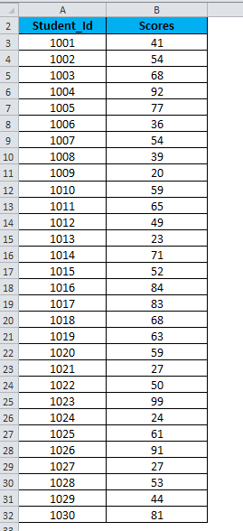
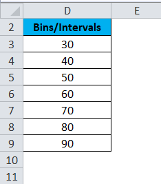
For creating a histogram, we need to create the intervals at which we want to find the frequency. These intervals are called bins.
Below are the bins or score intervals for the above data set.
Please follow the below steps to create the Histogram chart in Excel:
- Click on the Data tab.
- Now go to the Analysis tab on the extreme right side. Click on the Data Analysis option.
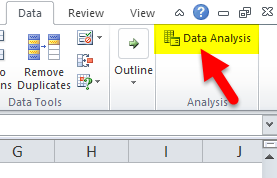
- It will open a Data Analysis dialog box. Choose the Histogram option and click on OK.
- A Histogram dialog box will open.
- In the Histogram dialog box, we will enter the following details:
Select the Input Range (as per our example – with the scores column B)
Select the Bin Range ( Intervals column D)
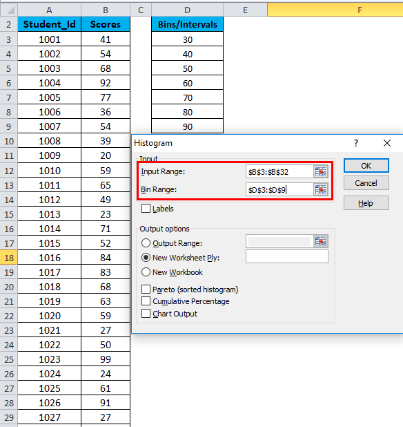
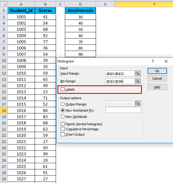
- If you want to include the column headings in the chart, then click on Labels. Otherwise, leave it as it is unticked.
- Click on Output Range. If you want to grab ate a histogram in the same sheet, then specify the cell address or Click on New Worksheet.
- Choose the Chart Output Option and click on OK.
- This would create a Frequency Distribution table and the Histogram chart in the specified cell address.
There are below points that need to keep in mind while creating Bin’s or Intervals:
- The First bin includes all the values below it. For bin 30, frequency 5 includes all the scores below 30.
- The last bin is 90. If the values are higher than the last bin, Excel automatically creates another bin – More. This bin includes any data values which are higher than the last bin. In our example, there are 3 values that are higher than last bin 90.
- This chart is called a static histogram chart. This means, if you want to make any changes in the source data, you will have to create the histogram again.
- You can do the formatting of this chart like other charts.
Example #2
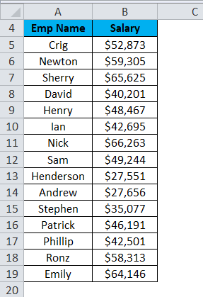
Let’s take another example with 15 data points which are the salary of a company.
Now we will create the bins for the above dataset.
For creating the histogram chart in excel, we will follow the same steps as earlier taken in example 1.
- Click on the Data tab. Select the Data Analysis option from the Analysis section.
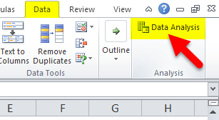
- A Data Analysis dialog box will appear. Choose the histogram option and click on OK.
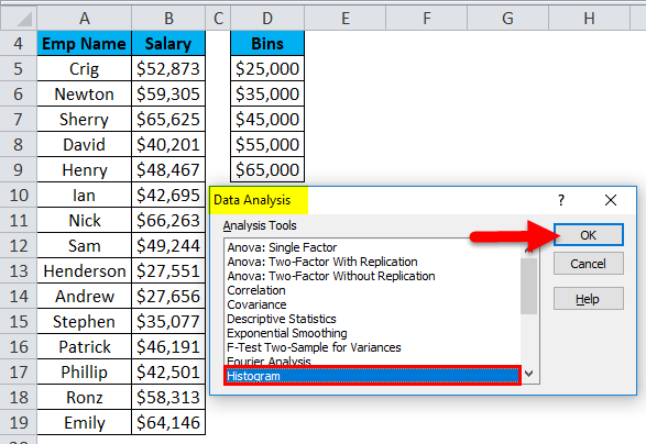
- It will open a histogram dialog box.
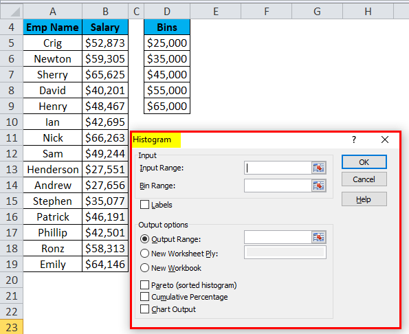
- Select the Input Range with the Salary data points.
- Select the Bin Range with the bins column.
- Click on Output Range as we want to insert the chart on the same sheet and select the cell address to insert the chart.
- Choose the Chart Output option and click on OK.
- The below chart will appear as :
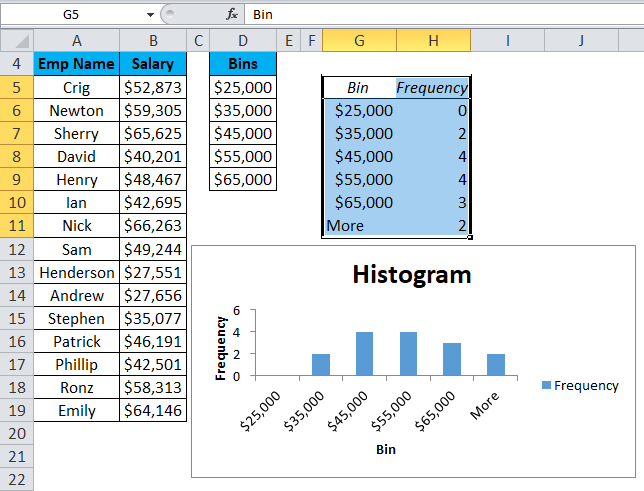
Explanation:
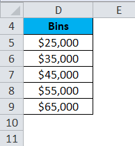
- The First bin, $25,000, will include all data points which are less than this value.
- The last bin More will include all the data points which are higher than $65,000. Its created automatically by Excel.
Pros
- The histogram is very useful while working with a large amount of data.
- A histogram chart shows the data in a graphical form that is easy to compare and easy to understand.
Cons
- Histogram chart is very difficult to extract the data from the input field in the histogram. It means difficult to point the exact number.
- While working with histogram, it creates a problem with multiple categories.
Things to Remember About Histogram Chart in Excel
- A Histogram chart is used for continuous data where the bin determines the range of data.
- The bins are usually determined as consecutive and non-overlapping intervals.
- The bins must be adjacent and are of equal size (but are not required to be).
- If you are working with Excel 2013, 2010 or earlier version, you need to activate the Excel Add-Ins for Data Analysis ToolPak.
Recommended Articles
This has been a guide to Histogram in Excel. Here we discuss its types and how to create a Histogram chart in Excel along with excel examples and a downloadable excel template. You may also look at these useful charts in excel –
- Marimekko Chart Excel
- Interactive Chart in Excel
- Surface Charts in Excel
- Comparison Chart in Excel
It’s a step-by-step tutorial to create a HISTOGRAM in Excel in different ways in a different version of Excel.
A histogram is a column or a bar chart that represents values using a range. Think of a class teacher who wants to present marks of students using a category range (Bins). In the class, she has 50 students, and to present the performance of the class, she can use the distribution of students according to their marks using a histogram.

In this guide, I’ll be sharing with you everything you need to master this chart. So stay with me for the next few minutes…
- 2016
- 2013
- Mac
- Pivot
- Other
Steps to Make a Histogram in Excel 2016
If you are like me, using Excel 2016 I’ve got good news for you and the good news is, that there is an inbuilt option to create a histogram in this version of Excel.
Let’s suppose you have a list of employees (here is the list) and their period of employment with the company.

And now you need to create a histogram that should show the number of employees in a particular period range (Bin).
Follow these simple steps:
- First of all, select the data and go to the Insert Tab ➜ Charting ➜ Insert Statistic Charts ➜ Histogram ➜ Histogram, to insert the chart.

In reality, this is the only step you need to follow, your chart is there in your spreadsheet.

You can delete the chart title and gridlines if you want.

Pro Tip When you’re using Excel 2016 make sure to convert your data into an Excel table to make it dynamic. So whenever you add new data to it, your chart gets updated automatically.
…download this sample file from here to learn more.
But now you need to have a look at how can you customize it and all the options you have with it.
Let’s explore some of the main options related to bins one by one:
- Now, select your chart’s axis and right-click on it, and open “Format Axis”.

1. By Categories
If you think about the data we are using here, every entry is unique as each employee’s name is different.

But if you have data where you have repetitive entries, then you can use this option to create a chart based on the SUM or COUNT of those categories instead of numeric bins.
In this case, the bins would be the categories not the distribution of numerical data.
2 Automatic
When you create a histogram, Excel creates bins automatically using the range of the values you have. In simple words, this option is the default way to make a histogram.
3. Bin Width
By using this option, you can specify the width of the Bins. Let’s say if you want to make each bin have 10 then this will create each bin of 0-10, 10-20, and so on.
With this option you have control over the width of the bin and Excel will create the number of bins using the width you specified. Let’s say you have values from 1 to 20 and you want bin width 4, then Excel will create 5 bins like this:

4. Number of Bin
And if you want to specify the number of bins instead of the range you can click on this option and enter the number. Let’s say if you want to have 3 bins and the range of values is 0-15 then Excel will create bins like:

5. Overflow Bin Underflow Bin
These two options help you to create more than or less than bins in the chart. Let say, you want to have a bin for the employees with a working period of fewer than 10 years.
You can simply enter 10 in the underflow. Or, if you want to have a Bin for the employees having a working period of more than 20 years, enter 20 in the overflow.

Steps to Create a Histogram Chart in Excel 2013 (Data Analysis Tool Pack)
If you are using Excel 2013 or a lower version then you need to follow different steps to create this chart.
There is ADD-IN which you need to install, “Analysis Tool Pack”. It comes with your Excel but you need to install it.
So let’s learn to install it (I’m using screenshots for Excel 2016 but the steps are the same in all the Excel versions) and then we’ll get into making a histogram.
Steps to Install Data Analysis Tool Pack
Once you click OK, it will process for a few seconds and you’re ready to go. You’ll have a “Data Analysis” button in the Data tab.

…make sure to download this sample data file from here to follow along.
Before you create a histogram using “Analysis Took Pack” you need to create Bins. Yes, manually. but it’s a simple thing, you know. Here we need bins like below or whatever you want to make.

Now let’s follow these simple steps to insert the histogram and make sure you have this data file with you to follow along.
- Input Range: The range where you have employee years with the company (Make sure to only select the values without heading).
- Bin Range: The range where you have bins, yes the one we have just created (Make sure to only select the values without heading).
- Output Option: Select the “New Worksheet” for the output and tick mark the “Chart Output” for the chart.
- In the end, click OK.
Once you click OK you’ll have a new worksheet with a chart and a frequency.

…here’s the sample file with a histogram created using “Analysis Tool Pack”.
Important Points You Need to Understand when you are using “Analysis Took Pack” to Create a Histogram in Excel
Creating a Histogram in the Excel for Mac [2011]
To create a histogram in the Mac version of Excel [2011] we need to install the “Analysis Tool Pack” as well.
…make sure to download this sample file to follow along.
Activating “Analysis Tool Pack” in Excel Mac
Follow these simple steps to activate “Analysis Tool Pack” in Excel Mac
Now the next step.
Step to Create a Histogram [Mac Excel]
Before you create your chart, make sure to create the bins as we have made in the above method. And, if you don’t know about the Bins, make sure to read about them in the above section of this post.
- Input Range: The range where you have employee years with the company (Make sure to only select the values without heading).
- Bin Range: The range where you have bins, yes the one we have just created (Make sure to only select the values without heading).
- Output Option: Select the “New Worksheet” for the output and tick mark the “Chart Output” for the chart.
- After that, click OK.
Once you click OK, it’ll insert a new worksheet with the frequency table and a histogram.

…download the final file from here to learn more.
Create a Histogram using the Pivot table and Pivot Chart
When it comes to control and flexibility there is nothing like a pivot table and pivot chart. I have found a simple way to create a histogram by combining a pivot table and a pivot chart. The below chart is a pivot chart, can you believe it?

Let me tell you how it works (with the same employee data here).
Now you need to do a bit of customization in the chart to make it a perfect one.
Boom! your histogram is ready.

…download the final sample from here to learn more.
Dynamic Histogram using FREQUENCY Function
If you create a histogram using “Analysis Tool Pack” it won’t be a dynamic one.
But…
You can create a dynamic histogram by using the FREQUENCY function. To use this function all you need is to create bins in the data (I’m using the same employee data here) and then enter the below formula in the formula bar:
=FREQUENCY(InputDataRange,BinRange)

Make sure to enter this formula as an array formula by using Alt + Shift + Enter.
After that, you just need to insert a normal column chart using the table we have just created.

And don’t forget to change the gap width to 0% from “Format Data Series” options.

…download the sample file from here to learn more.
When You Need to Create a Histogram
Creating a histogram in Excel is not rocket science, but you need to be aware of the situations where it can be helpful and useful.
1. To Present Large Data
Remember the example of the students? Sometimes it’s hard to present data in a normal chart (Line, Column, or Bar). But with a histogram, you can make bins and present large data in a simple chart.
2. To Understand the Distribution
A histogram not only distributes data into bins but also helps you to understand the distribution. Looking at the below histogram, you can understand that most of the students scored between 40 and 80. And 23 students scored above 60.
3. To Help in Decision Making
By using a histogram you can easily decide the students who need to work on their performance. Once you know the numbers in the distribution you can separately focus on each distribution.
What are Bins?
Bin (Bucket) is a range of values in which you distribute the frequency of occurrence. Normally, when someone makes a histogram he/she needs to create bins before but in while making a histogram in Excel you don’t need to create bins.
In the end
If you are using Excel 2016 then there is a simple one-click way to create a histogram as it’s there already. Otherwise, you can use the “Analysis Tool Pack”, but you need to install it first to use it.
Well, if you ask me, my favorite method to make a histogram is by using a pivot chart as it’s way more dynamic and gives you more options to control the chart.
But now you have to tell me one thing. Which method is your favorite?
Make sure to share your views with me in the comment section, I’d love to hear from you. And please, don’t forget to share this post with your friends, I am sure they will appreciate it.
More Charting Tips and Tutorials
- Add a Horizontal Line in a Chart in Excel
- How to Add a Vertical Line in a Chart in Excel
- How to Create a Bullet Chart in Excel
- How to Create a Dynamic Chart Range in Excel
- How to Create a Dynamic Chart Title in Excel
- How to Create Interactive Charts In Excel
- How to Create a Sales Funnel Chart in Excel
- How to Create a HEAT MAP in Excel
- How to Create a Pictograph in Excel
- How to Create a Milestone Chart in Excel
- How to Insert a People Graph in Excel
- How to Create PIVOT CHART in Excel
- How to Create a Population Pyramid Chart in Excel
- How to Create a SPEEDOMETER Chart [Gauge] in Excel
- How to Create a Step Chart in Excel
- How to Create a Thermometer Chart in Excel
- How to Create a Tornado Chart in Excel
- How to Create Waffle Chart in Excel
Содержание
- Построение гистограммы
- Способ 1: создание простой гистограммы в блоке диаграмм
- Способ 2: построение гистограммы с накоплением
- Способ 3: построение с использованием «Пакета анализа»
- Способ 4: Гистограммы при условном форматировании
- Вопросы и ответы

Гистограмма является отличным инструментом визуализации данных. Это наглядная диаграмма, с помощью которой можно сразу оценить общую ситуацию, лишь взглянув на неё, без изучения числовых данных в таблице. В Microsoft Excel есть сразу несколько инструментов предназначенных для того, чтобы построить гистограммы различного типа. Давайте взглянем на различные способы построения.
Урок: Как создать гистограмму в Microsoft Word
Построение гистограммы
Гистограмму в Экселе можно создать тремя способами:
- С помощью инструмента, который входит в группу «Диаграммы»;
- С использованием условного форматирования;
- При помощи надстройки Пакет анализа.
Она может быть оформлена, как отдельным объектом, так и при использовании условного форматирования, являясь частью ячейки.
Способ 1: создание простой гистограммы в блоке диаграмм
Обычную гистограмму проще всего сделать, воспользовавшись функцией в блоке инструментов «Диаграммы».
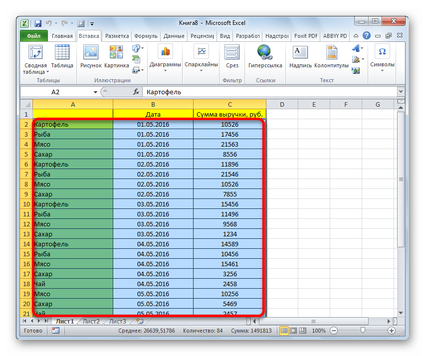
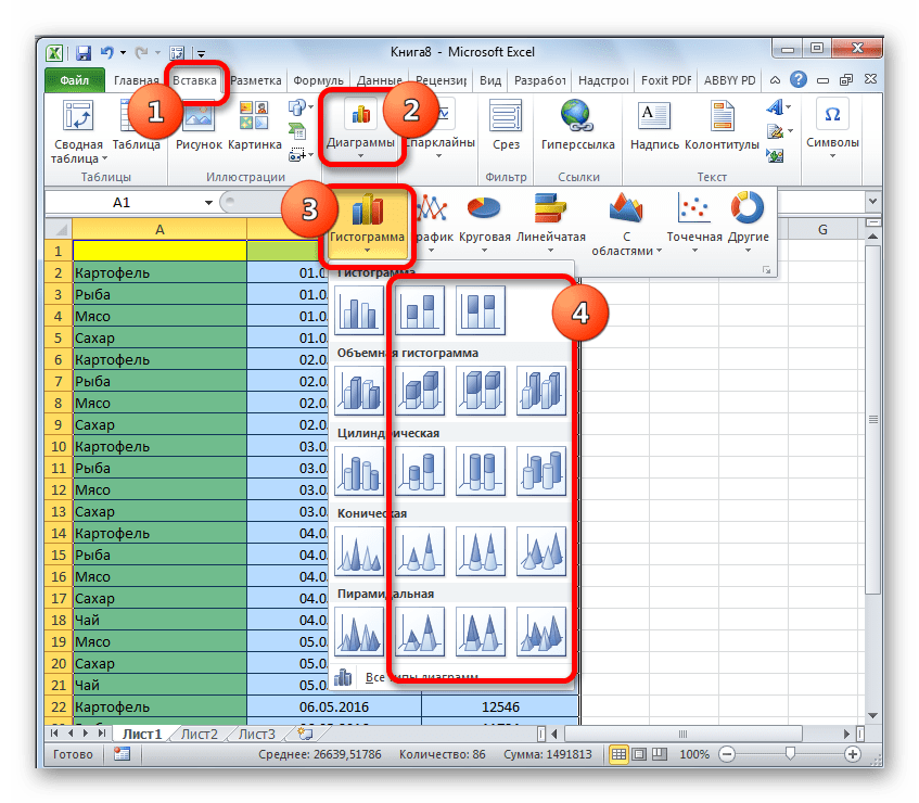
- Строим таблицу, в которой содержатся данные, отображаемые в будущей диаграмме. Выделяем мышкой те столбцы таблицы, которые будут отображены на осях гистограммы.
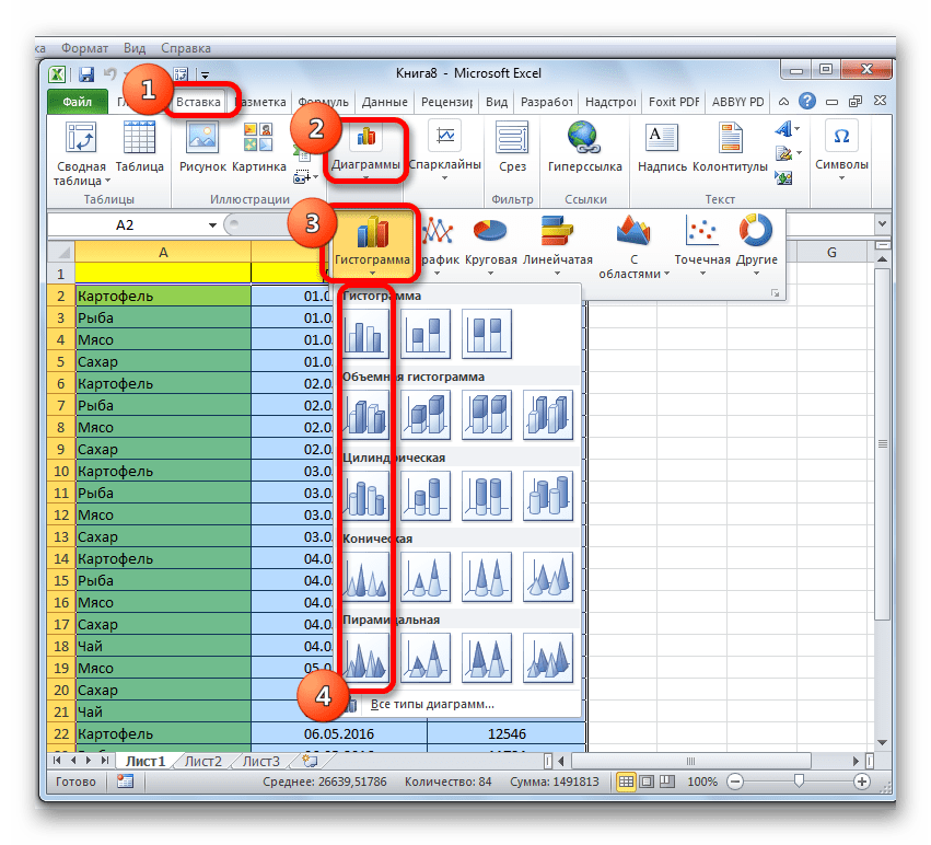
- Находясь во вкладке «Вставка» кликаем по кнопке «Гистограмма», которая расположена на ленте в блоке инструментов «Диаграммы».
- В открывшемся списке выбираем один из пяти типов простых диаграмм:
- гистограмма;
- объемная;
- цилиндрическая;
- коническая;
- пирамидальная.
Все простые диаграммы расположены с левой части списка.
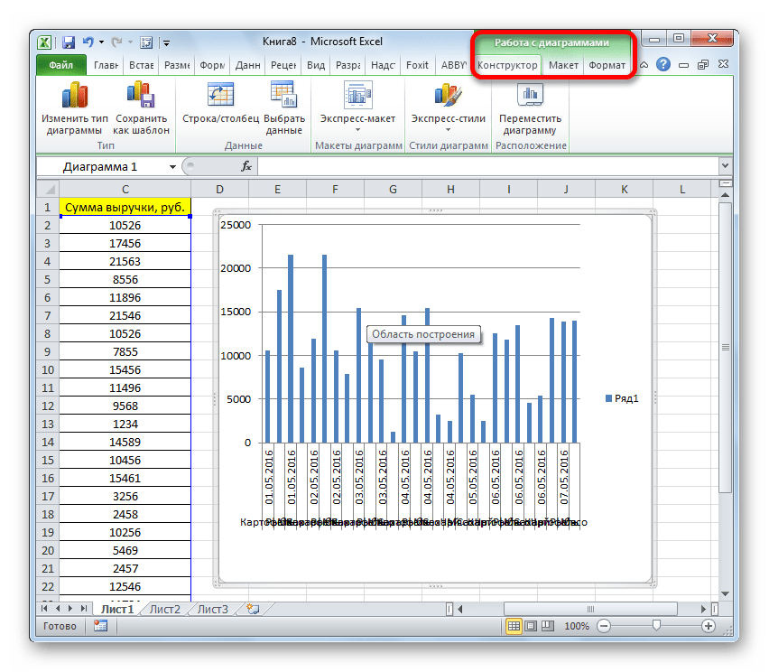
После того, как выбор сделан, на листе Excel формируется гистограмма.
- Изменять стили столбцов;
- Подписывать наименование диаграммы в целом, и отдельных её осей;
- Изменять название и удалять легенду, и т.д.
С помощью инструментов, расположенных в группе вкладок «Работа с диаграммами» можно редактировать полученный объект:
Урок: Как сделать диаграмму в Excel
Способ 2: построение гистограммы с накоплением
Гистограмма с накоплением содержит столбцы, которые включают в себя сразу несколько значений.
- Перед тем, как перейти к созданию диаграммы с накоплением, нужно удостовериться, что в крайнем левом столбце в шапке отсутствует наименование. Если наименование есть, то его следует удалить, иначе построение диаграммы не получится.
- Выделяем таблицу, на основании которой будет строиться гистограмма. Во вкладке «Вставка» кликаем по кнопке «Гистограмма». В появившемся списке диаграмм выбираем тот тип гистограммы с накоплением, который нам требуется. Все они расположены в правой части списка.
- После этих действий гистограмма появится на листе. Её можно будет отредактировать с помощью тех же инструментов, о которых шёл разговор при описании первого способа построения.


Способ 3: построение с использованием «Пакета анализа»
Для того, чтобы воспользоваться способом формирования гистограммы с помощью пакета анализа, нужно этот пакет активировать.
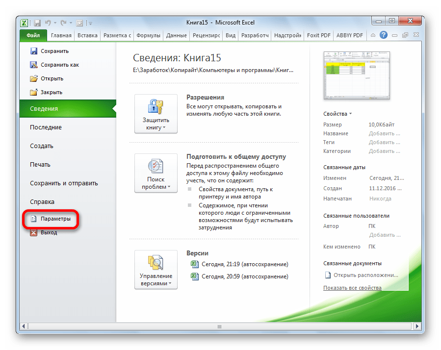
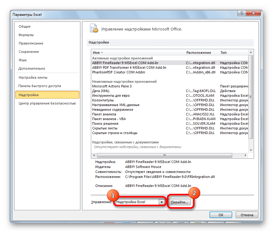
- Переходим во вкладку «Файл».
- Кликаем по наименованию раздела «Параметры».
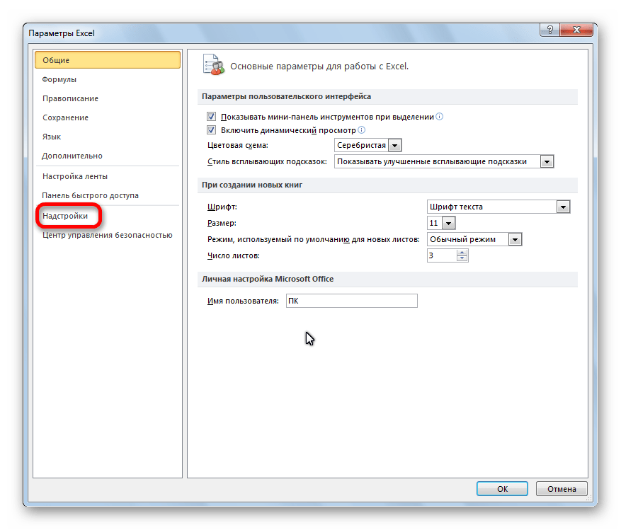
- Переходим в подраздел «Надстройки».
- В блоке «Управление» переставляем переключатель в позицию «Надстройки Excel».
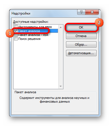
- В открывшемся окне около пункта «Пакет анализа» устанавливаем галочку и кликаем по кнопке «OK».
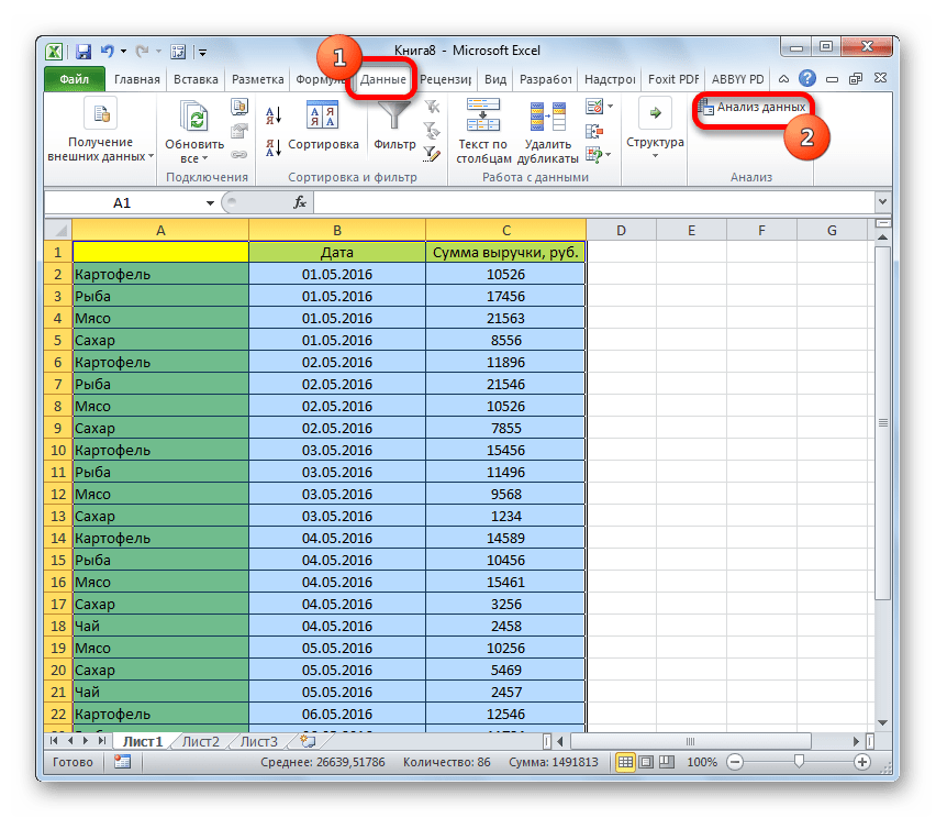
- Перемещаемся во вкладку «Данные». Жмем на кнопку, расположенную на ленте «Анализ данных».
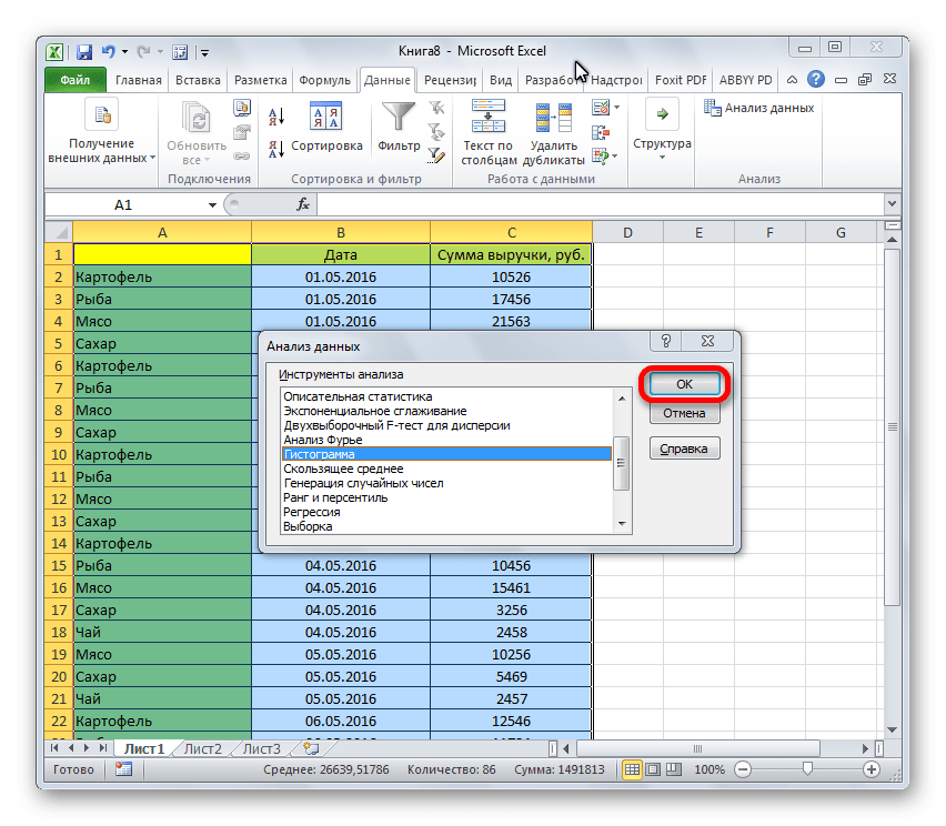
- В открывшемся небольшом окне выбираем пункт «Гистограммы». Жмем на кнопку «OK».
- Открывается окно настройки гистограммы. В поле «Входной интервал» вводим адрес диапазона ячеек, гистограмму которого хотим отобразить. Обязательно внизу ставим галочку около пункта «Вывод графика». В параметрах ввода можно указать, где будет выводиться гистограмма. По умолчанию — на новом листе. Можно указать, что вывод будет осуществляться на данном листе в определенных ячейках или в новой книге. После того, как все настройки введены, жмем кнопку «OK».
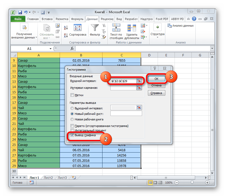
Как видим, гистограмма сформирована в указанном вами месте.

Способ 4: Гистограммы при условном форматировании
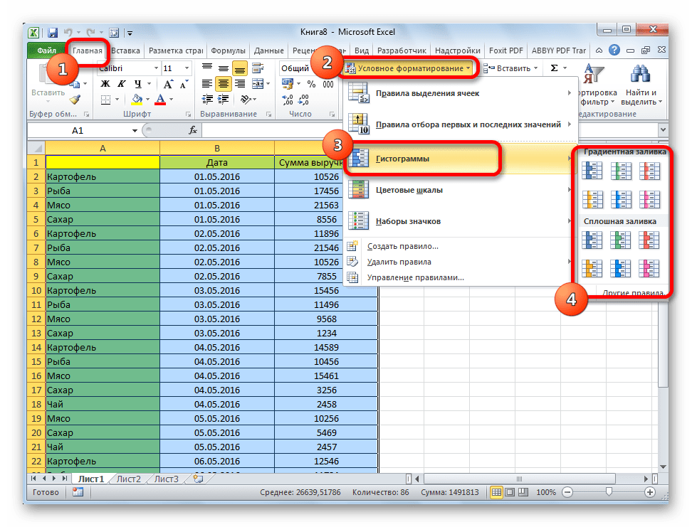
Гистограммы также можно выводить при условном форматировании ячеек.
- Выделяем ячейки с данными, которые хотим отформатировать в виде гистограммы.
- Во вкладке «Главная» на ленте жмем на кнопку «Условное форматирование». В выпавшем меню кликаем по пункту «Гистограмма». В появившемся перечне гистограмм со сплошной и градиентной заливкой выбираем ту, которую считаем более уместной в каждом конкретном случае.
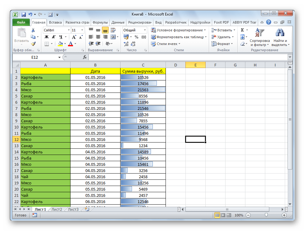
Теперь, как видим, в каждой отформатированной ячейке имеется индикатор, который в виде гистограммы характеризует количественный вес данных, находящихся в ней.
Урок: Условное форматирование в Excel
Мы смогли убедиться, что табличный процессор Excel предоставляет возможность использовать такой удобный инструмент, как гистограммы, совершенно в различном виде. Применение этой интересной функции делает анализ данных намного нагляднее.
Еще статьи по данной теме: