
A PivotTable is a powerful tool to calculate, summarize, and analyze data that lets you see comparisons, patterns, and trends in your data. PivotTables work a little bit differently depending on what platform you are using to run Excel.


-
Select the cells you want to create a PivotTable from.
Note: Your data should be organized in columns with a single header row. See the Data format tips and tricks section for more details.
-
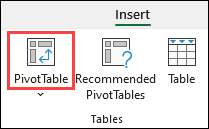
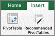
Select Insert > PivotTable.

-
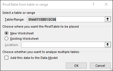
This will create a PivotTable based on an existing table or range.
Note: Selecting Add this data to the Data Model will add the table or range being used for this PivotTable into the workbook’s Data Model. Learn more.
-
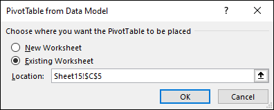
Choose where you want the PivotTable report to be placed. Select New Worksheet to place the PivotTable in a new worksheet or Existing Worksheet and select where you want the new PivotTable to appear.
-
Click OK.
By clicking the down arrow on the button, you can select from other possible sources for your PivotTable. In addition to using an existing table or range, there are three other sources you can select from to populate your PivotTable.
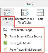
Note: Depending on your organization’s IT settings you might see your organization’s name included in the button. For example, «From Power BI (Microsoft)»
Get from External Data Source
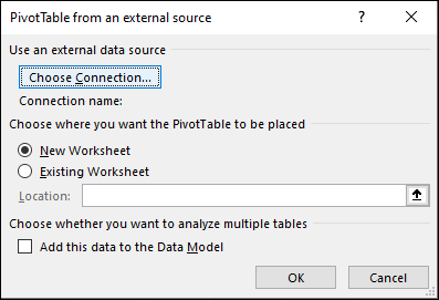
Get from Data Model
Use this option if your workbook contains a Data Model, and you want to create a PivotTable from multiple Tables, enhance the PivotTable with custom measures, or are working with very large datasets.
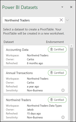
Get from Power BI
Use this option if your organization uses Power BI and you want to discover and connect to endorsed cloud datasets you have access to.
-
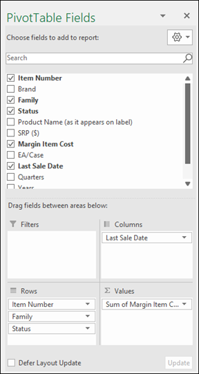
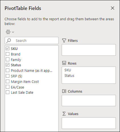
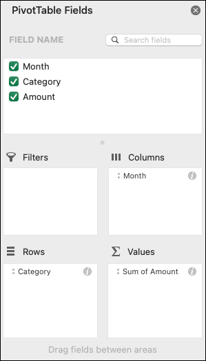
To add a field to your PivotTable, select the field name checkbox in the PivotTables Fields pane.
Note: Selected fields are added to their default areas: non-numeric fields are added to Rows, date and time hierarchies are added to Columns, and numeric fields are added to Values.
-
To move a field from one area to another, drag the field to the target area.
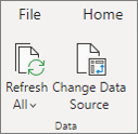
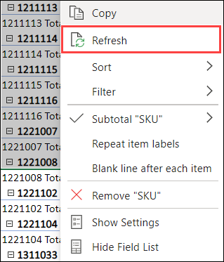
If you add new data to your PivotTable data source, any PivotTables that were built on that data source need to be refreshed. To refresh just one PivotTable you can right-click anywhere in the PivotTable range, then select Refresh. If you have multiple PivotTables, first select any cell in any PivotTable, then on the Ribbon go to PivotTable Analyze > click the arrow under the Refresh button and select Refresh All.
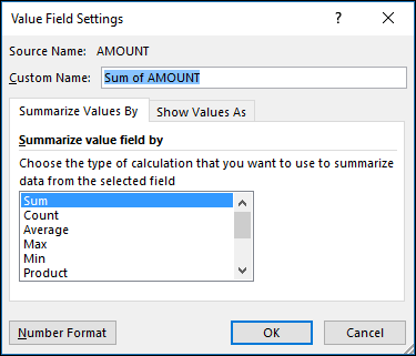
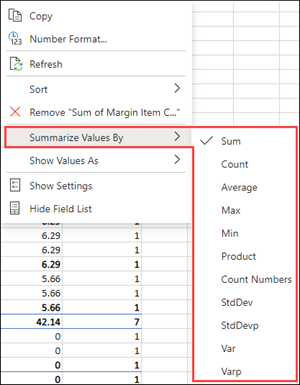
Summarize Values By
By default, PivotTable fields that are placed in the Values area will be displayed as a SUM. If Excel interprets your data as text, it will be displayed as a COUNT. This is why it’s so important to make sure you don’t mix data types for value fields. You can change the default calculation by first clicking on the arrow to the right of the field name, then select the Value Field Settings option.
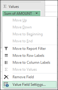
Next, change the calculation in the Summarize Values By section. Note that when you change the calculation method, Excel will automatically append it in the Custom Name section, like «Sum of FieldName», but you can change it. If you click the Number Format button, you can change the number format for the entire field.
Tip: Since the changing the calculation in the Summarize Values By section will change the PivotTable field name, it’s best not to rename your PivotTable fields until you’re done setting up your PivotTable. One trick is to use Find & Replace (Ctrl+H) >Find what > «Sum of«, then Replace with > leave blank to replace everything at once instead of manually retyping.
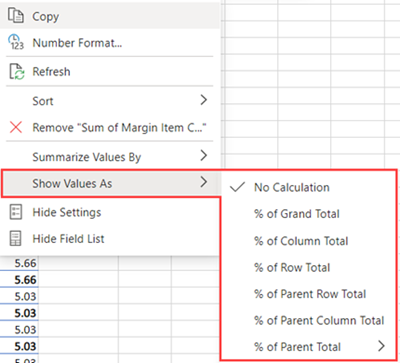
Show Values As
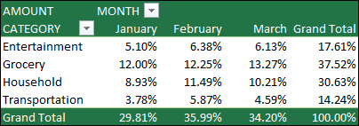
Instead of using a calculation to summarize the data, you can also display it as a percentage of a field. In the following example, we changed our household expense amounts to display as a % of Grand Total instead of the sum of the values.
Once you’ve opened the Value Field Setting dialog, you can make your selections from the Show Values As tab.
Display a value as both a calculation and percentage.
Simply drag the item into the Values section twice, then set the Summarize Values By and Show Values As options for each one.
-
Select a table or range of data in your sheet and select Insert > PivotTable to open the Insert PivotTable pane.
-
You can either manually create your own PivotTable or choose a recommended PivotTable to be created for you. Do one of the following:
-
On the Create your own PivotTable card, select either New sheet or Existing sheet to choose the destination of the PivotTable.
-
On a recommended PivotTable, select either New sheet or Existing sheet to choose the destination of the PivotTable.
Note: Recommended PivotTables are only available to Microsoft 365 subscribers.
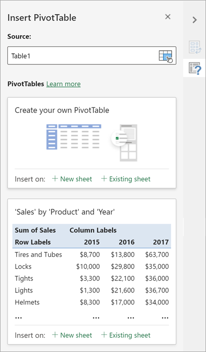
You can change the data sourcefor the PivotTable data as you are creating it.
-
In the Insert PivotTable pane, select the text box under Source. While changing the Source, cards in the pane won’t be available.
-
Make a selection of data on the grid or enter a range in the text box.
-
Press Enter on your keyboard or the button to confirm your selection. The pane will update with new recommended PivotTables based on the new source of data.

Get from Power BI
Use this option if your organization uses Power BI and you want to discover and connect to endorsed cloud datasets you have access to.
In the PivotTable Fields pane, select the check box for any field you want to add to your PivotTable.
By default, non-numeric fields are added to the Rows area, date and time fields are added to the Columns area, and numeric fields are added to the Values area.
You can also manually drag-and-drop any available item into any of the PivotTable fields, or if you no longer want an item in your PivotTable, drag it out from the list or uncheck it.
Summarize Values By
By default, PivotTable fields in the Values area will be displayed as a SUM. If Excel interprets your data as text, it will be displayed as a COUNT. This is why it’s so important to make sure you don’t mix data types for value fields.
Change the default calculation by right clicking on any value in the row and selecting the Summarize Values By option.
Show Values As
Instead of using a calculation to summarize the data, you can also display it as a percentage of a field. In the following example, we changed our household expense amounts to display as a % of Grand Total instead of the sum of the values.
Right click on any value in the column you’d like to show the value for. Select Show Values As in the menu. A list of available values will display.
Make your selection from the list.
To show as a % of Parent Total, hover over that item in the list and select the parent field you want to use as the basis of the calculation.
If you add new data to your PivotTable data source, any PivotTables built on that data source will need to be refreshed. Right-click anywhere in the PivotTable range, then select Refresh.
If you created a PivotTable and decide you no longer want it, select the entire PivotTable range and press Delete. It won’t have any effect on other data or PivotTables or charts around it. If your PivotTable is on a separate sheet which has no other data you want to keep, deleting the sheet is a fast way to remove the PivotTable.
-
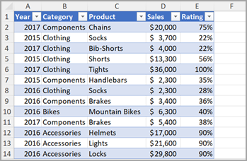
Your data should be organized in a tabular format, and not have any blank rows or columns. Ideally, you can use an Excel table like in our example above.
-
Tables are a great PivotTable data source, because rows added to a table are automatically included in the PivotTable when you refresh the data, and any new columns will be included in the PivotTable Fields List. Otherwise, you need to either Change the source data for a PivotTable, or use a dynamic named range formula.
-
Data types in columns should be the same. For example, you shouldn’t mix dates and text in the same column.
-
PivotTables work on a snapshot of your data, called the cache, so your actual data doesn’t get altered in any way.
If you have limited experience with PivotTables, or are not sure how to get started, a Recommended PivotTable is a good choice. When you use this feature, Excel determines a meaningful layout by matching the data with the most suitable areas in the PivotTable. This helps give you a starting point for additional experimentation. After a recommended PivotTable is created, you can explore different orientations and rearrange fields to achieve your specific results. You can also download our interactive Make your first PivotTable tutorial.
-
Click a cell in the source data or table range.
-
Go to Insert > Recommended PivotTable.
-
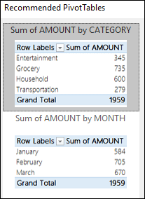
Excel analyzes your data and presents you with several options, like in this example using the household expense data.
-
Select the PivotTable that looks best to you and press OK. Excel will create a PivotTable on a new sheet, and display the PivotTable Fields List

-
Click a cell in the source data or table range.
-
Go to Insert > PivotTable.
-
Excel will display the Create PivotTable dialog with your range or table name selected. In this case, we’re using a table called «tbl_HouseholdExpenses».
-
In the Choose where you want the PivotTable report to be placed section, select New Worksheet, or Existing Worksheet. For Existing Worksheet, select the cell where you want the PivotTable placed.
-
Click OK, and Excel will create a blank PivotTable, and display the PivotTable Fields list.
PivotTable Fields list
In the Field Name area at the top, select the check box for any field you want to add to your PivotTable. By default, non-numeric fields are added to the Row area, date and time fields are added to the Column area, and numeric fields are added to the Values area. You can also manually drag-and-drop any available item into any of the PivotTable fields, or if you no longer want an item in your PivotTable, simply drag it out of the Fields list or uncheck it. Being able to rearrange Field items is one of the PivotTable features that makes it so easy to quickly change its appearance.
PivotTable Fields list
-
Summarize by
By default, PivotTable fields that are placed in the Values area will be displayed as a SUM. If Excel interprets your data as text, it will be displayed as a COUNT. This is why it’s so important to make sure you don’t mix data types for value fields. You can change the default calculation by first clicking on the arrow to the right of the field name, then select the Field Settings option.
Next, change the calculation in the Summarize by section. Note that when you change the calculation method, Excel will automatically append it in the Custom Name section, like «Sum of FieldName», but you can change it. If you click the Number… button, you can change the number format for the entire field.
Tip: Since the changing the calculation in the Summarize by section will change the PivotTable field name, it’s best not to rename your PivotTable fields until you’re done setting up your PivotTable. One trick is to click Replace (on the Edit menu) >Find what > «Sum of«, then Replace with > leave blank to replace everything at once instead of manually retyping.
-
Show data as
Instead of using a calculation to summarize the data, you can also display it as a percentage of a field. In the following example, we changed our household expense amounts to display as a % of Grand Total instead of the sum of the values.
Once you’ve opened the Field Settings dialog, you can make your selections from the Show data as tab.
-
Display a value as both a calculation and percentage.
Simply drag the item into the Values section twice, right-click the value and select Field Settings, then set the Summarize by and Show data as options for each one.
If you add new data to your PivotTable data source, any PivotTables that were built on that data source need to be refreshed. To refresh just one PivotTable you can right-click anywhere in the PivotTable range, then select Refresh. If you have multiple PivotTables, first select any cell in any PivotTable, then on the Ribbon go to PivotTable Analyze > click the arrow under the Refresh button and select Refresh All.
If you created a PivotTable and decide you no longer want it, you can simply select the entire PivotTable range, then press Delete. It won’t have any affect on other data or PivotTables or charts around it. If your PivotTable is on a separate sheet that has no other data you want to keep, deleting that sheet is a fast way to remove the PivotTable.
Data format tips and tricks
-
Use clean, tabular data for best results.
-
Organize your data in columns, not rows.
-
Make sure all columns have headers, with a single row of unique, non-blank labels for each column. Avoid double rows of headers or merged cells.
-
Format your data as an Excel table (select anywhere in your data and then select Insert > Table from the ribbon).
-
If you have complicated or nested data, use Power Query to transform it (for example, to unpivot your data) so it is organized in columns with a single header row.
Need more help?
You can always ask an expert in the Excel Tech Community or get support in the Answers community.
PivotTable Recommendations are a part of the connected experience in Microsoft 365, and analyzes your data with artificial intelligence services. If you choose to opt out of the connected experience in Microsoft 365, your data will not be sent to the artificial intelligence service, and you will not be able to use PivotTable Recommendations. Read the Microsoft privacy statement for more details.
Related articles
Create a PivotChart
Use slicers to filter PivotTable data
Create a PivotTable timeline to filter dates
Create a PivotTable with the Data Model to analyze data in multiple tables
Create a PivotTable connected to Power BI Datasets
Use the Field List to arrange fields in a PivotTable
Change the source data for a PivotTable
Calculate values in a PivotTable
Delete a PivotTable
Skip to content
В этом руководстве вы узнаете, что такое сводная таблица, и найдете подробную инструкцию, как по шагам создавать и использовать её в Excel.
Если вы работаете с большими наборами данных в Excel, то сводная таблица очень удобна для быстрого создания интерактивного представления из множества записей. Помимо прочего, она может автоматически сортировать и фильтровать информацию, подсчитывать итоги, вычислять среднее значение, а также создавать перекрестные таблицы. Это позволяет взглянуть на ваши цифры совершенно с новой стороны.
Важно также и то, что при этом ваши исходные данные не затрагиваются – что бы вы не делали с вашей сводной таблицей. Вы просто выбираете такой способ отображения, который позволит вам увидеть новые закономерности и связи. Ваши показатели будут разделены на группы, а огромный объем информации будет представлен в понятной и доступной для анализа форме.
- Что такое сводная таблица?
- Как создать сводную таблицу.
- 1. Организуйте свои исходные данные
- 2. Создаем и размещаем макет
- 3. Как добавить поле
- 4. Как удалить поле из сводной таблицы?
- 5. Как упорядочить поля?
- 6. Выберите функцию для значений (необязательно)
- 7. Используем различные вычисления в полях значения (необязательно)
- Работа со списком показателей сводной таблицы
- Закрытие и открытие панели редактирования.
- Воспользуйтесь рекомендациями программы.
- Давайте улучшим результат.
- Как обновить сводную таблицу.
- Как переместить на новое место?
- Как удалить сводную таблицу?
Что такое сводная таблица?
Это инструмент для изучения и обобщения больших объемов данных, анализа связанных итогов и представления отчетов. Они помогут вам:
- представить большие объемы данных в удобной для пользователя форме.
- группировать информацию по категориям и подкатегориям.
- фильтровать, сортировать и условно форматировать различные сведения, чтобы вы могли сосредоточиться на самом актуальном.
- поменять строки и столбцы местами.
- рассчитать различные виды итогов.
- разворачивать и сворачивать уровни данных, чтобы узнать подробности.
- представить в Интернете сжатые и привлекательные таблицы или печатные отчеты.
Например, у вас множество записей в электронной таблице с цифрами продаж шоколада:

И каждый день сюда добавляются все новые сведения. Одним из возможных способов суммирования этого длинного списка чисел по одному или нескольким условиям является использование формул, как было продемонстрировано в руководствах по функциям СУММЕСЛИ и СУММЕСЛИМН.
Однако, когда вы хотите сравнить несколько показателей по каждому продавцу либо по отдельным товарам, использование сводных таблиц является гораздо более эффективным способом. Ведь при использовании функций вам придется писать много формул с достаточно сложными условиями. А здесь всего за несколько щелчков мыши вы можете получить гибкую и легко настраиваемую форму, которая суммирует ваши цифры как вам необходимо.
Вот посмотрите сами.
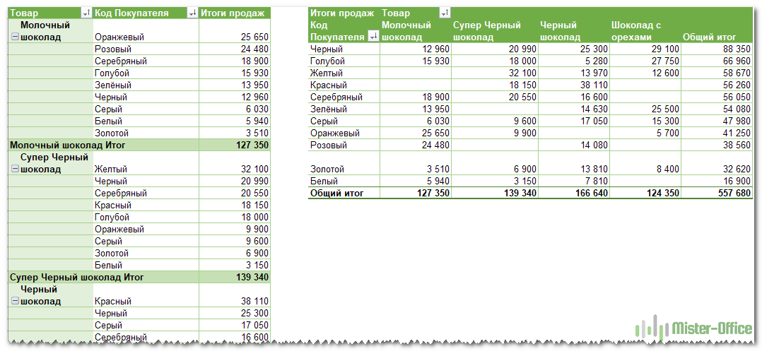
Этот скриншот демонстрирует лишь несколько из множества возможных вариантов анализа продаж. И далее мы рассмотрим примеры построения сводных таблиц в Excel 2016, 2013, 2010 и 2007.
Как создать сводную таблицу.
Многие думают, что создание отчетов при помощи сводных таблиц для «чайников» является сложным и трудоемким процессом. Но это не так! Microsoft много лет совершенствовала эту технологию, и в современных версиях Эксель они очень удобны и невероятно быстры.
Фактически, вы можете сделать это всего за пару минут. Для вас – небольшой самоучитель в виде пошаговой инструкции:
1. Организуйте свои исходные данные
Перед созданием сводного отчета организуйте свои данные в строки и столбцы, а затем преобразуйте диапазон данных в таблицу. Для этого выделите все используемые ячейки, перейдите на вкладку меню «Главная» и нажмите «Форматировать как таблицу».
Использование «умной» таблицы в качестве исходных данных дает вам очень хорошее преимущество — ваш диапазон данных становится «динамическим». Это означает, что он будет автоматически расширяться или уменьшаться при добавлении или удалении записей. Поэтому вам не придется беспокоиться о том, что в свод не попала самая свежая информация.
Полезные советы:
- Добавьте уникальные, значимые заголовки в столбцы, они позже превратятся в имена полей.
- Убедитесь, что исходная таблица не содержит пустых строк или столбцов и промежуточных итогов.
- Чтобы упростить работу, вы можете присвоить исходной таблице уникальное имя, введя его в поле «Имя» в верхнем правом углу.
2. Создаем и размещаем макет
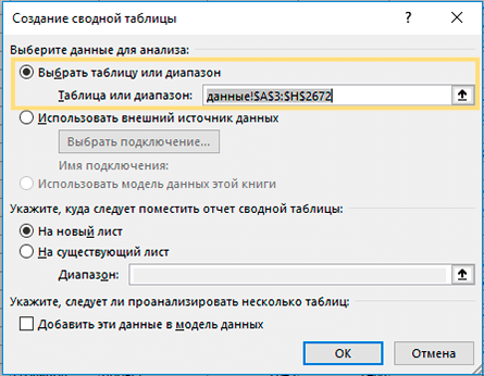
Выберите любую ячейку в исходных данных, а затем перейдите на вкладку Вставка > Сводная таблица .

Откроется окно «Создание ….. ». Убедитесь, что в поле Диапазон указан правильный источник данных. Затем выберите местоположение для свода:
- Выбор нового рабочего листа поместит его на новый лист, начиная с ячейки A1.
- Выбор существующего листа разместит в указанном вами месте на существующем листе. В поле «Диапазон» выберите первую ячейку (то есть, верхнюю левую), в которую вы хотите поместить свою таблицу.
Нажатие ОК создает пустой макет без цифр в целевом местоположении, который будет выглядеть примерно так:

Полезные советы:
- В большинстве случаев имеет смысл размещать на отдельном рабочем листе. Это особенно рекомендуется для начинающих.
- Ежели вы берете информацию из другой таблицы или рабочей книги, включите их имена, используя следующий синтаксис: [workbook_name]sheet_name!Range. Например, [Книга1.xlsx] Лист1!$A$1:$E$50. Конечно, вы можете не писать это все руками, а просто выбрать диапазон ячеек в другой книге с помощью мыши.
- Возможно, было бы полезно построить таблицу и диаграмму одновременно. Для этого в Excel 2016 и 2013 перейдите на вкладку «Вставка», щелкните стрелку под кнопкой «Сводная диаграмма», а затем нажмите «Диаграмма и таблица». В версиях 2010 и 2007 щелкните стрелку под сводной таблицей, а затем — Сводная диаграмма.
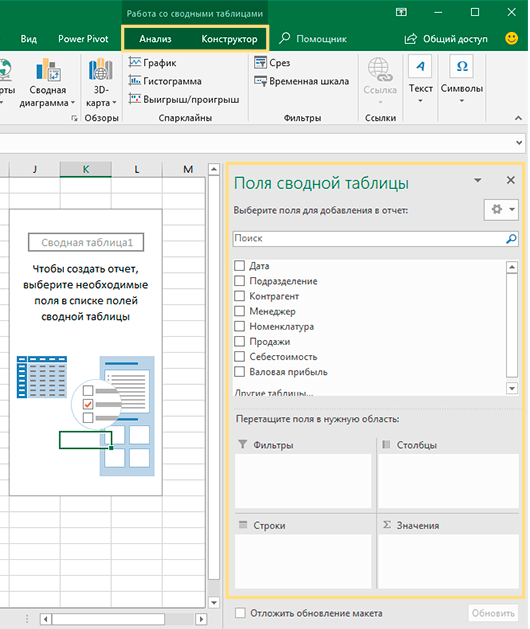
- Организация макета.
Область, в которой вы работаете с полями макета, называется списком полей. Он расположен в правой части рабочего листа и разделен на заголовок и основной раздел:
- Раздел «Поле» содержит названия показателей, которые вы можете добавить. Они соответствуют именам столбцов исходных данных.
- Раздел «Макет» содержит область «Фильтры», «Столбцы», «Строки» и «Значения». Здесь вы можете расположить в нужном порядке поля.
Изменения, которые вы вносите в этих разделах, немедленно применяются в вашей таблице.
3. Как добавить поле
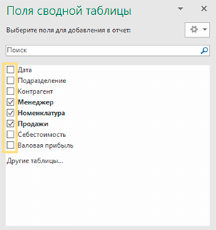
Чтобы иметь возможность добавить поле в нужную область, установите флажок рядом с его именем.
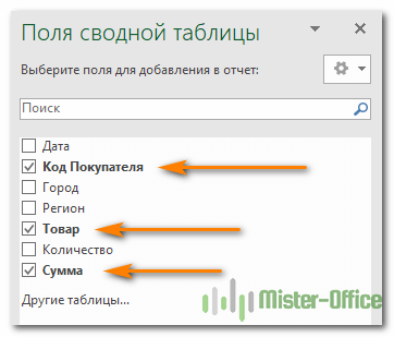
По умолчанию Microsoft Excel добавляет поля в раздел «Макет» следующим образом:
- Нечисловые добавляются в область Строки;
- Числовые добавляются в область значений;
- Дата и время добавляются в область Столбцы.
4. Как удалить поле из сводной таблицы?
Чтобы удалить любое поле, вы можете выполнить следующее:
- Снимите флажок напротив него, который вы ранее установили.
- Щелкните правой кнопкой мыши поле и выберите «Удалить……».

И еще один простой и наглядный способ удаления поля. Перейдите в макет таблицы, зацепите мышкой ненужный вам элемент и перетащите его за пределы макета. Как только вы вытащите его за рамки, рядом со значком появится хатактерный крестик. Отпускайте кнопку мыши и наблюдайте, как внешний вид вашей таблицы сразу же изменится.
5. Как упорядочить поля?
Вы можете изменить расположение показателей тремя способами:
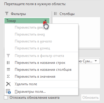
- Перетащите поле между 4 областями раздела с помощью мыши. В качестве альтернативы щелкните и удерживайте его имя в разделе «Поле», а затем перетащите в нужную область в разделе «Макет». Это приведет к удалению из текущей области и его размещению в новом месте.

- Щелкните правой кнопкой мыши имя в разделе «Поле» и выберите область, в которую вы хотите добавить его:

- Нажмите на поле в разделе «Макет», чтобы выбрать его. Это сразу отобразит доступные параметры:
Все внесенные вами изменения применяются немедленно.
Ну а ежели спохватились, что сделали что-то не так, не забывайте, что есть «волшебная» комбинация клавиш CTRL+Z, которая отменяет сделанные вами изменения (если вы не сохранили их, нажав соответствующую клавишу).
6. Выберите функцию для значений (необязательно)
По умолчанию Microsoft Excel использует функцию «Сумма» для числовых показателей, которые вы помещаете в область «Значения». Когда вы помещаете нечисловые (текст, дата или логическое значение) или пустые значения в эту область, к ним применяется функция «Количество».
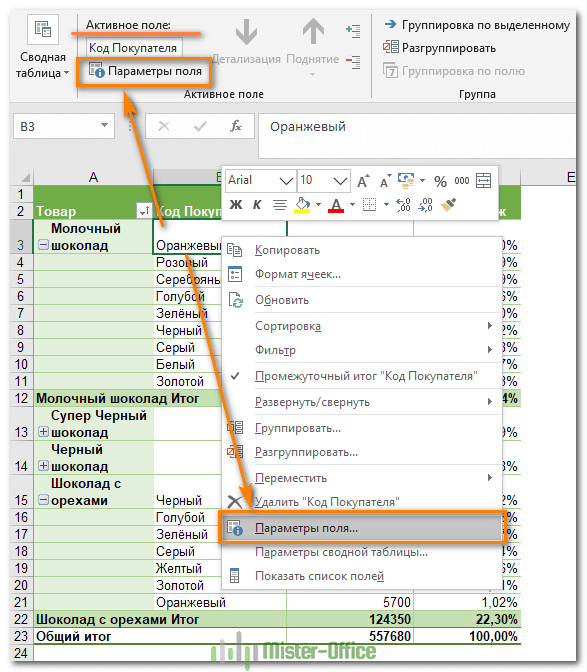
Но, конечно, вы можете выбрать другой метод расчёта. Щелкните правой кнопкой мыши поле значения, которое вы хотите изменить, выберите Параметры поля значений и затем — нужную функцию.

Думаю, названия операций говорят сами за себя, и дополнительные пояснения здесь не нужны. В крайнем случае, попробуйте различные варианты сами.
Здесь же вы можете изменить имя его на более приятное и понятное для вас. Ведь оно отображается в таблице, и поэтому должно выглядеть соответственно.
В Excel 2010 и ниже опция «Суммировать значения по» также доступна на ленте — на вкладке «Параметры» в группе «Расчеты».
7. Используем различные вычисления в полях значения (необязательно)
Еще одна полезная функция позволяет представлять значения различными способами, например, отображать итоговые значения в процентах или значениях ранга от наименьшего к наибольшему и наоборот. Полный список вариантов расчета доступен здесь .
Это называется «Дополнительные вычисления». Доступ к ним можно получить, открыв вкладку «Параметры …», как это описано чуть выше.
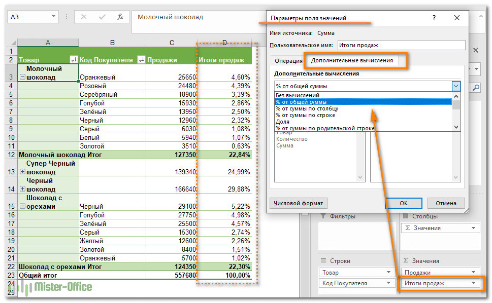
Подсказка. Функция «Дополнительные вычисления» может оказаться особенно полезной, когда вы добавляете одно и то же поле более одного раза и показываете, как в нашем примере, общий объем продаж и объем продаж в процентах от общего количества одновременно. Согласитесь, обычными формулами делать такую таблицу придется долго. А тут – пара минут работы!
Итак, процесс создания завершен. Теперь пришло время немного поэкспериментировать, чтобы выбрать макет, наиболее подходящий для вашего набора данных.
Работа со списком показателей сводной таблицы
Панель, которая формально называется списком полей, является основным инструментом, который используется для упорядочения таблицы в соответствии с вашими требованиями. Вы можете настроить её по своему вкусу, чтобы удобнее .
Чтобы изменить способ отображения вашей рабочей области, нажмите кнопку «Инструменты» и выберите предпочитаемый макет.

Вы также можете изменить размер панели по горизонтали, перетаскивая разделитель, который отделяет панель от листа.
Закрытие и открытие панели редактирования.
Закрыть список полей в сводной таблице так же просто, как нажать кнопку «Закрыть» (X) в верхнем правом углу панели. А вот как заставить его появиться снова – уже не так очевидно 
Чтобы снова отобразить его, щелкните правой кнопкой мыши в любом месте таблицы и выберите «Показать …» в контекстном меню.

Также можно нажать кнопку «Список полей» на ленте, которая находится на вкладке меню «Анализ».
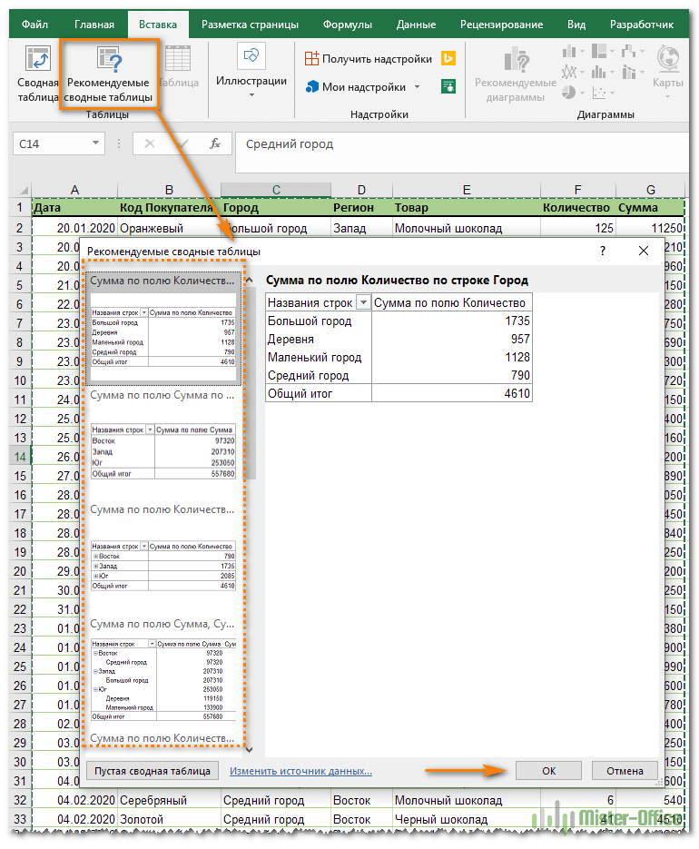
Воспользуйтесь рекомендациями программы.
Как вы только что видели, создание сводных таблиц — довольно простое дело, даже для «чайников». Однако Microsoft делает еще один шаг вперед и предлагает автоматически сгенерировать отчет, наиболее подходящий для ваших исходных данных. Все, что вам нужно, это 4 щелчка мыши:
- Нажмите любую ячейку в исходном диапазоне ячеек или таблицы.
- На вкладке «Вставка» выберите «Рекомендуемые сводные таблицы». Программа немедленно отобразит несколько макетов, основанных на ваших данных.
- Щелкните на любом макете, чтобы увидеть его предварительный просмотр.
- Если вас устраивает предложение, нажмите кнопку «ОК» и добавьте понравившийся вариант на новый лист.
Как вы видите на скриншоте выше, Эксель смог предложить несколько базовых макетов для моих исходных данных, которые значительно уступают сводным таблицам, которые мы создали вручную несколько минут назад. Конечно, это только мое мнение
Но при всем при этом, использование рекомендаций — это быстрый способ начать работу, особенно когда у вас много данных и вы не знаете, с чего начать. А затем этот вариант можно легко изменить по вашему вкусу.
Давайте улучшим результат.
Теперь, когда вы знакомы с основами, вы можете перейти к вкладкам «Анализ» и «Конструктор» инструментов в Excel 2016 и 2013 ( вкладки « Параметры» и « Конструктор» в 2010 и 2007). Они появляются, как только вы щелкаете в любом месте таблицы.
Вы также можете получить доступ к параметрам и функциям, доступным для определенного элемента, щелкнув его правой кнопкой мыши (об этом мы уже говорили при создании).
После того, как вы построили таблицу на основе исходных данных, вы, возможно, захотите уточнить ее, чтобы провести более серьёзный анализ.
Чтобы улучшить дизайн, перейдите на вкладку «Конструктор», где вы найдете множество предопределенных стилей. Чтобы получить свой собственный стиль, нажмите кнопку «Создать стиль….» внизу галереи «Стили сводной таблицы».
Чтобы настроить макет определенного поля, щелкните на нем, затем нажмите кнопку «Параметры» на вкладке «Анализ» в Excel 2016 и 2013 (вкладка « Параметры» в 2010 и 2007). Также вы можете щелкнуть правой кнопкой мыши поле и выбрать «Параметры … » в контекстном меню.
На снимке экрана ниже показан новый дизайн и макет.

Я изменил цветовой макет, а также постарался, чтобы таблица была более компактной. Для этого поменяем параметры представления товара. Какие параметры я использовал – вы видите на скриншоте.
Думаю, стало даже лучше. 😊
Как избавиться от заголовков «Метки строк» и «Метки столбцов».
При создании сводной таблицы, Excel применяет Сжатую форму по умолчанию. Этот макет отображает «Метки строк» и «Метки столбцов» в качестве заголовков. Согласитесь, это не очень информативно, особенно для новичков.
Простой способ избавиться от этих нелепых заголовков — перейти с сжатого макета на структурный или табличный. Для этого откройте вкладку «Конструктор», щелкните раскрывающийся список «Макет отчета» и выберите « Показать в форме структуры» или « Показать в табличной форме» .

И вот что мы получим в результате.

Показаны реальные имена, как вы видите на рисунке справа, что имеет гораздо больше смысла.
Другое решение — перейти на вкладку «Анализ», нажать кнопку «Заголовки полей», выключить их. Однако это удалит не только все заголовки, а также выпадающие фильтры и возможность сортировки. А для анализа данных отсутствие фильтров – это чаще всего нехорошо.
Как обновить сводную таблицу.
Хотя отчет связан с исходными данными, вы можете быть удивлены, узнав, что Excel не обновляет его автоматически. Это можно считать небольшим недостатком. Вы можете обновить его, выполнив операцию обновления вручную или же это произойдет автоматически при открытии файла.
Как обновить вручную.
- Нажмите в любом месте на свод.
- На вкладке «Анализ» нажмите кнопку «Обновить» или же нажмите клавиши ALT + F5.
Кроме того, вы можете по щелчку правой кнопки мыши выбрать пункт Обновить из появившегося контекстного меню.

Чтобы обновить все сводные таблицы в файле, нажмите стрелку кнопки «Обновить», а затем — «Обновить все».
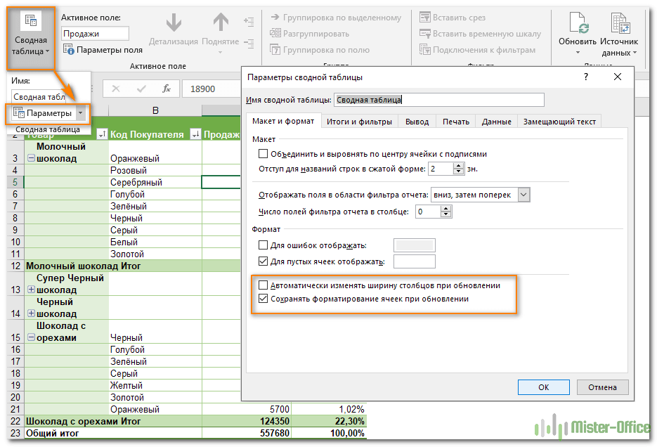
Примечание. Если внешний вид вашей сводной таблицы сильно изменяется после обновления, проверьте параметры «Автоматически изменять ширину столбцов при обновлении» и « Сохранить форматирование ячейки при обновлении». Чтобы сделать это, откройте «Параметры сводной таблицы», как это показано на рисунке, и вы найдете там эти флажки.
После запуска обновления вы можете просмотреть статус или отменить его, если вы передумали. Просто нажмите на стрелку кнопки «Обновить», а затем — «Состояние обновления» или «Отменить обновление».
Автоматическое обновление сводной таблицы при открытии файла.
- Откройте вкладку параметров, как это мы только что делали.
- В диалоговом окне «Параметры … » перейдите на вкладку «Данные» и установите флажок «Обновить при открытии файла».

Как переместить на новое место?
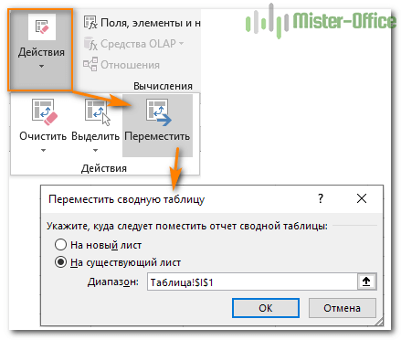
Может быть вы захотите переместить своё творение в новую рабочую книгу? Перейдите на вкладку «Анализ», нажмите кнопку «Действия» и затем — «Переместить ….. ». Выберите новый пункт назначения и нажмите ОК.
Как удалить сводную таблицу?
Если вам больше не нужен определенный сводный отчет, вы можете удалить его несколькими способами.
- Если таблица находится на отдельном листе, просто удалите этот лист.
- Ежели она расположена вместе с некоторыми другими данными на листе, выделите всю её с помощью мыши и нажмите клавишу Delete.
- Щелкните в любом месте в сводной таблице, которую хотите удалить, перейдите на вкладку «Анализ» (см. скриншот выше) => группа «Действия», нажмите небольшую стрелку под кнопкой «Выделить», выберите «Вся сводная таблица», а затем нажмите Удалить.
Примечание. Если у вас есть какая-либо диаграмма, построенная на основе свода, то описанная выше процедура удаления превратит ее в стандартную диаграмму, которую больше нельзя будет изменять или обновлять.
Надеемся, что этот самоучитель станет для вас хорошей отправной точкой. Далее нас ждут еще несколько рекомендаций, как работать со сводными таблицами. И спасибо за чтение!
Возможно, вам также будет полезно:
![]()
Download Article
Step-by-step tutorial for making and editing a pivot table in Excel
![]()
Download Article
- Building the Pivot Table
- Configuring the Pivot Table
- Using the Pivot Table
- Video
- Expert Q&A
- Tips
- Warnings
|
|
|
|
|
|
Trying to make a new pivot table in Microsoft Excel? The process is quick and easy using Excel’s built-in tools. Pivot tables are a great way to create an interactive table for data analysis and reporting. Excel allows you to drag and drop the variables you need in your table to immediately rearrange it. This wikiHow guide will show you how to create pivot tables in Microsoft Excel.
Things You Should Know
- Go to the Insert tab and click «PivotTable» to create a new pivot table.
- Use the PivotTable Fields pane to arrange your variables by row, column, and value.
- Click the drop-down arrow next to fields in the pivot table to sort and filter.
-
1
Open the Excel file where you want to create the pivot table. A pivot table allows you to create tabular reports of data in a spreadsheet. You can also perform calculations without having to input formulas.
- You can also create a pivot table in Excel using an outside data source, such as an Access database.
-
2
Highlight the cells you want to make into a pivot table. Note that the original spreadsheet data will be preserved. Skip this step if you’re going to make the pivot table using an external source of data.
- Make sure your data is formatted correctly. To create a pivot table, you’ll need a dataset that is organized in columns. It should have a single header row.
- Optionally, formatting your original data as a table using Insert > Table will help make sure the formatting is correct.
Advertisement
-
3
Go to the Insert tab and click PivotTable. This will open a new window for creating the pivot table.
- If you are using Excel 2003 or earlier, click the Data menu and select PivotTable and PivotChart Report.
- If you’re using an external source of data, click the drop-down arrow under PivotTable and select From External Data Source. Then click Choose Connection in the new window.
-
4
Select the location for your pivot table and click OK. This will place the new pivot table in the selected location. By default, Excel will place the table on a new worksheet, allowing you to switch back and forth by clicking the tabs at the bottom of the window. You can also choose to place the pivot table on the same sheet as the data, which allows you to pick the cell where you want it to be placed.
- You can later delete the pivot table without losing its data if needed.


Advertisement
-
1
Click the checkbox next to fields you want in the PivotTables Fields pane. This adds the field to your pivot table. Note that fields are what Excel calls the variables in your dataset, based on the headers in the header row.[1]
- Clicking the checkboxes automatically adds the field to a section of the pivot table. Non-numeric fields are placed in the rows section, dates are placed in the columns section, and numeric fields are placed in the values section.
- You can rearrange the fields by dragging them to a different section.
-
2
Add or move a row field. Drag a field from the field list on the right onto the «Row» section of the pivot table pane to add the field to your table.
- For example, your company sells two products: tables and chairs. You have a spreadsheet with the number (Sales) of each product (Product Type) sold in your five stores (Store).
- Drag the Store field from the field list into the Row Fields section of the pivot table. Your list of stores will appear, each as its own row.
-
3
Add a value field. Drag a field from the field list on the right onto the «Values» section of the pivot table pane to add the field to your table. The values will be calculated and organized based on the rows and columns you select.
- Continuing our example: Click and drag the Sales field into the Value Fields section of the pivot table. You will see your table display the sales information for each of your stores.
-
4
Add or move a column field. Drag a field from the field list on the right onto the «Column» section of the pivot table pane to add the column field to your table. This is used to separate your data by different categories or dates.
- Continuing our example, you could move Product Type to the columns section to see the product sales data for each store.
-
5
Add multiple fields to a section. Pivot tables allow you to add multiple fields to each section, displaying more information on the table or further subdividing the data.
- Using the above example, say you make several types of tables and several types of chairs. Your data notes whether the item is a table or chair (Product Type), but also the exact model of the table or chair sold (Model).
- Drag the Model field onto the Column Fields section. The columns will now display the breakdown of sales per model and overall type. You can change the order that these labels are displayed by clicking the arrow button next to the field in the boxes in the lower-right corner of the window. Select Move Up or Move Down to change the order.
-
6
Change the way data is displayed. You can change the way values are displayed by following these steps:
- Click the arrow icon next to a value in the Values box.
- Select Value Field Settings to change the way the values are calculated.
- For example, you could display the average value instead of a sum.
- You can add the same field to the Value box multiple times to take advantage of this. In the above example, the sales total for each store is displayed. By adding the Sales field again, you can change the value settings to show the second Sales as a percentage of total sales.
-
7
Learn some of the ways that values can be manipulated. When changing the ways values are calculated, you have several options to choose from depending on your needs.
- Sum — This is the default for value fields. Excel will total all of the values in the selected field.
- Count — This will count the number of cells that contain data in the selected field.
- Average — This will take the average of all of the values in the selected field.
-
8
Click the drop-down arrow next to a field to add a filter and sort data. Note that this is next to the field header in the pivot table, not in the pivot table editor pane. Adding a filter allows you to display only certain data given the criteria you select. Sorting the data changes the order that it appears in the pivot table.


Advertisement
-
1
Update your pivot table. Your pivot table will automatically update as you modify the data in the spreadsheet. This can be great for monitoring your spreadsheets and tracking changes.
- You can also manually update the pivot table by clicking Refresh in the PivotTable Analyze tab.
-
2
Change your pivot table around. Pivot tables are easy to edit using the editing pane. Try dragging different fields to different locations to come up with a pivot table that meets your exact needs.
- This is where the pivot table gets its name. Moving the data to different locations is known as «pivoting» as you are changing the direction that the data is displayed.
-
3
Create a pivot chart. You can use a pivot chart to show dynamic visual reports. Your Pivot Chart can be created directly from your completed pivot table.
- Click PivotChart in the «Tools» section of the PivotTable Analyze tab to make a pivot chart.


Advertisement
Add New Question
-
Question
I have created pivot tables in Excel 2020. I have selected in Design Totals to show Column and row totals but row totals will not show. Any advice please?

Kyle Smith is a wikiHow Technology Writer, learning and sharing information about the latest technology. He has presented his research at multiple engineering conferences and is the writer and editor of hundreds of online electronics repair guides. Kyle received a BS in Industrial Engineering from Cal Poly, San Luis Obispo.
wikiHow Technology Writer
Expert Answer
You can try using the PivotTable Options menu to resolve this issue. Go to the PivotTable Analyze tab > click the drop-down arrow under the PivotTable button > click Options > go to the Totals & Filters tab > check the box next to «Show grand totals for rows.»
-
Question
How do I change a name in a field/column in an existing pivot table without changing the field before/after the field requiring the update?
Kyle Smith is a wikiHow Technology Writer, learning and sharing information about the latest technology. He has presented his research at multiple engineering conferences and is the writer and editor of hundreds of online electronics repair guides. Kyle received a BS in Industrial Engineering from Cal Poly, San Luis Obispo.
wikiHow Technology Writer
Expert Answer
You can change a field name by right-clicking a value of the field in the pivot table > select Field Settings > and enter a new name in the «Custom Name» section.
-
Question
Why doesn’t my pivot table show the changes I made to the base file?
There could be couple of reasons: the base file could be missing from original location, or you did not save the changes properly in the base file. Also, remember to save your pivot table before you can expect to see any changes reflected.

See more answers
Ask a Question
200 characters left
Include your email address to get a message when this question is answered.
Submit
Advertisement
wikiHow Video: How to Create Pivot Tables in Excel
-
If you use the Import Data command from the Data menu, you have more options on how to import data ranging from Office Database connections, Excel files, Access databases, Text files, ODBC DSNs, webpages, OLAP and XML/XSL. You can then use your data as you would an Excel list.
-
If you are using an AutoFilter (Under «Data», «Filter»), disable this when creating the pivot table. It is okay to re-enable it after you have created the pivot table.
-
In addition to pivot tables, another powerful tool in Excel is the Solver function.
Thanks for submitting a tip for review!
Advertisement
-
If you are using data in an existing spreadsheet, make sure that the range that you select has a unique column name at the top of each column of data.
Advertisement
References
About This Article
Article SummaryX
A pivot table is an interactive table that lets you group and summarize data in a concise, tabular format. To create a pivot table, click the Insert tab, and then click the PivotTable icon on the toolbar. You can enter your data range manually, or quickly select it by dragging the mouse cursor across all cells in the range, including the labeled column headers. Or, if the data is in an external database, select Use an external data source, and then choose that database and range. Your new pivot table will be placed on the active worksheet by default, but you can change the sheet name and range under «»Existing Worksheet»» to put it elsewhere, or select New Worksheet to place it on its own brand new sheet. Click OK to place your pivot table on the selected sheet.
You’ll use the Pivot Table Fields bar on the right to lay out your table in columns and rows. Drag fields to the Columns and Rows areas, and then drag fields that represent values to the Values area. Adding fields to the Filters area lets you filter your table by the type of data in that field. You can add multiple data fields to any of these sections, and move things around until they look the way you’d like. Once you’ve created your table, you can click the PivotTable Analyze tab to view and manage more settings, or the Design tab to customize its color and style.
Did this summary help you?
Thanks to all authors for creating a page that has been read 2,133,227 times.
Reader Success Stories
-

«What helped me most with my questions were the sequential steps and explanations on what to do and how to do it. …» more
Is this article up to date?
If you are reading this tutorial, there is a big chance you have heard of (or even used) the Excel Pivot Table. It’s one of the most powerful features in Excel (no kidding).
The best part about using a Pivot Table is that even if you don’t know anything in Excel, you can still do pretty awesome things with it with a very basic understanding of it.
Let’s get started.
Click here to download the sample data and follow along.
What is a Pivot Table and Why Should You Care?
A Pivot Table is a tool in Microsoft Excel that allows you to quickly summarize huge datasets (with a few clicks).
Even if you’re absolutely new to the world of Excel, you can easily use a Pivot Table. It’s as easy as dragging and dropping rows/columns headers to create reports.
Suppose you have a dataset as shown below:
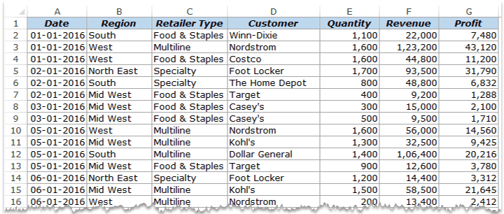
This is sales data that consists of ~1000 rows.
It has the sales data by region, retailer type, and customer.
Now your boss may want to know a few things from this data:
- What were the total sales in the South region in 2016?
- What are the top five retailers by sales?
- How did The Home Depot’s performance compare against other retailers in the South?
You can go ahead and use Excel functions to give you the answers to these questions, but what if suddenly your boss comes up with a list of five more questions.
You’ll have to go back to the data and create new formulas every time there is a change.
This is where Excel Pivot Tables comes in really handy.
Within seconds, a Pivot Table will answer all these questions (as you’ll learn below).
But the real benefit is that it can accommodate your finicky data-driven boss by answering his questions immediately.
It’s so simple, you may as well take a few minutes and show your boss how to do it himself.
Hopefully, now you have an idea of why Pivot Tables are so awesome. Let’s go ahead and create a Pivot Table using the data set (shown above).
Inserting a Pivot Table in Excel
Here are the steps to create a pivot table using the data shown above:
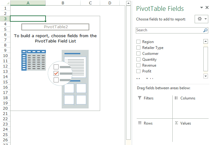
As soon as you click OK, a new worksheet is created with the Pivot Table in it.
While the Pivot Table has been created, you’d see no data in it. All you’d see is the Pivot Table name and a single line instruction on the left, and Pivot Table Fields on the right.
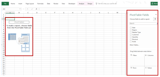
Now before we jump into analyzing data using this Pivot Table, let’s understand what are the nuts and bolts that make an Excel Pivot Table.
Also read: 10 Excel Pivot Table Keyboard Shortcuts
The Nuts & Bolts of an Excel Pivot Table
To use a Pivot Table efficiently, it’s important to know the components that create a pivot table.
In this section, you’ll learn about:
- Pivot Cache
- Values Area
- Rows Area
- Columns Area
- Filters Area
Pivot Cache
As soon as you create a Pivot Table using the data, something happens in the backend. Excel takes a snapshot of the data and stores it in its memory. This snapshot is called the Pivot Cache.
When you create different views using a Pivot Table, Excel does not go back to the data source, rather it uses the Pivot Cache to quickly analyze the data and give you the summary/results.
The reason a pivot cache gets generated is to optimize the pivot table functioning. Even when you have thousands of rows of data, a pivot table is super fast in summarizing the data. You can drag and drop items in the rows/columns/values/filters boxes and it will instantly update the results.
Note: One downside of pivot cache is that it increases the size of your workbook. Since it’s a replica of the source data, when you create a pivot table, a copy of that data gets stored in the Pivot Cache.
Read More: What is Pivot Cache and How to Best Use It.
Values Area
The Values Area is what holds the calculations/values.
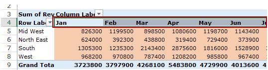
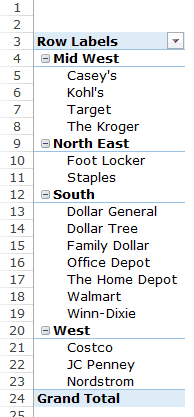
Based on the data set shown at the beginning of the tutorial, if you quickly want to calculate total sales by region in each month, you can get a pivot table as shown below (we’ll see how to create this later in the tutorial).
The area highlighted in orange is the Values Area.
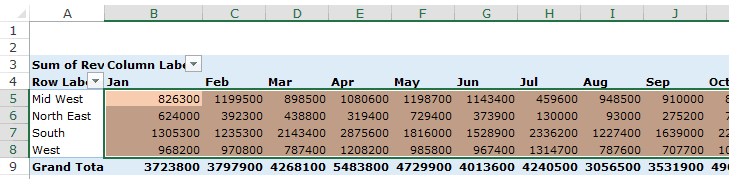
In this example, it has the total sales in each month for the four regions.
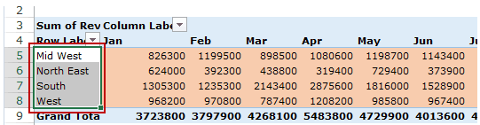
Rows Area
The headings to the left of the Values area makes the Rows area.
In the example below, the Rows area contains the regions (highlighted in red):
Columns Area
The headings at the top of the Values area makes the Columns area.
In the example below, Columns area contains the months (highlighted in red):
Filters Area
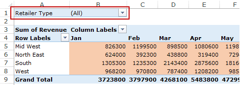
Filters area is an optional filter that you can use to further drill down in the data set.
For example, if you only want to see the sales for Multiline retailers, you can select that option from the drop down (highlighted in the image below), and the Pivot Table would update with the data for Multiline retailers only.
Analyzing Data Using the Pivot Table
Now, let’s try and answer the questions by using the Pivot Table we have created.
Click here to download the sample data and follow along.
To analyze data using a Pivot Table, you need to decide how you want the data summary to look in the final result. For example, you may want all the regions in the left and the total sales right next to it. Once you have this clarity in mind, you can simply drag and drop the relevant fields in the Pivot Table.
In the Pivot Tabe Fields section, you have the fields and the areas (as highlighted below):
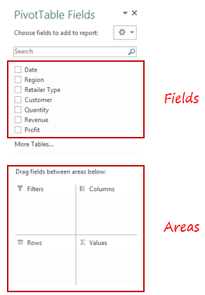
The Fields are created based on the backend data used for the Pivot Table. The Areas section is where you place the fields, and according to where a field goes, your data is updated in the Pivot Table.
It’s a simple drag and drop mechanism, where you can simply drag a field and put it in one of the four areas. As soon as you do this, it will appear in the Pivot Table in the worksheet.
Now let’s try and answer the questions your manager had using this Pivot Table.
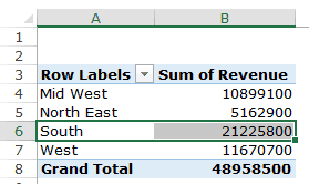
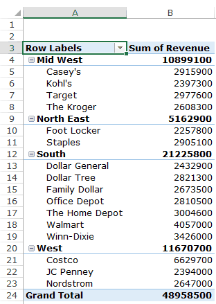
Q1: What were the total sales in the South region?
Drag the Region field in the Rows area and the Revenue field in the Values area. It would automatically update the Pivot Table in the worksheet.
Note that as soon as you drop the Revenue field in the Values area, it becomes Sum of Revenue. By default, Excel sums all the values for a given region and shows the total. If you want, you can change this to Count, Average, or other statistics metrics. In this case, the sum is what we needed.
The answer to this question would be 21225800.
Q2 What are the top five retailers by sales?
Drag the Customer field in the Row area and Revenue field in the values area. In case, there are any other fields in the area section and you want to remove it, simply select it and drag it out of it.
You’ll get a Pivot Table as shown below:
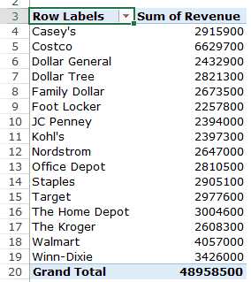
Note that by default, the items (in this case the customers) are sorted in an alphabetical order.
To get the top five retailers, you can simply sort this list and use the top five customer names. To do this:
This will give you a sorted list based on total sales.
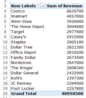
Q3: How did The Home Depot’s performance compare against other retailers in the South?
You can do a lot of analysis for this question, but here let’s just try and compare the sales.
Drag the Region Field in the Rows area. Now drag the Customer field in the Rows area below the Region field. When you do this, Excel would understand that you want to categorize your data first by region and then by customers within the regions. You’ll have something as shown below:
Now drag the Revenue field in the Values area and you’ll have the sales for each customer (as well as the overall region).
You can sort the retailers based on the sales figures by following the below steps:
- Right-click on a cell that has the sales value for any retailer.
- Go to Sort –> Sort Largest to Smallest.
This would instantly sort all the retailers by the sales value.
Now you can quickly scan through the South region and identify that The Home Depot sales were 3004600 and it did better than four retailers in the South region.
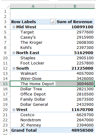
Now there are more than one ways to skin the cat. You can also put the Region in the Filter area and then only select the South Region.
Click here to download the sample data.
I hope this tutorial gives you a basic overview of Excel Pivot Tables and helps you in getting started with it.
Here are some more Pivot Table Tutorials you may like:
- Preparing Source Data For Pivot Table.
- How to Apply Conditional Formatting in a Pivot Table in Excel.
- How to Group Dates in Pivot Tables in Excel.
- How to Group Numbers in Pivot Table in Excel.
- How to Filter Data in a Pivot Table in Excel.
- Using Slicers in Excel Pivot Table.
- How to Replace Blank Cells with Zeros in Excel Pivot Tables.
- How to Add and Use an Excel Pivot Table Calculated Fields.
- How to Refresh Pivot Table in Excel.
Что такое сводная таблица Excel
Что такое сводная таблица (Pivot Table – англ.)? Pivot Table дословно переводится как «таблица, которую можно крутить, показывать в разных разворотах». Это инструмент, который позволяет представлять данные в виде, удобном для анализа. Вид сводной таблицы можно быстро менять с помощью одной только мышки, помещая данные в строки или столбцы, выбирать уровни группировки, фильтровать и «перетаскивать» мышкой столбцы с одного места на другое.
Также к сводным таблицам можно применять элементы управления и добавлять диаграммы, создавая наглядные отчеты. Примеры таких отчетов можно посмотреть здесь:
- Отчет о динамике и структуре продаж
- Анализ исполнения бюджета (БДР)
Исходные данные для сводной таблицы
Чтобы построить сводную таблицу, нужно обратиться к данным в Excel, организованным в виде плоской таблицы. Это значит, что все строки такой таблицы заполнены и в ней нет группировок.
Как построить сводную таблицу
Шаг 1. Выделить таблицу Excel
Выделите одну ячейку таблицы (тогда Excel автоматически определит границы таблицы на следующем шаге) или выделите всю таблицу вместе с заголовками.
Как быстро выделить таблицу:
- Выбрать ее любую ячейку и нажать Crtl + * или Ctrl + A, или
- Выбрать самую первую ячейку в таблице, зажать кнопки Ctrl и Shift, а затем нажать на кнопки вправо, затем вниз (→↓).
Если выделить больше одной ячейки, но не всю таблицу, в качестве источника данных будет захвачена только выделенная область.
Шаг 2. Создать сводную таблицу
Создайте сводную таблицу: перейдите на вкладку Вставка и выберите «Сводная таблица».
В появившемся диалоговом окне укажите исходные данные (если вы уже выделили таблицу, источник данных заполнится автоматически) и желаемое место расположения сводной таблицы. Её можно поместить на новый или существующий лист.
Когда сводная таблица добавлена, на листе появляется область сводной таблицы. Если эта область не активна (вы не выделили ее мышкой), на ней будет подсказка: «Чтобы начать работу с отчетом сводной таблицей, щелкните в этой области». Щелкаем по ней мышкой и происходят две вещи:
- Справа появится список полей сводной таблицы.
- В меню — две дополнительные вкладки, связанные с управлением сводной таблицей (Анализ и Конструктор).
Шаг 3. Добавить в сводную таблицу необходимые поля
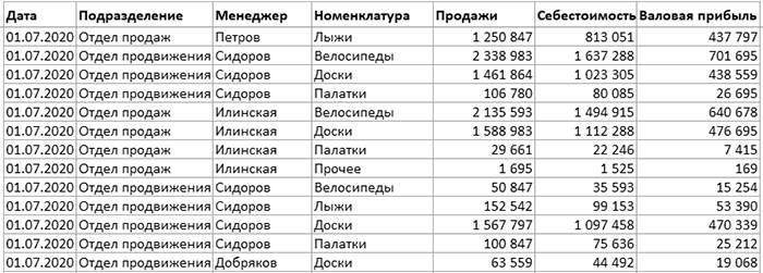
 Проставляем «галочки» в нужных полях сводной таблицы. При этом элементы «сами» встанут на свои места. Если просто поставить «галочки» в области выбора полей, Excel в зависимости от содержимого ячеек определит куда что ставить. Если в столбце содержатся только значения в числовом формате, то его содержимое попадет в область «Σ Значения».
Правило следующее: если поле содержит текст или числа хотя бы с одной пустой или текстовой ячейкой, то Excel автоматически поместит эти данные в область «Названия строк».
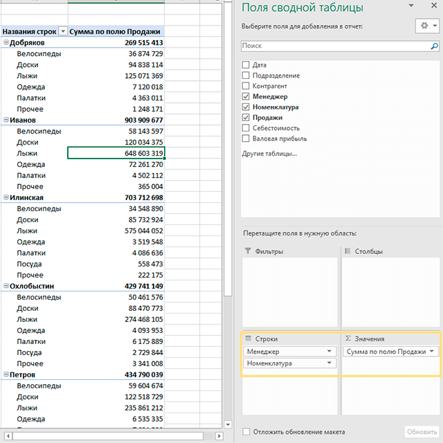
После заполнения областей сводной таблицы её вид изменится. В нашем примере в строках появились ФИО менеджеров и товары, а напротив них – суммы продаж. Далее данные можно детализировать и создать визуализации.
Поля можно «перетаскивать» мышкой из одной области в другую:

- Фильтры. С помощью фильтров отбираем из исходных данных нужную информацию. Для этого поместите поля в область фильтров и выберите значения, которые хотите анализировать.
- Столбцы – поместите в эту область поля, которые должны быть в заголовках столбцов.
- Строки – данные, которые будут выводиться в строках таблицы.
В область строк и столбцов можно поместить несколько полей. Тогда данные в таблице будут сгруппированы. - Область значений. В этой области размещаем числовые показатели, которые нужно просуммировать или рассчитать среднее, минимум, максимум и т.д.
Обновление сводной таблицы
Когда исходные данные поменяются, обновите сводную таблицу. Для этого перейдите в меню Данные и нажмите «Обновить». Такая же кнопка есть и на вкладке Анализ. Или еще можно щелкнуть правой кнопкой мышки по сводной таблице и выбрать «Обновить» в появившемся меню. После нажатия этой кнопки сводная таблица «пересчитается».
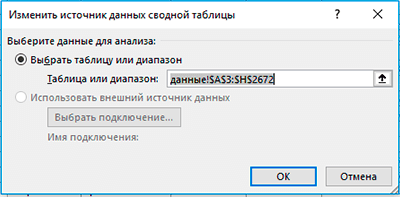
Если изменился сам источник данных (добавлены новые строки или столбцы), выберите любую ячейку сводной таблицы и перейдите в меню Анализ → Источник данных.
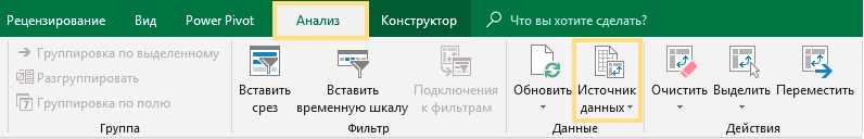
В появившемся окне выберите источник данных.
Один из оптимальных способов задать источник данных – это указать в качестве него «умную» smart-таблицу Excel. О преимуществах этого способа и вообще о плюсах использования «умных» таблиц читайте в следующей статье.
Резюме
В этой статье рассмотрен пример создания простой сводной таблицы, с помощью которой данные можно группировать, анализировать и представлять в нужном нам виде за несколько щелчков мышки. Так что сводные таблицы – это полезный инструмент, который пригодится вам в будущем.
То, что написано о сводных таблицах в статье — это еще не все. Для «продвинутой» аналитики в Excel есть надстройки и инструменты, которые расширяют функционал сводных таблиц до действительно серьезного уровня и переносят его в область Business Intelligence. Сейчас мы говорим о надстройках Power Query и Power Pivot, которые также задействованы в продукте Microsoft Power BI.