Charts help you visualize your data in a way that creates maximum impact on your audience. Learn to create a chart and add a trendline. You can start your document from a recommended chart or choose one from our collection of pre-built chart templates.

Create a chart
-
Select data for the chart.
-
Select Insert > Recommended Charts.
-
Select a chart on the Recommended Charts tab, to preview the chart.
Note: You can select the data you want in the chart and press ALT + F1 to create a chart immediately, but it might not be the best chart for the data. If you don’t see a chart you like, select the All Charts tab to see all chart types.
-
Select a chart.
-
Select OK.
Add a trendline
-
Select a chart.
-
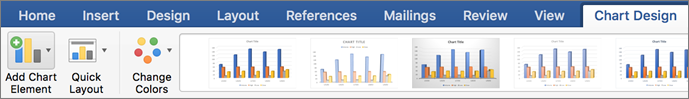
Select Design > Add Chart Element.
-
Select Trendline and then select the type of trendline you want, such as Linear, Exponential, Linear Forecast, or Moving Average.
Note: Some of the content in this topic may not be applicable to some languages.
Charts display data in a graphical format that can help you and your audience visualize relationships between data. When you create a chart, you can select from many chart types (for example, a stacked column chart or a 3-D exploded pie chart). After you create a chart, you can customize it by applying chart quick layouts or styles.
Charts contain several elements, such as a title, axis labels, a legend, and gridlines. You can hide or display these elements, and you can also change their location and formatting.
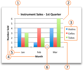
 Chart title
 Plot area
 Legend
 Axis titles
 Axis labels
 Tick marks
 Gridlines
You can create a chart in Excel, Word, and PowerPoint. However, the chart data is entered and saved in an Excel worksheet. If you insert a chart in Word or PowerPoint, a new sheet is opened in Excel. When you save a Word document or PowerPoint presentation that contains a chart, the chart’s underlying Excel data is automatically saved within the Word document or PowerPoint presentation.
Note: The Excel Workbook Gallery replaces the former Chart Wizard. By default, the Excel Workbook Gallery opens when you open Excel. From the gallery, you can browse templates and create a new workbook based on one of them. If you don’t see the Excel Workbook Gallery, on the File menu, click New from Template.
-
On the View menu, click Print Layout.
-
Click the Insert tab, and then click the arrow next to Chart.

-
Click a chart type, and then double-click the chart you want to add.
When you insert a chart into Word or PowerPoint, an Excel worksheet opens that contains a table of sample data.
-
In Excel, replace the sample data with the data that you want to plot in the chart. If you already have your data in another table, you can copy the data from that table and then paste it over the sample data. See the following table for guidelines for how to arrange the data to fit your chart type.
For this chart type
Arrange the data
Area, bar, column, doughnut, line, radar, or surface chart
In columns or rows, as in the following examples:
Series 1
Series 2
Category A
10
12
Category B
11
14
Category C
9
15
or
Category A
Category B
Series 1
10
11
Series 2
12
14
Bubble chart
In columns, putting x values in the first column and corresponding y values and bubble size values in adjacent columns, as in the following examples:
X-Values
Y-Value 1
Size 1
0.7
2.7
4
1.8
3.2
5
2.6
0.08
6
Pie chart
In one column or row of data and one column or row of data labels, as in the following examples:
Sales
1st Qtr
25
2nd Qtr
30
3rd Qtr
45
or
1st Qtr
2nd Qtr
3rd Qtr
Sales
25
30
45
Stock chart
In columns or rows in the following order, using names or dates as labels, as in the following examples:
Open
High
Low
Close
1/5/02
44
55
11
25
1/6/02
25
57
12
38
or
1/5/02
1/6/02
Open
44
25
High
55
57
Low
11
12
Close
25
38
X Y (scatter) chart
In columns, putting x values in the first column and corresponding y values in adjacent columns, as in the following examples:
X-Values
Y-Value 1
0.7
2.7
1.8
3.2
2.6
0.08
or
X-Values
0.7
1.8
2.6
Y-Value 1
2.7
3.2
0.08
-
To change the number of rows and columns included in the chart, rest the pointer on the lower-right corner of the selected data, and then drag to select additional data. In the following example, the table is expanded to include additional categories and data series.
-
To see the results of your changes, switch back to Word or PowerPoint.
Note: When you close the Word document or the PowerPoint presentation that contains the chart, the chart’s Excel data table closes automatically.
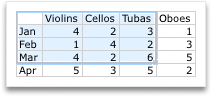
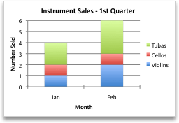
After you create a chart, you might want to change the way that table rows and columns are plotted in the chart. For example, your first version of a chart might plot the rows of data from the table on the chart’s vertical (value) axis, and the columns of data on the horizontal (category) axis. In the following example, the chart emphasizes sales by instrument.

However, if you want the chart to emphasize the sales by month, you can reverse the way the chart is plotted.
-
On the View menu, click Print Layout.
-
Click the chart.
-
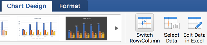
Click the Chart Design tab, and then click Switch Row/Column.
If Switch Row/Column is not available
Switch Row/Column is available only when the chart’s Excel data table is open and only for certain chart types. You can also edit the data by clicking the chart, and then editing the worksheet in Excel.
-
On the View menu, click Print Layout.
-
Click the chart.
-
Click the Chart Design tab, and then click Quick Layout.
-
Click the layout you want.
To immediately undo a quick layout that you applied, press
+ Z .
 + Z .
+ Z .Chart styles are a set of complementary colors and effects that you can apply to your chart. When you select a chart style, your changes affect the whole chart.
-
On the View menu, click Print Layout.
-
Click the chart.
-
Click the Chart Design tab, and then click the style you want.
To see more styles, point to a style, and then click
.To immediately undo a style that you applied, press
+ Z .
 .
.-
On the View menu, click Print Layout.
-
Click the chart, and then click the Chart Design tab.
-
Click Add Chart Element.
-
Click Chart Title to choose title format options, and then return to the chart to type a title in the Chart Title box.
See also
Update the data in an existing chart
Chart types
Create a chart
You can create a chart for your data in Excel for the web. Depending on the data you have, you can create a column, line, pie, bar, area, scatter, or radar chart.
-
Click anywhere in the data for which you want to create a chart.
To plot specific data into a chart, you can also select the data.
-
Select Insert > Charts > and the chart type you want.
-
On the menu that opens, select the option you want. Hover over a chart to learn more about it.
Tip: Your choice isn’t applied until you pick an option from a Charts command menu. Consider reviewing several chart types: as you point to menu items, summaries appear next to them to help you decide.
-
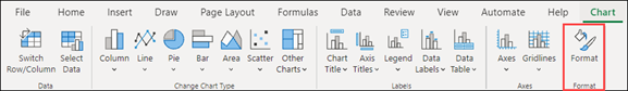
To edit the chart (titles, legends, data labels), select the Chart tab and then select Format.
-
In the Chart pane, adjust the setting as needed. You can customize settings for the chart’s title, legend, axis titles, series titles, and more.


Available chart types
It’s a good idea to review your data and decide what type of chart would work best. The available types are listed below.
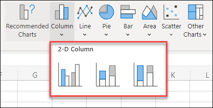
Data that’s arranged in columns or rows on a worksheet can be plotted in a column chart. A column chart typically displays categories along the horizontal axis and values along the vertical axis, like shown in this chart:

Types of column charts
-
Clustered column A clustered column chart shows values in 2-D columns. Use this chart when you have categories that represent:
-
Ranges of values (for example, item counts).
-
Specific scale arrangements (for example, a Likert scale with entries, like strongly agree, agree, neutral, disagree, strongly disagree).
-
Names that are not in any specific order (for example, item names, geographic names, or the names of people).
-
-
Stacked column A stacked column chart shows values in 2-D stacked columns. Use this chart when you have multiple data series and you want to emphasize the total.
-
100% stacked column A 100% stacked column chart shows values in 2-D columns that are stacked to represent 100%. Use this chart when you have two or more data series and you want to emphasize the contributions to the whole, especially if the total is the same for each category.
Data that is arranged in columns or rows on a worksheet can be plotted in a line chart. In a line chart, category data is distributed evenly along the horizontal axis, and all value data is distributed evenly along the vertical axis. Line charts can show continuous data over time on an evenly scaled axis, and are therefore ideal for showing trends in data at equal intervals, like months, quarters, or fiscal years.

Types of line charts
-
Line and line with markers Shown with or without markers to indicate individual data values, line charts can show trends over time or evenly spaced categories, especially when you have many data points and the order in which they are presented is important. If there are many categories or the values are approximate, use a line chart without markers.
-
Stacked line and stacked line with markers Shown with or without markers to indicate individual data values, stacked line charts can show the trend of the contribution of each value over time or evenly spaced categories.
-
100% stacked line and 100% stacked line with markers Shown with or without markers to indicate individual data values, 100% stacked line charts can show the trend of the percentage each value contributes over time or evenly spaced categories. If there are many categories or the values are approximate, use a 100% stacked line chart without markers.
Notes:
-
Line charts work best when you have multiple data series in your chart—if you only have one data series, consider using a scatter chart instead.
-
Stacked line charts add the data, which might not be the result you want. It might not be easy to see that the lines are stacked, so consider using a different line chart type or a stacked area chart instead.
-
Data that is arranged in one column or row on a worksheet can be plotted in a pie chart. Pie charts show the size of items in one data series, proportional to the sum of the items. The data points in a pie chart are shown as a percentage of the whole pie.

Consider using a pie chart when:
-
You have only one data series.
-
None of the values in your data are negative.
-
Almost none of the values in your data are zero values.
-
You have no more than seven categories, all of which represent parts of the whole pie.
Data that is arranged in columns or rows only on a worksheet can be plotted in a doughnut chart. Like a pie chart, a doughnut chart shows the relationship of parts to a whole, but it can contain more than one data series.

Tip: Doughnut charts are not easy to read. You may want to use a stacked column or stacked bar chart instead.
Data that is arranged in columns or rows on a worksheet can be plotted in a bar chart. Bar charts illustrate comparisons among individual items. In a bar chart, the categories are typically organized along the vertical axis, and the values along the horizontal axis.

Consider using a bar chart when:
-
The axis labels are long.
-
The values that are shown are durations.
Types of bar charts
-
Clustered A clustered bar chart shows bars in 2-D format.
-
Stacked bar Stacked bar charts show the relationship of individual items to the whole in 2-D bars
-
100% stacked A 100% stacked bar shows 2-D bars that compare the percentage that each value contributes to a total across categories.
Data that is arranged in columns or rows on a worksheet can be plotted in an area chart. Area charts can be used to plot change over time and draw attention to the total value across a trend. By showing the sum of the plotted values, an area chart also shows the relationship of parts to a whole.

Types of area charts
-
Area Shown in 2-D format, area charts show the trend of values over time or other category data. As a rule, consider using a line chart instead of a non-stacked area chart, because data from one series can be hidden behind data from another series.
-
Stacked area Stacked area charts show the trend of the contribution of each value over time or other category data in 2-D format.
-
100% stacked 100% stacked area charts show the trend of the percentage that each value contributes over time or other category data.
Data that is arranged in columns and rows on a worksheet can be plotted in an scatter chart. Place the x values in one row or column, and then enter the corresponding y values in the adjacent rows or columns.
A scatter chart has two value axes: a horizontal (x) and a vertical (y) value axis. It combines x and y values into single data points and shows them in irregular intervals, or clusters. Scatter charts are typically used for showing and comparing numeric values, like scientific, statistical, and engineering data.

Consider using a scatter chart when:
-
You want to change the scale of the horizontal axis.
-
You want to make that axis a logarithmic scale.
-
Values for horizontal axis are not evenly spaced.
-
There are many data points on the horizontal axis.
-
You want to adjust the independent axis scales of a scatter chart to reveal more information about data that includes pairs or grouped sets of values.
-
You want to show similarities between large sets of data instead of differences between data points.
-
You want to compare many data points without regard to time — the more data that you include in a scatter chart, the better the comparisons you can make.
Types of scatter charts
-
Scatter This chart shows data points without connecting lines to compare pairs of values.
-
Scatter with smooth lines and markers and scatter with smooth lines This chart shows a smooth curve that connects the data points. Smooth lines can be shown with or without markers. Use a smooth line without markers if there are many data points.
-
Scatter with straight lines and markers and scatter with straight lines This chart shows straight connecting lines between data points. Straight lines can be shown with or without markers.
Data that is arranged in columns or rows on a worksheet can be plotted in a radar chart. Radar charts compare the aggregate values of several data series.

Type of radar charts
-
Radar and radar with markers With or without markers for individual data points, radar charts show changes in values relative to a center point.
-
Filled radar In a filled radar chart, the area covered by a data series is filled with a color.
Add or edit a chart title
You can add or edit a chart title, customize its look, and include it on the chart.
-
Click anywhere in the chart to show the Chart tab on the ribbon.
-
Click Format to open the chart formatting options.
-
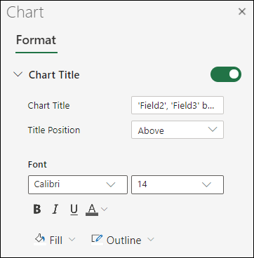
In the Chart pane, expand the Chart Title section.
-
Add or edit the Chart Title to meet your needs.
-
Use the switch to hide the title if you don’t want your chart to show a title.
Add axis titles to improve chart readability
Adding titles to the horizontal and vertical axes in charts that have axes can make them easier to read. You can’t add axis titles to charts that don’t have axes, such as pie and doughnut charts.
Much like chart titles, axis titles help the people who view the chart understand what the data is about.

-
Click anywhere in the chart to show the Chart tab on the ribbon.
-
Click Format to open the chart formatting options.
-
In the Chart pane, expand the Horizontal Axis or Vertical Axis section.
-
Add or edit the Horizontal Axis or Vertical Axis options to meet your needs.
-
Expand the Axis Title.
-
Change the Axis Title and modify the formatting.
-
Use the switch to show or hide the title.
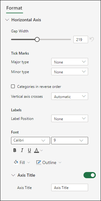

Change the axis labels
Axis labels are shown below the horizontal axis and next to the vertical axis. Your chart uses text in the source data for these axis labels.

To change the text of the category labels on the horizontal or vertical axis:
-
Click the cell which has the label text you want to change.
-
Type the text you want and press Enter.
The axis labels in the chart are automatically updated with the new text.
Tip: Axis labels are different from axis titles you can add to describe what is shown on the axes. Axis titles aren’t automatically shown in a chart.
Remove the axis labels
To remove labels on the horizontal or vertical axis:
-
Click anywhere in the chart to show the Chart tab on the ribbon.
-
Click Format to open the chart formatting options.
-
In the Chart pane, expand the Horizontal Axis or Vertical Axis section.
-
From the dropdown box for Label Position, select None to prevent the labels from showing on the chart.

Need more help?
You can always ask an expert in the Excel Tech Community or get support in the Answers community.
Create a chart (graph) that is recommended for your data, almost as fast as using the chart wizard that is no longer available.
Create a chart
-
Select the data for which you want to create a chart.
-
Click INSERT > Recommended Charts.
-
On the Recommended Charts tab, scroll through the list of charts that Excel recommends for your data, and click any chart to see how your data will look.
If you don’t see a chart you like, click All Charts to see all the available chart types.
-
When you find the chart you like, click it > OK.
-
Use the Chart Elements, Chart Styles, and Chart Filters buttons, next to the upper-right corner of the chart to add chart elements like axis titles or data labels, customize the look of your chart, or change the data that is shown in the chart.
-
To access additional design and formatting features, click anywhere in the chart to add the CHART TOOLS to the ribbon, and then click the options you want on the DESIGN and FORMAT tabs.
Want more?
Copy an Excel chart to another Office program
Create a chart from start to finish
Charts provide a visual representation of your data, making it easier to analyze.
For example, I want to create a chart for Sales, to see if there is a pattern.
I select the cells that I want to use for the chart, click the Quick Analysis button, and click the CHARTS tab.
Excel displays recommended charts based on the data in the cells selected.
You can hover over each one to see what looks good for your data.
Clustered Column is great for comparing data, so I click it.
And now, I have an eye catching chart of the data.
It looks like the Summer months are slower and the Winter months are busier.
Up next, Create pie, bar, and line charts.
Need more help?
Want more options?
Explore subscription benefits, browse training courses, learn how to secure your device, and more.
Communities help you ask and answer questions, give feedback, and hear from experts with rich knowledge.
After you input your data and select the cell range, you’re ready to choose the chart type. In this example, we’ll create a clustered column chart from the data we used in the previous section.
Step 1: Select Chart Type
Once your data is highlighted in the Workbook, click the Insert tab on the top banner. About halfway across the toolbar is a section with several chart options. Excel provides Recommended Charts based on popularity, but you can click any of the dropdown menus to select a different template.

Step 2: Create Your Chart
- From the Insert tab, click the column chart icon and select Clustered Column.

- Excel will automatically create a clustered chart column from your selected data. The chart will appear in the center of your workbook.
- To name your chart, double click the Chart Title text in the chart and type a title. We’ll call this chart “Product Profit 2013 — 2017.”

We’ll use this chart for the rest of the walkthrough. You can download this same chart to follow along.
Download Sample Column Chart Template
There are two tabs on the toolbar that you will use to make adjustments to your chart: Chart Design and Format. Excel automatically applies design, layout, and format presets to charts and graphs, but you can add customization by exploring the tabs. Next, we’ll walk you through all the available adjustments in Chart Design.

Step 3: Add Chart Elements
Adding chart elements to your chart or graph will enhance it by clarifying data or providing additional context. You can select a chart element by clicking on the Add Chart Element dropdown menu in the top left-hand corner (beneath the Home tab).

To Display or Hide Axes:
- Select Axes. Excel will automatically pull the column and row headers from your selected cell range to display both horizontal and vertical axes on your chart (Under Axes, there is a check mark next to Primary Horizontal and Primary Vertical.)

- Uncheck these options to remove the display axis on your chart. In this example, clicking Primary Horizontal will remove the year labels on the horizontal axis of your chart.

- Click More Axis Options… from the Axes dropdown menu to open a window with additional formatting and text options such as adding tick marks, labels, or numbers, or to change text color and size.


To Add Axis Titles:
- Click Add Chart Element and click Axis Titles from the dropdown menu. Excel will not automatically add axis titles to your chart; therefore, both Primary Horizontal and Primary Vertical will be unchecked.
- To create axis titles, click Primary Horizontal or Primary Vertical and a text box will appear on the chart. We clicked both in this example. Type your axis titles. In this example, the we added the titles “Year” (horizontal) and “Profit” (vertical).


To Remove or Move Chart Title:
- Click Add Chart Element and click Chart Title. You will see four options: None, Above Chart, Centered Overlay, and More Title Options.

- Click None to remove chart title.
- Click Above Chart to place the title above the chart. If you create a chart title, Excel will automatically place it above the chart.
- Click Centered Overlay to place the title within the gridlines of the chart. Be careful with this option: you don’t want the title to cover any of your data or clutter your graph (as in the example below).


To Add Data Labels:
- Click Add Chart Element and click Data Labels. There are six options for data labels: None (default), Center, Inside End, Inside Base, Outside End, and More Data Label Title Options.

- The four placement options will add specific labels to each data point measured in your chart. Click the option you want. This customization can be helpful if you have a small amount of precise data, or if you have a lot of extra space in your chart. For a clustered column chart, however, adding data labels will likely look too cluttered. For example, here is what selecting Center data labels looks like:


To Add a Data Table:
- Click Add Chart Element and click Data Table. There are three pre-formatted options along with an extended menu that can be found by clicking More Data Table Options:


Note: If you choose to include a data table, you’ll probably want to make your chart larger to accommodate the table. Simply click the corner of your chart and use drag-and-drop to resize your chart.
To Add Error Bars:
- Click Add Chart Element and click Error Bars. In addition to More Error Bars Options, there are four options: None (default), Standard Error, 5% (Percentage), and Standard Deviation. Adding error bars provide a visual representation of the potential error in the shown data, based on different standard equations for isolating error.

- For example, when we click Standard Error from the options we get a chart that looks like the image below.


To Add Gridlines:
- Click Add Chart Element and click Gridlines. In addition to More Grid Line Options, there are four options: Primary Major Horizontal, Primary Major Vertical, Primary Minor Horizontal, and Primary Minor Vertical. For a column chart, Excel will add Primary Major Horizontal gridlines by default.

- You can select as many different gridlines as you want by clicking the options. For example, here is what our chart looks like when we click all four gridline options.

To Add a Legend:
- Click Add Chart Element and click Legend. In addition to More Legend Options, there are five options for legend placement: None, Right, Top, Left, and Bottom.

- Legend placement will depend on the style and format of your chart. Check the option that looks best on your chart. Here is our chart when we click the Right legend placement.


To Add Lines: Lines are not available for clustered column charts. However, in other chart types where you only compare two variables, you can add lines (e.g. target, average, reference, etc.) to your chart by checking the appropriate option.
To Add a Trendline:
- Click Add Chart Element and click Trendline. In addition to More Trendline Options, there are five options: None (default), Linear, Exponential, Linear Forecast, and Moving Average. Check the appropriate option for your data set. In this example, we will click Linear.

- Because we are comparing five different products over time, Excel creates a trendline for each individual product. To create a linear trendline for Product A, click Product A and click the blue OK button.

- The chart will now display a dotted trendline to represent the linear progression of Product A. Note that Excel has also added Linear (Product A) to the legend.

- To display the trendline equation on your chart, double click the trendline. A Format Trendline window will open on the right side of your screen. Click the box next to Display equation on chart at the bottom of the window. The equation now appears on your chart.


Note: You can create separate trendlines for as many variables in your chart as you like. For example, here is our chart with trendlines for Product A and Product C.

To Add Up/Down Bars: Up/Down Bars are not available for a column chart, but you can use them in a line chart to show increases and decreases among data points.
Step 4: Adjust Quick Layout
- The second dropdown menu on the toolbar is Quick Layout, which allows you to quickly change the layout of elements in your chart (titles, legend, clusters etc.).

- There are 11 quick layout options. Hover your cursor over the different options for an explanation and click the one you want to apply.


Step 5: Change Colors
The next dropdown menu in the toolbar is Change Colors. Click the icon and choose the color palette that fits your needs (these needs could be aesthetic, or to match your brand’s colors and style).

Step 6: Change Style
For cluster column charts, there are 14 chart styles available. Excel will default to Style 1, but you can select any of the other styles to change the chart appearance. Use the arrow on the right of the image bar to view other options.

Step 7: Switch Row/Column
- Click the Switch Row/Column on the toolbar to flip the axes. Note: It is not always intuitive to flip axes for every chart, for example, if you have more than two variables.


In this example, switching the row and column swaps the product and year (profit remains on the y-axis). The chart is now clustered by product (not year), and the color-coded legend refers to the year (not product). To avoid confusion here, click on the legend and change the titles from Series to Years.

Step 8: Select Data
- Click the Select Data icon on the toolbar to change the range of your data.
- A window will open. Type the cell range you want and click the OK button. The chart will automatically update to reflect this new data range.


Step 9: Change Chart Type
- Click the Change Chart Type dropdown menu.

- Here you can change your chart type to any of the nine chart categories that Excel offers. Of course, make sure that your data is appropriate for the chart type you choose.

-
You can also save your chart as a template by clicking Save as Template…
- A dialogue box will open where you can name your template. Excel will automatically create a folder for your templates for easy organization. Click the blue Save button.


Step 10: Move Chart
- Click the Move Chart icon on the far right of the toolbar.
- A dialogue box appears where you can choose where to place your chart. You can either create a new sheet with this chart (New sheet) or place this chart as an object in another sheet (Object in). Click the blue OK button.


Step 11: Change Formatting
- The Format tab allows you to change formatting of all elements and text in the chart, including colors, size, shape, fill, and alignment, and the ability to insert shapes. Click the Format tab and use the shortcuts available to create a chart that reflects your organization’s brand (colors, images, etc.).

- Click the dropdown menu on the top left side of the toolbar and click the chart element you are editing.


Step 12: Delete a Chart
To delete a chart, simply click on it and click the Delete key on your keyboard.
A picture is worth of thousand words; a chart is worth of thousand sets of data. In this tutorial, we are going to learn how we can use graph in Excel to visualize our data.
What is a chart?
A chart is a visual representative of data in both columns and rows. Charts are usually used to analyse trends and patterns in data sets. Let’s say you have been recording the sales figures in Excel for the past three years. Using charts, you can easily tell which year had the most sales and which year had the least. You can also draw charts to compare set targets against actual achievements.
We will use the following data for this tutorial.
Note: we will be using Excel 2013. If you have a lower version, then some of the more advanced features may not be available to you.
| Item | 2012 | 2013 | 2014 | 2015 |
|---|---|---|---|---|
| Desktop Computers | 20 | 12 | 13 | 12 |
| Laptops | 34 | 45 | 40 | 39 |
| Monitors | 12 | 10 | 17 | 15 |
| Printers | 78 | 13 | 90 | 14 |
Different scenarios require different types of charts. Towards this end, Excel provides a number of chart types that you can work with. The type of chart that you choose depends on the type of data that you want to visualize. To help simplify things for the users, Excel 2013 and above has an option that analyses your data and makes a recommendation of the chart type that you should use.
The following table shows some of the most commonly used Excel charts and when you should consider using them.
| S/N | CHART TYPE | WHEN SHOULD I USE IT? | EXAMPLE |
|---|---|---|---|
| 1 | Pie Chart | When you want to quantify items and show them as percentages. |
|
| 2 | Bar Chart | When you want to compare values across a few categories. The values run horizontally |
|
| 3 | Column chart | When you want to compare values across a few categories. The values run vertically |
|
| 4 | Line chart | When you want to visualize trends over a period of time i.e. months, days, years, etc. |
|
| 5 | Combo Chart | When you want to highlight different types of information |
|


The importance of charts
- Allows you to visualize data graphically
- It’s easier to analyse trends and patterns using charts in MS Excel
- Easy to interpret compared to data in cells
Step by step example of creating charts in Excel
In this tutorial, we are going to plot a simple column chart in Excel that will display the sold quantities against the sales year. Below are the steps to create chart in MS Excel:
- Open Excel
- Enter the data from the sample data table above
- Your workbook should now look as follows

To get the desired chart you have to follow the following steps

- Select the data you want to represent in graph
- Click on INSERT tab from the ribbon
- Click on the Column chart drop down button
- Select the chart type you want
You should be able to see the following chart

Tutorial Exercise
When you select the chart, the ribbon activates the following tab

Try to apply the different chart styles, and other options presented in your chart.
Download the above Excel Template
Summary
Charts are a powerful way of graphically visualizing your data. Excel has many types of charts that you can use depending on your needs.
Conditional formatting is also another power formatting feature of Excel that helps us easily see the data that meets a specified condition
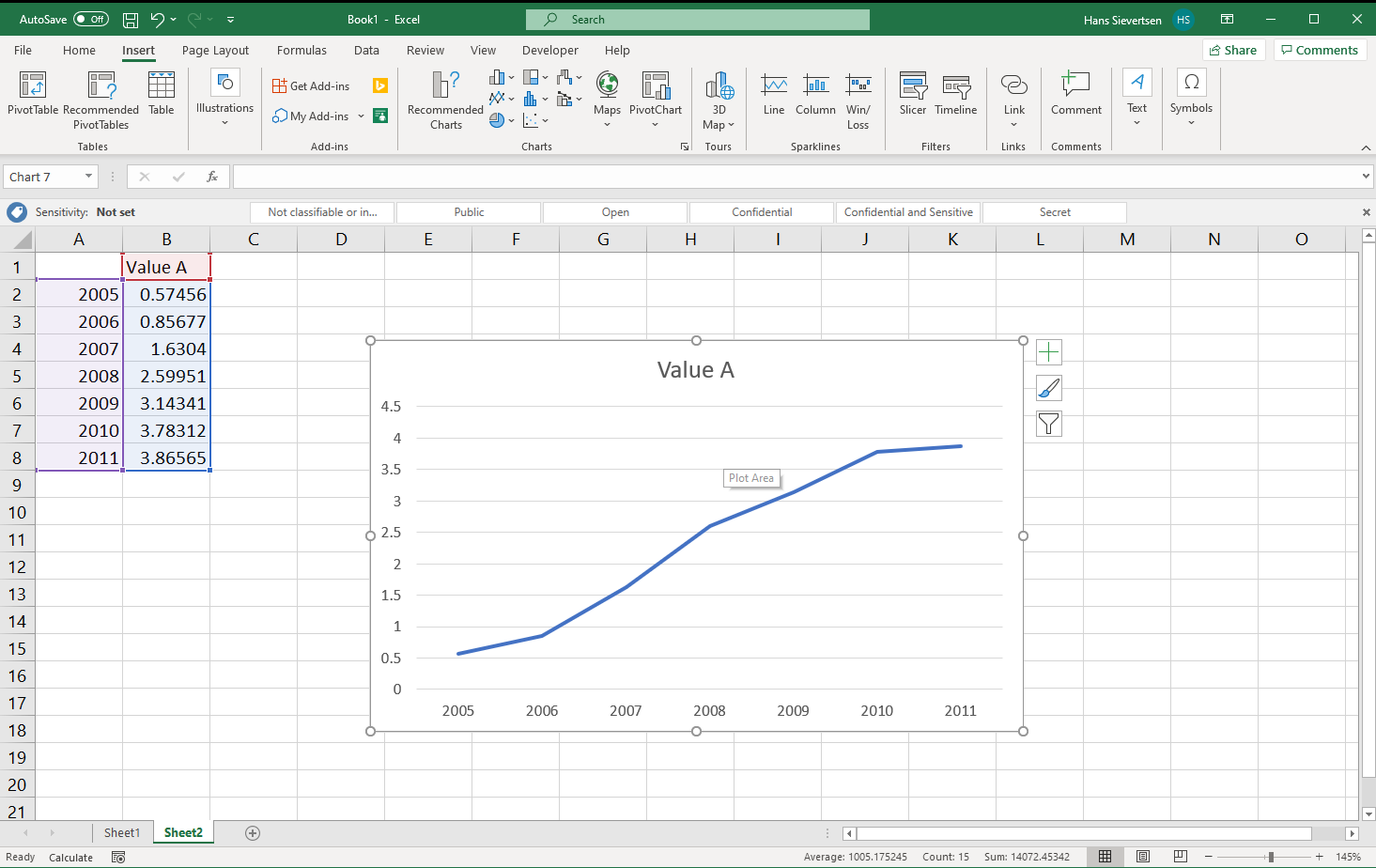
Our first line chart
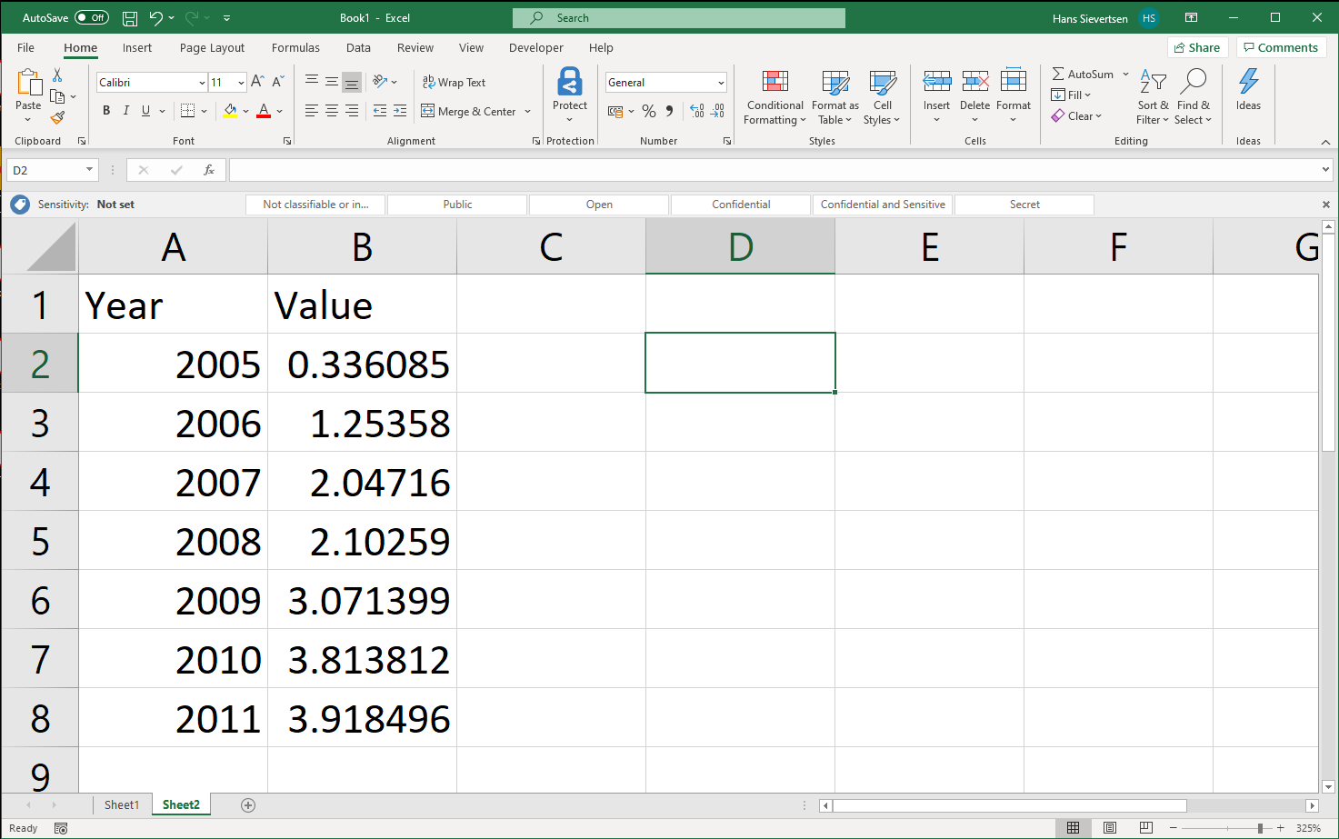
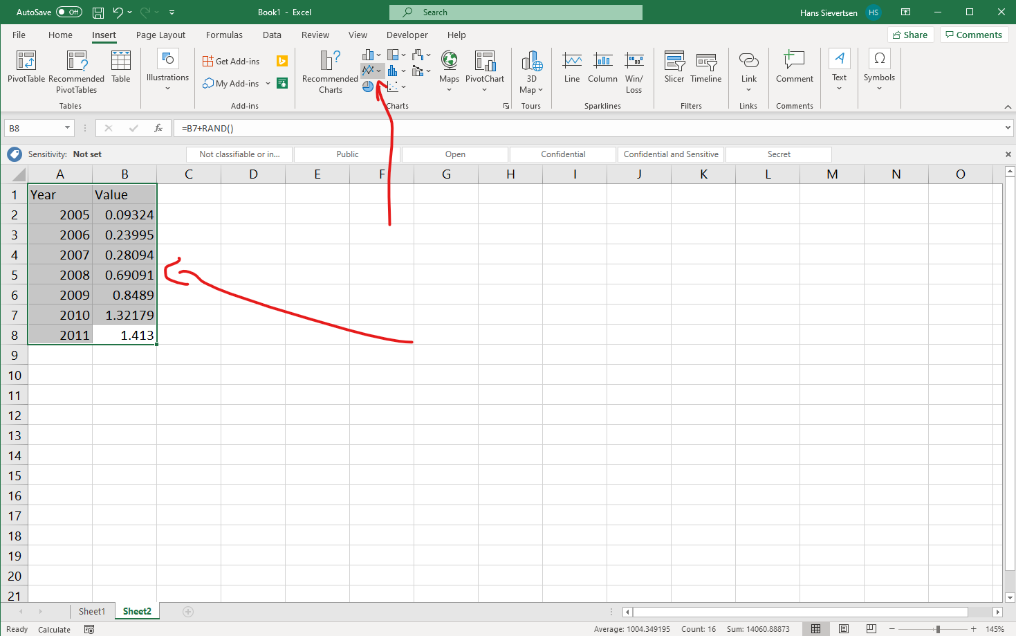
Let’s create our first chart in Microsoft Excel. We have a worksheet with two columns of data. Column A contains the variable Year and column B contains the variable Value. We want to create a chart where Year is shown on the horisontal axis and the variable Value on the vertical axis.
To insert a chart we select the Insert Tab.
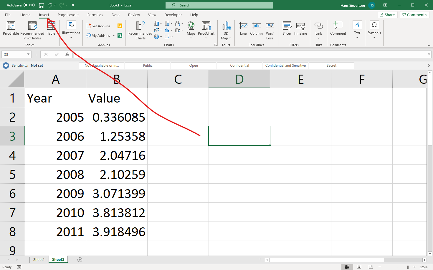
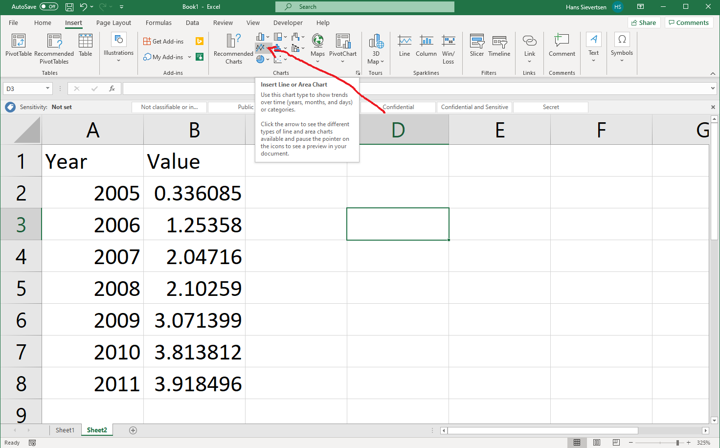
The Insert ribbon contains a section of charts. The icons reveal what type of chart they represent, but we can also hoover the mouse over the icon to see an explanation.
Let’s click on the icon that represents a line chart (see arrow below).
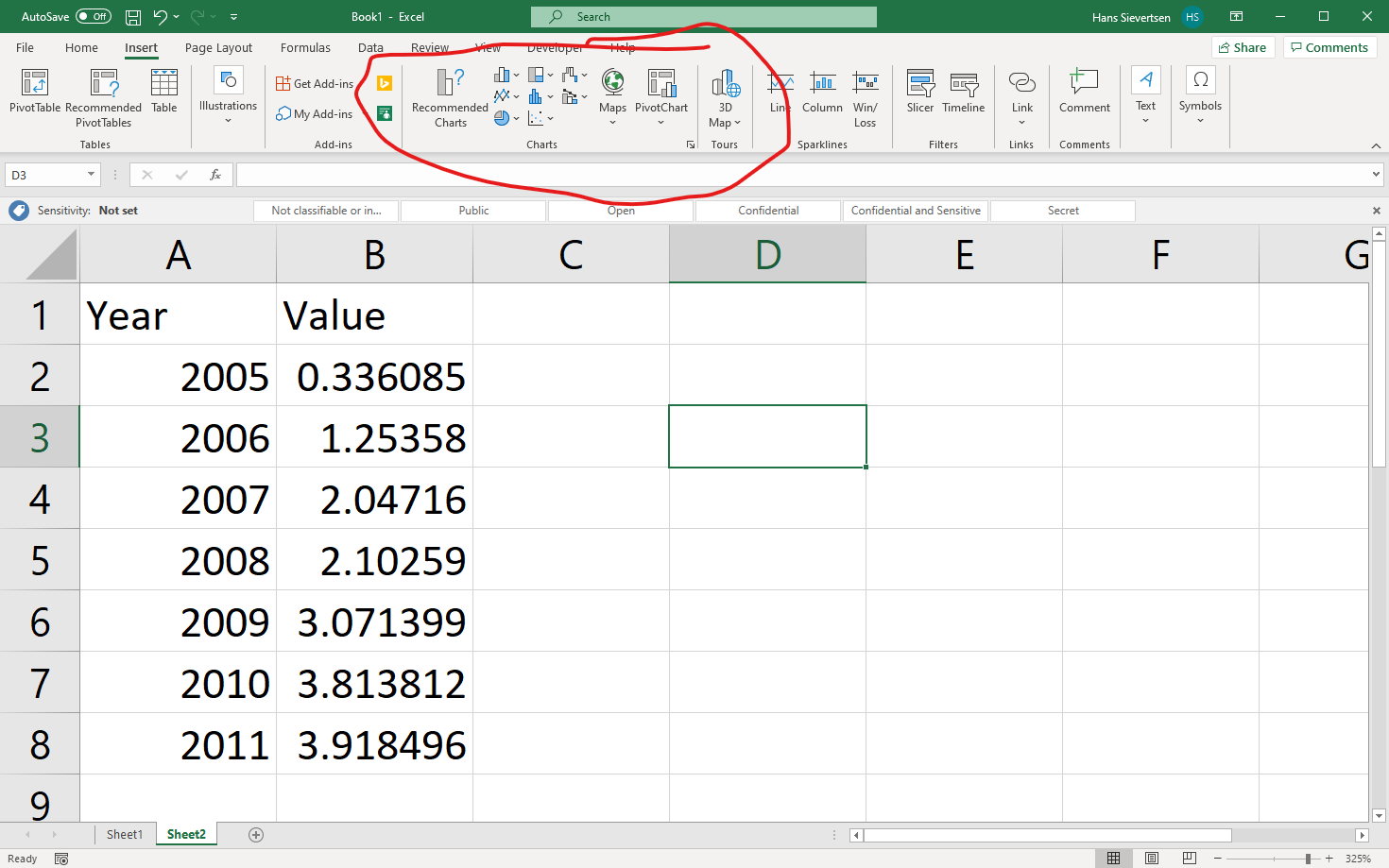
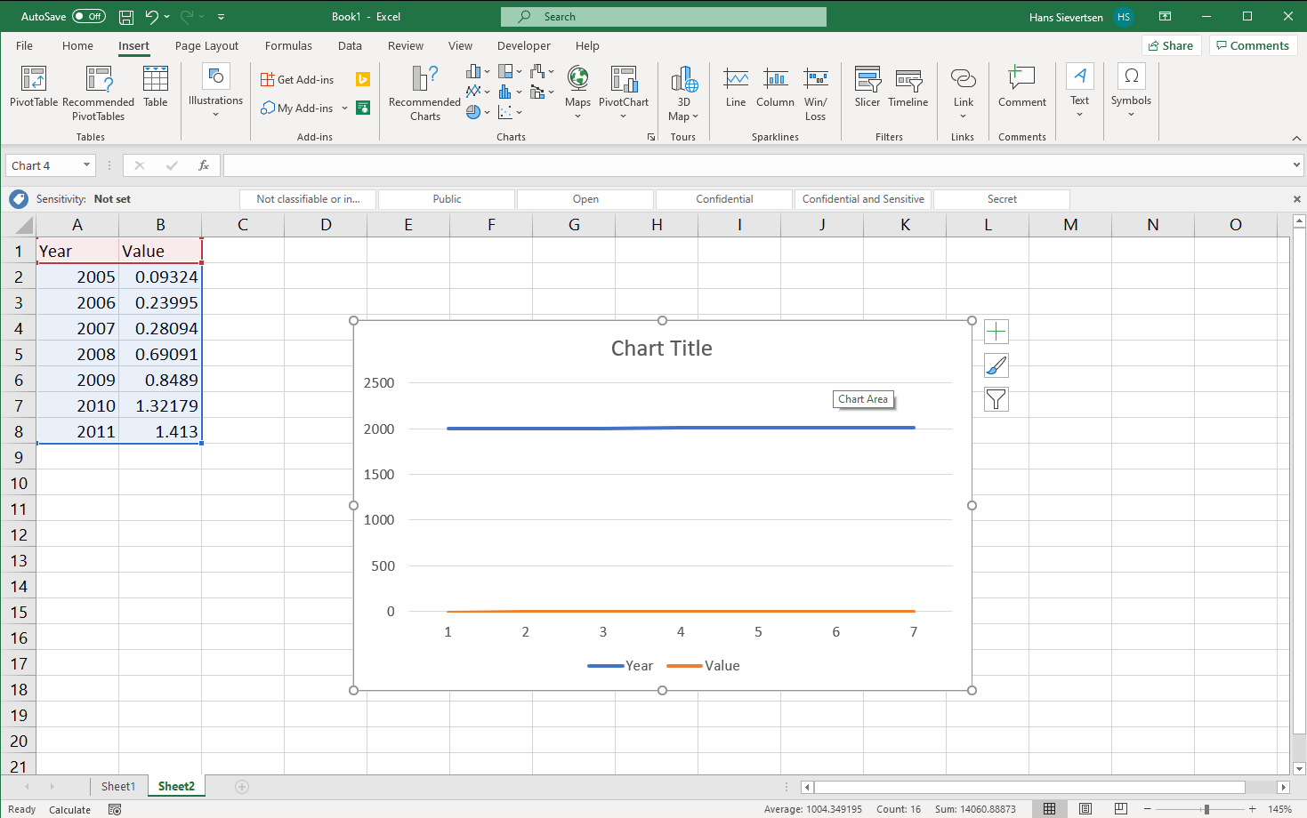
Clicking on the line chart icon opens a menu with different chart type options.
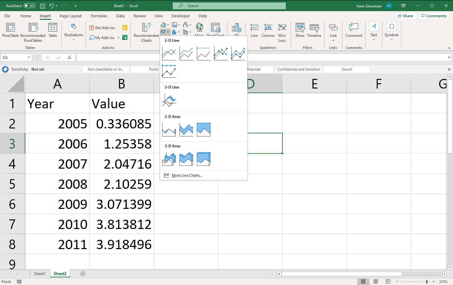
For now we’ll just pick the one in the upper left corner.
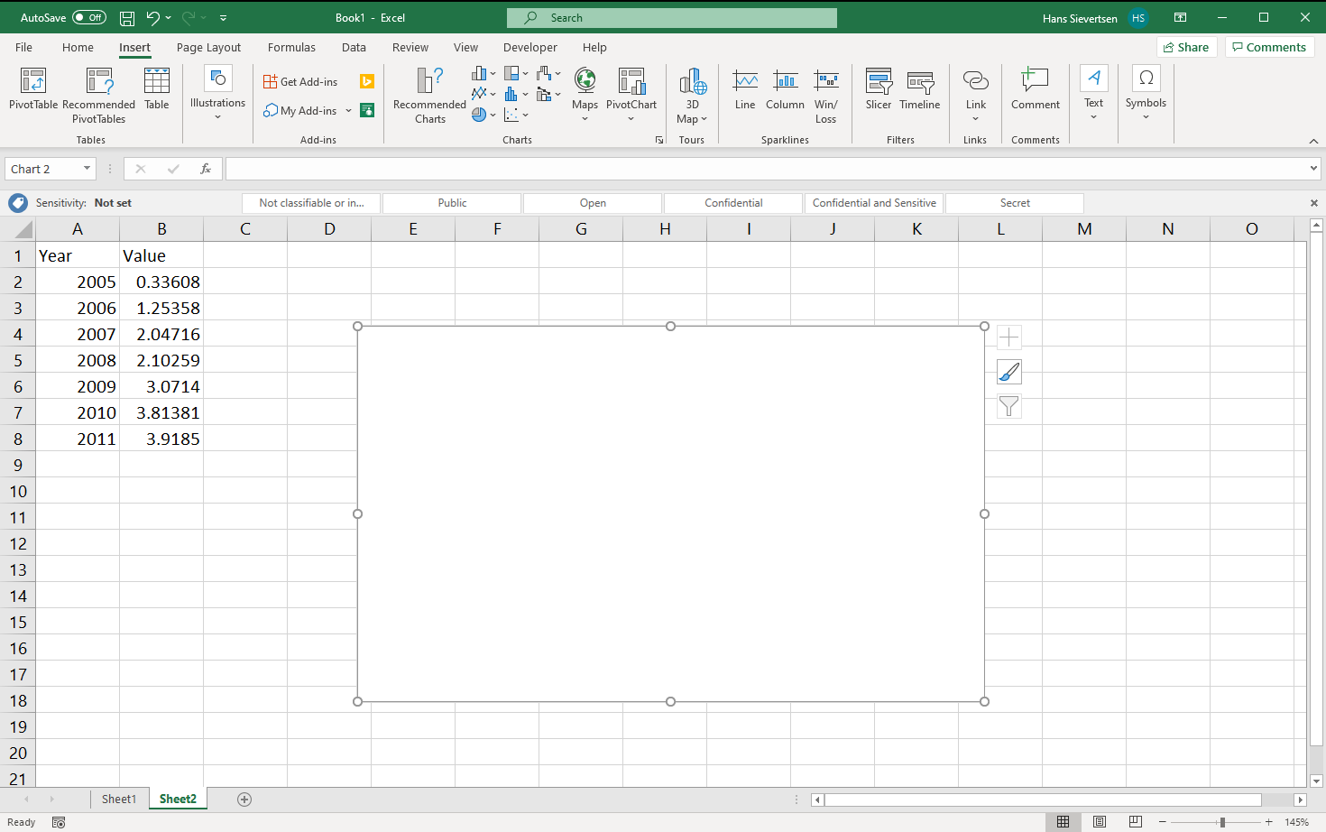
This creates a blank a canvas. Note if it doesn’t look like that for you,, it might be because Microsoft Excel guessed what data to include. We cover that case later. Just read-on for now!
We first need to tell Microsoft Excel what data to use for the chart. Once we’ve selected the chart canvas (just click on it), we can select the “Chart Design” tab and select “Select Data” (see below). Alternatively, we can just right-click on the canvas and click “Select Data”.
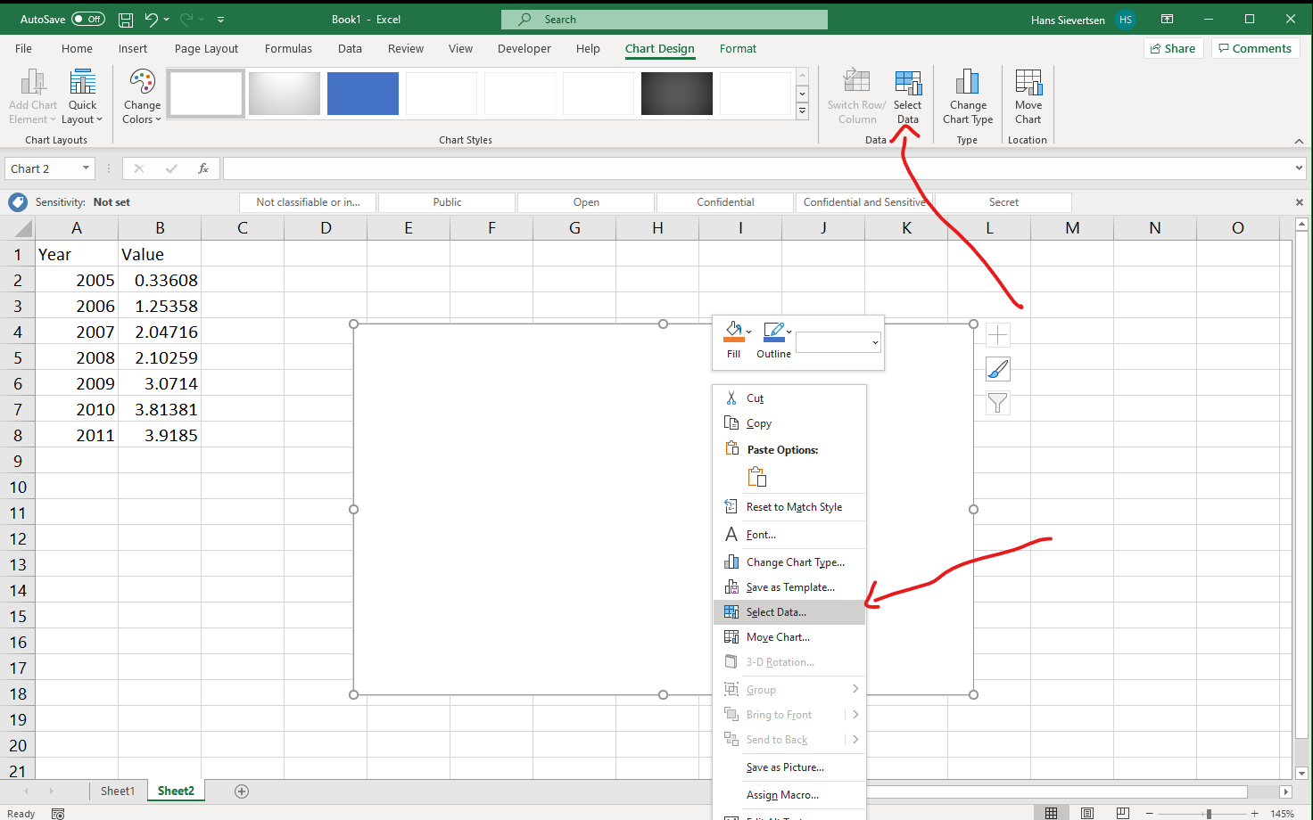
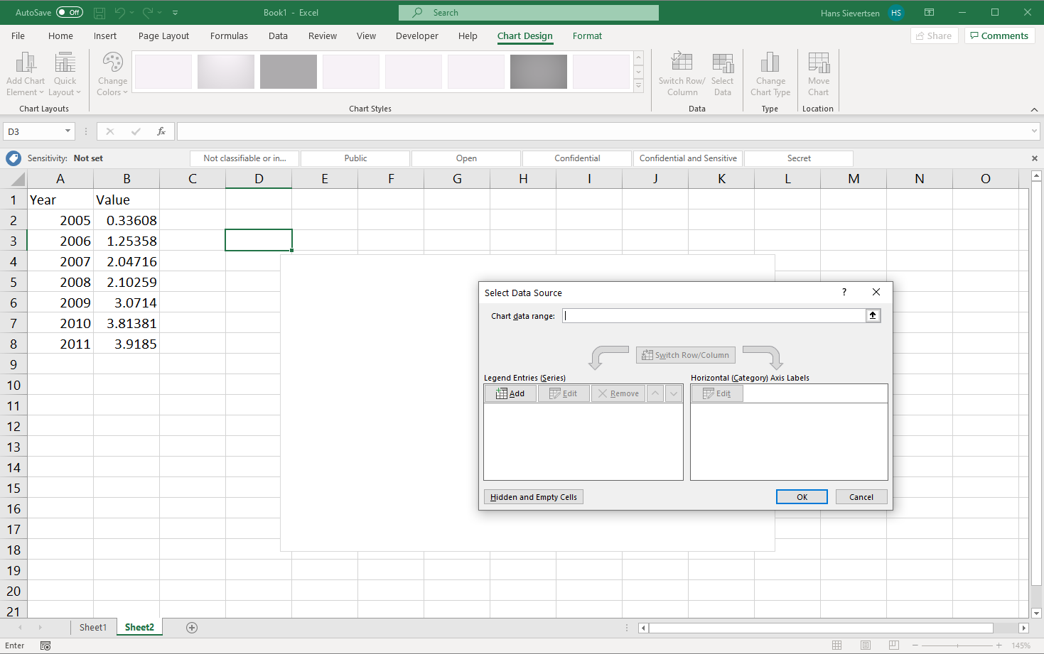
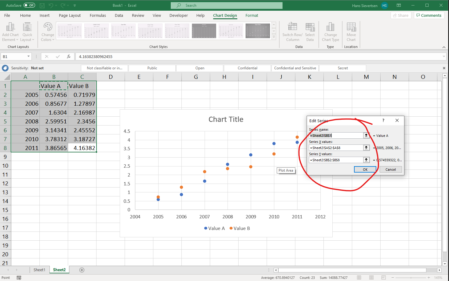
The select data looks like the menu below. In the top we can select the entire data range to be included. I generally recommend NOT to do that. Instead let’s focus on the two panels below. Here we can select the data to show on the vertical axis (y-axis) in the left panel, and the variable to show on the horisontal axis (x-axis) on the right panel.
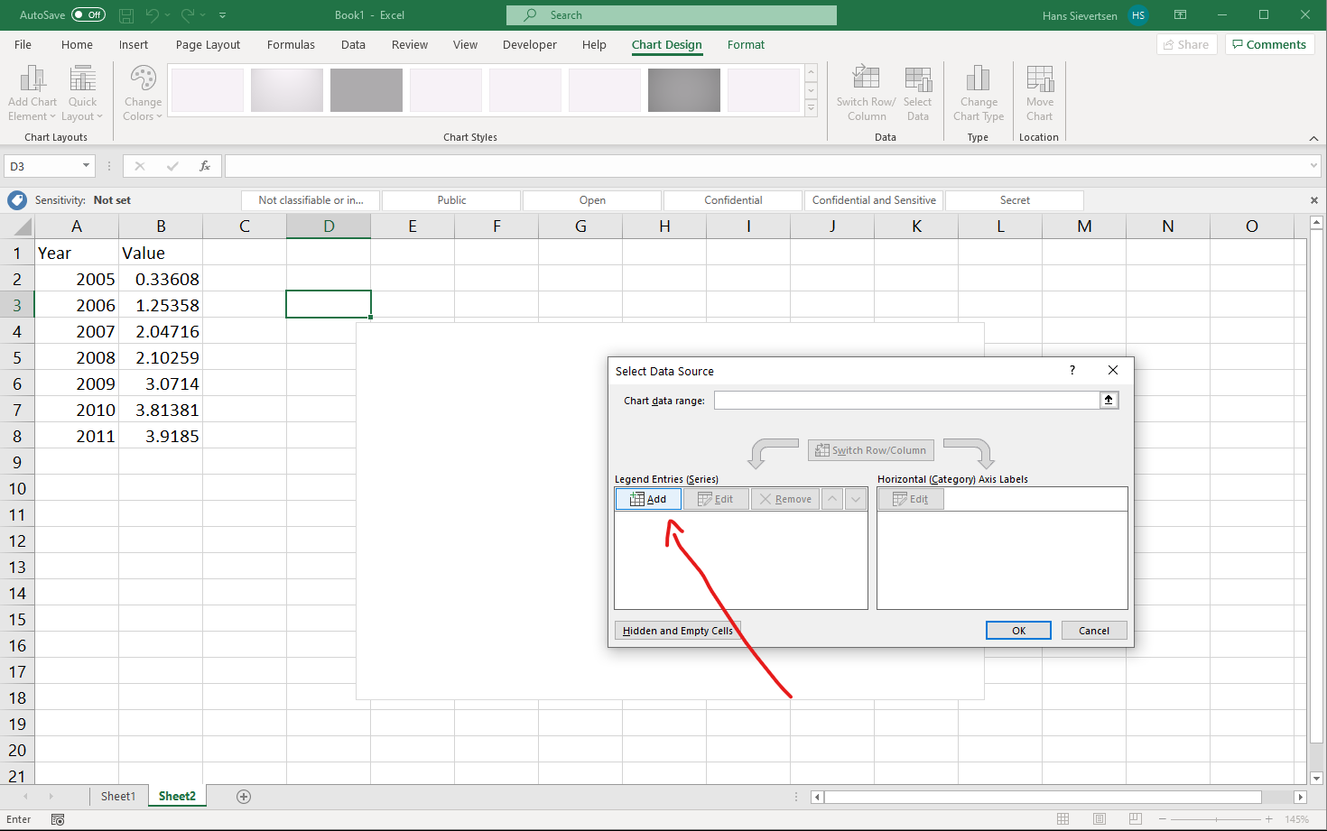
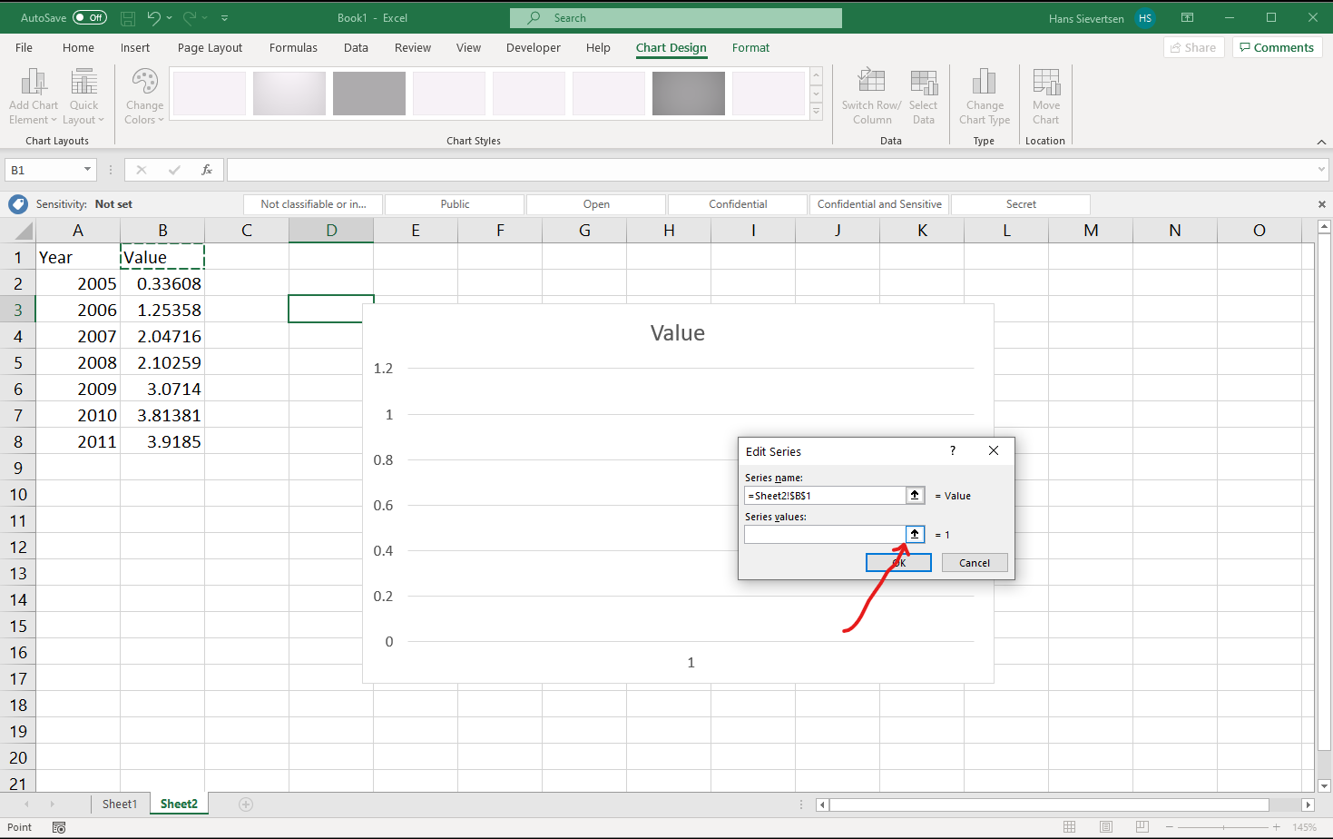
Let’s first tell Microsoft Excel what data to use for the vertical axis. We click “Add” as shown below.
We should now see a menu like the one below. Here we can add a name for the series and the content of the series.
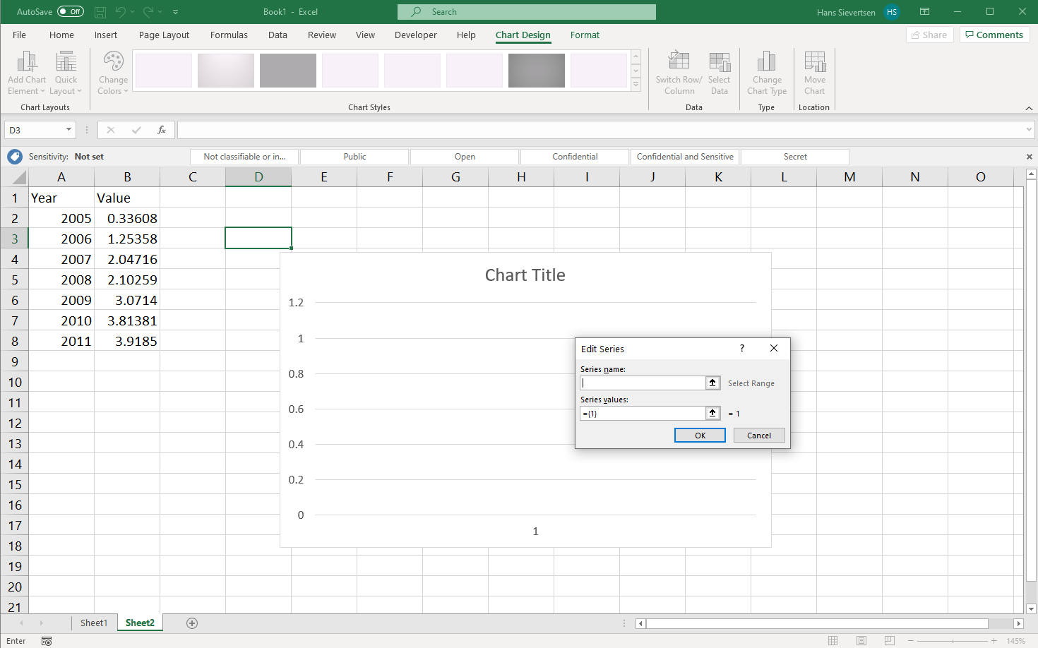
We can add the title of the series in “Series name” manually by simply typing it, or…
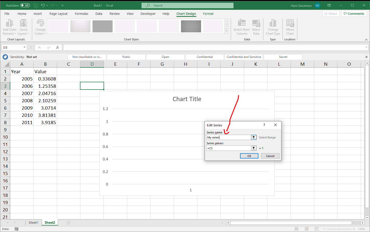
… we can click on the small icon with the arrow up as shown below.
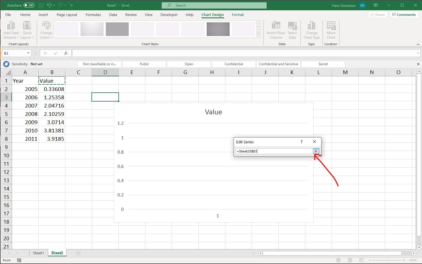
This opens yet another menu. We can now simply click on the cell that contains the title of the series or we can type the reference to the series like in the example below. The cell that is referenced should be marked with a dashed border. Click on the little icon indicated with the arrow below to confirm the selection.
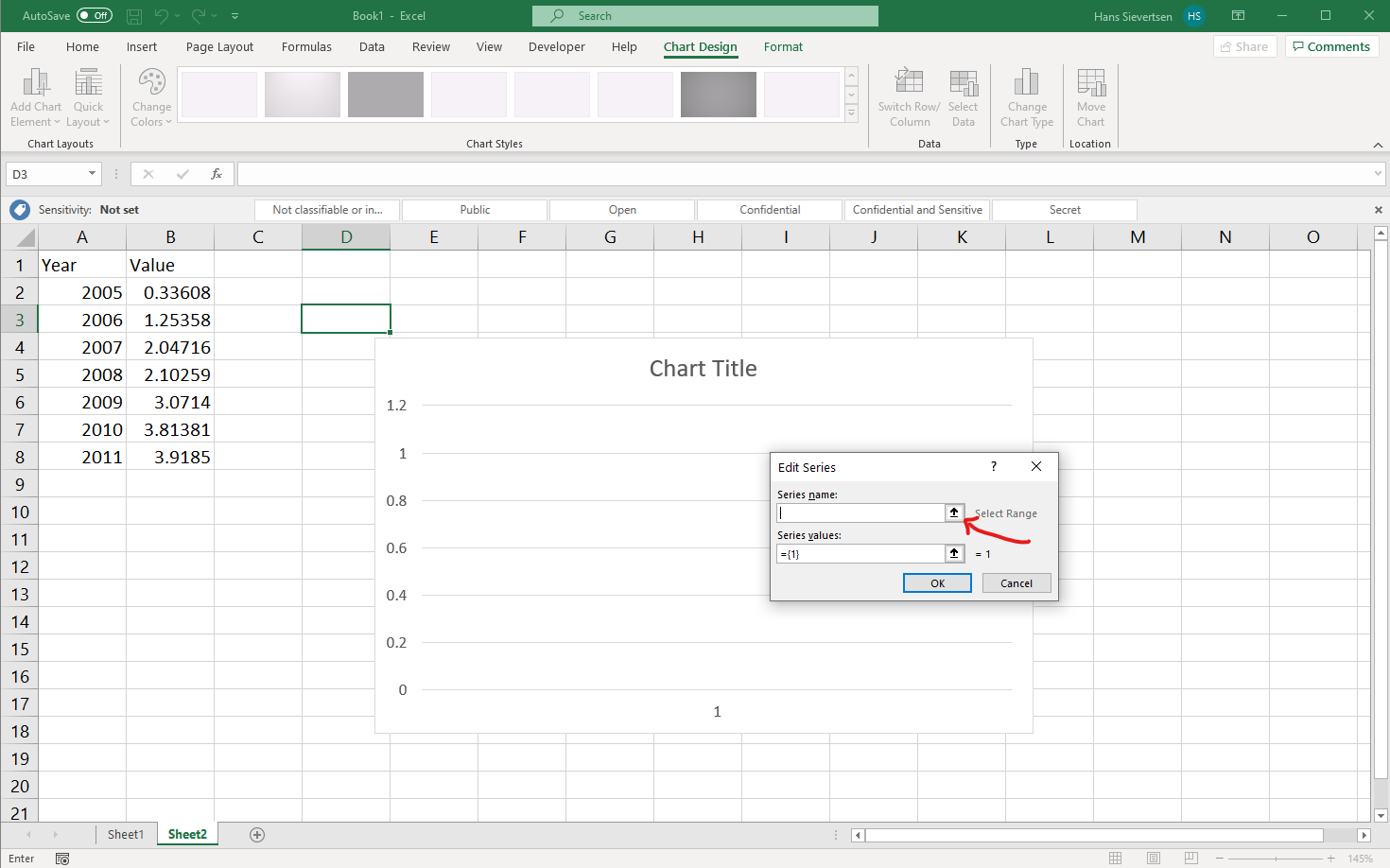
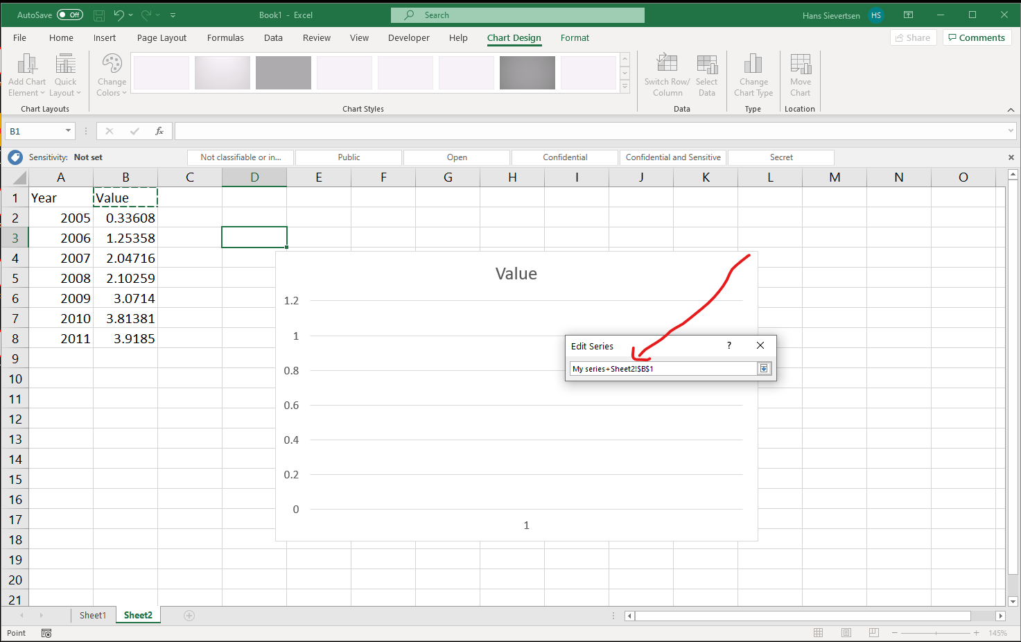
Note that it is very easy to mess up the reference to the right cell. For example as in the image below where I accidentially mixed-up a manual title entry with a reference to cell B1. Pay attention to what is written in the box!
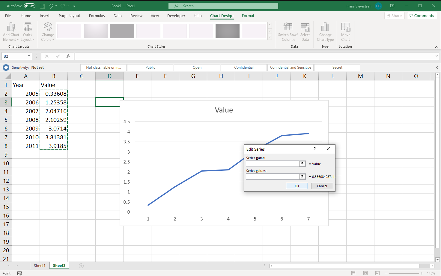
We are now back at the menu. Now click on the arrow up symbol for the “Series Values” section (just like we did for the “Series Name”).
We now select all the cells that contain the values to show on the vertical axis and confirm our selection just like we did for the name.
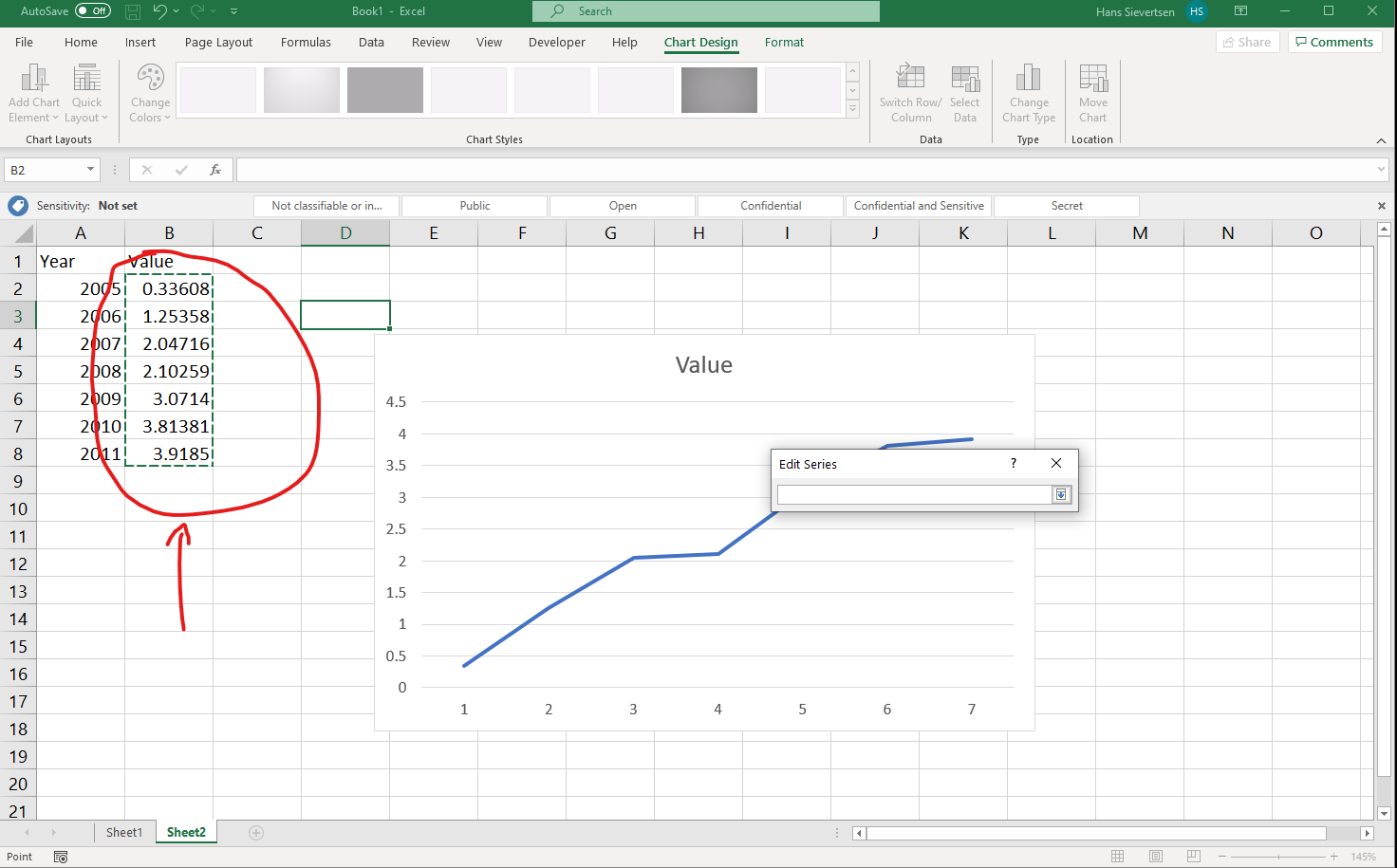
Back at the menu, we should already see our line. click “OK” to complete the series entry.
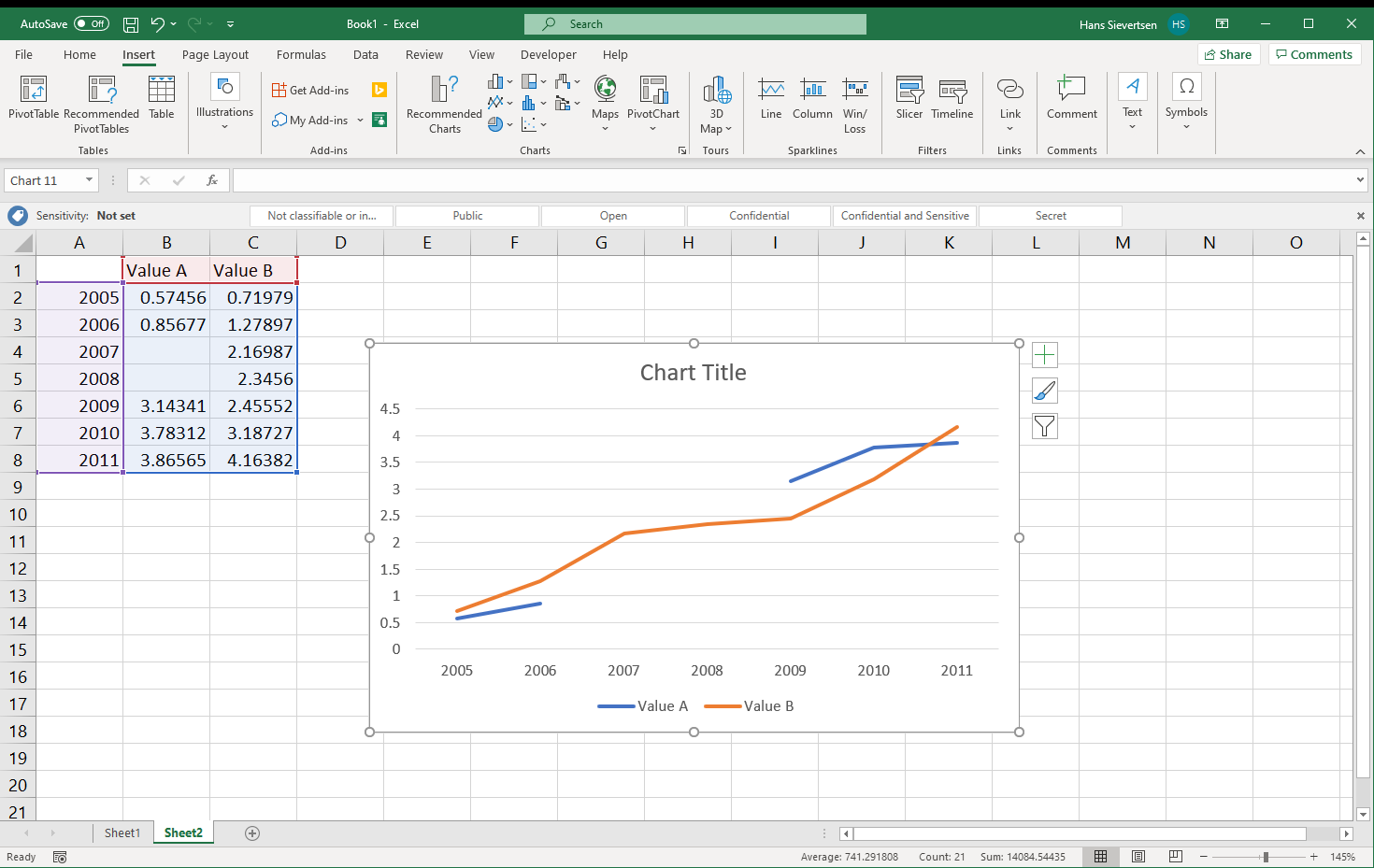
We might think we are done now, but wait! Look at the horisontal axis. It just shows values 1 to 7 and not the years from column A! We haven’t told Microsoft Excel what valus to use on the horisotnal axis yet.
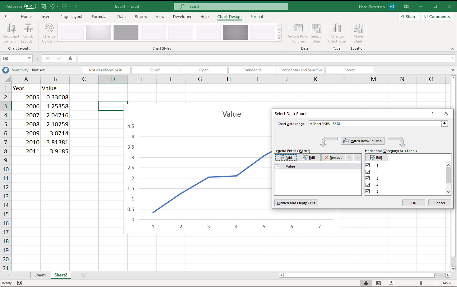
Click “Edit” in the right panel to select the series for the horisontal axis.
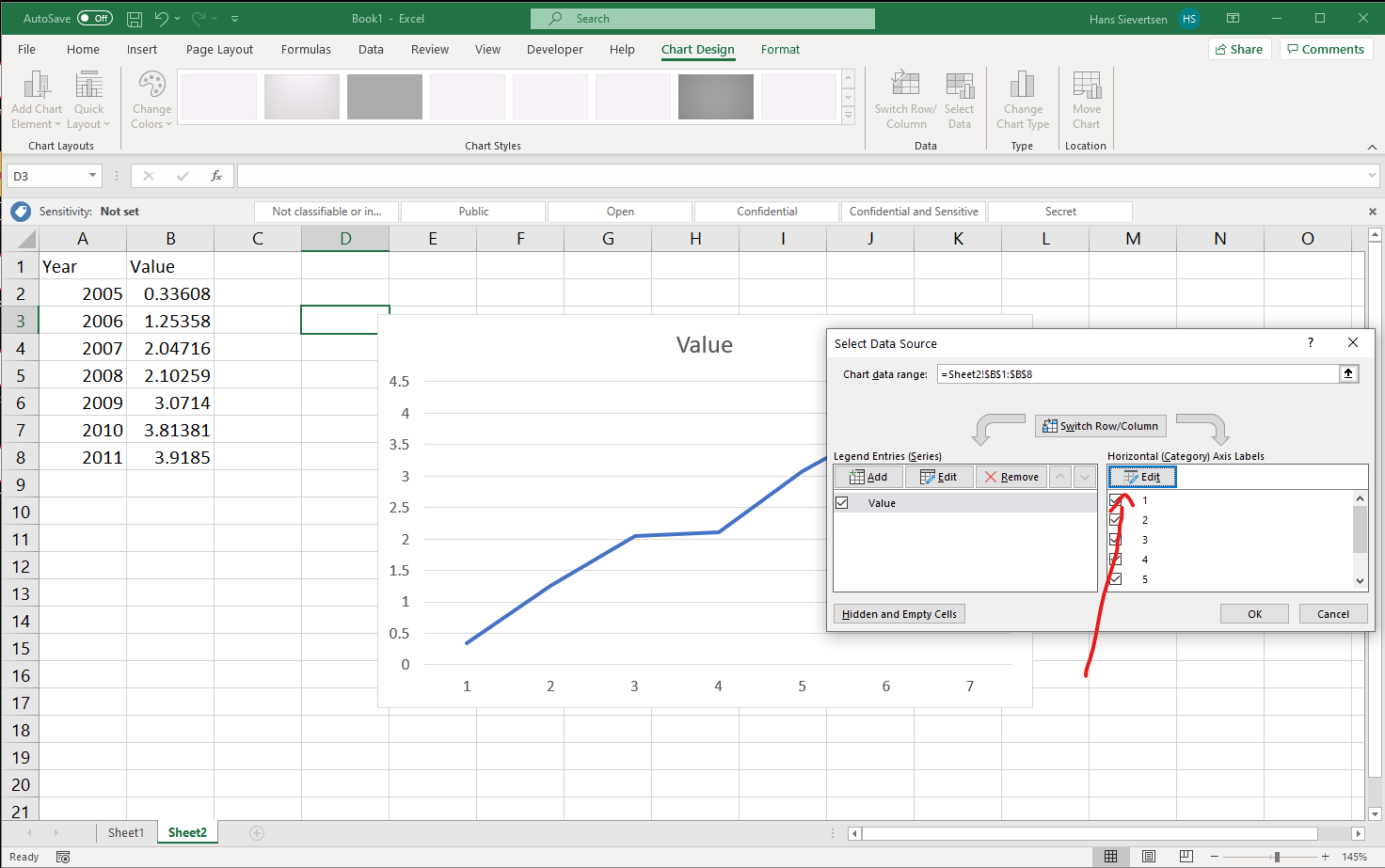
Follow the same procedure as for the data on the vertical axis and select the data for the horisontal axis and click OK.
Back at the menu things already look good. Click “OK” to finish the “Select Data” procedure.
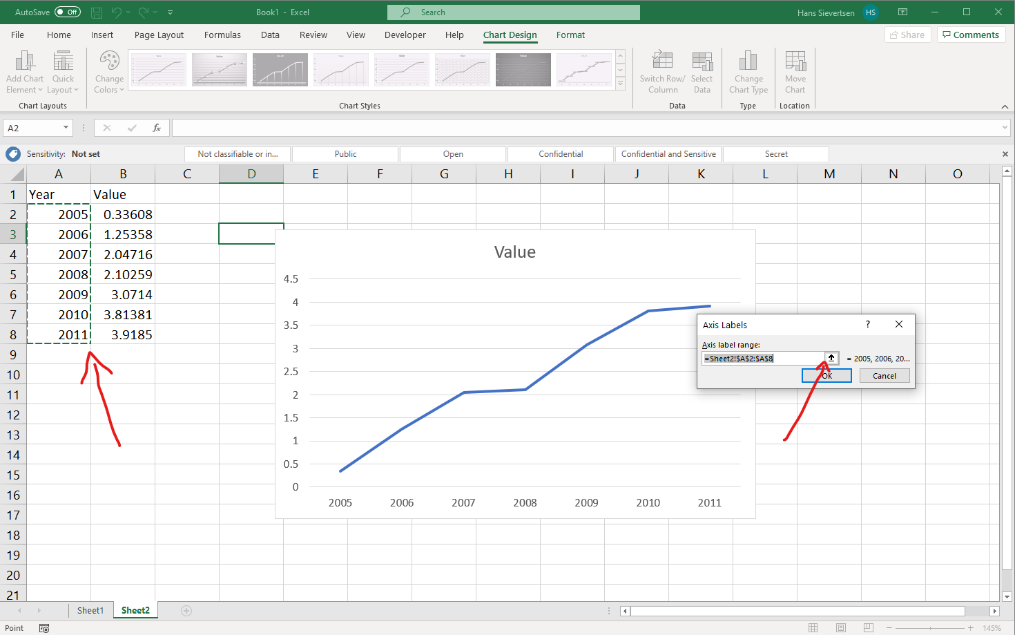
Looks good! Our first line chart!
What if the canvas is not blank?
If we (accidently) selected some of the data before clicking on “Insert line chart” as in the example below…
… it is very likely that Microsoft Excel produces something like the below. What is that? What happens is that Microsoft Excel make sa guess of what data you want to use where. Because it sees two columns with column headers it believes that you want to show both series on the vertical axis. So instead of showing Year on the horisontal axis it is shown on the vertical axis.
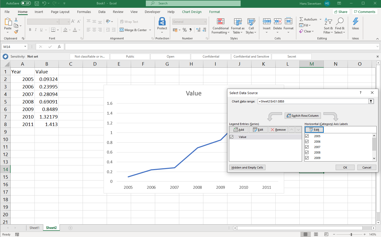
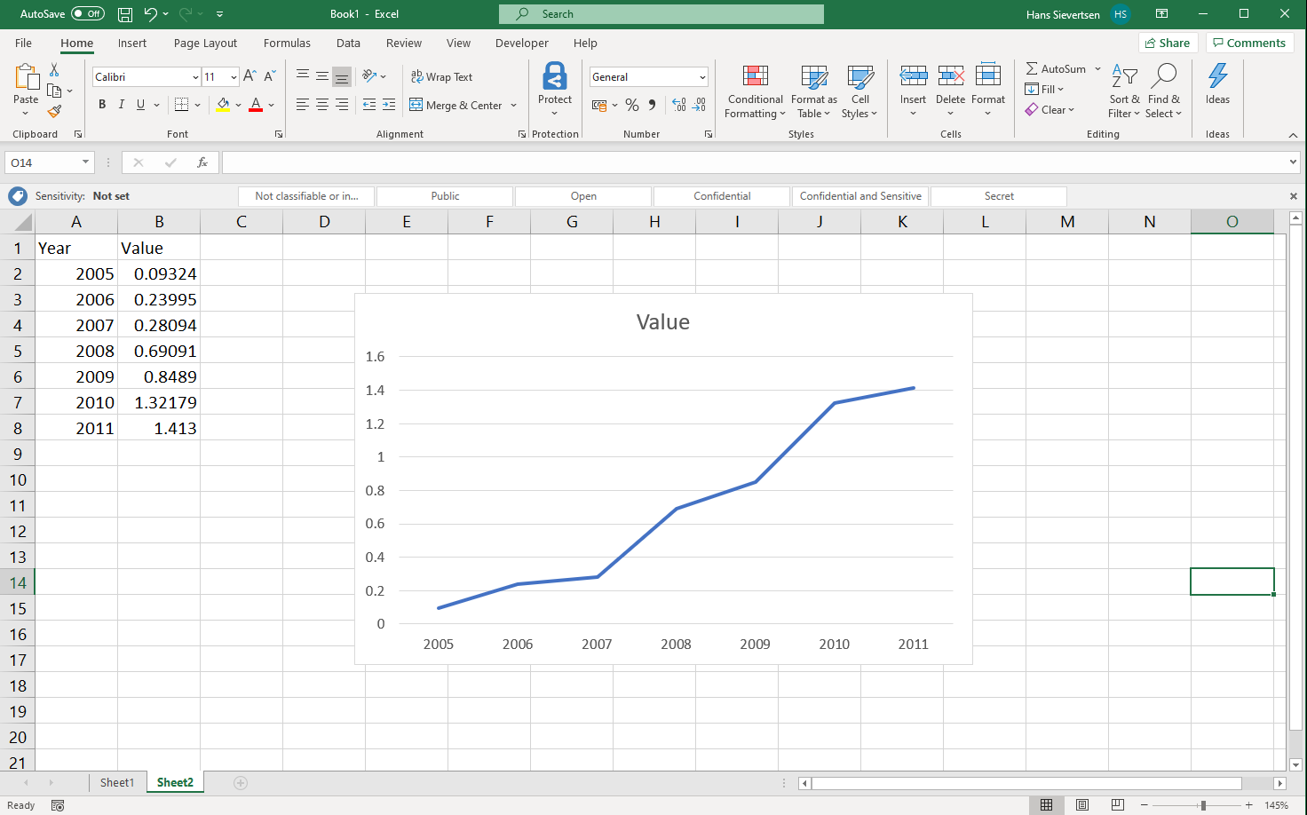
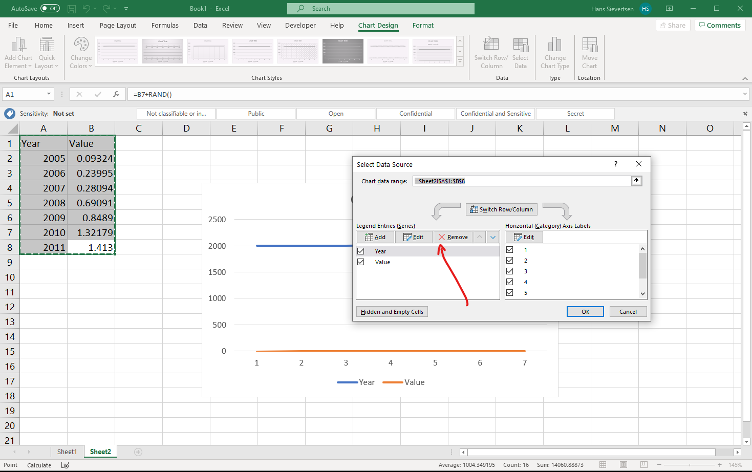
What can we do in that case? One solution is to select the chart area and press delete and start over. Another alternative is to go to the select data menu just like we did above. In the select data menu we highlight the row with “Year” in the left panel and click “Remove” to remove the Year series from the vertical axis. After that we can just follow the steps above and add the Year series to the horisontal axis using the right panel.
Getting Microsoft Excel to make the right guess
How could we help Microsoft Excel to make the right guess? That is simple. Remove the header for the Year series. And follow the same steps as below. If the data structure is like below, we can do all we did above in one quick step by selecting all the data and clicking insert line chart.
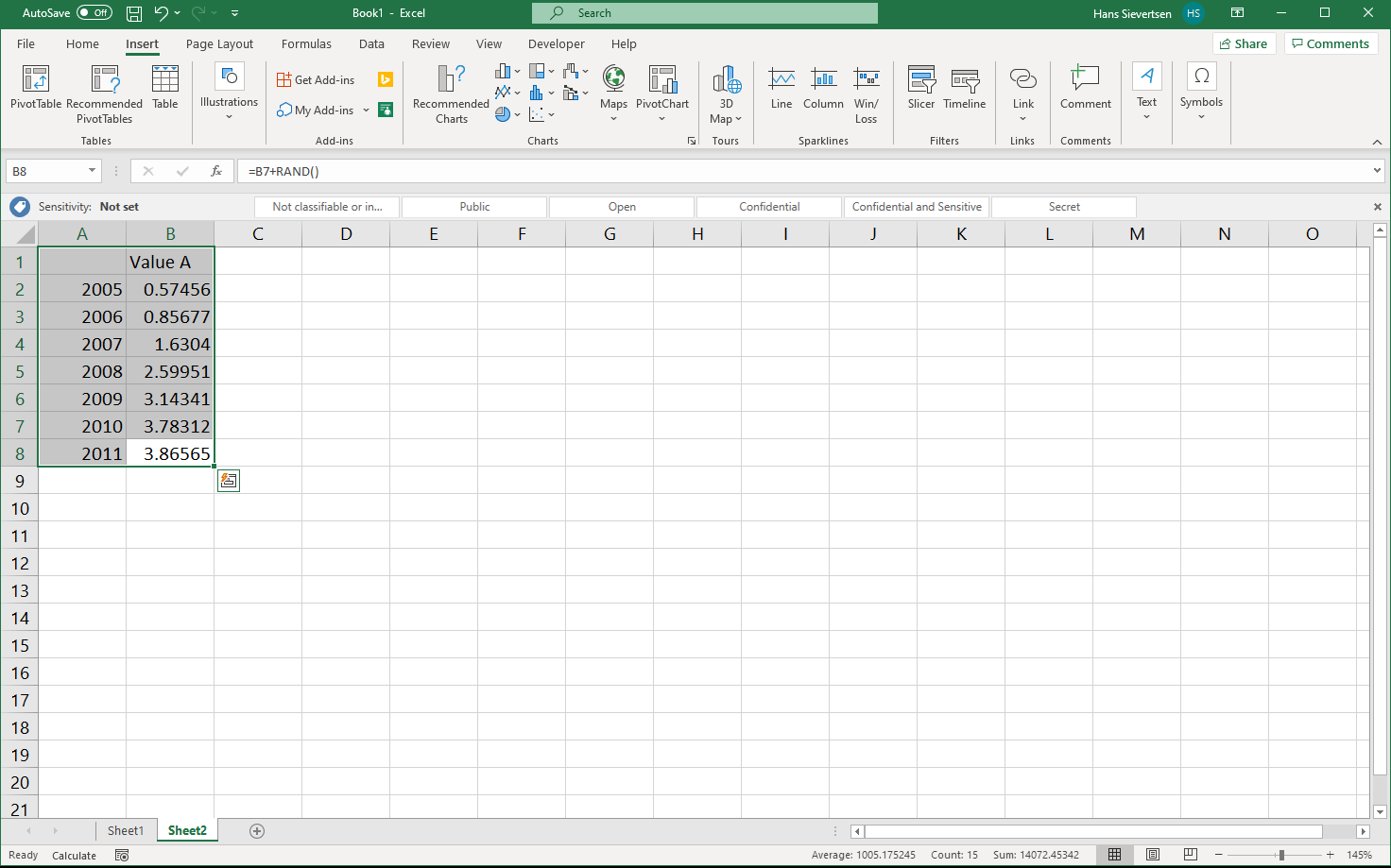
Voila! We have line chart with the right data series on the right axes.
A bar chart
To create a bar chart we follow the same steps as for the line chart, we just select the bar chart icon above the line chart icon (see below). The data selection procedure is just like for the line chart.
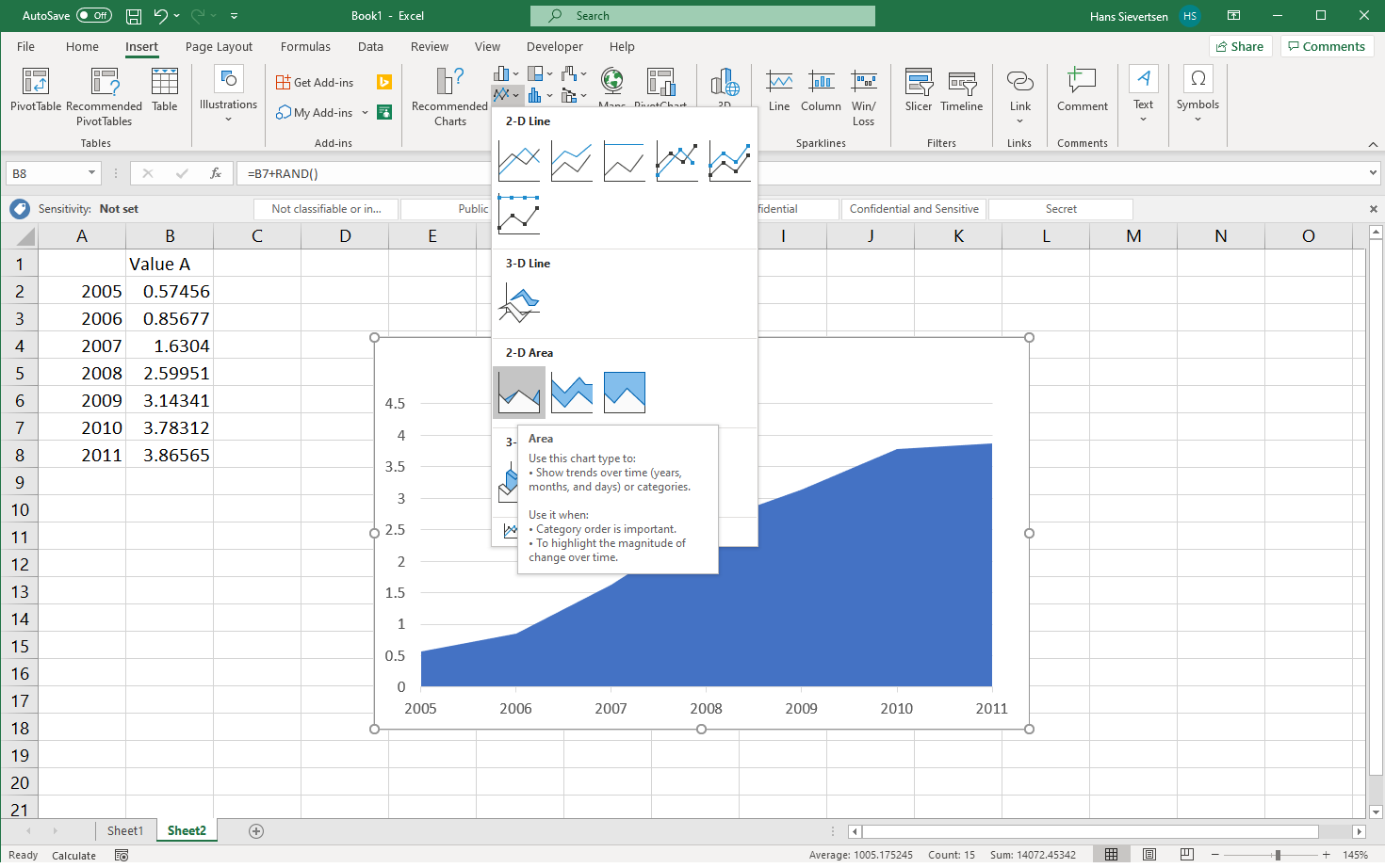
An area chart
We can find area charts within the line chart menu as illustrated below. The data selection procedure is just like for the line chart.
A stacked area chart
A stacked area chart puts the series on top of each other. For the example below we have two series that we put on top of each other. The stacked area chart is just to the right of the line chart. The data selection procedure is just like for the line chart.
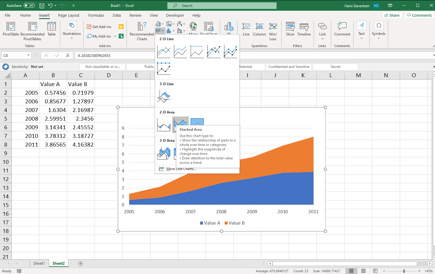
An unstacked area chart with two series
If we do not stack our series and create an area chart with two series, one series might cover the other series. It is therefore important that the ordering of the series is as desired. We can change the order in the “Select data” menu by highlighting a series in the left panel (just click on it) and clicking on the small arrows (see below) to change the ordering.
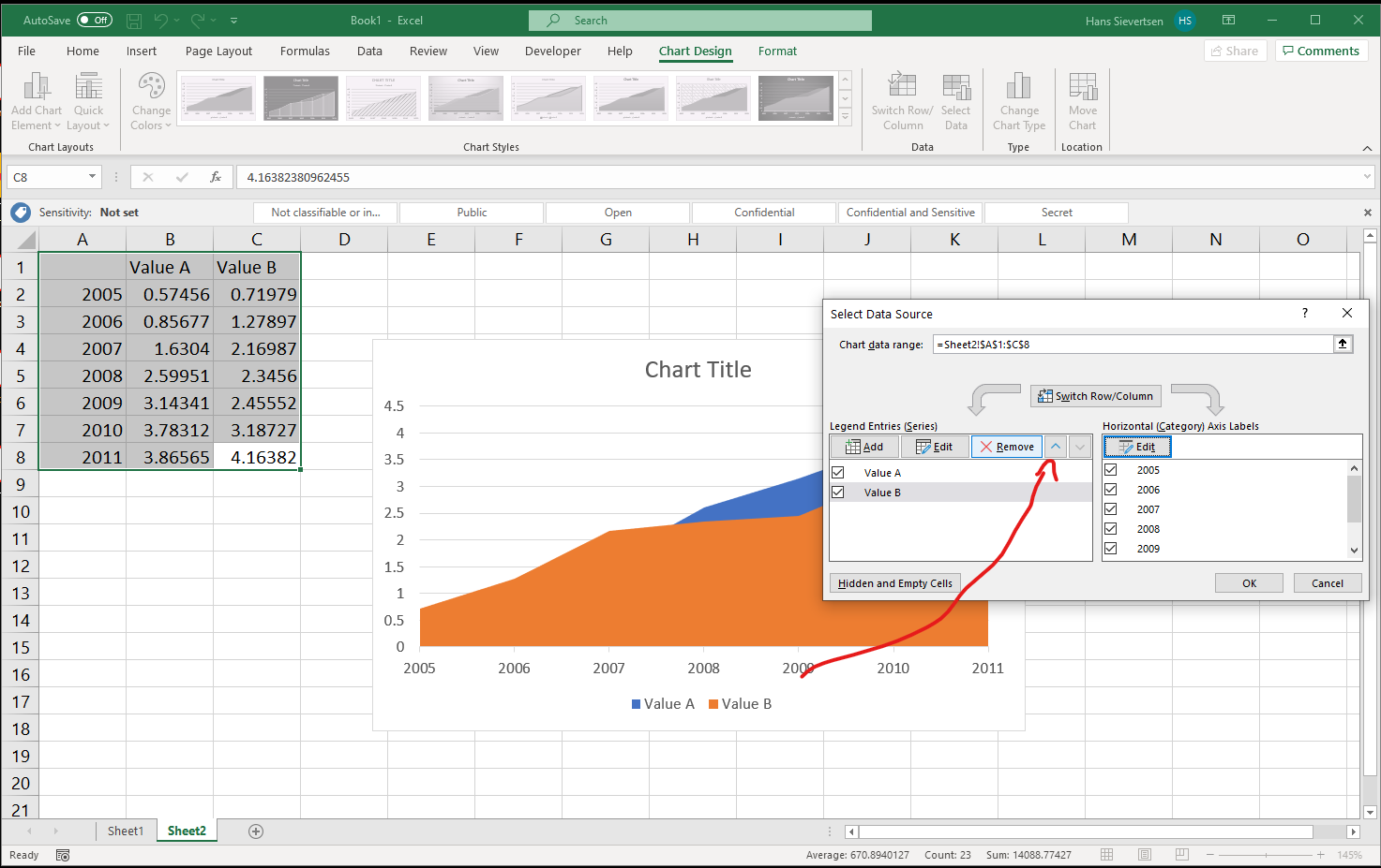
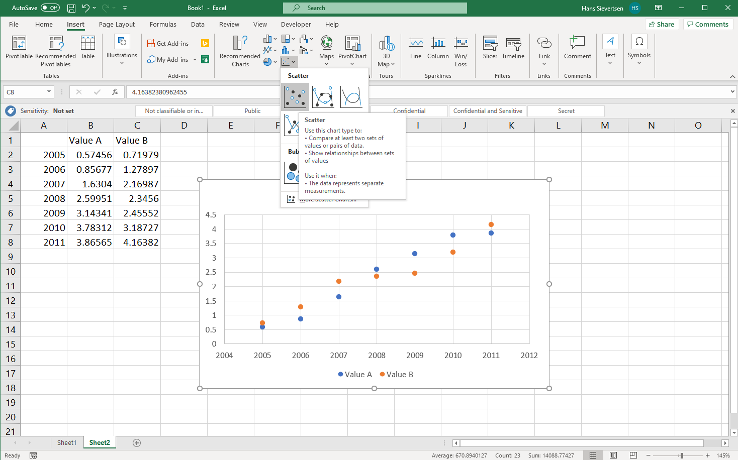
A scatter plot
Scatter plots work slightly differently than line charts, bar charts, and area charts in Microsoft Excel. Let’s try it. You will typically find the scatter plot icon in the lower row of the chart area in the ribbon, as shown below.
If we go to the “Select data” menu for the scatter plot we see that the right panel for the horisontal axis is “greyed out”. We cannot modify that part. That is because each seres has their own series on the vertical and horisontal axis.
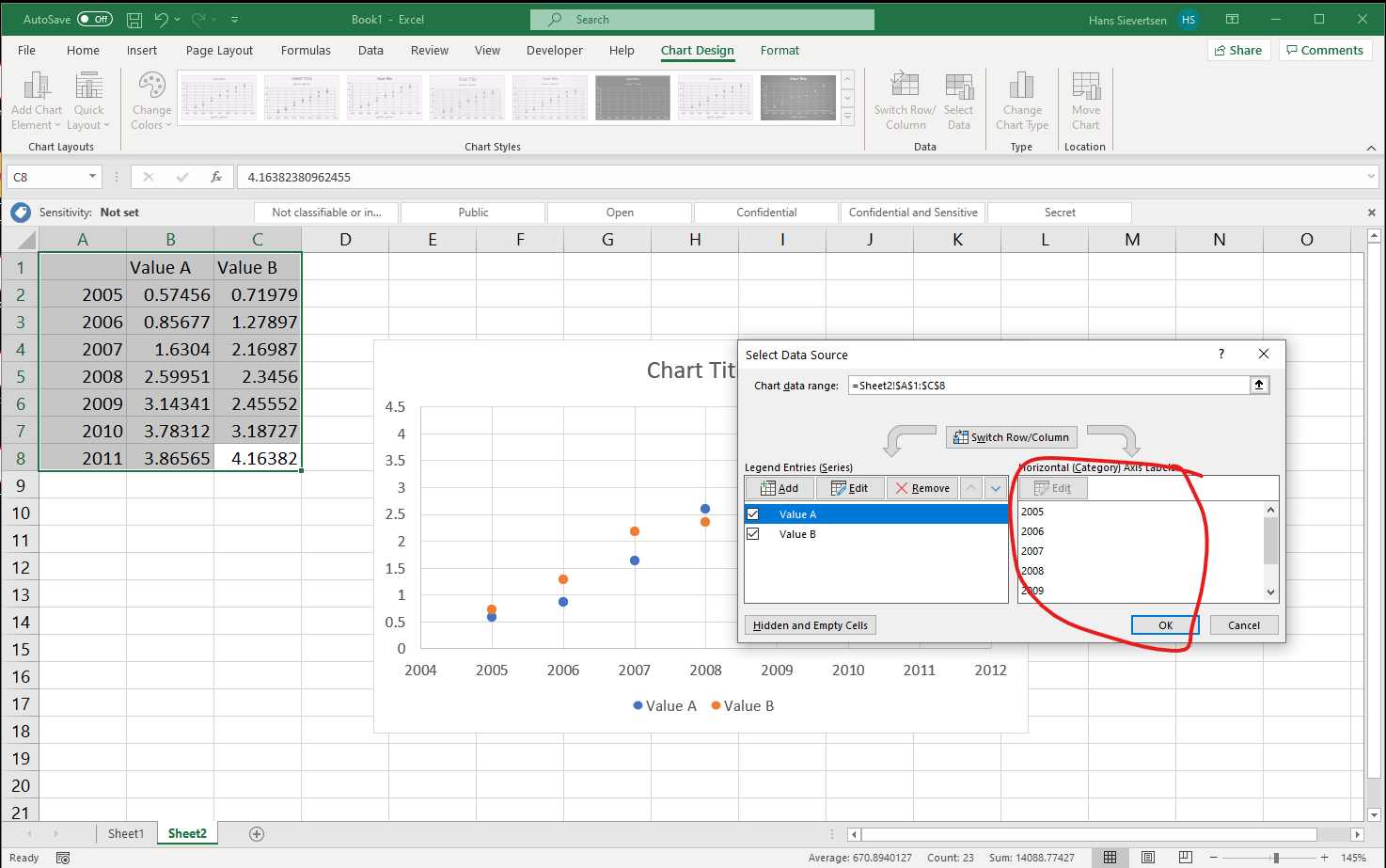
Let’s select “Edit” in the left panel to modify the data selection for one of the series. Recall that for the other charts we only changed the title of the series and the values on the vertical axis. However…
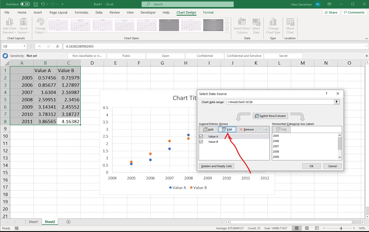
…in a Scatter plot, we specify both the values to use on the vertical and the horisontal axis for each series individual. We have one additional row in the select data menu, as shown below.
In many cases we don’t need to worry about this difference, however, it gives us more flexibility, because we can select the series independently.
A pyramid chart
Pyramid charts are often used to show the composition of the population by age and gender. In practice we can create a pyramid chart as a bar chart. We then multiply the values for one gender by -1 and later remove the “-” from the x axis, as shown below.
Polishing the chart
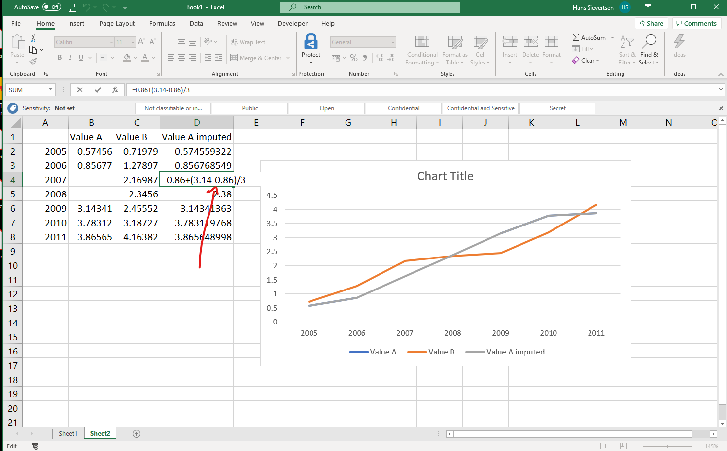
Missing data points
Real-World data is often incomplete. Like in the example below, we don’t observe any values for Value A in the years 2007 and 2008. This will lead to a gap in the line chart. This is typically fine and in line with what the data shows. However, in some cases we might want to make a guess of what these missing values could be. Our guess is that we can draw a straight line between the last observed value and the next observed value. This is called linear interpolation.
We can make Microsoft Excel draw a straight line between the last observed value and the next observed value by manually calculating what the values in the gaps are as in the example below.
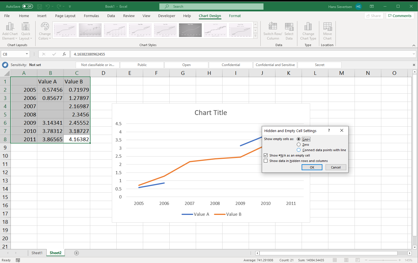
However, Microsoft Excel includes a function to do the linear interpolation and draw straight lines for us. To use this function simply go to the “Select data” menu and click on the “Hidden and Empty Cells” button in the lower left corner.
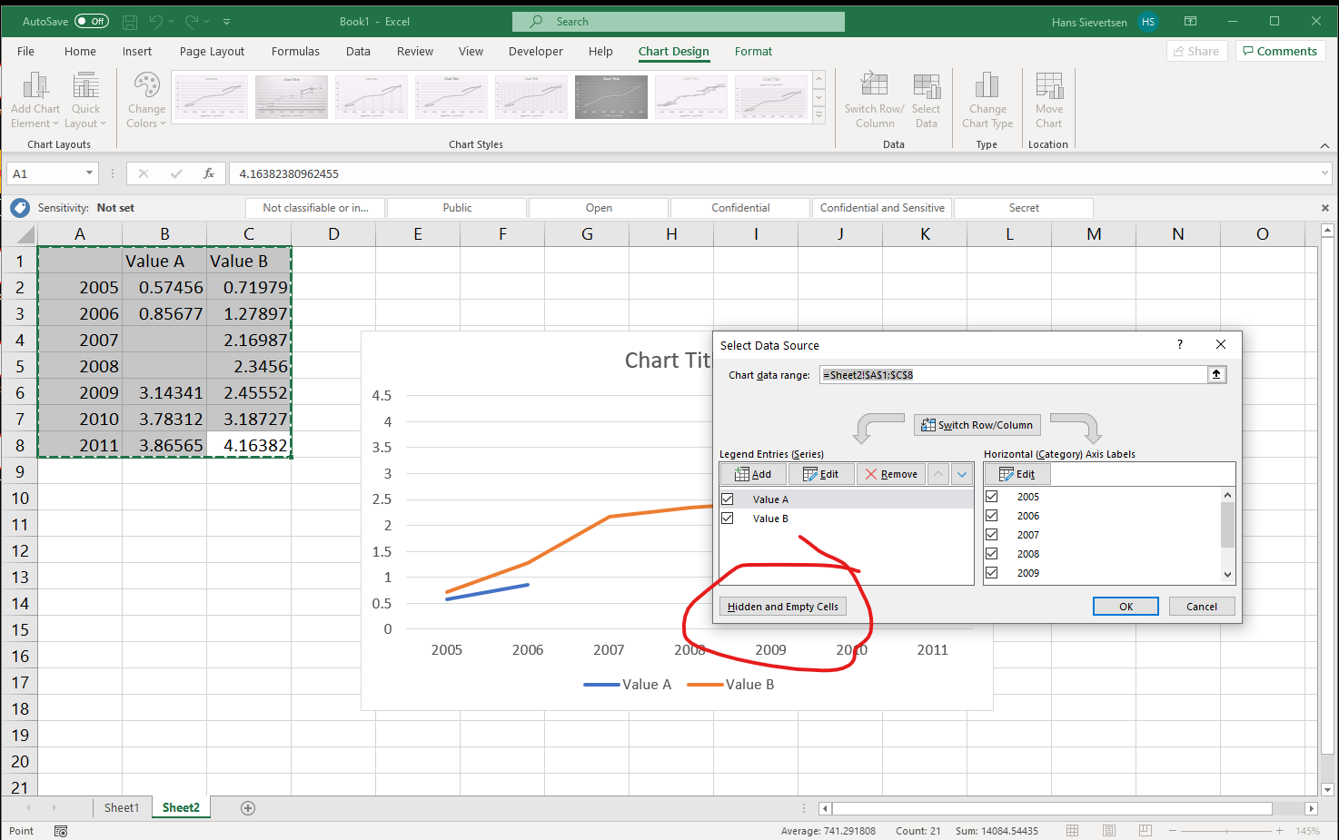
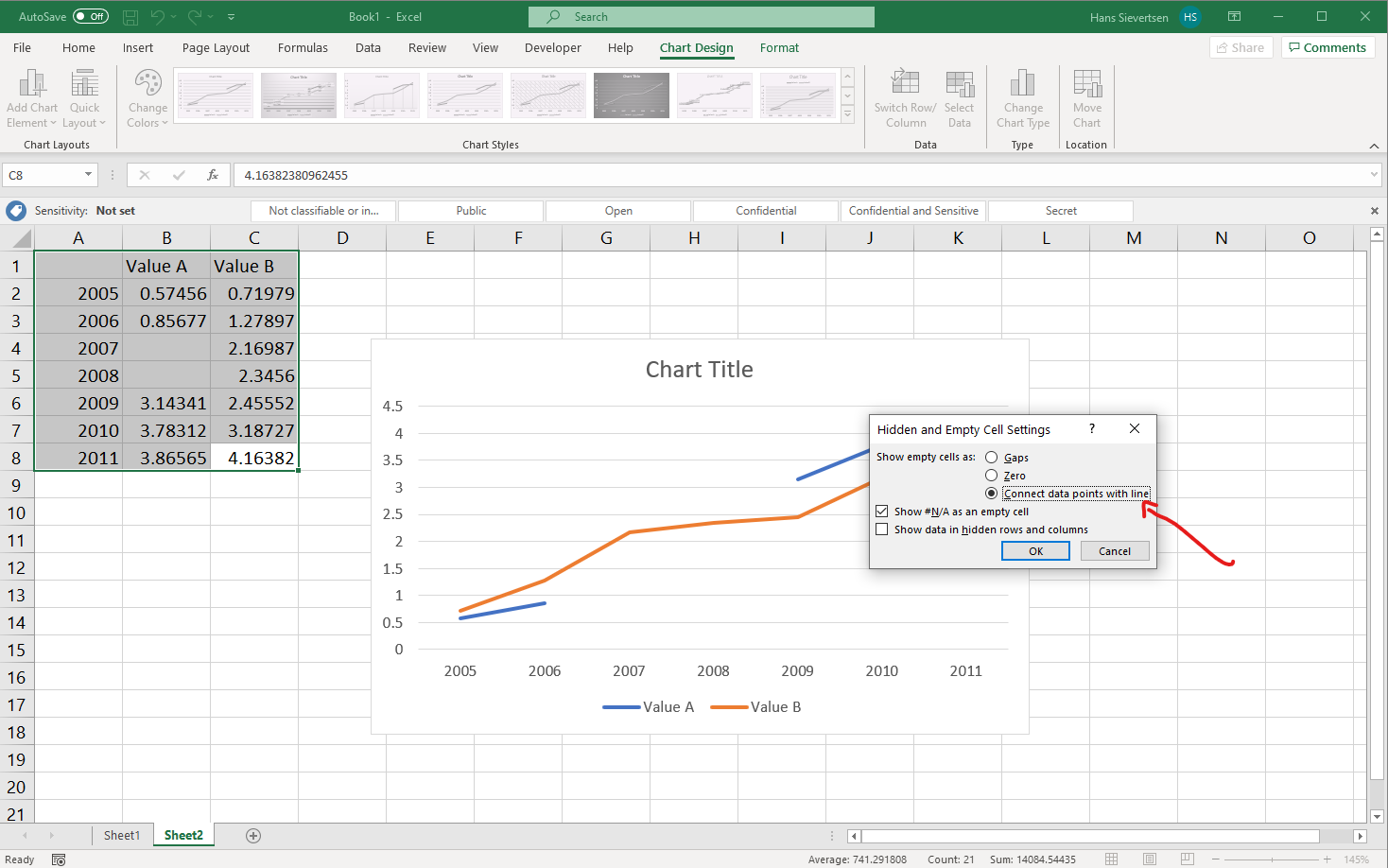
In the new menu, select “Connect data points with line”, to connect values.
Voila! Microsoft Excel did all the work for us!
Numerical values on the horisontal axis
You don’t always make brilliant decisions. One example is my decision not to include Kevin de Bruyne in my Fantasy Premier League Team in the season 2019/20. Another example is Microsoft’s decision to treat the horisontal axis in a line chart as categorical. I do not understand that because it is meaningless to connect values with a line that are categorical. But that is what they do!
What is the problem with treating the horisontal axis as categorical? The problem is that the numerical values are not given any importance by Microsoft Excel when generating the chart. Take a look at the chart below. The first value on the horisontal axis is 2000. The second value is 2006. The third value is 2007. The distance between 2000 and 2006 is the same as the distance from 2006 and 2007. That is misleading and not what we want. That is because Microsoft Excel ignores that 2000 is actually a number. It just treats it as text. What can we do to solve this issue?
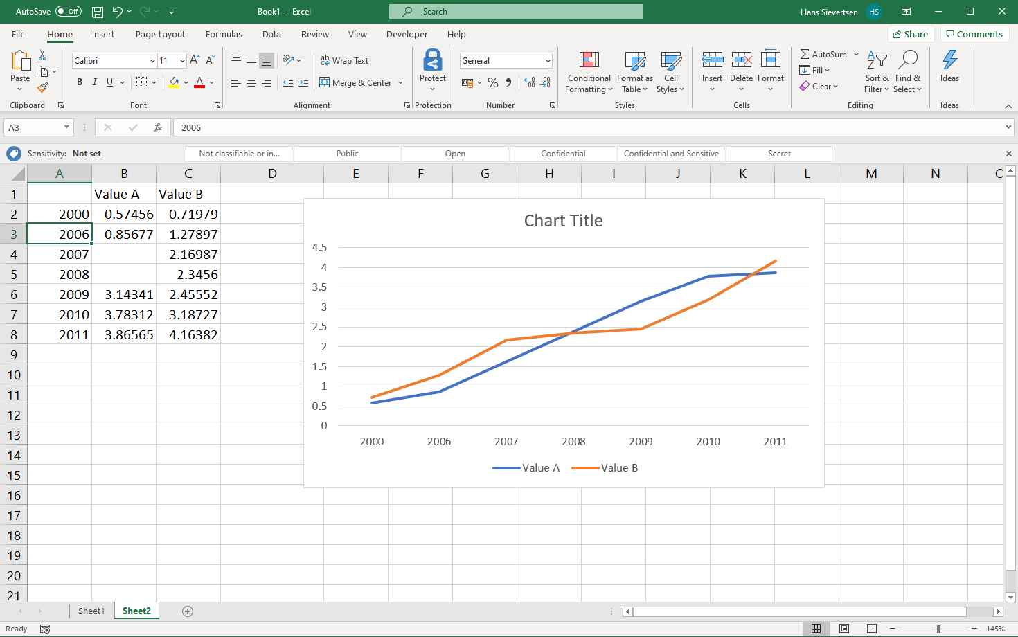
One solution is to manually add all the data points between 2000 and 2006 as in the example below (remember to connect lines across missing data points, as explained above).
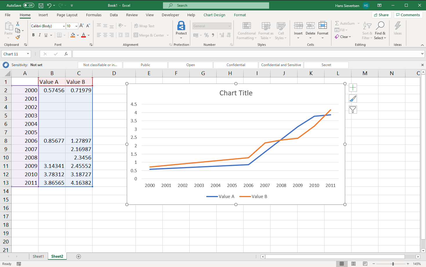
However, manually adding empty dataseries is not the best use of our time. There is an alternative solution: Scatter plots! Scatter plots differ from line charts (and bar charts, area charts etc) in that the horisontal axis is treated as numerical by default.
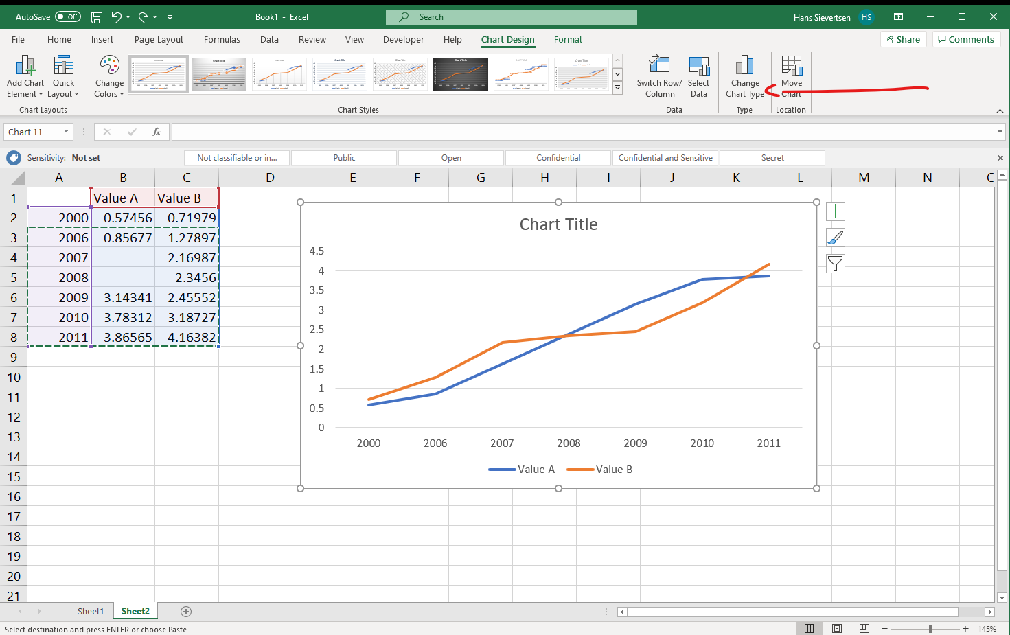
To change the chart type, click on “Change chart type” as shown below (you have to select your chart and select the Chart Design tab to see this option). You can also right-click on the chart and select “Change chart type”.
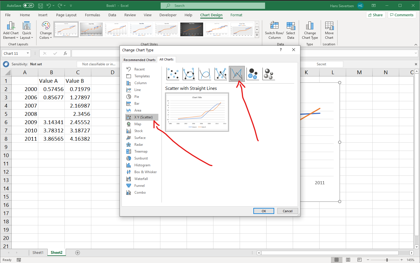
In the Change Chart Type menu select “X Y (Scatter)” and select the line chart chart as shown below. Don’t ask me why Microsoft Excel includes a line chart in the Scatter menu.
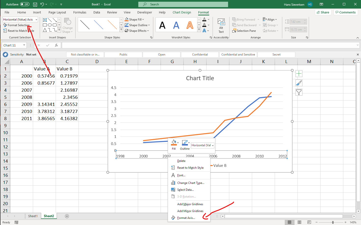
Voila! It works! The distance on the horisontal axis is now consistent with the values shown.
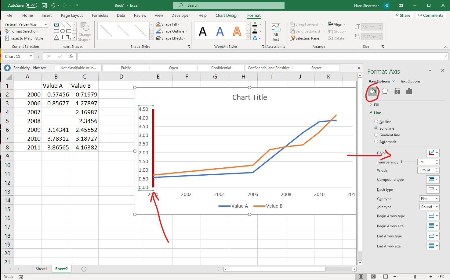
Formating axes
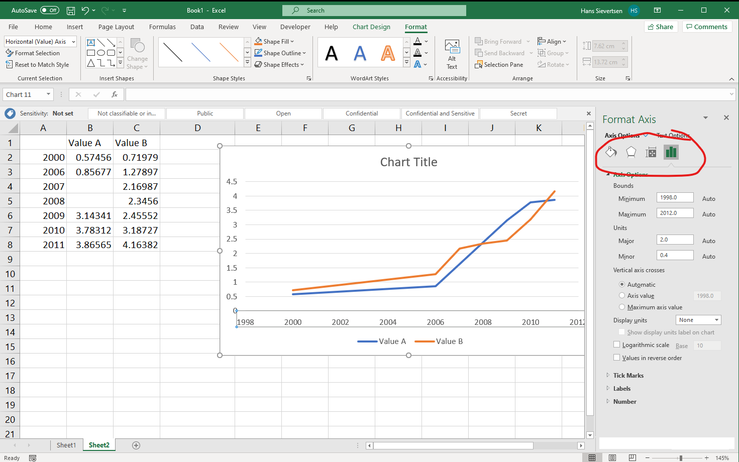
We can modify the axes scales and appearance. To change an axis, simply click on the axis (for example on one of the tick labels). If you’ve selected the “Format” tab, the ribbon will tell you what you’ve selected in the upper left corner (in the example below “Horizontal (Value) Axis”). We can then click “Format Selection” (or right-click on the axis and select “Format Axis”).
This opens a menu on the right as shown below.
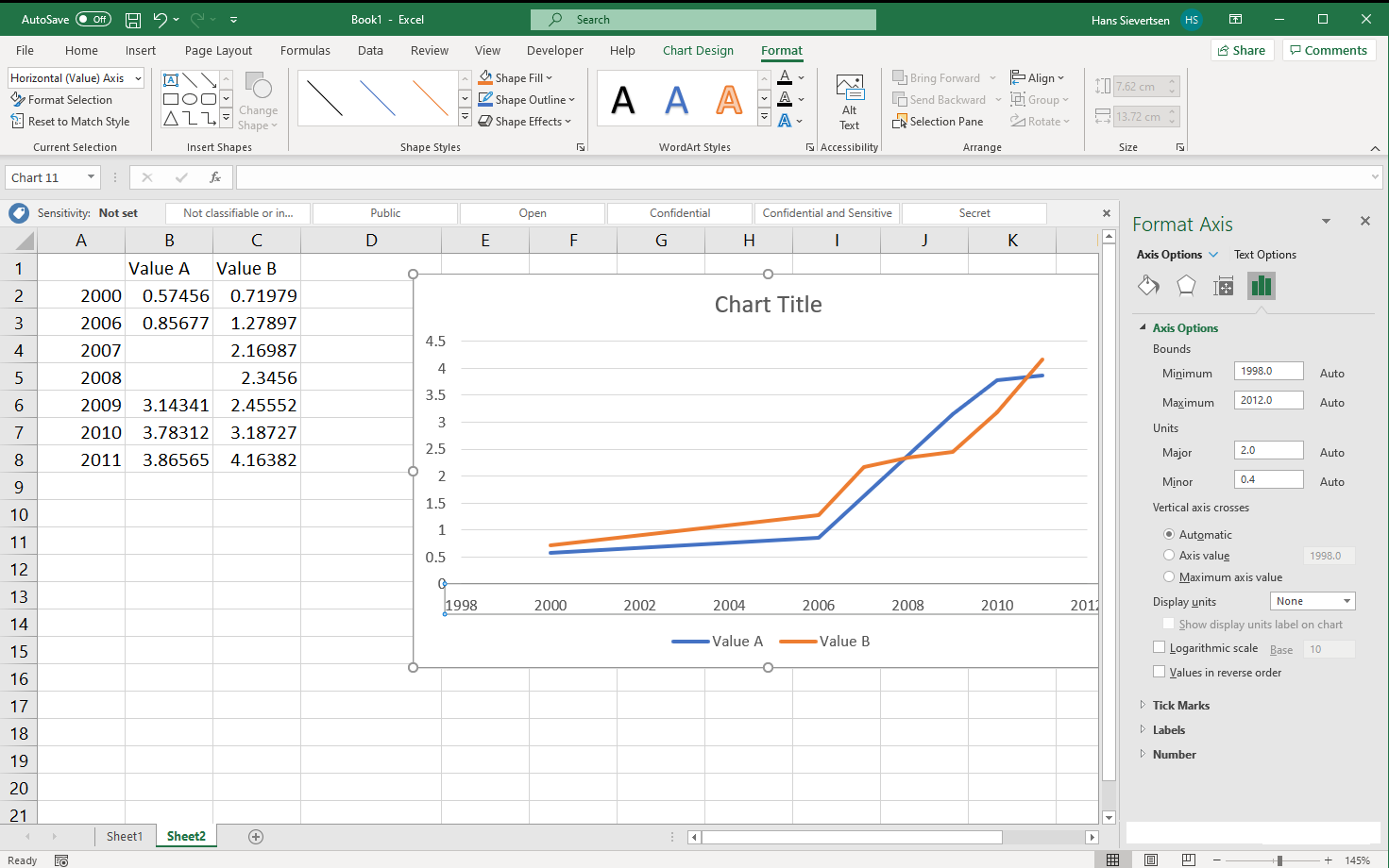
The menu consists of four categories (see below). The right-most category (the little bar chart symbol) allows us to change the scale and units on the axis.
We can modify the beginning and end value of the axis (or click “Reset” to let Microsoft Excel determine it automatically).
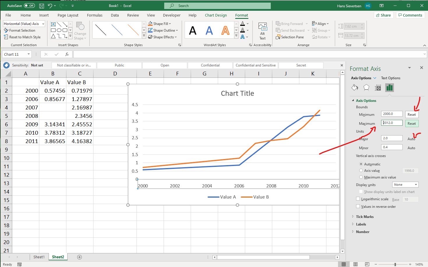
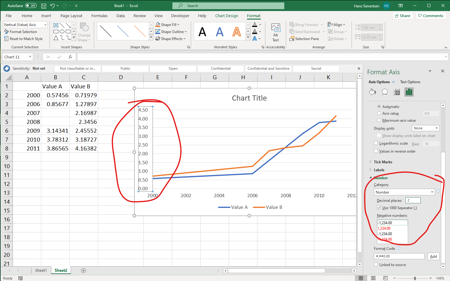
We can also change the appearance of the axis tick labels, by scrolling down to the “Number” section as shown below. In the example below we’ve told Excel to treat the labels on the vertical axis as numbers with two decimal places.
As shown in the example below, in the left-most menu we can change the colouring of the axis line, the line shape, the line thickness and other appearance aspects.
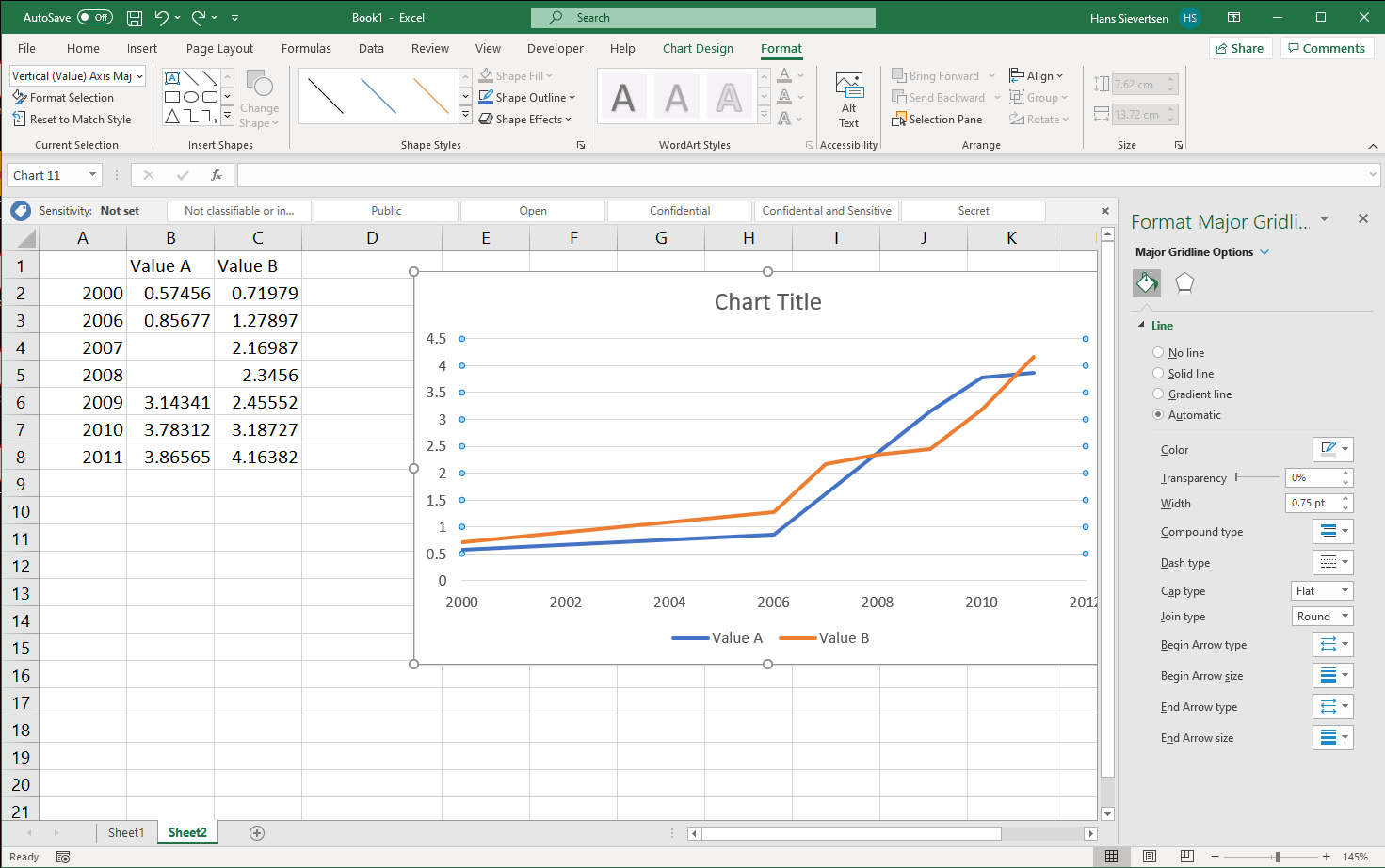
Formating other chart elements
We can modify almost all chart elements. We simply select the element we want to change and click “Format Selection” in the ribbon (or right-click and click Format…). In the example below we’ve selected the grid lines. We can then change the appearance of these grid lines in the menu on the right.
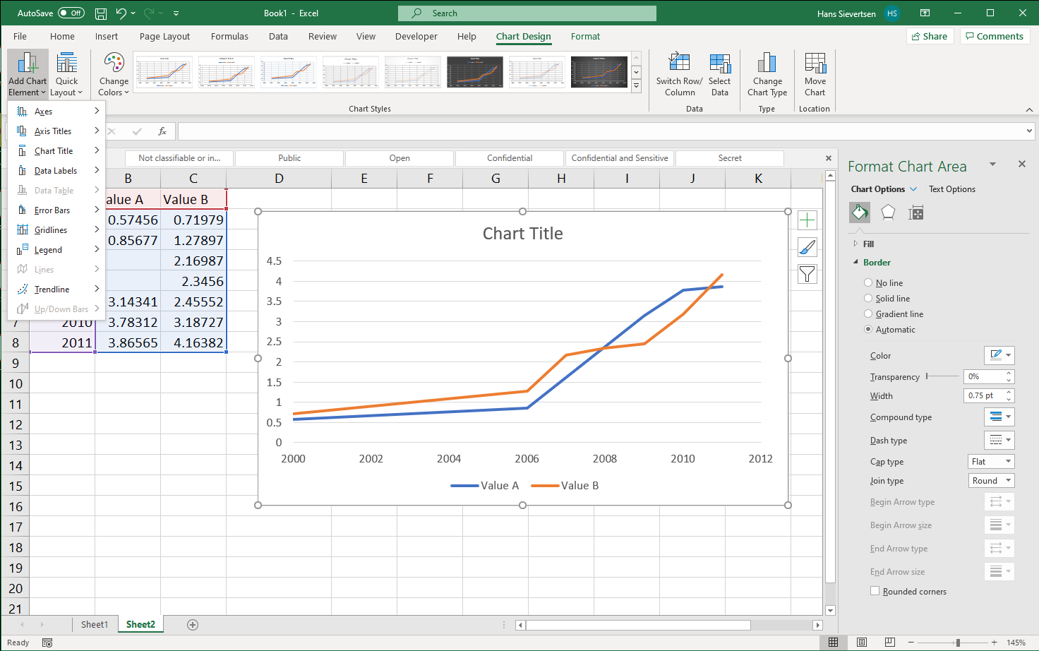
Adding chart elements
We can add chart elements in the Chart Design Tab by clicking Add Chart Element in the left-most part of the ribbon as shown below. we can also click on the big “+” symbol to the right of the chart.
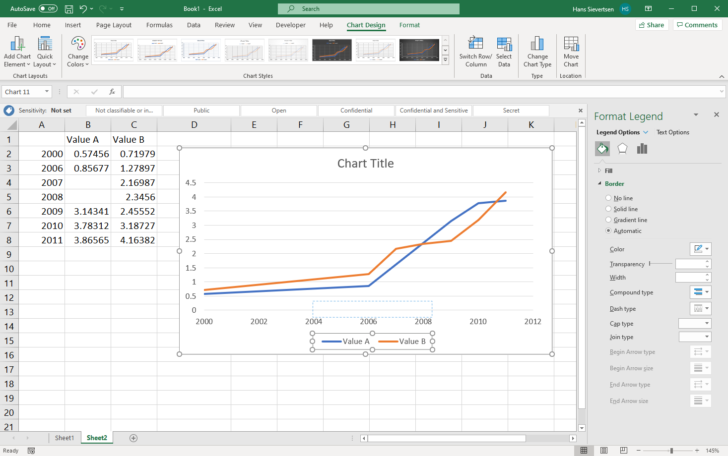
Moving chart elements
We can move chart elements by simply selecting and dragging them as shown for the legend below.
Inserting a text box
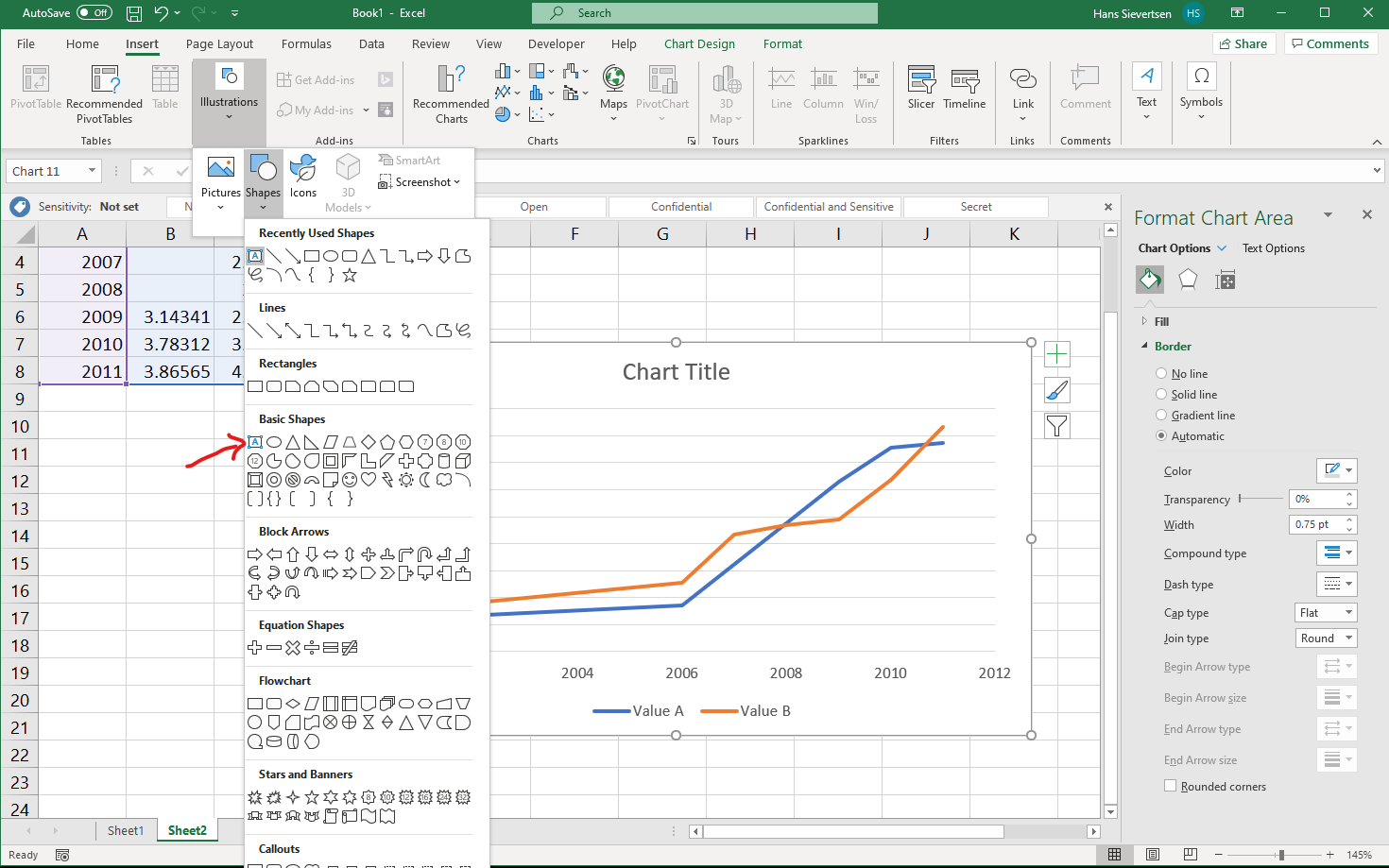
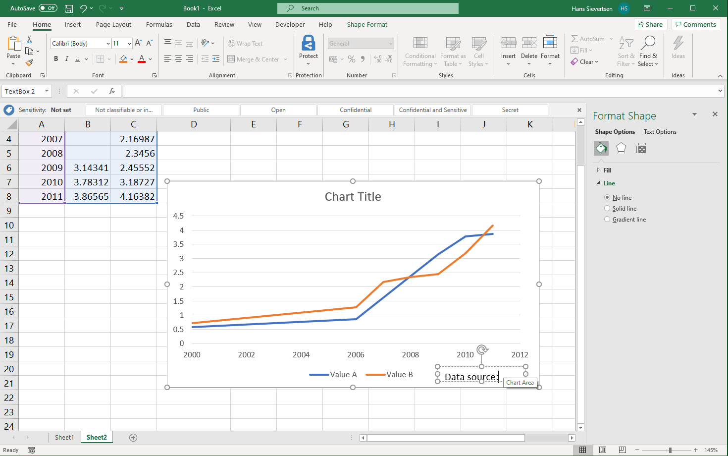
We can insert a text box in our chart (and other shapes), for example to include a note about value imputation and data sources. Simply select the “Insert” tab and then select Illustrations and Shapes. It is important that the chart canvas is selected when selecting this menu.
Combing chart types
We can combine several chart types in one chart as shown below
Windows
Mac