
In this video, see how to create pie, bar, and line charts, depending on what type of data you start with.
Want more?
Copy an Excel chart to another Office program
Create a chart from start to finish
We created a clustered column chart in the previous video.
In this video, we are going to create pie, bar, and line charts.
Each type of chart highlights data differently.
And some charts can’t be used with some types of data.
We’ll go over this shortly.
To create a pie chart, select the cells you want to chart.
Click Quick Analysis and click CHARTS.
Excel displays recommended options based on the data in the cells you select, so the options won’t always be the same.
I’ll show you how to create a chart that isn’t a Quick Analysis option, shortly.
Click the Pie option, and your chart is created.
You can chart only one data series with a pie chart.
In this example, those are the Sales figures in cells B2 through B5.
I am going to move and resize the chart, so it displays without having to scroll, which will also make it easier to customize (something we’ll look at in the next video.)
I click the chart; hold down the left mouse button, and drag to move it.
I scroll down a little, click the bottom right-hand corner of the chart, and drag it up and to the left to make it smaller.
Different data displays better in different types of charts.
If you try to graph too much data in a pie chart it looks like this, not very useful.
Now, I am creating a bar chart using the same data we used to create the pie chart.
Charting the same data different ways can provide you with a different perspective that may help you discover different insights in the data.
We are creating some of the more common chart types, but there are many more options.
To create charts that aren’t Quick Analysis options, select the cells you want to chart, click the INSERT tab.
In the Charts group, we have a lot of options.
Click Recommended Charts to see the charts that will work best with the data you have selected; click All Charts for even more options.
These are all of the different types of charts you can create.
As I mentioned earlier, a pie chart is not a recommended option for the data we selected, because it can only display one data series.
We could make a Pie chart, but it would only show the first data series, the Average Precipitation for New York, and not the second data series, the Average Precipitation for Seattle.
Instead, let’s make a Line with Markers chart.
Click Line, click Line with Marker, point to an option and you get a preview of the chart.
Click OK, and we have created our line chart.
Up next, Customize charts.
Once created, you can customize charts in many ways. Themes are preset color and shape combinations available in Excel. Changing the theme affects other options, as well as any other charts created in the future. If you only want to change the current chart, use the Chart Styles option.
To change the theme, click the Home tab, then click Themes, and make your choice.
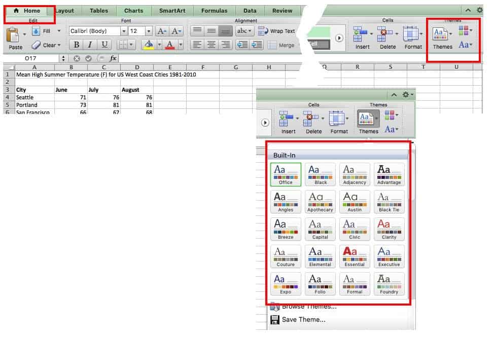
Other versions of Excel: Click the Page Layout tab, click Themes, and then make your choice.
To change the style, click Charts, and scroll through the options under Chart Styles on the same ribbon.
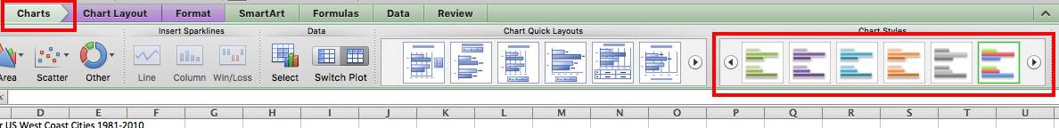
Other versions of Excel: Click Chart Tools or Chart Design tab, and click Layout to scroll through the options under Chart Styles. If you have a Chart Design tab, the different layouts will appear in the ribbon, similar to the image above.
Adding Titles
If the data presented in the chart isn’t quite clear, a title can help. Titles aren’t needed for charts with a single dependent variable.
Click on Chart Layout, click Chart Title, and click your option. Using the overlap/overlay option may cover part of the chart, so be sure the title doesn’t cover key information.
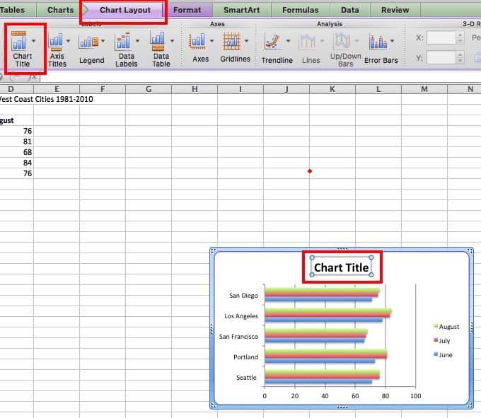
Other versions of Excel: Click Chart Tools tab, then click Layout, click Chart Title, and click your option.
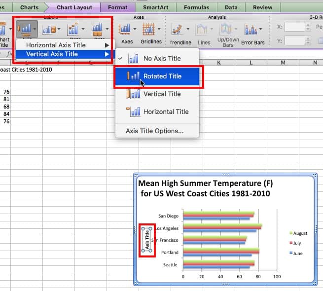
If the categories in the horizontal or vertical axis need a title, follow the steps above. However, select Axis Titles instead, and then choose the horizontal axis or vertical axis.
To change the font and appearance of titles, click Chart Title and then click More Title Options. Additionally, in some versions of Excel, you can click on the title in the chart and a side menu will appear with options to customize the text.
To reword a title, just click on it in the chart and retype.
Adjusting Axes
To adjust the horizontal or vertical axis, you can resize by clicking on a square in the corner and dragging an edge.

For finer adjustments, right click the axis and choose Format Axis…
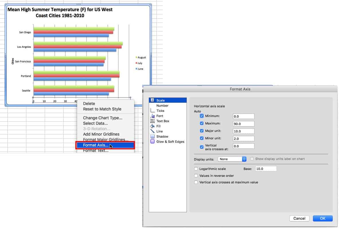
For a numeric axis, you can change the the start and end points, as well as the units displayed. Simply change the numbers in the boxes to make the starting and ending point the minimum and maximum, respectively.
Formatting Text
To format the copy, right-click any text in the chart and click Format Text (or Format Title or Format Legend, etc. — depending on your version of Excel and the area of the chart you wish to change). From this menu, you can change the font style and color, and add shadows or other effects.
Adding Data Labels
Data labels show the value associated with the bars in the chart. This information can be useful if the values are close in range. To add data values, right-click on one of the bars in the chart, and click Add Data Labels. This will create a label for each bar in that series. For clustered charts, one of each color will have to be labeled.

Moving the Legend
Click and drag the legend to a new location on the chart, or click on it and press the delete button on your keyboard to remove it completely.
Data Order
The items will appear in reverse order from the spreadsheet. Rather than changing the order there, it’s easier to right-click the axis, click Format Axis…, and then click the box next to Categories in Reverse Order. This change will also affect the order of the data clusters, if that was the chart format chosen.

In some versions of Excel, you can also change the data order by selecting one of the bars and editing the formula bar.
Adjusting Axis Text
If the text on an axis is long, pivot it on an angle to occupy less space. Right-click the axis, click Format Axis, click Text Box, and enter an angle.
You can also opt to only show some of the axis labels. Right-click the axis, click Format Axis, then click Scale, and enter a value in the Interval between labels box. A value of 2 will show every other label; 3 will show every third.

If you want to create a cleaner, less cluttered chart, hiding some labels is a good option. But the context of the hidden text is still obvious.
Changing Chart Values
Update the spreadsheet and the values in the chart will update, too. But remember, if the chart has been copied to a non-Microsoft Office document, it won’t update — in this case, copy the updated version and replace it in the document.
Changing the Look of the Bars
Right-click a bar, then click Format Data Series… and make adjustments. In addition to changing the color, you can also add a gradient or pattern, as well as many other effects.
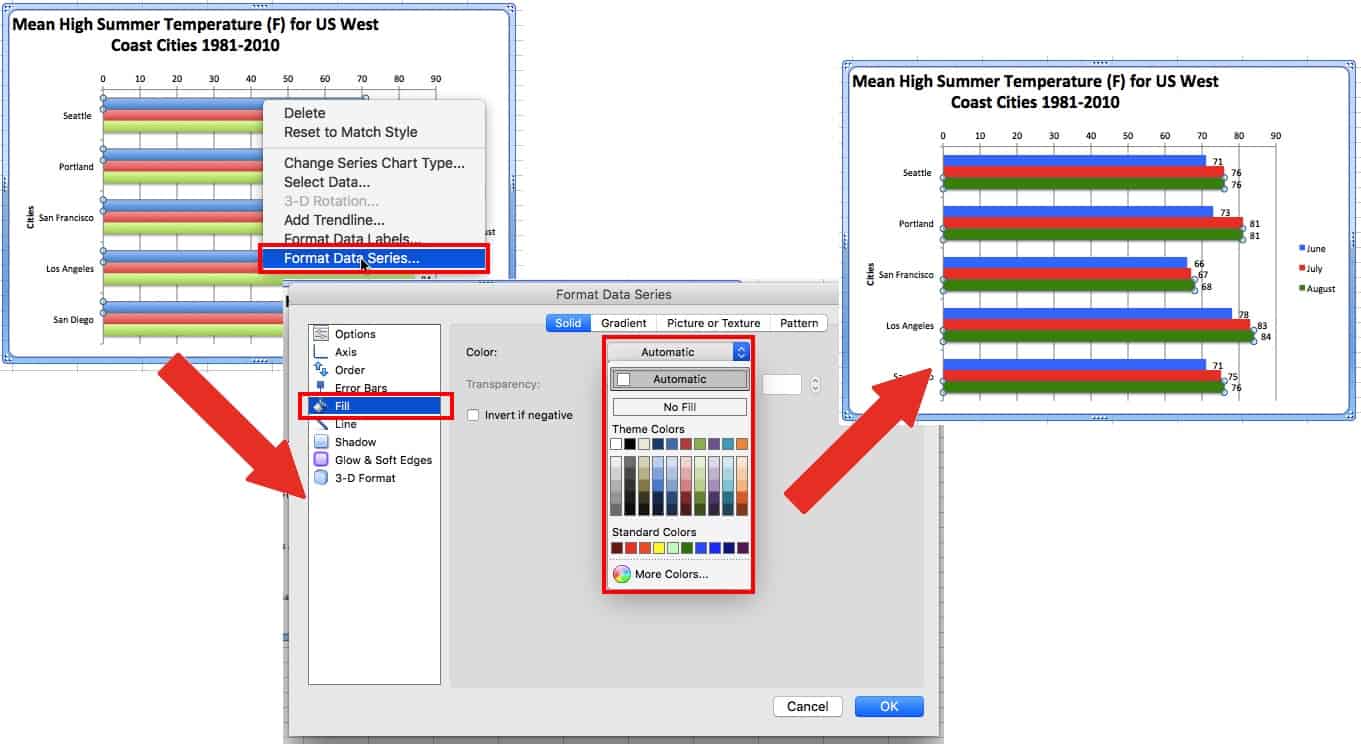
For clustered bar charts, any changes will only affect the bars associated with the same dependant variable of the selected bar. Repeat to update all the bars in the chart.
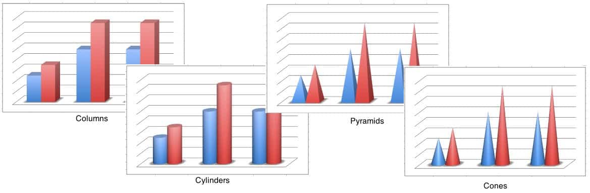
If bars don’t look right, select the chart, right-click the chart and click Change Chart Type…. In addition to the 2D bars demonstrated in this tutorial, there are options for 3D bars/columns, cylinders, cones, and pyramids.
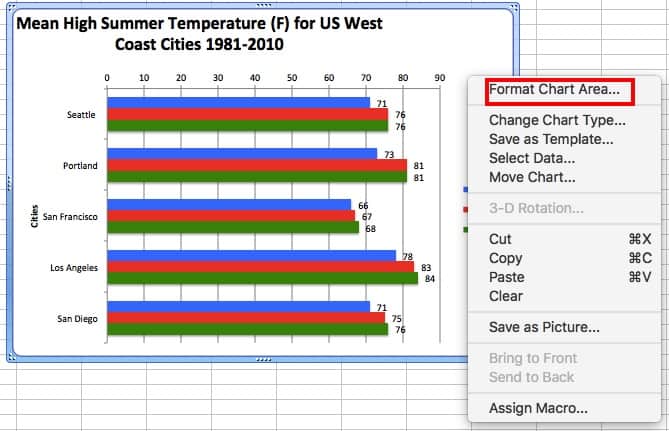
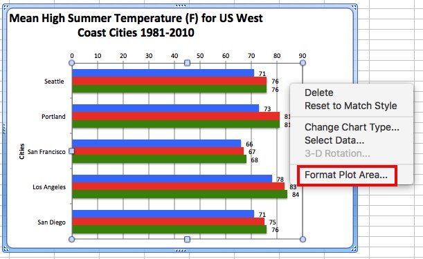
Changing the Background of the Chart and Plot Area
To change the background, right-click in a blank area of the chart and click Format Chart Area… or right-click the plot area and click Format Plot Area…. Like the bars, you can change the color, add a gradient or pattern, adjust the color and size of lines, as well as other effects.
Adding a Data Table
A data table displays the spreadsheet data that was used to create the chart beneath the bar chart. This shows the same data as data labels, so use one or the other.
To add a data table, click the Chart Layout tab, click Data Table, and choose your option. If the legend key option is chosen, you can remove the legend as demonstrated in the image below.
Changing Chart Orientation
To swap the vertical and horizontal axes, right-click on the chart and click Change Chart Type. If you chose a column chart, chose bar chart instead, and vice versa. There are other ways to do this, but this is the simplest.

A bar chart (or a bar graph) is one of the easiest ways to present your data in Excel, where horizontal bars are used to compare data values. Here’s how to make and format bar charts in Microsoft Excel.
Inserting Bar Charts in Microsoft Excel
While you can potentially turn any set of Excel data into a bar chart, It makes more sense to do this with data when straight comparisons are possible, such as comparing the sales data for a number of products. You can also create combo charts in Excel, where bar charts can be combined with other chart types to show two types of data together.
RELATED: How to Create a Combo Chart in Excel
We’ll be using fictional sales data as our example data set to help you visualize how this data could be converted into a bar chart in Excel. For more complex comparisons, alternative chart types like histograms might be better options.
To insert a bar chart in Microsoft Excel, open your Excel workbook and select your data. You can do this manually using your mouse, or you can select a cell in your range and press Ctrl+A to select the data automatically.

Once your data is selected, click Insert > Insert Column or Bar Chart.
Various column charts are available, but to insert a standard bar chart, click the “Clustered Chart” option. This chart is the first icon listed under the “2-D Column” section.
Excel will automatically take the data from your data set to create the chart on the same worksheet, using your column labels to set axis and chart titles. You can move or resize the chart to another position on the same worksheet, or cut or copy the chart to another worksheet or workbook file.
For our example, the sales data has been converted into a bar chart showing a comparison of the number of sales for each electronic product.
For this set of data, mice were bought the least with 9 sales, while headphones were bought the most with 55 sales. This comparison is visually obvious from the chart as presented.
Formatting Bar Charts in Microsoft Excel
By default, a bar chart in Excel is created using a set style, with a title for the chart extrapolated from one of the column labels (if available).
You can make many formatting changes to your chart, should you wish to. You can change the color and style of your chart, change the chart title, as well as add or edit axis labels on both sides.
It’s also possible to add trendlines to your Excel chart, allowing you to see greater patterns (trends) in your data. This would be especially important for sales data, where a trendline could visualize decreasing or increasing number of sales over time.
RELATED: How to Work with Trendlines in Microsoft Excel Charts
Changing Chart Title Text
To change the title text for a bar chart, double-click the title text box above the chart itself. You’ll then be able to edit or format the text as required.
If you want to remove the chart title completely, select your chart and click the “Chart Elements” icon on the right, shown visually as a green, “+” symbol.
From here, click the checkbox next to the “Chart Title” option to deselect it.
Your chart title will be removed once the checkbox has been removed.
Adding and Editing Axis Labels
To add axis labels to your bar chart, select your chart and click the green “Chart Elements” icon (the “+” icon).
From the “Chart Elements” menu, enable the “Axis Titles” checkbox.
Axis labels should appear for both the x axis (at the bottom) and the y axis (on the left). These will appear as text boxes.
To edit the labels, double-click the text boxes next to each axis. Edit the text in each text box accordingly, then select outside of the text box once you’ve finished making changes.
If you want to remove the labels, follow the same steps to remove the checkbox from the “Chart Elements” menu by pressing the green, “+” icon. Removing the checkbox next to the “Axis Titles” option will immediately remove the labels from view.
Changing Chart Style and Colors
Microsoft Excel offers a number of chart themes (named styles) that you can apply to your bar chart. To apply these, select your chart and then click the “Chart Styles” icon on the right that looks like a paint brush.
A list of style options will become visible in a drop-down menu under the “Style” section.
Select one of these styles to change the visual appearance of your chart, including changing the bar layout and background.
You can access the same chart styles by clicking the “Design” tab, under the “Chart Tools” section on the ribbon bar.
The same chart styles will be visible under the “Chart Styles” section—clicking any of the options shown will change your chart style in the same way as the method above.
You can also make changes to the colors used in your chart in the “Color” section of the Chart Styles menu.
Color options are grouped, so select one of the color palette groupings to apply those colors to your chart.
You can test each color style by hovering over them with your mouse first. Your chart will change to show how the chart will look with those colors applied.
Further Bar Chart Formatting Options
You can make further formatting changes to your bar chart by right-clicking the chart and selecting the “Format Chart Area” option.
This will bring up the “Format Chart Area” menu on the right. From here, you can change the fill, border, and other chart formatting options for your chart under the “Chart Options” section.
You can also change how text is displayed on your chart under the “Text Options” section, allowing you to add colors, effects, and patterns to your title and axis labels, as well as change how your text is aligned on the chart.
If you want to make further text formatting changes, you can do this using the standard text formatting options under the “Home” tab while you’re editing a label.
You can also use the pop-up formatting menu that appears above the chart title or axis label text boxes as you edit them.
READ NEXT
- › How to Find Links to Other Workbooks in Microsoft Excel
- › How to Create a Chart Template in Microsoft Excel
- › How to Rename a Data Series in Microsoft Excel
- › How to Add and Customize Data Labels in Microsoft Excel Charts
- › How to Make a Bar Graph in Google Sheets
- › How to Create a Geographical Map Chart in Microsoft Excel
- › How to Create and Customize a People Graph in Microsoft Excel
- › HoloLens Now Has Windows 11 and Incredible 3D Ink Features
To learn how to create a Column and Bar chart in Excel, let’s use a simple example of marks secured by some students in Science and Maths that we want to show in a chart format. Note that a column chart is one that presents our data in vertical columns. A bar graph is extremely similar in terms of the choices you’ve got but presents your data in horizontal bars. The steps below take you through creating a column chart, but you’ll also follow them if you would like to make a bar graph.
A bar chart is the horizontal version of a column chart. If you have large text labels use a bar chart. Once your data has been prepared correctly, you are then ready to create your chart. This is a quick and easy process, but it does involve a number of steps:
Creating a Bar Chart
Step 1. We need to select all the data which you need to include in the chart.

In our example we will select a range from A1:C6.

Step 2. It’s very important to include the row headings if you want to use values as labels on the chart.
Step 3. Under the Insert menu, you will find the options for Bar Charts, choose from the multiple designs mentioned in the image below:

In our case we are creating a Column chart and bar graph, so click the Column button first. The following options will then be displayed. As you’ll be able to see, there are many options available. Select 3D Clustered Column Chart. We can change it to at least one of the opposite chart types later if we decide that this one doesn’t suit our requirements.
Once you select a chart type, Excel will automatically create the chart and insert it into your worksheet.
Types of Bar Charts
There are some examples of different types of charts
Clustered column Charts
- Use this chart type to compare values across a few categories.
- Use it when the order of categories is not important.

Stacked column
Use this chart type to:
- Compare parts of a whole.
- Show how parts of a whole change over time.

100% Stacked Column
Use this chart type to:
- Compare the percentage that each value contributes to a total.
- Show how the percentage that each value contributes changes overtime.

3-D Clustered Column
- Use this chart type compare values across a few categories.
- Use it when the order of categories is not important.

3-D 100% Stacked column
Use this chart type to:
- Compare the percentages that each value contributes to a total.
- Show how the percentage that each value contributes changes over time.

3-D Column
Use this chart type to:
- compare values across a few categories.
- Show data on a third axis which will show some columns in front of others.

Clustered Bar Charts
Use this chart type to:
- Compare values across a few categories.
Use it when:
- The chart shows duration.
- The category text is long.

Stacked Bar
Use this chart type to:
- Compare parts of a whole across categories.
- Show how parts of a whole change overtime.
Use it when:
- The category text is long.

100% Stacked Bar
Use this chart type:
- Compare the percentage that each value contributes to a total.
- Show how the percentage that each value contributes changes overtime.
Use it when:
- The category text is long.

3-D Clustered Bar
- Use this chart type to:
- Compare values across a few categories.
Use it when:
- The chart show duration.
- The category text is long.

3-D Stacked Bar
Use this type to:
- Compare parts of whole across categories.
- Show how of a whole change over time.
Use it when:
- The category text is long

3-D 100% Stacked Bar
Use this chart type to:
- compare the percentage that each value contributes to a total.
- Show how the percentage that each value contributes changes over time
Use it when:
- The category text is long.

Note the following points about this chart:
1. Excel has automatically put labels on an angle to fit neatly into the space available.
2. The legend to the right of the chart contains the column heading from our spreadsheet. You can change them by editing the headings in our data table.
3. Excel has chosen these colors based on a default theme. You can change the theme if you need to, and the colors will change automatically. You can also override the colors manually if you need to.
4. There is no title on the chart by default. You can add one manually, or choose a chart layout that includes one.
![]()
Download Article
![]()
Download Article
It’s easy to spruce up data in Excel and make it easier to interpret by converting it to a bar graph. A bar graph is not only quick to see and understand, but it’s also more engaging than a list of numbers. This wikiHow article will teach you how to make a bar graph of your data in Microsoft Excel.
-

1
Open Microsoft Excel. It resembles a white «X» on a green background.
- A blank spreadsheet should open automatically, but you can go to File > New > Blank if you need to.
- If you want to create a graph from pre-existing data, instead double-click the Excel document that contains the data to open it and proceed to the next section.
-
2
Add labels for the graph’s X- and Y-axes. To do so, click the A1 cell (X-axis) and type in a label, then do the same for the B1 cell (Y-axis).
- For example, a graph measuring the temperature over a week’s worth of days might have «Days» in A1 and «Temperature» in B1.
Advertisement
-
3
Enter data for the graph’s X- and Y-axes. To do this, you’ll type a number or word into the A or B column to apply it to the X- or Y- axis, respectively.
- For example, typing «Monday» into the A2 cell and «70» into the B2 field might show that it was 70 degrees on Monday.
-
4
Finish entering your data. Once your data entry is complete, you’re ready to use the data to create a bar graph.


Advertisement
-
1
Select all of your data. To do so, click the A1 cell, hold down ⇧ Shift, and then click the bottom value in the B column. This will select all of your data.
- If your graph uses different column letters, numbers, and so on, simply remember to click the top-left cell in your data group and then click the bottom-right while holding ⇧ Shift.
-
2
Click the Insert tab. It’s in the editing ribbon, just right of the Home tab.
-
3
Click the «Bar chart» icon. This icon is in the «Charts» group below and to the right of the Insert tab; it resembles a series of three vertical bars.
-
4
Click a bar graph option. The templates available to you will vary depending on your operating system and whether or not you’ve purchased Excel, but some popular options include the following:
- 2-D Column — Represents your data with simple, vertical bars.
- 3-D Column — Presents three-dimensional, vertical bars.
- 2-D Bar — Presents a simple graph with horizontal bars instead of vertical ones.
- 3-D Bar — Presents three-dimensional, horizontal bars.
-
5
Customize your graph’s appearance. Once you decide on a graph format, you can use the «Design» section near the top of the Excel window to select a different template, change the colors used, or change the graph type entirely.
- The «Design» window only appears when your graph is selected. To select your graph, click it.
- You can also click the graph’s title to select it and then type in a new title. The title is typically at the top of the graph’s window.[1]


Advertisement
Sample Bar Graphs
Add New Question
-
Question
How can I change the graph from horizontal to vertical?

‘Bar Graph’ is horizontal. ‘Column Chart’ is the same but vertical, so use that instead.
-
Question
How do I move an Excel bar graph to a Word document?
You can copy and paste the graph. Do this the same way you’d copy and paste regular text.
-
Question
How do I adjust the bar graph width in Excel?
Click on the element you want to adjust. For example, if you want to adjust the width of the bars, you would click on the bars. If that doesn’t bring up options, try right clicking. Decreasing the gap width will make the bars appear to widen. If you have more than one set of data (i.e. the cost of two or more items over a given time span), you can also adjust the series overlap. If you’re not satisfied with the automatic layout of the axes, you can adjust these at your own peril.
See more answers
Ask a Question
200 characters left
Include your email address to get a message when this question is answered.
Submit
Advertisement
-
Graphs can be copied and then pasted into other Microsoft Office programs like Word or PowerPoint.
-
If your graph switched the x and y axes from your table, go to the «Design» tab and select «Switch Row/Column» to fix it.
Thanks for submitting a tip for review!
Advertisement
About This Article
Thanks to all authors for creating a page that has been read 1,266,169 times.