

Change the chart type of one or more data series in your chart (graph) and add a secondary vertical (value) axis in the combo chart.
Create a combo chart with a secondary axis
In Excel 2013, you can quickly show a chart, like the one above, by changing your chart to a combo chart.
-
Click anywhere in the chart you want to change to a combo chart to show the CHART TOOLS.
-
Click DESIGN > Change Chart Type.
-
On the All Charts tab, choose Combo, and then pick the Clustered Column — Line on Secondary Axis chart.
-
Under Choose the chart type and axis for your data series , check the Secondary Axis box for each data series you want to plot on the secondary axis, and then change their chart type to Line.
-
Make sure that all other data series are shown as Clustered Column.
Want more?
Copy an Excel chart to another Office program
Create a chart from start to finish
You can emphasize different types of data, such as Temperature and Precipitation, by combining two or more chart types in one Combo chart.
Different types of data, often, have different value ranges and with a Combo chart, you can include a secondary axis.
Select the cells you want to chart.
Combo chart is not a Quick Analysis option, so we click the INSERT tab on the ribbon, click the Combo button, and choose an option.
I am moving and resizing the chart to make it easier to work with.
I give the chart a title.
Adding a secondary axis for Precipitation will make the chart easier to understand.
I double-click the Precipitation line in the chart and select Secondary Axis in the task pane.
It would make the chart even clearer, if we added axis titles.
Click the CHART ELEMENTS button, click the arrow beside Axis Titles, select Primary Vertical and Secondary Vertical, click the title boxes and type the appropriate text.
Up next, Copy a chart.
Need more help?
Combo Chart in Excel (Table of Contents)
- Definition of Combo Chart in Excel
- Example to Create Combo Chart in Excel
Excel Combination Chart
You might have visualized your data with some of the graphical techniques most of the time in your reports, as it is a nice way to do so and gives a quick analytical overview of the data. However, have you faced any such scenario’s where you have to use a combination of two charts (for example, bar chart and line chart) in a single graph to give a more crisp idea about the data? I bet you must have come with such scenario’s. Combining two or more charts in a graph is not an easy task, but we will make it so throughout this article and assure you that you will be able to do it on your own with ease once you go through this article.
Definition of Combo Chart in Excel
As the word suggests, the combo chart is the combination of two graphs on the same chart to make it more understandable and visually more appealing. It allows you to represent two different datasets (which are related to each other) on the same chart. In the usual chart, we have two axis, X-axis and Y-axis, where on Y-axis you have series data, and on X-axis, you have categories. However, when you use a combination chart, you’ll have two series or, in other words, two Y-axis for the same X-axis or categories.
Example to Create Combo Chart in Excel
In the below example, we are going to explore how to create a combination of Bar graph and Line graph on the same chart.
You can download this Combo Chart Excel Template here – Combo Chart Excel Template
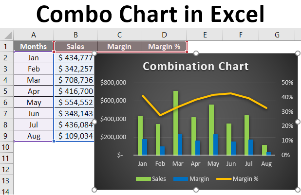
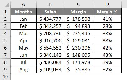
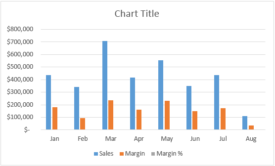
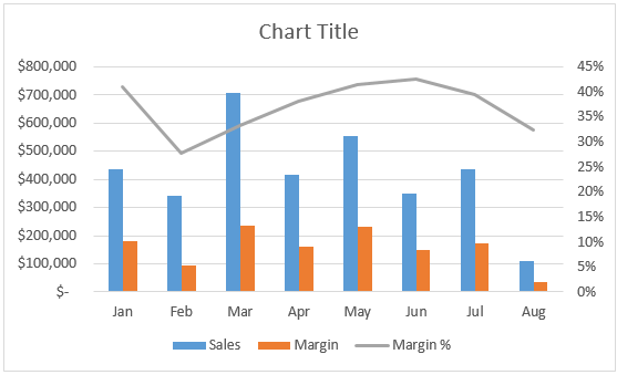
Suppose we are running a manufacturing company and selling our products across the globe. Following are the Sales, Margin and Margin% values from January to August (the Year 2019) for all the products we sold. See the image below.
We wanted to plot a graph of the same in excel so our management can better understand how we are moving in the business around the globe in the past 8 months. A bar chart seems to be the nicest way to make comparisons.
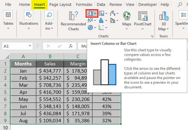
Step 1 – Select all the data spread across column A to D (Along with headers). Navigate to the “Insert” Tab and under the Charts section, click on the “Column or Bar Chart” icon.
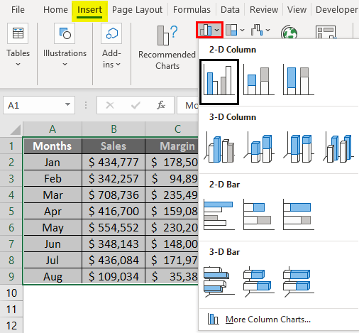
Step 2 – Once you click on the Insert Column or Bar Chart icon, you will be able to see multiple graph options using which your data can be represented. Select the Clustered Column Chart option from the list.
Step 3 – Once you click on the Clustered Column Chart option, you’ll be able to see a chart like this in your working excel sheet.
You can directly insert a combination chart and recommend the Charts option present under the Chart section. However, we wanted this to be for all the users (Some Excel users using the older version might not have the recommended charts option); we are showing it step by step.
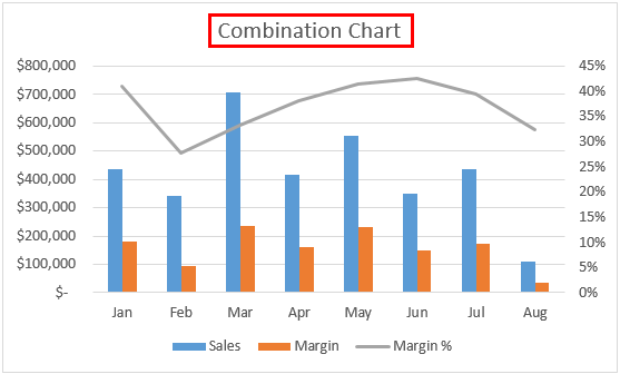
Here, in the graph above, you can see that the margin percentage is not clearly visible. Rightly so, because they have values really very small compared to that of sales and Margin values. However, we wanted to make the Margin% visible to management as well. So that they will have a better understanding of movements happening, for this, we can add a Line Chart under this one and mention Margin% on the line chart. Follow the steps as below to create a combination of two charts:
Step 4 – Select series bars and right-click on any one of those. You’ll see a series of options. Out of those, select the Change Series Chart Type… option.
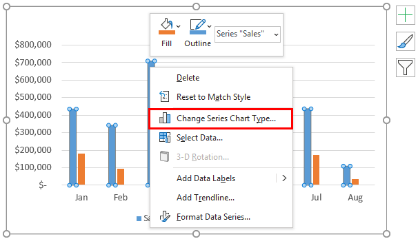
Step 5 – As soon as you click on the Change Series Chart Type… option, a Change Chart Type window will pop up, as shown in the below screenshot.
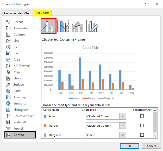
Step 6 – In the Change Chart Type window, select Combo as a category (as we want to combine two charts). It will most often be selected by default for you by the system, using its own intelligence.
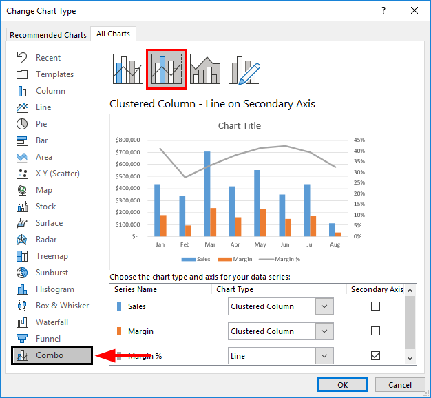
Step 7 – Inside Combo, you’ll see different combination options (ideally four). Out of those, select the second option, which is Clustered Column – Line on Secondary Axis chart. This option of the chart enables the secondary axis visible on the right-hand side of the graph. See screenshot below.

Step 8 – Click the “OK “ button, and you’ll be able to see the updated combined graph as below.
Now, the Margin% looks like having more relevance in that graph. Because it is now added as separate series values (remember the secondary Y-axis on the right-hand side of the graph). As the series values have been plotted on a separate axis, they are now not relevant to the values of primary series values (Y-axis). Therefore, they can now be seen more precisely and visually as well as technically more relevant.
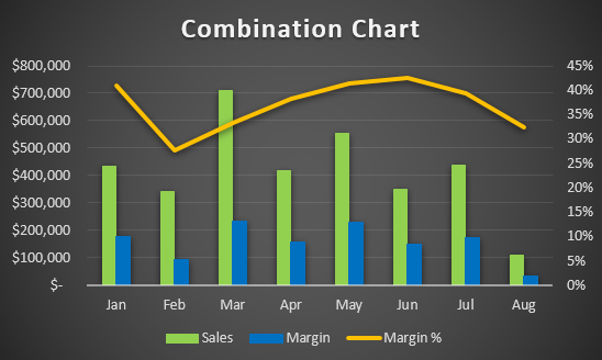
Step 9 – Add the Chart Title as “Combination Chart” under the Chart Title section under combo graph.
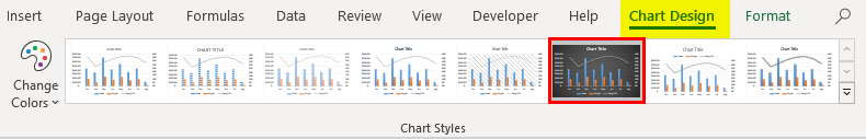
You can use more customizations like changing the design of the graph, adding axis labels or changing series bars and series line colors, changing widths, etc., to make your graph visually more pleasant. All these options are present under the Design tab.
This is how we can create Combo Chart under Excel when we have different data for the same categories.
This is from this article. Let’s wrap things up with some points to be remembered.
Things to Remember
- As it is a hybrid of two or more charts, it saves time as well as space to create two separate graphs. However, at the same time, it might confuse the user due to the complexity which gets added due to the combination.
- The combination chart allows to plot two different series values across the same categories, which is more decent because one can compare two totally different values for the same categories in a single graph.
- Though it seems easier to generate in excel, it needs to be precise and non-confusing to the user so that they can have better visualization for two different values for the same categories.
- You can use different combinations of charts other than Bar and Line charts to make a better combination. Ex. Gantt & Bar chart.
Recommended Articles
This is a guide to Combo Chart in Excel. Here we discuss How to create Combo Chart in excel along with practical examples and a downloadable excel template. You can also go through our other suggested articles –
- Marimekko Chart Excel
- Candlestick Chart in Excel
- Histogram Chart Excel
- Excel Combo Box
A combination chart or most commonly known as a combo chart in Excel. It is a combination of two or more different charts in Excel. We can create a combo chart from the “Insert” menu in the “Chart” tab to make such combo charts. To combine two charts, we must have two different data sets but one common field combined.
For example, suppose we have a year, revenue, and product sales in the percentage dataset. We want to show how the same chart’s revenues and sales have changed. In such cases, we can plot the year on X-axis. In contrast, revenue and product sales in the percentage on the two Y-axis in combination charts in Excel can help present and compare two different data sets related to each other in a single chart.
What is a Combination (Combo) Chart in Excel?
The combination charts in Excel let you represent two different data tables related to each other. So, for example, there would be a primary X-axis and Y-axis and an additional secondary Y-axis to help provide a broader understanding of one chart.
- The combination charts in Excel provide a comparative analysis of the two graphs of different categories and the mixed data type, enabling the user to view and highlight higher and lower values within the charts.
- A combo chart in Excel is the best feature that lets users summarize large data sets with multiple data tables and systematically illustrate the numbers in one chart.
- The combination charts in Excel are also called combo charts in the newer version of Excel. Typically, the new feature for combo charts in Excel is available from 2013 and later versions.
Table of contents
- What is a Combination (Combo) Chart in Excel?
- How to Create a Combo Chart in Excel?
- Combination Charts (Combo) in Excel Examples #1
- Combination Charts (Combo) in Excel Example #2
- Pros of Combination Charts in Excel
- Cons of Combo Charts in Excel
- Things to Remember
- Recommended Articles
- How to Create a Combo Chart in Excel?
How to Create a Combo Chart in Excel?
Below are examples of the Combination Chart in Excel (Combo).
You can download this Combination Chart Excel Template here – Combination Chart Excel Template
Combination Charts (Combo) in Excel Examples #1
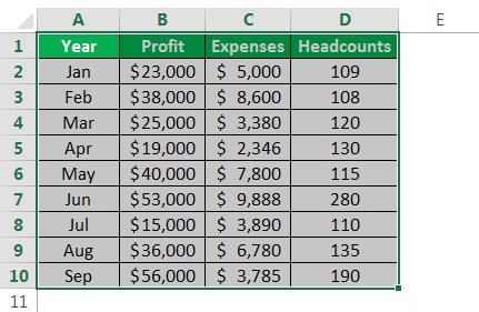
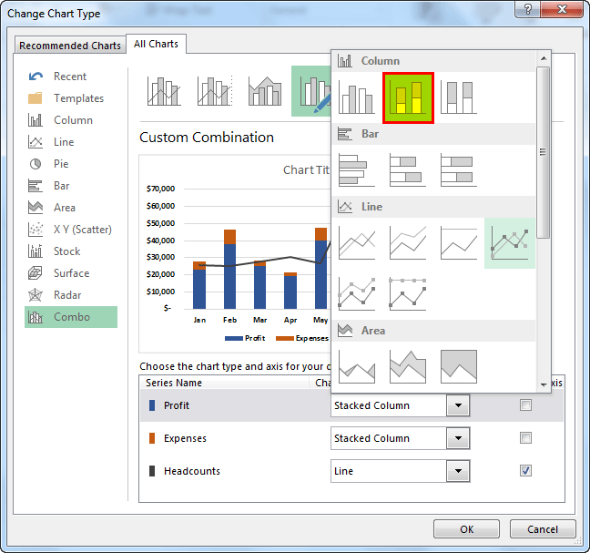
Consider the below example wherein we have profit, expenses, and headcount plotted in the same chart by month. We would have profit and expenses on the primary Y-axis, headcounts on the secondary Y-axis, and months on the X-axis.

- First, we must select the whole table to be plotted on the chart.

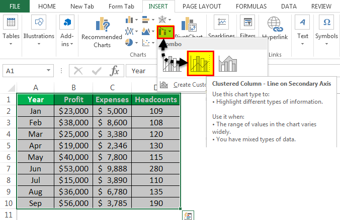
- As shown in the screenshot below, we must select the data table, go to the “Insert” tab in the ribbon, and select “Combo Charts,” as shown in the red rectangle and right arrow.

- Now, we must select the “Clustered Column” Excel chart in the options provided in the “Combo Charts” dropdown.

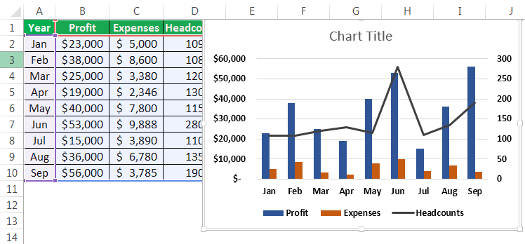
- Once the clustered chart is selected, the combo chart will be ready for display and illustration.

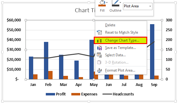
- If the chart needs to be changed to a different chart, we can right-click on the graphs and select “Change Chart Type,” as shown in the screenshot below.

- In the “Change Chart Type” window, we must select the data table parameters plotted on the secondary Y-axis by clicking the box with a tick mark.
For the current example, profit and expenses (in dollar value) are plotted on the primary Y-axis, and the headcounts are plotted on the secondary Y-axis.

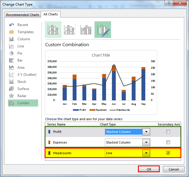
The screenshot below shows that the profit and expense parameters are changed to stacked bar charts, and headcount is selected as a line chart on the secondary Y-axis.

- Once the selections are made, we must click “OK.”

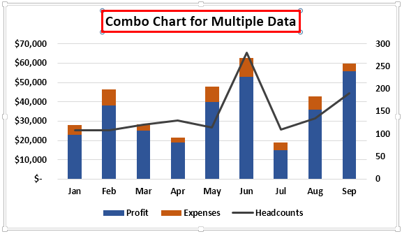
- Click on the “Chart title” and rename the chart to the required title to change the name, as shown below.

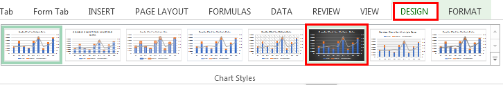
- To change the background for the charts, click on the chart so that the “Design” and “Format” tabs in the ribbon will appear, as shown in the red rectangle. Now, choose the required style for the chart from the “Design” tab.

Below is the completed chart for this example:-


Combination Charts (Combo) in Excel Example #2
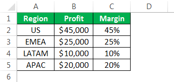
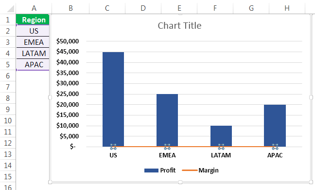
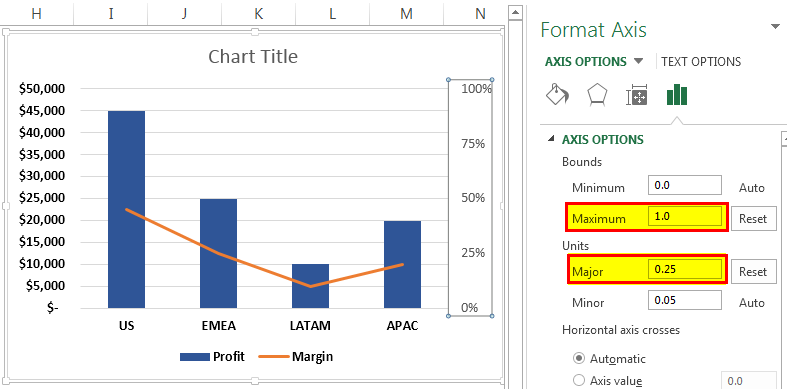
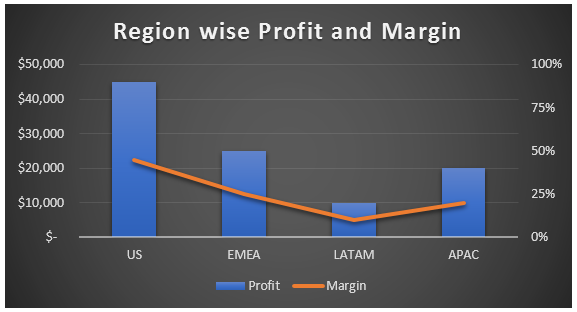
Consider the below table consisting of region-wise profit and margin data. This example explains an alternate approach to arriving at a combination chart in Excel.
Step 1:- First, we must select the data table prepared, then go to the “Insert” tab in the ribbon, click on “Combo,” and then select the “Clustered Column – Line.”
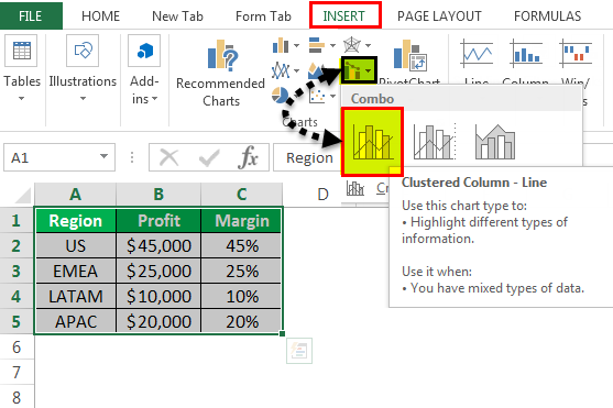
Once the clustered chart is selected, the combo chart will be ready for display and illustration.
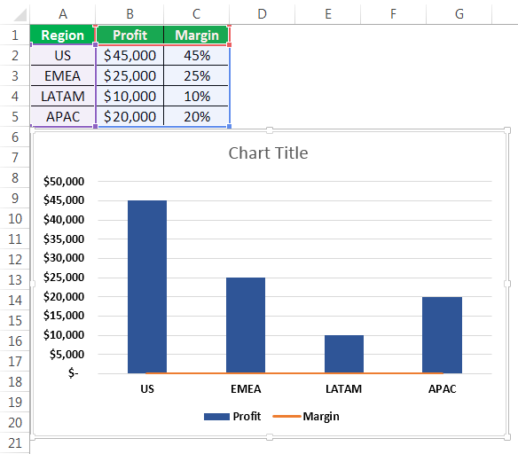
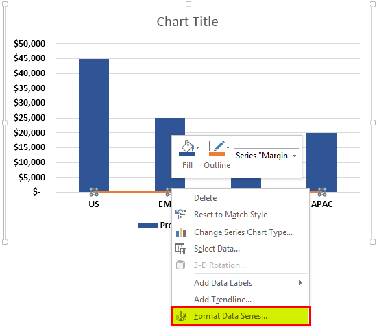
Step 2:- Once the clustered column line is selected, the below graph will appear with a bar graph for for-profit and a line graph for margin. Now, we must choose the line graph. But we noticed that the margin data in the chart is not visible. Thereby, we must go to the “Format” tab in the ribbon and click on the dropdown as shown in the red arrow towards the left, then select “Series Margin.”
Now, the line graph (orange graph) is selected.
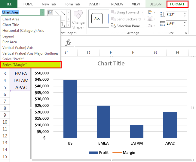
Step 3:- Now, we must right-click on the selected line graph in ExcelLine Graphs/Charts in Excels are visuals to track trends or show changes over a given period & they are pretty helpful for forecasting data. They may include 1 line for a single data set or multiple lines to compare different data sets. read more and select “Format Data Series.”
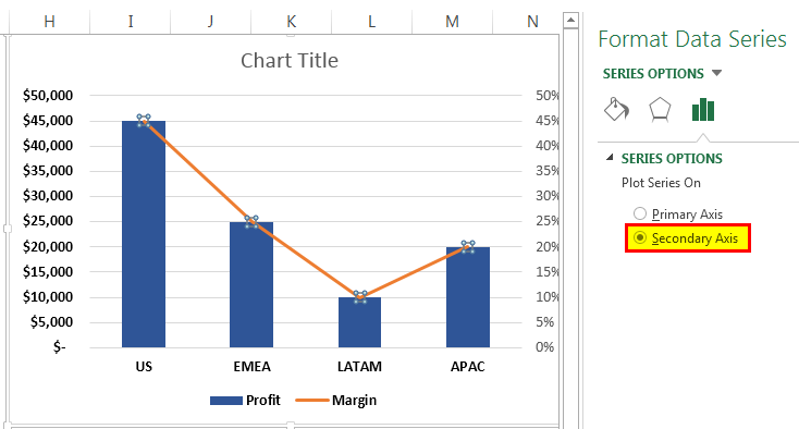
Step 4:- In the “Format Data Series” window, we must go to “Series Option” and click on the “Secondary Axis” radio buttonIn Excel, radio buttons or options buttons record a user’s input. They can be found in the developer’s tab’s insert section. read more. It will bring the margin data on the secondary Y-axis.
Below is the screenshot after selecting the secondary axisThe secondary axis is the other axis that is used to denote different data sets that cannot be displayed on a single axis. The primary axis, for example, depicts time, whereas the secondary axis displays production.read more.
Step 5:- Next, we must go to the “Series Options” dropdown and select “Secondary Vertical (Value) Axis” to adjust the scale in the secondary Y-axis.
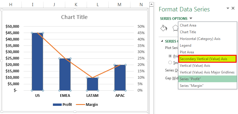
Step 6:- Now, choose the “Axis Options.”

Step 7:- Change the maximum bounds and major units per the requirement. For example, here, the maximum bound is selected to be 1, which would be 100%, and a major unit is changed to 0.25, which would have an equally distant measure of 25%.
Below is the final combination chart in Excel. For example, 2.
Pros of Combination Charts in Excel
- It can have two or more displays in one chart, providing concise information for better presentation and understanding.
- The combo chart in ExcelExcel Combo Charts combine different chart types to display different or the same set of data that is related to each other. Instead of the typical one Y-Axis, the Excel Combo Chart has two.read more showcases how we can illustrate the charts on both the Y-axis and talk to each other and their influences on each other based on the X-axis significantly.
- It could represent using different charts to display primary and secondary Y-axis data. For example, line and bar charts, bar and Gantt charts in ExcelGantt chart is a type of project manager chart that shows the start and completion time of a project, as well as the time it takes to complete each step. The representation in this chart is shown in bars on the horizontal axis.read more, etc.
- Best used for critical comparison purposes, which could help further analysis and reporting.
- The combination charts also show how we can portray the data table containing a wide range of Y-axes in the same chart.
- It can also accommodate different data tablesA data table in excel is a type of what-if analysis tool that allows you to compare variables and see how they impact the result and overall data. It can be found under the data tab in the what-if analysis section.read more and does not necessarily need to be correlated.
Cons of Combo Charts in Excel
- The combination chart in Excel can sometimes be more complex and complicated as the number of graphs on the charts increases. Thereby making it difficult to differentiate and understand.
- Too many graphs may make it difficult to interpret the parameters.
Things to Remember
- Choosing the right data tables with parameters for the chart is necessary to make sense.
- If the data table consists of large data, then make sure to distance the scale in the axis. Else, it may get crowded.
Recommended Articles
This article is a Guide to Combination Charts in Excel. We discuss how to create a combo chart in Excel, practical examples, and a downloadable template. You may learn more about Excel from the following articles: –
- Gantt Chart Example
- Stacked Column Chart in Excel
- Waterfall Chart in Excel
- Column Chart in excel
Imagine how lean your visualization dashboard would be if you could use a single chart to perform the job of two?
Well, we’re not talking about some utopia world. The world we’re talking about exists as you read this.


There’s a visualization design that can help you display insights into two different metrics in your data. Yes, you read that right. Essentially, it can perform the work of two charts.
The chart we’re talking about is called a Combo Chart in Excel.
The Combo chart in Excel can help you save a lot of space and time when visualizing two different data series.
You can supercharge your tool by installing third-party add-in to access Combo chart in Excel templates.
In this blog, you’ll learn the following:
- What is a Combo chart in Excel and when to use it?
- How to create a Combo Chart?
- The third-party add-in we recommend you use to access Combination Chart in Excel.
How to Create a Combo Chart in Excel in Data Storytelling
Before we dive right into the how-to guide, let’s define the chart we’ll be talking about throughout the blog post.
So here we go.
What is a Combo Chart in Excel?
A Combo Chart combines Column and Line Charts.
You can make a Combo Chart with data that share a common string, such as a financial year. This chart can help you answer questions about your data, such as:
What are the trends for the same categories in data?
The Combo visualization design provides you with a flexible way of displaying data. Besides, it forms the basis of data visualization designs, such as the Pareto or 80/20 visualization.
There’s a wider variety of Combination Charts in Excel you can use for your data stories, namely:
- Double Axis Line and Bar Chart
- Area Line Chart
- Dual Axis Grouped Bar Chart
- Vertical Axis Line Chart
In this blog post, we’ll primarily talk about the Double Axis Line and Bar Chart (a Combo chart in Excel variant).
Use Combo chart in Excel if your objective is to validate the relationship between two variables with different magnitudes and scales but related in context.
For example, you can use a Combination Chart in Excel to display insights into different sales metrics that share a common denominator, i.e., the financial year.
You can also use this chart to display insights into hidden patterns, trends, and outliers in your raw data.
The General Structure of a Combination Chart in Excel
Check out the key components of the Combo chart in Excel (below).
- Variables on the primary (left) side of a Combo Chart define the scale for that y-axis.
- Similarly, data points on the secondary (right) side of the chart define the scale for the y-axis.
- You can use lines and bars in a single chart to display insights into the relationship between varying variables.
- This chart can only display one hierarchy at a time.
For example, if the first cell selected is a quarterly value, other periods, such as monthly and annual values, will be excluded — only quarterly values will be displayed.
- If using a Line and Bar Combo visualization, then the lines should be in the foreground. And the bars should be in the background.
So When Should You Use the Combo chart in Excel?
Use the Combination Chart in Excel if your goal is to have a lean visualization dashboard that displays tons of insights.
Combo Charts, such as the Double Axis Line and Bar Graphs, can help you display insights into the relationship between two different data points.
For instance, these visualization diagrams can help you show insights into the relationship between forecasted and actual sales across a specified period.
Besides, you can use Combo Charts to extract comparison insights into key categories using high contrasting color schemes.
The Combo chart is a must-have tool for the sales department because it can convey insights into target versus actual sales revenue in a given financial year.
Furthermore, sales managers can leverage this chart to uncover the best and worst-performing staff.
How?
This visualization chart can display insights into the revenue, and the number of deals closed by sales associates in a compact manner.
Check out other successful applications of Combination Charts in Excel below:
-
Finance
You can use the Combo Charts to measure metrics, such as the billable hours vs. revenue collected.
-
Manufacture
If you belong to the manufacturing industry, use these charts to compare units sold versus sales revenue across a given period.
How to create Combo chart in Excel
This section will take you through how you can use Excel to visualize data using Combo Charts.
Let’s use the data below for our example.
| Months | Sales | Profit Margin |
| Jan | 965 | 16 |
| Feb | 385 | 31 |
| Mar | 1118 | 15 |
| Apr | 639 | 12 |
| May | 359 | 22 |
| Jun | 1622 | 14 |
| Jul | 1750 | 24 |
| Aug | 1001 | 12 |
| Sep | 1841 | 29 |
| Oct | 1632 | 12 |
| Nov | 1547 | 39 |
| Dec | 531 | 19 |
To get started with Excel, follow the steps below:
- Select the range of cells you want to visualize—A1:C13 in this example.
- Next, click Insert > Insert Combo Chart.
- Select Clustered Column – Line.

We acknowledge that Excel is among the most-used data visualization tools by most professionals and businesses. More so, it has been there for decades, plus it’s familiar to many.
However, this does not mean you should settle for less.
In other words, if your goal is to create insightful and easy-to-interpret Combo Charts, you’ve got to think beyond Excel.
Keep reading to discover more.
How can You Visualize Your Data with Ready-made Combination Charts in Your Excel?
To access an insightful and visually appealing Combination Chart in Excel, you have to install third-party apps (add-ins). There are thousands of add-ins you can find in Excel’s app store.
To save you time, we’ve tested hundreds of add-ins to find the best one for your day-to-day visualization needs.
ChartExpo ticks all the boxes with respect to the following:
- Ease of use
- Ease of access
- Number and quality of charts available
- Affordability
If your goal is to extract insights into two different variables in your data, your go-to chart maker should be ChartExpo.
In the coming section, you’ll learn how you can install ChartExpo add-in to access advanced Combo chart in Excel.


How to Install ChartExpo in Excel
To get started with ChartExpo for Excel add-In, follow the simple and easy steps below.
- Open the worksheet and click the Insert menu button.
- Click the My Apps button and then click the See All, as shown.

- Search for a ChartExpo add-in in the My Apps Store.

- Click the Insert button, as shown above.

- Click the Sign In with Microsoft button link, as shown above.

- Log in with your Microsoft account or create a new account.
- Enter your account and provide ChartExpo with permission to operate in your Excel spreadsheet.
Once you are logged in you will see ChartExpo interface in your sheet.

- Click the Search box and type the chart you want to visualize your data e.g Double Axis Line and Bar Chart provided by ChartExpo is fulfilled the requirement of Combo Chart in Excel.
Even you will type double in the search box, charts related to the word will be short listed.

- Alternatively, click the Category button on your top right-side to view all the six major categories in ChartExpo, this chart is available in Pay-per-Click (PPC) Charts category.

In the coming section, you’ll get to see the Double Axis Line and Bar Chart (a Combo chart in Excel type) in action.
Let’s jump right in.
Combo Chart Example using ChartExpo
Let’s visualize the tabular data below using the Double axis Line and Bar Chart (one of the combination charts in Excel).
Are you ready?
| Months | Sales | Profit Margin |
| Jan | 965 | 16 |
| Feb | 385 | 31 |
| Mar | 1118 | 15 |
| Apr | 639 | 12 |
| May | 359 | 22 |
| Jun | 1622 | 14 |
| Jul | 1750 | 24 |
| Aug | 1001 | 12 |
| Sep | 1841 | 29 |
| Oct | 1632 | 12 |
| Nov | 1547 | 39 |
| Dec | 531 | 19 |
To get started with the Combo Chart maker (ChartExpo), follow the simple steps below:
- Export the data above into your Excel sheet and select your desire visualization i.e. Double Axis Line and Bar Chart.

- Once the Double Axis Line and Bar Chart show, click the Create Chart from Selection button, as shown below.

- You will have default look of your chart based on this data as below:

This visualization is based on percentage values of the two columns in the sheet Sales and Profit margin. We can change the setting of the chart to see the visualization on actual data not on percentage.
You can click on Settings on top of the interface then in the property section open Chart Drawing and the select “Value Based” and then click on Apply.

You will have following look of your visualization based on values.

You can click on Edit Chart as shown above. After that you can click on pencil icon on left Axis and then find property Label Text and then add Prefix “$” sign, after that click on Apply All it will apply dollar sign with the axis.

Same you can do with right axis to add % as postfix, moreover you can add axis labels and change other properties to see your chart by exploring more properties final look you can give your data as belows:

Insights
- Blue bars and trend lines are showing sales whereas profit margin is shown with brown color.
- P1 point in the end of x-axis showing is actually the predictive point on chart ending with the trend of sales and profit margin.
- Sales and profit margin trends going upward.
- Only 4 months (Feb, May, Nov, and Dec) have reached to highest points.
- Profit margin remain lowest in May. Where as June, July, September and November remained good months in getting good profit margin.
Advantages of Combination Chart in Excel
Recap: A Combo Chart is a hybrid of two or more chart types, such as the Double Axis Line and Bar Chart.
- You can easily display your insights into two different metrics without using an extra chart.
- Combo Charts allow you to plot values with varying scales and magnitudes.
FAQs:
What is a combo chart?
A Combo Chart is a combination of Columns and Line Graphs.
You can make a combo chart with a single dataset or with two datasets that share a common string field, such as a financial year. You can use this chart to answer questions about your data.
How to create a Combo Chart in Excel?
Excel spreadsheet’s library has pretty basic Combination Charts that need more time to edit. Essentially, customizing and editing your charts can consume a lot of time.
But, you can supercharge your Excel with third-party add-in, such as ChartExpo to access advanced Combo Graphs, such as the Double Axis Line and Bar Charts.
What is the Combo Chart good for?
You can use Combination charts in Excel to display insights into varying metrics within a single view. You can also use them to visually highlight the differences of categories in data.
If your goal is to save space and create a lean data visualization dashboard, then your go-to tool should be this chart.
Wrap Up
Displaying insights into the trend and relationship of two different metrics in your data should never be nerve-wracking or time-consuming.
Use Combo chart in Excel for a change.
This (above) visualization design can help you save a ton of space in your dashboard.
We recommend you to think beyond your Excel, to access Combo Charts that are simple to interpret.
Why?
Combination Charts in Excel are very basic and require a lot of effort and time to edit. But, we’re not recommending you to do away with Excel.
Install third-party apps, such as ChartExpo into your Excel to access advanced Combo Charts.
ChartExpo is an add-in you can easily download and install in your Excel app. Besides, this tool comes loaded with insightful and easy-to-interpret Combination Charts, plus over 50 more advanced charts.
With this intuitive tool, you don’t need programming or coding skills to visualize your data.
Sign up for a 7-day free trial today to access an easy-to-interpret and visually appealing Combination Chart in Excel.
A combination chart is a chart that combines two or more chart types in a single chart.
To create a combination chart, execute the following steps.
1. Select the range A1:C13.

2. On the Insert tab, in the Charts group, click the Combo symbol.

3. Click Create Custom Combo Chart.

The Insert Chart dialog box appears.
4. For the Rainy Days series, choose Clustered Column as the chart type.
5. For the Profit series, choose Line as the chart type.
6. Plot the Profit series on the secondary axis.

7. Click OK.
Result:
