
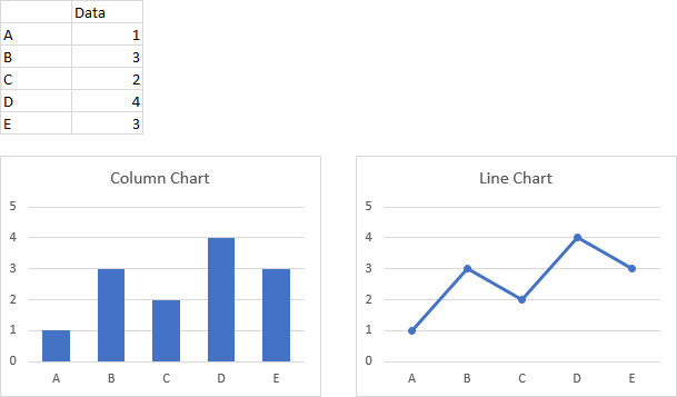
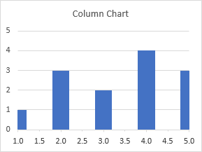
Column chart in Excel is a way of making a visual histogram, reflecting the change of several types of data for a particular period of time.
Is very useful for illustrating different parameters and comparing them. Let’s consider the most common types of column charts and learn to make them.
How to create a column chart that updates automatically?
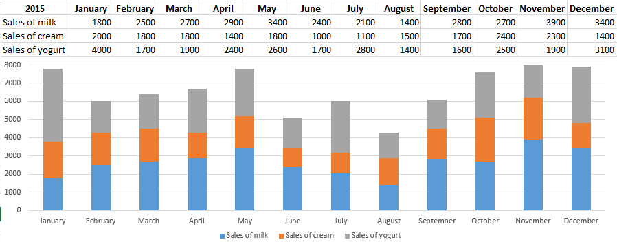
We have data on sales of different dairy products for each month in 2015.

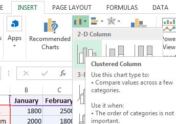
Let’s create a column chart which will respond automatically to the changes made to the spreadsheet. Highlight the whole array including the header and click tab «INSERT». Find «Charts»-«Insert Column Chart» and select the first type. It is called «Clustered».
We have obtained a column whose margin size can be changed. This chart clearly demonstrates the highest milk sales in November and the lowest cream sales in June.
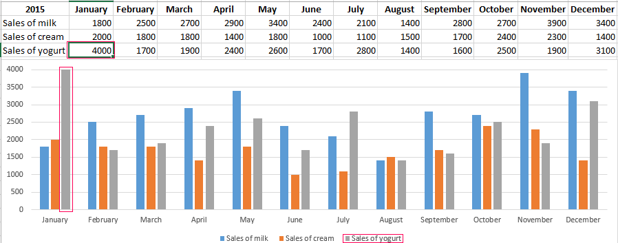
If we make changes to the spreadsheet, the column will also change. By way of example, let’s substitute 4000 for 1400 in yogurt sales. We can see that the «Sales of yogurt» has risen.
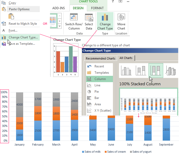
Stacked column chart
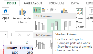
Let’s consider making a stacked column chart in Excel. It is another column chart type allowing us to present data in percentage correlation. It is created in the similar way, but a different type should be chosen.
We have obtained a chart showing that, for example, in January, milk sales were higher than those of yogurt and cream while in August a small amount of milk was sold compared to other products, and so on.
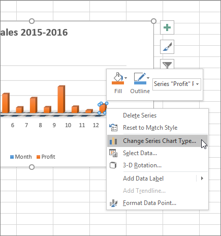
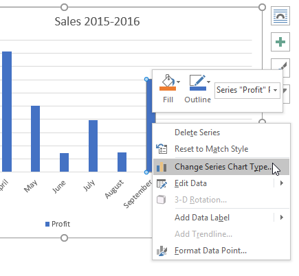
Column charts in Excel can be changed. If you right-click on the empty area of the chart and select «Change Type» (OR select: «CHART TOOLS»-«DESIGN»-«Change Chart Type») you can modify it a bit. Let’s change the stacked column to the normalized one. As a result, we have almost the same column with Y axis reflecting percentage correlations
Similarly, we can make other changes to the graph.
How to combine a column with a line chart in Excel?
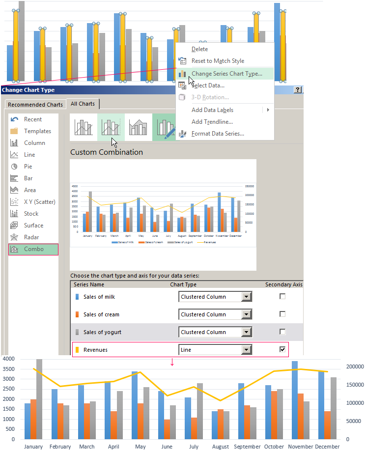
Some data arrays imply making more complicated charts combining several types, for example, a column chart and a line.
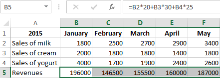
Let’s consider the example. To begin with, add to the spreadsheet one more row containing monthly revenue.
Now change the current type. Click on the empty area and select: «CHART TOOLS»-«DESIGN»-«Select Data». You will see a field offering to choose a different interval. Highlight the whole spreadsheet again, but this time with the revenue row.
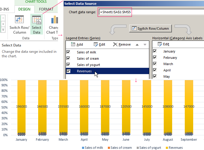
Excel has automatically expanded the value domain in Y-axis, therefore the data on sales volume are at the very bottom in the form of inconspicuous columns.
However, this histogram is incorrect as it contains numbers expressed both and in quantity (liters). Therefore, you need to make changes. Transfer the revenue data to the right side.
- Again select «CHART TOOLS»-«DESIGN»-«Change Type».
- In window select «Clustered».
- Click on the plus sign next to the histogram and uncheck: «Data Labels».
- Right-click the revenues columns, select Format Data Se and indicate «Secondary Axis».
- Done.
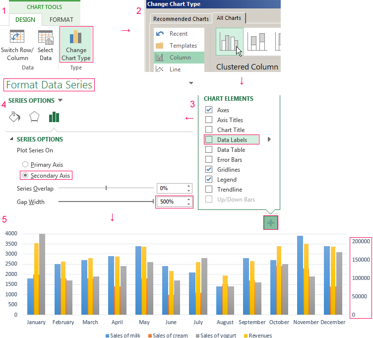
You can see that the histogram has changed immediately. Now revenues column has its value domain (in the right).
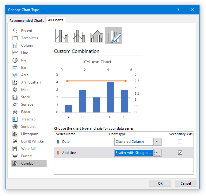
However, this variant is not convenient as the columns almost fuse together. Therefore make one more additional action: right-click the revenues columns and select «Change Series Type». In the appeared window, select the type «Combo»-«Custom Combination».
We have obtained a rather visual graph featuring a combination of a line. We can see that the maximal revenue was in January and the minimal one – in August.
In the similar way, you can combine any other types of charts.
Содержание
- Present your data in a column chart
- Did you know?
- Line Chart
- How to add a line in Excel graph (average line, benchmark, baseline, etc.)
- How to draw an average line in Excel graph
- How to add a line to an existing Excel graph
- How to plot a target line with different values
- Tips to customize the line
- Display the average / benchmark value on the line
- Add a text label for the line
- Change the line type
- Extend the line to the edges of the chart area
Present your data in a column chart
Column charts are useful for showing data changes over a period of time or for illustrating comparisons among items. In column charts, categories are typically organized along the horizontal axis and values along the vertical axis.

For information on column charts, and when they should be used, see Available chart types in Office.
To create a column chart, follow these steps:
Enter data in a spreadsheet.
Select the data.
Depending on the Excel version you’re using, select one of the following options:
Excel 2016: Click Insert > Insert Column or Bar Chart icon, and select a column chart option of your choice.
Excel 2013: Click Insert > Insert Column Chart icon, and select a column chart option of your choice.
Excel 2010 and Excel 2007: Click Insert > Column, and select a column chart option of your choice.
You can optionally format the chart a little further. See the list below for a few options:
Note: Make sure you click on the chart first before applying a formatting option.
To apply a different chart layout, click Design > Charts Layout, and select a layout.
To apply a different chart style, click Design > Chart Styles, and pick a style.
To apply a different shape style, click Format > Shape Styles, and pick a style.
Note: A chart style is different from a shape style. A shape style is a formatting option that applies to the chart’s border only, whereas the chart style is a formatting option that applies to the entire chart.
To apply different shape effects, click Format > Shape Effects, and pick an option such as Bevel or Glow, and then a sub option.
To apply a theme, click Page Layout > Themes, and select a theme.
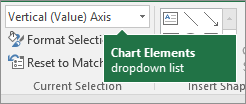
To apply a formatting option to a specific component of a chart (such as Vertical (Value) Axis, Horizontal (Category) Axis, Chart Area, to name a few), click Format > pick a component in the Chart Elements dropdown box, click Format Selection, and make any necessary changes. Repeat the step for each component you want to modify.
Note: If you are comfortable working in charts, you can also select and right-click on a specific area on the chart and select a formatting option.
To create a column chart, follow these steps:
In your email message, click Insert > Chart.
In the Insert Chart dialog box, click Column, and pick a column chart option of your choice, and click OK.
Excel opens in a split window and displays sample data on a worksheet.
Replace the sample data with your own data.
Note: If your chart is not reflecting data from the worksheet, make sure to drag the vertical lines all the way down to the last row in the table.
Optionally, save the worksheet by following these steps:
Click the Edit Data in Microsoft Excel icon on the Quick Access Toolbar.

The worksheet opens in Excel.
Save the worksheet.
Tip: To reopen the worksheet, click Design > Edit Data, and select an option.
You can optionally format the chart a little further. See the list below for a few options:
Note: Make sure you click on the chart first before applying a formatting option.
To apply a different chart layout, click Design > Charts Layout, and select a layout.
To apply a different chart style, click Design > Chart Styles, and pick a style.
To apply a different shape style, click Format > Shape Styles, and pick a style.
Note: A chart style is different from a shape style. A shape style is a formatting option that applies to the chart’s border only, whereas the chart style is a formatting option that applies to the entire chart.
To apply different shape effects, click Format > Shape Effects, and pick an option such as Bevel or Glow, and then a sub option.
To apply a formatting option to a specific component of a chart (such as Vertical (Value) Axis, Horizontal (Category) Axis, Chart Area, to name a few), click Format > pick a component in the Chart Elements dropdown box, click Format Selection, and make any necessary changes. Repeat the step for each component you want to modify.
Note: If you are comfortable working in charts, you can also select and right-click on a specific area on the chart and select a formatting option.
Did you know?
If you don’t have an Microsoft 365 subscription or the latest Office version, you can try it now:
Источник
Line Chart
Line charts are used to display trends over time. Use a line chart if you have text labels, dates or a few numeric labels on the horizontal axis. Use a scatter plot (XY chart) to show scientific XY data.
To create a line chart, execute the following steps.
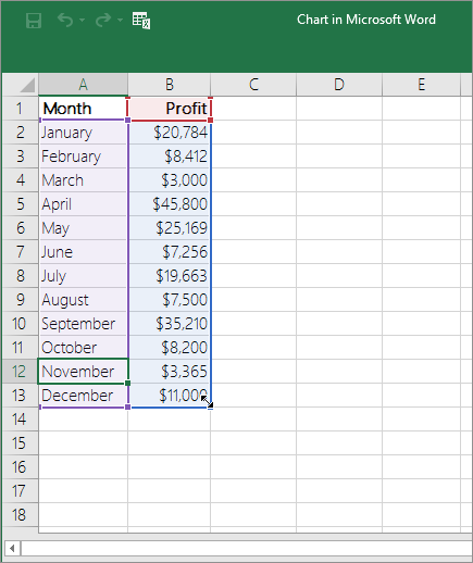
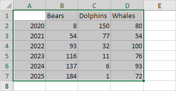
1. Select the range A1:D7.
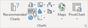
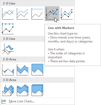
2. On the Insert tab, in the Charts group, click the Line symbol.
3. Click Line with Markers.

Note: only if you have numeric labels, empty cell A1 before you create the line chart. By doing this, Excel does not recognize the numbers in column A as a data series and automatically places these numbers on the horizontal (category) axis. After creating the chart, you can enter the text Year into cell A1 if you like.
Let’s customize this line chart.
To change the data range included in the chart, execute the following steps.
4. Select the line chart.
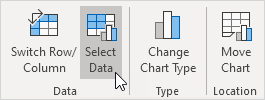
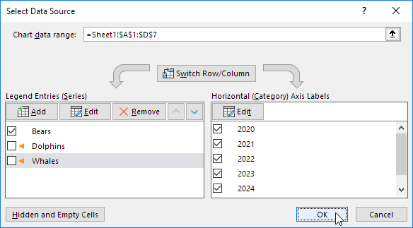
5. On the Chart Design tab, in the Data group, click Select Data.
6. Uncheck Dolphins and Whales and click OK.

To change the color of the line and the markers, execute the following steps.
7. Right click the line and click Format Data Series.
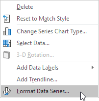
The Format Data Series pane appears.
8. Click the paint bucket icon and change the line color.
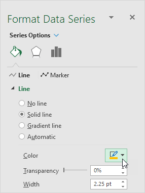
9. Click Marker and change the fill color and border color of the markers.
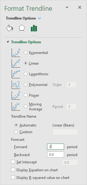
To add a trendline, execute the following steps.
10. Select the line chart.
11. Click the + button on the right side of the chart, click the arrow next to Trendline and then click More Options.
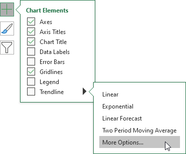
The Format Trendline pane appears.
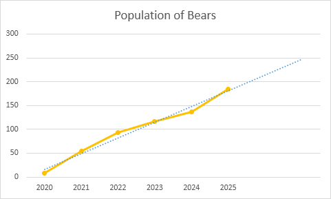
12. Choose a Trend/Regression type. Click Linear.
13. Specify the number of periods to include in the forecast. Type 2 in the Forward box.
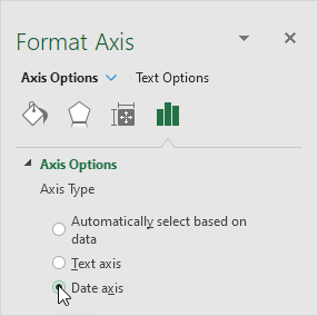
To change the axis type to Date axis, execute the following steps.
14. Right click the horizontal axis, and then click Format Axis.
The Format Axis pane appears.
15. Click Date axis.

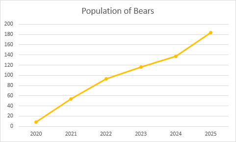
Conclusion: the trendline predicts a population of approximately 250 bears in 2024.
Источник
How to add a line in Excel graph (average line, benchmark, baseline, etc.)
 by Svetlana Cheusheva, updated on March 16, 2023
This short tutorial will walk you through adding a line in Excel graph such as an average line, benchmark, trend line, etc.
In the last week’s tutorial, we were looking at how to make a line graph in Excel. In some situations, however, you may want to draw a horizontal line in another chart to compare the actual values with the target you wish to achieve.
The task can be performed by plotting two different types of data points in the same graph. In earlier Excel versions, combining two chart types in one was a tedious multi-step operation. Microsoft Excel 2013, Excel 2016 and Excel 2019 provide a special Combo chart type, which makes the process so amazingly simple that you might wonder, «Wow, why hadn’t they done it before?».
How to draw an average line in Excel graph
This quick example will teach you how to add an average line to a column graph. To have it done, perform these 4 simple steps:
- Calculate the average by using the AVERAGE function.
In our case, insert the below formula in C2 and copy it down the column:
=AVERAGE($B$2:$B$7) 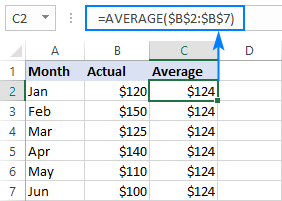

Done! A horizontal line is plotted in the graph and you can now see what the average value looks like relative to your data set: 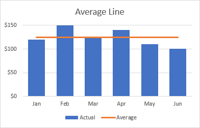
In a similar fashion, you can draw an average line in a line graph. The steps are totally the same, you just choose the Line or Line with Markers type for the Actual data series: 
- The same technique can be used to plot a median For this, use the MEDIAN function instead of AVERAGE.
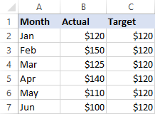
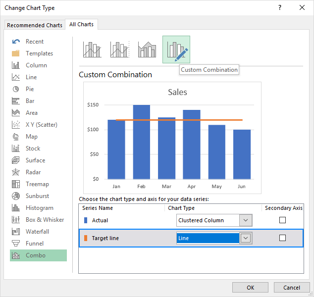
- Adding a target line or benchmarkline in your graph is even simpler. Instead of a formula, enter your target values in the last column and insert the Clustered Column — Line combo chart as shown in this example.
- If none of the predefined combo charts suits your needs, select the Custom Combination type (the last template with the pen icon), and choose the desired type for each data series.
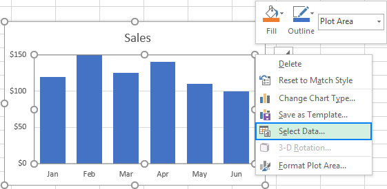
How to add a line to an existing Excel graph
Adding a line to an existing graph requires a few more steps, therefore in many situations it would be much faster to create a new combo chart from scratch as explained above.
But if you’ve already invested quite a lot of time in designing you graph, you wouldn’t want to do the same job twice. In this case, please follow the below guidelines to add a line in your graph. The process may look a bit complicated on paper, but in your Excel, you will be done in a couple of minutes.
- Insert a new column beside your source data. If you wish to draw an average line, fill the newly added column with an Average formula discussed in the previous example. If you are adding a benchmarkline or target line, put your target values in the new column like shown in the screenshot below:

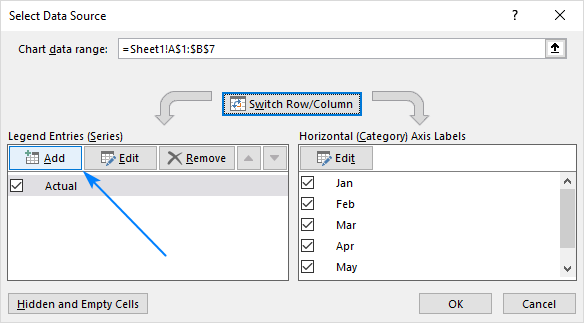
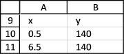
- Right-click the existing graph, and choose Select Data… from the context menu:
- In the Select Data Source dialog box, click the Add button in the Legend Entries (Series)
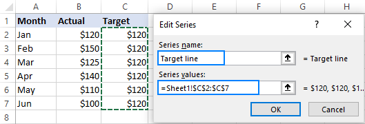
- In the Edit Series dialog window, do the following:
- In the Series namebox, type the desired name, say «Target line».
- Click in the Series value box and select your target values without the column header.
- Click OK twice to close both dialog boxes.
Done! A horizontal target line is added to your graph: 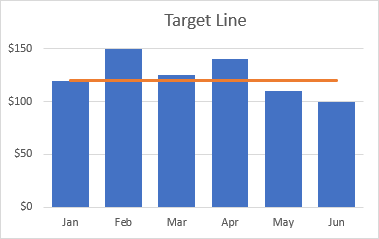
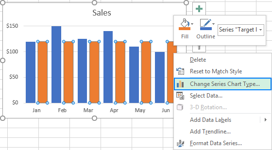
How to plot a target line with different values
In situations when you want to compare the actual values with the estimated or target values that are different for each row, the method described above is not very effective. The line does not allow you to pin point the target values exactly, as the result you may misinterpret the information in the graph: 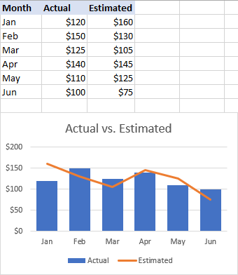
To visualize the target values more clearly, you can display them in this way: 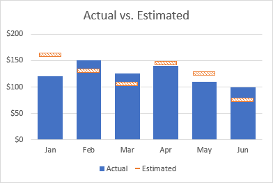
To achieve this effect, add a line to your chart as explained in the previous examples, and then do the following customizations:
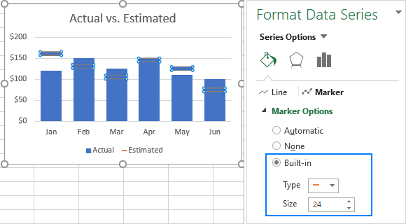
- In your graph, double-click the target line. This will select the line and open the Format Data Series pane on the right side of your Excel window.
- On the Format Data Series pane, go to Fill & Line tab >Line section, and select No line.
- Switch to the Marker section, expand Marker Options, change it to Built-in, select the horizontal bar in the Type box, and set the Size corresponding to the width of your bars (24 in our example):
- Set the marker Fill to Solid fill or Pattern fill and select the color of your choosing.
- Set the marker Border to Solid line and also choose the desired color.

The screenshot below shows my settings: 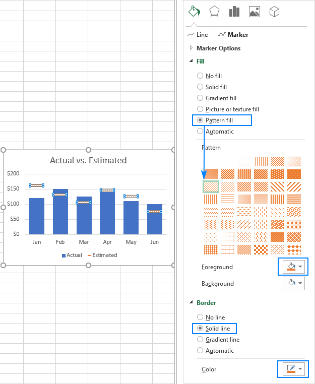
Tips to customize the line
To make your graph look even more beautiful, you can change the chart title, legend, axes, gridlines and other elements as described in this tutorial: How to customize a graph in Excel. And below you will find a few tips relating directly to the line’s customization.
Display the average / benchmark value on the line
In some situations, for example when you set relatively big intervals for the vertical y-axis, it may be hard for your users to determine the exact point where the line crosses the bars. No problem, just show that value in your graph. Here’s how you can do this:
- Click on the line to select it:
- With the whole line selected, click on the last data point. This will unselect all other data points so that only the last one remains selected:
- Right-click the selected data point and pick Add Data Label in the context menu:


The label will appear at the end of the line giving more information to your chart viewers: 
Add a text label for the line
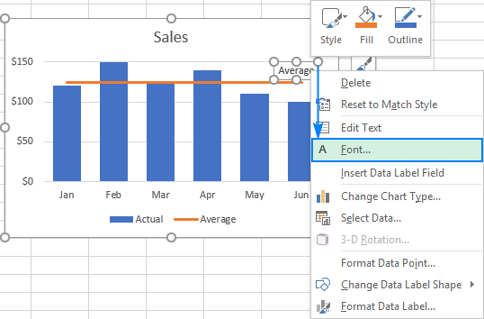
To improve your graph further, you may wish to add a text label to the line to indicate what it actually is. Here are the steps for this set up:
- Select the last data point on the line and add a data label to it as discussed in the previous tip.
- Click on the label to select it, then click inside the label box, delete the existing value and type your text:
- Hover over the label box until your mouse pointer changes to a four-sided arrow, and then drag the label slightly above the line:
- Right-click the label and choose Font… from the context menu.
- Customize the font style, size and color as you wish:


When finished, remove the chart legend because it is now superfluous, and enjoy a nicer and clearer look of your chart: 
Change the line type
If the solid line added by default does not look quite attractive to you, you can easily change the line type. Here’s how:
- Double-click the line.
- On the Format Data Series pane, go Fill & Line >Line, open the Dashtype drop-down box and select the desired type.
For example, you can choose Square Dot: 
And your Average Line graph will look similar to this: 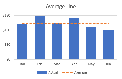
Extend the line to the edges of the chart area
As you can notice, a horizontal line always starts and ends in the middle of the bars. But what if you want it to stretch to the right and left edges of the chart?
Here is a quick solution: double-click the on the horizontal axis to open the Format Axis pane, switch to Axis Options and choose to position the axis On tick marks: 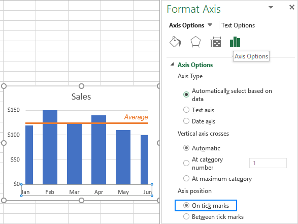
However, this simple method has one drawback — it makes the leftmost and rightmost bars half as thin as the other bars, which does not look nice.
As a workaround, you can fiddle with your source data instead of fiddling with the graph settings:
- Insert a new row before the first and after the last row with your data.
- Copy the average/benchmark/target value in the new rows and leave the cells in the first two columns empty, as shown in the screenshot below.
- Select the whole table with the empty cells and insert a Column — Line chart.
Now, our graph clearly shows how far the first and last bars are from the average: 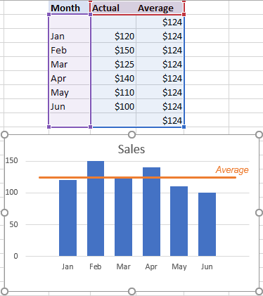
Tip. If you want to draw a vertical line in a scatter plot, bar chart or line graph, you’ll find the detailed guidance in this tutorial: How to insert vertical line in Excel chart.
That’s how you add a line in Excel graph. I thank you for reading and hope to see you on our blog next week!
Источник
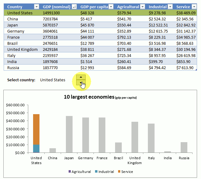
Home / Excel Charts / How to Add a Vertical Line in a Chart in Excel
Sometimes while presenting data with an Excel chart we need to highlight a specific point to get the user’s attention there. And the best way for this is to add a vertical line to a chart.
Yes, you heard it right. You can highlight a specific point on a chart with a vertical line. Just look at the below line chart with 12-months of data.

Now, you know the benefit of inserting a vertical line in a chart. But the point is, which is the best method? Well, out of all the methods, I’ve found this method (which I have mentioned here) simple and easy.
Without any further ado here are the steps and please download this sample file from here to follow along.
Steps to Insert a [Static] Vertical Line a Chart
Here you have a data table with monthly sales quantity and you need to create a line chart and insert a vertical line in it. Please follow these steps.
- Enter a new column beside your quantity column and name it “Ver Line”.
- Now enter a value “100” for Jan in “Ver Line” column.
- Select the entire table and insert a line chart with markers.
- You’ll get a chart like this.
- Now select the chart and open the “Chnage Chart Type” options from Design Tab.
- After that change chart type to secondary axis and chart type to “Column Chart”
- Now next thing is to adjust axis values for your column bar.
- Double click on your secondary axis to open formatting options.
- Change the maximum value to 100, as we have entered the same value in Ver Line column.
- In same axis options, move down to label position and select none (This will hide secondary axis, yup we don’t need it).
- Last but not least, we have to make our column bar little thin so that it will look like a line.
- Click on the data bar, go to series option and increase your “Gap Width” to 500%.


Congratulations! You have successfully added a vertical line to your chart. You can download this sample file from here to learn more about this.
Quick Tip: Just enter 100 in the cell where you want to add a vertical line. If you want to add a vertical line in Feb instead of May, just enter the value in Feb.
Steps to Add a [Dynamic] Vertical Line in a Chart
Now it’s time to level up your chart and make a dynamic vertical name. Please follow these simple steps for this.
- First of all, you need to insert a scroll bar. Go to developer tab ➜ Insert ➜ Scroll bar.
- Right-click on your scroll bar and select format control.
- Link your scroll bar to cell C10 and enter 12 for maximum value.
- In the end, click OK.
- After that go to your data table and insert this formula [=IF(MATCH($A2,$A$2:$A$13,0)=$D$1,100,””)] to cell C2 (Formula Bar) and drag down up to the last cell of the table.
- Now you can use the scroll bar to navigate your vertical line in your chart. You can download this sample file from here to learn more about this.


Conclusion
As I said, adding a vertical line in a chart is useful when you want to highlight a specific data point in your chart. There are also some other ways to add a vertical line but I found this method quick and easy. I hope this charting tip will help you to get better at Excel.
Have you ever tried to do this before with your chart?
Please share your views in the comment section I would love to hear from you and please don’t forget to share this tip with your friends.
More Charting Tips and Tutorials
- How to Add a Horizontal Line in a Chart in Excel
- How to Create a Bullet Chart in Excel
- How to Create a Dynamic Chart Range in Excel
- How to Create a Dynamic Chart Title in Excel
- How to Create Interactive Charts In Excel
- How to Create a Sales Funnel Chart in Excel
- How to Create a HEAT MAP in Excel
- How to Create a HISTOGRAM in Excel
- How to Create a Pictograph in Excel
- How to Create a Milestone Chart in Excel
- How to Insert a People Graph in Excel
- How to Create PIVOT CHART in Excel
- How to Create a Population Pyramid Chart in Excel
- How to Create a SPEEDOMETER Chart [Gauge] in Excel
- How to Create a Step Chart in Excel
- How to Create a Thermometer Chart in Excel
- How to Create a Tornado Chart in Excel
- How to Create Waffle Chart in Excel
Tuesday, September 11, 2018
Peltier Technical Services, Inc., Copyright © 2023, All rights reserved.
A common task is to add a horizontal line to an Excel chart. The horizontal line may reference some target value or limit, and adding the horizontal line makes it easy to see where values are above and below this reference value. Seems easy enough, but often the result is less than ideal. This tutorial shows how to add horizontal lines to several common types of Excel chart.
We won’t even talk about trying to draw lines using the items on the Shapes menu. Since they are drawn freehand (or free-mouse), they aren’t positioned accurately. Since they are independent of the chart’s data, they may not move when the data changes. And sometimes they just seem to move whenever they feel like it.
The examples below show how to make combination charts, where an XY-Scatter-type series is added as a horizontal line to another type of chart.
An XY Scatter chart is the easiest case. Here is a simple XY chart.
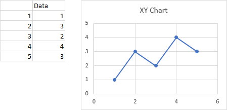
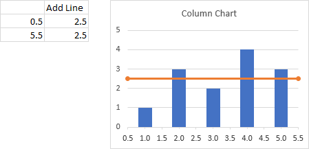
Let’s say we want a horizontal line at Y = 2.5. It should span the chart, starting at X = 0 and ending at X = 6.
This is easy, a line simply connects two points, right?
We set up a dummy range with our initial and final X and Y values (below, to the left of the top chart), copy the range, select the chart, and use Paste Special to add the data to the chart (see below for details on Paste Special).
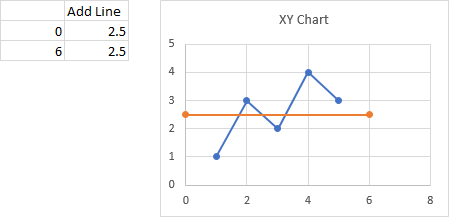
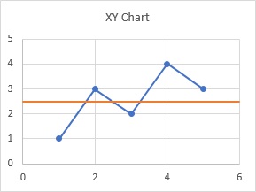
When the data is first added, the autoscaled X axis changes its maximum from 6 to 8, so the line doesn’t span the entire chart. We have to format the axis and type 6 into the box for Maximum. We probably also want to remove the markers from our horizontal line.
Paste Special
If you don’t use Paste Special often, it might be hard to find. If you copy a range and use the right click menu on a chart, the only option is a regular Paste, and Excel doesn’t always correctly guess how it should paste the data. So I always use Paste Special.
To find Paste Special, click on the down arrow on the Paste button on the Home tab of Excel’s ribbon. Paste Special is at the bottom of the pop-up menu.
You can also use the Excel 97-2003 menu-based shortcut, which is Alt + E + S (for Edit menu > Paste Special).
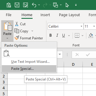
The tooltip below Paste Special in the menu indicates that you could also use Ctrl + Alt + V, but this shortcut doesn’t do anything for charts.
When the Paste Special dialog appears, make sure you select these options: Add Cells as a New Series, Y Values in Columns, Series Names in First Row, Categories (X Values) in First Column.
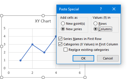
Click OK and the new series will appear in the chart.
Add a Horizontal Line to a Column or Line Chart
When you add a horizontal line to a chart that is not an XY Scatter chart type, it gets a bit more complicated. Partly it’s complicated because we will be making a combination chart, with columns, lines, or areas for our data along with an XY Scatter type series for the horizontal line. Partly it’s complicated because the category (X) axis of most Excel charts is not a value axis.
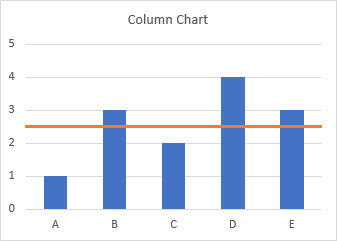
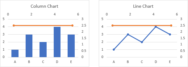
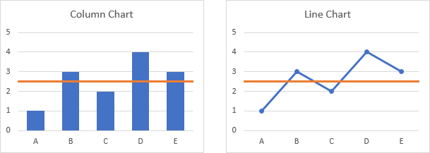
As with the XY Scatter chart in the first example, we need to figure out what to use for X and Y values for the line we’re going to add. The Y values are easy, but the X values require a little understanding of how Excel’s category axes work. Since the category axes of column and line charts work the same way, let’s do them together, starting with the following simple column and line charts.
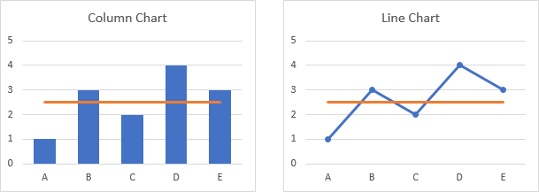
Note in the charts above that the first and last category labels aren’t positioned at the corners of the plot area, but are moved inwards slightly. This is because column and line charts use a default setting of Between Tick Marks for the Axis Position property. We can change the Axis Position to On Tick Marks, below, and the first and last category labels line up with the ends of the category axis. The line chart looks okay, but we have cut off the outer halves of the first and last columns.
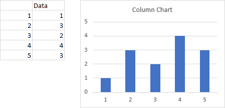
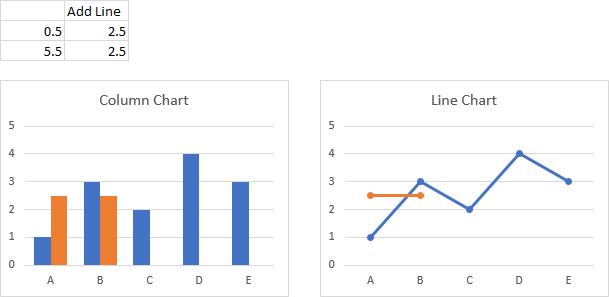
Let’s focus on a column chart (the line chart works identically), and use category labels of 1 through 5 instead of A through E. Excel doesn’t recognize these categories as numerical values, but we can think of them as labeling the categories with numbers.
Now let’s label the points between the categories. Not only do we have halfway points between the categories, we also have a half category label below the first category and another after the last category.
If the Axis Position property were set to On Tick Marks, our horizontal line starts at 1 (the first category number of 1) and ends at 5 (the last category number of 5). This would be wrong for a column chart, but might be acceptable for a line chart.
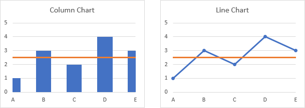
Here is our desired horizontal line, stretching from 0.5 to 5.5
So let’s use this data and the same approach that we used for the scatter chart, at the beginning of this tutorial.
Copy the range, and paste special as new series. We’ve added another set of columns or another line to the chart.
Right click on the added series, and choose Change Series Chart Type from the pop-up menu.
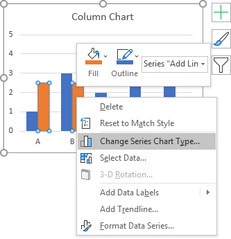
In the Change Chart Type dialog, select the XY Scatter With Straight Lines And Markers chart type. We’re using markers to temporarily mark the ends of the line, and we’ll remove the markers later; in general we will change directly to XY Scatter With Straight Lines.
The new series don’t line up at all, though, because Excel decided we should plot the scatter series on the secondary axes. We could rescale the secondary axes, then hide them, but that makes a complicated situation even more complicated.
So we need to uncheck the Secondary Axis box next to the Scatter series in the Change Chart Type dialog.
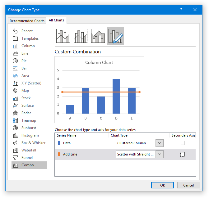
And now everything lines up as expected: the markers on the horizontal lines are at the edges of the plot area.
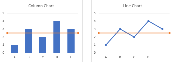
We should remove those markers now, and in the future select the chart type without markers.
“Lazy” Horizontal Line
You may ask why not make a combination column-line chart, since column charts and line charts use the same axis type. And many charts with horizontal lines use exactly this approach. I call it the “lazy” approach, because it’s easier, but it provides a line that doesn’t extend beyond all the data to the sides of the chart.
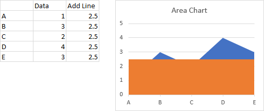
Start with your chart data, and add a column of values for the horizontal line. You get a column chart with a second set of columns, or a line chart with a second line.

Change the chart type of the added series to a line chart without markers. Doesn’t look very good for the column chart (left) since the horizontal line ends at the centerlines of the first and last column. You could probably get away with it for the line chart, even though the horizontal line doesn’t extend to the sides of the chart.
If we change the Axis Position so the vertical axis crosses On Tick Marks, the horizontal lines for both charts span the entire chart width. In the column chart, this comes at the expense of the outer halves of the first and last columns. The line chart looks okay, though.
Add a Horizontal Line to an Area Chart
As with the previous examples, we need to figure out what to use for X and Y values for the line we’re going to add. The category axis of an area chart works the same as the category axis of a column or line chart, but the default settings are different. Let’s start with the following simple area chart.
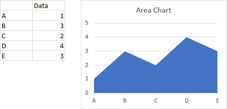
Notice that the first and last category labels are aligned with the corners of the plot area and the filled area series extends to the sides of the plot area. This is because the default setting of the Axis Position property is On Tick Marks. We can change it to Between Tick Marks, which makes the area chart look a bit strange.

Below is the data for our horizontal line, which will start at 1 (the first category number of 1) and end at 5 (the last category number of 5), without the half-category cushion at either end. Copy the data, select the chart, and Paste Special to add the data as a new series.
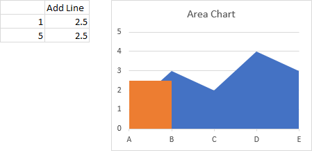
Right click on the added series, and change its chart type to XY Scatter With Straight Lines And Markers (again, the markers are temporary). The resulting line extends to the edges of the plotted area, but Excel changed the Axis Position to Between Tick Marks.
Change the Axis Position setting back to On Tick Marks, and remove the markers from the line.
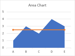
“Lazy” Horizontal Line
In the column chart, and perhaps for the line chart, the “lazy” approach did not give a suitable horizontal line, since the line did not extend to the edges of the plot area. Let’s see how it works for an area chart.
Make a chart with the actual data and the horizontal line data.
Right click on the second series, and change its chart type to a line. Excel changed the Axis Position property to Between Tick Marks, like it did when we changed the added series above to XY Scatter.

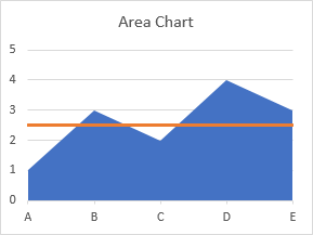
Change the Axis Position back to On Tick Marks, and the chart is finished.

For the area chart, the appearance of the lazy horizontal line is identical to the more complicated line that uses an XY Scatter series. Since it’s easier and just as good, it’s probably better to use the lazy approach.
Follow-Up
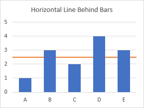
An alert reader noted in the comments that the line produced by this method is placed in front of the bars, and it might be better to place such reference lines behind the data. I have written a new post describing an approach that does just this: Horizontal Line Behind Columns in an Excel Chart.
Historical
I showed similar approaches in an old post, Add a Target Line.
More Combination Chart Articles on the Peltier Tech Blog
- Clustered Column and Line Combination Chart
- Precision Positioning of XY Data Points
- Horizontal Line Behind Columns in an Excel Chart
- Bar-Line (XY) Combination Chart in Excel
- Salary Chart: Plot Markers on Floating Bars
- Fill Under or Between Series in an Excel XY Chart
- Fill Under a Plotted Line: The Standard Normal Curve
- Excel Chart With Colored Quadrant Background
You’ve probably had to convert text to columns before in Excel. Usually in one cell, you’ll have a long line of text that is separated by commas, semicolons, or some other delimiter and all you’re trying to do is get each value into its own column. Something along the lines of this:

This is probably one of the most common use cases of Text-to-Columns I’ve seen. You have text in the format “Last Name, First Name” and you want to split this into two columns with one column being the First Name and the next column being the Last Name. What happens when you have multiple text in a cell entered in as new lines like this?

This is all in one cell and each text is separated by a new line. In this case, it looks like this was a database dump and all the text is put into one cell and our job is to put each value into a new column. The problem is, there is no delimiter! You could add a comma after each value but that would take forever if you had a cell with say 50 lines of text. How do we solve this?

Convert text to columns when the cell has multiple lines of text. Why is it so hard??
Convert Text to Columns For Cell With Multiple Lines With SUBSTITUTE()
The simple answer is using the function SUBSTITUTE() . It doesn’t seem intuitive, but what we need to do is format the cell with multiple lines of text so that it’s easy for the Text-to-Columns operation to work. We basically want the text in this cell to look like this:

Notice the commas after every value? Once the text in the cell looks like this, then we are ready to use the Text-to-Columns button to split the text up by the commas that separates each value. The key with using the SUBSTITUTE() function is we want to replace each new line with a comma. The ASCII character code for a new line break is 10 for PCs and 13 for Macs. In Excel, you can use the CHAR() function to represent different ASCII codes so we can do CHAR(10) to represent a line break. So in a a cell next to the cell with all your text, you can write the following formula to replace all the line breaks with a comma:
=SUBSTITUTE(B2,CHAR(10),",")
Let’s discuss what this formula does. All the SUBSTITUTE() function does is replace a character or characters in a text with another character. In this formula, the cell with the data in multiple lines is B2. The second value in the SUBSTITUTE() function is the actual text we are trying to find in the cell. In this case, the “text” we are trying to find is a new line break which is represented by CHAR(10) which we just discussed. Finally, we want to replace all occurrences of the new line break with a comma which is the last value in the SUBSTITUTE() function. If you apply this formula to this text, the result will look like this:

You’ll notice all our text goes onto one line with each value separated by a comma. This is exactly what we want because now we can use the Text-to-Columns operation to split this long text into columns.
Copying Text As Values For Text To Columns
If you try to use the Text-to-Columns operation on the cell where you have the SUBSTITUTE() function you’ll notice you’ll get this in the dialog box:

This isn’t correct because we don’t want to do text to columns on the text of the SUBSTITUTE() function, but rather on the resulting text of the function. All you would need to do at this point is to a Copy and Paste Special Values so that we get just the values from the function rather then the formula. After you do the Copy and Paste Special as Values, make sure you selected “Delimited” in Step 1 of the Text-to-Columns dialog box. Then you want to select Commas in Step 2:

You’ll see a preview of what the data will look like and the result looks exactly like what we want: the text (separated by commas) is split into multiple columns. The result in Excel should look like this:

Conclusion
There are multiple ways of solving problems in Excel, and this example shows how you can use different text hacks to get the result you want. This exercise was actually something asked of me in a workshop I gave a few weeks ago, and I didn’t know the answer until after I found that new line breaks are represented by CHAR(10) in Excel. Once I figured this out, I knew using the SUBSTITUTE() function, Paste Special as Values, and the Text-to-Columns would solve the problem of getting the source text into new columns.
Subscribe to Dear Analyst – A podcast about Excel and data analysis
![]()
Subscribe: Apple Podcasts | Android | Google Podcasts | Stitcher | TuneIn | Spotify | RSS
See all How-To Articles
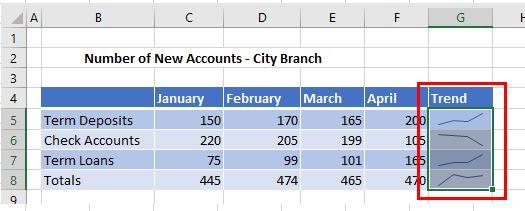
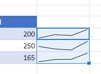
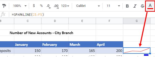
This tutorial demonstrates how to insert sparklines in Excel and Google Sheets.
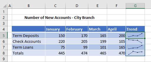
What Are Sparklines?
Sparklines are small graphs that are contained within one cell. They are often placed near relevant data to optimize the amount of space taken up. Data that a sparkline uses is organized in the same way as data would be organized in a regular chart. You can have Line, Column, or Win/Loss Sparklines.
Line Sparkline
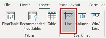
- In the Ribbon, select Insert > Sparklines > Line.
- Select the data range to create the sparkline for, and then select the location range for the sparkline.
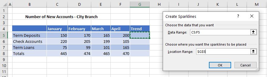
- Click OK.
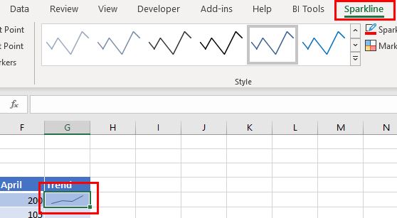
A sparkline is added to the selected range (in this case, a single cell, G5) and a new tab called Sparkline appears on the Ribbon.
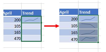
- Use the handle at the bottom right hand corner of the cell to copy the sparkline down to Rows 6–8.
- Select the range of cells for the Data Range as well as for the Location Range when creating the sparkline.
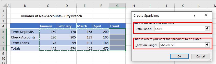
- Click OK to insert multiple sparklines into the worksheet.
Clear Sparklines
Select the sparklines you wish to clear and then in the Ribbon, select Sparklines > Clear > Clear Selected Sparklines.
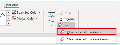
The Sparklines tab on the Ribbon then disappears.
Column Sparkline
- In the Ribbon, select Insert > Sparklines > Column.
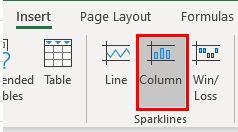
- Select the Data Range and Location Range as you did when inserting a Line Sparkline above, and then click OK.
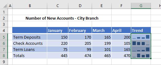
Alternatively, if you already have line sparklines in the location range, you can change the type of sparkline to Column by selecting Sparkline > Type > Column in the Ribbon.
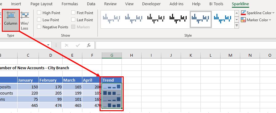
You can also use the Sparkline tab on the Ribbon to amend the Style and Color of the sparkline, or to show points on the sparkline.
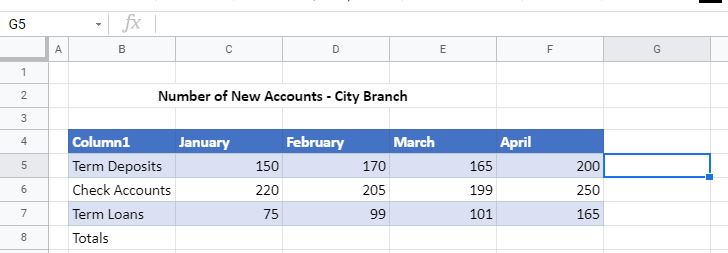
Insert Sparklines in Google Sheets
Inserting sparklines in Google Sheets is completely different. In Google Sheets, you have to use a formula to insert sparklines.
- First select the cell where you want the sparkline to be shown.
- Then type the SPARKLINE Function formula and highlight or type the data range.
=SPARKLINES(C5:F5)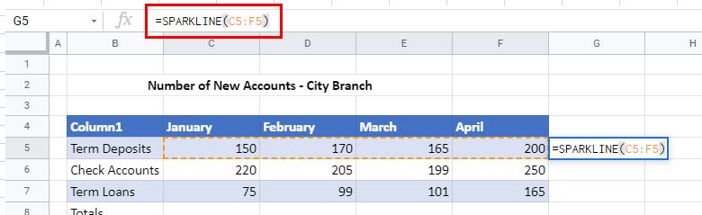
- Press ENTER to insert the sparkline into the spreadsheet.
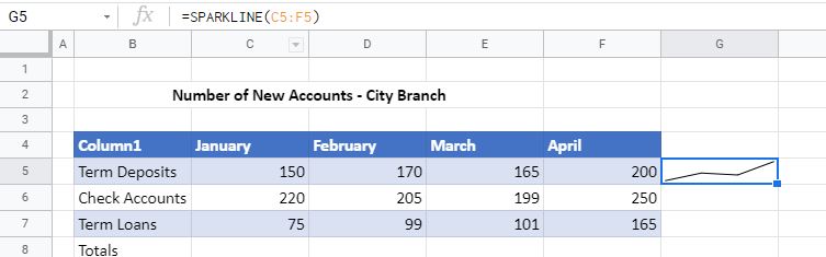
- Then use the handle at the bottom of the selected cell to copy the sparkline down to the cells below.
Google Sheets Sparkline Options
There is no Sparkline tab in Google Sheets. Instead, the properties of sparklines are defined within the formula.
- To change the color of the sparkline, amend the formula.
=SPARKLINE(C5:F5, {"color","red"})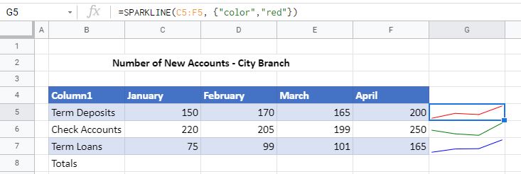
- To change the sparkline type to Column, you also need to amend the formula.
=SPARKLINE(C5:F5, {"charttype", "column"})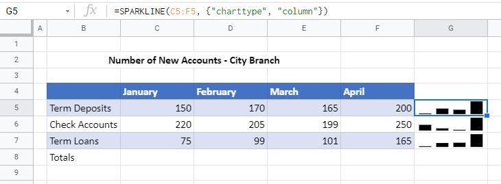
- To change the color and the type, you can combine the two options in one formula, separating them by means of a semicolon.
=SPARKLINE(C6:F6, {"color","blue"; "charttype", "column"})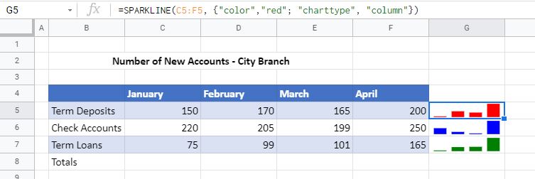
- You can also change the color of the sparkline by changing the color of the text in the cell selected. In the Menu, select Text Color, and select a color.
Author: Oscar Cronquist Article last updated on February 10, 2023
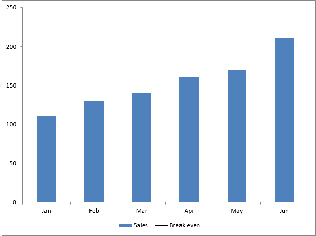
This tutorial shows you how to add a horizontal/vertical line to a chart. Excel allows you to combine two types of charts, in this case, I am going to combine the column and the x y scatter chart.
Why would you want to use a horizontal line?
It could be a break-even line for revenue or a threshold making it easy to spot specific dates/months/years containing interesting data points.
There are, of course, many more applications. I am also going to demonstrate how to insert a vertical line into a bar chart. Check out the Charts category for more interesting articles.
What’s on this page
- How to add a horizontal line
- Insert chart to a worksheet
- Add a second series to the chart
- How to change series chart type
- How to build a horizontal line
- Final chart customizations
- How to add a vertical line to an Excel Chart
- Insert a bar chart to a worksheet
- Add a second series to a bar chart
- Change the chart type of the second series
- Adjust scatter chart values
- Chart formatting
- Create a straight line through first and last chart column
- Get Excel file
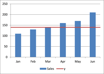
1.1 Insert a chart
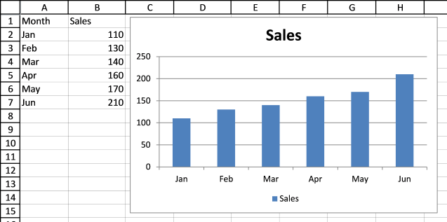
The first step is to create a chart with only one series. You can see my data in cell range A1:B7, see picture below.
- Select cell range A1:B7.
- Go to tab «Insert» on the ribbon.
- Press with left mouse button on the «Column chart» button.
The Excel column chart is created, shown in the picture below.
Back to top
1.2 Add a second series
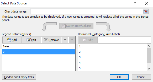
Now it is time to build the line. I will now add more data, see cell range A9:B11 in the picture below.
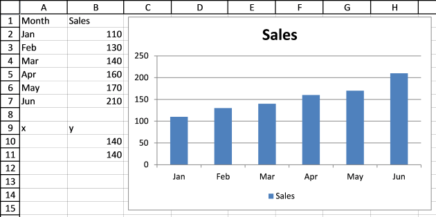
This series will be the horizontal line on the y-axis value 140.
- Press with right mouse button on on the chart.
- Press with mouse on «Select Data…».
- Press with left mouse button on «Add» button.
- Select cell B9 for «Series name:».

- Select cell range B10:B11 for series values.
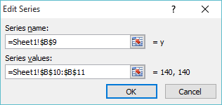
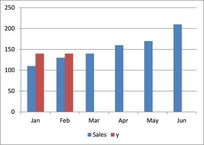
Excel colored the second series differently so you can distinguish them easily. There are only two columns in the second series because of the two cells we selected as series values.
Related article:
Recommended articles

Back to top
1.3 Change series chart type
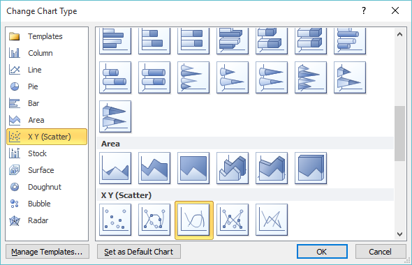
I am now going to change the chart type for the second series.
- Press with right mouse button on on the second series on the chart.
- Press with mouse on «Change Series Chart Type».

- Select chart type «Scatter with smooth lines».
- Press with left mouse button on OK button.
The second series is now a red line between Jan and Feb.
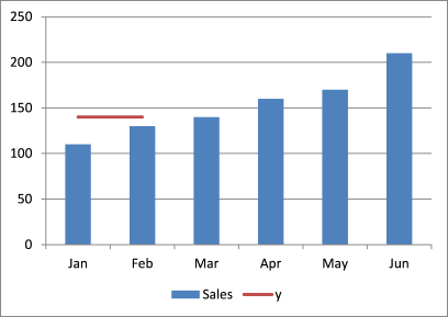
You can change the width and angle of the line by editing the values in cell range A10:B11.
Related post:
Recommended articles
Back to top
1.4 Build a horizontal line
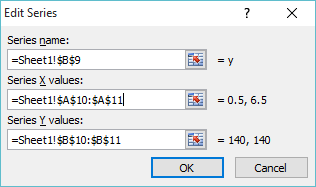
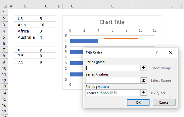
- Type 0.5 in cell A10.
- Type 6.5 in cell A11.

- Press with right mouse button on on chart.
- Press with mouse on «Select Data…».

- Select series «y».
- Press with mouse on «Edit» button.

- Select cell range A10:A11 for «Series X values:».
- Press with left mouse button on OK.
- Press with left mouse button on OK.
Related post:
Recommended articles
Highlight a bar in a chart
This article demonstrates how to highlight a bar in a chart, it allows you to quickly bring attention to a […]
Back to top
1.5 Final chart customizations
These are the steps I made to remove gridlines, create a smaller line and change the second series name value.
- Press with mouse on a grid line.
- Press the Delete button on the keyboard.
- Double press with left mouse button on a horizontal line.
- Decrease line width.
- Change line color.
- Press with left mouse button on Close button.
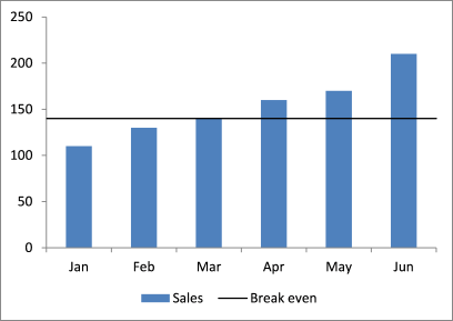
- Type «Break even» in cell B9.
If you want to know in greater detail how to customize a chart element, read the following post:
Recommended articles
Excel chart components
Charts in Microsoft Excel lets you visualize, analyze and explain data. Charting in Excel is very easy and you […]
Back to top
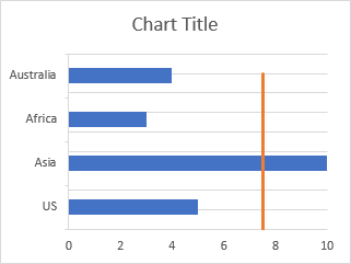
2. How to add a vertical line to a chart
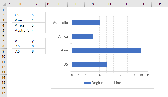
A vertical line on a bar chart would be just as useful as a horizontal line on a column chart.
The picture above shows a black line on value 7.5 with transparency ca 50%.
Here is how I built this chart.
2.1 Insert a bar chart
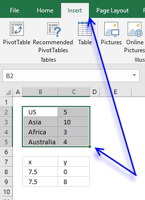
- Select the data.
- Press with mouse on «Insert» on the ribbon.
- Press with mouse on «Column» chart button.
- Press with left mouse button on «2D Clustered Bar»
The bar chart is now visible next to the data.
Back to top
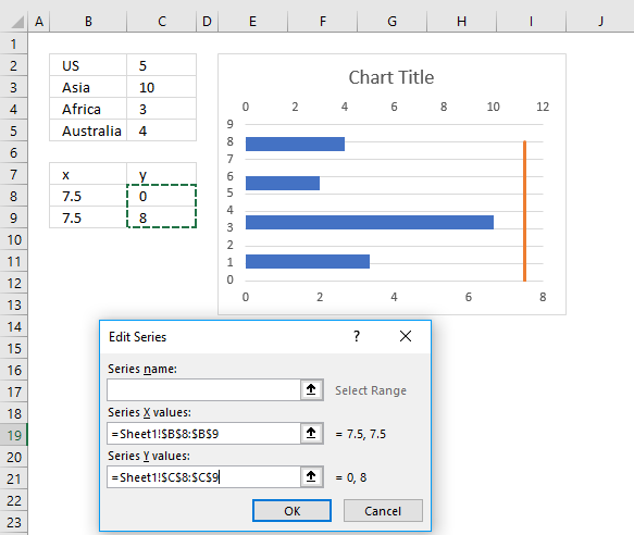
2.2 Add a second series
The x value is where on the chart I want the line to appear, the y value is a value you probably have to guess and adjust later.
- Press with right mouse button on on the chart and press with left mouse button on «Select Data…»

- Press with mouse on «Add» button shown above.
- Select the x values.

- Press with left mouse button on OK button.
- Press with left mouse button on OK button.
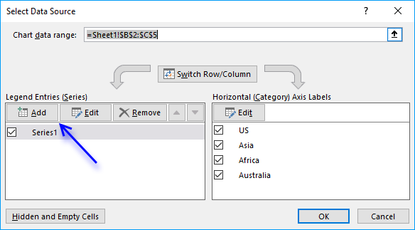
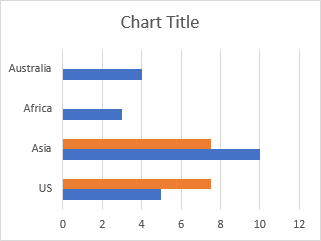
The chart now contains two series, the first series is blue and the second series is red.
Back to top
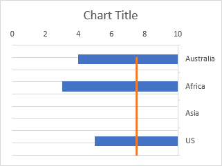
2.3 Change the chart type of the second series
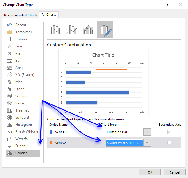
- Press with right mouse button on on the chart and then press with left mouse button on «Change Chart Type…».
- Press with mouse on tab «Combo»
- Select the clustered bar chart for series1.
- Select the Scatter with smooth lines chart for series2.
- Press with left mouse button on OK button.
The chart above has two x axis, one at the top and one at the bottom. The y axis regions disappeared and new y axis values appeared.
We certainly have some cleaning up to do.
Back to top
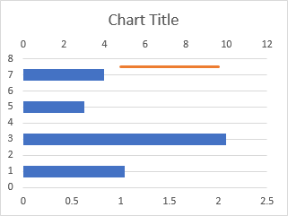
2.4 Adjust scatter chart values
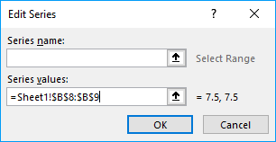
- Press with right mouse button on somewhere on the chart.
- Press with left mouse button on on «Select Data…».
- Select Series2.
- Press with mouse on «Edit» button.

- Select the x values.
- Select the y values.
- Press with left mouse button on OK button.
- Press with left mouse button on OK button.
The chart now looks like this.
Back to top
2.5 Chart formatting
- Delete all axis values
- Select the chart.
- Go to tab «Design» on the ribbon.
- Press with left mouse button on «Add Chart Element» button.
- Press with left mouse button on «Axis».
- Press with left mouse button on «Secondary Horizontal «.
- Repeat steps 4-5, then add a «Vertical Horizontal» axis.
To move the axis region values left follow these steps.
- Double press with left mouse button on the x axis values above plot area.
- Go to tab «Axis Options»
- Select «Vertical Axis crosses» axis value 0 (zero).
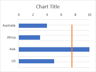
To move the axis values follow these steps.
- Double press with left mouse button on the y axis values to the left of the plot area.
- Go to tab «Axis Options»
- Select «Horizontal axis crosses» at category number: 0 (zero).
- Exit Settings
Double press with left mouse button on the line to open the settings. Change the line color, width and transparency.
The line is not covering the entire plot area, here is how to fix that.
- Select the chart.
- Go to tab «Design»
- Add the «Primary Vertical» axis
- Double press with left mouse button on axis values to open the settings.
- Go to tab «Axis Options»
- Change the maximum value so that the line covers the entire plot area. 8 worked for me.
- Delete the «Primary Vertical» axis.
To add a Legend follow these steps.
- Select chart.
- Go to tab «Design» on the ribbon, it appears when you select a chart.
- Press with left mouse button on the «Add Chart Element» button.
- Press with left mouse button on «Legend».
- Pick a position for the «Legend».
Back to top
3. Create a straight line through the first and last chart column

The image above demonstrates a custom chart line that fits the first and last column only.
3.1 Calculate the slope between the first and last column

We want a line that begins at the first column and ends with last column. We can use the SLOPE function to calculate the slope of this line.
Formula in cell C16:
=SLOPE(C10:C11, B10:B11)
The SLOPE function needs at least two coordinates (x, y) to calculate the slope, the first coordinate is (1,110) and the second coordinate is (6,210).
Type the x-coordinate of the first coordinate in cell B10 and the y-coordinate in cell C10, repeat with the second coordinate in cells B10:B11. We need these values to create the custom line.
3.2 Create a line on the chart
- Press with right mouse button on on the chart.
- Press with mouse on «Select Data…». A dialog box appears.

- Press with mouse on «Add» button. Another dialog box appears.

- Press with mouse on the button next to field «Series values:», select cell range C10:C11.
- Press with left mouse button on the OK button, see the image above. You are now back to the first dialog box.
- Press with left mouse button on the OK button on the first dialog box to apply changes.


The chart above shows the second series we just created, however, we want it to be a line not another series of columns. Here is how to change the chart type:
- Press with right mouse button on on the chart.
- Press with mouse on «Change Chart Type…».

- A dialog box appears. Press with mouse on «Combo chart».

- Select Chart Type: «Scatter with Straight…» for Series2.
- Press with left mouse button on check box «secondary Axis».
- Press with left mouse button on OK button.


There is now a line displayed on the chart, if we change the x-axis values for this line we get a line that fits both the first and last column.
- Press with right mouse button on on the chart.
- Press with mouse on «Select data…». A dialog box appears.

- Press with mouse on Series2 to select it, see image above.
- Press with mouse on the «Edit» button to change x-axis values. Another smaller dialog box is now visible, see the image below.

- Press with mouse on the arrow button next to the «Series X values:» field, see the image above.
- Select cell range B10:B11.
- Press with left mouse button on the «OK» button. You are now back to the first dialog box.
- Press with left mouse button on the «OK» button to apply changes.


The line now fits both the first and last column, here is how to extend the line to both y-axis borders.
We calculated the slope of the line in cell C16, we can now use that value to extend the line to both sides.
Change x value in cell B10 to 0.5 and subtract 110 with 20/2 equals 100. Change the x value in cell B11 to 6.5 and change the value in cell C11 to 220 (210+20/2).


Add Vertical Line using Shapes
The easiest way to add vertical line to Excel chart is to draw a line on top of the Excel Chart using shapes. Follow the steps on how to add a vertical line in Excel graph below:
STEP 1: Select the data that will be used to create a chart.

STEP 2: Go to Insert > Line Charts > Line with Markers.
STEP 3: Go to Insert > Illustrations > Line.

STEP 4: Draw the line on top of the Chart.

STEP 5: To increase the weight of the vertical line, Go to Shape Format > Shape Outline > Weight > 3/4 pt.

This will excel add vertical line to chart!

Even though this method is super easy, it comes with its own drawback.
This line is not linked to the data and hence will not change when you change the data. So, you will have to adjust this line as and when you update the data.
Add Vertical Line using XY Scatter Plot
To highlight a point in your chart, you can clearly define its position on the x-axis and create a vertical line for that plot.
In this example, we will be using a scatter chart to highlight the period in the chart that has the maximum sales. Let’s see how it can be done:
STEP 1: Select the data that will be used to create a chart.
STEP 2: Go to Insert > Line Charts > Line with Markers.
This is how your sales chart will look like:

Now, insert the data for your vertical line highlighting the period that achieved the maximum sales.
STEP 3: In cells D6 and D7, use the formula below to extract the sales period with the maximum sales amount.
=MATCH(MAX(B5:B16),B5:B16,0)
Here, the MAX Formula will return the largest sales amount in the array provided and the MATCH Formula will return the relative position of the maximum value in the array.

STEP 4: In cells E6 and E7, type the value 0 and 1 respectively.

STEP 5: Click on the chart and then Go to Chart Design Tab > Select Data.

STEP 6: In the Select Data Source dialog box, click on the Add button.

STEP 7: In the Edit Series dialog box, select cell D4 for the Series name box and cells D6:D7 for the Series Values box. Click OK.

STEP 8: Go to Chart Design > Change Chart Type.

STEP 9: In the Change Chart Type dialog box, select Scatter with Straight Line and check the box for the secondary axis. Click OK.

STEP 10: Again, Go to Chart Design> Select Data to open the Select Data dialog box. Select Period with Maximum Sales and then click on the Edit button.

STEP 11: In the Edit Series dialog box, select cells D6 and D7 for X values and E6 and E7 for Y values. Click OK.

You will a vertical line for the sales period 6 has been created but it does not extend to the top of the chart. Let’s change that and remove the secondary axis label as well!

STEP 12: Right-click on the secondary axis and select Format Axis.

STEP 13: In the Format Axis dialog box, select the Maximum bound as 1 and the Label Position as None.


Your vertical column highlighting the maximum sales is now ready!

This line is dynamic as well. In this updated sales data, the highest sales are now achieved in the sales period 2. The Line chart, as well as the vertical column, gets updated based on the new data.

Add Vertical Line using Additional column series
The last method is to use an additional column for the vertical line. Let’s dive into a step-by-step tutorial on how to add vertical line in Excel graph:
STEP 1: Add a new column Vertical Line, and place in the first value as 100.

STEP 2: Select the entire table, go to Insert > Line Charts > Line with Markers

STEP 3: Select the chart and go to Design > Change Chart Type > Combo > Custom Combination

STEP 4: For the Vertical Line series, change the Chart Type to Clustered Column and check Secondary Axis. Press OK.
(This will transform the Vertical Line series into a vertical column in your chart.
Make sure the SALES PERIOD and SALES are Line with Markers Chart Types).

STEP 5: Double click your Secondary Axis to view the Format Axis Panel.
Set Maximum to 100, to ensure our Vertical Line extends all the way to the top since we placed in the value of 100.

Click on Labels and change the Label Position to None.

STEP 6: Just to clean up our chart, notice there is a Sales Period Series.
Right click on it and click Delete. We do not need this.

STEP 7: Double click on the vertical bar, so that we can make it slimmer.

In the Format Data Point pane, Set Gap Width to 500%.

STEP 8: Now it is time to try out our interactive chart!
Drag and drop the Vertical Line value of 100 into another Sales Period and see the column chart move!

STEP 9: There is a cooler trick and we can make the Vertical Bar become Dynamic! For this we need the Developer Tab.
If you do not have the Developer Tab enabled yet, it is very easy to enable this first. Go to File > Options

Go to Customize Ribbon > Main Tabs > Developer. Check this and click OK.

STEP 10: Go to Developer > Insert > Form Controls > Scroll Bar. Drag this horizontally on top of the graph.

STEP 11: Right click on the scroll bar and select Format Control.

STEP 12: Set the Maximum Value to 12. This will depict our sales periods from 1 to 12.
For the Cell link, place in $D$5, this will show the value of the Scroll bar in this cell (i.e. which sales period it’s pointing to). Press OK.

STEP 12: In the Vertical Line column, place in this formula: =IF(A5=$D$5,100,””)
What this will do, is simply check if the Sales Period matches the value of the Scroll bar ($D$5).
If YES, then set the value to 100.
Setting the value to 100 will then make our vertical line show up in that Sales Period!
Now the pieces are almost all in place!

STEP 13: Double click the lower right corner of the formula cell, which will copy the same formula down the entire column.

Your interactive chart is now complete!!!
Try playing around with the scroll bar and see the Vertical Line move with it! Cool hey?

Make sure to download our FREE PDF on the 333 Excel keyboard Shortcuts here: