
Excel for Microsoft 365 Outlook for Microsoft 365 Excel 2021 Outlook 2021 Excel 2019 Outlook 2019 Excel 2016 Outlook 2016 Excel 2013 Outlook 2013 Excel 2010 Outlook 2010 Excel 2007 Outlook 2007 More…Less
Column charts are useful for showing data changes over a period of time or for illustrating comparisons among items. In column charts, categories are typically organized along the horizontal axis and values along the vertical axis.

For information on column charts, and when they should be used, see Available chart types in Office.
To create a column chart, follow these steps:
-
Enter data in a spreadsheet.
-
Select the data.
-
Depending on the Excel version you’re using, select one of the following options:
-
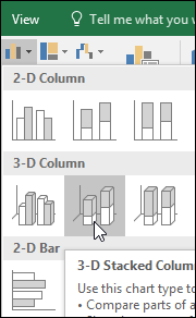
Excel 2016: Click Insert > Insert Column or Bar Chart icon, and select a column chart option of your choice.

-
Excel 2013: Click Insert > Insert Column Chart icon, and select a column chart option of your choice.
-
Excel 2010 and Excel 2007: Click Insert > Column, and select a column chart option of your choice.
You can optionally format the chart a little further. See the list below for a few options:
Note: Make sure you click on the chart first before applying a formatting option.
-
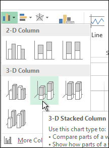
To apply a different chart layout, click Design > Charts Layout, and select a layout.
-
To apply a different chart style, click Design > Chart Styles, and pick a style.
-
To apply a different shape style, click Format > Shape Styles, and pick a style.
Note: A chart style is different from a shape style. A shape style is a formatting option that applies to the chart’s border only, whereas the chart style is a formatting option that applies to the entire chart.
-
To apply different shape effects, click Format > Shape Effects, and pick an option such as Bevel or Glow, and then a sub option.
-
To apply a theme, click Page Layout > Themes, and select a theme.
-
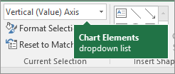
To apply a formatting option to a specific component of a chart (such as Vertical (Value) Axis, Horizontal (Category) Axis, Chart Area, to name a few), click Format > pick a component in the Chart Elements dropdown box, click Format Selection, and make any necessary changes. Repeat the step for each component you want to modify.
Note: If you are comfortable working in charts, you can also select and right-click on a specific area on the chart and select a formatting option.
-
To create a column chart, follow these steps:
-
In your email message, click Insert > Chart.
-
In the Insert Chart dialog box, click Column, and pick a column chart option of your choice, and click OK.
Excel opens in a split window and displays sample data on a worksheet.
-
Replace the sample data with your own data.
Note: If your chart is not reflecting data from the worksheet, make sure to drag the vertical lines all the way down to the last row in the table.
-
Optionally, save the worksheet by following these steps:
-
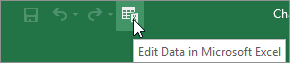
Click the Edit Data in Microsoft Excel icon on the Quick Access Toolbar.
The worksheet opens in Excel.
-
Save the worksheet.
Tip: To reopen the worksheet, click Design > Edit Data, and select an option.
You can optionally format the chart a little further. See the list below for a few options:
Note: Make sure you click on the chart first before applying a formatting option.
-
To apply a different chart layout, click Design > Charts Layout, and select a layout.
-
To apply a different chart style, click Design > Chart Styles, and pick a style.
-
To apply a different shape style, click Format > Shape Styles, and pick a style.
Note: A chart style is different from a shape style. A shape style is a formatting option that applies to the chart’s border only, whereas the chart style is a formatting option that applies to the entire chart.
-
To apply different shape effects, click Format > Shape Effects, and pick an option such as Bevel or Glow, and then a sub option.
-
To apply a formatting option to a specific component of a chart (such as Vertical (Value) Axis, Horizontal (Category) Axis, Chart Area, to name a few), click Format > pick a component in the Chart Elements dropdown box, click Format Selection, and make any necessary changes. Repeat the step for each component you want to modify.
Note: If you are comfortable working in charts, you can also select and right-click on a specific area on the chart and select a formatting option.
-
Did you know?
If you don’t have an Microsoft 365 subscription or the latest Office version, you can try it now:

See Also
Create a chart from start to finish
Create a box and whisker chart (floating chart)
Need more help?
Want more options?
Explore subscription benefits, browse training courses, learn how to secure your device, and more.
Communities help you ask and answer questions, give feedback, and hear from experts with rich knowledge.
Most companies (and people) don’t want to pore through pages and pages of spreadsheets when it’s so quick to turn those rows and columns into a visual chart or graph. But someone has to do it…and that person must be you.
Ready to turn your boring Excel spreadsheet into something a little more interesting?
In Excel, you’ve got everything you need at your fingertips. Excel users can leverage the power of visuals without any additional extensions. You can create a graph or chart right inside Excel rather than exporting it into some other tool.
What is the difference between Charts and Graphs?
According to reference.com…“The difference between graphs and charts is mainly in the way the data is compiled and the way it is represented. Graphs are usually focused on raw data and showing the trends and changes in that data over time. Charts are best used when data can be categorized or averaged to create more simplistic and easily consumed figures.“
So technically, charts and graphs mean separate things, but in the real world, you’ll hear the terms used interchangeably. People generally accept both so don’t worry too much about it!

In this post, you’ll learn exactly how to create a graph in Excel and improve your visuals and reporting…but first let’s talk about charts. Understanding exactly how charts play out in Excel will help with understanding graphs in Excel.
Charts in Excel
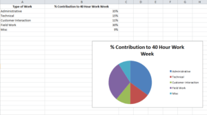
Charts are usually considered more aesthetically pleasing than graphs. Something like a pie chart is used to convey to readers the relative share of a particular segment of the data set with respect to other segments that are available. If instead of the changes in hours worked and annual leaves over 5 years, you want to present the percentage contributions of the different types of tasks that make up a 40 hour work week for employees in your organization then you can definitely insert a pie chart into your spreadsheet for the desired impact.
Graphs in Excel
Graphs represent variations in values of data points over a given duration of time. They are simpler than charts because you are dealing with different data parameters. Comparing and contrasting segments of the same set against one another is more difficult.
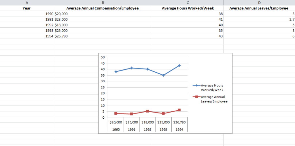
So if you are trying to see how the number of hours worked per week and the frequency of annual leaves for employees in your company has fluctuated over the past 5 years, you can create a simple line graph and track the spikes and dips to get a fair idea.
Types of Graphs Available in Excel
Excel offers three varieties of graphs:
- Line Graphs: Both 2 dimensional and three dimensional line graphs are available in all the versions of Microsoft Excel. Line graphs are great for showing trends over time. Simultaneously plot more than one data parameter – like employee compensation, average number of hours worked in a week and average number of annual leaves against the same X axis or time.
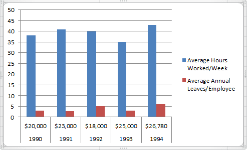
- Column Graphs: Column graphs also help viewers see how parameters change over time. But they can be called “graphs” when only a single data parameter is used. If multiple parameters are called into action, viewers can’t really get any insights about how each individual parameter has changed. As you can see in the Column graph below, average numbers of hours worked in a week and average number of annual leaves when plotted side by side do not provide the same clarity as the Line graph.
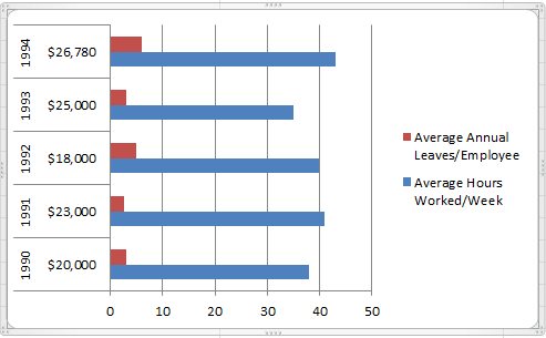
- Bar Graphs: Bar graphs are very similar to column graphs but here the constant parameter (say time) is assigned to the Y axis and the variables are plotted against the X axis.
1. Fill the Excel Sheet with Your Data & Assign the Right Data Types
The first step is to actually populate an Excel spreadsheet with the data that you need. If you have imported this data from a different software, then it’s probably been compiled in a .csv (comma separated values) formatted document.
If this is the case, use an online CSV to Excel converter like the one here to generate the Excel file or open it in Excel and save the file with an Excel extension.
After converting the file, you still may need to clean up the rows and the columns. It is better to work with a clean spreadsheet so that the Excel graph you’re creating is clean and easy to modify or change.
If that doesn’t work, you may also need to manually enter the data into the spreadsheet or copy and paste it over before creating the Excel graph.
Excel has two components to its spreadsheets:
- The rows that are horizontal and marked with numbers
- The columns that are vertical and marked with alphabets
After all the data values have been set and accounted for, make sure that you visit the Number section under the Home tab and assign the right data type to the various columns. If you do not do this, chances are your graphs will not show up right.
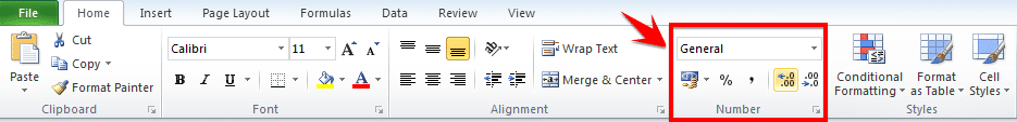
For example if column B is measuring time, ensure that you choose the option Time from the drop down menu and assign it to B.
Choose the Type of Excel Graph You Want to Create
This will depend on the type of data you have and the number of different parameters you will be tracking simultaneously.
If you are looking to take note of trends over time then Line graphs are your best bet. This is what we will be using for the purpose of the tutorial.
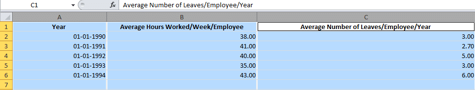
Let us assume that we are tracking Average Number of Hours Worked/Week/Employee and Average Number of Leaves/Employee/Year against a five year time span.
Highlight The Data Sets That You Want To Use
For a graph to be created, you need to select the different data parameters.
To do this, bring your cursor over the cell marked A. You will see it transform into a tiny arrow pointing downwards. When this happens, click on the cell A and the entire column will be selected.
Repeat the process with columns B and C, pressing the Ctrl (Control) button on Windows or using the Command key with Mac users.
Your final selection should look something like this:
Create the Basic Excel Graph
With the columns selected, visit the Insert tab and choose the option 2D Line Graph.
You will immediately see a graph appear below your data values.

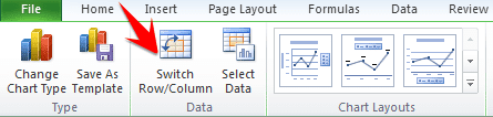
Sometimes if you do not assign the right data type to your columns in the first step, the graph may not show in a way that you want it to. For example, Excel may plot the parameter Average Number of Leaves/Employee/Year along the X axis instead of the Year. In this case, you can use the option Switch Row/Column under the Design tab of Chart Tools to play around with various combinations of X axis and Y axis parameters till you hit on the perfect rendition.
Improve Your Excel Graph with the Chart Tools
To change colors or to change the design of your graph, go to Chart Tools in the Excel header.
You can select from the design, layout and format. Each will change up the look and feel of your Excel graph.
Design: Design allows you to move your graph and re-position it. It gives you the freedom to change the chart type. You can even experiment with different chart layouts. This may conform more to your brand guidelines, your personal style, or your manager’s preference.

Layout: This allows you to change the title of the axis, the title of your chart and the position of the legend. You might go with vertical text along the Y axis and horizontal text along the X axis. You can even adjust the grid lines. You have every formatting tool conceivable at your fingertips to improve the look and feel of your graph.
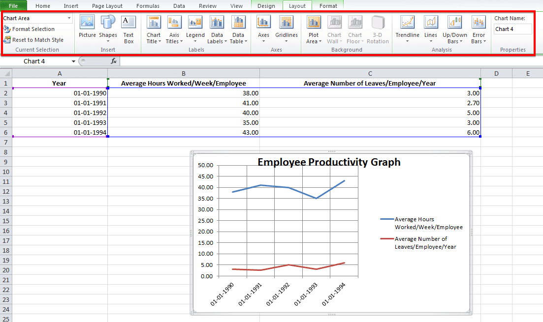
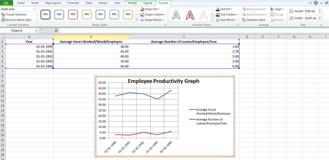
Format: The Format tab allows you to add a border in your chosen width and color around the graph to properly separate it from the data points that are filled in the rows and columns.
And there you have it. An accurate visual representation of the data that you have imported or entered manually to help your team members and stakeholders better engage with the information and utilize it to create strategies or be more aware of all the constraints while taking decisions!
Challenges with Making a Graph In Excel
When manipulating simple data sets, you can create a graph fairly easily.
But when you start adding in several types of data with multiple parameters, then there will be glitches. Here are some of the challenges that you’re going to have:
- Data sorting can be problematic when creating graphs. Online tutorials might recommend data sorting to make your “charts” look more aesthetically appealing. But beware of when the X axis is a time-based parameter! Sorting data values by magnitude may mess up the flow of the graph because the dates are sorted randomly. You may not be able to spot the trends very well.

You may forget to remove duplicates. This is especially true if you have imported the data from a third-party application. Generally, this type of information is not filtered of redundancies. And you might end up corrupting the integrity of your information if duplicates sneak into your pictorial representation of trends. When working with copious volumes of data, it is best to use the Remove Duplicates option on your rows.
Creating graphs in Excel doesn’t have to be overly complex, but, much like with creating Gantt charts in Excel, there can be some easier tools to help you do it. If you’re trying to create graphs for workloads, budget allocations or monitoring projects, check out project management software instead.
Many of those functions are automated and without manual data entry. And you won’t be left wondering about who has the latest data sets. Most project management solutions, like Workzone, have file sharing and some visualization capabilities built-in.
A column chart in Excel is a chart that is used to represent data in vertical columns. The height of the column represents the value for the specific data series in a chart. The column chart represents the comparison in the form of the column from left to right. If there is a single data series, it is easy to see the comparison.
For example, we need to know the sales of three top food products in country A for a survey. Then, we can insert the output into a column chart, a graphical representation in vertical bars or columns along a two-axis plotted with the values indicating the measure of the particular food product category in country A, and complete a concise survey.
Table of contents
- Column Chart in Excel
- Types of a Column Chart in Excel
- How to Make Column Chart in Excel? (with Examples)
- Example #1
- Example #2
- Pros
- Cons
- Things to Remember
- Recommended Articles
Types of a Column Chart in Excel
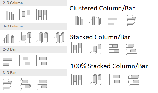
We have different types of column/bar charts available in Microsoft Excel, which are:
- Clustered Column Chart: A clustered chart in Excel presents more than one data series in clustered vertical columns. Each data series shares the same axis labels, so vertical bars are grouped by category. The clustered columns can make a direct comparison of multiple series and can show change over time. But they become visually complex after adding more series. Therefore, they work best in situations where data points are limited.
- Stacked Column Chart: This type of chart helps represent the total (sum) because it visually aggregates all categories in a group. The negative point about this chart is that it becomes difficult to compare the sizes of the individual classes. Stacking enables us to show a part of the whole relationship.
- 100% Stacked Column Chart: This is a chart type helpful to show the relative percentage of multiple data series in stacked columns, where the total (cumulative) of stacked columns always equals 100%.
How to Make Column Charts in Excel? (with Examples)
You can download this Column Chart Excel Template here – Column Chart Excel Template
Example #1
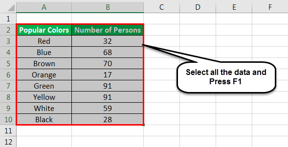
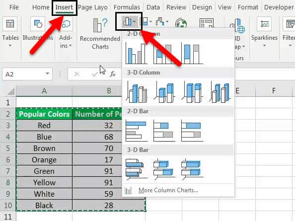
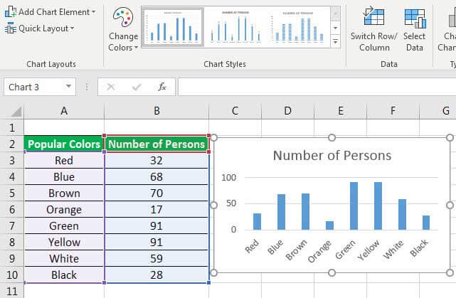
To make a column chart in Excel, first, we need to have data in table format. For example, suppose we have data related to the popularity of the colors.

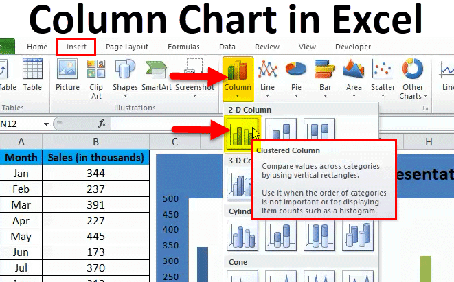
- To make the chart, we first need to select the whole data and then press the shortcut key (Alt+F1) to place the default chart type in the same sheet where the data is or F11 to place the chart in a separate new sheet.
- Else, we could use the long method to click on the InsertIn excel “INSERT” tab plays an important role in analyzing the data. Like all the other tabs in the ribbon INSERT tab offers its own features and tools. Under Insert Tab we have several other groups including tables, illustration, add-ins, charts, Power map, sparklines, filters, etc.read more tab -> Under Charts group -> Insert Column or Bar Chart.
We have a lot of different types of column charts to select. However, according to the data in the table and the nature of the data in the table, we should go for the clustered column. So, for which type of column chart should we go? We can find this below by reading the usefulness of various column charts.
- We must press Alt+F1 for the chart on the same sheet.
- For the chart in the separate sheet, we can press F11.
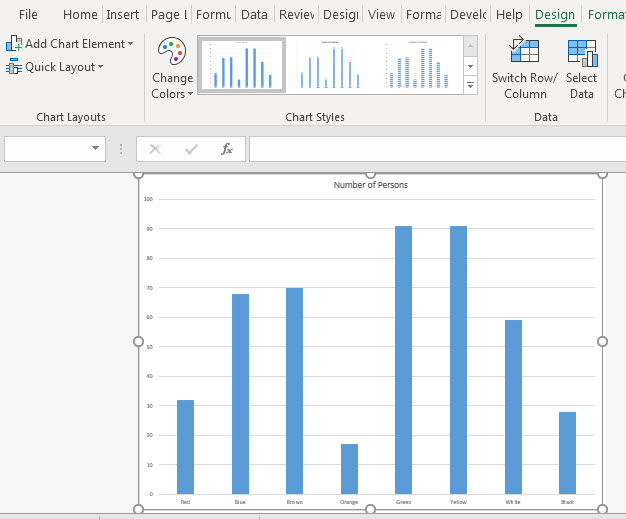
- Here, in Excel 2016, we have a ‘+’ sign on the right side of the chart where we have checkboxes to display the different chart elements.
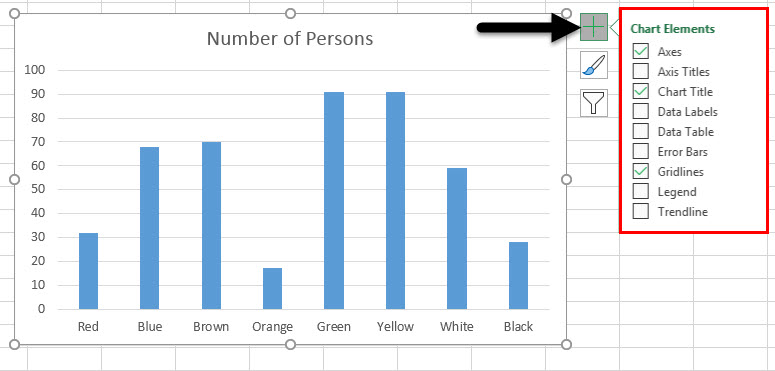
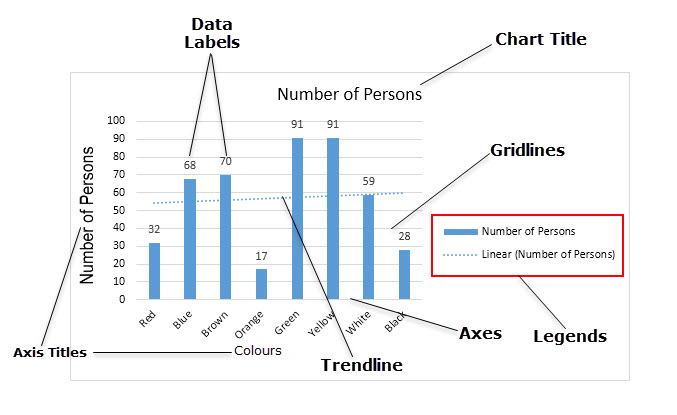
As we can see, the chart looks like the one below by activating the “Axes,” “Axes Titles,” “Chart Title,” “Data Labels,” “Gridlines,” “Legends,” and “Trendline.”
- Different types of elements of the chart are as follows:
We can enlarge the chart area by selecting the outer circle according to our needs. If we right-click on any of the bars, we have various options for formatting the bar and chart.
- If we want to change the formatting of only one bar, we need to click two times on the bar. Then right-click, and we can change the color of the individual bars according to the colors they represent.
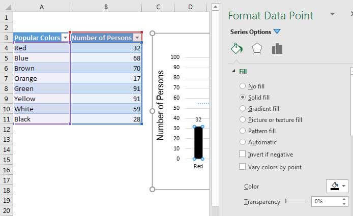
We can also change the formatting from the right panel, which is open when selecting any bar.
- By default, the chart is created using the selected data, but we can change the chart’s appearance by using the ‘Filter’ sign on the right side of the chart.

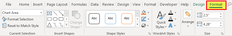
- Two more contextual tabs, “Design” and “Format,” open in the ribbon when a chart is selected.
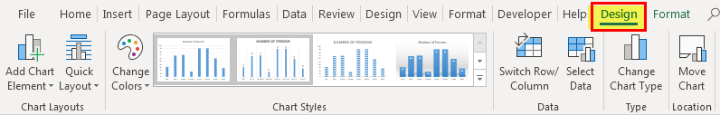
We can use the “Design” tab to format the entire chart, the color theme, chart type, moving chart, change the data source, the chart’s layout, etc.
In addition, the “Format” tab is for formatting individual chart elements like bars and text.
Example #2
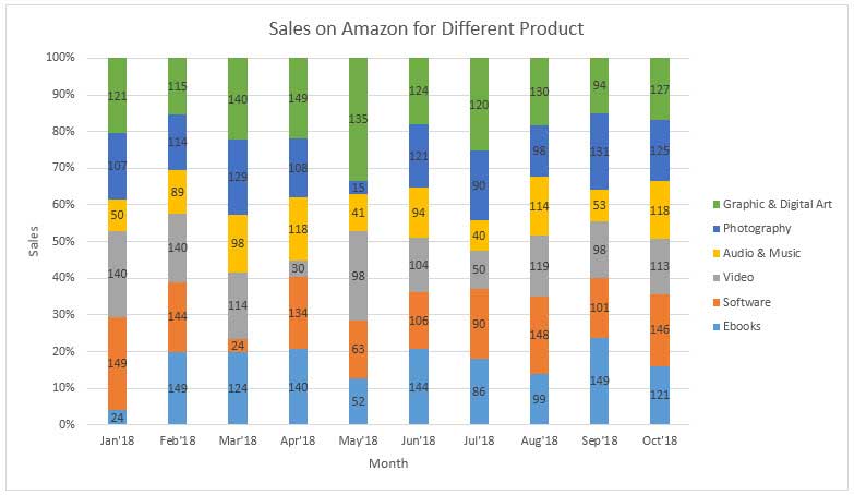
Please find below the column chart to represent the data of Amazon sales product-wise.
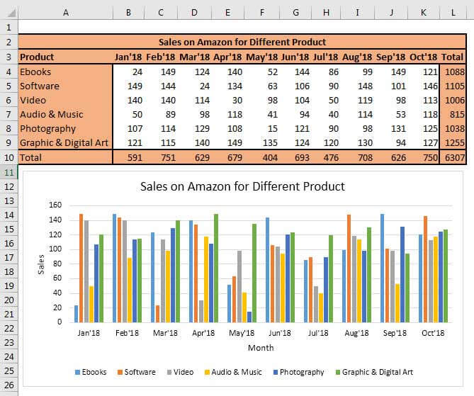
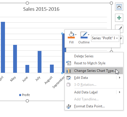
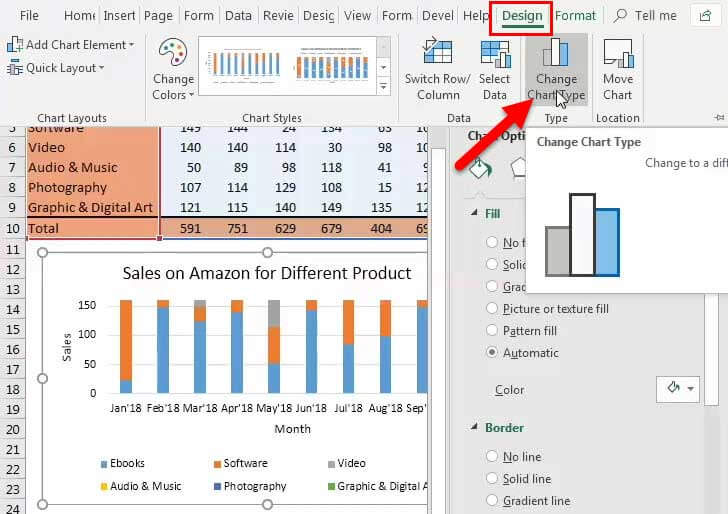
As we can see, the chart has become visually complex to analyze, so we will now use the “Stacked Column Chart” as it will also help us find the contribution of the individual product to the overall sale of the month. To do the same, we need to click on the Design tab-> Change Chart Type in the “Type” group.
Finally, the chart will look like the one shown below.
Pros
- A bar or column chart is more popular than another type of complicated chart. It can be understood by a person who is not much more familiar with chart representation but has gone through column charts in magazines or newspapers. Columns or bar charts are self-explanatory.
- We can also use it to see the trend for any product in the market. But, again, make trends easier to highlight than tables do.
- Display relative numbers/proportions of multiple categories in a stacked column chartA stacked column chart in Excel is a column chart where multiple series of the data representation of various categories are stacked over each other. The stacked series are vertical.read more.
- This chart helps summarize a large amount of data visually and is easily interpretable.
- These chart estimates can be made quickly and accurately—permitting visual guidance on the accuracy and reasonableness of calculations.
- Accessible to a broad audience as easy to understand.
- This chart is used to represent negative values.
- Bar charts can hold data in distinct categories and from one category in different periods.
Cons
- It fails to expose key assumptions, causes, impacts, and causes. That is why it is easy to manipulate to give incorrect impressions, or we can say they do not provide a good overview of the data.
- The user can quickly compare arbitrary data segments on a bar chart but cannot compare two slices that are not neighbors at once.
- The main disadvantage of bar charts is that it is straightforward to make them unreadable or wrong.
- We can easily manipulate a bar graph to give a false impression of a data set.
- Bar graphs are not helpful when displaying changes in speeds, such as acceleration
- Using too many bars in a bar chart looks highly cluttered.
- A line graph in excelLine Graphs/Charts in Excels are visuals to track trends or show changes over a given period & they are pretty helpful for forecasting data. They may include 1 line for a single data set or multiple lines to compare different data sets. read more is more useful when showing trends over time.
Things to Remember
- The bar and the column chart display data using rectangular bars where the length of the bar is proportional to the data value. But bar charts are useful when we have long category labels.
- We must use various colors for bars to contrast and highlight data in your chart.
- We should use self-explanatory chart titles and axis titles.
- When the data is related to different categories, use this chart. Otherwise, we can use a line chart for another type of data to represent the continuous data type.
- Always start the graph with zero, as it can mislead and confuse while comparing.
- Do not use extra formattings like the bold font or both types of gridlines in excelGridlines are little lines made of dots to divide cells from each other in a worksheet. The gridlines have slight faint invisibility; you can find it in the page layout tab. This option has a checkbox; for activating the gridlines, you can tick on it and untick if you wish to deactivate gridlines.read more for the plot area so that the main point can be seen and analyzed clearly.
Recommended Articles
This article is a guide to Column Chart in Excel. We discuss how to make column chart in Excel along with Excel examples and downloadable templates. You may also look at these useful functions in Excel: –
- Column Lock Excel
- Pareto Chart in Excel
- Area Chart in Excel
- Gantt Chart in Excel
Column Chart in Excel ( Table of Contents )
- Column Chart in Excel
- Types of Column Chart in Excel
- How to Make Column Chart in Excel?
Column Chart in Excel
A column Chart in Excel is the simplest form of a chart that can be easily created if one list of the parameter is against one set of value. Column Chart can be accessed from the Insert menu tab from the Charts section, which has different types of Column Charts such as Clustered Chart, Stacked Column, 100% Stacked Column in 2D and 3D as well. This simply compares the values across different categories with the help of vertical columns.
“The Simpler the chart, the better it is”. Excel Column chart straight forward tells the story of a single variable and does not create any sort of confusion in terms of understanding.
In this article, we will look into the ways of creating COLUMN CHARTS in excel.
Types of Column Chart in Excel
There are totally 5 types of column charts available in excel. Go to the Insert tab and click on the COLUMN.
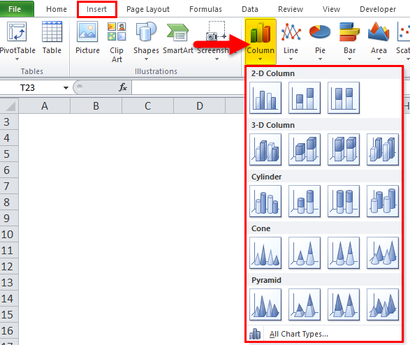
- 2-D column and 2-D stacked column chart
- 3-D column and 3-d stacked column chart
- Cylinder column chart
- Cone column chart
- Pyramid column chart
How to Make Column Chart in Excel?
The column Chart is very simple to use. Let us now see how to make a Column Chart in Excel with the help of some examples.
You can download this Column Chart Excel Template here – Column Chart Excel Template
Example #1
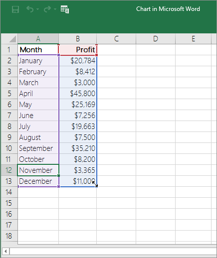
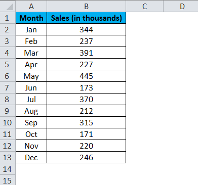
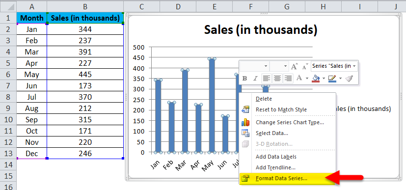
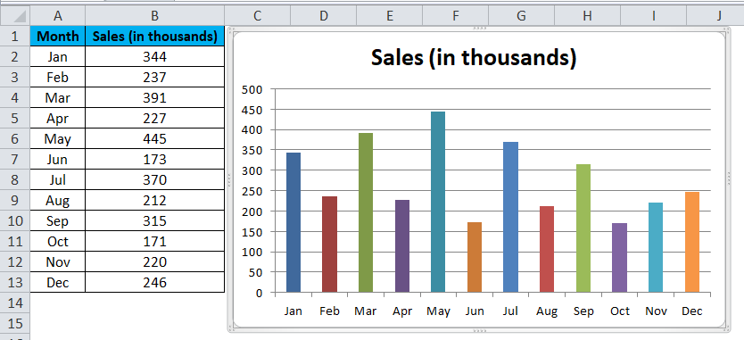
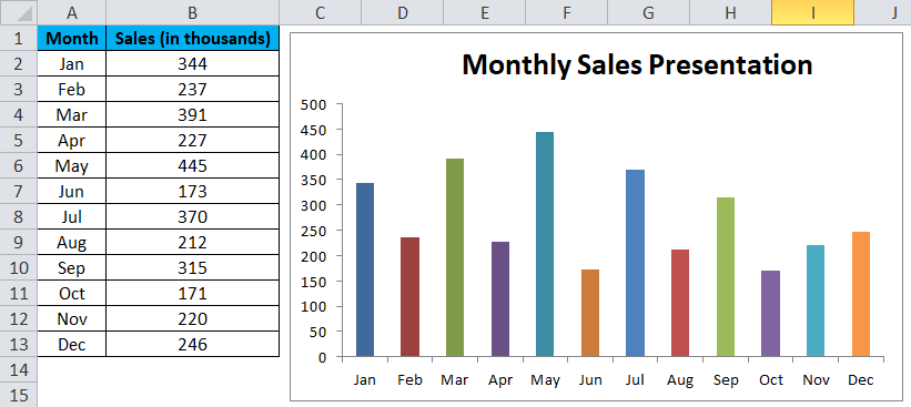
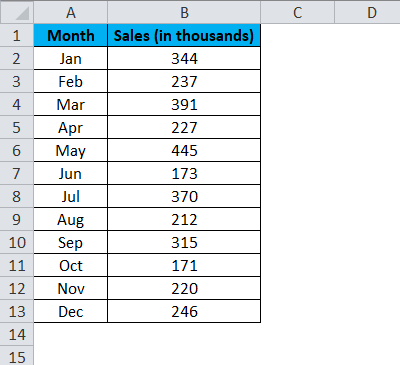
I have sales data from Jan to Dec. I need to present the data in a graphical way instead of just a table.
I am creating a COLUMN CHART for my presentation. Follow the below steps to get insight.
Step 1: Set up the data first.
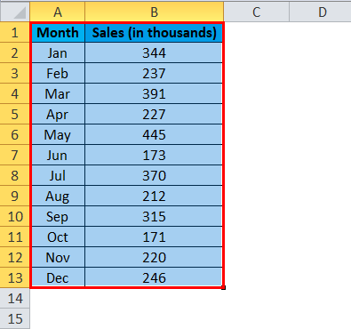
Step 2: Select the data from A1 to B13.
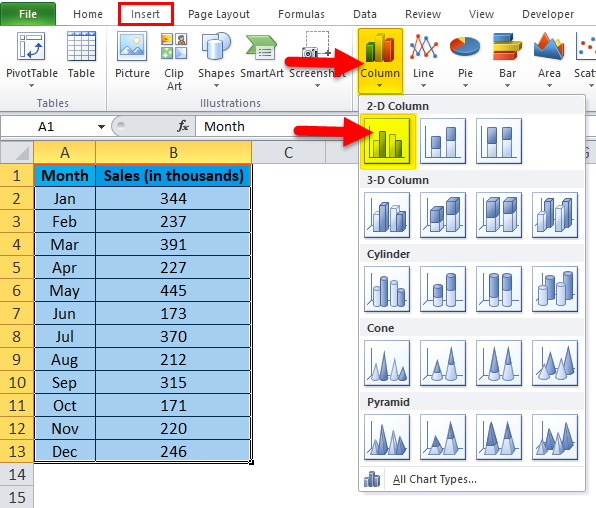
Step 3: Go to Insert and click on Column and select the first chart.
Note: The shortcut key to create a chart is F11. This will create the chart all together in a new sheet.
Step 3: Once you click on that chart, it will insert the below chart automatically.
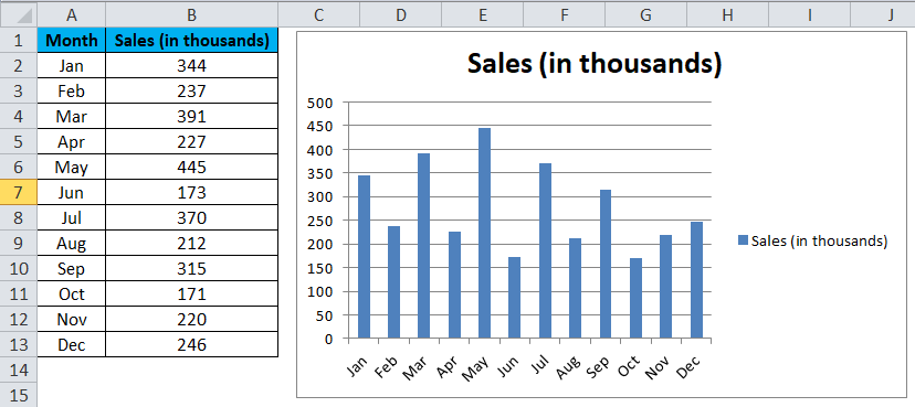
Step 4: This looks like an ordinary chart. We need to make some modification to make the chart look beautiful.
Right click on the bar and select Format Data Series.
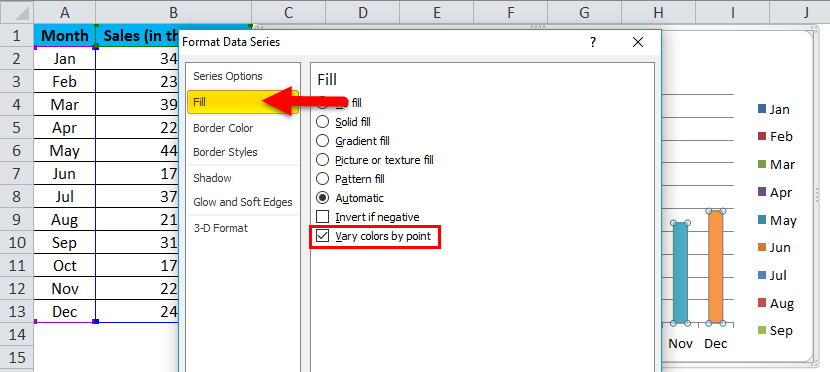
Step 5: Go to Fill and select Vary colors by point.
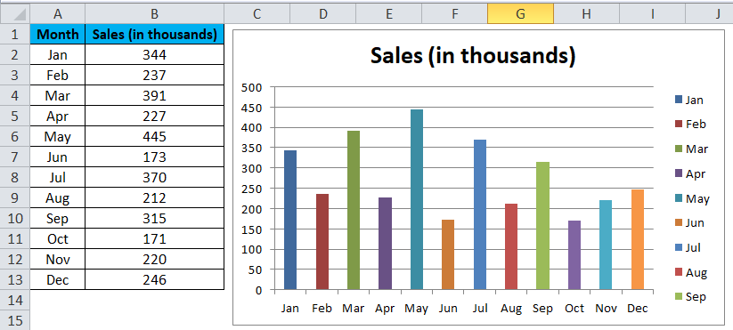
Step 6: Now your chart looks like this. Each bar colored with a different color to represent the different month.
Step 7: Remove Legend by selecting them and pressing the delete key option.
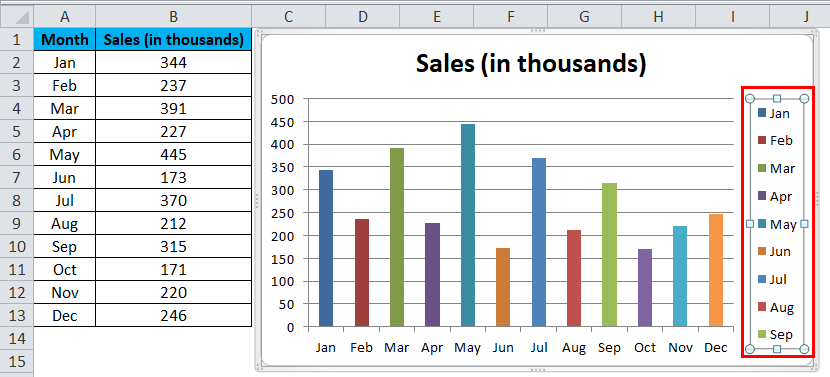
the Legend will be deleted
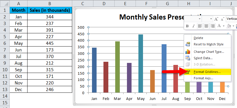
Step 8: Rename your chart heading by clicking on the title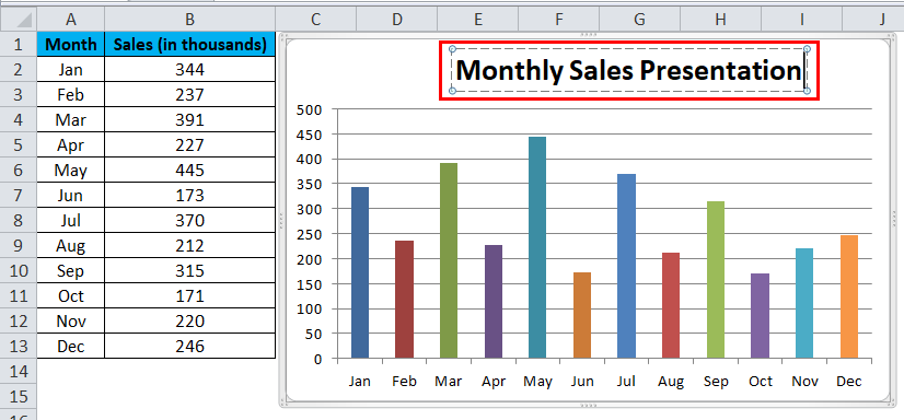
select the Gridlines and click on Format Gridlines.
Click on Line Color and select the no line option
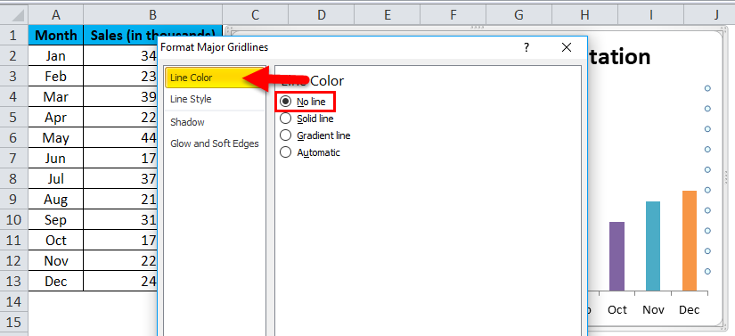
Gridlines will be removed.
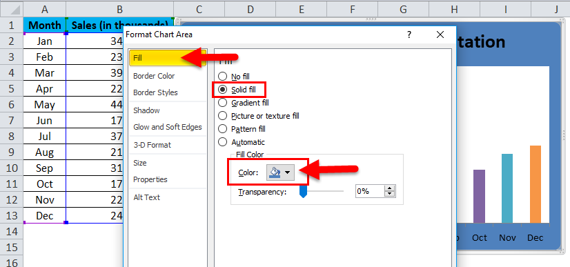
Step 9: Click on Format Chart Area.
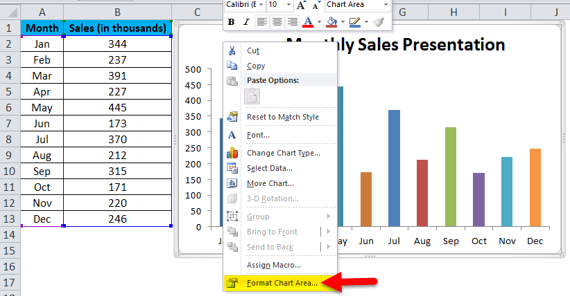
Select Fill option. Under Fill, Select Solid fill and select the background color according to your wish.
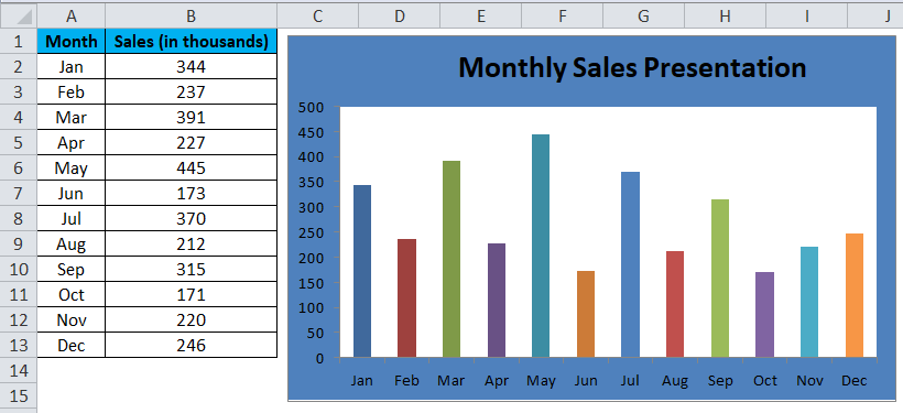
Finally, my chart looks like this.
Example #2
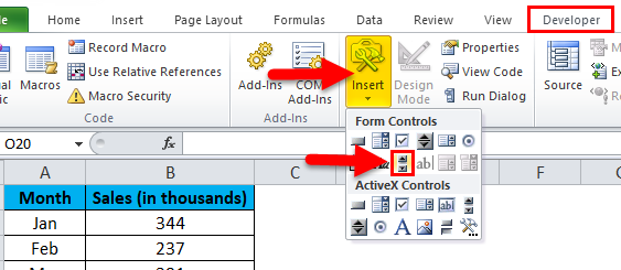
In this example, I am going to create a user-defined chart, i.e. based on the clicks you make, it will start to show the results in the column chart.
I am taking the same data from the previous example.
Step 1: Insert a “Horizontal Scroll Bar”. Go to developer tab > Click on Insert and select ScrollBar.
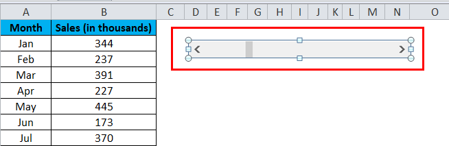
Step 2: Draw the scroll bar in your worksheet.
Step 3: Now right-click on the Scrollbar and select Format Control.
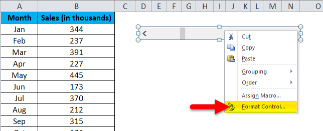
Step 4: Now go to Control and make the changes as shown in the below image.
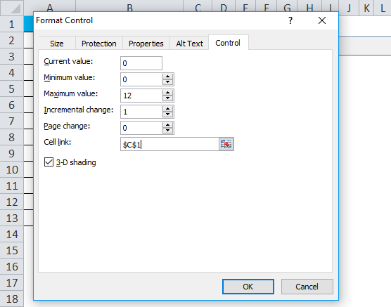
Current Value: This is the present value now. I have mentioned zero.
Minimum Value: This is the bare minimum value.
Maximum Value: This is the highest value to mention. I have chosen 12 because I have only 12 months of data to present.
Incremental Change: This is once you click on the ScrollBar, what is the incremental value you need to give.
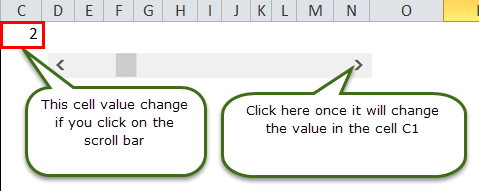
Cell link: This is the link given to a cell. I have given a link to cell C1. If I click on the scroll bar once in cell C1 the value will be 1; if I click on the scroll bar twice, it will show the value as 2 because it is incremented by 1.
Now you can check by clicking on the scroll bar.
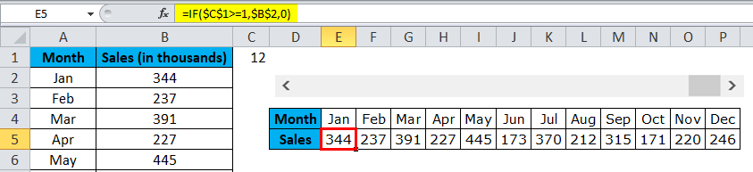
Step 5: Now, we need to rearrange the data to create a chart. I am applying the IF formula to rearrange the data.
In cell E5, I have mentioned the formula: If the cell C1 (scrollbar linked cell) is greater than or equal to 1, I want the value from cell B2 (that contains Jan month sales).
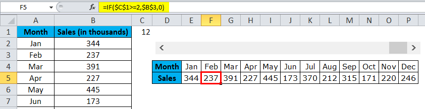
Similarly, in cell F5, I have mentioned if cell C1 (scrollbar linked cell) is greater than or equal to 2, I want the value from cell B3 (that contains Feb month sales).
So like this, I have mentioned the formula for all the 12 months.
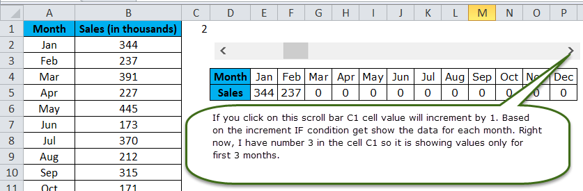
Step 6: Now insert a COLUMN CHART as shown in example 1. But here, select the rearranged data instead of the original data.
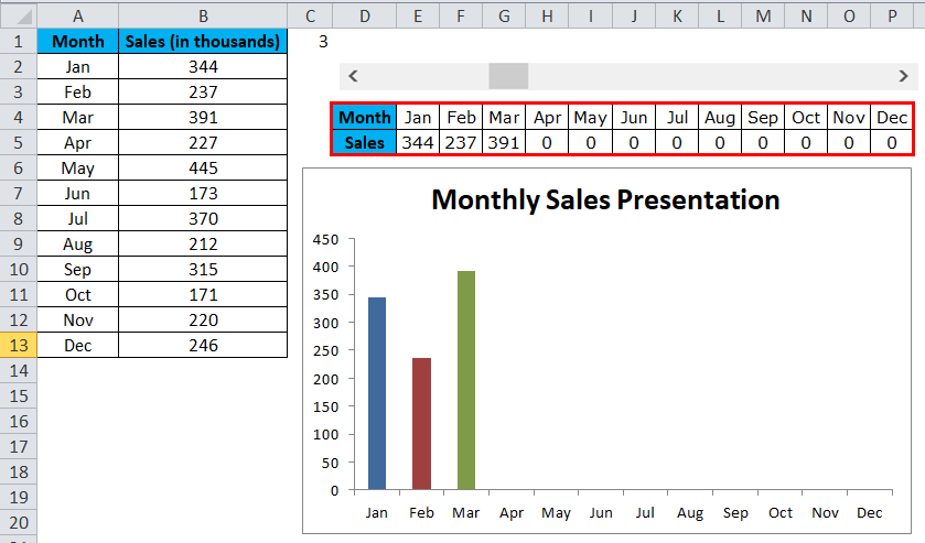
Step 7: Now, the COLUMN CHART has created. The clicks you make on the scroll bar will start to show the bars in the column chart.
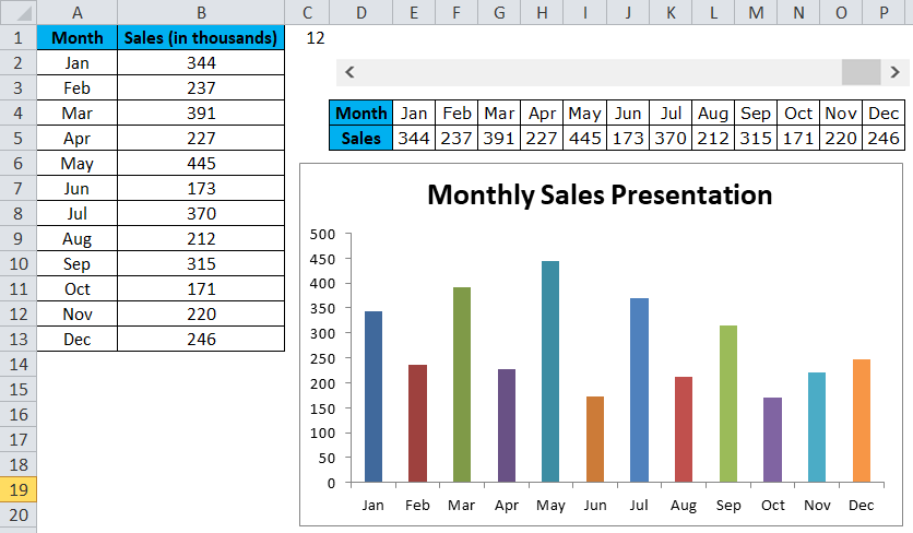
As of now, I have clicked the scroll bar only 3 times, so it is showing only for 3 months. If you want to see for the remaining months, you can click the scroll bar up to 12 times.
Advantages of Excel Column Chart
- Easy to make and understand.
- Show differences easily.
- Each bar represents only one series only.
Things to Remember in Dynamic Chart
- Arrange the data before creating a Column Chart in Excel.
- Use the Scroll Bar option to make the chart look attractive.
- If the single series has many data, then it becomes Clustered Chart.
- You can try many other column charts like a cylinder, pyramid, 3-D charts etc.…
Recommended Articles
This has been a guide to Excel Column Chart. Here we discuss how to create a Column Chart in Excel along with practical examples and a downloadable excel template. You can also go through our other suggested articles –
- VBA Excel Charts
- Excel Clustered Column Chart
- Excel Stacked Column Chart
- Grouping Columns in Excel
Column chart in Excel is a way of making a visual histogram, reflecting the change of several types of data for a particular period of time.
Is very useful for illustrating different parameters and comparing them. Let’s consider the most common types of column charts and learn to make them.
How to create a column chart that updates automatically?
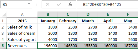
We have data on sales of different dairy products for each month in 2015.

Let’s create a column chart which will respond automatically to the changes made to the spreadsheet. Highlight the whole array including the header and click tab «INSERT». Find «Charts»-«Insert Column Chart» and select the first type. It is called «Clustered».
We have obtained a column whose margin size can be changed. This chart clearly demonstrates the highest milk sales in November and the lowest cream sales in June.
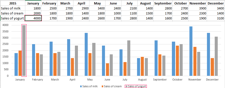
If we make changes to the spreadsheet, the column will also change. By way of example, let’s substitute 4000 for 1400 in yogurt sales. We can see that the «Sales of yogurt» has risen.
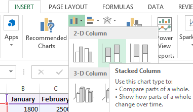
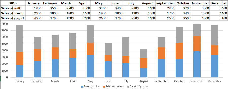
Stacked column chart
Let’s consider making a stacked column chart in Excel. It is another column chart type allowing us to present data in percentage correlation. It is created in the similar way, but a different type should be chosen.
We have obtained a chart showing that, for example, in January, milk sales were higher than those of yogurt and cream while in August a small amount of milk was sold compared to other products, and so on.
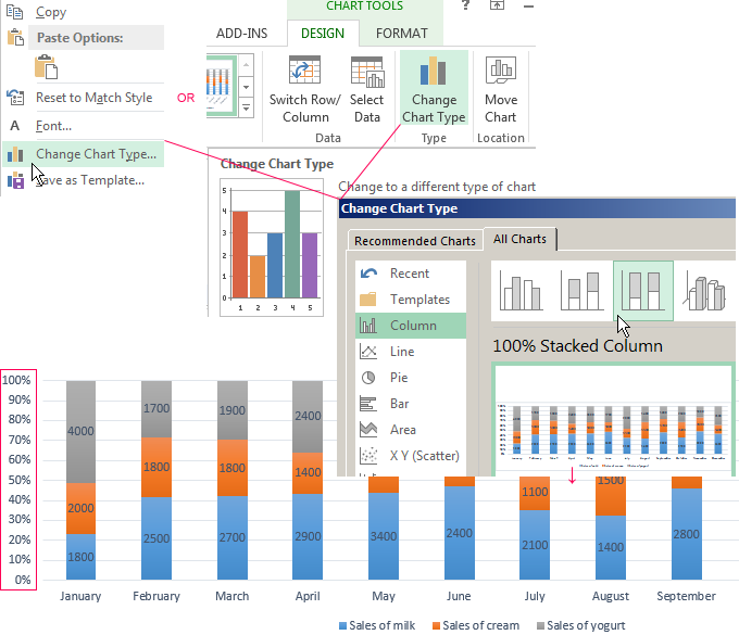
Column charts in Excel can be changed. If you right-click on the empty area of the chart and select «Change Type» (OR select: «CHART TOOLS»-«DESIGN»-«Change Chart Type») you can modify it a bit. Let’s change the stacked column to the normalized one. As a result, we have almost the same column with Y axis reflecting percentage correlations
Similarly, we can make other changes to the graph.
How to combine a column with a line chart in Excel?
Some data arrays imply making more complicated charts combining several types, for example, a column chart and a line.
Let’s consider the example. To begin with, add to the spreadsheet one more row containing monthly revenue.
Now change the current type. Click on the empty area and select: «CHART TOOLS»-«DESIGN»-«Select Data». You will see a field offering to choose a different interval. Highlight the whole spreadsheet again, but this time with the revenue row.
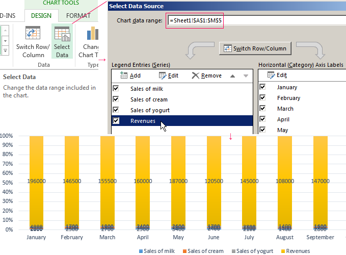
Excel has automatically expanded the value domain in Y-axis, therefore the data on sales volume are at the very bottom in the form of inconspicuous columns.
However, this histogram is incorrect as it contains numbers expressed both and in quantity (liters). Therefore, you need to make changes. Transfer the revenue data to the right side.
- Again select «CHART TOOLS»-«DESIGN»-«Change Type».
- In window select «Clustered».
- Click on the plus sign next to the histogram and uncheck: «Data Labels».
- Right-click the revenues columns, select Format Data Se and indicate «Secondary Axis».
- Done.
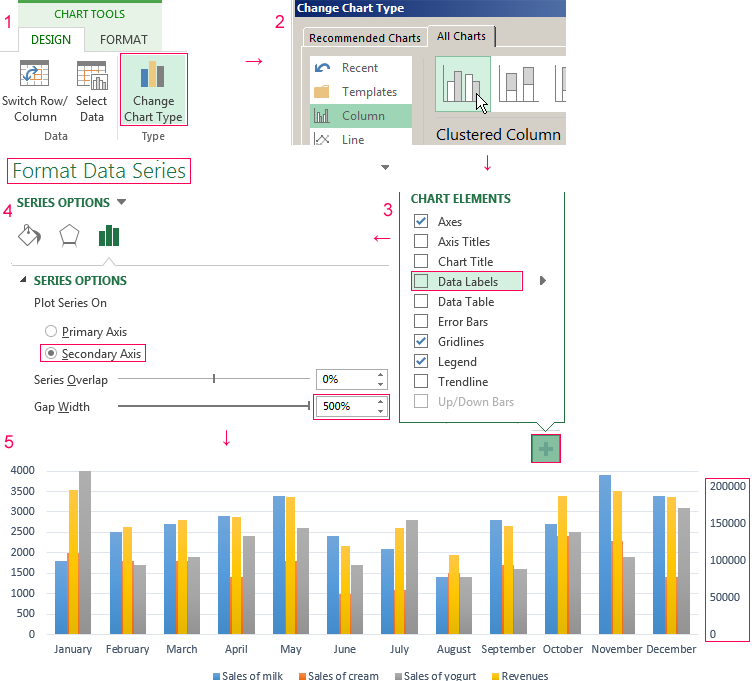
You can see that the histogram has changed immediately. Now revenues column has its value domain (in the right).
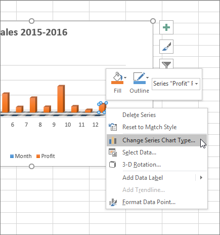
However, this variant is not convenient as the columns almost fuse together. Therefore make one more additional action: right-click the revenues columns and select «Change Series Type». In the appeared window, select the type «Combo»-«Custom Combination».
We have obtained a rather visual graph featuring a combination of a line. We can see that the maximal revenue was in January and the minimal one – in August.
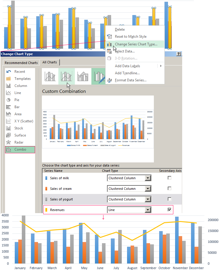
In the similar way, you can combine any other types of charts.
Column charts are used to compare values across categories by using vertical bars.
To create a column chart, execute the following steps.
1. Select the range A1:A7, hold down CTRL, and select the range C1:D7.

2. On the Insert tab, in the Charts group, click the Column symbol.

3. Click Clustered Column.

Result:

Note: only if you have numeric labels, empty cell A1 before you create the column chart. By doing this, Excel does not recognize the numbers in column A as a data series and automatically places these numbers on the horizontal (category) axis. After creating the chart, you can enter the text Year into cell A1 if you like.
What to Know
- Highlight the data, select Insert > Insert Column or Bar Chart, and choose a chart type. Click Chart Title to add or edit a title.
- Change the chart design: Click the chart background, select Design, and choose a chart style. Select Change Colors to alter chart colors.
- Change background color: Select Format > Shape Fill. Change text color: Select Text Fill. Change labels and legends: Change font style.
This article explains how to create a column chart in a Microsoft Excel spreadsheet so you can compare different values of data across a few categories. Instructions cover Excel 2019, 2016, 2013, 2010; Excel for Microsoft 365, and Excel for Mac.
Create a Basic Excel Column Chart
Entering the needed data into your spreadsheet is the first step in creating a chart. Begin by setting up a spreadsheet with your data, making sure to create a column for each category.
In the above example, the columns contain categories for Chocolate, Lemon, and Oatmeal cookies.
If you want to follow along with this tutorial, open a blank worksheet and enter the data shown in the image above.
The steps below create a basic column chart. This is a plain, unformatted chart that displays your data, a basic legend, and a default chart title.
-
Highlight the range of cells that contain your data.
-
Select Insert.
-
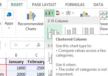
In the Charts group, select the Insert Column or Bar Chart to open a list of available chart types.
-
Hover over a chart type to read a description of the chart and see a preview of how the chart will look with your data.
-
In the 2-D Column section of the list, choose Clustered Column to add this basic chart to the worksheet.
Not sure what type of chart will look best with your data? Highlight the data and select Insert > Recommended Charts to see a list of suggestions.
Replace the Basic Chart Title
The chart may not have all the information you need to make it meaningful. Start by changing the chart title to something more descriptive.
Here’s how to replace the chart title:
-
Select the default chart title. A box appears around the words Chart Title.
-
Select the chart title a second time to put Excel in edit mode. This places the cursor inside the title box.
-
Delete the default text using the Backspace key.
-
Enter a new title.
To create a chart title that is on two separate lines, press Enter to go from the first line to the second.
Select Different Parts of the Chart
There are many different parts to a chart in Excel. The plot area of a chart contains the selected data series, the legend, and the chart title. All of these parts are considered separate objects and each is formatted separately. You tell Excel which part of the chart you want to format by selecting it.
If you make a mistake, quickly correct it using Excel’s undo feature. After you remove the mistake, select the right part of the chart and try again.
A common mistake is selecting the plot area in the center of the chart instead of selecting the entire chart. The easiest way to select the entire chart is to select a blank area at the top left or right corner of the chart.
Change the Chart Style
When a chart is created in Excel, or whenever an existing chart is selected, two additional tabs are added to the ribbon as shown in the image below. These Chart Tools tabs, Design and Format, contain formatting and layout options specifically for charts.
These Chart Tools will be used in the following steps to format the column chart.
Change the Chart Design
Chart styles are preset combinations of formatting options that can quickly format a chart with a variety of colors, line styles, and artistic effects.
-
Select the chart background to select the entire chart.
-
Select Design.
-
Choose Style 3 in the Chart Styles group.
-
After the changes are made, the columns in the chart have short, white, horizontal lines running through them. Also, the legend moves to the top of the chart beneath the title.
Change Column Colors
If you want to use different column colors for your chart, change the colors.
-
Select the chart background to select the entire chart, if necessary.
-
Select Design.
-
Select the Change Colors to open a list of color choices.
-
Hover over each row of colors to see the option name. You’ll also see a preview of your color choice in the chart.
-
Choose Colorful Palette 3. It is the third choice in the Colorful section of the list.
-
After you make the selection, the column colors for each series change to orange, yellow, and green. The white lines are still present in each column.
Change the Chart’s Background Color
To make your chart stand out on the page, change the color of the background.
-
Select the chart background to select the entire chart and to display the Chart Tool tabs.
-
Select Format.
-
Select Shape Fill to display a list of color choices.
-
Choose Light Gray, Background 2 from the Theme Colors section of the panel to change the chart’s background color to light gray.
Change the Chart Text Color
Now that the background is gray, the default black text isn’t very visible. To improve the contrast between the two, change the color of the text in the chart.
-
Select the chart background to select the entire chart.
-
Select Format.
-
Select the Text Fill down arrow to open the Text Colors list.
-
Choose Green, Accent 6, Darker 50% from the Theme Colors section of the list.
-
This changes the text in the title, axes, and legend to green.
Change the Font Type, Size, and Emphasis
Changing the text size and font can make it easier to read the legend, axes names, and values in the chart. Bold formatting can also be added to the text to make it stand out even more against the background.
The size of a font is measured in points and is often shortened to pt. 72 pt text is equal to one inch (2.5 cm) in size.
Change the Look of the Title Text in a Chart
You may want to use a different font or font size for the title of your column chart.
-
Select the chart title.
-
Select Home.
-
In the Font section, select the Font down arrow to open the list of available fonts.
-
Scroll to find and choose Arial Black to change the title font.
-
In the Font Size box, set the title font size to 16 pt.
-
Select Bold to add bold formatting to the title.
Change the Legend and Axes Text
Other text areas in the chart can be formatted to fit your style. Change the labels and the legend by changing the font style and size.
-
Select the X-axis (horizontal) label in the chart. A box surrounds the Oatmeal, Lemon, and Chocolate label.
-
Use the steps above to change the title text. Set the axis label to 10 pt, Arial, and Bold.
-
Select the Y-axis (vertical) label in the chart to select the currency amounts on the left side of the chart.
-
Use the steps above to change the title text. Set the axis label to 10 pt, Arial, and Bold.
-
Select the chart legend.
-
Use the steps above to change the title text. Set the legend text to 10 pt, Arial, and Bold.
Add Gridlines to Your Column Chart
In the absence of data labels that show the actual value of each column, gridlines make it easier to read the column values from the values listed on the Y (vertical) axis. When you want to make your chart easier to read, add gridlines to the plot area of the chart.
-
Select the chart.
-
Select Design.
-
Select Add Chart Element to open a drop-down menu.
-
Select Gridlines > Primary Horizontal Major to add faint, thin gridlines to the plot area of the chart.
Change the Color of the Gridlines
You may want to change the color of the gridlines to make the lines more visible against the gray background of the plot area of the chart.
-
In the graph, select a gridline. All the gridlines are highlighted and show blue and white dots at the end of each gridline.
-
Select Format.
-
Select Format Selection to open the Format task pane. Format Major Gridlines appears at the top of the pane.
-
Select Solid line.
-
Select Color and change the color to Orange, Accent 2.
Format the X-Axis Line
There’s an X-axis line above the X-axis labels but, like the gridlines, it’s difficult to see because of the gray background of the chart. Change the axis color and line thickness to match that of the formatted gridlines.
-
Select the X-axis label to highlight the X-axis line. Format Axis appear at the top of the Format task pane.
-
Set the line type to Solid line.
-
Set the axis line width to 2 pt.
-
Close the Format task pane when you’re finished.
Move the Chart to a Separate Sheet
Moving a chart to a separate sheet makes it easier to print the chart and it can also relieve congestion in a large worksheet full of data.
-
Select the chart background to select the entire chart.
-
Select Design.
-
Select Move Chart to open the Move Chart dialog box.
-
Select New sheet and type a descriptive title for the new sheet.
-
Select OK to close the dialog box. The chart is now located on a separate worksheet and the new name is visible on the sheet tab.
Thanks for letting us know!
Get the Latest Tech News Delivered Every Day
Subscribe

This Excel tutorial explains how to create a basic column chart in Excel 2016 (with screenshots and step-by-step instructions).
What is a Column Chart?
A column chart is a graph that shows vertical bars with the axis values for the bars displayed on the left side of the graph.
It is a graphical object used to represent the data in your Excel spreadsheet.
You can use a column chart when:
- You want to compare values across categories.
![]() Subscribe
Subscribe
If you want to follow along with this tutorial, download the example spreadsheet.
Download Example
Steps to Create a Column Chart
To create a column chart in Excel 2016, you will need to do the following steps:
-
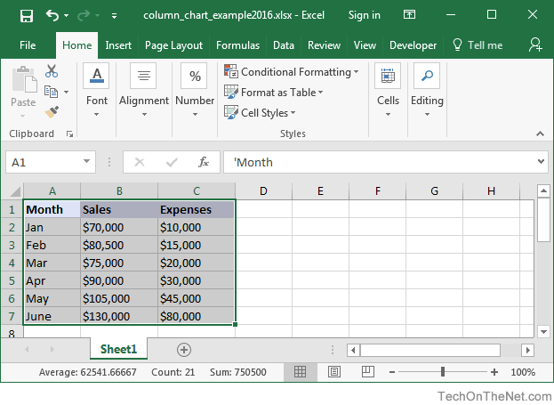
Highlight the data that you would like to use for the column chart. In this example, we have selected the range A1:C7.

-
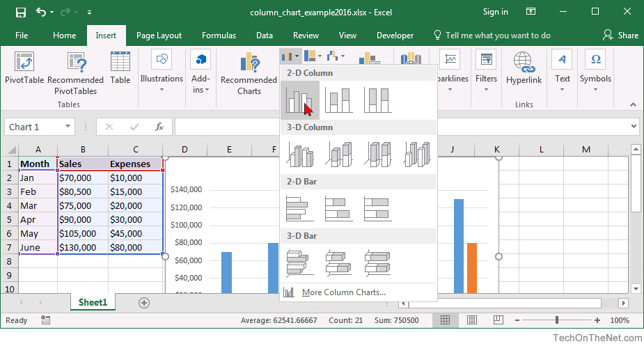
Select the Insert tab in the toolbar at the top of the screen. Click on the Column Chart button
 in the Charts group and then select a chart from the drop down menu. In this example, we have selected the first column chart (called Clustered Column) in the 2-D Column section.
TIP: As you hover over each choice in the drop down menu, it will show you a preview of your data in the highlighted chart format.

-
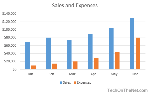
Now you will see the column chart appear in your spreadsheet with rectangular bars to represent both the sales and the expense numbers. The sales values are displayed as blue vertical bars and the expenses are displayed as orange vertical bars. You can see the axis values on the left side of the graph for these vertical bars.

-
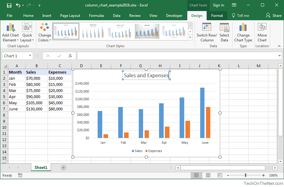
Finally, let’s update the title for the column chart.
To change the title, click on «Chart Title» at the top of the graph object. You should see the title become editable. Enter the text that you would like to see as the title. In this tutorial, we have entered «Sales and Expenses» as the title for the column chart.

Congratulations, you have finished creating your first column chart in Excel 2016!
Learn other Chart Types

Download PC Repair Tool to quickly find & fix Windows errors automatically
Bar graphs are graphical representations of statistical data in the form of strips or bars. This allows viewers to understand the difference between the various parameters of the data at a single glance rather than pointing out and comparing each set of data. If you wish to create a bar graph in Excel, read through this article.
Bar graphs in Excel are a form of charts and are to be inserted in the same manner. Bar graphs could be both 2-dimensional and 3-dimensional depending upon the type of Excel editor you use.
To create a bar graph in Excel:
- Select the data in question, and go to the Insert tab.
- Now in the Charts section, click on the downward-pointing arrow next to the Bar Graph option.
- Select the type of bar graph you wish to use. It would immediately show on the Excel sheet but might need a few seconds to load the data.
Usually, the location and size of the chart are centered. You can adjust both these parameters according to your needs.
Eg. Let us say we are provided with a set of data of the marks by students in a class. The data is further extended across various subjects. This makes the data complex because to compare between the students, you would have to literally pick each value from the list, highlight the row and column one by one and check which student scored what in which subject.
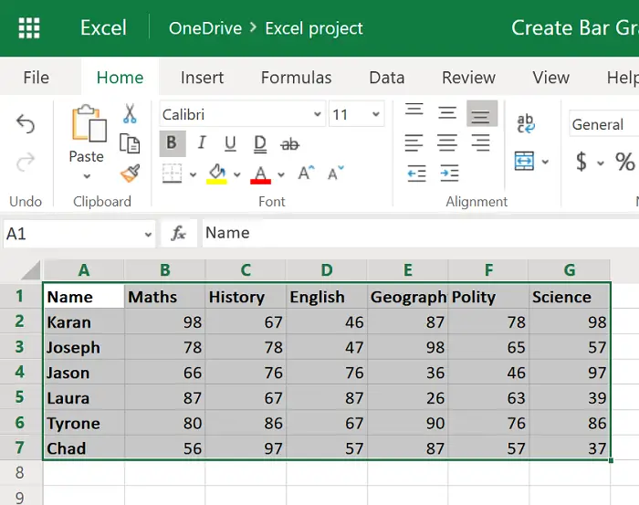
So, select the data from range A1 to G7 and go to Insert > Bar Graph.
Select the appropriate bar graph and change the location and size.

The subjects have been mentioned across Y-axis and the percentages across X-axis.
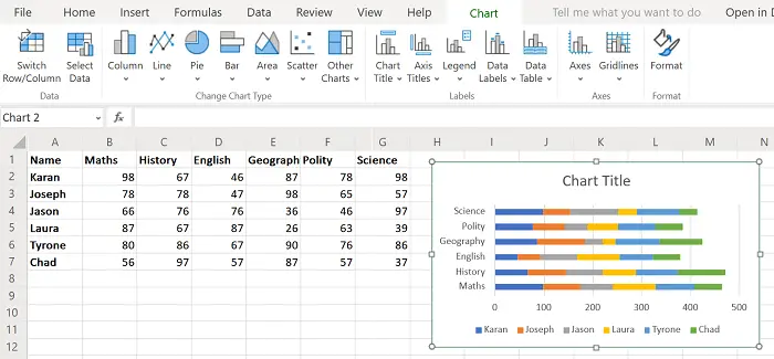
The names of the students have been mentioned using colors.
Now you can easily compare students on the basis of their marks scored in each subject.
How to make a Column Chart in Excel
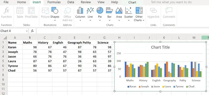
Alternatively, you could create a column chart. The procedure is similar to that for a bar graph as explained earlier, however, this time select Insert > Column and then choose the chart type.
A column chart makes details even clearer as you can simply compare the marks of 2 students by observing the respective heights of the columns. A column graph for the above-mentioned example has been shown in the image below.
However, it should be noted that this graph is static. You can also choose to create a dynamic chart in Excel.
Hope it helps!

Karan is a B.Tech, with several years of experience as an IT Analyst. He is a passionate Windows user who loves troubleshooting problems and writing about Microsoft technologies.
A column chart is a graphic visualization of data using vertically placed rectangular bars (columns). Usually, each column represents a category, and all columns are drawn with a height proportional to the values they represent. The types of data column charts can display vary greatly, as the structure allows for using column charts pretty much with any type of data. Numeric, text, or even date data can be displayed on the horizontal axis, and this flexibility makes column charts a staple in dashboard applications. Excel, being the go-to software for all data tasks supports all kinds of bar and column charts with extensive customization options. Let’s take a closer look!

Column Chart Basics
Sections

A column chart has 5 main sections:
- Plot Area: This is the area where the graphic representation (i.e. columns) is shown.
- Chart Title: As the name suggests, this is the title of the chart. Using a short but descriptive text is always a good practice.
- Vertical Axis: The axis that represents the measured values, also known as the y-axis.
- Horizontal Axis: The axis that contains the categories of data, also known as the x-axis. The data series can be grouped like shown in the sample chart above.
- Legend: The legend is an indicator that helps distinguish data series from each other.
Types

There are 3 types of column charts:
- Clustered: Each column for data series is clustered on the horizontal axis. This type is suitable to compare each individual value.
- Stacked: Data series rectangles are stacked on top of each other to form a single column for each category. The column heights are equal to the combined values of the categories. The stacked column charts are great for highlighting the differences between categories. However, it’s difficult to compare the relative size of the rectangles against each other.
- 100% Stacked: You can choose a 100% stacked column chart to see the relative ratio of multiple items. All columns are set to 100% length. This type is best used for comparing the contribution of each item within a category. However, the actual values are omitted.
Feel free to download our sample workbook below.
Insert a Column Chart in Excel
To create a column chart in Excel, begin by selecting your data and include the data labels in your selection so that they can be recognized automatically. You can always change them later.

Next, go to the INSERT tab in the Ribbon, and click on the Column Chart icon to see the column chart types. Click on the chart type of your liking. We will be using Clustered Column in our example.

Clicking the corresponding icon will insert the default version of that chart. Now, let’s take a look at customization options.
Customize a Column Chart in Excel
You can edit almost everything you see in a chart. Excel provides tons of options to personalize charts and make them fit nicely into any presentation. There are two ways to do this, by double-clicking the chart elements, or by right clicking them.
Double-Clicking
Double-clicking on any item will pop up the side panel, where you will find the options specific to the element you clicked. Keep in mind that once the side panel is open, you don’t need to double-click any of the options there – this was just to bring up the menu! The side panel includes element specific options as well as generic ones like those for colors and effects.

Right-Click (Context) Menu
Right-clicking an element will display the contextual menu containing configuration settings. You can modify basic styling properties (like changing chart colors), delete specfic items, or activate the side panel for more options. To display the side panel, click the options that begin with “Format” . For example, Format Data Series…

Chart Shortcut (Plus Button)
If you’re using Excel 2013 or newer, you can use chart shortcuts to add/remove elements, apply predefined styles and color sets, and filter values with a few clicks.
Another useful feature is that you can now see the effects of your actions on the fly without actually applying them. For example, in the image below, we held the mouse over the Data Labels item and Excel displays the chart labels.

Ribbon (Chart Tools)
Whenever you activate a ‘special’ object, Excel adds a new tab(s) to the Ribbon, and the same goes for charts. You can see chart specific tabs in a different column under the name CHART TOOLS. There are 2 tabs: DESIGN and FORMAT. The DESIGN tab allows adding new elements, applying different styles, modifying the data, and customizing the chart itself. The FORMAT tab, on the other hand, contains more generic options that are shared with other objects. Briefly, the chart tabs in the ribbon are the only menu where you can find all options in one place.

Customization Tips
Preset Layouts and Styles
Preset Layouts and Styles can help improve visuals of your charts, and streamline the process. You can find styling options in the DESIGN tab under CHART TOOLS, or clicking the brush icon in the Chart Shortcuts. Below are some examples:
Applying Quick Layout:

Changing colors:

Updating the Chart Style:

Changing chart type
You can change the type of your chart at any time from the Change Chart Type dialog. To change the type of your chart, click on the Change Chart Type item from the Right-Click (Context) Menu or DESIGN tab.

In the Change Chart Type dialog contains options for chart types and will also give you a quick preview. Select a chart type to continue.

Switch Row/Column
Excel usually assumes that horizontal labels are categories, and vertical labels are data series. If your data is structured the other way around, click the Switch Row/Column button in the DESIGN tab, when your chart is selected.

Move a chart to another worksheet
By default, charts are created in the worksheet with the underlying data. If you need to move your chart to a new sheet, or another existing sheet, you can use the Move Chart dialog. To open the Move Chart dialog, click Move Chart… under the DESIGN tab, or when you’re in the chart right-click menu. Please keep in mind that you need to right-click an empty place on the chart area to see this option, as this option will not be available when you click a chart element.

In the Move Chart dialog, you have 2 options:
- New sheet: Select this option and enter a name to create a new sheet and place your chart there.
- Object in: Select this option and select an existing sheet from the dropdown to move your chart onto that sheet.
