
Excel for Microsoft 365 for Mac Excel 2021 for Mac Excel 2019 for Mac Excel 2016 for Mac Excel for Mac 2011 More…Less
Important: Some of the content in this topic may not be applicable to some languages.
Data bars, color scales, and icon sets are conditional formats that create visual effects in your data. These conditional formats make it easier to compare the values of a range of cells at the same time.
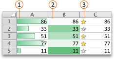
 Data bars
 Color scales
 Icon sets
Format cells by using data bars
Data bars can help you spot larger and smaller numbers, such as top-selling and bottom-selling toys in a holiday sales report. A longer bar represents a larger value, and a shorter bar represents a smaller value.
-
Select the range of cells, the table, or the whole sheet that you want to apply conditional formatting to.
-
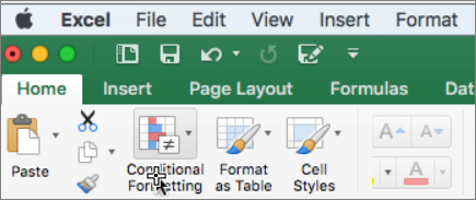
On the Home tab, click Conditional Formatting.

-
Point to Data Bars, and then click a gradient fill or a solid fill.
Tip: When you make a column with data bars wider, the differences between cell values become easier to see.
Format cells by using color scales
Color scales can help you understand data distribution and variation, such as investment returns over time. Cells are shaded with gradations of two or three colors that correspond to minimum, midpoint, and maximum thresholds.
-
Select the range of cells, the table, or the whole sheet that you want to apply conditional formatting to.
-
On the Home tab, click Conditional Formatting.
-
Point to Color Scales, and then click the color scale format that you want.
The top color represents larger values, the center color, if any, represents middle values, and the bottom color represents smaller values.
Format cells by using icon sets
Use an icon set to present data in three to five categories that are distinguished by a threshold value. Each icon represents a range of values and each cell is annotated with the icon that represents that range. For example, a three-icon set uses one icon to highlight all values that are greater than or equal to 67 percent, another icon for values that are less than 67 percent and greater than or equal to 33 percent, and another icon for values that are less than 33 percent.
-
Select the range of cells, the table, or the whole sheet that you want to apply conditional formatting to.
-
On the Home tab, click Conditional Formatting.
-
Point to Icon Sets, and then click the icon set that you want.
Tip: Icon sets can be combined with other conditional formats.
Format cells by using data bars
Data bars can help you spot larger and smaller numbers, such as top-selling and bottom-selling toys in a holiday sales report. A longer bar represents a larger value, and a shorter bar represents a smaller value.
-
Select the range of cells, the table, or the whole sheet that you want to apply conditional formatting to.
-
On the Home tab, under Format, click Conditional Formatting.
-
Point to Data Bars, and then click a gradient fill or a solid fill.
Tip: When you make a column with data bars wider, the differences between cell values become easier to see.
Format cells by using color scales
Color scales can help you understand data distribution and variation, such as investment returns over time. Cells are shaded with gradations of two or three colors that correspond to minimum, midpoint, and maximum thresholds.
-
Select the range of cells, the table, or the whole sheet that you want to apply conditional formatting to.
-
On the Home tab, under Format, click Conditional Formatting.
-
Point to Color Scales, and then click the color scale format that you want.
The top color represents larger values, the center color, if any, represents middle values, and the bottom color represents smaller values.
Format cells by using icon sets
Use an icon set to present data in three to five categories that are distinguished by a threshold value. Each icon represents a range of values and each cell is annotated with the icon that represents that range. For example, a three-icon set uses one icon to highlight all values that are greater than or equal to 67 percent, another icon for values that are less than 67 percent and greater than or equal to 33 percent, and another icon for values that are less than 33 percent.
-
Select the range of cells, the table, or the whole sheet that you want to apply conditional formatting to.
-
On the Home tab, under Format, click Conditional Formatting.
-
Point to Icon Sets, and then click the icon set that you want.
Tip: Icon sets can be combined with other conditional formats.
See Also
Highlight patterns and trends with conditional formatting
Need more help?
Want more options?
Explore subscription benefits, browse training courses, learn how to secure your device, and more.
Communities help you ask and answer questions, give feedback, and hear from experts with rich knowledge.
Color Scales
Color Scales are premade types of conditional formatting in Excel used to highlight cells in a range to indicate how large the cell values are compared to the other values in the range.
Here is the Color Scales part of the conditional formatting menu:
Color Scale Formatting Example
Highlight the Speed values of each Pokemon with Color Scale conditional formatting.
Color Scales, step by step:
- Select the range of Speed values
C2:C8
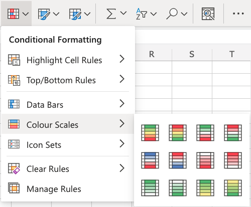
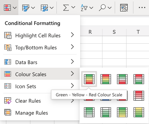
- Click on the Conditional Formatting icon in the ribbon, from the Home menu
- Select the Color Scales from the drop-down menu
There are 12 Color Scale options with different color variations.
The color on the top of the icon ![]() will apply to the highest values.
will apply to the highest values.
- Click on the «Green — Yellow — Red Colour Scale» icon
Now, the Speed value cells will have a colored background highlighting:
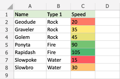
Dark green is used for the highest values, and dark red for the lowest values.
Rapidash has the highest Speed value (105) and Slowpoke has the lowest Speed value (15).
All the cells in the range gradually change color from green, yellow, orange, then red.
Note: The color formatting is relative to the smallest and largest cell values in the range.
Let’s see what happens if we add a fictional Pokemon with an even slower Speed value than Slowpoke:
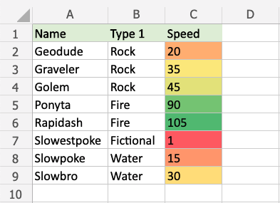
Now, the fictional Slowestpoke has the lowest Speed value of 1, which is highlighted in dark red.
Notice that the color of Slowpoke’s Speed value now is highlighted in orange instead of dark red.
Let’s see what happens if we add another fictional Pokemon that is faster than any of the other Pokemon:
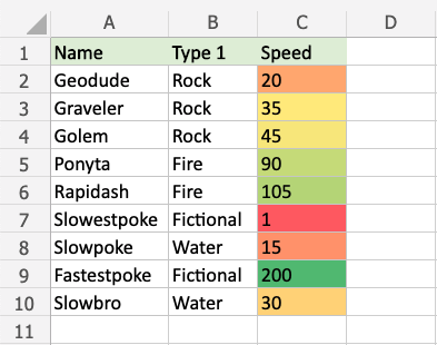
The fictional Fastestpoke has a higher Speed value (200) than any of the other pokemon and is highlighted in dark green.
Rapidash’ Speed value of 105 is no longer the highest value and is highlighted with a lighter green.
Notice that the Speed values of the other Pokemon also change as the highest value in the range is now 200 instead of 105.
Note: You can remove the Highlight Cell Rules with Manage Rules.
Home > Data Recovery > How to Format Cells with Color Scales in Your Excel Worksheet
In an Excel worksheet, you may need to format certain cells to make them different from others. Here we will introduce the method of using the color scales to fulfill this task.
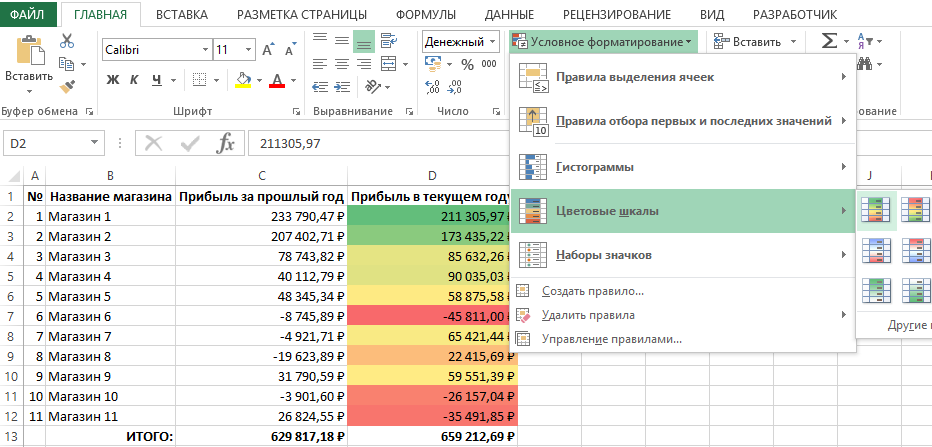
Sometimes in your Excel worksheet, you will format cells according to their values. For example, in the image below, now we need to format the cells according to the sales volume.
And instead of formatting cells manually, now you can use the feature of color scales in Excel.
Use Color Scales
- Select the target area in the worksheet.
- And then click the button “Conditional Formatting” in the toolbar.
- After that, move your cursor on the option “Color Scales”. Thus, a sub menu will appear.

- There are 12 pre-defined options in the sub menu. You can choose one of them. And here we also choose one in the menu.

Next you will immediately see the result in the worksheet. In the range, different cells will be filled with a different color according to their values.

Edit Color Scales
Instead of using the predefined color scales in the worksheet, you can also custom the scales by yourself. If you have never used the color scales in the worksheet, you can click the option “More Rules” in step 4 in the former part. On the other hand, if you have already used the color scales, you can follow the steps below and modify the settings.
- Put your cursor within the range. You can also select the whole area.
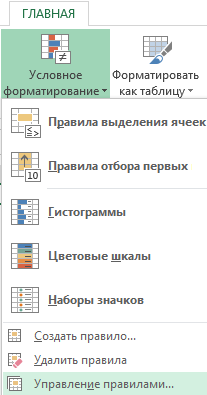
- And then click the button “Conditional formatting” in the toolbar.
- After that, click the option “Manage Rules” in the drop-down menu.

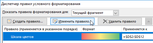
- In the newly pop-up window, choose the rule in the window.
- And then click the button “Edit Rule”. Besides, you can also directly double click the rule to edit it.

- In the “Edit Formatting Rule” window, click the small arrow in the text box of the “Minimum” in the “Type” area.
- Next you will see a drop-down list. There are five options available. And you can choose the option that your need.

- Now repeat the step 6 and 7 and change the type for the “Maximum”.
- Except for the option “Lowest Value” and the “Largest Value”, you need to set values for other options. Here we choose “Number” for the type. And we directly input the numbers into the two text boxes of “Values”. Besides, you can use you mouse and directly choose values from the worksheet.

- This is another key step in the setting. You need to set colors for the rule. First click the small arrow in the box.

- And then you will see the “Theme Color” menu pop up. Here you can choose one color in the menu. But if you need to set a specific color, click the option “More Color.
- In the “Colors” window, set the color that you need.

- And then click “OK”.
- Now repeat the step 10-13 and continue setting the color for the “Maximum”.
- When you have finished all the settings, click the button “OK” in the window.

- Next continue clicking “OK” in the manager window.


Thus, the new setting will take effect in the target range.

Change Format Style
In addition, sometimes there are more data in your target range, and 2-color scale is not enough for the range. Therefore, you can also choose to change the format style of the color scales. In the submenu of color scales, there are many options. And there are 8 options which are actually 3-color scale. You can choose one of them in this list.
But when you need to change the existing 2-color scale into 3-color scale, you can also modify it through the following steps.
- Repeat the first 5 steps in the previous part.
- Next click the small arrow in the text box of the “Format Style”.
- And then in the drop-down list, choose the “3-Color Scale”.

- Thus, you can see that there is a new color option. Here you can set the type and the color for the midpoint.

- When you finish the setting, click “OK” in the window.
- In the rules manager window, still click “OK”. Thus, the new color scale will take effect in the target range.


Save Your Data from a Damaged File
When you find that your Excel corrupts, do not panic. We have diagnosed many cases and give such a conclusion: most of the lost data are actually recoverable. Therefore, you only need to take the right action and save your data from the damaged file. However, there is no universal approach for all types file corruption. You can contact us and figure out the reason behind the data disaster. Besides, you can also repair Excel corruption by our potent Excel recovery tool. Most of the errors can be fixed easily with this application.
Author Introduction:
Anna Ma is a data recovery expert in DataNumen, Inc., which is the world leader in data recovery technologies, including repair docx file problem and outlook repair software products. For more information visit www.datanumen.com
Цветовые шкалы в Excel предназначены для заполнения ячеек соответствующим фоном цвет которого зависит от значения этих же ячеек. Очередная новая опция в условном форматировании Excel. Чтобы продемонстрировать правила работы с цветовыми шкалами Excel, мы будем использовать показательную небольшую таблицу.
Цветовые шкалы Excel и условное форматирование
Чтобы быстро освоить правила работы с цветовыми шкалами Excel, мы будем использовать условное форматирование основано на цветовых шкалах. Выделите диапазон ячеек D1:D12. Далее выберите инструмент: «ГЛАВНАЯ»-«Стили»-«Условное форматирования»-«Цветовые шкалы». Из предлагаемой галереи готовых стилей выберите шкалу «Зеленый-желтый-красный».
Уже при наведении мышки на соответствующий стиль шкалы, Excel автоматически подсвечивает цветами диапазон ячеек для предварительного просмотра. А после щелчка левой кнопкой мышки, ячейкам сразу присваиваются новые форматы.
Таким образом используя всего одно правило условного форматирования, ячейкам автоматически присваивается несколько цветов в одном и том же диапазоне. Наибольшие числовые значения выделились зеленым цветом, наименьшие – красным, а средние – желтым.
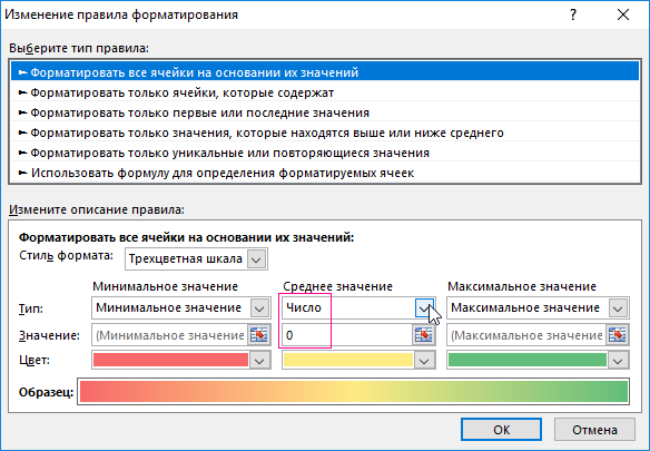
Для редактирования правила шкалы цветов:
- Выберите инструмент: «ГЛАВНАЯ»-«Стили»-«Условное форматирование»-«Управление правилами».
- В появившемся окне «Диспетчер правил условного форматирования» выберите правило «Шкала цветов» и нажмите на кнопку «Изменить правило».
- Появится окно «Изменение правила форматирования», в котором уже выбрана опция «Форматировать все ячейки на основании их значений». А в выпадающем списке «Стиль формата:» уже выбрано значение «Трехцветная шкала». Для настойки шкалы пользователю предоставляется целый ряд параметров. Можно указать значение его тип и цвет для максимума минимума или среднего.
- Измените значение на 0 для параметра «Среднее», а из выпадающего списка «Тип:» укажите для него «Число». И нажмите ОК на всех открытых окнах.
- Все ячейки, значения которых меньше минимального значения установленного в параметрах шкалы, будут одинаково отформатированы таким же цветом, как минимальное. Аналогично будут форматироваться ячейки со значениями выше максимального. Поэтому важно внимательно настраивать параметры, а лучше без уважительной причины их не менять. Ведь это может привести к тому, что шкала будет не полной, или будет много существенно разных значений, выделенных одинаковым цветом.
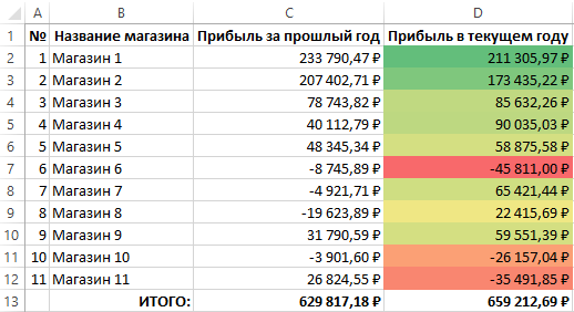
В результате у нас образовалась шкала цветовой температуры значений для ячеек таблицы Excel.
Сама таблица изменила способ заполнения диапазона ячеек разными цветами в соответствии с нашими настройками критериев.