
A clustered column chart in Excel is a column chart that represents data virtually in vertical columns in series. Though these charts are very simple to make, these charts are also complex to see visually. For example, if there is a single category with multiple series to compare, it is easy to view this chart. Still, as the categories increase, it is very complex to analyze data with this chart.
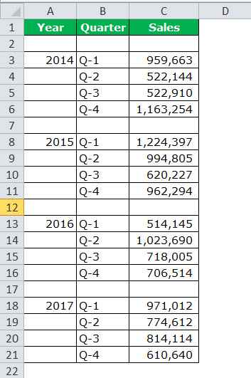
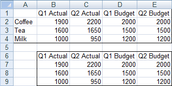
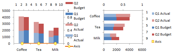
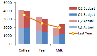
For example, suppose we have a dataset consisting of quarterly revenue in 3 columns – A, B, and C with different divisions such as output and utility in rows 6 and 7. Then, for data visualization, we can show this dataset as several clustered columns (each column per division) for quarters (three columns for each quarter) to display the revenue share within a sole division.
What is the Clustered Column Chart in Excel?
Before going straight into the “Clustered Column Chart in Excel,” we must look at the simple column chart. The column chart represents the data in vertical bars, looking horizontally across the chart. Like other charts, the column chartColumn chart is used to represent data in vertical columns. The height of the column represents the value for the specific data series in a chart, the column chart represents the comparison in the form of column from left to right.read more has X-axis and Y-axis. Usually, the X-axis represents the year, periods, names, etc. The Y-axis represents numerical values. The column charts display a wide variety of data to exhibit the report to the company’s top management or end-user.
Below is a simple example of a column chart.
Table of contents
- What is the Clustered Column Chart in Excel?
- Clustered Column vs Column Chart
- How to Create a Clustered Column Chart in Excel?
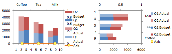
- Example #1 Yearly & Quarterly Sales Analysis
- Example #2 Target vs Actual Sales Analysis across Different Cities
- Example #3 Region-wise Quarterly Performance of Employees
- Pros of Clustered Column Excel Chart
- Cons of Clustered Column Excel Chart
- Things to Consider Before Creating Clustered Column Chart
- Recommended Articles
Clustered Column vs Column Chart
The simple difference between the column and clustered charts is the number of variables used. If the number of variables is more than one, we can call it a “clustered column chart.” If the number of variables is limited to one, we can call it a “column chart.”
One more significant difference is in the column chart. Again, we can compare one variable with the same set of other variables. However, in the clustered column Excel chart, we can compare one set of a variable with another set of variables within the same variable.
Therefore, this chart tells the story of many variables, while the column chart shows the story of only one variable.
How to Create a Clustered Column Chart in Excel?
The clustered column Excel chart is straightforward and easy to use. Let us understand the work with some examples.
You can download this Clustered Column Chart Excel Template here – Clustered Column Chart Excel Template
Example #1 Yearly & Quarterly Sales Analysis
Now, we need to do the formatting to arrange the chart neatly.
Below are the steps to find yearly and quarterly sales analysis:
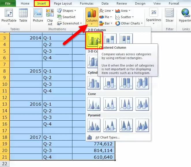
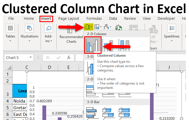
- Firstly, we must prepare the dataset as shown below.

- Then, we must select the data, go to “Insert” “Column Chart,” and choose “Clustered Column Chart.”

As soon as we insert the chart, it will look like this.
- Now, we need to do the formatting to arrange the chart neatly.
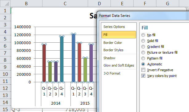
First, we must select the bars and click “Ctrl + 1” (do not forget Ctrl +1 is the shortcut to format).

Then, we must click on “Fill” and select the below option.

After varying each bar with a different color chart, it will look as shown below.


Formatting Chart:
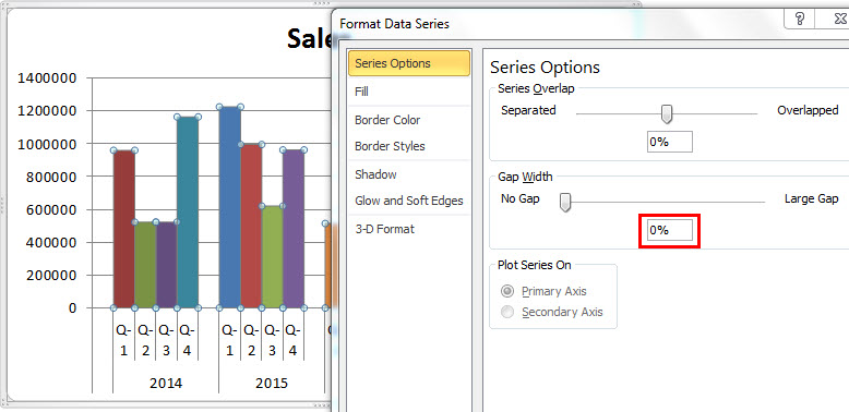
- After this, we must make the gap width of the column bars 0%.
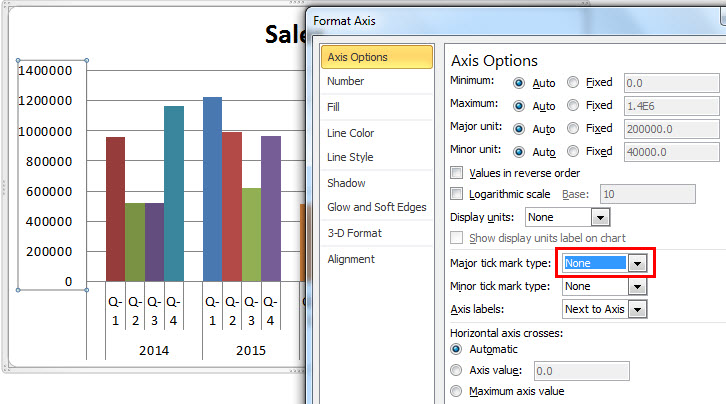
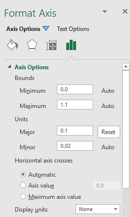
- Next, we must click on “Axis Options” and choose “Major tick mark type” to “None.”
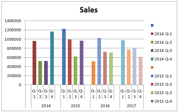
Therefore, our clustered chart may look like the one shown below.
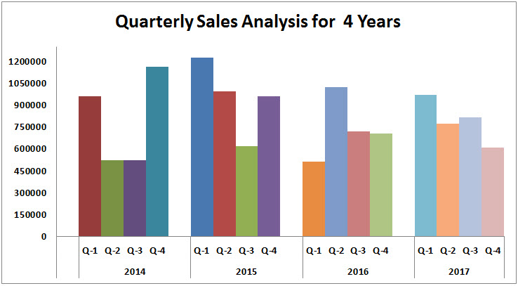
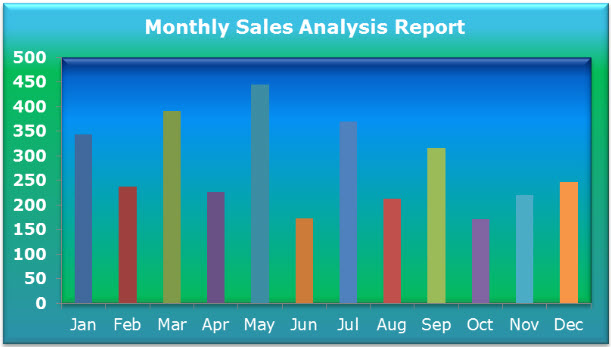
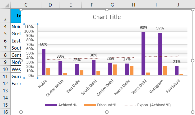
Interpretation of the Chart:
- Q1 of 2015 was the highest sales period, where it generated revenue of more than 12 lakhs.
- Q1 of 2016 is the lowest point in revenue generation. That particular quarter generated only 5.14 lakhs.
- In 2014, there was a steep rise in revenue after a dismal show in Q2 and Q3. Currently, this quarter’s revenue is the second-highest revenue period.
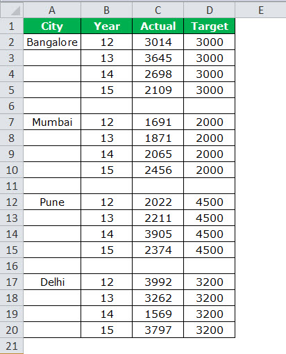
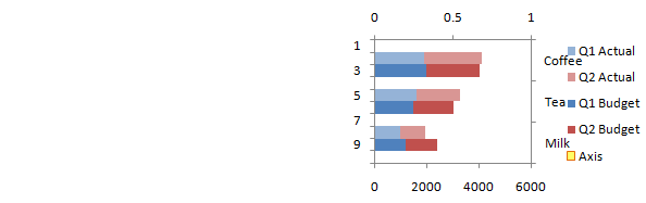
Example #2 Target vs Actual Sales Analysis across Different Cities
Step 1: We must arrange the data in the below format.
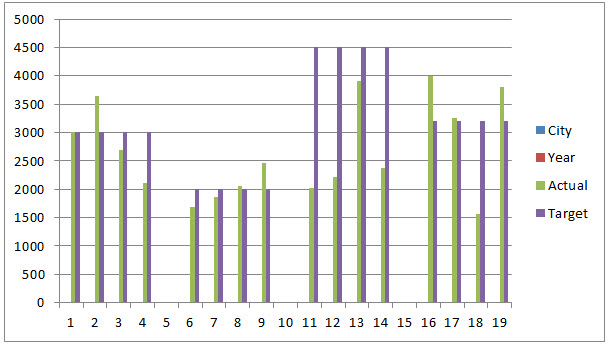
Step 2: We must insert the chart from the insert section. Then, follow the steps of the previous example to insert the chart. Initially, the chart will look like this.
Then, we need to do the formatting by following the below steps.
- Right-click on the chart and choose “Select Data.”
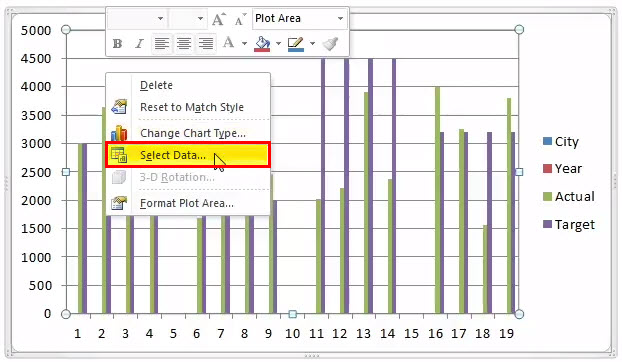
- And remove “CITY & YEAR” from the list.
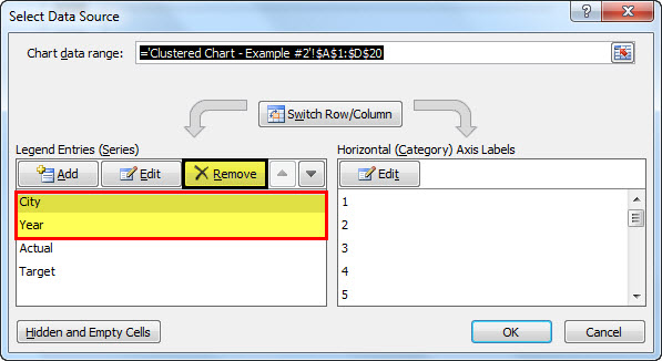
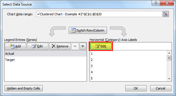
- Then, we must click on the “EDIT” option and select “CITY & YEAR” for this series.

- So now, the chart will look like this.
- Apply to format as we did in the previous one, and your chart looks like this.
- Now, we must change the “TARGET” bars chart from the “Column” chart to the “Line” chart.
- Select Target Bar chart and go to Design > Change Chart Type > Select Line Chart.
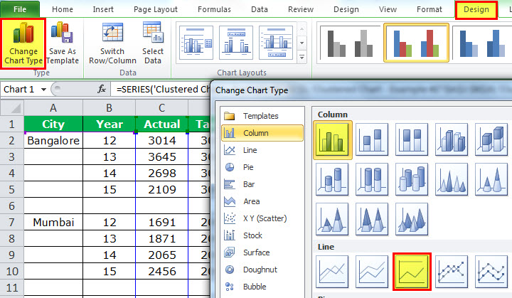
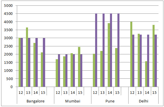
- Finally, our chart will look as shown below.
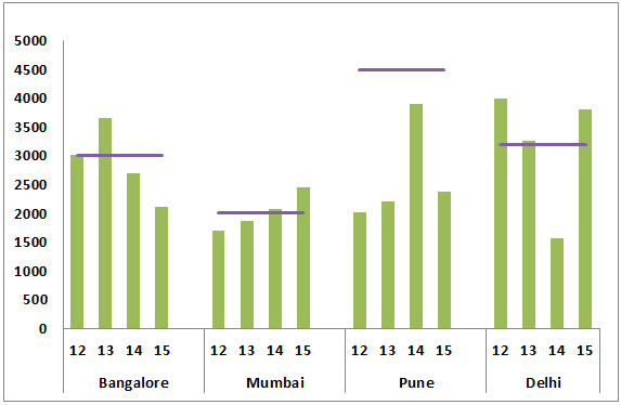
Interpretation of the Chart:
- The blue line indicates the target level for each city, and the green bars indicate the actual sales values.
- Pune is the city where it has achieved its target for the year.
- Delhi has exceeded the target besides Pune, Bangalore, and Mumbai cities.
- Delhi has achieved the target 3 years out of 4 years.
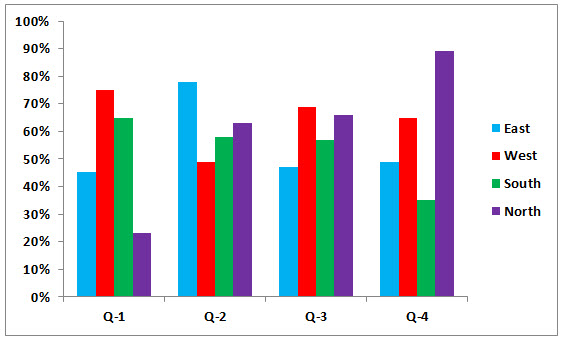
Example #3 Region-wise Quarterly Performance of Employees
Note: Let us do it independently, and the chart should look like the one below.
- Initially, we must create the data in the below format.

- And our chart must look like this as shown below.
Pros of Clustered Column Excel Chart
- The clustered chart allows us to directly compare multiple data series of each category.
- It shows the variance across different parameters.
Cons of Clustered Column Excel Chart
- Difficult to compare a single series across categories.
- It could be visually complex to view as the data of the series keeps adding.
- As the dataset keeps increasing, it gets confusing and makes it difficult to compare more than one data at a time.
Things to Consider Before Creating Clustered Column Chart
- We must avoid using a large data set, as it is tough to understand for the user.
- We must not use 3-D effects in the clustered chart.
- Always play smartly with data to arrange the chart beautifully, like how we inserted one extra row between cities to give extra spacing between each bar.
Recommended Articles
This article is a guide to Clustered Column Chart. We discussed creating clustered column chart in Excel, examples, and downloadable Excel templates. You may also look at these useful functions in Excel: –
- Types of Chart in Excel
- Create Stacked Column Chart in Excel
- Pareto Chart in Excel
- Bubble Chart in Excel
- VLOOKUP on Different Sheets

The difficulty may appear when we need to combine these two chart types, as Excel doesn’t give us any default, built-in tools for that.
In addition, many users – who try to combine them manually – have been confused as to how to consolidate the source data, the series and the graph axes for both charts at the same time.
There are several different methods to tackle this, so let’s discuss the relatively easy (and less confusing) method: where there are several secondary chart axes using the same dynamic Min and Max values.
Interesting Fact: There are several other ways to combine the clustered and stacked column charts together (such as adding the legend entries, arranging the target range with blank rows and others). However, none of them are ideal because each requires numerous additional actions and preparations related to source data or plot area, which may confuse a non-expert user. Also, every technique has its own advantages and disadvantages. That’s why in this article we are focusing on the most comprehensible method(in our opinion) that can be applied by regular users without difficulty.
Let’s walk through the entire process from the beginning…
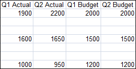
Preparing the Source Data

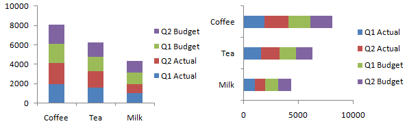
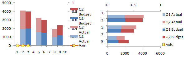
The sample data for this example was previously prepared to demonstrate the following idea:
The table in the screenshot has consolidated data that show Quarterly Revenue (Total Revenue per Quarter – columns B, C, D, E) by each Division (Productivity, Game, Utility – Rows #5, 7, 9) that includes a part of the Revenue received from the new apps (P – new apps, G – new apps, U – new apps, Rows #6, 8, 10) by each Division.
For the purpose of the data visualization, we need to show this data as several clustered columns (one column for each Division) for several Quarters (i.e. three columns for every Quarter), which are stacked and show the Revenue Share of the new apps within a single Division.
Pro Tip: This technique is based on a little trick for how to use both primary and secondary Y-axes and let them have the same Min and Max bounds in a dynamic way, without needing to change them manually.

NOTE: Keep in mind that we need to arrange the source data in the following way:
Row #1 – a total Revenue for the first Division per Quarter.
Row #2 – the Revenue of the new apps for the same Division per Quarter (in other words, the data of the Row#2 is a part (or a share) of the data of the Row #1).
Row #3 – a total Revenue for the second Division per Quarter.
Row #4 – the Revenue of the new apps for the same Division per Quarter (i.e. the data of the Row#4 is a part (or a share) of the data of the Row #3) etc.
Grouping the data in this way is required for the next stage of combining the charts.
Step 1
Let’s insert a Clustered Column Chart.
To do that we need to select the entire source Range (range A4:E10 in the example), including the Headings.
After that, Go To:
INSERT tab on the ribbon > section Charts > Insert a Clustered Column Chart

Pro Tip: Since a Clustered Column chart is a default Excel chart type (at least until you set another chart type as a default type), you can select a source data range and press ALT + F1 keys on your keyboard. This combination allows you to insert a default chart object by pressing the hotkeys only.
Step 2
If we take a look at the screenshot above, there is one thing that we may notice from the beginning: the Quarters are set as chart Series (that’s why they are shown inside the chart Legend) instead of the axis X as we need.
To fix this, let’s Select the Chart Area, right click and – in the Context Menu that appears – click on Select Data.
Within this new dialogue window, we need to click on Switch Row/Column in the middle of the window.

Pro Tip: Once you right-click on the Chart Area you can confirm the command Select Data by pressing “E” on your keyboard (take a look at every single option in the context menu – as you may notice, each character is underlined in a command keyword – these are so-called “lazy shortcuts” that are widely used by Excel experts to speed-up the whole range of repetitive actions during a daily work).
In our case, pressing the “E” key confirms Select Data… command; pressing the “F” key would confirm Font… command and so on.
In addition, to the mentioned shortcuts, you can find some commands on the Excel Ribbon under DESIGN and FORMAT contextual tabs that appear once we selected a Chart Area.
Step 3
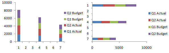
Once the Quarters and Revenue have been switched, we may notice that there are six series now related to every single row in the Revenue column (i.e. all values in column A, such as Productivity, P – new apps, Game etc.).
However, our aim is to stack every “new apps” column with the appropriate “total” column, i.e. we need to create a Stacked Column chart.
The first step to do that is to Select a Chart Area, right-click on it and Select Change Chart Type command in the context menu.
Once the Change Chart Type dialogue window appears, we need to select Combo chart type and for each series that has “- new apps” keyword in the name, we apply the Clustered Column chart type and check ON the secondary axis.

Pro Tip: Once you have right-clicked on the Chart Area you can confirm the command Select Data by pressing “Y” key on your keyboard (this is another “lazy shortcut”)
Once the initial chart has been created, it looks more like what we’re aiming for, however, there is still something wrong with it.
If we look closer, we may notice that the primary axis Y (on the left side of the Chart Area) and the secondary axis Y (on the right side of the Chart Area) are different, i.e. they use different numeric values for the Min and Max bounds.
We can change them manually if we make double-click on the Axis Y area (the appropriate Format Axis panel appears on the right side of the screen).
However, this is not an optimal approach because the source data may change next Quarter (or even Month), i.e. the Min and Max bounds may have values other than the current 2500 and 1200.
Moreover, we want this chart to be dynamic so that we don’t need to change the bounds manually each time the source data is changed.

The primary and secondary Y axes are not equal right now.
Let’s fix that later.
Step 4
The way we can make this chart (or – to be accurate – its axes Y) dynamic is to use a little trick: we need to calculate a single value that matches a Maximum value for the entire source range.
We can make the cell containing this value invisible (e.g. hide it, make the value in the cell hidden and/or locked, or apply the related – white in this example – font color), but it will still be used as a reference value which both Y axes can use as their Max bound.
Let’s try that then…
We’ll start by naming the next cell after cell Q4 (cell F4 in the screenshot) as “Inv. Value” and put the following formula in the cell under this one (cell F5 in the screenshot):
= MAX(B5:E10)
Step 5
How do we push this Max value to be used as a Max value for the secondary Y Axis?
Well, we use another small trick in Excel.
The secret is in the fact that we need to add this value as a new Series in the chart and check ON the secondary axis for this Series later.
So, let’s Select the Chart Area, right-click on it, click on the Select Data command and then click on Add on the left side of the dialogue window that appears.

In the next dialogue window, let’s set cell F4 as a name for the Series, and cell F5 as a data range for the new Series.
Click OK.

Step 6
As you may notice, the chart has changed – it seems like the chart is shifted in the wrong direction from what we need.
Once we click OK in the Select Data Source dialogue window during the previous step, Excel inserts the additional series (and the additional column for this series).
That’s why our other columns have been shifted too.
To fix that, we need to convert this new Series to some other chart type (such as a Linear graph).
Let’s select the Chart Area, right-click on it and select the Change Chart Type command again.
In the dialogue window that appears, we need to find a new Series in the list and apply another chart type (e.g. Linear chart) to it.
In addition, make sure to check ON the appropriate “Secondary Axis” checkbox for this Series.

NOTE: Keep in mind that we need to be sure that the “Secondary Axis” checkbox is flagged as ON for this series. Otherwise, the trick we’re attempting here won’t work properly.
In the case, if the secondary values inside a source data range are bigger than the primary values, we need to perform this trick twice – once for the secondary axis and once for the primary axis.
In other words, we are creating two new series, which are both based on the same Max value.
While we convert them to another type chart, we check ON “Secondary Axis” checkbox for one series, and check OFF the same checkbox for another series.
It will be related to the primary axis in this case.
Step 7
Let’s make some visual improvements to the chart.
First, we can move the Legend to the top.
To do that, Select the Legend Area, make double-click it and select Top legend position in the Format Legend panel that appears in the right side of the screen.
Also, we can delete the extra entry in the Legend (“Inv. Value” element in our example) as no one needs to see it.
Just select that value(s) and press the DELETE key on your keyboard.

Also, we recommend deleting all the entries for the secondary elements (“new apps” elements in the example) as have less Legend Entries improves readability and clearness.
We can apply another color (from a similar color palette) for every secondary chart series to make them visually and logically closer to the related primary series – see the screenshot below.

Step 8
Now it’s time to add the data labels.
Let’s select every single primary column one by one, right-click on it and select Add Data Labels > Add Data Labels in the context menu.
Repeat for all secondary columns.

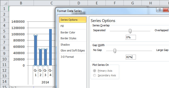
Pro tip: Feel free to play a little with the Series Overlap and Gap Width properties for the primary and secondary columns to enlarge/reduce the clearance between the two nearest columns and to make all values be located inside the columns.
Make sure that you apply the same changes for both primary and secondary columns to prevent the column shifting for one category only.
In our example, we used the following parameters – Gap Width: 70% and Series Overlap: -10% for both categories.
In addition, let’s delete both primary and secondary Y axes from the Chart Area.
Don’t worry! We are deleting only their visualization on the Chart Area, so all bounds and calculations will be untouched.
We can delete the gridlines too.
Finally, let’s move the position of the data labels to “Inside Base” for all the secondary columns to improve the overall readability.
To do that, select the data values for all three secondary columns one by one (i.e. we need to repeat this action three times), double-click on any data label, go to Label Options on the Format Data Labels panel that appears, and set the position as Inside Base.
Also, we can embolden the primary Data labels and the X Axis titles.
Just select the appropriate element and click on the Bold button on the HOME tab of the Ribbon (or press the CTRL + B hotkey on the keyboard).

NOTE: Don’t forget to move the data labels for all secondary Series (P – new apps, G – new apps, U- new apps) as each of them is considered as a separate Chart Series object, i.e. they all have a different Data Labels array.
Step 9
Let’s add the chart title.
Just select the Chart Title area and type the title of your chart.

Pro tip: We can make the Chart Title dynamic and linked to a specific cell.
In this case, every time we want to change or edit the chart title, the only thing we need to do is to update the related cell value.
To do that, select the Chart Title area and click inside the formula bar (the section where we usually enter a formula in the cell).
Type the following formula:
= cellAddresswhere “cellAddress” is the name of the cell with the chart title value (this is cell A3 in our example).
Just type the equal sign (“=”) and click on the cell with the chart title value.
Don’t be confused by the screenshot above – typically a cell address may include a Worksheet’s name where this cell is located.
So, the full cell address frequently looks like: ‘worksheetName!cellAddress
In addition, let’s add the additional text box inside the Chart Area that will show a text definition for the secondary Data Labels.
To do that, let’s select the Chart Area, then Go To:
INSERT tab on the Excel Ribbon > Text Section > Text Box
(alternatively: INSERT tab on the Excel Ribbon > Illustrations Section > Text Box)

Once the TextBox has been inserted, let’s type “New Apps” and format it.
We don’t need it to be dynamic, as “New Apps” definition is common for all “New Apps” columns.
Pro tip: Because we activated the Chart Area before the TextBox was inserted, it’s linked to this Chart object, so we don’t need to group them.
They are locked together, and the TextBox will be moved or edited in parallel with the chart.
Otherwise, both objects would be existing separately from each other and if we were to move or edit the Chart object, the TextBox object would be kept untouched.
Feel free to Download the Workbook HERE.
![]()
Published on: December 21, 2017
Last modified: March 29, 2023


Leila Gharani
I’m a 5x Microsoft MVP with over 15 years of experience implementing and professionals on Management Information Systems of different sizes and nature.
My background is Masters in Economics, Economist, Consultant, Oracle HFM Accounting Systems Expert, SAP BW Project Manager. My passion is teaching, experimenting and sharing. I am also addicted to learning and enjoy taking online courses on a variety of topics.
Clustered Column Chart (Table of Contents)
- Clustered Column Chart in Excel
- How to Make Clustered Column Chart in Excel?
Clustered Column Chart in Excel
Clustered Column Charts are the simplest form of vertical column charts in excel available under the Insert menu tab’s Column Chart section. Clustered columns show the growth of all the selected attributes covers the time period allowed by the chart itself. To create this, we simply have to select the data which have been available over a different time period, and we will have columns for each parameter. This is quite useful when we want to show growth.
Steps to Make Clustered Column Chart in Excel
To do that, we need to select the entire source Range, including the Headings.
After that, Go to:
Insert tab on the ribbon > Section Charts > > click on More Column Chart> Insert a Clustered Column Chart
Also, we can use the short key; first of all, we need to select all data and then press the short key (Alt+F1) to create a chart in the same sheet or Press the only F11 to create the chart in a separate new sheet.

When we click on more column chart, then we got a new window as below mention. We can choose the format then click on Ok.

How to Make Clustered Column Chart in Excel?
Clustered Column Chart in Excel is very simple and easy to use. Let us understand the working of Clustered Column Chart with some examples.
You can download this Clustered Column Chart Excel Template here – Clustered Column Chart Excel Template
Clustered Column Chart in Excel Example #1
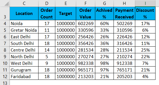
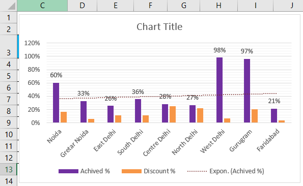
There is a summarization of data; this summarization is a company’s performance report, suppose some sales team in different location zone, and they have a target for sale the product. All filed like target, order count, Target, Order Value, Achieved %, Payment received, Discount % is given in the summary; now we can see them in a table as below mention. So we want to display the report by using a cluster column chart.
First of all, select the range. Click on Insert Ribbon > Click on Column chart > More column chart.
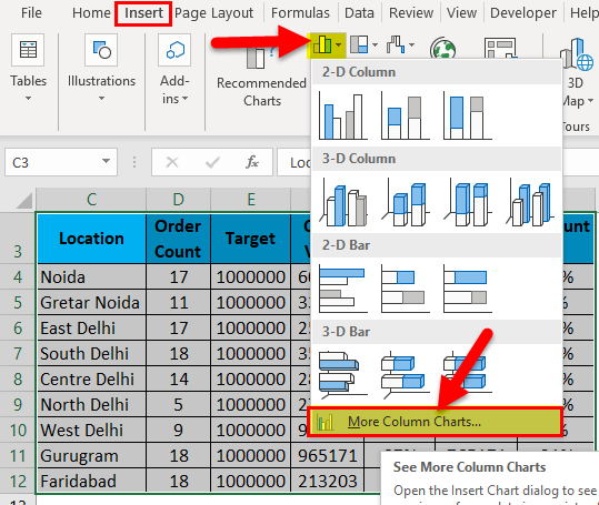
Choose the clustered column chart > Click on Ok.

Also, we can use a shortcut key ( alt+F11).
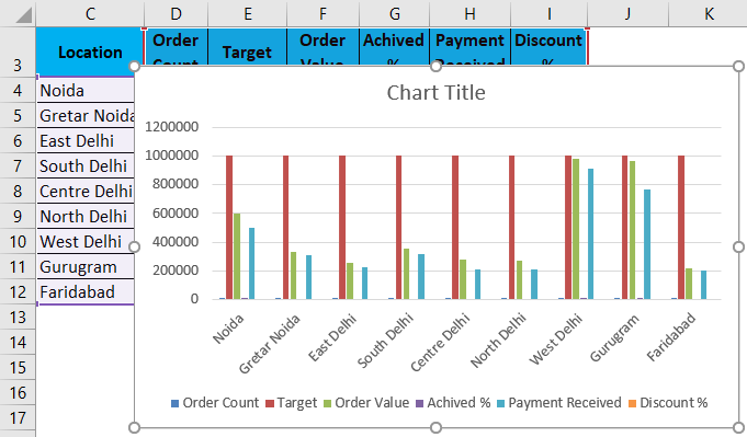
This visualization is default by excel; if we want to change anything so excel allows us to change the data and anything as we want.
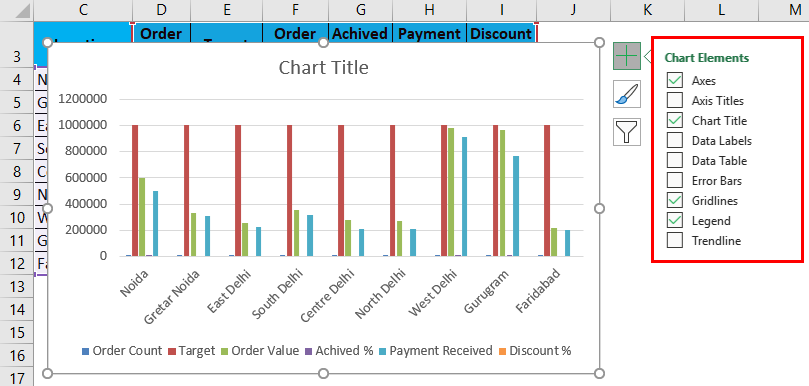
If we see on the right hand, so there is an option ‘ + ’ sign, so with the help of the ‘ + ‘ sign, we can display the different chart elements which are we need.
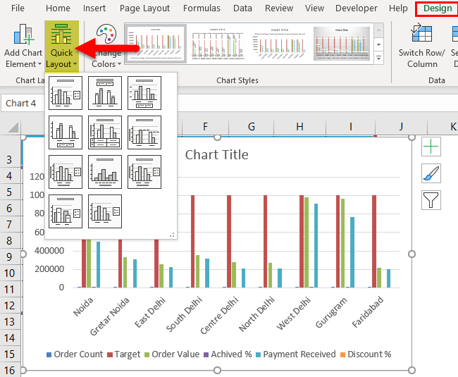
When we use the chart and select then two tabs more display. ‘Design ‘and ‘Format ‘as ribbon,
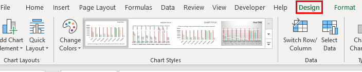
We can format the chart and color themes layout of the chart with the help of the Design ribbon tab.
Both ribbons are very useful for a chart. E.g., if we change the layout quickly, then just click on the Design tab and click on quick layout and change the layout of the chart.
If we want to change the color, we can use a shortcut to change the style and color of the chat; just click on the chart, and there is an option highlighted, as shown below.
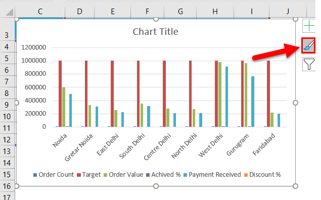
Click on the style you want.
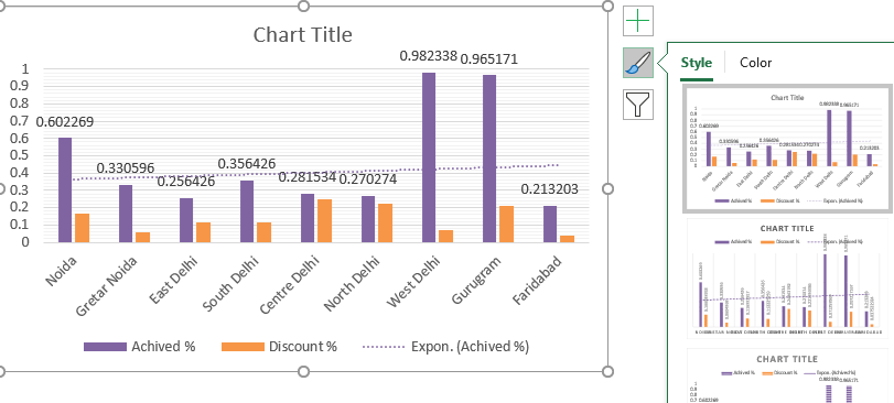
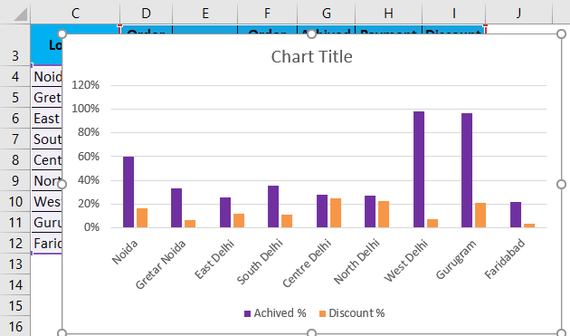
Chart also is given facility to filter the column which we do not need, similarly just click on the chart, at the right side, we can see the filter sign, as showing below mention pictures.
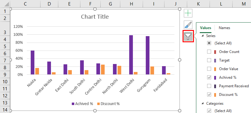
Now we can click on a column that we need to show in the chart.
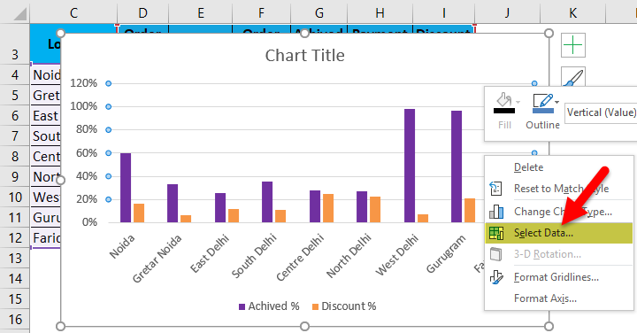
Again we can change the data range also; Right-click on the chart and select the data option; then, we can change the data also.
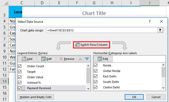
We can change the axis horizontally or vertically by just click on the switch row/column. We can also add or remove and edit a file.
We can also format the chart area by just right click on the chart and select the format chart area option.
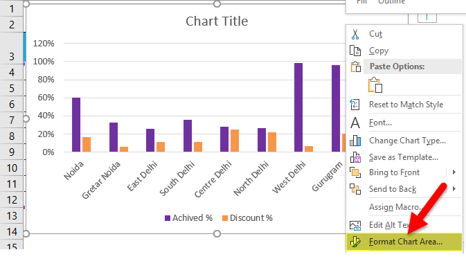
Then we get a new window on the right side, as shown below.
Just click on the chart option, then we can all options of formatting the chart like chart title, Axis, legend, plot area, series and vertically.
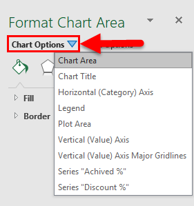
Then click on the option which we want to format.
In the Next Tab, we also format the text.
Some more important things are like add data labels, show trend line in chat; we need to know.
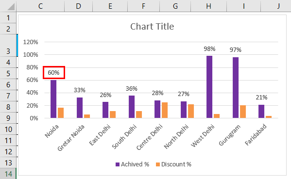
If we want to show data labels as a percentage, just right-click on a column and click on add data labels.
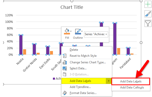
Data Label is added to the chart.
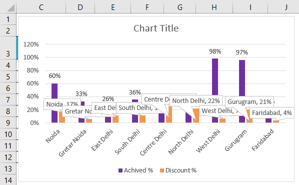
Also, we can show data labels with descriptions. With the help of data callouts. Right-click on column data column labels, click on add data labels and click on add data callouts. The picture is showing below mentioned.
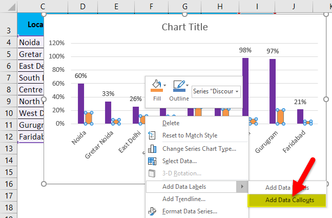
Data Callouts are added to the chart.
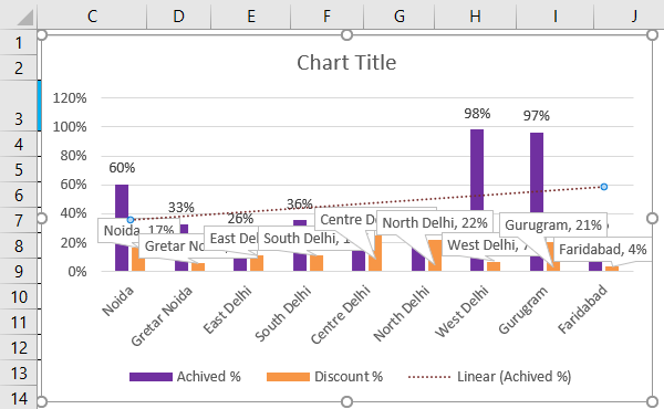
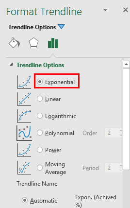
Sometimes we need trend analysis also on a chart. So right-click on data labels and add the trend line.
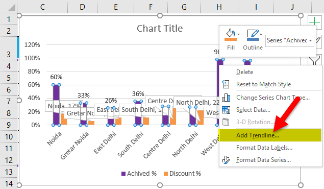
A Trendline is added to the chart.
We can also format the trend line.
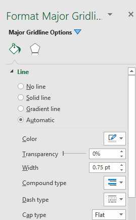
If we want to format the gridlines, then right-click on Gridlines and click on format gridlines.
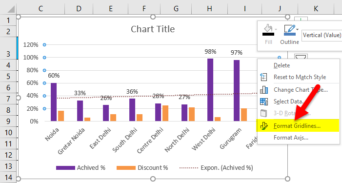
Right Click on Gridlines and click on Add Miner Gridlines.
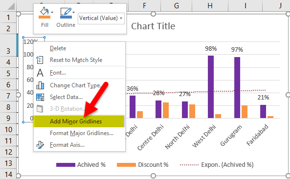
A miner Gridlines is added to it.
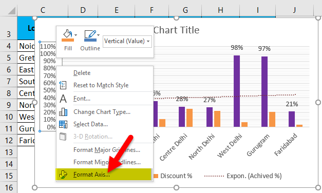
Right Click on Gridlines and click on Format Axis.
Finally, the Clustered Column Chart looks as given below.
Pros and Cons of a Clustered Column Chart in Excel
Following are the Pros and Cons:
Pros
- Since a Clustered Column chart is a default Excel chart type, at least until you set another chart type as a default type
- It can be understood by any person and will look presentable who is not much more familiar with the chart.
- It helps us to make a summarization of a huge data in the visualization, so easily we can understand the report.
Cons
- It’s visually complex when we add more categories or series.
- At one time more difficult to compare a single series across categories.
Things to be Remember
- All columns and labels should be filled with various colors to highlight the data in our chart easily.
- Use self-explanatory chart titles, axes titles. So by the title name, one can understand the report.
- If the data is relevant for this chart, then use this chart; otherwise, the data is related to different categories; we can choose another chart type that is representable.
- No need of using extra formatting so that anyone can see and analyze all points clearly.
Recommended Articles
This has been a guide to a Clustered Column Chart in Excel. Here we discuss how to create the Clustered Column Chart in Excel with excel examples and downloadable excel templates. You may also look at these useful functions in Excel –
- Comparison Chart in Excel
- Pie Chart In MS Excel
- Excel Stacked Column Chart
- Excel Column Chart
Go to the Insert tab. In the Charts group in the Ribbon, select Column. Alternatively, you can choose “Recommended Rharts” and choose from a selection of frequently used charts. Click on Clustered Column.
Contents
- 1 How do I group columns in Excel chart?
- 2 How do you cluster stacked columns in Excel?
- 3 What is a clustered column chart in Excel?
- 4 How do you cluster a column chart?
- 5 How do I select a clustered column chart?
- 6 How do I make a grouped bar chart?
- 7 How do you create a grouped chart in Excel?
- 8 How do I create a cumulative bar chart in Excel?
- 9 How do I create a stacked and clustered chart in Excel?
- 10 Is a clustered column chart a bar graph?
- 11 How do I make my bar chart closer together?
- 12 What is a grouped column chart?
- 13 What is a grouped bar chart?
- 14 How do I create a chart with 3 columns in Excel?
How do I group columns in Excel chart?
To do this, select a Row Labels cell or the Column Labels cell that you want to group, right-click your selection, and choose Group from the shortcut menu. Next, right-click the new group and choose Collapse from the shortcut menu.
How do you cluster stacked columns in Excel?
2a) Create a Clustered Stacked Column Chart
- Select the headings, data and blank rows (cells within thick border, in screen shot above)
- Create a Stacked Column chart from the selected data. OR, choose the Stacked Bar chart type instead.
- Change the Gap Width to zero.
- (optional) Change the chart colours.
What is a clustered column chart in Excel?
A clustered column chart displays more than one data series in clustered vertical columns. Each data series shares the same axis labels, so vertical bars are grouped by category. Clustered columns allow the direct comparison of multiple series, but they become visually complex quickly.
How do you cluster a column chart?
Column Chart
- On the Insert tab, in the Charts group, click the Column symbol.
- Click Clustered Column.
- Result:
- Note: only if you have numeric labels, empty cell A1 before you create the column chart.
How do I select a clustered column chart?
First of all, select the range. Click on Insert Ribbon > Click on Column chart > More column chart. Choose the clustered column chart > Click on Ok. Also, we can use a shortcut key ( alt+F11).
How do I make a grouped bar chart?
How to Create a Grouped Bar Chart?
- Select the table and go to the Insert menu, click on Recommended Charts and then select the Clustered Column Chart.
- The selected data will be plotted as a clustered chart with different bars created for each year and every three months.
How do you create a grouped chart in Excel?
How to create a chart with grouped data?
- Select data and under Insert option in toolbar, In Column select first option.
- Now in Toolbar under Design option, select Change Chart Type option.
- Choose Stacked Column option.
- Here you have your chart for grouped data.
How do I create a cumulative bar chart in Excel?
How to Make a Cumulative Chart in Excel
- Double-click the Excel file containing the data for which you want to create a cumulative chart.
- Click your mouse cursor on the uppermost cell in one of the columns, and then drag the mouse until all of the desired data in that column is selected.
How do I create a stacked and clustered chart in Excel?
In the data table insert column that is dedicated to free up space for stacked column and build clustered column chart. 2. Go to the Change Chart Type and choose Combo. Select Secondary axis checkbox for series that will be visualized as a stacked column chart.
Is a clustered column chart a bar graph?
A clustered column chart is sometimes called a bar graph, because it shows data organized in solid shapes like pillars.This should be at least two columns. Click on the Insert tab and find the Charts group of the ribbon.
How do I make my bar chart closer together?
How to move bars closer together in Excel bar chart?
- Right-click on the data series and select Format Data Series from the context menu.
- Then in the Format Data Series pane, change the data in Gap Width to resize the gaps between the bars, the smaller the data is the much loser the bars together.
What is a grouped column chart?
A grouped bar chart, also known as clustered bar graph, multi-set bar chart, or grouped column chart, is a type of bar graph that is used to represent and compare different categories of two or more groups.
What is a grouped bar chart?
grouped bar charts are Bar charts in which multiple sets of data items are compared, with a single color used to denote a specific series across all sets. As with basic Bar charts, both vertical and horizontal versions of grouped bar charts are available.
How do I create a chart with 3 columns in Excel?
Click the “Insert” tab, then “Column” from the Charts group and “Cluster Column” from the drop-down menu. The Cluster Column option is the left-most option of each of the column types, such as 2-D, 3-D or Cylinder. The cluster column chart is automatically created by Excel on the same page as your data.
Содержание
- Excel clustered column chart
- Excel clustered column chart
- Example – clustered column chart
- Modify clustered column chart
- Format clustered column chart
- Create Excel Cluster Stack Charts
- What Is a Clustered Stacked Chart?
- Video: Cluster Stack Column Chart
- Video Timeline
- Video Transcript
- вњ… Click here for Transcript
- Video Transcript: Clustered Stacked Column Chart
- Cluster Stack Chart
- Data Layout
- Make the Chart
- Format Chart
- Change Colours
- Clustered Stacked Chart In Excel
- Clustered Stacked Chart Example
- A) Data in Summary Grid — Rearrange Data
- Build a Cluster Stack Chart
- Excel’s Built-In Chart Types
- Clustered Column chart
- Stacked Column chart
- How to Make a Cluster Stack Chart
- 1) Change the Data Layout
- Original Data Layout
- Make Data Layout Changes
- Revised Data Layout
- 2a) Create a Clustered Stacked Column Chart
- Change the Gap Width
- Change the Chart Colours
- Completed Cluster Stack Column Chart with Format Changes
- 2b) Create a Clustered Stacked Bar Chart
- Example 2: Compare Win/Loss Scores
- Original Data Layout
- Revised Data Layout
- Calculations Added
- Cluster Stack Chart for Win/Loss
- B) Data in Detail Rows — Pivot Chart
- Data in Detail Rows
- Make a Pivot Table
- Make Pivot Chart
- C) Save Time with Excel Add-in
Excel clustered column chart
This Excel tutorial explains how to use clustered column chart to compare a group of bar charts.
Excel clustered column chart
Clustered column chart is very similar to bar chart, except that clustered column chart allow grouping of bars for side by side comparison. This tutorial demonstrates how to build clustered column chart.
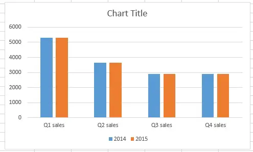
Example – clustered column chart
Suppose we want to build a sales bar chart for Q1 to Q4 in 2015. We can simply build a bar chart that shows sales of each quarter in each bar. But what if we also want to compare the sales in 2014 for each quarter (year over year comparison) ?
Now create a matrix as below
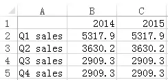
In Excel 2013, select data from A1 to C5, > Insert > Insert Column Chart > More Column Charts
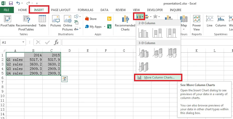
Under Clustered Column, there are two options as below. One is x-axis grouped by year, and the other is grouped by quarter.

In this example, we want to compare each quarter side by side, so we choose the first option.
Modify clustered column chart
Although we have completed the graph, we also want to know how to modify the graph parameter.
Now right click on the graph and click on Select Data
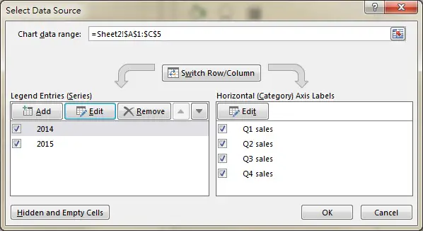
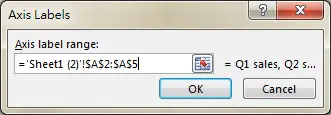
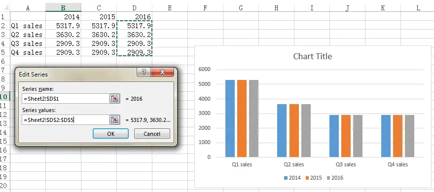
On the right hand side Horizontal Axis Labels, we can modify the X axis Labels by clicking on Edit button. In our example, we select Range A2:A5 in order to show Q1 sales to Q4 sales labels.
On the left hand side Legend Entries, 2014 and 2015 represent the y axis value of the bars, they are two sets of data so we need to add two entries (2014 and 2015) if we manually select the data.
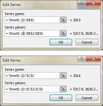
Assume that we have 2016 data in column D and we want to add it to the existing graph.
Click on Add button, and then fill in the Edit Series box as below.
Format clustered column chart
Most formatting are self explanatory, but one notable option is Series Overlap, you can adjust it to prevent the gap between each bar within the same group.
Источник
Create Excel Cluster Stack Charts
A cluster stack chart has clusters of columns or bars, with a stack in each column or bar. See how to set up your Excel data to create a cluster stack column chart or a cluster stack bar chart. Or use a pivot table and pivot chart, for a quick and easy solution.
What Is a Clustered Stacked Chart?
A Clustered Stacked chart is a combination of a Stacked Column or Bar chart, and a Clustered Column or Bar chart. Excel does not have a built-in Clustered Stacked Column or Bar chart type, but this tutorial different ways to create one.
Follow the steps below, to create a cluster stack chart, similar to this one. This chart has:
- a Cluster of columns for each region (East, West, North, South)
- a Stack in each column, with a different coloured segment for each season in the year
There are written steps, and there is also a step-by-step video below.

Video: Cluster Stack Column Chart
This short video shows how to set up your Excel data, by adding blank rows to space the region and year data, and putting the annual data on different rows.
Then, build the cluster stack chart, and make a couple of quick formatting changes, to end up with an attractive, and easy-to-understand clustered stacked chart.
The video transcript is below the video.
Video Timeline
- 00:00 Introduction
- 00:19 Cluster Stack Chart
- 00:40 Data Layout
- 01:52 Make the Chart
- 02:32 Format Chart
- 02:58 Change Colours
Video Transcript
If you’d like to read the video transcript, click on the green check box below. When you’re finished, you can click the check box again, to hide the transcript
вњ… Click here for Transcript
Video Transcript: Clustered Stacked Column Chart
Here is the full transcript for the Clustered Stacked Column Chart video.
In this workbook, I have: sales data for two years, for four different regions, broken down by season.
I’d like to create a chart like this one, that shows each of the regions, with a stack for each year and the seasons broken down within each stack. This is Debra Dalgleish from Contextures.com.
Cluster Stack Chart
This chart that I want to create is like a combination of a cluster column chart, and a stack column chart.
So we’ve got clusters for the regions and stacks for the years.
There’s nothing built into Excel that will do that so I’m going to copy my data to a blank sheet, then change the way it’s arranged.
Data Layout
To start I’ll copy the columns with data (I want to leave the original data unchanged)
Copy that, go to a blank sheet and paste it.
To get the data ready for the chart, I’m going to add some blank rows. I want a blank row before the first region and then a blank row after each region.
A quick way to rearrange my data is to:
- put some numbers down column A.
- I’ve got four regions and I need three rows for each region,
- so I’ll select and copy this,
- then paste it twice.
- I want a blank row at the very top, so I’ll type a zero here.
- I’m going to select those numbers and all the data that I have,
- and then sort those A to Z, so data A to Z.
Now there’s my blank at the top, and each region has its data in one row and then two blank rows after that.
All I have to do now is select the second year of data and drag it down one row.
So, we’ve got blanks, two rows of data, another blank, and this is how we need it to create our cluster stack column chart.
Make the Chart
- select starting in cell B2 above the region headings here;
- select all the headings and down to the last row that I’ve got numbered there,
- so I want to include that blank after South,
And then I’m going to insert my chart.
- Go to the Insert tab
- and I want a column chart, a stacked one.
- Click that, and there’s the chart.
Because we’ve got these blank rows, we’ve got East has its first year of data and then its second year, and then there’s a blank where the third row is empty, and the same for each of the other regions.
Format Chart
Now to make these look more clustered, I’ll do a little formatting.
- Click one of the segments
- and on the Format tab, Format Selection,
- and I want a gap of some little number, so I’ll put 20 here
and now it’s looking more clustered.
There’s a bigger space between the regions than there is between the stacks for each region.
Change Colours
The final thing you could do to make this look nicer, is to match up the colours.
Right now, winter for both years is blue, but you could make this a different shade of orange.
- So if I go to Format
- and choose a lighter orange here
- and do the same for the grey
- and for the yellow
And now you have a cluster stack chart and you can compare year to year totals for each region.
Clustered Stacked Chart In Excel
In Excel, you can create a Stacked Column chart, or a Clustered Column chart, using the built-in chart types.
Excel does not have a built-in Clustered Stacked Column chart type, but this tutorial shows 3 different methods that you can use to create an Excel cluster stack chart.
- A) Data in a Summary Grid — Rearrange the Excel data, then make a chart
- B) Data in Detail Rows — Make a Pivot Table & Pivot Chart
- C) Data in a Summary Grid — Save Time with Excel Add-In
Clustered Stacked Chart Example
In the examples shown below, there are
- 2 years of data
- 4 seasons of sales amounts each year
- 4 different regions
With each method, the goal is to create a cluster stack chart, similar to one shown below.
- The chart has a Cluster for each region, with 2 columns in each cluster — one for each year of data
- There is a Stack in each column, with a segment for each season in that year
A) Data in Summary Grid — Rearrange Data
If your data is summarized in a grid, like the one shown below, you can rearrange the data slightly, and then you’ll be able to create a cluster stack chart.
- NOTE: If your data is in details rows, instead of a summary grid, try the Pivot Table Cluster Stack Chart method instead
The table has 2 years of data for seasonal sales per region, with the seasons in different columns.

Build a Cluster Stack Chart
The instructions below will show you how to create the chart from this type of data:
1) First, you’ll see the limitations of using Excel’s built-in chart types.
2) Next, you’ll see the easy steps to rearrange your data slightly, before building the cluster stack chart.
NOTE: There are written steps, and there is also a step-by-step video below.
Excel’s Built-In Chart Types
Excel does not have a built-in cluster stack chart type. The two built-in Excel chart types that come closest are:
- Clustered Column chart
- Stacked Column chart
Neither of those chart types do exactly what you need, as you can see in the two examples shown below.
Clustered Column chart
Here is a clustered column chart, built from the regional sales data that is shown in the previous section. In this chart:
- The sales data is grouped by region — there is a cluster of columns for each region
- Each season, per region, is in a separate column — the legend at the right helps you find each year/season combination for each region
- You can’t compare year totals per region — only the year/season amounts are shown

Stacked Column chart
Next, here is a stacked column chart, built from the same regional sales data. In this chart:
- The sales data is grouped by region — there is a single stacked column for each region, along the Category (horizontal) axis
- All year/season amounts, per region, are in a single column — the legend at the right helps you find each year/season combination for each region
- You can’t compare year totals per region — only overall 2-year total is shown

How to Make a Cluster Stack Chart
Instead of using one of those built-in chart types, follow the steps below, to create a Cluster Stack chart.
To create a Clustered Stacked chart in Excel, there are 2 main steps, described in detail below:
- Make changes to the data layout
- Create a chart from the revised data
- a) Cluster Stack Column Chart
- b) Cluster Stack Bar Chart
1) Change the Data Layout
Whether you want to make a cluster stack column chart or a cluster stack bar chart, follow these steps to change the data layout.
Original Data Layout
Here is the original data layout for the sample data, arranged in a summary grid. The table shows 2 years of data for seasonal sales per region.
- Year and season names are in columns, across the top
- Region names are in rows, down the left side
- Sales amounts are in the grid, for each region, for each year/season
Make Data Layout Changes
Make the following small changes to the data:
NOTE: The video below shows a quick way to make those changes, by dragging the data with your mouse.
- Add a blank row after the heading row, to act as a spacer
- Add 2 blank rows after each region’s data
- Move the second year’s data down one row.
- Insert blank rows where you want columns separated
- Add a blank row at the end of the data
Revised Data Layout
Here is the revised data layout, for the clustered stacked Excel chart. The second year’s data has been shifted down one row, and blank rows were inserted.

In the revised data layout shown above:
- For each region
- First year’s data (red border) is in one row
- Second year’s data (blue border) was moved down to the row below
- Blank row was inserted after each region
- Spacer rows above the first region, and after the last region
- orange cells have this formula, to create an empty string: =»»
- zero values aren’t required — just a reminder not to delete spacer rows
2a) Create a Clustered Stacked Column Chart
Here are the steps to create a clustered stacked column chart from the revised data:
- Select the headings, data and blank cells in the data range.
- In the sample data, select the cells within the thick outline border, in screen shot above (cells B2:J15)
- Click the Insert tab, at the top of Excel, and click the Insert Column or Bar Chart command
- In the 2-D Column section, click Stacked Column
- OR, in the 2-D Bar section, click Stacked Bar

Change the Gap Width
At first, the chart’s columns are narrow, and spread apart. To make the chart look better, make the following changes to the gap width setting.
- Right-click on one of the columns, and click Format Data Series
- The Format Data Series pane opens, usually at the right side of the Excel window
- There are 3 icons at the top
- Fill & Line (paint bucket)
- Effects (hexagon shape)
- Series Options (column chart)
- Click the Series Options icon, if it is not already highlighted
- In the Series Options section, click the triangle, if necessary, to see all the settings
- Change the Gap Width setting to a low number — between 0% and 10%

After you reduce the Gap Width setting, the columns are wider, and closer together

Change the Chart Colours
At first, each season/year combination has a different colour. To make the seasons easier to compare, year to year. you can change the chart colours, for the second year’s stacked column
Make the second year’s colours a lighter shade of the first year’s colours, for each season. For example:
- Click the Winter segment, in one of the second year stacked columns,
- At the top of Excel, click the Format tab, at the far right
- Click the arrow for Shape Fill
- Select a fill colour that’s a lighter shade of the first year’ colour for that season
Then, repeat those steps to colour the remaining seasons for the second year.

Completed Cluster Stack Column Chart with Format Changes
When it is finished, the Clustered Stacked Column chart should look similar to the chart below.
For each region:
- First year’s data is in the left column
- Second year’s data is in the right column
- Seasonal colours are similar, to make comparisons easier
2b) Create a Clustered Stacked Bar Chart
If you chose the Stacked Bar chart type, the Clustered Stacked Bar chart should look like the one in the screenshot below.
For each region:
- 2020 data is in the top bar
- 2021 data is in the bottom bar

Example 2: Compare Win/Loss Scores
Here’s another example of a Cluster Stack chart, based on data in a summary grid.
This chart compares the highest and lowest win/loss scores for a fantasy football league, for each week in the season. There 3 weeks of data so far.

Original Data Layout
Originally, the win/loss data had one column per week, with four rows:

Revised Data Layout
To create a cluster stack chart, the following changes were made to the data:
- blank rows and blankcolumns were added
- win and loss data were put in separate columns for each week

Calculations Added
Next, a new section was added to the worksheet. In this section:
- formulas calculate the differences between high and low scores
- For example, this formula is in cell D20: =D8-D7
- yellow cells are used as source data for the cluster stack chart

Cluster Stack Chart for Win/Loss
Here is the chart that was created from the new formula section of Win/Loss fantasy football data layout.
- There is a cluster for each week, with 2 columns in each cluster — Win and Loss
- Each column is stacked, with a segment for high (red), and a segment for low (grey)
B) Data in Detail Rows — Pivot Chart
If your data is in details rows, instead of a summary grid, there is a quick and easy way to make a cluster stack chart. First, make a pivot table, and then make a pivot chart based on that pivot table.
An overview of this method is shown below, and that might be all the help you need for this method. If you’d like to see the detailed steps for creating the pivot table and pivot chart, you can go to the Cluster Stack Pivot Chart page.
NOTE: This type of cluster stack chart has equal space between all the columns. The «cluster» effect is created by the labels and lines below the horizontal axis
Data in Detail Rows
To use this pivot chart method, your data must be in details rows. This screen shot shows a named Excel table, with sales data for 2 years, for 4 different regions.
Each column has one type of information — Region, Year, Season, Sales and Season Number (Ssn)

Make a Pivot Table
First, create a new blank pivot table, based on the table with data in detail rows.
Next, add fields to the pivot table layout, based on the cluster stack chart that you want:
- Rows: Add fields for chart’s horizontal axis — Region and Year in this example
- Columns: Add fields for the «stack» — Season number (Ssn) in this example
- Values: Add number field — Sales in this example

Make Pivot Chart
Next, create a stacked column chart based on the pivot table.
- Tip: To make the columns wider, change the gap width to a low percentage, such as 20%
Here is the pivot chart, with a «cluster» for each Region, and a stack for each Year, showing a breakdown by season.

C) Save Time with Excel Add-in
If you frequently need to make this type of clustered stacked chart, or other custom Excel charts, you can save time by using an Excel add-in.
Go to the Peltier Tech website (affiliate link), and check out Jon Peltier’s Excel charting utility.
Jon’s charting utility can help you create complex Excel charts, quickly and easily — much faster than building the charts yourself, from scratch.
Источник
Adblock
detector
Home / Excel Charts / Create Clustered Column Chart in Excel
What is a Clustered Column Chart?
Excel Clustered Column Chart allows easy comparison of values across various categories. In simple words, it will enable us to compare one set of variables with another set of variables.
This chart also has an X and a Y-axis, where the X-axis represents the year, region, or name labels, and Y-axis represents the values in numbers.
It is easy to make but create complexities when more data series are added.
Let us learn how to create a Clustered Column Chart in few simple steps and an example. Example: Say we are creating a Clustered Column chart portraying region-wise sales per year.
- First step would be to highlight the dataset for which you want to create the clustered column chart.
- To insert a clustered column chart, go to the Insert option in the ribbon. Under the Charts section, select the Column Charts option, further select the Clustered Column chart option.
- Now, as you insert the chart, it is displayed as shown in the image below.
- In the end, you can give your chart a unique name. And choose the best design from the Chart Design Tab in the ribbon.
Adjusting the Chart Layout
Once the chart is inserted, it is time to add few elements if required or choose a better chart style and color. On the chart’s right side, you will find 3 options as Chart Elements, Chart Styles, and Chart Filters.
- Chart Elements: This option allows you to add, remove or change chart elements such as title, legend, etc. For example, if you select the ‘Data Table’ option from the chart Element options, your chart would look like:
- Chart Styles: This allows you to add a new style or color scheme to your chart. The below image is an example of a new chart style:
- Chart Filters: Chart filters allow you to edit and choose what points or names you want to display on your chart.
Formatting the Chart
Various options can help you format the chart.
- To access the formatting options, right-click on the chart and select “Format Chart area”.
- After which, a dialog box with the name Format Chart Area shall open.
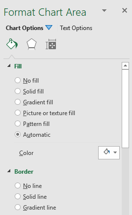
- You have three main chart options named Fill & Line, Effect, Size, and Properties.
- All these chart options give you various features like applying a background to the chart or applying a border or adding a shadow, changing the size of the chart, and much more.
The below image shows an example of applied gradient fill and shadow to the chart:
Note – You can also adjust the gaps between the columns by right-clicking on the vertical columns and selecting the Format Data Series option. Here you will get the option to change gaps between bars.
Switch Between Rows or Columns
To switch between rows and columns, right-click on the chart area
Next, choose the ‘Select Data’ option
A dialog box “Select Data Source” will pop up. In the center of the dialog box, you will find an option “Switch Row/Column”. You need to click on the option and finally click OK.
Considerations Before Creating a Clustered Column Chart
- Avoid employing a vast quantity of data because it is difficult for the user to understand.
- In your clustered chart, avoid using 3D effects.
- Use your data wisely to arrange the chart nicely, as we did by inserting one extra row between cities to provide some more spacing between each bar.
Insert a Clustered Column Pivot Chart in Excel
- To create a clustered column pivot chart, highlight the pivot table data
- On the ribbon, go to the Insert tab and select the Pivot Charts option.
- Once you select, an Insert chart dialog box will pop-up
- The left section of the dialog box has an option named “Column”
- After selecting the column, you will be able to see a Clustered column chart option.
- Please select it and click OK.
The clustered column pivot chart is ready.
Monday, August 1, 2011
Peltier Technical Services, Inc., Copyright © 2023, All rights reserved.
Excel has built-in chart types for clustered columns and bars, and for stacked columns and bars. One of the commonest charting questions in online Excel forums is, “How do I make a chart that is both clustered and stacked?”

This article demonstrates a protocol for building clustered-stacked column and bar charts in both modern versions of Excel, that is, Excel 2003 and earlier and Excel 2007 and later. The technique is a bit convoluted, and it requires an expanded data layout to get the appropriate appearance. And there’s an additional degree of complexity to get the category labels to line up neatly under or beside the clusters.
For those who need to produce many of these charts, and who don’t have 15 minutes to spend on each one, I have created the Peltier Tech Charts for Excel, a commercial Excel add-in that does the heavy lifting at the click of a button.
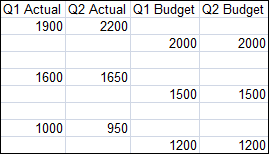
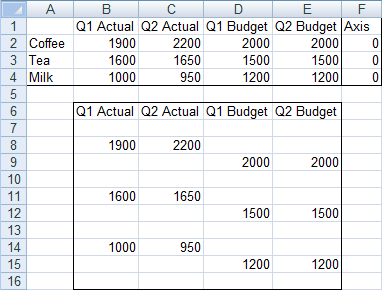
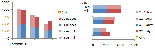
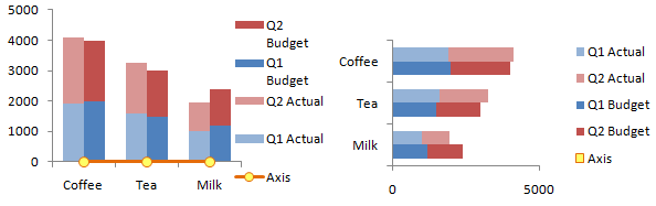
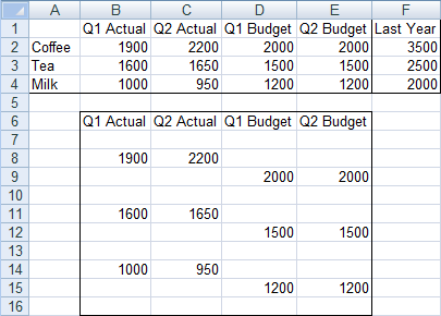
Built-In Column and Bar Charts
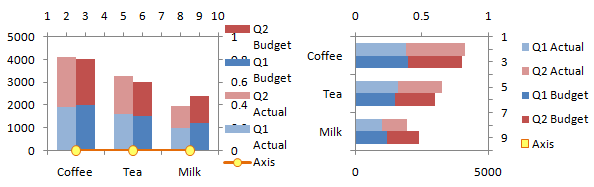
Let’s start with this simple data set, which compares budget and actual values for three commodities for two quarters of the year. We want to have clusters for each commodity, with stacked actual values next to stacked budget values within each cluster.
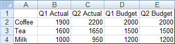
Without any effort or thought we can easily create clustered column or bar charts from this data.
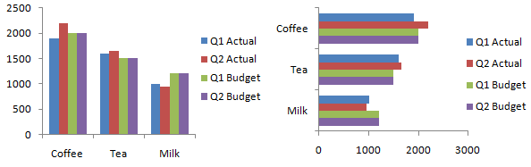
Stacked column and bar charts are just as easy.
It’s not obvious how to combine the chart types. The protocol involves inserting blank rows and cells into the data range of a stacked column or bar chart, and values only appear in some of the places in the chart. The proper arrangement will cluster stacks of values with stacks of zeros separating the clusters.
Starting the Chart
I’ll leave the original data alone (always a good practice) and create a staging data region which is linked to the original data. The easiest way to do this is to copy the original data, then use Paste Special Link to start building the staging area. We’ll make our chart first, then explore how modifying the data layout changes the chart. In practice, we’ll modify the data first and then make the chart, knowing the effects of data layout on chart appearance.
The first step is to make a stacked column or bar chart from the data in B6:E9. There are no categories selected (i.e., the commodities are not part of the initial chart), so Excel just uses the counting numbers 1, 2, 3.
Since categories always start from the origin, the bar chart’s category labels go from the bottom up, instead of top down as in the sheet. So the vertical axis has to be formatted to make the categories go in reverse order. Also the value (horizontal) axis has to cross at the maximum category, which is at the bottom now, since the order of categories was reversed.
Adjusting the Data
So that’s only stacked. Let’s adjust the data by inserting some rows.
The stacks of columns/bars are now spread out. Not yet what we want.
But lets stagger the budget data by a row, to move the budget data points off the actual data and onto blank slots in the chart.
Unfortunately the staggering doesn’t happen automatically, so we have to go back and tell Excel what data range to use for the chart. Right click on the chart, then select Select Data or Source Data (the command is version-specific). Click in the Chart Data Range box, and select this whole data range.
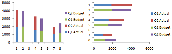
One more adjustment to the data. Let’s insert a row at the beginning and end so there’s a space outside of the first and last cluster.
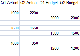
Again, we have to explicitly tell the chart about the updated data range. This is almost what we want.
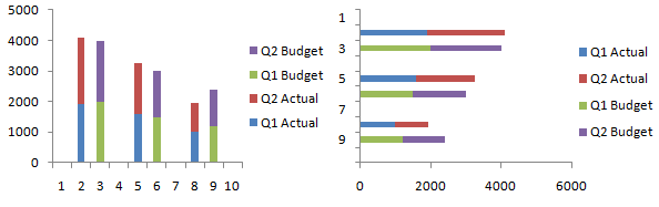
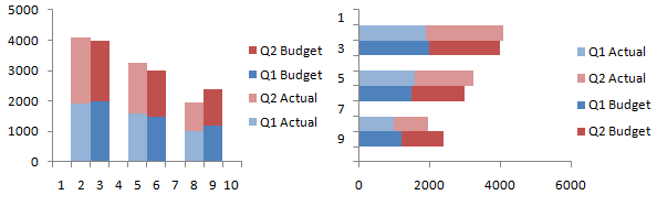
Reduce the gap between columns/bars to give the chart a clustered appearance: select one series of columns, press Ctrl+1 (numeral one) to open the formatting dialog, and in the first screen you see (“Series Options”) change the entry for Gap Width to zero. Color code the data series to make it clearer which data series are associated.
In practice, it is not necessary to create a chart using the compact data and adjust it after every modification to the data. The correct protocol is to adjust the data, and then make the chart shown here, and proceed with adding labels, below.
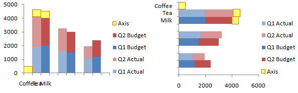
Adding the Labels
Almost done. We need to add the category (cluster) labels. We’ll do this by adding a “dummy” series to the secondary axis, and the secondary axis will have the category labels we want. Add a column to the original data range for the dummy axis series (column F in our example).
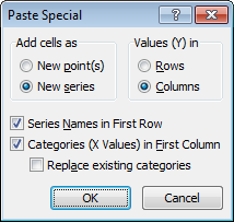
Select this added data (F1:F4), and hold Ctrl while selecting the column with our labels (A1:A4), so that both areas are highlighted. Make sure you include the blank top cell in the first column. Copy the range, select the chart, and use paste special (Home tab of the ribbon > Paste dropdown > Paste Special) to add this data to the chart as a new series, in columns, with series name in the first row and category labels in the first column. In other words, use these settings:
In Excel 2003 and earlier, the original labels (1, 2, 3, etc.) remain along the axis, but in 2007, the new labels take their place, even if we hadn’t checked “Replace Existing Categories”.
Since zero value bars have zero height or width, they don’t appear in the chart. Just to show where this new series is added, I’ve temporarily replaced the zeroes in column F with values of 500. The series spans only the first three categories.
If you’re making a stacked-clustered column chart, convert this new series to a line chart type. Sometimes Excel 2007 doesn’t expand the legend enough to show the legend entry for Axis, so I’ve stretched it in this chart.
Manipulating the Axes
Now format the Axis series to place it onto the secondary axis. To do this, select the Axis series. If you can’t see the Axis series, click the dropdown in the top left of the Chart Tools > Layout or Format tab, and choose the Axis series. Then press Ctrl+1 (numeral one) to open the Format Series dialog. On the first tab, choose Secondary Axis.
Now add the secondary category axis, which is secondary horizontal in 2007 column charts and secondary vertical in 2007 bar charts. This command in on the Chart Tools > Layout tab.
We need to reverse the bar chart’s secondary vertical axis (like we did the primary when we first made the bar chart), and at the same time, make the horizontal axis cross in the automatic position, which generally means at zero or at the minimum.
Now we have to switch the position of the category labels. In the column chart, format the left hand vertical axis so the horizontal axis cross at the maximum, and format the right hand vertical axis so the horizontal axis crosses at the automatic (minimum) position.
In the bar chart, format the bottom horizontal axis so the vertical axis cross at the maximum, and format the top horizontal axis so the vertical axis crosses at the automatic (minimum) position.
Important – Axis Label Alignment
We want only half a slot on the outside of the first and last clusters, not the full slot shown above, to center each cluster on the commodity category labels. Format the top horizontal axis of the column chart, or the right vertical axis of the bar chart, so the crossing axis is positioned on tick marks. The bottom horizontal axis or the left vertical axis of the chart, which contains the labels we just worked so hard to add, should have the crossing axis positioned between tick marks.
Select the secondary value axis, which is scaled from 0 to 1 (the right vertical axis of the column chart, or the top horizontal axis of the bar chart), and delete it.
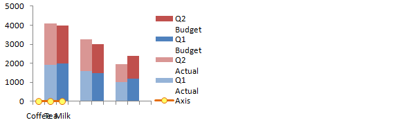
Format the primary category axis, which is scaled from 1 to 10 (the top horizontal axis of the column chart, or the right vertical axis of the bar chart), and format it so it has no tick marks or tick labels, and no line type.
Finally, select the Axis legend entry. In Excel 2003 be sure to select the text label, not the legend key (the marker and line). Press Delete. In the column chart, format the Axis series to be invisible (no marker, no line).
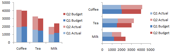
That wasn’t so hard, was it? Though it did take a very long time.
Adding a Line to a Clustered-Stacked Column Chart
It’s relatively easy to overlay a line chart series onto the clustered-stacked column chart. Instead of the column of zeros we used to generate our commodity axis labels, put in the values you want to plot, and add a meaningful column header.
When you go through the process above to add your labels and manipulate the axes, you will end up with data points where you want them. Just don’t bother hiding the series at the end of the process. If you want to show the line on a secondary axis, despite my warnings to the contrary, don’t delete the axis, simply scale it appropriately to your data.
Adding a line to a cluster-stack bar chart is much more complicated, so I will not cover it here.
This tutorial shows how to create Clustered-Stacked Charts, including the specialized data layout needed, and the detailed combination of chart series and chart types required. This manual process takes time, is prone to error, and becomes tedious.
I have created Peltier Tech Charts for Excel to create Clustered-Stacked Charts (and many other custom charts) automatically from raw data. This utility, a standard Excel add-in, lays out data in the required layout, then constructs a chart with the right combination of chart types. Charts can be made using data in a wide variety of arrangements, in either vertical or horizontal orientation.

This is a commercial product, tested on thousands of machines in a wide variety of configurations, Windows and Mac, which saves time and aggravation.
Please visit the Peltier Tech Charts for Excel page for more information.
Кластерная столбчатая диаграмма в Excel — это столбчатая диаграмма, которая представляет данные практически последовательно в вертикальных столбцах. Хотя эти диаграммы очень просто сделать, эти диаграммы также сложно увидеть визуально. Например, если есть одна категория с несколькими рядами для сравнения, эту диаграмму легко просмотреть. Тем не менее, по мере увеличения категорий очень сложно анализировать данные с помощью этой диаграммы.
Например, предположим, что у нас есть набор данных, состоящий из квартальной выручки в 3 столбцах — A, B и C с различными подразделениями, такими как выпуск и полезность в строках 6 и 7. Затем для визуализации данных мы можем представить этот набор данных как несколько сгруппированных столбцы (каждый столбец для подразделения) для кварталов (три столбца для каждого квартала), чтобы отобразить долю дохода в отдельном подразделении.
Прежде чем отправиться прямо в «Сгруппированная столбчатая диаграмма в Excel», мы должны смотреть на простую столбчатую диаграмму. Столбчатая диаграмма представляет данные в виде вертикальных полос, расположенных горизонтально по всей диаграмме. Как и другие диаграммы, столбчатая диаграммаСтолбчатая диаграммаСтолбчатая диаграмма используется для представления данных в вертикальных столбцах. Высота столбца представляет собой значение для определенного ряда данных на диаграмме, столбчатая диаграмма представляет собой сравнение в виде столбца слева направо. Подробнее имеет ось X и ось Y. Обычно ось X представляет год, периоды, имена и т. д. Ось Y представляет числовые значения. Столбчатые диаграммы отображают широкий спектр данных, чтобы представить отчет высшему руководству компании или конечному пользователю.
Ниже приведен простой пример гистограммы.
Оглавление
- Что такое кластеризованная столбчатая диаграмма в Excel?
- Кластеризованная колонка против гистограммы
- Как создать кластеризованную столбчатую диаграмму в Excel?
- Пример #1 Годовой и квартальный анализ продаж
- Пример #2 Анализ целевых и фактических продаж в разных городах
- Пример № 3 Квартальная производительность сотрудников по регионам
- Плюсы диаграммы Excel с кластеризованными столбцами
- Минусы диаграммы Excel с кластеризованными столбцами
- Что следует учитывать перед созданием гистограммы с кластеризацией
- Рекомендуемые статьи

Кластеризованная колонка против гистограммы
Простая разница между столбчатыми и кластерными диаграммами заключается в количестве используемых переменных. Если количество переменных больше одной, мы можем назвать это «кластеризованной столбчатой диаграммой». Если количество переменных ограничено одной, мы можем назвать это «столбцовой диаграммой».
Еще одно существенное отличие заключается в столбчатой диаграмме. Опять же, мы можем сравнить одну переменную с тем же набором других переменных. Однако в диаграмме Excel с кластеризованными столбцами мы можем сравнить один набор переменных с другим набором переменных в той же переменной.
Таким образом, эта диаграмма показывает историю многих переменных, в то время как столбчатая диаграмма показывает историю только одной переменной.
Как создать кластеризованную столбчатую диаграмму в Excel?
Диаграмма Excel с кластеризованными столбцами проста и удобна в использовании. Давайте разберемся с работой на некоторых примерах.
.free_excel_div{фон:#d9d9d9;размер шрифта:16px;радиус границы:7px;позиция:относительная;margin:30px;padding:25px 25px 25px 45px}.free_excel_div:before{content:»»;фон:url(центр центр без повтора #207245;ширина:70px;высота:70px;позиция:абсолютная;верх:50%;margin-top:-35px;слева:-35px;граница:5px сплошная #fff;граница-радиус:50%} Вы можете скачать этот шаблон Excel с кластеризованной столбчатой диаграммой здесь — Шаблон кластеризованной гистограммы Excel
Пример #1 Годовой и квартальный анализ продаж
Теперь нам нужно выполнить форматирование, чтобы аккуратно расположить диаграмму.
Ниже приведены шаги для поиска годового и квартального анализа продаж:
- Во-первых, мы должны подготовить набор данных, как показано ниже.
- Затем мы должны выбрать данные, перейти к «Вставить», «Столбчатая диаграмма» и выбрать «Столбчатая диаграмма с кластеризацией».
Как только мы вставим диаграмму, она будет выглядеть так.
- Теперь нам нужно выполнить форматирование, чтобы аккуратно расположить диаграмму.
Во-первых, мы должны выбрать полосы и нажать «Ctrl + 1» (не забывайте, что Ctrl + 1 — это ярлык для форматирования).
Затем мы должны нажать «Заполнить» и выбрать опцию ниже.
После изменения каждой полосы с помощью диаграммы другого цвета она будет выглядеть, как показано ниже.


Форматирование диаграммы:
- После этого мы должны сделать ширину зазора стержней столбца равной 0%.

- Затем мы должны нажать «Параметры оси» и выбрать «Основной тип галочки» на «Нет».

Поэтому наша кластеризованная диаграмма может выглядеть так, как показано ниже.

Интерпретация диаграммы:
- Первый квартал 2015 года был самым высоким периодом продаж, когда он принес доход более 12 лакхов.
- Первый квартал 2016 года — самая низкая точка по выручке. Этот конкретный квартал принес всего 5,14 лакха.
- В 2014 году наблюдался резкий рост выручки после удручающих результатов во втором и третьем кварталах. В настоящее время выручка за этот квартал является вторым по величине доходным периодом.
Пример #2 Анализ целевых и фактических продаж в разных городах
Шаг 1: Мы должны расположите данные в следующем формате.

Шаг 2: Мы должны вставить диаграмму из раздела вставки. Затем выполните шаги предыдущего примера, чтобы вставить диаграмму. Изначально график будет выглядеть так.

Затем нам нужно выполнить форматирование, выполнив следующие шаги.
- Щелкните правой кнопкой мыши на графике и выберите «Выбрать данные».

- И удалить «ГОРОД И ГОД» из списка.

- Затем мы должны нажать на кнопку «РЕДАКТИРОВАТЬ» вариант и выберите «ГОРОД И ГОД» для этой серии.


- Итак, теперь диаграмма будет выглядеть так.

- Примените к формату, как мы делали это в предыдущем случае, и ваша диаграмма будет выглядеть так.

- Теперь мы должны изменить «ЦЕЛЬ» гистограммы от диаграммы «Столбец» к «Линия» диаграмма.
- Выбирать Целевая панель график и перейти к Дизайн > Изменить тип диаграммы > Выберите линейную диаграмму.

- Наконец, наша диаграмма будет выглядеть так, как показано ниже.

Интерпретация диаграммы:
- Синяя линия указывает целевой уровень для каждого города, а зеленые столбцы — фактические значения продаж.
- Пуна — это город, в котором компания достигла своей годовой цели.
- Дели превысил план, за исключением городов Пуна, Бангалор и Мумбаи.
- Дели достиг цели 3 года из 4 лет.
Пример № 3 Квартальная производительность сотрудников по регионам
Примечание: Давайте сделаем это самостоятельно, и график должен выглядеть так, как показано ниже.
- Первоначально мы должны создать данные в следующем формате.

- И наша диаграмма должна выглядеть так, как показано ниже.

Плюсы диаграммы Excel с кластеризованными столбцами
- Кластерная диаграмма позволяет нам напрямую сравнивать несколько рядов данных каждой категории.
- Он показывает дисперсию по различным параметрам.
Минусы диаграммы Excel с кластеризованными столбцами
- Сложно сравнивать одну серию по категориям.
- Это может быть визуально сложно для просмотра, поскольку данные ряда продолжают добавляться.
- По мере того, как набор данных продолжает увеличиваться, он становится запутанным и затрудняет сравнение нескольких данных одновременно.
Что следует учитывать перед созданием гистограммы с кластеризацией
- Мы должны избегать использования большого набора данных, так как его сложно понять пользователю.
- Мы не должны использовать трехмерные эффекты в кластерной диаграмме.
- Всегда разумно работайте с данными, чтобы красиво упорядочить диаграмму, например, как мы вставили одну дополнительную строку между городами, чтобы увеличить расстояние между каждым столбцом.
Рекомендуемые статьи
Эта статья представляет собой руководство по кластерной гистограмме. Мы обсудили создание столбчатой диаграммы с кластерами в Excel, примеры и загружаемые шаблоны Excel. Вы также можете посмотреть на эти полезные функции в Excel:
- Типы диаграмм в Excel
- Создать столбчатую диаграмму с накоплением в Excel
- Диаграмма Парето в Excel
- Пузырьковая диаграмма в Excel
- ВПР на разных листах