
Most companies (and people) don’t want to pore through pages and pages of spreadsheets when it’s so quick to turn those rows and columns into a visual chart or graph. But someone has to do it…and that person must be you.
Ready to turn your boring Excel spreadsheet into something a little more interesting?
In Excel, you’ve got everything you need at your fingertips. Excel users can leverage the power of visuals without any additional extensions. You can create a graph or chart right inside Excel rather than exporting it into some other tool.
What is the difference between Charts and Graphs?
According to reference.com…“The difference between graphs and charts is mainly in the way the data is compiled and the way it is represented. Graphs are usually focused on raw data and showing the trends and changes in that data over time. Charts are best used when data can be categorized or averaged to create more simplistic and easily consumed figures.“
So technically, charts and graphs mean separate things, but in the real world, you’ll hear the terms used interchangeably. People generally accept both so don’t worry too much about it!

In this post, you’ll learn exactly how to create a graph in Excel and improve your visuals and reporting…but first let’s talk about charts. Understanding exactly how charts play out in Excel will help with understanding graphs in Excel.
Charts in Excel
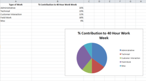
Charts are usually considered more aesthetically pleasing than graphs. Something like a pie chart is used to convey to readers the relative share of a particular segment of the data set with respect to other segments that are available. If instead of the changes in hours worked and annual leaves over 5 years, you want to present the percentage contributions of the different types of tasks that make up a 40 hour work week for employees in your organization then you can definitely insert a pie chart into your spreadsheet for the desired impact.
Graphs in Excel
Graphs represent variations in values of data points over a given duration of time. They are simpler than charts because you are dealing with different data parameters. Comparing and contrasting segments of the same set against one another is more difficult.
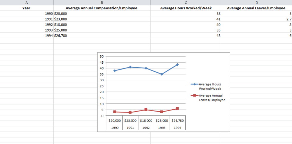
So if you are trying to see how the number of hours worked per week and the frequency of annual leaves for employees in your company has fluctuated over the past 5 years, you can create a simple line graph and track the spikes and dips to get a fair idea.
Types of Graphs Available in Excel
Excel offers three varieties of graphs:
- Line Graphs: Both 2 dimensional and three dimensional line graphs are available in all the versions of Microsoft Excel. Line graphs are great for showing trends over time. Simultaneously plot more than one data parameter – like employee compensation, average number of hours worked in a week and average number of annual leaves against the same X axis or time.
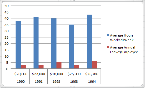
- Column Graphs: Column graphs also help viewers see how parameters change over time. But they can be called “graphs” when only a single data parameter is used. If multiple parameters are called into action, viewers can’t really get any insights about how each individual parameter has changed. As you can see in the Column graph below, average numbers of hours worked in a week and average number of annual leaves when plotted side by side do not provide the same clarity as the Line graph.
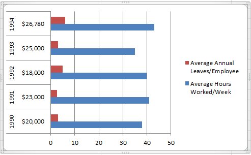
- Bar Graphs: Bar graphs are very similar to column graphs but here the constant parameter (say time) is assigned to the Y axis and the variables are plotted against the X axis.
1. Fill the Excel Sheet with Your Data & Assign the Right Data Types
The first step is to actually populate an Excel spreadsheet with the data that you need. If you have imported this data from a different software, then it’s probably been compiled in a .csv (comma separated values) formatted document.
If this is the case, use an online CSV to Excel converter like the one here to generate the Excel file or open it in Excel and save the file with an Excel extension.
After converting the file, you still may need to clean up the rows and the columns. It is better to work with a clean spreadsheet so that the Excel graph you’re creating is clean and easy to modify or change.
If that doesn’t work, you may also need to manually enter the data into the spreadsheet or copy and paste it over before creating the Excel graph.
Excel has two components to its spreadsheets:
- The rows that are horizontal and marked with numbers
- The columns that are vertical and marked with alphabets
After all the data values have been set and accounted for, make sure that you visit the Number section under the Home tab and assign the right data type to the various columns. If you do not do this, chances are your graphs will not show up right.
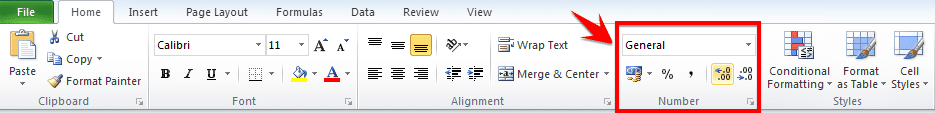
For example if column B is measuring time, ensure that you choose the option Time from the drop down menu and assign it to B.
Choose the Type of Excel Graph You Want to Create
This will depend on the type of data you have and the number of different parameters you will be tracking simultaneously.
If you are looking to take note of trends over time then Line graphs are your best bet. This is what we will be using for the purpose of the tutorial.
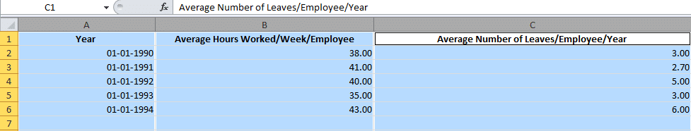
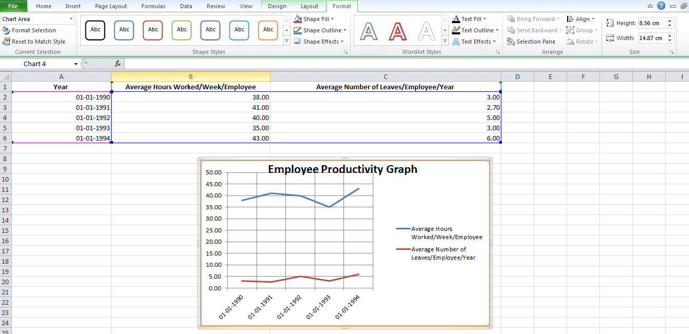
Let us assume that we are tracking Average Number of Hours Worked/Week/Employee and Average Number of Leaves/Employee/Year against a five year time span.
Highlight The Data Sets That You Want To Use
For a graph to be created, you need to select the different data parameters.
To do this, bring your cursor over the cell marked A. You will see it transform into a tiny arrow pointing downwards. When this happens, click on the cell A and the entire column will be selected.
Repeat the process with columns B and C, pressing the Ctrl (Control) button on Windows or using the Command key with Mac users.
Your final selection should look something like this:
Create the Basic Excel Graph
With the columns selected, visit the Insert tab and choose the option 2D Line Graph.
You will immediately see a graph appear below your data values.

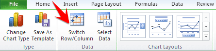
Sometimes if you do not assign the right data type to your columns in the first step, the graph may not show in a way that you want it to. For example, Excel may plot the parameter Average Number of Leaves/Employee/Year along the X axis instead of the Year. In this case, you can use the option Switch Row/Column under the Design tab of Chart Tools to play around with various combinations of X axis and Y axis parameters till you hit on the perfect rendition.
Improve Your Excel Graph with the Chart Tools
To change colors or to change the design of your graph, go to Chart Tools in the Excel header.
You can select from the design, layout and format. Each will change up the look and feel of your Excel graph.
Design: Design allows you to move your graph and re-position it. It gives you the freedom to change the chart type. You can even experiment with different chart layouts. This may conform more to your brand guidelines, your personal style, or your manager’s preference.

Layout: This allows you to change the title of the axis, the title of your chart and the position of the legend. You might go with vertical text along the Y axis and horizontal text along the X axis. You can even adjust the grid lines. You have every formatting tool conceivable at your fingertips to improve the look and feel of your graph.
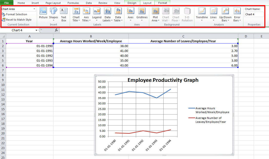
Format: The Format tab allows you to add a border in your chosen width and color around the graph to properly separate it from the data points that are filled in the rows and columns.
And there you have it. An accurate visual representation of the data that you have imported or entered manually to help your team members and stakeholders better engage with the information and utilize it to create strategies or be more aware of all the constraints while taking decisions!
Challenges with Making a Graph In Excel
When manipulating simple data sets, you can create a graph fairly easily.
But when you start adding in several types of data with multiple parameters, then there will be glitches. Here are some of the challenges that you’re going to have:
- Data sorting can be problematic when creating graphs. Online tutorials might recommend data sorting to make your “charts” look more aesthetically appealing. But beware of when the X axis is a time-based parameter! Sorting data values by magnitude may mess up the flow of the graph because the dates are sorted randomly. You may not be able to spot the trends very well.

You may forget to remove duplicates. This is especially true if you have imported the data from a third-party application. Generally, this type of information is not filtered of redundancies. And you might end up corrupting the integrity of your information if duplicates sneak into your pictorial representation of trends. When working with copious volumes of data, it is best to use the Remove Duplicates option on your rows.
Creating graphs in Excel doesn’t have to be overly complex, but, much like with creating Gantt charts in Excel, there can be some easier tools to help you do it. If you’re trying to create graphs for workloads, budget allocations or monitoring projects, check out project management software instead.
Many of those functions are automated and without manual data entry. And you won’t be left wondering about who has the latest data sets. Most project management solutions, like Workzone, have file sharing and some visualization capabilities built-in.
Over the past years, one of the things we’ve learned is that Microsoft Excel is like a Hallmark movie.
Some of us can’t get enough of them and others just can’t stand it. 💔😬
Regardless of your preference, if you’re a manager or business owner, you’ll probably have to rely on Excel for business insights.
Tools like Microsoft Excel graphs are helpful for data analysis and tracking.
And wayyy better than endless spreadsheets that can easily trigger a migraine.
Then why not turn your boring Excel spreadsheet into something interesting?
In this article, we’ll learn what an Excel graph is, how to make a graph in Excel, and its drawbacks. We’ll also suggest an alternative to create effortless graphs.
Let’s graph away!
What are Graphs & Charts in Microsoft Excel?
Graphs in Excel are graphical representations of variations in values of data points over a given period.
In other words, it’s a diagram that represents changes in comparison to one or more variables.
Too technical? 👀
Take a look at the image for clarity:

Wondering if graphs and charts in Excel are the same?
Graphs are mostly numerical representations of data as it shows how one variable is affecting or changing another.
On the other hand, charts are visual representations where variables may or may not be associated. They’re also considered more aesthetically pleasing than graphs. For example, a pie chart. 🥧
However, if you’re wondering how to make a chart in Excel, it isn’t very different from making a graph.
But for now, let’s focus on the main plot: graphs!✨
Steps To Make a Graph in Excel
The first (and obvious step) is to open a new Excel file or a blank Excel worksheet.
Done?
Then let’s learn how to create a graph in Excel.
⭐️ Step 1: fill the Excel sheet with data
Start by populating your Excel spreadsheet with the data you need.
You may import this data from different software, insert it manually, or copy and paste it.
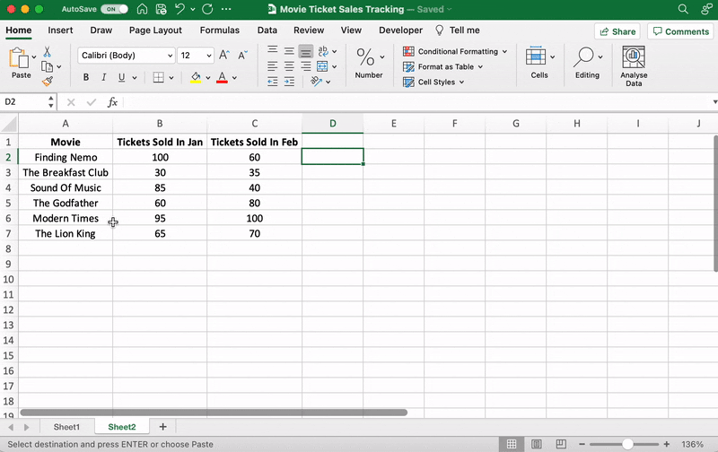
For our example, let’s say you’re an owner of a movie theater in a small town, and you often screen older movies. You probably want to track the sales of your tickets to see which movie is a hit so you can screen it frequently.
Let’s do that by comparing the ticket sales in January and February.
Here’s what your data might look like:

Column A contains the movie names.
Column B contains tickets sold in January.
And column C contains tickets sold in February.
You can bold headings and center align your text for better readability.
Done? Okay, get ready to pick a graph.
⭐️ Step 2: determine the Excel graph type you want
The type of graph you pick will depend on the data you have and the number of different parameters you want to track.
You’ll find the different graph types under the Excel Insert tab, in the Excel Ribbon, arranged close to one another like this:

Note: The Excel Ribbon is where you can find the Home, Insert, and Draw tabs.
Here are some of the different Excel graph or chart type options you can choose from:
- Line graph
- Column graph or bar graph
- Pie graph or chart
- Combo chart
- Area chart
- Scatter plot chart
➡️ Fun fact: Excel can help you decide the graph or chart type with the Recommended Charts (formerly known as Chart Wizard) option.
If you want to take notes of trends (increase or decrease) over time, then a line graph is perfect.
But for a long time frame and more data, a bar graph is the best option.
We’ll use these two graphs for the purpose of this Excel tutorial.
How To Create a Line Graph in Excel – 3 Steps
A line graph in Excel typically has two axes (horizontal and vertical) to function.
You need to enter the data in two columns.
Lucky for us, we’ve already done this when creating the ticket sales data table.
⭐️ Step 1: select data to turn into a line graph
Click and drag from the top-left cell (A1) in your ticket sales data to the bottom-right cell (C7) to select. Don’t forget to include column headers.
This will highlight all the data you want to display in your line graph.

⭐️ Step 2: insert line graph
Now that you’ve selected your data, it’s time to add the line graph.
Look for the line graph icon under the Insert tab.

With the data selected, go to Insert > Line. Click on the icon, and a dropdown menu will appear to select the type of line chart you want.
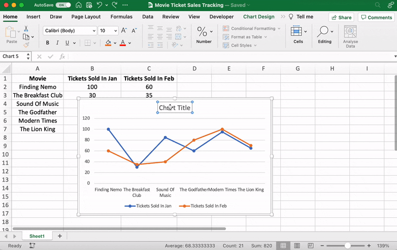
For this example, we’ll choose the fourth 2-D line graph (Line with Markers).
Excel will add your line graph representing your selected data series.

You’ll then notice the names of the movies appear on the horizontal axis and the number of tickets sold on the vertical axis.
⭐️ Step 3: customize your line graph
After adding the line graph, you’ll notice a new tab called Chart Design on your Excel Ribbon.
Select the Design tab to make the line graph your own by choosing the chart style you prefer.

You can also change the graph’s title.
Select the Chart Title > double click to name > type in the name you wish to call it. To save it, simply click anywhere outside the graph’s title box or chart area.
We’ll name our graph “Movie Ticket Sales.”
Anything else you need to tweak?
If you spot anything, now is the time to make those edits!
For example, here you can see The Godfather and Modern Times are smooshed together.
Let’s give them some space.
How?
Just drag any corner of the graph until it’s how you desire.

These are just some examples. You can customize every chart element if you like including the Axis Labels (the color of the lines that represent each data point, etc.)
Just double click on any chart element to open a sidebar for formatting like this:
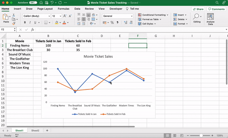
That’s it! You’ve successfully created a line graph in Excel!
Now, let’s learn how to make a bar graph. 📊
3 Steps To Create a Bar Graph in Excel
Any Excel graph or Excel chart begins with a populated sheet.
We’ve already done this, so copy and paste the movie ticket sales data to a new sheet tab in the same Excel workbook.
⭐️ Step 1: select data to turn into a bar graph
Like step 1 for the line graph, you need to select the data you wish to turn into a bar graph.
Drag from cell A1 to C7 to highlight the data.
⭐️ Step 2: insert bar graph
Highlight your data, go to the Insert tab, and click on the Column chart or graph icon. A dropdown menu should appear.
Select Clustered Bar under the 2-D bar options.
Note: you can choose a different type of bar chart option like a 3D clustered column or 2D stacked bar, etc.
As soon as you click on the bar graph option, it’ll be added to your Excel sheet.

⭐️ Step 3: customize your Excel bar graph
Now, you can go to the Chart Design tab in the Excel Ribbon to personalize it.
Click on the Design tab to apply a bar style you prefer from the many options.

You know the next step! Change the bar graph’s title.
Select the Excel Chart Title > double click on the title box > type in “Movie Ticket Sales.”
Then click anywhere on the excel sheet to save it.

Note: you can also add other graph elements such as Axis Title, Data Label, Data Table, etc., with the Add Chart Element option. You’ll find it under the Chart Design tab.
And that’s a wrap. 🎬
You’ve successfully created a bar graph in Excel!
Well, that was fun.
But the question is, do you have the time for graphs in your busy work schedule?
And that’s just the teaser when it comes to Excel graph drawbacks.
Read on to watch the full movie. 👀
Bonus: Check out these Excel Alternatives!
Create Effortless Graphs With ClickUp
If ClickUp were a Hallmark movie, graphs and this project management tool would be the perfect match.
A forever kind-of-love. ❤️
Whether you want to create graphs to monitor time, projects, people, ticket sales… you name it because we can do it all within a few clicks.
All without the drawbacks of using Excel!
Excel can be:
- Time-consuming and manual
- Complex and pricey
- Error-prone
The best part?
Most of those functions are automated without manual data entry. Phew.
1. Line Chart Widgets
The Line Chart Widget is a Custom Widget on our Dashboard. Use this ClickUp production to visualize literally anything in the form of a line graph.
It can be tracking profits, total daily sales, or how many movies you’ve watched in a month.
Like we said, a-n-y-t-h-i-n-g!

Visualize any set of values as a line graph with the Line Chart Widget on ClickUp’s Dashboard!
And that’s not it. You can visualize your data in many different ways too.
Just use any of these Custom Widgets:
- Calculations
- Bar charts
- Battery chart
- Pie chart
- And more

Present your data visually as a pie chart with Custome Widgets in ClickUp!
2. Gantt Chart view
Just like it’s difficult to love just one movie genre, we totally get that graphs alone don’t work.
And that’s why we have charts too!
Specifically, ClickUp’s Gantt chart, an interactive chart with live updates and progress tracking that can help you:
- Plan projects
- Assign tasks and assignees
- Schedule a timeline
- Manage dependencies
- And more

Drawing a relationship from one task to a future task in ClickUp’s Gantt Chart view!
3. Table view
If you’re a fan of the Excel grids, ClickUp has your back.
Starring… ClickUp Table view!
This view lets you visualize your tasks in the spreadsheet style.
It’s super fast and allows easy navigation between fields, bulk edits, and data export.
➡️ Fun fact: you can quickly copy and paste your table’s data into other programs, like MS Excel. Just click and drag to highlight the cells you want to copy.
Highlight data from your table in ClickUp to copy and paste into other programs!
And that was just the trailer for you. 📽️
Here are some more powerful ClickUp features in store for:
- Send and receive emails right from your project management tool with Email in ClickUp
- Work even when the wifi acts up with Offline Mode
- Work how you like with multiple ClickUp Views, including Calendar, Mind Maps, Chat, etc.
- Reduce your workload with ClickUp Automations
- Track time spent on tasks with ClickUp’s Native Time Tracker
- Share Table view or Dashboards with clients and external users using Public Sharing and Permissions
- View all graphs and charts on the go with ClickUp mobile apps
Now Showing: ClickUp 🎥🍿
You can surely make tons of graphs in Excel.
No doubt there.
But does that make it a smart choice?
I mean, if you have to Google how to make a graph in Excel, maybe that’s your red flag. 🚩
Tools are supposed to make your life easier.
Take ClickUp, for instance.
Our project management tool can be your graph maker, chart creator, spreadsheet builder, time tracker, workload manager…
It’s a hallmark for a quality tool that can be your all-in-one solution.
Get your ClickUp ticket for free today and enjoy watching your graphs come to life in minutes!
Related readings:
- How to create Gantt charts in Excel
- How to create a Kanban board in Excel
- How to create a burndown chart in Excel
- How to create a flowchart in Excel
- How to show dependencies in Excel
- How to create a KPI dashboard in Excel
- How to create a dashboard in Excel
- How to create a database in Excel
- How to make a work breakdown structure in Excel
Содержание
- Создание графиков в Excel
- Построение обычного графика
- Редактирование графика
- Построение графика со вспомогательной осью
- Построение графика функции
- Вопросы и ответы

График позволяет визуально оценить зависимость данных от определенных показателей или их динамику. Эти объекты используются и в научных или исследовательских работах, и в презентациях. Давайте рассмотрим, как построить график в программе Microsoft Excel.
Каждый пользователь, желая более наглядно продемонстрировать какую-то числовую информацию в виде динамики, может создать график. Этот процесс несложен и подразумевает наличие таблицы, которая будет использоваться за базу. По своему усмотрению объект можно видоизменять, чтобы он лучше выглядел и отвечал всем требованиям. Разберем, как создавать различные виды графиков в Эксель.
Построение обычного графика
Рисовать график в Excel можно только после того, как готова таблица с данными, на основе которой он будет строиться.
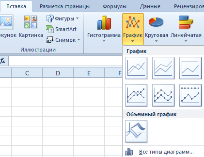
- Находясь на вкладке «Вставка», выделяем табличную область, где расположены расчетные данные, которые мы желаем видеть в графике. Затем на ленте в блоке инструментов «Диаграммы» кликаем по кнопке «График».
- После этого открывается список, в котором представлено семь видов графиков:
- Обычный;
- С накоплением;
- Нормированный с накоплением;
- С маркерами;
- С маркерами и накоплением;
- Нормированный с маркерами и накоплением;
- Объемный.
Выбираем тот, который по вашему мнению больше всего подходит для конкретно поставленных целей его построения.
- Дальше Excel выполняет непосредственное построение графика.
Редактирование графика
После построения графика можно выполнить его редактирование для придания объекту более презентабельного вида и облегчения понимания материала, который он отображает.
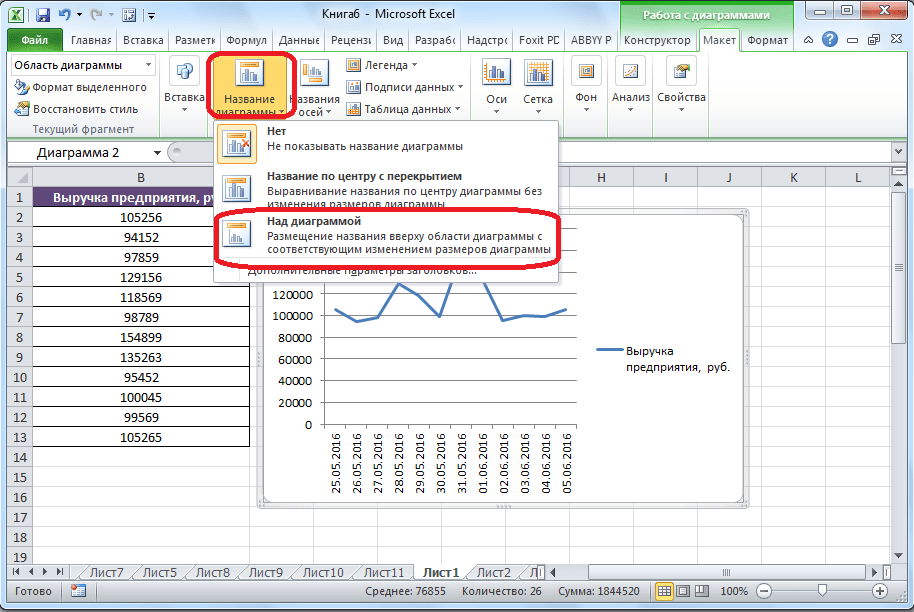
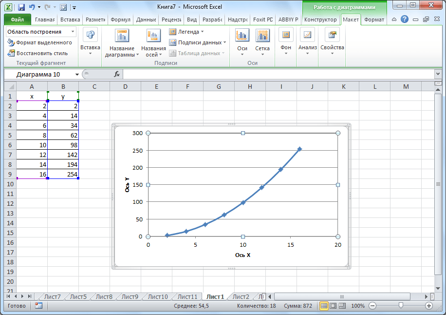
- Чтобы подписать график, переходим на вкладку «Макет» мастера работы с диаграммами. Кликаем по кнопке на ленте с наименованием «Название диаграммы». В открывшемся списке указываем, где будет размещаться имя: по центру или над графиком. Второй вариант обычно более уместен, поэтому мы в качестве примера используем «Над диаграммой». В результате появляется название, которое можно заменить или отредактировать на свое усмотрение, просто нажав по нему и введя нужные символы с клавиатуры.
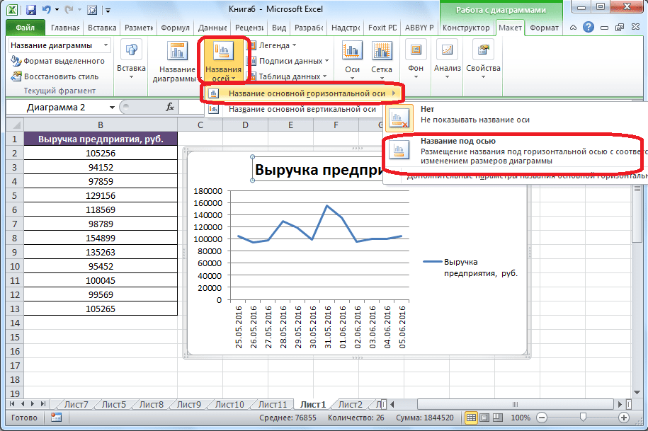
- Задать имя осям можно, кликнув по кнопке «Название осей». В выпадающем списке выберите пункт «Название основной горизонтальной оси», а далее переходите в позицию «Название под осью».
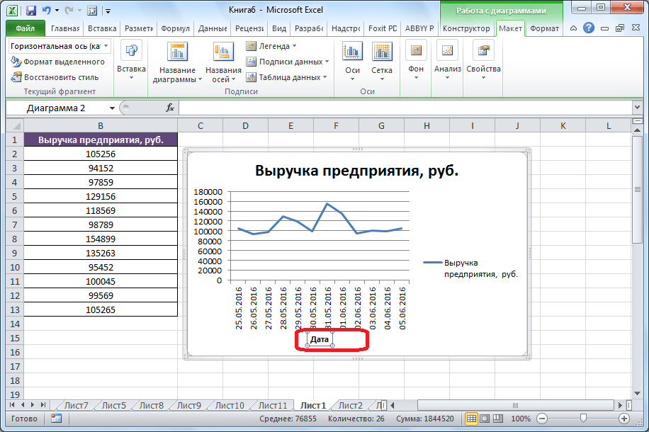
- Под осью появляется форма для наименования, в которую можно занести любое на свое усмотрение название.
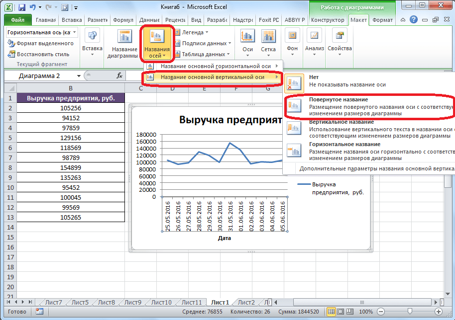
- Аналогичным образом подписываем вертикальную ось. Жмем по кнопке «Название осей», но в появившемся меню выбираем «Название основной вертикальной оси». Откроется перечень из трех вариантов расположения подписи: повернутое, вертикальное, горизонтальное. Лучше всего использовать повернутое имя, так как в этом случае экономится место на листе.
- На листе около соответствующей оси появляется поле, в которое можно ввести наиболее подходящее по контексту расположенных данных название.
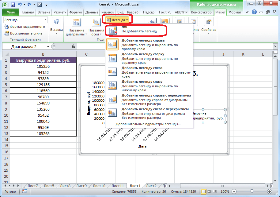
- Если вы считаете, что для понимания графика легенда не нужна и она только занимает место, то можно удалить ее. Щелкните по кнопке «Легенда», расположенной на ленте, а затем по варианту «Нет». Тут же можно выбрать любую позицию легенды, если надо ее не удалить, а только сменить расположение.

Построение графика со вспомогательной осью
Существуют случаи, когда нужно разместить несколько графиков на одной плоскости. Если они имеют одинаковые меры исчисления, то это делается точно так же, как описано выше. Но что делать, если меры разные?
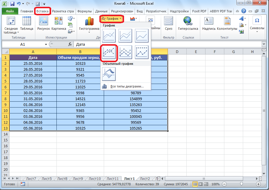
- Находясь на вкладке «Вставка», как и в прошлый раз, выделяем значения таблицы. Далее жмем на кнопку «График» и выбираем наиболее подходящий вариант.
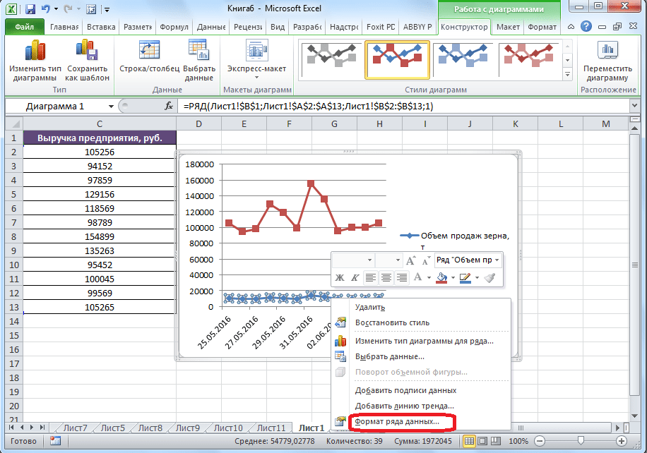
- Как видим, формируются два графика. Для того чтобы отобразить правильное наименование единиц измерения для каждого графика, кликаем правой кнопкой мыши по тому из них, для которого собираемся добавить дополнительную ось. В появившемся меню указываем пункт «Формат ряда данных».
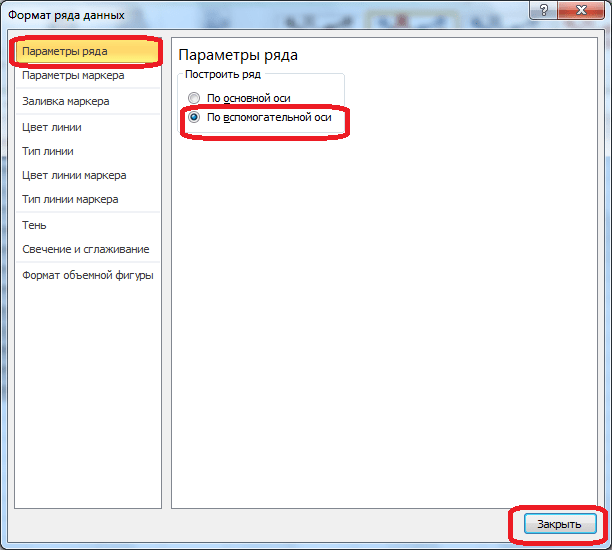
- Запускается окно формата ряда данных. В его разделе «Параметры ряда», который должен открыться по умолчанию, переставляем переключатель в положение «По вспомогательной оси». Жмем на кнопку «Закрыть».
- Образуется новая ось, а график перестроится.
- Нам только осталось подписать оси и название графика по алгоритму, аналогичному предыдущему примеру. При наличии нескольких графиков легенду лучше не убирать.

Построение графика функции
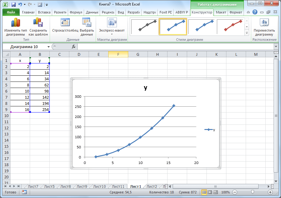
Теперь давайте разберемся, как построить график по заданной функции.
- Допустим, мы имеем функцию
Y=X^2-2. Шаг будет равен 2. Прежде всего построим таблицу. В левой части заполняем значения X с шагом 2, то есть 2, 4, 6, 8, 10 и т.д. В правой части вбиваем формулу. - Далее наводим курсор на нижний правый угол ячейки, щелкаем левой кнопкой мыши и «протягиваем» до самого низа таблицы, тем самым копируя формулу в другие ячейки.
- Затем переходим на вкладку «Вставка». Выделяем табличные данные функции и кликаем по кнопке «Точечная диаграмма» на ленте. Из представленного списка диаграмм выбираем точечную с гладкими кривыми и маркерами, так как этот вид больше всего подходит для построения.
- Выполняется построение графика функции.
- После того как объект был построен, можно удалить легенду и сделать некоторые визуальные правки, о которых уже шла речь выше.

Как видим, Microsoft Excel предлагает возможность построения различных типов графиков. Основным условием для этого является создание таблицы с данными. Созданный график можно изменять и корректировать согласно целевому назначению.
Еще статьи по данной теме:
Помогла ли Вам статья?
Building charts and graphs are one of the best ways to visualize data in a clear and comprehensible way.

However, it’s no surprise that some people get a little intimidated by the prospect of poking around in Microsoft Excel.

I thought I’d share a helpful video tutorial as well as some step-by-step instructions for anyone out there who cringes at the thought of organizing a spreadsheet full of data into a chart that actually, you know, means something. But before diving in, we should go over the different types of charts you can create in the software.
Types of Charts in Excel
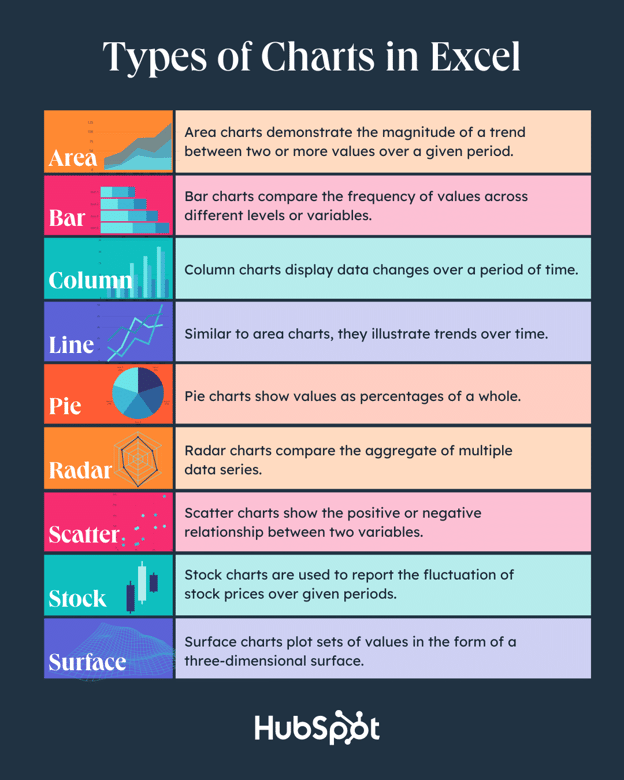
You can make more than just bar or line charts in Microsoft Excel, and when you understand the uses for each, you can draw more insightful information for your or your team’s projects.
|
Type of Chart |
Use |
|
Area |
Area charts demonstrate the magnitude of a trend between two or more values over a given period. |
|
Bar |
Bar charts compare the frequency of values across different levels or variables. |
|
Column |
Column charts display data changes or a period of time. |
|
Line |
Similar to bar charts, they illustrate trends over time. |
|
Pie |
Pie charts show values as percentages of a whole. |
|
Radar |
Radar charts compare the aggregate of multiple data series. |
|
Scatter |
Scatter charts show the positive or negative relationship between two variables. |
|
Stock |
Stock charts are used to report the fluctuation of stock prices over given periods. |
|
Surface |
Surface charts plot sets of values in the form of a three-dimensional surface. |
The steps you need to build a chart or graph in Excel are simple, and here’s a quick walkthrough on how to make them.
Keep in mind there are many different versions of Excel, so what you see in the video above might not always match up exactly with what you’ll see in your version. In the video, I used Excel 2021 version 16.49 for Mac OS X.
To get the most updated instructions, I encourage you to follow the written instructions below (or download them as PDFs). Most of the buttons and functions you’ll see and read are very similar across all versions of Excel.
Download Demo Data | Download Instructions (Mac) | Download Instructions (PC)
- Enter your data into Excel.
- Choose one of nine graph and chart options to make.
- Highlight your data and click ‘Insert’ your desired graph.
- Switch the data on each axis, if necessary.
- Adjust your data’s layout and colors.
- Change the size of your chart’s legend and axis labels.
- Change the Y-axis measurement options, if desired.
- Reorder your data, if desired.
- Title your graph.
- Export your graph or chart.
Featured Resource: Free Excel Graph Templates
.png)
Why start from scratch? Use these free Excel Graph Generators. just input your data and adjust as needed for a beautiful data visualization.
1. Enter your data into Excel.
First, you need to input your data into Excel. You might have exported the data from elsewhere, like a piece of marketing software or a survey tool. Or maybe you’re inputting it manually.
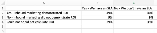
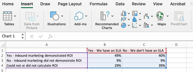
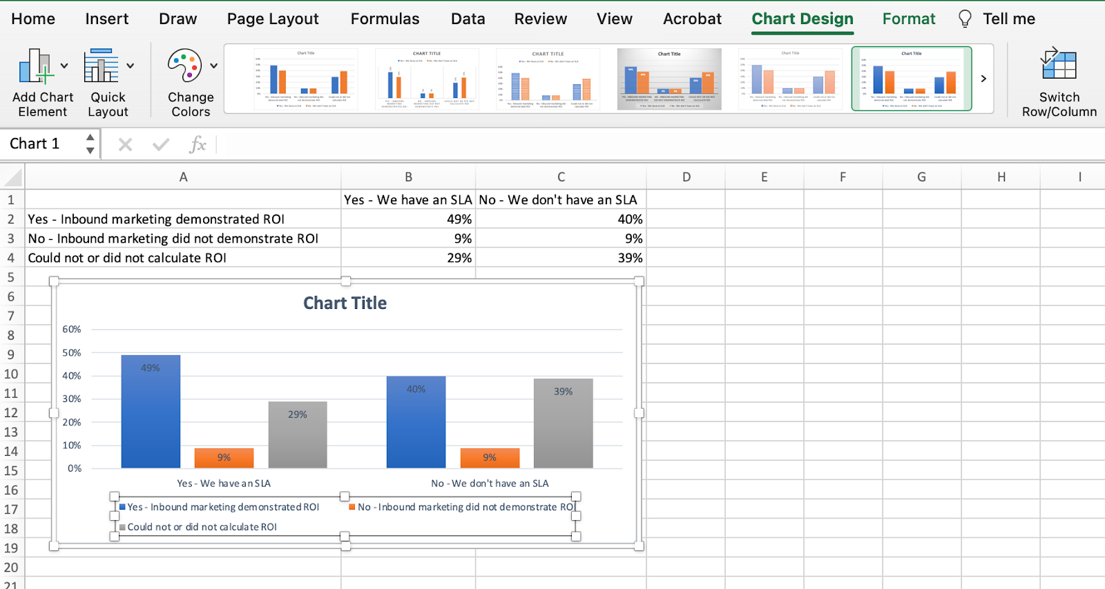
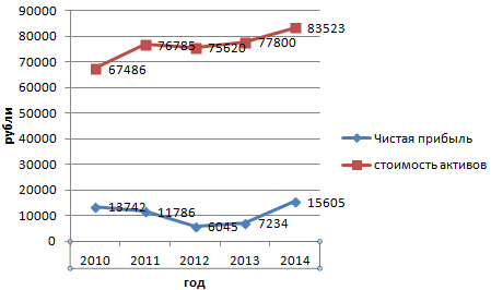
In the example below, in Column A, I have a list of responses to the question, “Did inbound marketing demonstrate ROI?”, and in Columns B, C, and D, I have the responses to the question, “Does your company have a formal sales-marketing agreement?” For example, Column C, Row 2 illustrates that 49% of people with a service level agreement (SLA) also say that inbound marketing demonstrated ROI.
2. Choose from the graph and chart options.
In Excel, your options for charts and graphs include column (or bar) graphs, line graphs, pie graphs, scatter plots, and more. See how Excel identifies each one in the top navigation bar, as depicted below:
To find the chart and graph options, select Insert.
(For help figuring out which type of chart/graph is best for visualizing your data, check out our free ebook, How to Use Data Visualization to Win Over Your Audience.)
3. Highlight your data and insert your desired graph into the spreadsheet.
In this example, a bar graph presents the data visually. To make a bar graph, highlight the data and include the titles of the X and Y-axis. Then, go to the Insert tab and click the column icon in the charts section. Choose the graph you wish from the dropdown window that appears.
I picked the first two dimensional column option because I prefer the flat bar graphic over the three dimensional look. See the resulting bar graph below.

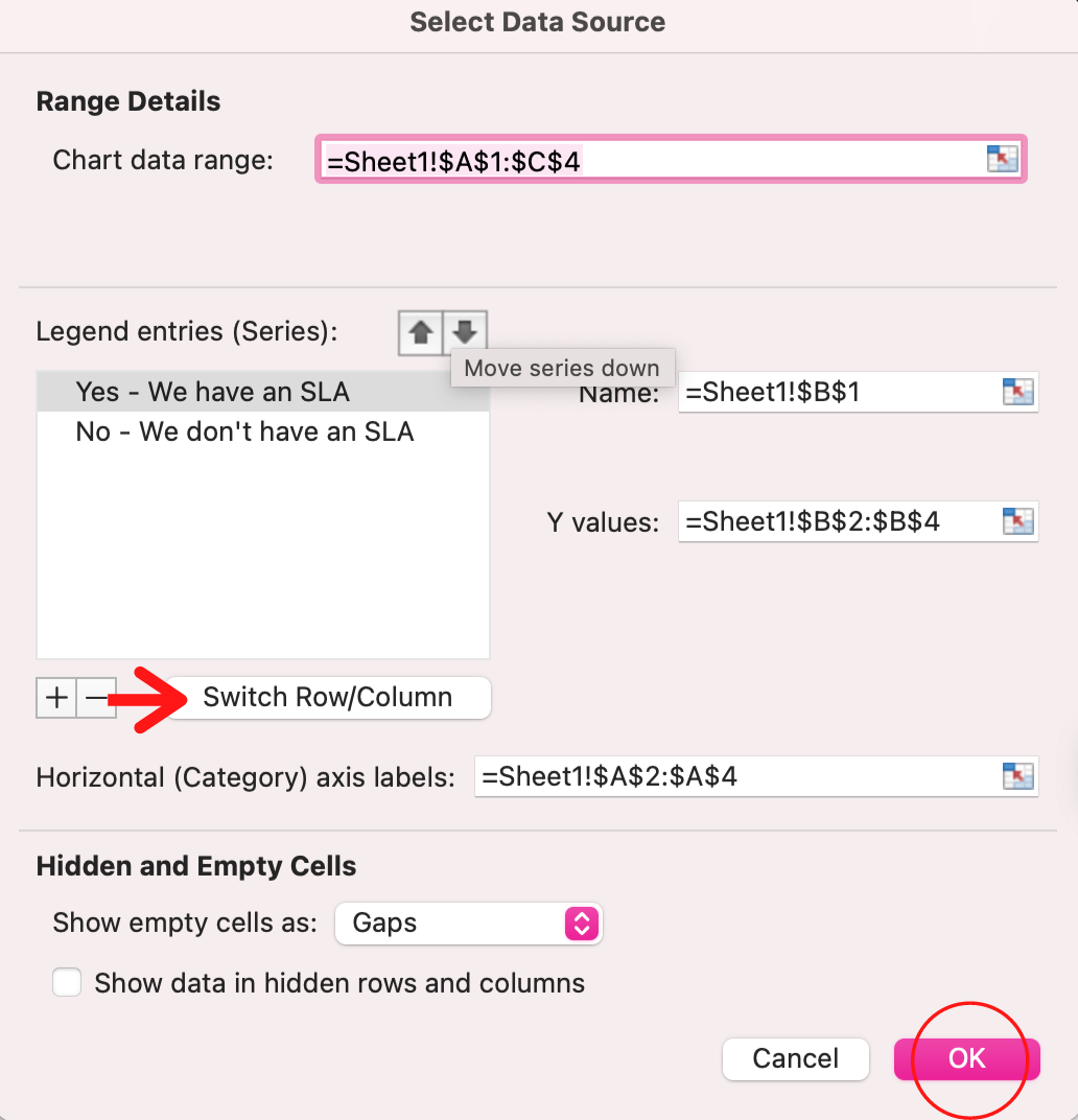
4. Switch the data on each axis, if necessary.
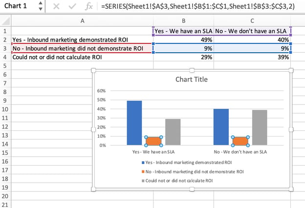
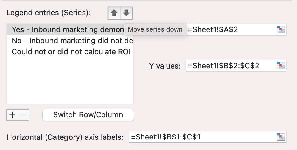
If you want to switch what appears on the X and Y axis, right-click on the bar graph, click Select Data, and click Switch Row/Column. This will rearrange which axes carry which pieces of data in the list shown below. When finished, click OK at the bottom.
The resulting graph would look like this:
5. Adjust your data’s layout and colors.
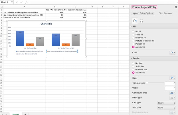
To change the labeling layout and legend, click on the bar graph, then click the Chart Design tab. Here, you can choose which layout you prefer for the chart title, axis titles, and legend. In my example below, I clicked on the option that displayed softer bar colors and legends below the chart.
To further format the legend, click on it to reveal the Format Legend Entry sidebar, as shown below. Here, you can change the fill color of the legend, which will change the color of the columns themselves. To format other parts of your chart, click on them individually to reveal a corresponding Format window.
6. Change the size of your chart’s legend and axis labels.
When you first make a graph in Excel, the size of your axis and legend labels might be small, depending on the graph or chart you choose (bar, pie, line, etc.) Once you’ve created your chart, you’ll want to beef up those labels so they’re legible.
To increase the size of your graph’s labels, click on them individually and, instead of revealing a new Format window, click back into the Home tab in the top navigation bar of Excel. Then, use the font type and size dropdown fields to expand or shrink your chart’s legend and axis labels to your liking.

7. Change the Y-axis measurement options if desired.
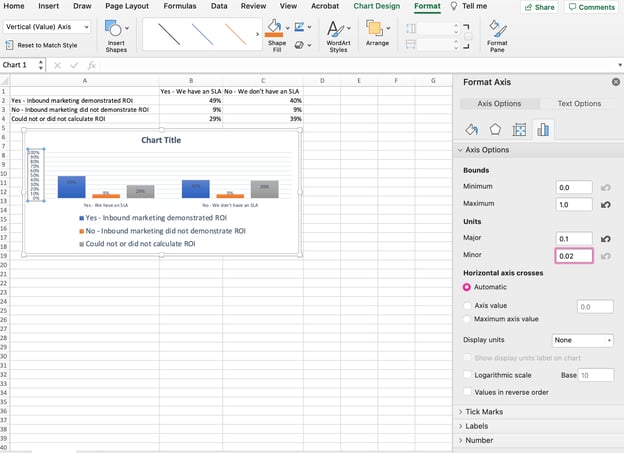
To change the type of measurement shown on the Y axis, click on the Y-axis percentages in your chart to reveal the Format Axis window. Here, you can decide if you want to display units located on the Axis Options tab, or if you want to change whether the Y-axis shows percentages to two decimal places or no decimal places.
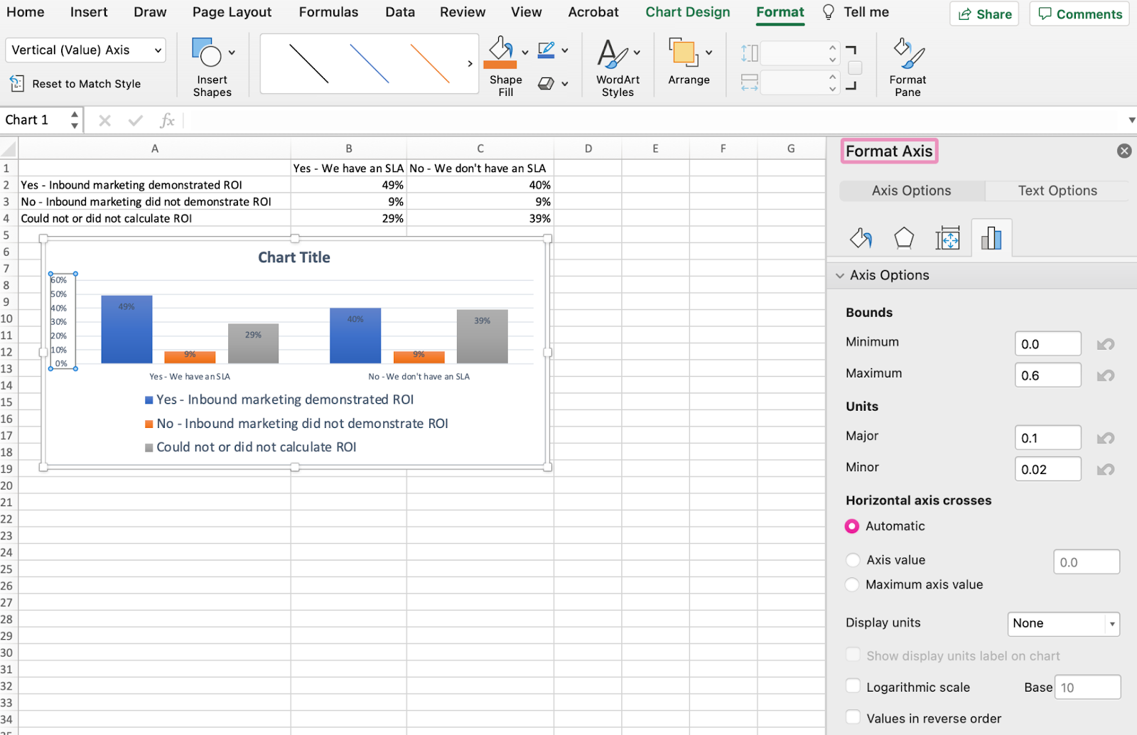
Because my graph automatically sets the Y axis’s maximum percentage to 60%, you might want to change it manually to 100% to represent my data on a universal scale. To do so, you can select the Maximum option — two fields down under Bounds in the Format Axis window — and change the value from 0.6 to one.
The resulting graph will look like the one below (In this example, the font size of the Y-axis has been increased via the Home tab so that you can see the difference):
8. Reorder your data, if desired.
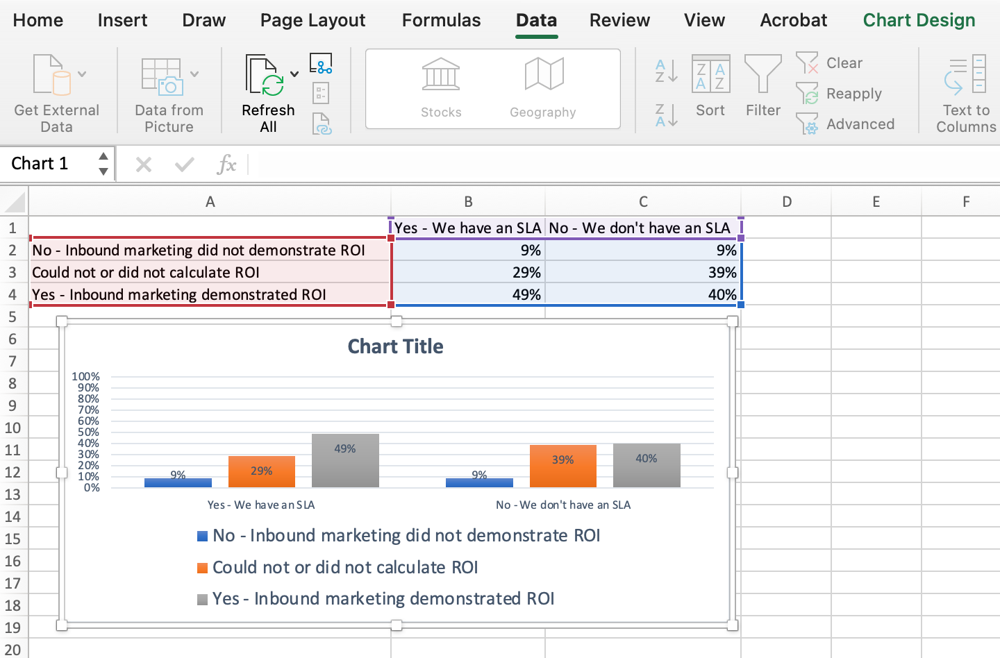
To sort the data so the respondents’ answers appear in reverse order, right-click on your graph and click Select Data to reveal the same options window you called up in Step 3 above. This time, arrow up and down to reverse the order of your data on the chart.
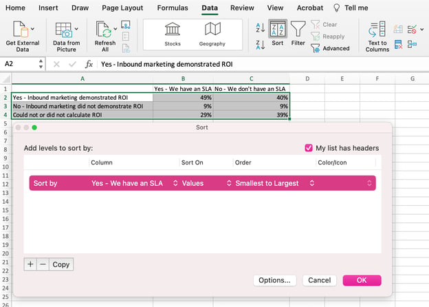
If you have more than two lines of data to adjust, you can also rearrange them in ascending or descending order. To do this, highlight all of your data in the cells above your chart, click Data and select Sort, as shown below. Depending on your preference, you can choose to sort based on smallest to largest, or vice versa.
The resulting graph would look like this:
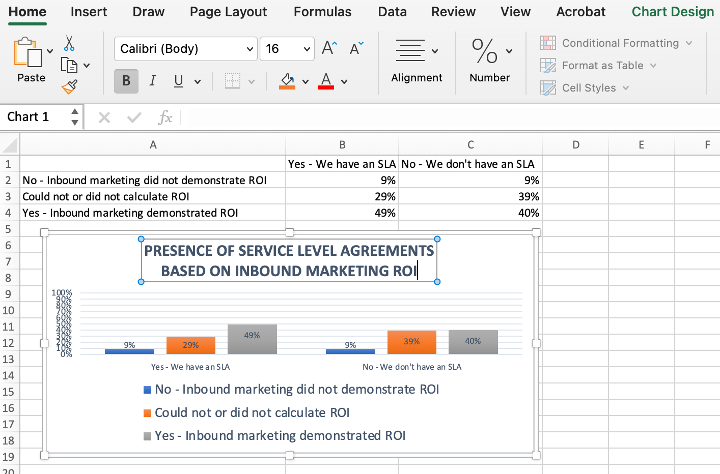
9. Title your graph.
Now comes the fun and easy part: naming your graph. By now, you might have already figured out how to do this. Here’s a simple clarifier.
Right after making your chart, the title that appears will likely be «Chart Title,» or something similar depending on the version of Excel you’re using. To change this label, click on «Chart Title» to reveal a typing cursor. You can then freely customize your chart’s title.
When you have a title you like, click Home on the top navigation bar, and use the font formatting options to give your title the emphasis it deserves. See these options and my final graph below:
10. Export your graph or chart.
Once your chart or graph is exactly the way you want it, you can save it as an image without screenshotting it in the spreadsheet. This method will give you a clean image of your chart that can be inserted into a PowerPoint presentation, Canva document, or any other visual template.
To save your Excel graph as a photo, right-click on the graph and select Save as Picture.
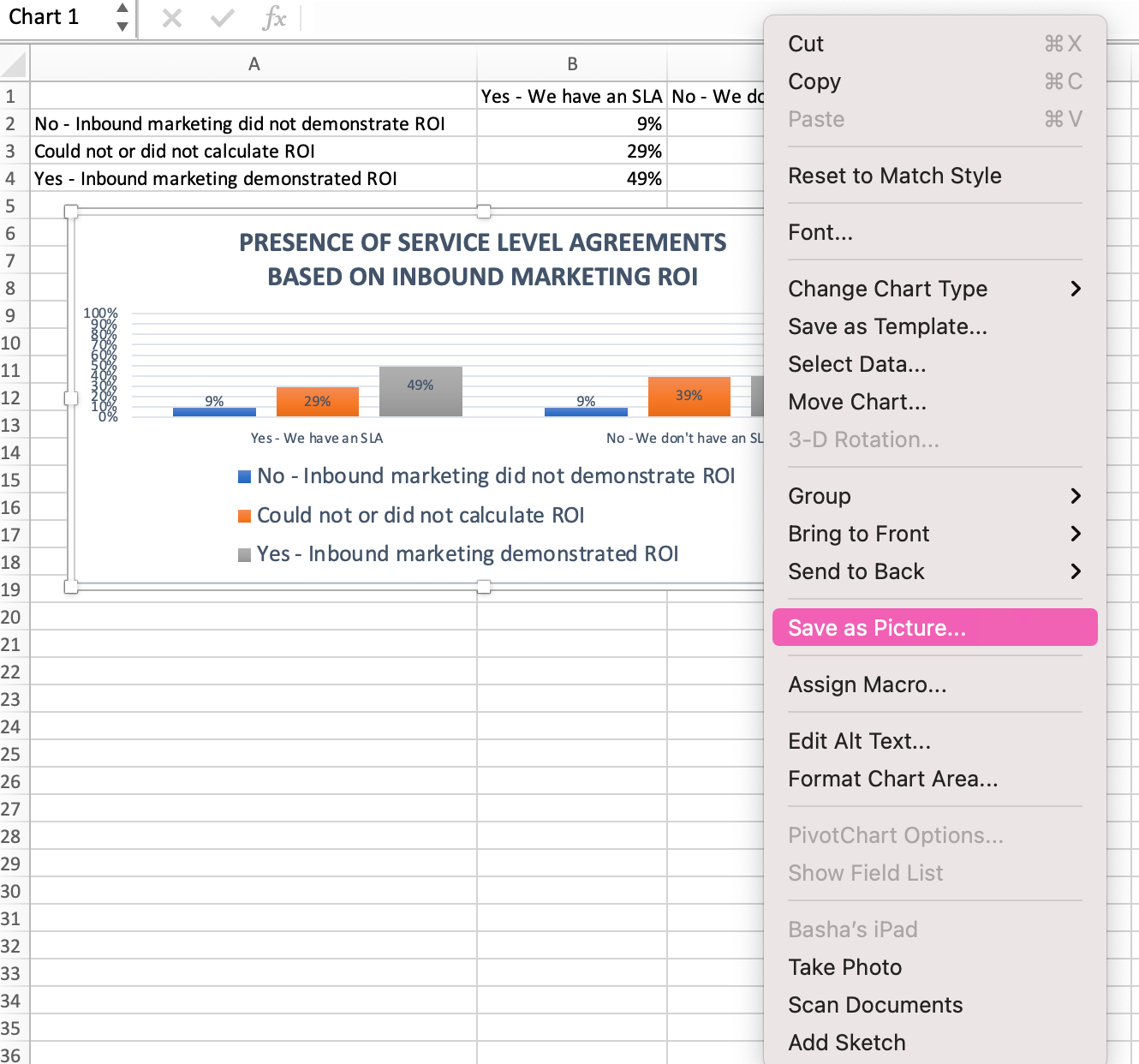
In the dialogue box, name the photo of your graph, choose where to save it on your computer, and choose the file type you’d like to save it as. In this example, it’s saved as a JPEG to a desktop folder. Finally, click Save.
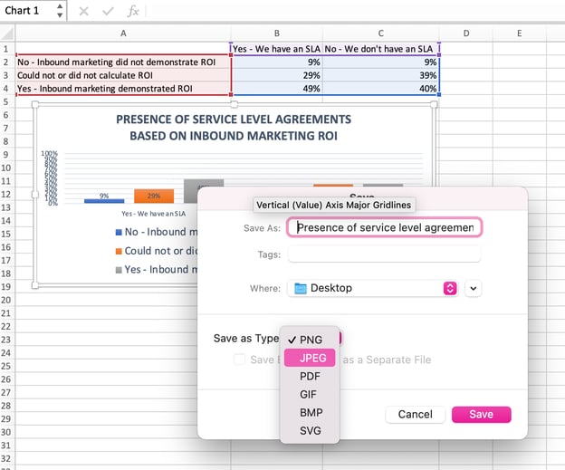
You’ll have a clear photo of your graph or chart that you can add to any visual design.

Visualize Data Like A Pro
That was pretty easy, right? With this step-by-step tutorial, you’ll be able to quickly create charts and graphs that visualize the most complicated data. Try using this same tutorial with different graph types like a pie chart or line graph to see what format tells the story of your data best.
Editor’s note: This post was originally published in June 2018 and has been updated for comprehensiveness.

Информация воспринимается легче, если представлена наглядно. Один из способов презентации отчетов, планов, показателей и другого вида делового материала – графики и диаграммы. В аналитике это незаменимые инструменты.
Построить график в Excel по данным таблицы можно несколькими способами. Каждый из них обладает своими преимуществами и недостатками для конкретной ситуации. Рассмотрим все по порядку.
Простейший график изменений
График нужен тогда, когда необходимо показать изменения данных. Начнем с простейшей диаграммы для демонстрации событий в разные промежутки времени.
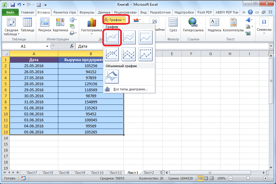
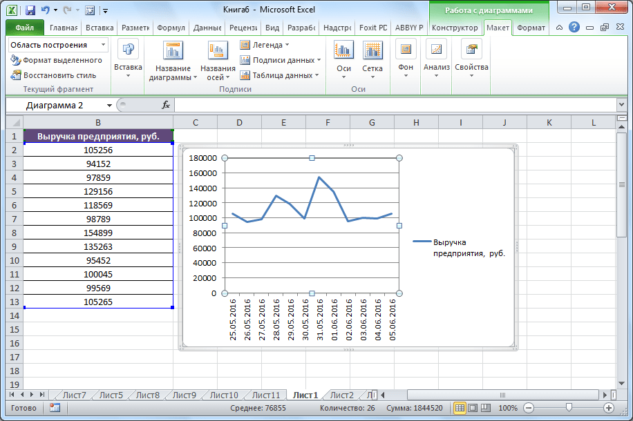
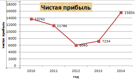
Допустим, у нас есть данные по чистой прибыли предприятия за 5 лет:
| Год | Чистая прибыль* |
| 2010 | 13742 |
| 2011 | 11786 |
| 2012 | 6045 |
| 2013 | 7234 |
| 2014 | 15605 |
* Цифры условные, для учебных целей.
Заходим во вкладку «Вставка». Предлагается несколько типов диаграмм:
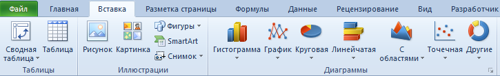
Выбираем «График». Во всплывающем окне – его вид. Когда наводишь курсор на тот или иной тип диаграммы, показывается подсказка: где лучше использовать этот график, для каких данных.
Выбрали – скопировали таблицу с данными – вставили в область диаграммы. Получается вот такой вариант:
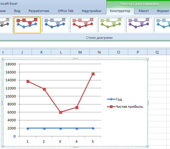
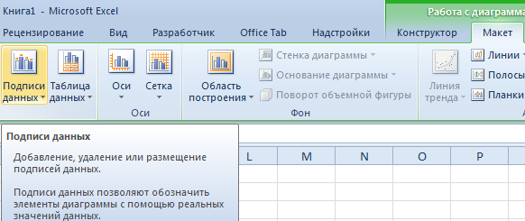
Прямая горизонтальная (синяя) не нужна. Просто выделяем ее и удаляем. Так как у нас одна кривая – легенду (справа от графика) тоже убираем. Чтобы уточнить информацию, подписываем маркеры. На вкладке «Подписи данных» определяем местоположение цифр. В примере – справа.
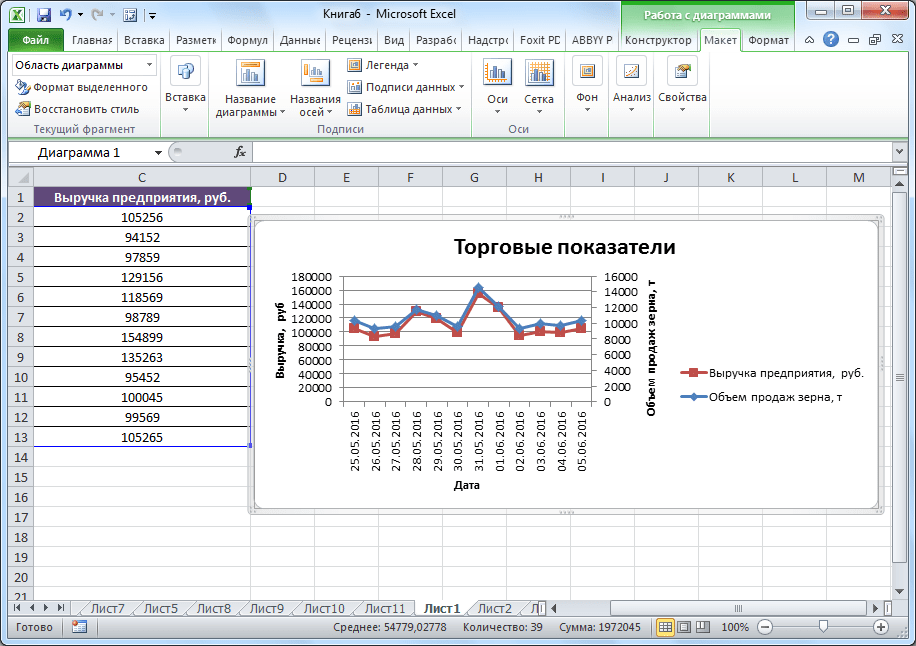
Улучшим изображение – подпишем оси. «Макет» – «Название осей» – «Название основной горизонтальной (вертикальной) оси»:
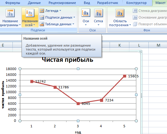
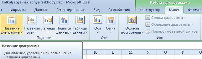
Заголовок можно убрать, переместить в область графика, над ним. Изменить стиль, сделать заливку и т.д. Все манипуляции – на вкладке «Название диаграммы».
Вместо порядкового номера отчетного года нам нужен именно год. Выделяем значения горизонтальной оси. Правой кнопкой мыши – «Выбрать данные» — «Изменить подписи горизонтальной оси». В открывшейся вкладке выбрать диапазон. В таблице с данными – первый столбец. Как показано ниже на рисунке:
Можем оставить график в таком виде. А можем сделать заливку, поменять шрифт, переместить диаграмму на другой лист («Конструктор» — «Переместить диаграмму»).
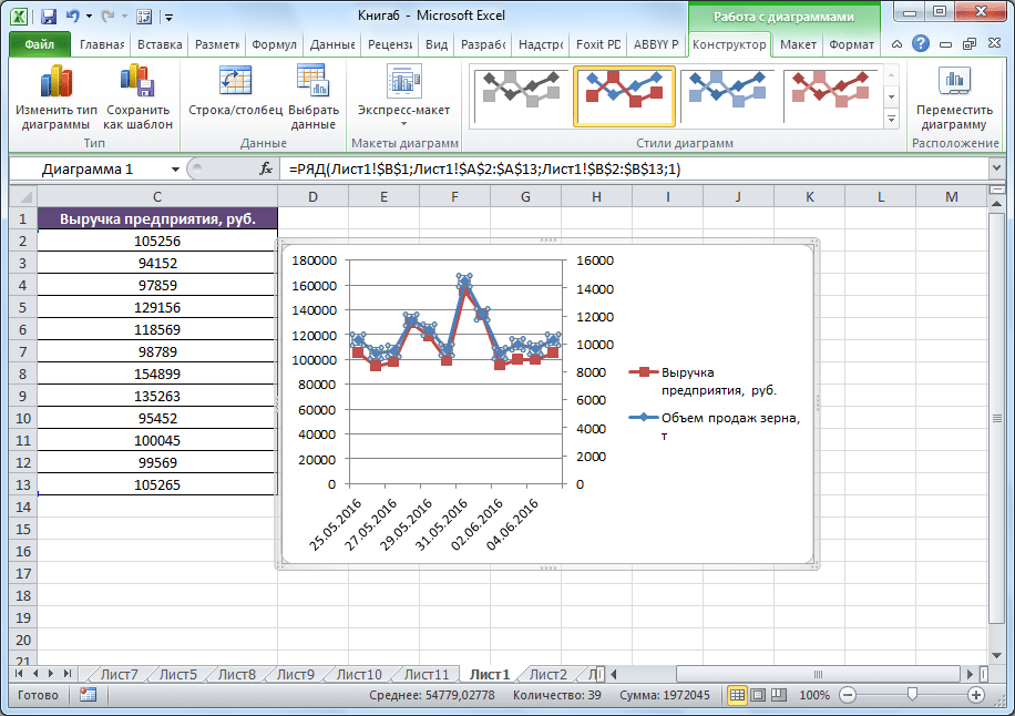
График с двумя и более кривыми
Допустим, нам нужно показать не только чистую прибыль, но и стоимость активов. Данных стало больше:
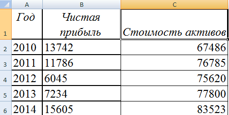
Но принцип построения остался прежним. Только теперь есть смысл оставить легенду. Так как у нас 2 кривые.
Добавление второй оси
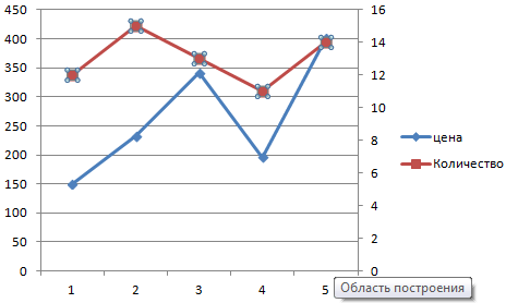
Как добавить вторую (дополнительную) ось? Когда единицы измерения одинаковы, пользуемся предложенной выше инструкцией. Если же нужно показать данные разных типов, понадобится вспомогательная ось.
Сначала строим график так, будто у нас одинаковые единицы измерения.
Выделяем ось, для которой хотим добавить вспомогательную. Правая кнопка мыши – «Формат ряда данных» – «Параметры ряда» — «По вспомогательной оси».
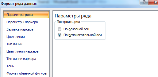
Нажимаем «Закрыть» — на графике появилась вторая ось, которая «подстроилась» под данные кривой.
Это один из способов. Есть и другой – изменение типа диаграммы.
Щелкаем правой кнопкой мыши по линии, для которой нужна дополнительная ось. Выбираем «Изменить тип диаграммы для ряда».
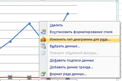
Определяемся с видом для второго ряда данных. В примере – линейчатая диаграмма.
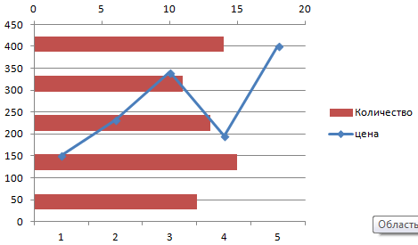
Всего несколько нажатий – дополнительная ось для другого типа измерений готова.
Строим график функций в Excel
Вся работа состоит из двух этапов:
- Создание таблицы с данными.
- Построение графика.
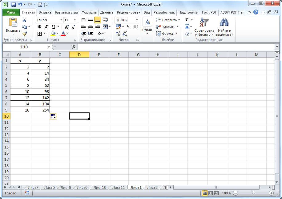
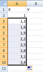
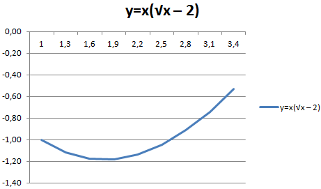
Пример: y=x(√x – 2). Шаг – 0,3.
Составляем таблицу. Первый столбец – значения Х. Используем формулы. Значение первой ячейки – 1. Второй: = (имя первой ячейки) + 0,3. Выделяем правый нижний угол ячейки с формулой – тянем вниз столько, сколько нужно.
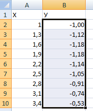
В столбце У прописываем формулу для расчета функции. В нашем примере: =A2*(КОРЕНЬ(A2)-2). Нажимаем «Ввод». Excel посчитал значение. «Размножаем» формулу по всему столбцу (потянув за правый нижний угол ячейки). Таблица с данными готова.
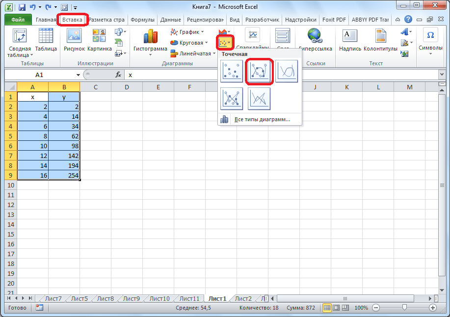
Переходим на новый лист (можно остаться и на этом – поставить курсор в свободную ячейку). «Вставка» — «Диаграмма» — «Точечная». Выбираем понравившийся тип. Щелкаем по области диаграммы правой кнопкой мыши – «Выбрать данные».
Выделяем значения Х (первый столбец). И нажимаем «Добавить». Открывается окно «Изменение ряда». Задаем имя ряда – функция. Значения Х – первый столбец таблицы с данными. Значения У – второй.
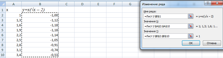
Жмем ОК и любуемся результатом.
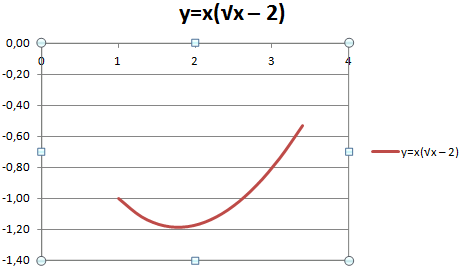
С осью У все в порядке. На оси Х нет значений. Проставлены только номера точек. Это нужно исправить. Необходимо подписать оси графика в excel. Правая кнопка мыши – «Выбрать данные» — «Изменить подписи горизонтальной оси». И выделяем диапазон с нужными значениями (в таблице с данными). График становится таким, каким должен быть.
Наложение и комбинирование графиков
Построить два графика в Excel не представляет никакой сложности. Совместим на одном поле два графика функций в Excel. Добавим к предыдущей Z=X(√x – 3). Таблица с данными:
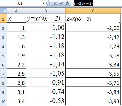
Выделяем данные и вставляем в поле диаграммы. Если что-то не так (не те названия рядов, неправильно отразились цифры на оси), редактируем через вкладку «Выбрать данные».
А вот наши 2 графика функций в одном поле.
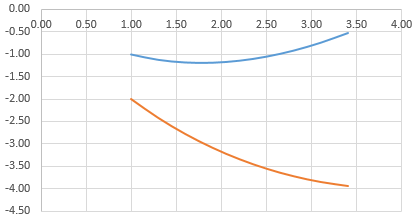
Графики зависимости
Данные одного столбца (строки) зависят от данных другого столбца (строки).
Построить график зависимости одного столбца от другого в Excel можно так:
Условия: А = f (E); В = f (E); С = f (E); D = f (E).
Выбираем тип диаграммы. Точечная. С гладкими кривыми и маркерами.
Выбор данных – «Добавить». Имя ряда – А. Значения Х – значения А. Значения У – значения Е. Снова «Добавить». Имя ряда – В. Значения Х – данные в столбце В. Значения У – данные в столбце Е. И по такому принципу всю таблицу.
Скачать все примеры графиков
Готовые примеры графиков и диаграмм в Excel скачать:
 Скачать шаблоны и дашборды с диаграммами для отчетов в Excel.
Как сделать шаблон, дашборд, диаграмму или график для создания красивого отчета удобного для визуального анализа в Excel? Выбирайте примеры диаграмм с графиками для интерактивной визуализации данных с умных таблиц Excel и используйте их для быстрого принятия правильных решений. Бесплатно скачивайте готовые шаблоны динамических диаграмм для использования их в дашбордах, отчетах или презентациях.
Точно так же можно строить кольцевые и линейчатые диаграммы, гистограммы, пузырьковые, биржевые и т.д. Возможности Excel разнообразны. Вполне достаточно, чтобы наглядно изобразить разные типы данных.