
When you create a chart in an Excel worksheet, a Word document, or a PowerPoint presentation, you have a lot of options. Whether you’ll use a chart that’s recommended for your data, one that you’ll pick from the list of all charts, or one from our selection of chart templates, it might help to know a little more about each type of chart.
Click here to start creating a chart.
For a description of each chart type, select an option from the following drop-down list.
Data that’s arranged in columns or rows on a worksheet can be plotted in a column chart. A column chart typically displays categories along the horizontal (category) axis and values along the vertical (value) axis, as shown in this chart:

Types of column charts
-
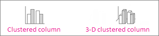
Clustered column and 3-D clustered column

A clustered column chart shows values in 2-D columns. A 3-D clustered column chart shows columns in 3-D format, but it doesn’t use a third value axis (depth axis). Use this chart when you have categories that represent:
-
Ranges of values (for example, item counts).
-
Specific scale arrangements (for example, a Likert scale with entries like Strongly agree, Agree, Neutral, Disagree, Strongly disagree).
-
Names that are not in any specific order (for example, item names, geographic names, or the names of people).
-
-
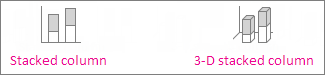
Stacked column and 3-D stacked column A stacked column chart shows values in 2-D stacked columns. A 3-D stacked column chart shows the stacked columns in 3-D format, but it doesn’t use a depth axis. Use this chart when you have multiple data series and you want to emphasize the total.
-
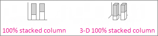
100% stacked column and 3-D 100% stacked column A 100% stacked column chart shows values in 2-D columns that are stacked to represent 100%. A 3-D 100% stacked column chart shows the columns in 3-D format, but it doesn’t use a depth axis. Use this chart when you have two or more data series and you want to emphasize the contributions to the whole, especially if the total is the same for each category.
-
3-D column 3-D column charts use three axes that you can change (a horizontal axis, a vertical axis, and a depth axis), and they compare data points along the horizontal and the depth axes. Use this chart when you want to compare data across both categories and data series.

Data that’s arranged in columns or rows on a worksheet can be plotted in a line chart. In a line chart, category data is distributed evenly along the horizontal axis, and all value data is distributed evenly along the vertical axis. Line charts can show continuous data over time on an evenly scaled axis, so they’re ideal for showing trends in data at equal intervals, like months, quarters, or fiscal years.

Types of line charts
-
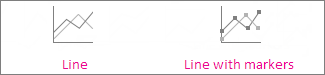
Line and line with markers Shown with or without markers to indicate individual data values, line charts can show trends over time or evenly spaced categories, especially when you have many data points and the order in which they are presented is important. If there are many categories or the values are approximate, use a line chart without markers.
-
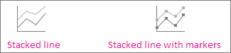
Stacked line and stacked line with markers Shown with or without markers to indicate individual data values, stacked line charts can show the trend of the contribution of each value over time or evenly spaced categories.
-
100% stacked line and 100% stacked line with markers Shown with or without markers to indicate individual data values, 100% stacked line charts can show the trend of the percentage each value contributes over time or evenly spaced categories. If there are many categories or the values are approximate, use a 100% stacked line chart without markers.
-
3-D line 3-D line charts show each row or column of data as a 3-D ribbon. A 3-D line chart has horizontal, vertical, and depth axes that you can change.
Notes:
-
Line charts work best when you have multiple data series in your chart—if you have only one data series, consider using a scatter chart instead.
-
Stacked line charts sum the data, which might not be the result you want. It might not be easy to see that the lines are stacked, so consider using a different line chart type or a stacked area chart instead.
-


Data that’s arranged in one column or row on a worksheet can be plotted in a pie chart. Pie charts show the size of items in one data series, proportional to the sum of the items. The data points in a pie chart are shown as a percentage of the whole pie.

Consider using a pie chart when:
-
You have only one data series.
-
None of the values in your data are negative.
-
Almost none of the values in your data are zero values.
-
You have no more than seven categories, all of which represent parts of the whole pie.
Types of pie charts
-
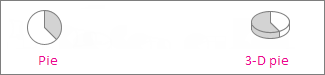
Pie and 3-D pie Pie charts show the contribution of each value to a total in a 2-D or 3-D format. You can pull out slices of a pie chart manually to emphasize the slices.
-
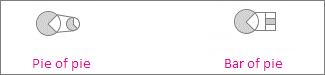
Pie of pie and bar of pie Pie of pie or bar of pie charts show pie charts with smaller values pulled out into a secondary pie or stacked bar chart, which makes them easier to distinguish.
Data that’s arranged in columns or rows only on a worksheet can be plotted in a doughnut chart. Like a pie chart, a doughnut chart shows the relationship of parts to a whole, but it can contain more than one data series.

Types of doughnut charts
-
Doughnut Doughnut charts show data in rings, where each ring represents a data series. If percentages are shown in data labels, each ring will total 100%.
Note: Doughnut charts aren’t easy to read. You may want to use a stacked column charts or Stacked bar chart instead.

Data that’s arranged in columns or rows on a worksheet can be plotted in a bar chart. Bar charts illustrate comparisons among individual items. In a bar chart, the categories are typically organized along the vertical axis, and the values along the horizontal axis.

Consider using a bar chart when:
-
The axis labels are long.
-
The values that are shown are durations.
Types of bar charts
-
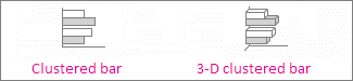
Clustered bar and 3-D clustered bar A clustered bar chart shows bars in 2-D format. A 3-D clustered bar chart shows bars in 3-D format; it doesn’t use a depth axis.
-
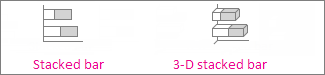
Stacked bar and 3-D stacked bar Stacked bar charts show the relationship of individual items to the whole in 2-D bars. A 3-D stacked bar chart shows bars in 3-D format; it doesn’t use a depth axis.
-
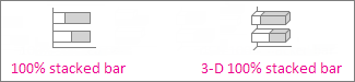
100% stacked bar and 3-D 100% stacked bar A 100% stacked bar shows 2-D bars that compare the percentage that each value contributes to a total across categories. A 3-D 100% stacked bar chart shows bars in 3-D format; it doesn’t use a depth axis.
Data that’s arranged in columns or rows on a worksheet can be plotted in an area chart. Area charts can be used to plot change over time and draw attention to the total value across a trend. By showing the sum of the plotted values, an area chart also shows the relationship of parts to a whole.

Types of area charts
-
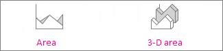
Area and 3-D area Shown in 2-D or in 3-D format, area charts show the trend of values over time or other category data. 3-D area charts use three axes (horizontal, vertical, and depth) that you can change. As a rule, consider using a line chart instead of a non-stacked area chart, because data from one series can be hidden behind data from another series.
-
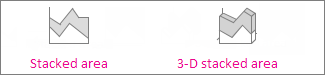
Stacked area and 3-D stacked area Stacked area charts show the trend of the contribution of each value over time or other category data in 2-D format. A 3-D stacked area chart does the same, but it shows areas in 3-D format without using a depth axis.
-
100% stacked area and 3-D 100% stacked area 100% stacked area charts show the trend of the percentage that each value contributes over time or other category data. A 3-D 100% stacked area chart does the same, but it shows areas in 3-D format without using a depth axis.
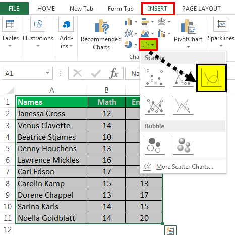
Data that’s arranged in columns and rows on a worksheet can be plotted in an xy (scatter) chart. Place the x values in one row or column, and then enter the corresponding y values in the adjacent rows or columns.
A scatter chart has two value axes: a horizontal (x) and a vertical (y) value axis. It combines x and y values into single data points and shows them in irregular intervals, or clusters. Scatter charts are typically used for showing and comparing numeric values, like scientific, statistical, and engineering data.

Consider using a scatter chart when:
-
You want to change the scale of the horizontal axis.
-
You want to make that axis a logarithmic scale.
-
Values for horizontal axis are not evenly spaced.
-
There are many data points on the horizontal axis.
-
You want to adjust the independent axis scales of a scatter chart to reveal more information about data that includes pairs or grouped sets of values.
-
You want to show similarities between large sets of data instead of differences between data points.
-
You want to compare many data points without regard to time—the more data that you include in a scatter chart, the better the comparisons you can make.
Types of scatter charts
-
Scatter This chart shows data points without connecting lines to compare pairs of values.
-
Scatter with smooth lines and markers and scatter with smooth lines This chart shows a smooth curve that connects the data points. Smooth lines can be shown with or without markers. Use a smooth line without markers if there are many data points.
-
Scatter with straight lines and markers and scatter with straight lines This chart shows straight connecting lines between data points. Straight lines can be shown with or without markers.

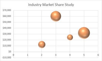
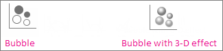
Much like a scatter chart, a bubble chart adds a third column to specify the size of the bubbles it shows to represent the data points in the data series.
Type of bubble charts
-
Bubble or bubble with 3-D effect Both of these bubble charts compare sets of three values instead of two, showing bubbles in 2-D or 3-D format (without using a depth axis). The third value specifies the size of the bubble marker.
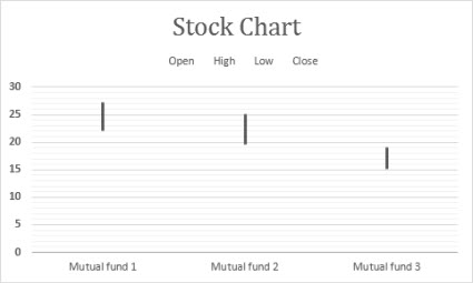
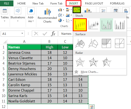
Data that’s arranged in columns or rows in a specific order on a worksheet can be plotted in a stock chart. As the name implies, stock charts can show fluctuations in stock prices. However, this chart can also show fluctuations in other data, like daily rainfall or annual temperatures. Make sure you organize your data in the right order to create a stock chart.
For example, to create a simple high-low-close stock chart, arrange your data with High, Low, and Close entered as column headings, in that order.
Types of stock charts
-
High-low-close This stock chart uses three series of values in the following order: high, low, and then close.
-
Open-high-low-close This stock chart uses four series of values in the following order: open, high, low, and then close.
-
Volume-high-low-close This stock chart uses four series of values in the following order: volume, high, low, and then close. It measures volume by using two value axes: one for the columns that measure volume, and the other for the stock prices.
-
Volume-open-high-low-close This stock chart uses five series of values in the following order: volume, open, high, low, and then close.


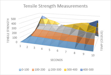
Data that’s arranged in columns or rows on a worksheet can be plotted in a surface chart. This chart is useful when you want to find optimum combinations between two sets of data. As in a topographic map, colors and patterns indicate areas that are in the same range of values. You can create a surface chart when both categories and data series are numeric values.
Types of surface charts
-
3-D surface This chart shows a 3-D view of the data, which can be imagined as a rubber sheet stretched over a 3-D column chart. It is typically used to show relationships between large amounts of data that may otherwise be difficult to see. Color bands in a surface chart do not represent the data series; they indicate the difference between the values.
-
Wireframe 3-D surface Shown without color on the surface, a 3-D surface chart is called a wireframe 3-D surface chart. This chart shows only the lines. A wireframe 3-D surface chart isn’t easy to read, but it can plot large data sets much faster than a 3-D surface chart.
-
Contour Contour charts are surface charts viewed from above, similar to 2-D topographic maps. In a contour chart, color bands represent specific ranges of values. The lines in a contour chart connect interpolated points of equal value.
-
Wireframe contour Wireframe contour charts are also surface charts viewed from above. Without color bands on the surface, a wireframe chart shows only the lines. Wireframe contour charts aren’t easy to read. You may want to use a 3-D surface chart instead.


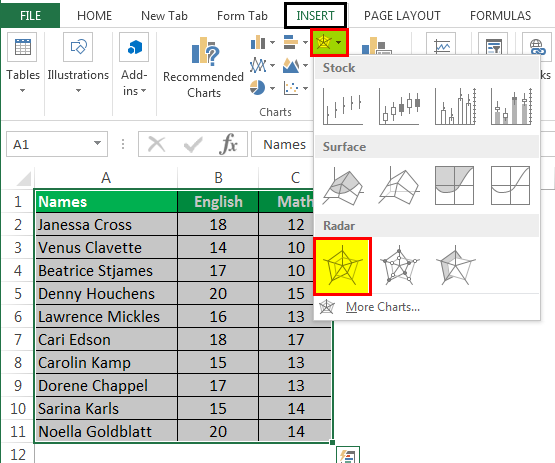
Data that’s arranged in columns or rows on a worksheet can be plotted in a radar chart. Radar charts compare the aggregate values of several data series.

Type of radar charts
-
Radar and radar with markers With or without markers for individual data points, radar charts show changes in values relative to a center point.
-
Filled radar In a filled radar chart, the area covered by a data series is filled with a color.


The treemap chart provides a hierarchical view of your data and an easy way to compare different levels of categorization. The treemap chart displays categories by color and proximity and can easily show lots of data which would be difficult with other chart types. The treemap chart can be plotted when empty (blank) cells exist within the hierarchal structure and treemap charts are good for comparing proportions within the hierarchy.

Note: There are no chart sub-types for treemap charts.
The sunburst chart is ideal for displaying hierarchical data and can be plotted when empty (blank) cells exist within the hierarchal structure . Each level of the hierarchy is represented by one ring or circle with the innermost circle as the top of the hierarchy. A sunburst chart without any hierarchical data (one level of categories), looks similar to a doughnut chart. However, a sunburst chart with multiple levels of categories shows how the outer rings relate to the inner rings. The sunburst chart is most effective at showing how one ring is broken into its contributing pieces.

Note: There are no chart sub-types for sunburst charts.
Data plotted in a histogram chart shows the frequencies within a distribution. Each column of the chart is called a bin, which can be changed to further analyze your data.

Type of histogram charts
-
Histogram The histogram chart shows the distribution of your data grouped into frequency bins.
-
Pareto chart A pareto is a sorted histogram chart that contains both columns sorted in descending order and a line representing the cumulative total percentage.

A box and whisker chart shows distribution of data into quartiles, highlighting the mean and outliers. The boxes may have lines extending vertically called “whiskers”. These lines indicate variability outside the upper and lower quartiles, and any point outside those lines or whiskers is considered an outlier. Use this chart type when there are multiple data sets which relate to each other in some way.

Note: There are no chart sub-types for box and whisker charts.
A waterfall chart shows a running total of your financial data as values are added or subtracted. It’s useful for understanding how an initial value is affected by a series of positive and negative values. The columns are color coded so you can quickly tell positive from negative numbers.

Note: There are no chart sub-types for waterfall charts.
Funnel charts show values across multiple stages in a process.

Typically, the values decrease gradually, allowing the bars to resemble a funnel. Read more about funnel charts here.
Data that’s arranged in columns and rows can be plotted in a combo chart. Combo charts combine two or more chart types to make the data easy to understand, especially when the data is widely varied. Shown with a secondary axis, this chart is even easier to read. In this example, we used a column chart to show the number of homes sold between January and June and then used a line chart to make it easier for readers to quickly identify the average sales price by month.

Type of combo charts
-
Clustered column – line and clustered column – line on secondary axis With or without a secondary axis, this chart combines a clustered column and line chart, showing some data series as columns and others as lines in the same chart.
-
Stacked area – clustered column This chart combines a stacked area and clustered column chart, showing some data series as stacked areas and others as columns in the same chart.
-
Custom combination This chart lets you combine the charts you want to show in the same chart.


You can use a Map Chart to compare values and show categories across geographical regions. Use it when you have geographical regions in your data, like countries/regions, states, counties or postal codes.
For example, Countries by Population uses values. The values represent the total population in each country, with each portrayed using a gradient spectrum of two colors. The color for each region is dictated by where along the spectrum its value falls with respect to the others.

In the following example, Countries by Category, the categories are displayed using a standard legend to show groups or affiliations. Each data point is represented by an entirely different color.

Change a chart type
If you have already have a chart, but you just want to change its type:
-
Select the chart, click the Design tab, and click Change Chart Type.
-
Choose a new chart type in the Change Chart Type box.

Many chart types are available to help you display data in ways that are meaningful to your audience. Here are some examples of the most common chart types and how they can be used.

Data that is arranged in columns or rows on an Excel sheet can be plotted in a column chart. In column charts, categories are typically organized along the horizontal axis and values along the vertical axis.
Column charts are useful to show how data changes over time or to show comparisons among items.
Column charts have the following chart subtypes:
-
Clustered column chart Compares values across categories. A clustered column chart displays values in 2-D vertical rectangles. A clustered column in a 3-D chart displays the data by using a 3-D perspective.
-
Stacked column chart Shows the relationship of individual items to the whole, comparing the contribution of each value to a total across categories. A stacked column chart displays values in 2-D vertical stacked rectangles. A 3-D stacked column chart displays the data by using a 3-D perspective. A 3-D perspective is not a true 3-D chart because a third value axis (depth axis) is not used.
-
100% stacked column chart Compares the percentage that each value contributes to a total across categories. A 100% stacked column chart displays values in 2-D vertical 100% stacked rectangles. A 3-D 100% stacked column chart displays the data by using a 3-D perspective. A 3-D perspective is not a true 3-D chart because a third value axis (depth axis) is not used.
-
3-D column chart Uses three axes that you can change (a horizontal axis, a vertical axis, and a depth axis). They compare data points along the horizontal and the depth axes.

Data that is arranged in columns or rows on an Excel sheet can be plotted in a line chart. Line charts can display continuous data over time, set against a common scale, and are therefore ideal to show trends in data at equal intervals. In a line chart, category data is distributed evenly along the horizontal axis, and all value data is distributed evenly along the vertical axis.
Line charts work well if your category labels are text, and represent evenly spaced values such as months, quarters, or fiscal years.
Line charts have the following chart subtypes:
-
Line chart with or without markers Shows trends over time or ordered categories, especially when there are many data points and the order in which they are presented is important. If there are many categories or the values are approximate, use a line chart without markers.
-
Stacked line chart with or without markers Shows the trend of the contribution of each value over time or ordered categories. If there are many categories or the values are approximate, use a stacked line chart without markers.
-
100% stacked line chart displayed with or without markers Shows the trend of the percentage each value contributes over time or ordered categories. If there are many categories or the values are approximate, use a 100% stacked line chart without markers.
-
3-D line chart Shows each row or column of data as a 3-D ribbon. A 3-D line chart has horizontal, vertical, and depth axes that you can change.

Data that is arranged in one column or row only on an Excel sheet can be plotted in a pie chart. Pie charts show the size of items in one data series, proportional to the sum of the items. The data points in a pie chart are displayed as a percentage of the whole pie.
Consider using a pie chart when you have only one data series that you want to plot, none of the values that you want to plot are negative, almost none of the values that you want to plot are zero values, you don’t have more than seven categories, and the categories represent parts of the whole pie.
Pie charts have the following chart subtypes:
-
Pie chart Displays the contribution of each value to a total in a 2-D or 3-D format. You can pull out slices of a pie chart manually to emphasize the slices.
-
Pie of pie or bar of pie chart Displays pie charts with user-defined values that are extracted from the main pie chart and combined into a secondary pie chart or into a stacked bar chart. These chart types are useful when you want to make small slices in the main pie chart easier to distinguish.
-
Doughnut chart Like a pie chart, a doughnut chart shows the relationship of parts to a whole. However, it can contain more than one data series. Each ring of the doughnut chart represents a data series. Displays data in rings, where each ring represents a data series. If percentages are displayed in data labels, each ring will total 100%.

Data that is arranged in columns or rows on an Excel sheet can be plotted in a bar chart.
Use bar charts to show comparisons among individual items.
Bar charts have the following chart subtypes:
-
Clustered bar and 3-D Clustered bar chart Compares values across categories. In a clustered bar chart, the categories are typically organized along the vertical axis, and the values along the horizontal axis. A clustered bar in 3-D chart displays the horizontal rectangles in 3-D format. It does not display the data on three axes.
-
Stacked bar and 3-D Stacked bar chart Shows the relationship of individual items to the whole. A stacked bar in 3-D chart displays the horizontal rectangles in 3-D format. It does not display the data on three axes.
-
100% stacked bar chart and 100% stacked bar chart in 3-D Compares the percentage that each value contributes to a total across categories. A 100% stacked bar in 3-D chart displays the horizontal rectangles in 3-D format. It does not display the data on three axes.

Data that is arranged in columns and rows on an Excel sheet can be plotted in an xy (scatter) chart. A scatter chart has two value axes. It shows one set of numeric data along the horizontal axis (x-axis) and another along the vertical axis (y-axis). It combines these values into single data points and displays them in irregular intervals, or clusters.
Scatter charts show the relationships among the numeric values in several data series, or plot two groups of numbers as one series of xy coordinates. Scatter charts are typically used for displaying and comparing numeric values, such as scientific, statistical, and engineering data.
Scatter charts have the following chart subtypes:
-
Scatter chart Compares pairs of values. Use a scatter chart with data markers but without lines if you have many data points and connecting lines would make the data more difficult to read. You can also use this chart type when you do not have to show connectivity of the data points.
-
Scatter chart with smooth lines and scatter chart with smooth lines and markers Displays a smooth curve that connects the data points. Smooth lines can be displayed with or without markers. Use a smooth line without markers if there are many data points.
-
Scatter chart with straight lines and scatter chart with straight lines and markers Displays straight connecting lines between data points. Straight lines can be displayed with or without markers.
-
Bubble chart or bubble chart with 3-D effect A bubble chart is a kind of xy (scatter) chart, where the size of the bubble represents the value of a third variable. Compares sets of three values instead of two. The third value determines the size of the bubble marker. You can choose to display bubbles in 2-D format or with a 3-D effect.

Data that is arranged in columns or rows on an Excel sheet can be plotted in an area chart. By displaying the sum of the plotted values, an area chart also shows the relationship of parts to a whole.
Area charts emphasize the magnitude of change over time, and can be used to draw attention to the total value across a trend. For example, data that represents profit over time can be plotted in an area chart to emphasize the total profit.
Area charts have the following chart subtypes:
-
Area chart Displays the trend of values over time or other category data. 3-D area charts use three axes (horizontal, vertical, and depth) that you can change. Generally, consider using a line chart instead of a nonstacked area chart because data from one series can be obscured by data from another series.
-
Stacked area chart Displays the trend of the contribution of each value over time or other category data. A stacked area chart in 3-D is displayed in the same manner but uses a 3-D perspective. A 3-D perspective is not a true 3-D chart because a third value axis (depth axis) is not used.
-
100% stacked area chart Displays the trend of the percentage that each value contributes over time or other category data. A 100% stacked area chart in 3-D is displayed in the same manner but uses a 3-D perspective. A 3-D perspective is not a true 3-D chart because a third value axis (depth axis) is not used.

Data that is arranged in columns or rows in a specific order on an Excel sheet can be plotted in a stock chart.
As its name implies, a stock chart is most frequently used to show the fluctuation of stock prices. However, this chart may also be used for scientific data. For example, you could use a stock chart to indicate the fluctuation of daily or annual temperatures.
Stock charts have the following chart sub-types:
-
High-Low-Close stock chart Illustrates stock prices. It requires three series of values in the correct order: high, low, and then close.
-
Open-High-Low-Close stock chart Requires four series of values in the correct order: open, high, low, and then close.
-
Volume-High-Low-Close stock chart Requires four series of values in the correct order: volume, high, low, and then close. It measures volume by using two value axes: one for the columns that measure volume, and the other for the stock prices.
-
Volume-Open-High-Low-Close stock chart Requires five series of values in the correct order: volume, open, high, low, and then close.

Data that is arranged in columns or rows on an Excel sheet can be plotted in a surface chart. As in a topographic map, colors and patterns indicate areas that are in the same range of values.
A surface chart is useful when you want to find optimal combinations between two sets of data.
Surface charts have the following chart subtypes:
-
3-D surface chart Shows trends in values across two dimensions in a continuous curve. Color bands in a surface chart do not represent the data series. They represent the difference between the values. This chart shows a 3-D view of the data, which can be imagined as a rubber sheet stretched over a 3-D column chart. It is typically used to show relationships between large amounts of data that may otherwise be difficult to see.
-
Wireframe 3-D surface chart Shows only the lines. A wireframe 3-D surface chart is not easy to read, but this chart type is useful for faster plotting of large data sets.
-
Contour chart Surface charts viewed from above, similar to 2-D topographic maps. In a contour chart, color bands represent specific ranges of values. The lines in a contour chart connect interpolated points of equal value.
-
Wireframe contour chart Surface charts viewed from above. Without color bands on the surface, a wireframe chart shows only the lines. Wireframe contour charts are not easy to read. You may want to use a 3-D surface chart instead.

In a radar chart, each category has its own value axis radiating from the center point. Lines connect all the values in the same series.
Use radar charts to compare the aggregate values of several data series.
Radar charts have the following chart subtypes:
-
Radar chart Displays changes in values in relation to a center point.
-
Radar with markers Displays changes in values in relation to a center point with markers.
-
Filled radar chart Displays changes in values in relation to a center point, and fills the area covered by a data series with color.
You can use a Map Chart to compare values and show categories across geographical regions. Use it when you have geographical regions in your data, like countries/regions, states, counties or postal codes.
For more information, see Create a map chart.
Funnel charts show values across multiple stages in a process.
Typically, the values decrease gradually, allowing the bars to resemble a funnel. For more information, see Create a funnel chart.
The treemap chart provides a hierarchical view of your data and an easy way to compare different levels of categorization. The treemap chart displays categories by color and proximity and can easily show lots of data which would be difficult with other chart types. The treemap chart can be plotted when empty (blank) cells exist within the hierarchal structure and treemap charts are good for comparing proportions within the hierarchy.
There are no chart sub-types for treemap charts.
For more information, see Create a treemap chart.
The sunburst chart is ideal for displaying hierarchical data and can be plotted when empty (blank) cells exist within the hierarchal structure . Each level of the hierarchy is represented by one ring or circle with the innermost circle as the top of the hierarchy. A sunburst chart without any hierarchical data (one level of categories), looks similar to a doughnut chart. However, a sunburst chart with multiple levels of categories shows how the outer rings relate to the inner rings. The sunburst chart is most effective at showing how one ring is broken into its contributing pieces.
There are no chart sub-types for sunburst charts.
For more information, see Create a sunburst chart.
A waterfall chart shows a running total of your financial data as values are added or subtracted. It’s useful for understanding how an initial value is affected by a series of positive and negative values. The columns are color coded so you can quickly tell positive from negative numbers.
There are no chart sub-types for waterfall charts.
For more information, see Create a waterfall chart.
Data plotted in a histogram chart shows the frequencies within a distribution. Each column of the chart is called a bin, which can be changed to further analyze your data.
Types of histogram charts
-
Histogram The histogram chart shows the distribution of your data grouped into frequency bins.
-
Pareto chart A pareto is a sorted histogram chart that contains both columns sorted in descending order and a line representing the cumulative total percentage.
More information is available for Histogram and Pareto charts.
A box and whisker chart shows distribution of data into quartiles, highlighting the mean and outliers. The boxes may have lines extending vertically called “whiskers”. These lines indicate variability outside the upper and lower quartiles, and any point outside those lines or whiskers is considered an outlier. Use this chart type when there are multiple data sets which relate to each other in some way.
For more information, see Create a box and whisker chart.
Data that is arranged in columns or rows on an Excel sheet can be plotted in a column chart. In column charts, categories are typically organized along the horizontal axis and values along the vertical axis.
Column charts are useful to show how data changes over time or to show comparisons among items.
Column charts have the following chart subtypes:
-
Clustered column chart Compares values across categories. A clustered column chart displays values in 2-D vertical rectangles. A clustered column in a 3-D chart displays the data by using a 3-D perspective.
-
Stacked column chart Shows the relationship of individual items to the whole, comparing the contribution of each value to a total across categories. A stacked column chart displays values in 2-D vertical stacked rectangles. A 3-D stacked column chart displays the data by using a 3-D perspective. A 3-D perspective is not a true 3-D chart because a third value axis (depth axis) is not used.
-
100% stacked column chart Compares the percentage that each value contributes to a total across categories. A 100% stacked column chart displays values in 2-D vertical 100% stacked rectangles. A 3-D 100% stacked column chart displays the data by using a 3-D perspective. A 3-D perspective is not a true 3-D chart because a third value axis (depth axis) is not used.
-
3-D column chart Uses three axes that you can change (a horizontal axis, a vertical axis, and a depth axis). They compare data points along the horizontal and the depth axes.
-
Cylinder, cone, and pyramid chart Available in the same clustered, stacked, 100% stacked, and 3-D chart types that are provided for rectangular column charts. They show and compare data in the same manner. The only difference is that these chart types display cylinder, cone, and pyramid shapes instead of rectangles.
Data that is arranged in columns or rows on an Excel sheet can be plotted in a line chart. Line charts can display continuous data over time, set against a common scale, and are therefore ideal to show trends in data at equal intervals. In a line chart, category data is distributed evenly along the horizontal axis, and all value data is distributed evenly along the vertical axis.
Line charts work well if your category labels are text, and represent evenly spaced values such as months, quarters, or fiscal years.
Line charts have the following chart subtypes:
-
Line chart with or without markers Shows trends over time or ordered categories, especially when there are many data points and the order in which they are presented is important. If there are many categories or the values are approximate, use a line chart without markers.
-
Stacked line chart with or without markers Shows the trend of the contribution of each value over time or ordered categories. If there are many categories or the values are approximate, use a stacked line chart without markers.
-
100% stacked line chart displayed with or without markers Shows the trend of the percentage each value contributes over time or ordered categories. If there are many categories or the values are approximate, use a 100% stacked line chart without markers.
-
3-D line chart Shows each row or column of data as a 3-D ribbon. A 3-D line chart has horizontal, vertical, and depth axes that you can change.
Data that is arranged in one column or row only on an Excel sheet can be plotted in a pie chart. Pie charts show the size of items in one data series, proportional to the sum of the items. The data points in a pie chart are displayed as a percentage of the whole pie.
Consider using a pie chart when you have only one data series that you want to plot, none of the values that you want to plot are negative, almost none of the values that you want to plot are zero values, you don’t have more than seven categories, and the categories represent parts of the whole pie.
Pie charts have the following chart subtypes:
-
Pie chart Displays the contribution of each value to a total in a 2-D or 3-D format. You can pull out slices of a pie chart manually to emphasize the slices.
-
Pie of pie or bar of pie chart Displays pie charts with user-defined values that are extracted from the main pie chart and combined into a secondary pie chart or into a stacked bar chart. These chart types are useful when you want to make small slices in the main pie chart easier to distinguish.
-
Exploded pie chart Displays the contribution of each value to a total while emphasizing individual values. Exploded pie charts can be displayed in 3-D format. You can change the pie explosion setting for all slices and individual slices. However, you cannot move the slices of an exploded pie manually.
Data that is arranged in columns or rows on an Excel sheet can be plotted in a bar chart.
Use bar charts to show comparisons among individual items.
Bar charts have the following chart subtypes:
-
Clustered bar chart Compares values across categories. In a clustered bar chart, the categories are typically organized along the vertical axis, and the values along the horizontal axis. A clustered bar in 3-D chart displays the horizontal rectangles in 3-D format. It does not display the data on three axes.
-
Stacked bar chart Shows the relationship of individual items to the whole. A stacked bar in 3-D chart displays the horizontal rectangles in 3-D format. It does not display the data on three axes.
-
100% stacked bar chart and 100% stacked bar chart in 3-D Compares the percentage that each value contributes to a total across categories. A 100% stacked bar in 3-D chart displays the horizontal rectangles in 3-D format. It does not display the data on three axes.
-
Horizontal cylinder, cone, and pyramid chart Available in the same clustered, stacked, and 100% stacked chart types that are provided for rectangular bar charts. They show and compare data the same manner. The only difference is that these chart types display cylinder, cone, and pyramid shapes instead of horizontal rectangles.
Data that is arranged in columns or rows on an Excel sheet can be plotted in an area chart. By displaying the sum of the plotted values, an area chart also shows the relationship of parts to a whole.
Area charts emphasize the magnitude of change over time, and can be used to draw attention to the total value across a trend. For example, data that represents profit over time can be plotted in an area chart to emphasize the total profit.
Area charts have the following chart subtypes:
-
Area chart Displays the trend of values over time or other category data. 3-D area charts use three axes (horizontal, vertical, and depth) that you can change. Generally, consider using a line chart instead of a nonstacked area chart because data from one series can be obscured by data from another series.
-
Stacked area chart Displays the trend of the contribution of each value over time or other category data. A stacked area chart in 3-D is displayed in the same manner but uses a 3-D perspective. A 3-D perspective is not a true 3-D chart because a third value axis (depth axis) is not used.
-
100% stacked area chart Displays the trend of the percentage that each value contributes over time or other category data. A 100% stacked area chart in 3-D is displayed in the same manner but uses a 3-D perspective. A 3-D perspective is not a true 3-D chart because a third value axis (depth axis) is not used.
Data that is arranged in columns and rows on an Excel sheet can be plotted in an xy (scatter) chart. A scatter chart has two value axes. It shows one set of numeric data along the horizontal axis (x-axis) and another along the vertical axis (y-axis). It combines these values into single data points and displays them in irregular intervals, or clusters.
Scatter charts show the relationships among the numeric values in several data series, or plot two groups of numbers as one series of xy coordinates. Scatter charts are typically used for displaying and comparing numeric values, such as scientific, statistical, and engineering data.
Scatter charts have the following chart subtypes:
-
Scatter chart with markers only Compares pairs of values. Use a scatter chart with data markers but without lines if you have many data points and connecting lines would make the data more difficult to read. You can also use this chart type when you do not have to show connectivity of the data points.
-
Scatter chart with smooth lines and scatter chart with smooth lines and markers Displays a smooth curve that connects the data points. Smooth lines can be displayed with or without markers. Use a smooth line without markers if there are many data points.
-
Scatter chart with straight lines and scatter chart with straight lines and markers Displays straight connecting lines between data points. Straight lines can be displayed with or without markers.

A bubble chart is a kind of xy (scatter) chart, where the size of the bubble represents the value of a third variable.
Bubble charts have the following chart subtypes:
-
Bubble chart or bubble chart with 3-D effect Compares sets of three values instead of two. The third value determines the size of the bubble marker. You can choose to display bubbles in 2-D format or with a 3-D effect.
Data that is arranged in columns or rows in a specific order on an Excel sheet can be plotted in a stock chart.
As its name implies, a stock chart is most frequently used to show the fluctuation of stock prices. However, this chart may also be used for scientific data. For example, you could use a stock chart to indicate the fluctuation of daily or annual temperatures.
Stock charts have the following chart sub-types:
-
High-low-close stock chart Illustrates stock prices. It requires three series of values in the correct order: high, low, and then close.
-
Open-high-low-close stock chart Requires four series of values in the correct order: open, high, low, and then close.
-
Volume-high-low-close stock chart Requires four series of values in the correct order: volume, high, low, and then close. It measures volume by using two value axes: one for the columns that measure volume, and the other for the stock prices.
-
Volume-open-high-low-close stock chart Requires five series of values in the correct order: volume, open, high, low, and then close.
Data that is arranged in columns or rows on an Excel sheet can be plotted in a surface chart. As in a topographic map, colors and patterns indicate areas that are in the same range of values.
A surface chart is useful when you want to find optimal combinations between two sets of data.
Surface charts have the following chart subtypes:
-
3-D surface chart Shows trends in values across two dimensions in a continuous curve. Color bands in a surface chart do not represent the data series. They represent the difference between the values. This chart shows a 3-D view of the data, which can be imagined as a rubber sheet stretched over a 3-D column chart. It is typically used to show relationships between large amounts of data that may otherwise be difficult to see.
-
Wireframe 3-D surface chart Shows only the lines. A wireframe 3-D surface chart is not easy to read, but this chart type is useful for faster plotting of large data sets.
-
Contour chart Surface charts viewed from above, similar to 2-D topographic maps. In a contour chart, color bands represent specific ranges of values. The lines in a contour chart connect interpolated points of equal value.
-
Wireframe contour chart Surface charts viewed from above. Without color bands on the surface, a wireframe chart shows only the lines. Wireframe contour charts are not easy to read. You may want to use a 3-D surface chart instead.

Like a pie chart, a doughnut chart shows the relationship of parts to a whole. However, it can contain more than one data series. Each ring of the doughnut chart represents a data series.
Doughnut charts have the following chart subtypes:
-
Doughnut chart Displays data in rings, where each ring represents a data series. If percentages are displayed in data labels, each ring will total 100%.
-
Exploded doughnut chart Displays the contribution of each value to a total while emphasizing individual values. However, they can contain more than one data series.
In a radar chart, each category has its own value axis radiating from the center point. Lines connect all the values in the same series.
Use radar charts to compare the aggregate values of several data series.
Radar charts have the following chart subtypes:
-
Radar chart Displays changes in values in relation to a center point.
-
Filled radar chart Displays changes in values in relation to a center point, and fills the area covered by a data series with color.
Change a chart type
If you have already have a chart, but you just want to change its type:
-
Select the chart, click the Chart Design tab, and click Change Chart Type.
-
Select a new chart type in the gallery of available options.

See Also
Create a chart with recommended charts
List of Top 8 Types of Charts in MS Excel
- Column Charts in Excel
- Line Chart in Excel
- Pie Chart in Excel
- Bar Chart in ExcelBar charts in excel are helpful in the representation of the single data on the horizontal bar, with categories displayed on the Y-axis and values on the X-axis. To create a bar chart, we need at least two independent and dependent variables.read more
- Area Chart in ExcelThe area chart in Excel is a line chart that shows the impact and changes in various data series over time by separating them with lines and presenting them in different colors. The line chart is used to create this graph.read more
- Scatter Chart in Excel
- Stock Chart in ExcelStock chart in excel is also known as high low close chart in excel because it used to represent the conditions of data in markets such as stocks, the data is the changes in the prices of the stocks, we can insert it from insert tab and also there are actually four types of stock charts, high low close is the most used one as it has three series of price high end and low, we can use up to six series of prices in stock charts.read more
- Radar Chart in Excel
Let us discuss each of them in detail: –
Table of contents
- List of Top 8 Types of Charts in MS Excel
- Chart #1 – Column Chart
- Chart #2 – Line Chart
- Chart #3 – Pie Chart
- Chart #4 – Bar Chart
- Chart #5 – Area Chart
- Chart #6 – Scatter Chart
- Chart #7 – Stock Chart
- Chart #8 – Radar Chart
- Things to Remember
- Recommended Articles
You can download this Types of Charts Excel Template here – Types of Charts Excel Template
Chart #1 – Column Chart
In this type of chart, the data is plotted in columns. Therefore, it is called a column chartColumn chart is used to represent data in vertical columns. The height of the column represents the value for the specific data series in a chart, the column chart represents the comparison in the form of column from left to right.read more.
A column chart is a bar-shaped chart that has a bar placed on the X-axis. This type of chart in Excel is called a column chart because the bars are placed on the columns. Such charts are very useful in case we want to make a comparison.
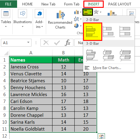
Below are the steps for preparing a column chart in Excel:
- First, select the data and the “Insert” tab, then select the “Column” chart.

- Then, the column chart looks like as given below:

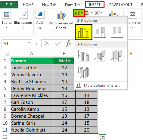
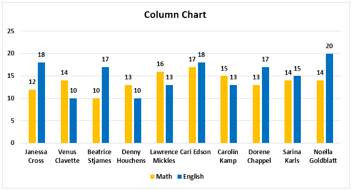
Chart #2 – Line Chart
Line charts are used if we need to show the trend in data. They are more likely used in analysis rather than showing data visually.
In this chart, a line represents the data movement from one point to another.
- Select the data and “Insert” tab, then select the “Line” chart.
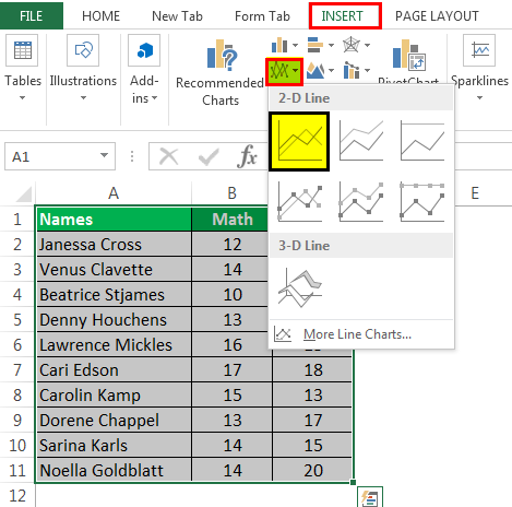
- Then, the line chart looks like as given below:

Chart #3 – Pie Chart
A pie chart is a circle-shaped chart capable of representing only one series of data. A pie chart has various variants that are 3-D charts and doughnut charts.
A circle-shaped chart divides itself into various portions to show the quantitative value.
- Select the data, go to the “Insert” tab, and select the “Pie” chart.
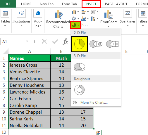
- Then, the pie chart looks like as given below:
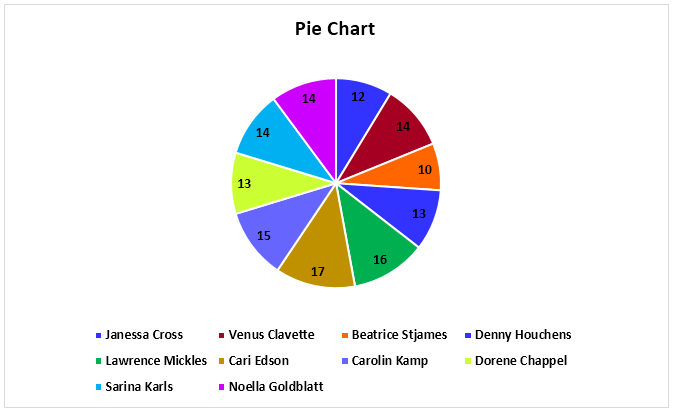
Chart #4 – Bar Chart
In the bar chart, the data is plotted on the Y-axis. That is why this is called a bar chart. Compared to the column chart, these charts use the Y-axis as the primary axis.
This chart is plotted in rows. That is why this is called a row chart.
- Select the data, go to the “Insert” tab, and then select the “Bar” chart.
- Then, the bar chart looks like as given below:

Chart #5 – Area Chart
The area chart and the line charts are the same, but the difference that makes a line chart an area chart is that the space between the axis and the plotted value is colored and is not blank.
Using the stacked area chart, this becomes difficult to understand the data as space is colored with the same color for the magnitude that is the same for various datasets.
- Select the data, go to the “Insert” tab, and select the “Area” chart.
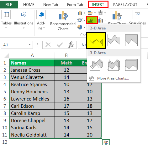
- Then, the area chart looks like as given below:
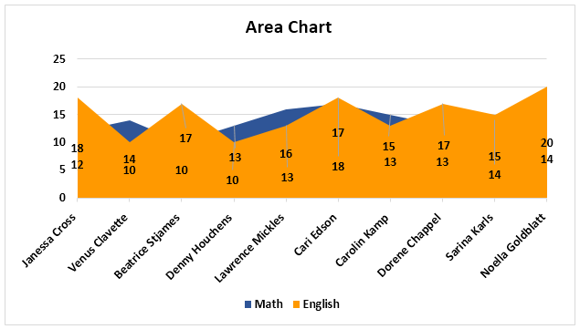
Chart #6 – Scatter Chart
The scatter chart in excelScatter plot in excel is a two dimensional type of chart to represent data, it has various names such XY chart or Scatter diagram in excel, in this chart we have two sets of data on X and Y axis who are co-related to each other, this chart is mostly used in co-relation studies and regression studies of data.read more plots the data on the coordinates.
- Select the Data and go to Insert Tab, then select the Scatter Chart.
- Then, the scatter chart looks like as given below:
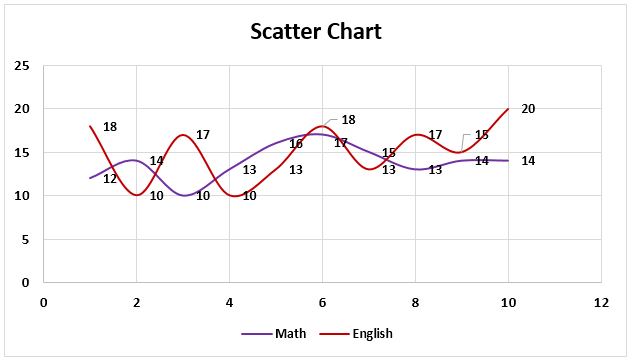
Chart #7 – Stock Chart
Such charts are used in stock exchangesStock exchange refers to a market that facilitates the buying and selling of listed securities such as public company stocks, exchange-traded funds, debt instruments, options, etc., as per the standard regulations and guidelines—for instance, NYSE and NASDAQ.read more or to represent the change in the price of shares.
- Select the data, go to the “Insert” tab, and then select the “Stock” chart.
- Then, the stock chart looks like as given below:
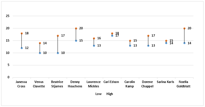
Chart #8 – Radar Chart
The radar chartRadar chart in excel is also known as the spider chart in excel or Web or polar chart in excel, it is used to demonstrate data in two dimensional for two or more than two data series, the axes start on the same point in radar chart, this chart is used to do comparison between more than one or two variables, there are three different types of radar charts available to use in excel.read more is similar to the spider web, often called a web chat.
- Select the data and go to “Insert Tab.” Then, under the “Stock” chart, select the “Radar” chart.
- Then, the radar chart looks like as given below:
Things to Remember
- If we copy a chart from one location to another, the data source will remain the same. However, it means that if we make any changes to the data set, both the charts will change, the primary and the copied.
- For the stock chart, there must be at least two data sets.
- We can only use a pie chart to represent one series of data. They cannot handle two data series.
- To keep the chart easy to understand, we should restrict the data series to two or three. Else, the chart will not be understandable.
- We must add data labels if we have decimals values to represent. If we do not add them, then we cannot understand the chart with accurate precision.
Recommended Articles
This article is a guide to Types of Charts in Excel. Here, we discuss the top 8 types of graphs in Excel, including column charts, line charts, scatter charts, radar charts, etc., along with practical examples and a downloadable Excel template. You may learn more about Excel from the following articles: –
- Create Grouped Bar Chart in ExcelGrouped Bar Chart is a Bar Chart type that blends & compares various categories of 2 or more data sets. It is also known as Multi-Series Bar Chart & helps in the efficient interpretation of differences. read more
- Chart Wizard in ExcelThe Chart Wizard in Excel is a type of wizard that walks users through the process of inserting a chart into an Excel spreadsheet in a step-by-step manner.read more
- How to make Graphs/Charts in Excel?In Excel, a graph or chart lets us visualize information we’ve gathered from our data. It allows us to visualize data in easy-to-understand pictorial ways. The following components are required to create charts or graphs in Excel: 1 — Numerical Data, 2 — Data Headings, and 3 — Data in Proper Order.read more
- Doughnut Excel ChartA doughnut chart is a type of excel chart whose visualization is similar to pie chart. The categories in this chart are parts that, when combined, represent the whole data in the chart. A doughnut chart can only be made using data in rows or columns.read more
A picture is worth of thousand words; a chart is worth of thousand sets of data. In this tutorial, we are going to learn how we can use graph in Excel to visualize our data.
What is a chart?
A chart is a visual representative of data in both columns and rows. Charts are usually used to analyse trends and patterns in data sets. Let’s say you have been recording the sales figures in Excel for the past three years. Using charts, you can easily tell which year had the most sales and which year had the least. You can also draw charts to compare set targets against actual achievements.
We will use the following data for this tutorial.
Note: we will be using Excel 2013. If you have a lower version, then some of the more advanced features may not be available to you.
| Item | 2012 | 2013 | 2014 | 2015 |
|---|---|---|---|---|
| Desktop Computers | 20 | 12 | 13 | 12 |
| Laptops | 34 | 45 | 40 | 39 |
| Monitors | 12 | 10 | 17 | 15 |
| Printers | 78 | 13 | 90 | 14 |
Different scenarios require different types of charts. Towards this end, Excel provides a number of chart types that you can work with. The type of chart that you choose depends on the type of data that you want to visualize. To help simplify things for the users, Excel 2013 and above has an option that analyses your data and makes a recommendation of the chart type that you should use.
The following table shows some of the most commonly used Excel charts and when you should consider using them.
| S/N | CHART TYPE | WHEN SHOULD I USE IT? | EXAMPLE |
|---|---|---|---|
| 1 | Pie Chart | When you want to quantify items and show them as percentages. |
|
| 2 | Bar Chart | When you want to compare values across a few categories. The values run horizontally |
|
| 3 | Column chart | When you want to compare values across a few categories. The values run vertically |
|
| 4 | Line chart | When you want to visualize trends over a period of time i.e. months, days, years, etc. |
|
| 5 | Combo Chart | When you want to highlight different types of information |
|


The importance of charts
- Allows you to visualize data graphically
- It’s easier to analyse trends and patterns using charts in MS Excel
- Easy to interpret compared to data in cells
Step by step example of creating charts in Excel
In this tutorial, we are going to plot a simple column chart in Excel that will display the sold quantities against the sales year. Below are the steps to create chart in MS Excel:
- Open Excel
- Enter the data from the sample data table above
- Your workbook should now look as follows

To get the desired chart you have to follow the following steps

- Select the data you want to represent in graph
- Click on INSERT tab from the ribbon
- Click on the Column chart drop down button
- Select the chart type you want
You should be able to see the following chart

Tutorial Exercise
When you select the chart, the ribbon activates the following tab

Try to apply the different chart styles, and other options presented in your chart.
Download the above Excel Template
Summary
Charts are a powerful way of graphically visualizing your data. Excel has many types of charts that you can use depending on your needs.
Conditional formatting is also another power formatting feature of Excel that helps us easily see the data that meets a specified condition
Charts are used to represent the data into graphical elements, which makes it very to easy to interpret the data; it becomes very useful if our data is very large. Excel provides various charts to represent the excel data and makes it very easy to understand and analyze the data compare to the excel cells data analysis. There are various charts available in excel. Namely, they are,
- Line Chart
- Bar Chart
- Column Chart
- Area Chart
- Pie Chart
- Surface Chart
In this example, we will be using random car sales data, including model name and the number of cars sold, as the dataset and represent it in the various graphs.
Create dataset
In this step, we will be inserting random financial sales data into our excel sheet. Below is the screenshot of the random data we will use for our various graphs.
Fig. 1 – Dataset
Line Chart
Line charts are most helpful in representing the trends. This can be very useful to analyze the ups and downs in a range of data over a particular time span. The data points in the chart are connected with the lines.
Note: To insert the graph, we need to select our dataset(or data table) and go to insert and then in the chart section and insert whatever graph we want.

Fig. 2 – Line Chart
Bar Chart
Bar charts are used to represent the categorical data using the rectangular horizontal bars with their height and length proportional to the data values it is used to represent.

Fig. 3 – Bar Chart
Column Chart
Column charts are used to represent the data in a vertical chart using the vertical bars. These graphs are mostly used for comparing the data points in the data. Column chart

Fig. 4 – Column Chart
Area Chart
Area charts are used to display graphically quantitative data. It is similar to the line chart and based on it. The area between the lines is filled with color, and they are easy to analyze as they are similar to the line chart showing ups and downs in the data.

Fig5 – Area Chart
Pie Chart
Pie charts are circular statistical graphs that are divided into slices of pie in the proportion to data values to represent the data. They are commonly used to analyze the percentage allocation of data points incomplete dataset.

Fig6 – Pie Chart
Surface Chart
Surface charts are 3-dimensional charts that are used to represent the data in a 3-dimensional landscape. They are mainly used to represent the large dataset. They display a variety of data at the same time.

Fig. 7 – Surface Chart
Excel provides you different types of charts that suit your purpose. Based on the type of data, you can create a chart. You can also change the chart type later.
Excel offers the following major chart types −
- Column Chart
- Line Chart
- Pie Chart
- Doughnut Chart
- Bar Chart
- Area Chart
- XY (Scatter) Chart
- Bubble Chart
- Stock Chart
- Surface Chart
- Radar Chart
- Combo Chart
Each of these chart types have sub-types. In this chapter, you will have an overview of the different chart types and get to know the sub-types for each chart type.
Column Chart
A Column Chart typically displays the categories along the horizontal (category) axis and values along the vertical (value) axis. To create a column chart, arrange the data in columns or rows on the worksheet.
A column chart has the following sub-types −
- Clustered Column.
- Stacked Column.
- 100% Stacked Column.
- 3-D Clustered Column.
- 3-D Stacked Column.
- 3-D 100% Stacked Column.
- 3-D Column.
Line Chart
Line charts can show continuous data over time on an evenly scaled Axis. Therefore, they are ideal for showing trends in data at equal intervals, such as months, quarters or years.
In a Line chart −
- Category data is distributed evenly along the horizontal axis.
- Value data is distributed evenly along the vertical axis.
To create a Line chart, arrange the data in columns or rows on the worksheet.
A Line chart has the following sub-types −
- Line
- Stacked Line
- 100% Stacked Line
- Line with Markers
- Stacked Line with Markers
- 100% Stacked Line with Markers
- 3-D Line
Pie Chart
Pie charts show the size of items in one data series, proportional to the sum of the items. The data points in a pie chart are shown as a percentage of the whole pie. To create a Pie Chart, arrange the data in one column or row on the worksheet.
A Pie Chart has the following sub-types −
- Pie
- 3-D Pie
- Pie of Pie
- Bar of Pie
Doughnut Chart
A Doughnut chart shows the relationship of parts to a whole. It is similar to a Pie Chart with the only difference that a Doughnut Chart can contain more than one data series, whereas, a Pie Chart can contain only one data series.
A Doughnut Chart contains rings and each ring representing one data series. To create a Doughnut Chart, arrange the data in columns or rows on a worksheet.
Bar Chart
Bar Charts illustrate comparisons among individual items. In a Bar Chart, the categories are organized along the vertical axis and the values are organized along the horizontal axis. To create a Bar Chart, arrange the data in columns or rows on the Worksheet.
A Bar Chart has the following sub-types −
- Clustered Bar
- Stacked Bar
- 100% Stacked Bar
- 3-D Clustered Bar
- 3-D Stacked Bar
- 3-D 100% Stacked Bar
Area Chart
Area Charts can be used to plot the change over time and draw attention to the total value across a trend. By showing the sum of the plotted values, an area chart also shows the relationship of parts to a whole. To create an Area Chart, arrange the data in columns or rows on the worksheet.
An Area Chart has the following sub-types −
- Area
- Stacked Area
- 100% Stacked Area
- 3-D Area
- 3-D Stacked Area
- 3-D 100% Stacked Area
XY (Scatter) Chart
XY (Scatter) charts are typically used for showing and comparing numeric values, like scientific, statistical, and engineering data.
A Scatter chart has two Value Axes −
- Horizontal (x) Value Axis
- Vertical (y) Value Axis
It combines x and y values into single data points and displays them in irregular intervals, or clusters. To create a Scatter chart, arrange the data in columns and rows on the worksheet.
Place the x values in one row or column, and then enter the corresponding y values in the adjacent rows or columns.
Consider using a Scatter chart when −
-
You want to change the scale of the horizontal axis.
-
You want to make that axis a logarithmic scale.
-
Values for horizontal axis are not evenly spaced.
-
There are many data points on the horizontal axis.
-
You want to adjust the independent axis scales of a scatter chart to reveal more information about data that includes pairs or grouped sets of values.
-
You want to show similarities between large sets of data instead of differences between data points.
-
You want to compare many data points regardless of the time.
-
The more data that you include in a scatter chart, the better the comparisons you can make.
-
A Scatter chart has the following sub-types −
-
Scatter
-
Scatter with Smooth Lines and Markers
-
Scatter with Smooth Lines
-
Scatter with Straight Lines and Markers
-
Scatter with Straight Lines
Bubble Chart
A Bubble chart is like a Scatter chart with an additional third column to specify the size of the bubbles it shows to represent the data points in the data series.
A Bubble chart has the following sub-types −
- Bubble
- Bubble with 3-D effect
Stock Chart
As the name implies, Stock charts can show fluctuations in stock prices. However, a Stock chart can also be used to show fluctuations in other data, such as daily rainfall or annual temperatures.
To create a Stock chart, arrange the data in columns or rows in a specific order on the worksheet. For example, to create a simple high-low-close Stock chart, arrange your data with High, Low, and Close entered as Column headings, in that order.
A Stock chart has the following sub-types −
- High-Low-Close
- Open-High-Low-Close
- Volume-High-Low-Close
- Volume-Open-High-Low-Close
Surface Chart
A Surface chart is useful when you want to find the optimum combinations between two sets of data. As in a topographic map, colors and patterns indicate areas that are in the same range of values.
To create a Surface chart −
- Ensure that both the categories and the data series are numeric values.
- Arrange the data in columns or rows on the worksheet.
A Surface chart has the following sub-types −
- 3-D Surface
- Wireframe 3-D Surface
- Contour
- Wireframe Contour
Radar Chart
Radar charts compare the aggregate values of several data series. To create a Radar chart, arrange the data in columns or rows on the worksheet.
A Radar chart has the following sub-types −
- Radar
- Radar with Markers
- Filled Radar
Combo Chart
Combo charts combine two or more chart types to make the data easy to understand, especially when the data is widely varied. It is shown with a secondary axis and is even easier to read. To create a Combo chart, arrange the data in columns and rows on the worksheet.
A Combo chart has the following sub-types −
- Clustered Column – Line
- Clustered Column – Line on Secondary Axis
- Stacked Area – Clustered Column
- Custom Combination
List of All Excel Charts & How to Use Them (2023 Tutorial)
One of the big reasons that make Microsoft Excel a great spreadsheet software is the charts that it has to offer 📊
Yes, people, you heard that right! Charts.
Microsoft Excel has a huge variety of charts to offer. You cannot only use Excel to store data but also to represent your data – in many shapes and forms.
What are the charts offered by Excel? And how and when can you use them? I will walk you through that in the guide below. Stay tuned.
To practice making a chart along with the guide download our free sample workbook here 📩
How to create a chart in Excel
Excel has simplified creating charts like something. To create a chart in Excel, you must have your data organized in rows or columns, and that’s it.
For example, here we have a dataset that tells the preferences for different brands among people 🛒

To turn this dataset into a chart:
- Select the data (don’t mind including the headers.)

- Go to the Insert tab > Recommended charts.

- Go to All Charts.
- Select any desired chart (from the list on the left side). We are making a pie chart out of it 🥧

Hover your cursor on any chart to see a preview of how your data would look when presented in that chart type.
- Click Okay and there comes your chart.

Alt-text:
It is only that easy to create a chart in Excel. Try creating different charts similarly in Excel.
But! Must know that different chart types suit different data types. The right chart for your data will depend upon your needs and your dataset 🤔
Change chart layout and design
When you create a chart in Excel, you’ll see it coming in the default chart style.
But you don’t have to go with those colors, styles, and layouts. You can instantly change them using the (so many) editing options offered by Excel 🎨
However, changing the colors, elements (and so much more) individually across the entire chart might cost you hours.
To your good, Excel has many layouts and styles for you to instantly change how your chart looks. And honestly speaking, it is only about a click🖱
Changing the Chart Layout
As the name suggests, chart layout changes the overall layout of your chart. It will reposition the elements, change how they look, add some, or even delete some of them under different layouts 😍
To change the layout of your chart:
- Select your chart (taking the same one from our example above).
Once you have selected the chart, you’d see two new tabs appearing on the Ribbon. The Chart Design tab and the Format tab.
- Go to the Chart Design tab > Quick Layouts button.

- Hover your cursor over the Quick Layouts button. And you’d see a menu of layouts 👁

- Hover the cursor over any layout to preview how it looks.
- Choose the layout you like by clicking on it.

Like we have chosen layout 7 here 7️⃣

Changing the Chart Design
Now that we have seen how to change the layout of any chart in Excel, let me tell you – changing chart designs in Excel is equally easy 🎭
You can try applying a wide variety of designs to your charts in Excel by following the steps below:
- Select the Chart.
- Go to the Chart Design Tab > Chart Styles Group.

You see that large drawer of designs. Those are not all.
- Click on the drop-down menu icon to the right of these styles to see more of them 🙈

- Hover your cursor over different chart styles to have a quick preview of each of them.
- Click on the one you like to have applied to your chart.
Like we tried Style 8 here 💡

List of all Excel chart types
We are off on a rollercoaster ride that won’t be ending anytime soon. Coming next is a long (very long) list of charts offered by Excel 💁♀️
So fasten your seat belts and here we go.
Bar Chart
A bar chart represents data in the form of bars (can be horizontal or vertical) 📊
To make a bar chart out of your dataset, it must be organized in the form of rows or columns.
Here is what a bar chart looks like.

All of these charts can be made in both, 2-D and 3-D styles 🕶
Column Chart
If you have your data plotted in columns (or even rows), you can plot a column chart out of it.
Like a bar chart representing each category of data in the form of horizontal bars, a column chart does the same in the form of vertical bars. Here is what it looks like 🧐

A column chart can take different shapes like stacked column charts where columns are stacked over one another.
Or a 100% stacked column chart where data is plotted in percentages. For all these charts, you can choose a simple 2D or 3D chart type 😍
Learn more about making Column Charts in Excel here.
XY Scatter Charts
If you have two-dimensional data in Excel, there’s a high chance a scatter plot will visualize it the best. Simply arrange your data into rows or columns with the data for any one axis in one row (or column) and the data for the other axis in the corresponding row (or column).
Excel will mark dots on each intersecting point of the X and Y axis values and return a scatter plot that looks like below 🕊

With large datasets, scatter plots make comparisons a lot easier. To learn how to make a scatter plot in Excel, hop on here.
Line Chart
If your data talks about time – a line chart is the best to visualize it like a trend over time.
In a line chart, categories are distributed across the y-axis. And time is spread across the y-axis. A line chart will show the distribution of data over time in the form of a continuous line.
This way line charts are ideal for showing trends over time 🏹
Here is what a line chart looks like:

You can make a line chart with markers where each data point is highlighted with markers (prominent dots).
Pro Tip!
A line chart works best with multiple datasets. If you have only a single dataset (trend) to show, a scatter plot may also work 👩🏭
However, for multiple datasets, a line chart is better. This is because it helps make a comparison between different trends displayed together.
Line charts are of the following types:
- Stacked Line charts
- 3-D Line charts
- 100% Stacked Line charts
Doughnut/Pie Chart
A doughnut chart is called such because it looks like a doughnut. No jokes – it does. 🍩
Check it out here.

And a Pie chart looks just like a round pie with slices 🍕

Both these charts represent data in the form of slices. And so, they are used to show the proportion of different categories in the whole dataset.
Bigger the category, the bigger the slice, and vice versa.
This helps data visualization as you can take a look into the chart to readily tell which item makes the biggest (or the smallest) part of the dataset 🔎
How to make a pie chart/doughnut chart in Excel? Learn here.
A pie chart only suits a dataset with 7 categories (at most). If your data has too many categories to present, the doughnut/pie chart may become a mess with too many slices to it.
Such a tightly packed pie chart makes it hard to visualize the data ❌
Bubble Chart
A bubble is a chart with bubbles – yes, here’s what it looks like.

A bubble chart is an enhanced version of a scatter plot. Just like a scatter plot, all data points are presented as scatter points on the graph.
However, here’s the difference: a bubble chart has bubbles that are of variable sizes. The size of each bubble is proportionate to the size of the value it represents. So if your data has three columns (three sets to compare), a bubble chart is your best choice💭
You can make various types of bubble charts in Excel like simple and 3D bubble charts.
Adding chart elements (like data labels) to the bubbles can enhance the readability of your Bubble Chart.
Stock Charts
Just like the name suggests, a stock chart shows fluctuations in data. The idea of a stock chart originates from the idea of a chart showing fluctuations in stock prices 🏪
However, by no means is a stock chart only limited to showing stock prices. You can use it to show any fluctuating data – could be annual performance scores, GDP, temperatures, or anything.
Here is what a stock chart looks like:

To make the perfect stock chart, arrange your data in the right order. There are different types of stock charts, like the ones listed below:
- High-Low-Close
- Open-High-Low-Close
- Volume-High-Low-Close
- Volume-Open-High-Low-Close
Histogram Charts
A Histogram makes a unique chart when it comes to data presentation. It displays data frequencies. Each column of the chart shows a bin (bin is a range, like 5 to 50) 🌂

You can change the size of the bins as desired. The length of each column shows the proportion of data relating to that bin (or range).
A Pareto chart is also a histogram, but with a line that shows the cumulative total percentage. See here:

Learn more about histogram charts in Excel here.
Sun Burst Chart
The sunburst chart is a hierarchal chart based on the idea of the sun with a broad radius of its rays 🌞
To make a sunburst chart, replace these rays with different hierarchies of the data that you want to be plotted.
If your data has different hierarchies, for example, if you want to show the sale of cars > ABC Brand & XYZ Brand > Sedan, hatchback, and SUV.

A sunburst chart will make one ring outside the chart for each of these hierarchies. The first hierarchy will make the innermost ring, and every next hierarchy will come next as another outer ring 💍
Treemap Chart
If you call this chart more of a set of hieratically arranged boxes – you are right.
A Treemap chart looks no different than that 💁♀️

It offers a helicopter view of a dataset with multiple categories. Each category has a different color that makes it easy to comprehend data.
Box & Whisker Charts
A box and a whisker chart in Excel looks like the one below:

It distributes data into different quartiles and shows together their mean and outliers. You’d see lines extending out of each box. What are those?
These lines are used to show the potential variability in data across their upper and lower quartiles 🚁
Learn more about Box & Whisker Plots in our blog here.
Area Chart
An area chart plots data by showing the area covered by it on the chart. See here.

Area charts are the best when it comes to comparing different streams of data together. Or when you want to show changes in data over a given period.
You can also plot the sum of your data on an Area chart to show much each category of the data contributes towards the whole 💪
Area charts can take different forms like the ones listed here:
- Stacked Area Chart
- 100% Stacked Area Chart
- 3-D Area Chart
Funnel Charts
Funnel charts are one of my top favorite charts in Excel. They are simple, easy to make, and represent the data in a fine, readable way 📖
You can use it to show values across multiple stages. For example, if you want to map the movement of a company’s revenue to its net profit, a funnel chart can help you with that.
It will show how much the revenue shrinks down after each expense. As the revenue keeps thinning down, the chart takes the shape of an inverted triangle (a funnel) 🔻
Here is what a funnel chart looks like:

Map Chart
When it comes to visuals, nothing beats the map chart. Needless to mention, a map chart looks like a map 🌐

It represents different categories of data and their sizes in the form of geographical regions on a map. It is best to use a map chart when you are showing geographical data that involves different regions, states, etc.
Each category in a map chart is shown using a different color that is defined through legends.
Frequently asked questions
More than 50. To mention a few, the bar chart, line chart, pie chart, column chart, and many more.
This number includes several varieties of each chart type. Like the clustered column chart, stacked column chart, etc. under the Column Chart type.
Kasper Langmann2023-02-02T18:44:11+00:00
Page load link
After you input your data and select the cell range, you’re ready to choose the chart type. In this example, we’ll create a clustered column chart from the data we used in the previous section.
Step 1: Select Chart Type
Once your data is highlighted in the Workbook, click the Insert tab on the top banner. About halfway across the toolbar is a section with several chart options. Excel provides Recommended Charts based on popularity, but you can click any of the dropdown menus to select a different template.

Step 2: Create Your Chart
- From the Insert tab, click the column chart icon and select Clustered Column.

- Excel will automatically create a clustered chart column from your selected data. The chart will appear in the center of your workbook.
- To name your chart, double click the Chart Title text in the chart and type a title. We’ll call this chart “Product Profit 2013 — 2017.”

We’ll use this chart for the rest of the walkthrough. You can download this same chart to follow along.
Download Sample Column Chart Template
There are two tabs on the toolbar that you will use to make adjustments to your chart: Chart Design and Format. Excel automatically applies design, layout, and format presets to charts and graphs, but you can add customization by exploring the tabs. Next, we’ll walk you through all the available adjustments in Chart Design.

Step 3: Add Chart Elements
Adding chart elements to your chart or graph will enhance it by clarifying data or providing additional context. You can select a chart element by clicking on the Add Chart Element dropdown menu in the top left-hand corner (beneath the Home tab).

To Display or Hide Axes:
- Select Axes. Excel will automatically pull the column and row headers from your selected cell range to display both horizontal and vertical axes on your chart (Under Axes, there is a check mark next to Primary Horizontal and Primary Vertical.)

- Uncheck these options to remove the display axis on your chart. In this example, clicking Primary Horizontal will remove the year labels on the horizontal axis of your chart.

- Click More Axis Options… from the Axes dropdown menu to open a window with additional formatting and text options such as adding tick marks, labels, or numbers, or to change text color and size.


To Add Axis Titles:
- Click Add Chart Element and click Axis Titles from the dropdown menu. Excel will not automatically add axis titles to your chart; therefore, both Primary Horizontal and Primary Vertical will be unchecked.
- To create axis titles, click Primary Horizontal or Primary Vertical and a text box will appear on the chart. We clicked both in this example. Type your axis titles. In this example, the we added the titles “Year” (horizontal) and “Profit” (vertical).


To Remove or Move Chart Title:
- Click Add Chart Element and click Chart Title. You will see four options: None, Above Chart, Centered Overlay, and More Title Options.

- Click None to remove chart title.
- Click Above Chart to place the title above the chart. If you create a chart title, Excel will automatically place it above the chart.
- Click Centered Overlay to place the title within the gridlines of the chart. Be careful with this option: you don’t want the title to cover any of your data or clutter your graph (as in the example below).


To Add Data Labels:
- Click Add Chart Element and click Data Labels. There are six options for data labels: None (default), Center, Inside End, Inside Base, Outside End, and More Data Label Title Options.

- The four placement options will add specific labels to each data point measured in your chart. Click the option you want. This customization can be helpful if you have a small amount of precise data, or if you have a lot of extra space in your chart. For a clustered column chart, however, adding data labels will likely look too cluttered. For example, here is what selecting Center data labels looks like:


To Add a Data Table:
- Click Add Chart Element and click Data Table. There are three pre-formatted options along with an extended menu that can be found by clicking More Data Table Options:


Note: If you choose to include a data table, you’ll probably want to make your chart larger to accommodate the table. Simply click the corner of your chart and use drag-and-drop to resize your chart.
To Add Error Bars:
- Click Add Chart Element and click Error Bars. In addition to More Error Bars Options, there are four options: None (default), Standard Error, 5% (Percentage), and Standard Deviation. Adding error bars provide a visual representation of the potential error in the shown data, based on different standard equations for isolating error.

- For example, when we click Standard Error from the options we get a chart that looks like the image below.


To Add Gridlines:
- Click Add Chart Element and click Gridlines. In addition to More Grid Line Options, there are four options: Primary Major Horizontal, Primary Major Vertical, Primary Minor Horizontal, and Primary Minor Vertical. For a column chart, Excel will add Primary Major Horizontal gridlines by default.

- You can select as many different gridlines as you want by clicking the options. For example, here is what our chart looks like when we click all four gridline options.

To Add a Legend:
- Click Add Chart Element and click Legend. In addition to More Legend Options, there are five options for legend placement: None, Right, Top, Left, and Bottom.

- Legend placement will depend on the style and format of your chart. Check the option that looks best on your chart. Here is our chart when we click the Right legend placement.


To Add Lines: Lines are not available for clustered column charts. However, in other chart types where you only compare two variables, you can add lines (e.g. target, average, reference, etc.) to your chart by checking the appropriate option.
To Add a Trendline:
- Click Add Chart Element and click Trendline. In addition to More Trendline Options, there are five options: None (default), Linear, Exponential, Linear Forecast, and Moving Average. Check the appropriate option for your data set. In this example, we will click Linear.

- Because we are comparing five different products over time, Excel creates a trendline for each individual product. To create a linear trendline for Product A, click Product A and click the blue OK button.

- The chart will now display a dotted trendline to represent the linear progression of Product A. Note that Excel has also added Linear (Product A) to the legend.

- To display the trendline equation on your chart, double click the trendline. A Format Trendline window will open on the right side of your screen. Click the box next to Display equation on chart at the bottom of the window. The equation now appears on your chart.


Note: You can create separate trendlines for as many variables in your chart as you like. For example, here is our chart with trendlines for Product A and Product C.

To Add Up/Down Bars: Up/Down Bars are not available for a column chart, but you can use them in a line chart to show increases and decreases among data points.
Step 4: Adjust Quick Layout
- The second dropdown menu on the toolbar is Quick Layout, which allows you to quickly change the layout of elements in your chart (titles, legend, clusters etc.).

- There are 11 quick layout options. Hover your cursor over the different options for an explanation and click the one you want to apply.


Step 5: Change Colors
The next dropdown menu in the toolbar is Change Colors. Click the icon and choose the color palette that fits your needs (these needs could be aesthetic, or to match your brand’s colors and style).

Step 6: Change Style
For cluster column charts, there are 14 chart styles available. Excel will default to Style 1, but you can select any of the other styles to change the chart appearance. Use the arrow on the right of the image bar to view other options.

Step 7: Switch Row/Column
- Click the Switch Row/Column on the toolbar to flip the axes. Note: It is not always intuitive to flip axes for every chart, for example, if you have more than two variables.


In this example, switching the row and column swaps the product and year (profit remains on the y-axis). The chart is now clustered by product (not year), and the color-coded legend refers to the year (not product). To avoid confusion here, click on the legend and change the titles from Series to Years.

Step 8: Select Data
- Click the Select Data icon on the toolbar to change the range of your data.
- A window will open. Type the cell range you want and click the OK button. The chart will automatically update to reflect this new data range.


Step 9: Change Chart Type
- Click the Change Chart Type dropdown menu.

- Here you can change your chart type to any of the nine chart categories that Excel offers. Of course, make sure that your data is appropriate for the chart type you choose.

-
You can also save your chart as a template by clicking Save as Template…
- A dialogue box will open where you can name your template. Excel will automatically create a folder for your templates for easy organization. Click the blue Save button.


Step 10: Move Chart
- Click the Move Chart icon on the far right of the toolbar.
- A dialogue box appears where you can choose where to place your chart. You can either create a new sheet with this chart (New sheet) or place this chart as an object in another sheet (Object in). Click the blue OK button.


Step 11: Change Formatting
- The Format tab allows you to change formatting of all elements and text in the chart, including colors, size, shape, fill, and alignment, and the ability to insert shapes. Click the Format tab and use the shortcuts available to create a chart that reflects your organization’s brand (colors, images, etc.).

- Click the dropdown menu on the top left side of the toolbar and click the chart element you are editing.


Step 12: Delete a Chart
To delete a chart, simply click on it and click the Delete key on your keyboard.

In Microsoft Excel, a chart is often called a graph. It is a visual representation of data from a worksheet that can bring more understanding to the data than just looking at the numbers.
A chart is a powerful tool that allows you to visually display data in a variety of different chart formats such as Bar, Column, Pie, Line, Area, Doughnut, Scatter, Surface, or Radar charts. With Excel, it is easy to create a chart.
Here are some of the types of charts that you can create in Excel.
Bar Chart

- How to create a bar chart in Excel 2016 | 2010 | 2007
Column Chart
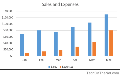
- How to create a column chart in Excel 2016 | 2010 | 2007
Pie Chart
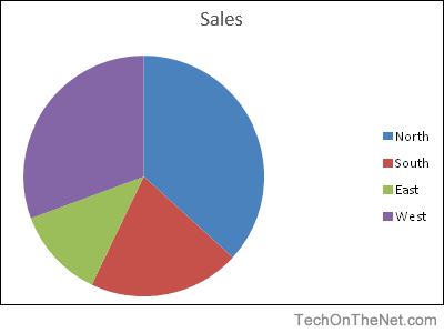
- How to create a pie chart in Excel 2016 | Excel 2007
Line Chart
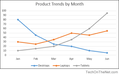
- How to create a line chart in Excel 2016 | Excel 2007
Advanced Charting
- Create a column/line chart with 8 columns and 1 line in Excel 2003
- Create a chart with two Y-axes and one shared X-axis in Excel 2007
You’ve got a presentation due in a few days and you really want to impress the boss. You want to show your data in a way that’s easy to understand, but also visual and impressive. The best way to do that is to choose the right Excel charts and graphs.
You can draw upon many different tools for creating charts and graphs, but Microsoft Excel remains one of the most powerful and functional of them all. It allows you to visualize data in whatever format and style you want, as you’ll see below.
In this article, you’ll learn about the many types of charts available to you in Microsoft Excel using examples from publicly available data provided by data.gov. The data set is drawn from the 2010 US Census; we’ll use this data to show you how impressive it is when you pick the right Excel chart types for your data.
Creating the Right Excel Chart Types
The US Government provides volumes of data to the public annually, completely free to peruse. One of the most valuable bodies of information to learn more about cultural and social facts is the Census.
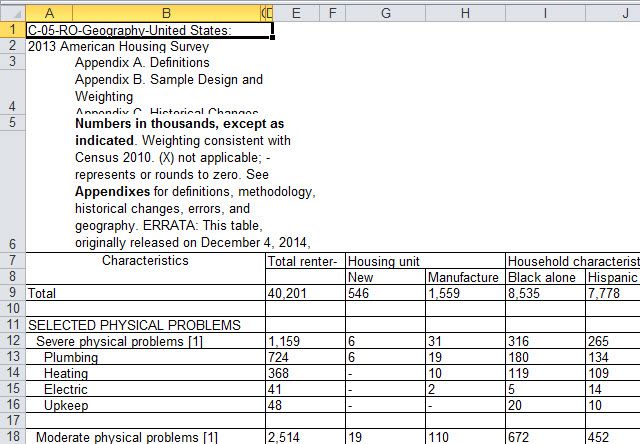
For the first few examples below, I’ve referred to problems that renters have had with their dwellings, split up by the four regions of the United States.

This is a nice, small subset of data, perfect for learning about Excel charts and graphs.
In order to decide which chart to use, you’ll need to take a close look at what the data represents and how you want to visualize that data.
1. Excel Column Charts
One of the most common charts used in presentations, column charts are used to compare values to one another. Usually, these are values that have been categorized in some way. The most common subset of column charts is one set of data broken up into categories.
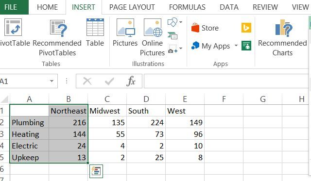
In this case, I’ve chosen to break it down by the number of problems renters have in the Northeast United States. Once you’ve selected your data, just click Insert, and you’ll see a choice of chart types in the menu. In this case, you can go with a 2-D or 3-D column.
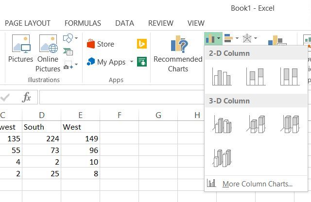
Personally, I prefer the look of 3-D charts. Here’s what the data above looks like using 3-D bar charts.
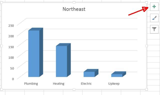
Unfortunately, bar graphs are created by default without any vertical or horizontal labels. You’ll need to add those in so people know what each axis represents.
Doing that is easy enough. Just click the «+» button to the upper right corner of the chart, make sure Axis Titles is selected, and then only select Primary Vertical.
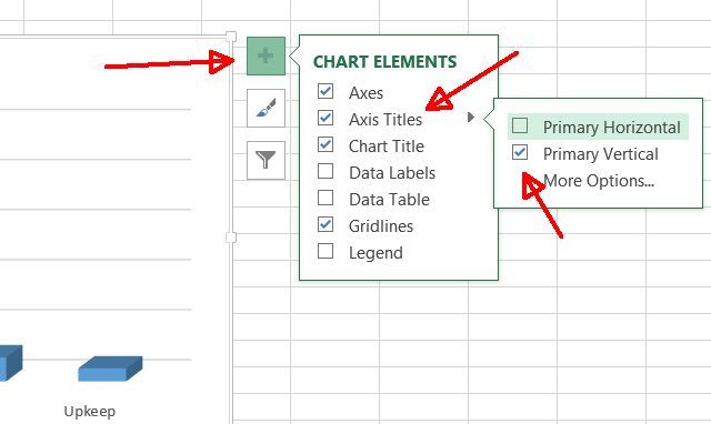
Now, you’ll see a vertical label that you can edit.
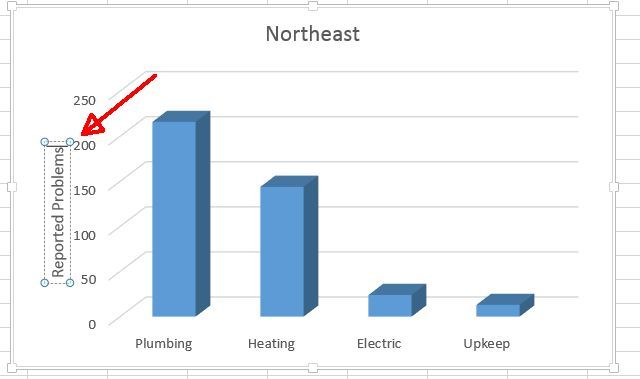
As you can see, using a column chart to visualize categorized data makes the inequity being illustrated clear as day to see. Obviously, people in the Northeast have major plumbing and heating problems. How bad is the problem compared to the rest of the country?
To investigate this difference, let’s add more categorized data using bar charts instead. Bar charts are the same as column charts, but the categories appear horizontally rather than vertically.
This time, highlight all the data.
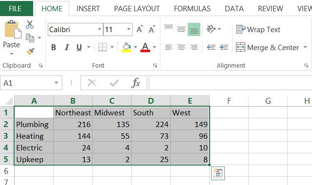
Now, click Insert in the menu above, just like you did before. This time, click on the dropdown for bar charts, just to the right of the column charts dropdown.
There you have it. You now have a bar chart comparison of reported problems by renters, broken down by geographic region.
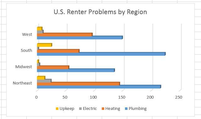
I had to edit the title as shown. You do this simply by clicking on the title itself and typing a new title, at least in Microsoft 365. In other versions, you may need to click Advanced Edit.
As you can see, column charts and bar charts are a really cool way to either compare categorized data for one data set, or to compare categorized data across multiple data sets. For example, the regional chart above shows quite clearly that plumbing issues are much worse in the South and the Northeast, while the South struggles a lot more than anyone else with property upkeep.
2. Excel Pie Charts
As the name implies, pie charts are shaped like a pie. They’re best used when you need to show how much of one dominant, overarching category is taken up by smaller sub-categories.
For example, a university may use a pie chart to show a breakdown of the racial demographics of its student population. Using our data above, you might use a pie chart to break Northeast renter problems down by repair issues.
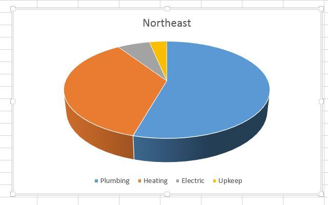
Pie graphs are some of the best Excel chart types to use when you’re starting out with categorized data. With that being said, however, pie charts are best used for one single data set that’s broken down into categories. If you want to compare multiple data sets, it’s best to stick with bar or column charts.
3. Excel Line Charts
Moving on to line charts requires a new set of data. This is because line charts and other similar chart types tend to be time-dependent. You’re usually charting a data point as it changes over a given period of time, although not always.
For a line chart, you only need an X and a Y value. In the example below, X will be time and Y will be population. You could just as easily chart other time-dependent variables, such as the productivity of your company (Y) as the number of bonuses paid goes up (X).
The census data set that we’ll use in this example represents the change in population of the United States from 2010 through 2015.
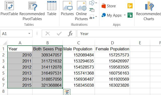
Highlighting the year and the total population columns and then clicking Insert from the menu above allows you to choose a line chart graph. Selecting this option results in a line chart in your spreadsheet. Right-click on the chart and choose Select Data Source. Make sure that the Year is unselected.
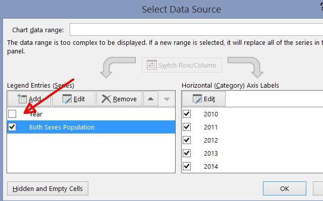
Now that it’s not trying to use the Year column as Y, it’ll use it as X and correctly label your horizontal axis.
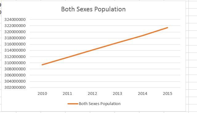
At just a glance, you can see that the population of the US has been steadily increasing at a rate of about 0.76% per year. Very interesting, and line charts are some of the best Excel graphs and charts to use when conveying a progression like this.
4. Excel Area Charts
Area charts are identical to line charts, but the area under the line is filled in. While the focus of the line chart is still changing in value over time, the purpose of an area chart is to highlight the magnitude of these changing values over time.
The difference is subtle, but when you need to express things like how many trees have been clear cut from 1990 to 1995 versus 2000 to 2005, the area chart really is one of the best Excel chart types to use.
With the population data above, you can compare things like male versus female population growth from 2010 through 2015.
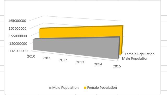
You could also represent the same data using a stacked area chart (also available in the charts section under the Insert menu).
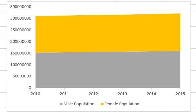
This chart can be thought of as a line graph and a pie chart combined into one. You can see the percentage breakdown of the categorized data as that data changes over time.
5. Excel Scatter (XY) Charts
A favorite in the scientific community, scatter charts are plotted data points, usually highlighting a clustered anomaly amongst similarly-measured data points or a far-reaching outlier. They’re used to show correlations or patterns in the data that aren’t obvious when you’re just looking at each individual datum.
For example, plotting cancer recovery success rates against time spent in the hospital may show a correlation between how long someone is treated for cancer and how successful the treatment is likely to be.
To show the power of this chart type, I’ve plotted the number of asthma hospitalizations in Chicago from 2000 through 2011, organized by zip code.
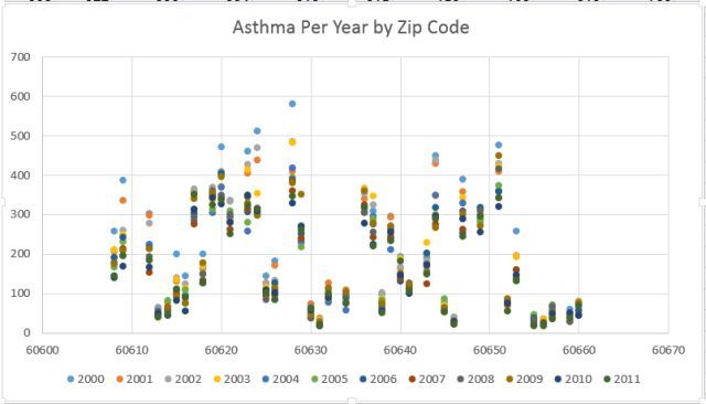
This XY scatter chart reveals that zip code 60628 had more asthma hospitalizations per year than just about every other region, and zip codes 60655 and over make up the best areas to live if you want the least possible odds of having an asthma hospitalization.
6. Excel Bubble Charts
Bubble charts are also extremely useful for data sets like this. This is a fun visualization to create when you have three dimensions of data that you need to plot.
This is a typical XY plotted data point of two values (the point being a «bubble»), with a combined additional value that determines the size of that bubble. For example, with this kind of chart, you could plot how many teens go to the movies, but the size of each data point (bubble) may represent how many females make up that data set.
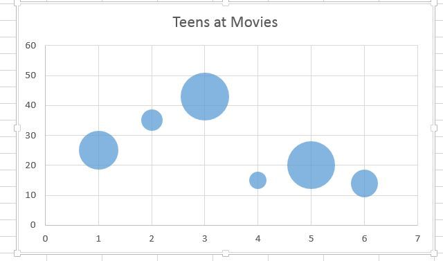
It’s a really interesting way to represent two sets of data with one chart. In the example above, if you included the name of the movies as the X-axis labels, you could identify which, of all of the movies listed, attracted a larger teen female audience.
7. Excel Surface Charts
These three-dimensional Excel chart types let you plot two sets of data points across several dimensions. It can be complex to use, but, with the right data points (IE, two sets of data with a clear relationship), the visualization can be quite impressive.
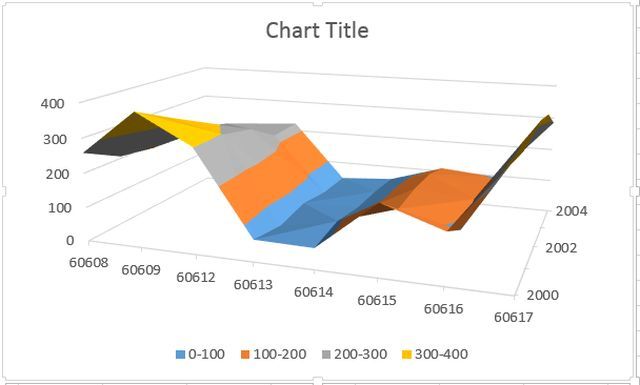
The 3-D version of the chart looks like a topographic map, plotting altitude and distance from any given point. Similarly, you can use this map to do things like chart the severity of a disease outbreak against age and the time that the person remains sick.
By plotting in this way, interesting patterns might become self-evident, things that you’d never notice otherwise. Knowledge is power.
8. Excel Doughnut Charts
Doughnut charts are another complex visualization that lets you graph one data series in a sort of pie chart format. You can add additional data sets in «layers», resulting in a multicolored «doughnut». These Excel chart types are best used when the two data sets are subcategories of a larger category of data.
A good example of this are the data sets used earlier in this article, plotting male and female population per year.
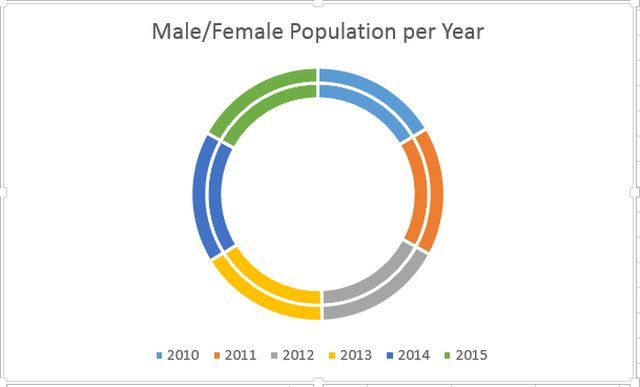
As you can see, every series (the years 2010 through 2015) contains nearly identical-sized segments, showing just how slowly both populations change from year to year. The value of this graph really comes from having the right data and the right goal that you want to achieve visually with that data.
Choosing the Right Excel Charts and Graphs
There may be a wide selection of graphs to use, but what you should actually choose really boils down to the type of data sets you’re working with and just what exactly it is that you’re trying to show or prove with that data. Some Excel charts and graphs will make your argument much clearer than others.
Knowing what the chart needs to accomplish is half of the battle. The other half is figuring out exactly how to arrange your data and format the chart.
The truth is that graphs make a huge impact on any presentation. Now that you know how to use everything that’s available to you in Microsoft Excel, choosing the right Excel graphs and charts for your needs will be easy. You’ll be able to create a presentation with them that’ll really knock their socks off.
Last Updated: January 3, 2023
This article will show you the best types of charts in Excel for data analysis, presentation, and reporting within 15 minutes.
You will learn about the various types of charts in Excel, from column charts, bar charts, line charts, and pie charts to stacked area charts.
How to select the best excel chart?
The type of Excel chart you select for your analysis and reporting depends upon the type of data you want to analyze and report and what you want to do with the data:
- Visualize data (make sense of data esp. big data)
- Classify and categorize data
- Find a relationship among data
- Understand the composition of data
- Understand the distribution of data
- Understand the overlapping of data
- Determine patterns and trends
- Detect outliers and other anomalies in data
- Predict future trends
- Tell meaningful and engaging stories to decision-makers
What are the most popular Excel charts and graphs types?
Following are the most popular Excel charts and graphs:
- Clustered column chart
- Combination chart
- Stacked column chart
- 100% stacked column chart
- Bar chart
- Line chart
- Number chart
- Gauge chart (Speedometer chart)
- Pie chart
- Stacked area chart
- Venn diagram
- Scatter chart
- Histogram
- Actual vs target chart
- Bullet chart
- Funnel chart
When to use a line chart?
#1 Use line charts when you want to show/focus on data trends (uptrend, downtrend, short term trend, sideways trend, long term), especially long term trends (i.e. changes over several months or years) between the values of the data series:

#2 Use line charts when you have too many data points to plot, and the use of a column or bar chart clutters the chart.
#3 Use a line chart instead of a clustered column chart if the order of categories is important:


#4 In a line graph, the x-axis would represent the categories, and the y-axis would represent the measurement values that would be represented periodically.
#5 A line graph should be used when you want to emphasize the changes for values for one variable that are represented on the vertical axis to the other variable represented on the horizontal axis.
#6 Line graphs are better than bar graphs when there are smaller changes.
#7 To read a line graph, first examine the two axes and understand the value points represented on the graph. The second thing is to figure out if there was a rise or fall in the data.
When to use a clustered column chart?
#1 Use a clustered column chart when you want to compare two to four data series. In other words, avoid using column charts if you have just one data series to plot:

Alternatively, avoid creating a column chart with more than four data series.
For example, the following chart contains just five data series, and it has already started looking cluttered:

The chart below contains 11 data series and is very difficult to read and understand:

If you want to create a column chart that contains a lot of data series, then you can try switching ‘row’ and ‘column’ of the chart and see whether it makes any difference:

For example, after switching the row and column of the chart (with 11 data series), it looks like the one below:

Though it still looks cluttered, this chart is much easier to read and understand.
#2 Although the clustered column chart looks like a simple column chart, it is slightly different. A simple column chart is used to represent only a single variable over the other variable, whereas clustered column charts represent multiple data variables.
#3 Use a clustered column chart when the data series you want to compare have the same unit of measurement. So avoid using column charts that compare data series with different units of measurement.
For example, in the chart below, ‘Sales’ and ‘ROI’ have different units of measurement.
The data series ‘Sales’ is of type number. Whereas the data series ‘ROI’ is of type percentage:


#4 Use a clustered column chart when the data series you want to compare are of comparable sizes. So if the values of one data series dwarf the values of the other data series, then do not use the column chart.
For example, in the chart below, the values of the data series ‘Website Traffic’ completely dwarf the values of the data series named ‘Transactions’:

#5 Use a clustered column chart when you want to show the maximum and minimum values of each data series you want to compare.
#6 Use a clustered column chart when you want to focus on short term trends (i.e. changes over days or weeks) and/or the order of categories is not important.
Breaking a clustered column chart
The chart below contains 11 data series and is very difficult to read and understand:

One method of making this chart easier to read and understand is breaking it into several smaller clustered column charts.
For example, you can create one column chart that compares the sales performance of various countries in January.
Create another column chart which just compares the sales performance of various countries in Feb and so on:

The rule of thumb is to avoid presenting too much data in one chart, regardless of the chart type.
When to use a combination chart?
A combination chart is simply a combination of two or more charts.
For example, the combination of a column chart with a line chart.
I use combination charts a lot, and I think you must know how to create them as they are very useful.
#1 Use a combination chart when you want to compare two or more data series that have different units of measurement:

#2 Use a combination chart when you want to compare two or more data series that are not of comparable sizes:

#3 Use a combination chart when you want to display different types of data in different ways that can be represented in the same chart. For example, line, bar and column charts can be used on the same chart.
When to use a stacked column chart?
Use a stacked column chart when you want to compare data series along with their composition, and the overall size of each data series is important:

When to use a 100% stacked column chart?
Use a 100% stacked column chart when you want to compare data series along with their composition but the overall size of each data series is not important:

This chart is used to show the percentage of multiple data series in stacked columns.
When to use a stacked area chart?
Use a stacked area chart when you want to show the trend of composition and emphasize the magnitude of change over time.
For example, the following stacked area chart shows the breakdown of website traffic:

When to use a bar chart?
#1 Use a bar chart whenever the axis labels are too long to fit in a column chart:

What are the different types of bar charts?
Horizontal bar charts – Represent the data horizontally. The data categories are shown on the vertical axis, and data values are shown on the horizontal axis.
Vertical bar charts – Also called a column chart. It represents the numerical values represented in the vertical bars. These are used mainly to display age ranges and salary ranges.
Grouped bar charts – Grouped bar charts represent the different time period numbers that belong to a single category.
Stacked bar charts – It is a bar chart that represents the comparisons between categories of data but with the ability to compare and break down the data.
When to use a pie chart?
#1 Use a pie chart to show a 100% composition of data. In other words, the various pie slices you use must add up to 100%. This means do not create a pie chart where the various pie slices do not represent parts of the whole pie.
For example, the following pie chart is not a good representation of data composition as the two pie slices add up to 82% and not 100%:

#2 Use a pie chart to show the composition of data only when you have got one data series and less than five categories to plot.
For example, the following pie chart shows the breakdown of website traffic sources in the last month:

Here I have got only four categories (search traffic, referral traffic, direct traffic, and campaigns) to plot. So a pie chart is ideal for showing the breakdown.
However, if there were more than four categories to plot, like eight or ten categories, the pie chart would have become cluttered and hard to read.
For example, the following pie chart looks cluttered because it has got too many categories:

#3 Pie charts generally express the part to the whole relationship in your data. When your data is represented in ‘percentage’ or ‘part of’, then a pie chart best meets your needs.
#4 Use a pie chart to show data composition only when the pie slices are of comparable sizes. In other words, do not use a pie chart if the size of one pie slice completely dwarfs the size of the other pie slice(s):

#5 Order your pie slices so that as you look clockwise from top to bottom, the biggest pie slice comes first, followed by the second biggest pie slice and so on. This makes the pie chart easy to read:

These pie charts are made from the following data:

To create a pie chart where the biggest pie slice comes first, followed by the second biggest pie slice and so on.
I have sorted the data in decreasing order (from largest to smallest).
Best practices for using pie charts
Limit the number of pie slices
Always make sure to use a minimal number of slices when creating a pie chart. It is really difficult to read a large number of slices.
If you have more than five categories, it is recommended to use a different chart type.
Make sure all data adds up to 100%
Verify that the pie slices are valued at 100% when added up.
Include annotations: Include percentages and labels for your pie chart to make it easy to read.
Pie charts work best for 25%, 50%, 75% and 100%.
Don’t compare multiple pie charts.
Do not use multiple pie charts for comparison as the slice sizes are really difficult to compare side by side.
When to use a number chart?
If you want to visualize just one type of data and it contains a numeric value that does not fall in any range/interval, then use the number chart:

When to use a gauge chart (also known as a speedometer chart)?
If you want to visualize just one type of data and it contains a numeric value that falls in a range/interval, then use the gauge chart (also known as the speedometer chart):

A gauge chart should be used when you want to validate if your data falls in the acceptable range or not.
A gauge chart would generally have the maximum value as default and thresholds as low, medium and high, which indicates if the data is falling within the acceptable range.
Thresholds would be displayed in red, green and yellow for specified values.
When to use a scatter chart?
#1 Consider using a scatter chart when you want to analyze and report the relationship/correlation between two variables:

This chart shows that the relationship between the two variables (‘x’ and ‘y’) is linear. As the value of the variable ‘x’ increases, there is a corresponding increase in the value of the variable ‘y’.
#2 Create a scatter chart only when ten or more data points are on the horizontal axis. The more data points, the better it is for a scatter chart. Conversely, just a few data points (like five or six) are not good enough for creating a scatter chart.
#3 Use a scatter chart when you want to show ‘why’. For example: why revenue is correlated with average order value or why conversion rate is correlated with the number of transactions.
When to use a histogram?
Use a histogram to show frequency distribution for quantitative data.
A histogram represents the visual representation of numerical data that falls within a specified range of values called ‘bins’. It looks exactly like a vertical graph.

Note: You would need to install the ‘Analysis ToolPak’ to create a histogram in Excel.
When to use an ‘actual vs target’ chart?
The chart below shows whether target sales were achieved in each quarter:

This chart is based on the following data table:

The ‘Actual vs target’ chart is a combination chart that requires some formatting.
You can’t insert this chart straightaway into your Excel spreadsheet.
Use this chart when you have got multiple goals, and you want to show progress towards each goal.
When to use a bullet chart?
The chart below shows the performance of sales in Quarter 4:

This chart is based on the following data table:

If the actual sales are between $0 to $240,000, sales performance is considered ‘Poor’.
If the actual sales are between $240,000 to $300,000 ($240,000 + $60,000) then it is considered ‘Fair’.
If the actual sales are between $300,000 to $360,000 ($240,000 + $60,000 + $60,000) then it is considered ‘Good’.
If the actual sales are between $360,000 to $400,000 ($240,000 + $60,000 + $60,000 + $40,000) then it is considered ‘Excellent’.
A bullet chart is a combination chart (though it looks like a single bar chart) that is used to show progress towards a single goal using a range of predefined qualitative and quantitative parameters.
You can’t insert this chart straightaway into your Excel spreadsheet, and it is also quite tricky to create.
If you have multiple goals and want to show progress towards each goal, then use the ‘Actual vs target’ chart.
But if you have only one goal and want to show progress towards this goal (using both qualitative and quantitative data), then use the bullet chart.
A bullet chart can be a vertical bar chart or a horizontal bar chart.
The choice of vertical or horizontal alignment depends on the space available to use for data visualization.
When to use a funnel chart?
Funnel charts visually represent the progressive reduction of data from one phase to another phase.
The first stage is usually referred to as the intake stage.
The chart below shows different stages of the purchase funnel and how users moved from one stage to the next:

This chart is based on the following data table:

As the name suggests, the funnel chart is used for funnel visualization. It is perfect for showing lead funnels and sales funnels.
A funnel chart provides visual pictures of the stages in the process.
For example, let us take an example of an ecommerce business. Funnel charts can be used to understand how many users have added the products to the cart, provided shipping details and completed the purchase.
It also provides us with information about users who have abandoned the cart.
This chart is available in MS Excel (2016 and above). You just need to select your data table and insert the ‘Funnel’ chart.
Funnel charts are mostly used for the sales process and to identify potential problems.
A funnel consists of a higher value, called the head, and the lower part, which is referred to as the neck.
When to use a Venn diagram?
Use a Venn diagram to show the overlapping of data.
The multi-channel conversion visualizer chart used in Google Analytics to visualize multi-channel attribution is a Venn diagram:

In web analytics, we can use a Venn diagram to determine whether or not a website has got attribution problems.
If there is little to no overlap between two or more marketing channels, the website doesn’t have attribution issues.
If there is a good amount of overlap, the website has attribution issues. You should seriously consider taking multi-channel attribution into account while analyzing and interpreting the performance of marketing campaigns.
To learn more about attribution modelling read this article: Beginners Guide to Google Analytics Attribution Modelling
Another great use of Venn diagrams is in visualizing the backlinks overlaps between websites:

The tool I have used to create this Venn diagram is Venny.
Note: You can create a Venn diagram in Excel. Check out this tutorial on the Microsoft Office website: Create a Venn diagram.
What are the different types of Venn diagrams?
Two set diagrams – Two circles with overlapping properties. This is the most common and simplest form of the Venn diagram used to compare two metrics or variables.
Three set diagrams – This lets you visualize the relationship between three subjects rather than two variables.
Four set diagram– This comprises four circles with overlapping properties. It is a bit more complex than the normal Venn diagram, and each circle represents the different aspect of the data and their comparison to other variables.
Which charts to avoid for reporting purposes?
Throughout this article, I have talked about the charts that should be used.
However, there are some charts that should be avoided for reporting purposes unless your target audience is as data-savvy as you.
Following are those charts:
#1 Charts to avoid > Treemap

#2 Charts to avoid > Waterfall chart

#3 Charts to avoid > Radar chart

#4 Charts to avoid > Bubble chart

The reason you should avoid reporting data via these charts to your clients is simple.
Most people have no idea what you are trying to communicate via these charts.
Use these charts only when your target audience is as data-savvy as you.
How to change the chart type in Excel?
MS Excel allows you to change the chart type.
For example, you can convert a clustered column chart into a stacked column chart. Or you can convert a column chart into a bar chart.
For example, let’s convert the following column chart into a bar chart:

Follow the steps below to change the chart type in excel:
Step-1: Open MS Excel and navigate to the spreadsheet which contains the chart you want to edit
Step-2: Select the chart, and then from the ”Design’ tab, click on the ‘Change Chart Type’ button:

You will now see the ‘Change Chart Type’ dialog box like the one below:

Step-3: Click on ‘Bar’ (from the left-hand navigation) and then click on the ‘OK’ button:

Excel will now change your column chart into a bar chart:

What is data visualization in Excel?
Data visualization is the presentation of data (both qualitative and quantitative data) in graphical format.
In Excel, charts and graphs are used to make a visual representation of data.
What are the benefits of data visualization
Through data visualization you can easily:
- Visualize data (make sense of data, especially big data)
- Classify and categorize data
- Find a relationship among data
- Understand the composition of data
- Understand the distribution of data
- Understand the overlapping of data
- Determine patterns and trends
- Detect outliers and other anomalies in data
- Predict future trends
- Tell meaningful and engaging stories to decision-makers
Data presentation is a very important skill for an optimizer (marketer, analyst). In fact, it is so valuable that LinkedIn lists it as one of the top skills that can get you hired.
Excel charts are commonly used for data visualization and presentation. But selecting the right Excel chart is always a challenge.
If you use an incorrect Excel chart for your analysis, you may misinterpret data and make the wrong business and marketing decisions.
If you use an incorrect Excel chart for your presentation, stakeholders may misinterpret your charts and take wrong decisions.
Therefore selecting the right Excel chart is critically important.
What are the most common data types that can be visualized?
Following are the most common data types that can be visualized:
#1 Quantitative data (also known as interval/ratio data) is the data that can be measured.
For example, ten customers, sales, ROI, weight, etc.
#2 Qualitative data can be classified/categorized but cannot be measured.
For example, colors, satisfaction, rankings, etc.
#3 Discrete data – quantitative data with a finite number of values/observations.
For example, five customers, 17 points, 12 steps, etc.
#4 Continuous data – quantitative data with value / observation within a range/interval.
For example sales in the last year.
#5 Nominal data – qualitative data that cannot be put into a meaningful order (i.e. ranked).
For example {Blue, Yellow, Green, Red, Black}
#6 Ordinal data – qualitative data that can be put into a meaningful order (i.e. ranked).
For example, {very satisfied, satisfied, unsatisfied, very unsatisfied} or {strong dislike, dislike, neutral, like, strong like}.
The anatomy of an Excel chart
To read an Excel chart, you must understand the various components of the chart.
Consider the following data table in Excel:

This data table has got five variables: ‘Month’, ‘Sales’, ‘Cost’, ‘Profit’, and ‘ROI’:

This data table is made up of categories and data series:

Categories – Here, the first category is ‘Jan’, the second category is ‘Feb’, the third category is ‘Mar’, etc.
Data series – A data series is a set of related data points.
Data points – A data point represents an individual unit of data. 10, 20, 30, 40, etc., are examples of data points. In the context of charts, a data point represents a mark on a chart:

Consider the following Excel chart, which is made from the data table mentioned earlier:

This chart is made up of the following chart elements:

- Primary Horizontal Axis:
- Primary Vertical Axis
- Secondary Vertical Axis
- Primary Horizontal Axis Title
- Primary Vertical Axis Title
- Secondary Vertical Axis Title
- Chart Title
- Data Labels
- Gridlines
- Legend
- Trendline
In Excel, categories are plotted on the horizontal axis and data series are plotted on the vertical axis:

From the chart above, we can conclude the following:
- Months are plotted on the primary horizontal axis.
- Sales, cost, and profit are plotted on the primary vertical axis.
- ROI is plotted on the secondary vertical axis.
Following are examples of other Excel chart elements:
- Data Table with legend keys
- Data Table with no legend keys
- Error bars (Standard Error)
- Error bars (Percentage)
- Error bars (Standard Deviation)
- Primary Major Horizontal Gridlines
- Primary Major Vertical Gridlines
- Primary Minor Horizontal Gridlines
- Primary Minor Vertical Gridlines
- Linear Trendline
- Exponential Trendline
- Linear Forecast Trendline
- Moving Average Trendline
#1 Data table with legend keys

#2 Data table with no legend keys

#3 Error bars (standard error)

If you want to see the margin of error as a standard error amount, then use the standard error bar.
About Error Bar
An error bar is a line through a point on a graph, parallel to one of the axes, which can help you see margins of error at a glance.
#4 Error bars (percentage)

If you want to see the margin of error as a percentage, use the percentage error bar.
#5 Error bars (standard deviation)

If you want to see the margin of error as a standard deviation, then use the standard deviation error bar.
#6 Primary major horizontal gridlines

About Chart Gridlines
Chart gridlines are the faint lines that appear on the plot area of a chart. They are used to make the data in a chart that displays axes easier to read. They can appear both horizontal and vertical.
#7 Primary major vertical gridlines

#8 Primary minor horizontal gridlines

#9 Primary minor vertical gridlines

#10 Linear trendline

Use the Linear trendline if your data set is linear (resembles a straight line) and the data values are increasing or decreasing at a steady rate.
About Trendlines
The trendlines are used to graphically display trends in data. A trend is a movement in a particular direction.
A trend can be short (or seasonal), intermediate, or long term. Longer the trend more significant it is. For example, a 3 months trend is not as significant as 3 years trend.
#11 Exponential trendline

Use the exponential trendline if data values increase or decrease at increasingly higher rates.
#12 Linear forecast trendline

Use the Linear forecast trendline if your data set is linear (resembles a straight line), the data values are increasing or decreasing at a steady rate, and you want to forecast the data.
#13 Moving average trendline

Use the moving average trendline if there is a lot of fluctuation in your data.
How to add a chart to an Excel spreadsheet?
To add a chart to an Excel spreadsheet, follow the steps below:
Step-1: Open MS Excel and navigate to the spreadsheet, which contains the data table you want to use for creating a chart.
Step-2: Select data for the chart:

Step-3: Click on the ‘Insert’ tab:

Step-4: Click on the ‘Recommended Charts’ button:

Step-5: Select the chart you want to use from the ‘Insert chart’ dialog box and then click on the ‘ok’ button:

You should now be able to see the chosen chart inserted in your spreadsheet:

How to add, change, or remove a chart element in Excel?
To add, change or remove a chart element in Excel (2013 or above), follow the steps below:
Step-1: Open MS Excel and navigate to the spreadsheet which contains the chart you want to edit.
Step-2: Select the chart, and then from the ”Design’ tab, click on the ‘Add Chart Element‘ drop-down menu:


Step-3: Select the chart element you want to add, change or remove from one of the drop-down menus.
For example, if you want to add a data table to your chart, then click on ‘Data Table‘ > ‘With legend Keys‘:

You can now see your chart along with the data table:

How to add a trendline to a chart in excel?
Follow the steps below:
Step-1: Open MS Excel and navigate to the spreadsheet which contains the chart you want to edit.
Step-2: Select the chart, and then from the ”Design’ tab, click on the ‘Add Chart Element‘ drop-down menu.
Step-3: Click on the ‘Trendline’ drop-down menu and select the type of trendline you want to add to your chart.

How to change the color or style of a chart?
Step-1: Open MS Excel and navigate to the spreadsheet which contains the chart you want to edit.
Step-2: Select the chart, and then from the ”Design’ tab, click on the ‘Change Colors‘ drop-down menu to change the colours used in your chart:

If you want to change the style/design of the chart, then click on one of the styles under the ‘Design’ tab:

How to build data visualizations in Excel?
You can build a data visualization in excel through the following charts and graphs:
- Clustered column chart
- Combination chart
- Stacked column chart
- 100% stacked column chart
- Bar chart
- Line chart
- Number chart
- Gauge chart (Speedometer chart)
- Pie chart
- Stacked area chart
- Venn diagram
- Scatter chart
- Histogram
- Actual vs target chart
- Bullet chart
- Funnel chart
Other articles on Excel charts
- Which Chart Type Works Best for Summarizing Time-Based Data in Excel
- Five Advanced Excel Charts and Graphs
- Data Visualization in Excel Tutorial
- What type of chart to use to compare data in Excel
Articles on data analysis and reporting
- Top 20 reasons why people misinterpret data and reports
- Making Good Marketing Decisions Despite Faulty Analytics Data
- Ten tips to analyse data trends in Google Analytics
- 21 Secrets to Becoming a Champion in Data Reporting
- How to become a champion in data reporting via Storytelling
- Google Analytics Dashboard Tutorial
Frequently asked questions about types of charts in Excel
What is data visualization?
Data visualization is the presentation of data (both qualitative and quantitative data) in graphical format. Through data visualization you can easily: make sense of data (especially big data), classify and categorize data, find relationships among data, understand the composition of data, understand the distribution of data, understand the overlapping of data, determine patterns and trends, detect outliers and other anomalies in data, predict future trends and tell meaningful and engaging stories to decision-makers.
Why is it important to use the correct Excel chart?
If you use an incorrect Excel chart for your analysis, you may misinterpret data and make the wrong business and marketing decisions. If you use an incorrect Excel chart for your presentation, stakeholders may misinterpret your charts and take wrong decisions. Therefore selecting the right Excel chart is critically important.
What is a data series?
A data series is a set of related data points.
What is a data point?
A data point represents an individual unit of data. 10, 20, 30, 40, etc., are examples of data points. In the context of charts, a data point represents a mark on a chart.
What should be the criteria for selecting an Excel chart?
The type of Excel chart you select for your analysis and reporting should depend upon the type of data you want to analyse and report and what you want to do with the data. Do you want to classify and categorize data or find relationships among data or understand the composition, distribution or overlapping of data?
What is quantitative data?
Quantitative data (also known as interval/ratio data) is the data that can be measured. For example, ten customers, sales, ROI, weight etc.
What is qualitative data?
Qualitative data can be classified/categorized but cannot be measured, for example, colours, satisfaction, rankings, etc.
What is discrete data?
It is quantitative data with a finite number of values/observations. For example, five customers, 17 points, 12 steps etc.
What is continuous data?
It is quantitative data with value/observation within a range/interval. For example, sales in the last year.
What is nominal data?
Nominal data is qualitative data that can not be put into a meaningful order (i.e. ranked). For example {Blue, Yellow, Green, Red, Black}
#1 Why digital analytics is the key to online business success.
#2 The number 1 reason why most marketers are not able to scale their advertising and maximize sales.
#3 Why Google and Facebook ads don’t work for most businesses & how to make them work.
#4 Why you won’t get any competitive advantage in the marketplace just by knowing Google Analytics.
#5 The number 1 reason why conversion optimization is not working for your business.
#6 How to advertise on any marketing platform for FREE with an unlimited budget.
#7 How to learn and master digital analytics and conversion optimization in record time.