
Word for Microsoft 365 Word 2021 Word 2019 Word 2016 Word 2013 Word 2010 Word Starter 2010 More…Less
You can make a chart in Word. If you have lots of data to chart, create your chart in Excel, and then copy from Excel to another Office program. This is also the best way if your data changes regularly and you want your chart to always reflect the latest numbers. In that case, when you copy the chart, keep it linked to the original Excel file.
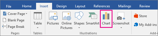
To create a simple chart from scratch in Word, click Insert > Chart, and pick the chart you want.
-
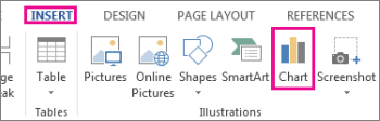
Click Insert > Chart.

-
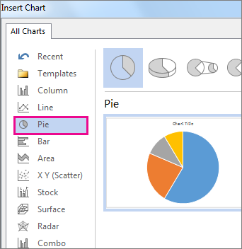
Click the chart type and then double-click the chart you want.
-
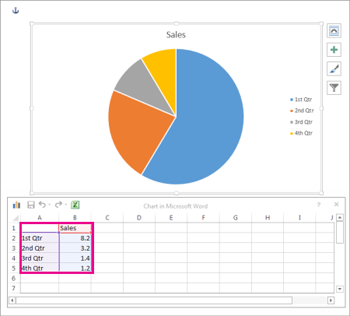
In the spreadsheet that appears, replace the default data with your own information.
-
When you’ve finished, close the spreadsheet.
-
If you want, use the Layout Options button
to arrange the chart and text in your document.
 to arrange the chart and text in your document.
You can make a chart in Word or Excel. If you have lots of data to chart, create your chart in Excel, and then copy from Excel to another Office program. This is also the best way if your data changes regularly and you want your chart to always reflect the latest numbers. In that case, when you copy the chart, keep it linked to the original Excel file.
To create a simple chart from scratch in Word, click Insert > Chart and pick the chart you want.
-
Click Insert > Chart.
-
Click the chart type and then double-click the chart you want.
-
In the spreadsheet that appears, replace the default data with your own information.
-
When you’ve finished, close the spreadsheet.
-
If you want, use the Layout Options button
to arrange the chart and text in your document.
Important:
Office 2010 is no longer supported. Upgrade to Microsoft 365 to work anywhere from any device and continue to receive support.
Upgrade now
In Microsoft Word 2010, you can insert many kinds of data charts and graphs, such as column charts, line graphs, pie charts, bar charts, area graphs, scatter graphs, stock charts, surface charts, doughnut charts, bubble graphs, and radar graphs.
Notes:
-
Don’t see the chart that you want in this article? For more information about the variety of graphs and charts you can use, see Available chart types.
-
Want to create an organization chart? For more information about how to create organization charts, see Create an organization chart.
-
If Microsoft Excel 2010 isn’t installed on your computer, you will not be able to take advantage of the advanced data charting capabilities in the Microsoft Office 2010. Instead, when you create a new data chart in Word 2010, Microsoft Graph opens.
How?
|
|
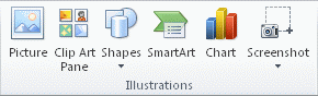
On the Insert tab, in the Illustrations group, click Chart.
|

|
|
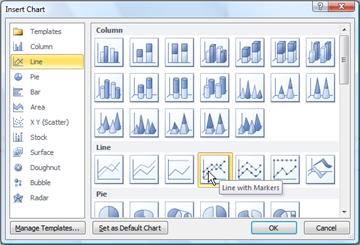
In the Insert Chart dialog box, click the arrows to scroll through the chart types. Select the type of chart that you want and then click OK.
When you rest the mouse pointer over any chart type, a ScreenTip displays its name. |

|
|
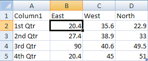
Edit the data in Excel 2010. When you are finished editing your data, you can close Excel.
Sample data in an Excel worksheet |

Tips
-
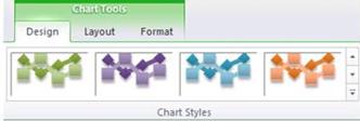
To get a good idea of what you can add to or change in your chart, under Chart Tools, click the Design, Layout, and Format tabs, and then explore the groups and options that are provided on each tab.
Note: If you don’t see the Chart Tools, make sure that you click anywhere inside the chart to activate it.
-
You can also access design, layout, and formatting features that are available for specific chart elements (such as chart axes or the legend) by right-clicking those chart elements.
More information
-
To learn about the available chart types, see Available chart types.
-
To edit data in your chart, see Change the data in an existing chart.
Top of Page
See also
Present data in a chart
Need more help?
MS Word
How to Make Letterhead in Microsoft Word
![]()
Published
1 year ago
on
November 18, 2021

How to make a letterhead in Word correctly and neatly is actually easy, but surely there are still many of you who don’t know how to make it.
In an official letter, of course, there is a letterhead and there is always a line at the bottom right. Well, it turned out to be quite easy to make you know.
Apart from being the introduction to a letter, letterhead is also commonly used as a place to write the identity of the letter, such as the identity of the sender and recipient.
For those of you who want to know how to make it, here we explain in full the steps to make a letterhead in Word for you.
HOW TO MAKE LETTERHEAD IN WORD
You should know how to make a letterhead in Word this time, guys, especially when you want to send letters between agencies.
Although not all agencies use it, it doesn’t hurt you to try and find out how to make this letterhead, here are the steps!
- First, open your Word.
- Place the cursor at the back of the last word of the letterhead
- Then select the menu Borders – Borders and Shading.
- After the border menu appears, all you have to do is select the line you want on the menu with a sign like this.
Don’t rush to click Ok, because there’s one more thing you have to do to make it, guys. In the section below, remove it or set it like this to make the line only exist at the bottom, and then Ok.
Yeah, you have successfully drawn the line, Guys, it’s easy and fast, right, how to make a letterhead in Word?
You don’t need to be confused anymore about how to make it. For beginners, making letterhead or letterhead does sound quite difficult.
In fact, how to make a letterhead in Word is fairly easy as long as you already know the procedure. After all, the letterhead cannot be made casually because it is an official identity.
The letterhead contains the official identity of an institution, agency, or company. Well, you can create an official identity on the letterhead in Microsoft Word.
MS Word
How to Create a Background in Microsoft Word
![]()
Published
1 year ago
on
November 18, 2021

This way of making a background in Word aims to beautify the appearance of the document and make it more attractive Guys.
Usually, this is often found in the use of proposals, certificates, covers, and not infrequently in job applications.
With this function, how do you make it? It’s so easy. Yes, although there are several ways you can do this, you can follow this tutorial in full.
HOW TO MAKE A BACKGROUND IN WORD
This background function is very useful if you want to create a document that upholds the originality of Guys, for example, a thesis.
In addition to having to know how to create a table of contents in Microsoft Word, you may also need to know how to create a background in your thesis document, especially in showing the results of the tests you did.
How to make this background is also needed if you want to make an official letter from the agency. Besides needing to know how to make letterhead lines in Word, you also need to know how to add a background to the letter. Here’s how:
- The first thing you can do is change the color.
- Go to Design – Page Color – and immediately choose a color like this.
That is the easiest way and you can change the color according to your needs or tastes, guys. In addition to this method, you can also replace it with an image that you have.
The method is almost the same, guys, pay attention to the following rare:
- Go to the Design menu.
- Click Page Color.
- Select Fill Effects.
- Next, select the tab Picture – Select Picture – From a File.
- Then find the image you have and press Ok
- Finished! The background will change.
But, you also need to remember that both methods will not appear when you print either color or image.
To make it appear when printing, then you need to go to the File menu – Options – Display – and check the Print background colors and Image.
Well, after you go through these few steps, the background will change and also enter when you print, GRATZ!!! It’s easy to make a background in Word.
MS Word
How to Create a Signature in Word
![]()
Published
1 year ago
on
November 11, 2021

There are several ways to make a signature in Microsoft Word. And the method is really easy, just follow the steps below, guys!
Making a signature is really needed, especially in the digital era like now, right? Of course, you need a signature in your Word file, so from that our Team will provide this tutorial in detail.
Actually, you can also use a third application or additional devices such as pens that support your PC or laptop. But this is the easiest way without using other devices and applications Guys.
HOW TO CREATE A SIGNATURE IN WORD
You need to sign first, Guys on a piece of white paper. Make sure the paper is really white and the pen has colour ink that you can really see clearly.
This function is for later photos or files the resolution will be smaller Guys. Not only that, but the customized color saturation will also reduce the thickness of the pen color, you know.
So make sure you give a signature with a clear enough emphasis. Here’s how to create a signature in Word:
- Prepare a white paper with a signature on it. Photos using a smartphone or you can directly scan the signature through a scanner.

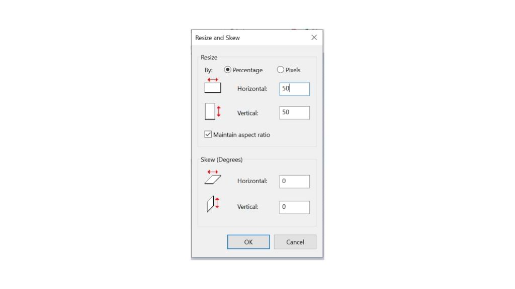
- You can reduce the resolution and crop it so that the photo focuses on the signature. For convenience, click the image file > Edit.
- On the Paint menu, you can resize to reduce the resolution. Choose 50 per cent resolution, fill Horizontal 50 and Vertical 50
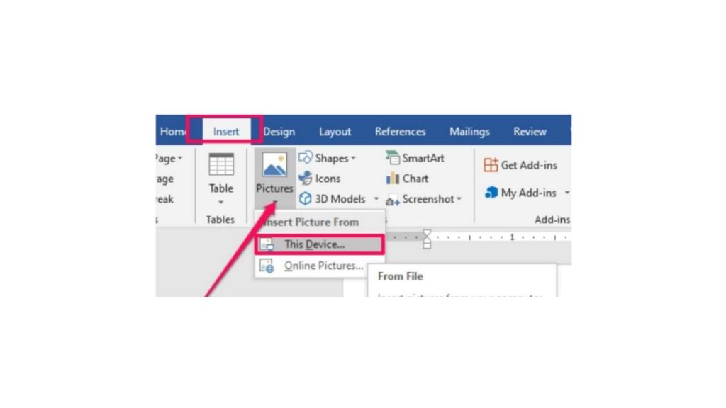
- Hover over the exact position of the word you want to add a signature to. Click Insert > Picture > insert the previous signature image file.
- After you insert the image, reduce the size again using the cursor for more precision.
- Double click on the image.
- On the Format menu, select the Color > Recolor > Black and White 50 per cent submenu.
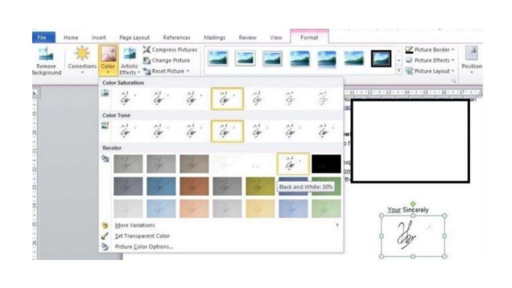
- if your signature is not clear, double click on the image, select menu Correction > Brightness 0 per cent (Normal) Contrast 40 per cent.
You can change the last two steps depending on the contrast and color saturation you want, guys. So you can at the same time adjust the thickness of your signature that has entered the word, so guys.
I also said what Guys, how easy it is to make a signature in Microsoft Word! The most important thing is to make sure your signature is clear enough, and the photos are of high enough quality. Obviously, so that later your signature looks good, it doesn’t break.
Updated: 12/31/2020 by
In Microsoft Word, not only can you create documents with text and insert pictures into documents, but you can also create a chart or graph to add visual detail to documents.
There are two options for creating a chart or graph in Microsoft Word. Click a link below for details on how to use each option.
Create chart or graph directly in Microsoft Word
Like in Microsoft Excel, Microsoft Word provides the capability of creating a chart or graph and adding to your document. To create and insert a chart or graph directly in Microsoft Word, follow the steps below.
- Open the Microsoft Word program.
- In the Ribbon bar at the top, click the Insert tab.
- In the Illustrations section, click the Chart option.
- Once the Insert Chart window is open, select the type of chart or graph you want to create, then click the OK button.
- A basic version of the selected chart or graph type, with sample data, is added to the document. A Chart in Microsoft Word window also opens, which looks like a Microsoft Excel spreadsheet. In the spreadsheet window, add, remove, or modify the columns and rows of data to include the data points and values you want your chart to display.
- As you modify the columns, rows, and values in the spreadsheet window, the chart or graph in Microsoft Word automatically updates and display the new or changed data.
- When finished modifying the chart, close the spreadsheet window.
If you need to update the chart data after closing the spreadsheet window, you can re-open the spreadsheet window by right-clicking the chart and selecting the Edit Data option.
Create chart or graph in Microsoft Excel and copy to Microsoft Word
Microsoft Excel provides more functionality and data manipulation capabilities than Microsoft Word provides when creating a chart or graph. If you need the increased capabilities of Excel to create a chart or graph, and then put it in a Microsoft Word document, follow the steps below.
- Open the Microsoft Excel and Microsoft Word programs.
- Create the chart or graph in Microsoft Excel.
- How to create a chart or graph in Excel, Calc, or Sheets.
- After the chart or graph is created and ready to be placed in the Word document, select the entire chart in Excel.
- Right-click the chart or graph and select the Copy option. You can also press Ctrl+C on your keyboard to copy the chart or graph.
- In the Word document, place your mouse cursor where you want to add the chart or graph.
- Right-click and select the Paste option to place the chart or graph in the document. You can also press Ctrl+V on your keyboard to paste the chart or graph.
Note
Using the process above, you cannot modify the chart or graph through Microsoft Word after placing it in the document.

Charts offer a concise and visually appealing way to present numeric information. This tutorial explains the basics of creating and customizing charts in Microsoft Word. We’ll cover five topics:
- How to insert a chart
- How to update existing data in a chart
- How to resize a chart
- How to reposition a chart
- How to change chart colors
These steps apply to all seventeen of Word’s prebuilt chart types:
| Column | Area | Surface | Histogram | Combo |
| Line | X Y (Scatter) | Radar | Box & Whisker | |
| Pie | Map | Treemap | Waterfall | |
| Bar | Stock | Sunburst | Funnel |
Important Note: Word provides many ways to customize charts—many more than can reasonably be covered in one tutorial. So, this tutorial presents the basic methods I believe will be most useful for the majority of users.
Before we begin…
What about Figures and Graphs?
In the writing world, charts and graphs fall under the umbrella term figures, which also includes photos, drawings, maps, and musical scores.
Graphs are generally considered a type of chart. Therefore, the term chart is used throughout this tutorial. However, all the steps shown here also apply to visuals typically considered to be graphs, such as line graphs.
This tutorial is also available as a YouTube video showing all the steps in real time.
Watch more than 150 other writing-related software tutorials on my YouTube channel.
The images below are from Word for Microsoft 365. The steps are the same in Word 2021, Word 2019, Word 2016, and Word 2013. However, your interface may look slightly different in those older versions of the software.
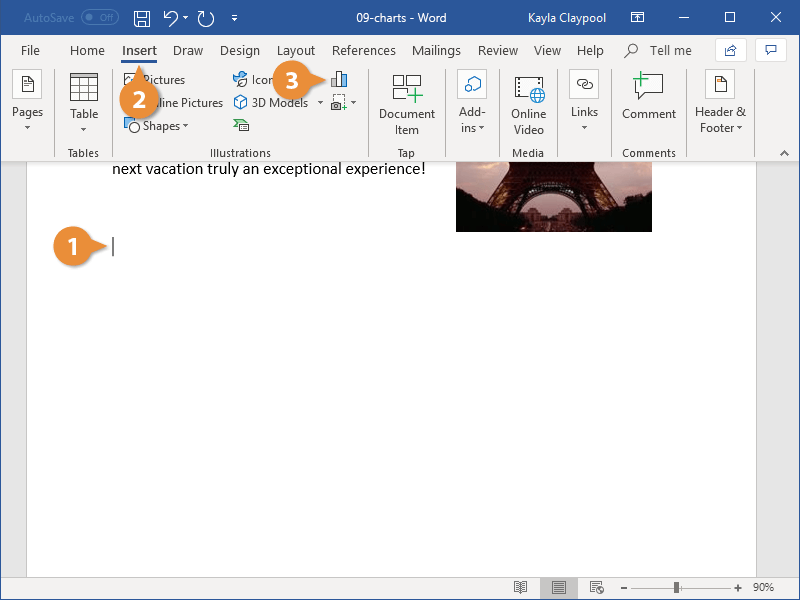
How to Insert a Chart
- Place your cursor where you want to insert the chart.
- Select the Insert tab in the ribbon.

- Select the Chart button in the Illustrations group.

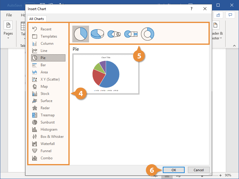
- Select a chart type from the left side of the Insert Chart dialog box.

Pro Tip: Hover your pointer over the example image in the center of the Insert Chart dialog box to see a larger example of the chosen chart type.
- Select a subtype of the selected chart.
The available subtypes will depend on the selected chart. Common charts such as pie charts and bar charts offer attractive 3-D options.

- Select the OK button to close the Insert Chart dialog box and insert the chart.

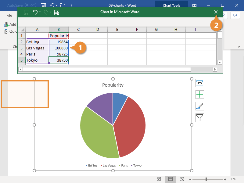
- Enter labels and numbers into the spreadsheet by typing over the example data. Add additional labels and numbers or delete the example data as necessary.

- Select the X to close the spreadsheet.

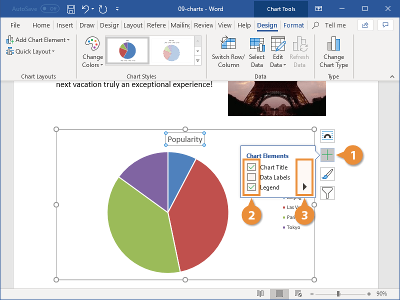
- (Optional Step) Select the Chart Elements button to the right of the chart if you want to add or remove the title, data labels, or the legend. (Click inside the border to select the chart if the right-side buttons are not visible.)

How to Update Existing Data in a Chart
- Right-click the chart.
- Select Edit Data from the shortcut menu.

Pro Tip: Select the arrow next to Edit Data and select Edit Data in Excel if you want to update your chart in Excel rather than Word’s spreadsheet.
- Edit your data in the spreadsheet (see figure 6).
- Select the X to close the spreadsheet and apply your changes (see figure 7).
How to Resize a Chart
Charts can be resized by dragging the border or by using exact dimensions (e.g., 3” x 4”).
Basic Method: Resize a Chart by Dragging the Border
- Click inside the border to reveal the resizing handles.

- Click and hold one of the handles as you drag the chart to the appropriate size.
-
- The corner handles provide movement in all directions.
- The side handles provide horizontal movement.
- The top and bottom handles provide vertical movement.
Advanced Method: Resize a Chart to Exact Dimensions
- Click inside the border to select the chart.
- Select the Layout Options button to the right of the chart.

- Select See more from the Layout Options menu.

- Select the Size tab in the Layout dialog box.

- (Optional Step) Select Lock aspect ratio if you want to maintain the current shape.

- Enter the dimensions in the Height and Width boxes. If you selected Lock aspect ratio, you only have to enter one of these numbers.

- Select the OK button to close the Layout dialog box and apply your new dimensions.

How to Reposition a Chart
You can customize your chart’s placement on the page by changing its alignment and text wrapping. Text wrapping determines how charts and other figures are positioned in relation to the surrounding text.
- Select the Home tab in the ribbon.

- Click inside the border to select the chart.
- Select the Align Left, Center, or Align Right button in the Paragraph group.

- (Optional Step) Select the Layout Options button to the right of the chart for text wrapping options.

Your position changes will be applied immediately.
How to Change Chart Colors
You can choose a prebuilt color palette for your whole chart or select custom colors for individual elements.
See the bonus section below for information about using RGB, HSL, and Hex color codes.
Basic Method: Choose a Prebuilt Color Palette
- Click inside the border to select the chart.
- Select the Chart Styles button to the right of the chart.

- Select the Color tab in the shortcut menu.

- Select a color palette.

Your new color palette will be applied immediately.
Advanced Method: Choose Custom Colors
- Select and then right-click the individual chart element you want to change.
- Select the Fill button in the shortcut menu.

- Select a color from the drop-down menu or choose More Fill Colors for additional options.

Your new color will be applied immediately.
Bonus Section: How to Use RGB, HSL, and Hex Color Codes in a Chart
Word lets you use RGB (Red, Green, Blue) and HSL (Hue, Saturation, Lightness) color codes in your charts. In addition, you can use Hex color codes if you are using an updated version of Word for Microsoft 365 (formerly Office 365).
- Select and then right-click the individual chart element you want to change.
- Select the Fill button in the shortcut menu (see figure 23).
- Select More Fill Colors from the drop-down menu.

- Select the Custom tab in the Colors dialog box.

- Select RGB or HSL from the Color model menu or enter a code in the Hex box.

- Enter your RGB or HSL code into the appropriate boxes. (Skip this step if you are using a Hex code.)

- Select the OK button to close the Colors dialog box and apply your color change.

Related Resources
Three Ways to Insert Tables in Microsoft Word
How to Save Tables and Figures as Images in Microsoft Word (PC & Mac)
How to Update Table and Figure Numbers in Microsoft Word
How to Change the Style of Table Titles and Figure Captions in Microsoft Word
How to Create and Update a List of Tables or Figures in Microsoft Word
How to Write Figure Captions for Graphs, Charts, Photos, Drawings, and Maps
How to Write Table Titles
How to Reference Tables and Figures in Text
Updated November 27, 2022
-
1
Open a Microsoft Word document. To do so, you can double-click an existing Word document, or you can open Microsoft Word and select your document from the Recent section.
- If you’re opening a new document, simply open the Microsoft Word program and click Blank document instead.
-
2
Click in the document where you want to insert your graph. Doing so will place the blinking cursor where you clicked; this is where your graph will appear when you add it.
- For example, clicking below a paragraph of text will set that location as the place to insert your graph.
Advertisement
-
3
Click the Insert tab. It’s at the top of the Word page, to the right of the Home tab.
-
4
Click Chart. You’ll see this option below and to the right of the Insert tab. Its icon resembles several different-colored bars.
-
5
Click a chart format. These are listed on the left side of the Chart pop-up window.
- A few common chart formats are Line, Column, and Pie.
- You can customize your chart’s format by clicking an appearance option at the top of your format’s window.
-
6
Click OK. Doing so will insert your chart into your document.
- You’ll also see a small Excel window with cells appear—this is where you’ll input your data.


Advertisement
-
1
Click a cell in the Excel window. Doing so will select it, which will allow you to add a point of data to that cell.
- The values in the «A» column dictate the X-axis data of your graph.
- The values in the «1» row each pertain to a different line or bar (e.g., «B1» is a line or bar, «C1» is a different line or bar, and so on).
- Numerical values outside of the «A» column or the «1» row represent different points of data on the Y-axis.
- Anything written in an Excel cell can be re-written to reflect your data.
-
2
Type in a number or name.
-
3
Press ↵ Enter or ⏎ Return. Doing so will enter your data into the cell, allowing you to move on to another cell.
-
4
Repeat this process for every point of data you need. As you enter data, your graph will change to display it.
-
5
Click X in the top right corner of the Excel window. Doing so will close the window and save your graph changes.
- You can re-open the Excel window at any time by clicking on your graph.


Advertisement
Add New Question
-
Question
How do I label the axes in a line graph?

The «Chart Tools» menu. Click on the tab entitled «Layout» in the Chart Tools menu. Click on «Axis Titles» from within the «Labels» group. Click on «Primary Horizontal Axis Title» or «Secondary Horizontal Axis Title» to add a horizontal axis text box to your chart.
-
Question
How do I make a table around existing text in my document?
You need to click «Insert» and then click «Smartapp.» Then click on «Relationships» on the left hand side and pick your table.
-
Question
How do I change the title if I update entries?
You can just click on your title and type in the updated title when you’re ready.
See more answers
Ask a Question
200 characters left
Include your email address to get a message when this question is answered.
Submit
Advertisement
-
On Word 2010 or earlier, the Excel window will pop up outside of Microsoft Word as an entirely new Excel document.
Thanks for submitting a tip for review!
Advertisement
-
Make sure you save your work!
Advertisement
About This Article
Article SummaryX
1. Click where you want to put the graph.
2. Click Insert.
3. Click Chart.
4. Select a format.
5. Click OK.
6. Click the Excel window.
7. Add graph data.
Did this summary help you?
Thanks to all authors for creating a page that has been read 646,939 times.
Is this article up to date?
In a Word document, select Insert > Chart. Select the graph type and then choose the graph you want to insert. In the Excel spreadsheet that opens, enter the data for the graph.
Contents
- 1 How do I insert a graph in Word?
- 2 How do you make an XY graph in Word?
- 3 How do I make a line graph in Word 2020?
- 4 How do you create a graph?
- 5 How do you make a curve graph on Microsoft Word?
- 6 How do you create a line graph?
- 7 How do you make a graph on the computer?
- 8 How do you add a line in Word?
- 9 How do I create a bar graph?
- 10 Can you make graphs in Canva?
- 11 How do I draw a straight line in Word?
- 12 How do you insert a curved arrow in Word?
- 13 How do you graph a curved line?
- 14 Where do you plot on a graph?
- 15 How do I use Excel to make a bar graph?
- 16 What is an XY graph?
- 17 How do I add a line to a graph in Excel?
- 18 What program can I use to create a graph?
- 19 How do I create an underline in Word?
- 20 How do you put a line through text?
How do I insert a graph in Word?
How to Create a Graph in Word
- Open a document.
- Go to the “Insert” tab and click on “Chart.”
- Select the chart type and double-click on the chart you want to use.
- Insert your data over the default data in the spreadsheet.
- Click on the “X” in the upper right corner of the spreadsheet if you’re finished.
How do you make an XY graph in Word?
Step 1: Open the Word document. Step 2: Go to the Insert tab on the ribbon and click on the Chart option under the Illustrations group. Step 3: An Insert Charts dialog box will appear on the screen. Select the XY (Scatter) option from the left pane and pick a line graph that you want to insert.
How do I make a line graph in Word 2020?
To insert a line graph, go to the Insert Tab and click on Charts. A pop-up window will appear containing different types of charts and graphs. Scroll down to Line Chart and select the desired one. Then click on OK to insert the line graph on your blank page.
How do you create a graph?
How to Make a Graph in Excel
- Enter your data into Excel.
- Choose one of nine graph and chart options to make.
- Highlight your data and click ‘Insert’ your desired graph.
- Switch the data on each axis, if necessary.
- Adjust your data’s layout and colors.
- Change the size of your chart’s legend and axis labels.
How do you make a curve graph on Microsoft Word?
Draw a curve
- On the Insert tab, click Shapes.
- Under Lines, click Curve.
- Click where you want the curve to start, drag to draw, and then click wherever you want to add a curve.
- To end a shape, do one of the following: To leave the shape open, double-click at any time. To close the shape, click near its starting point.
How do you create a line graph?
To draw a line graph, first draw a horizontal and a vertical axis. Age should be plotted on the horizontal axis because it is independent. Height should be plotted on the vertical axis. Then look for the given data and plot a point for each pair of values.
How do you make a graph on the computer?
Using Excel and Copying the Graph
To do this, create the graph as you normally would in Excel (go to “Insert” and then choose the type of chart you want from the “Charts” group), and highlight the data as needed.
How do you add a line in Word?
Insert a line
- On the Insert tab, select Shapes.
- Under Lines, select any line style you like.
- Select a location in the document, hold and drag your pointer to a different location, and then release the mouse button.
How do I create a bar graph?
1 Method 1 of 1: Making Your Own Bar Graphs
- Collect your data. The first thing you have to do is to collect all of your data.
- Draw an x and a y-axis. This will look like a large “L” shape.
- Label the x-axis.
- Label the y-axis.
- Draw your bars.
- Interpret the data.
Can you make graphs in Canva?
Canva offers a huge range of templates for infographics, presentations and reports, so you can put your beautiful custom charts exactly where you need them. And you can publish your graphs exactly as you please: you can share, download, embed or even order professional prints.
How do I draw a straight line in Word?
How to Add a Horizontal Line in Word
- Launch Word.
- Click the Insert tab, then click the “Shapes” button in the Illustrations group.
- Click the first line icon in the Lines menu that drops down.
- Press and hold down the “Shift” key to keep your line straight when you draw it.
- Format the line, if desired, by clicking it.
How do you insert a curved arrow in Word?
How to Create a Curved Arrow. On the “Insert” tab of the Ribbon, click the “Shapes” button. In the “Lines” section, click one of the curved arrow shapes. You’ll find one with a single arrowhead, one with two heads, and a simple curved line with no arrowheads.
How do you graph a curved line?
Right-click on the line in the graph and select “Format Data Series.” This is where you will choose options to make the line in the graph curved.
Where do you plot on a graph?
Follow these simple steps:
- First, find the value for x on the x-axis.
- Next, find the y-value – in this case, y=1100, so find 1100 on the y-axis.
- Your point should be plotted at the intersection of x=0 and y=1100.
- Finally, plot the point on your graph at the appropriate spot.
How do I use Excel to make a bar graph?
To insert a bar chart in Microsoft Excel, open your Excel workbook and select your data. You can do this manually using your mouse, or you can select a cell in your range and press Ctrl+A to select the data automatically. Once your data is selected, click Insert > Insert Column or Bar Chart.
What is an XY graph?
Also called: scatter plot, X-Y graph. The scatter diagram graphs pairs of numerical data, with one variable on each axis, to look for a relationship between them. If the variables are correlated, the points will fall along a line or curve. The better the correlation, the tighter the points will hug the line.
How do I add a line to a graph in Excel?
In the chart, select the data series that you want to add a line to, and then click the Chart Design tab. For example, in a line chart, click one of the lines in the chart, and all the data marker of that data series become selected. Click Add Chart Element, and then click Gridlines.
What program can I use to create a graph?
Create chart or graph in Microsoft Excel and copy to Microsoft Word. Microsoft Excel provides more functionality and data manipulation capabilities than Microsoft Word provides when creating a chart or graph.
How do I create an underline in Word?
Do one of the following:
- Press Ctrl+U to apply a simple underline.
- To apply a different style of underline, go to Home and select Font dialog box launcher . Select Underline style to choose a different underline style.
How do you put a line through text?
When you have your text selected, look on the “Home” tab of Word’s Ribbon. In the “Font” group, click the Strikethrough button (it’s the three letters with a line drawn through them). Now, any text you had selected should be struck through. You can also apply strikethrough formatting using the Font window.

You can add charts to your documents to help present information graphically. Using them instead of, or in addition to, tables of data can make it easier for readers to understand.
Insert a Chart
- Click where you want to insert the chart.
- Click the Insert tab.
- Click the Chart button in the Illustrations group.

- Column and Bar charts work well to compare different sets of data against each other.
- Line and Area charts are great for showing trends over time.
- Pie charts show different categories as parts of a whole.
- Select a chart type.
- Select a chart style.
- Click OK.
The Insert Chart dialog box lets you choose from a variety of chart types. Some chart types will be better at displaying certain data than others.
The most common types of charts are Column, Line, and Pie.
Each chart type has a few styles to choose from, presenting the data differently.
A blank chart is inserted, along with a spreadsheet full of placeholder data.
Add Chart Data
When a chart is inserted, its spreadsheet will be full of placeholder data that you can replace with your own content.
- Enter your chart data.
- Click the spreadsheet window’s Close button when you’re done.
As you add rows and columns, the row headers, column headers, and data are highlighted by borders.
To add or remove sections of the data, click and drag any of the selection handles in the spreadsheet and what’s included in the chart will change.
To reopen the spreadsheet, select the chart, click the Design tab in the Chart Tools ribbon group, and click the Edit Databutton.
Change the Layout
You can quickly adjust a chart’s layout at any point after you’ve inserted it. Layouts will affect the position of chart elements like the title, legend, and data labels.
- With the chart selected, click the Design tab in the Chart Tools ribbon group.
- Click the Quick Layout button.
- Select a layout.
A gallery of available layouts appears, based on the chart’s type.
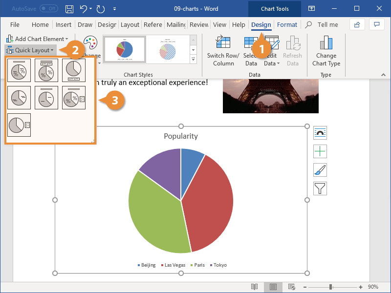
The layout is applied.
If you want to change the color or style, use the options in the Chart Styles group.
Modify Chart Elements
Another way to change the chart layout is to use the chart tool shortcuts to edit the active chart elements.
- With the chart selected, click the Chart Elements button.
- Click the check box next to the element you want to toggle on or off.
- Click the list arrow next to a chart element and select an option.
Different chart types contain different chart elements. Depending on the chart type, you may be able to adjust gridlines, titles, legends, and data or axis labels.
Each element can also be customized further. You can set the position of elements such as the title or legend, or toggle subsets of specific elements, such as horizontal or vertical gridlines.
You can continue to set up chart elements in this way until the chart appears exactly how you want it.
You can also insert or modify chart elements by clicking the Design tab in the Chart Tools ribbon group, then clicking Add Chart Element.

FREE Quick Reference
Click to Download
Free to distribute with our compliments; we hope you will consider our paid training.
Содержание
- Создание базовой диаграммы в Ворде
- Вариант 1: Внедрение диаграммы в документ
- Вариант 2: Связанная диаграмма из Excel
- Изменение макета и стиля диаграммы
- Применение готового макета
- Применение готового стиля
- Ручное изменение макета
- Ручное изменение формата элементов
- Сохранение в качестве шаблона
- Заключение
- Вопросы и ответы

Диаграммы помогают представлять числовые данные в графическом формате, существенно упрощая понимание больших объемов информации. С их помощью также можно показать отношения между различными рядами данных. Компонент офисного пакета от Microsoft — текстовый редактор Word — тоже позволяет создавать диаграммы, и далее мы расскажем о том, как это сделать с его помощью.
Важно: Наличие на компьютере установленного программного продукта Microsoft Excel предоставляет расширенные возможности для построения диаграмм в Word 2003, 2007, 2010 — 2016 и более свежих версиях. Если же табличный процессор не установлен, для создания диаграмм используется Microsoft Graph. Диаграмма в таком случае будет представлена со связанными данными – в виде таблицы, в которую можно не только вводить свои данные, но и импортировать их из текстового документа и даже вставлять из других программ.
Создание базовой диаграммы в Ворде
Добавить диаграмму в текстовый редактор от Майкрософт можно двумя способами – внедрить ее в документ или вставить соответствующий объект из Эксель (в таком случае она будет связана с данными на исходном листе табличного процессора). Основное различие между этими диаграммами заключается в том, где хранятся содержащиеся в них данные и как они обновляются непосредственно после вставки. Подробнее все нюансы будут рассмотрены ниже.
Примечание: Некоторые диаграммы требуют определенного расположения данных на листе Microsoft Excel.
Вариант 1: Внедрение диаграммы в документ
Диаграмма Эксель, внедренная в Ворд, не будет изменяться даже при редактировании исходного файла. Объекты, которые таким образом были добавлены в документ, становятся частью текстового файла и теряют связь с таблицей.
Примечание: Так как содержащиеся в диаграмме данные будут храниться в документе Word, использование внедрения оптимально в случаях, когда не требуется изменять эти самые данные с учетом исходного файла. Этот метод актуален и тогда, когда вы не хотите, чтобы пользователи, которые будут работать с документом в дальнейшем, должны были бы обновлять всю связанную с ним информацию.
Если все что вам требуется – это создать базовую диаграмму, а работа осуществляется в текстовом документе шаблонного типа, сделать это можно и без редактора от компании Microsoft. В качестве более простой и доступной альтернативы рекомендуем воспользоваться онлайн-сервисом Canva, содержащим необходимый минимум инструментов для графического представления данных и их оформления прямо в браузере и поддерживающим возможность интеграции с Google Таблицами.
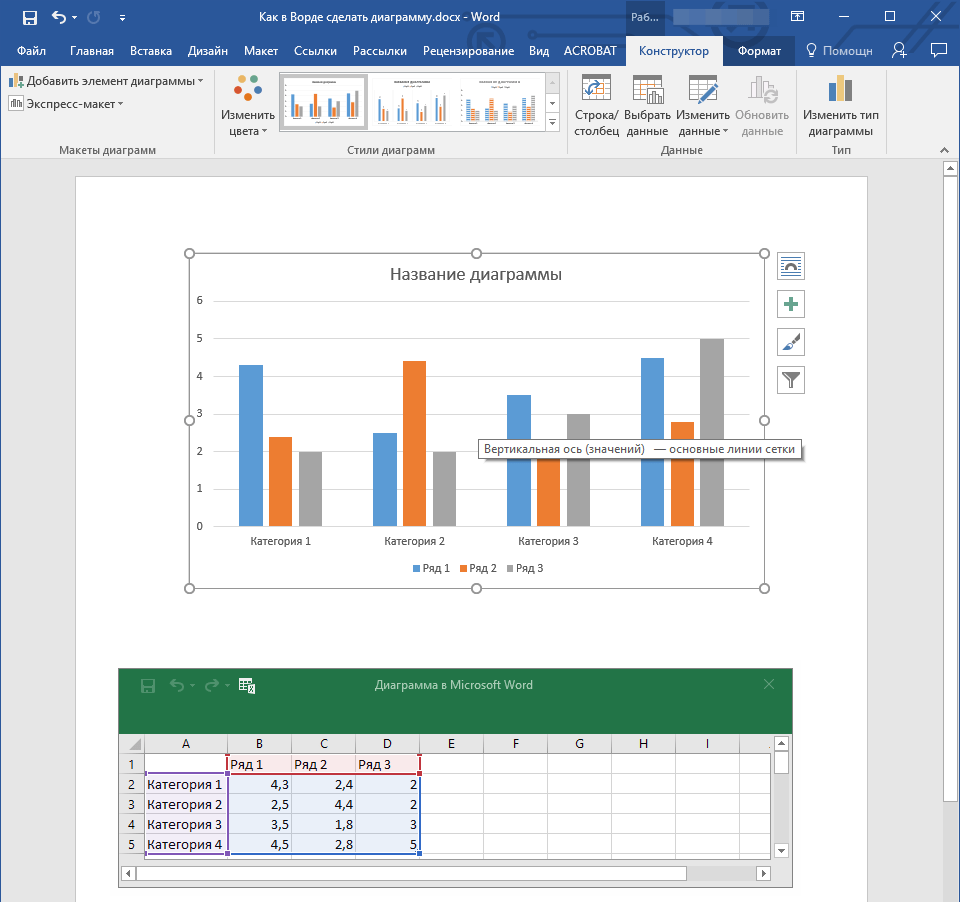
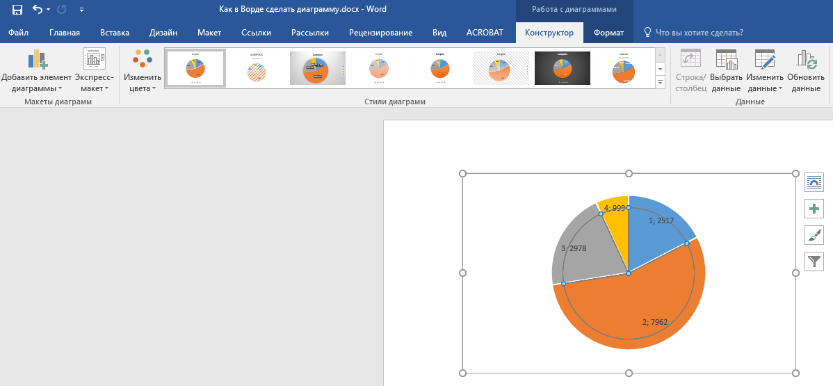
- Для начала кликните левой кнопкой мышки в том месте документа, куда вы хотите добавить диаграмму.
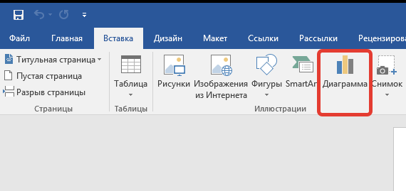
- Далее перейдите во вкладку «Вставка», где в группе инструментов «Иллюстрации» кликните по пункту «Диаграмма».
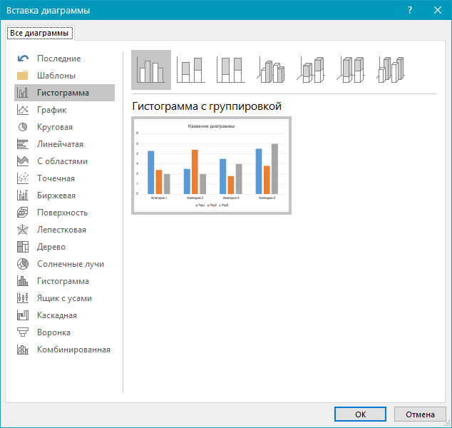
- В появившемся диалоговом окне выберите диаграмму желаемого типа и вида, ориентируясь на разделы в боковой панели и представленные в каждом из них макеты. Определившись с выбором, нажмите «ОК».
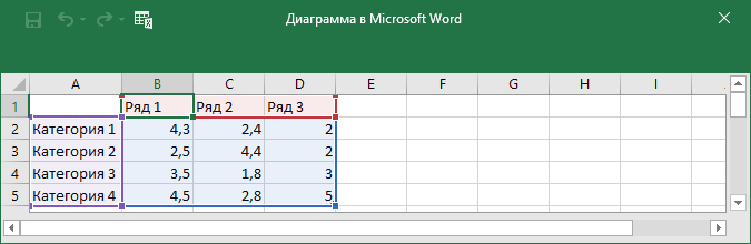
- На листе появится диаграмма, а немного ниже — миниатюра листа Excel, которая будет находиться в разделенном окне. В нем же указываются примеры значений, применяемых в отношении выбранного вами элемента.
- Замените указанные по умолчанию данные, представленные в этом окне Эксель, на значения, которые вам необходимы. Помимо этих сведений, можно заменить примеры подписи осей (Столбец 1) и имя легенды (Строка 1).
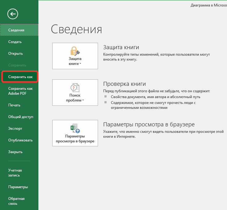
- После того как вы введете необходимые данные в окно Excel, нажмите на символ «Изменение данных в Microsoft Excel» и сохраните документ, воспользовавшись пунктами меню «Файл» — «Сохранить как».
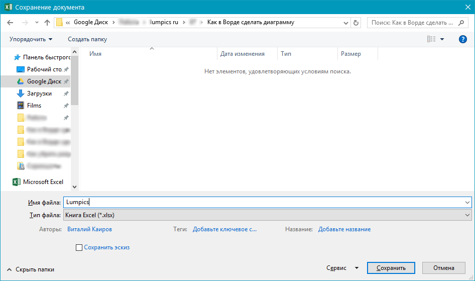
- Выберите место для сохранения документа и введите желаемое имя. Нажмите по кнопке «Сохранить», после чего документ можно закрыть.

Это лишь один из возможных методов, с помощью которых можно сделать диаграмму по таблице в Ворде.
Вариант 2: Связанная диаграмма из Excel
Данный метод позволяет создать диаграмму непосредственно в Excel, во внешнем листе программы, а затем просто вставить в Word ее связанную версию. Данные, содержащиеся в объекте такого типа, будут обновляться при внесении изменений/дополнений во внешний лист, в котором они и хранятся. Сам же текстовый редактор будет хранить только расположение исходного файла, отображая представленные в нем связанные данные.
Такой подход к созданию диаграмм особенно полезен, когда необходимо включить в документ сведения, за которые вы не несете ответственность. Например, это могут быть данные, собранные другим пользователем, и по мере необходимости он сможет их изменять, обновлять и/или дополнять.
- Воспользовавшись представленной по ссылке ниже инструкцией, создайте диаграмму в Эксель и внесите необходимые сведения.
Подробнее: Как в Excel сделать диаграмму
- Выделите и вырежьте полученный объект. Сделать это можно нажатием клавиш «Ctrl+X» либо же с помощью мышки и меню на панели инструментов: выберите диаграмму и нажмите «Вырезать» (группа «Буфер обмена», вкладка «Главная»).
- В документе Word нажмите на том месте, куда вы хотите добавить вырезанный на предыдущем шаге объект.
- Вставьте диаграмму, используя клавиши «Ctrl+V», или выберите соответствующую команду на панели управления (кнопка «Вставить» в блоке опций «Буфер обмена»).
- Сохраните документ вместе со вставленной в него диаграммой.
Примечание: Изменения, внесенные вами в исходный документ Excel (внешний лист), будут сразу же отображаться в документе Word, в который вы вставили диаграмму. Для обновления данных при повторном открытии файла после его закрытия потребуется подтвердить обновление данных (кнопка «Да»).
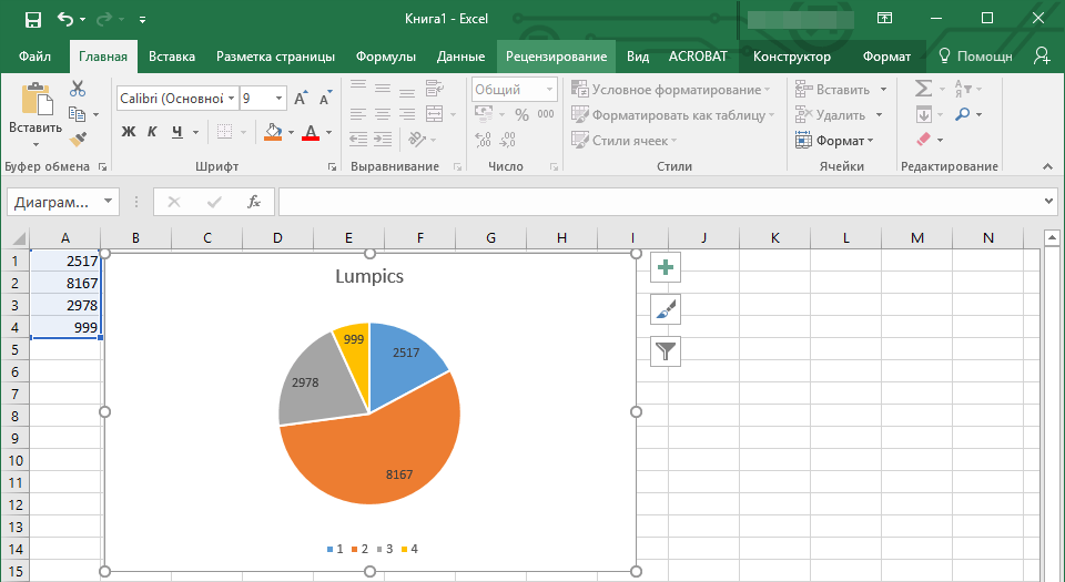
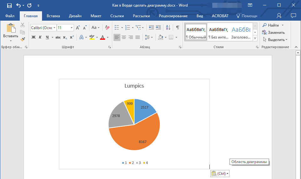
В конкретном примере мы рассмотрели круговую диаграмму в Ворде, но таким образом можно создать и любую другую, будь то график со столбцами, как в предыдущем примере, гистограмма, пузырьковая и т.д.
Изменение макета и стиля диаграммы
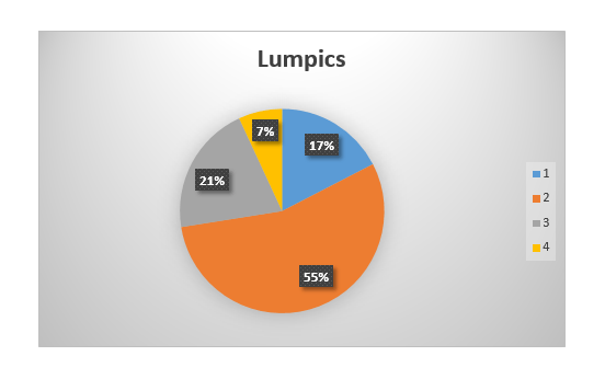
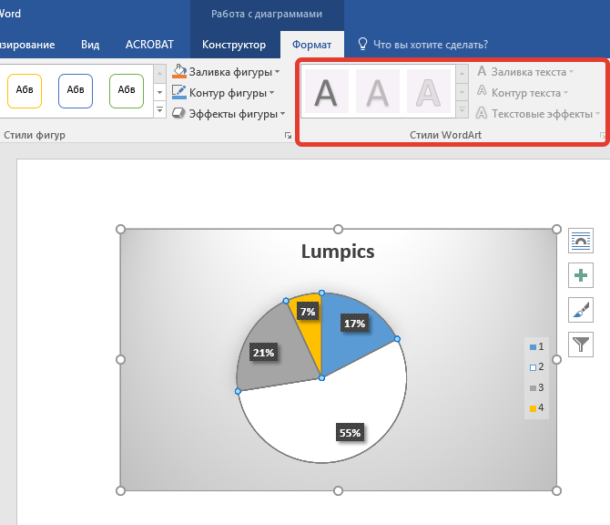
Диаграмму, которую вы создали в Word, всегда можно отредактировать и дополнить. Вовсе необязательно вручную добавлять новые элементы, изменять их, форматировать — всегда есть возможность применения уже готового стиля или макета, коих в арсенале текстового редактора от Майкрософт содержится очень много. Каждый такой элемент всегда можно изменить вручную и настроить в соответствии с необходимыми или желаемыми требованиями, точно так же можно работать и с каждой отдельной частью диаграммы.
Применение готового макета
- Кликните по диаграмме, которую вы хотите изменить, и перейдите во вкладку «Конструктор», расположенную в основной вкладке «Работа с диаграммами».
- Выберите макет, который вы хотите использовать (группа «Стили диаграмм»), после чего он будет успешно изменен.
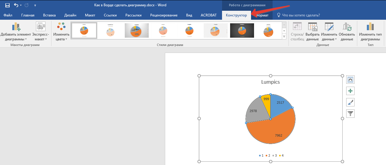
Примечание: Для того чтобы увидеть все доступные стили, нажмите по кнопке, расположенной в правом нижнем углу блока с макетами — она имеет вид черты, под которой расположен указывающий вниз треугольник.
Применение готового стиля
- Кликните по диаграмме, к которой вы хотите применить готовый стиль, и перейдите во вкладку «Конструктор».
- В группе «Стили диаграмм» выберите тот, который хотите использовать для своей диаграммы
- Изменения сразу же отразятся на созданном вами объекте.
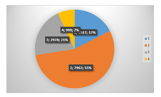
Используя вышеуказанные рекомендации, вы можете изменять свои диаграммы буквально «на ходу», выбирая подходящий макет и стиль в зависимости от того, что требуется в данный момент. Таким образом можно создать для работы несколько различных шаблонов, а затем изменять их вместо того, чтобы создавать новые (о том, как сохранять диаграммы в качестве шаблона мы расскажем ниже). Простой пример: у вас есть график со столбцами или круговая диаграмма — выбрав подходящий макет, вы сможете из нее сделать диаграмму с процентами, показанную на изображении ниже.
Ручное изменение макета
- Кликните мышкой по диаграмме или отдельному элементу, макет которого вы хотите изменить. Сделать это можно и по-другому:
- Кликните в любом месте диаграммы, чтобы активировать инструмент «Работа с диаграммами».
- Во вкладке «Формат», группа «Текущий фрагмент» нажмите на стрелку рядом с пунктом «Элементы диаграммы», после чего можно будет выбрать необходимый элемент.
- Во вкладке «Конструктор» в группе «Макеты диаграмм» кликните по первому пункту — «Добавить элемент диаграммы».
- В развернувшемся меню выберите, что вы хотите добавить или изменить.


Примечание: Параметры макета, выбранные и/или измененные вами, будут применены только к выделенному элементу (части объекта). В случае если вы выделили всю диаграмму, к примеру, параметр «Метки данных» будет применен ко всему содержимому. Если же выделена лишь точка данных, изменения будут применены исключительно к ней.
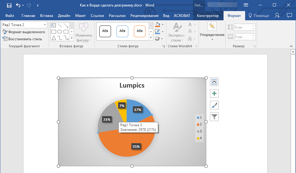
Ручное изменение формата элементов
- Кликните по диаграмме или ее отдельному элементу, стиль которого вы хотите изменить.
- Перейдите во вкладку «Формат» раздела «Работа с диаграммами» и выполните необходимое действие:
Сохранение в качестве шаблона
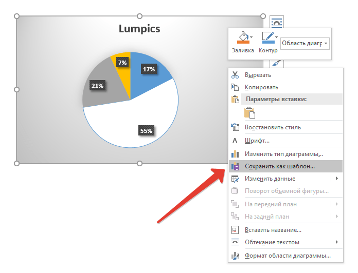
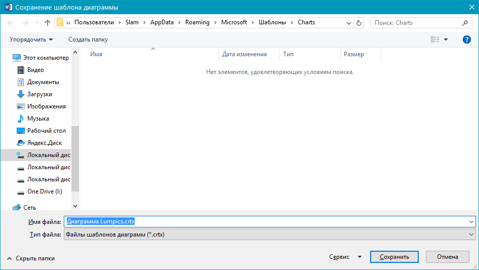
Нередко бывает так, что созданная вами диаграмма может понадобиться в дальнейшем, точно такая же или ее аналог, это уже не столь важно. В данном случае лучше всего сохранять полученный объект в качестве шаблона, упростив и ускорив таким образом свою работу в будущем. Для этого:
- Кликните по диаграмме правой кнопкой мышки и выберите в контекстном меню пункт «Сохранить как шаблон».
- В появившемся окне системного «Проводника» укажите место для сохранения и задайте желаемое имя файлу.
- Нажмите по кнопке «Сохранить» для подтверждения.
Заключение
На этом все, теперь вы знаете, как в Microsoft Word сделать любую диаграмму — внедренную или связанную, имеющую различный внешний вид, который всегда можно изменить и подстроить под свои нужды или необходимые требования.
Visualize data in MS Word with graphs
Updated on December 9, 2021
What to Know
- In a Word document, select Insert > Chart. Select the graph type and then choose the graph you want to insert.
- In the Excel spreadsheet that opens, enter the data for the graph. Close the Excel window to see the graph in the Word document.
- To access the data in the Excel workbook, select the graph, go to the Chart Design tab, and then select Edit Data in Excel.
This article explains how to create a graph in Microsoft Word for a Mac or a Windows computer. Instructions in this article apply to Microsoft Word 2019, Word 2016, Word 2013, and Microsoft 365 for Windows and Mac.
How to Create a Graph in Microsoft 365 for Mac
Microsoft Word offers a variety of ways to visualize data. When you know how to make a graph in Word, you can create visual aids by importing data from Microsoft Excel.
Follow these steps to create and customize graphs in the version of Word that comes with Microsoft 365 for Mac:
-
Select Insert in the upper-left corner of Word.
-
Select Chart.
-
Hover the mouse cursor over the type of graph that you wish to create, for example, Line or Statistical.
-
A sub-menu appears that contains multiple options, including different formats and variations. Select the graph you want to insert in the document.
-
In the Excel spreadsheet that opens, enter the data for the graph.
-
When you’re satisfied with the category names and values, close the Excel window to see the graph in the Word document.
-
To access the data in the Excel workbook at a later time, select the graph, go to the Chart Design tab, and then select Edit Data in Excel.
How to Create a Graph in Word for Windows
To create a graph in Word for Microsoft 365, Word 2019, Word 2016, and Word 2013:
-
Select Insert in the upper-left corner of Word.
-
Select Chart.
-
In the Insert Chart dialog box, select the type of graph that you wish to create. For example, choose either Line, Bar, or Histogram.
-
Each grouping of graphs contains multiple options, including different formats and variations. After choosing the graph that you wish to insert, select OK.
-
The graph appears in the Word document, and a new window containing editable data in a spreadsheet opens. To modify the category names and data, replace the existing text and numeric values with the appropriate entries. Changes made in the spreadsheet are instantly reflected in the graph.
If you want to edit the data in Microsoft Excel, select Edit Data in Microsoft Excel in the miniature spreadsheet.
-
When you’re satisfied with the category names and values, close the spreadsheet window.
How to Change the Graph Format and Edit Data
After the graph is created, formatting buttons appear to the right. If these buttons aren’t visible, select the chart. These settings control how the graph interacts with the text around it from a layout perspective.
You can also add or remove elements in the graph (including titles, labels, gridlines, and a legend), change graph styles and colors, and apply filters to the graph. More configurable options are found in the Windows version as opposed to macOS.
To access or edit the data in the graph, select Edit Data or Edit Data in Excel.
Thanks for letting us know!
Get the Latest Tech News Delivered Every Day
Subscribe

Sometimes documents you’re authoring can benefit from an illustrative chart. Rather than taking the time to set up a chart in another application and embedding it or copying and pasting it into Microsoft Word, you can use the built-in chart feature.
RELATED: How to Link or Embed an Excel Worksheet in a Word Document
Create a Chart in Word
You might be creating a company report, business proposal, or college essay where a data-filled visual is an ideal addition.
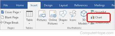
Place your cursor where you want the chart in your Word document. Then, go to the Insert tab and click “Chart” in the Illustrations section of the ribbon.

Pick the type of chart you want to add on the left and the style on the right. If you’re familiar with the chart options in Excel, you can choose from the same types in Word like bar, column, pie, line, and many others. Click “OK” to insert the chart.
Once you insert the chart, an Excel spreadsheet will open. The sheet contains sample data to get you started and is a stripped-down version of Excel without tabs or a ribbon.
You can edit the data in the spreadsheet to include your own or copy and paste the data from another spot into the attached sheet. You’ll then see the chart in Word immediately update with your changes.
RELATED: How to Choose a Chart to Fit Your Data in Microsoft Excel
Update the Chart Data
Anytime you want to update the data for the chart, you can do so by heading to the Chart Design tab.
Click the drop-down arrow for Edit Data. Select “Edit Data” to display the small spreadsheet you had when you created the chart, or select “Edit Data in Excel” to open the sheet in a standard Excel window with tabs and a ribbon.
Customize a Chart in Word
Once you insert the chart into Word with the data you want, you can make some customizations. You can add a title, adjust the colors, pick a theme, include a legend, and more. Again, if you’re familiar with customizing charts in Excel, you’ll recognize the below options.
RELATED: How to Create and Customize a Funnel Chart in Microsoft Excel
Use the Chart Design Tab
Select the chart and go to the Chart Design tab. Starting on the left side of the ribbon you can add, remove, and position chart elements, change the layout, pick new colors, and select a style.
On the right side of the Chart Design ribbon, you have an option for Change Chart Type. If you believe a different type of graph would work better with your data, you can select it here.
Open the Format Chart Sidebar
If you’d like to change the font, border, or specifics of the chart like a series or axis, you can use the Format Chart sidebar.
Right-click the chart and pick “Format Chart Area” or double-click the chart.
When the sidebar opens, click the arrow next to Chart Options to select a part of the chart to adjust.
Use the tabs at the top of the sidebar for fill and line colors, effects, and properties. These tabs change depending on the chart area you select in the drop-down list.
Use the Floating Buttons on Windows
If you’re using Word on Windows, you also have floating buttons for quick changes to your chart. Select the graph, and these will display on the right side.
You can then change the Layout Options for the chart’s placement within the text. You can also use the Chart Elements, Chart Styles, and Chart Filters buttons to adjust items on the chart, choose a color scheme, and apply filters.
By creating a chart directly in Microsoft Word, you can save yourself a bit of time. This is especially handy if you’re using a small amount of data that’s beneficial to your Word document.
If you’re interested in other ways to use charts in your documents, take a look at how to create a flowchart in Word.
READ NEXT
- › How to Remove Borders in Microsoft Word
- › Google Chrome Is Getting Faster
- › The New NVIDIA GeForce RTX 4070 Is Like an RTX 3080 for $599
- › Expand Your Tech Career Skills With Courses From Udemy
- › BLUETTI Slashed Hundreds off Its Best Power Stations for Easter Sale
- › How to Adjust and Change Discord Fonts
- › Mozilla Wants Your Feature Suggestions for Thunderbird