
Lesson 17: Working with Charts
/en/excel2010/using-templates/content/
Introduction
A chart is a tool you can use in Excel to communicate data graphically. Charts allow your audience to see the meaning behind the numbers, and they make showing comparisons and trends much easier. In this lesson, you’ll learn how to insert charts and modify them so they communicate information effectively.
Charts
Excel workbooks can contain a lot of data, and this data can often be difficult to interpret. For example, where are the highest and lowest values? Are the numbers increasing or decreasing?
The answers to questions like these can become much clearer when data is represented as a chart. Excel has various types of charts, so you can choose one that most effectively represents your data.
Optional: You can download this example for extra practice.
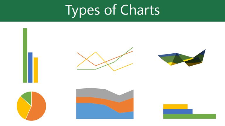
Types of charts
Click the arrows in the slideshow below to view examples of some of the types of charts available in Excel.

Excel has a variety of chart types, each with its own advantages. Click the arrows to see some of the different types of charts available in Excel.
-
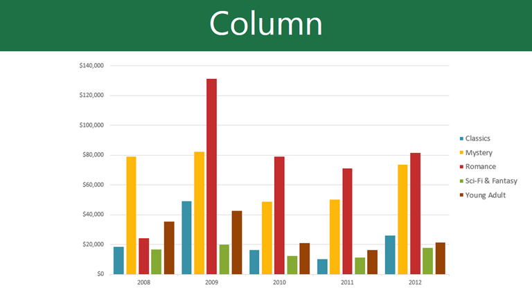
Column charts use vertical bars to represent data. They can work with many different types of data, but they’re most frequently used for comparing information.
-
Line charts are ideal for showing trends. The data points are connected with lines, making it easy to see whether values are increasing or decreasing over time.
-
Pie charts make it easy to compare proportions. Each value is shown as a slice of the pie, so it’s easy to see which values make up the percentage of a whole.
-
Bar charts work just like column charts, but they use horizontal instead of vertical bars.
-
Area charts are similar to line charts, except the areas under the lines are filled in.
-
Surface charts allow you to display data across a 3D landscape. They work best with large data sets, allowing you to see a variety of information at the same time.
Identifying the parts of a chart
Click the buttons in the interactive below to learn about the different parts of a chart.
Horizontal Axis
The horizontal axis, also known as the x axis, is the horizontal part of the chart.
In this example, the horizontal axis identifies the categories in the chart, so it is also called the category axis. However, in a bar chart, the vertical axis would be the category axis.
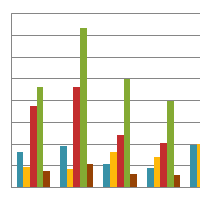
Legend
The legend identifies which data series each color on the chart represents. For many charts it is crucial, but for some charts it may not be necessary and can be deleted.
In this example, the legend allows viewers to identify the different book genres in the chart.
Data Series
The data series consists of the related data points in a chart. If there are multiple data series in the chart, each will have a different color or style. Pie charts can only have one data series.
In this example, the green columns represent the Romance data series.
Title
The title should clearly describe what the chart is illustrating.
Vertical Axis
The vertical axis, also known as the y axis, is the vertical part of the chart.
In this example, a column chart, the vertical axis measures the height—or value—of the columns, so it is also called the value axis. However, in a bar chart, the horizontal axis would be the value axis.
To create a chart:
- Select the cells you want to chart, including the column titles and row labels. These cells will be the source data for the chart.
 Selecting cells
 - Click the Insert tab.
- In the Charts group, select the desired chart category (Column, for example).
 Selecting the Column category
 - Select the desired chart type from the drop-down menu (Clustered Column, for example).
 Selecting a chart type
 - The chart will appear in the worksheet.
 The new chart
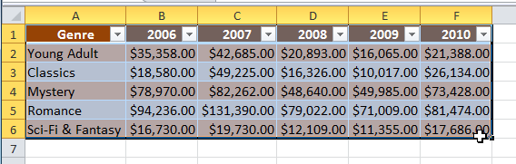
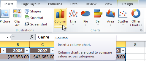
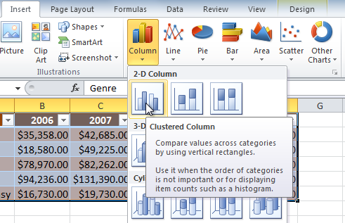
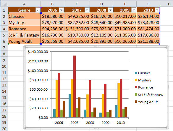
Chart tools
Once you insert a chart, a set of chart tools arranged into three tabs will appear on the Ribbon. These are only visible when the chart is selected. You can use these three tabs to modify your chart.
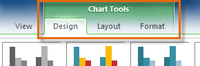 The Design, Layout and Format tabs
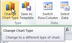
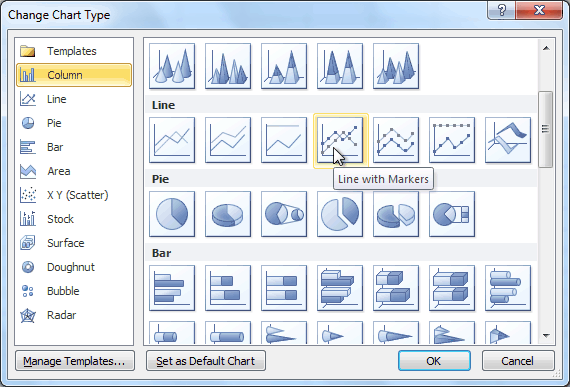
To change chart type:
- From the Design tab, click the Change Chart Type command. A dialog box appears.
 The Change Chart Type command
 - Select the desired chart type, then click OK.
 Selecting a chart type
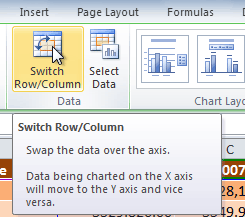
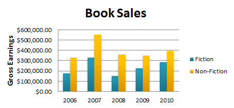
To switch row and column data:
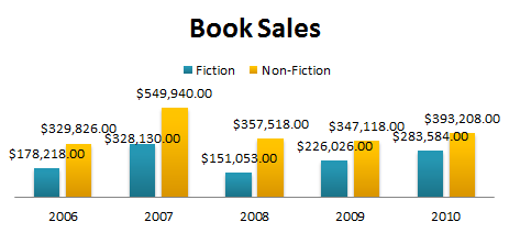
Sometimes when you create a chart, the data may not be grouped the way you want. In the clustered column chart below, the Book Sales statistics are grouped by Fiction and Non-Fiction, with a column for each year. However, you can also switch the row and column data so the chart will group the statistics by year, with columns for Fiction and Non-Fiction. In both cases, the chart contains the same data—it’s just organized differently.
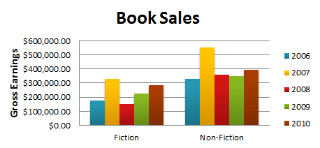 Book Sales, grouped by Fiction/Non-Fiction
- Select the chart.
- From the Design tab, select the Switch Row/Column command.
 The Switch Row/Column command
 - The chart will readjust.
 Book sales, grouped by year
To change chart layout:
- Select the Design tab.
- Click the More drop-down arrow in the Chart Layouts group to see all of the available layouts.
 Viewing all of the chart layouts
 - Select the desired layout.
 Selecting a chart layout
 - The chart will update to reflect the new layout.
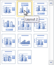
 The updated layout
Some layouts include chart titles, axes, or legend labels. To change them, place the insertion point in the text and begin typing.
To change chart style:
- Select the Design tab.
- Click the More drop-down arrow in the Chart Styles group to see all of the available styles.
 Viewing all of the Chart Styles
 - Select the desired style.
 Selecting a chart style
 - The chart will update to reflect the new style.
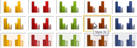
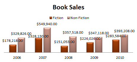 The updated chart
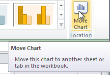
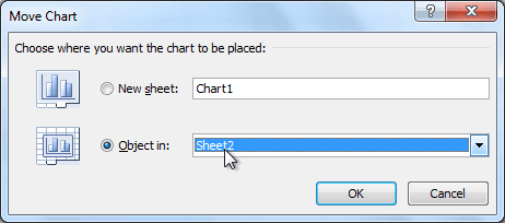
To move the chart to a different worksheet:
- Select the Design tab.
- Click the Move Chart command. A dialog box appears. The current location of the chart is selected.
 The Move Chart command
 - Select the desired location for the chart (choose an existing worksheet, or select New Sheet and name it).
 Selecting a different worksheet for the chart
 - Click OK. The chart will appear in the new location.
Keeping charts up to date
By default, when you add more data to your spreadsheet, the chart may not include the new data. To fix this, you can adjust the data range. Simply click the chart, and it will highlight the data range in your spreadsheet. You can then click and drag the handle in the lower-right corner to change the data range.
If you frequently add more data to your spreadsheet, it may become tedious to update the data range. Luckily, there is an easier way. Simply format your source data as a table, then create a chart based on that table. When you add more data below the table, it will automatically be included in both the table and the chart, keeping everything consistent and up to date.
Watch the video below to learn how to use tables to keep charts up to date.
Challenge!
- Open an existing Excel 2010 workbook. If you want, you can use this example.
- Use worksheet data to create a chart.
- Change the chart layout.
- Apply a chart style.
- Move the chart to a different worksheet.
/en/excel2010/working-with-sparklines/content/
Содержание
- Present your data in a column chart
- Did you know?
- Excel 2010 —
- Working with Charts
- Excel 2010: Working with Charts
- Lesson 17: Working with Charts
- Introduction
- Charts
- Types of charts
- Identifying the parts of a chart
- Horizontal Axis
- Legend
- Data Series
- Title
- Vertical Axis
- To create a chart:
- Chart tools
- To change chart type:
- To switch row and column data:
- To change chart layout:
- To change chart style:
- To move the chart to a different worksheet:
- Keeping charts up to date
- Excel 2010 Chart Types
- Excel 2010 Chart Type Dialog
- Explanations for the ratings
- Preferred
- Acceptable
- Use With Caution
- AVOID
- New Dialog
- “Missing” Chart Types
- Share this:
Present your data in a column chart
Column charts are useful for showing data changes over a period of time or for illustrating comparisons among items. In column charts, categories are typically organized along the horizontal axis and values along the vertical axis.

For information on column charts, and when they should be used, see Available chart types in Office.
To create a column chart, follow these steps:
Enter data in a spreadsheet.
Select the data.
Depending on the Excel version you’re using, select one of the following options:
Excel 2016: Click Insert > Insert Column or Bar Chart icon, and select a column chart option of your choice.
Excel 2013: Click Insert > Insert Column Chart icon, and select a column chart option of your choice.
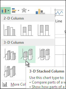
Excel 2010 and Excel 2007: Click Insert > Column, and select a column chart option of your choice.
You can optionally format the chart a little further. See the list below for a few options:
Note: Make sure you click on the chart first before applying a formatting option.
To apply a different chart layout, click Design > Charts Layout, and select a layout.
To apply a different chart style, click Design > Chart Styles, and pick a style.
To apply a different shape style, click Format > Shape Styles, and pick a style.
Note: A chart style is different from a shape style. A shape style is a formatting option that applies to the chart’s border only, whereas the chart style is a formatting option that applies to the entire chart.
To apply different shape effects, click Format > Shape Effects, and pick an option such as Bevel or Glow, and then a sub option.
To apply a theme, click Page Layout > Themes, and select a theme.
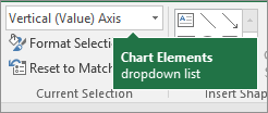
To apply a formatting option to a specific component of a chart (such as Vertical (Value) Axis, Horizontal (Category) Axis, Chart Area, to name a few), click Format > pick a component in the Chart Elements dropdown box, click Format Selection, and make any necessary changes. Repeat the step for each component you want to modify.
Note: If you are comfortable working in charts, you can also select and right-click on a specific area on the chart and select a formatting option.
To create a column chart, follow these steps:
In your email message, click Insert > Chart.
In the Insert Chart dialog box, click Column, and pick a column chart option of your choice, and click OK.
Excel opens in a split window and displays sample data on a worksheet.
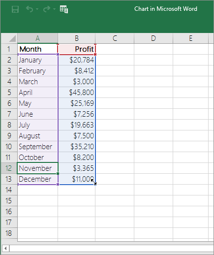
Replace the sample data with your own data.
Note: If your chart is not reflecting data from the worksheet, make sure to drag the vertical lines all the way down to the last row in the table.
Optionally, save the worksheet by following these steps:
Click the Edit Data in Microsoft Excel icon on the Quick Access Toolbar.

The worksheet opens in Excel.
Save the worksheet.
Tip: To reopen the worksheet, click Design > Edit Data, and select an option.
You can optionally format the chart a little further. See the list below for a few options:
Note: Make sure you click on the chart first before applying a formatting option.
To apply a different chart layout, click Design > Charts Layout, and select a layout.
To apply a different chart style, click Design > Chart Styles, and pick a style.
To apply a different shape style, click Format > Shape Styles, and pick a style.
Note: A chart style is different from a shape style. A shape style is a formatting option that applies to the chart’s border only, whereas the chart style is a formatting option that applies to the entire chart.
To apply different shape effects, click Format > Shape Effects, and pick an option such as Bevel or Glow, and then a sub option.
To apply a formatting option to a specific component of a chart (such as Vertical (Value) Axis, Horizontal (Category) Axis, Chart Area, to name a few), click Format > pick a component in the Chart Elements dropdown box, click Format Selection, and make any necessary changes. Repeat the step for each component you want to modify.
Note: If you are comfortable working in charts, you can also select and right-click on a specific area on the chart and select a formatting option.
Did you know?
If you don’t have an Microsoft 365 subscription or the latest Office version, you can try it now:
Источник
Excel 2010 —
Working with Charts


Excel 2010: Working with Charts
Lesson 17: Working with Charts
Introduction
A chart is a tool you can use in Excel to communicate data graphically. Charts allow your audience to see the meaning behind the numbers, and they make showing comparisons and trends much easier. In this lesson, you’ll learn how to insert charts and modify them so they communicate information effectively.
Charts
Excel workbooks can contain a lot of data, and this data can often be difficult to interpret. For example, where are the highest and lowest values? Are the numbers increasing or decreasing?
The answers to questions like these can become much clearer when data is represented as a chart. Excel has various types of charts, so you can choose one that most effectively represents your data.
Optional: You can download this example for extra practice.
Types of charts
Click the arrows in the slideshow below to view examples of some of the types of charts available in Excel.
Excel has a variety of chart types, each with its own advantages. Click the arrows to see some of the different types of charts available in Excel.
Column charts use vertical bars to represent data. They can work with many different types of data, but they’re most frequently used for comparing information.

Line charts are ideal for showing trends. The data points are connected with lines, making it easy to see whether values are increasing or decreasing over time.

Pie charts make it easy to compare proportions. Each value is shown as a slice of the pie, so it’s easy to see which values make up the percentage of a whole.
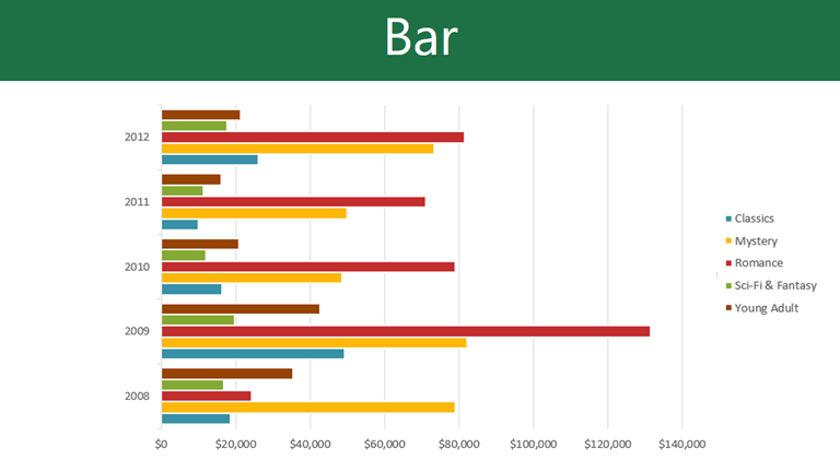
Bar charts work just like column charts, but they use horizontal instead of vertical bars.
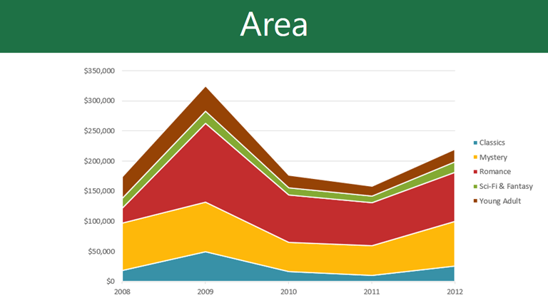
Area charts are similar to line charts, except the areas under the lines are filled in.

Surface charts allow you to display data across a 3D landscape. They work best with large data sets, allowing you to see a variety of information at the same time.

Identifying the parts of a chart
Click the buttons in the interactive below to learn about the different parts of a chart.
Horizontal Axis
The horizontal axis, also known as the x axis, is the horizontal part of the chart.
In this example, the horizontal axis identifies the categories in the chart, so it is also called the category axis. However, in a bar chart, the vertical axis would be the category axis.
Legend
The legend identifies which data series each color on the chart represents. For many charts it is crucial, but for some charts it may not be necessary and can be deleted.
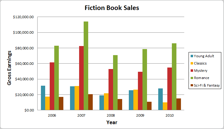
In this example, the legend allows viewers to identify the different book genres in the chart.
Data Series
The data series consists of the related data points in a chart. If there are multiple data series in the chart, each will have a different color or style. Pie charts can only have one data series.
In this example, the green columns represent the Romance data series.
Title
The title should clearly describe what the chart is illustrating.
Vertical Axis
The vertical axis, also known as the y axis, is the vertical part of the chart.
In this example, a column chart, the vertical axis measures the height—or value—of the columns, so it is also called the value axis. However, in a bar chart, the horizontal axis would be the value axis.
To create a chart:
- Select the cells you want to chart, including the column titles and row labels. These cells will be the source data for the chart.
Chart tools
Once you insert a chart, a set of chart tools arranged into three tabs will appear on the Ribbon. These are only visible when the chart is selected. You can use these three tabs to modify your chart.
To change chart type:
- From the Design tab, click the Change Chart Type command. A dialog box appears.
To switch row and column data:
Sometimes when you create a chart, the data may not be grouped the way you want. In the clustered column chart below, the Book Sales statistics are grouped by Fiction and Non-Fiction, with a column for each year. However, you can also switch the row and column data so the chart will group the statistics by year, with columns for Fiction and Non-Fiction. In both cases, the chart contains the same data—it’s just organized differently.
- Select the chart.
- From the Design tab, select the Switch Row/Column command.
To change chart layout:
- Select the Design tab.
- Click the More drop-down arrow in the Chart Layouts group to see all of the available layouts.
Some layouts include chart titles, axes, or legend labels. To change them, place the insertion point in the text and begin typing.
To change chart style:
- Select the Design tab.
- Click the More drop-down arrow in the Chart Styles group to see all of the available styles.
To move the chart to a different worksheet:
- Select the Design tab.
- Click the Move Chart command. A dialog box appears. The current location of the chart is selected.
Keeping charts up to date
By default, when you add more data to your spreadsheet, the chart may not include the new data. To fix this, you can adjust the data range. Simply click the chart, and it will highlight the data range in your spreadsheet. You can then click and drag the handle in the lower-right corner to change the data range.
If you frequently add more data to your spreadsheet, it may become tedious to update the data range. Luckily, there is an easier way. Simply format your source data as a table, then create a chart based on that table. When you add more data below the table, it will automatically be included in both the table and the chart, keeping everything consistent and up to date.
Watch the video below to learn how to use tables to keep charts up to date.
Источник
Excel 2010 Chart Types
Friday, September 9, 2011 by Jon Peltier 19 Comments
Excel 2010 Chart Type Dialog
Excel offers a wide range of standard chart types. Below is the Chart Type dialog from Excel 2010, but all of these standard chart types have been available since Excel 97, and most of them since before that.
What makes my dialog different is that it has been annotated to show which chart types you may use freely, which types you may use with caution, and which types you should avoid. If you’ve been reading this blog for a while, and paying attention, you will probably not be surprised by most of the ratings.
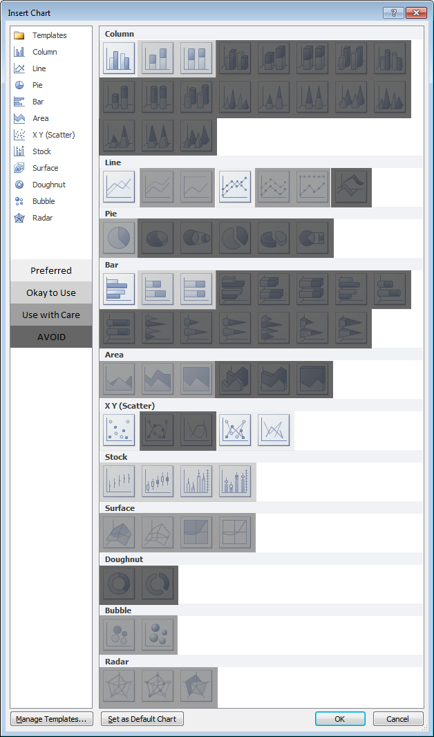
Explanations for the ratings
Preferred
This group comprises the commonest and most easily understood charts you can make. Line charts and XY (Scatter Charts), with and without markers and lines. Simple clustered bar and column charts.
Acceptable
These charts are also readily understood, but might not be the first choice for most data sets. They should be used with “a little” caution.
Stacked charts are tougher to decode. Because the bars do not share a common baseline, their lengths are harder to compare.
Stock charts are tough for non-finance people to get, because they convey a lot of information in a specialized way. However, for people familiar with them, stock charts are very useful.
Use With Caution
This set of charts can be useful, if you understand their limitations and drawbacks, and if the audience is skilled in their interpretation.
Stacked line charts can be confusing if the audience does not understand that each line represents a cumulative total of that line’s data plus all previous lines’ data.
Ordinary 2D pie charts can be useful if the number of data points is small and you only use one at a time. Bar charts generally do a better job.
Area charts are problematic for several reasons. Unstacked charts risk areas in back being obscured by those in front, while stacked ones may have an issue if the audience doesn’t realize they represent cumulative data. Line charts are often a better option.
Bubble charts cause problems with interpretation of bubble sizes. Is the area or the diameter proportional to the data being represented? Also, the resolution isn’t too good. It’s often best to use bubble size to indicate discrete factors.
Radar or spider charts seem like they’d be good at displaying cyclic data, but the spoke length is often confounded by the areas within the lines, and it’s impossible to compare values which are not on the same spoke. Line charts are usually a better choice.
Surface and contour charts are the only 3D charts not rated “AVOID”. They can be useful for showing some data. The X and Y values are not treated as numeric variables, but as categories (though you can still use them for numerical values if the points are equally spaced along the axes). Some orientations may lead to features in front obscuring features in back. The wireframe versions have too many line segments, the filled ones may rely too much on color, and starting in 2007, the filled ones have a weird shading applied which often makes the chart less clear. However, when used with care, these can be useful tools.
AVOID
These charts should be avoided because they are difficult to interpret, and some of them have features which may actually distort data.
Most 3D charts are particularly troublesome. The audience has trouble lining up the data elements with offset axes, some elements hide other elements, and the perspective may stretch some elements and shrink others. In many cases the third dimension is a false dimension, created not with data but with lots of extra non-data ink.
All but the simplest 2D pie charts are problematic: donut charts, pie-of-pie and bar-of-pie charts, exploded pie charts. These all have features that make them even less comprehensible than regular 2D pie charts.
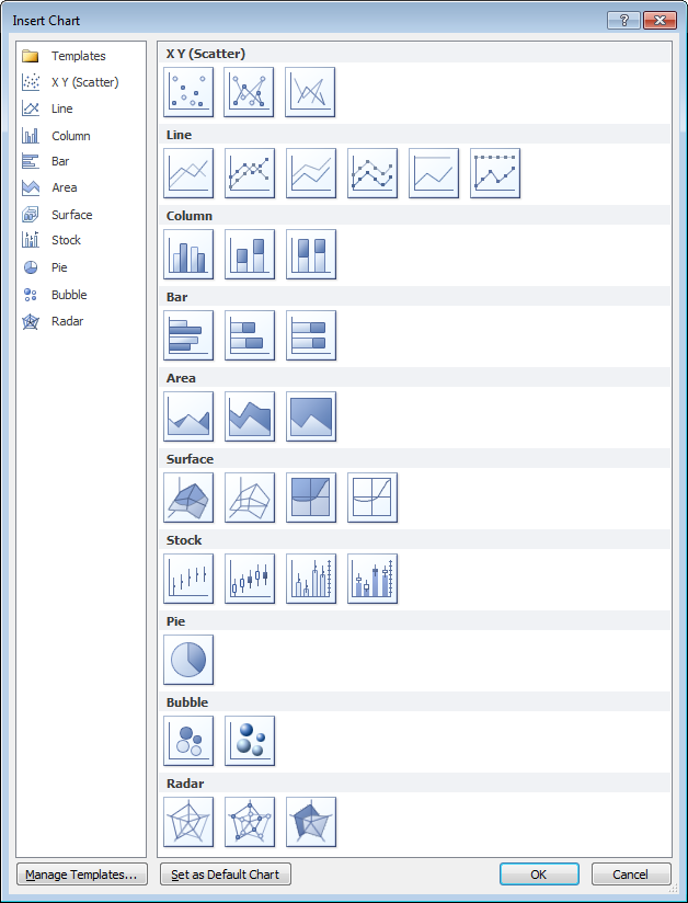
New Dialog
What if we just remove the charts rated “AVOID” from the dialog and do a little rearranging? This isn’t bad:
“Missing” Chart Types
There are various other chart types that aren’t in the Excel dialog, but which you can still make in Excel. You need the savvy to figure out how to arrange the data and how to mix various chart types, and you need the patience to repeat these tasks as necessary. There’s no decent Histogram (despite what the Analysis Toolpak claims), though you can make a column chart and fix it up. Similarly you can make your own Pareto Chart by adding a line series to a column chart. You can make Tornado Charts or simple Gantt Charts by pimping a bar chart. I’ve written some tutorials that show how to make tricky chart types and utilities that will do the work at the click of a button: Waterfall Charts (Bridge Charts), Box and Whisker Charts, Clustered and Stacked Column and Bar Charts, Marimekko Charts, Dot Plots, and Panel Charts.
Posted: Friday, September 9th, 2011 under Chart Types.
Tags: .
Comments: 19
Источник
Excel 2010 allows users to create charts and graphs through various commands and tools, specifically through multiple keyboard shortcuts available in Excel as well as the Insert Charts Dialogue. The dialogue is available in the Insert Tab’s Charts Group, which also contains various charts arranged categorically.
The multiple chart types and presentations available in the dialogue allow several different approaches to presenting a given data set. A Change Chart Type dialogue is also available in Excel, functionally similar to the Insert Charts dialogue.
Charts in Excel can be moved through drag functionality as well as the Zoom Slider.
Watch the free video here, transcripts for the entire video follow:
Video transcripts:
Hello and welcome back. In the previous section, we looked at a very simple example of a chart in Excel 2010. In this section, we’re going to go through pretty much the same procedure, but this time we’re going to go through it in much more detail and look at some of the additional features that you should be aware of when you’re starting to create graphs and charts in Excel 2010. So, let’s get started.

Now, as before, we’re going to choose an adjacent or contiguous set of cells. We’re actually going to plot a chart for this group of cells here. The particular worksheet I’m looking at corresponds to some monthly sales figures for some employees for 3 months of the year. Now, in the body of this data we have the actual sales figures themselves, the numbers themselves. But apart from that we have in the top left hand corner an empty cell and that will quite often be the case that we have an empty cell in the top left hand corner. Along the top we have what we will refer to as the Categories. In this case three months of the year: January, February, and March. And down the left hand column we will have what we call the Series Values. Each of these employees has a Series of monthly sales figures corresponding to the three categories: January, February and March. So, the names Anne Carnegie, Scott Denvers, and so on are our Series Values. The months Jan., Feb., Mar. are our Category Values.
Now, with the required data selected, I can go through to Insert a Chart in exactly the same way that I did before, but there’s actually a shortcut way. In earlier versions of Excel, there has always been a shortcut whereby with the F11 key you can create a Default Chart from selected data. That’s actually still available in Excel 2010. But Excel 2010, in addition, offers the option of using Alt plus F1. And the Alt plus F1 keystroke is a time saver, which will enable you to create a chart that corresponds to a default that you can change. First of all, let me press Alt and F1 now and straightaway you can see the Default Chart is created basically with one click.
Now, there we have each of our Series Values, that’s each of our employees. We have their sales by Category, the three months of the year that we’ve selected. Let’s see how to change this Default Chart. Let me use the undo command to remove the chart that’s there now. And let me go to Insert tab and if I click on the button in the bottom right of the Charts group. The Insert Chart dialog opens and you can see at the bottom of this dialog, there’s a button Set as Default Charts and in fact, that Column chart, what’s called the Clustered Columns Chart is actually selected at the moment and that’s set as my Default Chart. Let me look at the 3D version of that, 3D Clustered Column, and click on Set as Default Chart for that and then click on OK. Now you can see that my chart has been inserted. You can see what it looks like: the five employees and the Categories, the months. Let me undo the addition of that chart. But let me now do Alt plus F1 and see what happens. And there you can see that with Alt plus F1, my Default Chart type is now seen to have been changed.
Okay, so let me undo that chart as well, the one that I’ve done with the shortcuts and let’s look at the conventional way of inserting a chart of our choice. Click on Insert and as I pointed out previously, in the Charts group we have a choice of basically seven options here: Column, Line, Pie, Bar, Area, Scatter and Other Charts and there are several in each category. There are, in fact, 19 types of Column chart and under Other Charts, if I click on the dropdown next to Other Charts we can see that we have Stock Charts, Surface Charts, Doughnuts, Bubble Charts, Radar and most of these we’re going to look at in detail later on. If you know in advance which of the Categories you want, so for instance if you know you want to do a Pie Chart, you can click on the dropdown next to Pie and you can see the Pie options that are available. All of these dropdowns as well have at the bottom All Chart Types and if we click on All Chart Types, we get basically the same Insert Chart Dialog that we saw before with the full list of all of the available chart types. Let me just Cancel that.
As an alternative to going via one of these specific icons, we can use the dialogue box launcher in the bottom right of the Charts group. Click on that. Note the tip there, Create Charts and we can straightaway bring up the Insert Charts Dialog, which has the full list of available graphs and charts in it. Now there are so many graphs and charts here that it may seem really quite confusing, but it’s probably something you shouldn’t worry about too much to begin with. For many of the types of chart we’re going to look at there are only a small number of options, although they may need quite a lot of customization. It’s mainly for the more common types, such as Column charts where we do have a lot of entries. But in fact, the differences between them are quite slight and in many cases with a bit of practice you will be able to hone in on exactly which one you want pretty quickly.

So, let’s just look at these options for Column charts. If we take, for instance, the Cylinder options here, we have a Clustered Cylinder option and next to it are three other cylinder options. Now they’re all basically all going to show the same information, but with a different arrangement of the cylinders. The Clustered Cylinder shows the sales figures side-by-side. The Stacked Cylinder shows the sales figures stacked. The 100% Stacked shows the sales figures in each case proportionally divided up to 100% of sales for each of my Series, i.e. my employees. And then here we have the 3-D Cylinder. Let’s just do the first two of those to see what they look like. Let’s start with the Clustered Cylinder. If I do Clustered Cylinder you can see there are my Series, my employees. Categories are obviously the months, the sales figures there. Let me undo that one. Now let me do Insert, Dialog Box Launcher and this time I’m going to do the Stacked Cylinder. Basically it’s the same information arranged in different ways. And it’s very common amongst the Column options on the charts there to have these options grouped together, the straight forward Cylinder, Stacked, 100% and so on. So, they’re not quite as confusing as they might look at first.
Now, as we saw in the previous section once you’ve inserted a chart, you enable the Chart Tools group of tabs, Design, Layout, and Format. And on the Design tab at the extreme left there is Change Chart Type. If I click on the Change Chart Type button, I bring up the Change Chart Type dialog, which looks exactly the same as the Insert Chart dialog. The chart type I have at the moment is selected and if I wanted to change the type, which I’m going to do, I’m going to change it to a 3-D Cylinder now. I select 3-D Cylinder, click on OK, and my chart type is changed.
Now, I mentioned right at the beginning of this section that the data we chart doesn’t need to be contiguous on the spreadsheet. So, let’s just look at how we deal with noncontiguous data in general terms now. Let me first of all remove the chart that I inserted before, just use the Undo button. And here, what I’m going to do is, I am going to select the same amount of data that I did before. So that’s my five employees, Jan., Feb., Mar. and then all I need to do to include the next three months is to hold the Control key down and select the next three months worth of data. Note that I’m avoiding the Quarter totals that I’d included here. Now, this is generally how to select noncontiguous data in Excel so there’s nothing surprising or new there. And, of course, if I wanted to say try this out with my Default Chart type I could just do Alt-F1 and now you can see that I have a rather crowded looking chart. But it now has for my five employees six months worth of data for each employee.
One of the other basic things that you need to know about when you’re working with graphs and charts in Excel 2010 is how to move them around. Now, I’ve created here a straight forward chart with a small amount of data and it’s quite often the case that when the chart appears, it’s not in the right place; you need to move it to see what’s behind it or you want to move it into a report. We’re going to look at actually moving the chart around between worksheets and into other documents later on. But in terms of moving it around on the sheet itself, there’s a few things to be aware of. First of all, the area of the chart where you can actually grab it and move it is a selected part of the chart. For instance, if I click here in this sort of white area, I get the cross-hair which basically tells me that I can move the chart around. I can drag it with the mouse. But if I click say here, within the Legend, I would not be able to move it. I’d be selecting either individual Series names or the whole Legend. And I could actually use that to resize it. I could resize the Legend like that. Or I could edit one of the individual Series names. But I couldn’t move the chart like that. So, it’s important to get the hang of how to actually drag the chart without doing what I did just then, which is to actually drag the chart itself within the whole chart area. Don’t forget if you do accidentally move a part of a chart just use the Undo to put it back where it was.
Now, one or two other things to be aware of in terms of moving a chart around on a worksheet, if you do find a part of the chart area where you can drag it, which I’ve got here. Once you get towards the edge of the sheet, dragging can continue but you might have a lot of trouble seeing in relation to the rest of your data, the rest of the content of the sheet where the chart is. Again, let’s just do an Undo. One option, when you’re dealing with a very large amount of data and you want to move a chart into position so that you can either look at the data or position the chart for reporting purposes, is to use the Zoom Slider which is often quite useful with charts. If I Zoom out here, for instance, although I’ve only got a small amount of data here at the moment. If you imagine that with a lot more data, we’ll see more data later on, you can see how much easier it is to position the chart when I’m zoomed out like that. So, take advantage of the Zoom facility.
And finally in this section, let’s just look at a bigger move of a chart with the chart selected so that we have it Highlighted. We can see the Highlight box around the outside. Cut it, either using the Cut button there on the Ribbon or by using the Control-X key sequence. Then we can click on any cell and Paste. And there the chart appears based on the cell that we’ve selected. And similarly, if I go to another worksheet in my workbook, select the cell there, C3, do Paste again, and my chart now appears on that new worksheet. So, that’s the basic way of moving a chart between worksheets.
So, we’ve looked at quite a few of the most important basics of graphing and charting in Excel 2010 in this section and we’re going to continue on the same theme in the next one, so I’ll see you then.

Simon Calder

Chris “Simon” Calder was working as a Project Manager in IT for one of Los Angeles’ most prestigious cultural institutions, LACMA.He taught himself to use Microsoft Project from a giant textbook and hated every moment of it. Online learning was in its infancy then, but he spotted an opportunity and made an online MS Project course — the rest, as they say, is history!
Charts and diagrams are tools you can use to visually represent the data in a worksheet. You can use them to show trends, averages, high points, low points, and more. Not only do they make your worksheets more visually appealing, they also make it easier for you and your intended audience to sort out and understand the information you are presenting to them. This is especially true when dealing with a great deal of data.
If you used Excel 2003, you might remember the Chart Wizard. It was a four-step window designed to help you create and customize a chart as painlessly as possible. For Excel 2007 and 2010, Microsoft removed the Wizard and simply stuck all of the chart buttons in the ribbon. But don’t let that intimidate you. It’s actually easier to create and customize charts in 2010 than it was in 2003.
So let’s navigate to the Insert tab and take a look at the Chart tools.

Types of Charts Here you can see the different types of charts. There are column charts, line charts, pie charts, bar charts, and more. Each button bears a graphic representation of the chart it creates, making it easy to identify. You can also click the tiny arrow in the lower right-hand corner of the Charts group to launch the Chart window. The chart window offers all of the same options as the buttons, except you are able to scroll through the different types of chart templates.
Clicking any of the Chart buttons unfurls a dropdown menu that contains a list of chart templates.

In this example, you can see all of the chart templates that are associated with the Column button. The button at the bottom labeled «All Chart Types» is another way to launch the Chart window. Let’s take a look at it while we’re there.

Like we said earlier, this window just gives you another way to browse chart templates. You can either click any item in the list on the left to see the templates associated with it, or simply use the scroll bar on the right.
Clicking a template automatically inserts it into the document . Unless a data range has already been selected, your chart will show up in your spreadsheet as an empty box. So to select a data range, select the data in your worksheet that you want the chart to represent.
In the following example, the information in the graph has been taken from the section called «Decorations.» As you can see, the chart simply compares the estimated costs of decorations with their actual costs. Before we created this chart, we selected a cell in the Decorations group to select that data range.

If you neglected to select a data range, or selected the wrong data range, don’t worry—Excel 2010 gives you many tools to change the data range of a chart that has already been inserted. We’ll tell you more about this in a minute.
Chart Tools
Whenever you insert or select a chart in Excel, the Chart Tools tabs automatically activate. The Chart Tools consist of three tabs: Design, Layout, and Format. The tools on these tabs will help you customize your charts.
Let’s take a look at the Design tab and discuss the options available to you. Below is a zoom of the Design tab of Chart Tools, left and right.


In this example, you can see that the Chart Tools are available because of the green highlight above the ribbon.
- Change Chart Type — The first button on the far left of the Design tab is the Change Chart Type button. Use it to launch the Change Chart Type window which is identical in every respect to the Insert Chart window. From here you can select a new template for your chart.
- Save As Template – If you’ve created a custom chart that you want to use later as a template, you can click the Save As Template Button.
- Switch Row/Column—This tool allows you to change the representation of your chart. For instance, take another look at the chart we made earlier. It lists flowers, candles, lighting, balloons, paper supplies, and a total along the bottom, while the estimated and actual costs were represented by the colors. If we click the Switch Row/Column button, these items are swapped.

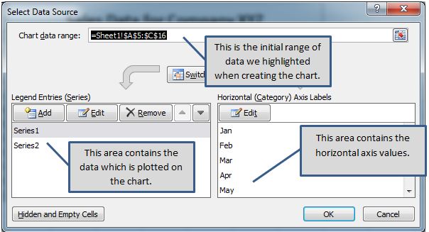
- Select Data—As we mentioned earlier, if you didn’t choose a data range, or didn’t select the correct data range, we could easily change this after the chart was created. The Select Data button lets us accomplish that. Clicking it launches the Select a Data Range window.

The data range refers to the number of cells you’d like to use. For instance, in the above example «=Expenses! $B$12:$D$18» refers to cells B12 through D18 on the worksheet titles «Expenses.» For now, it may be easier to select the data range by dragging your mouse over it. To do that, click the Data Range button  next to the text box.
The Select Data Source window minimize and you’ll see another box that looks like this:

But don’t worry, you will not have to relaunch the Select Data Source window. This box is simply asking you to define the data range, and you can do it easily by clicking on a cell, holding the mouse button, and dragging it over all of the cells you’d like to add. MS Excel automatically enters the selected cell coordinates into the data range window. When you are finished, you can either click the button on the right  or push Enter.
Once you’ve created your chart and chosen data, you can begin to customize the look at feel. The Chart Layout group gives you a couple of quick layout styles you can easily apply to any chart.

To apply them, simply select a chart, then click on a chart. The icons representing each chart give you a good idea what the resulting chart will look like. For instance, the first button in the example above puts a title at the top of the chart and a legend on the left. The next button puts a title at the top, a legend directly under it, and labels at the top of each graph bar.
Below is an example of what our chart would look like if we selected the second button.

You can see additional quick layout styles by clicking the arrow at on the right.
You can rename the chart by clicking «Chart Title» and typing your own name. There’s another way to change the chart name, too, which we’ll talk about in just a minute.
To delete any element in a chart, simply select it, and hit the backspace or delete button.
Modifying and Moving a Chart Now let’s take a look at the Layout tab under Chart Tools. Many of the options will be familiar to you, since we’ve already discussed them, so let’s focus on the tools that pertain specifically to charts.

Here is a zoom of the ribbon Layout Ribbon above, left and right


Remember a minute ago when we said there was another way to change a chart name? Well, if you look to the far right of the Layout tab, you’ll see the Chart Name box. The selected chart is named Chart 3. We can change it by clicking the box and typing a new name.
You can also use the buttons on the ribbon to choose a chart title, change the title of each axis, modify the legend or data labels, or even plot an axis or a trendline.
Charts can be moved just like any other object in Excel. Simply select the object, move the mouse over the edge of it until it turns into a 4-headed arrow, then click and hold the left mouse button to drag.
Organizational Charts
While an ordinary chart represents data, diagrams and organizational charts explain the causal relationship between elements. The following organizational chart, for instance, explains the relationship between managers and subordinates.

Organizational charts are called SmartArt in Excel 2010. You can find the SmartArt button on the Insert tab. It looks like this: . Clicking it launches the SmartArt graphic gallery.

A basic organizational chart will open in the current worksheet. It will look like this.

The SmartArt tools will also open in the ribbon. From it you can customize your SmartArt to suit your needs, or try another. You can even change the chart color. Below this ribbon is a zoom of the left and right sides.


Just like any other object entered into Excel, you can resize it by dragging the outer edges to the chosen dimensions. Move an Organizational chart by dragging it to any location within a worksheet.
Changing an Organizational Chart
You will notice there are two panes in our organizational part. The one on the left is basically to make it easier to enter text. You can click the placeholder text in either the pane on the left or in the organizational chart itself and start typing to change it.
Other Changes to Charts
To add a picture to an organizational chart, just click the picture placeholders, which can be seen in the above example in the center of each circle. This will open a window from which you can select a picture from any location on your computer.
Sparklines Sparklines are an exciting new feature that allows you to create a quick visual representation of the information in a range of cells in a single cell. This visual representation can come in the form of a line graph, a bar graph, or win/loss graph.
Below is an example of a Sparkline. The cells highlighted in yellow represent the data range, while the selected cell (outlined in purple) represents the Sparkline graph.

The Sparkline group of buttons is located on the Insert tab of the ribbon.

When you click one of these buttons to create a Sparkline graph, you will first be asked to select a data range on which the graph is to be based.

Enter a data range, then select the cell where you want the sparkline graph to appear. Click OK when finished.
Whenever you create a Sparkline graph, or whenever a cell containing one is selected, the Sparkline Tools/Design tab will be available in the ribbon. Below this ribbon is a zoom of the left and right sides of it.


From here, you can change the graph type, the visual style, colors, axis, etc.
A combo (or combination chart) is a chart that plots multiple sets of data using two different chart types. A typical combo chart uses a line and a column.
Despite being out of support for several years, Excel 2010 is still in use in many organisations, however, unlike Excel 2013 and 2016, Excel 2010 does not offer combo chart as one of the built-in chart types. This tutorial shows how to create a combo chart in Excel 2010.
Select the Cells
Select the cells containing the headings and numbers to be included in the chart

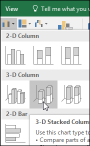
Insert a Column Chart
- Click the Insert tab on the Ribbon
- Click Column
- Click the type of column chart required – in this example 2-D Column has been selected

The Column Chart

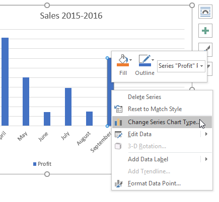
Change One of the Bars (to a Line)
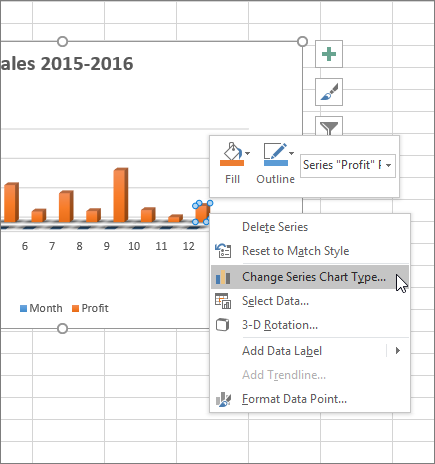
- Right click on one of the bars that represent the series to be changed (to a line) and select Change Series Chart Type from the menu
- Select the type of chart required for this data series
- Click OK

Display the Scale for the Line on Secondary Axis (Optional)
- In the chart, right click the line
- Select Format Data Series
- In the Series Options, select Secondary Axis

Creating a chart in Excel is a simple process once you know how. With this post learn the steps you need to take in order to create a chart and make some custom formats to the Excel chart which will ensure you are presenting an effective chart every time…
Create an Excel Chart
In the first post of this charting series we looked at the various chart types on offer in Excel 2010 and some of their main reasons to use them. This post leads on from that and now looks at the steps involved in creating a chart in Excel 2010 along with the some of the initial formatting options that will help you produce an effective looking chart.
This post will cover:
- Inserting a chart
- Components of a chart
- Positioning and sizing a chart
- Adding a title to a chart
- Formatting the legend in a chart
Starting steps
To begin with we need some data to chart. If you have your own data to hand then feel free to use that or you can download the following Excel file which will help you work through examples.
Inserting a chart
To create a chart you first need to highlight your data and then insert a chart. Excel will build the chart type of your choice using the data that you have highlighted.
This method is generally the quickest way to produce a chart, as with many features in Excel there are other methods. To create the chart with this method the steps are:
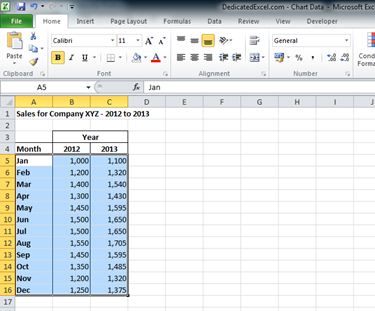
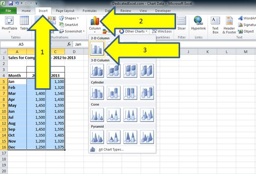
1) Select your data. To do this select the upper left cell of your data, for this example cell A5. Then holding down the left mouse button drag the cursor down and across to the last cell of data cell C16, you can then release the left mouse button. Your data should take on a highlighted appearance like below:
2) With the data highlighted select the “Insert” tab (1) across the Excel ribbon which is found at the top the worksheet. For this example we will create a standard column chart by selecting the “Column” icon (2) and the standard column chart (3):
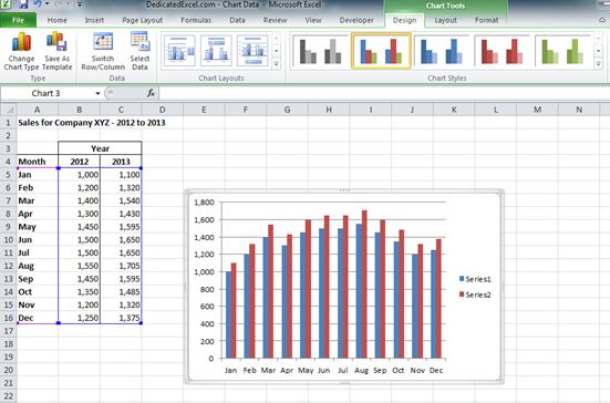
3) Now you have created a basic chart which will show up on the worksheet and should look very similar to this:
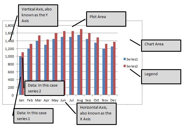
Components of a Chart
When your chart is created it is created as an object within Excel.
A chart object has a variety of components that go into its creation and it is worth being aware of each one as they can all be formatted individually. This means for the user is that you can select any of the components on their own, by left-clicking the mouse button while the cursor is over that component, then format it individually.
By formatting that means you can move components around the chart area or change text styles and many more different formatting options you would associate with Excel.
Positioning and Sizing a chart
When you have generated a chart you will often need to reposition it on your worksheet and perhaps resize the chart so it fits in better with your report. A chart is treated as an object within Excel and we can move objects easily using the mouse.
To reposition a chart:
1) Select the chart – left click the mouse with the cursor anywhere on the chart, you will notice that the border thickness of the chart increases when it is selected, this is just Excels way of showing you that the object has been selected.
2) Making sure the cursor is in the chart area (see above for where that is on a chart) hold down the left mouse button. While the mouse button is held down you control the chart position so can move it around the worksheet wherever you need to, as soon as you release the mouse button the chart will take the new position.
To resize the chart:
1) Position the mouse cursor on any corner of the chart, the cursor will change to a diagonal style arrow which represents it is possible to resize the chart object.
2) Hold the left mouse button down and while you have the mouse button held down you can drag the cursor in any direction to expand or shrink the chart. As with re-positioning of the chart as soon as you release the left mouse button your chart will take its new size.
Now you can move and resize the chart so it can be anywhere, or any size, on the worksheet. For this example I have moved and resized the chart so it fits neatly alongside the data:
Add a title to a chart
Adding a title to a chart should always be considered. If it is totally obvious what the chart shows then you might consider omitting one as they do take up space but if in doubt always include one.
To add a chart title:
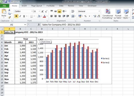
1) Select the chart by left clicking the mouse anywhere on the chart.
2) On the Excel ribbon (at the top of the screen) you will now see additional options called “Chart Tools” (1). The “Chart Tools” option will only appear when you have a chart object selected, it remains hidden at all other times. Within the “Chart Tools” option select the tab called “Layout” (2) then select the icon called “Chart Title”(3) and for this example we will add in a title “Above Chart”(4):
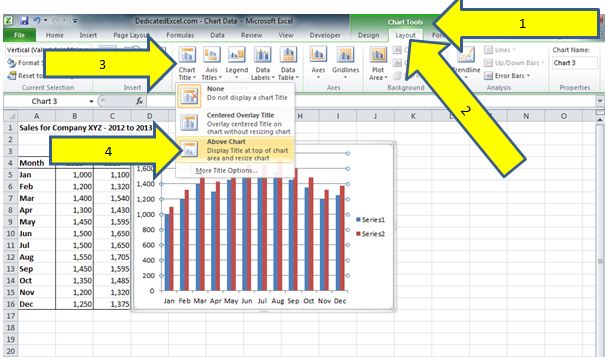
3) Your chart should now look like the below image with the words “Chart Title” added as a title:
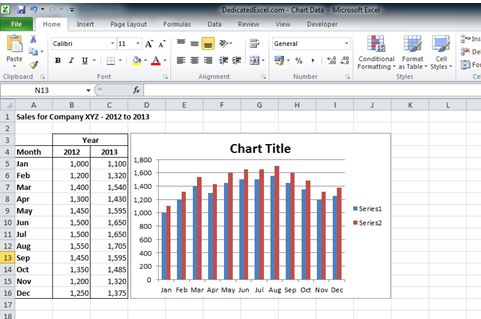
The chart title becomes an additional component on the Chart and as a result it can be selected and formatted on its own.
To amend the chart title left click the mouse button within the chart title component (which will highlight it by placing a box around it), we can then simply highlight the text or left click the mouse button for a second time within the box and delete the standard “Chart Title” text and replace it with our own:
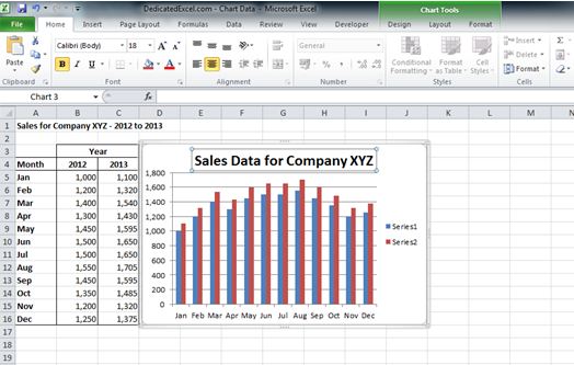
Formatting the legend in a chart
The legend can be a very important component on a chart as it acts as a key to what the data values represent. In our example we might know that the blue column is 2012 data and the red column is 2013 data but remember that your end-user might not.
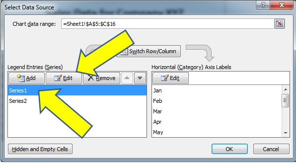
When you have initially created a chart in this example Excel has no titles for the data values, it has just referred to them as “Series 1” and “Series 2”. A data series is a range of values that are plotted on the chart and in our example we have two different data series as we have data values for 2012 and 2013.
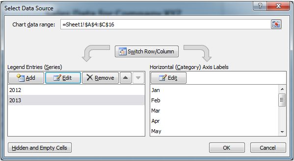
To change the legend names we need to drill into the data that feeds the chart, this is done by right-clicking on the chart and choosing the “Select Data” option from the menu:
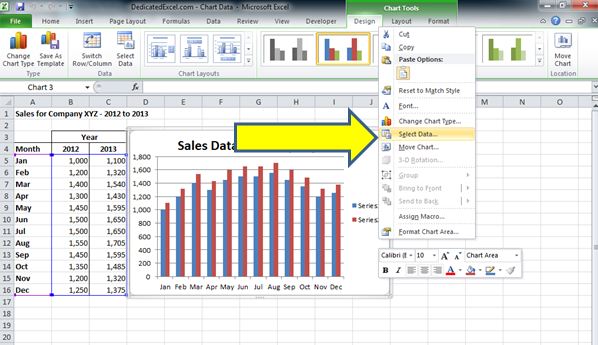
When you have clicked on the “Select Data” option a new menu box will open up where we can edit the data that is feeding the chart:
In the far left box you will see the current labels, “Series 1” and “Series 2”. Just above them is the Edit button which we can click on to edit that data series.
To edit Series 1 click once on the name which highlights it then left click on the Edit Button:
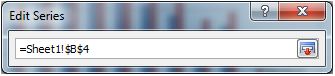
Another menu box will now open that shows you the following:
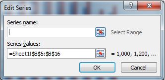
This menu box shows us the Series Name, which you can see is currently empty, along with the range of data that is currently associated with that series, in this example cells B5 to B16.
There are two options available to you to rename the data series, the first is we can simply type in a name in the empty “Series name” box, so in this case we know that the range B5 to B16 refers to 2012 sales so we can type in 2012.
Alternatively the preferred method is to link the name to a cell on the worksheet, which means if the name ever changes on the worksheet the legend will update automatically.
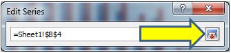
To do this click on the icon next to the Series name box:
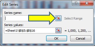
Then click on the cell you want to link, in this case it is B4 as that contains the title:
Click on the icon to the right hand side:
And then click OK:
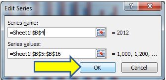
Now instead of “Series 1” the label has updated to “2012”. Repeat the process for Series 2 using cell C5 as the title so you end up with the following view:
The last step is to click on “OK” and the legend will update with the new labels and the chart should look like so:
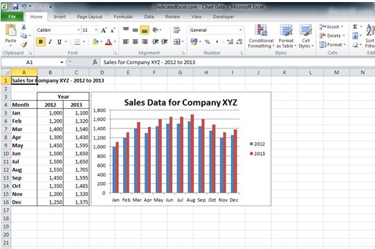
As you can see from the updated chart the legend clearly shows that the blue columns in the chart refer to 2012 and the red ones refer to 2013, which is much clearer for the end user.
Summary
- In this post we learned how to insert a chart by highlighting our data and then selecting the insert chart option from the Excel 2010 ribbon.
- An Excel chart contains multiple components, such as a legend or a plot area; each of those components can be selected and formatted individually.
- Re-positioning the chart can be done by selecting the chart area and holding down the left mouse button while you move the cursor around the worksheet. You can also resize the chart by positioning the mouse cursor over a corner of the chart and holding down the left mouse button to resize.
- Adding a title to the chart, while not always necessary, can be done using the layout tab found within the chart options menu on the Excel ribbon. You must have the chart selected to be able to see the chart options menu on the Excel ribbon.
- Formatting the legend can be done within the “Select Data” option found by right-clicking on the chart. A legend will help end-users clearly understand what the values in a chart refer to.
There are many more options and features in charts to learn but with the ones explained in this post you have everything you need to get started on creating an effective looking chart within Excel 2010.
The next post in the series will look at formatting some of the other components in a chart such as the horizontal and vertical axis, along with changing the look or type of chart presented so make sure you keep an eye out for that one. Remember you can follow to site on Twitter or via an RSS feed so you always become aware of when a new guide has been added.
Keep Excelling,

Friday, September 9, 2011
Peltier Technical Services, Inc., Copyright © 2023, All rights reserved.
Excel 2010 Chart Type Dialog
Excel offers a wide range of standard chart types. Below is the Chart Type dialog from Excel 2010, but all of these standard chart types have been available since Excel 97, and most of them since before that.
What makes my dialog different is that it has been annotated to show which chart types you may use freely, which types you may use with caution, and which types you should avoid. If you’ve been reading this blog for a while, and paying attention, you will probably not be surprised by most of the ratings.
Explanations for the ratings
Preferred
This group comprises the commonest and most easily understood charts you can make. Line charts and XY (Scatter Charts), with and without markers and lines. Simple clustered bar and column charts.
Acceptable
These charts are also readily understood, but might not be the first choice for most data sets. They should be used with “a little” caution.
Stacked charts are tougher to decode. Because the bars do not share a common baseline, their lengths are harder to compare.
Stock charts are tough for non-finance people to get, because they convey a lot of information in a specialized way. However, for people familiar with them, stock charts are very useful.
Use With Caution
This set of charts can be useful, if you understand their limitations and drawbacks, and if the audience is skilled in their interpretation.
Stacked line charts can be confusing if the audience does not understand that each line represents a cumulative total of that line’s data plus all previous lines’ data.
Ordinary 2D pie charts can be useful if the number of data points is small and you only use one at a time. Bar charts generally do a better job.
Area charts are problematic for several reasons. Unstacked charts risk areas in back being obscured by those in front, while stacked ones may have an issue if the audience doesn’t realize they represent cumulative data. Line charts are often a better option.
Bubble charts cause problems with interpretation of bubble sizes. Is the area or the diameter proportional to the data being represented? Also, the resolution isn’t too good. It’s often best to use bubble size to indicate discrete factors.
Radar or spider charts seem like they’d be good at displaying cyclic data, but the spoke length is often confounded by the areas within the lines, and it’s impossible to compare values which are not on the same spoke. Line charts are usually a better choice.
Surface and contour charts are the only 3D charts not rated “AVOID”. They can be useful for showing some data. The X and Y values are not treated as numeric variables, but as categories (though you can still use them for numerical values if the points are equally spaced along the axes). Some orientations may lead to features in front obscuring features in back. The wireframe versions have too many line segments, the filled ones may rely too much on color, and starting in 2007, the filled ones have a weird shading applied which often makes the chart less clear. However, when used with care, these can be useful tools.
AVOID
These charts should be avoided because they are difficult to interpret, and some of them have features which may actually distort data.
Most 3D charts are particularly troublesome. The audience has trouble lining up the data elements with offset axes, some elements hide other elements, and the perspective may stretch some elements and shrink others. In many cases the third dimension is a false dimension, created not with data but with lots of extra non-data ink.
All but the simplest 2D pie charts are problematic: donut charts, pie-of-pie and bar-of-pie charts, exploded pie charts. These all have features that make them even less comprehensible than regular 2D pie charts.
New Dialog
What if we just remove the charts rated “AVOID” from the dialog and do a little rearranging? This isn’t bad:
“Missing” Chart Types
There are various other chart types that aren’t in the Excel dialog, but which you can still make in Excel. You need the savvy to figure out how to arrange the data and how to mix various chart types, and you need the patience to repeat these tasks as necessary. There’s no decent Histogram (despite what the Analysis Toolpak claims), though you can make a column chart and fix it up. Similarly you can make your own Pareto Chart by adding a line series to a column chart. You can make Tornado Charts or simple Gantt Charts by pimping a bar chart. I’ve written some tutorials that show how to make tricky chart types and utilities that will do the work at the click of a button: Waterfall Charts (Bridge Charts), Box and Whisker Charts, Clustered and Stacked Column and Bar Charts, Marimekko Charts, Dot Plots, and Panel Charts.