
Charts help you visualize your data in a way that creates maximum impact on your audience. Learn to create a chart and add a trendline. You can start your document from a recommended chart or choose one from our collection of pre-built chart templates.

Create a chart
-
Select data for the chart.
-
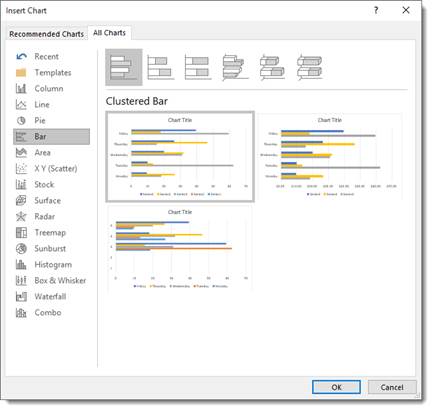
Select Insert > Recommended Charts.
-
Select a chart on the Recommended Charts tab, to preview the chart.
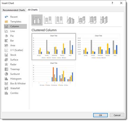
Note: You can select the data you want in the chart and press ALT + F1 to create a chart immediately, but it might not be the best chart for the data. If you don’t see a chart you like, select the All Charts tab to see all chart types.
-
Select a chart.
-
Select OK.
Add a trendline
-
Select a chart.
-
Select Design > Add Chart Element.
-
Select Trendline and then select the type of trendline you want, such as Linear, Exponential, Linear Forecast, or Moving Average.
Note: Some of the content in this topic may not be applicable to some languages.
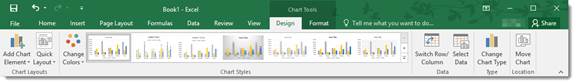
Charts display data in a graphical format that can help you and your audience visualize relationships between data. When you create a chart, you can select from many chart types (for example, a stacked column chart or a 3-D exploded pie chart). After you create a chart, you can customize it by applying chart quick layouts or styles.
Charts contain several elements, such as a title, axis labels, a legend, and gridlines. You can hide or display these elements, and you can also change their location and formatting.
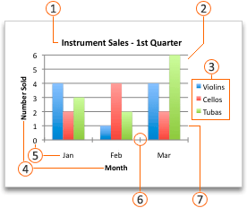
 Chart title
 Plot area
 Legend
 Axis titles
 Axis labels
 Tick marks
 Gridlines
You can create a chart in Excel, Word, and PowerPoint. However, the chart data is entered and saved in an Excel worksheet. If you insert a chart in Word or PowerPoint, a new sheet is opened in Excel. When you save a Word document or PowerPoint presentation that contains a chart, the chart’s underlying Excel data is automatically saved within the Word document or PowerPoint presentation.
Note: The Excel Workbook Gallery replaces the former Chart Wizard. By default, the Excel Workbook Gallery opens when you open Excel. From the gallery, you can browse templates and create a new workbook based on one of them. If you don’t see the Excel Workbook Gallery, on the File menu, click New from Template.
-
On the View menu, click Print Layout.
-
Click the Insert tab, and then click the arrow next to Chart.

-
Click a chart type, and then double-click the chart you want to add.
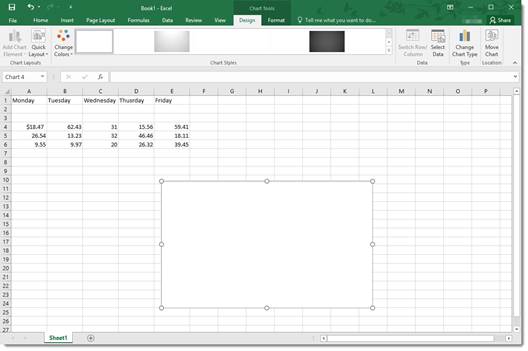
When you insert a chart into Word or PowerPoint, an Excel worksheet opens that contains a table of sample data.
-
In Excel, replace the sample data with the data that you want to plot in the chart. If you already have your data in another table, you can copy the data from that table and then paste it over the sample data. See the following table for guidelines for how to arrange the data to fit your chart type.
For this chart type
Arrange the data
Area, bar, column, doughnut, line, radar, or surface chart
In columns or rows, as in the following examples:
Series 1
Series 2
Category A
10
12
Category B
11
14
Category C
9
15
or
Category A
Category B
Series 1
10
11
Series 2
12
14
Bubble chart
In columns, putting x values in the first column and corresponding y values and bubble size values in adjacent columns, as in the following examples:
X-Values
Y-Value 1
Size 1
0.7
2.7
4
1.8
3.2
5
2.6
0.08
6
Pie chart
In one column or row of data and one column or row of data labels, as in the following examples:
Sales
1st Qtr
25
2nd Qtr
30
3rd Qtr
45
or
1st Qtr
2nd Qtr
3rd Qtr
Sales
25
30
45
Stock chart
In columns or rows in the following order, using names or dates as labels, as in the following examples:
Open
High
Low
Close
1/5/02
44
55
11
25
1/6/02
25
57
12
38
or
1/5/02
1/6/02
Open
44
25
High
55
57
Low
11
12
Close
25
38
X Y (scatter) chart
In columns, putting x values in the first column and corresponding y values in adjacent columns, as in the following examples:
X-Values
Y-Value 1
0.7
2.7
1.8
3.2
2.6
0.08
or
X-Values
0.7
1.8
2.6
Y-Value 1
2.7
3.2
0.08
-
To change the number of rows and columns included in the chart, rest the pointer on the lower-right corner of the selected data, and then drag to select additional data. In the following example, the table is expanded to include additional categories and data series.
-
To see the results of your changes, switch back to Word or PowerPoint.
Note: When you close the Word document or the PowerPoint presentation that contains the chart, the chart’s Excel data table closes automatically.
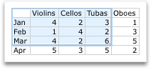
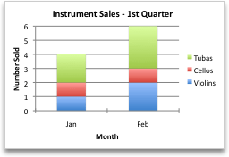
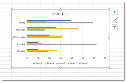
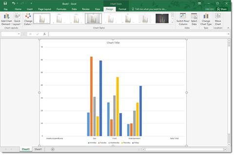
After you create a chart, you might want to change the way that table rows and columns are plotted in the chart. For example, your first version of a chart might plot the rows of data from the table on the chart’s vertical (value) axis, and the columns of data on the horizontal (category) axis. In the following example, the chart emphasizes sales by instrument.

However, if you want the chart to emphasize the sales by month, you can reverse the way the chart is plotted.
-
On the View menu, click Print Layout.
-
Click the chart.
-
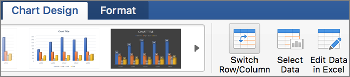
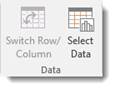
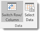
Click the Chart Design tab, and then click Switch Row/Column.
If Switch Row/Column is not available
Switch Row/Column is available only when the chart’s Excel data table is open and only for certain chart types. You can also edit the data by clicking the chart, and then editing the worksheet in Excel.
-
On the View menu, click Print Layout.
-
Click the chart.
-
Click the Chart Design tab, and then click Quick Layout.
-
Click the layout you want.
To immediately undo a quick layout that you applied, press
+ Z .
 + Z .
+ Z .Chart styles are a set of complementary colors and effects that you can apply to your chart. When you select a chart style, your changes affect the whole chart.
-
On the View menu, click Print Layout.
-
Click the chart.
-
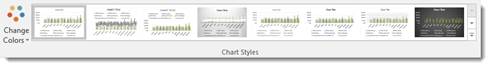
Click the Chart Design tab, and then click the style you want.
To see more styles, point to a style, and then click
.To immediately undo a style that you applied, press
+ Z .
 .
.-
On the View menu, click Print Layout.
-
Click the chart, and then click the Chart Design tab.
-
Click Add Chart Element.
-
Click Chart Title to choose title format options, and then return to the chart to type a title in the Chart Title box.
See also
Update the data in an existing chart
Chart types
Create a chart
You can create a chart for your data in Excel for the web. Depending on the data you have, you can create a column, line, pie, bar, area, scatter, or radar chart.
-
Click anywhere in the data for which you want to create a chart.
To plot specific data into a chart, you can also select the data.
-
Select Insert > Charts > and the chart type you want.
-
On the menu that opens, select the option you want. Hover over a chart to learn more about it.
Tip: Your choice isn’t applied until you pick an option from a Charts command menu. Consider reviewing several chart types: as you point to menu items, summaries appear next to them to help you decide.
-
To edit the chart (titles, legends, data labels), select the Chart tab and then select Format.
-
In the Chart pane, adjust the setting as needed. You can customize settings for the chart’s title, legend, axis titles, series titles, and more.


Available chart types
It’s a good idea to review your data and decide what type of chart would work best. The available types are listed below.
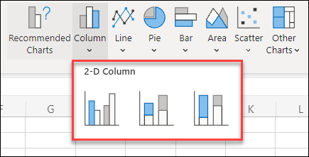
Data that’s arranged in columns or rows on a worksheet can be plotted in a column chart. A column chart typically displays categories along the horizontal axis and values along the vertical axis, like shown in this chart:

Types of column charts
-
Clustered column A clustered column chart shows values in 2-D columns. Use this chart when you have categories that represent:
-
Ranges of values (for example, item counts).
-
Specific scale arrangements (for example, a Likert scale with entries, like strongly agree, agree, neutral, disagree, strongly disagree).
-
Names that are not in any specific order (for example, item names, geographic names, or the names of people).
-
-
Stacked column A stacked column chart shows values in 2-D stacked columns. Use this chart when you have multiple data series and you want to emphasize the total.
-
100% stacked column A 100% stacked column chart shows values in 2-D columns that are stacked to represent 100%. Use this chart when you have two or more data series and you want to emphasize the contributions to the whole, especially if the total is the same for each category.
Data that is arranged in columns or rows on a worksheet can be plotted in a line chart. In a line chart, category data is distributed evenly along the horizontal axis, and all value data is distributed evenly along the vertical axis. Line charts can show continuous data over time on an evenly scaled axis, and are therefore ideal for showing trends in data at equal intervals, like months, quarters, or fiscal years.

Types of line charts
-
Line and line with markers Shown with or without markers to indicate individual data values, line charts can show trends over time or evenly spaced categories, especially when you have many data points and the order in which they are presented is important. If there are many categories or the values are approximate, use a line chart without markers.
-
Stacked line and stacked line with markers Shown with or without markers to indicate individual data values, stacked line charts can show the trend of the contribution of each value over time or evenly spaced categories.
-
100% stacked line and 100% stacked line with markers Shown with or without markers to indicate individual data values, 100% stacked line charts can show the trend of the percentage each value contributes over time or evenly spaced categories. If there are many categories or the values are approximate, use a 100% stacked line chart without markers.
Notes:
-
Line charts work best when you have multiple data series in your chart—if you only have one data series, consider using a scatter chart instead.
-
Stacked line charts add the data, which might not be the result you want. It might not be easy to see that the lines are stacked, so consider using a different line chart type or a stacked area chart instead.
-
Data that is arranged in one column or row on a worksheet can be plotted in a pie chart. Pie charts show the size of items in one data series, proportional to the sum of the items. The data points in a pie chart are shown as a percentage of the whole pie.

Consider using a pie chart when:
-
You have only one data series.
-
None of the values in your data are negative.
-
Almost none of the values in your data are zero values.
-
You have no more than seven categories, all of which represent parts of the whole pie.
Data that is arranged in columns or rows only on a worksheet can be plotted in a doughnut chart. Like a pie chart, a doughnut chart shows the relationship of parts to a whole, but it can contain more than one data series.

Tip: Doughnut charts are not easy to read. You may want to use a stacked column or stacked bar chart instead.
Data that is arranged in columns or rows on a worksheet can be plotted in a bar chart. Bar charts illustrate comparisons among individual items. In a bar chart, the categories are typically organized along the vertical axis, and the values along the horizontal axis.

Consider using a bar chart when:
-
The axis labels are long.
-
The values that are shown are durations.
Types of bar charts
-
Clustered A clustered bar chart shows bars in 2-D format.
-
Stacked bar Stacked bar charts show the relationship of individual items to the whole in 2-D bars
-
100% stacked A 100% stacked bar shows 2-D bars that compare the percentage that each value contributes to a total across categories.
Data that is arranged in columns or rows on a worksheet can be plotted in an area chart. Area charts can be used to plot change over time and draw attention to the total value across a trend. By showing the sum of the plotted values, an area chart also shows the relationship of parts to a whole.

Types of area charts
-
Area Shown in 2-D format, area charts show the trend of values over time or other category data. As a rule, consider using a line chart instead of a non-stacked area chart, because data from one series can be hidden behind data from another series.
-
Stacked area Stacked area charts show the trend of the contribution of each value over time or other category data in 2-D format.
-
100% stacked 100% stacked area charts show the trend of the percentage that each value contributes over time or other category data.
Data that is arranged in columns and rows on a worksheet can be plotted in an scatter chart. Place the x values in one row or column, and then enter the corresponding y values in the adjacent rows or columns.
A scatter chart has two value axes: a horizontal (x) and a vertical (y) value axis. It combines x and y values into single data points and shows them in irregular intervals, or clusters. Scatter charts are typically used for showing and comparing numeric values, like scientific, statistical, and engineering data.

Consider using a scatter chart when:
-
You want to change the scale of the horizontal axis.
-
You want to make that axis a logarithmic scale.
-
Values for horizontal axis are not evenly spaced.
-
There are many data points on the horizontal axis.
-
You want to adjust the independent axis scales of a scatter chart to reveal more information about data that includes pairs or grouped sets of values.
-
You want to show similarities between large sets of data instead of differences between data points.
-
You want to compare many data points without regard to time — the more data that you include in a scatter chart, the better the comparisons you can make.
Types of scatter charts
-
Scatter This chart shows data points without connecting lines to compare pairs of values.
-
Scatter with smooth lines and markers and scatter with smooth lines This chart shows a smooth curve that connects the data points. Smooth lines can be shown with or without markers. Use a smooth line without markers if there are many data points.
-
Scatter with straight lines and markers and scatter with straight lines This chart shows straight connecting lines between data points. Straight lines can be shown with or without markers.
Data that is arranged in columns or rows on a worksheet can be plotted in a radar chart. Radar charts compare the aggregate values of several data series.

Type of radar charts
-
Radar and radar with markers With or without markers for individual data points, radar charts show changes in values relative to a center point.
-
Filled radar In a filled radar chart, the area covered by a data series is filled with a color.
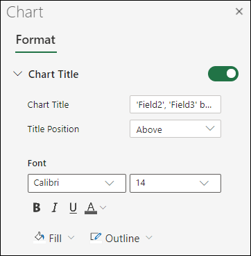
Add or edit a chart title
You can add or edit a chart title, customize its look, and include it on the chart.
-
Click anywhere in the chart to show the Chart tab on the ribbon.
-
Click Format to open the chart formatting options.
-
In the Chart pane, expand the Chart Title section.
-
Add or edit the Chart Title to meet your needs.
-
Use the switch to hide the title if you don’t want your chart to show a title.
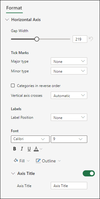
Add axis titles to improve chart readability
Adding titles to the horizontal and vertical axes in charts that have axes can make them easier to read. You can’t add axis titles to charts that don’t have axes, such as pie and doughnut charts.
Much like chart titles, axis titles help the people who view the chart understand what the data is about.

-
Click anywhere in the chart to show the Chart tab on the ribbon.
-
Click Format to open the chart formatting options.
-
In the Chart pane, expand the Horizontal Axis or Vertical Axis section.
-
Add or edit the Horizontal Axis or Vertical Axis options to meet your needs.
-
Expand the Axis Title.
-
Change the Axis Title and modify the formatting.
-
Use the switch to show or hide the title.

Change the axis labels
Axis labels are shown below the horizontal axis and next to the vertical axis. Your chart uses text in the source data for these axis labels.

To change the text of the category labels on the horizontal or vertical axis:
-
Click the cell which has the label text you want to change.
-
Type the text you want and press Enter.
The axis labels in the chart are automatically updated with the new text.
Tip: Axis labels are different from axis titles you can add to describe what is shown on the axes. Axis titles aren’t automatically shown in a chart.
Remove the axis labels
To remove labels on the horizontal or vertical axis:
-
Click anywhere in the chart to show the Chart tab on the ribbon.
-
Click Format to open the chart formatting options.
-
In the Chart pane, expand the Horizontal Axis or Vertical Axis section.
-
From the dropdown box for Label Position, select None to prevent the labels from showing on the chart.

Need more help?
You can always ask an expert in the Excel Tech Community or get support in the Answers community.
Any information is easier to perceive when it’s represented in a visual form. It’s particularly relevant for numeric data that needs to be compared. In this case, charts are the optimal variant of representation. We will work in Excel.
Moreover, we will learn to create dynamic charts and graphs, which are updated automatically when you change the data. The link at the end of the article will allow you to download a sample template.
How to build a chart off a table in Excel?
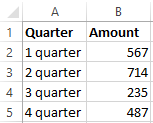
- Create a table with the data.
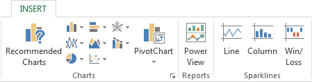
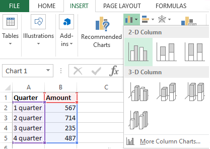
- Select the range of values A1:B5 that need to be presented as a chart. Go to the «INSERT» tab and choose the type.
- Click «Insert Column Chart» (as an example; you may choose a different type). Select one of the suggested bar charts.
- After you choose your bar chart type, it will be generated automatically.
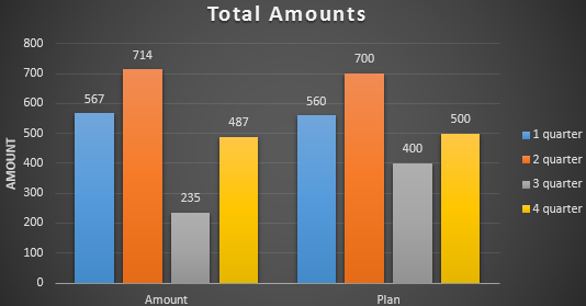
- Such a variant isn’t exactly what we need, so let’s modify it. Double-click on the bar chart’s title and enter «Total Amounts».
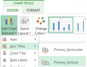
- Add the vertical axis title. Go to «CHART TOOLS» — «DESIGN» — «Add Element» — «Axis Titles» — «Primary Vertical». Select the vertical axis and its title type.
- Enter «AMOUNT».
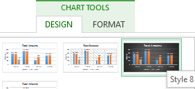
- Change the color and style. Choose a different style number 9.
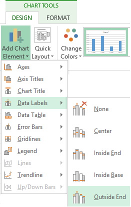
- Specify the sums by giving titles to the bars. Go to the «DESIGN» tab, select «Data Labels» and the desired position.
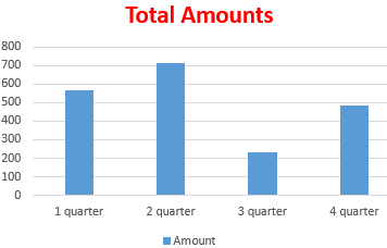
Done!
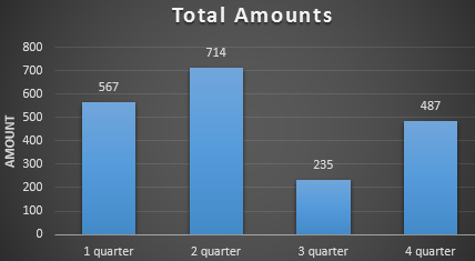
As a result, we have a stylish presentation of the data in Excel.
How to add data in an Excel chart?
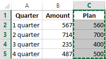
- Add new values to the table – the «Plan» column.
- Select the new range of values, including the heading. Copy it to the clipboard (by pressing Ctrl+C). Select the existing chart and paste the fragment (by pressing Ctrl+V).
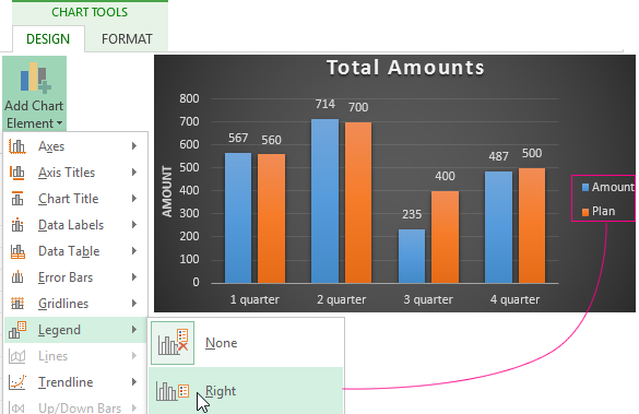
- As it’s not entirely clear where the figures in our bar chart come from, let’s create the legend. Go to «DESIGN» — «Legend» — «Right». This is the result:
There is a more complicated way of adding new data into the existing graph through the «DESIGN» «Select Data» menu (open it by right-clicking and selecting «Select Data»).
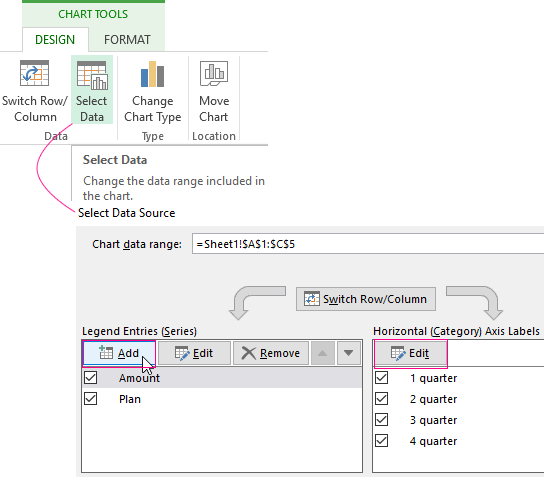
After you click «Add» (legend elements), there will open the row for selecting the range of values.
How to reverse axes in an Excel chart?
In the menu you’ve opened, click the «DESIGN»-«Switch/Column» button.
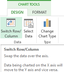
The values for rows and categories will swap around automatically.
How to lock controls in an Excel chart?
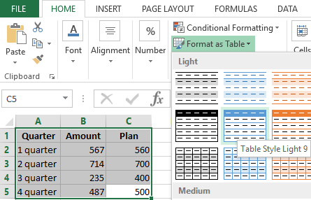
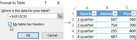
If you need to add new data in the bar chart very often, it’s not convenient to change the range every time. The optimal variant is to create a dynamic chart that will update automatically. To lock the controls, let’s transform the data range into a «Smart Table».
- Select the range of values A1:C5 and click «Format as Table» on «HOME» tab.
- Select any style in the drop-down menu. The program suggests you select the range for the table – agree with the suggested variant. The values for the graph will appear as follows:
- As soon as you begin to enter new information in the table, the chart will also change. It has become dynamic:
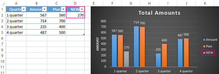
We have learned how to create a «Smart Table» off the existing data. If the spreadsheet is blank, start off with entering the values in the table: «INSERT» — «Table».
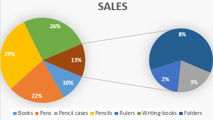
How to build a percentage chart in Excel?
Pie charts are the best option for representing percentage information.
The input data for our sample chart:
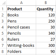
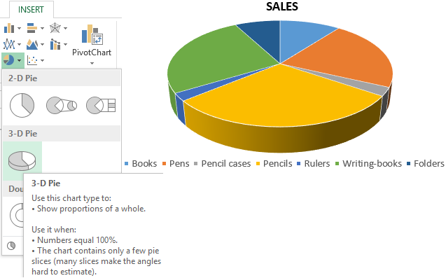
- Select the range A1:B8. «INSERT» — «Insert Pie or Doughnut Chart» — «3D-Pie».
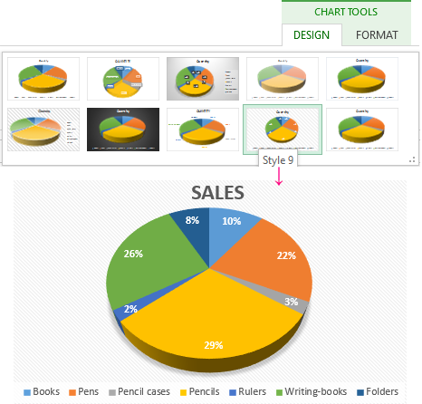
- Go to the tab «DESIGN» — «Styles». Among the suggested options, there are styles that include percentages. Choose the suitable 9.
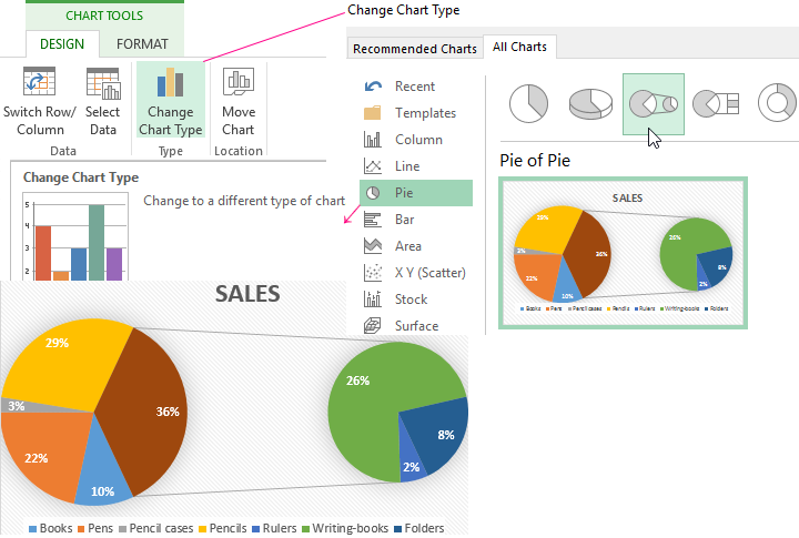
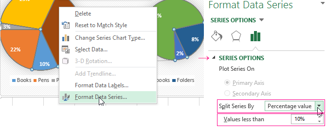
- The small percentage sectors are visible poorly. To highlight them, let’s create a secondary chart. Select the pie. Go to the tab «DESIGN» — «Change Chart Type». Select a pie with a secondary graph.
- The automatically generated option does not fulfill the task. Right-click on any sector. The dots designating the boundaries will become visible. Click «Format Data Series». Enter the following row parameters:
- We have obtained the desired variant:
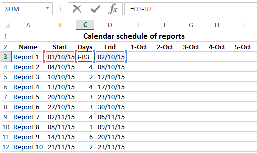
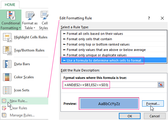
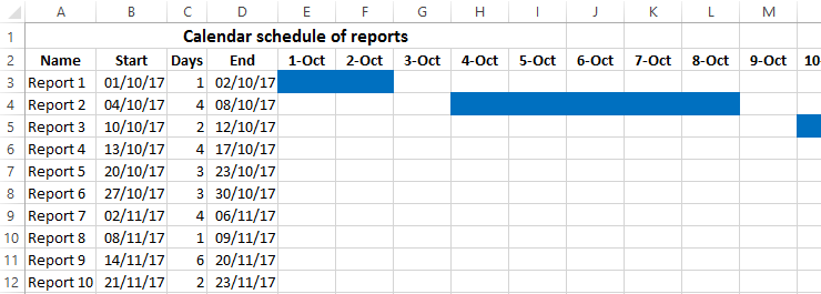
Gantt chart in Excel
The Gantt chart is way of representing information in the form of bars to illustrate a multi-stage event. It’s a simple yet impressive trick.
- We have a (dummy) table containing the deadlines for different reports.
- To create a chart, insert a column containing the number of days (column C). Fill it in with the help of Excel formulas.
- Select the range to contain the Gantt chart (E3:BF12). That is, the cells to be filled with a color between the beginning and end dates.
- Open the «Conditional Formatting» menu (on the «HOME» tab). Select «New Rule» — «Use a formula to determine which cells to format».
- Enter the formula of the following type: =AND(E$2>=$B3,E$2<=$D3). Excel uses the operator «И» to compare the date in the current cell with the beginning and end dates. Then, click «Format» and select the fill color.
When you need to build a presentable financial report, it’s better to use the graphical data representation tools.
A simple Gantt graph is ready. You can also download the template with a sample:
Download all examples
If the information is represented in a graphical way, it’s perceived visually much quicker and more efficiently than texts and numbers. It makes it easier to conduct an analytic analysis. It makes the situation clearer – both the whole picture and particular details.
Charts and graphs were specifically developed in Excel for fulfilling such tasks.
After you input your data and select the cell range, you’re ready to choose the chart type. In this example, we’ll create a clustered column chart from the data we used in the previous section.
Step 1: Select Chart Type
Once your data is highlighted in the Workbook, click the Insert tab on the top banner. About halfway across the toolbar is a section with several chart options. Excel provides Recommended Charts based on popularity, but you can click any of the dropdown menus to select a different template.

Step 2: Create Your Chart
- From the Insert tab, click the column chart icon and select Clustered Column.

- Excel will automatically create a clustered chart column from your selected data. The chart will appear in the center of your workbook.
- To name your chart, double click the Chart Title text in the chart and type a title. We’ll call this chart “Product Profit 2013 — 2017.”

We’ll use this chart for the rest of the walkthrough. You can download this same chart to follow along.
Download Sample Column Chart Template
There are two tabs on the toolbar that you will use to make adjustments to your chart: Chart Design and Format. Excel automatically applies design, layout, and format presets to charts and graphs, but you can add customization by exploring the tabs. Next, we’ll walk you through all the available adjustments in Chart Design.

Step 3: Add Chart Elements
Adding chart elements to your chart or graph will enhance it by clarifying data or providing additional context. You can select a chart element by clicking on the Add Chart Element dropdown menu in the top left-hand corner (beneath the Home tab).

To Display or Hide Axes:
- Select Axes. Excel will automatically pull the column and row headers from your selected cell range to display both horizontal and vertical axes on your chart (Under Axes, there is a check mark next to Primary Horizontal and Primary Vertical.)

- Uncheck these options to remove the display axis on your chart. In this example, clicking Primary Horizontal will remove the year labels on the horizontal axis of your chart.

- Click More Axis Options… from the Axes dropdown menu to open a window with additional formatting and text options such as adding tick marks, labels, or numbers, or to change text color and size.


To Add Axis Titles:
- Click Add Chart Element and click Axis Titles from the dropdown menu. Excel will not automatically add axis titles to your chart; therefore, both Primary Horizontal and Primary Vertical will be unchecked.
- To create axis titles, click Primary Horizontal or Primary Vertical and a text box will appear on the chart. We clicked both in this example. Type your axis titles. In this example, the we added the titles “Year” (horizontal) and “Profit” (vertical).


To Remove or Move Chart Title:
- Click Add Chart Element and click Chart Title. You will see four options: None, Above Chart, Centered Overlay, and More Title Options.

- Click None to remove chart title.
- Click Above Chart to place the title above the chart. If you create a chart title, Excel will automatically place it above the chart.
- Click Centered Overlay to place the title within the gridlines of the chart. Be careful with this option: you don’t want the title to cover any of your data or clutter your graph (as in the example below).


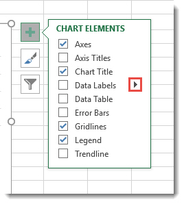
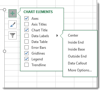
To Add Data Labels:
- Click Add Chart Element and click Data Labels. There are six options for data labels: None (default), Center, Inside End, Inside Base, Outside End, and More Data Label Title Options.

- The four placement options will add specific labels to each data point measured in your chart. Click the option you want. This customization can be helpful if you have a small amount of precise data, or if you have a lot of extra space in your chart. For a clustered column chart, however, adding data labels will likely look too cluttered. For example, here is what selecting Center data labels looks like:


To Add a Data Table:
- Click Add Chart Element and click Data Table. There are three pre-formatted options along with an extended menu that can be found by clicking More Data Table Options:


Note: If you choose to include a data table, you’ll probably want to make your chart larger to accommodate the table. Simply click the corner of your chart and use drag-and-drop to resize your chart.
To Add Error Bars:
- Click Add Chart Element and click Error Bars. In addition to More Error Bars Options, there are four options: None (default), Standard Error, 5% (Percentage), and Standard Deviation. Adding error bars provide a visual representation of the potential error in the shown data, based on different standard equations for isolating error.

- For example, when we click Standard Error from the options we get a chart that looks like the image below.


To Add Gridlines:
- Click Add Chart Element and click Gridlines. In addition to More Grid Line Options, there are four options: Primary Major Horizontal, Primary Major Vertical, Primary Minor Horizontal, and Primary Minor Vertical. For a column chart, Excel will add Primary Major Horizontal gridlines by default.

- You can select as many different gridlines as you want by clicking the options. For example, here is what our chart looks like when we click all four gridline options.

To Add a Legend:
- Click Add Chart Element and click Legend. In addition to More Legend Options, there are five options for legend placement: None, Right, Top, Left, and Bottom.

- Legend placement will depend on the style and format of your chart. Check the option that looks best on your chart. Here is our chart when we click the Right legend placement.


To Add Lines: Lines are not available for clustered column charts. However, in other chart types where you only compare two variables, you can add lines (e.g. target, average, reference, etc.) to your chart by checking the appropriate option.
To Add a Trendline:
- Click Add Chart Element and click Trendline. In addition to More Trendline Options, there are five options: None (default), Linear, Exponential, Linear Forecast, and Moving Average. Check the appropriate option for your data set. In this example, we will click Linear.

- Because we are comparing five different products over time, Excel creates a trendline for each individual product. To create a linear trendline for Product A, click Product A and click the blue OK button.

- The chart will now display a dotted trendline to represent the linear progression of Product A. Note that Excel has also added Linear (Product A) to the legend.

- To display the trendline equation on your chart, double click the trendline. A Format Trendline window will open on the right side of your screen. Click the box next to Display equation on chart at the bottom of the window. The equation now appears on your chart.


Note: You can create separate trendlines for as many variables in your chart as you like. For example, here is our chart with trendlines for Product A and Product C.

To Add Up/Down Bars: Up/Down Bars are not available for a column chart, but you can use them in a line chart to show increases and decreases among data points.
Step 4: Adjust Quick Layout
- The second dropdown menu on the toolbar is Quick Layout, which allows you to quickly change the layout of elements in your chart (titles, legend, clusters etc.).

- There are 11 quick layout options. Hover your cursor over the different options for an explanation and click the one you want to apply.


Step 5: Change Colors
The next dropdown menu in the toolbar is Change Colors. Click the icon and choose the color palette that fits your needs (these needs could be aesthetic, or to match your brand’s colors and style).

Step 6: Change Style
For cluster column charts, there are 14 chart styles available. Excel will default to Style 1, but you can select any of the other styles to change the chart appearance. Use the arrow on the right of the image bar to view other options.

Step 7: Switch Row/Column
- Click the Switch Row/Column on the toolbar to flip the axes. Note: It is not always intuitive to flip axes for every chart, for example, if you have more than two variables.


In this example, switching the row and column swaps the product and year (profit remains on the y-axis). The chart is now clustered by product (not year), and the color-coded legend refers to the year (not product). To avoid confusion here, click on the legend and change the titles from Series to Years.

Step 8: Select Data
- Click the Select Data icon on the toolbar to change the range of your data.
- A window will open. Type the cell range you want and click the OK button. The chart will automatically update to reflect this new data range.


Step 9: Change Chart Type
- Click the Change Chart Type dropdown menu.

- Here you can change your chart type to any of the nine chart categories that Excel offers. Of course, make sure that your data is appropriate for the chart type you choose.

-
You can also save your chart as a template by clicking Save as Template…
- A dialogue box will open where you can name your template. Excel will automatically create a folder for your templates for easy organization. Click the blue Save button.


Step 10: Move Chart
- Click the Move Chart icon on the far right of the toolbar.
- A dialogue box appears where you can choose where to place your chart. You can either create a new sheet with this chart (New sheet) or place this chart as an object in another sheet (Object in). Click the blue OK button.


Step 11: Change Formatting
- The Format tab allows you to change formatting of all elements and text in the chart, including colors, size, shape, fill, and alignment, and the ability to insert shapes. Click the Format tab and use the shortcuts available to create a chart that reflects your organization’s brand (colors, images, etc.).

- Click the dropdown menu on the top left side of the toolbar and click the chart element you are editing.


Step 12: Delete a Chart
To delete a chart, simply click on it and click the Delete key on your keyboard.
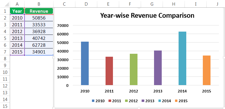
A picture is worth of thousand words; a chart is worth of thousand sets of data. In this tutorial, we are going to learn how we can use graph in Excel to visualize our data.
What is a chart?
A chart is a visual representative of data in both columns and rows. Charts are usually used to analyse trends and patterns in data sets. Let’s say you have been recording the sales figures in Excel for the past three years. Using charts, you can easily tell which year had the most sales and which year had the least. You can also draw charts to compare set targets against actual achievements.
We will use the following data for this tutorial.
Note: we will be using Excel 2013. If you have a lower version, then some of the more advanced features may not be available to you.
| Item | 2012 | 2013 | 2014 | 2015 |
|---|---|---|---|---|
| Desktop Computers | 20 | 12 | 13 | 12 |
| Laptops | 34 | 45 | 40 | 39 |
| Monitors | 12 | 10 | 17 | 15 |
| Printers | 78 | 13 | 90 | 14 |
Different scenarios require different types of charts. Towards this end, Excel provides a number of chart types that you can work with. The type of chart that you choose depends on the type of data that you want to visualize. To help simplify things for the users, Excel 2013 and above has an option that analyses your data and makes a recommendation of the chart type that you should use.
The following table shows some of the most commonly used Excel charts and when you should consider using them.
| S/N | CHART TYPE | WHEN SHOULD I USE IT? | EXAMPLE |
|---|---|---|---|
| 1 | Pie Chart | When you want to quantify items and show them as percentages. |
|
| 2 | Bar Chart | When you want to compare values across a few categories. The values run horizontally |
|
| 3 | Column chart | When you want to compare values across a few categories. The values run vertically |
|
| 4 | Line chart | When you want to visualize trends over a period of time i.e. months, days, years, etc. |
|
| 5 | Combo Chart | When you want to highlight different types of information |
|


The importance of charts
- Allows you to visualize data graphically
- It’s easier to analyse trends and patterns using charts in MS Excel
- Easy to interpret compared to data in cells
Step by step example of creating charts in Excel
In this tutorial, we are going to plot a simple column chart in Excel that will display the sold quantities against the sales year. Below are the steps to create chart in MS Excel:
- Open Excel
- Enter the data from the sample data table above
- Your workbook should now look as follows

To get the desired chart you have to follow the following steps

- Select the data you want to represent in graph
- Click on INSERT tab from the ribbon
- Click on the Column chart drop down button
- Select the chart type you want
You should be able to see the following chart

Tutorial Exercise
When you select the chart, the ribbon activates the following tab

Try to apply the different chart styles, and other options presented in your chart.
Download the above Excel Template
Summary
Charts are a powerful way of graphically visualizing your data. Excel has many types of charts that you can use depending on your needs.
Conditional formatting is also another power formatting feature of Excel that helps us easily see the data that meets a specified condition
Create a Chart | Change Chart Type | Switch Row/Column | Legend Position | Data Labels
A simple chart in Excel can say more than a sheet full of numbers. As you’ll see, creating charts is very easy.
Create a Chart
To create a line chart, execute the following steps.
1. Select the range A1:D7.

2. On the Insert tab, in the Charts group, click the Line symbol.

3. Click Line with Markers.

Result:

Note: enter a title by clicking on Chart Title. For example, Wildlife Population.
Change Chart Type
You can easily change to a different type of chart at any time.
1. Select the chart.
2. On the Chart Design tab, in the Type group, click Change Chart Type.

3. On the left side, click Column.

4. Click OK.
Result:

Switch Row/Column
If you want to display the animals (instead of the months) on the horizontal axis, execute the following steps.
1. Select the chart.
2. On the Chart Design tab, in the Data group, click Switch Row/Column.

Result:

Legend Position
To move the legend to the right side of the chart, execute the following steps.
1. Select the chart.
2. Click the + button on the right side of the chart, click the arrow next to Legend and click Right.

Result:

Data Labels
You can use data labels to focus your readers’ attention on a single data series or data point.
1. Select the chart.
2. Click a green bar to select the Jun data series.
3. Hold down CTRL and use your arrow keys to select the population of Dolphins in June (tiny green bar).
4. Click the + button on the right side of the chart and click the check box next to Data Labels.

Result:

How to Make Charts or Graphs in Excel?
Steps in making graphs in Excel:
- Numerical Data: The first thing required in your Excel is numerical data. Charts or graphs can only be built using numerical data sets.
- Data Headings: These are often called data labels. The headings of each column should be understandable and readable.
- Data in Proper Order: It is very important how the data looks in Excel. If the information to build a chart is bits and pieces, we might find it difficult to construct a chart. So arrange the data properly.
Table of contents
- How to Make Charts or Graphs in Excel?
- Examples (Step by Step)
- Example #1
- Example #2
- Things to Remember
- Recommended Articles
- Examples (Step by Step)
Examples (Step by Step)
Below are some examples of how to make charts in Excel.
You can download this Make Chart Excel Template here – Make Chart Excel Template
Example #1
Assume we have passed six years of sales data. We want to show them in visuals or graphs.
- First, we must select the date range we are using for a graph.

- Then, go to the “INSERT” tab > under the “Charts” section, and select the “COLUMN” chart. We can see many other types under the “Column” chart but prefer the first one.

- As soon as we have selected the chart, we can see the below chart in Excel.

- It is not the finished product yet. We need to make some arrangements here. So, we must select the blue-colored bars and press the “Delete” button. Else, right-click on bars and choose “Delete.”

- Now, we do not know which bar represents which year. So, right-click on the chart and select “Select Data.”

- In the below window, we must click on “EDIT,” which is on the right-hand side.

- After we click on the “EDIT option,” we will see a small dialog box below. It will ask to select the “Horizontal Axis Labels.” So, choose the “Year” column.

- Now, we have the “Year” name below each bar.

- After that, change the heading or title of the chart as per the requirement by double-clicking on the existing header.
- Add “Data Labels” for each bar. The “Data Labels” are each bar’s numbers to convey the message perfectly. Right-click on the column bars and select “Add Data Labels.”

- Change the color of the column bars to different colors. Next, select the bars and press “Ctrl + 1.” We may see the format chart dialog box on the right-hand side.

- Now, go to the “FILL” option, and select the option “Vary colors by point.”

Now, we have a neatly arranged chart in front of us.


Example #2
We have seen how to create a graph with auto-selection of the data range. Next, we will show you how to build an Excel chart with a manual data selection.
- Step 1: First, we must place the cursor in the empty cell and click on the “Insert Chart.”

- Step 2: After we click on the “Insert Chart,” we can see a blank chart.

- Step 3: Right-click on the chart and choose the “Select Data” option.

- Step 4: In the below window, click on “Add.”

- Step 5: In the below window, under “Series name,” select the heading of the data series, and under the “Series values,” select data series values.

- Step 6: Now, the default chart is ready.

Now, we must apply the steps shown in the previous example to modify the chart. Next, refer to steps 5 to 12 to alter the chart.
Things to Remember
- For the same data, we can insert all types of charts. It is important to identify a suitable chart.
- If the data is smaller, it is easy to plot a graph without any hurdles.
- In the case of percentage data, we must select the PIE chartMaking a pie chart in excel can help you with the pictorial representation of your data and simplifies the analysis process. There are multiple kinds of pie chart options available on excel to serve the varying user needs.read more.
- We must try using different charts for the same data to identify the best fit chart for the data set.
Recommended Articles
This article is a guide to Making Charts in Excel. Here, we discuss how to make charts or graphs in Excel, practical examples, and a downloadable Excel template. You may learn more about Excel from the following articles: –
- Organization Chart in Excel
- Examples of Line Chart in Excel
- Excel Chart Templates
- 8 Types of Charts in Excel
- Infographics in Excel
Reader Interactions
Home / Excel Charts / Interactive Charts
A chart is a perfect tool to present data in an understandable way. But sometimes it sucks because we overload it with data. Yes, you heard it right.
I believe that when it comes to charts it should be neat and clean and the best solution to this problem is using interactive charts. By using interactive charts in Excel, you can present more data in a single chart, and you don’t even have to worry about all that clutter.
It’s a smart way. Look at the below chart where I am trying to show target vs. achievement, profit, and market share.

Do you think this is a decent way to present it? Of course not. And now check out this, where have an interactive chart which I can control with option buttons.
What do you think? Are you ready to create your first interactive chart in Excel?
Steps to Make an Interactive Chart in Excel
In today’s post, I’m going to show you the exact steps which you need to follow to create a simple interactive chart in Excel. Please download this file from here to follow along.
1. Prepare Data
- First of all, copy this table and paste it below the original table.

- Now, delete the data from the second table.
- In the Jan month cell of target and achievement, insert the following formulas and copy those formulas into the entire row (Formula Bar).
=IF($A$1=1,B3,NA()) - After that, into the Jan month of profit and copy it into the entire row.
- In the end, Jan month of market share copy it into the entire row.


Your interactive data table is ready.
All the cells in this table are linked with A1. And when you enter “1” in the A1 table will show you data for target and achievement only. For “2” it will show profit and market share for “3”.
2. Insert Option Buttons
- Go to developer tab ➜ Control ➜ Insert ➜ Option button.
- Insert three option buttons and name them as following.
- Button-1 = TGT Vs. ACH
- Button-2 = Profit
- Button-3 = Market Share
- After that, right-click on any of the buttons and select “format control”.
- In format control options, link it to the cell A1 and click OK.
- Now, you can control your data with these option buttons.


3. Insert Secondary Axis Chart
- First of all, select your table and insert a column chart.
- After that, select your data bars & click on “change chart type”. Go to Design Tab ➜ Design ➜ Change Chart Type.
- Now for profit and market share, change the chart type to the line with markers and tick the secondary axis for both.


Congratulations! your interactive chart is ready to rock. You can also make some formatting changes to your chart if you want.
Sample File
Download this sample file from here to learn more.
Conclusion
In the end, I just want to say that with an interactive chart you can help your user to focus on one thing at a time.
And you can save a lot of space in the dashboards as well. Sometimes you feel that it’s a lengthy process but it’s a one-time setup that can save you a lot of time. I hope this tip will help you to get better at charting, but now, tell me one thing.
What kind of interactive charts do you use? Share with me in the comment section, I’d love to hear from you, and please don’t forget to share this tip with your friends, I’m sure they will appreciate it.
More Charting Tutorials
- How to Add a Horizontal Line in a Chart in Excel
- How to Add a Vertical Line in a Chart in Excel
- How to Create a Bullet Chart in Excel
- How to Create a Dynamic Chart Range in Excel
- How to Create a Dynamic Chart Title in Excel
- How to Create a Sales Funnel Chart in Excel
- How to Create a HEAT MAP in Excel
- How to Create a HISTOGRAM in Excel
- How to Create a Pictograph in Excel
- How to Create a Milestone Chart in Excel
- How to Insert a People Graph in Excel
- How to Create PIVOT CHART in Excel
- How to Create a Population Pyramid Chart in Excel
- How to Create a SPEEDOMETER Chart [Gauge] in Excel
- How to Create a Step Chart in Excel
- How to Create a Thermometer Chart in Excel
- How to Create a Tornado Chart in Excel
- How to Create Waffle Chart in Excel
Creating and Editing Beautiful Charts and Diagrams in Excel 2019

The greatest benefit of Excel 2019 compared to other Microsoft Office software is its ability to quickly generate charts, graphs and diagrams. After you enter data into your spreadsheet, adding a chart to your worksheet is as simple as clicking a few buttons, formatting the chart, and clicking the save button. You have several options for the type of chart that you want to add to your spreadsheet, and you can even add effects and 3D elements.
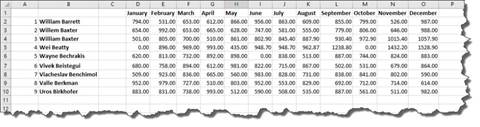
Set Up Your Data
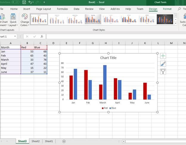
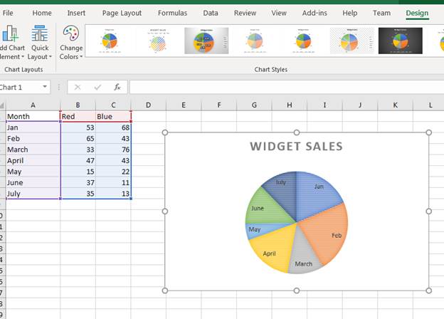
Before you can create a chart, you need some data stored in a spreadsheet. This can be test data or data from a previous spreadsheet. For this article’s examples, we’ll use a chart of products sold. The scenario is an ecommerce store that sells red and blue widgets. The following spreadsheet shows the sample data setup:
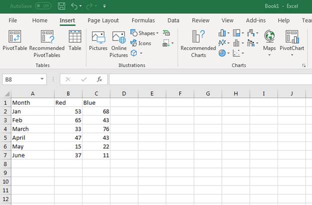
(Sample data for a new chart)
Notice that the «A» column is used for the first six months of the year. Column «B» has the number of sales for Red widgets by month. Column «C» has the number of Blue widgets sold by month. Suppose we want to see a graph to visually represent the number of sales each month. This can be done by inserting an Excel 2019 chart into the spreadsheet that contains the data.
Inserting a Standard Chart
Any chart or diagram that you want to make can be found in the «Insert» tab on Excel.
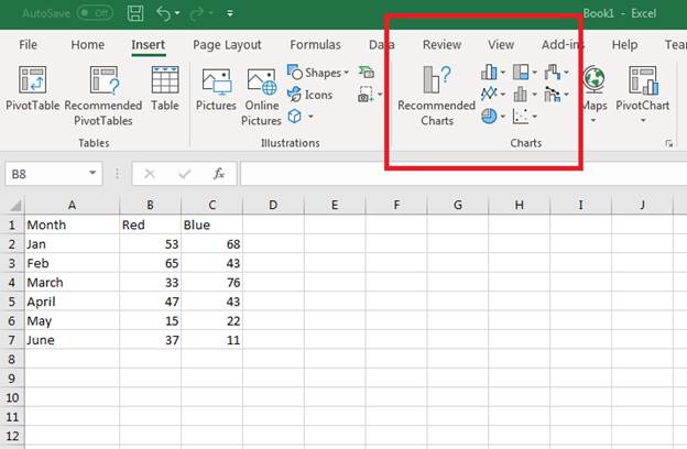
(Location of chart buttons)
Each type of chart is shown using an icon on the button. With Excel, you can make bar, line, pie, scatter, hierarchy and several others. You might be wondering which type of chart is the best for your data, and Excel has a new «Recommended Charts» function that makes a suggestion for you based on the data stored.
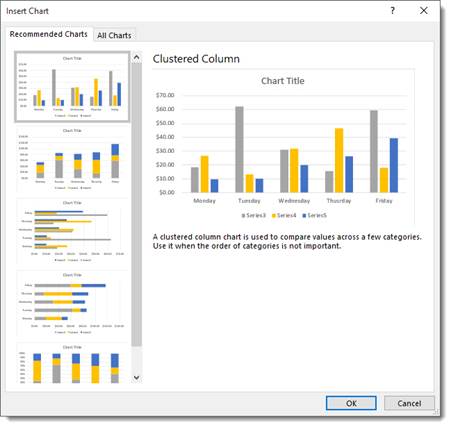
When you select the data for your chart, make sure that you select the row and column header cells. Excel will use these headers for the labels inserted into your chart’s image. Select cells A1 to C7 to select all data. Next, click the «Recommended Charts» button. A new window displays showing a list of recommended charts for the data selected.
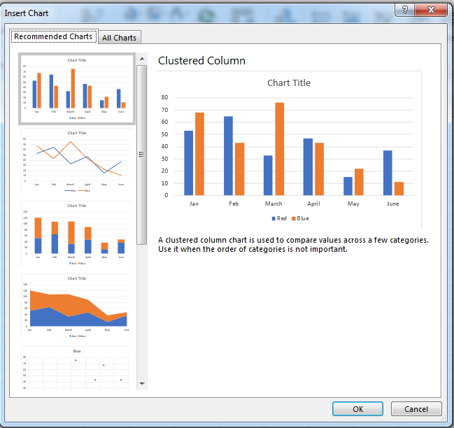
(Recommended chart window)
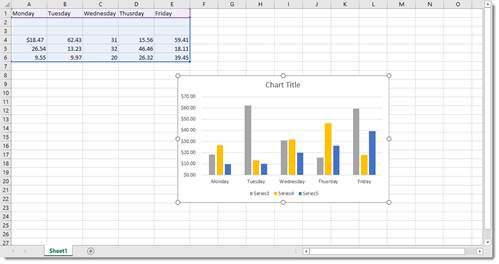
The recommendations Excel displays use column and row headers, and then add data to show you a visual representation of the chart that you’re about to insert into the spreadsheet. In the image above, Excel shows you several charts to choose from. For this example, a clustered column chart (the first option in the image above) is chosen. Excel automatically draws the chart and inserts it into the spreadsheet.
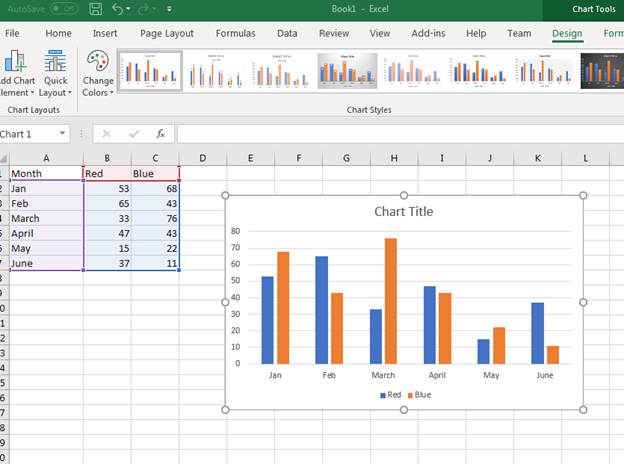
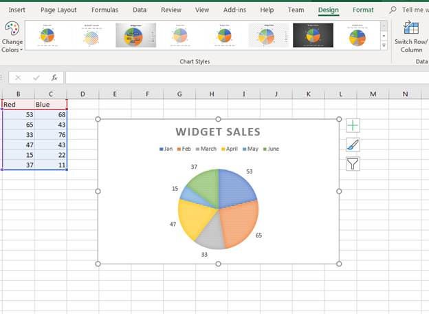
(Inserted clustered column chart)
A clustered chart makes a comparison of sales for each widget based on the months of the year. For instance, in January 53 red widgets were sold and 68 blue widgets were sold. The red widget sales numbers are shown in blue, and the blue widget sales are shown in yellow.
It doesn’t make sense to display red widgets in blue, so we want to change the colors used in the bar graphs. Excel provides formatting option for charts where you can change labels, colors and even change the chart type on the fly.
To change a bar’s color, click it in the chart. A window on the right displays a list of formatting and effects that you can add to the selected component in the chart.
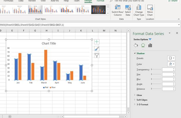
(Bar chart effects and color options)
You’ll see in the format window that you have several options. The paint bucket icons is the «Fill» button that lets you change colors and the type of pattern displayed in the selected bar (in this scenario it’s the blue bars). Click the paint bucket icon, and then click the drop down next to the «Color» label.
With the red widget sales bar shown as red, the orange bar should be a new color. We can change the blue sales bar to blue, and then the bar chart is more intuitive. After you change colors and formatting in a chart, Excel automatically changes any labels associated with a chart component.
(New chart colors updated in a sales chart)
To the left of the chart, you can see the data highlighted letting you know what Excel is using in the chart. Purple is the bar labels and the blue highlighted data is used to populate bar values. The red highlighted cells are the color labels at the bottom of the chart.
Since the spreadsheet chart has no title, Excel doesn’t know what value to give the chart title component. The default chart title is labeled «Chart Title.» You can change the chart title component by double clicking the text box. Type a new chart name for the title. In this example, the chart title was changed to «Widget Sales.»
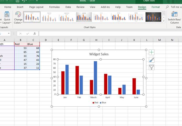
(Title change in a sales chart)
Changing a Chart’s Design
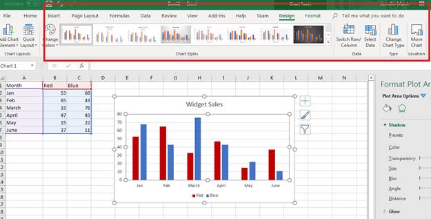
The «Format» tab displayed as an option for each image that you added to a spreadsheet. When you add a chart to a spreadsheet, the «Design» tab displays as an option. You can change several elements of a chart including the type of chart that displays in the «Design» tab. The tab is displayed by default when you first create a chart, but you need to select the tab after you’ve finished adding effects.
You have several options in the «Design» tab.
(Design tab options for a chart)
The «Chart Styles» section is where you can change the type of bar chart. Click any one of these bar chart types to change the way it displays in Excel. The downside of using this option is that Excel reverts color and effect changes back to the default. After you change the bar chart type, you again need to redo color changes and any special effects such as shadows, glow effects and 3D formatting.
You can also change the entire chart type and switch to a new one using the «Change Chart Type» button. This button is in the «Type» section to the right of the «Chart Styles» section. Click this button and a new «Change Chart Type» window displays.
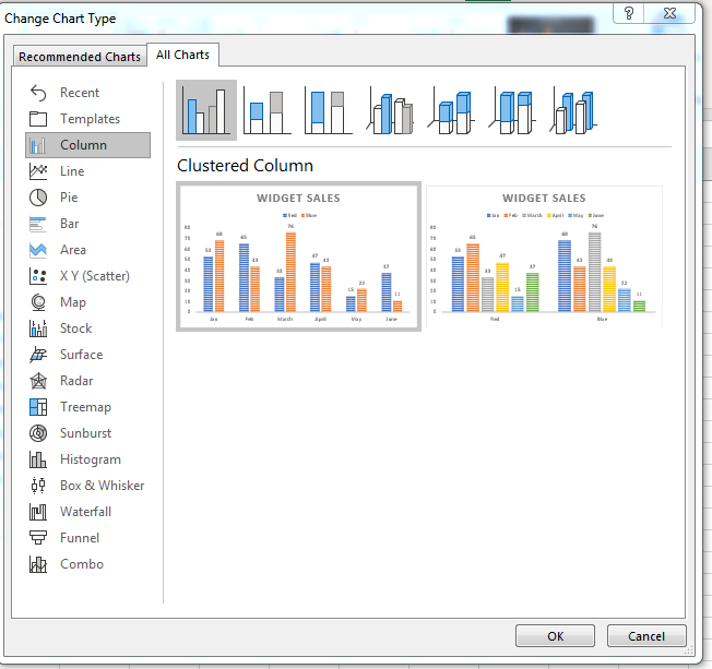
(Change Chart Type options)
Since we only used the recommended chart type function, the complete list of chart type options wasn’t initially displayed during the first chart creation. When you have a full list of chart types, you can see that Excel has several types that you can choose from. Excel orders chart types by the most commonly used, so the first few are what you’ll likely use in your own spreadsheets.
In this example, we’ll switch the chart type to a pie chart. Click the «Pie» option in the left panel. You can then choose a sub-type at the top of the window. In the image above, notice that there are several bar types. You can choose sub-types in any chart selection to make your charts visually appealing.
(A bar chart changed to a pie chart)
With a chart changed to a new type, you can still have access to the «Design» tab to make more revisions. Notice that the pie chart also changes to the default colors created by Excel. You can click any part of the pie chart to change its effects just like you did with the bar chart and the formatting window opens.
If you want to change the sub-type for a chart, you can use the «Quick Layout» button that displays a dropdown of options.
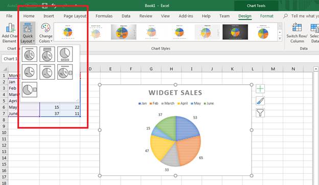
(Quick Layout options to change the chart sub-type)
The dropdown displays the sub-type options that display data in different ways for a pie chart. For instance, you can show the values within the colored areas versus the default layout that shows values outside of the colored sections. You can show a percentage indicated by the icon that shows a percent section in the icon. This feature of Excel 2019 makes it much faster and easier when choosing a new sub-type for your charts.
Click one of the options in the dropdown to change the bar chart to a different layout. Notice that the right of the chart image has several buttons. You can use these to quickly change the way a chart displays visually to users. With Excel, you have several options to pick and choose the way your charts and graphs display. You can match colors to brands or change them based on the data being used. These options along with the ease of how you can create charts is what makes Excel a great option for creating spreadsheets.
Changing Chart Data
As you continue to develop your spreadsheet, you might add more data to your chart. For instance, you might add another month to your chart. It could be August and now you want data shown from the month of July. You can change data in a chart using the «Select Data» option.
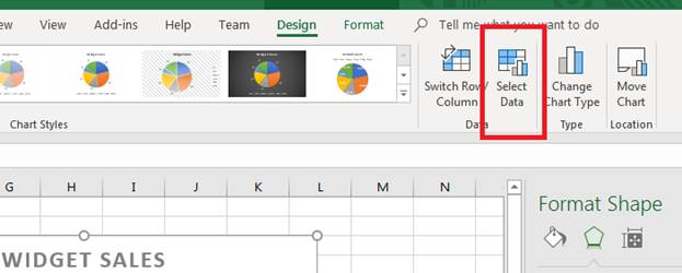
(Select Data button)
By clicking the «Select Data» button, a window opens that asks for new data. We’ve added a new row with data that reflects the number of sales in July. We now want to add this data to the pie chart.
Click the «Select Data» button and a new window opens.
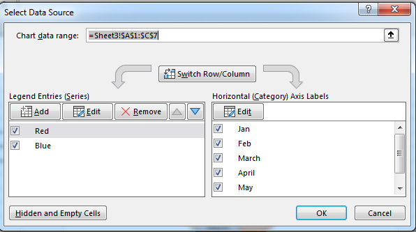
(The «Select Data» window provides options to change data used in a chart)
Notice that you can switch columns and rows. This option is beneficial when you need to change the way a chart uses data when it doesn’t translate well during chart propagation. The arrow button next to the «Chart data range» text box opens a new window that lets you choose a new range of cells for chart values. Use this to select the newly added July row stored in the spreadsheet data.
Press «Enter» when you are done with your selection, and then click «OK» to add the new range to your pie chart. Excel automatically updates the graph and displays the new results.
(Updated chart data)
Use Excel’s chart options to create graphs that represent your data in a visual format. Excel has several chart options, so any diagram or layout that you think best represents your information is available. After you create a chart, you don’t have to stick to the data chosen. You can choose new data and update it continuously as you add more information to your spreadsheet.
Remember that any changes that you don’t like can be immediately changed using the «Undo» button in the quickbar at the top of your Excel window.
Chart Recommendations
In prior versions of Excel, you had the Chart Wizard to help you create charts. That was a great tool and a great help, but Excel offers you something even better: Recommended Charts tool. This is under the Insert tab on the Ribbon in the Charts group (as pictured above).
To create a chart this way, first select the data that you want to put into a chart. Include labels and data.
When you click on the Recommended Charts button, a dialogue box opens like the one pictured below.
Based on your data, Excel recommends a chart for you to use.
On the left side of this dialogue box is all the chart recommendations.
On the right is a preview of what the chart will look like with your data.
Choose the chart that you want to use, then click OK.
The chart is embedded in your worksheet for you:
You’ll also notice that the Chart Tools Format tab opens in the Ribbon:
The tools shown above will help you customize your charts
Types of Charts
To the right of the Recommended Charts button on the ribbon, you’ll see this:
You can use these buttons and their dropdown menus to create these types and styles of charts. We’re going to go from left to right, starting at the top left, and cover all the buttons above.
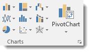
Insert Column or Bar Chart. This is the first button, located in the top left corner. With this, you can preview data as a 2-D or 3-D vertical column chart or as a 2-D or 3-D horizontal bar chart.
Insert Hierarchy Chart. Use this chart to compare a part to a whole or to show the hierarchy of several columns or categories.
Insert Waterfall or Stock Chart. The waterfall chart is used to show how a starting value is affected by a series of positive and negative values, while the stock chart is used to show the trend of a stock’s value over time.
Insert Line or Area Chart. This lets you preview data as a 2-D or 3-D line or area chart.
Insert Statistic Chart. Use these charts to show a statistical analysis of your data. Chart types include Histogram, Pareto, and Box and Whisker charts.
Insert Combo Chart. These charts are best when you have mixed data or want to emphasize different types of information. You can preview your data as a 2-D combo clustered column and line chart – or clustered column and stacked area chart.
Insert Pie or Doughnut Chart. You can preview data as a 2-D or 3-D pie or 2-D doughnut chart.
Insert Scatter (X,Y) or Bubble Chart. Preview data as a 2-D scatter or bubble chart.
Insert Surface, or Radar Chart. With this, you can preview data as a 2-D stock chart that uses typical stock symbols, a 2-D or 3-D surface chart, or even a 3-D radar chart.
More Chart Types
Excel brings with it some new chart types to help you better illustrate data that you include in your worksheets.
These chart types include:
- Treemap. A treemap chart displays hierarchically structured data. The data appears as rectangles that contain other rectangles. A set of rectangles on the save level in the hierarchy equal a column or an expression. Individual rectangles on the same level equal a category in a column. For example, a rectangle that represents a state may contain other rectangles that represent cities in that state.
- Waterfall. As explained by Microsoft, «Waterfall charts are ideal for showing how you have arrived at a net value, by breaking down the cumulative effect of positive and negative contributions. This is very helpful for many different scenarios, from visualizing financial statements to navigating data about population, births and deaths».
- Pareto. A Pareto chart contains both bars and a line graph. Individual values are represented by bars. The cumulative total is represented by the line.
- Histogram. A histogram chart displays numerical data in bins. The bins are represented by bars. It’s used for continuous data.
- Box and Whisker. A Box and Whisker chart, as explained by Microsoft, is «A box and whisker chart shows distribution of data into quartiles, highlighting the mean and outliers. The boxes may have lines extending vertically called ‘whiskers’. These lines indicate variability outside the upper and lower quartiles, and any point outside those lines or whiskers is considered an outlier.»
- Sunburst. A sunburst chart is a pie chart that shows relational datasets. The inner rings of the chart relate to the outer rings. It’s a hierarchal chart with the inner rings at the top of the hierarchy.
Creating Charts Using the Ribbon
By using the chart options we discussed in the last section, we can quickly and easily create a chart, then embed it into our worksheet.
Let’s insert a bar chart into our worksheet below.
Start out by selecting the data you want to use in the chart.
Now click the Insert Column or Bar Chart button on the Ribbon.
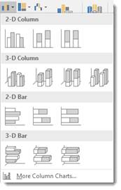
Choose the bar chart you want to use, or click More Column Charts.
If you click More Column Charts, this is what you’ll see:
On the right side of the window, you will see a list of different chart types. Click Bar.
At the top, you’ll see bar charts illustrated in gray. These are different styles of bar charts. You can click on any of the styles and see a preview of your data in that style of chart (in color) in the box below.
Select the type of chart you want, then click OK.
Excel embeds the chart in your worksheet for you:
Creating a Chart from Scratch
So far in this article, we’ve taught you how to create charts by selecting your data first. However, you don’t have to do it that way (although it’s the easiest). In other words, you can start to create your chart without selecting data first.
Let’s learn how.
Click the Insert Column or Bar Chart button on the Ribbon again. However, this time, don’t select any data before you do it.
Select the type of bar chart that you want to use.
You’ll see a blank area on your worksheet where your chart will be embedded, and you’ll also notice the Chart Design and the Chart Format tabs open on the Ribbon.
Click the Select Data button under the Design tab.
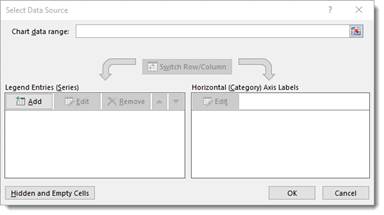
The Select Data Source dialog window will open.
The data range refers to the number of cells you’d like to use. For instance, «=Sheet1!$A$1:$G$8» refers to cells A1 through G8 on worksheet one.
It’s actually much easier to select the data range by dragging your mouse over it. To do that, click the Data Range button  next to the text box.
You’ll see another box that looks like this:
This window is simply asking you to define the data range, and you can do it easily by clicking on a cell, holding the mouse button, and dragging it over all of the cells you’d like to add. MS Excel automatically enters the selected cell coordinates into the data range window. When you are finished, you can either click the button on the right  or push Enter.
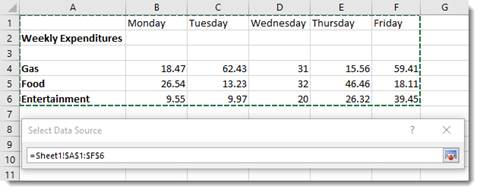
When you hit Enter, the chart appears in your worksheet:
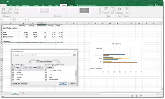
Now you can use the Select Data Source dialogue box to add legend entries – or edit and remove them.
You can also edit your axis labels.
Note that your axis labels were your row labels. These appear as colors representing each day of the week.
Your legend entries were your column labels. These appear on the left, vertically.
Your data appears as the bars.
If you want, you can switch rows and columns so that the days of the week appear on the left and your axis labels become legend entries.
Uncheck any entries that you don’t want to appear in the chart.
Click OK when you’re finished.
Creating Charts Using the Quick Analysis Tool
To use the Quick Analysis tool for creating charts, select that data that you want to include in chart. Click on the Quick Analysis tool button at the bottom right of the selected data (circled in red below):
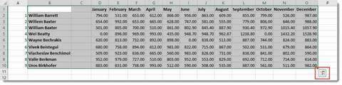
Click Charts (circled in red):
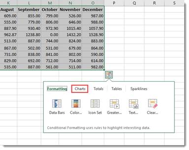
Select the type of chart you want.
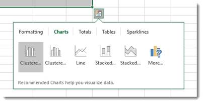
We’re going to choose a clustered chart.
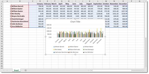
The chart is embedded in your spreadsheet:
Modifying and Moving a Chart
There are a number of ways to modify a chart after it’s made.
You can right click on the plot area as we’ve done below.
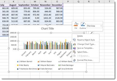
From the menu, you can delete the chart, reset, change the chart type, save the chart as a template, or select data to include in the chart. You can also format the chart area.
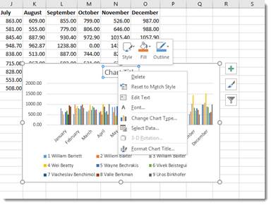
You can also click on the chart’s title to change or format it.
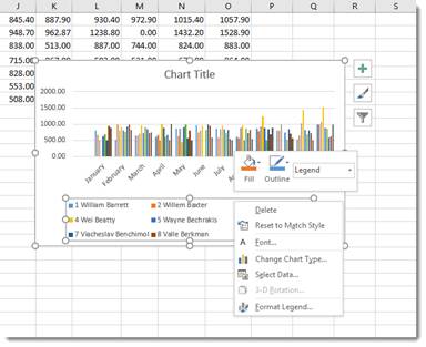
You can also right click on the legend or any other aspect of the chart to move it around and make changes. We’re going to talk about modifying chart elements in another section.
If you want to move a chart, simply click and drag any of its bounding box borders:
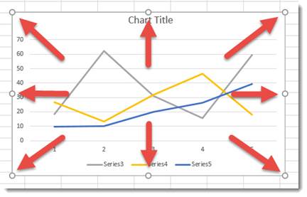
You can use the handles on the bounding box (the little circles indicated by the arrows above) to resize your chart. Drag it in to make it smaller, out to make it larger.
Chart Sheets
If you want a chart to appear on its own sheet in the workbook, simply click somewhere in the plot of the chart or select the data in your spreadsheet. Hit F11 on your keyboard.
The chart is moved to its own sheet as a clustered column chart.
Note that the sheet is named Chart1 by default. You can change that name the same way that you change any other worksheet name.
The Design Tab and Customizing Charts
The tools on the Design tab help you to customize your charts so that you achieve the look, feel, and purpose that you want.
The Design tab is pictured below. You can mouse over any tools to learn their names.

We’re going to cover all the aspects of the Design tab, starting with groups and breaking them down into tools.
Chart Layouts is the first group on the left. It contains the Add Chart Element tool and the Quick Layout tool. The Add Chart Element tool allows you to modify some elements, such as titles, data labels, legend, etc. The Quick Layout tool allows you to select a new layout for your chart.
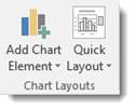
Chart Styles gives you different styles of charts to choose from. You can also change the colors used in your charts using the Change Colors tool.
The Data group allows you to reverse rows and columns in your chart. We also talked about doing this earlier. It also gives you the Select Data tool, which we used in a prior section.
The Type group contains Change Chart Type. You can change the type of chart by using this tool.
The Location group has the Move Chart tool that allows you to move the chart to a different place within your worksheet – or to another worksheet.
Customizing Chart Elements with the Chart Elements Button
The Chart Elements button appears as a plus sign whenever your chart is selected.
In the snapshot below, you can see it to the right of our chart.
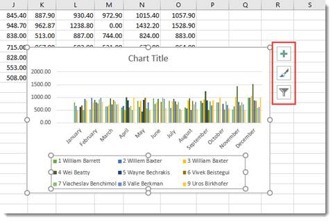
When you click it, you’ll see a list of chart elements that you can add to your chart.
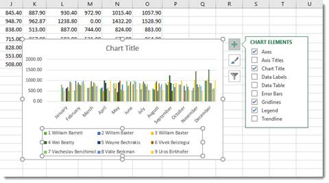
The elements that are in your chart have checkmarks beside them. You can uncheck them to remove the elements. To add an element, simply put a checkmark in the box beside it.
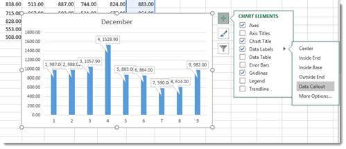
If you want to remove or add just a part of an element, or specify its layout as with Data Labels, you’ll use the Chart Elements continuation menu.
Here’s how to do this.
Start by putting a checkmark beside Data Labels (as an example).
You’ll see an arrow appear to the right of the word Data Labels (indicated in red below.)
Click the arrow and you’ll see the continuation menu.
Select a layout option.
We’re going to choose Data Callout.
Formatting a Chart
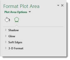
To format a chart, you can double click in the plot area or the chart area. If you double click in the chart area, it opens the Format Chart Area pane on the right side of your window. If you double click in the plot area, it opens the Format Plot area on the right side of your screen, as shown below.
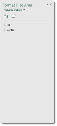
At the top of the pane, are the options.

Fill & Line looks like a bucket pouring green paint and allows you to format the fill and lines of your chart.
The Effects button is the one on the right, which allows you to add special effects to your chart to customize the look.
Take time to play around with the different formatting options for your charts. It’s a lot of fun to do, and you will discover interesting combinations of effects that will produce charts you’ll love.
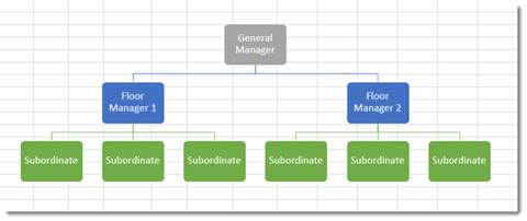
Organizational Charts or Diagrams with SmartArt
While an ordinary chart simply represents data, diagrams and organizational charts explain the causal relationship between elements. The following organizational chart, for instance, explains the relationship between managers and subordinates.
The simplest way to create an organizational chart is to click the Insert tab, then SmartArt. The SmartArt icon has been scaled down in Excel 2019, so we’ve circled it in red below.
The SmartArt dialogue box appears:
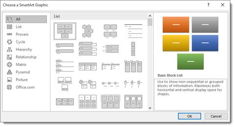
Choose the type of organizational chart or diagram you want on the left. You can choose a style from the middle section called List.
Once you choose your chart or diagram, click OK.
It appears in your spreadsheet:
Click on the areas marked text to add your own.
In the Ribbon, the SmartArt Design and Format tabs appear.
You can use these tools to change the layout, apply a style, change the colors, and other formatting elements.
View Animation in Charts
One of the debated new features in Excel 2019 is the animation added to charts.
Here’s how the animation works.
After you create a chart, then change the data for the chart in the spreadsheet, you can watch your chart and see it change too – in full animation.
In other words, if you have a bar chart, and you change the data so that a bar will be shorter, you can watch the bar slowly become shorter right after you change the data.
Sparklines
A sparkline is simply a small chart that’s aligned with a row of your data. It typically shows trend information.
Let’s learn how to add one in the spreadsheet below:
To insert a sparkline, go to the Ribbon, click the Insert tab, then the Sparklines group.
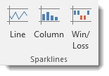
Choose the type of sparkline you want to add.
We’re going to choose Line.
You’ll see this dialogue box.
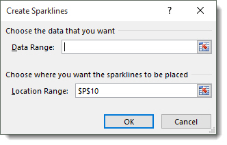
Select the cells in your spreadsheet that you want to use for your sparkline. Just drag your mouse to select the cells.
Next, enter the absolute reference for the cell where you want the sparkline to appear.
Click OK.
The sparkline now appears in the location you specified.
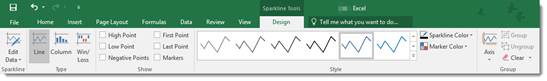
You can also format your sparkline using the Sparkline Tools Design tab that opens in the Ribbon.
Data Visualization is the representation of data in a graphical format. It makes the data easier to understand. Data Visualization can be done using tools like Tableau, Google charts, DataWrapper, and many more. Excel is a spreadsheet that is used for data organization and data visualization as well. In this article, let’s understand Data Visualization in Excel.
Excel provides various types of charts like Column charts, Bar charts, Pie charts, Linecharts, Area charts, Scatter charts, Surface charts, and much more.
Steps for visualizing data in Excel:
- Open the Excel Spreadsheet and enter the data or select the data you want to visualize.
- Click on the Insert tab and select the chart from the list of charts available or the shortcut key for creating chart is by simply selecting a cell in the Excel data and press the F11 function key.

- A chart with the data entered in the excel sheet is obtained.
- You can design and style your chart with different types of styles and colors by selecting the design tab.
- In Excel 2010, the design tab option is visible by clicking on the chart.

Example 1:
The Excel data is as follows:

The column chart obtained for the data by following the above steps:

Example 2:
When excel data contains multiple columns and if you want to make a chart for only a few columns, then select the columns required for making the chart and press the ‘F11’ function key or click on the Insert tab and select the chart from the list of charts available.


We can also select the required data columns by doing right-click on the chart and click on the ‘select data‘ option. Now, data can be added or removed for making the chart.

For swapping rows and columns in the chart, use the ‘Switch Row/Column‘ option available in the design tab.
We can also make different types of charts for the same spreadsheet data by clicking on the ‘Change Chart Type’ option in the Design tab.
To make your chart more clear, use the ‘Layout’ tab. In this tab, you can more changes to your chart like editing the chart title, adding labels to your chart, adding a legend, and adding horizontal or vertical grid lines.

Example 3: Formatting Chart Area
To format the chart area, right-click on the chart and select the option ‘Format chart Area‘.

The format chart area provides various options for formatting the chart like Filling the chart with patterns and solid colors, Border colors, Styles for borders, the shadow effect for your chart, and many more. Formatting makes the chart look more attractive and colorful.
Example 4: Creating Sparklines
Sparklines in Excel are small charts that fit in the data cells of the excel sheets.

Steps for Creating Spark Lines:
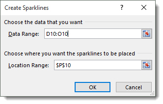
- Select the Excel data range for sparklines as shown in the below figure.
- Click on Sparklines in the Insert tab and select any one of the three sparklines.

- Add the Location Range and Data Range for the creation of sparklines and click ok.
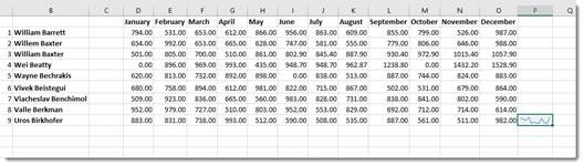
Finally, the F, G, H columns are displayed with the line, column, and Win/loss sparklines.

We can also color these sparklines by the Design tab as shown below:

We can Mark data points and also change Sparkline Color.
