
Business intelligence (BI) is essentially the collection of tools and processes that are used to gather data and turn it into meaningful information that people can use to make better decisions. Excel 2013 offers lots of new BI features and functionality, making it easier than ever to gather data and use the data to create powerful reports, scorecards, and dashboards. Excel Services in SharePoint Server 2013 (on premises) enables you to share, view, explore, and refresh workbooks in a browser window, similar to how it works in Excel.
Read this article to learn about BI features in Excel and which ones are supported in Excel Services and Excel Web App.
In this article
-
What BI capabilities are available in Excel?
-
What Excel BI features are supported in SharePoint Server 2013?
-
What Excel BI features are supported in Excel Services (SharePoint Server) together with Excel Web App (Office Web Apps Server)?
-
Learn more about Microsoft BI tools
What BI capabilities are available in Excel?
In Excel 2013, you can perform a wide range of tasks—from getting data to creating reports—as part of your organization’s BI solution. The following table summarizes the powerful BI capabilities that are available in Excel.
|
Task |
Description |
|---|---|
|
Get data into Excel |
You can Import data from external data sources, such as SQL Server tables, SQL Server Analysis Services cubes, Microsoft Azure data, OData data, and more. You can use Power Query to find, combine, and refine data across a wide variety of sources, including internal and external data sources. You can import data into Excel, or you can use a data connection to create charts, tables, and reports using external data. |
|
Sort, organize, and work with data in Excel |
You can use Flash Fill to format columns of data to display a particular way. You can also create a Data Model to combine one or more tables of data into a single data source that you can use to create reports, including views that you create by using Power View. You can use Quick Analysis to select data and see recommended ways to visualize that data. |
|
Visualize data in Excel |
You can create a wide variety of reports that include tables, line charts, bar charts, radar charts, and so on. You can use Power Map to create three-dimensional data visualizations on a globe. You can use Power View to create mashups that include interactive charts and tables. And, you can create reports that use conditional formatting and key performance indicators (KPIs) to show at a glance whether performance is on or off target for one or more metrics. |
|
Apply filters to charts and tables in Excel |
You can add slicers, timeline controls, and filters to worksheets to make it easier to focus on more specific information. |
|
Explore and analyze data in Excel |
You can use Quick Explore to explore information in a PivotChart report or a PivotTable report, and view additional information about that value in a new chart or table on the screen. You can also use lots of other BI features to analyze data in Excel. |
|
Use more advanced analytic capabilities |
If you are an advanced user, you can create Calculated Measures and Calculated Members for PivotChart reports or PivotTable reports that use Analysis Services data. And, you can create Calculated Fields in Power Pivot. |
For more information about new features in Excel, see What’s new in Excel 2013.
What Excel BI features are supported in SharePoint Server 2013?
Many of the BI capabilities that are available in Excel are supported in Excel Services in SharePoint Server 2013 (on premises). This means that you can view and interact with workbooks in a browser window much like you would by using the Excel client. In general, the following features are supported:
-
Refreshing external data In most cases, workbooks that are published to SharePoint libraries retain live data connections so that people can typically refresh the data. For more information, see Work with external data in Excel Services (SharePoint Server).
-
Viewing workbooks that contain a Data Model (This requires Excel Services to be configured to support Data Model functionality.) See Data models in Excel Services.
-
Viewing, sorting, and exploring data in reports in a browser window You can interact with a workbook in a browser window similar to how you would do that in Excel See Video: Explore a workbook in the browser.
-
Displaying a single item in a workbook in its own SharePoint Web Part A single item can include a PivotChart report, a PivotTable report, a worksheet, or a range of data in Excel. See Display Excel content in an Excel Web Access Web Part.
-
Choosing between worksheet view and gallery view You can choose how you want workbooks to be displayed in a browser window. See Use Browser View Options to specify how you want a workbook to display in a browser window.
When you’re using a workbook in a browser window, you can’t create certain kinds of items, such as timeline controls, PivotChart reports, PivotTable reports, calculated members, and calculated measures. You can, however, create those items in Excel, upload the workbook to a library in SharePoint Server 2013, and then view that workbook in the browser.
What Excel BI features are supported in Excel Services (SharePoint Server) together with Excel Web App (Office Web Apps Server)?
If your organization is using SharePoint Server 2013 together with Office Web Apps Server (on premises), then the BI capabilities that are supported depend on how things are configured. Either Excel Services (SharePoint Server 2013) or Excel Web App (Office Web Apps Server) is used to render workbooks in a browser window.
Excel Services and Excel Web App are not exactly the same, so this decision affects which BI capabilities are available to you when you are using a workbook in a browser window. The following table summarizes some of the key differences:
|
Feature |
What’s supported when Excel Web App is used to render workbooks |
What’s supported when Excel Services is used to render workbooks |
|---|---|---|
|
Refreshing data in a workbook in a browser window |
Most kinds of secure external data connections are not supported. For more information, see Working with external data in Excel Services. |
Most kinds of external data connections are supported, as is the ability to refresh data in a browser window. For more information, see Working with external data in Excel Services. |
|
Data modeling in Excel |
You can view workbooks that contain a Data Model, but in general, you cannot explore data in certain items, such as PivotChart reports, PivotTable reports, and timeline controls that use a Data Model as their data source. Data refresh is not supported in a browser window, but you can open the workbook in Excel to refresh its data. |
You can view and interact with items in workbooks that contain a Data Model. |
|
Flash Fill |
The ability to use Flash Fill when viewing or editing a workbook in a browser window is not supported. You must open the workbook in Excel to use this feature. |
The ability to use Flash Fill when viewing a workbook in a browser window is not supported. You must open the workbook in Excel to use this feature. |
|
Quick Analysis |
The ability to use Quick Analysis when viewing or editing a workbook in a browser window is not supported. You must open the workbook in Excel to use this feature. |
The ability to use Quick Analysis when viewing a workbook in a browser window is not supported. You must open the workbook in Excel to use this feature. |
|
Charts and tables, PivotTables, PivotCharts, reports, and scorecards |
The ability to view, sort, filter, and interact with reports and scorecards that were created by using Excel is supported in a browser window. |
The ability to view, sort, filter, and interact with reports and scorecards is supported in a browser window. |
|
Power Map |
Currently, views that were created by using Power Map are not supported. You must open the workbook in Excel to use this feature. |
Currently, views that were created by using Power Map are not supported in a browser window. You must open the workbook in Excel to use this feature. |
|
Power View |
Views that were created by using Power View are not supported in Excel Web App. |
Views that were created by using Power View are supported in Excel Services. |
|
Slicers and timeline controls |
The ability to use existing slicers and timeline controls is supported. |
The ability to use existing slicers and timeline controls is supported. |
|
Quick Explore |
The ability to use Quick Explore is supported in a browser window. |
The ability to use Quick Explore is supported in a browser window. |
|
Calculated measures and calculated members |
Workbooks that contain calculated measures and calculated members are supported. |
Workbooks that contain calculated measures and calculated members are supported. |
|
Calculated Fields in Power Pivot |
Calculated fields are not supported in Excel Web App. |
The ability to use existing calculated fields is supported in Excel Services. |
Learn more about Microsoft BI tools
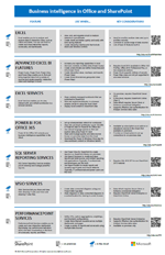
This article covers BI in Excel and Excel Services, but there are other Microsoft BI tools available. Get the poster
|
|
BI in Office and SharePoint to learn more about BI tools in Office and SharePoint. The poster summarizes all the BI tools that are available—on premises and in the cloud—with links to additional information about each tool. |
Business intelligence (BI) is essentially the collection of tools and processes that are used to gather data and turn it into meaningful information that people can use to make better decisions. Excel 2013 offers lots of new BI features and functionality, making it easier than ever to gather data and use the data to create powerful reports, scorecards, and dashboards. Excel Services in SharePoint Server 2013 (on premises) enables you to share, view, explore, and refresh workbooks in a browser window, similar to how it works in Excel.
Read this article to learn about BI features in Excel and which ones are supported in Excel Services and Excel Web App.
In this article
-
What BI capabilities are available in Excel?
-
What Excel BI features are supported in SharePoint Server 2013?
-
What Excel BI features are supported in Excel Services (SharePoint Server) together with Excel Web App (Office Web Apps Server)?
-
Learn more about Microsoft BI tools
What BI capabilities are available in Excel?
In Excel 2013, you can perform a wide range of tasks—from getting data to creating reports—as part of your organization’s BI solution. The following table summarizes the powerful BI capabilities that are available in Excel.
|
Task |
Description |
|---|---|
|
Get data into Excel |
You can Import data from external data sources, such as SQL Server tables, SQL Server Analysis Services cubes, Microsoft Azure data, OData data, and more. You can use Power Query to find, combine, and refine data across a wide variety of sources, including internal and external data sources. You can import data into Excel, or you can use a data connection to create charts, tables, and reports using external data. |
|
Sort, organize, and work with data in Excel |
You can use Flash Fill to format columns of data to display a particular way. You can also create a Data Model to combine one or more tables of data into a single data source that you can use to create reports, including views that you create by using Power View. You can use Quick Analysis to select data and see recommended ways to visualize that data. |
|
Visualize data in Excel |
You can create a wide variety of reports that include tables, line charts, bar charts, radar charts, and so on. You can use Power Map to create three-dimensional data visualizations on a globe. You can use Power View to create mashups that include interactive charts and tables. And, you can create reports that use conditional formatting and key performance indicators (KPIs) to show at a glance whether performance is on or off target for one or more metrics. |
|
Apply filters to charts and tables in Excel |
You can add slicers, timeline controls, and filters to worksheets to make it easier to focus on more specific information. |
|
Explore and analyze data in Excel |
You can use Quick Explore to explore information in a PivotChart report or a PivotTable report, and view additional information about that value in a new chart or table on the screen. You can also use lots of other BI features to analyze data in Excel. |
|
Use more advanced analytic capabilities |
If you are an advanced user, you can create Calculated Measures and Calculated Members for PivotChart reports or PivotTable reports that use Analysis Services data. And, you can create Calculated Fields in Power Pivot. |
For more information about new features in Excel, see What’s new in Excel 2013.
What Excel BI features are supported in SharePoint Server 2013?
Many of the BI capabilities that are available in Excel are supported in Excel Services in SharePoint Server 2013 (on premises). This means that you can view and interact with workbooks in a browser window much like you would by using the Excel client. In general, the following features are supported:
-
Refreshing external data In most cases, workbooks that are published to SharePoint libraries retain live data connections so that people can typically refresh the data. For more information, see Work with external data in Excel Services (SharePoint Server).
-
Viewing workbooks that contain a Data Model (This requires Excel Services to be configured to support Data Model functionality.) See Data models in Excel Services.
-
Viewing, sorting, and exploring data in reports in a browser window You can interact with a workbook in a browser window similar to how you would do that in Excel See Video: Explore a workbook in the browser.
-
Displaying a single item in a workbook in its own SharePoint Web Part A single item can include a PivotChart report, a PivotTable report, a worksheet, or a range of data in Excel. See Display Excel content in an Excel Web Access Web Part.
-
Choosing between worksheet view and gallery view You can choose how you want workbooks to be displayed in a browser window. See Use Browser View Options to specify how you want a workbook to display in a browser window.
When you’re using a workbook in a browser window, you can’t create certain kinds of items, such as timeline controls, PivotChart reports, PivotTable reports, calculated members, and calculated measures. You can, however, create those items in Excel, upload the workbook to a library in SharePoint Server 2013, and then view that workbook in the browser.
What Excel BI features are supported in Excel Services (SharePoint Server) together with Excel Web App (Office Web Apps Server)?
If your organization is using SharePoint Server 2013 together with Office Web Apps Server (on premises), then the BI capabilities that are supported depend on how things are configured. Either Excel Services (SharePoint Server 2013) or Excel Web App (Office Web Apps Server) is used to render workbooks in a browser window.
Excel Services and Excel Web App are not exactly the same, so this decision affects which BI capabilities are available to you when you are using a workbook in a browser window. The following table summarizes some of the key differences:
|
Feature |
What’s supported when Excel Web App is used to render workbooks |
What’s supported when Excel Services is used to render workbooks |
|---|---|---|
|
Refreshing data in a workbook in a browser window |
Most kinds of secure external data connections are not supported. For more information, see Working with external data in Excel Services. |
Most kinds of external data connections are supported, as is the ability to refresh data in a browser window. For more information, see Working with external data in Excel Services. |
|
Data modeling in Excel |
You can view workbooks that contain a Data Model, but in general, you cannot explore data in certain items, such as PivotChart reports, PivotTable reports, and timeline controls that use a Data Model as their data source. Data refresh is not supported in a browser window, but you can open the workbook in Excel to refresh its data. |
You can view and interact with items in workbooks that contain a Data Model. |
|
Flash Fill |
The ability to use Flash Fill when viewing or editing a workbook in a browser window is not supported. You must open the workbook in Excel to use this feature. |
The ability to use Flash Fill when viewing a workbook in a browser window is not supported. You must open the workbook in Excel to use this feature. |
|
Quick Analysis |
The ability to use Quick Analysis when viewing or editing a workbook in a browser window is not supported. You must open the workbook in Excel to use this feature. |
The ability to use Quick Analysis when viewing a workbook in a browser window is not supported. You must open the workbook in Excel to use this feature. |
|
Charts and tables, PivotTables, PivotCharts, reports, and scorecards |
The ability to view, sort, filter, and interact with reports and scorecards that were created by using Excel is supported in a browser window. |
The ability to view, sort, filter, and interact with reports and scorecards is supported in a browser window. |
|
Power Map |
Currently, views that were created by using Power Map are not supported. You must open the workbook in Excel to use this feature. |
Currently, views that were created by using Power Map are not supported in a browser window. You must open the workbook in Excel to use this feature. |
|
Power View |
Views that were created by using Power View are not supported in Excel Web App. |
Views that were created by using Power View are supported in Excel Services. |
|
Slicers and timeline controls |
The ability to use existing slicers and timeline controls is supported. |
The ability to use existing slicers and timeline controls is supported. |
|
Quick Explore |
The ability to use Quick Explore is supported in a browser window. |
The ability to use Quick Explore is supported in a browser window. |
|
Calculated measures and calculated members |
Workbooks that contain calculated measures and calculated members are supported. |
Workbooks that contain calculated measures and calculated members are supported. |
|
Calculated Fields in Power Pivot |
Calculated fields are not supported in Excel Web App. |
The ability to use existing calculated fields is supported in Excel Services. |
Learn more about Microsoft BI tools
This article covers BI in Excel and Excel Services, but there are other Microsoft BI tools available. Get the poster
|
|
BI in Office and SharePoint to learn more about BI tools in Office and SharePoint. The poster summarizes all the BI tools that are available—on premises and in the cloud—with links to additional information about each tool. |
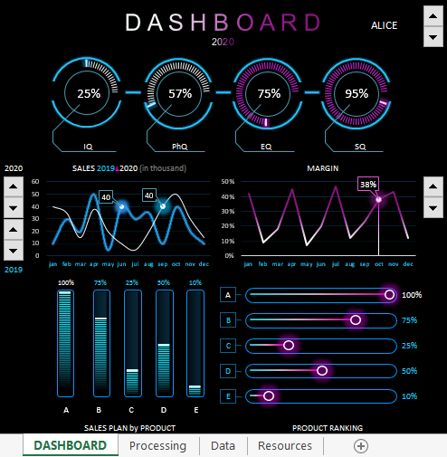
Dashboard with data visualization for analyzing the correlation of IQ levels with the sales performance of managers. You can download a ready-made dashboard template for the presentation of a report on the analysis of the intelligence of sales personnel and sales performance in Excel at the end of the article. But first, let’s consider the interactive functionality and principles of building visualization using the example of the model of the relationship between smart coefficients and sales in practice.
Modern analysis of sales force efficiency in Excel
This dashboard in Excel allows you to perform visual analysis to assess the effectiveness of sales personnel management.
The model of the situation for the practical application of the dashboard is as follows. The sales department employs 10 managers. Each manager has his own sales performance indicators as each of them has its own advantages and disadvantages. Some of the managers are generally out of place or are selling the wrong types of products under ineffective pressure from management. Other salespeople need just a little nudge in the right direction to maximize new results.
From the situation described above, the question arises, how can all this be determined? Psychology comes to the rescue. Most large companies employ at least one psychologist among their employees. And this is a wise decision! It has long been proven that a person spends most of his energy on the psyche. Also, certain patterns of correlation between the relationship between business intelligence and successful human performance were noticed.
At first, the emphasis was placed on the IQ indicator. Many executives began hiring coaches to improve their IQ levels. Regular IQ tests were conducted to analyze the mental growth of employees and the effectiveness of coaching. But in practice, many HR managers have often argued about the IQ approach to sales growth. And not in vain! After all, Dr. Goleman later proved that a person’s success depends 4 times more on the level of the emotional intelligence quotient EQ than on IQ.
High emotional intelligence is determined by the ability to manage, create, and control emotions. After all, business is not only numbers and cold calculations, but also emotions that cannot be calculated with formulas. If business success was guaranteed by accurate calculations, then mathematicians would be the best businessmen. In fact, any business is based on the sale of goods or services. After all, any sale is primarily an emotional decision of the consumer’s choice.
Emotions are the main source of energy. All living things in this world are constantly fighting for energy, so there is no other world except the emotional one! Create, control and manage emotions = manage energy. The higher your EQ, the better your ability to work with your energy and your counterparties (customers, employees, business partners). Consequently, people with high EQ scores have a higher chance of success in sales and therefore in business.
Coefficients for determining the level of business intelligence of a manager
Modern methods for the effective management of sales personnel necessarily include several intellectual tests at once to analyze the indicators of the intellectual level of employees in various important areas. The most popular smart Q tests are coefficient determination:
- IQ — mental intelligence (mind, logic, analytical forecast).
- PhQ — physical Intelligence (fitness, health, comfort and discipline).
- EQ — emotional intelligence (self-management, understanding oneself, understanding others, the ability to build relationships, the skills to create a suitable atmosphere).
- SQ — spiritual intelligence (values, principles, beliefs, morality).
To track the dynamics of the correlation between improved sales results and the intellectual growth of managers, it is very effective to use tools for visual analysis. As an example, a dashboard will be presented with data visualization for all business intelligence ratios and performance indicators in sales. For convenient and efficient work, the dashboard is equipped with some interactive features. But first things first.
Preparing baseline data for comparing IQ and sales levels
To build a visualization of comparative multilevel analyzes, it is necessary to pre-prepare and well structure all different initial data into one integral system. In order not to create a complex large table with a large number of flags for the interconnection of different initial information, all incoming data was split into several small tables. This not only improves readability, but also makes it easy to master the capabilities of the dashboard template. All of these tables are on one sheet «Data», but with large amounts of data, they can be divided into separate sheets for ease of use. In this example, the initial data looks like this:
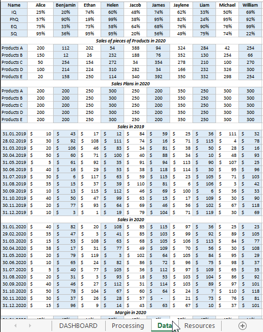
All initial information is divided into 6 tables:
- Managers
- Sales of pieces of Products in 2020
- Sales Plans in 2020
- Sales in 2019
- Sales in 2020
- Margin in 2020
All tables, before displaying data for dashboard visualization, form a general relationship, and all this happens on the «Processing» sheet:
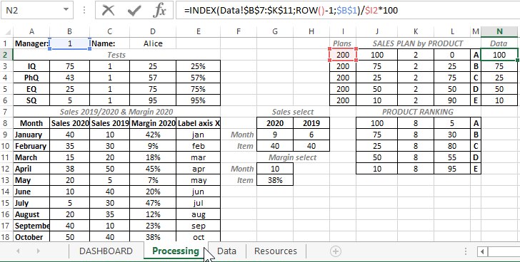
With the help of complex formulas, the selection of the initial values from the “Data” sheet is made for further calculations and calculations. On the “Processing” sheet, preparation is being made to visualize the comparison of the indicators of managers’ IQs with their indicators of the dynamics of productivity growth.
Download dashboard of business intelligence and sales performance in Excel
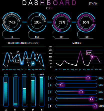
The structure of the interactive dashboard for comparative visual analysis consists of 5 blocks.
The first block looks like a panel of diagrams with a visual display of 4 indicators of intellectual coefficients of managers:

The same block contains the first and main control for switching between managers (counter in the upper right corner). In fact, this is an element of control of the whole dashboard, since when using it, all information about the intellectual abilities and dynamics of sales is completely updated for each manager separately.
As a dashboard user, a business manager or sales manager has the ability to visually analyze the strengths and weaknesses of each sales manager. And after the analysis, make important decisions:
- Which training or coaching course to send an employee to to improve his efficiency.
- What group of products the manager should sell.
- How to set sales plans for specific product groups.
- How to motivate.
- When to punish.
- Where to set goals for promotion.
- At what level is his dismissal deadline.
The second block «SALES 2019 & 2020 (in thousand)». Here is a chart for a comparative analysis of monthly transactions for the current and last year:
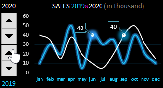
For the convenience of working with this block and effective presentation of the report, cursors are provided for the control of two interactive elements on the right. By managing them, you can focus on important points in the dynamics of the presentation of indicators.
Third block «MARGIN»:
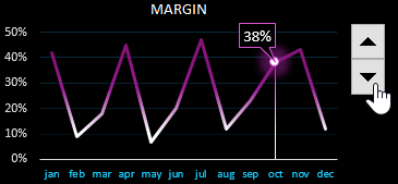
The block is similar to the previous one, but displays the percentage of the share of the margin (net profit) received by the firm from the manager’s effective trading activity. A very mercantile schedule, but this is business and nothing personal.
The fourth block «SALES PLAN by PRODUCT»:
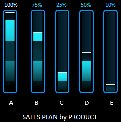
Here are presented the performance indicators of sales plans for 5 different groups of goods (A, B, C, D, E). If the plan is 100% fulfilled, then the top labels of the histogram columns are highlighted in white. If the plan is overfulfilled, the signature is colored red. In this case, it is worth paying attention to the setting of the plan level, perhaps it should be revised for the next accounting period for the current manager.
The fifth block «PRODUCT RANKING»:
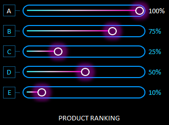
All product groups are ranked here. Their rating is determined as a percentage. 100% has a headliner (the best selling product group). The rest of the products are assigned the share they occupy in comparison with the leading group.
For example, group B did not have enough 25% to make the same result as the flagship — group A. Group E needs to sell exactly half more to reach leader A.
Together, the blocks are harmoniously combined into a convenient interactive-driven intelligent business dashboard:
 Download dashboard for analyzing business intelligence in Excel
The last sheet «Resources» contains graphic elements from figures made in MS PowerPoint, which is also included in the MS Office package. Unfortunately, you cannot create shapes of this complexity in Excel yet.
This dashboard does not contain macros, all interactive controls are implemented using standard Excel tools on the «DEVELOPER» — «Insert» tool tab.
Table of Contents
- Introduction
- Prerequisites
- Make charts with sample data
- Create Chart from Excel Data
- Create Pie Charts
- Build Line Chart and Cylinder Charts
- Upload to SharePoint
- Available Chart Types
- Summary
Introduction
We can derive business intelligence out of the Excel data by making use of its charting capability. In order to work with charting options, Excel provides the chart object.
The chart can either be an embedded chart (contained in a ChartObject object) or a separate chart sheet.
We have a lot of options to create business intelligence charts within SharePoint like SSRS, PerformancePoint, PowerPivot, Power BI, Client Side Rendering and so on. In this article, we will see how to get started with the charting capability of Excel using
VBA, upload it and view it from SharePoint.
Prerequisites
We have to make sure that the developer tab is available in the Excel sheet in order to get started with development using VBA. In order to do tha,t right click anywhere on the Tool bar and select «Customize the Ribbon» option.

From the list box, select Developer option and click on OK.

This will activate the Developer tab in the Ribbon menu.

Click on «View Code» to open up the Visual Basic Code window.

Make charts with sample data
Before making use of the Excel data, we will see how to create a simple chart in Excel by making use of hard coded data to create a business intelligence chart out of it. We will be using the «charts.Add» method to add a new chart to the Excel sheet. We
will then use ‘ActiveChart.SetSourceData Sheets(«Sheet1»).Range’ to set the data range and will populate the series data using ‘ ActiveChart.SeriesCollection(1).Formula’ .
Sub
ConvertDataToChart()
'Add a new chart
Add
'Set a data range for the chart which will be populated later
SetSourceData Sheets("Sheet1").Range("a1:d4")
'Set the chart type
ChartType = xlBarClustered
'Set arbitrary values for the data series
SeriesCollection(1).Formula = _
"=SERIES(""Maruthi Baleno"",{""Q1"",""Q2"",""Q3"",""Q4""},{2000,3000,4000,5000},1)"
SeriesCollection(2).Formula = _
"=SERIES(""Ford Figo"",{""Q1"",""Q2"",""Q3"",""Q4""},{1500,2200,3400,4500},2)"
SeriesCollection(3).Formula = _
"=SERIES(""Renault Duster"",{""Q1"",""Q2"",""Q3"",""Q4""},{100,1100,3120,7300},3)"
End
Sub
On running the macro, we will get the below chart output in the sheet.

We can change the type of the chart we want to display by modifying the ChartType property, as shown below.
ChartType = xlCylinderColStacked

Create Chart from Excel Data
Now, we will see how to create charts from the data present in the Excel sheet. Say for instance, we have the below set of data that indicates the mark list for a set of students and we want to create chart from this data.

We can use fairly simple VBA macro to get this done. We can add a chart to the sheet using ‘Chart. Add’ and set the properties for the ‘ActiveChart’ object. We will specify the range of Excel cells upon which the chart should be created by setting the value
for ‘ActiveChart.SetSourceData Source’ . ‘ ActiveChart.ChartType’ will set the type of chart we want to use.
Sub
MakeColumnChart()
'Add a new chart object
Add
'Set the Chart Properties
ChartType = xl3DColumn
SetSourceData Source:=Sheets("Sheet1").Range("A1:E7")
Location Where:=xlLocationAsObject, Name:="Sheet1"
End
Sub
We can now run the script and see how the chart looks like by clicking on the «Run» button.

Select the macro name and Click on Run.

This will generate the chart for us in the Excel sheet next to the data.

Create Pie Charts
Using the same technique, we can create similar Pie Charts to derive business intelligence. We will make use of the below Excel data to demo the pie chart experience.

The code is similar to the Column chart that we created above. The only change is the ‘ChartType’ property. We will be setting it to ‘xlPie’ this time.
Sub
MakePieChart()
'Add a new chart object
Add
'Set the Chart Properties
ChartType = xlPie
SetSourceData Source:=Sheets("Sheet2").Range("A4:B7")
Location Where:=xlLocationAsObject, Name:="Sheet2"
End
Sub
Let’s go ahead and select the macro and run it to see the output chart.

Thus, we can see the pie chart representation for the Excel data.

Build Line Chart and Cylinder Charts
By changing the ChartType to ‘xlLine’, we can convert the previous Pie Chart to a Line Chart as shown below.

Similarly, changing the ‘ChartType’ to ‘xlCylinderCol’ will fetch us the below Cylinder chart.
ChartType = xlCylinderCol

From the design tab, we can modify these charts and give a better look and feel to it.

Upload to SharePoint
So far, we saw how to create the charts from the Excel data. Now, we will upload the Excel to SharePoint so that it can be used for better collaboration among business users. Before uploading, let’s save it. Do ensure that you save it in the xlsm format
as specified by the warning message below so as to preserve the macros.

Now, head over to the SharePoint document library and upload the file.

As we can see the Excel file has been uploaded successfully. On clicking the Excel document, it will be rendered using Excel Online.

Thus, the pie chart has come up next to the Excel data just like in the desktop Excel application.

Available Chart Types
We can make use of the entire set of Charts provided by the Microsoft Excel team to derive and showcase business intelligence reports with the slightest customization. Refer the below table to see the complete list of available charts. We just have to change
the ‘ChartType’ property to the required Name.
ChartType = <Specify ChartName Here>
| Name | Value | Description |
| xl3DArea | -4098 | 3D Area. |
| xl3DAreaStacked | 78 | 3D Stacked Area. |
| xl3DAreaStacked100 | 79 | 100% Stacked Area. |
| xl3DBarClustered | 60 | 3D Clustered Bar. |
| xl3DBarStacked | 61 | 3D Stacked Bar. |
| xl3DBarStacked100 | 62 | 3D 100% Stacked Bar. |
| xl3DColumn | -4100 | 3D Column. |
| xl3DColumnClustered | 54 | 3D Clustered Column. |
| xl3DColumnStacked | 55 | 3D Stacked Column. |
| xl3DColumnStacked100 | 56 | 3D 100% Stacked Column. |
| xl3DLine | -4101 | 3D Line. |
| xl3DPie | -4102 | 3D Pie. |
| xl3DPieExploded | 70 | Exploded 3D Pie. |
| xlArea | 1 | Area |
| xlAreaStacked | 76 | Stacked Area. |
| xlAreaStacked100 | 77 | 100% Stacked Area. |
| xlBarClustered | 57 | Clustered Bar. |
| xlBarOfPie | 71 | Bar of Pie. |
| xlBarStacked | 58 | Stacked Bar. |
| xlBarStacked100 | 59 | 100% Stacked Bar. |
| xlBubble | 15 | Bubble. |
| xlBubble3DEffect | 87 | Bubble with 3D effects. |
| xlColumnClustered | 51 | Clustered Column. |
| xlColumnStacked | 52 | Stacked Column. |
| xlColumnStacked100 | 53 | 100% Stacked Column. |
| xlConeBarClustered | 102 | Clustered Cone Bar. |
| xlConeBarStacked | 103 | Stacked Cone Bar. |
| xlConeBarStacked100 | 104 | 100% Stacked Cone Bar. |
| xlConeCol | 105 | 3D Cone Column. |
| xlConeColClustered | 99 | Clustered Cone Column. |
| xlConeColStacked | 100 | Stacked Cone Column. |
| xlConeColStacked100 | 101 | 100% Stacked Cone Column. |
| xlCylinderBarClustered | 95 | Clustered Cylinder Bar. |
| xlCylinderBarStacked | 96 | Stacked Cylinder Bar. |
| xlCylinderBarStacked100 | 97 | 100% Stacked Cylinder Bar. |
| xlCylinderCol | 98 | 3D Cylinder Column. |
| xlCylinderColClustered | 92 | Clustered Cone Column. |
| xlCylinderColStacked | 93 | Stacked Cone Column. |
| xlCylinderColStacked100 | 94 | 100% Stacked Cylinder Column. |
| xlDoughnut | -4120 | Doughnut. |
| xlDoughnutExploded | 80 | Exploded Doughnut. |
| xlLine | 4 | Line. |
| xlLineMarkers | 65 | Line with Markers. |
| xlLineMarkersStacked | 66 | Stacked Line with Markers. |
| xlLineMarkersStacked100 | 67 | 100% Stacked Line with Markers. |
| xlLineStacked | 63 | Stacked Line. |
| xlLineStacked100 | 64 | 100% Stacked Line. |
| xlPie | 5 | Pie. |
| xlPieExploded | 69 | Exploded Pie. |
| xlPieOfPie | 68 | Pie of Pie. |
| xlPyramidBarClustered | 109 | Clustered Pyramid Bar. |
| xlPyramidBarStacked | 110 | Stacked Pyramid Bar. |
| xlPyramidBarStacked100 | 111 | 100% Stacked Pyramid Bar. |
| xlPyramidCol | 112 | 3D Pyramid Column. |
| xlPyramidColClustered | 106 | Clustered Pyramid Column. |
| xlPyramidColStacked | 107 | Stacked Pyramid Column. |
| xlPyramidColStacked100 | 108 | 100% Stacked Pyramid Column. |
| xlRadar | -4151 | Radar. |
| xlRadarFilled | 82 | Filled Radar. |
| xlRadarMarkers | 81 | Radar with Data Markers. |
| xlStockHLC | 88 | High-Low-Close. |
| xlStockOHLC | 89 | Open-High-Low-Close. |
| xlStockVHLC | 90 | Volume-High-Low-Close. |
| xlStockVOHLC | 91 | Volume-Open-High-Low-Close. |
| xlSurface | 83 | 3D Surface. |
| xlSurfaceTopView | 85 | Surface (Top View). |
| xlSurfaceTopViewWireframe | 86 | Surface (Top View wireframe). |
| xlSurfaceWireframe | 84 | 3D Surface (wireframe). |
| xlXYScatter | -4169 | Scatter. |
| xlXYScatterLines | 74 | Scatter with Lines. |
| xlXYScatterLinesNoMarkers | 75 | Scatter with Lines and No Data Markers. |
| xlXYScatterSmooth | 72 | Scatter with Smoothed Lines. |
| xlXYScatterSmoothNoMarkers | 73 | Scatter with Smoothed Lines and No Data Markers. |
Source: TechNet
Summary
Thus, we saw how we can create Business Intelligence Charts from Excel Data and upload it to SharePoint.
One of the most common ways to collect and maintain data in organizations is through Excel sheets. But getting deeper insights from Excel may not always be possible, especially when you are dealing with massive volumes of data. To remedy this, you can use data visualization tools such as Power BI.
You can easily set up the Power BI Excel connection and start making attractive reports and dashboards. Using the simple UI, you can import data from your excel files and begin designing your reports. Power BI has a huge collection of charts, graphs, etc that can be customized according to your business needs.
In this article, you will learn how to effectively set up the Power BI Excel connection in 5 easy steps.
Table of Contents
- What is Power BI?
- Key Features of Power BI
- What is Excel?
- Key Features of Excel
- What are the benefits of setting up Power BI Excel Integration?
- What are the Steps to Export data from Power BI to Excel?
- Power BI Excel Connection Step 1: Extract Data
- Power BI Excel Connection Step 2: Prepare Your Data
- Power BI Excel Connection Step 3: Generate Your Report
- Power BI Excel Connection Step 4: Format Your Report
- Power BI Excel Connection Step 5: Save Your Report and Publish to Power BI Service
- How to Connect to Power BI Datasets with Analyze in Excel?
- Steps to Establish Power BI Excel Connection
- Limitations of Analyze in Excel
- What are the Limitations to Importing an Excel Workbook in Power BI?
- Conclusion
What is Power BI?
Power BI is a data visualization and business intelligence tool that transforms data from a variety of data sources into interactive dashboards and BI reports. The Power BI suite offers multiple software, connectors, and services Power BI Desktop, Power BI services based on SaaS, and Power BI mobile apps available on a variety of platforms. This set of services is used by business users to consume data and create BI reports.
Key Features of Power BI
- DAX Functions: The DAX function is a Data analysis expression included in PowerBI. These analytic functions are predefined codes for performing analytics-related operations on your data. Currently, there are about 200 functions in the PowerBI function library.
- Data Security: Power BI Protects your data with industry-leading data security features such as sensitivity labeling, end-to-end encryption, and real-time access monitoring.
- Flexibility: Power BI allows you to extract data from a variety of sources. For instance, you can easily set up the Power BI Excel Connection and visualize excel data in Power BI. From On-premise to Cloud-based databases, structured to unstructured data Power BI allows you to work with a broader range of datasets.
- Data Filteration: In Power BI, you can create data subsets from several databases and work only on the filtered data that has contextual relevance.
What is Excel?
Microsoft Excel is a spreadsheet application developed by Microsoft to organize and record data in a tabular format. Launched in 1985, Microsoft Excel is a widely used Spreadsheet software in businesses worldwide allowing you to organize and manipulate data through formulas in columns and rows. MS Excel is loaded with functionalities to perform several operations such as calculations, pivot tables, graph tools, etc.
Compatible with Microsoft Windows, macOS, Android, and iOS, MS Excel is included with the MS Office Suite. It is typically used by firms to record, organize and analyze financial data. MS Excel also offers VBA programming that can assist you in automating repetitive tasks.
Key Features of Excel
- Conditional Formatting: MS Excel allows you to apply formats to a cell or range of cells, and have that formatting change depending on the value of the cell or the value of a formula.
- Built-in Formulae: MS Excel provides you with basic and advanced built-in formulae for sum, average, minimum, etc. You can use formula auditing to graph or trace the relationship between cells and formulas with blue arrows. You can track precedents (cells that provide data for a particular cell) or the cells that depend on the value of a particular cell.
- Data Protection: Excel spreadsheets can be password protected on your laptop or PC. MS Excel also provides a robust system to recover data.
- Data Sorting & Filtering: You can easily perform the basic data sorting and filtering operation on your data in excel. MS Excel also provides Advanced filtering options for complex criteria.
What are the benefits of setting up Power BI Excel Integration?
Setting up the Power BI Excel Integration can help assist you in the following aspects:
- Deal with large volumes of data: Power BI has great compression capabilities for Microsoft Excel and text / .csv files that allow you to view, analyze, and visualize large amounts of data that cannot be opened in Excel. Most computers have a hard time opening a 300MB .csv file, which makes it difficult to analyze and report in Excel.
- Analyze Trends Quickly: Analyzing trends with Power BI is very easy. With built-in time intelligence analysis features, it only takes a few seconds to view massive amounts of data. You can see data by various dimensions and attributes, including date and time dimensions.
- Share your Reports: You can now publish to a secure Microsoft cloud service called Power BI Service and automate basic data updates. Just click Publish in the upper-right corner of the Power BI home feed. You can then easily share these reports with your colleagues and collaborate with them.
- Visualization Made-Easy: The great thing about Power BI is that with basic design ideas, it allows you to easily create something visually appealing and neat. Drag-and-drop functionality, easy resizing, and copy and paste make it feel like you’re at home for those familiar with the Microsoft Office suite.
Hevo Data, a No-code Data Pipeline helps to transfer data from 100+ sources to a Data Warehouse/Destination of your choice and visualize it in your desired BI tool such as Power BI. Hevo is fully managed and completely automates the process of not only loading data from your desired source but also enriching the data and transforming it into an analysis-ready form without even having to write a single line of code. Its fault-tolerant architecture ensures that the data is handled in a secure, consistent manner with zero data loss.
It provides a consistent & reliable solution to manage data in real-time and always have analysis-ready data in your desired destination. It allows you to focus on the key business needs and perform insightful analysis by using a BI tool of your choice.
Get Started with Hevo for Free
Check out what makes Hevo amazing:
- Secure: Hevo has a fault-tolerant architecture that ensures that the data is handled in a secure, consistent manner with zero data loss.
- Schema Management: Hevo takes away the tedious task of schema management & automatically detects the schema of incoming data and maps it to the destination schema.
- Minimal Learning: Hevo, with its simple and interactive UI, is extremely simple for new customers to work on and perform operations.
- Hevo Is Built To Scale: As the number of sources and the volume of your data grows, Hevo scales horizontally, handling millions of records per minute with very little latency.
- Incremental Data Load: Hevo allows the transfer of data that has been modified in real-time. This ensures efficient utilization of bandwidth on both ends.
- Live Support: The Hevo team is available round the clock to extend exceptional support to its customers through chat, email, and support calls.
- Live Monitoring: Hevo allows you to monitor the data flow and check where your data is at a particular point in time.
Sign up here for a 14-Day Free Trial!
What are the Steps to Export data from Power BI to Excel?
Power BI provides a beginner-friendly interface to quickly load data from Excel and start visualizing it. To begin setting up the Power BI Excel Integration, ensure that you have Power BI installed on your system. If not done already, you can download Power BI Desktop. You can start building the Power BI Excel Integration by following the simple steps given below:
- Power BI Excel Connection Step 1: Extract Data
- Power BI Excel Connection Step 2: Prepare Your Data
- Power BI Excel Connection Step 3: Generate Your Report
- Power BI Excel Connection Step 4: Format Your Report
- Power BI Excel Connection Step 5: Save Your Report and Publish to Power BI Service
Power BI Excel Connection Step 1: Extract Data
- Step 1: For this Power BI Excel Connection article, you download a sample Financial Excel Workbook. You can also work with any of your Excel workbooks.
- Step 2: Open Power BI Desktop. Navigate to the Home ribbon and click on the Excel option present in the Data section.
- Step 3: Go to the folder where you have saved your workbook and click on the Open button after selecting the file.
Power BI Excel Connection Step 2: Prepare Your Data
Now, a Navigator window will pop up on your screen. It displays an overview of the data so you can be sure that the range of the data is correct. For instance, all the numeric data types are shown in italics. Navigator allows you to transform your data before loading it. Transforming the data can often assist you in creating visualizations that are easier to understand. Follow the steps given below to perform various transformations:
- Step 1: Check the box next to Financials and click on the Transform Data button.
- Step 2: In the given sample data, values of units sold in decimal don’t make sense. Hence, you can transform it into whole numbers. Select the Units sold column and navigate to Transform Tab > Data Type > Whole Number. Click on the Replace current option to change the data type.
- Step 3: To make the segments easier to observe in the visualizations, later on, you can change its format to uppercase. To do that, select the Segments column and navigate to Transform tab > Format > UPPERCASE.
- Step 4: You can shorten the Month Name Column header to Month by just double-clicking the Month Name column, and renaming it to just Month.
- Step 5: For this sample data, it is assumed that the Montana product was discontinued last month, so you can filter this data from your report to avoid confusion. To do that, go to the Product column. Click on the dropdown and clear the box next to Montana.
You can now observe that each transformation has been added to the list under Query Settings in Applied Steps.
- Step 6: Since your data is now prepared, you can go to the Home tab and save the modification by clicking on the Close & Apply option.
You can also notice that Power BI has recognized various filed such as Sales, Discounts, etc of numeric data types by placing a Sigma symbol. It has also denoted the Date field as a Date time entity by placing a Calendar icon.
Power BI Excel Connection Step 3: Generate Your Report
After the data preparation step of the Power BI Excel Connection, you can now move toward creating your reports. To do that, follow these simple steps:
- Step 1: Go to the Insert ribbon on the top, and click on the Text Box option. You can now type the title for this report as “Executive Summary – Finance Report”.
- Step 2: Select the text you typed and set the font size to 20 and bold. You can also resize the box for the text to be in one line.
- Step 3: To create a line chart to see which month and year had the maximum profit, go to the Fields pane. Drag the Profit field to a blank area on the report canvas. You will notice that Power BI displays a column chart with one column, Profit.
- Step 4: Similarly, drag the Date field. You now will see the profit columns for 2 years.
- Step 5: To view profits for each month, go to the Fields section of the Visualizations pane. Click on the drop-down in the Axis value and change Date from Date Hierarchy to Date.
Now, Power BI will display profits month-wise.
- Step 6: You can change the bar chart to a line chart from the Visualization pane.
- Step 7: To see which country had the highest profits, drag the Country field from the Fields pane to a blank area on your report canvas to create a map. Then, drag the Profit field to the map.
- Step 8: You can also find out which companies and segments to invest in. To do that, first, you can create some space by dragging the two charts you’ve built to be aligned side by side in the top half of the canvas.
- Step 9: Click on the blank area in the lower half of your report canvas and select the Sales, Product, and Segment fields from the Fields pane. After you observe a chart, you can drag it to fill the space under the two upper charts.
- Step 10: A slicer is an effective tool for filtering report page visual elements for certain selections. In this case, you can build two different slicers to narrow down the performance for each month and each year. The slicer uses the date field of the original table. You can drag the Date option from the Fields pane to the blank area on the left of the canvas.
- Step 11: Now, select Slicer from the visualization pane. You can also drag the ends to filter, or select the arrow in the upper-right corner and change it to a different type of slicer.
Power BI Excel Connection Step 4: Format Your Report
After preparing the basic report in the 3rd step of Power BI Excel Connection, you can start modifying its format for better visualization:
- Step 1: You can change the theme to Executive from the View pane.
- Step 2: You can also make specific changes to your graphs and charts individually in the Format tab of the Visualizations pane. Select Visual 2 (profits by month & year graph) and change the title text in the title section to “Profit by Month and Year” and Text size to 16 pt with the Toggle Shadow set to On.
- Step 3: Similarly for Visual 3, change the Theme to Grayscale in the Maps section. Like Visual 2, change the title Text size to 16 pt with the. Toggle Shadow set to On for both Visual 3 & 4.
- Step 4: For Visual 5, go to the Selection controls section & toggle the “Select all” option to On. In the Slicer header section, set the Text size to 16 pt.
- Step 5: You can also add a background for the title. For that, go to the Insert ribbon on the top and navigate to Shapes > Rectangle. You can place the rectangle at the top of the page, and stretch it according to the width of the page and the height of the title.
- Step 6: Go to the Format shape pane, in the Outline section and set the Transparency to 100%. You can also set the Fill color to Theme color 5 #6B91C9 (blue).
- Step 7: Now navigate to the Format tab and select Send backward > Send to back. For the title to appear clearly, select the text in Visual 1, the title, and change the font color to White.
- Step 8: Similarly, create and place the rectangle shape for Visuals 2 & 3. Here also, change the Transparency to 100%. & set the color to White 10% darker in the fill section. Finally, go to the Format tab & select Send backward > Send to back.
Power BI Excel Connection Step 5: Save Your Report and Publish to Power BI Service
Coming to the last Power BI Excel Connection Step, you can now save this report by going to the File menu and clicking on the Save option.
Power BI allows you to share your reports with your colleagues via its Power BI service. This allows Power BI account holders to interact with your report but they can’t save changes. To publish your report, follow these steps:
- Step 1: Go to the Home ribbon and click on the Publish option. If you don’t have a Power BI service account, you can opt for a free trial also.
- Step 2: You need to choose a destination such as My workspace in the Power BI service > Select.
- Step 3: Click on the Open ‘your-file-name’ in the Power BI option.
This will open your report in the browser.
- Step 4: Click on the share icon at the top of your report to share it with your colleagues. This completes setting up your Power BI Excel Connection.
How to Connect to Power BI Datasets with Analyze in Excel?
Another aspect of Power BI Excel Integration is bringing Power BI Datasets to Excel using the Analyse in Excel feature. You can then view and interact with them using PivotTables, charts, slicers, and other Excel features.
Steps to Establish Power BI Excel Connection
Follow these simple steps to easily set up the Power BI Excel Connection and analyze your data in Excel:
- Step 1: In the Power BI Service, go to the dataset or report you want to analyze in Excel. Click on the More options (…) next to the dataset or report name and select Analyze in Excel.
- Step 2: Another way for the Power BI Excel Connection is by opening the report and selecting Export > Analyze in Excel.
- Step 3: You can also select a dataset and then click on the Analyze in Excel in the menu bar of the Dataset details pane.
- Step 4: Using any of the above Power BI Excel Connection steps, the Analyze in Excel feature should install automatically. Finally, click on the Download button.
A new Excel workbook will be downloaded to your system that contains an OLAP connection to a Power BI dataset.
After opening the file, you may have to Enable Editing & Enable Content depending on your systems settings.
Limitations of Analyze in Excel
Though Analyze in Excel is an excellent feature for utilizing Power BI Excel Integration, there are some challenges that you might encounter:
- Some firms may have Group Policy rules that prohibit the installation of required updates for Excel. If you are unable to install the update, please contact your administrator.
- Row-level security (RLS) is supported for Analyse in Excel. RLS is applied at the data model level and to all users who access the data in the report.
- When using Analyze in Excel, you may get unexpected results or the function may not work as expected.
- Only PowerBI datasets that use import mode maintain hierarchies in Excel workbook analysis. When using Analyze in Excel, the hierarchy of PowerBI datasets created with DirectQuery or composite models is not preserved.
- While using Analyse In Excel, you cannot change the connection string to specify the locale after the workbook is generated.
- When data exceeds 2GB, an error message may be displayed. In this case, you can reduce the amount of data by applying a filter or using an XMLA endpoint.
- For guest users, Power BI data can’t be analyzed in Excel for datasets sent (from) by another tenant.
- Analyzing PowerBI data in Excel is a PowerBI service feature. It is not possible to analyze Power BI data in Excel using Power BI Report Server or Power BI Embedded.
What are the Limitations to Importing an Excel Workbook in Power BI?
While trying to set up the Power BI Excel connection, there are some challenges that you may face when you import an Excel Workbook in Power BI:
- External Connections to SQL Server Analysis Services Tabular Models: Excel 2013 allows you to connect to SQL Server Analysis Services tabular models and create PowerView reports based on those models without having to import the data. This connection type is not currently supported when importing an Excel workbook into Power BI Desktop. Alternatively, you need to recreate these external connections in Power BI Desktop.
- Hierarchy: Power BI Desktop doesn’t support this type of data model object. Therefore, when you import an Excel workbook into Power BI Desktop, the hierarchy is skipped.
- Binary Data Columns: This data model column type is not currently supported by Power BI Desktop. The binary column of data is removed from the Power BI Desktop result table.
- Unsupported PowerView Elements: PowerView has some features that are not available in Power BI Desktop like Themes or specific types of visualizations (scatter plots using playback axes, drill-down behavior, etc.). These unsupported visualizations display unsupported visualization messages in the appropriate places in Power BI Desktop reports that you can edit or omit as needed.
- Named range using PowerQuery’s FromTable or M’s Excel CurrentWorkbook: Importing this named range data into Power BI Desktop is not currently supported, but is a planned update. These named ranges are now loaded into Power BI Desktop as a connection to an external Excel workbook.
- PowerPivot to SSRS: External PowerPivot connections to SQL Server Reporting Services (SSRS) are not currently supported because this data source is not currently available in Power BI Desktop.
Conclusion
In this article, you have learned how to effectively set up the Power BI Excel integration. Power BI Excel connection enables you to easily import data from Excel and gets you started with your report generation in minutes. With a user-friendly interface and a vast collection of visualization features, you can create visually stunning and informative dashboards and reports.
As you collect and manage your data across several applications and databases in your business, it is important to consolidate it for complete performance analysis of your business. To achieve this you need to assign a portion of your engineering bandwidth to Integrate data from all sources, Clean & Transform it, and finally, Load it to a Cloud Data Warehouse, BI Tool like Power BI, or a destination of your choice for further Business Analytics. All of these challenges can be comfortably solved by a Cloud-based ETL tool such as Hevo Data.
Visit our Website to Explore Hevo
Hevo Data, a No-code Data Pipeline can seamlessly transfer data from a vast sea of 100+ sources to a Data Warehouse, BI Tool like Power BI, or a Destination of your choice. It is a reliable, completely automated, and secure service that doesn’t require you to write any code!
If you are using Power BI as your Data Analytics & Business Intelligence platform and searching for a no-fuss alternative to Manual Data Integration, then Hevo can effortlessly automate this for you. Hevo, with its strong integration with 100+ sources and BI tools(Including 40+ Free Sources), allows you to not only export & load data but also transform & enrich your data & make it analysis-ready in a jiffy.
Want to take Hevo for a ride? Sign Up for a 14-day free trial and simplify your Data Integration process. Do check out the pricing details to understand which plan fulfills all your business needs.
Tell us about your experience of setting up the Power BI Excel Connection! Share your thoughts with us in the comments section below.