
Business intelligence (BI) is essentially the collection of tools and processes that are used to gather data and turn it into meaningful information that people can use to make better decisions. Excel 2013 offers lots of new BI features and functionality, making it easier than ever to gather data and use the data to create powerful reports, scorecards, and dashboards. Excel Services in SharePoint Server 2013 (on premises) enables you to share, view, explore, and refresh workbooks in a browser window, similar to how it works in Excel.
Read this article to learn about BI features in Excel and which ones are supported in Excel Services and Excel Web App.
In this article
-
What BI capabilities are available in Excel?
-
What Excel BI features are supported in SharePoint Server 2013?
-
What Excel BI features are supported in Excel Services (SharePoint Server) together with Excel Web App (Office Web Apps Server)?
-
Learn more about Microsoft BI tools
What BI capabilities are available in Excel?
In Excel 2013, you can perform a wide range of tasks—from getting data to creating reports—as part of your organization’s BI solution. The following table summarizes the powerful BI capabilities that are available in Excel.
|
Task |
Description |
|---|---|
|
Get data into Excel |
You can Import data from external data sources, such as SQL Server tables, SQL Server Analysis Services cubes, Microsoft Azure data, OData data, and more. You can use Power Query to find, combine, and refine data across a wide variety of sources, including internal and external data sources. You can import data into Excel, or you can use a data connection to create charts, tables, and reports using external data. |
|
Sort, organize, and work with data in Excel |
You can use Flash Fill to format columns of data to display a particular way. You can also create a Data Model to combine one or more tables of data into a single data source that you can use to create reports, including views that you create by using Power View. You can use Quick Analysis to select data and see recommended ways to visualize that data. |
|
Visualize data in Excel |
You can create a wide variety of reports that include tables, line charts, bar charts, radar charts, and so on. You can use Power Map to create three-dimensional data visualizations on a globe. You can use Power View to create mashups that include interactive charts and tables. And, you can create reports that use conditional formatting and key performance indicators (KPIs) to show at a glance whether performance is on or off target for one or more metrics. |
|
Apply filters to charts and tables in Excel |
You can add slicers, timeline controls, and filters to worksheets to make it easier to focus on more specific information. |
|
Explore and analyze data in Excel |
You can use Quick Explore to explore information in a PivotChart report or a PivotTable report, and view additional information about that value in a new chart or table on the screen. You can also use lots of other BI features to analyze data in Excel. |
|
Use more advanced analytic capabilities |
If you are an advanced user, you can create Calculated Measures and Calculated Members for PivotChart reports or PivotTable reports that use Analysis Services data. And, you can create Calculated Fields in Power Pivot. |
For more information about new features in Excel, see What’s new in Excel 2013.
What Excel BI features are supported in SharePoint Server 2013?
Many of the BI capabilities that are available in Excel are supported in Excel Services in SharePoint Server 2013 (on premises). This means that you can view and interact with workbooks in a browser window much like you would by using the Excel client. In general, the following features are supported:
-
Refreshing external data In most cases, workbooks that are published to SharePoint libraries retain live data connections so that people can typically refresh the data. For more information, see Work with external data in Excel Services (SharePoint Server).
-
Viewing workbooks that contain a Data Model (This requires Excel Services to be configured to support Data Model functionality.) See Data models in Excel Services.
-
Viewing, sorting, and exploring data in reports in a browser window You can interact with a workbook in a browser window similar to how you would do that in Excel See Video: Explore a workbook in the browser.
-
Displaying a single item in a workbook in its own SharePoint Web Part A single item can include a PivotChart report, a PivotTable report, a worksheet, or a range of data in Excel. See Display Excel content in an Excel Web Access Web Part.
-
Choosing between worksheet view and gallery view You can choose how you want workbooks to be displayed in a browser window. See Use Browser View Options to specify how you want a workbook to display in a browser window.
When you’re using a workbook in a browser window, you can’t create certain kinds of items, such as timeline controls, PivotChart reports, PivotTable reports, calculated members, and calculated measures. You can, however, create those items in Excel, upload the workbook to a library in SharePoint Server 2013, and then view that workbook in the browser.
What Excel BI features are supported in Excel Services (SharePoint Server) together with Excel Web App (Office Web Apps Server)?
If your organization is using SharePoint Server 2013 together with Office Web Apps Server (on premises), then the BI capabilities that are supported depend on how things are configured. Either Excel Services (SharePoint Server 2013) or Excel Web App (Office Web Apps Server) is used to render workbooks in a browser window.
Excel Services and Excel Web App are not exactly the same, so this decision affects which BI capabilities are available to you when you are using a workbook in a browser window. The following table summarizes some of the key differences:
|
Feature |
What’s supported when Excel Web App is used to render workbooks |
What’s supported when Excel Services is used to render workbooks |
|---|---|---|
|
Refreshing data in a workbook in a browser window |
Most kinds of secure external data connections are not supported. For more information, see Working with external data in Excel Services. |
Most kinds of external data connections are supported, as is the ability to refresh data in a browser window. For more information, see Working with external data in Excel Services. |
|
Data modeling in Excel |
You can view workbooks that contain a Data Model, but in general, you cannot explore data in certain items, such as PivotChart reports, PivotTable reports, and timeline controls that use a Data Model as their data source. Data refresh is not supported in a browser window, but you can open the workbook in Excel to refresh its data. |
You can view and interact with items in workbooks that contain a Data Model. |
|
Flash Fill |
The ability to use Flash Fill when viewing or editing a workbook in a browser window is not supported. You must open the workbook in Excel to use this feature. |
The ability to use Flash Fill when viewing a workbook in a browser window is not supported. You must open the workbook in Excel to use this feature. |
|
Quick Analysis |
The ability to use Quick Analysis when viewing or editing a workbook in a browser window is not supported. You must open the workbook in Excel to use this feature. |
The ability to use Quick Analysis when viewing a workbook in a browser window is not supported. You must open the workbook in Excel to use this feature. |
|
Charts and tables, PivotTables, PivotCharts, reports, and scorecards |
The ability to view, sort, filter, and interact with reports and scorecards that were created by using Excel is supported in a browser window. |
The ability to view, sort, filter, and interact with reports and scorecards is supported in a browser window. |
|
Power Map |
Currently, views that were created by using Power Map are not supported. You must open the workbook in Excel to use this feature. |
Currently, views that were created by using Power Map are not supported in a browser window. You must open the workbook in Excel to use this feature. |
|
Power View |
Views that were created by using Power View are not supported in Excel Web App. |
Views that were created by using Power View are supported in Excel Services. |
|
Slicers and timeline controls |
The ability to use existing slicers and timeline controls is supported. |
The ability to use existing slicers and timeline controls is supported. |
|
Quick Explore |
The ability to use Quick Explore is supported in a browser window. |
The ability to use Quick Explore is supported in a browser window. |
|
Calculated measures and calculated members |
Workbooks that contain calculated measures and calculated members are supported. |
Workbooks that contain calculated measures and calculated members are supported. |
|
Calculated Fields in Power Pivot |
Calculated fields are not supported in Excel Web App. |
The ability to use existing calculated fields is supported in Excel Services. |
Learn more about Microsoft BI tools
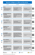
This article covers BI in Excel and Excel Services, but there are other Microsoft BI tools available. Get the poster
|
|
BI in Office and SharePoint to learn more about BI tools in Office and SharePoint. The poster summarizes all the BI tools that are available—on premises and in the cloud—with links to additional information about each tool. |
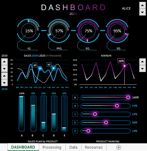
Dashboard with data visualization for analyzing the correlation of IQ levels with the sales performance of managers. You can download a ready-made dashboard template for the presentation of a report on the analysis of the intelligence of sales personnel and sales performance in Excel at the end of the article. But first, let’s consider the interactive functionality and principles of building visualization using the example of the model of the relationship between smart coefficients and sales in practice.
Modern analysis of sales force efficiency in Excel
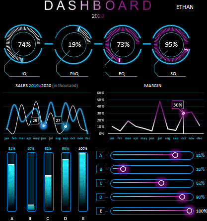
This dashboard in Excel allows you to perform visual analysis to assess the effectiveness of sales personnel management.
The model of the situation for the practical application of the dashboard is as follows. The sales department employs 10 managers. Each manager has his own sales performance indicators as each of them has its own advantages and disadvantages. Some of the managers are generally out of place or are selling the wrong types of products under ineffective pressure from management. Other salespeople need just a little nudge in the right direction to maximize new results.
From the situation described above, the question arises, how can all this be determined? Psychology comes to the rescue. Most large companies employ at least one psychologist among their employees. And this is a wise decision! It has long been proven that a person spends most of his energy on the psyche. Also, certain patterns of correlation between the relationship between business intelligence and successful human performance were noticed.
At first, the emphasis was placed on the IQ indicator. Many executives began hiring coaches to improve their IQ levels. Regular IQ tests were conducted to analyze the mental growth of employees and the effectiveness of coaching. But in practice, many HR managers have often argued about the IQ approach to sales growth. And not in vain! After all, Dr. Goleman later proved that a person’s success depends 4 times more on the level of the emotional intelligence quotient EQ than on IQ.
High emotional intelligence is determined by the ability to manage, create, and control emotions. After all, business is not only numbers and cold calculations, but also emotions that cannot be calculated with formulas. If business success was guaranteed by accurate calculations, then mathematicians would be the best businessmen. In fact, any business is based on the sale of goods or services. After all, any sale is primarily an emotional decision of the consumer’s choice.
Emotions are the main source of energy. All living things in this world are constantly fighting for energy, so there is no other world except the emotional one! Create, control and manage emotions = manage energy. The higher your EQ, the better your ability to work with your energy and your counterparties (customers, employees, business partners). Consequently, people with high EQ scores have a higher chance of success in sales and therefore in business.
Coefficients for determining the level of business intelligence of a manager
Modern methods for the effective management of sales personnel necessarily include several intellectual tests at once to analyze the indicators of the intellectual level of employees in various important areas. The most popular smart Q tests are coefficient determination:
- IQ — mental intelligence (mind, logic, analytical forecast).
- PhQ — physical Intelligence (fitness, health, comfort and discipline).
- EQ — emotional intelligence (self-management, understanding oneself, understanding others, the ability to build relationships, the skills to create a suitable atmosphere).
- SQ — spiritual intelligence (values, principles, beliefs, morality).
To track the dynamics of the correlation between improved sales results and the intellectual growth of managers, it is very effective to use tools for visual analysis. As an example, a dashboard will be presented with data visualization for all business intelligence ratios and performance indicators in sales. For convenient and efficient work, the dashboard is equipped with some interactive features. But first things first.
Preparing baseline data for comparing IQ and sales levels
To build a visualization of comparative multilevel analyzes, it is necessary to pre-prepare and well structure all different initial data into one integral system. In order not to create a complex large table with a large number of flags for the interconnection of different initial information, all incoming data was split into several small tables. This not only improves readability, but also makes it easy to master the capabilities of the dashboard template. All of these tables are on one sheet «Data», but with large amounts of data, they can be divided into separate sheets for ease of use. In this example, the initial data looks like this:
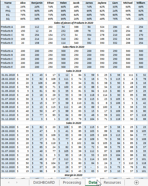
All initial information is divided into 6 tables:
- Managers
- Sales of pieces of Products in 2020
- Sales Plans in 2020
- Sales in 2019
- Sales in 2020
- Margin in 2020
All tables, before displaying data for dashboard visualization, form a general relationship, and all this happens on the «Processing» sheet:
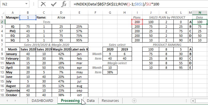
With the help of complex formulas, the selection of the initial values from the “Data” sheet is made for further calculations and calculations. On the “Processing” sheet, preparation is being made to visualize the comparison of the indicators of managers’ IQs with their indicators of the dynamics of productivity growth.
Download dashboard of business intelligence and sales performance in Excel
The structure of the interactive dashboard for comparative visual analysis consists of 5 blocks.
The first block looks like a panel of diagrams with a visual display of 4 indicators of intellectual coefficients of managers:

The same block contains the first and main control for switching between managers (counter in the upper right corner). In fact, this is an element of control of the whole dashboard, since when using it, all information about the intellectual abilities and dynamics of sales is completely updated for each manager separately.
As a dashboard user, a business manager or sales manager has the ability to visually analyze the strengths and weaknesses of each sales manager. And after the analysis, make important decisions:
- Which training or coaching course to send an employee to to improve his efficiency.
- What group of products the manager should sell.
- How to set sales plans for specific product groups.
- How to motivate.
- When to punish.
- Where to set goals for promotion.
- At what level is his dismissal deadline.
The second block «SALES 2019 & 2020 (in thousand)». Here is a chart for a comparative analysis of monthly transactions for the current and last year:
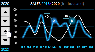
For the convenience of working with this block and effective presentation of the report, cursors are provided for the control of two interactive elements on the right. By managing them, you can focus on important points in the dynamics of the presentation of indicators.
Third block «MARGIN»:
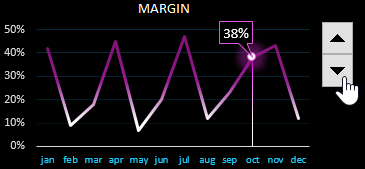
The block is similar to the previous one, but displays the percentage of the share of the margin (net profit) received by the firm from the manager’s effective trading activity. A very mercantile schedule, but this is business and nothing personal.
The fourth block «SALES PLAN by PRODUCT»:
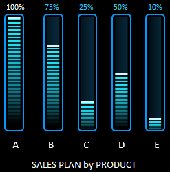
Here are presented the performance indicators of sales plans for 5 different groups of goods (A, B, C, D, E). If the plan is 100% fulfilled, then the top labels of the histogram columns are highlighted in white. If the plan is overfulfilled, the signature is colored red. In this case, it is worth paying attention to the setting of the plan level, perhaps it should be revised for the next accounting period for the current manager.
The fifth block «PRODUCT RANKING»:
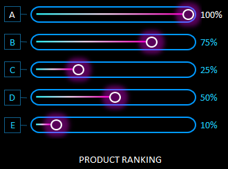
All product groups are ranked here. Their rating is determined as a percentage. 100% has a headliner (the best selling product group). The rest of the products are assigned the share they occupy in comparison with the leading group.
For example, group B did not have enough 25% to make the same result as the flagship — group A. Group E needs to sell exactly half more to reach leader A.
Together, the blocks are harmoniously combined into a convenient interactive-driven intelligent business dashboard:
 Download dashboard for analyzing business intelligence in Excel
The last sheet «Resources» contains graphic elements from figures made in MS PowerPoint, which is also included in the MS Office package. Unfortunately, you cannot create shapes of this complexity in Excel yet.
This dashboard does not contain macros, all interactive controls are implemented using standard Excel tools on the «DEVELOPER» — «Insert» tool tab.
Over the last few posts, we looked at Business Intelligence and an example of how it can be used in a small business. But is Business Intelligence for the Excel User? And does it have anything to do with Accountants? ( missed the first post, you can access it here. You can also access the second post here)
Business Intelligence for the Excel User
In every organization I have visited or worked at, Excel is used by most employees at some level. Senior-level employee, marketing, sales, finance, and accounting. Everyone uses Excel. Like it or not, no matter how much money companies spend on powerful software packages, people tend to dump data from the software into excel for slicing, dicing, analyzing and reporting (I bet you are guilty of this too!). Even worse, each person and each department have their own set of reports. From all these reports that are produced, how many of them are actually shared around the company? Or just kept for the use of the employee or the department?
What if you have access to all of these reports? All of these data sets, along with other data sets, both internal and external. What insights could this provide for your organization and your company?
Well, now you do have access because Excel has a suite of tools. Power Tools: Power Query, Power Pivot, and Power View. All work stand alone and, all combined make a very powerful BI system. Business Intelligence for the Excel User!
Let me explain
Power Query can be described as SQL for Excel users (without the need for knowing SQL). It allows users find data from many sources (including big data source), combine data, transform data, and make the data usable for reporting and data analytics.
Power Pivot will allow you to carry out complex calculations across multiple tables of data (using DAX) and model data in a way that is structured for reporting and visualizations.
In Power View, you can quickly create a variety of visualizations, from tables and matrices to bubble charts and sets of small multiple charts. With these visualizations trends in data are easily spotted making business decisions easier and actionable
Business Intelligence and the Accountant
‘What’s all this got to do with the Accountant?’ I hear you say! Plenty. For years now accountants have been rationalizing data. Making sense of the numbers. Producing reports to explain the story. This places accountants in a prime position to recognize data that is useful, data that can help align business with its strategic plan. Then analyze that data and report on it.
Accountants are already Excel users. New software is just a barrier right! Why fix what’s not broken! Excels BI tools are not a new software to learn. THIS is just an extension to the tools Accountants already have.
I am here to help. Below you will find links to my Power Courses (Each of these BI tools can be used in isolation, therefore we have a course for each). If you want to provide business intelligence services in your organization, now is the time to upskill.
Sound’s interesting – I would like to preview Power Query
I’m curious – tell me more about Power Pivot
Access All Areas Unlimited Excel Learning – Explore now
Business Intelligence for the Excel user and accountant brings the power of data to the ordinary business.
Would you like exclusive offers and discounts on our courses? Sign up for my newsletter to get Tips and trick on Excel and Business intelligence and exclusive discounts that are only available for my newsletter subscribers
If you are still not convinced you to need to learn Excel Power Tools, why don’t you check out these demonstrations and watch Excel Power Tools in Action
.
Table of Contents
- Introduction
- Prerequisites
- Make charts with sample data
- Create Chart from Excel Data
- Create Pie Charts
- Build Line Chart and Cylinder Charts
- Upload to SharePoint
- Available Chart Types
- Summary
Introduction
We can derive business intelligence out of the Excel data by making use of its charting capability. In order to work with charting options, Excel provides the chart object.
The chart can either be an embedded chart (contained in a ChartObject object) or a separate chart sheet.
We have a lot of options to create business intelligence charts within SharePoint like SSRS, PerformancePoint, PowerPivot, Power BI, Client Side Rendering and so on. In this article, we will see how to get started with the charting capability of Excel using
VBA, upload it and view it from SharePoint.
Prerequisites
We have to make sure that the developer tab is available in the Excel sheet in order to get started with development using VBA. In order to do tha,t right click anywhere on the Tool bar and select «Customize the Ribbon» option.

From the list box, select Developer option and click on OK.

This will activate the Developer tab in the Ribbon menu.

Click on «View Code» to open up the Visual Basic Code window.

Make charts with sample data
Before making use of the Excel data, we will see how to create a simple chart in Excel by making use of hard coded data to create a business intelligence chart out of it. We will be using the «charts.Add» method to add a new chart to the Excel sheet. We
will then use ‘ActiveChart.SetSourceData Sheets(«Sheet1»).Range’ to set the data range and will populate the series data using ‘ ActiveChart.SeriesCollection(1).Formula’ .
Sub
ConvertDataToChart()
'Add a new chart
Add
'Set a data range for the chart which will be populated later
SetSourceData Sheets("Sheet1").Range("a1:d4")
'Set the chart type
ChartType = xlBarClustered
'Set arbitrary values for the data series
SeriesCollection(1).Formula = _
"=SERIES(""Maruthi Baleno"",{""Q1"",""Q2"",""Q3"",""Q4""},{2000,3000,4000,5000},1)"
SeriesCollection(2).Formula = _
"=SERIES(""Ford Figo"",{""Q1"",""Q2"",""Q3"",""Q4""},{1500,2200,3400,4500},2)"
SeriesCollection(3).Formula = _
"=SERIES(""Renault Duster"",{""Q1"",""Q2"",""Q3"",""Q4""},{100,1100,3120,7300},3)"
End
Sub
On running the macro, we will get the below chart output in the sheet.

We can change the type of the chart we want to display by modifying the ChartType property, as shown below.
ChartType = xlCylinderColStacked

Create Chart from Excel Data
Now, we will see how to create charts from the data present in the Excel sheet. Say for instance, we have the below set of data that indicates the mark list for a set of students and we want to create chart from this data.

We can use fairly simple VBA macro to get this done. We can add a chart to the sheet using ‘Chart. Add’ and set the properties for the ‘ActiveChart’ object. We will specify the range of Excel cells upon which the chart should be created by setting the value
for ‘ActiveChart.SetSourceData Source’ . ‘ ActiveChart.ChartType’ will set the type of chart we want to use.
Sub
MakeColumnChart()
'Add a new chart object
Add
'Set the Chart Properties
ChartType = xl3DColumn
SetSourceData Source:=Sheets("Sheet1").Range("A1:E7")
Location Where:=xlLocationAsObject, Name:="Sheet1"
End
Sub
We can now run the script and see how the chart looks like by clicking on the «Run» button.

Select the macro name and Click on Run.

This will generate the chart for us in the Excel sheet next to the data.

Create Pie Charts
Using the same technique, we can create similar Pie Charts to derive business intelligence. We will make use of the below Excel data to demo the pie chart experience.

The code is similar to the Column chart that we created above. The only change is the ‘ChartType’ property. We will be setting it to ‘xlPie’ this time.
Sub
MakePieChart()
'Add a new chart object
Add
'Set the Chart Properties
ChartType = xlPie
SetSourceData Source:=Sheets("Sheet2").Range("A4:B7")
Location Where:=xlLocationAsObject, Name:="Sheet2"
End
Sub
Let’s go ahead and select the macro and run it to see the output chart.

Thus, we can see the pie chart representation for the Excel data.

Build Line Chart and Cylinder Charts
By changing the ChartType to ‘xlLine’, we can convert the previous Pie Chart to a Line Chart as shown below.

Similarly, changing the ‘ChartType’ to ‘xlCylinderCol’ will fetch us the below Cylinder chart.
ChartType = xlCylinderCol

From the design tab, we can modify these charts and give a better look and feel to it.

Upload to SharePoint
So far, we saw how to create the charts from the Excel data. Now, we will upload the Excel to SharePoint so that it can be used for better collaboration among business users. Before uploading, let’s save it. Do ensure that you save it in the xlsm format
as specified by the warning message below so as to preserve the macros.

Now, head over to the SharePoint document library and upload the file.

As we can see the Excel file has been uploaded successfully. On clicking the Excel document, it will be rendered using Excel Online.

Thus, the pie chart has come up next to the Excel data just like in the desktop Excel application.

Available Chart Types
We can make use of the entire set of Charts provided by the Microsoft Excel team to derive and showcase business intelligence reports with the slightest customization. Refer the below table to see the complete list of available charts. We just have to change
the ‘ChartType’ property to the required Name.
ChartType = <Specify ChartName Here>
| Name | Value | Description |
| xl3DArea | -4098 | 3D Area. |
| xl3DAreaStacked | 78 | 3D Stacked Area. |
| xl3DAreaStacked100 | 79 | 100% Stacked Area. |
| xl3DBarClustered | 60 | 3D Clustered Bar. |
| xl3DBarStacked | 61 | 3D Stacked Bar. |
| xl3DBarStacked100 | 62 | 3D 100% Stacked Bar. |
| xl3DColumn | -4100 | 3D Column. |
| xl3DColumnClustered | 54 | 3D Clustered Column. |
| xl3DColumnStacked | 55 | 3D Stacked Column. |
| xl3DColumnStacked100 | 56 | 3D 100% Stacked Column. |
| xl3DLine | -4101 | 3D Line. |
| xl3DPie | -4102 | 3D Pie. |
| xl3DPieExploded | 70 | Exploded 3D Pie. |
| xlArea | 1 | Area |
| xlAreaStacked | 76 | Stacked Area. |
| xlAreaStacked100 | 77 | 100% Stacked Area. |
| xlBarClustered | 57 | Clustered Bar. |
| xlBarOfPie | 71 | Bar of Pie. |
| xlBarStacked | 58 | Stacked Bar. |
| xlBarStacked100 | 59 | 100% Stacked Bar. |
| xlBubble | 15 | Bubble. |
| xlBubble3DEffect | 87 | Bubble with 3D effects. |
| xlColumnClustered | 51 | Clustered Column. |
| xlColumnStacked | 52 | Stacked Column. |
| xlColumnStacked100 | 53 | 100% Stacked Column. |
| xlConeBarClustered | 102 | Clustered Cone Bar. |
| xlConeBarStacked | 103 | Stacked Cone Bar. |
| xlConeBarStacked100 | 104 | 100% Stacked Cone Bar. |
| xlConeCol | 105 | 3D Cone Column. |
| xlConeColClustered | 99 | Clustered Cone Column. |
| xlConeColStacked | 100 | Stacked Cone Column. |
| xlConeColStacked100 | 101 | 100% Stacked Cone Column. |
| xlCylinderBarClustered | 95 | Clustered Cylinder Bar. |
| xlCylinderBarStacked | 96 | Stacked Cylinder Bar. |
| xlCylinderBarStacked100 | 97 | 100% Stacked Cylinder Bar. |
| xlCylinderCol | 98 | 3D Cylinder Column. |
| xlCylinderColClustered | 92 | Clustered Cone Column. |
| xlCylinderColStacked | 93 | Stacked Cone Column. |
| xlCylinderColStacked100 | 94 | 100% Stacked Cylinder Column. |
| xlDoughnut | -4120 | Doughnut. |
| xlDoughnutExploded | 80 | Exploded Doughnut. |
| xlLine | 4 | Line. |
| xlLineMarkers | 65 | Line with Markers. |
| xlLineMarkersStacked | 66 | Stacked Line with Markers. |
| xlLineMarkersStacked100 | 67 | 100% Stacked Line with Markers. |
| xlLineStacked | 63 | Stacked Line. |
| xlLineStacked100 | 64 | 100% Stacked Line. |
| xlPie | 5 | Pie. |
| xlPieExploded | 69 | Exploded Pie. |
| xlPieOfPie | 68 | Pie of Pie. |
| xlPyramidBarClustered | 109 | Clustered Pyramid Bar. |
| xlPyramidBarStacked | 110 | Stacked Pyramid Bar. |
| xlPyramidBarStacked100 | 111 | 100% Stacked Pyramid Bar. |
| xlPyramidCol | 112 | 3D Pyramid Column. |
| xlPyramidColClustered | 106 | Clustered Pyramid Column. |
| xlPyramidColStacked | 107 | Stacked Pyramid Column. |
| xlPyramidColStacked100 | 108 | 100% Stacked Pyramid Column. |
| xlRadar | -4151 | Radar. |
| xlRadarFilled | 82 | Filled Radar. |
| xlRadarMarkers | 81 | Radar with Data Markers. |
| xlStockHLC | 88 | High-Low-Close. |
| xlStockOHLC | 89 | Open-High-Low-Close. |
| xlStockVHLC | 90 | Volume-High-Low-Close. |
| xlStockVOHLC | 91 | Volume-Open-High-Low-Close. |
| xlSurface | 83 | 3D Surface. |
| xlSurfaceTopView | 85 | Surface (Top View). |
| xlSurfaceTopViewWireframe | 86 | Surface (Top View wireframe). |
| xlSurfaceWireframe | 84 | 3D Surface (wireframe). |
| xlXYScatter | -4169 | Scatter. |
| xlXYScatterLines | 74 | Scatter with Lines. |
| xlXYScatterLinesNoMarkers | 75 | Scatter with Lines and No Data Markers. |
| xlXYScatterSmooth | 72 | Scatter with Smoothed Lines. |
| xlXYScatterSmoothNoMarkers | 73 | Scatter with Smoothed Lines and No Data Markers. |
Source: TechNet
Summary
Thus, we saw how we can create Business Intelligence Charts from Excel Data and upload it to SharePoint.
- Книги
- Зарубежная компьютерная литература
- Michael Alexander
📚 Microsoft Business Intelligence Tools for Excel Analysts читать книгу
Читайте только на ЛитРес!
Как читать книгу после покупки
- Чтение только в Литрес «Читай!»
По вашей ссылке друзья получат скидку 10% на эту книгу, а вы будете получать 10% от стоимости их покупок на свой счет ЛитРес. Подробнее
Стоимость книги: 4 103,85 ₽
Ваш доход с одной покупки друга: 410,38 ₽
Чтобы посоветовать книгу друзьям, необходимо войти или зарегистрироваться
- Объем: 387 стр.
- Жанр: зарубежная компьютерная литература, программыРедактировать
![]()
Эта и ещё 2 книги за 399 ₽
По абонементу вы каждый месяц можете взять из каталога одну книгу до 700 ₽ и две книги из специальной подборки. Узнать больше
Оплачивая абонемент, я принимаю условия оплаты и её автоматического продления, указанные в оферте
Описание книги
Bridge the big data gap with Microsoft Business Intelligence Tools for Excel Analysts The distinction between departmental reporting done by business analysts with Excel and the enterprise reporting done by IT departments with SQL Server and SharePoint tools is more blurry now than ever before. With the introduction of robust new features like PowerPivot and Power View, it is essential for business analysts to get up to speed with big data tools that in the past have been reserved for IT professionals. Written by a team of Business Intelligence experts, Microsoft Business Intelligence Tools for Excel Analysts introduces business analysts to the rich toolset and reporting capabilities that can be leveraged to more effectively source and incorporate large datasets in their analytics while saving them time and simplifying the reporting process. Walks you step-by-step through important BI tools like PowerPivot, SQL Server, and SharePoint and shows you how to move data back and forth between these tools and Excel Shows you how to leverage relational databases, slice data into various views to gain different visibility perspectives, create eye-catching visualizations and dashboards, automate SQL Server data retrieval and integration, and publish dashboards and reports to the web Details how you can use SQL Server’s built-in functions to analyze large amounts of data, Excel pivot tables to access and report OLAP data, and PowerPivot to create powerful reporting mechanisms You’ll get on top of the Microsoft BI stack and all it can do to enhance Excel data analysis with this one-of-a-kind guide written for Excel analysts just like you.
Подробная информация
- Возрастное ограничение:
- 0+
- Дата выхода на ЛитРес:
- 11 января 2018
- Объем:
- 387 стр.
- ISBN:
- 9781118821558
- Общий размер:
- 25 MB
- Общее кол-во страниц:
- 387
- Размер страницы:
- 187 x 235 мм
- Правообладатель:
- John Wiley & Sons Limited
«Microsoft Business Intelligence Tools for Excel Analysts» — читать онлайн бесплатно фрагмент книги. Оставляйте комментарии и отзывы, голосуйте за понравившиеся.
Оставьте отзыв
Другие книги автора
Поделиться отзывом на книгу
Michael Alexander
Microsoft Business Intelligence Tools for Excel AnalystsPDF