
Want to create a burndown chart in Excel?
Burndown charts are one of the most intuitive ways of measuring your project’s progress against targets and deadlines.
And tracking them in Microsoft Excel is the go-to option for many teams.
But are the rows and columns in Excel giving you vertigo?
Fear no more.
This article will explain what a burndown chart is, the three steps of creating one in Excel, and a better Excel alternative to the process!
What Is a Burndown Chart?
A burndown chart is a visual representation of how much work is remaining against the amount of work completed in a sprint or a project.
In a typical Agile Scrum project, there could be two kinds of burndown charts:
- Sprint burndown chart: to track the amount of work left in a particular sprint (a 2-week iteration). It’s also known as a release burndown chart
- Product burndown chart: to track the amount of work left in the entire project
We bet you’re asking, “all that’s fine, but how do I recognize a burndown chart?”
Here’s what a typical sprint burndown chart looks like.
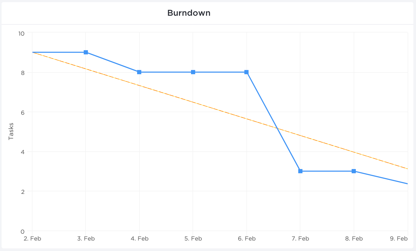
Now let’s break this down.
The ‘X’ axis (horizontal) represents the time set aside for a particular sprint or project completion.
The ‘Y’ axis (vertical) represents the remaining work.
The top left corner is where the project (or sprint) begins, and the bottom right corner is where it ends.
As for the two lines running between the two points, here’s what they represent:
- Ideal work remaining line (orange)
This represents how the team will ‘burn down’ all the remaining work if all things went as planned. It’s an ideal estimation that works as a baseline for all project calculations.
- Actual work remaining line (blue)
This is a representation of the actual work done and how much is left in the pipeline. It’s usually not a straight line as it’s subject to real-life events and delays in the team’s way. Ideally, you want the actual work line to stay under the ideal line.
But how does one create this chart?
You could always use handy project management tools that automatically generate such essential charts. On the other hand, you could opt for a more manual approach with good ol’ Microsoft Excel.
How to Create a Burndown Chart in Excel
Here’s how you can make a burn down chart in Excel in three simple steps.
In this article, we’ll focus on creating a work burndown chart for a sprint.
This example sprint is 10 days long and contains 10 tasks.
Ready to get down to cell-ular level in Excel?! Bring your microscopes 🔍
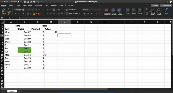
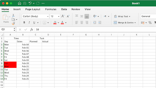
Step 1: Create a table
We’ll lay the groundwork for the work burndown chart with a table. This will contain your basic information on time and the tasks remaining.
For the tasks, split it into two columns, representing the number of remaining tasks you estimate you’ll have (your planned effort) and the actual tasks remaining on that day.
Open a new sheet in Excel and create columns as per your project’s needs.
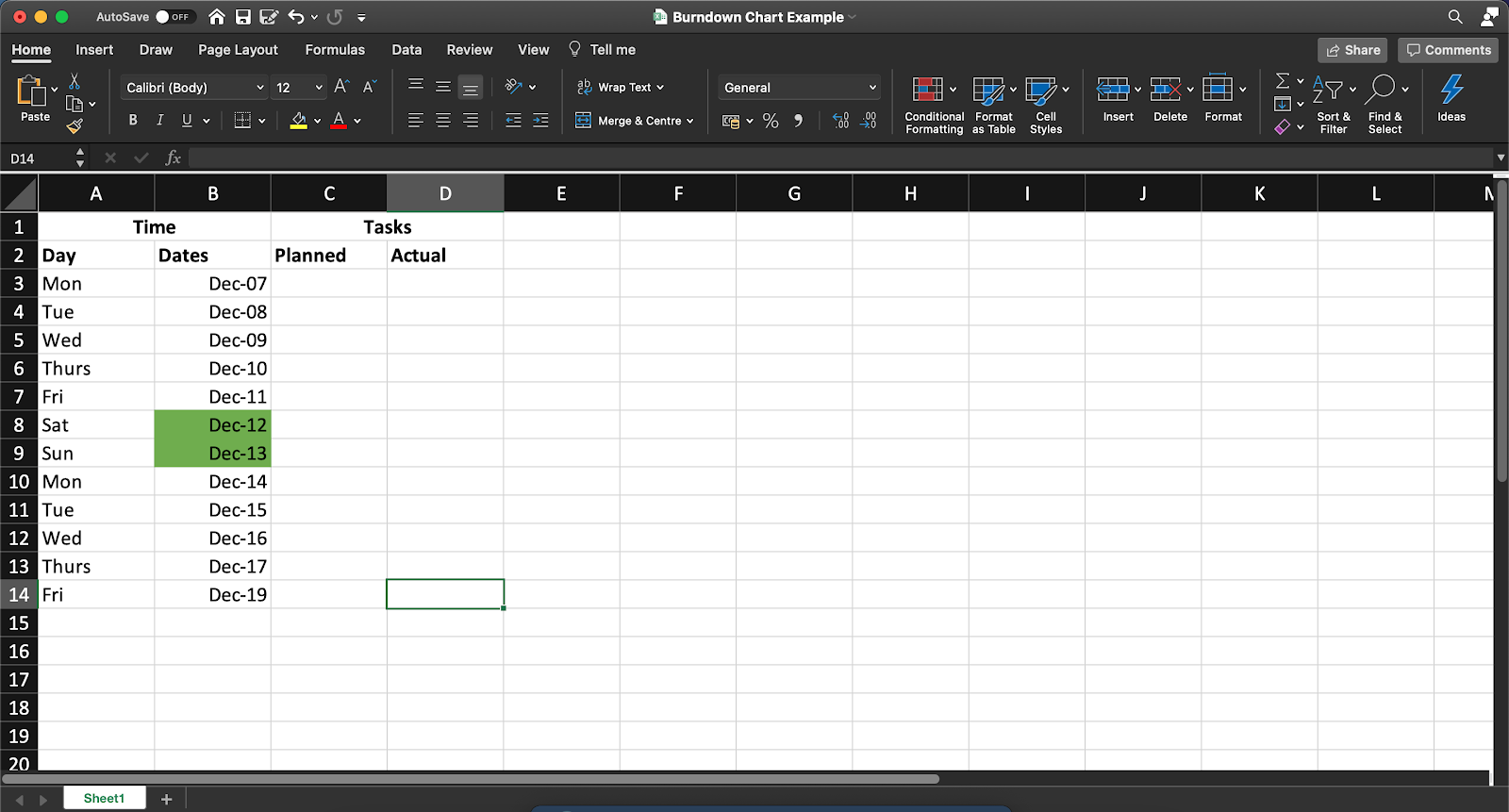
You can add details to this table for your work burndown chart, such as:
- The name of each product backlog item
- Story points
- Estimated effort (in hours)
- Actual effort (in hours)
- Remaining effort (in hours)
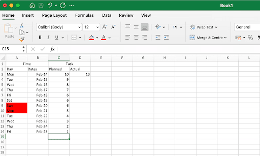
Step 2: Add data in the planned column
Now, we add our values to the planned column, representing how many tasks you ideally want remaining at the end of each day of the 10-day sprint.
Remember, this is an ideal scenario.
So whatever numbers you add here do not account for any real-world complications that your team may face in the sprint duration.
In our example, we’ve assumed an ideal burndown rate of one task or user story per working day. We’ve not accounted for weekends, and hence the number of tasks doesn’t reduce on Saturday and Sunday in this table.
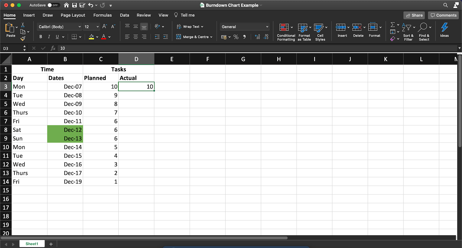
Note: You’ll have to manually update the Actual column at the end of each day to reflect the number of tasks that actually remain.
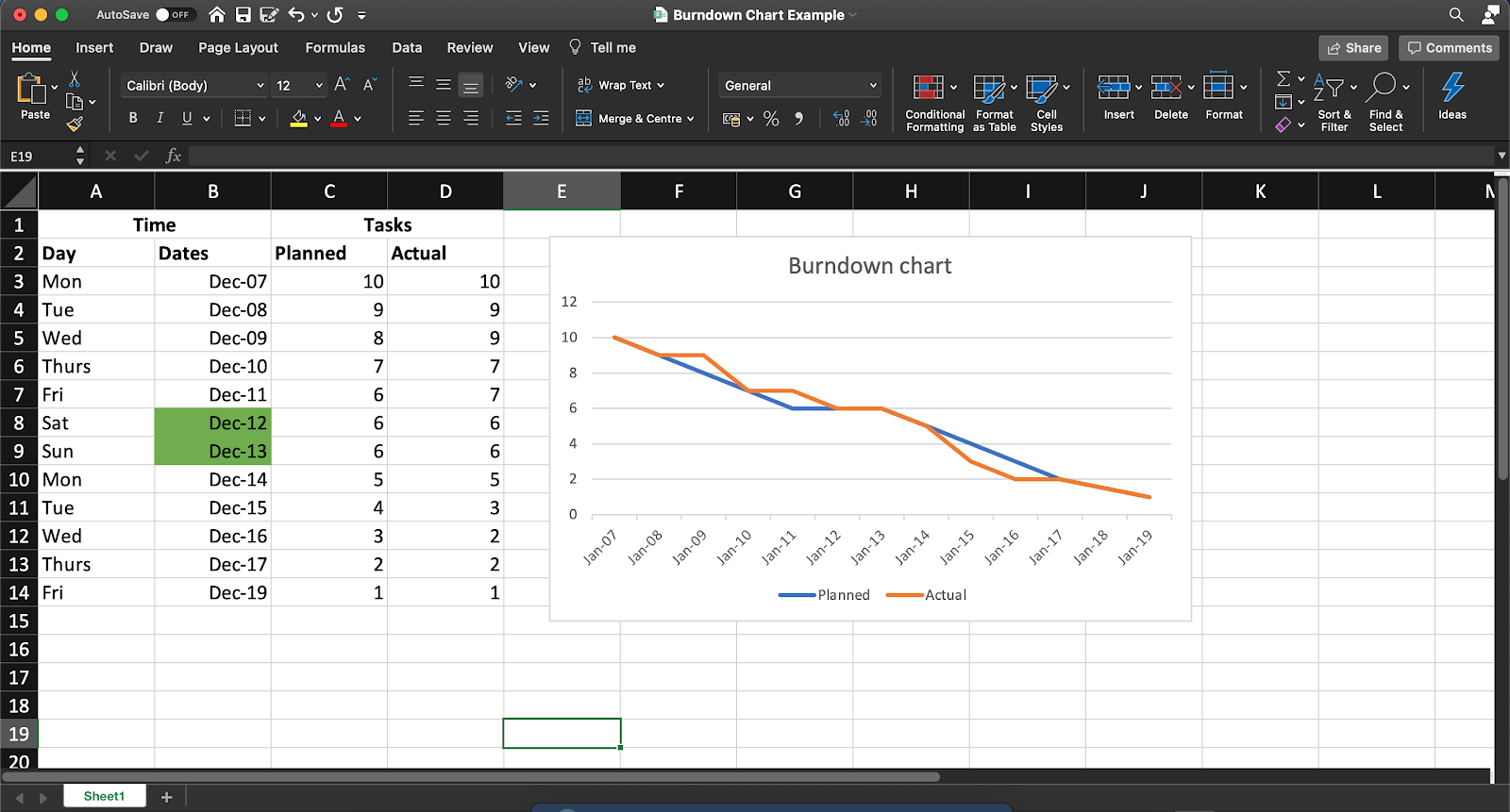
Step 3: Generate a chart
Once you’ve assembled your hard-earned data in one place, Excel will take over the rest of your process!
To do this, follow these steps:
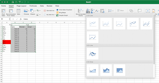
- Select the ‘Dates,’ ‘Planned,’ and ‘Actual’ columns
- Click on Insert in the top menu bar
- Click on the line chart icon
- Select any simple line chart from here
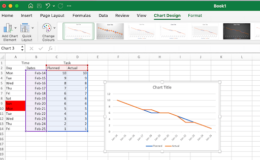
Once you’ve generated your graph, you can change the values in the ‘Actual’ column to edit the chart.
Your final Excel work burndown chart may resemble this:
So what do you think? Easy enough to create an Excel burndown chart, right?
After all, it’s just three simple steps.
But if you’d like to skip them too, we have a solution to help you cut to the chase.
4 Excel Burndown Chart Templates
Let’s face it. Between day-zero and your project deadline, you’re barely going to have time to breathe.
So building a project burn down chart from scratch is pretty much out of the question.
That’s why we’ve gathered three simple Excel burndown templates to make your life easier; so you can focus on what you do best.
Productive too, but being fabulous is never bad!
Just pick a burndown chart excel template from here.
1. Simple Burndown Chart Template
Use this ClickUp Burndown Chart Whiteboard template to visualize your “Sprint” points expectation and actual burn rate.
2. Actual and estimated hours burndown chart template

3. Agile Scrum burndown chart Excel template
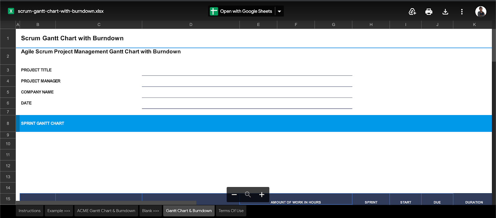
4. Gantt chart + burndown chart template
However, even with templates to save the day, it’s not all smooth sailing with Excel work burndown charts.
The 3 Limitations of Excel for Burndown Charts
When it comes to data management, Excel is a lot of things. It makes data simple, reliable, readily available. But some things about it will make you feel like Cinderella’s stepsisters, trying on those glass slippers.
Because Excel will never be enough for all your burndown chart needs.
Take a look at its glaring flaws.
1. Tedious, manual process
The point of a burndown chart is to give you quick, visual feedback about the sprint’s progress.
But working on Excel defeats this purpose.
Think about it.
Each sprint or project is different.
What’re you going to do?
Build a different table for each of them?
Pfff, please. That’s way too much effort.
Even if you decide to work with templates, how will you present these charts?
Last we checked, if you’re a Scrum master, presenting an MS Excel or Google spreadsheet at your daily scrum isn’t really the best idea.
This means you’ll need to migrate the charts and tables to your company’s intranet or wherever else you’re presenting!
2. Non-collaborative
If working in an Agile Scrum team is like sharing a large, family-sized pizza, MS Excel is like a lonely slice. 🍕
It’s awesome, as long as it’s only a party of one. 👀
Excel does provide basic support for collaborative editing.
It’s simply not smooth enough for an entire Agile team.
3. Inadequate mobile support
Mobile-friendliness is one of the top 10 things to watch out for in any software.
But looking at your Excel burndown chart on your phone is going to be like trying to fit the world map on your palm!
This is just the tip of the iceberg for why Excel is inadequate for most teams. Check out what makes Excel really unfit for project management.
Essentially, Excel is like a set of training wheels for your bicycle.
Everyone needs them. But they also eventually outgrow them.
And that’s the point!
You learn the basics of data management on MS Excel.
But as you move up the project management ladder, it’s time to move on to more significant, better, more powerful tools.
Like ClickUp, the world’s highest-rated productivity tool.
Create Effortless Burndown Charts with ClickUp
ClickUp is your one-stop-shop for every single project management need.
From setting Goals to tracking time on projects, ClickUp has you covered.
As for burndown charts, they’re well within our wheelhouse too!
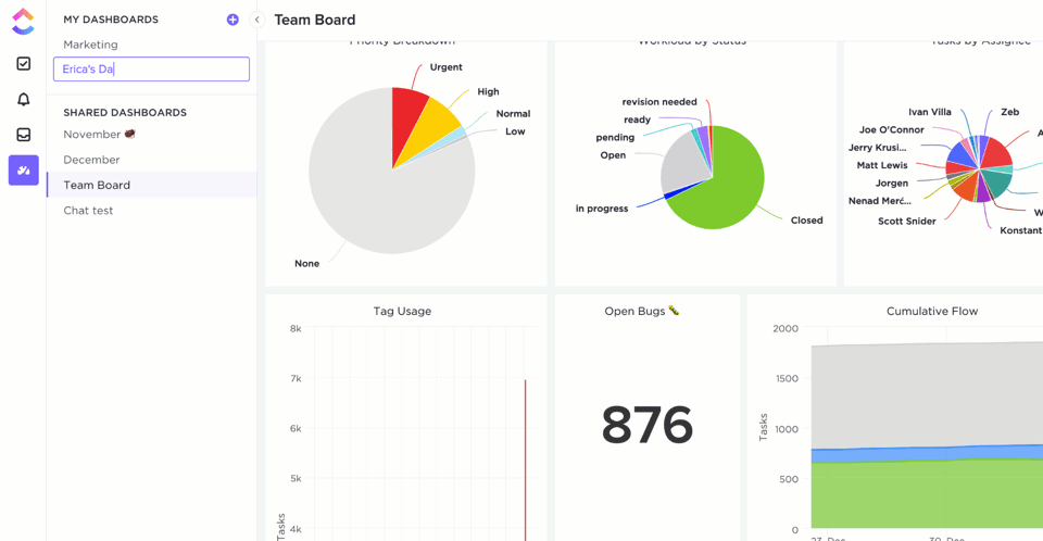
ClickUp Dashboards give you real-time updates about your project’s health at one glance.
And you can populate your Dashboard with Sprint Widgets like burndown charts!
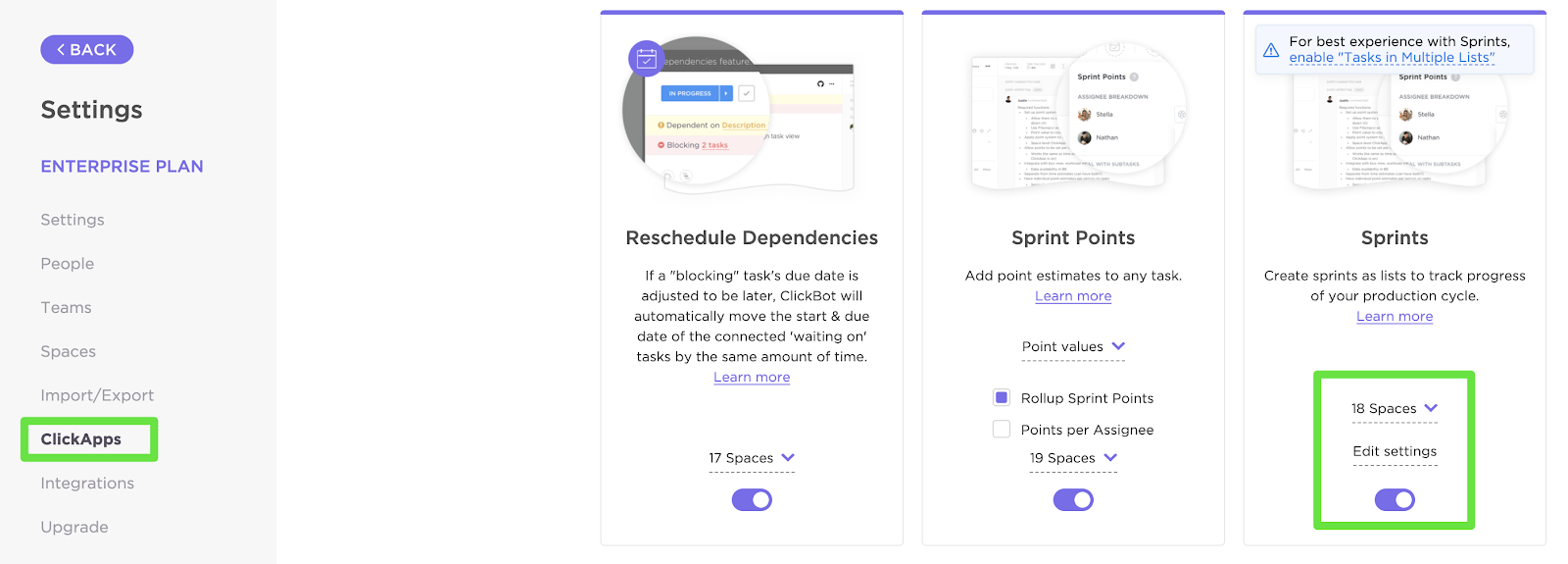
To set one up, first enable the Sprints ClickApp that lets you set and measure sprints on your project.
You can customize your Sprint Widgets by:
- Selecting the source of data
- Setting the time range
- Setting the workload type
Now that your data is in place, here’s how you can add a Burndown chart (or any other Sprint Widget) to your Dashboard:
- Enable Dashboards ClickApp (if you don’t find them by default)
- Click on the ‘+’ sign in the sidebar to add a new Dashboard
- On the Dashboard, click on ‘+ Add Widget’
And just like that, you’ll have the Burndown chart that’ll update you on project progress in real-time. Pretty nifty, right?
But notice how we said Sprint Widgets.
Yes, there are more!
These are some other handy Agile Widgets you can add to your Dashboard:
- Burnup chart: measure the scope of completed against the total work
- Velocity chart: calculate the amount of work your team can handle in a sprint
- Cumulative flow diagram chart: identify potential bottlenecks in the sprint’s progress
- Lead time chart: measure the time taken to complete a project (or a portion of it) from start to finish
- Cycle time chart: calculate the time taken to complete a single task from start to finish
And that isn’t all!
ClickUp is full of more project-friendly features such as:
- Gantt charts: take a look at everything in your project’s timeline at one glance
- Time Tracking: keep a record of time spent per task
- Assigned Comments: assign tasks to team members by tagging them in comments
- Goals: split your sprint Goals into easy-to-achieve Targets
- Automation: choose from over 50+ automations to save time
- Multiple Views: customize your home page by selecting from List, Board, Box, Calendar, or Table views
- Docs: created a detailed knowledge base for your agile and scrum projects
- Powerful iOS and Android mobile apps: for on the go work collaboration
Related Resources:
- How to Create a Timesheet in Excel
- How to Create a To Do List in Excel
- How to Create a Mind Map in Excel
- How to Make a Schedule in Excel
- How to Create a Form in Excel
- How to Make a Dashboard in Excel
- How to Make an Org Chart in Excel
- How to Make a Graph in Excel
- How to Create a Database in Excel
Burn Your Project Tracking Problems Away 🔥
Microsoft Excel laid down the foundation for advanced data management as we know it.
But let’s face it. Your project isn’t a history project.
And creating burndown charts on an Excel spreadsheet is going to keep you stuck in the dark ages of project management.
To run a high-power, fast-paced, Agile project, you’ll need equally nimble software.
Excel can still play a supporting role. But for your showstopper, you need ClickUp.
Set up your sprints, track their progress, manage your teams, all in one place with ClickUp’s features.
So get ClickUp for free today and burn past all your project problems!
This tutorial will demonstrate how to create a burndown chart in all versions of Excel: 2007, 2010, 2013, 2016, and 2019.
Burndown Chart – Free Template Download
Download our free Burndown Chart Template for Excel.
Download Now
In this Article
- Burndown Chart – Free Template Download
- Getting started
- Step #1: Prepare your dataset.
- Step #2: Create a line chart.
- Step #3: Change the horizontal axis labels.
- Step #4: Change the default chart type for Series “Planned Hours” and “Actual Hours” and push them to the secondary axis.
- Step #5: Modify the secondary axis scale.
- Step #6: Add the final touches.
- Download Burndown Chart Template
As the bread and butter of any project manager in charge of agile software development teams, burndown charts are commonly used to illustrate the remaining effort on a project for a given period of time.
However, this chart is not supported in Excel, meaning you will have to jump through all sorts of hoops to build it yourself. If that sounds daunting, check out the Chart Creator Add-in, a powerful, newbie-friendly tool for creating advanced charts in Excel while barely lifting your finger.
In this step-by-step tutorial, you will learn how to create this astounding burndown chart in Excel from scratch:
So, let’s get started.
Getting started
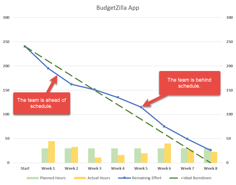
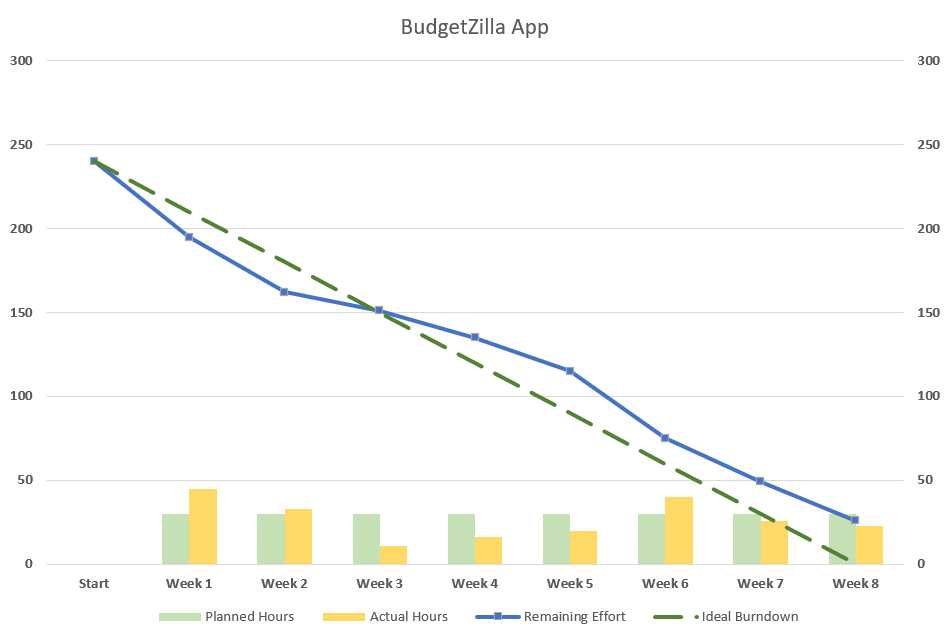
For illustration purposes, suppose your small IT firm has been developing a brand new budgeting app for about six months. Before hitting the first major milestone to show the progress to the client, your team had eight weeks to roll out four core features. As a seasoned project manager, you estimated it would take 240 hours to get the work done.
But lo and behold, that didn’t work out. The team failed to meet the deadline. Well, life is not a Disney movie, after all! What went wrong? In an effort to get to the bottom of the problem to figure out at what point things went off the rails, you set out to build a burndown chart.
Step #1: Prepare your dataset.
Take a quick look at the dataset for the chart:
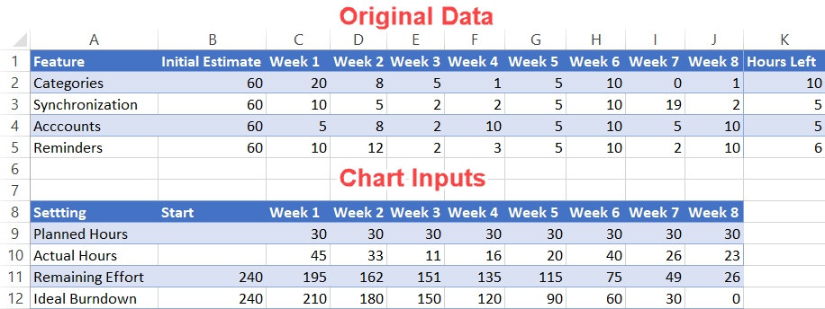
A quick take on each element:
- Original Data: Pretty self-explanatory—this is the actual data accumulated over the eight weeks.
- Chart Inputs: This table will make up the backbone of the chart. The two tables have to be kept separated to gain more control over the horizontal data label values (more on that later).
Now, let’s go over the second table more in detail so that you can easily customize your burndown chart.
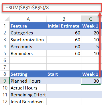
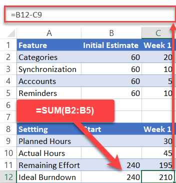
Planned Hours: This represents the weekly hours allocated to the project. To calculate the values, add up the initial estimate for each task and divide that sum by the number of days/weeks/months. In our case, you need to enter the following formula into cell C9: =SUM($B$2:$B$5)/8.
Quick tip: drag the fill handle in the bottom right corner of the highlighted cell (C9) across the range D9:J9 to copy the formula into the remaining cells.
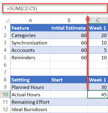
Actual Hours: This data point illustrates the total time spent on the project for a particular week. In our case, copy =SUM(C2:C5) into cell C10 and drag the formula across the range D10:J10.
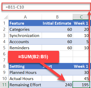
Remaining Effort: This row displays the hours left until project completion.
- For the value in the Start column (B11), just sum up the total estimated hours by using this formula: =SUM(B2:B5).
- For the rest (C11:J11), copy =B11-C10 into cell C11 and drag the formula across the rest of the cells (D11:J11).
Ideal Burndown: This category represents the ideal trend of how many hours you need to pour into your project each week to meet your deadline.
- For the value in the Start column (B12), use the same formula as B11: =SUM(B2:B5).
- For the rest (C12:J12), copy =B12-C9 into cell C12 and drag the formula across the remaining cells (D12:J12).
Short on time? Download the Excel worksheet used in this tutorial and set up a customized burndown chart in less than five minutes!
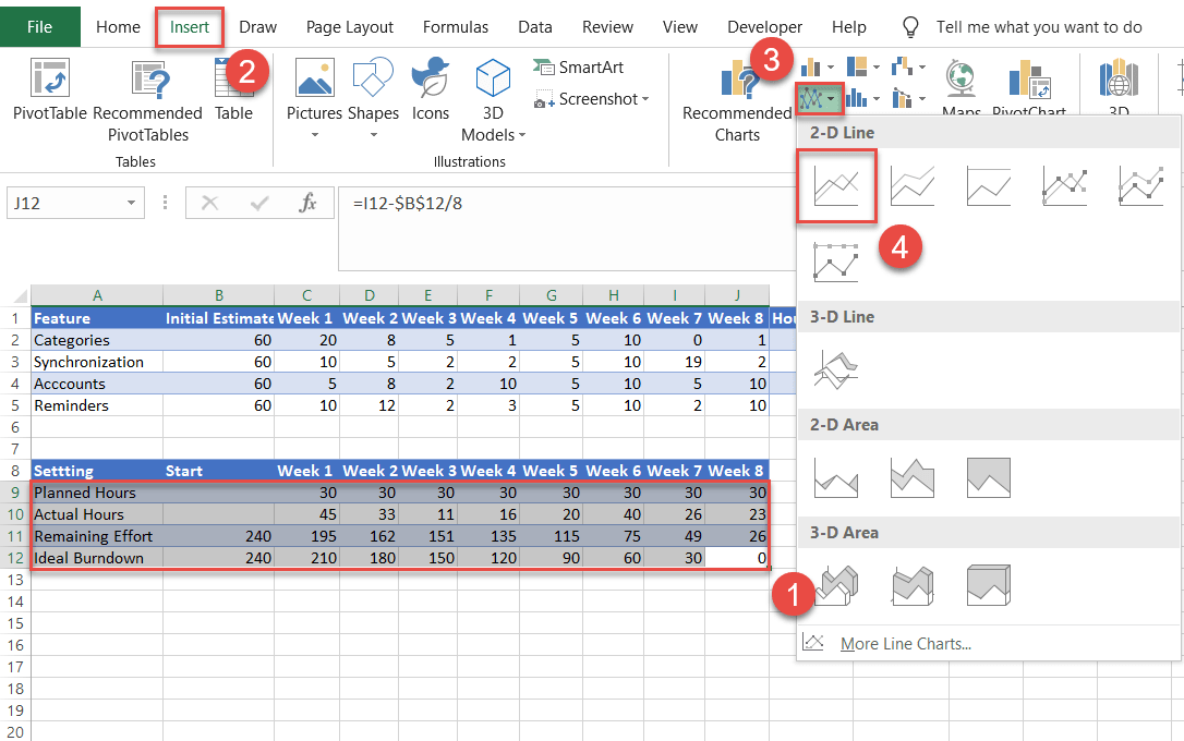
Step #2: Create a line chart.
Having prepared your set of data, it’s time to create a line chart.
- Highlight all the data from the Chart Inputs table (A9:J12).
- Navigate to the Insert tab.
- Click the “Insert Line or Area Chart” icon.
- Choose “Line.”
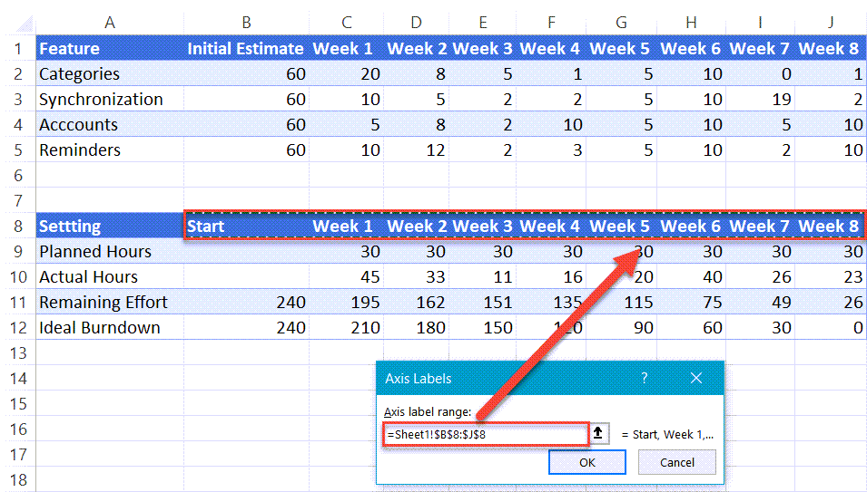
Step #3: Change the horizontal axis labels.
Every project has a timeline. Add it to the chart by modifying the horizontal axis labels.
- Right-click on the horizontal axis (the row of numbers along the bottom).
- Choose “Select Data.”
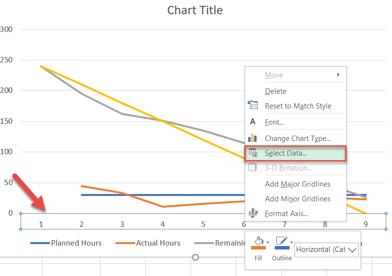
In the window that appears, under Horizontal (Category) Axis Labels, select the “Edit” button.
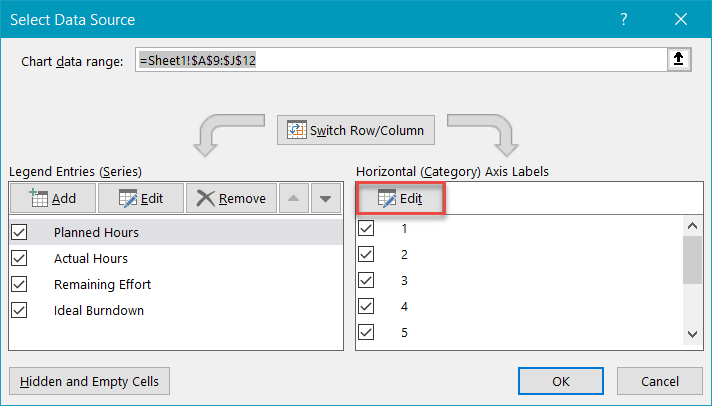
Now, highlight the header of the second table (B8:J8) and click “OK” twice to close the dialog box. Notice that because you have previously separated the two tables, you have complete control over the values and can change them the way you see fit.
Step #4: Change the default chart type for Series “Planned Hours” and “Actual Hours” and push them to the secondary axis.
Transform the data series representing the planned and actual hours into a clustered column chart.
- On the chart itself, right-click the line for either Series “Planned Hours” or Series “Actual Hours.”
- Choose “Change Series Chart Type.”
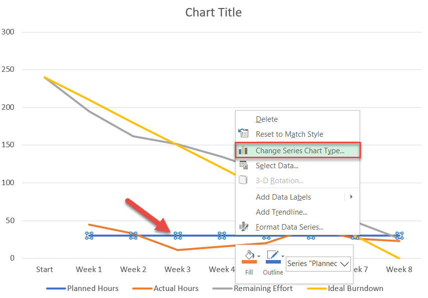
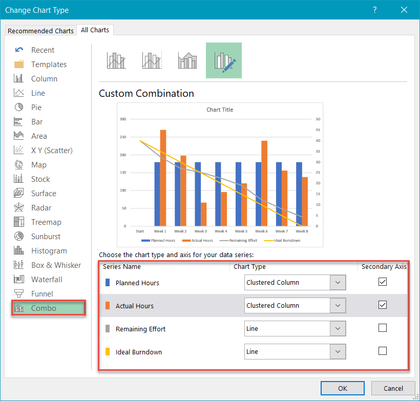
Next, navigate to the Combo tab and do the following:
- For Series “Planned Hours,” change “Chart Type” to “Clustered Column.” Also, check the Secondary Axis box.
- Repeat for Series “Actual Hours.”
- Click “OK.”
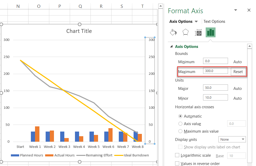
Step #5: Modify the secondary axis scale.
As you may have noticed, instead of being more like a cherry on top, the clustered column chart takes up half the space, stealing all the attention from the primary line chart. To work around the issue, alter the secondary axis scale.
First, right-click on the secondary axis (the column of numbers on the right) and select “Format Axis.”
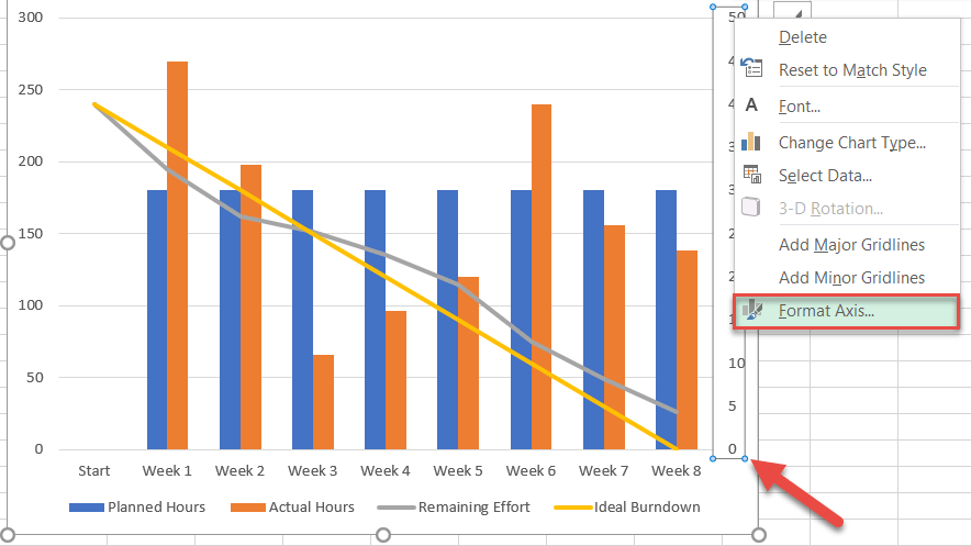
In the task pane that pops up, in the Axis Options tab, under Bounds, set the Maximum Bounds value to match that of the primary axis scale (the vertical one to the left of the chart).
In our case, the value should be set to 300 (the number at the top of the primary axis scale).
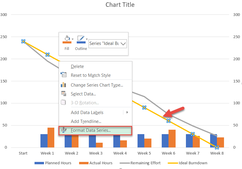
Step #6: Add the final touches.
Technically, the job is done, but since we refuse to settle for mediocrity, let’s “dress up” the chart by making use of what Excel has to offer.
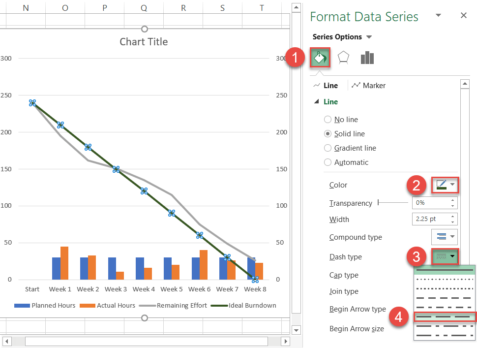
First, customize the solid line representing the ideal trend. Right-click on it and select “Format Data Series.”
Once there, do the following:
- In the task pane that appears, switch to the Fill & Line tab.
- Click the Line Color icon and select dark green.
- Click the Dash Type icon.
- Choose “Long Dash.”
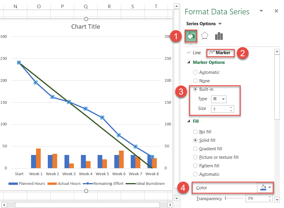
Now, move on to the line displaying the remaining effort. Select Series “Remaining Effort” and right-click to open the “Format Data Series” task pane. Then do the following:
- Switch to the Fill & Line tab.
- Click the Line Color icon and select blue.
- Go to the Marker tab.
- Under Marker Options, choose “Built-in” and customize the marker type and size.
- Navigate to the “Fill” section immediately below it to assign a custom marker color.
I also changed the column colors in the clustered column chart to something lighter as a means to accentuate the line chart.
As a final adjustment, change the chart title. You have now crossed the finish line!
And voila, you have just added another arrow to your quiver. Burndown charts will help you easily see trouble coming from a long way off and make better decisions as you manage your projects.
Download Burndown Chart Template
Download our free Burndown Chart Template for Excel.
Download Now

Looking to create a burndown chart in Excel?
In this article, we will walk you through the concept of a burndown chart, the types of burndown charts, and how to make a burndown chart in Excel.
Burndown chart is used by agile project managers to track their projects.
This makes it easy to determine, whether things are going according to plan and if you’ll be able to meet your deadline and reach your objective.
Burndown charts are one of the easiest ways to track your project’s progress in relation to its goals and deadlines.
While for many teams, Microsoft Excel is the preferred method, the easier way is to use a visual project management software like Nifty to automate progress tracking in real-time.

What is a burndown chart?
A burndown chart is a visual representation of the amount of work remaining to perform versus the amount of time available.
Such a chart is commonly used in scrum boards and other agile workflow lifecycles for software development.
In addition to software development projects, Burndown charts can be used on any project in which progress overtime matters.
The vertical axis in a burndown chart represents the amount of work while the horizontal axis shows the amount of time, the project (or sprint) starts in the upper left corner and ends in the lower right corner.
Here you can see a sample of a burndown chart:
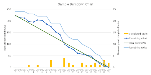
The two lines that travel between the two spots reflect the following:
- The ideal work line (green): If all goes according to plan, this is how the scrum team will actually burn down the remaining work. It’s a perfect estimate that serves as the foundation for all project computations.
- Actual work remaining line (blue): This is a representation of the actual work completed and the amount of work that remains in the pipeline. Because it is subject to real-life events and delays in the team’s path, it is rarely a straight line. You want the real work line to keep under the ideal line as much as possible.
A burndown chart can be used to estimate how long it will take to complete all of the tasks. During a working day, the software development team or any other team that is using the burndown chart can update the chart so that the whole team would know about the stage of the project and the amount of time needed to complete the project.
Burndown charts are essentially two sorts in the agile scrum process:
- A sprint (release) burndown chart: used to keep track of how much work is remaining in a particular sprint.
- A product burndown chart: used to control the amount of work remaining on an entire project.
Why use a burndown chart?
Here are some of the reasons to use a burndown chart for your software development projects or any other projects:
- Keeping track of the project’s scope creep
- Maintaining the team’s schedule
- Comparing the scheduled work to the progress of the team
How to create a burndown chart?
You can create a burndown chart in two ways. You may choose to use a project management tool that generates such important charts for you. Another way to create a burndown chart is to use Microsoft Excel to take a more manual approach.
How to make a burndown chart in excel?
So, let’s now see how to make a burndown chart in Excel in only three easy steps. We will focus on making a sprint burndown chart and suppose that the time needed to complete the sprint is 10 days and there are 10 tasks to do.
1. Create a Table in the Excel Sheet
The first step to making a burndown chart in Excel is creating a table in the Excel sheet. This table will establish the foundation for the sprint burndown chart and provide you with basic information about the amount of time you have left and the tasks you still have to complete.
Divide the tasks into two columns, one for the estimated amount of tasks you’ll have (your planned effort) and the other for the actual tasks you’ll have that day. Create columns according to your project’s demands in a new Excel sheet.
Here is a sample of a burndown chart in Excel:
This is the very simple version of data in the cells of the table and you can customize them so that they show what you actually mean. For instance, you can write the name of your product backlogs, estimated effort, actual effort, and remaining effort.
2. Add Planned Tasks Data
Now what you should do is to enter your data such as numbers in the planned tasks column, which represents the number of jobs you would like to have left at the end of each day of the 10-day sprint. Remember that the number of planned tasks is an ideal value and can be different from what actually happens in reality due to many reasons. For instance, your team may have a personal reason for a one-day leave, there may be out-of-schedule tasks and projects, etc.
As a result, any numbers you enter here do not account for any real-world issues that your team may face throughout the sprint. Here in this sample, let’s suppose that you have considered your planned tasks schedule to be one task per working day. The point to take into account is that you should weekends should not be assigned any tasks as they are not working days. So, remember not to take them into consideration while scheduling your planned tasks column.
The actual tasks column should be updated after each working day based on actual data. This number should represent the actual number of tasks that remain for the rest of the days of the sprint.
3. Create a Graph via a Burndown Chart
The rest of the work to make a burndown chart will be done by Excel. Your task is just to add the data based on your ideal as well as the actual data. To ask Excel to create the graph or the burndown chart, you should follow these steps:
- Select the three right columns of ‘Dates,’ ‘Planned,’ and ‘Actual.’
- In the top menu bar, select Insert.
- Select the line chart icon from the drop-down menu.
- Choose a basic line chart from the menu.
After making your burndown chart, you can manually change the values of the actual tasks column in the table and change the burndown chart.
Here is what your burndown chart should look like:
If your actual amount of work done is the same as what you planned in the planned tasks column, there would be only one line in your burndown chart. However, that is unlikely to happen because, as mentioned before, many things can occur to procrastinate completing the tasks based on what you have idealized before the start of the sprint.
Limitations of using Excel for burndown charts?
Excel is a powerful tool when it comes to data management. It makes data clear, dependable, and accessible. However, while the process of making a burndown chart in Excel is easy especially if you are an Excel expert, there are some flaws and limitations with it. Here is a list of Excel limitations for burndown charts:
1. Time-Consuming
Entering the sprint or project data in the Excel sheet can be very boring and time-consuming when making a burndown chart. It is because it should be done manually which would take up your speed. And the purpose of burndown charts is to show you the process of your sprints and projects within less than seconds so that you quickly know what is going on in your business and how productive your team has been. Making a burndown chart in Excel kills the whole purpose of burndown charts as it is slow, manual, and boring.
Imagine that you want to have a project burndown chart with many sprint burndown charts within it. Think of the amount of time you will lose as a project manager that you could spend on much more important things to make your team more productive.
2. Error-Prone
Excel is great for accounting because it facilitates the work of accountants by eliminating the calculator from their desk. However, in a process like making a burndown chart and especially when you are manually entering the data related to the actual amount of work done, Excel is prone to errors that would burn your burndown chart and your team’s efforts to ashes. If you, as a project manager or a scrum master, want to have an errorless and authentic burndown chart, Excel is a limited tool to meet your need.
3. Non-Collaborative
Being part of an Agile Scrum team means that there has to be a lot of communications and collaborations going on and the team should be working together. Yes, you can share your Excel sheet with your scrum team or ask the team at the end of each working day to report to you but is that not too traditional? Ever thought that it would give a kind of insecurity to your scrum team that you do not trust it? Or, it may also mean that there is a hierarchical order in your company that would keep your team members having normal communications with you? Excel is, therefore, not enough for scrum teams when it comes to collaborative burndown charts.
4. No Support for Mobile Devices
One of the top ten features to look for in any software is mobile compatibility. However, accessing or making the Excel burndown chart on your phone will be inadequate. On MS Excel, you study the fundamentals of data administration but that will not be enough as your business needs grow. Therefore, you will need to upgrade to more important, better, and more powerful tools.
What is the best alternative to Excel for making burndown charts?
The above-mentioned limitations can really affect your team’s productivity when managing projects. The alternative is to use a visual project management software that create burndown charts for you so you can focus on actual work . Wasting time on unnecessary tasks like building a burndown chart in Excel can easily be automated with better tools would eventually result in not focusing on more important things.
The best alternative for Excel and your visual project management needs is Nifty.
Nifty is a cloud-based project management tool that can meet all your project management needs. You can create milestones (Gantt Charts) for your projects as well as track time on projects for performance analysis to measure the productivity of your team in real-time.
Here are some key features of Nifty:
- Reporting: Get a birds-eye view across all your projects & workloads with Overviews. You can get an eye-catching project overview with colorful visuals instead of a plain burndown chart you get with Excel.
- Discussions: Discussions allow project team members to focus their efforts in order to make more informed decisions. They also facilitate collaboration in real-time to discuss ideas, gather input, and make important choices especially with the use of an idea board.
- Task Management: Organize, prioritize, and manage tasks with a high level of detail.
- Project Time Tracking: Drive efficiency and smarter decision-making with meaningful time logs.
- Milestones: Milestones serve as your visual project guide by automating progress based on task completion.
- Docs & Files: The centralized docs and files can help you maintain an organized workflow by consolidating project documents and files.
- Project Portfolios: That helps you bring better organization and more automation to your workflow.
👉 Does Nifty have a free trial? Yes, Nifty offers a free 14 day trial. Click here to get started 🎉
Conclusion
Microsoft Excel is credited with laying the groundwork for advanced data management. But, time has changed and it is all about speed and efficiency when it comes to using tools. And using an Excel spreadsheet to create burndown charts will make you a traditional project manager in the modern era.
That is easy to avoid if you choose a proper alternative like graphic design software to Excel for making your burndown charts in your agile projects. Turn to Nifty and enjoy all its project management features at a reasonable price or eb=ven for free forever! Wish you the best of luck!
What’s an Excel Burndown Chart For?
In agile or iterative development methodologies such as Scrum an Excel burndown chart is an excellent way to illustrate the progress (or lack of) towards completing all of the tasks or backlog items that are in scope for the current iteration or sprint.
Excel can be an effective tool to track these iterations, or sprints, as well as report on the progress using a burndown chart in Excel.
We’ll break the task of creating an Excel burndown chart into four main groups.
- Set up the sprint’s information.
- Set up the work backlog.
- Set up the burn down table.
- Create the chart.
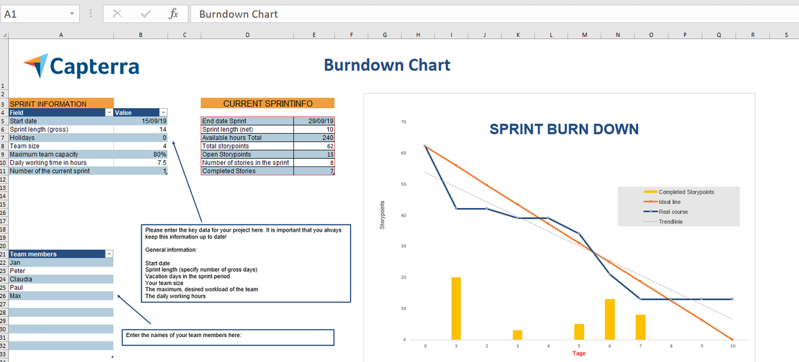
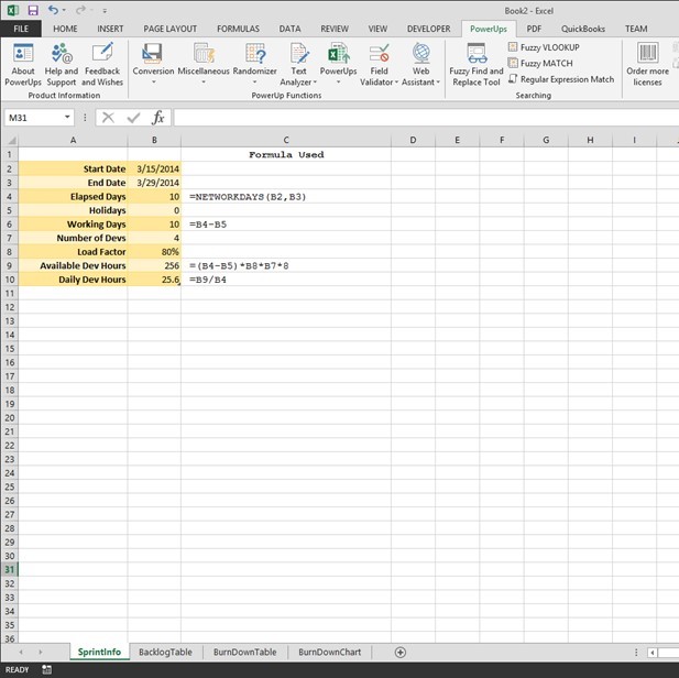
Setting up the Sprint Information for Your Excel Burndown Chart
The key thing the Burn Down chart will show is a plot of the amount of planned work against the amount of remaining work. To figure out the amount of work that can be done in a sprint, in its simplest form, is calculate the total number of developer or person-hours collectively available.
In this tutorial, I set up as below. You can elect to simplify of course.
First, you can get the number of calendar working days between a start and end date. The NETWORKDAYS function in Excel is handy for this. Additionally, you can allow for holidays or other special days and subtract from the calendar working days. This will give you the number of working days for this sprint. In this example, I named the working days cell WorkingDays to make some formulas later easier to read/follow.
Next, the number of developers is provided along with the load factor. In this example I used 80% as an indication of the level of productivity or utilization for development tasks. Remember, things like meetings, training, bio-breaks, vacation, illness, etc all come out of the 100%. Coming up with a factor this best represents your team will help in the overall estimation and capacity determination.
With the information described above you can calculate the total number of developer hours. You can use days too, depending on the level of granularity you need. Eight working hours/day is assumed in this example.
WorkingDays * LoadFactor * NumberOfDevs * 8
The number of developer hours available on a given day is as follows.
TotalDeveloperHours / ElapsedDays
You can see this set up in the sample workbook image below. The formulas used are placed next to the cells.
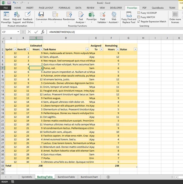
Setting up the Sprint Backlog Table for an Excel Burndown Chart
A sprint, or iteration, is bound by a set amount of time (usually in weeks) and a set of work items to be completed. Items queued up on the work list are called the sprint backlog.
The sprint backlog table needs to have three key columns. They are the work item ID, the amount of time estimated to complete the item, and the amount of time remaining to complete the item. Initially, the amount of time remaining is equal to the initially estimated amount of time.
You can add additional columns to suit your needs. For example, you may want to add columns to identify the sprint number, the name of the task, the person the task is assigned to, and the status of the item. I’ve added these columns for this example too.
At the bottom of the table you will have two number of interest. The first will be the total amount of time estimated for this iteration or sprint. I named this cell TotalHours in Excel. The second will be total number of remaining hours. As mentioned above, these two numbers are the same at the start of the sprint.
The image below shows the sample sprint backlog table I used in this tutorial.
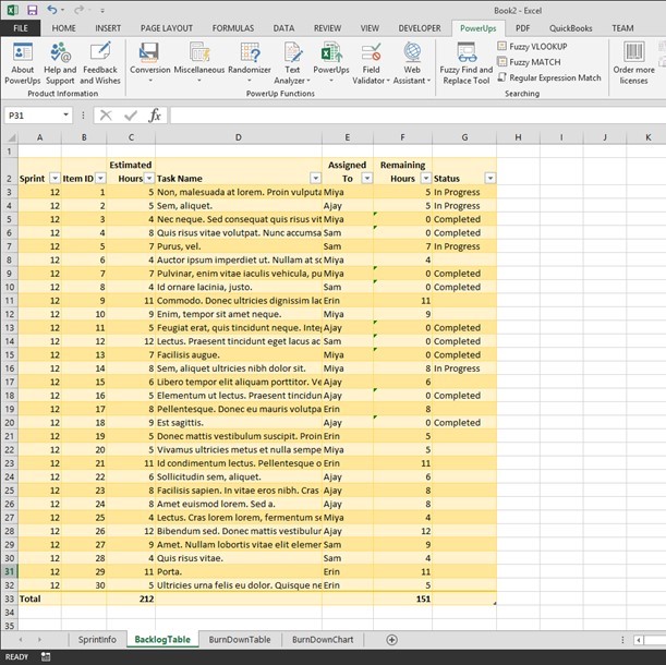
As you work on the items in your sprint, you will update the values for the remaining amount of time (Remaining Hours in this example). When an item is completed, set it’s remaining amount of time to zero. I also chose to indicate a status of “In Progress” in addition to “Completed”. The image below illustrates this.
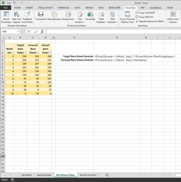
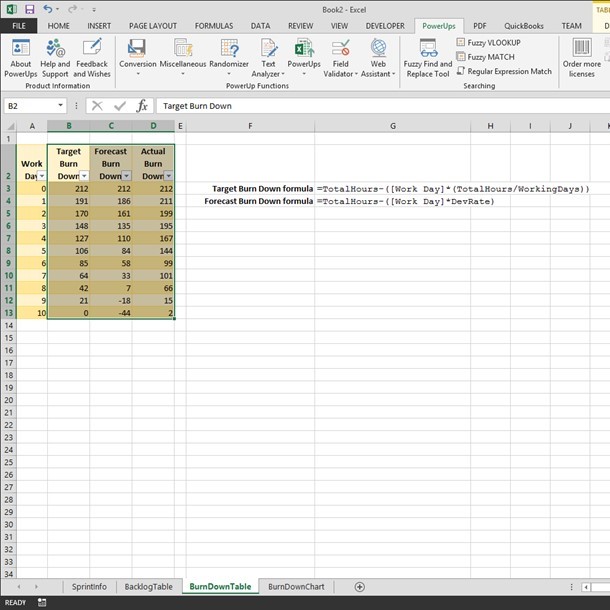
Setting up the Burndown Table for Your Excel Burndown Chart
So far, you have set up to determine the amount of work needed as well as how much work is left to perform. Since an Excel burndown chart needs to show how your team is tracking to completion over time, you’ll set up another table to figure out the ideal rate of completion to compare to the actual rate of completion.
In this table, the first column will list the days in the sprint. Create one row per day.
Next, create a column to represent the ideal progress towards completion. I called the column Target Burn Down. In this column, the formula used is the following.
=TotalHours - ([Work Day]*(TotalHours/WorkingDays))Add another column for the actual progress. I called the column Actual Burn Down. In this column, you will enter the number of actual remaining hours from the sprint backlog table each day. You would do this after polling your team on their progress to date and updating the sprint backlog table data.
In this tutorial example, I also added another column called Forecast Burn Down. I set this up to represent the projected progress based on the number of available developer hours. This would give an idea as to whether the amount of work in the sprint was too much or not enough. The formula is as follows.
=TotalHours - ([Work Day] * DevRate)This table is pictured below.
Creating the Excel Burndown Chart
At this point you’ve the setup work. The actual Excel burndown chart is simply a line chart. Select the columns that track the burndown. In this example we’ll use the Target, Forecast, and Actual Burn Down columns.
Select a line chart type from the Insert tab on the ribbon. I used the 2D line with markers chart type.
In the chart, select the numbers across the x-axis and change the label range to the numbers in the Work Day column. In this example, I just used the numbers from 0 thru 10 for each day. You could the rows Day 1, Day 2, etc.
I changed a couple colors and the Excel burndown chart produced is below.
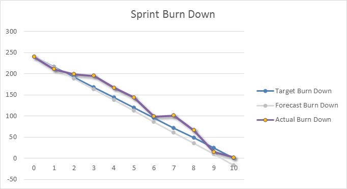
Reading the Excel Burndown Chart
In the Excel burndown chart picture above, any point above the blue line (Target Burn Down) indicates work is not tracking to on-time completion. Conversely, any point below the blue line indicates work is tracking to early completion.
The light gray line in this example shows the amount of work included in the sprint is slightly less than the estimated team capacity.
An Excel burndown chart can be an effective way to illustrate the progress a team is making towards completing all of their items on time and can give the team some easy to see information needed to better manage the sprint to help ensure successful completion.
Get a Jump Start with an Excel Burndown Chart Template
You can get an Excel template for a burndown chart here.
There you go.
Диаграмма выгорания и диаграмма выгорания обычно используются для отслеживания прогресса в направлении завершения проекта. Теперь я расскажу, как создать диаграмму выгорания или выгорания в Excel.
Создать диаграмму выгорания
Создать диаграмму выгорания
 Создать диаграмму выгорания
Например, есть базовые данные, необходимые для создания диаграммы выгорания, как показано ниже:
Теперь вам нужно добавить новые данные под базовыми данными.
1. Под базовыми данными выберите пустую ячейку, здесь я выбираю ячейку A10, набираю «Оставшееся рабочее время сделки»И в ячейке A11 введите«Фактическое оставшееся рабочее время», См. Снимок экрана:
2. Рядом с A10 (тип ячейки «Оставшееся рабочее время») введите эту формулу. = СУММ (C2: C9) в ячейку C10, затем нажмите Enter ключ, чтобы получить общее рабочее время.
Функции: В формуле C2: C9 — это диапазон ячеек рабочих часов для всех ваших задач.
3. В ячейке D10 рядом с общим количеством рабочих часов введите эту формулу. = C10 — (10 канадских долларов / 5), затем перетащите маркер автозаполнения, чтобы заполнить нужный диапазон. Смотрите скриншот:
Функции: В формуле C10 — это оставшееся рабочее время сделки, $ C $ 10 — это общее рабочее время, 5 — количество рабочих дней.
4. Теперь перейдите в ячейку C11 (которая находится рядом с типом ячейки «Фактическое оставшееся рабочее время») и введите в нее общее количество рабочих часов, здесь 35. Смотрите снимок экрана:
5. Введите эту формулу = СУММ (D2: D9) в D11, а затем перетащите маркер заполнения в нужный диапазон.
Теперь вы можете создать диаграмму выгорания.
6. Нажмите Вставить > линия > линия.
7. Щелкните правой кнопкой мыши пустую линейную диаграмму и нажмите Выберите данные в контекстном меню.
8. в Выберите источник данных диалоговое окно, нажмите Добавить для открытия Редактировать серию диалоговое окно и выберите «Оставшееся рабочее время сделки»Как первая серия.
В нашем случае мы указываем ячейку A10 в качестве имени серии и указываем C10: H10 в качестве значений серии.

9. Нажмите OK вернуться назад Выберите источник данных диалоговое окно и щелкните Добавить еще раз, затем добавьте «Фактическое оставшееся рабочее время»Как вторая серия в Редактировать серию диалог. Смотрите скриншот:
В нашем случае мы указываем A11 в качестве имени серии и указываем C11: H11 в качестве значений серии.


10. Нажмите OK, вернуться к Выберите источник данных снова нажмите Редактировать в Ярлыки горизонтальной оси (категории) раздел, затем выберите Диапазон C1: H1 (Ярлыки «Итого» и «Даты») на Диапазон этикеток оси коробка в Ярлыки осей диалог. Смотрите скриншоты:


11. Нажмите OK > OK. Теперь вы можете видеть, что диаграмма выгорания создана.
Вы можете щелкнуть диаграмму и перейти к макет вкладку и нажмите Легенда > Показать легенду внизу чтобы показать диаграмму выгорания более профессионально.
В Excel 2013 щелкните Дизайн > Добавить элемент диаграммы > Легенда > Дно.
Создать диаграмму выгорания
Создать диаграмму выгорания намного проще, чем создать диаграмму выгорания в Excel.
Вы можете создать свои базовые данные, как показано на скриншоте ниже:
1. Нажмите Вставить > линия > линия чтобы вставить пустую линейную диаграмму.
2. Затем щелкните правой кнопкой мыши пустую линейную диаграмму, чтобы выбрать Выберите данные из контекстного меню.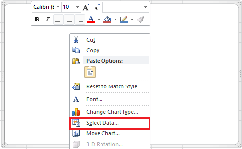
3. Нажмите Добавить в Выберите источник данных диалоговом окне, затем добавьте название серии и значения в Редактировать серию диалоговое окно и щелкните OK , чтобы вернуться к Выберите источник данных диалоговое окно и щелкните Добавить снова добавить вторую серию.
Для первой серии в нашем случае мы выбираем ячейку B1 (заголовок столбца оценочной единицы проекта) в качестве имени серии и указываем диапазон B2: B19 в качестве значений серии. Измените ячейку или диапазон в соответствии с вашими потребностями. См. Снимок экрана выше.
Для второй серии в нашем случае мы выбираем ячейку C1 в качестве имени серии и указываем диапазон C2: C19 в качестве значений серии. Измените ячейку или диапазон в соответствии с вашими потребностями. См. Снимок экрана выше.
4. Нажмите OK, теперь перейдите к Ярлыки горизонтальной оси (категории) в Выберите источник данных диалоговое окно и щелкните Редактировать кнопку, затем выберите значение данных в Ярлыки осей диалог. И нажмите OK. Теперь метки оси были заменены метками даты. В нашем случае мы указываем диапазон A2: A19 (столбец даты) как метки горизонтальной оси.
<


5. Нажмите OK. На этом диаграмма выгорания завершена.
И вы можете поместить легенду внизу, щелкнув вкладку Макет и щелкнув Легенда > Показать легенду внизу.
В Excel 2013 щелкните Дизайн > Добавить элемент диаграммы > Легенда> Внизу.
Относительные статьи:
- Создать блок-схему в Excel
- Создать контрольную диаграмму в Excel
- Создать диаграмму эмоций в Excel
- Создать диаграмму этапов в Excel
Лучшие инструменты для работы в офисе
Kutools for Excel Решит большинство ваших проблем и повысит вашу производительность на 80%
- Снова использовать: Быстро вставить сложные формулы, диаграммы и все, что вы использовали раньше; Зашифровать ячейки с паролем; Создать список рассылки и отправлять электронные письма …
- Бар Супер Формулы (легко редактировать несколько строк текста и формул); Макет для чтения (легко читать и редактировать большое количество ячеек); Вставить в отфильтрованный диапазон…
- Объединить ячейки / строки / столбцы без потери данных; Разделить содержимое ячеек; Объединить повторяющиеся строки / столбцы… Предотвращение дублирования ячеек; Сравнить диапазоны…
- Выберите Дубликат или Уникальный Ряды; Выбрать пустые строки (все ячейки пустые); Супер находка и нечеткая находка во многих рабочих тетрадях; Случайный выбор …
- Точная копия Несколько ячеек без изменения ссылки на формулу; Автоматическое создание ссылок на несколько листов; Вставить пули, Флажки и многое другое …
- Извлечь текст, Добавить текст, Удалить по позиции, Удалить пробел; Создание и печать промежуточных итогов по страницам; Преобразование содержимого ячеек в комментарии…
- Суперфильтр (сохранять и применять схемы фильтров к другим листам); Расширенная сортировка по месяцам / неделям / дням, периодичности и др .; Специальный фильтр жирным, курсивом …
- Комбинируйте книги и рабочие листы; Объединить таблицы на основе ключевых столбцов; Разделить данные на несколько листов; Пакетное преобразование xls, xlsx и PDF…
- Более 300 мощных функций. Поддерживает Office/Excel 2007-2021 и 365. Поддерживает все языки. Простое развертывание на вашем предприятии или в организации. Полнофункциональная 30-дневная бесплатная пробная версия. 60-дневная гарантия возврата денег.
")
Вкладка Office: интерфейс с вкладками в Office и упрощение работы
- Включение редактирования и чтения с вкладками в Word, Excel, PowerPoint, Издатель, доступ, Visio и проект.
- Открывайте и создавайте несколько документов на новых вкладках одного окна, а не в новых окнах.
- Повышает вашу продуктивность на 50% и сокращает количество щелчков мышью на сотни каждый день!
")
A Burndown Chart is used to visualize the work remaining in the time available for a Sprint.
If your Project Management tool suite does not include an easy method for tracking your Effort Points and generating a Burndown Chart out-of-the-box, you may want to generate your own using Microsoft Excel.
This blog post will show you an example of how we generate Burndown Charts at Coria.

Step 1: Create the Shell of Your Burndown Template in Excel (or Just Download Ours)
Your Burndown Chart should include columns to track:
- Your list of Product Backlog Items (PBIs) — The PBIs should be groomed, prioritized by your Product Owner, and listed in order of importance.
- The number of «Effort Points» for each PBI — Your team should determine the number of Effort Points for each of these PBIs using an arbitrary scale (like a modified Fibonacci sequence). When you first create your Excel template, just leave these values blank until you’ve assigned Effort Points during Sprint Planning using a technique like Planning Poker.
- The number of working days available in the Sprint — We like to include the calendar date as well as the count. Your spreadsheet should skip calendar dates for all non-working days (example, Day 1 = July 11th and Day 6 = July 18th).

Short on Time?
Get a blank Burndown Chart template to help kickoff your next Agile Sprint.
DOWNLOAD NOW
Step 2: Add a Spot to Total Your Effort Points
Your Burndown Chart should include rows for:
- Actual Remaining Effort (by day)
- Ideal Trend of Remaining Effort (if spread equally across each available day)
![]()
The Remaining Effort is calculated by getting the sum of all the Effort Points completed on a specific day in the Sprint and subtracting that total from the number of Effort Points remaining.
Example Excel Formula:
=E13-SUM(F6:F12)
Where:
- Cell E13 = Total Effort Points for all remaining PBIs on the previous day
- Cells F6 through F12 = Total Effort Points completed on a specific day in the Sprint
The Ideal Trend of remaining effort is calculated by first dividing the number of total points by the available number of working days, and then subtracting that from the total remaining Effort Points for each day.
Example Excel Formula:
=E14-($E$13/10)
Where:
- Cell E13 = Total Effort Points for All PBIs
- Cell E14 = Total Effort Points from the Previous Work Day
- 10 = Number of Work Days in the Sprint
Step 3: Create a Chart to Track Your Progress
Your Burndown Chart should also include a graph that shows:
- The actual trend of work completed over time
- The ideal trend work completed over time
This chart will allow you to see, at-a-glance, whether you are on target to complete the work items you’ve committed to in the current Sprint.

The chart will quickly show you when and how much churn is introduced during the Sprint. For example, if new Product Backlog Items are slipped in part-way through the iteration, your trend line will show an obvious blip:

Step 4: Enter Your Effort Points in the Initial Estimate Column
Once your team has determined an estimate of the number of Effort Points for each PBI, enter the value as a positive integer in the column you’ve added for tracking your initial estimates.

Make sure that you only include PBIs and Bugs that your team has committed to working on during the current Sprint.
Total up these Effort Points at the bottom of the spreadsheet. You will use this initial total to calculate your Remaining Effort and Ideal Trend.
Step 5: Track Your Progress Daily (and Honestly)
When a work item (PBI or Bug) is completed, enter the number of Effort Points it was estimated at during Sprint Planning in the column for the day on which it was completed. This should be a positive integer that matches the value listed in the Initial Estimate column of your spreadsheet for the work item.
It’s worth noting that an item must be developed, tested, and validated before it’s really 100% complete and any completion points are awarded. It doesn’t count that a developer finished coding unless a QA person verifies that it works.
You’re not allowed to cheat so that you can make your chart look nicer!
Step 6: Make Sure to Account for Change
If everything always went according to plan, you would never add any new work items after Sprint Planning. If you work in a dynamic environment with evolving priorities and demanding stakeholders, this might not always be the case.
You may also want to track the addition of new bugs that are discovered during the Sprint to gather a more accurate picture of how much work your team can accomplish in a given Sprint.
To account for any added PBIs or Bugs that are introduced during a sprint, enter the estimated number of effort points using a negative number on the day the item is accepted into the Sprint.
Visually highlight any items that were added after Sprint Planning by adding them to the bottom of the list. Change the background color of the Initial Estimate cell and leave the contents of the cell blank.
For example, if a new Product Backlog Item with an estimated effort of 3 points is added to the Sprint on Day 3, change the background color of the Initial Estimate cell to orange and add a -3 value to the cell that lines up with Day 3:

We also change the background color of the corresponding Effort Points cell so that it’s easy to see when new items were added:

You can optionally include a color-coded value to reflect projected completion dates if you’d like to do some what-if analysis before the end of the Sprint.
Step 7: Analyze Your Team’s Velocity
Keep a running tally of how many Effort Points you complete over time to track your progress. As your team works together for multiple Sprints, it will be easier to:
- Determine how many Effort Points your team can safely commit to in a given Sprint
- Show stakeholders the impact of adding new work items during an active Sprint
- Identify trouble areas with your work items (for instance, if your burndown chart shows that everything is completed at the very end of the Sprint, it may indicate that your PBIs should be broken out into smaller, more manageable chunks)
Your velocity will increase over time as you work together as a cohesive unit and become more familiar with the technical challenges specific to your environment. In addition to helping pinpoint opportunities for improvement for each individual Sprint, keeping an historical record of your Burndown Charts is an excellent way to quantify and show off your progress.
Short on time?
Get a blank Burndown Chart template to help kickoff your next Agile Sprint.
Download Now.

Anne Saulnier
Project Manager, Digital Strategist
Contents
- 1 How do you create a burndown chart?
- 2 How is burndown chart calculated?
- 3 What is a burndown chart?
- 4 How do you do a burndown chart?
- 5 How do you create a burndown chart in agile?
- 6 What does a burndown chart display Mcq?
- 7 What is burndown chart and velocity?
- 8 Who creates burndown chart?
- 9 What does an iteration burndown chart track?
- 10 Which one of the following is shown in the release of a burndown chart?
- 11 How do I create a release burndown in Jira?
- 12 What is burnup and burndown chart?
- 13 What is plotted in Sprint Burndown chart?
- 14 What does not match with Agile Manifesto?
- 15 Is a sprint the same as an iteration?
- 16 What are the inputs to a sprint planning meeting?
- 17 How do I create a burndown chart in Excel 2016?
- 18 How often does a burndown chart track?
- 19 How does a roadmap differ from a burndown chart?
- 20 What are the four types of burn down charts?
4 steps to create a sprint burndown chart
- Step 1: Estimate work. The burndown chart displays the work remaining to be completed in a specified time period.
- Step 2: Estimate remaining time.
- Step 3: Estimate ideal effort.
- Step 4: Track daily progress.
How is burndown chart calculated?
The burndown chart provides a day-by-day measure of the work that remains in a given sprint or release. The slope of the graph, or burndown velocity, is calculated by comparing the number of hours worked to the original project estimation and shows the average rate of productivity for each day.
What is a burndown chart?
What is a burndown chart? A burndown chart shows the amount of work that has been completed in an epic or sprint, and the total work remaining. Burndown charts are used to predict your team’s likelihood of completing their work in the time available.
How do you do a burndown chart?
The burndown chart shows the total effort against the amount of work for each iteration. The quantity of work remaining is shown on a vertical axis, while the time that has passed since beginning the project is placed horizontally on the chart, which shows the past and the future.
How do you create a burndown chart in agile?
How to Create a Burndown Chart?
- Step 1 – Estimate Effort of your Tasks.
- Step 2 – Plan Number of Days for Sprint.
- Step 3 – Calculate Total Estimated Effort.
- Step 4 – Calculate Remaining Estimated Effort.
- Step 5 – Enter Actual Effort.
- Step 6 – Calculate Remaining Actual Effort.
- Step 7 – Insert Chart.
What does a burndown chart display Mcq?
A burndown chart represents the amount of remaining work with respect to the time.
What is burndown chart and velocity?
Velocity Chart
Keeping track of the velocity is the responsibility of the scrum master. At the end of each sprint demo, the scrum master should calculate the number of points that were estimated for the stories that were accepted as done during that sprint.
Who creates burndown chart?
ScrumMaster
The Rules of Scrum: Your ScrumMaster creates and maintains the team’s Sprint burndown chart. The Sprint burndown chart tracks the amount of work remaining in the Sprint day-by-day. The burndown chart is updated daily and is visible to the team and stakeholders.
What does an iteration burndown chart track?
The Iteration Burndown Chart is a graphical representation and projection of remaining unfinished work in that Iteration.The start date and end date of the Iteration Burndown Chart correlates to the start date and end date of the Iteration.
Which one of the following is shown in the release of a burndown chart?
In Scrum, the release burndown chart is a “big picture” view of a release’s progress. It shows how much work was left to do at the beginning of each sprint comprising a single release.
How do I create a release burndown in Jira?
How to create a burndown chart in Jira? Scrum projects in Jira have Release burndown chart option available out of the box. You can find it in Project menu > Reports > Burndown chart. The chart shows Completed and remaining work based on Story points grouped by sprints on the horizontal axes that represents time.
What is burnup and burndown chart?
A burn down chart shows how much work is remaining to be done in the project, whereas a burn up chart shows how much work has been completed, and the total amount of work. These charts are particularly widely used in Agile and scrum software project management. A burn down and burn up chart of the same project.
What is plotted in Sprint Burndown chart?
The Sprint Burndown Chart makes the work of the Team visible. It is a graphic representation that shows the rate at which work is completed and how much work remains to be done. The chart slopes downward over Sprint duration and across Story Points completed.
What does not match with Agile Manifesto?
The correct answer for your question is “Processes and tools over individuals and interactions“.
Is a sprint the same as an iteration?
Sprint and iteration are essentially the same things. The standard duration for each is two weeks.A Sprint (or iteration) is just long enough to be able to complete (develop and test) stories while short enough to pivot quickly. The ability to pivot quickly is key to agility.
What are the inputs to a sprint planning meeting?
According to the the Scrum Guide description of the Sprint Planning: “The input to this meeting is the Product Backlog, the latest product Increment, projected capacity of the Development Team during the Sprint, and past performance of the Development Team.“
How do I create a burndown chart in Excel 2016?
How to Create a Burndown Chart in Excel
- Step 1: Create a table. We’ll lay the groundwork for the work burndown chart with a table.
- Step 2: Add data in the planned column.
- Step 3: Generate a chart.
How often does a burndown chart track?
2. Burndown chart example for progress updated at the end of the sprint. This is the burndown chart of a team that updates all their statuses a day before the sprint review meeting. This chart adds very little value during a retrospective and teams should make sure their statuses are updated daily.
How does a roadmap differ from a burndown chart?
How does a roadmap differ from a burndown chart? Roadmaps help communicate the big picture to stakeholders. Burndown charts are helpful for tracking deadlines.
What are the four types of burn down charts?
Codegiant
- Burndown charts + templates.
- Task status chart breakdown (complete, waiting for review, in progress, open).
- Task type chart breakdown (feature, hotfix, bug, improvement, blocker)
- Roadmaps.
- Sprints.
- Epics.
- Analyze your tasks’ performance.
- Tasks and subtasks.
Are you up for an Excel burndown chart?
If you understand what the burndown charts are, you will get to know how important tools they are. You will get help in managing the deadlines of your projects. In Microsoft Excel, the burndown charts let you track how many leaves are left to collect in the basket. While dealing with larger data in Excel, you may develop migraine, as this is not an easy thing.
However, don’t worry, we are here to help you out in such scenarios.
First of all, let’s overview what a burndown chart is.
What is a Burndown Chart?
You may call it a progress-monitoring tool that lets you track and manage computational procedures throughout a project. With the Agile framework, the sprint cycle is assimilated and planned as per scrum tactic while making different software and applications. During a software development project, it helps the chart in becoming a primary tool for analyzing the progress.
Why Should I Use Burndown Chart in Excel?
As you know, burndown files are worthy tools for handling all project needs. It might be possible that scrum and agile teams apply these sources to fulfill needs to speed up the progress. For Excel, making a structure is also valuable so that teams can utilize persistent updates to project owners, management, and other team members.
Hence, it is vital to generate some elements while creating a burndown chart in Excel.
- Estimated number of finished sprint tasks
- The real number of finished sprint tasks
- Estimated time for all residual tasks
- Real-time for all finished tasks
Let’s come back to our main topic, how to create a burndown chart in Excel.
How to Create a Burndown Chart in Excel?
Here you will find some easy steps to follow in order to make Excel burndown charts.
Follow the below-mentioned steps for making an easy burndown chart Excel.
- Generate a New Spreadsheet
First, you need to open a new spreadsheet in Excel and make labels for your data. With a simple layout, utilize the first row for the labels. Merge cells A1 and B1. Now, label the newly created cell as a “timeline” to make a double-column following A and B.
For the date, you can use cell A2, and for the day, use cell B2. Now, track the real working days you have done the sprint tasks.
Next, merge cells C1 and D1. Now, make another cell and double column for tracking the sprint progress. You may label it as “tasks.”
For the next two cells C2 and D2, you can label them as “expected” and “real.” These cells are labeled for the number of tasks you have supposed to do and the number of tasks you have finished in reality during a day of the sprint phase.
- Track the Sprint Timeline
You need to list every date and resultant weekday under the “timeline” cells while setting up and labeling the excel sheet. For instance, suppose your sprint has 14 days starting from Thursday with an off on coming Monday. You will see 17 entries overall with “date” and “day” columns that can uncover the real status of your project.
- Register the Estimated Tasks from the Sprint Logjam
You may list the estimated tasks to finish each day by using the data from the logjam. Suppose, the sprint starts on Monday, 8th September, you would have to record the resulting amount of estimated tasks in the same row labeled as the “expected” column.
In case, if you try to finish six tasks on Monday, September 8, you will see “Monday” in cell A3 and in cell B3 you will see “September.” Apart from that in cell C3, you would see the number of tasks “6.”
- Check the Number of Tasks Done in Reality
Updating the spreadsheet side by side while completing tasks each day to file the number of tasks you need to complete under the “Actual” cell in column D. As in the previous example, you may be expecting to finish six tasks on Monday, 8th September, but in reality, you successfully done with five and one-half tasks. So, you would consider it as 5.5 under the “actual” column in cell D3.
- Transfer the Data into a Graph
Whenever you try to fill in the burndown chart, Excel transfers the results into a graph presenting the alteration in development eventually. For this, you need to choose and mark the columns labeled as “date,” “expected” and “actual.”
Choose the insert option to pop up a menu. You can choose the line graph option from the Insert menu.
Drawbacks of Excel Burnout Charts
With Excel, you can make larger data simple, reliable, easy to understand, and readily available. However, at some points, you may feel like traveling in two opposite directions. It simple is unrealistic. Don’t ever think about it.
Keep in mind that Excel is never enough for all burndown chart requirements. Let’s have a look at some evident drawbacks.
- Boring Manual Process
Remember, each sprint of the project is different and works on a different paradigm. Primarily, Excel allows you to analyze your data quickly and reliably. Obviously, you cannot make a separate table and chart for each column or sprint. These limits Excel to expanding its functions.
- Non-Collaborative
Microsoft Excel is a kind of piece that can fulfill the puzzle. However, it is an awesome thing to work on only when it is alone. Whenever you try to join it with another app or tool, you will get disappointed because it is so tricky and you can never complete the task you just started.
- Poor Mobile Support
Did you ever try Excel working on your mobile phone?
Hopefully, you got many issues handling even smaller data. Well, mobile phones are nowadays working as oxygen for human beings, and never assume your tool’s success when it is not mobile-friendly.
Always remember that Excel has lots of problem solutions and you should never underestimate the power of Excel tools. Keep practicing Excel’s basic functions as well as advanced functions. And that’s it!
Hi everyone, in this article we will explain the concept of creating a burndown chart in Microsoft Excel. A burndown chart is a visual representation of the remaining workload in relation to the available time. Such a chart is commonly used in scrum boards and other agile workflow lifecycles for software development, and with good knowledge you can easily become software developer
Measuring progress over time is a standard project management activity. Projects using the agile methodology require tracking progress over time more often than projects using the waterfall model. In agile methodology, there are multiple iterations of tasks and each iteration is commonly referred to as a sprint.
A burndown chart is a standard mechanism for monitoring the progress of tasks and consumed effort over a period of time. To perform the following steps, Microsoft Excel must be available and installed. If Excel is available, open Excel and follow the steps below to create a burndown chart. There are many things to know about Excel that you may not already know.
How to create burndown chart in Microsoft Excel
Step 1: Create a new spreadsheet
- Open a new spreadsheet in Excel and create labels for your data. In a simple layout, use the first row for your labels. Combine cells A1 and B1 and label the new cell “timeline” to create a double column under A and B. Use cell A2 for the “date” and cell B2 for the “day” to track the actual working days you complete the sprint tasks.
- Combine cells C1 and D1 to create a new cell and double column for recording the sprint progress and label it “tasks.” Label cells C2 and D2 as “expected” and “actual” for the number of tasks you expect to complete versus the number of tasks you actually finish during each day of the sprint cycle.
Step 2: Record the sprint timeline
- When you set up and label the Excel sheet, list each date and corresponding weekday for the under the combined “timeline” cells. For example, assume a sprint contains 14 days and starts on a Thursday, with a holiday on the following Monday. This timeline would contain 17 entries under the “date” and “day” columns to account for the holiday and weekend days teams aren’t working.
Step 3: List the expected tasks from the sprint backlog
- Using the data from the backlog, record the expected tasks to complete for each day of the sprint. For instance, if the first day of the sprint starts on a Monday, September 8, you would list the corresponding number of expected tasks in the same row under the “expected” column. If you expect to complete six tasks for Monday, September 8, “Monday” appears in cell A3, “September 8” is in cell B3 and the number of tasks “6” would be in cell C3.
Step 4: Monitor the number of actual completed tasks
- As you complete tasks each day, update the spreadsheet to document the number of tasks you are able to finish under the “actual” cell in column D. With the previous examples, if you expect to complete six tasks on Monday, September 8 but only finish five and one-half of the last task, you would record this as “5.5” under the “actual” column in cell D3, as the corresponding date, day and expected value appear in the third row.
Step 5: Convert the data into a graph
- Each time you update the burndown chart, Excel can convert the results into a graph showing the change in progress over time. To do this, select and highlight the columns “date,” “expected” and “actual” and navigate to the toolbar. Select the “insert” option to pull up a menu. From the “insert” menu, select the line graph option. From here, you can generate a line graph to visualize the different data points you have in your chart.
Final Words
We hope you enjoyed our article on creating burndown charts in Microsoft Excel. Using Excel’s functions can simplify data visualization, as the program converts data values into linear functions according to the parameters you set. For example, if you create a chart from your burndown table, you can select a date range and analyze the workload for the selected range. This is also useful for tracking team productivity, as you can create a chart that shows the comparison between the assigned workload and the tasks actually completed for each workload. You can also make/customize pie charts in Excel
I hope you understand this article, How to create burndown chart in Microsoft Excel.
James Hogan
James Hogan is a senior staff writer at Bollyinside, where he has been covering various topics, including laptops, gaming gear, keyboards, storage, and more. During that period, they evaluated hundreds of laptops and thousands of accessories and built a collection of entirely too many mechanical keyboards for their own use.